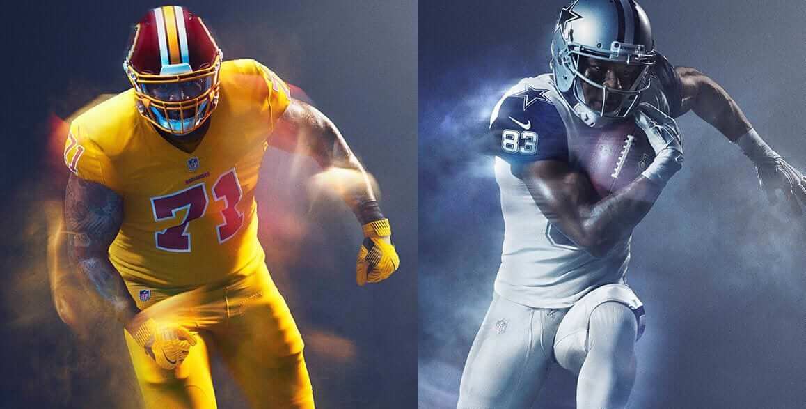
The Cowboys will be wearing their mono-white Thursday-night uniforms for tomorrow’s game against Washington. But what with the ’Skins be wearing?
That’s the question that began spreading around uni-verse yesterday, as it became increasingly apparent that some sort of Color Rash drama was unfolding.
Some quick background: Washington has never had to wear the Rash. Their only Thursday game last year was on Thanksgiving (which wasn’t a Rash game), and they opted out the year before that, when the Rash was optional. Team brass has never liked the Rash. Back in March, they even tried to enact a Rash opt-out bylaw, citing “Garish uniforms” as the reason, but the proposal didn’t have enough support to pass.
That would appear to be that. But word began spreading yesterday that the team was pushing back against the idea of wearing the mono-yellow unis this Thursday. J.P. Finlay, who covers the team for NBC Sports, had this to say:
Here's what I know about Thursday's color rush, from multiple sources, NFL wants #Redskins to wear them. Members of #Redskins front office do not.
— JP Finlay (@JPFinlayNBCS) November 28, 2017
When Washington coach Jay Gruden held his regular Tuesday press conference yesterday, Washington Post reporter Dan Steinberg asked Gruden about the uniforms. It didn’t go over well (click on image after the tweet to enlarge):
Jay Gruden 1) doesn't know if the Skins will wear Color Rush uniforms on Thursday 2) made fun of me for driving to Ashburn to ask him that
— Dan Steinberg (@dcsportsbog) November 28, 2017
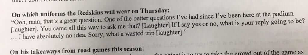
Steinberg later clarified that Gruden was just fucking with him, but the issue remains: Will the team wear the Rash or not? What if the league says, “Yes, you will,” but the team decides to disobey? Would there be fines? Would the officials get orders from the league to prevent the team from playing?
Just this morning, Steinberg posted this article. Here are the key bits:
A team spokesman has said for weeks that he doesn’t know what the team will wear Thursday night; he repeated that message on Tuesday. An NFL spokesman referred all Redskins uniform questions back to the team.
…
[P]layers were actually discussing this very issue when reporters entered the team’s locker room [on Tuesday], with one starter asking another whether it was true that the team would wear all-burgundy uniforms against the Cowboys. I don’t want to dabble in fake news, and clearly there was no confirmation to be had in the locker room, but here’s what I learned:
• One player said he had been told that the team would not be introducing any new pieces of clothing Thursday. Since the team has never worn the gold tops [that were shown in promo images], this would imply that any monochromatic outfit would either be all-white or all-burgundy.
• Another player said that players who wear Nike cleats had already been given burgundy cleats for the game and added that he was expecting the team to wear all-burgundy.
• A third starter, asked directly what the team would be wearing Thursday night, answered that it would be all-burgundy.
• But three other starters professed ignorance. A fourth other starter, asked what the team would be wearing Thursday night, said, “That’s what I’m trying to figure out myself.”
It’s a lot of potential intrigue, although I think we all know the likely outcome: The team will just go ahead and wear the Rash. But we’ll find out soon enough.
Meanwhile, speaking of the Rash, it’s spreading to the Chargers this Sunday.
Update: A few minutes after I posted this entry, former Washington tight end Chris Cooley, who co-hosts a sports talk radio show in DC, tweeted this:
As of now… color rush for Redskins will be burgundy on burgundy.
— Chris Cooley (@thecooleyzone) November 29, 2017
(My thanks to Phil for his contributions to this section.)
NHL uni vote: With the NHL winding down the celebration of its centennial, the league has come up with an interactive website that lets fans vote on the 100 greatest uniforms in NHL history.
Basically, the league has chosen 100 uniforms, and you get to rank them via a series of knockout votes. The rankings are based on the best “winning percentages” from the voting. Of course, you might not necessarily agree with their choices for the 100 nominees. SportsLogos.net honcho Chris Creamer, who worked on this project with the league, gave me this explainer:
We chose 100 uniforms to put into a pool. We tried to do a set amount for each team depending on how many seasons the team played — we aimed for four uniforms for each Original Six club, three for the Second Six, etc., picking the best or most unique uniforms each team wore to give as much representation across the board as possible.
We also tried to pick at least one design from every season in league history. You can see the full list of 100 uniforms/teams by clicking on the “Gallery” link in the top-right area. This will also give you the photo galleries and historical write-ups.
And there you have it. Happy voting!

MLB uni ads update: MLB commish Rob Manfred (right) appeared on radio talker Mike Francesa’s show on Monday, and their discussion briefly turned to a subject of great concern (if you want to hear the audio, go here and skip to the 28:15 mark):
Mike Francesa: Are we going to see advertising on player uniforms?
Rob Manfred: You know, we’re gonna have in 2019, for the first time, the Under Armour logo will actually be on the front of the uniform, as opposed to the sleeve. That’s a big change for baseball. We’re gonna work through that change before you see any other changes in that area. I’m not sure that we’re headed in that direction.
Francesa: We’re not looking like race car drivers, though, anytime soon, right?
Manfred: No. I think you can put your head on your pillow and sleep easy on that.
Francesa: I mean, for me it’s hard enough for these teams to have extra uniforms. When they have 27 different uniforms that they’re selling, that’s enough, you know?
This is consistent with what Manfred has said in the past about uniform ads. Basically, he won’t rule it out but he doesn’t even want to talk about it until they get through the Under Armour transition.
It’s a fabulously slippery position to take, because it allows everyone to project their predisposed notions onto the situation. If you expect the worst, you can say, “He’s totally gonna go for uniform ads in the early 2020s.” If you’re more of an optimist, you can say, “No plans in the works, no trial balloons being floated — we’re good.”
(My thanks to @mike3783 for the tip.)

The Cincinnati Bengals, Straight Out of the Kitchen
By Alex Hider
I grew up in Cincinnati as a Browns fan, but uni-watching knows no rivalry. The other day I stumbled across this recent article, written by my wonderful colleagues at local ABC affiliate WCPO (disclaimer: I work for E.W. Scripps, WCPO’s parent company).
As many know, the current Bengals weren’t Cincinnati’s first pro football team. The original Cincinnati Bengals played in a few different pro and semi-pro leagues from 1937-1941. For whatever reason, I was always under the impression that the original Bengals drew inspiration for their name from the Cincinnati Zoo’s rare collection of Bengal tigers.
But according to a 1987 interview with Hal Pennington, who coached the original pre-NFL Bengals franchise, “The Jungle” got its start in the kitchen:
I looked at my mother’s old range, and right on the range there was a picture of a big tiger with his teeth snarling and everything. But right underneath it, it said “BENGAL.”
Fascinating! So that’s how the original Bengals got their name. (The piece goes on to mention that Floyd, Wells & Co., a Pennsylvania company that produced stoves, held the trademark to “Bengal” at the time.) The NFL Bengals then based their name on the original team’s name.
So, if you’re looking for a gift for the Bengals fan in your life this holiday season, hop on over to eBay and search on “Bengal stove.” There are a few available for purchase now.

Culinary Corner: For Thanksgiving, which the Tugboat Captain and I spent upstate at her brother’s house, I decided to make a really wonderful dish that I learned from my mom: scalloped potatoes. Of course, mashed potatoes would be a more traditional Thanksgiving option, but someone else was already making that, and I figure you can never have too many potatoes, so there you go. Here’s how to make this excellent dish:
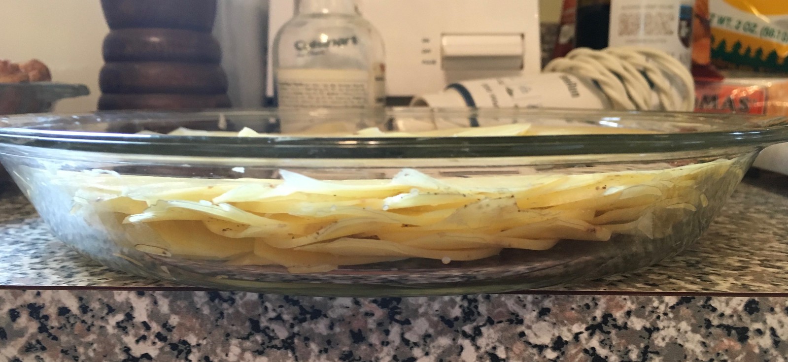
1. Get yourself three or four medium to large-ish potatoes. The waxy varieties are better if you can get them, but standard baking potatoes are fine if that’s all you can get. Peel them and then use a mandoline or other slicer to slice them very, very thin — almost paper-thin.
2. Working in concentric circles, arrange the potato slices in a 9.5-inch pie dish or other round or oval baking dish. After you’ve made one layer of slices, sprinkle the layer with salt, pepper, and some chopped garlic (for all of these photos, you can click to enlarge):
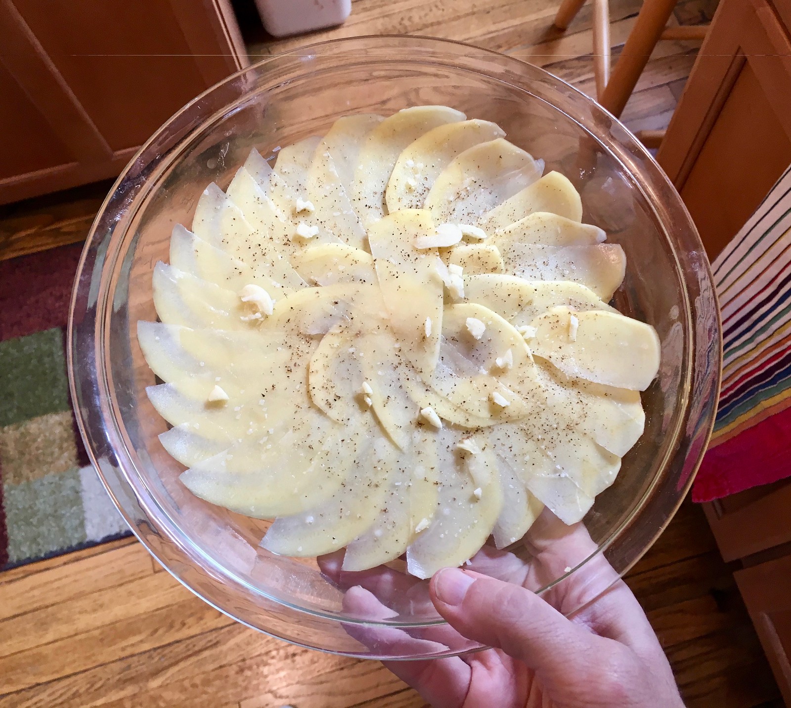
3. Add a new layer of slices on top of the first one, and then continue adding layers, sprinkling every second or third layer with additional salt, pepper, and garlic. Continue until you’ve done about six or seven layers, or until the dish is mostly full, or until you’ve run out of potatoes.
Here’s a side view of how the finished layers look:
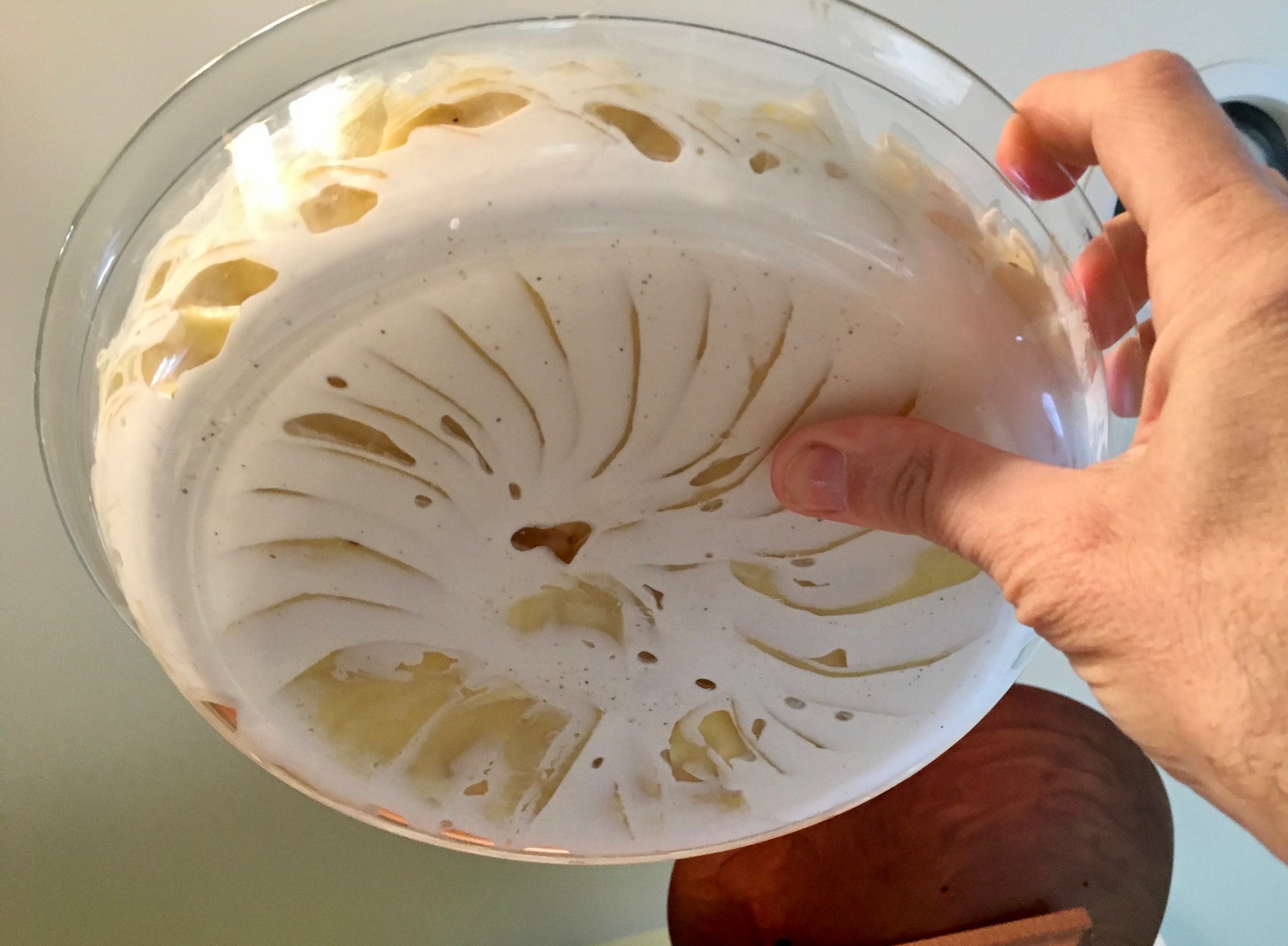
4. Pour 1/3 cup of heavy cream over the layered potatoes. Wait a few seconds to allow the cream to settle into the layers and then add another 1/3 to 1/2 cup. Tilt the pan back and forth a bit, if necessary, to ensure that the cream is evenly distributed. Then dot the top surface with butter:

One nice thing about using a glass pie plate is that you can see how the cream is distributed along the bottom:
5. Bake the potatoes in a 325º oven for about 90 minutes (but check on them after an hour or so, just to make sure they’re not burning). They’re done when the top is golden brown. I went ahead and made three batches for Thanksgiving, including one in a big cast iron skillet:
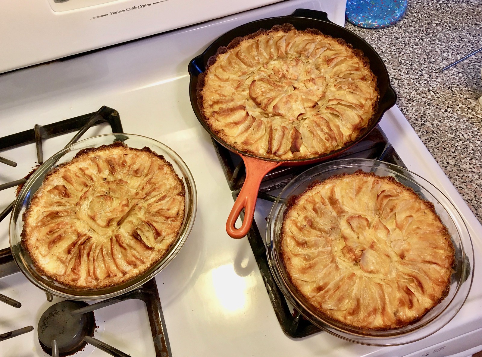
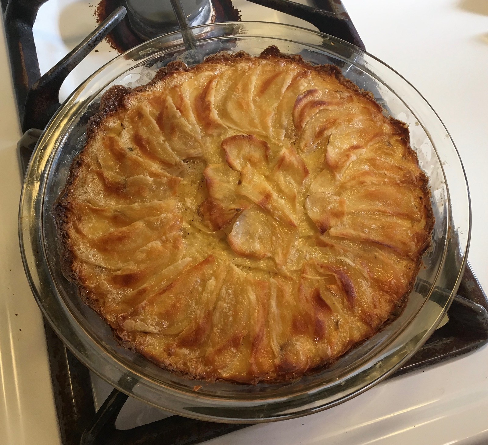
Doesn’t that look good? Trust me, it is. And everyone at our Thanksgiving dinner agreed.
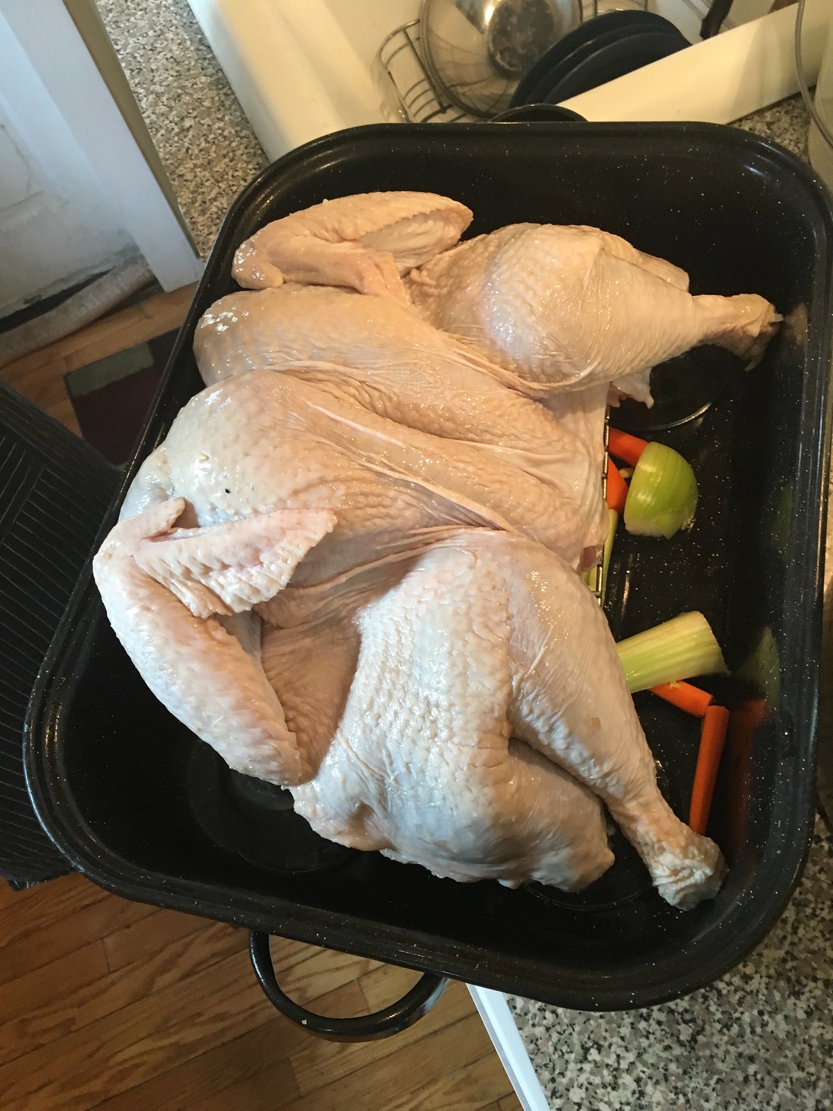
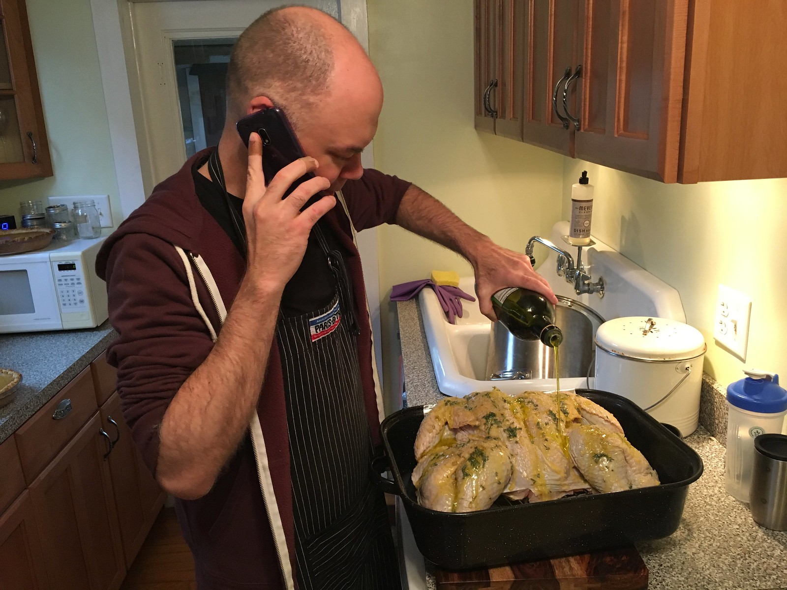
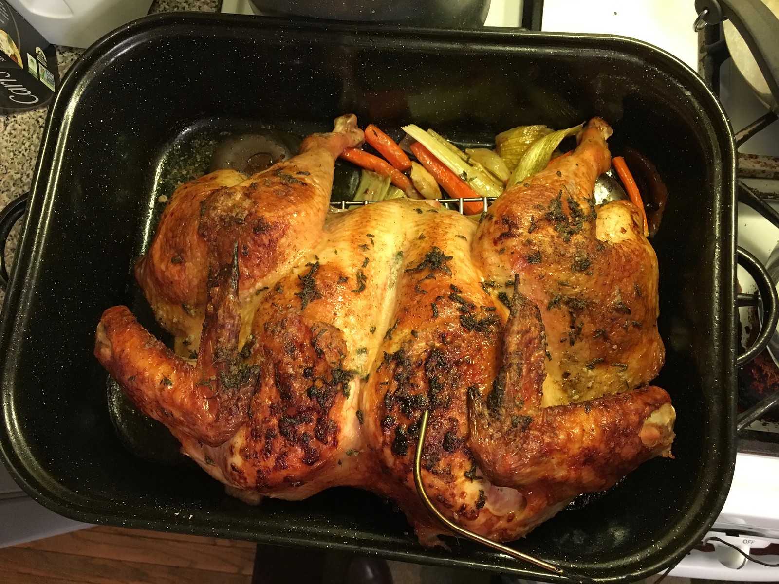
As long as we’re talking about Thanksgiving: A few weeks ago I mentioned that I’d spatchcocked a chicken (i.e., removed its backbone, which allows for faster and more even cooking), which prompted several of you to ask if spatchcocking would also work on a turkey. As it turned out, the Tugboat Captain’s brother Peter spatchcocked our Thanksgiving bird, with excellent results:

There’s one more Thanksgiving-related cooking project I want to share with you, but I’ll save that one for tomorrow.

Click to enlarge
KRC update: The latest installment of Key Ring Chronicles is a very short but very sweet item about a name tag. Check it out here.
The Ticker
By Alex Hider

Baseball News: Here’s a good look at one of the new BP caps … The Indians shared a photo on their Instagram page of a 2001 ceremony that honored the top 100 players in team history — a photo that has quite a variety of unis throughout team history (from @History_Cle). … New 80th-anniversary uniforms for the Fukuoka SoftBank Hawks.

NFL News: Lots of teams unveiled the “cleats for a cause” shoes that players will be wearing this weekend, including the Bills, Bears, Broncos, Browns, Colts, Cowboys, Jaguars, Jets, Raiders, Seahawks and Washington. Even Bill Belichick is playing along. More photos of cleats here. (from David Goodfriend and Brinke).
College Football News: Georgia will wear white on Saturday in the SEC Championship game, meaning Auburn will be in blue (from Phil). … Here’s a ranking of all the uni combinations Syracuse wore this season (from Bryan Prouse). … Ohio State will wear white for the Big Ten championship game.

Hockey News: The Blackhawks wore purple warmups on Monday for Hockey Fights Cancer night. The Golden Knights did the same thing last night (from Ken Traisman and Robert Hayes, respectively). … Some of the new NHL retail jerseys come with a tag that can be scanned by a smartphone for exclusive content. According to Ryan Feuerstein, the league is using old logos on the smartphone app.

Basketball News: The Trail Blazers will wear their red alts for the first time on Thursday (from Phil). … According to Seth Horowtiz, Knicks PF Kyle O’Quinn played the first eight minutes of Monday’s game with his jersey untucked without being called for a violation. He was then taken out, and later returned with his jersey tucked. … The University of Akron went GFGS last night (from @Steve_424).

Soccer News: FIFA is reportedly struggling to find advertisers ahead of the World Cup, thanks to the governing body’s scandalous reputation. … Whenever one of Real Madrid’s players gets injured, they continue to train in a pool with a buoyancy suit. The man who developed those suits has quite the story. … Torino will honor the victims of the Chapecoense plane crash by wearing green uniforms for this weekend’s match against Atalanta (from The Boot Room).

Grab Bag: Diamondback Beer, a brewery in Baltimore, is releasing a beer named after sportscaster and Maryland native Scott Van Pelt (from Andrew Cosentino). … Ivan Zaytsev a volleyball player for Italian club Sir Safety Conad Perugia, took the court recently with a temporary tattoo advertisement and could face disciplinary action. … Knoxville Christian School in Tennessee is using a lightly modified version of the Royals’ logo (from Derek Brownlee). … New jersey advertiser for the New South Wales Rugby League team (from E.P. Conrad).
Bringing back ketchup n’ mustard and fighting color rush is all Bruce Allen has done right for “Washington”
Amen. I hope my gold Cousins jersey will be a talking piece only, which would be neat.
In the Flyers-Sharks game last night, Flyers goalie Michael Neuvirth had a purple mask for Hockey Fights Cancer. I don’t have a screen grab, though.
Here we go:
link
link
Those potatoes look amazing. Going to try making them this weekend. Got a feeling first time around will be a disaster for me!
I’ve made scalloped potatoes a bunch of times and Paul’s recipe looks perfect. My only comment is that they have to be sliced thin. Mandolin, kitchenaid, whatever, make sure they’re thin. The only way to turn the recipe into a disaster is to chunk the potatoes.
Hey, like it says in today’s entry: paper-thin!
Sorry, I’m agreeing with you to emphasize the THIN part. Its a very forgiving dish and JamesG shouldn’t have a feeling of dread.
Agreed. Hard to mess up anything that involves potatoes, butter, cream, garlic, and salt!
Hey Paul,
I know the topic of NFL players wearing gold chains has come up here from time to time. There’s an interesting tidbit in this story on Pro Football Talk about how Michael Crabtree’s chain getting ripped off is what may have instigated the fight between he and Aqub Talib.
link
Maybe Kyle O’Quinn got his jersey from UNTUCKit!
advertising for Tyson meat on the site?
Not sure what you’re referring to. Aside from the ads in the right sidebar, the ads on the site are “served” and based on your browsing history and location, meaning that the ads you see are probably different from the ads someone else sees.
did something similar with sweet potatoes and a muffin pan. Could also be done the way you did it, I suppose. Really good.
link
But what with the ’Skins be wearing?
Paul, your scalloped potatoes brought back memories. My mom used to make a similar receipe but she put the potatoes in a large bowl and cooked them, baked them in the oven with pork chops thrown in the casserole. She would then serve the large bowl to us and you had to go fishing for your pork chop. Plus the potatoes, of course. Thanks for bringing back that memory. I know what I am having for dinner now.
Apparently the fine for not wearing the color rash is a paltry $5K, so it’s not like there is a big disincentive in play here.
I’m just surprised it took this long for someone to strenuously object.
And the rash is spreading of course: Chargers in mono-royal this Sunday and Bills in mono-red the following Sunday. Some teams clearly do like the rash.
In fairness to the Chargers, their rash uniform was one of the best received and arguably a non-unitard version of that could be their full time design going forward.
Excellent news gathering- THANK YOU! I was worried this protest would be punished via a cap hit
So let me get this straight…the Washington football team doesn’t want to wear a “garish” color rash uni for one game and wants to opt out. Meanwhile, their name permanently applies color rash to an entire race of people. I smell an Onion news article here somewhere.
“Washington Football Team Refuses to Wear Offensive Uniforms”
There is glorious irony in this yes
Paul, heard that ESPN had some layoffs; are you still good there?
Yes, I appear to have dodged the bullet once again.
Check that — it’s not yet clear who’s being laid off. So we’ll see.
As a temporarily unemployed person (recently moved across country as a trailing spouse), I gotta say: My thoughts are with everyone losing their jobs today. Just remember – this too shall pass this too shall pass this too shall pass.
I think you should have titled today’s entry “Revolt of the Rash”
link
That NHL voting thing is a wonderful timesuck. And I appreciate that uniforms other than the handful of famous classics are getting support. But there seems to be a strong color bias, in that basically no unis with black-and-white photos are beating unis with color photos. And most of the b&w-on-b&w matchups are tied or close to tied. In retrospect, a shame that the older photos weren’t colorized for the contest.
A wonderful timesuck indeed. But they REALLY need a “neither” option. I’ve been presented with some matchups where both unis are garish.
Amen to the “neither”. A few matchups I hated both so I had to choose which I hated least.
And some of the time frames encompassed several different jerseys yet you only get shown one, obviously. A glaring example is the Penguins from their inception throughout their powder blue/navy blue era – SO MANY different iterations and designs cover that era.
Same with the Kings purple/gold era – two distinct designs albeit it with the same logo – the later design with the arms stripes and the addition of white trim.
Oh well. Fun, though. And I’m giving the black and white pics all the love I can. Because I really do like those uniforms. Vote for wool, cotton and durene over polyester!!
-Jet
Ugh… the hideous yellow Nashville Predators jersey with that stupid logo is leading the Kansas City Scouts gorgeous blue threads by 66 to 34!! Must be a lot of young fans voting… sigh…
-Jet
I like the absence of a “neither” option. A contest like this should always be played by Thunderdome rules: Two men enter, one man leaves. Even among two bad options, one is always worse.
Conversely, I’d be inclined to use a “both” option on many of these, so I’m glad it’s set up to force me to choose, even when it’s between favorites.
Personally, I’ve surprised myself by how often I’ve voted for the current Florida Panthers and Tampa Bay Lightning over uniform sets that I consider minor classics. I mean, I’ll take Hartford and most variations of the Habs over all comers. But the Panthers and Lightning appeal to me over uniforms I’d otherwise have called classics like some of the lesser Bruins, Penguins, and Flyers uni sets.
I was just about to comment along very similar lines. It’s a real shame some of those older images weren’t colourised – having seen some of them in colour previously, I can’t help but think there’d be some swayed opinions!
So how did Miami get out of wearing the orange uniforms? Wasn’t it something with the equipment staff not liking them? Whatever it is, how did they get out of it and Washington is having an issue?
At least Miami had worn orange jerseys before (albeit with aqua/green/white pants). Skins have NEVER worn their mustard gold as a jersey, as it is treated as an accent/complimentary color, not their main. Thank God. SKINS APOLOGIST SPEAKING
I believe it had to do with who their color rash opponent was this year? They played at Baltimore, right? So the road team can choose to go mono-white (with white socks)? Perhaps that’s it? Purple and orange don’t clash, and I don’t think they create the same color blind problems as other combos.
In last nights Flyers-Sharks game, Philadelphia’s number 70, Danick Martel, was missing the “100th anniversary” patch on his right sleeve. No screen grab though
I know the Cleveland Indians’ uniforms have included a few clinkers, but none of them were in that photograph!
Speaking of Baltimore Brewers, Waverly Brewing Company (link) was named to honor the town of Waverly where the old Memorial Stadium lived.
They also have been know to have baseball themed beer names. Their house blonde ale is called “Golden Sombrero”.
As I’m sure you know, Waverly is actually a neighborhood in Baltimore City. It started out as a village in the early 1800’s and was annexed by Baltimore City in 1888.
Love the Chargers going gold masks for their all blues game.
Note this is the second time this season for the Chargers to go mono blue; the last time was mono Navy.
It is interesting that they have navy, royal, and powder blue sets. And of the three their primary navy blue is the least appealing.
If the 1979-1992 Whalers uniforms don’t win that competition i will riot.
The North Stars uni appears to be winning a lot of its match-ups. I hope they or the Whalers win.
Whalers haven’t come up for me yet so I’ll have to click on them when I get the “choose a random team” option, because I’m curious to see which version they show. Some subtle changes in there and of course they at one point changed to navy for the dark jerseys instead of green… but the distinctive logo is there throughout…
-Jet
Okay, just had a Hartford one come up. I see the year span is for the green jerseys only, the navy blue era was starting in 92-93 and isn’t an option. Still… they could have picked a much better picture. The one shown is rather uninspiring with the waist striping obscured and the green and blue colors on the white jersey look dark and washed out in the photo, like the camera settings weren’t correct or whatever…
-Jet
Those late 70’s Rangers jerseys were cool, as well as the Bobby Orr-Bruins. Untouchable.
The thing that bugs me about that vote is that they lump the 2002-07 Penguins unis in with the 2007-16 Edge unis, which were NOT THE SAME DESIGN BY A LONG SHOT. And the picture used is, of course, the Edge era.
They also lumped in the 1998, 2007, and 2014 Blues in as one design era, when they’re actually three different versions, with the 1998 and 2014 variations being similar, but not the exact same. Meanwhile, they have multiple variants of the Canadiens’ red uniform, which were even more subtly altered over time than the Blues’, yet are treated as separate design eras.
Yeah Rob, how about the powder blue era Penguins? Changed their design on almost a yearly basis. And the first year 67-68 design with the diagonal name a la the Rangers was completely different than any of the ones with the skating penguin.
-Jet
Good grief, I was just given the choice of the “fish sticks” Islander uni versus the 76-78 “Winnipeg Rangers” uni…
-Jet
“The NFL Bengals then based their name on the original team’s name.”
I actually didn’t know there was a previous Cincinnati Bengals that played back in the 30’s and 40’s. I think I always assumed that Paul Brown wanted to make the new Cincinnati AFL franchise into a carbon copy of the Browns, but since he couldn’t actually call the team the Browns, he chose Bengals because it started with a B and the Brown’s color scheme fit that name.
I am still looking for the “big tiger with his teeth snarling and everything” that inspired it all.
Can’t find a good pic of the Bengal (oven) logo.
Until the most recent Bob’s Burgers episode, I thought the word was “spatchCOOK,” not “spatchCOCK.” I was very confused.
and I figure you can never have too many potatoes
Don’t tell that to the diabetics in my family…I’ve been trying to convince them otherwise.
Looks good, Paul. I’d try that over mashed. But if there are sweet potatoes as well I’m choosing those instead.
The University of Akron went GFGS last night
If the numbers are gold, I’ll take it. It’s a step up from the last five years or so, when they’ve worn almost no gold at all.
Paul- to your knowledge, has another instance of an outright dissent towards wearing a pro league-assigned uni, based on visual appeal alone ever occurred?
I love the simplistic reasoning that was provided by the Skins for the removed proposal-
GARISH UNIFORMS
Hemmingway would’ve been proud.
Well, the Broncos held a bonfire for their vertically striped socks when the team stopped wearing them. I’d say that counts as dissent.
I’m really wondering if this may be a landmark instance.
Would be so ironic if it is so, by the REDSKINS
I wonder what happened to the White Sox’s short pants when they were done with them.
At least one pair is framed for posterity:
link
Baseball players do not belong in shorts, for many reasons. Prob best explained by this Tom Selleck movie quote:
“We’re not athletes, we’re baseball players!”
Didn’t the Tigers and Red Sox forgo use of the Turn Ahead the Clock uniforms in 1999 because they got “lost” in shipment during Hurricane Floyd?
As far as I can tell this is sort of a first. And maybe I am missing something, but based on how Washington reacted, almost seems like the teams were left out of the design process on the color rash costumes? So when the Skins saw theirs, they hated them. Sort of speaks to the problems when you do gimmicks like this.
Blues third jersey in 1996?
link
And of course Chris Sale last year with the White Sox
link
Not sure if this will appear but an NFL tweet image promoting the game shows the Redskins in burgandy tops and yellow pants. FWIW
link
It also shows the Cowboys in their regular uni, not their Thurs-night uni.
In short: Not an indication of anything.
And I didn’t think so, but one part of me thinks if they believed in the color rush so much, they’d use images to promote it.
Thanks Alex, good story about the Bengals name. Nice info in that clip.
So if you go to the top of that NHL uniforms page, there’s a Top 10 leaderboard, and yes…THE WHALE are at the top.
Also in the top 10, the other awesome uniform that was criminally stolen from us…the 1980-1995 Quebec Nordiques.
The leaderboard sending some messages to present teams. People like the Sabres in royal blue. Seems to be the same message to the Oilers, who just abandoned their classic royal blues.
May be time for the Ducks to consider a new uniform redesign which features a return to the eggplant and jade. Didn’t think I would, but as time continues to pass, I miss that unique colour scheme more and more.
I lived up the street from Scott Van Pelt when I was a kid. I played at his house. My parents were friends of his parents. My next-door-neighbor, who was one of my best friends from the time we were not even 2 years old, is Scott’s best friend. It kills me that he’s more or less a household name. Who woulda thought that the kid I used to play with would have a beer named after him? Funny, because the first time I ever heard of Natty Boh (the ultimate Baltimore beer) was from Scott’s father.
Good for you, Scott!
SVP is one of my favorites. Whether he is or isn’t a genuine person- he sure comes across as one.
As a cowboys fan I have to say the boys color rush is one of the only color rushes I really like. Sadly enough so are the Giants I think it’s because both of them are somewhat throw/faux backs. On the other hand the skins mustard color rash if worn on field will def be one of the worst NFL unis ever
So any news on the Washingtonian jerseys for tonight. Are they going mono-burgundy?
Yes.