As you may have noticed in the left-hand sidebar, our friends at Grey Flannel Auctions are running another catalog auction. Here are some of the highlights:
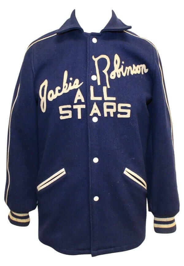
• Did you know Jackie Robinson had his own traveling All-Star team in the late 1940s and early ’50s? I didn’t, until I saw this gorgeous jacket. There’s no indication that Jackie himself wore this particular jacket, but whatever — it’s magnificent.
• I love, love, love this 1912 Red Sox championship watch fob. What a beauty! (And if you’re into championship jewelry, you’ll also like this 1915 Red Sox ribbon and medallion, this 1920 Indians championship pin, and this 1926 Asheville pendant.)
• Who knew that the Dodgers had separate jackets just for rookies? Not me! Probably from spring training. Love that Skinner tagging, too.
• What’s even better than a green-trimmed Johnny Bench jersey from the Reds’ first St. Patrick’s Day game? Having that jersey with the accompanying stirrups!
• Here’s an interesting one: a 1944 “U.S. All Stars” jersey worn by infielder Eddie Joost, apparently as part of military promotional team during World War II. Note that the periods are rotated so they appear as diamonds!
• If you liked that line of college football jerseys recently launched by Ebbets Field Flannels as much as I do, you’ll love this 1960s Princeton jersey.
• I was a little surprised to see that this 1977 Willie McCovey jersey showed a raised “c” on his McNOB. So I did a bit of checking and found that, sure enough, the Giants consistently styled his name that way on a variety of different jersey styles, as seen here, here, here, and here. Unfortunately, I couldn’t find any rear-view photos of him from his stints with the Padres and A’s. Anyone..?
• Here’s an inscription you won’t often see: Mickey Mantle disgustedly signed this ball at the end of a low-turnout autograph session in New Orleans with, “This is the last fuckin ball in N.O.”
• Man, the letterspacing on this Steve Garvey gamer is waaaaay off. Looks very amateur-ish!
• Mets fans might be interested in these two non-Mets gamers: a Jerry Koosman White Sox jersey and a Jon Matlack Rangers jersey.
Want to see more? You can see all of the auction lots here.
Click to enlarge
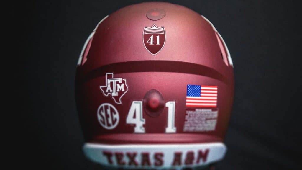
Presidential tribute: All Texas A&M teams are adding a memorial decal or patch for George H. W. Bush, who died on Friday night. The school is home to Bush’s presidential library and will be his final resting place. The memorial logo will be worn for the rest of the 2018-19 athletic year.
It’s a nice gesture, but the design looks a bit too much like an Interstate highway route marker, don’t you think?
In case you missed it on Sunday, I had a look back at Bush in various uniforms. Lots of good discussion in the comments, too.

Click to enlarge
And speaking of Bush…: As you’ve probably heard, Bush has been lying in state at the U.S. Capitol rotunda. An interesting term, that — lying in state. Until yesterday, I always thought it referred to the state of the dead body — like, it’s lying in a state of preservation, a state of embalmment. That’s what I thought it meant.
But then the Tugboat Captain asked me about the history of the term, so I looked it up. And it turns out that I was way off-base: “Lying in state is the tradition in which the body of a dead official is placed in a state building, either outside or inside a coffin, to allow the public to pay their respects. It traditionally takes place in the principal government building of a country, state, or city. … [A] viewing in a location other than the principal government building may be referred to as lying in repose.”
Faaaaascintating. I had no idea! Am I the only one who thought “state” referred to the state of the body rather than the governmental state?
For all photos in this section, click to enlarge
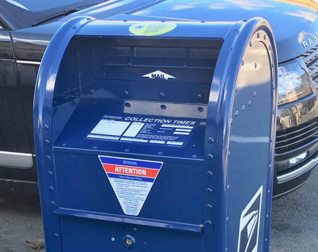
Mailbox blues: Since I mail out Uni Watch membership cards on a fairly regular basis, I still interact pretty frequently with mailboxes. And lately a new kind of box has been appearing all over Brooklyn (and, I’m assuming, elsewhere). At first glance, it looks just like a standard mailbox. But instead of the familiar cantilevered door, it has a slot:
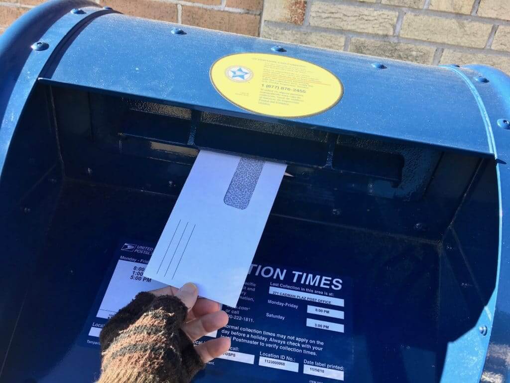
This configuration is designed to make the box more tamper-proof. If you get down and look more closely at the slot, you can see that there’s a little internal grate that adds an additional layer of security:
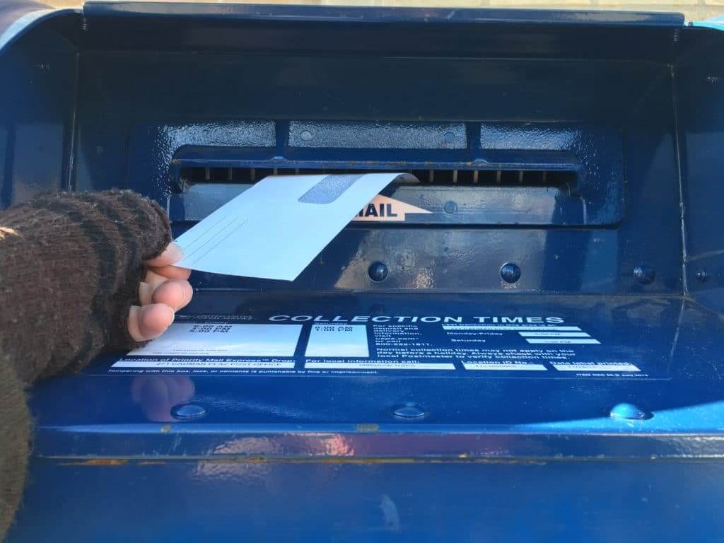
I hate these new boxes. For starters, padded mailers and small packages won’t fit through the slot like they would before. But more importantly, the slot makes for a completely unsatisfying consumer experience. I miss the reassuring heft of the cantilevered door, the friendly squeak as the door opened and closed, the ritual of re-opening the door to make sure that letter had disappeared into the box. The slot offers no such pleasures. A very sterile interaction.
And then there’s this: I understand that mail theft is a longstanding problem (remember all those westerns where the bandits were going to rob the mail train?), and I guess it’s good that the Postal Service is addressing it, but there’s something unsettling about being forced to think about it. Mailing a letter is already a tremendous act of faith — it’s kind of a miracle that it works at all, right? If you start making me think about how risky it might be, I might not be able to maintain my suspension of disbelief. These new boxes also have a warning decal that advises, “For the security of your mail, avoid putting mail in the box after the past posted pick-up time.” So now they’re actually telling me it’s not safe to use the box. You might as well tell me there’s no Santa Claus (who, by coincidence, is a big Postal Service customer — I wonder if his mailboxes are tamper-proof!).
One footnote to all of this: The Tugboat Captain was particularly disappointed to learn that the mailbox nearest to our house had been replaced with the new model. She had repainted that box (with official Post Office Blue paint!) several times over the years when it got dingy-looking or graffiti-tagged. When the old box was replaced, she wondered where it had ended up and if there might be some way for her to purchase it. (It would go great with our mail chute.) But her hopes were soon dashed when she found this page, which states: “Collection boxes, including post type, street collection, and relay storage boxes, must not be sold to the public. They must be destroyed by the owning Postal Service entity and sold as scrap. Collection boxes designated for sale as scrap must be recycled.”
Despite this edict, vintage mailboxes show up in antiques shops here and there. And now that I’ve been told I’m not supposed to have one, of course I want to have one. Hmmmmmm.
Click to enlarge
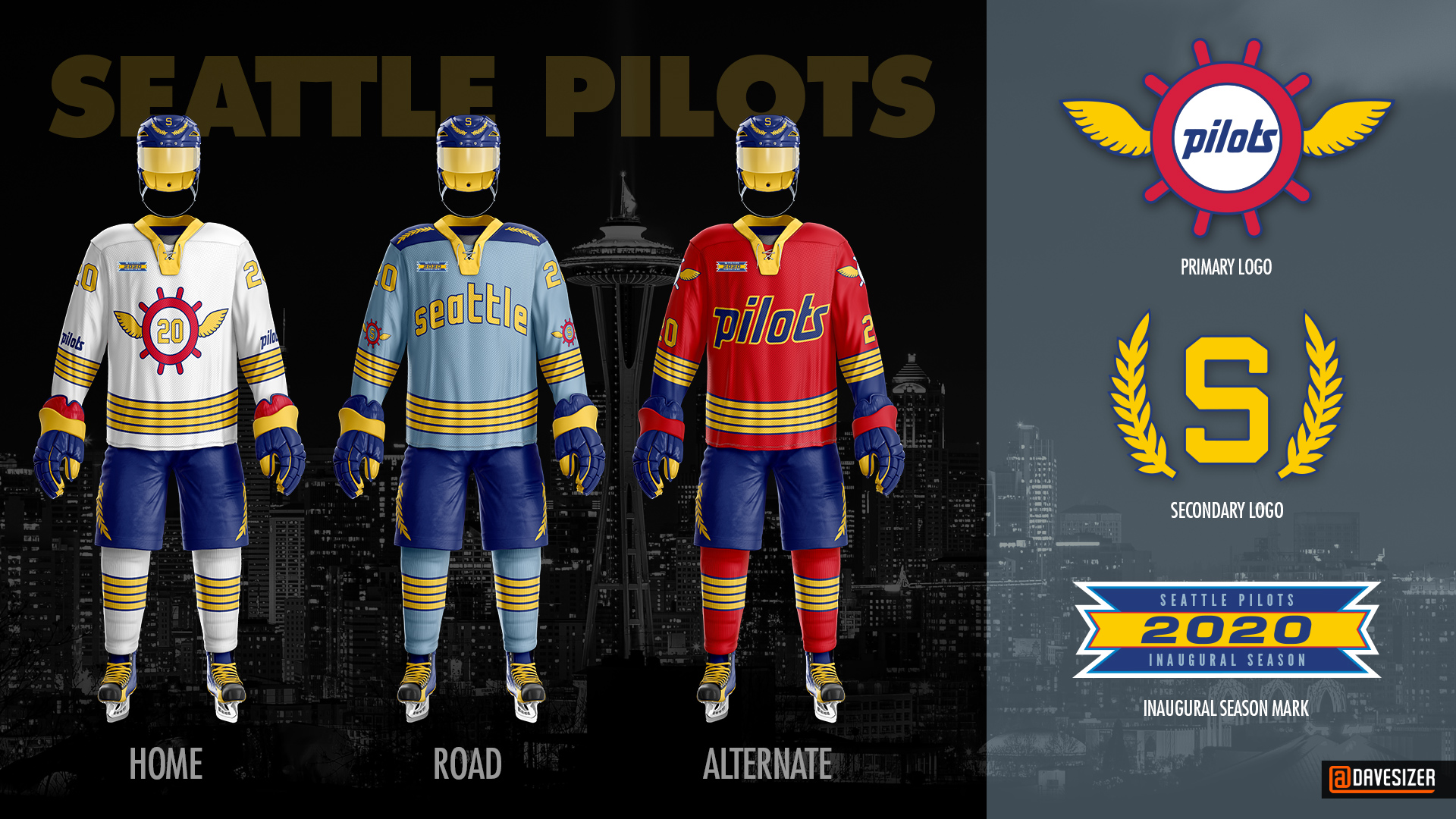
ESPN contest results reminder: In case you missed it yesterday, the results of my contest to create a new identity for an NHL team in Seattle are now available. Lots of great designs, including Dave Sizer’s Seattle Pilots concept, shown above. Enjoy!
Meanwhile, the NHL has made it official — the league will have a Seattle team starting in 2021-22.

Question Time reminder: In case you missed it on Monday, I’m gearing up for a new round of Question Time, the AMA-style forum where you can submit questions about whatever you like and I’ll do my best to answer them.
In case you’ve forgotten, here’s how it works: Send one question to the Question Time address (please note that this is not the usual Uni Watch email address). Your question can be about uniforms, sports, or anything else, although I reserve the right not to answer questions that are too personal. One question per person — this rule will be strictly enforced! And if you want to see which questions I’ve already answered, you can see the previous eight installments of Question Time here.
I’ll answer this latest round of questions either later this month or in early January. Thanks!
Free shipping reminder: In case you missed it last Friday: We recently offered a one-week additional $5 price break on our flex-fit Uni Watch Alternate Cap, knocking the price down to $19.99. While the price has now gone back to $24.99 (still cheaper than the original $29.99), we’ve decided to offer free shipping, which is more or less the same thing as maintaining the price break. If you’re thinking, “Wow, he must really have a lot of unsold caps that he’s trying to move,” you’re right! Get yours here.
Meanwhile: All of our fine Uni Watch products, including a few that you may have forgotten about, are listed on this one handy page.
The Ticker
By Paul

’Skins Watch: In the “You’ve got to be fucking kidding me” department, a weekly newspaper in Texas ran a story about a high school football game the other day with the headline “Cowboys Scalp Indians.” Seriously? That’s a screen shot of the article, which was taken down after people objected. A source close to the paper tells me that the person responsible for the headline (who was not the bylined reporter, so don’t blame him) has been reprimanded (from Brett Baker). … White Shield School in North Dakota has a new gym floor with lots of Native imagery. And why shouldn’t they, because it’s a Native school on a reservation. They’re the ones who should be allowed to do this stuff if they want (from James Gilbert).

Football News: The NFL has a new stat for “improbable completions” (NYT link). … The Seahawks will wear their mono-neon alternates on Monday night. … Last weekend’s “My Cause, My Cleats” footwear even extended to the Eagles’ coaching staff. … Here’s how the totally garish Las Vegas Bowl patch looks on an Arizona State jersey (from Joe Farris).

Hockey News: The Canadiens wore nickNOBs during pregame activities last night, with the jerseys being auctioned off for charity. … The Oshawa Generals, a junior team in Ontario, are named after a local General Motors plant. Now that GM has announced plans to close the plant, there are some calls for the team to change its name, but for now the team says the name is staying put (from @ohhhsourry). … Yesterday’s announcement of the new Seattle franchise featured an “LNH” version of the NHL logo. That’s the French version, which appears on the Canadiens’ jerseys. Odd to see it so prominently featured at the Seattle announcement (from Alex Allen). … Meanwhile, did you see that little girl in the red jersey in the Seattle/LNH photo I just linked to? A hockey writer says the Seattle team’s jerseys will look something like that (from Moe Khan). … NHL refs have added a “Mick” memorial patch for former official Mick McGeough, who died on Nov. 23 (from Moe Khan).

Pro Basketball News: Joakim Noah, newly acquired by the Grizzlies, will wear No. 55. … Here’s an article explaining how various Mavs players chose their uni numbers (from Sam McKinley). … Lakers F LeBron James is proud that his son wore No. 23 for his eighth grade basketball team (thanks, Brinke). … Here are the All-Star uniforms for Japan’s B-League (from Jeremy Brahm).

College Hoops News: Kentucky F P.J. Washington is wearing pink shoes as a tribute to his grandmother, who’s battling breast cancer (from Josh Hinton). … Bit of Seton Hall history last night, as the Pirates wore “Pirates” on their chest for the first time ever.

Soccer News: Tormenta FC is now being outfitted by Adidas (from Ed Zelaski). … A comparison of game-worn kits indicates that soccer jerseys have gotten much smaller in the past 20 years (from Josh Hinton). … The Michigan Bucks, a minor league team coming to Flint in 2019, are having a contest to choose the team’s new identity, including a new team name, colors, and logo. … Sinuhé Guevara says Adidas usually personalizes soccer managers’ jackets with their initials — “ZZ” for former Real Madrid manager Zinedine Zidane, for example. But Real Madrid’s current manager, Santiago Solari, has only a single “S.” Sinuhé theorizes that it might be because Adidas, a German company, doesn’t want to use the Nazi-associated “SS.”

Grab Bag: The Delhi Daredevils — that’s a cricket team in the Indian Premier League — have renamed themselves the Delhi Capitals. … South African rugby teams will wear Marvel Comics superhero-inspired uniforms in 2019. … Long Beach State is looking for a new mascot (from Andy Garms). … New 50th-anniversary logo for Sonoma Raceway in California. … A hit-and-run driver in India was apprehended because of a clue he left behind: the Mercedes logo that had broken off of his car.
Here’s a pic of Willie McCovey in an A’s jersey:
link
Ah, good find. Thanks!
to me the bad thing about the A&M sticker is it looks too much like a crown. bad enough for any potus, but worse when there are other active politicians in the family
your two postal items go together pretty well. how better to pull of mail theft than to obtain and deploy an old postbox? of course finding a good location would be difficult.
In the picture accompanying that unfortunate HS football headline, did anyone else notice that the Jourdanton helmets are complete rip-offs of the Utah Utes?
In regard to the Seattle writer, hopefully he’s wrong. The last thing the NHL needs is another red, black and white uniform. Maybe he’s just referring to the crest.
I agree. I hope it’s not one of those Vegas Knights things where the owner has their mind set on a name and color scheme (which I suppose they have every right to do, but I find it limiting).
I can see them not going with colors reminiscent of the Seahawks, though, as that’s not too far off of the Canucks.
Yep and at least the Vegas owner came up with an unique color ( for the NHL) – the grey home uniform.
Just call them the Seattle Totems. Kelly green with silver trim. Done and done.
I think David Pagnotta’s sources likely not accurate and he probably should not be reporting on this hearsay. There is no way we can get another red and black team.
Team CEO Tod Leiweke has been quoted stating they are not going to rush the name and colours until they find something they feel great about.
link
Good to know. Paul received so many great concepts that fit the city identity far better than the generic little league jersey she’s wearing. I could easily see the use of Totems/Thunderbirds imagery but as that skews a bit too close to the Canucks’ orca logo I could also see it being avoided.
It’s actually not a Seattle writer. Writer in question is David Pagnotta, who is based in Toronto. Pagnotta was the one writer that had inside information on the John Tavares sweepstakes this past summer, so I have a feeling his sources are likely very strong and accurate.
Wouldn’t hate the color scheme for Seattle, and I love the striping.
Thinking this is wrong. Chris Creamer’s Sports Logos says this…
“It’s a process of really putting your ear to the track and understanding and hearing what fans feel and believe,” NHL CEO Tod Leiweke told NHL.com. “That’s the art form. The science is then bringing in professionals who can take direction and sentiment and begin to apply it to what practically could be a name and a logo that will stand the test of time and I’m confident we’ll land on the right thing. We want to be deliberate, but we’re not going to rush this to the point we don’t feel great about it.”
I’m sure hoping David P has it wrong, we don’t need a 6th red/black dominant uniform (NJ, Chi, Ott, Carolina and the Flames) – am I missing one?
The only thing I could think of, maybe the good people of Seattle are sick of having greens and blues on every local uni, and this represents a change? But it would would like an inter-squad game when Seattle plays the Devils
There is one missing. Coyotes with darker red and black.
Red as a dominant colour for a Seattle team just doesn’t seem right. It’s the Emerald City and there is already so much red in the NHL.
Wouldn’t Mickey Mantle’s comment on the ball indicate a HIGH turnout? Like, this is the last fuckin’ ball, because I’ve signed them all?
Just reporting what the auction listing says about the event.
Gotta also keep in mind that Mantle had link when it came to signings. And link.
I am hoping the Seattle NHL franchise goes with some sort of silver – especially with silver helmets!
It would be really cool if they went without helmet stickers their first season like the Seahawks.
That is a great idea! What a cool quirk for a city to have two teams without helmet logos in their first year.
I loved those plain silver Seahawks helmets in 1976!
Sigh. Do we really have to debunk this myth again? The Seahawks never had blank silver helmets — not in 1976 or at any other point.
Robinson Cano just answered your question from yesterday Paul. He’ll wear 24 for the Mets.
link
Yesterday’s question wasn’t *whether* he’d wear 24 (we already knew that he would); it was whether he *should* wear 24.
This is why Iove this site. Where else would I get up to speed on USPS mail box design and Joakim Noah’s newest jersey number? Brilliant all around, Paul.
Thanks, Lindy!
32 teams in the NHL is just too much (and I love hockey).
Given the fact they are also looking at Europe in the next decade, it may be time to either contract or be realistic of relocation (looking at Florida –> Quebec City) to create stability.
More black and red in the league just create less originality and more “uniformity” across a league that is lacking in originality.
With team being forced to follow the “Adizero” template, I have very low expectations for this teams identity.
The classic knee-jerk “move ’em to Canada!” response whenever a US team in a non-traditional market starts failing is really not practical, simply because the only cities left in Canada are too small. Winnipeg is now by far the smallest metropolitan area in the NHL (well behind Buffalo, which is the smallest US NHL market), and Quebec City is roughly the same size.
Yes, I understand that hockey is much more popular in Canada, perhaps comparable to the popularity of the NFL in the US. But cities like Winnipeg and Quebec City are roughly the size of Little Rock, Arkansas or Knoxville, Tennessee. Even given Americans’ love of football, would you really expect an NFL team to survive in those cities? There’s a reason Winnipeg and Quebec City lost their teams in the first place – lack of fan support. It’s not because they didn’t have passionate fans. It’s simply because they didn’t have ENOUGH fans… because those markets are too small.
I think the NFL is a bad example, per their revenue sharing. Look at Green Bay. They survive because of the structure of the club, and the way that NFL revenues work.
Where would most of an NHL team’s revenue come from?
Green Bay is also a huge anomaly. The NFL started out with many teams in very small markets, and the Packers were the only one that didn’t fail over time. A lot of people like to trot out the Packers as an example of why an NHL team would succeed in a place like Winnipeg or QC, but if anything, the Packers’ story (in context) demonstrates the exact opposite.
And the Packers, functionally, are a Milwaukee team, at least to the extent that they need to be. That is, they’re a local team in the Milwaukee media market, and if there are seats available Milwaukeeans are likely to travel there (much easier to get to 8 home games in the NFL than the 40 or more in the other major leagues).
Green Bay is its own media market.
NFL teams also don’t get revenue from local TV deals (outside of meaningless preseason broadcasts). The NFL has one large national deal, which all teams equally share. MLB, NHL, and NBA teams (can) get substantial revenue from local broadcast deals. Small market teams, no matter how passionate, have trouble securing that big chuck of cash simply because fewer eyes in the market means networks will pay less for rights because the networks make less revenue from ad sales during the broadcasts. Nate Silver’s group did an interesting analysis on this subject, arguing that though the Canadian markets were smaller, they should theoretically be more lucrative simply because a higher percentage of people in the markets are fans. They did the math (my numbers are made up in this example) saying that while Houston has 7 mil in its metro area, you could expect only 10% (700k) to tune into games, meanwhile Quebec has 800k in the metro area, but you’d get 70% (560k) to watch. Thus, the market sizes aren’t as far apart as you’d expect. Of course the counterpoint is that uou won’t be able to really grow the market share in Canadians cities, whereas in a place like Houston if you can gain traction you have a lot of opportunity for growth.
I didn’t think the problem with NHL hockey in Canada was “lack of fan support”. Certainly Quebec held their own with bodies coming through the turnstiles on game nights.
I was under the impression that corporate money was much more limited in Canada, and thats the primary reason that NHL level hockey isn’t/wasn’t viable up north.
I am sure there are also tax considerations.
Lee
Despite what the loyalists will tell you, the first edition of the Jets actually had pretty miserable attendance for most of its existence. See here for an example:
link
To be fair, the Nordiques certainly did better in that area, so attendance may not have been as big a factor in their demise.
I respectfully disagree with you. St. John’s Newfoundland is #20 on the list of Canada’s biggest cities. They have around 206,000. I have no doubt they could and would fully support an NHL team – a lot better than trying to force teams into Florida and Arizona.
While I have to admit I found it a bit hard to connect the dots between some group willing to pay $650m and later that night watching the Bruins and Panthers play to mostly empty seats, the reality why Florida or Arizona draw really poorly is they’ve never been any good. Decades of at best mediocre play takes its toll as it would do in any city. Nashville and Tampa sell out every game with the Nashville crowd considered one of the best in hockey.
N
Daniel, attendance was not the issue with Jets 1.0. The problem was lack of revenue for the owners. Winnipeg Enterprises Corp. owned the old outdated Winnipeg Arena so they made all of the money from concerts etc. and took all of the concession money made at any event, including Jets games, held in the facility. The Jets owners only made money on ticket sales and TV rights and that made viability impossible. A new downtown arena was requested by ownership in the early 80s but the city’s idiot decision makers built a disastrous mall instead. There were no local buyers stupid enough to take on a losing proposition when the team was available for sale. Jets 2.0 have never had an unsold ticket.
Actually it makes sense for the USPS to order decommissioned mailboxes to be scrapped. Most of all, in the wrong hands it could be used for malicious intent. Not to mention that the metal will (presumably) be recycled.
The mailbox change is more likely to keep packages out of the boxes for safety, rather than for security of the mail in the box. Anything not an envelope they want going to a post office, then there’s video of the sender, witnesses, etc.
But as I noted, these new boxes have a warning decal that specifically addresses tampering:
link
When reading the story, I too thought that design was more to prevent putting suspicious packages in the mailboxes (as mailbombs designed to explode inside the box or mailing explosives/anthrax/…. to a target) more than mail theft.
…and garbage.
Paul, sure it says that, but when new uniforms come out they say its because they are .34% lighter and have magic slimming properties for linemens butts. but we all know the reason is to make money.
With that said, Paul, if you and the Tugboat Captain happen upon one, go for it! See if you can get one of the ones from the 60s that were red on top and blue on the bottom. Those were cool.
Agreed — that’s my preferred design.
Ticker item response…yes, many soccer jerseys are now tiny, shrink-wrapped. Same with football. Basketball jerseys did that for a while. I figured that trend was started by players wanting to show off their physiques for pride or intimidation. Showing off the guns. Making it harder to grab and hold is also a game benefit, but to a lesser degree. If that were as important then hair would be getting shorter and that’s not the case. But baseball went the other way. When football and soccer got small, baseball got big. Longing for the days of a well tailored baseball uniform.
It’s funny to watching Premier League highlights from the 90s now and see how loose and billowing the kits used to be.
There are mailboxes in Southern California I saw on my last visit there which are so prone to theft, they lock them over the weekend. You have to go into the post office to drop mail
Forgive my ignorance as a Canadian who’s never touched a US mailbox, but what did the design look like before that left them so prone to theft?
We have had mailboxes with tiny letter slots for years which were (AFAIK) basically theftproof. The cantilevered door was still there but it was basically an inch tall. You still get the squeak and can look in to see if your letter went, but it was way too small for hands.
link
We haven’t had the real “old style” mailboxes, that could accept a parcel, for maybe 30 years?
link
Like this:
link
As a follow-on to your note about “lying in state,” you may also be interested to know that that term is reserved for government officials.
When the bodies of notable private citizens (such as Billy Graham or Rosa Parks) are placed in the U.S. Capitol, they are said to be “lying in honor.”
Here’s link.
Also, link, when the body or casket of a government official is displayed in a non-governmental building, they are said to be “lying in repose.”
My understanding was that “lying in state” was when a political figure had died, and the general public was allowed to come in to view.
I never thought it referred to the state of the dead body.
I didn’t know the part about the body being in the principal government building, or if it wasn’t, it was in “repose” (although I have heard that term).
I’ve learned something new today, so I am going back to bed.
Lee
On all the coverage today, they’re saying President Bush will be lying in repose in his home church in Texas today/tomorrow.
According to the stickers in my post office, there are fairly small size limits and weight limits on US mail, above which the mail needs to be received by a post office employee. The stated reason is security.
I suspect the new boxes are constructed to make it harder for these larger/heavier mail items to be placed in a mailbox.
The 13-ounce limit for stamped mail placed in boxes has been in effect for many years. But there were plenty of padded mailers and small packages that fell within that limit and could be placed in boxes. That will now be impossible with the new boxes.
The Bush decal is based on the logo of the George H.W. Bush Presidential Library Foundation. link Basically, they took the Presidential Seal and personalized the shape in the middle for the foundation logo.
Good catch. But the shield still doesn’t work when removed from that context.
On the McCovey jersey – I thought San Francisco got it right in 1977 when they used the city name on the road jerseys. From 1978 on, they only used the team name, home and road. I like to think of the 1977-1982 uniforms as the Amazing Technicolor Giants era.
I hate these new boxes. For starters, padded mailers and small packages won’t fit through the slot like they would before. But more importantly, the slot makes for a completely unsatisfying consumer experience. I miss the reassuring heft of the cantilevered door, the friendly squeak as the door opened and closed, the ritual of re-opening the door to make sure that letter had disappeared into the box. The slot offers no such pleasures. A very sterile interaction.
Agreed. Feel the same way about losing the old lever-activated voting machines.
Feel the same way about losing the old lever-activated voting machines.
I want one of those, too! Want to put it around my bathroom toilet. It’d be the best stall ever! And rig up a level-flush mechanism!
The NHL Seattle announcement took place at a Board of Governors meeting. They just came out of the full board’s vote for approval of their expansion bid, but it wasn’t the only item on the BoG’s agenda. The “LNH” variant is part of the stock background they’re using for all press events.
I feel like the Uni-Watch crowd may appreciate this: TaylorMade recently released a teaser video for their new driver. The teaser shows that the face of the driver has little screws in it.
link
So, for the first time in a loooong time, the phrase “hit it on the screws” will return to its sport of origin, golf. As you may know, old persimmon drivers used to have screws in the face to hold in an insert. If you hit the screws, you typically got a great result because you were hitting a titanium piece very near the sweet spot of the club.
I didn’t know that that was the origin of the term. Thanks for schooling us on that!
although – it looks like those screws are nowhere near the sweet spot!
I don’t think you’ll want to hit the ball on the screws of that club. They must not have known that was the origin of the phrase either.
Mechanical Engineer, checking in.
Cantilevers don’t move at all; they are completely fixed on one end and prevent any rotation or sliding.
The post box you are referring to a basic hinge.
Oooh, thanks for correcting me on that, and my apologies for misusing the term!
Paul,
Did the Tugboat Captain paint the mailbox just to be a good neighbor or was she commissioned? How did she find the exact paint match?
I was wondering that too… And did she have to do it under the dark of night? Seems like an unauthorized paint job on a USPS box could be something they’d be heavy-handed about?
Lee
Part of an annual neighrhood-cleanup campaign. Local community board supplied the paint. Not sure where they got it.
“For the security of your mail, avoid putting mail in the box after the [last] posted pick-up time.”
So at what point after the last pick-up time and before the first pick-up time does it become safe again to use the box? It sounds like there should be a bouncer with a velvet rope standing in front of the thing.
Sort of like not feeding Gremlins after midnight.
The same time that it becomes safe to feed the gremlins.
The vintage mailbox picture to which you linked is called a Relay Box. According to the USPS a relay box is, “(1) An olive green lockable receptacle in which city carriers leave mail on the line of travel for later pickup and delivery by another carrier. It resembles a standard blue collection box without the pull-down letter slot.” The blue boxes are called collection boxes.
Personally, if I were to collect illicit postal property, I would want a relay box.
I’m not willing to pay $2000 for it, however. I guess if one is going to acquire illicit government property, one would have to use illicit means to do so. I don’t want to mess with anyone’s mail however. Interfering with mail delivery is a crime in and of itself, beyond the crime of stealing government property. And, it’s really impolite and would give you bad karma.
Yes, thank you, I understand the difference between a collection box and a relay box. But the regulation I quoted just prior to linking to the vintage relay box applied to *all* postal boxes and said they must *all* be destroyed and recycled. But sometimes a few of them show up on the antiques market, so I linked to one.
The new boxes are designed to stop “mail fishing.” Thieves tie a string to small juice bottles slathered in rat trap glue, drop the bottle in the box and fish out envelopes containing checks. The thief “washes” the check using acetone, isopropanol or commercial products like brake fluid to erase the payees name and dollar amount. The thief then makes out the washed check using a confederate’s name and bumps up the dollar amount. It started in the Bronx a couple of years ago and spread to the other boroughs and North Jesey. Incidents more than doubled in NYC in the past year.
I still use snail mail because I have even less faith in Internet security but now drop off my mail at the post office. I checked my closest mailbox when I got off the bus (in Staten Island) and it is still the old hinge type. I’m guessing that the USPS is changing boxes that have already been hit first.
For Paul’s amusement, Vince McMahon’s fever dream XFL revival announced their cities and stadiums for their inaugural season in 2020.
City: Dallas
Stadium: Globe Life Park in Arlington (Arlington, Texas)
City: Houston
Stadium: TDECU Stadium (Houston, Texas)
City: Los Angeles
Stadium: StubHub Center (Carson, California)
City: New York
Stadium: MetLife Stadium (East Rutherford, New Jersey)
City: Seattle
Stadium: CenturyLink Field (Seattle, Washington)
City: St. Louis
Stadium: The Dome at America’s Center (St. Louis, Missouri)
City: Tampa
Stadium: Raymond James Stadium (Tampa, Florida)
City: Washington, D.C.
Stadium: Audi Field (Washington, D.C.)
I cannot imagine these buildings selling out. But there’s a lot I couldn’t imagine about the times we live in, so I suppose we’ll see.
I never understand why these start up leagues put their teams in cities that already have NFL teams. At least the AAF is using smaller cities like Birmingham. I just think these leagues would have better success in cities without competition.
I wonder if Edward Jones (former owner thereof) or Enterprise (that of the city-backed Rams stadium plan) will consider buying the naming rights for the Dome again, or if it’ll be a wait-and-see (how successful this thing is) approach.
With the Rangers moving across the street, I’d assumed TBiA would simply be razed to make new room for parking, or one of those fancy ballpark-entertainment complexes that are all the rage now. Any ideas if (a) they’re hoping to move to the new stadium long-term, or (b) they’d reconfigure the old-ish one to make it more football-appropriate, assuming the league lasts more than a year?
RE: Seattle hockey team and red. A few months back when the Key Arena deal was made, renderings came out showing what it would look like for the potential (at the time) NHL team. The renderings showed lots of red. I’ll add my vote to red not being a good Seattle color and also already overused in the NHL. But nonetheless, would not be surprised if their plan, as of now, is to make them red.
link
Radio interview with Dave Tippett, one of the staff folks with the Seattle hockey team said they will likely stay away from blue/green/grey due to the proximity of the team to the Canucks, but that the branding and mascot presentations are ongoing. Comment from Tippett is later on in the episode.
link
Fine to stay away from a blue/green combo, as Canucks are blue with green trim. But no reason stay away from green as a primary color, with black, silver, or other colors as trims. Especially since Evergreens and Emeralds are names they are considering (based on the domains they reserved). A quality and unique color scheme could be a dark, forest green with lighter, tealish green as an accent color.
Yes! I’d love to see a “double” color aside from double blue. Navy and sky are not uncommon, but forest and lime would look great.
Also, old Seattle Totems were green.
Interesting about your “lying in state” comment. I’ve never encountered anyone who interpreted it as you did.
Bush decal: When I first saw the Texas A & M helmet, I did not notice the decal. I thought all the players were going to wear the helmet sticker “41.” How nice would that be?
I think all of the players should wear 41. That would be really cool.
The initials seen on soccer coaches training kits are put on by equipment managers not by the manufacturer themselves. Same goes for the numbers/names on player kits. At least that’s how I do it.
Oh, interesting. I didn’t know that. So, the decision on Solari’s jersey was from him or Real Madrid which, given the club’s history, wouldn’t be surprising if they want to avoid any controversial connection. But again, it’s all especulation. Thanks for the info.
It does suck that GM is closing the plant in Oshawa, but that is not a reason to change the Oshawa Generals name. Yes, the name was a product of the company’s sponsorship (appropriate compared to advertising) for the team that started in the 1930s. The club has a long, storied history with that name and it is independent now from anything to do with the business.
The Generals have nice uniforms now, but they were way cooler back around the early 1990s when they rocked the cool red/blue double colour helmet:
link
May have been one of the only teams in early 1990s that wore different colour pants at home and on the road.
Solid blue pants with the white uniforms:
link
Red pants with striping with the red uniforms:
link
Another famous General, albeit in a very different Generals uniform. Agree that Oshawa has had some of the best junior hockey uniforms. End of the day, the city will do fine, it has been gobbled up in the Greater Toronto sprawl
link