By Phil Hecken, with Comrade Robert Marshall
Follow @PhilHecken
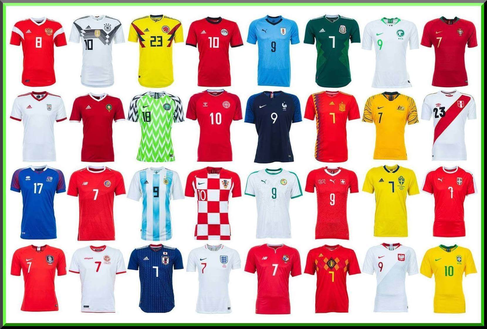
Settle in kids, because we’ve got a big (fun?) one today — a post that’s actually been months in the making. You’re probably all like, “Wait, didn’t you already preview the World Cup jerseys last weekend?” Well, yes. But those were just reviews and those were just the jerseys. Today I’m back with Comrade Robert Marshall (who’ll forget more about soccer than I’ll ever know) to do one of those “ranking the World Cup unis” pieces (that get so monotonous) but with a yuge twist: we’ll do this one tourney-style. I’ll let Robert take it from here:
Robert Marshall: Rather then ranking the teams like so many do, or making snarky fashion reviews, I thought it would be more fun to have a tournament. After all, that’s what the Copa Mundial is. Another twist is rather then just one person’s opinions, I thought it would be more fun to include multiple voices. Mr. Phil and I will alternate rounds, to shake up what is in reality a tournament. Also worthy of note, the groups have been set up by the upstanding folks at FIFA, so we should have some upsets in groups of death, and surprise runs as this uni-tournament progresses and we rummy-knock teams out. Ultimately we will collaborate on the winner in a Kentucky knife fight.
The Germans are the reigning world champions, and in that language they have a practice of mashing together words to make crazy new words, so let’s call this Das Überglobalkitdominant Cup. What are the rules? It is run like die Weltmeistershaft, but with guerseys. Home and change kits should be equally weighted. How is tradition/innovation treated? Crests, number fonts, distant TV angles, as well as seeing fashion on a joyfully gent gallivanting about town. All is in play. One last note before we make like Jackie Gleason. I may use foreign language and reference, and for those who do not know me, my voice can be flowery to put it kindly.
The Group Stage
(by Robert Marshall)
Group A: If one of these teams wins Das Überkitdominant Cup, I’ll be a a Putin’s bot.
advancing (Uruguay and Russia):
1. Uruguay’s Sol de Atlántida graphic is splendid on top of the old school ice cream cone socks.
2. The Ruskie’s change kit is 1927 modernist architecture cool, and the CCCP style home kit makes me frightened like a kitten facing a bear, a large hungry Russian bear that wants to eat kitten livers.
No soup for these guys…
Saudia Arabia – OUT

I am in love with the Saudi’s falcon-ball crest, but maybe because there is nothing else to look at other then all green or white, no Lilly’s gilded.
Egypt – OUT

Salah got traded to United? Snark aside, I do love having 3 distinct shirt-short-sock colour elements, and enjoy the classic umbro-eque styled sublimated checks on the jersey. As for the change, they just look like Germany. So they are 2 for two on theft rather then being unique, that is in common parlance a fail.
Group B: Dumpster fire
advancing (Spain and Portugal):
1. What happened to the exploding triangle Euro-16 change Spain?
2. What happened to the fender seafoam green Euro-16 change Portugal?
The mission may serve better soup then Adidas for these lost souls…
Morocco – OUT

The green shorts break the home kit nicely, but Morocco is a colourful country filled with graphic imagery, and Adidas took the Marrakesh Express to template town. As for that slap on red epaulette for the change? Positively negative Gymboree.
Iran – OUT

I take back everything I said about Morocco, because Adidas clearly told Iran to go to the thrift store.
Group C: Aaaah, much better, a uni-group of death
advancing (France and Peru):
1. France is iconic and beautiful from a TV distance at home, and so stylish with the sublimated change on the streets that it makes me want to vomit romantic images of cool.
2. Peru has the only true sash. Hm, the gerbil is on the wheel here. The tournament is in Russia, winners of the universe let alone the world wear sashes, and there is another connection I need not mention. With that in mind, “Sashes are for winners, the biggest winners, the biggest. believe me, sashes are totally huge, huuuuge.”
86ing chicken noodle? It had to be done…
Australia – OUT

I know that shouting down gold and green is like setting off purple smoke pyros in the terrace of this site’s heart, but this kit has issues. I applaud the effort, and I like the back story of the yellow wave in qualifying, but it needs some green shorts! In addition to cadmium poisoning, the graphic incorporation of the waves on the sleeves is just sloppy. The change is sharp enough, but guess who is barbecued snags.
Denmark – OUT

Denmark hurts me. I love Hummel, and it’s a Danish kit for a Danish team. Not only that, Hummel jerseys often come with a recipe for Danish pastry pinned to the collar. How great is that? The chevrons are unique in the tournament, and both kits have red/white alternating shorts to break things up, but sadly the team will be eating rogbrød in Copenhagen come the knockout rounds.
Group D: Don’t cry for me Argentina, the truth is I never left you.
advancing (Nigeria and Coratia):
1. Nigeria is obviously dynamic.
2. Croatia is always a darling.
Bring me the gaucho with the ladle! There is no locro in this joint?….
Argentina – OUT

I am shocked at myself for knocking out one of my favourite kits of all time in the group stage. The blue and white stripes over black shorts are so perfect. Unfortunately, while I love the sublimated trend, it just doesn’t work here. First the stripes are a strong enough graphic element on their own, don’t Messi it up. Light blue and white are so close in shade that sublimation is just “for sake”. As for the change, this is where they run off the cliff in my mind’s eye. Maybe take a note from Croatia and just own the stripes, and reverse all of the white and black. But adding insult to this kit is the retro Adidas 90’s template, which stunk like skunk in the first place since all those stripes are is the 3 made ginoromous. Completely ridiculous. If I can further bash this template for a moment, to me it reads as if someone is putting their hands on their chest and pushing their nipples together. I’m sorry this one was long winded, but it is beautiful Argentina in the group stage.
Iceland – OUT

I would love to give the Viking war chant. Unfortunately, while I can give the small Italian kit maker credit for the unique fire and ice sleeve elements, the 1970’s bleep-bloop computer pattern only hits the mark on the white kit.
Group E: I’ll be out in a minute. No! don’t open the door mom. Oh, the shame of it all.
advancing (Brazil & Costa Rica):
1. Brasil wins by default for the home, but that change looks like what is produced when a cartoon coyote is hit with an anvil.
2. The DNA for Costa Rica?
Eww, gross. No, we don’t serve Puma stew here…
Serbia – OUT

I love the mismatched socks Serbia, yet don’t know why. The stripes on the front of the change would be great if they didn’t fade for any reason other then they can make that happen. As a side note, I feel bad for eliminating 2 Puma teams here because I kind of like that number font, I honestly do. It’s like my id and super-ego are having a fight on order and chaos on this font.
Switzerland – OUT

Switzerland lines up chest-crests like so many dirty dollars, and the contoured map lines just muddy up their account.
Group F: THE group of death
advancing (Germany and Mexico):
1. Germany is the the winner because hey get the Adolpf Dassler Co.’s royal treatment. The best road in the tournament, and Adidas’ best retro-redesign.
2. Mexico’s home is bright, iconic, and beautiful from TV angles. As for the change, it is as spicy like árbol chili.
When you wake up wondering what just hit you, remember Menudo isn’t just a boy band from the 80’s…
Sweden – OUT

Sweden has a great colour scheme that they use successfully in every sport. Here they do a great job of breaking up the kit with alternating short colours. The Home is solid if unremarkable, and their shade of blue is perfect on the Condivo template on the alternate. The only problem, this is a group where you really need to stand out, or get the roofus-goofus.
South Korea – OUT

Such a group of death. positively adore the South Korean crest. The change kit is among my favourites with that abstract sublimated Taegeuk symbol. Unlike some other kits in the Cup, this sublimation really stands out and can be seen from a distance. The change is candy-sweet enough to advance them, but the black and red home is as sexy as a pair of Mary Jane’s on a clown.
Group G: Cheers mate, this is a cracker of a net-tickle in the group stage, but you might get right proper collywobbles when faced with real competition…
advancing (England and Belgium):
1. England’s home and change are iconic. The sublimated St. George’s cross is a nice nice touch and should find itself somehow on every jersey.
2. North Carol-Belgium.
Chowderhead stew…
Tunisia – OUT

The Eagles of Carthage is a dynamic name, and their team I predict will have the most dynamic beards. But all red, all white, and on a weak template? How does Uhlsort have one team in the tournament and not try anything? If it was me, i would have hand painted them with Scimitar Orynx blood and just let people debate if i was evil or daft. At least it would have shown a boyhood zest for grandiosity.
Panama – OUT

New Balance tried on Panama, but the sublimated pattern screams 1980’s aerobics class even worse then that sounds. Maybe this is one of those it looks better on the field jams, but I doubt it.
Group H: Let’s all yawp together, Ei! Ei!…Oh!
advancing (Japan and Senegal):
1. Nippon easily has the best home kit in the Cup. As a stand alone fashion jersey or on the field, this is as cool as square watermelons. Sadly the modest change is honne and tateme to their home kit, and has me worried for them when they are out of my control.
2. “The lions of hospitality” have a great name, but could be more dynamic with their colour scheme, but the sublimated Lion is pretty solid.
I don’t even think you can make soup out of pączki or bunuelo…
Poland – OUT

Polską has maybe the best red/white kit of the tournament with a great crest and that subtle fading semi-sash, but it isn’t enough to move on. Sorry pineapple (that’s for my better half).
Colombia – OUT

Again with the horrible nipple pusher on the home design Adidas that is noting more then 3 stripe branding? As for the change, and like so much yellow eliminated, I hate that it’s the only orange. But the pattern is also a problem for me. While less all over the map then Spain, the busy shirt pattern doesn’t really work with the 3 stripes on the shorts. I dig referencing the past, but making a weak 94 retro-nod doesn’t work if the design is inherently flawed.
If you’re still reading, you’ve already won. Let’s see how Robert’s Rules of Order have left us, now that we move from the Group stage to the Elimination stages. Here are your 16 advancing kits, seeded based on the 1/2 finishes given above:

Phil Hecken
Whew, thanks Comrade. I’ll do my elimination in a slightly less-flowery way. Definitely some surprises coming out of the Group Stage, that’s for sure, but I think I can take it down to eight teams from the 16 you’ve moved on. Let’s get rid of the lesser of the eight from each of the Group of 16 matches, shall we?
Uruguay vs. Portugal
Right off the bat, this is a great matchup and it’s a shame someone’s gotta go. I’m totally digging Uruguay’s powder blue tops — and that feature a nice central sun motif which is based on the Sol de Atlántida monument. Puma’s kits aren’t all that great overall, but they did Uruguay a solid here. Portugal went retro — and while that’s generally a plus for me, it’s not here, or at least not enough to tip the scales. Both change kits are rather bland, so neither gets the edge. But I love love love Uruguay and they move on to the Round of Eight.
Portugal – OUT

France vs. Croatia
If Croatia hadn’t shown up in the checkerboard, they wouldn’t get out of the Group stage, so that’s good. The red and white kit top actually kinda makes me dizzy (though on TV they’ll be fine) with the add zig-zag checks they have, but it’s only a minor quibble. France will look great in their blue/white/red home kit, and I think the white change top is pretty nice too. But I really like Croatia’s navy change strip with the subtle checkerboards built in. In a matchup that wasn’t really all that close, Croatia: welcome to the Group of Eight.
France – OUT

Brazil vs. Mexico
Brazil’s home kit is exactly how you expect them to look in World Cup play, and that’s pretty much good enough for me. The yellow and blue (with the green number/collar) is just exquisite. Not a giant fan of the change kit, but I can certainly live with it. As far as Mexico, at least there’s no black here. I don’t actually mind the three stripes of varying shades and gradients on the green jersey, but other than that, it’s really nothing to write home about. And while the change strip kinda evokes the flag, it really doesn’t move me like a flag-as-uni would. It would have taken a major faux pas from Brazil not to advance, but they did just fine here. Brazil, welcome to the Round of Eight.
Mexico – OUT

England vs. Senegal
Other reviewers have knocked England for being “safe” or “boring” but I think that’s the beauty of both of these kits. The white/blue of the home and the red/white of the change may be simple, but they’re both gorgeous. The subtle beauty here is the thing. As for Senegal, I love the colors, but I quite dislike the number fonts and the sublimated lion head on the chest. I get what they’re going for, but putting the terrible number font across the sublimated lion kinda ruins both. While I’d love for the uni upset in this one, it’s not gonna happen. England moves on to the Group of Eight.

Senegal – OUT
Spain vs. Russia
Clearly the fix is in, with Russia making it to the Round of 16 to begin with, but I gotta play the cards dealt. I am not a fan of the red Russia home shirt at all, although I rather like the change top. But that’s not nearly enough for me to like the whole package. Spain, despite the very underwhelming change strip, advances to this match with a fan-fuckin-tastic home look. I don’t usually like unbalanced, crazy shit on the side of a jersey, but here it just works! Also, I should really hate the black socks but I don’t. I think Comrade Marshall would have gone the other way in this matchup, but he gets his say in every other round. Прощай Russia. Welcome to the Great Eight, Spain.
Russia – OUT

Nigeria vs. Peru
If I had my way, Nigeria would win the whole kit-and-kaboodle (see what I did there?), as I’ve been in love with the Super Eagles kit since it was released. I mean, seriously, how can you not love this? Even if they have to wear the change strip, that’s pretty fine too, though nothing comes close to the awesomeness of the home kit. Poor Peru. That beautiful sash and throwback motif should be advancing — and if we ranked the 32 teams from 32-1, they might well be number 2 (and certainly top 5), but the draw is the killer here, and by virtue of coming up against the sheer beauty of Nigeria, I have to relegate Peru to the losers bracket (well, if there were one). Congratulations, Nigeria, your pass to the Group of Eight is secured.
Peru – OUT

Germany vs. Costa Rica
If there is a uni set that can push Nigeria, it’s the one worn by Germany. BOTH kits here are drop dead gorgeous, and will be favorites to advance out of the quarterfinals, for a wicked show-down vs. Nigeria. I could see an upset occurring there. Costa Rica never had a chance here (I’m surprised they survived the group stage), and once again a New Balance team have a nice home kit ruined but horrible number fonts. It looks bad on the home and worse on the change. Easy call here. Germany: welcome to the Group of Eight.
Costa Rica – OUT

Japan vs. Belgium
This is another slam-dunk, easy call here. Sometimes gimmicky motifs work and I get where Japan is going with the Samurai (is it chainmaille they’re going for?) pattern, but it’s a little too cute for me. Their change kit is about as boring as can be, so that doesn’t help Japan’s cause any. But no matter, Belgium has two luscious kits at their disposal and either of them is better than Japan’s best (the blue Samurai) so it’s a double sweep for the 1984-inspired throwback and her change strip compatriot. Belgium: You’re in the Great Eight.
Japan – OUT

And with that, here’s your uni group of eight…

And now back to Comrade Marshall, who’ll get us down the four semi finalists…
Robert Marshall
Uruguay vs. Croatia
France and Croatia I hope went to extra time for Phil. A rough match-up with rough uni-tackles for sure. I on the other hand have an easier choice, Croatia welcome to the semi-finals.
Uruguay – OUT

I am loving the traditional black socks with the blue tops (ice cream cones when you consider the shape of a leg), they feel like they are still kicking around the real leather ball with the laces and winning the first Copa Mundial, and it is just as amazing today too. Where They come up short is on the Sol de Atlántida graphic. I love it as an idea, but the stitching flips the dominant colour in the top 3rd and breaks it up for no good reason. Why ruin this graphics’s subtle touch? As for Uruguay’s change it might be simple, but is so gorgeous with those blue shorts, a great look that breaks up the typical all white. I have not talked goalies yet, but maybe this is the time to start bringing it up? The black-white-black goalie look, if that is indeed accurate, is awesome no doubt,.
Brazil vs. England
How can you knock Brasil? Then again England is as solid as Procol Harum, and classic. But then I come back to the fact that the best identifiable colours in the tournament are the Seleção. I have to push forward Brasil here.
England – OUT

The Three Lions have the perfect crest. The kit is clean and classic. My only advice would be to continue St. Georges cross sublimated on both jerseys. The 66 Cup change is still amongst my favourite’s and it translate here. Unfortunately, you met Brasil too soon, banger that mash.
Nigeria vs. Spain
Nigeria’s innovation makes Spain’s Adidas’ retro-shambles look like in was invented by inquisitors so sharp and fresh they are in the dark ages.
Spain – OUT

The home set template is positively brutal with red, blue, gold, (reads like) purple, and black. The patterns of the jersey can’t match up with the Adidas 3-stripes, and what is up with my grandfather’s black socks? The best thing I can say is that it’s politically controversial, which is a howl. As for the change, garbage. The subtle sublimated pattern makes the jersey look grey, but not on the sleeves and not on the shorts, those are white. Just silly. Own the light blue with orange, otherwise it’s greyish with no rhyme or reason to the pattern. This set getting this far makes me more angry then Tom chasing Jerry over set mouse traps, I say nertz to you Spain..
Germany vs. Belgium
This Adidas showdown is somehow tougher when I look head to head. And I didn’t even want Belgium out of the first round, go figure. I will just always love the German change, even if the home as subtle problems if I see them again.
Belgium – OUT

I am not a fan of the Red Devil’s NoCarBelgium look, but it is better then in the past were they throw in every colour Thorgan-hapHazard Maryland flag style. And it is striking and unique, I would be remiss if I didn’t give them that too. The crest is striking, and that all black goalie kit will look great if that’s correct, and better then the German blue. Unfortunately, the Condivo template on the change is just that, something we have all seen before. That being said, my heart pounds for goldellow-black-goldellow, a striking combo.
With the quarterfinals now complete, here’s a look at the semi-finals:

Phil Hecken
Well, Comrade, you’ve left me with four beautiful kits, and some very tough choices. The Croatia/Brazil semi is almost as difficult a choice as the Nigeria/Germany tilt. Let’s have at it.
Croatia vs. Brazil
I’m made my case for each set of kits, and Brazil’s home kit is probably the best of the four, but we’re picking the winner on both sets and in this instance, Croatia’s home (stellar) and clash (superb) together get the slight (ever-so) nod over Brazil, who are only slightly dragged down by that mono royal-ish road. Checker-mate for Croatia, you’re moving on to the final!

Brazil – OUT
Nigeria vs. Germany
If I had my way, these two would meet in the final, instead of the unfortunate semi-berth draw they find themselves in. The Super Eagles home kit is just sooooooo good (and their change kit isn’t bad either) that I have got to give them the super-doubleovertime-kicks win. I can’t fault Germany here. Both of their kits are stellar. In any other World Cup I’d surely pass them through to the finals, but (and I’m sure to Comrade Marshall’s chagrin), the Eagles advance. On to the final, Nigeria!
Germany – OUT

Phew! We made it to the final. Here’s how we got there:

So we have Croatia vs. Nigeria in the final.
Phil:
Well, Comrade, it’s down the these two fine kits. While neither deserves to “lose,” sadly one will have to. For the reasons I’ve outlined earlier, I think the Super Iggles have the best looking kit in these games, but I see you want to have a knock down, drag out final. For my money, nothing beats the Nigeria top. Nothing. It’s far-and-away the best looking jersey in this (or maybe any) World Cup. It would have taken a herculean effort to topple it, and even the Eagles change kit is really nice. Croatia is beautiful too, don’t get me wrong, but in this tourney, there can. only. be. one.
Robert
Let me start by saying the best home kit is easily The Blue Samurai, the best road is Die Mannshaft, and Les Bleus home is the best distant for TV shots. I also feel we somehow dropped the ball on Peru somehow, the more I think the more me like. But none of those kits made it to the final, you managed to eliminate them, as I am sure I did to your favourites along the way, but that’s what made this a fun exercise. While I agree with you that The Super Eagles home is outstanding, I am inclined to argue for Croatia being a better overall kit. so let’s break this down PK style, and see who comes out on top.
Regular time has left us tied, as has extra time. We’re going to PKs to decide this one. Based on 5 criteria, we can inveigh our final, final thoughts. We’ve agreed this final has gone to PKs, and the 5 criteria we’ll use in PKs to decide are the following (as decided by Comrade):
1. Crest
2. Goalie
3. Tradition/innovations
4. Home
5. Change
Crest
Phil
Neither crest is all that outstanding, but both are solid. They convey their purpose, as they should. I’d call this one a push.
Robert
Nigeria has an eagle standing on a 70’s soccer ball, but Croatia has the checked shield and the classic leather ball. I think Croatia fires one top shelf here. Agreed? Edge: Croatia
Goalie
Robert
Croatia’s goalie kit looks to be lime green and pink. but red and blue make purple, that would clearly be a better choice. Ironically Nigeria’s Primary goalie kit will be purple, and I would rather see this in black. Butthe accent green does match the teams home green, that’s a nice touch. Looks like Nigeria slips one past my keeper here after yours made a lucky save when a puppy somehow sprinted across the pitch and was hit by the strike even though the keeper dove the wrong way. Do you agree? Edge: Nigeria
Phil
I don’t know much about either goalie, I’ll be honest. As far as I can tell, Nigeria’s goalkeeper is Vincent Ezenwa and the Croatian goalkeeper is Dominik Livakovic. I’ll call this a push.
Tradition/Innovation
Phil
You’re killing me here, Comrade. This here article from 2014 says Nigeria is the world’s most crazed soccer nation, so that’s good enough for me. I don’t follow the beautiful game like you do, so my knowledge in this area is admittedly suspect.
Robert
Croatia has a distinct look that at one time was progressive. They stay true to that tradition, and put a nice twist on owning itwith the sublimated fade to the checks. My only problem is no blue socks crushes my uni-soul, I must also lament that Nigeria’s home completely blows everything out of the water for imagination with the most distinct and clearly most popular kit of the tournament. Germany wa the only home/change that could have taken Nigeria down. Croatia soars over the wood-work, and you put a howler lower right past the outstretch finger tips of my keeper. I stand corrected, you take it. Edge: Nigeria
Home
Robert
Croatia could make an argument here on the home kit, I like the hazy take on the traditional squares, and it’s iconic. But it looks like they are going to go white socks instead of blue, and that is disconcerting. There is no argument here, Nigeria rips this one straight at my goalie who is knocked clear through the back of the onion bag. Or maybe my keeper grabs a balloon accidentally like he was Borris Badinov and floats off leaving the net empty, either way. Edge: Nigeria
Phil
OK, my expertise. Unis. Their primary kit is the. best. in. the tourney. I do not know if I can argue this any more strongly than I already have. Nothing, not even Croatia’s awesome checkerboard (dizzying though it may be up close) can compare. This should be more than enough to put them over the top.
Change
Phil
Both clubs are mono-dark, and both have patterns, though Nigeria’s is much more subtle than that of the Croats who boast the checkerboard in dark and light blue. Slight (SLIGHT) edge here to Croatia, but not enough to sway my opinion. Plus, who knows how often either squad will be called upon to wear the clash? Maybe never? And when they do match up (both are in Group D, so we’ll see them in the Group stage), I’d think both teams could wear their primary kits, no?
Robert
I actually like the multiple shades of green combo that teams like Werder Bremen used this year, so Nigeria’s dark green with lime accents is simple, but sharp. But I don’t know how that can topple the subtle coat of arms motif being carried onto the change. The crest pops off this Croatia kit, as do the red numbers. and when pared with the red hose, this is look might make us look back and say it was a darkhorse top 5.While closer then I initially thought, Croatia puts a cracker past the keeper. Agreed? Edge: Croatia

Croatia – OUT
The Winner: NIGERIA
Phil
When we go to kicks, it’s close, but not that close. Nigeria takes the World Cup uni trophy.
Robert
It was closer than that. But yes, Nigeria is our uni champeen.

Nigeria – CHAMPION
What say you all?

MLB unveils jerseys, caps and socks for 2018 All-Star Game


We’d seen teasers before, but yesterday MLB officially unveiled batting practice caps, jerseys and socks, as well as official caps and game socks, for the 2018 All-Star Game taking place on July 16 and 17 at Nats Park in Washington. As is common practice for All Star Games these days, the BP jerseys mimic the colors/jersey style of the team hosting the event. These are no exception.
What you see above are the official caps for the Nationals and Orioles, which are basically the teams regular caps but (and I’m not sure if this is intentional or ironic) a tri-color cap, which harkens back to the Nationals club of origin, the Montreal Expos, who also wore a tri-colored/paneled cap for many years. Last year’s game caps featured metallic gold, star-shaped grommets, while this year there are no grommets at all, with solid silver stars in place of the former grommets.
Since the Nationals colors are red, white and blue (duh!), the National and American BP jerseys will also be rendered in red and blue, with the National League getting the red tops and the American League getting the navy ones:


I’m definitely NOT a fan of these — note the almost Nikelace-like contrasting collar and (it’s tough to see) the side panels with contrasting colors and a line of stars. The National League jersey gets an image of the Capitol dome, while the American League Jersey gets an image of the Washington Monument. There’s also a bunch of writing contained within the wordmarks — according to the Washington Post, “The script inside the stars-and-stripes word mark isn’t from the Declaration of Independence or any other primary documents in American history, but from part of an essay by baseball historian John Thorn. ‘Baseball is not a conventional industry,’ Thorn wrote. ‘It belongs neither to the players nor management, but to all of us. It is our national pastime, our national symbol and our national treasure’.”
Here’s a closeup:

Of course, not only do teams get special game caps to wear for the ASG itself, there are also BP caps player will wear for working out and for the Home Run Derby. Like the jerseys, it’s red for the National League, and blue for the American:


According to our pal Chris Creamer (who seems to get the scoops on all the event jerseys), “The designs are basically the same on the cap, a ring of 30 stars (one for each MLB team) surrounds the team’s usual cap logo all re-coloured to match the red/white/blue colour scheme. On the visor are six stars, three on each side (divisions?) and on the inside stars are seen on the inside of the crown.”
Being that hosiery is a big retail thing, there will also be two sets of socks. The ones on the left will be worn (and seen on those who choose to go high-cuffed) for the workout/HRD, while the ones on the right will be worn for the game itself:


Not sure why there are two (oh wait, I think I can guess) and I could see these getting mixed up on game days (or let them wear either set for the HRD and the game, right?), but the shoe/hosiery horse left the barn a long time ago.
There you have it. I’m not a yuge fan (but then I don’t particularly care how BP tops and caps look), although I do have to admit that IF you must have a special game cap, the tri-color is the way to go. The Nats may not recognize much of their Montreal roots, so maybe this is MLB’s way of reminding them. Or not.
Florida Panthers Unveil 25th Anniversary Season Logo
Yesterday, the Florida Panthers debuted a new 25th Anniversary logo “marking the celebratory launch of a historic season.”
The team put out a pretty detailed graphic describing the features of the new logo (click to enlarge):

There’s a pretty decent (though loaded with corporate-speak) article the club put out detailing the logo here. According to the team owner it “gives a little nod to our original uniforms while saying very boldly how proud we are to be a part of the South Florida community.”
They’ll have a different patch for the home/road sweaters:
FIRST LOOK: Florida Panthers' 25th-anniversary logos. Separate versions for home and road patches. pic.twitter.com/H0rUdg0h8p
— Paul Lukas (@UniWatch) June 15, 2018
Some quick takeaways:
I wouldn’t say it crosses the “too busy for a logo” threshold, but it’s pretty close.
I’ve always liked the sun/palm tree/stick logo the team has used, and that’s relegated to a tiny section at the interior of this logo (and in simplied form). That’s overlaid across the number “25” (rendered in silver, which is symbolic of 25th anniversaries) and which itself is overlaid across a representation of the state flag. It all kind of gets lost inside there.
On the “red” patch, the flag motif is almost completely invisible. Not great.
Here’s how it will look on the sweaters:
Here’s how the #FlaPanthers 25th anniversary patch will look on player’s home/away jerseys in the upcoming season. pic.twitter.com/gqp0IQIr9i
— Jameson Olive (@JamesonCoop) June 15, 2018
Note the “white” logo shows the silver in metallic form (not sure if the “red” logo will have the similar treatment — it’s hard to tell from those photos).
The rest of the logo (as explained in the graphic above) is basically a mashup of the club’s prior crest/logos. I love the “Florida Panthers Hockey Club” radially arched around the roundel, but the rest is kind of meh. But it’s just an anniversary logo, so nothing to get too worked up over. Overall, it works, but it’s not great.

Old Time Base Ball Photos
Readers will recall I featured Ronnie Bolton (who posts on Twitter as @OTBaseballPhoto and who you should definitely follow) earlier this year with some great football played on baseball field photos and writeups, some MLB Opening Day specials, and more recently with some old baseball stadia (here and here). As his twitter handle implies, Ronnie’s specialty is old baseball photos.
Last weekend, Ron provided us with some soccer-related photos, being we had our World Cup jersey preview. Since we’re doing a uni-elimination bracket/tourney today, he’s back with some more soccer-related pics!
Enjoy. Here’s Ronnie:
1930 FA Cup

Wembley Stadium, London, April 26, 1930 – The 776-foot long LZ 127 Graf Zeppelin flies low over Wembley Stadium during 1930 FA Cup final between Arsenal and Huddersfield. Goals by Alex James and Jack Lambert would give Arsenal the 2-0 victory in front of 92,499.
San Siro

San Siro, Milan, Italy, 1965 – Home to both A.C. Milan (founded 1899) and Inter Milan (founded in 1909 and also know just as “Inter”) and is known today as Stadio Giuseppe Meazza, named after Giuseppe Meazza, the two-time World Cup winner (1934, 1938) for Italy and who played for both Milan clubs. When it first opened in 1926 it’s capacity was 35,000, today it can hold over 80,000 making it the largest stadium in Italy.
Soccer Bowl ’78

Giants Stadium, East Rutherford, NJ, August 27, 1978 – The Tampa Bay Rowdies and the Cosmos (They dropped “New York” from their name the previous year) faced off in Soccer Bowl ’78, the NASL title game. The Cosmos came into the contest as defending champs and at the end they were still standing as champs beating the Rowdies 3-1. The match drew 74,901 to Giants Stadium and to this day it still remains the largest crowd to see a soccer championship game in North America.
Thanks, Ronnie. He’ll be back periodically with more wonderful old photos and the backstories that go with them.

Kreindler’s Korner
I had the distinct pleasure of featuring the wonderful artwork of artist Graig Kriendler on two occasions over the summer and fall of 2017.
For those who don’t wish to click the links, Graig paints baseball heroes (and regular guys) from the past, and is an immense talent.
Occasionally, I will be featuring his work on Uni Watch.
Here’s today’s offering (click to enlarge):

Title: “No Amateur”
Subject: Jim Thorpe, 1913
Medium: Oil on linen
Size: 20″ x 28″To this day, Jim Thorpe carries a mystique about him. Still considered one of the greatest all-around athletes of the 20th century, you’d be hard-pressed to find a story about one of his exploits that didn’t make your eyes bulge in astonishment.
His professional career in baseball (which is what ultimately got him hung) wasn’t much to speak about. Though blessed with god-like natural abilities, he was often criticized for being lazy and unwilling to practice. Batting .252 in 289 games, it seemed proof that there was only so far natural gifts could take you in baseball.
Here’s he’s pictured during batting practice at the Polo Grounds. The date is April 10, 1913, and the season is about to open up with the Giants facing Boston. New York was routed, 8-0. Thorpe didn’t play. In fact, for the most part he was used as a pinch hitter and pinch runner that season – he compiled 35 at-bats in 19 games and hit .143 with two stolen bases.
And yet still, he was still Jim Thorpe, and certainly a worthy subject to put onto canvas. Aside from being an interesting character to paint, I also loved the uniforms of the New York Giants that year. They hadn’t changed all that much in overall appearance from previous years, sticking with a pinstripe motif and flaunting that interlocking ‘NY.’ But it was in the color department where things went a bit out of the ordinary. Ditching the black trim of 1912, the club opted for a chromatic lavender for their hat brims, stripes and socks. The ensemble was the first in a series of bold experiments with color, which finally culminated in 1916’s often-maligned crosshatched violet style.
Additionally, it’s worth noting the interesting patterns in the grass behind Thorpe – such artistry by the groundskeepers was a common sight at the Polo Grounds in that era.
But even the sartorial and landscaping eccentricities shouldn’t take away from the fact that New York baseball fans could come to the Polo Grounds that year and see one of the most marvelous sportsmen that had ever been born. That is, if he ever came off the bench.
Thanks, Graig! You can (and should!) follow Graig on Twitter.
The Ticker
By Anthony Emerson

Baseball News: The HoF Knitter blog has a great post on baseball sweaters. Highly recommended (from @BorchertField). … Some Rangers players visited their future home yesterday, wearing Rangers-branded hard hats (from Josh Manck). Ignacio Salazar notes that the beams going into the ballpark are branded with a Bush-era Rangers wordmark. … Also posted in the NFL section: check out these great retro Royals and Chiefs pennants from a bar in County Galway, Ireland (from @gimmethewooby). … After a raccoon climbing a skyscraper in St. Paul, Mn., went viral earlier in the week, the St. Paul Saints will be briefly rebranding as the St. Paul Raccoons in 10 days. Have I mentioned recently how much I love independent baseball? (from Jeremy Fromo). … Fans received these Red Schoendienst decals at last night’s Cardinals game (from @Cards_Blues). … @BSmile posted this nice piece of Mets fan memorabilia: a button that reads “I was a Believer, but now we’ve lost Seaver,” referencing the Mets’ trade of Tom Seaver to the Reds in 1977. … Here’s an article on the everything the Richmond Flying Squirrels (Double-A affiliates of the Giants) bring with them on the road (from Tom Turner).

NFL News: @NFL_Journal with some great 70s and 80s spots today: a logo-less Broncos helmet, very small NOBs for the Oilers, inconsistent number sizes on the Jets (I think?), no NOB and no helmet on QB Steve DeBerg, a rarely-seen wordmark on the bottom of a sideline jacket, striping inconsistencies on the Broncos’ helmets and, finally, no NOB on this Charger. Great stuff. … Remember five second ago when I wrote that the Rangers toured their new digs in Rangers-branded hard hats? The Rams toured their new Inglewood stadium, and wore the greatest hard hats I’ve ever seen. You can buy one for yourself here (photo from Matt Shevin and purchase link from James Gilbert). … Cross-posted from the MLB section: check out these great retro Royals and Chiefs pennants from a bar in County Galway, Ireland (from @gimmethewooby). … Washington CB Quinton Dunbar is changing his number from 47 to 23.
College/High School Football News: At 8:14 in the video in this blog post, there is some rare color footage of the Tuskegee Institute’s football team and marching band (from Jeff Ash). … For the first time in history, Michigan Stadium will have blue end zones instead of maize (from @GenerationInk). … St. Joseph Central Catholic High School in Fremont, Oh., has a very AC/DC-esque helmet logo. Not exactly the kind of inspiration you’d expect for a Catholic prep school (from Kenny Hilliard).

Hockey News: The blog Bus League Hockey has a review of the logo of the National Amateur Hockey League’s newest team (or, if you prefer, most recently rebranded team), the Topeka Pilots (né Topeka RoadRunners).

NBA News: ESPN had 30 artists design 30 billboards to try to woo LeBron to each NBA team. Each one is unique and very well designed, though I must say, I love the simple beauty of the Blazers’ one. And, as a Celtics fan, I must point out that eleven of our NBA titles were won when the league’s trophy was the Walter A. Brown Trophy, which of course rotated from team to team like the Stanley Cup. Highly recommended nonetheless (from Dustin Long).

College Hoops News: The basketball home of the Cincinnati Bearcats, Fifth Third Arena (I still call it the Shoe!), is getting a new video board (thanks, Brinke).

Soccer News: What happens when a football expert and fashion expert sit down to talk about World Cup kits? The Times found out (from Tom Turner and Ted Arnold). … Egypt had some patch issues in their opening match against Uruguay (from Josh Hinton). … We’ve covered this briefly before, but here are more great pictures from Atlético Madrid’s brief flirtation with Columbia Pictures as their primary advertiser — each time a new movie came out, Atleti got a new kit advertisement (from Mark Coale). … We’ve seen supermarket soda box displays for sports teams, but what about supermarket produce displays for the World Cup? That’s from a Polish market in the UK (from Josh Hinton). … You ever wonder why Uruguay’s crest features four championship stars despite the country only winning the World Cup twice? Here’s your answer (from Bob Kelly). … Something seem different about the turf in Russia compared to previous World Cups? It appears grounds crews are mowing in ten stripes per half, as opposed to the usual nine (from @ElNino22). … Manchester City’s away kit has been leaked to FootyHeadlines. … Middlesbrough has moved from Adidas to Hummel, and have launched their new kits. … Arsenal’s new third kit has been leaked. … New kits for Villarreal (from Ed Żelaski). … Talk about a random thrift shop find: Corneal Davis found a 2007-08 Ioannis Amanatidis Greek national team jersey at a New Orleans thrift shop.

Grab Bag: Here’s a nice little video on the history of the Adidas logo and three stripes (from Rob Walker). … Scientists in Switzerland have discovered a way to make naturally red chocolate. It’s the first new “color” (for lack of a better term) of chocolate since Nestlé’s debut of white chocolate eighty years ago (from @walbergLines). … A principal at a high school in Michigan has apologized for chastising two graduating students who arrived at commencement in their Marine Corps dress uniforms rather than caps and gowns.
That can’t be Steve DeBerg in the photo of the helmetless QB. DeBerg’s NFL career started in 1977, and that photo is from well before that.
The QB in question is Don Horn; here’s another view of Horn in the same game in 1971:
link
You are correct. Game was on Halloween 1971 at the Vet. I believe it was the game in which Rich “Tombstone” Jackson suffered what was essentially a career ending knee injury.
Jackson suffered the career-ending injury at The Vet. What a shock. It took all of four regular season games at that dump to realize the turf would end careers. Yet nothing was ever done about it until the Linc opened 32 years later.
The City of Philadelphia, the Eagles and Phillies should all be embarrassed for costing Tombstone his bust in Canton.
‘inconsistent number sizes’ is the Eagles, not the Jets.
A lot of content, some to criticize:
Mexico’s home is bright, iconic, and beautiful from TV angles
I like the Mexican kit, but the one word I would not use to describe it is “bright.” Not when Mexico specifically darkened its color scheme for the World Cup. It has some historical basis, as Mexico wore a burgundy shirt for several years as their first choice.
and what is up with my grandfather’s black socks (for Spain)?
A red shirt, royal blue shorts, and black socks is the traditional Spanish uniform. It’s one thing to criticize the look, another to seem to be ignorant of why it’s used in the first place.
Croatia’s home (stellar) and clash (superb) together get the slight (ever-so) nod over Brazil, who are only slightly dragged down by that mono royal-ish road.
Except Brazil does not wear an all-blue change kit. Their change kit has white shorts. This was what they wore in the 1954 Final, when Sweden wore their yellow/blue and forced Brazil to change. They picked up the uniforms at a Stockholm sporting goods store; the coaches tried to psych up the players by appealing to their Catholicism and convincing them they would be wearing the blue color of the Virgin Mary. Brazil won the final and adopted this as their standard change kit.
Ultimately, exercises such as this are personal opinions based on personal aesthetics. Difficult to criticize on those grounds. But they are diminished by the occasional lack of knowledge as to the history and traditions of national team uniforms. We wouldn’t accept this in an analysis of baseball or college football uniforms; why should we endure it for soccer?
a fair crit dj
perhaps vibrant instead of bright for mexico? red socks are dynamic when paired with non red shirts or shorts.
you got me on brasil, they will be wearing white shorts when they can. what i saw was them in blue.
spain i stand by, it’s garbage.
There is no hotlink active in this entry:
@BSmile posted this nice piece of Mets fan memorabilia: a button that reads “I was a Believer, but now we’ve lost Seaver,” referencing the Mets’ trade of Tom Seaver to the Reds in 1977
Re: Topeka Pilots ticker piece and league name cited. The NAHL that they are part of is actually the North American Hockey League.
The Topeka Pilots logo should of used the taped stick blades as the wings.
I also hate wordmarks in logos, because it’s either redundant or a statement you have a poor name or design.
Here’s a link: link
“@BSmile posted this nice piece of Mets fan memorabilia: a button that reads “I was a Believer, but now we’ve lost Seaver,” referencing the Mets’ trade of Tom Seaver to the Reds in 1977.”
“The match drew 74,901 to Giants Stadium and to this day it still remains the largest crowd to see a soccer championship game in North America.”
Professional soccer.
The 1978 Soccer Bowl had the largest crowd to witness a championship in North America? You may want to reword that.
1. Estadio Azteca has hosted 2 World Cup finals and the capacity is considerably larger than 74,901. The 1986 final had over 110,000 in attendance. The 1968 final had close to 120,000. I would suspect that some Liga MX games would also outdraw 75,000.
2. The Rose Bowl hosted over 94,000 for the 1994 World Cup final and 90,000+ for the Women’s World Cup final in 1999.
I’m not sure about Liga MX’s history, but I think they currently play a two-legged championship series. So I guess you could conceivably see, over the course of both games, it’s entirely possible they’ve drawn over 75,000 people (if not in a single game).
I’m guessing it came from Wikipedia entry on Soccer Bowl ’78 (link). Toward the end of the opening paragraphs: “To date, it remains the largest crowd for a professional club soccer championship game in North America,” (including a link here: link)
This is an incredibly solid Saturday post. Wow! Chocked full of great stuff.
That said, Nigeria does not have the best kit. Maybe the freshest but not the best. I can see if you do not factor tradition into the criteria how Nigeria would finish close to the top, but you have to respect a classic uni. I have to side with Brazil or Germany for best kit.
Thanks for all the work you did not this. Really awesome!!!
The Michigan endzones used to be green, not maize
I kinda like those all star game caps, and their nod to the Expos, intentional or not. They’re much better than the offerings the past couple of years, especially those awful sweatpants caps from last year. I wish the patches were uniform in color, rather than team colors. It would provide a nice splash of contrasting color, especially for the team’s that got stuck with gray.
Been a long time since I’ve seen a photo of a soccer field from when the NASL had the 35 yard offsides lines…
Nigeria’s “popular” light kit reminds me of what my kids wore years ago for while playing AYSO soccer. Peru’s sash, Croatia’s checkerboard, Japan’s navy, and Columbia’s away are, in my opinion, much better options.
Thanks for your efforts.
i GREEE THAT NIGERIA ISN’T THE BEST, BUT WHEN YOU PLAY IT OUT AS A TOURNAMENT, YOU GET UPSETS. BUT I AGREE WITH YOU THAT JAPAN’S HOME IS A BETTER KIT. AND I LOVE GERMANY’S ROAD. AND I TOO LOVE PERU.
OOOPS, SORRY ABOUT THE CAPS
Saw my first WC Game today. What tool decided on the number and name fonts? Looks like someone decided an old number tube would be a good font (again).
Just awful.
Yeah, some of these number fonts are garbage.
The square one that Germany, Egypt, Colombia, Japan, and a bumch of others are using — woof! Colombia even clutters it up with lines and dots inside. Total garbage.
The one worn by Switzerland and Serbia would look nice if it didn’t appear to be rusting away. I really like the big flag on the “1”. It looks a little odd for the guy wearing number 21, but for 10-19 it looks great. I watched the Serbia-Costa Rica game and for some two-digit players the number seemed to be off-center on the players’ chests. Is it just my imagination, or is the “1” wider than the “2”? When was the last time you saw a font where that happened? Just give that font solid edges and it looks great.
Tunisia’s looks bold and readable… until you seee that hideous “4”.
The Futura-like one used by South Korea is probably my favorite, with Denmark’s bold readbale font second.
I miss the link. I like how they have added front numbers to the jerseys (moving them from the shorts) since then, but don’t like NOBs and would prefer more readable numbers. Even link, they are easy to read!
I wish the Panthers’ 25th anniversary logo had the leaping cat. I know they want to avoid that and focus on the newer logo, but this could’ve been better. I also don’t like it saying “hockey club” because it sounds too much like soccer. Florida Panthers would’ve been enough.