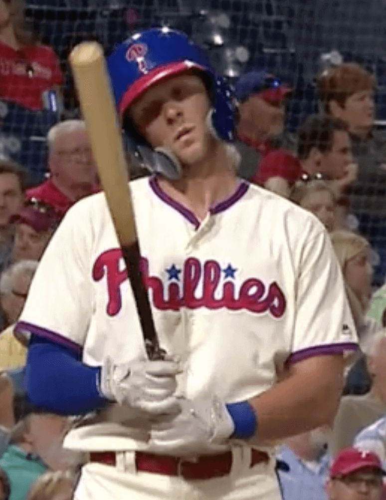
The Phillies wore their cream alternates with the blue headwear yesterday. They’ve been wearing that alternate uni design since 2008 — a full decade — but yesterday was different. It was the first time they’ve ever worn it for a night game. And the reason for that uniform anomaly is rooted in another uniform anomaly: Rhys Hoskins’s double-C-flapped batting helmet.
As I mentioned on Monday, Hoskins came off the disabled list on Saturday but is still nursing a hairline-fractured jaw, so he wore a double-C-flapped helmet. Since it was an afternoon home game, the Phils wore their cream alts with the blue caps and helmets. They wore the same uniforms again for Sunday afternoon’s game and then had Monday off.
Last night the Phils hosted the Rockies, so they would normally have worn their primary home pinstripes with the red caps and helmets. But the team had not been supplied with a red version of Hoskins’s double-c-flapped helmet, so they decided to wear the cream alternates with the blue headwear. The Phillies have confirmed to me that it’s the first time that uni combo has ever been worn for a night game.
I had a couple of questions, so during the game I emailed Phillies media relations honcho Greg Casterioto, who was nice enough to respond to me within an inning or so.
First, instead of making the entire team wear a different uniform, why not just wear the standard night uniform and let Hoskins wear a non-matching helmet? I was wondering if it might have been a superstitious thing (the Phils won on Saturday and Sunday in the cream alts and Hoskins’s blue double-flapped helmet), but Casterioto said it was strictly due to MLB regulations that require a team to wear matching helmets.
I followed up by asking Casterioto if the team consulted MLB on this and was given a specific instruction to wear matching helmets, or if the Phils simply made the decision on their own based on their understanding of the rule. Didn’t hear back from him on that one, unfortunately. If MLB really did tell them that Hoskins couldn’t wear a helmet in a non-matching color — even if it happened to be rigged up with special protective gear — that seems really ridiculous. I’m hoping that’s not how it played out.
C-flaps are attached to batting helmets by Rawlings, not by the team equipment staffs. And that leads to my second question: If Rawlings was able to supply a blue double-C-flapped helmet for Hoskins for Saturday’s game, why were they unable to provide a red version in time for Tuesday night’s game? Here’s Casterioto’s response to that question:
A blue one was made for Saturday, which was the first possible day that [Hoskins] was eligible to come off the DL. We did not know until Saturday if it would provide sufficient protection, hence they did not make a red one until Monday. Unfortunately, it could not get to Philadelphia [Tuesday]. It is scheduled to arrive [Wednesday], along with a maroon helmet for Thursday [when the Phils will be wearing their powder blue throwbacks]. These are custom items that have to be made, including painting. They are not in stock.
Rawlings has done everything they can to help us with this unique situation. I can’t stress enough how much we appreciate their help with this.
All very interesting — and yet another chapter in what is clearly shaping up as the Year of the C-flap, just as I predicted two months ago.
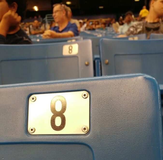
Great spot by eagle-eyed tot: Longtime reader/contributor Jason Hillyer and his four-year-old son, Jameson, were attending last night’s Rays/Jays game at the Trop when Jameson noticed something interesting: All of the “8” seat numbers in their section were upside-down!
That’s a world-class observation, especially from such a youngster. I’d say Jameson’s uni-watching future looks bright!
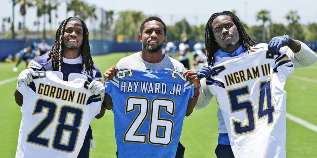
Generationally speaking: The Chargers posted this photo of running back Melvin Gordon, cornerback Casey Hayward, and defensive end Melvin Ingram yesterday — all with generational suffixes on their nameplates.
The three players have been in the league for four, seven, and seven years, respectively. None has ever worn a generational suffix in the past (although it’s hard to tell in Gordon’s case, because his NOB is typically obscured by his hair), but they’ve all apparently decided to do so this season.
I’m not sure what the single-team record is for generational suffixes, but I assume the Chargers are now in the running. Personally, I’m not a fan of this NOB trend (a surname does not include a generational suffix), but I’ll admit that there’s something kinda cool about seeing the three players and their jerseys all grouped together in the photo.
Also: Note that there’s no period on Hayward’s JrOB — a topic we’ve explored before.
(My thanks to Mike Miller for bringing this one to my attention.)
Yet another StripeRite poll: Thanks to everyone who weighed in yesterday regarding the two Pittsburgh sock designs. The sleeve-based striping was the clear winner, so we’ll go with that version.
Meanwhile, here’s a new development: We just got access to some bottle green yarn! The good news is that we can now do a Green Bay sock design, which many of you have asked about. The bad news, for reasons not worth explaining here, is that we can only do three sock designs in this next round of product, so now we need your help once again to decide which design won’t make the cut.
Here are the four finalists, based on the two previous days of polling (click to enlarge):
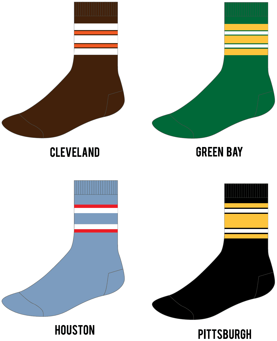
We can only do three of these designs; the fourth one will be bumped to a future StripeRite batch. Which three would you choose? Once again, please vote only if you think you might purchase this product. You can vote for up to three:
[totalpoll id=”97860″]
My continued thanks for your feedback. I feel like all four of these designs are excellent, so there’s no wrong answer. And whichever one doesn’t make the cut will give us a good leg up on our next round of socks.
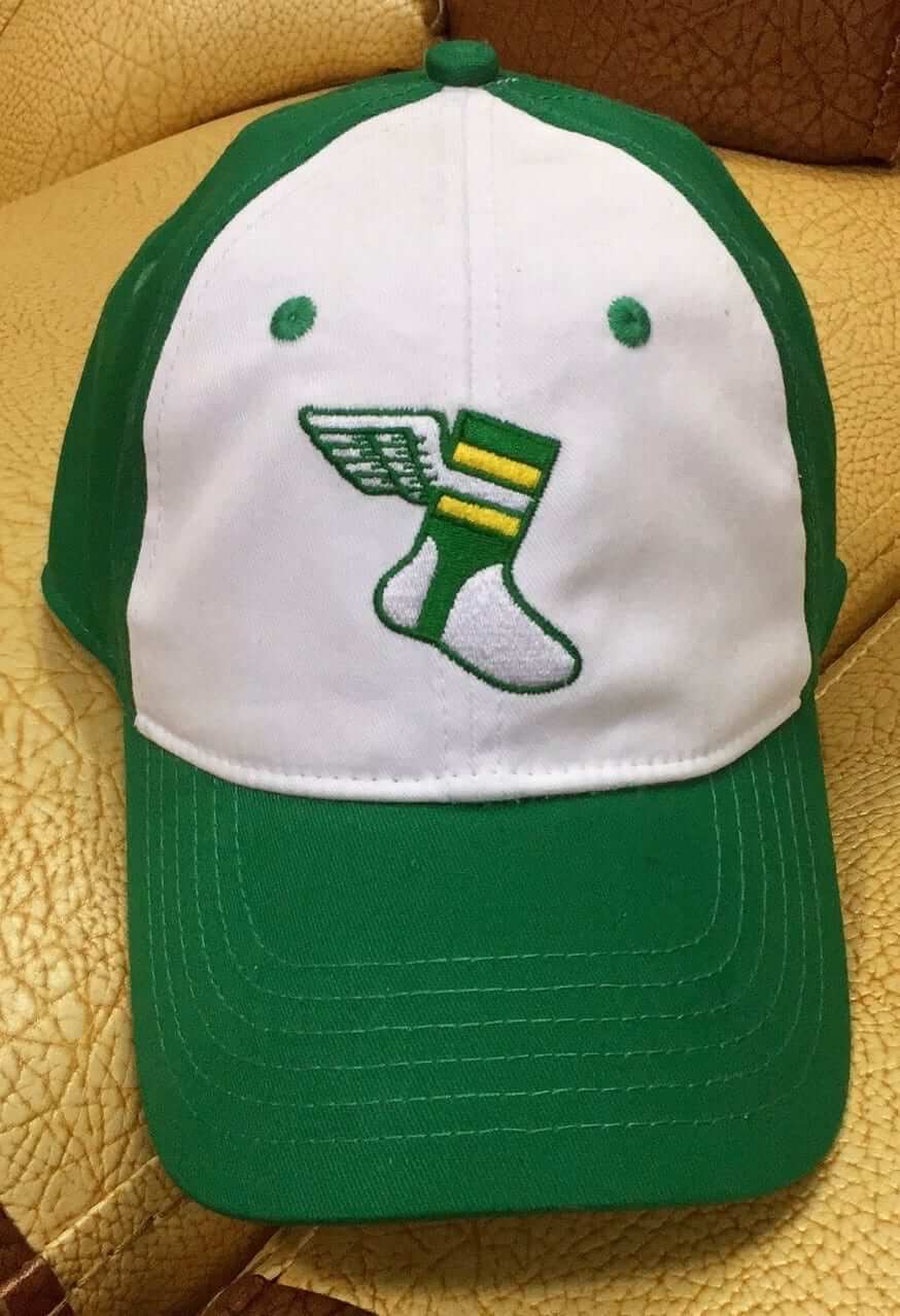
Alternate cap update: After some annoying delays, our alternate cap (shown at right; click to enlarge) is now in production. Here are the details:
1. The cap is not any particular brand; it was custom-built for us from the ground up. Our partner for that was Golden Sombrero, which is run by Bart Silberman, the guy who used to run the retro brand Moonlight Graham.
2. The cap will be a flex-fit, rendered in stretch twill.
3. The caps should be available sometime in late July.
4. The price should be somewhere around $29.99 plus shipping.
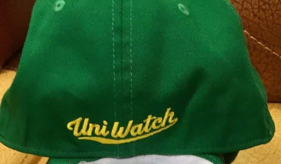
5. The cap will have the Uni Watch script on the back (click to enlarge):
6. In a particularly nice touch, the Uni Watch script will also appear on the inner seam taping (click to enlarge):
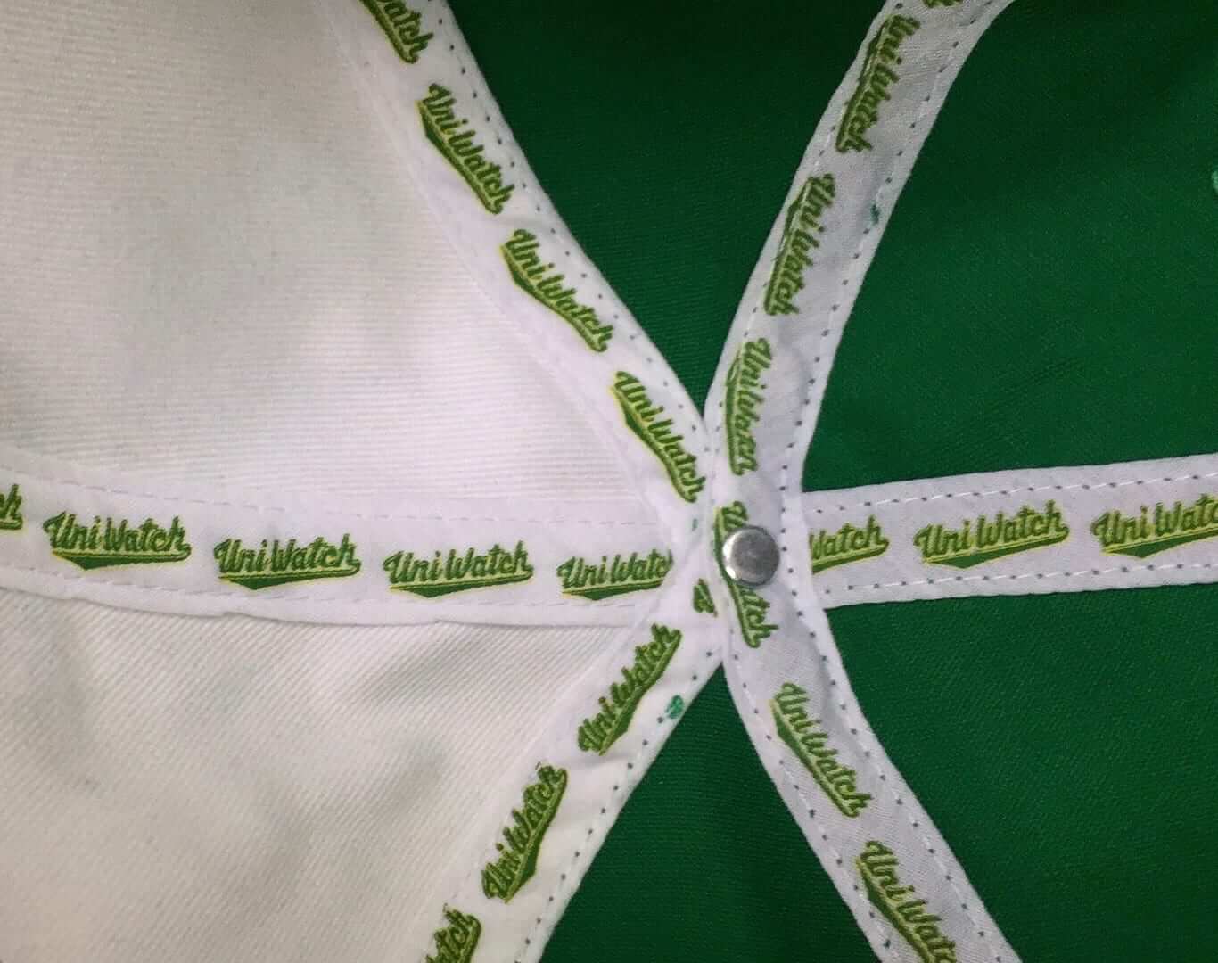
Pretty cool, right?
7. Here’s the tricky part. There will be two sizes available: S/M and L/XL. I know some of you have very big heads, so I tried to get an XXL version made, but there’s a 144-unit minimum for that size, and I doubt we can sell that many, so for now I’ve decided not to do it. I’m willing to order the XXLs, however, if enough of you are willing to pay for it in advance so I that I won’t be on the hook for a bunch of unsold inventory. So if you would be willing to pre-order an XXL cap, please indicate so below:
[totalpoll id=”97844″]
Meanwhile: Our classic cap, available through Ebbets Field Flannels, should be restocked in all fitted sizes around the end of this month. The adjustable version is still available now.
And now a few words from Phil: Sunday is Father’s Day, and I’ll be continuing my annual tradition of posting photos of “Dads in Uniform.” It’s something I began doing in 2013, and continued in 2014, 2015, 2016, and again last year, and I’m looking forward to keeping it going strong.
This year, based on a suggestion from reader Bill Hetrick, I’ve decided to add photos of equipment your father used and passed down to you. For more details on that, look here.
If you’d like to have a photo of your dad (or uncle or granddad!) featured this Sunday, or if you have a piece of equipment he passed down to you, please send me an email along with a photo (just one, please) and a short description (100 words or less) by this Thursday, June 14, midnight Eastern. I’ll run all the submissions this Sunday. Thanks.
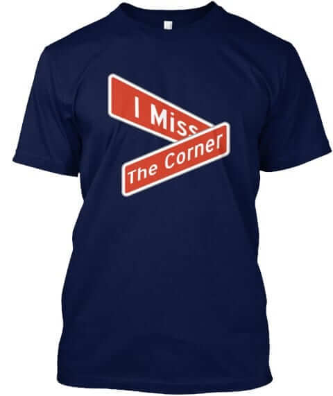
Naming Wrongs reminder: In case you missed it earlier this week, we have new Naming Wrongs designs for the Corner (shown at right) and for two CFL stadiums. Full details here. In addition, in case you missed it last week, we also have new designs for the Georgia Dome, the Omni, and McNichols Arena. You can get the scoop on those here.
This will likely be our last round of Naming Wrongs shirts for a while, in part because designer Scott M.X. Turner is busy getting ready to move across the country and in part because we’ve now crossed off every stadium and arena we had on our list. We may still do more designs if we get specific requests for them (or if some new corporate venue names are announced), but this should hold us for now. My thanks to everyone for their support and enthusiasm for this project.
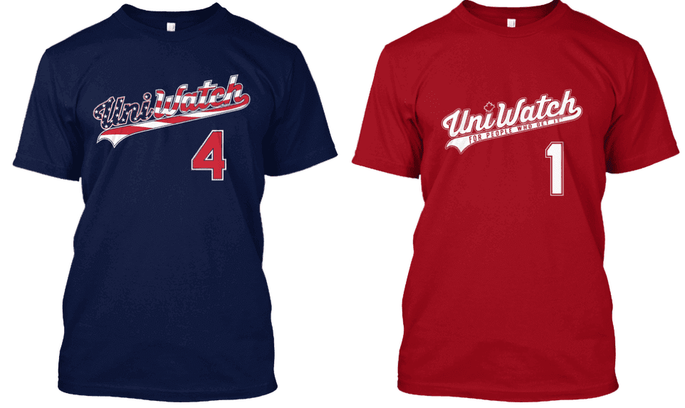
Holiday shirt reminder: Although our respective heads of state aren’t exactly members of each other’s fan clubs at the moment, the United States and Canada remain close allies with lots in common.
That includes the two major holidays that we celebrate in early July — Canada Day on July 1 and Independence Day on July 4. You can get Uni Watch shirts for either holiday (or both holidays!) by ordering now — the Independence Day shirt is here and the Canada Day shirt is here. Thanks.
The Ticker
By Alex Hider

Baseball News: Blue Jays P Jaime García messed up the buttons on his jersey last night (from Ewan Williams). … The Mariners will give away a bobblehead of P James Paxton with a bald eagle perched on his shoulder on July 1. Paxton was famously harassed by an eagle on April 5 during a national anthem performance (from Mike Chamernik). … The Padres ball girls wear more authentic helmets on fauxback nights than the players (from @Greg1MB). … Austin Gillis spotted a liquor store in Smyrna, Ga., that is poaching the Rays’ logo. … A previously unknown Lou Gehrig game-worn jersey has been sold for a record price (from Rich Mueller). … A Boston native got a nostalgic tattoo late last year, not knowing the design was eerily similar to the Blue Jays’ logo (from Brinke). … Didn’t mention this yesterday, but the Staten Island Yankees are sending their “Pizza Rat” caps to fans in “pizza boxes” along with packets of parmesan cheese and crushed red pepper. Great touch. … A minor league baseball team will begin play soon at a stadium in Madison, Ala., just outside of Huntsville, and there’s controversy as to what the team’s geographic identifier will be (from Phil). … The Lakewood BlueClaws, the Philies Class-A affiliate, will wear Grateful Dead uniforms on June 16 (from John McMunn). … Friday is the 30th anniversary of the release of Bull Durham, so the Durham Bulls will wear throwback uniforms — the same ones they wore five years ago for the 25th anniversary (from Andy Harris).

Football News: The Montreal Alouettes are wearing four different helmet designs over four months this season, beginning with the team’s classic winged design in week one. Here are the rest of the helmets they’ll be wearing (from Moe Khan). … The street sign for Johnny Unitas Way in Ocean City, Maryland, includes a Colts logo at the top (from @Hail21RIP). … Back in the 1960s and early ’70s, Washington’s top defensive player of the week got to wear a purple helmet instead of the usual gold.

Hockey News: In a photo taken ahead of the Caps’ championship parade, all coaches and team officials are wearing black suits — except for one person, who wore a blue suit (from John Chapman). … Speaking of the parade, Caps RW T.J. Oshie drank a beer through his jersey during the festivities (from Mike Chamernik). … The Panthers will unveil a 25th-anniversary logo this Friday (from Mike McLaughiln).

NBA News: Once again, Draymond Green trolled LeBron James with a T-shirt at the Warriors championship parade (from Brinke). … Lammert Wijnsma made a player logo concept for Sixers PG Ben Simmons. … Scott Trembly found some crappy knockoff NBA gear for sale in Naples, Italy. … Steph Curry wore retro Warriors shorts at the team’s championship parade (from Eli Basch).

College Hoops News: USF’s basketball arena will now be known as the Yuengling Center, after the beer company. Of course, we’ll still be calling it the USF Sun Dome (from Andrew Mason and James Gilbert).

Soccer News: FIFA unveiled the patches for 2018 World Cup jerseys yesterday (from Josh Hinton). … Also from Josh Hinton: Penn FC of the USL wore Star Wars jerseys on Saturday night. … Could these be Liverpool’s road kits for next season? (From Moe Khan). … Bordeaux, a team in France’s Ligue 1, had their home kit for next season leaked yesterday (from Ed Zelaski). … Nigeria’s World Cup team has some pretty wild travel outfits (from @VerbDC). … This post offers a great history of the soccer balls of the World Cup (from @GameplanChicago). … Brazil’s 1970 World Cup uniforms have been named the champion of the BBC’s “World Cup of Kits” (from Bruce Jaynes). … More World Cup history: A retrospective of the greatest jerseys in the tournament’s history, reimagined as patterns (from Dan Kennedy and Alex Ridoré). … From best to worst: This site is selling the ugliest jerseys in World Cup history (from @GameplanChicago). … New 2018 home kits for Luxembourg (from Ed Zelaski). .. Here’s a good look at World Cup kits through the ages (from Mike Raymer). … Wolverhamton Wanderers’ new kit has leaked.

Grab Bag: The Philadelphia Wings of the National Lacrosse League unveiled their new home jerseys yesterday. … The vest that golfer Jason Day wore during his US Open practice round yesterday looked remarkably like a bulletproof vest (from Chris Perrenot). … After a trademark dispute with Pitt, a Pittsburgh-area brewery decided to have a bit of fun with the controversy and renamed a beer the “Non-Trademark Infringement Alma Mater IPA” (from Wayne A. Jones). … These posts in Geelong, Australia are painted like old-timey swimmers (from James Gilbert). … Millennials in Sweden are reportedly referred to as the “curling generation” because parents have swept all obstacles from their path (from James Gilbert). … Here’s a good breakdown of fictitious teams that have appeared on The Simpsons (from Richard Hill).
Easy sock vote today since the Pittsburgh design isn’t even a sock stripe pattern!
Easy sock vote for the Pittsburgh design for that exact reason! Sleeve-stripe socks is a brilliant idea.
Very interesting lede today! Fascinating.
Talk about the tail wagging the dog!
Phillies felt more compelled to change every uniform element to break night game protocol.
I suppose they could have donned blue hats with the pinstriped uniform set, but that has never been done with the blue hat/red bill – only with the short-lived alternate solid blue cap of 1994.
The guy wearing a blue suit in the Caps team photo is owner Ted Leonsis.
Figures the owner would be the one to dress differently from everyone else.
Gordon wore the III while at Wisconsin.
link
How many players with a “III” suffix have contracts with adidas? Just curious.
Love the soccer pattern web site but every picture has an apostrophe catastrophe!
That neck tattoo does not look “eerily similar” to the Blue Jays logo.
The alt cap looks great. Regarding sizing, I assume as it gets closer to release they’ll be some sort of comparison for the S/M and L/XL to traditional hat sizing and/or other caps already out there? Can’t wait to get this.
Those Steph Curry shorts are actually designed like the Warriors 03-10 jerseys, rather than being actual retro shorts. As far as I know, they never wore shorts with the team name spelled out across the legs like that.
Also that Pizza Rats unboxing video is absurd and also really funny.
It says “retro,” not “throwback.” I’d say the term is accurate.
I wasn’t offering a correction – just more information, as the shorts are rather unusual!
Curious to see how the Montreal Alouettes are going to be handling the different helmet logo each month. Will get our first look on Saturday.
Diminishes it a bit if they are just wearing their regular uniforms with the different logo. Seems like a mismatch with their historic logos. Appears may be so, as no announcement on any different uniforms.
I am for this experiment if it leads us away from the current primary logo they have had since 1996.
Rather than just swap out logos this year, the Alouettes should just come to their senses and shelve the present uniform. We need them to go back to this:
link
link
That’s a very good one, but look of the recolouring of the 1970’s logo has really grown on me.
Any previous Alouettes logo is much better than their current regular helmet logo.
Thank you for thinking of us with big heads with the alternate cap. Most elastic L/XL caps don’t fit over my head in a comfortable fashion.
If there’s one thing I’ve learned from our various cap ventures this year, it’s that a lot of Uni Watch readers have big hat sizes!
My personal take on generational suffixes on unis (not that anybody asked) is that the whole point of the suffixes is to be able to tell John Smith Sr. from John Smith Jr. and John Smith III, and so forth. So unless Sr. and Jr. play for the same team at the same time (a la Ken Griffey Sr. and Jr. with the Reds), nobody is going to think that Dad is the one on the field if Junior is the one who plays for the team. (Secondary take: regardless of what is worn on the jerseys, there is no need for announcers to repeatedly use the generational suffix every time the player’s name is mentioned. As a Red Sox fan I hear this *constantly* with Jackie Bradley Jr., although I tolerate the “JBJ” reference because that seems more like a nickname.)
Regarding Jackie Bradley, I’ve noticed Dave O’Brien using Jr. and not using it pretty interchangeably.
You may be right. I tend to listen to the radio feed more often. Their practice seems to be Jr. on first reference and JBJ afterward. The out-of-town/national broadcasts, however, tend towards Jr. on every reference.
You are correct. Not to mention the easiest way to differentiate a player when looking at just their uniforms is by the numbers. So really, there isn’t a need for suffixes or first initials, because if you see Smith #45 and Smith #12, and have any familiarity with the team at all, you’ll know who is who. This is especially true in football, since numbers are set by position, the likelihood of having Smith and Smith both playing the same position such that you could confuse them during game action is pretty slim (or that, while watching a football game from the standard camera angle you would even be able to clearly see the first initial or suffix on the back to differentiate anyway).
The Griffeys played together on the Mariners not the Reds (and didn’t wear suffixes).
The generational suffix is part of a player’s given name, not his surname. If Casey Hayward Jr. has a child, his or her surname will not be Hayward Jr.
Suffixes on jerseys are an example of creeping first-name-on-backism. The NFL should either put every player’s full name on back, or stick to surnames only. The only time suffixes should be permitted is when it’s necessary to differentiate among players with the same surname. So if a father and son with the same first and last names play together, JR. and III make sense. And if two brothers, or unrelated players with the same last name, play on a team, and one has a suffix, the suffix is a reasonable choice for differentiating them. In no other instance is a suffix on back defensible so long as other players are not permitted to have their given names on back too.
The Griffey’s played together in Seattle, not Cincinnati, and they didn’t use any generational indicators…
[img]https://matthewtodderich.files.wordpress.com/2012/06/griffeys.jpg[\img]
I can’t believe I forgot the Griffeys played together on the Mariners rather than Cincinnati. Major brain cramp on my part.
Unfortunatley it looks like that purple Liverpool kit is legit.
link
The 2 Merseyside teams put out a charity kit years ago where you could get either one in purple (red + blue)
One thing that has always bugged me about the Phillies cream alts is that the piping tends to look purple.
I’m not entirely whether its the shades of blue and red or the proportions of the stripes but it really easily blends together into a purple.
Ugh, now I see it too!
Still, I’d like to see the pinstripes(which have always made the uniform take on a pink-ish hue in my eyes)retired and the cream alt/blue caps made primary, with a road gray version featuring those additional blue accents.
I agree entirely. It’s been 26 years with the same home/road set. Use the Cream at home, new road set. Keep the Red Cap for the Red jersey.
Now that we have Double C Flap helmets, how close do you think we are to seeing link??
As a longtime Oilers fan, I’m encouraged by the vote tally. Not only would I purchase a pair, I’d purchase 3 pair in that deal…if it’s an option.
Re those “ugly” World Cup jerseys, that Mexico shirt is beautiful! Second-best jersey Mexico has ever worn. And the 1994 USA shirts are so bad they’re … well, they’re pretty bad. But they’re classics! Kudos to streaker for bringing those three designs back at a reasonable price.
The Germany and Ireland shirts, though, “ugly” doesn’t even begin to do their badness justice.
Both Mexico’s kits this year are bellissimo.
This Azzurri fan has been giving consideration to voting for the other green/white/red tricolor team just on the uniforms alone.
I’m somewhat fascinated by the Phillies’ reply regarding the Double-C flapped helmet, specifically where he explains that
“we did not know until Saturday if it would provide sufficient protection, hence they did not make a red one until Monday.”
If they were unsure whether it would provide sufficient protection until he actually used it in a game, why wouldn’t they just order all three colors initially, and if things didn’t work out with the blue one he simply wouldn’t wear the red and maroon ones?
Is a billion-dollar company really so cheap that they can’t afford to order a couple extra helmets that they might not actually wear on-field?
Are you telling me that if it didn’t work out they couldn’t remove one (or both) of the flaps and re-purpose it as a spring training, batting practice, or minor league helmet?
C’mon, Phils, we’re talking a couple hundred bucks, here.
Why not wear the blue helmets with the pinstriped uniform? We see teams wear mismatched helmets with throwback unis all the time.
Paul- heard you on the 99PI episode about the Raptors Barney and 90s NBA unis.
Paul,
what size is Uni Watch Alternate hat S/M equivalent to? (I’m a 6-7/8 and is hoping the hat will be close to 7)
Not positive of numbered size equivalents but will definitely have that info when the cap is ready to sell.
Call me crazy but if your doing a green sock make it the Uniwatch sock!
The Green Bay sock can double as the UW sock. A happy coincidence!
Well if any asks me if they’re Packers socks I’m just going to point them to the site here instead. :)
Same colors, but not same design.
I might wear uni-watch socks, but I wouldn’t wear Green Bay socks (I’m a Vikings fan).
Lee
Could also double as early-to-mid 1970s Edmonton Eskimos socks (for us Canadians, eh!)
link
Wouldn’t it be about right if the Cleveland socks get replaced by the Green Bay socks after being voted in first?
FIFA epic fail on the 2 patches…why junk-it-up. Those patches will make every kit “noisy”…hideous to behold. Boo.
The square design isn’t ideal but it shouldn’t be that much of an issue, especially since they’re sleeve patches.
For the socks, I’d say go CLE/HOU/PIT and make it an old AFC Central bundle. Sorry, Bengals.
I’m a USPS letter carrier, and upside down eights on mailboxes are fairly common (and infuriating!)
Agreed FIFA hideous patches
Paul, How tall will the socks be? I know at least for illustration purposes they are just showing standard size, but will they be like dress socks? Or more like stance-type socks?
I reluctantly support the Yeungling Re-naming!!
They are crew socks — over the ankle but not over the calf.
Thank you sir