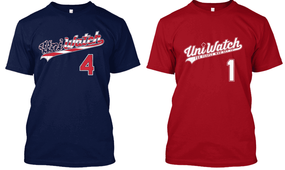
I’m happy to announce that we’re going to be partnering with American Trench again for another round of StripeRite socks. Here are some details:
1. There will be three or possibly four designs in this set. All of them will be based on football stripe patterns.
2. The socks should be available in late July or early August.
3. The prices are not yet finalized but are likely to be something like $16.50 per pair, with discounts for three- or four-packs. (More on that in a second.) Yes, I know that’s a lot for a pair of socks, but that’s the reality when you’re doing small production runs for made-in-USA product.
4. There will only be one production run for this batch — no re-stocks, no second runs. Once they’re gone, they’re gone.
5. The designs we can do are limited by the yarn colors we have access to. For example, the sock mill isn’t currently offering green yarn, so that makes it impossible to do certain designs. Given the current color availability, we’re considering these six potential designs (click to enlarge):
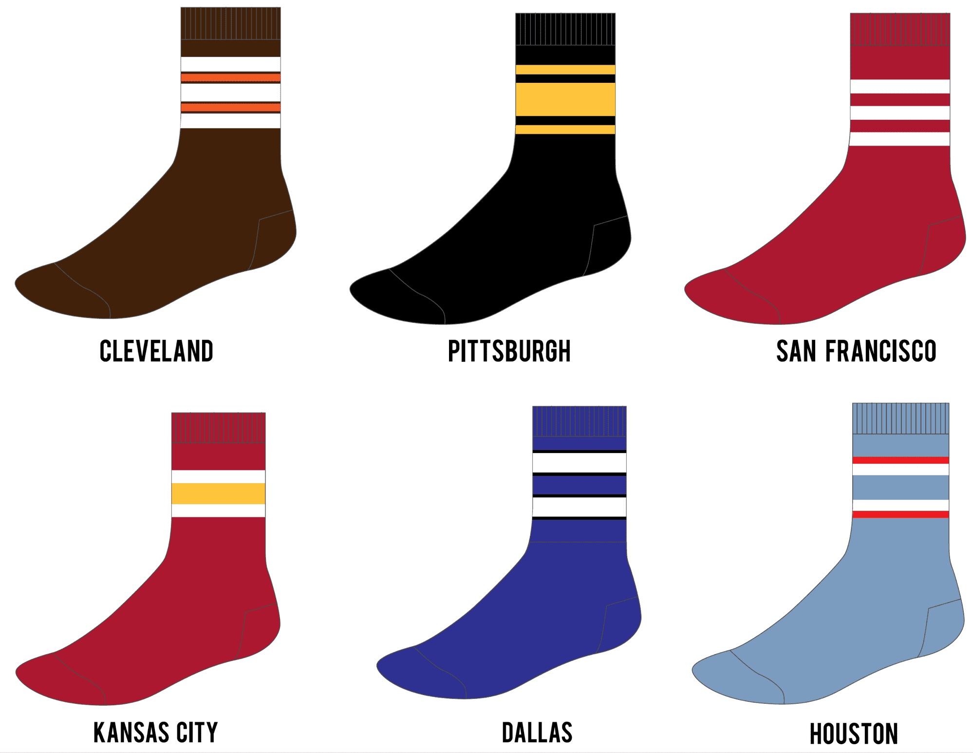
We’d like your help in narrowing these down to three or four designs. Please vote for any three of these, but please vote only if you think you might purchase them. If you don’t plan to buy, please don’t vote — thanks.
[totalpoll id=”97750″]
In addition, we could use your help in deciding whether to offer three- or four-sock bundles. Again, please vote only if this is something you’d be interested in purchasing:
[totalpoll id=”97753″]
Thanks so much for your help and feedback — greatly appreciated.
Now that’s a theme uniform: The Single-A Wisconsin Timber Rattlers became the Wisconsin Brats on Saturday night, complete with lederhosen-style uniforms. This is definitely one of the better-executed MiLB theme unis we’ve seen — check out the game highlights above to see them in action.
Speaking of MiLB theme concepts: In case you missed it on Friday, my latest ESPN piece uses the Syracuse Chiefs’ recent Brannock Device promotion as a case study to examine how a MiLB team goes through one of these single-game rebrandings. It was a blast to report and write, and I think you’ll really like it — check it out here.
Click to enlarge
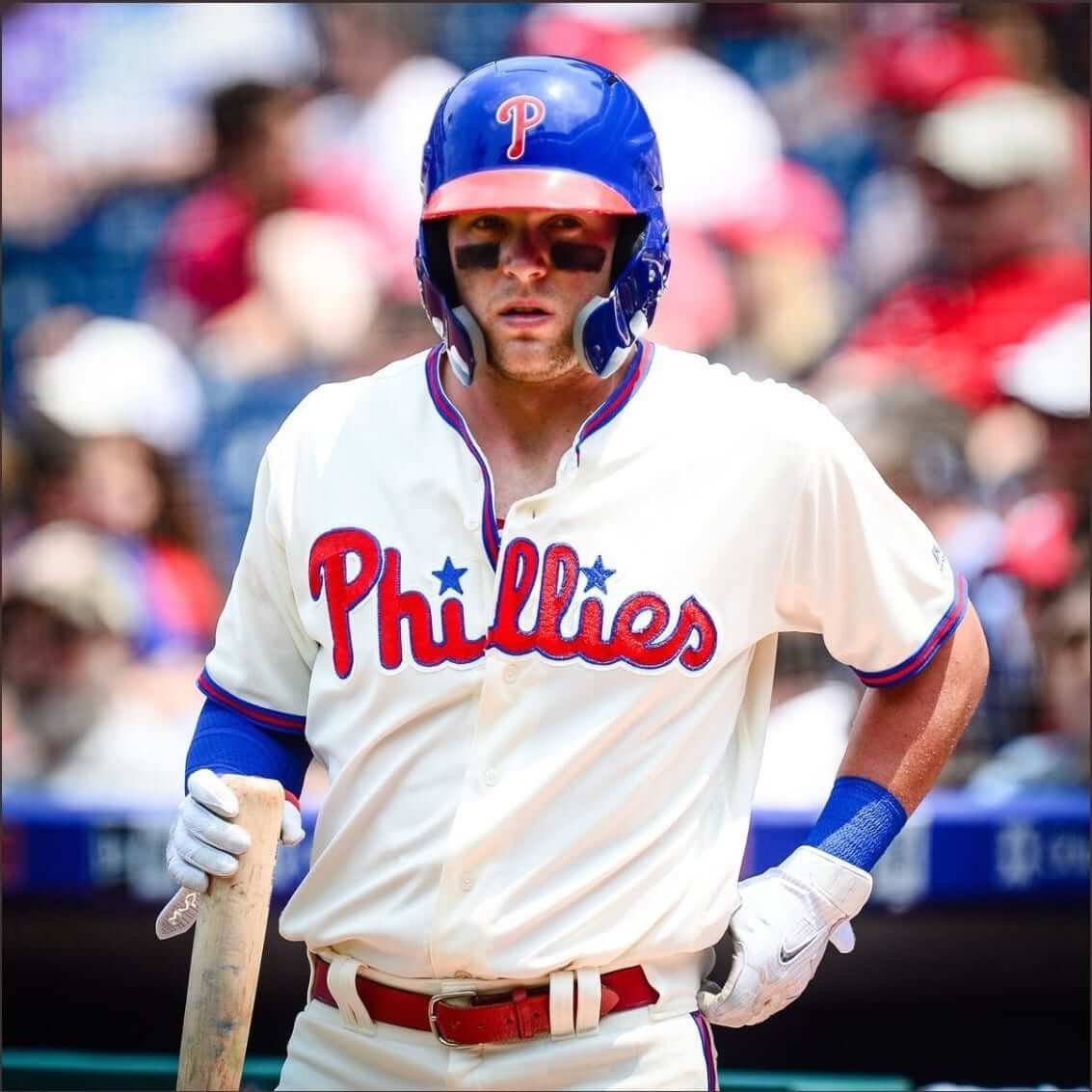
An MLB first: This was mentioned in Sunday’s Ticker, but I know a lot of you don’t follow the site on the weekend, so I’m going to repeat it here: Phillies outfielder Rhys Hoskins was activated from the DL on Saturday after suffering a fractured jaw a few weeks ago. The injury is still healing, so he’s wearing something that’s never appeared before on an MLB diamond: a double-earflapped helmet with C-Flaps attached to both sides.
As you may recall, back in April I wrote that the C-Flap was poised for a breakout season, and this is just the latest confirmation of that.
As for Hoskins, he homered in his second at-bat wearing the double-flap rig. As he rounded the bases and approached home, he touched the two flaps, as if to say, “Yup, it’s working!”:
First ever double C-flap homer gets a double C-flap celebration, too pic.twitter.com/C2jfvVlho0
— Ben Harris (@byBenHarris) June 9, 2018
(My thanks to Todd Savage and John McMunn for their contributions to this section.)

Raffle results: The winners of the “Gridiron Mishmash” posters are Nick Werner and Shawn Dobbins, and the winners of the Vintage Brand canvas prints are Wolfie Browender and Marc Rivlin. Congrats to them, and thanks to all who entered.
More raffles coming soon, and I’ll also be publishing a the transcript of an interview I recently did with “Gridiron Mishmash” illustrator Alex Bennett, so stay tuned for that.
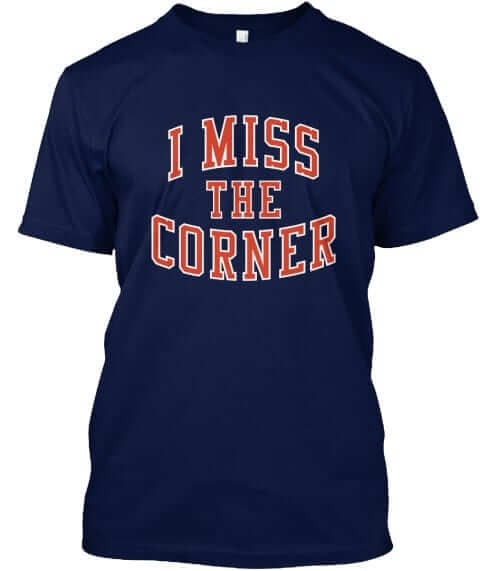
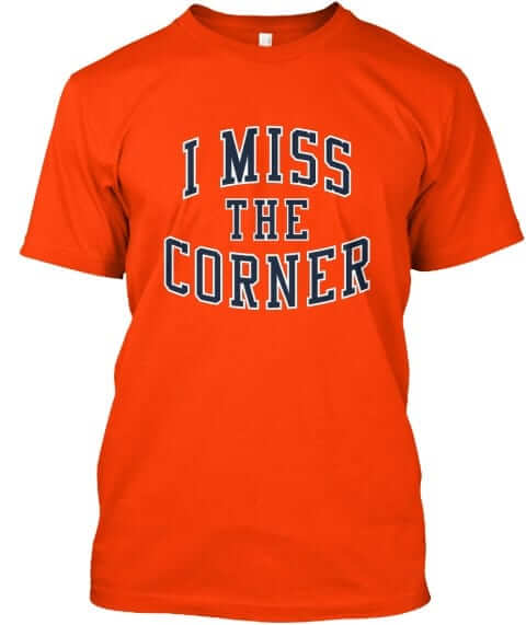
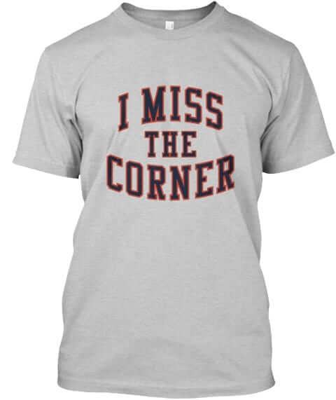
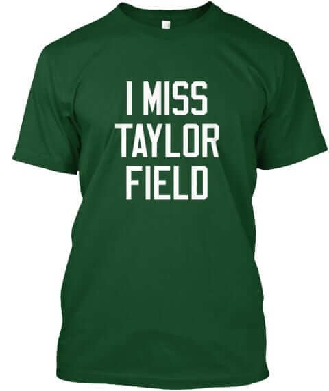
Naming Wrongs update: We have three new Naming Wrongs designs to share with you today. This will be our last round of product for a while (in part because designer Scott Turner is busy moving across the country, and in part because we’ve now dealt with pretty much every stadium and arena we had on our list). One at a time:
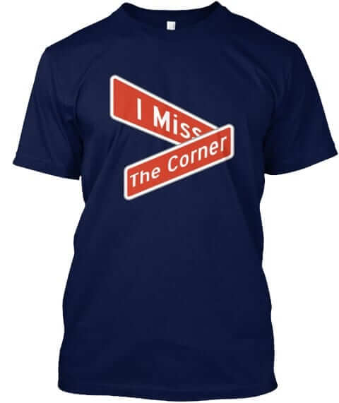
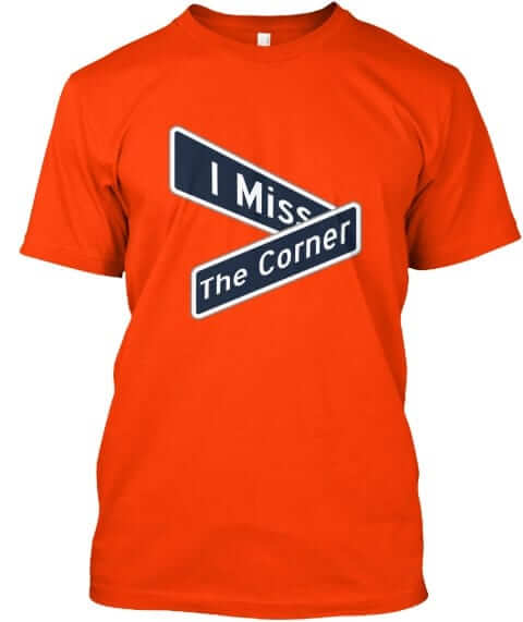
The Corner: Lots of people were asking for a Tiger Stadium shirt, but we’re not doing anything that includes a team name, so we did “The Corner” instead. There are two styles — one involving street signs (available in navy and orange) and one with a more conventional type treatment (in navy, orange, and grey):
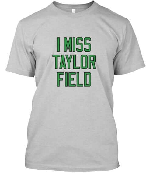
Taylor Field: This one’s for CFL fans. I’ve been told it is likely to be one of our biggest sellers. Available in green and grey:
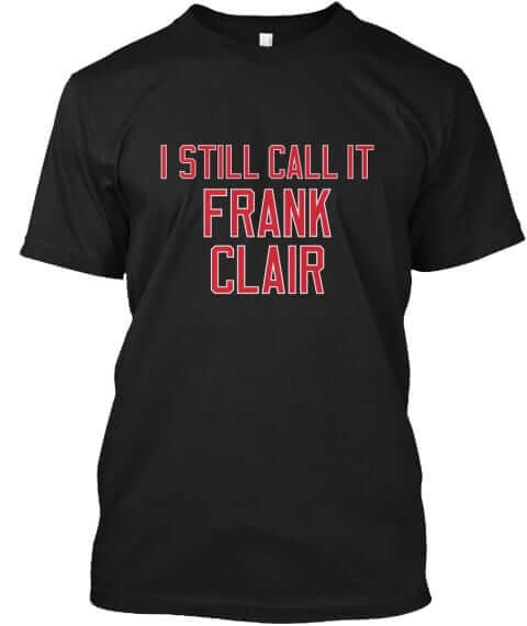
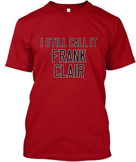
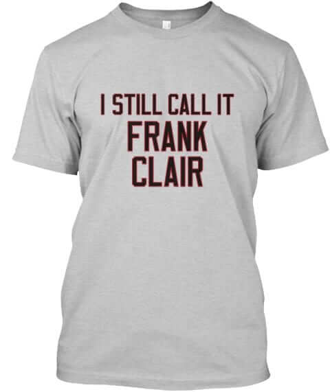
Frank Clair: Another CFL design. Available in black, red, and grey:
In addition, in case you missed it last week, we also have new designs for the Georgia Dome, the Omni, and McNichols Arena. Full details here.
These designs are now available in the Naming Wrongs shop. They’re also cross-listed in the Uni Watch shop, where card-carrying members can get 15% off. (If you’re a member and need the discount code, send me a note and I’ll hook you up.) My thanks, as always, for your consideration.
Holiday shirt reminder: Although our respective heads of state aren’t exactly presidents of each other’s fan clubs at the moment, the United States and Canada remain close allies with lots in common.
That includes the two major holidays that we celebrate in early July — Canada Day on July 1 and Independence Day on July 4. You can get Uni Watch shirts for either holiday (or both holidays!) by ordering now — the Independence Day shirt is here and the Canada Day shirt is here. Thanks.
And now a few words from Phil: Sunday is Father’s Day, and I’ll be continuing my annual tradition of posting photos of “Dads in Uniform.” It’s something I began doing in 2013, and continued in 2014, 2015, 2016, and again last year, and I’m looking forward to keeping it going strong.
This year, based on a suggestion from reader Bill Hetrick, I’ve decided to add photos of equipment your father used and passed down to you. For more details on that, look here.
If you’d like to have a photo of your dad (or uncle or granddad!) featured this Sunday, or if you have a piece of equipment he passed down to you, please send me an email along with a photo (just one, please) and a short description (100 words or less) by this Thursday, June 14, midnight Eastern. I’ll run all the submissions this Sunday. Thanks.
The Ticker
By Paul, pinch-hitting for Jamie

Baseball News: Cleveland OF Melky Cabrera’s batting helmet decal was coming loose yesterday (from Ed Hahn). … Prior to yesterday’s A’s game, there was a very nice tribute to equipment manager Steve Vucinich, to mark his 50 years (!) with the team. Additional info here and here (big thanks to Terry Mark). … Reds P Austin Brice is another player who wears a uni-numbered belt, although one of the numerals is usually covered by his belt loops (from Joanna Zwiep). … Yankees OF Aaron Hicks hit a ball that went through an open bullpen door at Citi Field two nights ago (from Mike Chamernik). … For reasons that aren’t clear, at least to me, Mississippi State RF Elijah MacNamee ran from the outfield to the bench in order to get a new cap last night. Maybe the first one didn’t fit properly.

Football News: Good shot of two Houston Oilers wearing two different number fonts. … Several Bengals players are wearing new helmet models during OTAs. That article also includes this: “Others have noticed that the black striping painted on the new helmets during the spring sessions is slightly different from player to player, and that is due to a manufacturer error. When the players reconvene for training camp at the end of July, the striping will be once again be uniform across the locker room” (from David Sonny and Patrick O’Neill). … A series of NFL team tumblers lists the city name and team name for each club, except for the Raiders tumber, which doesn’t mention the city. … Here’s another article on the impending demolition of the Akron Rubber Bowl (from @OlegKvasha).

NBA News: Here are some unused logo concepts that didn’t make the cut for the Nuggets’ recent redesign. … Oh baby, check out this awesome St. Louis Hawks mini-van (from Erik Spoonmore). … Brian Sanford has compiled a good site devoted to this past season’s NBA uniform matchups.

Soccer News: New crest for Edinburgh City (from our own Jamie Rathjen). … Here’s a pretty cool video showing Japanese Daruma dolls being painted in World Cup design patterns (from Jeremy Brahm). … Chelsea has a new sleeve advertiser (from Ted Kerwin).

Grab Bag: Kenya Sevens, the country’s national rugby union team, has stoked controversy by covering up their jersey ad as a way of protesting the fact that the players hadn’t been paid. … A NJ dry cleaner uses its hangers to promote their affiliation with various NJ pro teams (from @KlimmyOnSporps). … “The National Lacrosse League’s new championship trophy was presented to the Saskatchewan Rush in the deciding game on Saturday night in Saskatoon,” says Wade Heidt. “The Rush elected to wear their alternate uniforms at home during the championship series, creating an interesting color-vs.-color matchup, with Saskatchewan wearing their lime green alternates while the Rochester Knighthawks wore their usual road purple.” … Tennis pro Roger Federer is reportedly leaving Nike and signing on with Uniqlo (from Blake Fox).

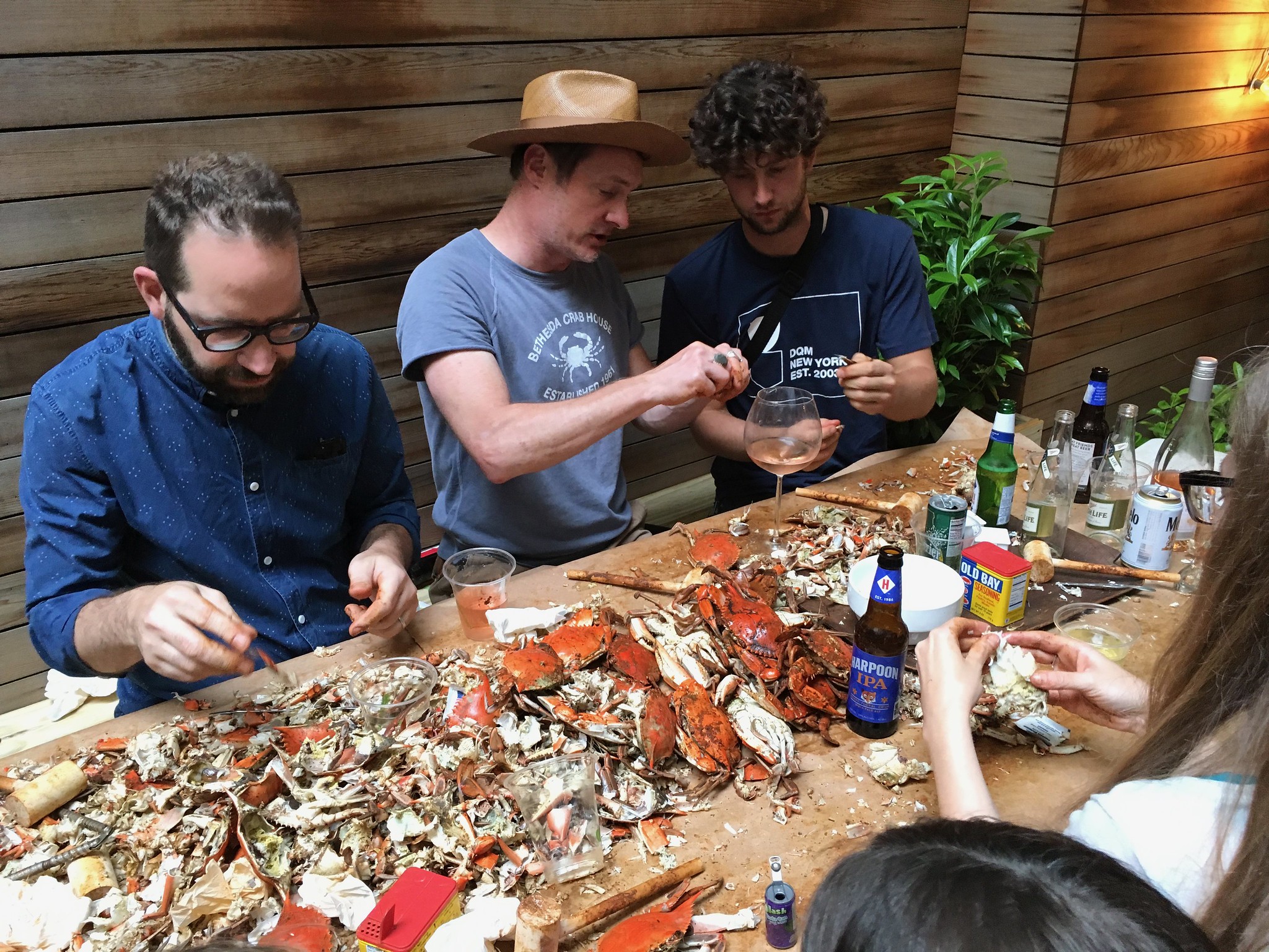
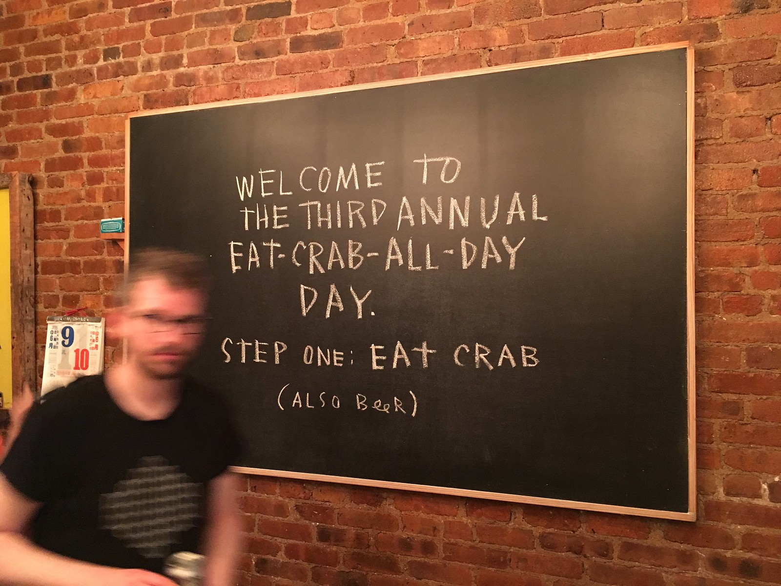
What Paul did last night two nights ago: Last month I wrote about Brooklyn artist Mac Premo and his Rube Goldberg-like double play machine. While reporting that story, I kinda hit it off with Mac and his wife, Adrianna, so on Saturday they invited us to their place for their third annual Maryland crab fest, which was a hoot. Lots of people, lots of beer, and lots and lots of crabs. We hope to return the favor by having them over for a crawfish boil sometime soon!

*Raises hand to humbly suggest that adding in the Packers to CLE and HOU would be perfection.
As noted in today’s text, we don’t have access to green yarn.
Oh man! I’m pretty embarrassed that I didn’t see that. I’m totally busted. I was in such a hurry to whine I didn’t even keep reading and see the green yarn thing. I’ve bought a lot of the other ones and really like them btw. Would order this set in a heartbeat again. In my defense though? It 2018. Like, no disrespect was intended. It never crossed my mind a vendor would have a supply limitation such as no dark green. That seems more like a 1985 problem. Come on guys!!
Couldn’t agree with you more regarding the yarn colors. Very frustrating to us that we don’t have a good green option!
You have access to red, white, and blue. Why no Giants?
Which iconic Giants striped sock design would you like us to use?
Here, I’ll save you the trouble: The Giants have not worn striped socks since 1936. If we used that stripe design (or any of their stripe designs from even earlier in their history), I’m fairly certain you would not recognize it as a Giants design.
More: link
link
Maybe not iconic, but Giants and stripes.
Just looking for a team that I actually like.
Good call, and shame on me for not remembering those late-’70s striped hose (although, like many Giants fans, I’ve tried to forget a *lot* of things about that period in the team’s history).
But the larger point remains: If we did that stripe pattern, nobody would recognize it as a Giants design. So there’s no point in doing it.
The Giants are probably better known for sleeve stripes, anyway. Well, sometimes.
Any chance of eliminating the thin brown stripes between the orange and white of the CLE socks? I know they had them on from the late 60’s to the mid 00’s. I liked when they went back to not having the thin lines separate the bigger stripes.
While you’re talking merchandise, what ever happened to the alternate version of the cap? Perhaps I just missed the on sale announcement?
Coming in July.
We future purchasers were a bit jealous when Ms Tug Cap was modeling one in a photo from last week …
That was a prototype/sample/etc. Final version will be even better!
“This is Philly!”
link
ed
“…check out this awesome St. Louis Hawks mini-van ”
To call a Volkswagen Type 2 (aka Transporter, Kombi, Bus or Camper) a *minivan* is near blasphemy!!
Is the Naming Wrongs series not using team names for legal reasons or a philosophical one? I guess nobody around today calls it Briggs Stadium…
Both.
I love the Canada Day shirt but it’s a lot outside of my price range. I assume that the prices are so high to bring in revenue for the site.
Wha..? The Canada Day shirt is only $21.99, which is a really good price for a shirt with a two-sided design. I make a lot less on that shirt than I do on our one-sided designs.
Pretty sure that by the time I was becoming sports-aware as a kid circa 1980, nobody was really still calling it Briggs Stadium. Not even my grandparents.
Gotta say, I particularly love the street sign version. Even looks like the classic FHWA font (looks to me like Series E in particular). This appeals to me both as a sports fan and a roadgeek! I’ll have to wait until this weekend at the earliest, though, before I’ll be able to spring for one.
A total of $26 (with shipping) for a novelty shirt can be high for some. To say it is “a really good deal…” makes it feel like a sale a bazaar.
1) You’ve put your thumb on the scale by using the disparaging term “novelty shirt.” Can you please give me an example of a T-shirt design that is *not* a “novelty shirt”?
2) We all have our budgetary constraints, our own concepts of value, and so on. No issue there. But to describe a two-sided shirt priced at $21.99 as being priced “so high,” as the original commenter did, seems odd. Makes me wonder if he’s somehow seeing a different price on his browser.
It does cost more for larger sizes, though. But that happens with shirts at retail, too.
Don’t know what people are expecting.
If you’re going to throw the Briggs name out there, you might as well throw Navin Field out there too. I love the addition of a Tiger Stadium shirt. No matter the true name of the stadium, true Tigers and Lions fans just know it as “The Corner,” so that name on the shirt is perfect!
I would only be interested in the socks if a full knee-high option were available. Any mid-calf sock is uncomfortable for me, so I either go ankle-high or knee-high.
And you know it’s the Dead Zone when a sock vote is the lede! XD
Though, at least we’ve got NHL thirds coming back to look forward to, and hopefully we’ll get to see more than just a couple around the Draft.
I would agree. I think the company would sell more socks with a knee-high option.
The whole point of the StripeRite project is to create crew-length socks. Details here: link
Well, it’s a project my calves refuse to allow me to participate in, then.
If I *could*, though, I’d lean toward the SF ones. Pittsburgh, maybe, though the throwback Northwestern stripes don’t feel quite right to me.
I thought these socks were ankle high, specifically so that the stripe pattern ‘showed’.
I didn’t think these went up to the calf. I also have never purchased any, so I do not know, its just what I thought.
Lee
“A NJ dry cleaner uses its hangers to promote their affiliation with various NJ pro teams”
“Cleaner of the pro’s”
Apostrophe catastrophe……or not?? Hmmmmm?
Unless it’s indicating that there is a single pro, and he has something to be cleaned, then there should be no apostrophe in “pros.” I think that’s just bad grammar, not an apostrophe catastrophe.
But, an apostrophe is also used to replace letters in a shortened word. I suppose “professionals” is not *really* what they were going for here, and it is simply bad grammar. I was throwing them a li’l bone.
I know, I know, and contractions are two words shortened to one via an apostrophe.
btw, I believe the first quotation marks and the apostrophe are upside-down.
But “pros” is not a contraction of “professionals.” It is the plural of “pro.” We use an apostrophe before a plural “s” if and only if it’s necessary to avoid confusion, usually in cases where the plural would spell a different, usually non-homophonous, word. There is no other common word in English spelled “pros” with which the plural of “pro” could be confused. Compare with Oakland’s MLB team, whose nickname could be read as the common conjunction “as” without the apostrophe.
The point is easily proven either way. There is another common word that’s short for a longer one that’s frequently used in the same context, by the same writers and signmakers, as “pro,” and that is frequently written as a plural. If the plural “pro’s” is a correct usage, then we should also see frequent instances of “fan’s” used as a plural for “fan.” Pro:professional::fan:fanatic. Anyone who wishes to make the case for “pro’s” as a proper plural has only to offer evidence of the common use of “fan’s” as a plural and their case will be proven.
Regarding Hoskins double C-Flap. The Phillies blue Sunday alternate helmets are very inconsistent with the logo. Some players have a 3D logo while others have the normal sticker.
link You can see a raised logo in this picture.
Since the logo issue was mentioned here last week… we now know what the “IHOb” stunt is about.
Burgers.
Quite frankly, I never seek out IHOP for anything other than breakfast-related foods. And the burger offerings they’re don’t exactly wow me with anything especially unique. I mean, I get it, they want to try to diversify to increase traffic, but this doesn’t make me want to choose them over, say, their own sister restaurant, Applebee’s, for burgers. Plus, there are other sit-down restaurants within my area that provide more variety with their burgers.
Interesting. Thank you Rob for the news break. I had just assumed it was for “International House of Breakfast”. I am surprised. I will not be going to my local IHOP for burgers either.
I think “IHOb” is just a short-term re-branding…a publicity stunt to draw attention to their (new?) burger options.
Yeah, I was pretty skeptical about them permanently changing their name, and once today’s reveal came about, I knew this couldn’t be anything more than a stunt.
Still, it’s fun to poke at them…
“IHOP” sounds jaunty with the word “hop.” It sounds complete when the inflection goes up.
“IHOB” inflects down and sounds like someone is leaving something unsaid. You hob? You’re hobbled? Huh?
And now the Phillies Twitter feed is stunting in response: link
“For example, the sock mill isn’t currently offering green yarn, so that makes it impossible to do certain designs.” I take back everything I said about Nike not having the right green for the Eagles a couple of years ago – it is an industry-wide issue!
Perrier and IPA’s at a crab feast? A true MD one would only be serving Natty Boh or any other beer that can be bought in a 30 pack!
Touché. As the Tugboat Captain and I were shopping for beer on our way to the party, I actually said, “Too bad there’s no Natty Boh” (which isn’t sold here in NYC). We brought Bud instead.
cheap beer is definitely the way to go when it comes to picking crabs…even better if it comes out of a pitcher.
Speaking of Uni Merch and looking ahead a few months, is there any thought to making a Hanukkah themed “Ugly Sweater” shirt?
Not right now. But I’ll consider it.
Anyone know why the new Edinburgh City F.C. crest is so similar to the Manchester City/NYCFC/Melbourne City crests? From what I can tell, the “City Football Group” has no stake in the Edinburgh club, so why model the crest off that template? FWIW, I really dig it, I’m just curious.
It does look similar, but it seems it’s just that roundels are a big thing right now. The old crest was a roundel as well.
The designer came up with similar concepts for Hamilton Academical and “Dundee City” (a hypothetical merger of Dundee and Dundee United).
Very similar to the Man City badge, less similar to NYCFC/Melbourne City. Probably, and this is just speculation, they looked to Man City for inspiration.
I still hope this is a short-term publicity stunt, as it is utterly ridiculous to make this change.
Cripes…. That was supposed to be connected to the IHOP comments.
I wear RAIDERS socks to work everyday.
Wondered about the date of the NJ dry cleaner story…so many out of date logos….
A NJ dry cleaner uses its hangers to promote their affiliation with various NJ pro teams (from @KlimmyOnSporps)
Oh, wow, Park Cleaners… the same cleaners that were reportedly involved in the link.
Whoops, that was supposed to be a standalone post, not a reply. Though it is on the same subject. (Also, thought I closed the first tag after “lawsuit”…)
I’ve got all the Stripe-Rites and I’ll purchase whatever comes next, but HOW in the world has there not been a green/gold Packers-type design to this point? Been patiently waiting for it… Wouldn’t a sock that matches the hat be great?
As Paul noted, they just don’t have green yarn. At least, not yet.
…AND NOW I read the complete thread and learn there is no green yarn. My apologies! I will, however, continue to wait patiently.
Sorry, but that Federer/Nike story is totally bogus. Not a chance he leaves Nike at this stage, he’s been with them his entire career. Plus, 30 million per YEAR? Right. No one can afford that.
I find it hard to believe too. Nike has been nothing but good to Roger. They would be dumb to let the GOAT go just like that.
At this point, I can’t assume anything about anybody anymore.
whether he is staying or going, Fed’s contract with the swoosh has expired
link
Never heard of Uniqlo until last year when I was looking for some good underwear that wouldn’t break the bank. Hope this isn’t true because I would assume my underwear just got a lot more expensive.
they do have good boxer briefs
That NJ dry cleaner was caught up in the Eli Manning scandal, and accused of purposely damaging Giant jerseys.
Not sure if they still do the team jerseys, I would think not.
They did the jerseys when the teams were local and played in The Meadowlands. That hanger is old.
It would specifically date from 1990-1997, since those were the years the Nets had that logo. The Jets changed soon afterward.
i live in MD and I haven’t even picked crabs yet this season. I have been hankering for them, I think it’s gotta happen very soon.
I’m a Marylander living in Philadelphia. One thing I can tell you is, never, never go to Chickie’s and Pete’s for blue crabs.
They have “crab” fries which have an Old Bay-like seasoning on them, which are good, so I thought why not pick a few crabs too.
The blues came out with out their shells, partially cleaned already and covered in butter, garlic, and oregano. What the flying fuck?
HA! I actually grew up in south Jersey, so that is how I ate crabs growing up, Italian Style! Definitely a different take, but I wouldn’t say they are bad. I can eat them either way.
when you explain the prep process for Italian/Jersey Style crabs to a Marylander, they give you a look like you have 3 heads. “What do you mean you clean them first?”
Didn’t get a chance to read the ESPN piece until this morning, Paul. It’s such an enjoyable read and really well done. I’m originally from Cortland just south of Syracuse and I never knew the Brannock was a ‘Cuse-made product until I learned it from you!
Hope you enjoyed Syracuse. Now put that rocket-arm away, you’ll hurt somebody!
Thanks so much — glad you enjoyed!
The Steelers stripes are not correct – these are missing the white stripes inside the yellow Northwestern stripes?
This pattern is the one used on their color rash uniforms – why choose that pattern??
link
They also wore it in the 1960s.
True, but why select a design they wore for a couple of seasons, versus the one they’ve worn for nearly 50 years? I’m a Steelers fan, but voted for the Oilers for this reason.
Well, the one they wore for a couple of seasons was worn *as a sock,* while you’re arguing in favor of a striping pattern that’s only been worn on the sleeves.
It’s an interesting point, though. I’ll have some follow-up thoughts on this tomorrow!
Paul,
Any chance you could let us know what canvas prints the two winners chose? I looked at a lot of them and I’m kind of curious.
Wolfie Browender chose the 1937 Marquette vs. the University of Wisconsin Badgers football canvas, and Marc Rivlin chose the the 1973 National League Championship Series Game 5 ticket.
Thanks.
My 88 year old parents still refer to it as Briggs Stadium. But I guess “The Corner” is cool.
Re: The Frank Clair shirt: There should be another that says “I still call it Lansdowne Park”, going further back into its history.
And however much the C-Flap is popular with baseball players these days, IMO, I miss the days when football facemasks were attached to batting helmets.
It is cool that we are getting Naming Wrongs shirts for both Roughriders and Rough Riders fans on the same day!
That was exceptionally well-played, and now I’m not sure whether I hope more that it was intentional or unintentional!
Would prefer not to see KC or SF in the new batch of StripeRites. The past several sets have been heavy on red (Cards, BoSox, Habs) and I’d like to get a little more variety in color.
Did yall make a “I Still call it 1-AA” tee shirt. If so I really want that one.
“Sleeve Partner”
Even as an advertising lawyer, I’m rolling my eyes at that term, Chelsea.
Any chance these will ever be available in a ‘plus’ size? I would be all over those Browns socks, but I wear a 14 shoe and can’t fit into regular mens/unisex socks.
Unfortunately, I don’t think that’s in the cards. Our production runs just aren’t big enough to allow for that.
I’m really sorry about that — I realize it must suck to be a hard-to-fit size (for socks or for anything else).
No worries. I’m thinking about getting my dad (who also Gets it (R))a pair for his BD. I think he’d get a kick out of them, and since they’re brown, he could wear them under his work slacks. He’s rolls his eyes at modern sock fashion, but u think he’d get a kick out of it if it were his own little secret.
Thanks for the sock poll. I’m looking forward to another set. Maybe set V will have the classic Broncos sock.
Keep up the good work.
link
Rhys Hoskins double c-flap helmet brought out the Star Wars geek in me. It reminds me of the helmets worn by A-Wing pilots.
link
I voted for the “Houston” socks, because even though I was never an Oilers fan, I #LuvTheBlue !
Paul, I know you are not crazy about the Panthers color scheme but if you were to ever offer a black sock with the silver and blue stripes like on the shoulders of the team jersey I would definitely buy a bundle…I think you underestimate how much people like that combo and it might be a big seller even if its not to your tastes.
Remember, the Panthers “all-blacks” were voted best uniforms on a major site a while back. People love those colors together.
I’d purchase Saints or Dodgers socks