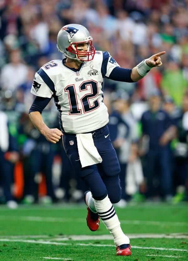
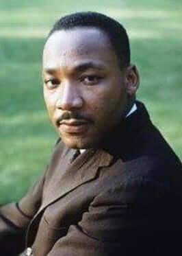
On Saturday, the Tugboat Captain and I were at a bar in deepest Brooklyn, watching the Eagles/Falcons game. When that game ended, they switched to the Titans/Patriots game, and they showed Tom Brady walking onto the field.
I realize that a lot of people hate Tom Brady. Some people hate him because he married a supermodel (which I don’t care about because celebrity culture means less than nothing to me). Other people hate him because they hate Boston and/or hate teams from Boston (I like Boston fine, and I’m a Yankees-hating Mets fan, which means I’m predisposed to liking the Red Sox). Others hate him because of deflategate (he served his suspension).
As I explained to the Tugboat Captain as we watched the game the other night, I really like Tom Brady. Not so much because he’s a great quarterback, but because he’s a great-looking quarterback. When I think of what I want a quarterback to look like, aesthetically, I think of Brady or someone very much like him. Everything about his body and posture looks and feels Just Right. The ratio of his torso to his legs, the ratio of his thighs to his calves, the width of his shoulder pads, his height, the way he plants his back foot after fading back to pass, even the way he wears his eye black. From an aesthetic standpoint, he is immensely pleasing to watch. He’s like the dictionary definition of how a quarterback should look (at least in my dictionary). About the only thing I don’t like about his look is the knee brace on his left leg, which looks particularly clunky with the Pats’ striped white road socks.
Brady also happens to be tremendously successful, but on-field success doesn’t always correlate with aesthetic appeal. Peyton Manning was a great quarterback, but I never enjoyed watching him play. His body, and the way that body moved, never appealed to me. Another example: Dan Fouts. When I was a kid, I was always surprised that Fouts was so successful, because he didn’t look like he’d be successful. His body was stubby (well, relatively speaking, compared to lots of other quarterbacks, or at least it looked that way, in part because he was one of the first QBs to wear a flak jacket under his jersey) and his movements weren’t graceful.
Quarterbacks I’ve loved to watch over the years, aside from Brady, have included Roger Staubach (although I’ve always hated the Cowboys and therefore always hated Staubach) and Randall Cunningham (great posture, and I loved his shoulder pads and even his thigh pads, if you can believe that). Quarterbacks that have kinda bugged me have included Fran Tarkenton (too small), Drew Brees (too small), and Joe Namath (terrible posture with those sloping shoulders). I don’t mean to take anything away from those quarterbacks, each of whom, obviously, is an all-time great. I just haven’t found them as visually satisfying to watch.
The two teams I root for — the 49ers and Giants — are both in the NFC, so I rarely have any emotional stake in Brady’s games. I’m free to observe him on a strictly aesthetic basis, and I usually like what I see.
As for yesterday’s playoff games:
• Jaguars running back Leonard Fournette wore his old purple and gold shoulder pads from LSU:
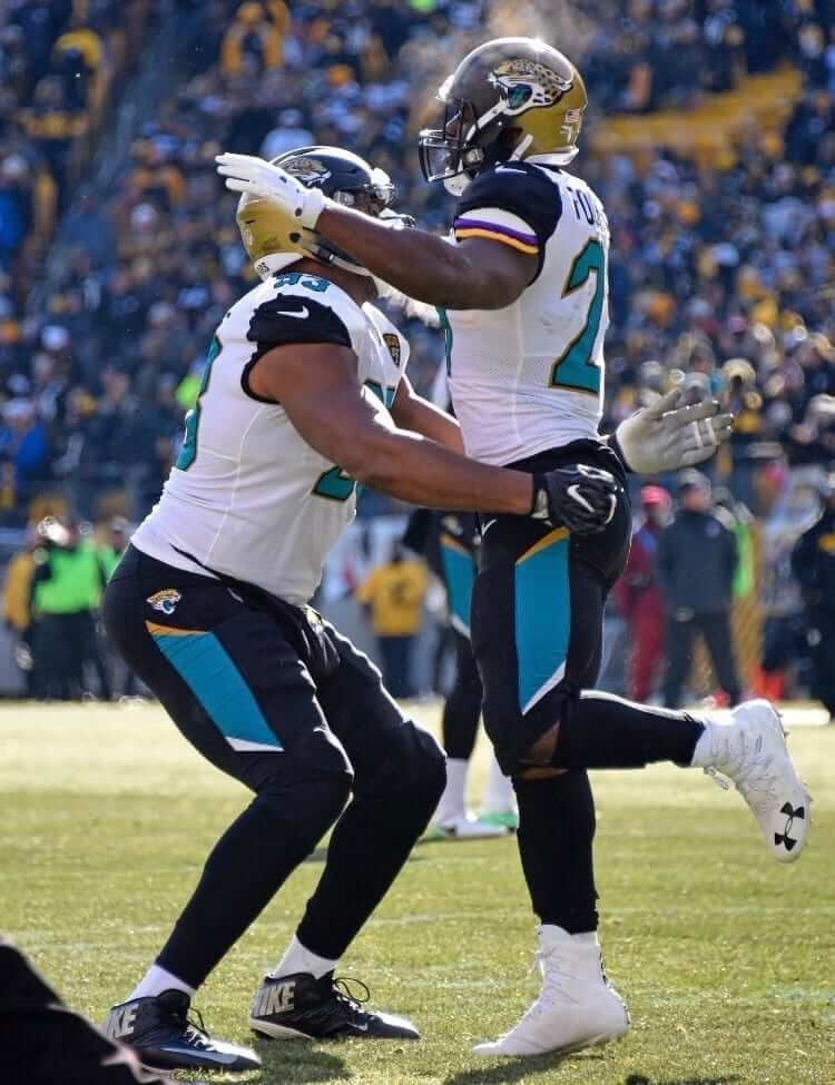
Leonard Fournette did indeed wear #LSU shoulder pads in today’s playoff win, sent to him by the school’s equipment guys, per people who would know such things. https://t.co/SpgPrMiRVP
— Ross Dellenger (@RossDellenger) January 14, 2018
• Steelers linebacker Vince Williams wore a backplate emblazoned with the uni number of injured teammate Ryan Shazier:
• The Jags celebrated their win with teal champagne — gross.
Jaguars contingent in Pittsburgh celebrates trip to AFC title game with teal champagne. pic.twitter.com/TbADFLChzq
— Darren Rovell (@darrenrovell) January 14, 2018
• Vikings wide receiver Stefon Diggs, who caught the miracle game-winning catch against the Saints, wore solid white socks with no purple:
Meanwhile: Only three games left to go in the season. There’s still a chance that we could have our first mono-black Super Bowl team (and history’s worst Super Bowl helmet), if the Jags win in New England. There’s also the unsettling possibility of the Jags facing the Vikings, which would be an aesthetic shitshow of epic proportions. You know who I’ll be rooting for next Sunday.
(My thanks to Robert Hayes, Ryan Miller, and Griffin Smith for their contributions to this section.)
NBA uni ad update: When the NBA season tipped off on Oct. 17, 17 of the league’s 30 teams were wearing corporate advertising patches. Less than 10 days later, that number ticked up to 18, as the Pelicans got on board. Less than three weeks after that, the number reached 19, as the Hornets revealed their ad patch.
At that point, it seemed plausible — or at least not implausible — that there’d be a steady drip-drip-drip of additional teams joining the ad program as the season progressed. I recall one longtime reader (hi, Dan!) posting a comment that basically said, “Well, now it’s obvious that every team is going to do it.”
It has now been exactly two months since the Hornets became the 19th ad-clad team, and we’re still stuck at 19. With the season now a bit more than half over, I’d say it now seems plausible — or, again, not implausible — that the number is likely to stay right where it is.
I think the primary lesson here is that this is all uncharted territory and that we should refrain from making strong predictions, or even having strong expectations, because the whole enterprise has turned out to be extremely unpredictable.
All of that said, while I’m disappointed that so many teams have gone ad-clad, I’m very pleased that more than a third of the league’s teams have remained ad-free, at least so far. A nice surprise. #NoUniAds
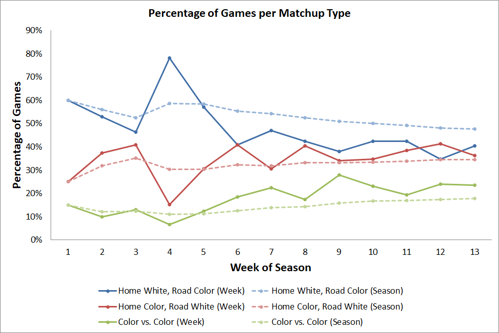
NBA Uni Tracking
By Collin Wright
The three possible types of color matchups are beginning to level out, but we’ll probably see more home teams wearing colors and color-on-color games as teams begin wearing their two alternate uniforms, most of which are colored (click to enlarge):
Just think about it: Today is Martin Luther King Jr. Day, the day when we celebrate the life of history’s greatest American. It’s astonishing to think how short that life was — King was only 39 when he was assassinated nearly 50 years ago. If he were still alive, today would be his 89th birthday. Imagine what he could have accomplished in those 50 years, and imagine how much better off we’d be for it. What a waste.
The Grizzlies, who are playing the Lakers today, will honor King today by debuting their new alternate uniform, whose design is based on signage from the 1968 Memphis sanitation workers’ strike — the final civil rights campaign of King’s life. The full story behind the design is nicely spelled out here — definitely worth reading. The game will tip off at 5:30pm Eastern and is being televised by TNT.
In addition, the UMass-Lowell basketball team will be wearing King-themed uniforms for this afternoon’s game against New Hampshire:
Check out the special #MLKDay Jerseys the @RiverHawkMBB team will be donning Monday afternoon when we host UNH. Built around MLK's Life Blueprint speech. #AEHoops #UnitedinBlue #Dream
Tickets: https://t.co/cuO9MZdZ0Z pic.twitter.com/Wa6YZ1WcZ1— UMassLowellAthletics (@RiverHawkNation) January 12, 2018
(My thanks to Tommy Coyle for his contribution to this section.)
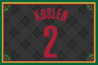
Membership update: If you made a New Year’s resolution to finally sign up for a custom-designed Uni Watch membership card already (like Ryan Koslen’s card, shown at right, which is based on the Trail Blazers’ new Dr. Jack Ramsay-themed alternate), there’s no time like the present to make good on that resolution.
Remember, a Uni Watch membership card entitles you to a 15% discount on any of the merchandise in our Teespring shop. (If you’re an existing member and would like to have the discount code, email me.) As always, you can sign up for your own custom-designed card here, you can see all the cards we’ve designed so far here, and you can see how we produce the cards here.
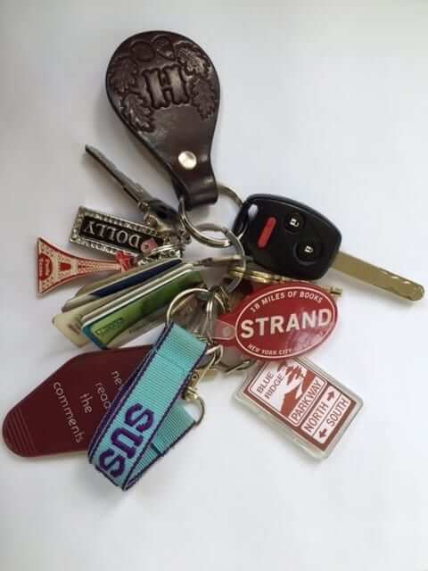
KRC update: The latest installment of Key Ring Chronicles is about a miniature Blue Ridge Parkway sign (among lots of other trinkets, as seen above). Check it out here.
I am low on KRC content and in need of new entries. If your key ring includes a special object with a good story behind it, please get in touch.

Click to enlarge
Curling update: My curling team won its final game of the season with a very solid 7-2 victory last night. That’s me holding the “Curler’s Crying Towel” that reader Will Scheibler recently sent me (and that I showcased on the site last week). Fortunately, we didn’t need any of those excuses this time time around.
The Ticker
By Jamie Rathjen

Baseball News: Cardinals third base coach José Oquendo is reclaiming No. 11 in his second spell in the position, moving the current occupant, infielder Paul DeJong, to No. 12 (from Braden Claassen). … Reader Chris Flinn found a baseball-themed Sesame Street book with great visuals, including a bullpen cart as well as Bert and Ernie et al. wearing stirrups.

Hockey News: The Tulsa Oilers (ECHL), an affiliate of the Blues, wore Blues-themed jerseys on Saturday (from Mike Iles). … Former Blackhawks winger Éric Dazé was invited onto the ice before his team’s game yesterday against the Red Wings, appearing with the CCM jersey he would have worn instead of a current one (from Michael Alper).

Basketball News: Vanderbilt did a blackout yesterday against Kentucky, except the team wore gold instead (from Josh Hinton). … The officials in yesterday’s Indiana-Northwestern game were wearing stripes of two different widths (from @Adam_PHN).

Soccer News: Everton striker Cenk Tosun, who joined the team this week, wears FNOB. He’s not the only Turkish-German player in Liverpool to do so, as Liverpool defender Emre Can does as well. … American winger Landon Donovan recently un-retired to play for Mexican team Club León. Donovan is to wear No. 20, which “must be a reference” to the seven times that the U.S. have beaten Mexico 2-0 since 2001 (collectively known as “Dos a Cero”), says Mark McGinnis. … New white third shirt for Scottish Championship team Queen of the South. … Japanese team FC Tokyo revealed its new home kit (from Jeremy Brahm). The team’s website also shows the away and three goalkeeper shirts. … Future USL team Nashville SC has one of those explanations of the elements of its crest, except you can’t see all of it here (from Josh Hinton). The guy standing in front of it is pro wrestler Eric Young. … Also from Josh: An Arsenal fan at yesterday’s game at Bournemouth was wearing a mashup of this season’s home shirt, last season’s away shirt, and the team’s 90s-era crest. … The NOB of Sevilla’s Danish center-back Simon Kjær has what Charlie Eldred calls “AshOB,” as in the name of the letter “æ.” … English second-tier women’s team Millwall Lionesses have a rare advertiser-free kit, except for the maker’s mark.

Grab Bag: The NLL’s Rochester Knighthawks wore teal alternates at home, creating a color-on-color matchup with the New England Black Wolves (from Wade Heidt). … The chair umpires at the Australian Open tennis tourney now have motorized seats (from Blake Fox). … Several new paint schemes for NHRA Funny Car driver Matt Hagan (from David Firestone). … Reader Preston Salisbury sent us a view of British Airways’ 1984-1997 livery. … New brown berets for the U.S. Air Force.
you forgot the part where Brady left his pregnant GF for his current wife
/\THIS/\
Some don’t like Brady because of the whole TB12 nutritional snakeoil thing.
link
Also, as a St. Louisan, we were conditioned to despise the Patriots for their *little* SpyGate deal, for which they received no more than a mild slap on the wrist. I would assume Eagles & Panthers fans feel similarly: three Super Bowl titles by no more than three points, so who knows how much knowing what the opposing team was doing on certain plays helped?
Slap on the wrist? Massive fines and forfeiting draft picks is a slap on the wrist? You consider it that now in hindsight but the reality is your St. Louis team did not lose because of spy gate. How many other coaches (including mike Martz) has cameras filming things? Perhaps Brady and the patriots could have won by more than just a field goal.
Spygate…you mean like when your St. Louis Cardinals hacked into the Houston Atros database???? Violating federal laws and not just some league rules…..
@Alex
A fine of $500k to someone making $4m+ a year is decent, but by no means impoverishes him. The $250k imposed on the team was a joke; they forfeited precisely one draft pick. Yes, a first-rounder. But it seems that, over the years, the Patriots have almost shown a certain disdain for first-rounders; the lower the pick, the better, in a sense (in terms of having to pay a player who may or may not wash out in a couple years anyway, a certain amount). So the league really did Belichick a favor there lol.
Not sure where you’re going with the accusations about other coaches taping things, but I don’t recollect hearing any such formal accusations levied, let alone actually investigated and punished by the league.
@Sandy
Yeah… that whole hacking thing… ugh. I wish we could’ve gotten some sort of advantage from that. I’m sure we’ll find out more in the future if the Cards actually got any sensitive information, but right now it’s pretty impossible to guess what was gained; I remember hearing some initial reports that maybe the Cards were checking up on the Astros to see if Luhnow took anything with him that technically belonged to his old team.
By the way, stiffer penalties involved there: $2m sent Houston’s way, plus the Cards’ top 2 picks in last year’s draft (admittedly, 2nd & 3rd rounders, as they lost their 1st round pick after signing Dexter Fowler). Oh, and a $280k fine (on, presumably, less than a $4m salary) and almost 4 years in jail for the hacker, Chris Correa.
In the Membership update, the link to the Blazers alternate actually goes to a picture of a Mets retail jersey.
Bizarre. Fixed. Here’s the proper link: link
Did anyone notice that Stefon Diggs removed his helmet after the TD pass, and was not flagged for a penalty under the Emmett Smith rule? At that point the game was not over, as the Vikings still had to try the phantom extra point.
It wouldn’t have affected the play, just that the penalty would have been enforced on the extra point.
I noticed as well. I wonder if the ref thought the game was over as well so he kept the flag in his pocket.
as a bitter Browns fan, i noticed this too
damn you Dwayne Rudd.. damn you
Wasn’t the Rudd penalty where he took his helmet off while the play was still going on? I wasn’t sure.
it was.. but still…once his helmet came off it sounded off alarms to me
This really comes as a surprise? The refs were ridiculously biased toward the Vikings the entire game. Every single pass interference call, except for the first one, were terrible calls. They even took the Ted Ginn touchdown off the board for ‘holding’.
Yes, I’m an angry Saints fan, why do you ask?
The ref did throw a flag on the play, there is a sideline camera view of the play where you can see the flag being thrown after he throws his helmet
There was a flag thrown — you can see it at the end of this clip: link . It wasn’t announced because of all the pandemonium and also because that penalty is enforced on the kickoff, which of course wasn’t going to happen.
My big question is where did the helmet land? he could’ve hurt someone pretty badly.
He threw it to the middle of the endzone.
Speaking of aesthetically pleasing football players, 2 guys who always stood out to me when I was a kid were Ronnie Lott and Derrick Thomas. They just looked perfect in their uniforms.
Proofreading:
“I’m free observe him”
Fixed.
This year’s Super Bowl might be one of the worst looking matchups ever. All four teams have sub-par looking uniforms.
Least worst to most worst:
Patriots v Vikings
Jaguars v Vikings
Patriots v Eagles
Jaguars v Eagles
To be fair, I think the Vikings uniform is decent, it’s just ruined by the font system.
What was the patch Drew Brees was wearing on the left side of his jersey? Walter Payton award? Was it on all season or just playoffs?
link
They put those a couple of weeks ago. Paul made a blog entry about it but can’t remember exactly when.
this shoulda been the cover photo: link
Further detail to the Rochester Knighthawks wearing teal alternates at home. That is a new teal uniform for this year.
Spell check: “Fournette”
I’ve never liked Brady’s spatting of his shoes, adds too much clunk to his aesthetic.
Fixed.
Here’s to hoping that every one of the teams remaining (except for the Vikings, who have one of the best uniforms in the league in my opinion) rebrand their uniforms for 2018. We already have confirmation that the Jags will do so. I’ll always hope the Patriots will, but considering the success they’ve had in their current unis I’m not sure they’ll ever change them. For the Eagles, it’s simple: KELLY GREEN.
I really hope that when the Jags rebrand, they scrap the two-tone helmet, though I would like them to have a matte black helmet, as matte is underused in the nfl.
This is the part where I point out that what you’re actually hoping for are redesigns, not rebrands: link
I still say the 2009-12 Jags helmets are the best, though if they won’t go back to that paint job, solid matte black would be okay.
I will never accept the Patriots as a blue squad; in red, they are my favorite team. It’s a prejudice that goes as deep as Broncos’ fans have for the orange jerseys.
Speaking of aesthetically pleasing, the old CCM jerseys are light years more pleasing to me than what NHL teams have been wearing for the past 10 years or so. Starting with the straight hems, and manufacturer & league logos on the hem rather than crowding the nameplate & neckline.
AGREED. And the Adizero unis this year have, in many cases, taken a downgrade in the collar area with that new design. A few teams have gone with a single color all the way around (including the panel with the NHL shield) and those look decent enough, but then there are teams like the link, whose collar treatment makes me think of link.
Something else of note – Daze’s uniform must have been from his rookie season, 1995-96 (or his late-season call-up for the final four games of the 1995 season), since the Blackhawks switched to Nike in 1996 and Pro Player in 1999. When they went back to CCM in 2000, the logo moved to the back of the neck (and the red jersey would have had a Koho logo anyway, because The Hockey Company wanted to spread both the CCM and Koho brands).
I am first and foremost a Bears fan. But, also a 49’ers fan, secondly. Roger Craig is from my hometown area. His Mom actually worked at the Caterpillar facility in Bettendorf, IA. My Dad was her supervisor before that facility closed and moved to Corinth, MS. Roger used to give his Mom his used jerseys, which she would wear to work occasionally. Roger took great care of her and she didn’t have to work. But, being the proud woman she was, she came to work every day.
Paul, I still haven’t forgotten your BBQ sauce. I ended up giving away my last batch. I’ll get some headed your way very soon.
Today’s lede doesn’t sit right with me. I’m not trying to suggest anything malicious on Paul’s part, but football (especially NFL) positions (“most notably quarterback,” according to link) are and have been racialized. I know that you mention Randall Cunningham, but multiple paragraphs devoted to how great Tom Brady looks as a quarterback (body ratios, use of accessories) strikes me as part of the problem of deciding who gets to play what positions.
You’re demonstrably wrong. If having a body like Tom Brady’s were the litmus test for getting a job as QB, then Peyton Manning wouldn’t have gotten the job. Dan Fouts wouldn’t have gotten the job. Joe Namath wouldn’t have gotten the job. And so on.
And yeah, I like the look of Randall Cunningham. How inconvenient to your argument.
There’s something to be said for looking like a successful QB. Personally I always loved Peyton’s pre-snap stance. Something very “giddy-up” about it. I know of some QBs (most notably Andy Dalton) that gets criticized because he doesn’t “look” cool. A very small part of looking good is the confidence to pull it off.
Your argument is a bit off-base. I’m saying that there is a pervasive attitude regarding what players in certain positions should look like which gives preference to certain types of players and denies opportunities to others. Peyton Manning or Randall Cunningham being a quarterback has little to do with that racialization. Your comments that Tom Brady is a “great-looking quarterback” fall victim to this.
Once again: Your argument is demonstrably false. If it were a “pervasive attitude” that QBs “should look like” Tom Brady, then Peyton Manning wouldn’t have gotten the job, because his physical presence is nothing like Brady’s.
We’re done here. Let’s please move on. Thanks.
I suppose that you deleted my comment. My apologies if it was a technological error. Please know that your preferences exist within a system that discourage players from playing certain positions. The system is harmful and racist and you, when posting in a public forum, perpetuate it.
This is beyond absurd. Threre was a time when black QBs were rare, in part because of racist assumptions about black intellectual capacity. If I had made my post about Tom Brady in, say, 1985, I think you’d have a pretty good argument.
But it’s pretty hard to make that argument today, in the era of Jameis Winston, RG3, Russell Wilson, Cam Newton, etc. And that’s not counting all the black QBs of the past generation: Cunningham, Daunte Culpepper, Donovan McNabb, Warren Moon, Steve McNair, etc.
I am not perpetuating racism, I am not engaging in eugenics. I am simply expressing what I find aesthetically attractive (including Randall Cunningham).
One more time: We’re done here. Let’s please move on. Thanks.
I always though Jeff George was one of the best-looking QBs in the game as well. Physically, he just looked like he was born to play the position.
*thought
That sounds almost Moneyball-ish. Specifically the line in the movie “the Red Sox look at Damon and they see a star. A player worth $XXMillions a year.” A lot of that movie is based on “screw how they look, get good players”.
Really? Can’t a person such as Paul offer their opinion without having their motives being questioned? I don’t always agree with him, but geez man, stop with the racism in everything already. Please. Thank you. -C.
Although I’m somewhat disappointed the ad patches don’t jump at me like they once did (I’ve gotten used to them/conditioned) I’m proud to say my team (Bulls) has gone no-ad so far.
I was at the Army-Navy game in 1963. I think the greatest one of that rivalry. After the game my friend and I ran onto the field and asked Staubach for his autograph. He said he did not want to sign there. Then he told us to hang onto his jersey and follow him. And he took us into the locker room. Signed for us and introduced us to some other players. So thrilling and so much class.
Sad that Team CAT (as our curling team is known) will be ending our season as a foursome — Paul, as always, played a great vice! But the team will continue with three of us for another seven weeks; not sure if we’ll change or retire the name. Also, we won 7-3, not 7-2. Didn’t really matter as we were up 7-0 after the first four ends and were just having some fun after that.
Full disclosure: I’m a huge Pats fan.
I know exactly what Paul is talking about. I’ve thought the same thing about Brady and it always bothers me seeing other QBs visually who don’t “look the part” regardless of how good they are. The biggest one I can think of is Big Ben. Legendary QB, but looks like a potato with legs.
“Best-looking” QBs in the league for me (besides TB12)? Garrappolo in SF. Eli in NY. Cam in Carolina isn’t bad at times but a little bulky for my taste (although it seems most/all mobile QBs are since they need the extra torso protection).
And honestly the fact TB12 wears what would now be considered an “old school” helmet design, helps. While I appreciate the advancements for player safety, visually today’s helmets are not all that attractive IMHO.
Just my $0.02 no one asked for. :)
I totally agree. I am a fan of “regular” helmets…Schutt makes a fine looking helmet. Brady wore a revo speed once or twice and looked goofy.
To me, Mike Vick looked the best in his uniform. Agree about Big Ben.
Wentz looks the part of a modern QB although I don’t like his choice of helmet.
I don’t like the Eagles number font, especially the number 1. I think it makes Wentz look not as good.
Really? Hmm.. That’s one of the few things I hope they keep when they change to kelly green.
A question came up in the comments section of this blog last week or so about whether the Vikings’ unusual number font, which is sewn into the turf, would be used during Super Bowl LII for the yardage markings. It appears different turf altogether will be used.
link
I have to admit, I’ve never really paid the kind of attention to quarterbacks that Paul is discussing here. As a Detroiter, it makes me wonder where Matthew Stafford would rank.
Great bit on Brady’s aesthetic perfection as a quarterback, which is rounded out by his wearing number ’12’. Possibly because of having come of age in the 70s when 12 was more prevalent among QBs, it is to me the undisputed archetype QB number, with 32 and 44 in the backfield, a 38 tight end, 80 and 88 as receivers.
12 IS the number for quarterbacks. I hate when receivers and kickers wear it.
I’ve also always thought Matt Ryan would loose a lot better if he wasn’t wearing a punters number.
I don’t know if Jags-Vikings would look worse than Broncos-Seahawks. The Vikings uniforms aren’t that bad, save the goofy numeral font, which sadly applies to a lot of teams. Then again, the Jags’ uniform is so over-the-top awful that it drags the aesthetics of practically any game down to the bottom of the pile.
Paul nailed it when he said that Tom Brady is the stereotypical quarterback that you’d see in the encyclopedia if you looked up the word. That’s one thing I can’t stand about Brady. He’s now arguably the best QB of all time, and he’s also the least interesting of the lot. I get where you’re coming from with his lanky yet strong posture–Joe Montana, Cam Newton, and Aaron Rodgers are others that have that body language that says that they are in control of the game.
However, when I watch Drew Brees play, I am in awe of his agility and ability to get open and sling the deep ball. Every time he drops back, I think “now there’s a quarterback.” It will forever be overshadowed by the Vikings’ miracle, but his performance yesterday was very impressive.
It will forever be overshadowed by the Vikings’ miracle…
Well, he did win a Super Bowl…
I read that as his surperb 2nd half performance will forever be overshadowed by the Vikings’ miracle.
Of course as a Saints fan, I never want to see any of that game ever again.
I feel like Brady’s aesthetics as a quarterback have broadly matched his arc as a cultural figure. He started out really looking like a movie star playing quarterback.
link
And gradually over the years he seems to have added weirder, clunkier, and stranger items to his accoutrements: the knee brace, the gloves, the odd spats job, and the clunky red cleats, and the black undershirt.
Kind of like Darth Vader. He’s more machine now than man, twisted and evil.
Oh my, you kids are talking about Tom Brady’s body….quite passionately. Weird.
Not at all: Posture and presentation are the basic building block of aesthetics. The way players look on the field is Square One for appreciation (or lack thereof) of a sport. It reminds me of the reason I glommed onto baseball; the pitcher’s appearance and windup.
My goodness, check out that torso in relation to his thighs. I’m weak.
OK, we get it.
Lee
Under Memphis’ new uniform: “…wearing debuting…”?
Fixed.
Bert and Ernie in stirrups is cool, but it’s a shame about the softball tops.
Can’t remember if it was me with the ad thing, but it seems like something I might say. Let me say this: In this rather greedy, money-driven day and age, when owners have a chance to grab revenue and they don’t, color me very surprised. Pleasantly so, yes, but still surprised. It certainly doesn’t follow just about every other trend in sports.
I still have a feeling, once ads are a little more normalized, that we’ll see them on every team. In Europe, even Barcelona gave in eventually.
Nope, wasn’t you. A different Dan!
AS Roma don’t wear ads.
Considering purple is one of the best colors ever created, I’ll be pulling for the Vikes to make it to the Super Bowl.
I grew up a Tulsa Oilers fan, essentially from birth. At that point (late ’60s, creeping into the ’70s), they were a Maple Leafs farm club. They wore Maple Leafs unis (with the Oilers logo). Then, in the early to mid ’70s, they were a Canucks farm club and wore Canucks unis (with their own logo). Early ’80s saw a switch to Rangers affiliation and Rangers unis (with Tulsa and Oilers wordmarks in the place of New York and Rangers, respectively). Seeing them were Blues unis once, for a special “Affiliation Night” makes me wish they wore them full time. I grew up loving Maple Leafs, Canucks, and Rangers unis (and still do), because in their own way, they represented my hometown.
*wear not were. Sorry.
Interesting and well done entry post by Paul. I’m in agreement with him that Tom Brady looks like what a quarterback should look like. Lean, well proportioned, and he strikes me as a decisive leader. It’s just a short story by Paul about his observations but it’s posts like that one that help make Uni-Watch so enjoyable. All that and I agree with Paul. Brady just feels like a qb and a guy like Peyton Manning not so much. Manning’s greatness can’t be disputed but Brady really looks the part while manning seemed big, not proportioned well and maybe even a bit gangly.
I totally agree that Tom Brady is a great looking player and am glad it was noticed and apreciated in todays lede. I also want to give a shoutout to the best looking qb of all time, Johnny Unitas. The Baltimore colts uni with the haircut and the sleeves and all black shoes are a dynamite combo and that was the look a whole generation tried to replicate.
I think this opens up a whole new post. Best looking players by position.
I hated Emmitt Smith but he made his facemask popular. Growing up in the 90’s guys would ask for the Emmitt mask when playing. 22, shorter but squatty. He looked like what a running back should.
Brian Dawkins is the perfect safety. Derrick Thomas is what an outside linebacker should be. Brent Jones was the perfect tight end. Is there a more perfect cornerback than Deion Sanders? Herb Adderly maybe.
I also associate the Riddell VSR4 and Schutt helmets with what a player should look like. I don’t like the newer helmets appearance at all (although safety is number 1 and I don’t disagree with that).
Huh. For me, that face ask you’re talking about (I had to Google a picture), I’ll always associate with Deion.
I always associate that face mask with Eric Dickerson. I believe it was created for players wearing glasses.
Those NCAA referee jerseys are the exact same as every other referee jersey in the league….the white is always thicker than the black stripes….
Did anyone notice that Willie Snead was wearing an Adidas Techfit shirt backwards split at the neck yesterday under his jersey? I couldn’t find a good picture, but you can definitely see the words Techfit split across the neck which is something that is only on the back of those shirts.
“Blanc de Bleu”!!!! We used to own a liquor store and carried it because it was from a small wholesaler. It was actually good, but customers wouldn’t drink it because of the color. I’m surprised because it sold for only like 15 bucks.
I don’t dislike Tom Brady. He is [arguably] the best QB in history. What I do not like is obnoxious Pat fan who seem to believe his accolades are THEIR accolades. They aren’t subjective when analyzing players and situations. Rarely in his career have I seen Brady pressured. That’s due to his staunch O-line being good enough to give him time. The [rare] times he’s been pressured he’s looked as bad as the next guy. I realize “what ifs” don’t hold much weight, but “what if” Brady played his entire career with the Browns… or Lions… or anyone else? The story would be different. (Of course I realize this applies to every player) But looking for a little modesty from a Pat fan is futile and they are quick to troll your team on sports sites, regardless of success or failure. I had some Boston area fans crack on me for being from Indiana and the Midwest. I was just a dumb “rube” who didn’t know about sports. It’s rather ridiculous to hear that sort of nonsense when winners like Larry Bird and Brad Stevens have played for and are currently leading one of YOUR beloved teams.
Let’s please not critique fans of a particular team, or a particular city. That’s never been what Uni Watch is about, and I’d very much like to keep it that way. Thanks.
On a side note, I never thought I’d see Uni-Watch discuss a person’s body in a uniform or fit for the position they play. I guess I see what you mean though – Look at old Raider highlights of Ken Stabler. For me, no QB has “looked” better in a uniform or under center. Except for maybe Reno Hightower, the greatest quarterback in the history of south Kern county.
For me, the most quintessential QB “look” — Doug Williams
All this talk of QBs looking the part, and not a single mention of Jared Lorenzen, aka the Hefty Lefty? For shame!
link
Cam Newton is probably the current NFL quarterback who looks the least like the stereotypical QB.
I thought was the Jags’ David Garrard. Short, really dark, wore hairstyles and clothes that were about 15 years behind the times. Think “Lester Hayes playing qb”.
Tom Brady is certainly a good-looking guy.
Problem is, he has to wear the Patriots’ mess of a uniform.
Put him back in the classic white/red Patriots throwbacks and then you’ve got something.
Question for the masses:
Does anyone else find it odd that the Vikings’ “ship-style” sleeve stripe faces backward, as if it was retreating? I interpret it the same way I see the U.S. flag on sleeves, which leads with the field of blue as if moving forward.
It just bugs me. Okay, off my soapbox now …
-C.
For me what helps the classic look of a QB is the longer sleeves vs the scrunched up sleeves. Brady, Manning, A Rodgers, Roethlisberger in our modern era all rock that look. Where Brees, Wilson, Newton, Keenum, Stafford have the scrunched sleeves…it’s not as Quarterback-y.
Good point.
I’m a Bills fan, and even on top of that I hate Tom Brady for everything he is. I hate that he embodies what Americans picture to be a “Man” or that he looks and acts “how a man should act”. I think his wife is a beast and he’s a moron who shills pseudoscience..
But I completely agree. He is what a Quarterback should look like.
Surprised that no one has mentioned Warren Moon. No QB has ever looked better in every regard; from body type to classic over-the-top passing technique to the prettiest spirals ever seen. The No. 1 on his jersey also suited him.
Plus, Moon sported a killer mustache.
I’ve never seen Uncle Rico in uniform but watching him drop back and peg strikes to imaginary receivers makes me think he would’ve looked great. Probably could’ve won states!
Little late to the party, but one thing I have wondered with the NBA uni ads is the playoffs. Yes we are stuck at 19 now. While I dont have the list of non-ad teams handy, I wonder if/when some of those teams make the playoffs if that would change. It would certainly be the more lucrative time to add an ad even if just for a few games. At this point, there does not appear to be any rule against it.
BTW, I still think eventually all NBA teams are going to have an ad patch. But I’m happy to be wrong thus far.
Why have the Vikings not worn all white on the road since their redesign? Maybe they have and I’ve missed those instances, however I think of the all white road unis as a classic look and am surprised they don’t install the look more often. As I understand the rules, NFL teams have helmet and uniform restrictions but can switch up their pants at their choosing. I believe that the NFC team is the designated away team for SB VII, which would be a great time to rock the all white uniform. Any additional information would be greatly appreciated and thank you for all that you do!
According to the Gridiron Uniform Database, they went mono-white once in 2015 and also in the 2013 preseason:
link