
There’s a word that has become increasingly prevalent when people refer to new uniforms. It’s a word I see being used in various media outlets, on Twitter, and even in the comments section of this website you’re reading right now. The word is “rebranding,” and its spread throughout the uni-verse needs to stop. Now.
Why don’t I like the use of “rebranding” as it pertains to uniform design? One thing at a time:
1. The term is usually used inaccurately. The vast majority of sports “rebrandings” are actually redesigns. Let’s take a few examples:
• Does the Browns’ new look qualify as rebranding? No way. They have the same team name, the same colors, the same rooting section (the Dawg Pound), and, except for some very nuanced tweaks, the same helmet design. They pretty much stand for the same thing they’ve always stood for — no-frills, Rust Belt football. (That’s assuming you think a football team can “stand for” anything besides playing football, which I’d say is iffy at best anyway.) Yes, they have new jerseys and new pants — and that’s called a redesign. So why do people insist on calling it a “rebrand”? In part because they like using that term (more on that in a sec) and in part because they like to fool themselves into believing that a uniform redesign automatically signals a new era, or even a renaissance, in the team’s on-field performance (a rebrand serving as a reboot, so to speak), even though it usually doesn’t.
• What about the Dolphins — did their recent makeover qualify as a rebrand? It’s true that they changed their helmet logo, but not radically — they kept the sunburst motif. They also kept their team name, color scheme, and basic visual approach. The changes were clearly evolutionary and incremental. This is not a rebrand; it’s a redesign.
• When the Diamondbacks changed from purple/teal to red/black, was that a rebrand? There’s more of a case to be made here, since they changed the color scheme, radically changed their wordmarks, and put a nickname on the home jerseys. But they also retained the “A” and “D” logos (albeit in the new color scheme), maintaining a sense of continuity. I’d still call this a redesign, although I wouldn’t argue too hard with someone who called it a rebrand. This one could go either way.
• When the Devil Rays changed to the Rays, that was a rebrand. New team name, new colors, new logos, new imagery focus (the sunburst instead of the fish) — in short, a new identity. That can legitimately be called rebrand. Most uniform changes don’t come close to this level of identity makeover and are therefore just redesigns, not rebrands.
2. “Rebranding” has that jargon-y feel that seduces people into thinking they know more about a given subject — in this case, marketing — than they actually do. If someone talks about a team’s “new uniform design,” he sounds like a geek (or a Uni Watch reader, which is basically the same thing); if he talks about the team’s “rebrand,” he sounds more worldly, more sophisticated. Or at least that’s the idea. But as noted above, most of the people who toss around the term “rebranding” have no idea what the term actually means, and even less of an idea of how corporate marketing works. Which brings us to”¦
3. The increasing use of “rebranding” helps to legitimize the spread of corporate-speak in a world that’s already awash in way too much corporate verbiage. It’s bad enough that we have to hear about “branding” in politics (the “Republican brand,” Hillary Clinton’s “personal brand,” blah-blah-blah) and, increasingly, in everyday life (the notion of having a “personal brand” is now taken seriously, or even as a given, by a distressing number of people), all of which contributes to the idea that the entire world can be viewed and assessed through the lens of market forces and business practices. That idea is not only patently false, it’s also bad for our culture as a whole.
4. You know how every new uniform now features embedded “stories” about the typography being at a 37-degree angle, or the side striping being based an architectural detail, or all that other crap that everyone will forget about 10 minutes after the end of the unveiling event? If you call this stuff “design,” it would get laughed out the room (as it should); if you call it “branding,” then it’s more like, “Ooooh, you’re telling a story, ahhhhh, how sophisticated.” In other words, the use of “rebranding” gives cover to all the extraneous bells, whistles, and other bullshit that’s ruining sports design these days. This isn’t branding, people — it’s just design, and in most cases it’s bad design.
5. As I briefly mentioned in the Browns example above, the whole notion that a sports team can “stand for something” other than, you know, a bunch of athletes playing a game is pretty dubious. Are there teams that have developed legitimate brand profiles? Sure — the Yankees come to mind, for example (they stand for hubris disguised as an uncompromising demand for excellence). But most teams are just teams. Even if you think of them as brands, a uniform change certainly doesn’t qualify as a rebrand; it’s just a redesign.
Look: Branding is, for the most part, about lies and deception. It’s about presenting a false image (the Wizard of Oz) that lures people into buying something less exciting than that image (the man behind the curtain). Brands are not your friends — they’re just illusions. Branding is a real phenomenon, but let’s save the term for situations to which it actually applies.
T-Shirt Club reminder: In case you missed it earlier this week, the the Uni Watch T-Shirt Club’s latest design is now available for purchase. As we discussed last week, it’s the powder blue design, which looks really good now that we’ve added the gold outlining (click to enlarge):
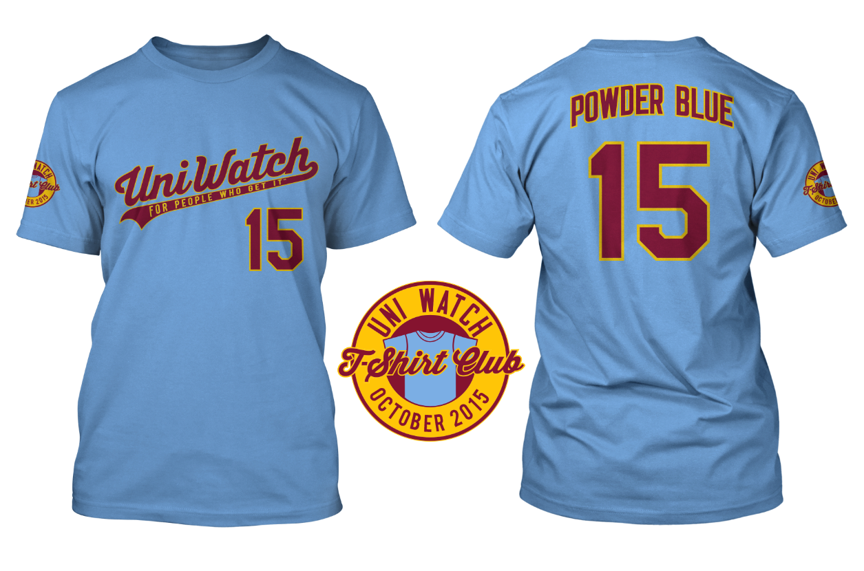
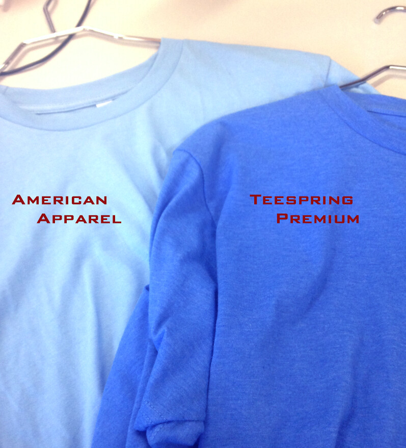
An important note: If you go to the ordering page, you’ll see that we’re offering three different T-shirt brands, each of which has its own shade of powder blue. American Apparel is the lightest shade and Teespring Premium is the darkest, with Gildan in between. Here’s a photo of the AmApp and Teespring fabrics (click to enlarge):
So compare the color shades, and also use the sizing chart for each brand, to choose the shirt that’s best for you.

Mike’s Question of the Week
By Mike Chamernik
My brother and I have plans to attend Saturday’s Twins/White Sox game at Sox Park. I checked the promotional schedule, and the Sox will hold “Halfway to St. Patrick’s Day,” an annual event that honors the city’s South Side Irish. The Sox will wear green-pinstriped jerseys and green caps.
It should be fun to see the Sox green-clad that evening, if only for the novelty. I don’t believe I’ve ever attended a holiday-themed sporting event before.
My question is, what are some of your favorite and least favorite holiday-themed jerseys from over the years? I haven’t really cared for the NBA’s Christmas Day unis from the last few years, but the 2015 offerings look really sharp. I’m excited for that day.
The Ticker
By Mike Chamernik

Baseball News: The Royals set a team attendance record this season. The fan who officially broke it received a 2,477,701 NOB jersey (with No. 15 on the front and back) that was signed by the team. … Check out these 1996 Expos World Series phantom tickets. They’re even in French! … Hank Aaron wore a Mets cap during batting practice at an old timers game in 1979 (from Ferdinand Cesarano).

NFL News: The Browns’ orange numbers on their brown jerseys make it hard for coaches to identify players when they watch game film (from Thomas Moore). … The Washington Post is holding an NFL mascot bracket, based on who readers think would win in a fight. The champion will have to be the Titans, right? They’re divine beings, which are much more powerful than a ram or Texan. To sidestep any potential issues, Washington is represented by a Hogette and the Chiefs by a wolf. Also, the Chargers aren’t some electrity-conjuring menaces; nope, they are Dodge Chargers (from John Gagosian). … A site ranked all 32 NFL logos. It’s like what Grantland did with the NBA two days ago, only with considerably less thought. … A few people sent this in: Mitchell & Ness made a graphic with the best players to wear each number from 00 to 99. No. 6 threw me off, though, because I thought it was a misspelled Jay Cutler jersey. Nope, it’s Kevin Butler. … The Bears wore orange number practice jerseys yesterday. The look mimics the “Monsters of the Midway” throwbacks they will wear on Sunday against Green Bay (from Tom Juettner). … The Seahawks have a couple things going on with Starbucks (which is Seattle-based, of course). The coffee chain is giving out cup sleeves with 12th man jerseys on them, and it is selling gift cards with Hawks logos on them (from Jamin Svendsen and John Przebieglec, respectively). … Also, Seattle residents can get Seahawks-themed library cards. … Browns WR Terrelle Pryor switched to No. 17. … A designer mocked up some team concept helmets (from Phil). … The Jets will wear white jerseys for their first three home games. … After a year in Oakland, WR James Jones returned to the Packers this week. TE Richard Rodgers gave him back his No. 89. … I don’t know the context of this logo, but here’s a moose mashed up with Flying Elvis.

College & High School Football News: New helmet stickers for Pitt (from Robert James). … Air Force will wear 1985 throwbacks on Saturday. … It takes a little bit of time for Utah’s equipment staff to apply decals onto the Utes’ black matte helmets. Here’s what they’ll wear on Friday (from Landon Freter). … Fresno State will do a blackout against Utah next weekend (from Phil). … Toledo has more than a dozen uniform combinations. … Here’s a look at Syracuse’s all-orange unis. … Arkansas’ Blytheville Chickasaws, a high school team, has some creative helmets (from Larry Morris). … Fans wanted to see Colorado State’s helmet stickers. … Nashville’s Hillsboro High School has two-toned uni numbers. The school’s nickname is also the Burros (from Tony Shiffman).

Hockey News: New dark jerseys for the SPHL’s Pensacola Ice Flyers (from Ryan Bohannon). … Connor McDavid, the Oilers’ No. 1 overall draft pick this year, is the first notable hockey player to sign an endorsement deal with Adidas.

Soccer News: The club 1860 Munich unveiled Oktoberfest-inspired Lederhosen uniforms. … Wayne Rooney was awarded a No. 50 jersey to commemorate the 50 goals he’s scored for England, which is a team record (from Graham Clayton).

NBA News: Bulls F Nikola Mirotic is Montenegrin and plays for Spain in international hoops. After a loss to Serbia in EuroBasket this weekend, a fan waved a Serbia flag in his face while he was leaving the court, and Mirotic ripped it apart. More details here.

College Hoops News: New shorts for Indiana? Last year, the Hoosiers had thicker red stripes at the bottom. … New white uniforms for Baylor. … New throwbacks for Western Kentucky.

Grab Bag: New logo for fashion company DKNY. Here’s how nonsensical my brain is ”” whenever I see that acronym I fill it out to stand for Donkey Kong New York. Why? I don’t know. … Apple execs have a fondness for wearing purple. Paul just cranked up his Zune in disgust. … New logo for Chicago’s Moody Bible Institute (from Aaron Telecky). … The Eugene (Ore.) School Board is considering a five-year, $300,000 deal with Nike, where the company would outfit its high school teams (from Phil). … A Russian volleyball player wears a mask to protect a broken nose (from Jeremy Brahm). ”¦ Golfer Michelle Wie now has rainbow-colored hair.
Reminder: Phil and I will be at this gallery show devoted to sports-centric design, curated by longtime Uni Watch pal/ally Todd Radom, tonight. We expect to be there from about 6:30-8:00pm. Hope to see you there.
Didn’t the Cleveland Browns try a orange number during the 1984 preseason and end up scrapping it because the coaches and fans found it too hard to read? Why did they do it again? They have a great iconic uniform and they ruined it with the makeover. This comes from a lifelong Steelers fan!!!
Better be careful there, Paul may make dispute what a makeover exactly means!
Anyways, I think the bext example of what a rebrand is, is the New Orleans Hornets becoming the New Orleans Pelicans.
Then the Charlotte Bobcats rebranded themsleves as the Charlotte Hornets.
Also the Atlanta Thrashers rebranding themselves as the Winnipeg Jets.
I totally agree, and am I diehard stiller fan as well. They were a top look in the league before this travesty. I even loved the gray face mask, I looked very rugged and classic, and they were the last to have it. If you are the only one to have a classic feature, like Paul says with color, own it. They at least match the the awful on the field play with their look. By the way, what has this decade done to it’s redesigns? Every one has been loud and obnoxious with neon colors, reminding me of the teal craze of the early 90’s.
I even loved the gray face mask, it looked very rugged and classic, and they were the last to have it.
No, they weren’t/aren’t. That award goes to the Raiders, Cowboys, and Cardinals, all 3 of whom have never worn a facemask that wasn’t gray. The Browns used white facemasks for 30 years. They brought the gray back in 2006, coinciding with the team’s 60th anniversary as a “returning to our roots” marketing gimmick.
Wow, I’m eating my words lol. I guess I forget because they all have a white or silver helmet. It looks great on the Browns though.
“It looks great on the Browns though.”
Correction: Looked. Was soooo much better than the current brown. We probably won’t have a chance to see the grey mask again till the team’s 75th anniversary in 2021 at which point fans with good taste will be clamoring for a return to something like this:
link
“The Browns’ orange numbers on their brown jerseys make it hard for coaches to identify players when they watch game film.”
I LOL’d at this. The moment they were unveiled, I thought (as I’m sure many of you did) “Orange on brown? Hard to read.” It’s taken till Week One for them to figure this out?
Not only was this an issue in 1984, but even in the Browns very first season (1946), there was an issue with orange numbers on the brown jersey. The Browns first two games that season featured two games with orange numbers (with white drop shadow) on the brown jersey. By Week 7 of the ’46 AAFC season, the Browns had changed to plain white numbers on their brown tops.
A case “those who forget the past are doomed to repeat it.” Or something like that.
I couldn’t agree more, Art. The Browns (and yes, I’m from Cleveland) had the best and most recognizable uniforms in the game from 1946 until 2014, but they sold their soul to Nike, and now the Browns look like a middle-school team. Otto Graham must be spinning in his grave. Great article by Paul, though. Brands, like car salesmen, are not our friends!
Because Nike is a company full of buffoons and teams that allow them to control them have no spine.
The leagues are paying Nike et al ZILLIONS of dollars to make their teams look like crap. So who’s the buffoon?
Actually, Nike is the one that paid the league ZILLIONS of dollars to get the NFL uniform contract.
Ha! True that. Spending money to make money. I’m sure Nike is confident they will reap even more ZILLIONS* for the contract.
* I really wish that were a real amount. Fun to read… especially in all caps.
Great piece today. What about the Canucks radical redesign to the V jerseys in 1978? At the time, the blue and green jerseys were considered really bland, in my opinion because the Durene material used at the time didn’t allow the colours to pop like modern materials. There was a lot of talk at the time about how the Canucks spent $200,000 for the design ( an outrageous sum at the time), and how it was intended to give the players a psychological boost.
Clearly this was a redesign, but was it also rebranding, considering the team name etc. stayed the same? And was this an early example of the phenomenon we are all now familiar with? Were there earlier examples?
This is arguably rebranding. But the term wasn’t used as much in those days, and it *definitely* wasn’t applied as much to sports, in large part because there wasn’t as much merch.
I’ll guess that if you went through all the press releases and coverage of that Canucks’ change, you wouldn’t find the word “rebranding”. That’s more recent marketingbabble.
Vancouver’s change was extreme enough to fit what Paul is calling rebranding. There are certainly older examples: Colt .45s to Astros, Phillies to Blue Jays. I don’t know how big a deal it was when the Pirates went from red and blue to black and gold in 1948.
Phillies to Blue Jays was not a complete change, though; they never completely dropped the Phillies moniker, and that was the name that remained on the front of the jerseys. And from what I can tell, the reaction to the Blue Jays name was mostly one of apathy.
Colt .45s to Astros can definitely be called a rebrand, especially considering it was an issue over the use of an existing brand – Colt’s, and its Single Action Army pistol, to be precise – that forced the team to change their name.
Okay, having a page that explains the choices on that M&N By The Numbers image really helps. Yesterday all I saw of it was the image circulating on Twitter, without a link to the page itself, and so I couldn’t quite identify some of the NNOB numbers. I mean, I got Starr, Nitschke, and Ditka right away, but 37 threw me for a bit – I thought it might be Doak Walker, but the blue seemed a bit light for a Lions jersey.
And I think it’s a bit of a raw deal that Otto Graham didn’t get so much as an honorable mention for either 14 or 60.
Yes, the write is nice to see. It’s good to see some of MY faves/picks honorably mentioned.
However, the absence of Sammy Baugh (33) altogether is a crime!
EXACTLY my thought on Sammy Baugh!!! Whiskey tango foxtrot???
I can maybe accept Starr for #15. But to mention Jack Kemp and Neil Lomax but not Steve Van Buren??
As a ‘Skins fan I beg of you:
Can we please kill off the Hogettes once and for all. It’s been 30 years people!!
No. No we can’t. They’re just as intertwined into Redskins history as the Dawg Pound in Cleveland.
I could do without the dawg pound too.
The “Black Hole” also.
Does the carpet match the drapes?
Great post about rebranding. Spot on. QOTW: I do like that the New Jersey Devils try and break out their red and green throwback alts on St. Patrick’s Day. I like the way that fits.
I’ve always been a little puzzled by that one, because red/green are Christmas colors. Seems like that would be a better holiday for that uni.
Yes, but the NHL has a short Christmas “holiday.” No games, practices, call ups, or trades from 12/24 to 12/26, IIRC. At least you can play a game on St Patrick’s Day.
I agree with the overuse of “rebranding”. Glad that UNC and Nike went with “refresh” earlier this year.
Maybe the Browns coaches should try watching on a better screen. Bright freakin orange on a dark background is not hard to read. If it was, the Bears would be having the same problem with those throwback uniforms… but they aren’t.
I’d love to hear from anybody who watched the Cleveland @ Tampa Bay game and see if they concur with The Jeff on the legibility of the uniform numbers on TV.
Of course, if the coaches are having problems with the numbers when watching live from the sidelines, that’s another thing.
I had no problem reading them on TV, but white with a orange drop shadow would look much better IMHO.
I don’t think it’s so much the orange as the stupid unnecessary white shadowing that’s creating it. The Bears numbers are easy to read because there is enough negative space inside them.
Since this is a new Browns franchise I suppose nobody knew that the 1984 Browns introduced new jerseys that featured orange numbers with white outlines on brown jerseys. Those numbers also were very hard to read and led to new brown jerseys with white numbers and orange outlines being used in the regular season. The new design lasted one year before being jettisoned for the traditional Cleveland Browns design in 1985 (we can only hope).
People who use the word “rebranding” are probably the same people who insist on calling a room in their home a “space”. STFU. That “space” with a toilet is, and will always be, a bathroom. The “space” where I cook is my kitchen. I hate jargon.
I really appreciate you Paul for your efforts and pioneering uniform journalism. And yes, your blog is your own self made appropriate soapbox to speak your opinions. It’s just, I really don’t relate to some of the axes you choose to grind. When you do these pieces about how You feel towards a topic, they feel condescending, as in, if We don’t agree then We are ignorant. No more case in point when you do your own Q & A’s to back your own points up.
I love this site, I’m here every morning after walking the dog. That won’t change.
I do however like reading more about your thoughts on uniforms instead of your thoughts on social behaviors.
I do however like reading more about your thoughts on uniforms instead of your thoughts on social behaviors.
In other words, you don’t care for cultural criticism. There’s nothing wrong with that — nobody is obliged to like cultural criticism. But this site is, among other things, about cultural criticism. Complaining about that is like complaining about water being wet.
I appreciate your kind words and devoted readership — thank you. And I’m sorry Uni Watch isn’t always exactly what you want it to be. Life is like that sometimes.
I like when you shake things up and get people out of their comfort zones. If people are afraid of a little social commentary which awakens them from their apathy, all the better.
Meh. Whatever. Hunh??
I love your point of view on social behaviors. There’s so many instances when the term “rebranding” makes me cringe. Here’s my anti-social behavior one liner:
“Re-branding” – sounds like something Nazi’s would do after moving you to a new work camp.
I think the DBacks and Rays are the best middle ground for a “redesign or rebrand” test. DBacks: no name change at all and both the cap logos stayed with the color change. Rays: lost a word in the name even though the word Devil had been kept off the jerseys for some time, new colors, new main logos, but the manta ray on the sleeve inexplicably stays. So if it’s like the DBacks or less radical, it’s a redesign. If it’s like the Rays or more radical, it’s a rebrand. If it’s in the middle, then tweak my test.
QotW: I’m a curmudgeon. My favorite holiday jerseys are in the NHL (haha, for warmups only, meaning the game looks proper) and when teams stay within themselves and use what they have. One time in NCAA basketball, Kansas wore “twice a year because Adidas makes them and makes us wear them, even though we are blue and red is bad luck for us” red against Ohio U in green on Xmas. Cool. Or Bulls red at home on Valentine’s Day. Nice. OK, you want a real answer? When the Boston Celtics celebrate St. Pat’s with special green jerseys with metallic gold trim, hot damn those look sweet.
The other misapplied term that bothers me is “curate.” Especially when it’s used to mean “merchandising.”
Marketing terms like “Rebranding,” “Curate,” “Refresh,” “Reboot,” etcetera? They’re all about merchandising.
I never realized the Dolphins logo contained a sunburst, I had always thought the porpoise was jumping in front of a Ring of Fire! Learn something new every day.
Hear hear. But I would submit that branding can have a non-pernicious, authentic place for sports teams. A team is a sort of community asset, and in modern Americ our sports teams often stand as representatives of localities. As our culture has grown more national and homogenous – due not only to mass media but also to the greater geographic movements of Americans – we’ve lost much of our older social/cultural markers of local identity. Sports teams are one of the few institutions that still express a coherent idea of local identity. So when a team can establish a brand identity that speaks to local or civic identity, that’s a good thing. Take the Yankees: The team’s insufferable brand identity nicely represents a local character that is at once something that many New Yorkers love about their city and that most Americans dislike about the Big Apple. The Mets, to a lesser but still significant extent, express a different, more working-class part of the New York identity. You could put the Padres in any American city and cause no confusion. But put the Mets in even another classically working-class Northern city – Cleveland, say – and it would seem dissonant. There’s something distinctly New York about the Mets, even if less so than for the Yankees. That’s the kind of branding in sports that I’d argue is actually virtuous, a civic good. Not many teams have it, but it’s something every team could pursue with its marketing/branding strategy. It’s also an approach more likely to show positive results for the bottom line than chasing generic natuonal popularity.
A few thoughts:
1) I have long maintained that sports teams are not just business entities but also civic entities, so I agree with Scott’s underlying point here.
2) However, that underlying point has been hijacked by an endless parade of “pride” uniforms that signify pretty much nothing aside from a desire to sell more merch.
3) Trust me, there is nothing “working class” about the Mets. Their brand identity, such as it is, is suburban. That’s been their defining value (and contrast to the Yankees) during the Wilpon administration.
Wholeheartedly agreed, with this and with the branding rant up there. And this is coming from a sports designer. :-)
Isn’t practically every city “blue collar” in some form or another? No town can be completely patrician or white collar since somebody has been taking out the garbage and fixing the plumbing.
Is Milwaukee so different from Detroit, Cleveland, or even Houston? Cities often spring up around industry and sports teams spring up from cities.
Some cities are (or at least were) more oriented around production economies, while others are more oriented around service economies, or tech, or education. It’s a real distinction, although it’s usually overhyped.
I’ll take your word about the Mets. But I would put out there that just about any time a wage-earning character in the little crime vignettes at the beginning of “Law & Order” is talking about baseball with somebody, he’s talking about the Mets. When it’s a yuppie, he’s talking about the Yankees. That’s a pretty common trope in American entertainment, and it wouldn’t work if it didn’t telegraph a lot of cultural significance to the average viewer.
Baylor: Still the worst!
Google has a Football themed header today. Not sure who designed the field though. Doesn’t look regulation to me.
link
I thought that was rather odd too – not the kind of sports they usually highlight. I am calling NFL out on slipping something under the table to them.
“Nashville’s Hillsboro High School has two-toned uni numbers. ”
Yeah, those are easy to read.
I’ve always called the scent of my facts as my “personal brand”
I coach for a black and orange school. Last set of uniforms are black with white numbers because it is a huge issue. Coaches tape is not TV quality, even at the NFL level. Those coaches want to be able to do their tape work everywhere with the new technologies like Hudl. The colored numbers are a huge issue. Worst though is red/blue. I hate scouting tape of teams with blue uni/ red numbers or vice versa. You can’t read a thing. I end of scouting by shoes and hair bands.
QOTW:
This is off-topic, but since you are going to a White Sox game, beware:
If you buy a ticket for the upper deck, or mid-level seats, you will only be allowed to walk the upper deck concourse, or mid-level concourse. Only field-level ticket-holders get to walk the field-level concourse. I’ve been to 20+ stadiums, and Sox Park (good name!) is the only one with this stupid policy.
I think it’s always an official policy, but they are more lax for some games than others: No way you’re getting to the lower level on a Saturday against the Cubs, but on a Tuesday against the Mets they don’t really care.
Dodger Stadium does this, too, though it’s more due to the tiered design in the hillside.
Did the Bears wear NOB when Sayers played? That’s the jersey in the M&N that doesn’t look right to me. Though I’d have put Manning’s Colts jersey instead of Bronco.
Nagurski’s looks a lot less right…
Emlen Tunnell never wore a NOB either.
The 77 for Roaf is even worse… That graphic certainly doesn’t make me want to buy any of their products if that’s how little they care about accuracy.
The NFL went NOB league-wide after the merger was completed, and Sayers played through 1971, so his last two seasons, he would have had an NOB jersey.
Donkey Kong New York! Haha!
Paul,
Just wondering how you feel about the Florida Marlins becoming the Miami Marlins. Would their model be akin to the Rays or the D-Backs?
I’d say no. Ditto for the Phoenix/Arizona Coyotes.
Sometimes what college teams call rebounding is just a new organization of their logos and colors and trademarks.
Big Mitchell & Ness fan, but man do they love the Broncos!!
DeMarcus Ware and Peyton Manning are fine for this concept, but not as Broncos. Please.
QOTW: can’t find a photo, but have seen some German club hockey teams with traditional Christmas themed jerseys with winter snow scenes, etc. Kind of looks like a box of Christmas cookies, then layered with ads. Done well, it can be a nice look despite my description.
Thomas Sabo Ice Tigers Nürnberg ?
link
link
That’s it!!!!!
My favorite holiday-themed uniform is none. Decorate the court/field if you must, but leave the uniforms alone.
Well…OK…I suppose when the New Orleans Hornets did the Mardi Gras thing, that was cool. I wouldn’t consider it a loss, though, if the rebranded Pelicans didn’t do it in the future.
I think it’d be great if more teams recognized their local traditions/holidays like the Hornets. I’d like to see the Sabres sporting Dyngus Day* themed unis.
* link
I’d like to see the Buffalo Braves with Dingus Day unis, but I guess that (Clipper) ship has sailed…
*Dyngus…
Re: Connor McDavid signing with Adidas
He may be the most recent, and he is pretty darn notable, but come on, you’re treating Mike Cammalleri like chopped liver!
link
I agree with most of what Paul said, especially regarding the use of “rebranding” as inaccurate.
That said, the guy who wrote the article Paul shared sounded like a complete douche. Let us all hope that we never become as jaded and disgruntled as that sad sack.
Not sure which article you’re referring to. If you mean Sam Biddle’s “Brands Are Not Your Friends” piece, Sam happens to be a brilliant and highly influential tech writer. I don’t know him personally and have no stake in polishing his apple, but he’s really good.
Rebranding is always tied to team success, while some despise the Vancouver Canucks “V” look, others associate that set with the club which made the Cup Finals in 1980.
The Tampa Bay Rays were very successful from 2008-2013 with a very bland set(in my opinion), but the on field success elevated those uniforms. Conversely, the New York Giants rebrand in the mid 70s, is a look I like, but many others associate that uniform with losing.
Two words: Joe Pisarcik
Or do you mean the “Modern” ny?
Just have to point out that the Canucks were in the 1982 Finals, not 1980 (that year was Flyers vs. Islanders).
I noticed that Randy White was the choice for Mitchell and Ness’s best #54. What’s funny is that M&N used to make a White jersey, but doesn’t anymore, so instead used a clearly fake knock-off jersey for White’s picture. Seems odd they couldn’t just find a pic of their old jersey.
…Branding is, for the most part, about lies and deception. It’s about presenting a false image?
Huh? A false image? A lie? WTF? Very funny. Trumpesque in its falsification to the rebranding term. Well played.
However, the reality is that a sports team rebrand is when a team or league set out redefine and reshape discussions and attitudes about what their fans (their customers) feel about their club(s) — and ultimately how they can engage (or re-engage) with their product, service or “experience”. That’s not lying— it’s call ‘repositioning”.
Changing the size of a team numerals is REWORK of a detail.
1995-96 Rockets = REBRAND. (no one is lying about that…)
The Oregon Ducks = BRAND EXCESS to drive awareness. Ugly? Yes. Discussion grabber. Certainly. Lying? No, it’s gross.
Non-sports uni-afficiandos would benefit from whipping through this basic but spot on THE BRAND GAP by Branding Icon Marty Neumeier. It’s long on pages but quick content.
And he’s not lying?
link
If you drink a certain kind of corporate Kool-Aid, this comment makes sense.
But back here on planet Earth, it’s just marketing-babble.
Much better analysis of branding here:
link
I’d also like to do away with Pick 6.
Matthew Stafford? Is that you?
QOTD: This one is a no-brainer. The Calgary Hitmen wear a Christmas-themed jersey every year the day they do the teddy bear toss (to collect bears for the Children’s hospital).
link
link
I don’t love their logo (that weird skull thing) but the skull wearing a Santa cap is perfect.
Typo alert: in #5 in the re-branding piece: “Are there are teams that have developed legitimate brand profiles?” One too many “are”s.
Thank you! Now fixed.
“That’s assuming you think a football team can “stand for” anything besides playing football, which I’d say is iffy at best anyway.”
I think this is a key point. Are there any sports logos that stand for anything besides playing the sport?
There certainly aren’t any sports logos that stand for something the way that (say) the Apple logo or the Mercedes logo stand as shorthand for something
“That’s assuming you think a football team can “stand for” anything besides playing football, which I’d say is iffy at best anyway.”
Warning: Brief Hijack.
This point leads to my beef with those who allegedly are offended by Indian sports team names and logos. The team names and logo only stand for the team playing, they don’t stand for disrespect to anyone’s heritage, religion or ancestors. The Washington Redskins stand only for the NFL pro American football team that plays its home games in suburban Washington DC somewhere. Period. Stop. Chief Wahoo stands only for the MLB team that plays its home games at the ballpark at East 9th & Carnegie in Cleveland OH. Period. Stop.
You may now resume your regularly scheduled comments.
Uh, no.
So if a team decided to use a swastika as its logo, or if it called itself the Rapists, or if its logo were an extended middle finger, all of that would be fine because, after all, it’s just a sports team?
Nuh-uh.
Just because a team is just a team, that doesn’t mean that boundaries of taste and decency don’t exist, or that the team can’t overstep those boundaries with its messaging and symbology. We can debate whether the ’Skins name or Chief Wahoo fall into that category (I say they do, you may disagree), but the debate itself is a real one, and it doesn’t disappear just because most sports “branding” is marketing-speak bullshit.
My advice to anyone wanting to think deeper about issues like branding is to read Naomi Klein’s book on the topic. The book is a bit dated now (1999) but its still a stunning read on the topic of branding
link
In regards to the DBacks – “I’d still call this a redesign, although I wouldn’t argue too hard with someone who called it a rebrand. This one could go either way.”
I agree that it is a redesign. However, for the sake of your argument, I believe you should be more decisive here. If the word “rebranding” is spread throughout the uni-verse and needs to stop, then maybe you should give us a more definitive answer. Any indecisiveness here from a uniform expert won’t do much but just perpetuate the misuse of the word. Just a thought!
it looks like the Browns were just holding off using the orange pants in the preseason
link
I wish they’d wear brown socks with the orange pants and vice versa.
Lovely
Now we know why Aaron Rodgers was sporting adidas kicks at the PGA Championship back in August.
link
QOTW:
King Clancy – St. Patrick’s Day 1934
link
So that banner the Pats had ready to unveil if Brady hadn’t been reinstated has the number 1 styled like their wordmark, kind of interesting, I doubt it has anything to do with future changes to the numbers on the unis, but who knows.
Now Mississippi Valley State looks wonderful. Green hats , shirts and britches. I like the way Russell did their shirts. I just wish SU would have worn their blue hats.
I would agree with you that a Titan mascot would be the winner. Unfortunately our mascot is T-Rac… A racoon.
Though it should be noted that our mascot, as far as I know, is the only one to ever drive over an opposing teams quarterback during an actual NFL game.
link
“It all became moot in a preseason game against Tennessee, when the Titans’ mascot, T-Rac, ran over McPherson with his golf cart at the end of halftime, injuring the bursa sac in McPherson’s knee. The next week, Hurricane Katrina hit New Orleans. The week after, the Saints cut McPherson.”
‘Scuse me if I have my terms wrong. Mono-Gold means all one color right? How are the 29-30 Packers in today’s photo mono? Gold jersey with darker pants? Would royal blue and light blue be mono-blue?
I’m probably alone on this but I just don’t like white pants in football. (1st seems to be the 34 Eagles). I love the old look when they wore colors from khaki, through Carhartt work pant brown (orange) to dark browns. I think it had to do with the then current states of fabric, dying and laundry technologies. Add in the economics of pre-TV NFL and fancy pants just weren’t realistic.