The NFL yesterday announced this year’s 32 nominees for the Walter Payton Man of the Year Award, an annual award recognizing philanthropy and community impact. And the league also announced two new uni-related protocols pertaining to the award.
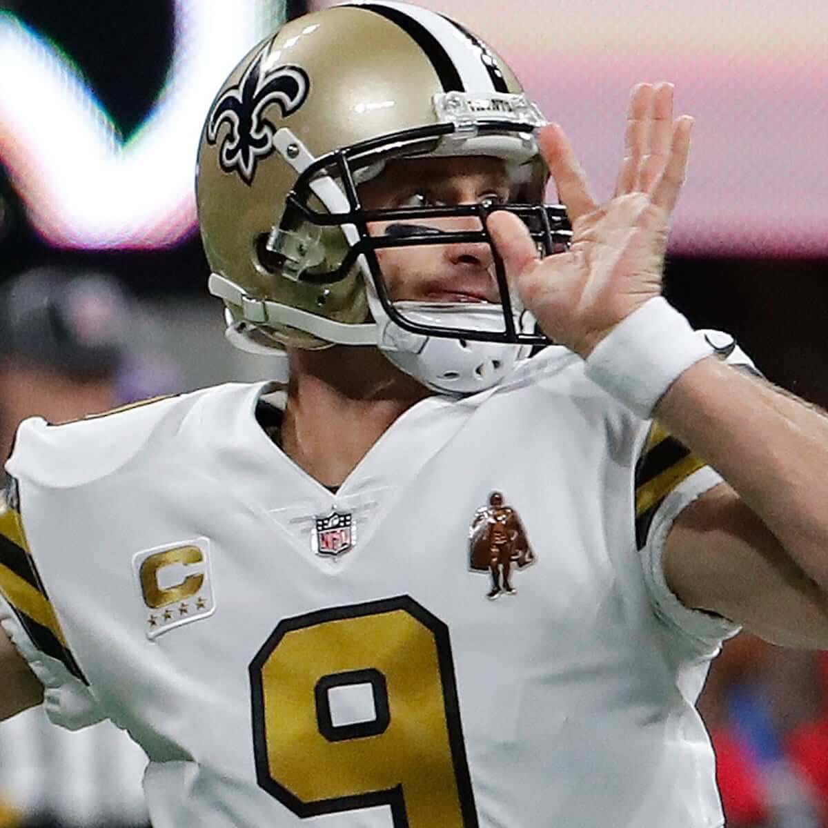
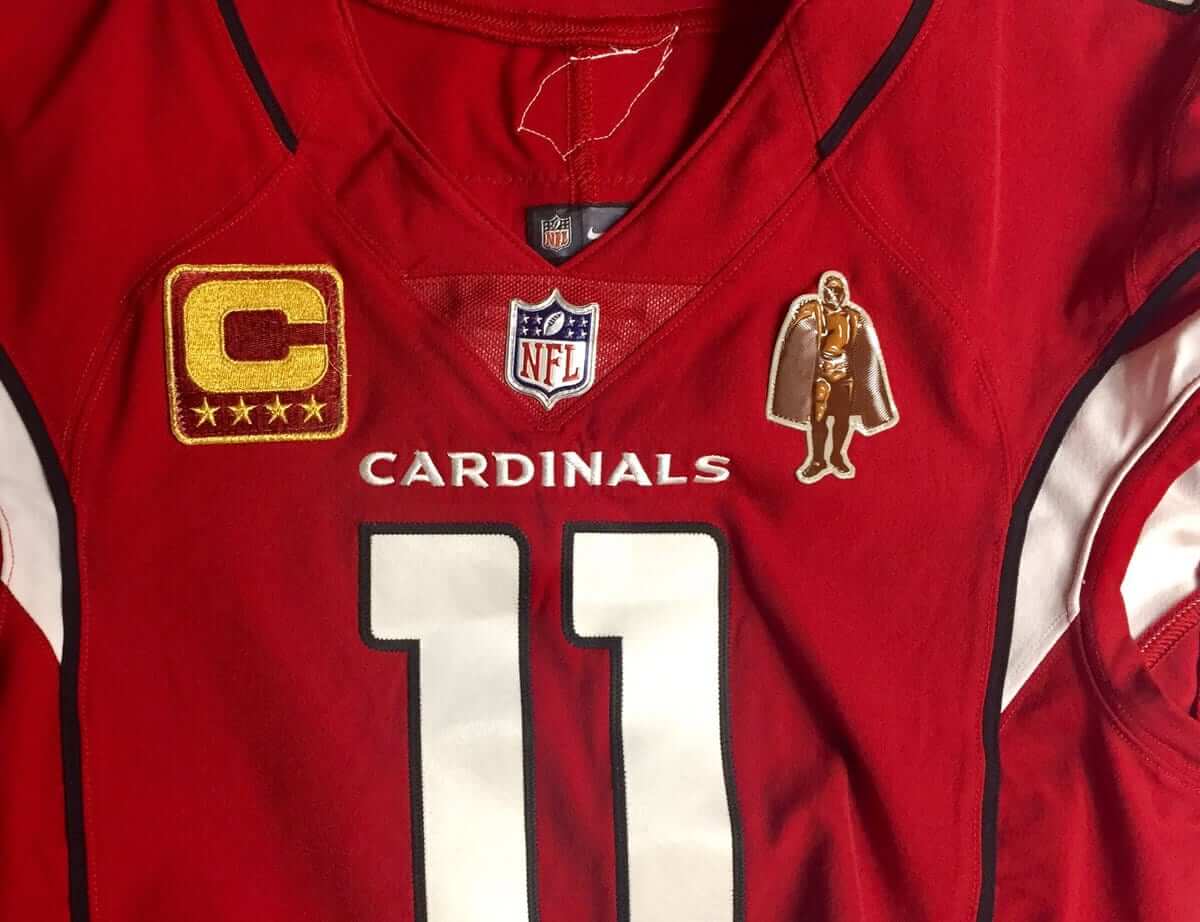
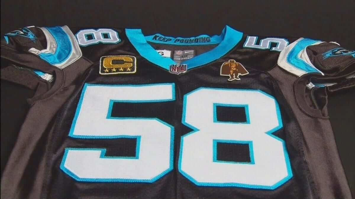
For starters, all active players who’ve won the Payton award will now wear a jersey patch for the rest of their careers. The first such player to do so was Saints quarterback Drew Brees, who wore the patch for last night’s game against the Falcons (see above). Other active players who’ll be wearing the patch, beginning this weekend, are Cardinals wide receiver Larry Fitzgerald, Cowboys tight end Jason Witten, Giants quarterback Eli Manning, and Panthers linebacker Thomas Davis.
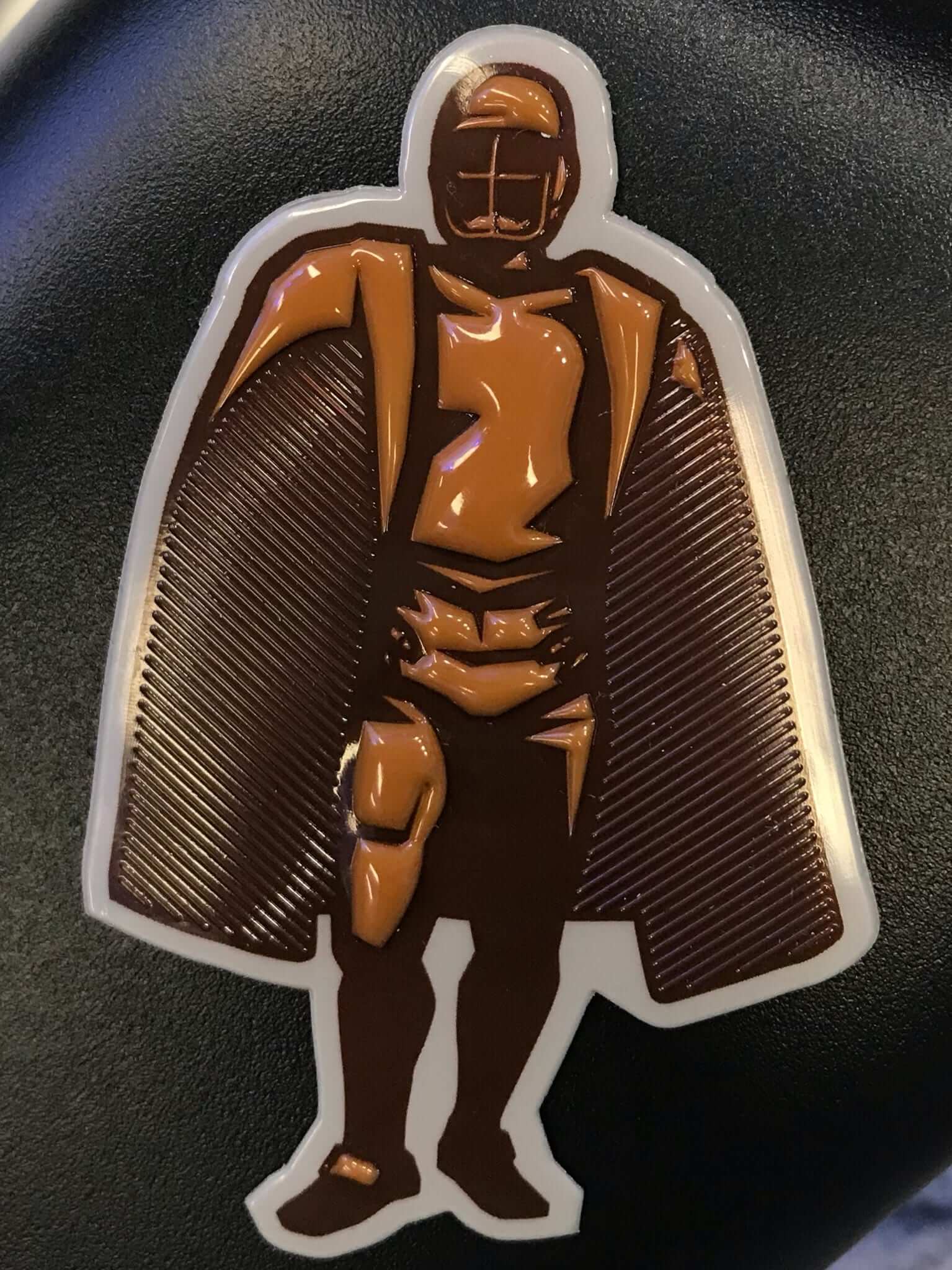
Here’s a close-up of the patch, followed by a glimpse at how it will look on Fitzgerald’s and Davis’s jerseys (click to enlarge):
In addition, this year’s 32 Payton Award nominees — one from each team — will wear a helmet decal for the rest of this season and postseason. This year’s winner will be announced on Feb. 3, the night before the Super Bowl.
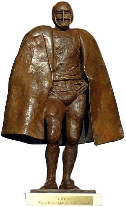
If you’re thinking that the patch doesn’t look much like Payton, you’re right. The patch is based on the Payton trophy (shown at right; click to enlarge), which was originally created back in 1969 (NYT link), six years before Payton’s first NFL season. The trophy model was a journeyman NFL tackle named Steve Wright. Back then, the honor was simply called the Man of the Year Award. It was named after Payton following his death in 1999, but the trophy has remained the same.
Payton appears to have been a great guy, and it’s nice to see the NFL recognizing something other than the military and cancer, but the feeling here is that a patch is too much. Manning, for example, already wears a captaincy patch and the Joan Tisch memorial patch (plus the NFL patch and the “ny” chest mark), which means the Payton patch will just add more needless clutter. A helmet decal would be the better way to go.
Also, having a player wear an honorific patch for the balance of his career seems like a bit much, especially for this type of award. The whole point of philanthropy, volunteerism, and other do-gooder enterprises is that you do them out of sincerity and commitment, not to bring attention to yourself. It’s one thing to be recognized for one night at an awards ceremony; it’s another to trumpet your do-gooder status on the chest of your jersey every week for years on end.
Just to be clear, I don’t blame the players — I’m sure it wasn’t their idea. But the whole enterprise feels a bit tone-deaf and overdone.
One final thought: I saw a few conspiracy theorists on Twitter last night claiming that this patch is designed to get people accustomed to the sight of extra patches and thereby soften us up for the inevitable move toward jersey ads. I suppose that could be true, but a logical counter-argument is that this actually works against the possibility of jersey ads because it creates a visual distraction on some of the league’s most high-visibility players. What advertiser would want that competing with his ad? Either way, I’ve heard exactly zero credible chatter about the NFL moving toward jersey ads, so let’s skip the conspiracy theories and stick to reality.
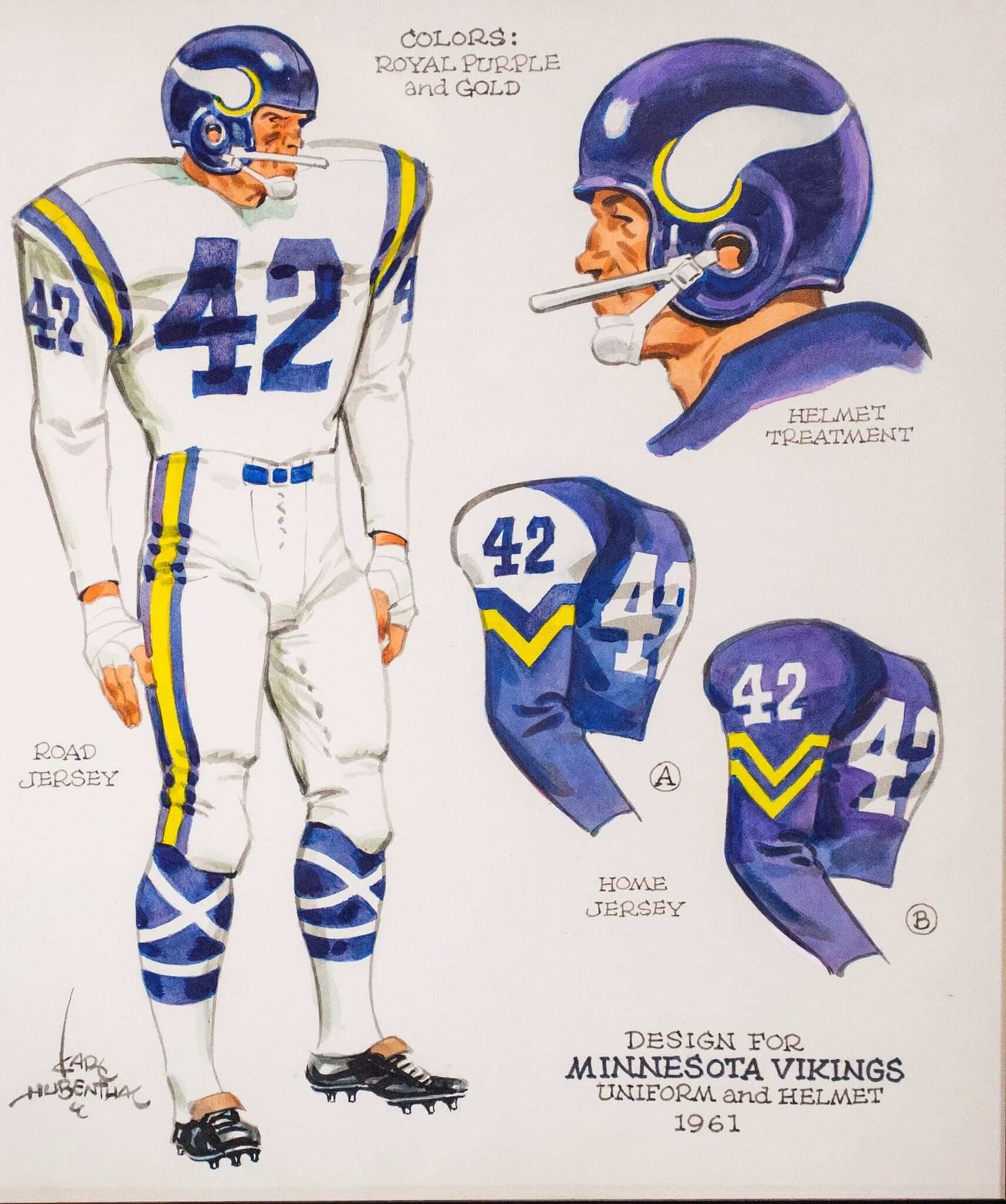
Vikings follow-up: Remember my recent ESPN piece about how cartoonist Karl Hubenthal designed the Vikings’ uniforms, and how he used purple and gold because those were the colors of GM Bert Rose’s alma mater, the University of Washington?
Several Vikings fans responded to that piece with counter-narratives — stories that contradicted the one I reported. So I went back and did a bunch of additional reporting (including an interview with former Vikings coach Bud Grant, who’s now 90 years old), in an attempt to sort which stories were accurate and which ones weren’t.
The result is a new ESPN follow-up column, which I think you’ll find very interesting. Check it out here.
Sticker update!: When I recently announced that StickerYou had created a little Uni Watch shop on their website, several of you got in touch to say, “Stickers are great — but what I really want are magnets.”
I’m happy to report that your requests have been heard. If you go to StickerYou’s Uni Watch shop, you’ll see that they’re now offering three separate options: sheets of stickers, individual singles, and magnets. According to the StickerYou folks, this is the first time they’ve set up a shop like this for one of their partners. Nice!
Click to enlarge
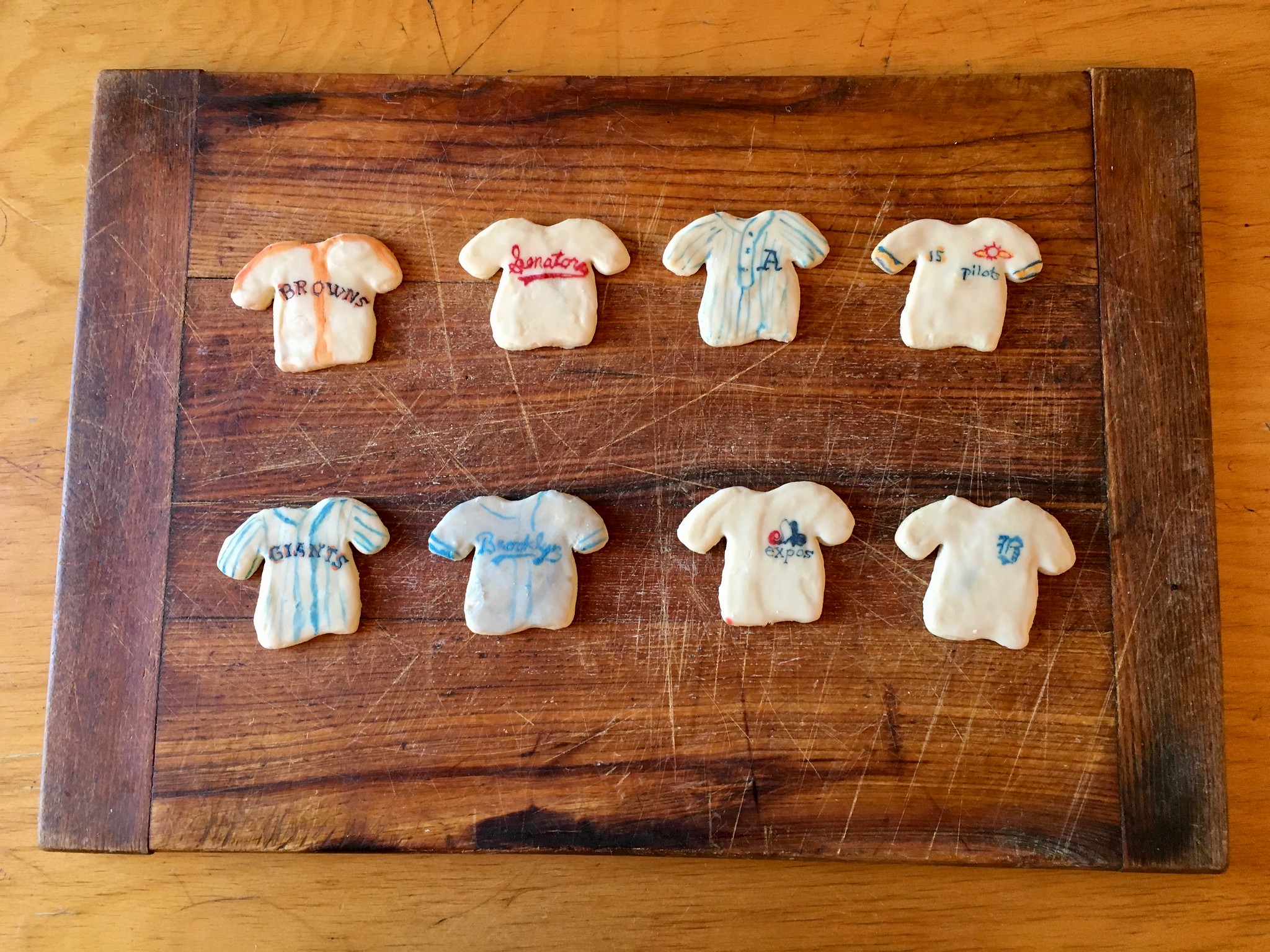
Cookie monster: An annual highlight of my holiday season is always the arrival of a package from longtime reader/baker Elena Elms, who always sends me a batch of homemade baseball uni-themed cookies.
Her theme this year is MLB franchises that moved and changed their name, their colors, or just their city. On the top row we have, from left, the 1945 St. Louis Browns; the 1970 Washington Senators; the 1917 Philadelphia A’s; and the 1969 Seattle Pilots.
The bottom row features the 1932 New York Giants; the 1945 Brooklyn Dodgers; the 1969 Montreal Expos; and the 1940 Boston Braves.
My thanks, as always, to Elena for her talent and generosity — a winning (and delicious) combination.
The Ticker
By Kris Gross

Baseball News: Orioles P Kevin Gausman is changing his number to 34 in honor of Roy Halladay. … Thanks to @TigersHistory on Twitter for creating a video showing the evolution of the Tigers’ Old English D. … Reader AJ Wilhelmi just bought a new Royals hat, thinking he was getting a 50th-season patch. To his surprise, it was actually a 25th-season patch from 1993. “Why would this be on a new New Era cap I have no idea,” he says. … The NHL’s San Jose Sharks wore Giants-themed warmups last night (thanks Phil). … Thanks to BSmile, who passed along this 1948 Satchel Paige Pennant. … The Birmingham Barons, Double-A affiliate of the White Sox, have unveiled new alternates (from Scott Stantis). … Kentucky players got their new gloves in, and Rawlings misspelled pitcher Austin Keen’s name (from Tyler Crum). … Here’s the Hanshin Tigers’ logo rendered as a subway map (from Jeremy Brahm). … When you think of Jim Thome, you probably see him wearing his familiar No. 25. Yesterday the Indians tweeted a photo showing that he wore No. 6 when making his MLB debut. But according to baseball-reference.com, he actually wore No. 59 prior to wearing No. 6 (from 216 Sports History). … If you take a closer look at that No. 6 photo, it appears that Thome also had American and Canadian flag decals on his batting helmet. Anyone know what that’s about? According to Thome’s 1991 game log, his MLB debut came on Sept. 4 in Minnesota, but his next several games were home games against the Blue Jays. Is there some reason the Indians would have added flag decals for those game?

NFL News: Here is your Color Rash matchup from last night between the Saints and Falcons. Reader Martin D. White says the white-vs.-red pairing made him think of God vs. the Devil. ” Not sure how I feel about this since I live in Atlanta,” he adds. … Also from last night, we had a runaway captaincy patch for one of the Saints players (from Stephen Kean and Dustin Hart).
College Football News: ForTheWin ranked the 12 most stunning alternate uniforms from this past season (thanks Phil). … Here is a cool story on the making of the Heisman Trophy (NYT link). “No two are exactly the same,” says the director of the company that creates them (thanks, Paul). … Former UCF head coach and current Nebraska head coach Scott Frost wore lapel pins for both schools at last night’s award show (from Hardy Wallbanger). … The Nike logo appeared on the rock at Tennessee to welcome the Vols’ new head coach (from Mike Stevens).

Hockey News: In a recent podcast about the Lightning, former player Dave Andreychuk talks about winning the Stanley Cup in 2004 and missing out on some of the cool things champions normally get to do because of the lockout the following season. Andreychuk, who now works for the Lightning, has the personalized George W. Bush jersey they would have given to the president if they’d had the chance to go the White House. Here’s the jersey, and you can listen to the conversation here. Skip to the 28:11 mark (from Joe Delach). … Cross-listed from the baseball section: The Sharks wore San Francisco Giants-themed warmups last night. … The Cleveland Monsters, AHL affiliate of the Blue Jackets, will wear Captain America jerseys on their superhero night (from Ben Adams). … This goalie mask for Roseau High School in Minnesota honors the high school’s wall of fame members (from Greg Enkers). … There’s a new hockey helmet on the market that has received a five-star safety rating from the Virginia Tech Helmet Lab, the first time they’ve ever given that rating to a hockey bucket (from Clark Ruhland). … The Penguins created a custom jersey for Anthony Daniels, the actor who plays C-3PO in the Star Wars movies. Custom tagging, too (from @j_canales87 and Jerry Wolper). … Senators C Jean-Gabriel Pageau, who wears No. 44, wore teammate Gabriel Dumont’s No. 40 helmet last night (from Brian Rowland).

NBA News: The 76ers and Lakers went color-on-color last night (from Daniel Spevak). … In a follow-up to yesterday’s sub-lede about the drop-down NOBs on the Grizzlies’ alternate jerseys, Kristopher Kolob notes that the drop-down NOB was shown at the Nike unveiling event in September, but the team posted a picture with a radially arched NOB on its website. “Not sure it was a last-minute change or just sloppy design edit,” he says. … It sounds like the Hornets may be getting white throwbacks. … 76ers guard JJ Redick said in his podcast he didn’t know who the Sixers’ jersey advertiser is, although he knew the Celtics’. Head to the 51-minute mark (from Joel Mathwig).

College Hoops News: Throwback unis for Old Dominion (from Jason Rhodes). … Texas Tech is hosting a throwback night at the Lubbock Coliseum. Here’s a look at the center court design (from Everett Corder). … The logo for the 2019 Final Four in Minneapolis will be revealed later this morning (from James Gilbert). … All of the Howard players appeared to change jerseys right before last night’s tip-off. Anyone know what that was about? (From Andy Moeschberger).

Soccer News: Here’s an article about the 1990 German World Cup kit, which the 2018 kit is based upon (from Andy Riley). … DC United tweeted graphics of the kits they wore during their MLS Cup appearances (from @OlegKvasha). … New 110th-anniversary throwbacks, complete with a lace-up collar, for SPAL (from Matthew Klimberg). … Here’s a piece on a 1972 game between France and the USSR. “It was possibly the first instance of front numbers and the Adidas trefoil being worn in an international game,” says Denis Hurley.

Grab Bag: Check out this slideshow showing three different stitching designs of the Brooklyn Bridge as shown on Brooklyn Gum cycling jerseys. … Tris Wykes had dinner last night with a Los Angeles-based friend and noticed something interesting: “His house’s emergency curb ID number features the college logos of his and his wife’s alma maters, the Universities of Washington and Minnesota.”
Proofreading:
“All Payton appears to have been a great guy”
I’m looking forward to the Vikings update.
Fixed.
The American/Canadian flag on the backs of helmets was done to support Operation Desert Storm in 1991. Several MLB and MiLB teams had this sticker, and a few minor league teams had a larger sleeve patch:
link
I have no memory of that. It was pre-Uni Watch, but still. Thanks for the explainer!
Interesting find while looking this up: Andy Van Slyke got in trouble for removing the Canadian flag decal. Unfortunately no pics of this (but plenty of full decal on Getty from that season).
link
turns out he’s a bit crazy
link
Yup, we even added the US flag patch to our youth hockey jerseys (which I still have) during Desert Storm.
I was all ready to be impressed that the SPAL throwbacks don’t have a hidden maker’s mark and advertisement like Juventus’s from a few weeks ago….
….aaaand there’s a Macron logo at the bottom of the sleeve. Gross.
Interesting that Gausman went with 34 to honor Halladay instead of 32. He only wore 34 during his 4 seasons in Philadelphia.
I can understand the association though, because Halladay in 34 was the last part of his career and when he played for an American team (which, let’s be real, affects TV coverage and exposure). Add a couple of signature moments like a perfect game and a playoff no hitter, and I’m not quibbling. Even though 32 appears available.
Just a guess, but Gausman made his major league debut in 2013, which was also Halladay’s final year. It’s possible he chose 34 because that’s the number Halladay wore the only year they were both in the league.
Also, Gausman was 22 years old in 2013, meaning he was 19 when Hallady joined the Phillies. So it may just be fresher in his mind.
I just think it is interesting. When Halladay goes into the HOF, we all probably expect him to go in as a Blue Jay since he spent a majority of his career there. then you see something like this and it makes you think whether he was better known as a Phillie?
New Era makes several MLB caps that have older commemorative patches from previous years, including several caps for teams using older World Series logos. That Royals cap is presumably one of those caps.
The team may not have worn them on their caps on the field but that doesn’t stop New Era from selling hats with that logo.
Re: Grizzlies showing this year’s new alternate jersey with radially arched NOB on their website instead of the drop-down. Are we sure that was not just a photo from last season? Or a jersey on sale left over from last season? Any link to the photo/story on their website?
Yes, we presented that link yesterday. Here it is again:
link
Oh yes, thanks! My apologies. Did skim the story on the drop-down name but missed this and did not click on the link.
I like the drop-down name on basketball jerseys. Nice optional look for the Grizzlies for their alternates.
Still, to me best Grizzlies uniform will always be this for obvious reasons:
link
Once the Grizzlies left town, my favourite team became just another team. At least we could always go down to Seattle to still catch NBA games, right? And then….
The WPMOTYA patch looks like an iced gingerbread cookie.
I wonder if the NFL even consulted the Payton Award winners about the patch. It seems to me that they’d find it a little embarrassing.
Yes, they did consult with the players. More details here:
link
Damm, I thought it was a Darth Vader Star Wars promotion.
I had the exact same thought. From the long shot of it, it looks like Darth Vader outline.
Same!
Same! I don’t mind the idea of the jersey patch (although Paul makes good points against), but the execution is laughable.
These plastic patches look like Shrinky Dinks. I’m tempted to put one in the oven and see what happens.
Is it me but the long shot of the Payton patch looks sort of like Darth Vader.
I thought it was Captain Morgan at first.
Looks like Darth Vader for sure. I thought the same thing when I saw the first pic on this post. Maybe a Bears-colored “34” would have been a better choice?
Lids has been selling a line of MLB caps with random historical patches on the side, not always corresponding with what caps the teams wore when they wore the patch. Twins 40th anniversary, Brewers 25th season, that sort of thing. Here’s the Royals 25th anniversary version:
link
I really liked the Saints in all white with gold numbers!
Any all red (or all black for that matter) uniform looks forced to my eyes.
Yes. The Saints all-white uniforms are an improvement over their current, regular unis. Those white jerseys they wore last night are beautiful!
I definitely agree with Paul on the patch. It’s just more clutter, and it would have been better served as a helmet sticker.
I hope that the Lightning can get that jersey to George W. Bush. That long lockout complicated things.
Just a small edit: The bit on the royals cap in the ticker is sending me to the download link as opposed to the image link
I’ll second (or third or forth) everyone else here that says 1) it looks like Darth Vader, and 2) it seems force and adds clutter.
Also the plastic (“chrome”) looks brutal, it is a sad day if patches have officially transitioned from the beautiful stitched design to these eye sores.
RE: Falcons color rash. It wouldn’t be too bad if they had black socks.
If you want see a parade of bad NFL helmets, just take this quiz!!
sheesh!
link
Many of those helmets were so inaccurate. The people who rendered those helmets didn’t do their research.
Owners of click bait sites should get the death penalty!
Last night was the occasional time that the color rash jersey is better than the regular unis (for both teams in this case).
The Saints current white jerseys are nice, but those from last night are better.
The Falcons just need to pair that red jersey with white pants and it make it their regular uni.
I thought the same thing. That Saints combo is perfect. The Falcons red top is stunning… SO much better than their current arena league-style look.
It is a perfect example of less is more when it comes to uniforms. There is a reason why teams like Green Bay, Kansas City, Chicago, and Oakland haven’t changed their look in years.
I’m of two minds about the Falcons: part of me thinks that a no-frills red jersey (with white pants, natch) would fix everything that ails them. However, the other part of me yearns for a return to their 1960s red helmet/black jersey combo. All I know is, I’ve always disliked their all-red AND all-black unis (even though I grew up with the former look as a kid in ’70s Atlanta).
Yes, I’d prefer red helmet and black jersey combo of yesteryears.
The black helmet and red jersey I think would work better for the Texans (obviously swapping black for navy).
The Saints uni was wonderful but put them in gold pants and it would be even better.
Atlanta’s jerseys were an improvement over their standard abominations but the red pants made the package unsightly.
The Falcons’ jersey reminded me of the WFL’s Memphis Grizzlies and somewhat of the 1972 B.C. Lions even though theirs were orange:
link
link
I’m glad I’m not the only one who doesn’t like this Walter Payton patch. I would assume most who win this award are captains, so this makes the front of their jerseys look like Nascar drivers. I agree that a helmet sticker would have been much better.
Those chain-stitched Brooklyn Bridges remind me of a childlike ghost holding his little brother’s hand as they cross the street.
I hate these sites using clickbait terms like stunning and breathtaking. Wait, I got it. Brent Musberger is behind it. Suit that bastard up and throw him on the field to experience the violence he gets off on.
Quote from the Heisman story.
The last sentence rings strong with us Uni-Watcher don’t it?:
“Mr. Manning, …. may have touched more Heisman Trophies than anyone else. “Sometimes I get frustrated,” he said, “that people don’t get as big a kick out of it as I do.” “
The Vikings follow-up piece is up:
link
Great story Paul! For the uni-enthusiasts it seems crazy that teams have such little knowledge of their uniform and logo history, especially a history that only dates back to the 1960s. Very interesting to read the overlapping stories from the multiple parties involved, and the fact that they are all respectful of one another makes it seem that each party probably did contribute in some way or another.
Nice follow up on Vikings. Seems like the layers are deep and multi-faceted.
Indeed. Another one of those deep rabbit holes. A fun story to report (although also frustrating, because all the key people are dead, so I’m mostly left with hearsay).
Was it just me? – I was bothered by the clash between the Saints helmet color and the gold color on the uniforms. I loved the uniforms, and looked great from distance. But up close, I was like – those clash!
big BIG upset in Georgia
Braves affiliate in Gwinnet does NOT go “Buttons” after all.
#Stripers
#Stupid
#ShouldHaveGoneButtons
link
Actually, it’s not that bad. Don’t like the uni sets at all. But pinstripes are a must if your team is the Stripers. “They” thought the same thing when the Savannah Bananas were announced. Now, that college summer team sells out almost every game.
Comparing attendance figures in a one-traffic light town like Savannah to a suburb of a thriving metropolis like Atlanta is laughable at best and ignorant at worst.
You verbally suppose the crackers in Gwinnettt will dig into their chained-to-their-wrangler-jean-belt-loop wallets is an affront to all southerners who can head to the new Ted (aka suntrust park) and watch MAJOR LEAGUE baseball.
1. Attendance wont rise in Gwinnett
2. The Stripers is a dumb name
3. General Sherman should have finished the job and torched Savannah for their sins
#GodBlessUniwatch
#GodBlessTheTugboatCaptain
#EternalAmnesty4PurpleLovers
If Savannah is such a great draw, then I’m sure we’ll soon see a minor league team back in the city, even if a new park isn’t built. It’s easy to pack a park when you play about 10 games, rather than the 70 or so the Sand Gnats played when part of the Sally League.
I doubt Gwinnett gets any boost at the gate from the nickname change.
From reading the comments on the tweet and then rewatching the video, looks like the Howard team isn’t changing jerseys, they are all taking of their undershirts. Still confusing, but at least part of it was figured out
Paul, excellent Vikings column. Really enjoyed the family stories and level of detail. An outstanding effort!!!
Thanks, Mike — appreciated.
From a distance patch looks like Darth Vader LOL.
My two cents on Man of the Year patches – it would be awkward if a previous winner still in the league made the blotter or other negative news down the road.
Liked Falcons jerseys last night because they were red and at least had throwback theme.
Regarding the “Runaway Captaincy Patch”, why was that guy’s patch black, but Drew Brees’ gold?
Brees has been a captain for more than four years, which means he gets the gold patch.
As far as the color vs. color thing goes, when the Lakers are concerned it’s more of an oddity when it’s color vs. white. As a matter of fact, the reporting of color vs. color is hardly significant at all these days.
It wasn’t significant when they were at home, because it used to be their regular home uniform. However, they’ve been wearing the yellow just as much on the road this year, so it’s significant in that aspect.
Thanks for clearing up the Man of the Year patch on Brees’s jersey last night. My wife wanted to know why Darth Vader was on his jersey.
I’m confused about something – why were the college logos on the curbside noteworthy? Are they not commonplace elsewhere? I ask because such things are very prevalent here in Houston.
Elena, great looking cookies. That Expos cookie is a beauty. The Expos white jersey is one of the best ever.