[Editor’s Note: Today we have a guest entry from Judy Adams, who’s going to discuss some of the finer points of this year’s U.S. Open tennis tourney. Enjoy. — PL]
By Judy Adams
If you’ve been watching the U.S. Open, which wraps up this weekend, you may have noticed that many of the players have been wearing matching outfits that are coordinated from their headbands to their shoelaces, as if they’re wearing uniforms. But these “uniforms” don’t designate a team affiliation or even a country. Rather, the players dressed are alike to represent their clothing outfitters. The matching outfits communicate the message that the players are on Team Nike, or Team Adidas, and so on.
Major tennis suppliers Nike, Adidas, and Lotto were the first to adopt the team-branded look, but now smaller outfitters like Asics, Lacoste, and Fila have gotten on the bandwagon. Watch any tournament and you’ll see a wide range of players in matching attire, from top 10 to up-and-comers and even juniors. The rare exceptions are the truly elite players — Roger Federer and Rafael Nadal on the men’s tour and Serena Williams and Maria Sharapova on the women’s (all Nike clients) — who have their own signature looks.
I initially noticed the uniforms at last year’s U.S. Open, when I kept getting Americans Jack Sock and Ryan Harrison confused because both were dressed in Nike neon green shirts, white shorts, green socks and orange shoelaces [for all photos, click to enlarge]:


But the first newsworthy occurrence of players wearing the same outfit may have happened earlier that summer at Wimbledon, where Nike outfitted its female players in a “baby doll” dress that was more reminiscent of lingerie than competitive attire. After a number of players came up with creative modifications to keep the dress from flying up and exposing their midriffs in the middle of a rally — one went so far as to use a headband as a belt — Nike was forced to modify the dress to make it more competition-friendly.
The matching outfits can lead to surreal visual pairings. At this year’s Australian Open, for example, hometown favorite Daria Gavrilova stepped on the court in exactly the same outfit as her opponent, Timea Bacsinszky, with the only difference being that one wore a headband while the other wore a visor:

Since then, the clothing suppliers with the biggest rosters have come up with alternate outfits, sparing their players from that awkward moment of showing up to the dance in the same dress as their frenemy. Several companies now have what I like to refer to as “home” and “away” kits.
The one place where you might think you’d find players dressed as a team is on the doubles court. But players negotiate their clothing deals individually, not as doubles teams, so doubles partners don’t match unless they happen to have the same clothing outfitter. It’s more likely that a player will match one of his opponents across the net rather than the teammate beside him.
Here’s a look at the uniforms from major clothing suppliers that have been worn in this year’s U.S. Open:
Nike: The primary shirt is called the Fall Advantage NYC Henley, paired with the Fall Ace NYC Short. The “home” kit, with colors described as “Armory Blue with Pure Platinum,” is seen here on quarterfinalist Andrey Rublev, and has also been worn by Juan Martin Del Potro, Borna Coric, Denis Shapavalov, Nick Kyrgios, and several others:
There’s also a women’s version, as shown here on Elina Svitolina:
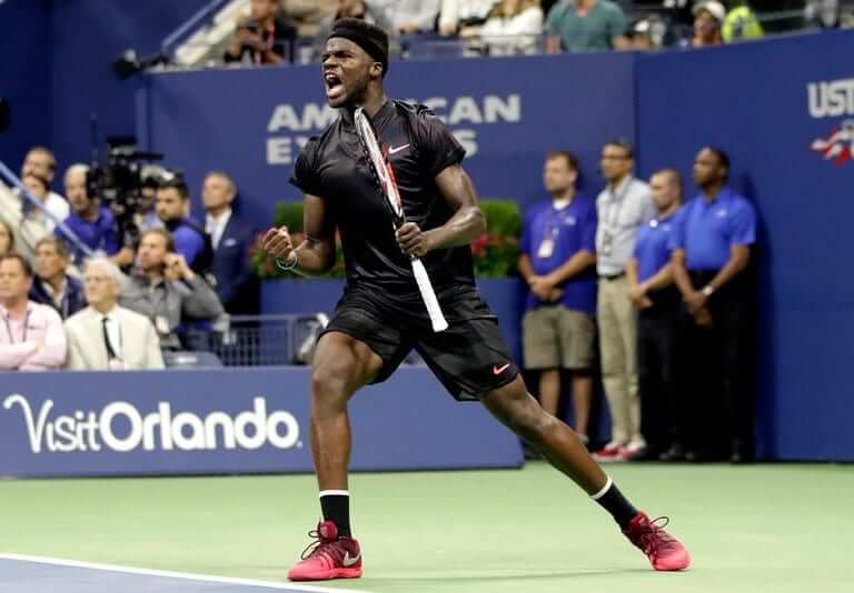
The “away” comes in “Black with Hot Punch” and was worn by Americans Frances Tiafoe, Sock, and Jared Donaldson:
And here’s the black version for women, as worn by Madison Keys:
Adidas: The German supplier has gone all out with designs by Pharrell Williams in bold primary colors. It’s a unique look — but maybe a bit less unique when multiple players are wearing it (in this case Naomi Osaka, Simona Halep, and Jelena Ostapenko):

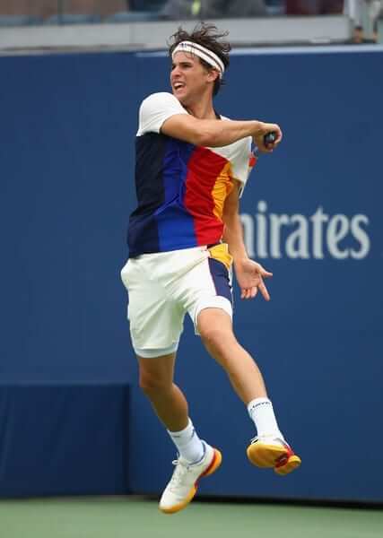
Perhaps the most popular uniform of the tournament has been Adidas’s Pharrell NYC Crew, seen on Dominic Thiem, Lucas Pouille, Mischa Zverev, and many more:
Lotto: The teal/green zippered henley and black shorts combo was worn by surprise semifinalist Kevin Anderson, as well as by John Millman and others:
My reaction to the coordinated kits this year is the same reaction that I initially had last year: It’s confusing and gimmicky, especially early in the tournament when the number of players wearing the same outfit can reach double digits. It feels like the marketing tail is wagging the on-court dog. It makes me appreciate players like Stan Wawrinka, whose sartorial choices are bold, if not necessarily successful. At the same time, I’m happy that clothing companies are taking their tennis lines seriously enough to align with high-profile designers like Pharrell Williams and Stella McCartney, who also designed for Adidas this summer. And I have to admit, I really like those wide red, blue, and yellow stripes.
Click to enlarge
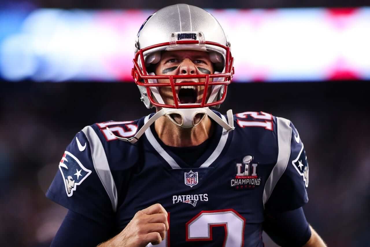
Friday Morning Uni Watch: As expected, the Patriots wore a championship patch for last night’s NFL season opener against the Chiefs. They wore similar season-opening patches following their three previous Super Bowl wins (but did not wear one following their first championship in Super Bowl XXXVI). Although no announcement has been made, it’s a safe bet that this patch, like the others, will be one and done, not a season-long thing.
Only one other NFL team has ever worn this type of patch: the Saints, in 2010.
Other notes from last night’s Pats/Chiefs game:
• Pats wideout Danny Amendola wore a jersey from last year, with the full collar striping:
Very odd, especially given that he had worn one of the new jerseys during the preseason.
• The Chiefs are still one of the two NFL holdout teams that insist on going with plain white nose bumpers. (The other: Washington.) While we’re at it: They also have blank neck bumpers.
• The Pats unveiled their latest championship banner.
• Chiefs cornerback Marcus Peters sat during the national anthem and wore a social justice message on the soles of his cleats:
Chiefs’ Marcus Peters sits for the National Anthem and is promoting activism on his cleats. pic.twitter.com/dW9uRTZasK
— Sporting News (@sportingnews) September 8, 2017
The Ticker
By Paul

’Skins Watch: The principal of a Maryland high school has banned a Native American headdress that had been worn by the leader of the student section during sports events (from Nelson Warwick). … A seven-year-old indigenous girl from Calgary has refused to play for her hockey team because the team’s uniform features a Blackhawks-style jersey crest (from Marc-Louis Paprzyca).

Baseball News: The Royals will have a 50th-season patch on their jerseys and caps next year. Disappointing that they didn’t wait until their 50th anniversary, which would be 2019. … New 10th-season logo for the Bowling Green Hot Rods (from Nicole Lynn Perry). … Fast work by the Yankees, who were playing a rainout-makeup game on the road yesterday but still managed to add a black armband for former player and GM Gene Michael mere hours after his death was announced. They’ll wear it for the balance of this season. … Looks like Cleveland P Corey Kluber is the latest MLBer to have his jersey sewn shut. As you may recall, this is also done by two Dodgers (good spot by Dan Swan).

NFL News: The Raiders will wear black in Tennessee this Sunday, which means the Titans will be wearing white at home (from James Brooks). … Similarly, the Steelers will wear black in Cleveland, which means the Browns will be wearing white at home. … Speaking of the Steelers: Now that the regular season is upon us, their front helmet numbers have returned. “Also, water is wet,” says Brian Cox. … “I had heard that for a brief period of time after the AAFC/NFL merger that the new league would be called the National American Football League (NAFL),” says Marc Viquez. “Here’s a mention of that name in the first paragraph of a 1950 newspaper article.” … Some uni number changes for the Titans (from Eric Wright). … I feel like we may have seen this before, but just in case: Here are some shots of Broncos return man Rick Upchurch playing with a blank helmet during a 1975 game. … 49ers and Bengals players wore knockoff-style jerseys for a 1990 episode of Family Feud. … A detective in the current Manhunt: Unabomber mini-series is shown wearing an Eagles jacket. “Unabomber or Uni-bomber?” says Yancy Yeater. … Speaking of the Iggles, team owner Jeff Lurie wants to bring back kelly green throwbacks but can’t because of the one-shell rule. Lurie says he’ll try to get the rule changed, but he already tried that a few months ago and it went nowhere. A simple solution, of course, would be to go with kelly full-time, instead of as a throwback (thanks, Phil). … Here’s something I haven’t seen before: Bluetooth NFL helmets. Although those are for the Cowboys, I assume other teams are available. … A new stadium set to open in the UK next year features a retractable field that would conceivably allow the venue to host soccer and NFL games on the same day (from Ted Arnold. … Never seen this before: Pro Bowl Scouting Cards, from a 1973 Fleer set (from Ray Hund).
College Football News: Here are this week’s uni combos for WVU, Duke, TCU, UNLV, and UNC. … Oregon will be wearing those anti-cancer uniforms this weekend. More on that here and here. … In the wake of the recent Charlottesville violence, Virginia added a “#HoosTogether” patch last week. Now Indiana, which is playing against UVA this weekend, has announced that it will add a “#HoosTogether” helmet decal (from Jamie Rathjen). … Here’s a very detailed look at the Frank Kush throwbacks that Arizona State will be wearing this weekend. … New LeBron James cleats for Ohio State (from Jason Hillyer).

Hockey News: The Penguins’ practice jerseys have a new number font. … New center ice logo for the Senators (from Mike Styczen and Moe Khan). … The Predators’ Twitter feed has been using jersey numbers to count down the days to the season opener. Since Viktor Arvidsson changed his uni number, they had to get creative with his entry (from our own Alex Hider). … Speaking of the Preds, here’s a look at their new practice jerseys. … And while we’re at it, new practice togs for the Ducks. … The Lightning will have their 25th-anniversary logo at center ice this season. … A little birdie took a photo of the Vegas Golden Knights’ inaugural red line design, which features the team’s helmet motif, along with sunbursts. Feels too busy. … Grateful Dead jerseys on tap this February for the Kalamazoo Wings. … One commentator’s opinion: The renaming of the Maple Leafs’ arena shows how boring naming rights have become (from Ted Arnold). … I love this: Some NHL players were asked to draw their own team’s logo (from Mike Chamernik, who’s moved on to bigger and better things but is still keeping in touch).

NBA News: The new box cover of NBA 2K18 shows Kyrie Irving in a Photoshopped Celtics uniform, featuring a smaller GE ad patch than the one in real life (from @L_A_B_10). … The Clippers are adding pricey courtside seating along the scorer’s table. … New court design for the Cavs (from KC Kless).

College Hoops News: New court for DePaul. Additional photos and info here (from Brian Flood). … New uniforms for Montana (from @SodaPopinskiCU). … New court for Wichita State (from @PhillyPartTwo).

Soccer News: Cross-listed from the NFL section: Tottenham’s new stadium, set to open next year, features a retractable field that would conceivably allow the venue to host soccer and NFL games on the same day (from Ted Arnold).

Grab Bag: Georgetown’s new deal with Nike includes factory labor monitoring (from Scott Trembly).
To all our readers in Florida, and also to those who have friends and family there, my thoughts are with you today. Take care, be safe, and here’s hoping the storm veers out to sea.
I”m sure this has been asked many times, but what ‘evidence’ does the NFL have to justify the one-shell rule? I just have a hard time believing it has any impact on the concussion issue. Of course given their reputation toward concussions the past few years I can’t see them reversing the one-shell rule since they’ve made the case that it’s safer.
link
Proofreading: “Broncos return man Rick Upchurch playing without a blank helmet during a 1975 game.” Should be with a blank helmet.
Fixed.
The Twins did the same thing as the Royals, with a 50 seasons patch celebrating their existence from 1961-2010: link. I agree they should have waited until 2011 as well…
Proofreading:
“will match one of opponents”
“the new jerseys during the preseason.royal”
“(from Ted Arnold.” At the end of Soccer News; no end paren.
And I’d like to reiterate what Paul said about the hurricane.
Fixed.
Proofreading: “Broncos return man Rick Upchurch playing without a blank helmet during a 1975 game.” Should be with a blank helmet.
Sorry, thought first one didn’t go through.
Already fixed.
Royals 50th ordinal patch follows their 40th anniversary patch which followed a 25th ordinal. Consistent if every other patch is different.
Good observation. Wonder how these decisions are made whether to do the patch for seasons or anniversaries.
Initially, I thought Simona Halep’s 80’s style outfit was in Romanian flag colors (she’s Romanian). I’m disappointed it’s just a coincidence. It would be cool if each player had a design based on their native flag.
Kelly green for the Eagles full time would be welcomed by me. I have grown to despise the existing set. The green jersey looks black on TV, especially since they went to the Nike template. The helmet looks black as well. They wear black socks and mostly black accents. And it all looks terrible. The worst uniform set of all the Philly teams (yes, even the Bimbo clad Union).
BFBS died a peaceful death in most parts of the country. Hell, even the 76ers got with the program. It’s time to go back to kelly green full time.
What I don’t get is why Jeff Lurie is even deliberating this. The majority of Eagles fans prefer kelly to midnight. Most Iggles fans grudgingly accepted it because it’s our team but there was never any huge outcry to change the colors when he did. And the impetus for the change was a new owner putting his stamp on the team… by letting his wife recolor the uniforms. Well, they divorced and he remarried. Let the last vestige of a failed marriage go by the wayside.
Bringing up other teams dumping BFBS amused me, because it reminded me of the Islanders. At a time when the Knicks and Mets were moving away from BFBS (and for the Knicks, it was only ever trim on their jerseys, never worn as a primary uniform color), the Isles went full-bore BFBS with their alternates in about the worst way possible. Then, after ditching those ugly unis, they went BFBS again as a nod to their new landlords, the Nets (who themselves are the current poster children for BFBS).
Yep, you know the history. I’ve had season tickets since ’94, so got to experience two years of the kelly green before the change. I’d go to the throwbacks they wore in 2010 (for one game) full time. They looked great on the field. No need for the bird on the sleeves, just give me the wings on the helmet (in silver) and the green and white. Classy, clean look. Own the green.
Lurie’s “excuse” for not returning to Kelly green is pure BS. When he bought the team in 1994, it took him years to even acknowledge the team’s history and past great players as if the franchise didn’t exist before he took over. Last year when he brought this up, he said that he was still gauging the fans’ interests in doing it. Lurie knows full well a great majority of fans want the Kelly green. He could easily go back if he wanted to.
Lurie’s “excuse” for not returning to Kelly green is pure BS.
Could it be that the term “Kelly” green causes PTSD?
Nice! But fans were over midnight green well before Chipper ever blew through town.
Speaking of the Iggles, team owner Jeff Lurie wants to bring back kelly green throwbacks but can’t because of the one-shell rule. Lurie says he’ll try to get the rule changed, but he already tried that a few months ago and it went nowhere. A simple solution, of course, would be to go with kelly full-time, instead of as a throwback.
Certainly agree with the idea of going kelly green full-time. Hell, they could keep their current design and just change the shade of green, and I’m sure that alone would make people happy.
Of course, the league could always try to get the PA to go along with ending the grandfather clause for discontinued helmet models, which seems to be the sole reason the one-shell rule exists, since, if all players used currently-in-production models, replacement shells of the same model would not be an issue, the way it currently is with discontinued models and the inability to get new shells. That the disco’d models are still certified shouldn’t matter. The fact that the NCAA doesn’t have such a prohibition by now is telling as well (since NCAA careers are inherently shorter, it’s rather unlikely a college player would be wearing a disco’d helmet).
And that’s my NFL helmet rule rant for this month. :P
A little birdie took a photo of the Vegas Golden Knights’ inaugural red line design, which features the team’s helmet motif, along with sunbursts.
Sun bursts? More like Vegas Stars.
Is that a thing?
Want to take this time to acknowledge the Kansas City Chiefs after watching a bit of last night’s game.
They have been consistent in the philosophy of not changing their uniforms significantly. Which means that they have not screwed up their look like some other NFL teams have done.
I support your rebel attitude toward staying with blank nose and neck bumpers. Keep up the good work by sticking with that uniform – with the striping of how a football uniform should look.
It lifts my heart to see a team in red uniforms playing well in Foxboro. That should happen more often.
Should we interpret that to mean the Pats should switch back to red primary jerseys?
Though, in retrospect, I have to question the choice originally. After all, they’ve always based their iconography on the Revolutionary War era, yet they had jerseys of the color most associated with the British forces we were rebelling against. That’s not to say their old red jerseys are a bad look or anything… it’s just food for thought.
Choosing blue over red for historical accuracy is too literal for my tastes. Why can’t the Pats be red just because it’s a better-looking and more distinctive uniform? It grinds my gears that all their success came after dumbing down their identity.
Yep, big supporter. I’ve said this before but as other pure red/yellow (athletic gold)teams died on vine – Atlanta/Calgary Flames, Houston Rockets and the Atlanta Hawks, the Chiefs remained rock solid, despite having an availble opening to add black, as their helmet arrowhead has a black outline.
Um. The Red Wings?
Sorry.. Didn’t read the “yellow” for some odd reason. As for the Flames, they seem to slowly be creeping back to their original strip.
Is there a reason to push for both soccer matches and football games to be played on the same field on the same day? I’m not against it or anything, just curious why that seems to be something they want so badly. Seems like there would be a lot of cleanup to do in between events, etc., that would make that a logistical nightmare beyond the field/pitch switch.
They aren’t going to schedule NFL on the same day as a Spurs match. They are simply pointing out that they could cover (or uncover) the underlying field turf quickly.
I was trying to think about that, too. Cool idea, but why? On the rare occasion Spurs might be scheduled for a Monday night match, MNF games there wouldn’t be able to start until after midnight, which doesn’t exactly seem practical.
The only way I could see it working is if Spurs have a noon (local time) start on a Sunday. Match is over by 2pm, turn around, get NFL field rolled out and everything ready for a 6pm (1pm EST) NFL game.
There would have to be extraordinary circumstances to schedule games on the same day. There is so much more than rolling the Spurs’ pitch out of the way and throwing up some NFL goal posts that happens to prepare for an NFL game. I don’t think the EPL or the NFL (or NFLPA, maybe, if they have a say?) would approve.
There are arenas that host basketball and hockey on the same day. When I was in college our team would play an 11:30 am tip-off, be done by 2 pm or so, then they would hustle everyone out of the arena so they could remove the hardwood and put up the remaining boards and plexiglass for that night’s minor league hockey game.
Movable turf isn’t a brand-new concept. The Cardinals have had it at their stadium in Glendale since it opened. The system allows them to have natural grass in an domed stadium, by having the grass outside in the sun when they’re not playing. It also protects the turf from getting wrecked by other events.
I’m sure that’s the line of thinking with the new Tottenham stadium – not “We can have two codes of football in the same day!”, but “We can protect our [association] football turf from being wrecked by those gridiron ruffians and other, non-sports events!”
“in a domed stadium”
I was originally going to use “indoor” instead of “domed”, but changed the word without changing the article beforehand. Oops.
Kelly McParland really messed up the current name of the White Sox’s park – Guaranteed Rate Field, not “Guarantee Rate Centre”. Though at least his heart’s in the right place with the gist of the article. #NamingWrongs
Not a fan of the Pens’ new practice uni numbers. Hopefully that isn’t a sign that they’re going to mess with their game jerseys again, now that they’ve got them back to being near-perfect (if only the collars didn’t get butchered by the Adizero template – they should’ve done what the Red Wings did and make the collars a single color). Personally, though, I think they should find some use for the 1996 third-jersey number font that never got used except for the captain’s C and A. (It’s also extremely frustrating that I can’t find an actual picture of a jersey with that font, and I can remember seeing it being shown back in 1996, even though the Pens went with block numbers instead.)
I remember matching tennis outfits at the majors when I was a kid. Didn’t Zina Garrison and Arantxa Sanchez-Vicario have the same Reebok outfits back in the day? (My memory will be fuzzy on specifics, but I know this isn’t a new phenomenon.)
Back when singles players also participated in doubles, you saw matching outfits pretty regularly. As players shifted to singles or doubles specialists in recent years/decades, it became less prevalent.
“Pro Bowl Scouting Cards, from a 1973 Fleer set”
These, along with Team Checklist cards, would garner a resounding “Awe, man” from kids across the country when opening a pack of cards and finding these.
To the spokes with you!!
I think you mean “Aw,” not “Awe”!
;)
Indeed!
Anyone else catch the apostrophe catastrophe in Tottenham’s video about its fancy new field?
The NFL field has rails for the soccer pitch “hidden safely beneath it’s surface”
Maybe English grammar is different in England?
I’m deferring to link here and going to say “no”. This is yet another case of sloppy grammar, and proof that it’s not limited to “us dumb Yanks”.
I still don’t see how not standing for the national anthem and showing a lack of respect for the flag is somehow connected to uniforms.
In this case I’m a bit more understanding seeing Peters’ custom cleats.
As has been explained many times, it has to do with the visual culture of the game.
For example, most baseball teams line up along the baselines on Opening Day. But in Baltimore, the teams line up in the infield:
link
That’s visually noteworthy. So is sitting during the anthem. Glad we cleared that up (yet again). Let’s please move on. Thanks.
Thanks. Interesting visual difference between Baseball during the national anthem and Football during the national anthem
I had no idea that this is a Baltimore special. I also have no idea why they are using a 15-by-15 flag. Would a knowledgeable fan please educate me as to why they do it this way, or share a link? Hon?
The 15×15 flag is the “Star Spangled Banner” as it flew over Fort McHenry.
I believe it’s the Star Spangled Banner, Ft. McHenry is in Baltimore.
link
Various NHL practice jerseys that have been posted over the last couple days and they all seem to have a circular logo on the front of the jersey. Is this something Adidas has done league-wide?
link
It wouldn’t be the first time the league’s done something like that. Back in the mid-1990s, practice jerseys had the team logo inside the NHL’s “Center Ice” roundel (referring to the Center Ice Collection merchandise branding, not the out-of-market broadcast package). They later shrank the Center Ice logo and moved it to the right side of the upper chest with an NHL logo inside it, leaving a large team logo in the center of the chest.
Paul,
I’m going to disagree with you disagreeing with Kansas City celebrating its 50th season and not waiting for a 50th anniversary. I don’t think I can change your mind, but my reasoning is that inaugural seasons are celebrated and not the 1st anniversary of the inaugural season.
While your OCD focuses on the symmetry of the numbers (1968-2018), mine focuses on the actual number of seasons.
The wildly inconsistent ways in which sports anniversaries get treated, period, can drive even non-OCD people crazy.
It’s 1969-2018……
Patriot’s Matt Patricia was wearing the Salute to Service camo hat last night.
link
No worries on matching tennis togs. For almost 100 years, till about the time the Open Era was born, 1968, male players looked exactly the same – white t’s or polos and white shorts. Without looking it up, guessing the advent of matches on color TV’s, and Lamar Hunt’s WCT league brought color shirts and shorts to the game for the first time.
With all due respect, you know not of what you speak. Shorts in men’s tennis did not exist prior to the 1930s, and the absence of color in tennis togs was purely class-driven. I could go on, but I shan’t.
Seeing all of those Patriot banners demonstrates how the awesomeness of the Super Bowl logo has been lost once they went to that generic, bland, silver format. Ugh. Let the host city design it, darn you!
DePaul has a new arena for that new court.
After looking at the vintage style secondary logo at centre ice for the Ottawa Senators, made me wish my favourite NHL team would be inspired to do the same.
Would be cool to see the Canucks put 2 present-day stick-in-rink logos in the centre ice circle. One on each side of the red line. Bottom of the logo facing the goals (similar to the Canadiens and Flyers). A nod to the logo on the ice in the old days:
link
If I played for Kalamazoo Wings I would go all Chris Sale on the Greatfull Dead jerseys.
The matching outfits can lead to surreal visual pairings