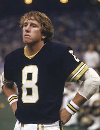
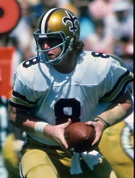
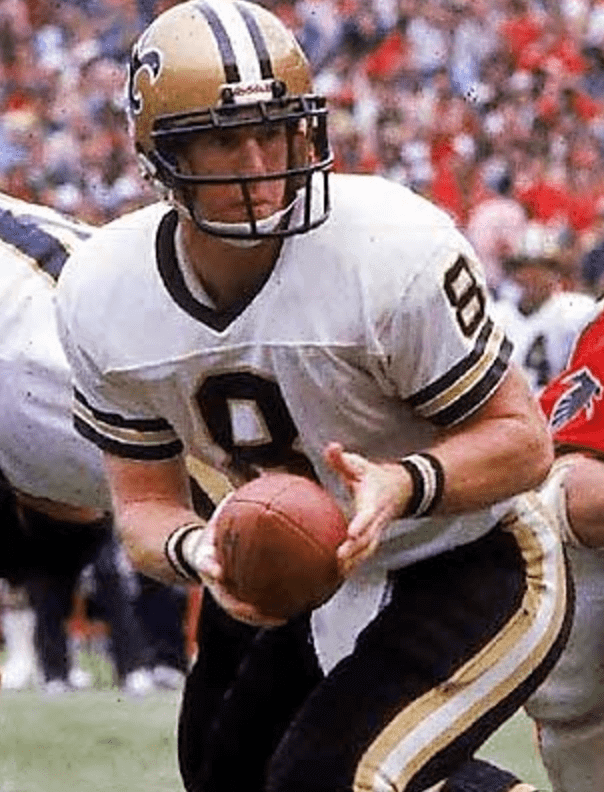
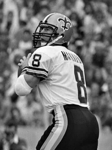
Longtime reader/contributor Gene Sanny recently got in touch to let me know about a really unusual facemask worn by former Saints quarterback Archie Manning (who’s shown at right; dig those Saint-patterned wristbands!). If Gene had simply said, “Hey, look at this,” it probably would’ve ended up in the Ticker and that would’ve been the end of it. But Gene’s email included something that intrigued me: “I knew Archie Manning was notorious for wearing a ton of different facemasks throughout his career,” he wrote, “but look at this!”
I hadn’t realized Manning was known as a man of many masks (which is weird, because I grew up watching football during the prime of Manning’s career and was pretty mask-attentive in those days), so I went back and looked at some old photos. And sure enough, it appears that Manning was extremely fickle regarding his facemask choices. Who knew? Well, Gene knew. But not me!
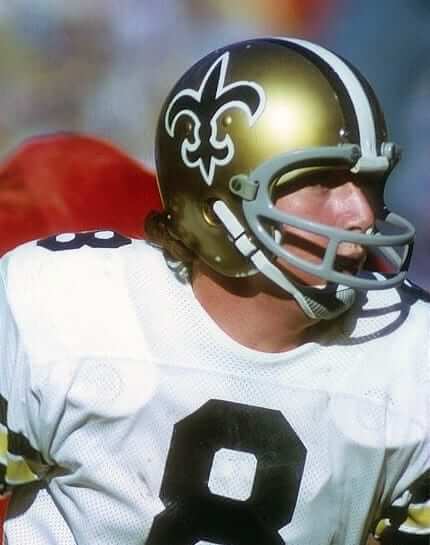
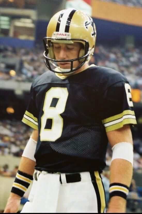
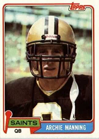
Some quick context: Manning played with the Saints from 1971 through 1982 — 12 seasons. But he sat out 1976 due to injuries and appeared in only one game in 1982. So for practical purposes, Manning played 10 seasons for the Saints.
Now, granted, anyone who’s in the league that long will likely have lots of chances to change or upgrade his facemask, just by virtue of new designs becoming available, new advances in helmet/mask technology, and so on. Still, I found photos showing Manning wearing 10 different masks with the Saints (and that’s not counting the weird one that Gene showed me), which seems like a lot, right?
And here’s another oddity: The Saints changed facemask colors in 1976, going from grey to black. But from what I can see, Manning never duplicated any of his grey masks in black. So those 10 different mask designs I found (plus the 11th one from Gene) all have distinct bar orientations, irrespective of their color differences.
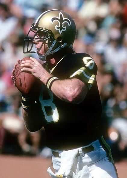
With that in mind, let’s look at Manning’s masks. Instead of going chronologically, I’m going to go from the simplest design to the most complex — in part because I’m not positive of all the game dates, and in part because in some cases I want to make stylistic comparisons from different years. Here we go:
1. Manning’s simplest mask was a grey single-bar model:
2. Manning also wore a grey mask that I’m pretty sure was a Dungard 207:
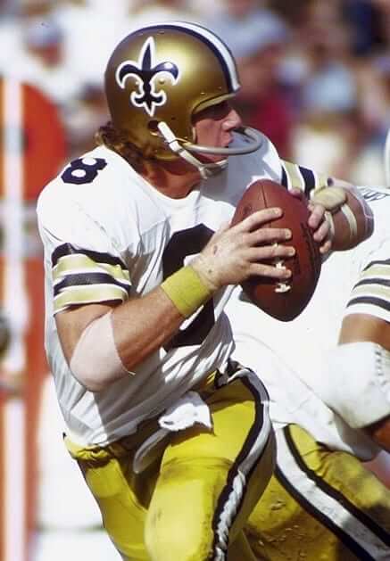
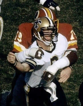
3. Later in his career, when the Saints had switched to black masks, Manning wore a different Dungard design. This one, I’m pretty sure, was the 205, which had less separation between the bars (also, note the team-branded waistband towel and the wristbands!):
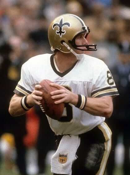
4. Going back to the Saints’ grey-masked period, Manning wore a mask that I believe was the Schutt 710:
5. He later wore a similar but more boxy grey design, which appears to be a Schutt 1968 OPO Square Jaw:
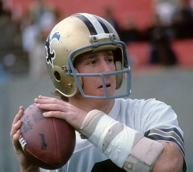
6. Manning later wore a similar design in black. This one was a little less boxy than mask No. 5, but also not quite the same as mask No. 4:
7. Manning also wore a boxier version in black — but this design had two horizontal bars across the top of the mask, instead of one, with a small vertical bar connecting them:
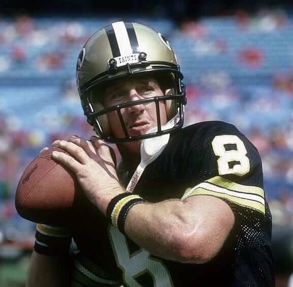
8. He also wore something very similar, but with three vertical bars connecting the top two horizontal bars:
9. He also wore a version with two horizontal bars across the top and two horizontal bars across the center of the mask (sorry, this is the only photo I could find of this design):
10. Manning also dabbled with a version of this mask that had two vertical bars connecting the top and center of the mask (apparently a Schutt Eye Glass OPO):
11. And now, finally, the mask that Gene Sanny sent me, which got this whole thing rolling. Behold Archie Manning wearing a lineman’s facemask (a Schutt Double Wire JOP):
According to Getty Images (which is often wrong about dates), that’s from a 1980 game against the Bears. Crazy, right? Can anyone think of any NFL quarterback ever wearing something as elaborate as that?
Update: Reader Chris Markham found a Chicago Tribune article about the game in which Manning wore the lineman’s mask. Turns out Manning broke his nose in the second quarter after a hit from the Bears’ Alan Page and switched to a larger mask during the game.
Here’s the relevant portion of the article:
Manning insisted the broken nose didn’t bother him in the second half nearly as much as the Bear defense that surrounded him with relentless pressure. “When my nose was broken I was dazed and couldn’t breathe,” Manning said. “I felt fine afterwards. The bird cage [protective face mask normally worn by linemen] I wore in the second half didn’t obstruct my vision, but those hands waving in my face sure did.”
Additional photos of Manning wearing this mask can be seen here.
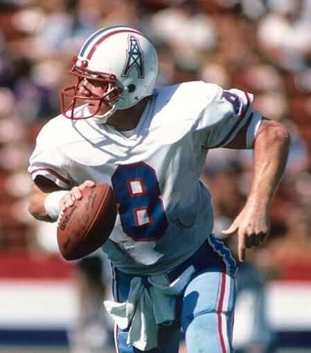
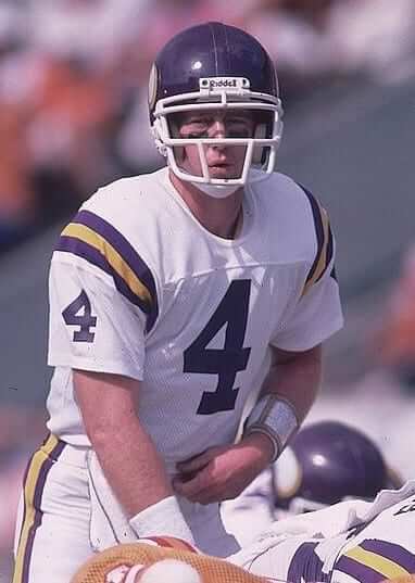
Footnote: Manning finished his career with cups of coffee in Houston and Minnesota. Judging by the admittedly scant photographic record, it looks like he used mask No. 7, albeit in different colors, while playing for both of those teams:
And there you have it. Did I miss any of Manning’s NFL mask designs? Also, has any other player gone through as many masks as Manning did?
(Big thanks for Gene Sanny, whose offhand comment made today’s entry possible; to Scott Johnston, for his assistance in identifying some of the mask models; and to our own Mike Chamernik for his assistance with some updated info.)
T-Shirt Club update: Many of you have been asking me if there will be a new round of Uni Watch T-Shirt Club tees for 2017. Answer: Yes! And while things aren’t completely set yet, I can tell you this much:
• For each of the past two years, we’ve done shirts that had a consistent design theme. This year I’d like to try something different. I’ve asked a bunch of artists, illustrators, and designers — all of them longtime friends of Uni Watch — to each take a crack at producing a Uni Watch T-shirt design. Stylistically speaking, the results will likely be all over the map, so we won’t have any thematic consistency this year, but each shirt will still say, “Uni Watch,” both literally and metaphorically. It’ll sort of be like an “artist of the month” program (or every two months, or whatever).
• I’m not sure how many shirts we’ll do this year, because I don’t know yet how many artists will be part of this. For now, I have five confirmed participants: Larry Torrez (the guy who designed my Twitter avatar); Rob Ullman (best known around here for his pin-up/jersey illustrations); Todd Radom (one of the sports world’s foremost graphic designers); Scott M.X. Turner (the man who created our magnifying glass logo, and who’s also designed every one of our 1,700-plus membership cards); and the pseudonymous Wafflebored (the guy behind so many awesome DIY projects). Bryan Molloy, who designed all of the 2015 and ’16 shirts, will likely do a shirt this year as well, if his schedule allows. I’m a big fan of all these folks’ work, and I’m excited to see what they whip up.
It’s possible that some additional artists will come on board as the year progresses. So even if we start with, say, six artists, we might end up doing more shirts than that by the end of the year.
Speaking of which: Are you a talented artist, illustrator, or designer? Would you like to be considered as one of this year’s T-Shirt Club creators? Are you a really obvious friend of Uni Watch who I have somehow overlooked for this project? If so, shoot me a note, along with some of your work (or a smack in the head, as the case might be), and we’ll talk.
• I’m fairly certain that this year’s shirts will not have a T-Shirt Club sleeve patch (like we did in 2015) or jock tag (2016). I might have the individual artists include some sort of T-Shirt Club graphic or identifier as part of their designs — or I might not. That’s one of several variables I need to get squared away with the artists. Actually, we could use some feedback here: For those of you who purchase the shirts, does having some sort of Club graphic make the whole thing feel more “official” in a way you find enjoyable? Is the graphic actually annoying and you’d be happier without it? Or do you not care?
• In a related item: At the moment I’m leaning against having a “Collect ’em all” incentive prize. One reason for this is that I don’t even know how many shirts we’ll be doing, and it seems unfair to ask you to commit to buying a certain number of shirts when I can’t even tell you how big that commitment will be. But getting rid of the year-end prize will cut down on the collectability factor, which I know many of you enjoy. Any thoughts on that?
• Another variable: Who will produce these shirts? The one thing I can say for sure is that it will not be Represent. It may be Teespring, however. Or it may be someone else entirely. Still working that out.
• The first shirt will likely be ready for ordering at some point in February. We’ll make each shirt available for at least 10 days, and maybe longer.
I think that’s it. More info soon.
LAST CALL ”” Raffle reminder: Today is the last day to enter the raffle for the IceJerseys $100 discount code. Full details here.
Design contest reminder: I’m currently accepting entries for a “Redesign the Chargers” contest. Full details here.
Membership update: If your New Year’s resolution was to finally sign up for a Uni Watch membership card already, there’s no time like the present. You’ll join over 1,700 other cardholders, including Alex Barfield, whose card (shown at right) is based on the Waco BlueCats. Never heard of that team? That’s because they don’t exist yet! But they’ll start playing in 2018, and they’ve already released their uniform designs, and that’s what Alex asked for. I think it’s the first time we’ve done a card based on a team whose first game is still more than a year away.
You can sign up for your own custom-designed membership card here, you can see all the cards we’ve designed so far here, and you can see how we produce the cards here.
The Ticker
By Alex Hider

Baseball News: Andrew Benintendi of the Red Sox will be wearing No. 16 this upcoming season. He wore No. 40 during his rookie year (from Ethan Faust). … The Fresno Grizzlies have officially unveiled their 2017 Fresno Taco uniforms (from Phil). … Oklahoma State will wear seven different caps this season (from Brian). … Looks like the White Sox will be marking the centennial of their 1917 World Series title with throwbacks.

NFL News: Former 49ers TE Vernon Davis owns a Jamba Juice in Santa Clara, Calif., but he apparently can’t use the Niners logo in photos of himself (from Michael R. Carroll). … Peter Fredrickson sent along this video from a 1979 matchup between the Bears and Cowboys in Dallas. Anyone know why the star at midfield was surrounded by red stars? … The duckling statues in Boston’s Public Garden have been decked out with Patriots jerseys.

Hockey News: The NHL is reminding teams that goalies should be wearing the new, trim-cut pants that were discussed in the off-season. More on those regulations here (thanks, Mike). … The Amarillo Bulls of the NAHL will wear Star Wars jerseys on Saturday (from Rovitz). … Moe Khan points out that the Canucks don’t use era-specific color schemes on their retired number banners. … Looks like the makers of Good Will Hunting didn’t want to fork over any cash to the Bruins of the NHL (from Joe Z). … Dartmouth G Adrian Clark’s mask features characters created by Dr. Seuss, who was a Dartmouth grad (from Tris Wykes).

NBA News: The Warriors, Raptors, Rockets, and Wizards will have new Chinese New Year socks to go along with their CNY jerseys (thanks Paul). … The Lakers wore throwbacks last night (from Robert Hayes). … The Nets wore their grey alternates at home last night, creating a red vs. grey game against the Raptors (from Zachary Loesl). … The Warriors broke ground on their new arena with a bizarre choreographed dance routine (thanks, Mike).

College and High School Hoops News: The Immortal Ten is a group of Baylor basketball players who were killed in a bus accident in 1927. Last night, the Bears honored those 10 players on their jerseys (from Austin Staton). … Bowling Green has some nice vertically arched NOBs (from Luke Schaffner). … Sweet candy-stripe warmups for Latrobe High School (Pennsylvania) (from Rich Donahue). … Texas A&M wore throwbacks last night (from John Urbina).

Soccer News: Yesterday’s Ticker had the news about Juventus’s new minimalist logo. Here’s how eight other teams’ logos might look if they went with a similarly minimalist approach (from Ted Arnold). … New away jersey for DC United (from John Muir).

Grab Bag: New athletic logos for the DII school East Stroudsburg University (from Andrew Garigliano). … All Roanoke College athletic teams will wear a patch commemorating the college’s 175th year (from Jacob Clifton). … Bill Gates and some other tech investors have filed a patent for a football helmet that would detect concussions (thanks, Phil). … New lacrosse helmets for Washington. … Lots of old uniforms from Pepperdine’s sports history are showcased in this article (from Phil).
Great stuff on Manning. Any thoughts on trying to contact him and interview him on this?
Yes, thinking about that for a follow-up item that could run on ESPN. More on that soon.
Cool!
Agreed.
I think I have noticed in general that Archie Manning wore a lot of different face masks, but not 10 in 10 years lot!
Lee
Great post with great detail. As a kid at Falcon games I followed Manning’s career, and was well aware of his different masks. Archie also wore several different masks at Ole Miss. I blogged a similar post, with less detail: link
Proofreading:
“Can anyone thing of any NFL quarterback”
“Wafflebord”
“The Immortal Ten is a group of Baylor basketball players that were killed” ‘that was’ or ‘who were’
The Saints might be able to put you in touch with Archie, if you want to pursue that.
Fixed.
As for the missing Manning mask models:
5. Schutt 1968 OPO Square Jaw (link)
6. Riddell OPO (link)
7 & 8 are variants of the Schutt single-wire OPO (not sure of exact model names)
9 is a variant of the Schutt double-wire OPO
10. Schutt Eye Glass OPO (link)
11. Schutt double-wire JOP (link)
Good stuff, Scott — thanks!
With #6, Helmet Hut has a great discussion forum on Riddell’s attempt to overtake Schutt in the 1970s, and reviews some other masks they designed but never took off, including those masks used by the USFL in the mid 80s.
link
Wow, usually my off-hand comments get me in trouble…. not this time… nice piece :)
*Sign me up for an Ullman shirt!
Mike Phipps of the Bears wore a fullback facemask in 1979.
link
The other odd thing about the Cowboys field star surrounded by red stars is that it is facing the opposite way. Other youtube footage shows this as well.
My gut tells me it is not a midfield logo…
Watching the video, it is indeed the midfield logo.
Also, the end zones say “Texas Stadium”.
Lee
When Manning was traded to the Vikings, Dave Casper (who I never knew played for the Oilers) was trade to the Vikes also. Both went in exchange for drafts picks the following year.
Casper went to Houston in the middle of the 1980 season for first- and second-round picks, per Wikipedia.
Manning’s version of the EGOP mask is my favorite mask of all time. I wish Schutt would make a current version of it.
“Peter Fredrickson sent along this video from a 1979 matchup between the Bears and Cowboys in Dallas. Anyone know why the star at midfield was surrounded by red stars?”
At the 2:18 clip, you’ll notice in at least one of the games the end zones had “Texas Stadium” in them, which is odd because before and after that season the end zones had “Cowboys.”
link
I’m not sure how many red stars there were and why they were there other than to note the Cowboys celebrated their 20th season in 1979. And I’m not sure how long the red stars were there because in the 1979 season finale, you’ll notice no red stars at midfield (look closely as this clip starts).
link
Judging from the highlight films I’ve seen, the Cowboys had the star at midfield at Texas Stadium in 1974 (and possibly sooner). The NFL logo had been at midfield from 1975-78, but the star returned in 1979 and has been a staple in Texas Stadium and the current stadium since.
According to the SMU Media Guide, 1979 is when the Mustangs moved full time to Texas Stadium. Maybe they just used the generic turf for the HS Championships & had it until they got SMU specific turf?
Justin, I think you’re spot on with the SMU reference. I believe they didn’t have team-specific turf at that time and went with a look that was easy to change from Saturday to Sunday. IIRC, the Cowboys normally used the NFL logo at midfield, so the change to a more generic look would use the star (and the red stars could also be for one of SMU’s colors). That also explains the “Texas Stadium” endzone markings. Although the video was a bit washed out when I viewed it, it also looked like the helmet graphics in the endzones were white. They just changed the logo in the helmet from mustang to star. By the end of the season, they probably went with a more “Cowboys” look because the SMU season was over.
I’m looking forward to the White Sox 1917 throwbacks. One of the best dressed teams of all time as far as I’m concerned.
I wonder which design they’ll wear. I see that they wore special patriotic uniforms in the world series. link
They’ve worn both versions as throwbacks before.
Regular season version:
link
World Series version:
link
link
I see that when the White Sox did the first ever throwback game 27 years ago, they added headspoon piping for some reason. Hopefully the throwbacks will be more accurate this time.
It is also striking in looking at photos of the 1917 team, that while players went high cuffed back then, the uniforms were otherwise worn very loose and baggy.
The problem wasn’t that they added link, but that they used a single black soutache piping instead of the correct link.
Research wasn’t always what it is now, nor was interest in authenticity. After all, when the Brewers hosted their first TBTC game (after wearing link in that first-ever) the Brew Crew just link.
In any case, I’m just always so glad to see the White Sox link.
I’m partial to the World Series variant, but I think they both look great.
The mention of the “lineman’s mask” is interesting in light of the kind of masks worn by linemen today, which are essentially the same as those worn by “skill players” (I dislike that term. It takes skill to block). Ndamukong Suh’s mask is essentially the same as Tom Brady’s, although Suh probably wears a visor.
The new trend is Linemen wearing “Skill” player facemasks. Can’t say I like it. I like the big, intimidating cages.
like this one?
link
I’ve seen this pic a million time, but never noticed that the player in the left background ALSO seems to have DIY facemask happening too.
Proofreading:
“Juventis’s new minimalist logo”
“Juventus” was misspelled.
Also the Bowling Green NOB is vertically arched, not radially.
The quality of college basketball NOBs is consistently better than their NBA counterparts.
Fixed.
Players often change facemasks as a result of injury, and given how often Manning was sacked with the Saints, it’s not surprising he would try different designs. During Manning’s career, it was extremely rare to call penalties on hands to the face of quarterbacks.
All true. But there were plenty of other QBs who were sacked quite a bit, and none of them changed masks as often as Manning. So while you have explained why he changed masks, you have not explained why he is an outlier in that regard.
Chris Markham just sent in a note about the Manning pic Gene Sanny found. According to a 1980 game story in the Chicago Tribune, Manning broke his nose in the second quarter after a hit from the Bears’ Alan Page. He switched to a larger mask during the game.
From the Trib: “Manning insisted the broken nose didn’t bother him in the second half nearly as much as the Bear defense that surrounded him with relentless pressure. ‘When my nose was broken I was dazed and couldn’t breathe,’ Manning said. ‘I felt fine afterwards. The bird cage [protective face mask normally worn by linemen] I wore in the second half didn’t obstruct my vision, but those hands waving in my face sure did.'”
Also, here are two more grainy photos of Manning’s big mask. link
Anybody who ever wore a mask with a center bar knows that it actually seems like there’s 2 bars in front of your eyes…. hold your finger up in front of your face about where a mask would be and focus on something out in front of you…. I think that would be distracting for a QB trying to focus downfield.
Now I’m imagining all of you guys at work holding your finger up in front of your face :)
Huh. I never had that problem. Your mileage may vary, I guess.
I have noticed that it’s rare to see a center bar anymore, at least in the pros.
Benintendi has his NAME on back of his Red Sox home jersey? Sounds fishy.
Not quite the Schutt Double Wire JOP, but I remember in high school seeing Tony Robinson wearing this mask at QB for Tennessee.
link
hey, can you post like, fifty more pics of manning getting drilled from behind? those make me so, so happy.
The primary reason I haven’t bought any of the shirts before is I don’t like the collectibility aspect in terms of how they get marked with the tags, patches, etc. Buying a shirt that belongs to a group only in terms of an understood theme (Uni Watch designer of the month) that does not show up on the shirt would entice me to buy the ones I like on a case-by-case basis.
I have always found the collectibility branding to mirror the problems with sports branding in general but perhaps that was the ironic point.
Whatever that #5 mask is, I remember the Packers wearing those across the board. Lynn Dickey had the “Marino mask” version. I always thought those looked kind of weird.
I meant #6
I am so on board for the Todd Radom and Wafflebored shirts.
Gotta LOVE those Saints helmets with the proper (i.e. oversized) fleur-de-lys on them! Outstanding article!
Not to be a troll or anything but I find it interesting how the sleeve patch or the jock tag on the shirts can be described as making them feel more official but a makers mark (which to me, makes a product seem more official) is a huge taboo around these parts. The dichotomy is fascinating.
Apples and oranges, Attila.
A maker’s mark CONFLICTS with the team brand. It takes a 49ers jersey (or whatever) and says, “Don’t think about the 49ers — think about Nike!” That is, and has always been, my objection to maker’s marks.
Our sleeve patches and jock tags have NOT CONFLICTED with Uni Watch. On the contrary, the AMPLIFY the Uni Watch message. They take a Uni Watch T-shirt and say, “Hey, think EVEN MORE about Uni Watch.”
You may have perfectly good reasons for disliking our patches and jock tags. (Another reader in one of this morning’s earlier comments had a good objection to them.) But comparing them to maker’s marks isn’t just bad trolling — it’s bad logic.
Like I said, I wasn’t trying to troll. And I don’t dislike the patches or jock tags either. I think it’s a great idea in fact. I suppose more accurate would have been if Teespring or whoever was on the jock tag instead of Uni Watch. Your response makes complete sense. Thanks.
I suppose more accurate would have been if Teespring or whoever was on the jock tag instead of Uni Watch.
Yes, exactly!
Is it just me or does the Vikings helmet look huge…like the Great Gazoo?
Was thinking the exact same thing on VIkes helmet! Rick Moranis as dark helmet in spaceballs!!
Wow, those minimal soccer logos are so incredibly half-baked, I guess some folks can throw up whatever just to get hits/be current. I don’t mind the new Juve crest, it’s kind of interesting, but I’ve seen some funny responses to it online.
I concur. I sort of like the idea behind the Man Utd one, but it’s a little silly with the devil’s horns & tail. But I do like how Juve’s new crest resembles the striping on their iconic shirts.
Have you considered a football helmet-style Uni-Watch decal?
Perfect for laptops and car windows.
We did have these a few years back:
link
I remember those, but what about the thick, heavy-duty “authentic” clear decals that beyond the actual logo?
link
Hmmmm. I shall consider it!
Oh, what an awesome idea!
I might buy a couple, if available.
Lee
I’d buy me a couple of those… I have an old HS football helmet that’s dying for a makeover for sure.
I’d buy clear decals. The stickers were pretty cool, but I wished that they were removable
Are clear decals more easily removable?
No…. fathead type decals yes, but any kind of decal made for putting on a car window has good glue to it, and is rarely able to be removed and used again. You can really “baby” it off with time and patience, but that’s not what vehicle decals are designed to do.
I guess I should mention I’m saying this because at the top of the thread, it said car windows. If you want movable reusable decals, maybe more of a cling rather than a decal.
The Lions and the Chiefs also did the decorate a statue with our teams jersey thing. Didn’t work to well for them. Guess we will see how it works for the Pats this weekend.
30 years in Dallas perhaps?
sorry, 20?
That is the most San Francisco thing I’ve ever seen — a choreographed ground breaking.
Today’s piece is my favourite kind of stuff on Uni Watch. Thanks Gene!
No problem, my accidental pleasure :)
I’m seconding Wafflebored’s post that this Archie Manning article is my favorite kind of thing to read on Uni Watch. Digging in to these little overlooked details of uni history is what makes this site fascinating. Also, I really like those old Saints unis so much better than the current ones, especially when coupled with matching wrist bands and towels.
As for the t-shirt club: I love this idea of rotating the artists throughout the year. I also like having some kind of patch or shirt tag or something: it’s a geeky-cool detail. As for the collectability, I would vote in favor of having some kind of incentive to collect all of them. That being said, I’m unlikely to be able to collect all of them (particularly the pin-up girl version, which, with due respect to everybody involved, I find a little sexist) so whether there’s an incentive or not is not a major issue for me.
Juventus has apparently backed off their new minimalist logo – yesterday they the old logos back up link.
I am not at all a follower of soccer, but as I was flipping channels yesterday I saw the logo for the Justice Network (airing mostly “Cop’s” type programming) and thought it looked similar to the minimalist Juventus logo. I’m not sure how to embed links but if you google image search the Justice Network you can see the logo similarities.
link
Not 100% positive but I think the new logo goes in full effect in July.
John Riggins wore a lineman’s looking face mask in Super Bowl XVIII.
As for the “collect ’em all”, I’m all for a prize, but maybe something different, like a mug or a specialty t-shirt..
Oh, and Archie’s #6 and #4 were always two facemask’s favorites of mine…Roger Staubach had that face mask that was like the standard face mask for QB’s, the NFL always used it for their graphic on merchandise.
Brad Johnson wore a large face mask throughout his career that seemed more like a lineman’s than a quarterback’s.
In what can only be called an ill-conceived idea, Marquette is trying to create a stripe pattern in the stands for its National Marquette Day game at the Bradley Center, but is not doing so by either giving away T-shirts or simply asking fans to dress in a certain color, but by prompting fans to buy one of three T-shirts for $10.
link
Twitter reaction has been understandably harsh.
link
link
A few things:
1. Marquette is doing a giveaway for every game this year, and already has plans to give away a pint glass that night, so it’s not like fans aren’t receiving anything that day, though they only give out 1,000 of them (link).
2. It’s worth noting, from the link above, that they’re giving away T-shirts at the next home game.
IMHO, this has “it’s not going to work” written all over it.
What a terrible idea. If they’re giving out tshirts at the next home game, why not just do the “stripe out” then?
The T-shirts they’re giving out at that game are Al McGuire themed for their annual “Al’s Night.”
Methinks there was a cunning plan some folks didn’t think all the way through.
they overestimated the appeal of this particular cunning stunt.
Just want to let you know that your wordplay didn’t go unnoticed.
The Memphis Redbirds (Cardinals AAA affiliate) are making some big announcement today at noon CST.
I think it has something to do with a logo or uniforms because their twitter avatar is blacked out, and the teaser videos they have been posting have shown flashes of logos used throughout Memphis pro baseball history.
They announced a new branding package.
Here’s the details.
link
That’s nicely done! There’s a nice sense of whimsy and a pleasant absence of ferocity.
Very nicely done. And despite the unfortunate marketing puffery about the new mascot being “edgy,” it’s tame and whimsical, grinning instead of scowling, and shows no teeth whatsoever. Terrific type treatment, and a good move putting “Memphis” on both home and away jerseys. I just wish we could see the rear name/number treatment.
They posted link in their team shop. Stubby Clapp is a formee player who is now the manager. I assume this is an accurate representation.
Oh, wow, that’s fantastic. Judging by similar script aspects of the Toledo and Cedar Rapids uniforms, those numbers may be tackle-twill with a heavy dose of chain-stitching.
Or just a single screen-printed layer, like current MLB “reproduction” jerseys.
One thing I’m sure we can all agree on is that the Saint’s uni looked very sharp in Manning’s era. I wish they would go back to it.
Stripes…. simple as that. No stripes currently, so not as cool looking, or coordinated with the helmet. I like it better when uniforms are, well…. uniform :)
I agree with Mr. Sanny. I also suggest that sleeved football jerseys look much better than sleeveless.
What about a vintage racing shirt design something like this:
link
Nice!
If you would like any help with a design like this, I would love to be of assistance.
Wow – that is quite the impressive list of artists that you’ve lined up for this year’s shirts, Paul. Really looking forward to seeing what they & you come up with.
Joe Namath was “famath” for his cowcatcher and his other giant mask.
link
link
On items from last few days.
— Chargers LA avatar did not even have a registered trademark.
— The QB sneak end zone at Lambeau Field said Dallas in 1967 Ice Bowl.
— Cowboys played home game v. Browns in 1967, Washington had played there the previous week. You could clearly see remnants of Washington team name under Browns in Cotton Bowl end zone (also had ‘CB’ logo’.
Highlights here: link
Packers seamstress adds captains patches on road uniforms for Sunday.
link
1968 Cowboys v. Browns – Note Don Meredith’s linebacker-like mask and ‘463’ sign on center field wall.
link
I remember #6 being one of my favorite face masks growing up. Largent wore one for a year or so. So did John Jefferson, some Jets and Rams off the top of my head. Also, I seem to remember Dan Fouts wearing a full cage because of a broken nose or something. Can anyone confirm that?
Steve Young wore some pretty big facemasks, for a QB…
link
One 1 2 and 4 Archie seems to have rivets protruding from the side of the helmet, flanking the upstroke of the logo.
Mark McGwire’s lil bro, link, had some unique face protection. Can’t remember if the ultra dark tinted visor was because he had light sensitivity issues, or just didn’t want the DBs to track his eyes?
Paul:
I was a Saints fan from their inception and I can tell you that living in Massachusetts, their games were RARELY shown on TV. It’s no wonder you “missed” all of the different facemask styles!
I think something with the artist’s signature would be appropriate for each tshirt.
Yup. That’s exactly what I’m planning!
No chin strap on helmet #5. Warm up photo? Or posed image? Or is strap connected to other rivets on hidden side.
Either way… great posting!!!
Pregame.
On the topic of helmets. Tim Raines is the last flapless player to be elected into the Hall of Fame. I think he might also the only one to go flapless wearing a model that looks like it should have flaps. The rest wore the catcher’s helmets.
I got to wondering about Archie while he was in college. It seems that he switched masks around there as well.
Here he is with #1: link
Here is something that looks in-between #4 and #5: link
Here is #5: link
And Here he is with no mask at all: link
Sorry, here’s the right link for the last one: TinyURL.com/zg2rzcq
Is it just me or does Archie look sad in just about every single photo?
Playing for the Saints was rough back then.
“Former 49ers TE Vernon Davis owns a Jamba Juice in Santa Clara, Calif., but he apparently can’t use the Niners logo in photos of himself”
But if you zoom in above Davis’ right shoulder, you’ll see another image of him in the Niners white uniform….only the helmet logo is not removed from that image.
Have the White Sox ever thrown back to these “away” uniforms (1969 and 1970)?
Congrats to the Rock (the baseball Rock)
link
No. They’ve done 1908, 1959, 1964, 1917, but not 1969-70.
Facemask #7 by Archie Manning must be a prototype version of today’s ROPO-SW.
Eli currently wears a mask similar to the one with the three vertical bars on the top of the mask. Wonder if that’s homage to his dad or just a cool coincidence.