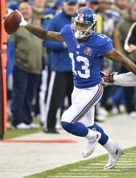
Big news out of the Meadowlands yesterday, as the Giants announced that they’re redesignating their white alternate pants as their home pants. They’ll now wear the white design for all regular season home games. The grey pants, which had enjoyed primary status both at home and on the road, will now be worn for regular season road games and during the preseason.
This means the G-Men will primarily be pairing white pants with blue jerseys and grey pants with white jerseys. But what happens when they’re forced to wear blue on the road (such as when they play their annual intra-division game in Dallas)? They’ll stick to the newly established pants protocol, meaning they’ll pair the blue jerseys with grey pants in those instances.
As a Giants fan, I heartily approve of this move. I’ve long been a fan of the white pants. The grey ones have always looked too dirty and blah for my tastes. Also, take at a look at these two photos (click to enlarge):
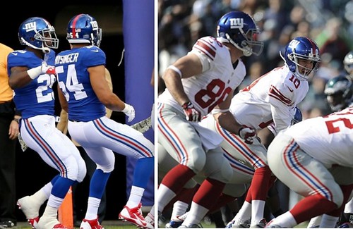
As you can see, the striping on the white pants is more blue-dominant, so it makes sense to wear that with the blue jerseys. Similarly, the striping on the grey pants is more red-dominant, so it makes sense to wear that with the red-trimmed white jerseys. As noted above, this striping-suitability model will break down when the team is forced to wear blue on the road, but whatever — I still count all of this as progress. (Of course, it would make even more sense if the Giants’ road jerseys were trimmed in blue instead of red, but that’s another story.)
Now that the white pants have graduated from alternate status, can they be improved? Yup: Get rid of that grey interstriping and just make the pants red, white, and blue. There’s no grey anywhere else on the Jints’ uniforms, so why have it on the pant stripes?
In addition, there’s also a report that the Giants are changing from black shoes to white. I’m a bit more agnostic about that change, but we’ll see.
In another positive development, the Giants have also announced their full uniform schedule. Only a handful of NFL teams do this, and I can’t recall any team doing it so early in the summer. Kudos to the Giants for sharing this info, and shame on any NFL teams that don’t do likewise. There’s really no excuse not to.
Click to enlarge
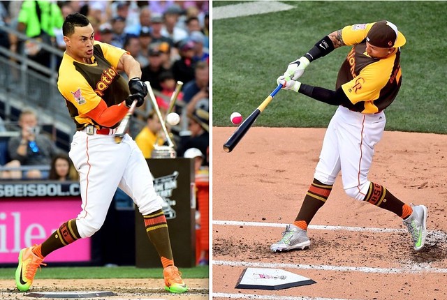
Derby doings: Back in May it was announced MLB’s new official sock supplier, Stance, had created new sock designs for the Home Run Derby and All-Star Game, but MLB said players would not be required to go high-cuffed in order to show off the new hose. They apparently changed their mind about that, because every player at last night’s Home Run Derby (including Giancarlo Stanton and Carlos Gonzalez, shown above) went high-cuffed.
I’m very conflicted about this. On the one hand, I’m pleased to see MLB mandating some sock exposure; on the other hand, I’m not happy that they’re only doing it as part of a corporate partnership. It remains to be seen if they’ll impose a high-cuffery standard for tonight’s All-Star Game.
Also of note from the Derby: In previous years, players wore their regular team pants, so you got a mix of mix of white, grey, pinstriped, and so on. But last night everyone wore white pants with reddish-orange trim and a reddish-orange belt, creating a more consistent, integrated look:
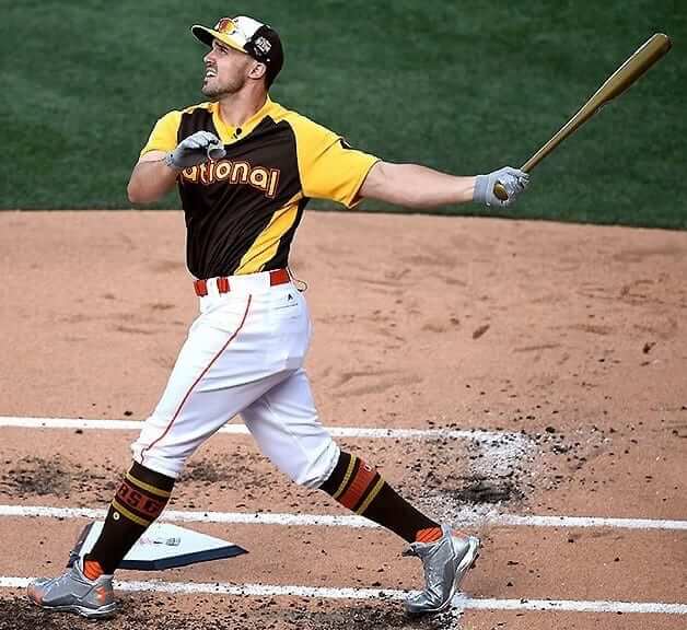
As I’ve said from the start, I’m a fan of this year’s Derby attire. Love that old Padres Taco Bell look. The net result is more of a costume than a uniform, but it’s a good costume, a fun costume. As a Mets fan, though, I did feel a little bad for Terry Collins, who at 67 deserves to wear something a bit more dignified (definitely click to enlarge this one — it’s a very sharp photo):
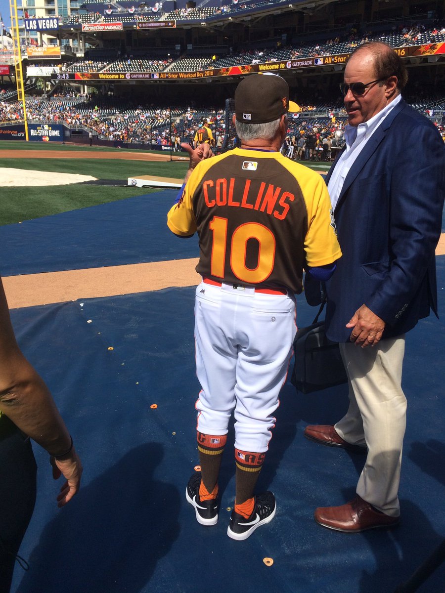
That shot also shows how absurd MLB’s logo creep has become, as Collins is wearing five visible iterations of the silhouetted batter. Enough!
(My thanks to Mike Chamernik and pcostello9 for their contributions to this section.)
Click to enlarge
Collector’s Corner
By Brinke Guthrie
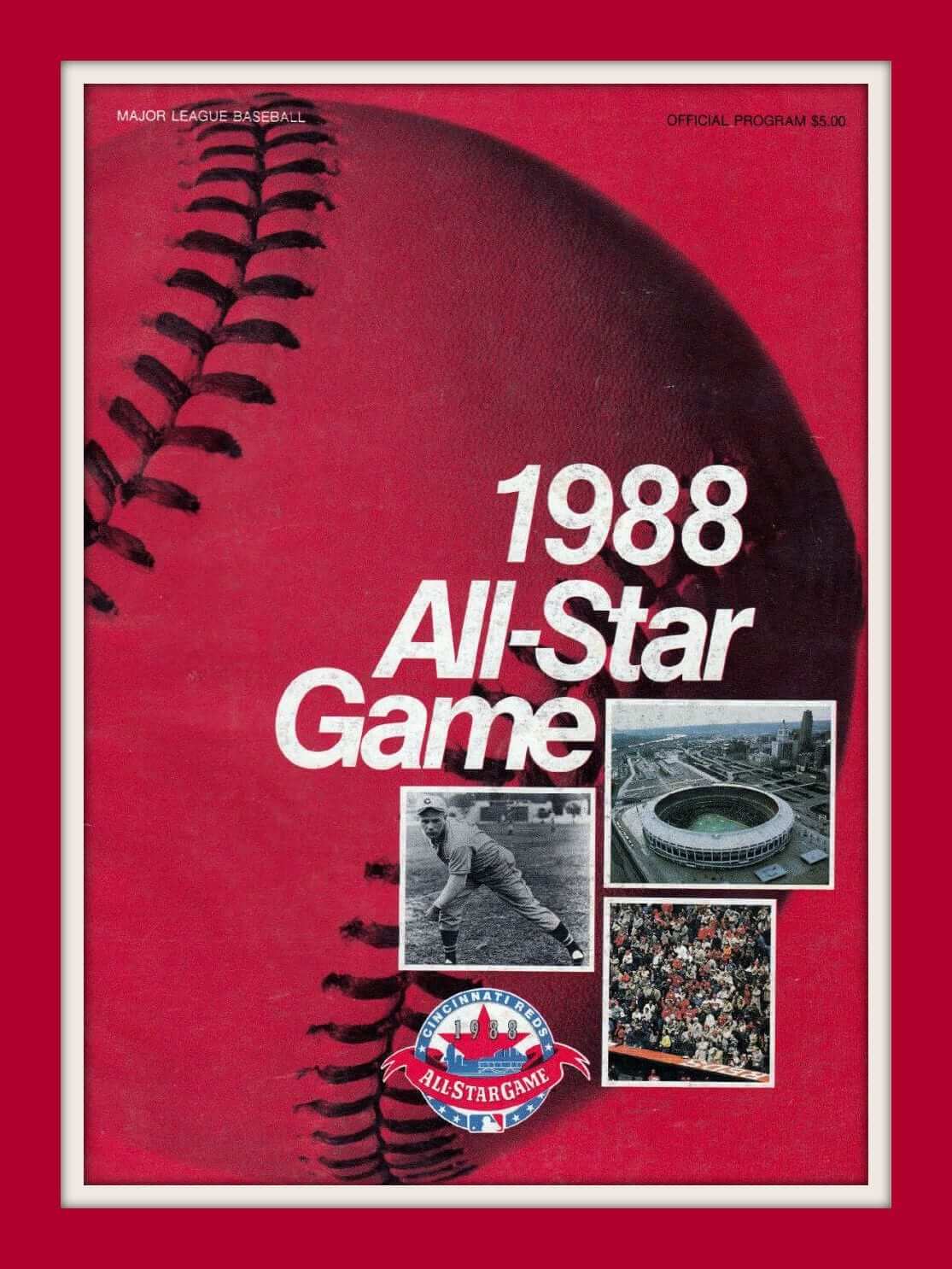
Tonight is the night for the big All-Star bash in San Diego. Hard to believe it’s been nine years since the one here in San Francisco, and even harder to believe it’s been 28 years since this one in Cincinnati. I worked for a Cincy radio station at the time, and we flew our hot air balloon right above the stadium, which happened to be restricted airspace because VIce President Bush was there. I looked down, 1,200 feet below, why it’s home plate! Then we heard a loud whirring noise that got progressively louder, and the Fuji Blimp was just underneath us. So that’s why it’s all white below us.
Speaking of the All-Star Game: For all you kids out there, back in the day you voted for the players by punching out holes in a ballot like this one and then either deposited it in a box at the stadium or mailed it in. [I did a Uni Watch post on that long-ago era of All-Star ballot design last year. ”” PL]
Good times, good memories. Now on to the rest of the week’s picks:
• Speaking of San Diego, here’s a 1970s Padres ice cream mini-helmet in one color scheme they haven’t tried — black and old gold, like the Saints. How would that look? No one else in the league does it, after all.
• This 1970s LP is called “The Two Sides of Bobby Orr.” The album features insightful commentary from the Bruins great.
• Nice 1970s retro Phillies milk mug right here!
• Nice graphics on this set of 1960s NHL “Rah Rahs” buttons.
• Seen plenty of helmet banks like this one over the years, but this is the first one ever for the Buffalo Bills. First one for the (Baltimore) Colts, too.
• Here’s a T-shirt for former Cardinals/Cowboys star Jackie Smith, called “Jackie’s Place.” Maybe he had his own bar? By the way, Jackie, I remember where I was when you dropped that TD pass in the 1979 Super Bowl — a first-floor dorm at Miami University. The other guys weren’t Dallas fans and they enjoyed this a lot.
• Nice retro graphics on this 1970s NFL Cowboys lamp.
• Somehow, I think this vintage Miami Dolphins pennant slipped past the NFL Properties licensing guys.
• This isn’t the first puzzling 1970s Braves sticker I’ve found on eBay. It has a goofy ball on it, and says “Braves Baseball Is More…” More what?
• This fellow put a lot of work into a DIY set of mini gumball NFL helmets, complete with goalpost.
• And from reader David Firestone, a full set of 26 1970s Riddell helmet plaques!

Raffle results, and today’s new raffle: The winner of the A’s cap is Kevin McElwee. Congrats to him, and thanks to all who entered.
Our next ’47 cap up for raffle is this Phillies pillbox snapback:
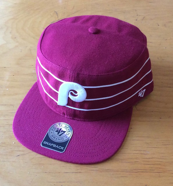
To enter, send an email with your name and shipping address to this address (not to the usual Uni Watch email address, please) by 8pm Eastern TODAY. One entry per person. I’ll announce the winner tomorrow, and I’ll also announce tomorrow’s raffle cap, and then we’ll keep repeating that process for each remaining weekday this month. If you win one of the raffles, please be nice enough to step aside and stop entering the remaining ones. Thanks.
StripeRite reminder: In case you missed it yesterday, I’ve partnered with Scott Turner and American Trench to produce a new line of crew socks with great stripe patterns down toward the ankle, where everyone will be able to see them:
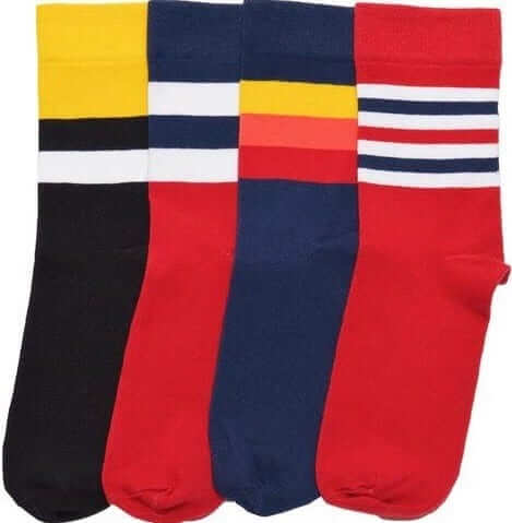
The socks are available here, and there’s lots of additional info here.
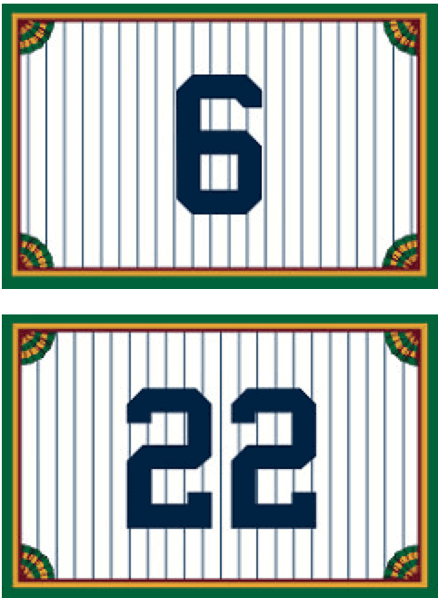
Membership update: It’s always amusing when two new membership enrollees ask for the same design motif. That was the case recently with new members Jake Stetson and Hugo Boutin, who both asked for Yankees-themed cards (both shown at right).
I just mailed out a batch of new cards yesterday. And for reasons not worth explaining, I’ll be sending another batch to the printer on Wednesday. So if you sign up now, you’ll get your card with almost no waiting time.
As always, you can sign up for your own custom-designed membership card here, you can see all the cards we’ve designed so far here, and you can see how we produce the cards here.
The Ticker
By Mike Chamernik

Baseball News:
Majestic has been successful with outfitting fans and players for the All-Star festivities (from Phil). … You can give a yea or nay to every Home Run Derby jersey over the last 15 years (from Phil). … Madison Bumgarner has a charity partnership with Carhartt where the company donates $500 for every strikeout. The pitcher received this jacket for raising more than $73,000 so far this season. … Oh geez, we missed this: The Rockies wore camo on Sunday for Military Appreciation Day. Here’s another look (from eddiemart2398). … Flashy new haircut for Bryce Harper (from Andrew Cosentino). … Angels infielder Yunel Escobar was ejected Sunday for drawing in the infield dirt. He was passive-agressively bemoaning a check-swing call. … David Ortiz leads the list of the top-selling baseball jerseys this season (from Andrew Cosentino). … The Salt Lake City Bees wore Utah Jazz-themed uniforms this weekend. Although baseball isn’t associated with jazz like basketball frequently is, the unis look sharp (from Kurt Adison). … The Vermont Lake Monsters will wear 1996 throwbacks on Saturday. … The Omaha Stormchasers will wear hunting camo jerseys Saturday. … Ryan Harrington reports that Hanley Ramirez moved his foot guard up around his shin on Friday after fouling off a pitch that hit him. He has done this before. … Kenn Tomasch says the Dizzy Dean biopic The Pride of St. Louis shows the 1934 Cardinals wearing this cap. According to Okkonen, he Cardinals did wear a cap similar to that, but it was in 1940, and only on the road.

NFL News: In the prolonged wake of Deflategate, NFL refs will now inspect all 24 game balls before kickoff. … Arthur Savokinas spotted this great Eagles bus-van at an old car lot in Old Forge, PA. Here’s a look at the front.
College Football News: Virginia Tech continues the renovations to its football facilities (from Andrew Cosentino). … USC revealed this year’s jerseys. Speaking of the Trojans, their aesthetic tradition isn’t as complex as you might think (from Denis Costello and Phil). … New white uniforms for Brown (from Jimmy Black). … Here’s a ranking of Big Ten uniforms (from Chris Flinn).

Hockey News: The AHL St. John’s IceCaps are moving to Laval, a suburb of Montreal, and the Canadiens are letting fans name the team. Only Quebec residents can enter, though, and bilingual French/English name submissions are highly encouraged. … The Islanders revealed the jersey numbers for their three free agents this offseason: Andrew Ladd, Jason Chimera and P.A. Parenteau (from John Muir). … It appears that the Panthers have a new Reebok practice jersey template. They used to have this pattern (from @houndogg). … The KHL’s Chinese expansion team unveiled jerseys featuring a sublimated Great Wall design (from Hnattyville Gazette).

NBA News: Tim Duncan retired yesterday. He played 19 seasons for the Spurs, and aside from a few small tweaks like crew neck and V-neck collars, the uniforms stayed the same the entire time (from @HolyCalamity). … Check it out: Chicago Bulls stirrups! The 1966-67 Bulls posed for a team photo wearing socks that are very similar to what is pictured (that was the Bulls’ inaugural season). Also, the Bulls wore these oddly-patterned socks during that season, too. … It had previously been reported that the players from the WNBA’s Minnesota Lynx wore pregame T-Shirts on Saturday to call for change in the wake of the recent shootings in Baton Rouge, St. Paul, and Dallas. Now comes word that four Minneapolis police officers who were working as security at that game walked off the job in response to those T-shirts, and the head of the local police union says others may follow. At least one other WNBA team has worn similar T-shirts: the New York Liberty, whose players wore pregame shirts that said “#BlackLivesMatter” and “#Dallas5” on Sunday.

Grab Bag: St. Bonaventure updated its logo. … The goalpost pads at last Sunday’s Canberra Raiders-North Queensland Cowboys Australian rugby match were shaped like milk cartons (from Jim Gregg). … This Detroit sports logo mashup jersey is truly awful. … A Munich photographer is documenting German nine-pin bowling alleys before they vanish entirely (from @univers47). … A variety of animals, from dogs to llamas, have interrupted the Tour de France (from Mary Bakija). … Here’s a good pronunciation guide for Ikea products (from Brinke). … A private equity firm acquired Mitchell & Ness from Adidas. No big changes are expected as of yet (from Tommy Turner). … Adidas is suing Skechers over a similar shoe design. Both produced running shoes with angled “blades” on the soles (from Michael Ehrlich). … New logo for WWE Smackdown? … U.S. Sailing has unveiled its sail designs for the Rio Olympics (from Chris Viel).
The current poll results in that SI Home Run Derby jerseys piece is interesting. I’ve always liked the 2008 set, though I know my bias for the Yankees design aesthetic may be seeping in. Always liked the 09 St. Louis and 12 Kansas City inspired ones as well.
The St. Louis jerseys were fun with their reference to the pastel blue road jerseys of the ’70s. I hated the San Francisco jerseys because of their ham-fisted lettering.
 “There’s no grey anywhere else on the Jints’ uniforms, so why have it on the pant stripes?”
Well, there’s the grey facemask, so…. :)
Ugh. And you’re right.
Lee
U.S. Sail design for Rio – I’m surprised by this… When displaying a flag vertically, one must keep the “canton” (top inner corner) in the original position. What that means is when we look at a US flag, the stars are in the top left and therefore when we move it vertically they should still be in the top left. It appears to be backwards, but a quick google search shows this is correct flag etiquette. This isn’t that well known, but definitely a pet peeve of mine so I thought I’d spread the word!
The upper left is the place of honor on a flag, so that’s where the stars are always supposed to be displayed. It’s almost physically painful to me to see those sails.
Yep, people just rotate the flag and display it wrong. You’d like to think for the Olympics they’d know how to display it correctly on a ‘uniform’. link
Hard to know if it is truly backwards… if the picture was taken from the other side of the boats, would the canton not be in the upper left?
No, not hard to know. Look at the design for spinnakers on smaller American boats at Rio: link
Note that the “USA” text is clearly meant to be read from the perspective of someone looking at the ship from the front, not from behind. Not unique to Team USA: Pretty much anytime you see type or logos on a sailboat spinnaker, it’s oriented to be viewed from the front, not from the rear.
Bills helmet bank has peculiar logo. Tail is wrong, and the buffalo’s feet are a little too happy.
Also, plenty of color-on-color team action on that “Dolphins” pennant.
The minimal amount of grey in the pants is the perfect complement to the grey facemask.
Honestly, the only thing they needed to do was darken the grey and everything would have been great. It needs a bit more contrast with the white to be a strong pant color.
A a lifelong NYG fan, I was a fan of the gray pants. I can live with the white but I cannot stand white cleats, they need to be black.
I preferred the gray pants for the New York Giants. The white pants are OK, but a downgrade, for sure.
New WHITE uniforms for BROWN (from Jimmy BLACK)
“Back in the day” was two years ago: link
Never liked the Giants grey pants.
I wanted to be the first to say last night’s Home Run Derby uniforms looked great! Stirrups would have been great, but I liked the socks, too. Lots of detail, and colorful.
Although I am not Giants fan I too am conflicted about the purported switch to white shoes. When I was a kid, white cleats/spikes were a big deal. Joe Willie Namath and Charlie Finley’s Oakland A’s were rocking the white shoes but the accepted practice was to wear black cleats/spikes. It was a big deal in high school when the coach finally relented my senior year and my buddies and I all went out and got new Puma white spikes. Sometime around 85-88 that trend reversed itself and black was back in vogue. As Paul and I are roughly the same age I bet a lot of people in our age group feel the same way.
“Oh geez, we missed this: The Rockies wore camo on Sunday for Military Appreciation Day.”
I wouldn’t say we missed it.
BTW, those NHL buttons in Collector’s Corner must be 70s, not 60s. The Seals didn’t become “California” until 1970, and Chicago wasn’t in the Western Division until 1970, either.
That is the 7 team NHL West division in 1970-71 and 1971-72. A geographically challenged NHL during expansion.
Oakland Seals became California Golden Seals in 1970-71.
Chicago was put in the West division in 70-71, while my Vancouver Canucks spent their time in the East division.
Very disheartening news from the NYFG. The 2005 re-make was classic throwback perfection (minus the lack of sleeves on the jerseys). Watching those teams from 2005-2009 made those old black and white films from the ’50’s and ’60’s come to life in full color.
Maybe its the History teacher in me…. or my family’s association with the Giants as season ticket holders and fans since ’25, but the nostalgia associated with the ’05-’09 teams had depth.
The “team cleat” introduced when Nike took over the unis marked the beginning of the end. The black-dominated cleat was quickly replaced, and not for the better.
Growing up through the 1980’s I never understood why fans today are so high on that uniform combination. A return to white cleats takes an unfortunate step in that direction.
The 1994 Giants throwback, on the road, featured white cleats and it looked atrocious! For a glimpse as to how it’s going to look this year look no further than punter Brad Wing from last season.
link
Horrible.
I realize I’m in the minority opinion here….but I’m sure I’m not alone!
In the Hockey news section, wouldn’t it be “their three free agents” rather than”their three of free agents”?
Fixed.
Sorry for the dead link… let me try again
link
Count me in the camp that has always liked the gray pants. Since switching back to the NY logo, I always thought that the Giants were calling to a kind of classic 1950s era NFL look, epitomized by the no-nonsense, no frills blue jersey, and to my mind, made the team appear much more dignified than say, the Atlanta Falcons with all their bells and whistles, or the Browns with their words down the pants.
Not to say that a simple change to white pants diminishes that all, but I just happen to like the overall package they already had.
Know what? I’m sick of the white pants *and* grey pants. Solid blue. Don’t even wait for the Color Rash date.
I’m torn on the Giants change. If they drop the gray from the striping and keep to the white pants only at home I’ll mostly be OK with it. But I’d rather them just bring back the gray pants they used when they first went back to this uniform set and use those full time.
The HD stuff I’m much less torn on. Yes I prefer pajamas so the stirrups and high socks did nothing for me. Especially being branded. And seeing the rest of the costume makes me hate the throwback trend even more. Ugh! Just more proof the Padres need to go back to blue and orange full time. Best look they ever had was the blue and orange. No more brown!
I’m not a Giants fan, but zi could never understand the point of having gray pants when nothing else is gray. Not sure why they would wear these with the white jerseys, regardless if they have 2 red stripes instead of 1. I’m assuming they will wear their gray pants with the alternate Red jerseys, so really they will only wear white pants 6 times.
Paul –
The jerseys the Panthers are wearing is the Reebok 20P00 practice jersey:
link
Basically, they’re using standard retail practice jerseys for that camp. Probably a cost-saving measure.
I ordered two pair of American Trench socks today. You also get a 15% discount when you sign up for their newsletter (which you can opt out of later). Free shipping to boot! $28 for two pair…not bad for quality socks. Thanks for helping put this together Paul!
Giants in Color Rush = Eeeew. Not looking forward to that reveal.
One note from the Tour de France: The Tinkoff cycling team has been sporting a jersey with a familiar Old English “D” below the left clavicle.
It was a mystery as to why the Detroit Tigers are sponsoring an Eastern European cycling team. That is, until an interview with a team member on TV. The “D” actually stands for La Datcha, a chain of rental chalets in Europe.
Paul mentions that he’d like to see each NFL release its uniform schedule in advance.
I actually take the opposite stance. I’d like teams to reveal what they will be wearing when they come out of the locker rooms on game days.
I love waking up each Sunday morning, and checking out the uniform looks, and match-ups.
Plus, if they didn’t lock themselves in, teams could leave them a little flexibility for alternates/special events.
2 cents, spend as you see fit.
Lee
I agree that it ruins any element of surprise. And of course one of the biggest reasons to announce the unis in advance is so fans will know which jersey they’re “supposed” to wear at the game (or while watching the game on TV), which I think is ridiculous.
Still, I like the advance notice is that it makes my job easier and helps me communicate useful info to my readers. And if they already know what they’re going to wear for each game by the end of July (which they do), I don’t really see the point of keeping that info under wraps. Except, as you said, to preserve some element of surprise.
I hate living in a world wear every football team knows in July what they will be wearing all season.
/dramatic
Lee
I would prefer to live in a world where fans cannot be certain what a football team will be wearing until after fans have arrived at the stadium. If I were emperor of the world, I think I might outlaw football [color]-outs even before I outlaw the wave. And I really, really hate the wave.
” And I really, really hate the wave.”
I second that emotion.
I would like to live in a world where the home team wore their home uniform and the away team wore their away uniform and that was that…
How about the gatorade shower? Can that go too?
“The 1966-67 Bulls posed for a team photo wearing socks that are very similar to what is pictured (that was the Bulls’ inaugural season).”
That’s 1968-69 season team photo on the link. No one wore #11 in 1966-67 nor #12 in 1967-68.
“Kenn Tomasch says the Dizzy Dean biopic The Pride of St. Louis shows the 1934 Cardinals wearing this cap. According to Okkonen, he Cardinals did wear a cap similar to that, but it was in 1940, and only on the road.”
He’s also wearing a 1944-45 button up jersey. Jerseys with the sleeve piping were worn from 1940-50 but with zipper fronts except those two seasons when they wore both.
link
I like the blue tops with white pants. Looks great. Grey pants with white tops? Not so great. Go with blue or red pants
Surprised it took that long for the new Smackdown logo to get leaked.
Old Forge High School is the Blue Devils in case anyone is assuming the owner of the Eagles bus is a Duke fan
Collins looked OK in that uniform. Too bad Berman wasn’t wearing one also.
Exactly, Collins looked fine, especially next to Berman.
Chris Berman sunk to a new and lower low.
link
Throwbacks trump one offs every time. I’d love to see more throwbacks mixed in minor league baseball as opposed to gimmicky tops and hats. Retro Baby!!!
Agreed! Vermont Lake Monsters throwing back to 1996 Vermont Expos – the last championship pro championship for a Burlington team – should look great.
Well, my interest in the ‘football giants’ goes way back into the 50’s when the gray pants were the norm. They wore them for many many years deep into the 60’s….so I’m partial to that look. For many years, the usual Giants uni was blue helmet, red jersey and gray pants.
Yeah, in fact, red jerseys were the norm for years going all the way back to their founding. For 16 years they wore either blue or red jerseys, and when the rule change came requiring a white alternate for TV, the white jersey had red numbers and trim, so the red seems pretty obviously a nod to the history of the team.
It’s a shame those of us in the U.S. with relatives in Quebec can’t add our suggestions to the Laval AHL team. I hope, upon hope, Les Voyageurs return.
The problem with the Terry Collins picture is he’s forced to talk/listen to Berman.
The Tenors sang the Canadian national anthem at tonight’s MLB all-star game. To make a statement they changed some of the lyrics, to say “all lives matter”, however, as no one outside of Canada knows the lyrics, it may have gone unnoticed.
It’s a small bit of progress for the Giants to go back to white pants. The real step would be to ditch both boring, dated sets (home and away) and bring back the great uni’s they wore in the 80’s & 90’s.
To me, those were the perfect progression from the staid, dull uniforms they wore in the 60’s: The red borders on the home uniform numbers/blue borders on the road uniform numbers were a logical splash of color that fit the team’s colors. The white facemasks were bold and bright against the blue helmet, and the big, strong font of “GIANTS” on the helmets fits the name of the team so much more than lowercase initials (Isn’t it silly and contradictory to represent a team named ‘Giants’ with lowercase letters? If the team was owned by e.e. cummings and he was going for irony, then ok…)
Take a look at photos of Taylor and Simms and Bavaro and Carson and others on the field in those uniforms: they’re clean, bold, and modern with a clear connection to the team’s history. The uni’s they’ve worn since 2000 were and are a step back. The ‘ny’ logo was only worn on the helmets for about 10 years (early ’60’s to mid-70’s) so it’s not like it had decades of history – An update was needed, and it’s needed again. I’ll keep hoping, and I’ll buy new Giants gear as soon as they do a real update.
The author should look up the definition of the word agnostic.
Maybe it’s because I’m a Cowboys fan but I think it’s really cool when a team has different uniform sets that aren’t mirror images of one another. I believe the Cowboys and Giants are the only teams who do this. I know that the Cowboys uniform sets are all drastically different with all of the jerseys being different styles and the pants being different with each jersey. Though I must admit I would cry with joy if we ever got rid of the green pants and royal blue trim on the whites and just stuck to navy and silver. Or if we just wore those glorious double star color rush jerseys year round….