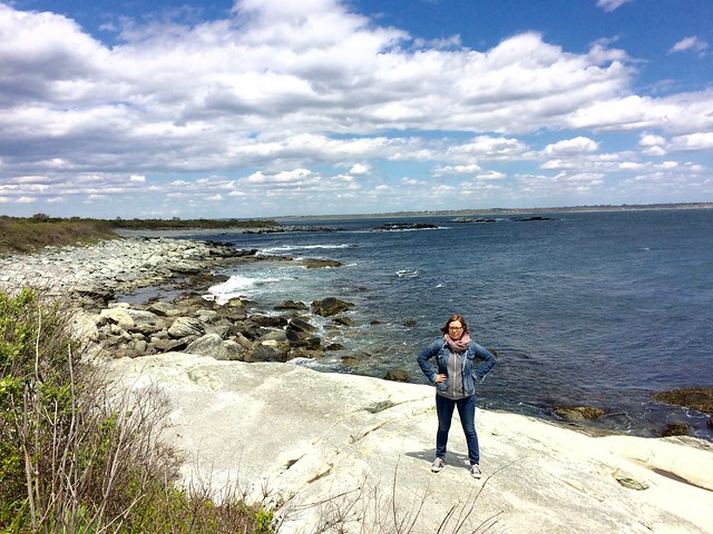
Photo taken Sunday at Sachuest Point National Wildlife Refuge; click to enlarge
As most of you know by now, my favorite state is Wisconsin, but there are plenty of other states competing for second place. One of them is Rhode Island, which is gorgeous, has a surprisingly eccentric food scene (a subject I once wrote about for The New York Times), and is situated not too far from Uni Watch HQ. So when the Tugboat Captain and I recently found ourselves in desperate need of a weekend getaway, Rhode Island was the perfect solution.
We arrived in Providence at 6pm on Friday and headed back home about 48 hours later. In between, we drove about 200 miles around the Ocean State. Due to southern Rhode Island’s unusual geography and a few other factors, we had to double back over a few stretches that we had already driven on, so our route didn’t end up as a neat circle or anything like that, but this should give you an idea of areas we were exploring (click to enlarge):
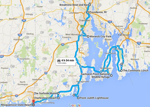
Here’s a rundown of some of what we did, some of what we saw, and a lot of what we ate and drank. Most of the photos were taken by me, although a few are from the Captain (you can assume most of the better ones are hers), one is from my friend Vicky, and two were poached from the internet. Almost all of them can be clicked to enlarge.
Friday, May 13: On our way up Providence, we stopped in New Haven, Conn., to get pizza at Frank Pepe, which may or may not be, as one writer has claimed, “the best pizza in America,” but it’s certainly in the upper echelon. Frank’s signature specialty is a clam pie, but we figured we’d be eating plenty of seafood in Rhode Island, so we went for pepperoni and bacon instead, and holy shit was it good:
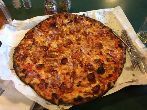
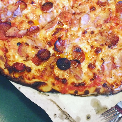
We had some leftover slices, and they made the car smell really good as we proceeded eastward. Soon we hit the Rhode Island state line, which brings up a peeve of mine. As you may know, Rhode Island recently had a bit of a kerfuffle over the state’s crummy new tourism slogan. It just so happens that I have the perfect slogan for them — one that I’ve been wanting them to use for years now. When Roger Williams founded Rhode Island on the principle of religious tolerance in 1663, his endeavor was known as “the lively experiment.” How awesome would that be as a slogan? Imagine crossing the state line and seeing a welcome sign that said, “Welcome to Rhode Island: The Lively Experiment.” Perfect!
Unfortunately, the welcome sign we saw when we crossed the state line looked like this:

Pfeh.
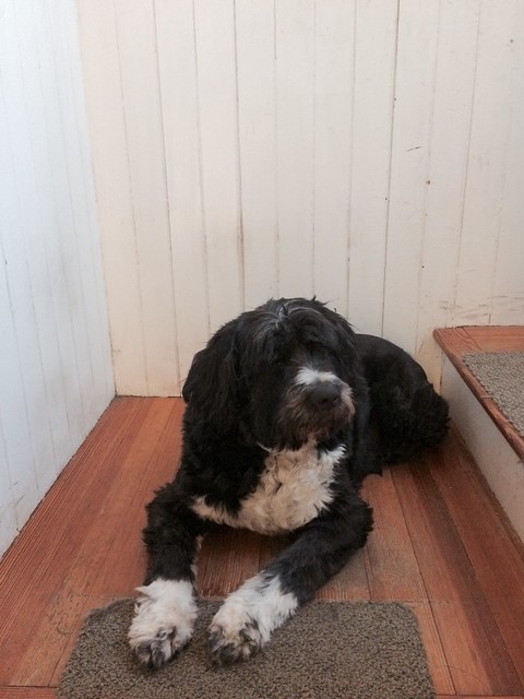
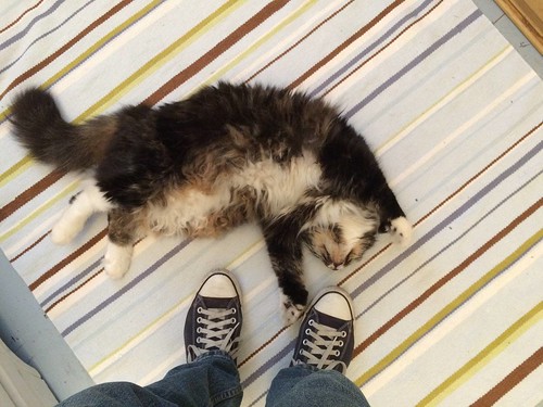
We eventually reached the house of my friend Vicky, who had offered to put us up for the night. I’ve known Vicky from the zine and indie-rock world for nearly 30 years (the second cat I ever owned was one of her cat’s kittens), but this was the first time I’d been to her house in Providence, so it was also the first time I’d met her wonderful dog, Lola, and her even more wonderful cat, Giacomo (who was a bit of a lively experiment himself):
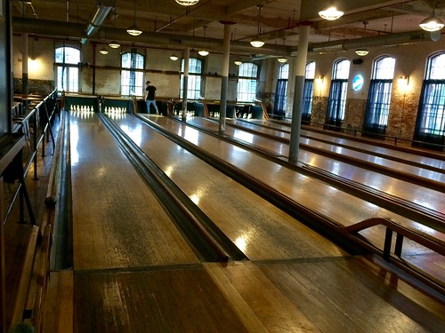
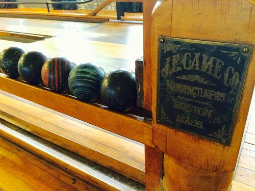
Vicky had booked us a lane at BreakTime Bowl, a new-ish duckpin bowling facility with live pinsetters, located in an old mill. Although the accompanying bar and some other amenities are new, the lanes themselves are original — they were built for the mill workers.
It had been about three and a half years since I had bowled ducks (that was with you, Robert Marshall!), so it was great to get back in the swing. And man, what a gorgeous space:
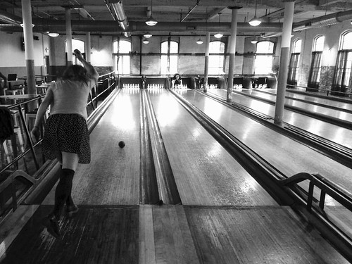
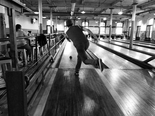
The only downer was our pinboy, who danced on the lane, stood in the gutters, stuck his foot out in front of oncoming balls and then removed it at the last second, lost track of which ball Vicky was on and therefore reset her pins prematurely, and generally behaved like a complete ass. I’ve bowled with live pinboys many times (and I’ve also been a pinboy), but this time I did something I’d never done before: I didn’t leave a tip.
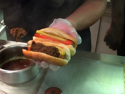
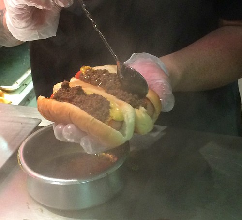
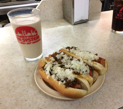
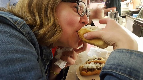
After bowling, Vicky brought us to a speakeasy-ish bar hidden behind a lingerie shop (just as weird as it sounds), where we had a few cocktails. And then it was time to hit one of my favorite Ocean State spots: Olneyville New York System, the definitive source for Rhode Island hot wieners (always say “hot wieners” in Rhode Island, never “hot dogs”). I had mine with a glass of coffee milk, the official state drink.
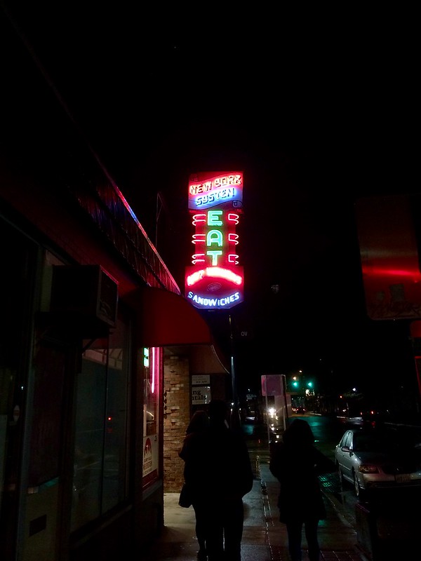
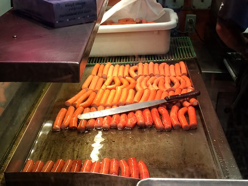
That was a full day and a fuller night. So we went back to Vicky’s and crashed.
Saturday, May 14: After breakfast at a local diner, we headed south, stopping at a few yard sales along the way. One of the sales had an item that caught my eye — one of those motorized shoe buffer/polisher thingies:
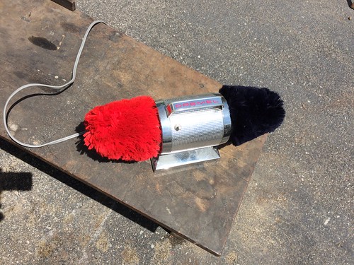
I have no reason to own such an item. I wear sneakers almost every day, plus it seems like one of those executive toys that I’d never want any part of. But for some reason I was entranced by the buffer — the bright colors, the streamlined shape, the absurdity of it all, plus I thought it might garner interesting reactions from the cats. I kept circling back to it. The seller saw me eyeing it at one point and said, “It’s nice, right? Still works, too.” So I asked him to plug it in, at which point we discovered that it didn’t work. I found myself feeling oddly crestfallen over this development, and I guess my disappointment must have shown, because the seller said, “You still want it? Just take it. No charge.” I insisted that he take a dollar, because I didn’t want to take something for free. So we put it in the back of the car and now I’m the owner of a very attractive but non-functioning shoe buffer. (I’ll probably end up putting it out on the curb in a day or three, but for now I’m still enjoying the weirdness value of having it in the house.)
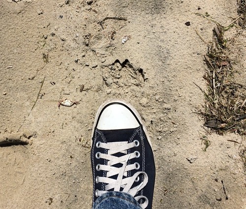
It was a cool blustery day, but we wanted to stroll by the water, so we headed to Warwick City Park, which has a nice little beach. At one point during our walk I saw a teeny-tiny dead crab — so small, so beautiful. I took this photo, using my sneaker for scale (the crab is just to the left of my toe), not realizing there was a piece of an even smaller crab a few inches away:
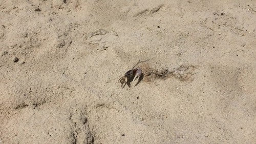
A few minutes later we saw live crabs — lots of them. It was a huge colony of fiddler crabs, darting in and out of their holes. Mesmerizing! The Captain got a little footage of this fella:
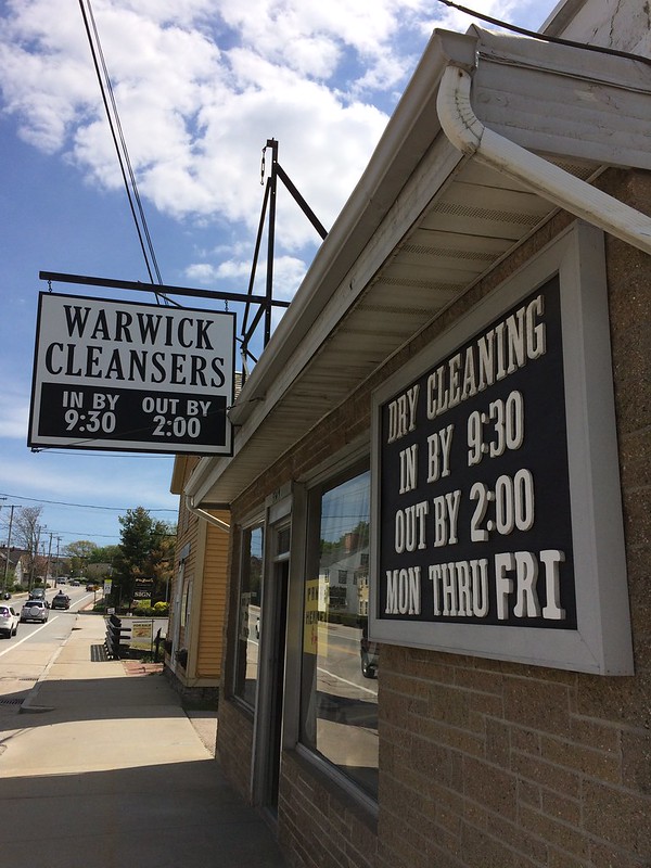
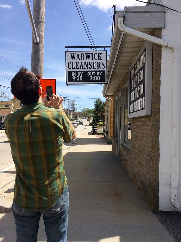
A little farther down the road, we came across an excellent regionalism that I had only recently become aware of: Dry cleaning businesses in Rhode Island are sometimes called cleansers instead of cleaners. Vicky, who told us about this phenomenon a few weeks ago when we were planning this trip, said cleansers used to be common but are now vanishing as shops update their signage, so we were happy to come across this one in Warwick:
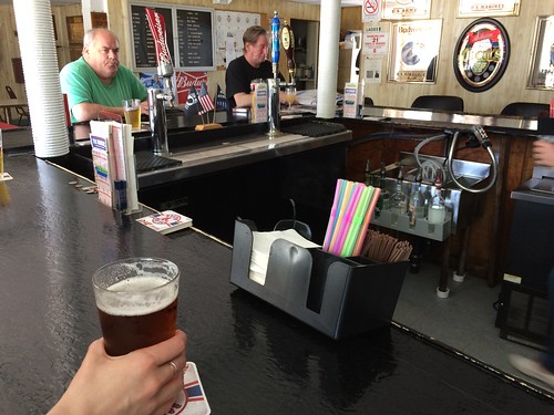
The cleanser was near a VFW hall that was open to the public, so we stopped in for a drink. This shot captures the place nicely, from the brightly colored bendy straws to the amazing, amazing face on the guy in the green shirt:
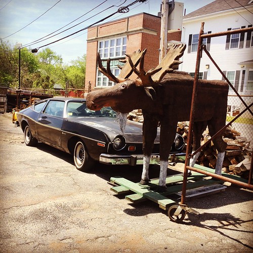
Across the street from the VFW hall was some sort of facility (maybe a fire department — I no longer remember), and in that facility’s parking lot was a big moose statue on a dolly, which was sort of irresistible. Whatever it’s used for, I hope I get invited to it, or manage to attend it, or whatever:
Next up was the town of East Greenwich, home of the Greenwich Hotel and its super-spectacular sign:
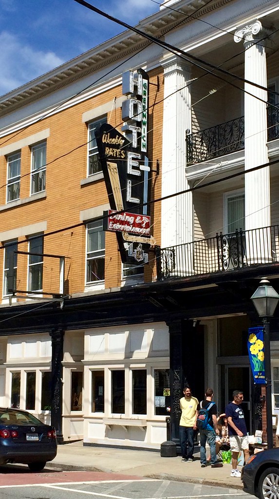
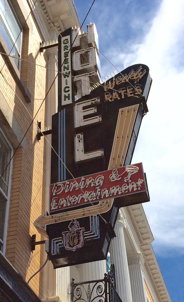
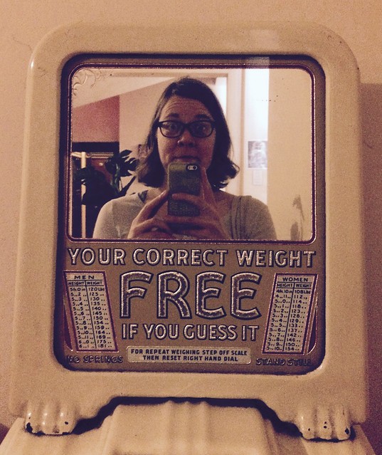
I’d been to the Greenwich before, I believe in 2012. There’s an amazing bar inside, almost as gorgeous as the sign, but it turned out that they don’t open until 7pm, so we couldn’t stop in for a drink. We did use the restrooms in the hotel lobby, however, one of which offered a nice bonus amenity:
The rest of the afternoon was a mix of driving, snacking on the leftover pizza, meeting a bunny on a leash (sorry, no photo), and one prominent disappointment (we wanted to visit the Point Judith Lighthouse but didn’t realize it had become a Coast Guard station and was off-limits to the public — dang).
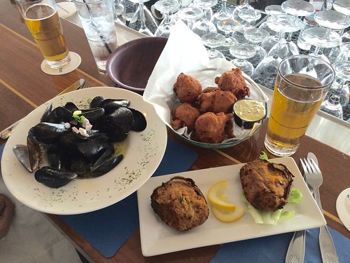
We definitely wanted seafood for dinner, and I knew just the place for it: George’s of Galilee, where we sat at a second-floor bar overlooking a marina and shared a classic Rhode Island meal of locally caught mussels, clamcakes (essentially fritters, sort of like hush puppies but with clams), stuffies (a mix of ground quahog clams, sausage, breading, and spices spooned into clam shells and baked), and Narragansett beer:
All in all, a very good day. We ended up crashing at a motel in Charlestown.
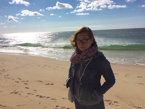
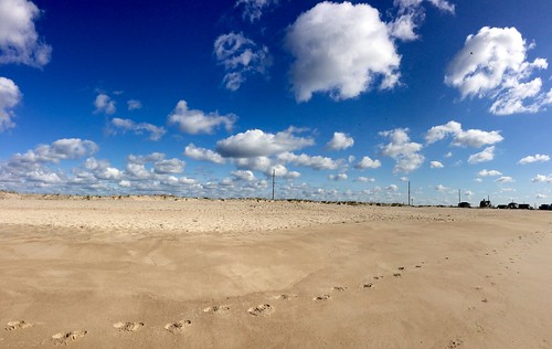
Sunday, May 15: We had gone to bed very early (like, 9:30pm-ish), so we woke up early and headed straight to Charlestown Beach, where we enjoyed a brisk, blustery walk under a very beautiful sky:
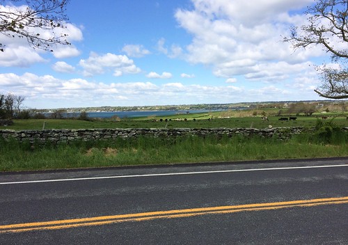
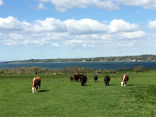
I wanted to have breakfast at a place in Little Compton, which was more than an hour away, so we set off on a really nice drive that took us across several bridges with great views of the ocean. Along the way, shortly outside of Little Compton, we came across a herd of dairy cows. The weird thing was that the cows’ field was near the shoreline, so sea was visible in the background, with a few boats tooling by. It felt like a really odd collision of agricultural and nautical cultures, with one of Rhode Island’s ubiquitous stone walls tossed in for Colonial bonus points. It reminded me of some of the scenes I’d come across when I traveled in Scotland in 2010:
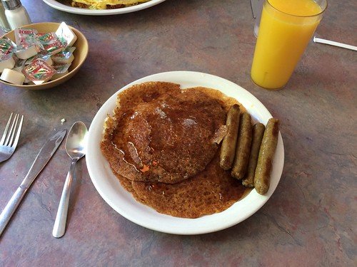
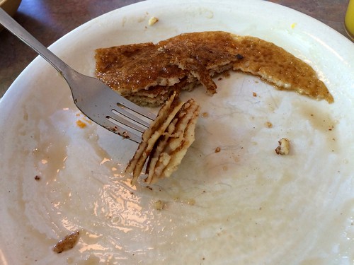
Soon after that we reached our destination: Commons Lunch, home of some of Rhode Island’s best johnnycakes, which are unleavened cornmeal pancakes — super-thin but still toothsome:

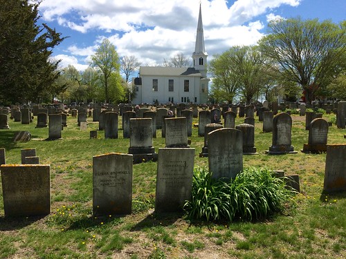
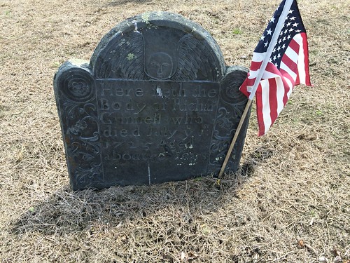
After breakfast we took a stroll in the beautiful cemetery behind the United Congregational Church, where some of the headstones date back to the 1700s (or maybe earlier — many of them were too worn down to read):
I was particularly intrigued by this pair of stones, each showing a hand pointing up toward Heaven (there’s an explanation of the symbolism here). The thing that really struck me was how the hand on the woman’s stone is more feminine-looking:
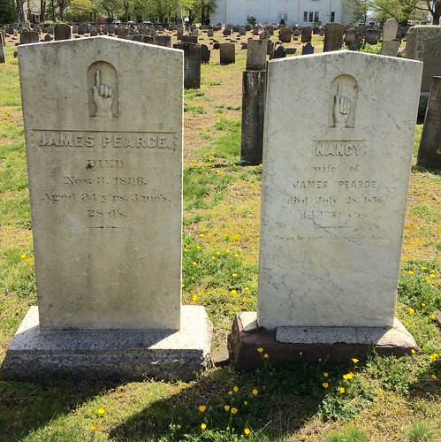
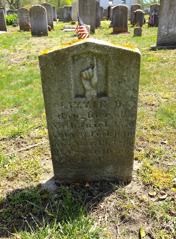
The hands on those stones are left hands, but a few yards away was another stone with a right hand:
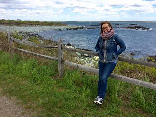
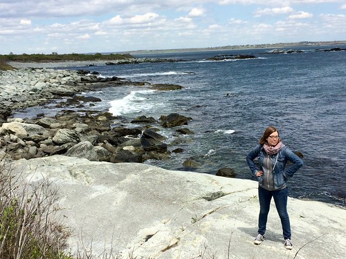
I really like wildlife preserves (at least when they’re not being occupied by armed seditionists), so our next stop was Sachuest Point National Wildlife Refuge, where we went on a 1.5-mile oceanside walking trail. It had become a seriously windy day, and it was pretty raw down by the water — felt more like mid-March than mid-May — but some of the views were jaw-droppers:
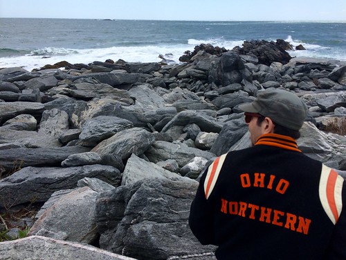

We snuck in one more meal before heading home, this time at Two Little Fish in Westerly, a seafood shack with a bunch of endearingly googly-eyed fish signs on its exterior:
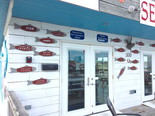
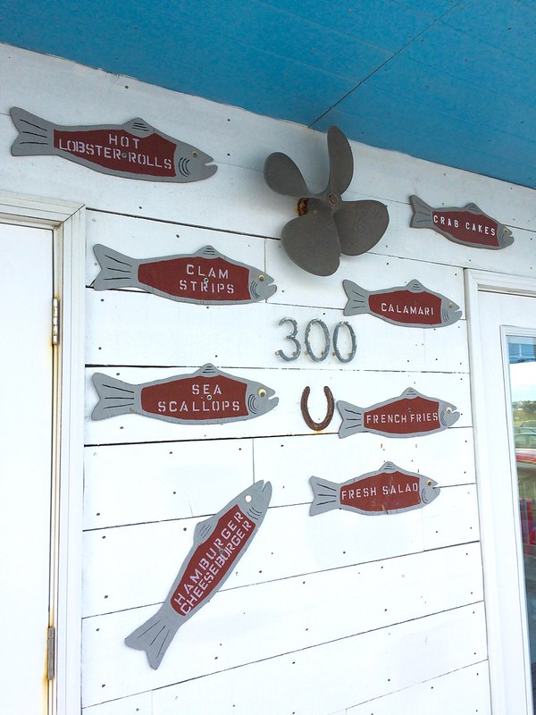
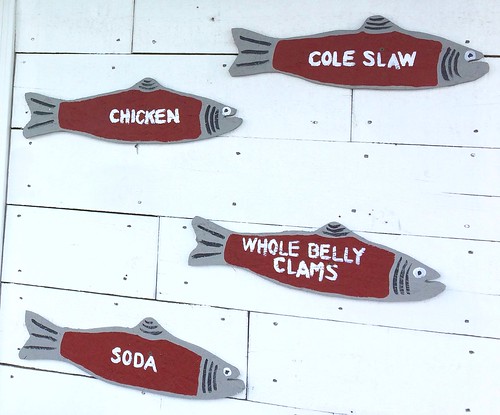
It had gotten seriously cold and windy by this point (we had tried going for another beach walk, which was pretty unpleasant), so we warmed up with some very good chowder and another order of clamcakes, washed down with a local brew:
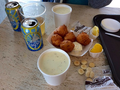
After that we headed back to NYC, but the weekend still had one little treat for us. Toward the end of our trip home, as we were driving through the Bronx, we saw a rainbow. But not just any rainbow — we were able to see both ends of it:
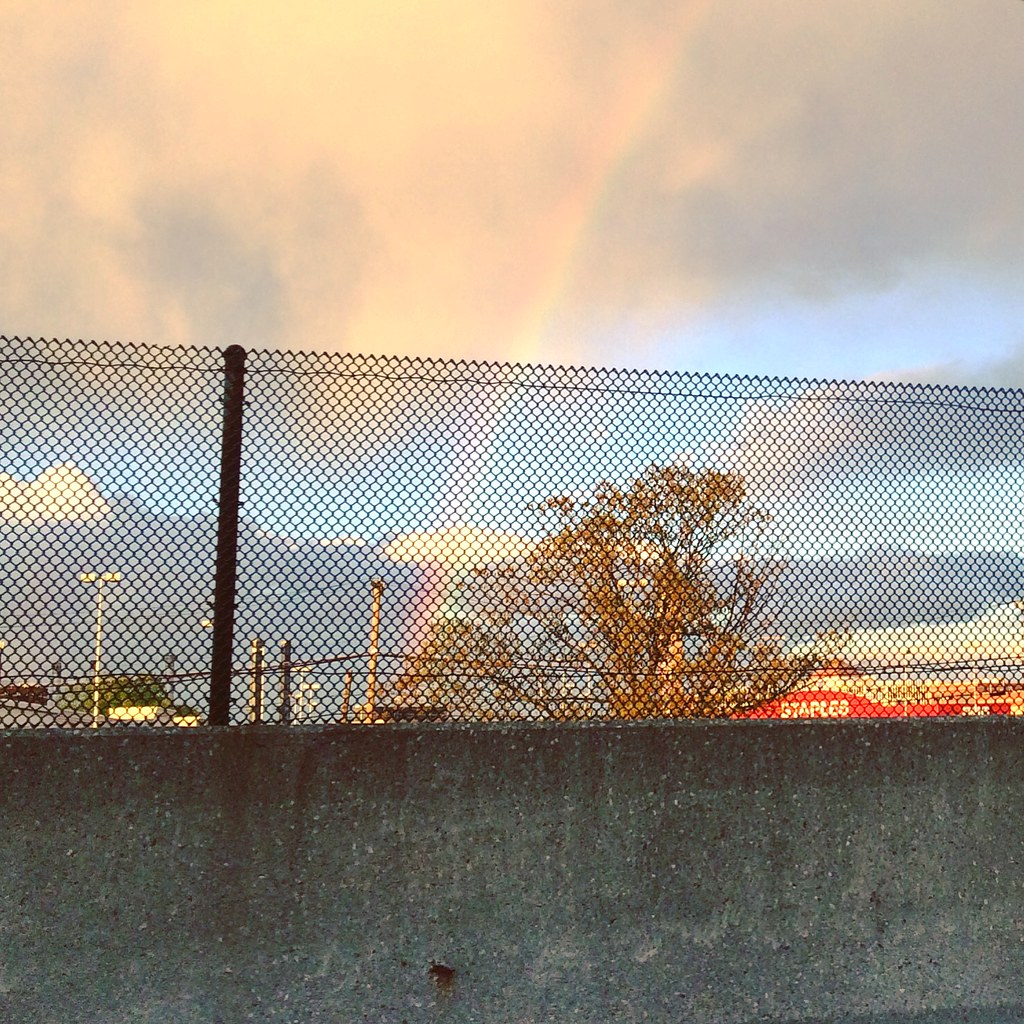
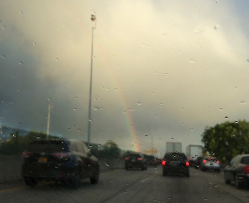
Although we weren’t able to capture it in a photo, we could see the entire 180-degree arc! I had only seen that once before, during a 1997 road trip in Iowa (where it’s so flat that seeing both ends of a rainbow is probably commonplace). A perfect capper to a really great weekend.
Thanks, as always, for indulging me with these travelogues. We’ll get back to regular Uni Watch content tomorrow.
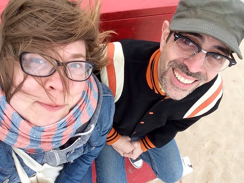

For all Pitt photos, click to enlarge
Actual uniform news, how about that: The good news is that Pitt officially restored the script logo to its athletics program last night. The bad news, as shown above, is that the the football uniforms have a ridiculous number font. Here’s a rear view:
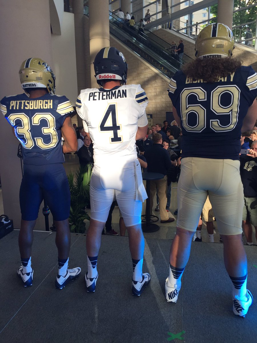
As you can see, the numerals are block on the outer contours but curved on the inner contours. As usual, in classic Nike fashion, there’s a “story” behind the font. And as usual, the story doesn’t matter, because the design looks awful, and that’s what matters. As soon as I saw it, I immediately thought of nuts — the hardware kind — so let’s call this font Totally Nuts.
Here’s a good look at the script on the new blue alternate helmet:

And here’s a peek at the new men’s and women’s basketball uniforms:

You can see all of the school’s new uniforms here.
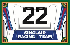
Membership update: As usual, we got a slew of orders on Purple Amnesty Day, but not all of them were for purple-inclusive designs. One of the most interesting requests we got was from Alex Sinclair, who wanted the us to do the hood livery of the 1971 Porsche 917K in Martini Racing colors. As you can see at right, membership card designer Scott Turner did a tremendous job in executing that design.
We also got plenty of purple orders, some of which have been added to the membership card gallery. If you placed an order and don’t see it there yet, don’t worry — we’ll get to it shortly.
As always, you can order your own custom-designed membership card (but not with any purple, at least until next year’s Purp Walk) here, you can see all the cards we’ve designed so far here, and you can see how we produce the cards here.
Party reminder: Remember, Uni Watch party next Wednesday, May 25, 7pm, at the Fourth Avenue Pub in Brooklyn, with special guest Chris Creamer of SportsLogos.net. Hope to see lots of you there.
And while we’re at it: The following night — Thursday, May 26, 7pm — I’ll be a featured guest at this live “Talk Show” event, where the host will be interviewing me on the finer points of what it’s like to be a uniform reporter. It’s free — you should come.
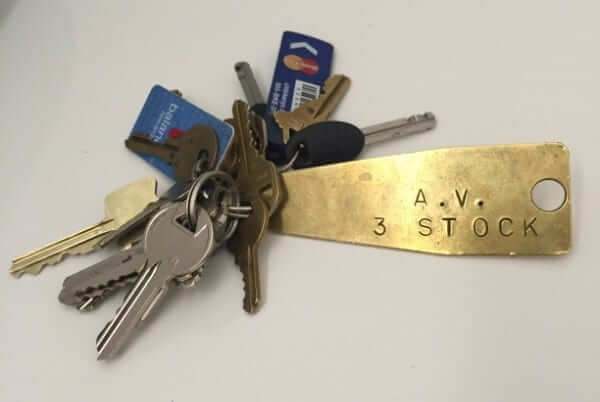
KRC update: The latest installment of Key Ring Chronicles, about a big brass tab salvaged from an old German factory, is up. Check it out here.
Incidentally, I’m always in the market for for new Key Ring Chronicles submissions. If you have a special item on your key ring with a good story behind it, please consider sending that story (ideally limited to 300ish words), along with a photo (ideally showing your entire key ring with everything on it and nothing bleeding out of the frame, like in the photo shown above), here. Thanks.
The Ticker
By Paul

Baseball News: Here’s what various concession items cost at Shea Stadium in 1967. Yeah, things cost a lot less back then, go figure, but the more interesting thing, at least to me, is that they sold egg salad sandwiches, soup, and cigars. No word on how much Phil’s favorite ballpark item, bacon on a stick, cost back then (from Jason Mott). … A school team in Waynedale, Ohio, wears uniforms based on the Padres’ 1978 design (from Jeff Moulden). … Braves OF Mallex Smith’s home and road NOBs have very different letter spacing. … Latest Cleveland player to wear stirrups: Rajai Davis. … The Brooklyn Cyclones will become the Coney Island Franks for one game this summer (thanks, Phil). … 1990s Nickelodeon Night jerseys upcoming for the Frederick Keys (from Justin Wages). … Speaking of the Keys, they’ll be giving away an “Iron Manny” bobblehead this Saturday (from Andrew Cosentino). … The hoodie that Tigers skipper Brad Ausmus left on the field after a tantrum the other day is being auctioned off for charity (from Chris Flinn). … Look closely and you can see that Red Sox P David Price has two dates printed on the webbing of his glove. Anyone know what those are about? (From @MetsTilDeath.) … Iron Man uni this Saturday for the Indianapolis Indians. … Here’s a story on that guy who’s the world’s greatest batting stance imitator (from Mary Bakija).

NFL News: Here’s a shot of former Oilers QB Lynn Dickey wearing a preseason-only Oilers jersey. I was wondering if the Gridiron Uniform Database guys had included that on their site, but of course they had. … Check out this old Bengals shot of QB Kenny Anderson and RB Pete Johnson with mismatched facemask colors (thanks, Phil).
College Football News: Arizona State sure has a lot of helmet options. … Back in February I did an entry about players who wore No. 100 in 1969 to mark college football’s centennial. One of those players played for Louisville, but we didn’t have his name — until now (good find by Kelley Dicky). … Looks like Louisiana Tech may have leaked their new road jersey. Here’s last year’s, for comparison.

Hockey News: Yesterday’s post about NHL prototypes prompted several people to mention that there had once been a Sharks prototype with a zippered collar, which was nixed because the zipper was deemed to be a safety hazard. Mike Styczen has now come up with photos of this — look here, here, and here. … Here’s a gallery of NHL dressing rooms (thanks, Mike). … Lightning C Steven Stamkos and soccer player Kaká did a jersey swap last night, and the Lightning even included Kaká’s accent on his NOB. … The International Ice Hockey Federation has been holding some internal elections for various positions, with the order of the candidates’ speeches indicated by numbered pucks (from John Muir). … The Federal League has a new team, and it’s a mouthful: the St. Clair Shores Fighting Saints. If your city name is three words, shouldn’t you maybe think about sticking to a one-word team name? (From Justin Walden.). … Here’s an odd place for a patch. That’s the London Knights celebrating their OHL championship last week (from Marc Viquez).

NBA News: A Warriors game features a lot of arena entertainment in addition to the game itself. … Speaking of NBA arenas, here’s a slideshow of notable images at the Cavs’ arena. I love how the introductory text says, “You go straight through the metal detector to the concessions to your seat,” as if the metal detector were part of the fun. I didn’t click through all 44 slideshow images, but I’m guessing they didn’t include a photo of the security pat-down (from Jason Hillyer). … Here’s the 76ers’ douchebaggery du jour. Can they keep coming up with a new way to inappropriately and prematurely display their jersey advertisement every single day? (From F.K. Yaaj.) … Anyone know the story behind the lapel pin being worn by Warriors coach Steve Kerr last night?

Soccer News: Unusual look for the ref in yesterday’s Europa League final. … That same game featured two teams outfitted by New Balance — an uncommon match-up. … The Portland Timbers have unveiled the first official MLS team emoji app (from my old zine pal Gail O’Hara). … The Greencock Morton kit that fans were very unhappy about has now been withdrawn (from George Chilvers). … Manchester United and Crystal Palace fans have been told that they can’t wear team jerseys, pins, scarves, or other team merch if they’re sitting in certain corporate club areas at Wembley (from DK).

Grab Bag: Workers in lower Manhattan are having a Post-it design war. … Here’s an Indian cricket player wearing No. 777. … The staff at Guantánamo Bay prison complex in Cuba have all sorts of intramural sports teams, many of them with very amusing names. … New logo for the next Star Trek series. … Here’s what many of the top tennis players will be wearing at the French Open (thanks, Phil).
In recent years, Rhode Island has installed several of these signs along popular thoroughfares as your enter the state: link
Oh, that’s actually the sign design we saw when crossing the border, but I couldn’t find a photo of it, so I linked to the other design instead. OK, I’ll swap that in — thanks!
*you
1. Rhode Island is understatedly quirky and most people wouldn’t realize it.
2. Greenock Morton. Nobody wants a Greencock.
3. Without the accent, Kaká becomes poop.
On the Bengals shot I think that the black paint has just flaked off Kenny Anderson’s face mask.
That’s a good photograph of their best uniform. But it would have been improved if they’d found a way to keep light from glinting off of the silkscreened black stripes on the orange fabric.
As much as I drive thru Rhode Island (truck driver), looks like I need to stop and be a tourist.
Thanks for the pictures.
Proofreading (or is it “creative spelling/grammar”?)
“Anyone know the story behind the lapel pin beig worn by Warriors coach Steve Kerr last night?” being
“The Portland Timbers have unveiled first official team emoji app”
When I saw the Warriors in April, I can’t say any of their “arena entertainment” made an impression.
Here’s what I got on the David Price dates:
-8/17/2007> two days after he signed his first professional contract, don’t know any other significance
-4/24/2008>friend Tyler Morissey died in a car accident
The first date is when his other best friend died, just saw it in an E:60 thing they did on Price. He lost both of his best friends in 8 months.
The first date was the date one of his best friends passed away. The second date is the date his other best friend died. This was mentioned in the E:60 report on him that aired a couple of weeks ago.
Here’s a link with some explaination of the dates on Price’s glove.
link
There’s still sand in my shoes! Permanent souvenir.
I get an error on the Indianapolis Iron Man link.
Fixed. Here’s the proper link:
link
In the soccer section it should read Greenock Morton not Greenock Norton.
Fixed.
yeah, they painted Kenny’s facemask over and over, but the paint always wore off pretty quickly…. didn’t stick to the plastic mask very well…. there’s tons of pics out there where it’s worn off in the center (where he would hold it or adjust it) and still black near the edges.
Probably his coffee breath peeled off the paint.
link
Remember Paul it’s “Tracking” not “Kerning” on Braves OF Mallex Smith’s jersey. Kerning-space between 2 letters, tracking space between all the letters.
Thanks for the reminder.
“Tracking” has other meanings in the uni-verse. How about spacing?
That will work. Enjoyed the Rhode Island trip report, good stuff!
Sure, that’s a nice moose statue on a dolly, but no mention of the fab (or maybe just odd) car lurking behind it?
AMC Matador. Oh the memories.
Loved the Matador pic. As you said… memories.
Well, visiting a wildlife preserve while it’s occupied by armed seditionists could be quite a lively experiment after all. Hopefully not a deadly one.
Two things re: Pitt number font.
One, I don’t think it is that bad. It *looks* nice and clean, and it is much better than Arizona’s or Miami’s awful number font, for instance. Perhaps Paul’s comment set my expectations low.
Two, am I the only one annoyed when a school’s football uniform number font doesn’t match that of the rest of their school’s sports? Arizona has long been a prime offender, which is too bad IMO because their basketball uniforms are so clean. Oregon still uses the old, original Nike rebrand number font on their hoops unis and the Belotti font on their football unis. Why not make them all the same? It doesn’t seem *that* hard.
Actually, the Bellotti font is retired for football. Oregon now uses a number font on football jerseys that debuted in the 2012 Rose Bowl. It is strange that the 1999 football number font lives on the basketball jerseys.
Screw the moose — look at that ’76 Matator coupe!
/shoulda asked me aboot the Point Judith lighthouse…
I’ll bet plenty of “uniform guys” also happen to be “car guys”!
Yep. I’m a Mopar guy. -C.
Some of us just have a soft spot for cars that generally aren’t remembered fondly. Ah, to drive my red Gremlin again….
The Sharks’ zippered sweater addresses my OCD complaint about their original jerseys: that one of the shark fins on the shoulders had been pointed backwards.
It’s too bad they didn’t carry over the shoulder patches to the final version of the Nike jersey. Though the final version did have vertically arched NOBs, so it at least had that much going for it over the zippered prototype.
I was always fascinated with the Dave Jennings, punter for the Football Giants (and Jets) and his facemask!
Jennings wore FOUR different versions of the Giants uni during his career. He wore the last “ny” helmet/uni combo in his rookie year of 1974
link
The “disco” NY logo in ’75
link
And then the “GIANTS” unis of the late 70’s with all the stripes and early 80’s when things calmed down a bit..
link
link
I always loved how Jennings kept his classic 2-bar facemask throughout his career… even when the giants went to white masks. It was so cool to see his grey mask when everyone else had white..
While gathering pictures for this post this morning I realized that in 1975 the Giants painted his mask white! I believe this was the only year he wore a white mask… Fascinating
For the record, he finished with the Jets.. and kept his classic grey 2-bar!!
link
Hey Paul, I’m born and raised in RI and I read your site almost everyday. While I usually scroll straight to the uni-related items, I was surprised to see your RI trip here. I couldn’t believe you were writing about Breaktime bowling, Olnyeville Weiners, and Justine’s speakeasy. They really are some great places to go to, and I loved he recap. Thanks for the Rhody love!
The biggest thing about Rajai Davis going to the stirrups is now his has striped socks. How hard is it for the clubhouse guy to only have striped socks, stirrups or otherwise?
Another great travelogue Paul!
Kicking it off with Pepe’s Pizza – great call, their pizza rocks! Connecticut has some of the best pizza of any state I’ve been to.
I’m personally a Sally’s guy, but you can’t go wrong with Pepe’s. They’re both awful damn good. It’s also worth checking out the various Greek pizza joints in the area. A totally different pie but also very good. The code is any place calling itself “pizza house” or “house of pizza” is Greek. For a special treat, stop by Beverly Pizza House in Bridgeport. Eli will wield a machete and argue sports with you while your pie is baking. Fun times.
Sally’s has weird hours. Never seems to be open when I’m in New Haven!
Have you done Louis Lunch?
Yes, many times (most recently, I believe, in February of 2015).
I was thinking the same thing about Louis Lunch. But going to Frank Pepe’s and not having a clam pie!?!? Bold choice is my only comment….
Well, they *do* offer a slew of other toppings/styles/etc.
Here’s my thought on Pepe’s clam pie, and on white pies in general: A pizza without tomato sauce is, to me, not a pizza. It may be (and often is!) a very delicious foodstuff, but it is not pizza. At least not to me. So when I’m really in the mood for pizza, I do not order a white clam pie, or any other white pie. But I have ordered white pies, and will no doubt do so many times again, when I’m in the mood for something delicious but am not dead-set on getting pizza.
Anyone else notice that at the bottom of the ’67 Shea Stadium concession stand sold a “Met Yearbook” not a “Mets Yearbook”? Were the names interchangeable or was “Mets” used as some sort of plural.
Technically speaking, that’s a typo.
But many people mistakenly use the singular form (of any team name, not just the Mets) in various constructions — “Met Yearbook,” “Yankee fan,” etc. All of these are wrong (if you’re a fan of the Yankees, then you’re a Yankees fan), but they’ve achieved a certain colloquial/vernacular/conversational currency.
These are not wrong. It is a matter the base form of the noun used as the appositive, which a noun modifying another noun, as in “dog food”. This is the traditional manner of naming things having to do with a team. It is the reason that we have the expression “Yankee baseball” and the names “Yankee Stadium”, “Tiger Stadium”, “Dodger Stadium”, and “Angel Stadium of Anaheim”; and it is why Tommy Lasorda bleeds “Dodger blue”.
The convention of using the plural exists alongside of this more traditional convention. The newer convention has given us names such as “Giants Stadium” and “Royals Stadium”.
I strongly prefer the more traditional practice; and that has long been the norm in New York. People mainly talk of being a Yankee fan, a Met fan, a Giant fan, a Jet fan, a Ranger fan, and Islander fan, a Knick fan, a Net fan.
I always called myself a Yankee fan when I was a kid. After I stopped following the Major Leagues, I referred to myself as a CityHawk fan (New York CityHawks, Arena Football), a Bear fan (Newark Bears, independent Atlantic League baseball), and a Dragon fan (New York Dragons, Arena Football). It was the linguistic convention that felt most comfortable in those contexts.
In other contexts, the newer convention seems to flow better. As a fan of Chelsea F.C., who are called “the Blues”, if I were forced to put “Blues” into that construction, I wouldn’t say “a Blue fan”, but only “a Blues fan”. The problem doesn’t come up at all with NYCFC. And, regarding the Cosmos, it feels more natural to say “a Cosmos fan”.
Still, the traditional practice is the dominant one in New York when it comes to the baseball, football, and hockey teams. Especially for baseball, the versions “Yankees fan” and “Mets fan” feel very wrong and vaguely out-of-town-ish (notwithstanding Paul’s reporting that it is the usage that he favours). For the basketball teams, the usage is more split between the traditional and the newer practices.
Dude: They are wrong. The end.
Equally perfunctorily: no; you are wrong.
Actually, Ferdinand, I’m right. It’s pretty simple: If you are a fan of the New York Yankees, you are a New York Yankees fan (the singular/plural format doesn’t change simply because the words have been rearranged), and thus also a Yankees fan. That is not opinion; that is basic grammar. Any professional copy editor — and I should know, because I once was one — would agree.
You may like certain conversational aspects of “Yankee fan,” and I agree that conversational conventions can have a certain appeal, but it is still wrong.
Think of it this way: Let’s say, for the sake of argument, that you’re a fan of the Rolling Stones (which you may in fact be, I don’t know). Would you say you’re a “Stone fan”? Of course not. You’re Stones fan. Works the same way with team names.
We’re done here. Let’s move on. Thanks.
Despite your insistence that we’re done here, you bring up things that require rebuttal.
First, you cannot deny that the base form of the noun is traditionally used in the appositive; it will not do to just wave away the many good examples that I gave. Also, consider “shoe store”; no one says “shoes store”. The fact is that the appositive use of the base form — even where the concept is plural — is a productive pattern in the language, which, as any student of linguistics knows, means that this cannot be called “incorrect”.
Also, it is absurd to deny that both conventions are in use simultaneously. Yes, I am a Stones fan. I am also a Beatle fan. Some names work one way (“Yankee fan”; “Beatle fan”); some names work the other way (“Cosmos fan”; “Stones fan”).
No, Ferdinand is not wrong. When a noun is used as an adjective, it is very often singular. We call it a boat race, not a boats race; a foot stool, not a feet stool; a cigarette packet, not a cigarettes packet.
Wish I could find the video online, but back in the late 1980s WGN ran ads for Cubs broadcasts featuring a couple of stereotypically Chicagoan bleacher bums talking in the style of SNL’s Bill Swerski’s Superfans. The punchline of my favorite ad in the series came in a promo for a series against New York: The one guy asks the other, “What the heck’s a ‘met’?”
When I was tiny I thought they were named after the catcher’s mitt.
The bleacher bums were Dennis Franz and columnist Mike Royko.
Paul, I’m always impressed with your travelogues…the sheer number cool places you’re able to track down is so impressive. Is there a flux capacitor in your vehicle or what?
That pizza photo. I’ll be thinking of that for the rest of the damn day.
Same here.
+1
I truly enjoy your travelogues Paul. Another blog site for those maybe? Your jacket is also epic and awesome. Love it. Looks like a good weekend was had.
I caught the Ohio Northern letter jacket too! I lived 10 minutes from Ada for a few years.
Where’d you unearth the ONU Polar Bear jacket, Paul?
I live in RI and I know I never visited Little Compton. Thanks for the idea.
According to new WashingtonPost polling, only 90% of Native Americans are “not bothered” by Washington Redskins name vs 9% who are “offended.”
link
Paul,
Love the travelogues. Makes me wish I lived closer to the sea.
One thing I’m surprised you didn’t mention (maybe you’ve covered it before) is the official name of the state:
State of Rhode Island and Providence Plantations
I’m surprised that the official name would be on the road signs.
Also, one thing they didn’t show in the Quicken Loans arena pics is that even though the color scheme in the whole arena reflects the current wine/gold, the tile walls in the restrooms still has random powder blue and orange tiles on a white wall from when the arena was first opened.
Wisconsin? Interesting choice. I have a hard time topping Montana, Colorado, Washington & Oregon… which all seem to vault to the top when I’m there.
BTW, Is that your AMC Matador?
Wisconsin has been awesome in my 3 short visits there. I can see it as a viable option — a bit biased opinion from me though, since I’m a Packer fan.
Colorado is awesome too!
The drive from Providence south through Warren, Bristol, Middletown to Newport is one of the nicest little roadies in our fine country.
Thanks for sharing your RI travelogue! Love it!
FYI, your trips have at least partially inspired me. This fall I will be doing a road trip through Quebec (inspired the trip, not the destination).
Anyways, keep ’em coming!
Lee
Oooh, Quebec – nice!
Quebec in the FALL no less!
The idea is to start in Montreal, and do a a big circle from there to Quebec City, and back.
Lee
Another superb travelogue. Some of your best writing. Thanks.
I love that Martini livery on Alex Sinclair’s card. My card has the BASF livery from the 1980 Procar BMW M1,so it’s awesome to see another sportscar racing livery!
love vacation posts, makes the outdated mac-E-sixfour crash worth it. and yes that is a nod to canadian twofours. but i’ve been reading this site for so long that i now have had two computers go beyond obsolete, a testament.
VFB pilsen is having a sadly lacking duckpin memorial day pork smoking bag-bocc-jart best of three, feel free to come by and get your arse kicked, errrrrrrrrrr, embarrass me again like you have every time since i dominated the lanes at st. charles.
blah blah, blah…but i love vacation, love dyi, love the culi-corner, love the human interest, the keys, the report cards, the whatnot. keep up the good work brownbag.
Great piece on your Rhode Island trip Paul.
I don’t know which way you go when you visit ESPN, but if you take I84, there’s another great pizza place in Waterbury, CT called Domenick & Pia. I consider it to be on par with Pepe’s (which I love as well). If you ever have the chance, treat yourself there, it won’t disappoint.
Thanks, Mike — adding it to my list!
Frank Pepe is the best pizza I ever had. They have a fresh tomato pizza in the summer that is out of this world.
Steve’s lapel pin is the same as worn by the OKC coaching staff, W7, in honor/memory of Monty Williams’s family.
While looking at the new membership cards I noticed that the #34 Northwestern card doesn’t have the brick effect in the numbers like previous Northwestern-based membership cards.
The enrollee asked for the 2012 version, which he said did not have the brick pattern.
I didn’t double-check that, but now I see that they *did* have the brick pattern in 2012. Hmmmmm…..
Two thoughts on Pitt:
– The script on the helmets is a huge improvement, but they missed a chance to return to their unique color combination of the royal blue/”mustard” yellow of the Marino era
– the photo of the players from behind makes it appear that #33 is actually a guy named “Pittsburgh” since the other two players have NOB’s…
Thanks for the travel entry Paul! Great stuff! I grew up in CT and have long forgotten how pretty RI is. Honestly, I don’t think I ever had a hot wiener there, but man, are they as good as they look?
Also, where did the Ohio Northern jacket come from? That’s awesome! I went to Otterbein,and ONU was/is one of our athletic rivals.
Hot wieners: Tremendous.
Ohio Northern jacket: eBay, quite a few years ago. One of the many vintage varsity jackets I own.
True story: In November of 2009 I was wearing that jacket while walking around Manhattan, and I guess I was crossing the street a little too slowly for a cranky motorist who was trying to turn into/thru the intersection. He rolled down his window and shouted at me, “Go back to Ohio, ya faggot!”
A little over a year later, in January of 2011, I went to Ada, Ohio — where Ohio Northern is located — link that’s located there. It was really cold, so I brought a heavy winter coat. But I also brought the Ohio Northern jacket, just in case. Didn’t get to wear it, though. Too cold.
Well…here’s the story behind the jacket. I shoulda known it was an eBay find.
Tim is an Otterbein grad, my dad a Muskingum grad…Ohio Northern is hard to like! HA!
Go Muskies! Not sure if it’s still the case, but Muskingum College would be an interesting uni-review by themselves. When I was in school, their colors were black and what I would describe as hot pink. That, coupled with their mascot being a fish, made for a pretty unique situation.
Paul, re the hot wieners, have you ever had a Skyline Chili Coney (or Gold Star, very similar in Cinci), and if so, is a RI hot wiener similar? The meat sauce on the hot wiener looks less liquid-like than Skyline, but I’m wondering if the taste is similar. Garnished with onions and mustard, it’s got to rock either way! That’s how you eat a friggin’ hot (wiener) dog.
Hot wiener sacue is not chili. It’s a thin, Greek-style meat sauce.
Love Cincy dogs, love RI hot wieners. Cousins but not twins.
Hot wiener sacue is not chili. It’s a thin, Greek-style meat sauce.
Skyline or Cincinnati chili is not chili. It’s a thin, Greek-style meat sauce. (Allegedly of Greek Macedonian origin.) So in origin and form, the two sauces would seem to be much the same. How do they differ in terms of flavor or ingredients?
My own impression of RI cuisine is that it’s like “normal” American food in form and appearance, but the ingredients and thus flavors are just different enough to be really interesting. Like drizzling ice cream with hot Hershey’s coffee syrup instead of chocolate syrup. You wouldn’t know of the difference by looking at it; the proof of Rhode Island’s pudding really is in the eating.
Tim:
Technically, Muskingum’s “pink” color is described as “magenta.” That’s what they’ve always said — “Black and Magenta” or the alumni are part of the “Long Magenta Line.”
I still have my dad’s Muskingum letterman jacket. Classic.
For the Mets concession card, multiply all of those prices by 7.19 to account for inflation. Still pretty cheap! I don’t remember the last time I saw a MLB ballpark hotdog for under 2 bucks
Nice travelogue. I love Rhode Island, and agree that “A Lively Experiment” would be a great slogan for the state.
Also, I presented a paper at the 2013 Spectacle of Toleration conference hosted in conjunction with the RI Council of Humanities’ A Lively Experiment exhibit you link to in the post.
Great pictures as always. As a native of south Louisiana, I love seeing photos of people wearing jackets and actual coats into mid-May.
Charlestown Beach had the darkest night sky I’ve seen around here (the northeast) maybe even better than most places I’ve been to out west. I got out of my car wondering how it got so cloudy since I left Newport not long before, but it was the summer Milky Way like I’ve not seen in a long time.
There was a cool old wooden textile mill not far from there, still operational. They wouldn’t let me inside to take photos but it was fun to stand outside and listen to the hum of machinery through the open windows.
The moose statue is cool but how ’bout that AMC Matador?
Thought you’d find this interesting:
link
Speaking of Pitt, their club hockey team appears to wear yellow pants. Not a bad look
link
Wow, great trip! And we’ve been to a few of the places.
Sachuest Point is on the corner of the island, and if you go down to the water it’s a beach full of stones which are worn to perfect ovalness, like they were giant shelled almonds or M&Ms.
Vertical face mask alert on the Pitt O lineman. Love it.
Seeing the giant Sixers jersey reminded me of a question that occurred to me yesterday after seeing the picture of the statue with the polluted jersey: since the sponsorship doesn’t begin until the ’17-18 season (at least on-court; I presume that’s the case off it, as well), aren’t the Sixers essentially giving StubHub free advertising by displaying the logo in a place that we won’t actually see next season?
Now, I’m not saying the franchise is run by intelligent people, but it seems like it would be a smart business move on their part to go to StubHub and say, “hey, we can put your logo on everything that’s not used in games or sold in stores between now and the start of the ’17-18 season for an extra million.”
Has it occurred to you that the current exposure was negotiated and factored into the price that was paid?
Notice the knishes on the Mets menu? The Yankees had them too. Only in NY!
Don’t mind the new Pitt unis….but once again a team invents a new idiotic font just for the sake of being unique. Stop the madness!