
Welcome to another installment of Question Time, where you ask me stuff and I do my best to answer. Here we go:
When you watch TV, do you adjust the volume to an odd numbered level?
It’s true that I have a strong preference for odd numbers. When staying in a hotel or motel, I request an odd-numbered room; when attending a sporting event, I try to sit in an odd-numbered seat; and so on.
It had never occurred to me to set my TV to an odd-numbered volume level. But maybe I’ll have to start doing that now.
I generally agree with your stance on advertising on jerseys, but does your view change if the team is named after the sponsor? For example (until recently), PSV football club in the Netherlands, or Total Network Solutions (now The New Saints) in Wales? And in cycling, of course, the big single-owner teams tend to have more elegant jerseys than the ones with multiple smaller sponsors. Or is it all just something we’d be better off without?
Generally speaking, I’m opposed to all of this stuff. But I acknowledge that there’s a difference between a team named after its sponsor (that’s how we got the Green Bay Packers) and a team named after its advertiser (that’s how we got the New York Red Bulls). For a refresher course on the difference between a sponsor and an advertiser, look here.
What are your thoughts on the use of yellow or gold as a home color, as used by teams like the Lakers, the Pacers, the old L.A. Kings, and so on?
I’m fine with it.
What do you think about teams who wear yellow but call it gold (i.e., the Oakland Athletics)? Gold is a color used by the 49ers and Notre Dame, not the Steelers or the Pirates.
Excellent question. Referring to yellow as “gold” is really just another form of bullshit, and we should probably stop doing it. I’ll try to do my part.
You mentioned a while back that you are probably nearer to the end of Uni Watch than the beginning. However, you keep expanding your presence. I’ve seen you on ESPN, SI, constant plugs by Howie Rose, etc. I hope you continue with this, as you are a daily must”“read for me. Do you see an end in sight?
First, writing for ESPN is my job, and I’ve written for them since 2004, so that’s not “expanding my presence” — it’s just business as usual as long as I’m under contract to them. Second, I have no control over Howie Rose mentioning Uni Watch on the air or anything like that, so that’s not “expanding my presence” either. It just speaks to the fact that Uni Watch has caught on in certain circles, which is great.
That said, I’ve now been doing Uni Watch in one form or another for nearly 17 years (and have been doing this daily blog for nearly 10 years), which is a long time. I never intended for this project — or for any of my media projects — to become the totality of my career. And yes, I think this one, or at least my involvement in it, is closer to its end than to its beginning. How close? That depends on a lot of factors, and I can’t yet assess how those will play out. But don’t worry, I’m not going anywhere just yet.
Why did you decide to make us click through to each blog entry? I can’t read every day, so when I catch up on your site, it’s a huge hassle to have to click, back up, scroll down, click, back up scroll down, etc. Your site was much easier to read when the entire entry was on the front page.
The entries were getting too long and our home page was taking way too long to load. We wanted to keep the home page manageable. Simple as that.
What are your favorite professional sports teams in MLB, the NHL, the NFL, and the NBA?
MLB: Mets. NHL: Canadiens, with the Rangers a close second. NFL: 49ers, with the Giants a close second. NBA: Knicks.
Do you use any particular resources (e.g., travel sites) when planning your road trips? You seem to find wonderful off-the-beaten-path spots. Or is it just that you pick things up from word of mouth?
I generally cobble together info from a variety of sources — travel guides, friends’ recommendations, offhand mentions in articles, etc. — and use that info to put virtual pins in digital maps for later use. Also, I have a pretty good nose for a certain kind of spot that pushes my buttons. It’s hard to explain, but sometimes I’ll just say, “Turn down that road — I have a good feeling about it,” and I’ll turn out to be right. Also-also, I’m very willing to go to places where I “don’t belong” (a black bar where I’m the only white guy, for example, or the one neighborhood in town that the locals say to avoid). That helps a lot.
Why is it that sometimes the magnifying glass at the top of the Uni Watch site is hovering over the number 7, while other times it’s over the number 15?
Originally it was just 7, to match the number on my membership card. When Uni Watch celebrated its 15th anniversary in 2014, I had webmaster John Ekdahl add 15 to the mix. When our 15th-anniversary year ended, I asked John to remove the 15, but for some reason he had trouble doing it, and I decided there were more important things to worry about, so I didn’t press him on it. It’s stayed that way, and I’m fine with it. We’ll likely have a new site design soon, so it will be moot anyway.
Are there rules for NBA team logos/jerseys set by the league? Are there specific requirements? And can teams get around those?
Sure, there are all sorts of rules — rules regarding number placement and size, rules regarding NOB lettering, etc. And no, there’s no way to get around them. If you could get around them, they wouldn’t be rules!
Is The Tugboat Captain really a tugboat captain?
No. Sorry, but the source of that nickname will remain private.
Do you think we will ever see MLB enact a rule similar to the NFL and NHL that limits the number of times a third jersey/uniform can be worn?
No. There are soooo many games in a baseball season — no need to limit anything (which is too bad, actually, because some of the alternates are now worn more often than the primaries).
Six years ago I knew very little about soccer. I thought it was boring and I made fun of it. Then my kids started playing and I began watching it on all levels, and now I simply can’t get enough of it. Is there anything that you used to not like or care about that you’ve completely changed your tune on?
For a long time I didn’t like mustard. Then, around the time I was 30, I suddenly started liking it. Now I love it and can’t even comprehend that I used to dislike it. Like, how was that even possible?
Also: I distinctly remember buying Hüsker Dü’s Metal Circus EP in December of 1983 and thinking, “Wow, this is just noise.” I couldn’t understand why it had gotten some very positive reviews (which is why I bought it in the first place) or how anyone could even listen to it. But eventually I played it again. And again. And again. Within a few months, it had grown on me to the point where I couldn’t stop playing it. By the end of 1984, Hüsker Dü was my favorite band. They were rawer than anything I was used to at the time, so it just took a little while for my ears to adjust.
Also-also: For many years I kinda hated A Prairie Home Companion. I thought it was too precious, and I probably had a bias against it because my parents liked it and I thought it represented a certain kind of cultural entertainment that my parents liked and I didn’t. Then, somewhere around 2004-ish, it suddenly clicked for me and I began to appreciate it as live radio performance. It has its flaws, and I don’t go out of my way to listen to it every week, but I do listen to it when I’m able to, and I consider myself a fan.
I know you’ve said hip hop doesn’t speak to you, but do you think you’ll ever give it another chance? As with all genres, I think 85% of it is terrible, but have you ever given some of the more “approachable” artists a listen? My elderly parents can vibe with A Tribe Called Quest to some degree. The early parallels of hip hop and punk rock (which I know you like) are a bonus.
I get the argument, I get the parallels, and I wish I got the sound — but I don’t. And it’s not like I haven’t tried. Honestly, I wish I liked hip hop, because it’s the predominant form of cultural expression for a major chunk of our society, but it’s just not my thing. Sorry.
I’ve heard you say that the proper way to wear stirrups is with the lower opening in the front and the higher opening in the back. But I’ve bought plenty of stirrups and I’ve never seen any instructions or indication about how they should be worn. Who says the lower opening has to be in the front?
This is a great question, especially because stirrups came with two same-sized openings for many decades (additional examples here, here, and here). I’m not sure exactly when that changed. A good potential research project!
Anyway: By the late 1960s, stirrups were definitely being made with two different-sized openings, and the lower opening was consistently being worn in the front. To me, this makes sense — in part, I’m sure, because it’s what I grew up with and is therefore what I’m used to seeing, but also because it follows the standard protocols of aerodynamic design, in which things are lower in the front and higher in the back. It also seems intuitive to have the larger opening in the back because that’s where the calf muscle bulges outward, while the front of the leg just has the flat shinbone.
How often do you go to the ESPN campus in Bristol, and what do you do when you’re there? Do you see some of the big names?
I spent a day in Bristol in mid-March. That was my first visit in nearly two years, which is by far the longest gap I’ve had between visits since I started writing for ESPN in 2004. It used to be that I’d be required to show up every six or nine months for a meeting, or strategy session, or some sort of training, but lately that hasn’t been required of me, so I didn’t head up there. It was mostly laziness — it’s about a three-hour drive. But I really shouldn’t have let so much time go by. It’s important for me to show my face, remind people that I’m a human being, not just an email address, reinforce relationships, and so on. I plan to get back into the six- or nine-month rhythm.
What do I do when I’m there? Go to meetings, sit down with editors, catch up with people I haven’t seen in a while, etc. On my most recent visit, I also shot a few video segments in a studio (much better than the Skype vids we usually do), which was fun. And I usually spend a good part of a Bristol day just sitting at a computer and working, the same as I’d do on any other day.
The various ESPN platforms (website, magazine, TV, etc.) are spread out in different buildings. So when I visit, I’m usually just seeing website staff. I do occasionally see some of the TV and radio guys walking around the grounds, or eating in the cafeteria, but it’s not like I’m sharing an elevator with Chris Berman or standing next to Stephen A. Smith in the men’s room.
I like vests for MLB teams. Not for every team, but for some of them. It seems like the Rockies are the only vested team left (and the Diamondbacks, when they wear their throwbacks). Why don’t teams wear vests anymore, and do you think they’ll come back?
As is so often the case, the answer here comes down to the merch-industrial complex. Teams don’t wear vests anymore because fans don’t like to buy or wear vests — simple. Of course, that’s a terrible reason, because a team’s on-field program should be driving its retailing program, not the other way around, but that’s not the way it works. Which is just another example of why we’d all be better off if jerseys had never been made available for sale in the first place.
You’ve been writing for a long time. When and where was your first piece published?
I guess it depends on how you define “published.” Here are some key dates:
• When I was a kid, I subscribed to Sport magazine (which at the time was Sports Illustrated’s main rival). In the fall of 1977, when I was 13, they ran a reader poll that asked all sorts of questions about sports. You were supposed to fill it out, tear it out of the magazine, and mail it in. The last question asked you to indicate your age group, and the lowest age range was 18-29. So I tore out the poll, put it in my typewriter, and typed, “I AM THIRTEEN” next to the age question. Then I mailed it in along with a letter in which I basically gave them shit for not including a younger-than-18 age option in the poll question. I believe the final line of the letter was, “After all, what are you — adult chauvinist pigs?” (Yes, that sounds sort of cringe-worthy now.) A month or two later, they printed the letter on the letters page of their December 1977 issue, complete with my name and hometown and everything. I’m pretty sure I was insufferably pleased with myself, and I distinctly remember telling one of my teachers that I’d had a letter printed “in a national magazine.” And so it began.
• In high school, I wrote for my school paper, so I guess you could say that was my first work as a published journalist. I’m pretty certain none of it was any good, however.
• I also wrote for my college paper — a lot of news and a lot of music criticism. While I’m sure much of it was crap, I do recall at least two pieces that I thought were pretty good and that, I hope, would still hold up reasonably well today. (I didn’t keep the clips, so we’ll never know.)
• After graduating college, I published eight issues of a music zine from 1986 through ’88. This was my first experience with self-publishing. I’m sure some of you would say, “Big deal, anyone can self-publish,” but doing a zine taught me a lot that served me well later on.
• In October of 1993, when I was 29 and working as a book editor, I began publishing another zine, about consumer culture. This led, almost immediately, to a column that I began writing in NYPress, an alt-weekly here in New York (now defunct). That column was the first writing I was ever paid for, which I imagine some people would define as the benchmark of “really” being published. Personally, I would disagree with that, but it would be fair to say that these two late-1993 developments — the zine and the NYPress column — were the start of my writing career, such as it is. A little more than two years later, I quit my book editing job and became a full-time journalist. That was 20 years ago.
When are you coming back to the Great Northwest?
Good question. No current travel plans for that part of the country. But I like it out there very much — I’d love to have an excuse to go!
In your opinion, at what age should fans stop wearing jerseys? College and pro. I’ve heard once you graduate college, you shouldn’t wear them. Ohio State fans are notorious for wearing jerseys well into their later years.
I’m not into wearing pro or college jerseys at any age — never been my thing. But if it’s your thing, I don’t see any reason for an age restriction.
If you had the ability to attend any sporting event that occurred during your lifetime which one would it have been?
Game Six of the 1986 World Series would probably be my first choice. Buster Douglas’s KO of Mike Tyson in 1990 would also be on the list.
If you could take back anything related to the Uni Watch blog — a take, a fan interaction, a project, a post — what would it be?
Last summer I got suckered by those bogus MLB All-Star Game pillbox cap concepts. Wasn’t skeptical enough, didn’t have my bullshit detector turned high enough, and swallowed it whole. An embarrassing lapse in judgment.
I’ve noticed that when you report on your vacations or what you “did last night,” you don’t seem to mention any museums. Do you dig museums? If so which are your favorites?
Are you serious? In the last month alone I’ve written about exhibits and events I’ve seen at the Queens Museum (Ramones exhibit), the Museum of American Folk Art (Masons/Odd Fellows exhibit), and Museum of Morbid Anatomy (atomic-era music and films). I’ve also written many times about my enthusiasm for the City Reliquary, where I’ve actually produced two exhibits and used to sit on the board.
I like museums just fine. Here in NYC, in addition to the four facilities I just named, I like the Museum of Natural History, the Museum of the City of New York, the Brooklyn Museum, the Museum of Jewish Heritage, the International Center for Photography, the Cooper-Hewitt/Smithsonian Design Museum, the Tenement Museum, the FIT Museum (which, incidentally, has an upcoming exhibition on uniform design), the New York Transit Museum, and a bunch more. I’m a card-carrying member of several of those facilities, in fact.
It can be a bit trickier when I’m traveling, because I tend to favor rural back-roads travel. But I love small local history museums (a good way to get a feel for a town or a county), and I’ve also enjoyed lots of quirky little museums scattered around the country, like the Museum of Beverage Containers, the Museum of Questionable Medical Devices, and so on. Actually, I think both of those places have closed, alas. But you get the idea.
Have you ever been contacted or contracted by a college or professional sports team to help design their uniforms, even on a simple consulting basis? If not, is that something you’d ever consider doing?
No team or school has ever approached me. Even if they did, I’d have to decline, because it would present a conflict of interest — I couldn’t write about a uniform if I’d had a role in its creation, and I probably couldn’t even write about that team or school once I had a working relationship with them.
I am in North Carolina, and we love our barbecue. Do you like barbecue, and if so, do you like a vinegar-based sauce, or a tomato-based sauce?
Do I like barbecue? Seriously? Have you been reading this blog since, you know, ever?
Yes, I like barbecue. A lot. I like many different styles (Texas, Memphis, KC, etc.), but when it comes to Carolina ’cue, I’m a vinegar devotee. My favorite North Carolina ’cuery is Allen & Son.
If I must try one restaurant/eatery in the New York area, what would it be?
I love visiting New York City, but it’s obviously very different from the rest of the country. You’ve lived there most of your life. Don’t you think that makes your opinions about uniforms and other things out of touch with regular Americans?
First, some quick facts: I’ve traveled in 49 states (I’ll get to Hawaii eventually), most of them extensively. As I’ve mentioned many times over the years, my favorite part of the country is the Great Lakes region, and my favorite state is Wisconsin, which I try visit every year or so.
But even if none of that were true, I really, really disagree with the notion that urbanites in general and New Yorkers in particular are somehow distinct from “regular Americans.”
Here’s the deal: There are 8.4 million Americans in New York City. That’s more Americans than the number of Americans in Iowa, West Virginia, Idaho, and Nebraska combined. To my way of thinking, that makes New York City a pretty goddamn American place. Maybe people in those other states are out of touch with New Yorkers, not the other way around.
Okay, that last sentence was a joke, but you get my point. Does sheer population make NYC more American than those other places? Of course not. But it sure isn’t less American.
Has living in NYC shaped who I am? Sure, just as your residence has probably shaped who you are. But I don’t see any of that as bad or problematic.
In the four major sports, which team in each league has the most ridiculous uniform?
MLB: Diamondbacks. NFL: Jaguars. NBA: Hawks. Nothing in the NHL is all that ridiculous at the moment, but I guess I’d go with the Avalanche.
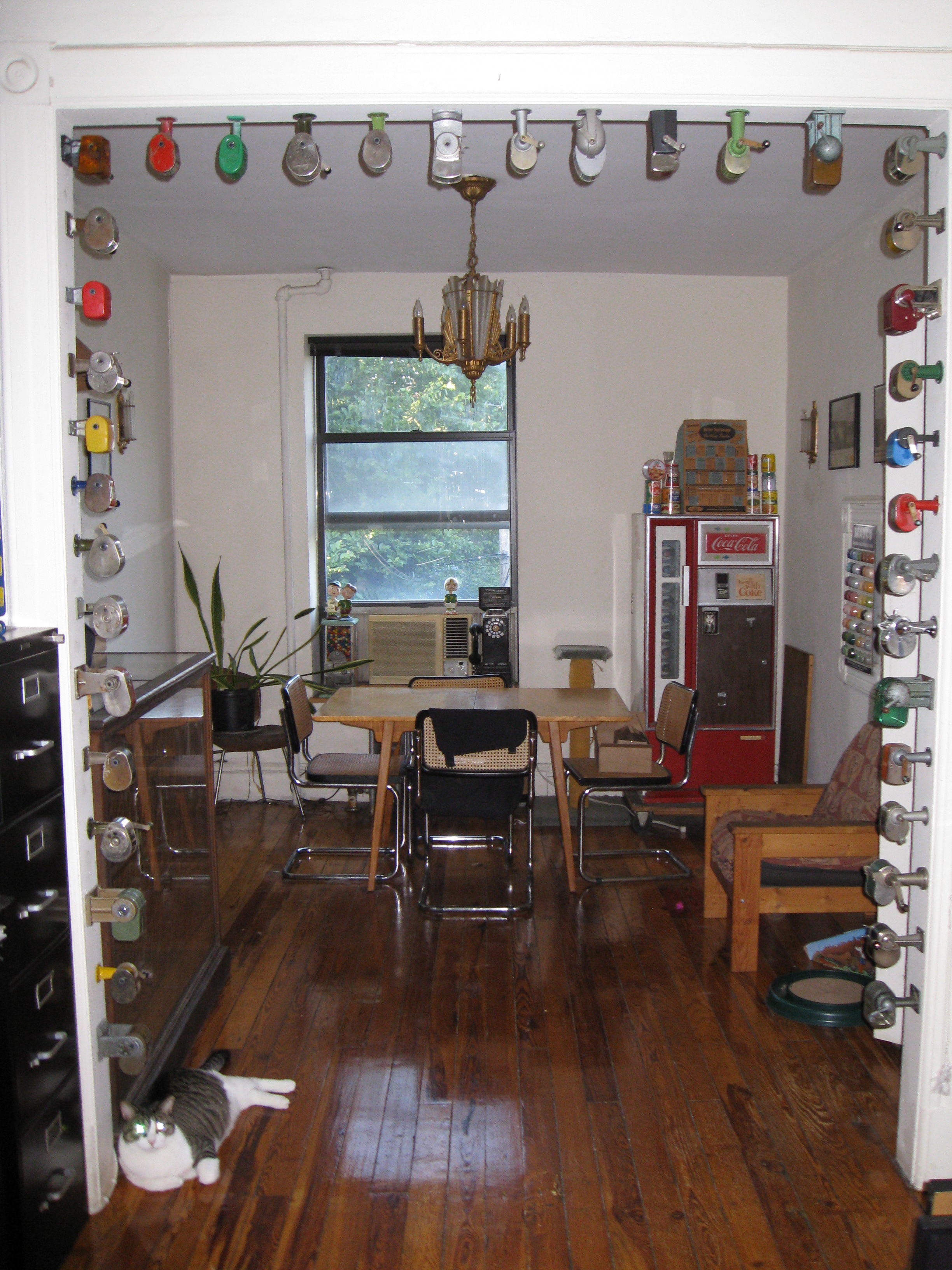
After watching on you on your ESPN Friday Flashbacks, I am very impressed by your pencil sharpener collection on display in the background. How many do you have? When did you start the collection? Why the interest in pencils?
So many people have asked about the pencil sharpeners because of those Flashback videos!
In 2009, my friends Jon and Karen got me a really cool Christmas present: some beautiful vintage pencils from an Indiana bacon and lard company. They were unsharpened, never used. I figure a pencil wants to be used, but I didn’t own a sharpener at the time. Since the pencils were old and beautiful, I thought I should get an old, beautiful sharpener, so I looked on eBay to find one. I was struck by the variety — so many colors, so many different designs! I couldn’t choose just one, so I got two. And then a third. And then a fourth. I was hooked.
One problem with collecting is that you’re never really done — there’s always more stuff out there, and your collection is never truly complete. But in this case, I created a built-in stopping point, because I decided to fill an archway in my apartment. Once the archway was full of sharpeners, the collection would be done. Here’s how it turned out (click to enlarge):
What are your thoughts on why Major League Baseball allows players to wear their pants up or down, socks/no sock, etc., and has it ever been an issue the league has considered addressing?
MLB has never had any rules regarding pants or socks. If it were to enact such rules now, they would have to be approved by the players’ union as part of the collective bargaining process. And the union would never agree to any such rules, since players want as much freedom as possible regarding how they dress.
Suppose the players of an NFL team decide their color rush uniforms are too horrifying to wear and they switch to their normal uniforms (or just the jerseys) after warm-ups. What happens?
Suppose unicorns fly out of my ass and begin invading your house? What happens?
The push to sell more merchandise has led to more and more uniform variations for you to write about. Does this make the beat you cover more interesting? Or since you are passionate about the integrity of the uniform, does it make you more depressed?
People often say to me, “You should be happy that these teams are spitting out so many crazy uniforms — otherwise you’d have nothing to write about!”
For better or worse, it doesn’t work that way. I’m more interested in quality than quantity. The carousel of merch-driven designs, most of which are unnecessary at best, ugly at worst, makes my job much less enjoyable than it would otherwise be, and forces me to spend too much time and energy covering worthless crap — time and energy that could be better spent delving into uniform history, interviewing designers, learning about manufacturing processes, and more. It’s a lose-lose.
What are some of your passions or hobbies that you’ve yet to divulge to your readers?
Hmmm. I really love watching the birds that come to the feeder that I keep outside of my living room window.
Why do you hate purple color so much?
I’ve already answered this question countless times over the years, but okay, one more time: I actually think purple in nature is quite nice ”” eggplants, violets, plums, etc. But purple in design applications has always struck me as really tacky. It’s the diva of colors, never content to do a little when it can do too much instead. There’s a damn good reason you rarely see a purple car or a purple house. Now if we could just eradicate purple uniforms, clothing, and accessories too. Zero purple tolerance!
How is your wrist? I wiped out on my bike last September and I’m still not 100% strength in my right hand. I don’t think I broke it, but I have trouble still.
My wrist, which I broke in 2012, is fine. 100% back to normal. But my elbow, which I broke last October, still feels like it isn’t quite there yet. Close, but not quite. I’m sure it’ll be fully healed soon, though.
Who did you vote for in the New York primary?
Sorry, I believe in the sanctity of the secret ballot.
I’m starting to wonder why I bother to come to the site anymore. Your opinions are so predictable — I already know what you’re going to think about new uniform before you even say it. Can’t you vary it up, just to make things more interesting?
A few thoughts in response to this:
1. You are essentially “accusing” me of being consistent. From where I sit, that’s a compliment. Thank you!
2. I’d like to think that Uni Watch is unpredictable and surprising in all sorts of ways, but I can’t suddenly start changing my opinions just to keep your attention. I like what I like, I don’t what I don’t, and that’s just the way it is.
3. There’s a lot more to Uni Watch than my reactions to new uniforms. There are the history-based pieces, the think pieces, and lots of other stuff that I think is plenty unpredictable.
4. I’m admittedly projecting here, but I suspect you don’t agree with most of my opinions on uniforms. Why do I think that? Because most people on the internet love coming to echo chambers where their own positions and opinions are predictably, unsurprisingly reaffirmed over and over again. That’s pretty much how the internet works. So while you say your complaint is that my opinions are too predictable, I suspect what you really mean is that they’re too predictably the opposite of your opinions. Sorry about that. Again, there’s nothing I can do about it.
5. If I’m right about that last part, allow me to suggest that it can be valuable to have a critic in your life with whom you consistently disagree. It can be a good mechanism for measuring and testing the strength of your own opinions, for example. I have a few writers who I read for precisely this reason.
Whether we agree or disagree, it sounds like you’ve been reading the site a long time. Thanks for that — I appreciate it.
We’ve seen these controversies about ESPN personalities who’ve sent out tweets that were actually paid advertisements. Has anyone ever offered to pay you for a tweet?
Yes. Earlier this year a certain “branded content site” — basically a lifestyle website that’s really just a vehicle for a certain soft drink — offered me $600 to tweet a link to an article they were producing about a certain sporting event. I declined. I’m pretty sure that’s the only time I’ve been offered anything like that.
Other companies frequently offer to send me free stuff and ask that I tweet about it or write about it. I never agree to any quid pro quo. Sometimes they send the stuff anyway. Sometimes I write about it, if I like it; more often I don’t. A lot of it ends up in the year-end raffle.
I’m a graphic designer, illustrator, and sports nerd who would love to work for a company that designs logos, uniforms, etc. for sports teams. I live in NYC, so you’d think there would be plenty of such opportunities, but so far I haven’t figured out how to find them. Can you help?
Unfortunately, I’m not up to speed on job leads in the design world. If you already work in that field, I’m sure you’re much more plugged in than I am regarding where to find the best opportunities. Sorry.
Now that we’ve reached our “Manifest Destiny” moment with the NBA’s decision to advertise on jerseys, what is your take on when/if the other three major U.S. sports will follow suit and why?
I’m hopeful that it won’t happen. For now, at least, the commissioners of the other leagues have been pretty straightforward about not wanting to go down that road. And just to be clear, they haven’t issued wishy-washy statements that give them plenty of wiggle room (“Well, we have no interest at the present time, but it’s something we might want to investigate in the future”). They’ve flat-out said, “We have no interest in that, period.” I was on a conference call when NHL commish Gary Bettman said that, and his words and tone were very clear.
Now, could he and the other commissioners change their minds, or just be lying? Sure. But these are guys whose statements are usually full of corporate-speak and open-ended possibilities (“That’s something we might be interested in, if the conditions are optimal and if our business partners feel it’s a good move”¦”), and they haven’t used that type of language here. So while I’m definitely worried about how things could develop, I’m also hopeful that this particular contagion can be contained and limited to NBA.
You’ve occasionally mentioned that you’d like to move the site to a paid-subscription model, so you wouldn’t have to deal with advertisers. If you did that, how much would the subscription cost?
I see lots of advantages to the paid model. For starters, the site would look a lot cleaner without all the ads. Plus I wouldn’t have to spend so much time chasing down payments from advertisers. Plus-plus I’d just prefer not to be adding more advertising to the world.
If we moved to a subscription system, the price would probably be something on the order of $10/month, or $100/year. I realize that might be a hardship for some of you, which is the primary reason I haven’t chosen to go that route. But it’s something I continue to think about.
It’s pretty obvious that most people come to this site to read about uniforms. So why do you make us read about grommets, key rings, what you did last night, and other stuff we don’t care about?
First of all, nobody’s “making” you read about anything. If there’s something on the site you don’t care for, it’s easy enough to scroll past it.
Secondly, I know for a fact that many readers do care about the various non-uni stuff I post. How do I know that? Because they tell me. Do these people comprise a majority of the site’s readership? Probably not. But again, it’s easy enough for everyone else to scroll past the bits that don’t interest them.
More importantly, please consider the simple reality that the reasons why you come to the site may not always align with the reasons why I produce the site. Those reasons mostly align (you want nothing but uni-related content, I give you lots of uni-related content), but not completely.
This site is about uniforms, but it’s also my home base. It’s where I say what’s on my mind, let the world know what I’m up to, and so on. Maybe none of that stuff interests you (just like the soccer section of the Ticker doesn’t interest some people, etc.), but I ask that you please indulge me anyway. And again, is it really so hard to just scroll past the parts you don’t care for?
———
That’s it for this round. You can see previous editions of Question Time here. We’ll have new installments soon-ish.
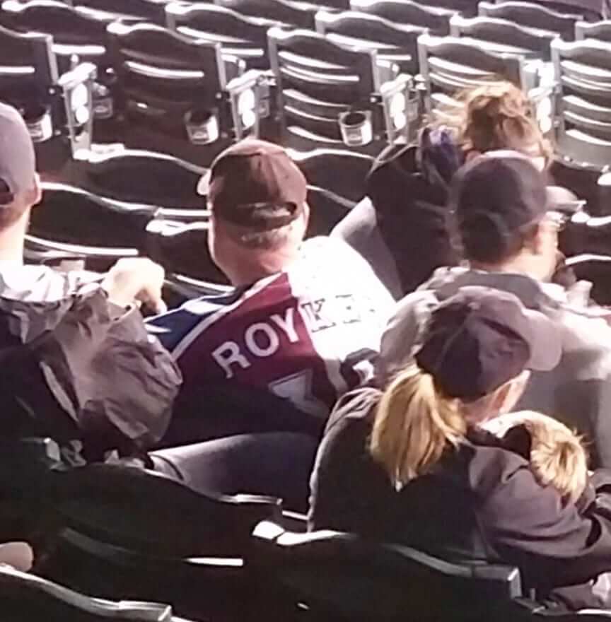
Worth a second look: Yesterday’s Ticker mentioned that the a fan in Colorado had been wearing a Rockies/Avs Frankenjersey (shown above). Now reader Jared Bower has pointed out something I missed. Take it away, Jared:
This is probably the greatest jersey mashup I’ve ever seen. It’s a combo of Patrick Roy and Larry Walker, who both wore No. 33, and the combined NOB — “Royker” — would be pronounced “Wah-ker.” Just incredible.
Good call! I don’t usually get excited about fan apparel, but this one is really clever. Congrats to the fan, big thanks to Jared, and thanks also to reader Jim Rodenbush, who sent (and, I believe, took) the photo in the first place.
Goalie shirt ”” LAST CALL: Today is the last day to order our hockey goalie T-shirt. Here’s the base design, and the three color options:
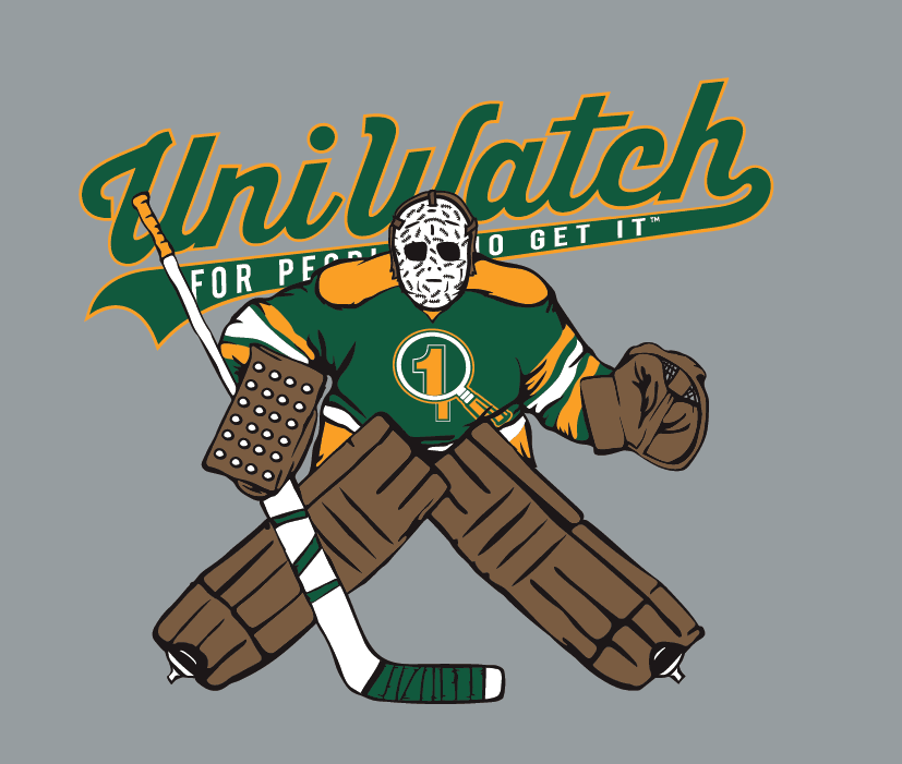
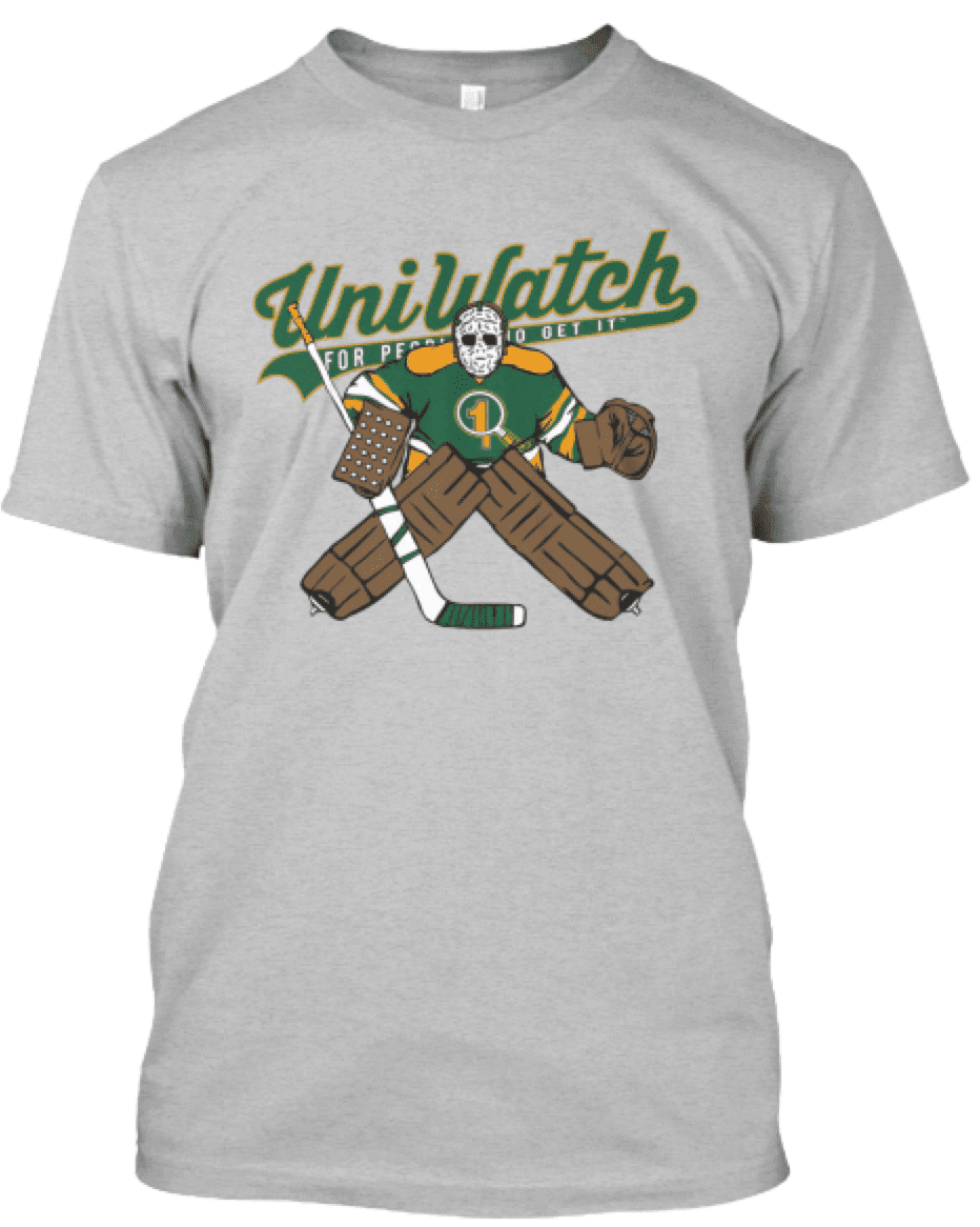
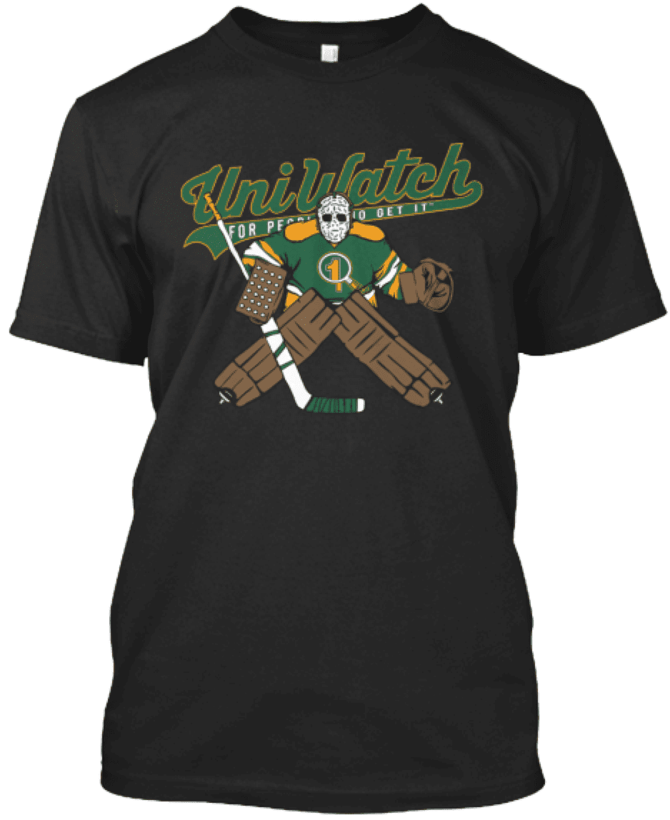
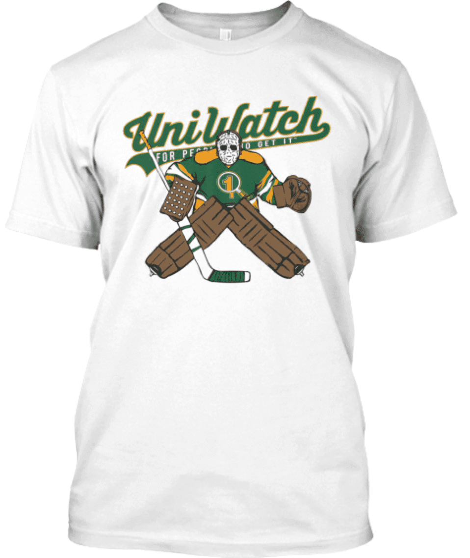
This shirt is not part of the Uni Watch T-Shirt Club, does not have Club’s jock tag graphic, and neither counts toward nor is required for 2016 “Collect ’Em All” eligibility. It’s just a bonus design that we’re offering for those who want it. You can get it here until 11pm Eastern tonight.

Click to enlarge
PermaRec update: The completely awesome logo shown above was for a company called Baer Brothers. It appears on a piece of stationery that was mailed out in 1947. Get the full scoop over on Permanent Record.
The Ticker
By Paul

Baseball News: Fifty years ago, Green Bay Press-Gazette wrote a column about how baseball could be improved. Key quote, from the very end of the column: “Replace the drab gray or white uniforms with brightly colored uniforms like every other sports has” (from Jeff Ash). ”¦ A section of seats at the Mets’ ballpark is getting a new corporate-advertised name that’s even more embarrassing than the old corporate-advertised name. ”¦ Love this old ad for a kids’ “baseball suit,” approved by Willie Mays (from BSmile). ”¦ Birch Run High School in Michigan wore 1966 throwbacks to mark the 50th anniversary of its state championship team. ”¦ Whoa, check out this vintage 1970s boy’s grooming kit, with Steve Carlton on the box! (Nice find by Chris Weber.) ”¦ Cleveland 3B Jose Ramirez’s batting helmet may have set a hang-time record the other night. ”¦ Yesterday’s post about lopsided jersey lettering prompted uni historian Craig Brown to note that this problem goes back at least to the 1880s. … Taiyo Whale throwbacks for the Yokohama DeNA Baystars. ”¦ The Salem Red Sox will wear memorial uniforms for two local reporters who recently died while covering a story. Further details here, including this passage: “Instead of the typical red, white and blue color scheme, the white jerseys will feature maroon lettering with a teal outline, representing the favorite colors of Adam and Alison [the two reporters]. Additionally, every member of the Red Sox will have either Adam or Alison’s name on the nameplate above the number on the back of the jersey. The first 1,000 fans through the gates will receive maroon and teal remembrance ribbon pins. In addition, all fans are encouraged to wear either maroon or teal to help honor Adam and Alison” (from Phil). … Tigers slugger Miguel Cabrera now has his own line of (ugly) caps (from Jerry Nitzh). … New cleats for Pirates INF Josh Harrison. … Remember former MLBer Al Alburquerque (who once had a terribly kerned NOB)? He’s now with the Triple-A Salt Lake Bees, and last night he ended up pitching against the Albuquerque Isotopes — Albuquerque vs. Albuquerque! (From Jeff Frank.) … The bad news is that the Sacramento River Cats think Memorial Day weekend is about “saluting the armed forces,” which, as we’ve discussed many times, is bad civics. The good news is that their jersey for the occasion isn’t camouflage. … Odd scene last night in Anaheim, as the Cardinals’ players wore navy batting helmets but the base coaches’ helmets were red (screen shot by Nathan Harvill). … Whoa, check out this uni number treatment. That’s the Aquinas Institute Irish, a high school team from Rochester, N.Y. Additional photos here (from Brady James).

Pro Football News: Browns rookies have been given their uni number assignments (from Robert Hayes). … “The Saskatchewan Roughriders’ new uniforms will be unveiled on Thursday,” says Wade Heidt. “However, it looks like they may have provided a sneak peek at the new helmet with the recently updated logo. Silver had been dropped, so the shield background has been switched to green, and the logo is larger on the helmet than it had been.” … The Broncos have a community-engagement slogan: “Be a champion in the community.” Players making local appearances wear jerseys with that slogan as the NOB (from Cameron Macaulay). … “I recently bought this 2004 Buccaneers Thanksgiving coin-flip coin,” writes David Firestone. “I’m confused as to why it even exists. The Bucs didn’t play on Thanksgiving in 2004, or at any point in their history until 2006. Furthermore, Thanksgiving was Week 12 of the 2004 season, and the Bucs played an away game that week, at Carolina, so the refs for that game would have used a Panthers coin.”
College Football News: Tennessee’s mono-grey uniforms will return for 2016. … New uniforms for Appalachian State (from Chris Daniels).

Hockey News: Here’s an article on a guy with a huge collection of Wayne Gretzky memorabilia. … Penguins G Matt Murray’s mask is based on Denis Herron’s old design. … What’s even more annoying than corporate-advertised towels? A collection receptacle specifically for corporate-advertised towels. … Reader Jeff Mendenhall is looking for color photos of the Salem Polar Twins, a minor league team that played in the Southern Hockey League from 1973-77. If anyone can help, contact Jeff directly.

NBA News: I have it on good authority that the Jazz will be revealing some new logos tomorrow. But if you don’t want to wait that long, keep an eye on my Twitter feed today and you might be rewarded. look here. … Kyrie Irving has a new signature shoe. … New uniforms for the Suns’ D-League affiliate (thanks, Phil).

Soccer News: New fauxback for Minneapolis City SC (from Ben Whitehead). ”¦ Here’s a pretty sharp-looking Virginia Tech concept uni (from Andrew Cosentino). ”¦ West Ham United played their last home game at the Boleyn Ground last night and had a commemorative kit for the occasion (from The Boot Room). ”¦ New home kit for Liverpool. … New uniforms for AFC Cleveland (from Ed Å»elaski). … Here are one observer’s picks for the five worst kits of all time (from Phil). … New away jersey for Juventus. … New home kit for West Brom.

Grab Bag: Sensational look at the evolution of gas station architecture (big thanks to Al Stone). ”¦ A kid’s collection of 200 vintage Mac computers will be the basis for a new museum. ”¦ Female Russian troops raised eyebrows by marching in miniskirts at a military parade. ”¦ Good article on good graphic design for voting ballots (from @GKG_77). ”¦ New uniforms in the works for Malaysia Airlines. ”¦ A South African education official has called for all school uniforms to carry a South African flag patch. ”¦ The Citadel has rejected a Muslim cadet’s request to wear a hijab with her standard uniform. ”¦ New uniforms for Indian Railways. ”¦ A woman running for Congress in North Carolina is taking some liberties with Google’s logo. ”¦ Unexpected visual effect: Camouflage looks just like a gyro cone. ”¦ The longtime rock critic Robert Christgau writes a weekly column called “Expert Witness” for Noisey (that’s Vice Media’s music site), which features something pretty unbelievable: Each weekly installment of the column features Christgau’s name five times and the column name four times before they even get to the first word of that week’s column. I’m not sure whether this reflects an extreme case of a journalistic narcissism, unbelievably favorable contractual terms, or just really bad web design. ”¦ Faaaascinating article about the intersection between Scientology and motor sports. Recommended (from Alex Sinclair). ”¦ Here’s Dale Earnhardt Jr.’s paint scheme for the 2016 All-Star Race (from David Firestone). ”¦ New indigenous-themed Aussie football guernsey for the Western Bulldogs (from @Doyoubaseball).
Whoa. Tremendous amount to sift through today(!). But I gotta address this:
“Excellent question. Referring to yellow as “gold” is really just another form of bullshit, and we should probably stop doing it. I’ll try to do my part.”
~~~
Did THE send in the question that prompted that response? I’ll stop calling it gold when the Packers (and Steelers) say their team colors are “green and yellow” and “black and yellow.”
Until then, athletic gold is NOT yellow — Oregon wears yellow. The Packers wear gold.
Sure, we can use “gold” to refer to both metallic gold and yellow gold, but then it just adds confusion. Like using “blue” instead of specifying “navy” or “royal”, etc. So, I guess the Rams never changed their colors – they went from “blue and gold” to “blue and gold” right?
Or we can just call it yellow, because in every application outside of sports uniforms, that’s what it freaking is.
Can’t wait to get to Cit Field and enjoy some gold M&Ms!
Teams that use yellow but call it gold are really just demonstrating a lack of confidence in their own collective masculinity. It’s a weird thing about our modern culture that bright colors are considered effeminate – it’s a historical twist at odds with most of Western history, when the display of bright colors on one’s person or in one’s home was a mark of status and confidence for men. But thus has our culture evolved that dark and muted colors are considered masculine, and bright and saturated colors are considered feminine. Which is bullshit, obviously; most teams that wear yellow look plenty fierce and manly doing so. But oh my gosh we can’t call it yellow, because that’s girly. Gotta insist that it’s really gold or “athletic gold” – the latter being a euphemism that made sense a century ago when metallic gold was not an available fabric option. Today, the color of the element gold is readily available for all uniform elements, so “athletic gold” is just a lie. It’s yellow. And there’s nothing wrong with that. In fact, yellow usually looks better than gold on sports uniforms, and projects more of a sense of boldness and confidence than its metallic relative.
If the Packers persist in feeling they need to compensate for something, a better choice than “green and gold” would be “turf and cheddar.”
Oh, Scotty. I’m shocked…shocked you’d disagree with me.
I think, though, in this instance, the aversion to calling it “yellow” has more to do with the traditional perception of cowardice than femininity.
I don’t disagree that there are probably some colors (either in name or in actual use) are probably avoided due to some ancient bullshit about “masculine” or “feminine” properties. (For example, see my Sunday post about pink).
But calling it gold (which it is, albeit “athletic gold”) vs. yellow is in this instance, less about femininity than cowardice.
This. Well said, Phil.
What I meant was, teams that insist on calling yellow by another name are no-good yellow chickens.
I get what you’re saying, but I’m not entirely persuaded. I mean, calling somebody “yellow” to mean “cowardly” seems anachronistic to me. It’s something you’d expect in a black-and-white movie, or something you’d say to emphasize that you’re joking about it. If someone said to me, “You yellow rat!” I’d assume either that he’s joking, or that he’s trying and failing to engage in racial insults. Sort of like how red and pink used to be strongly associated with communism – see the briefly renamed Cincinnati Redlegs – but today, if someone called me a “pinko symp” I’d assume he’s joking and/or engaging in kitschy Cold War nostalgia, not that he’s actually accusing me of being a fifth columnist.
The masculine/feminine dichotomy may be overstated – gasp, what, an under-nuanced argument in an internet comment? shock! There’s another important aspect of perceived maturity/childishness at play as well. Dark and muted colors are seen as more adult than bright colors. You say “gold” and nobody thinks of the color of a school bus, or even the color of a Packers helmet. They think of aspects of the element gold – the pale ring on their finger, or tan nuggets in a movie prospector’s pan, or coins of ancient provenance, or whatever. You say “yellow” and people think about school buses or clown suits or brightly colored toys. link
Yellow has a lot of silly baggage. I’m just suggesting that concern for that baggage, not actually any objectively real characteristics of any shades or hues in the space between green and orange, are why folks in some industries seem oddly obsessed with not calling yellow, yellow.
Former Cleveland Browns radio announcer would always describe the Steelers colors (he would describe both teams colors in the pre game) as black and yellow. I am pretty sure he said yellow as a jab at the Steelers.
I’m still calling it maize.
You mean corn?
As a possible explanation on gold vs. yellow. I know when referees (specifically basketball and soccer come to mind) call fouls or possession verbally they call they prefer to use a one syllable word. I remember as a kid a soccer team I played against wore purple uniforms but the referee at the coin flip told us they would be called blue.
I’m sure there are some readers who are athletic officials who might weigh in on this.
I officiate high school and college games in both soccer and basketball.
Many (almost all) of my fellow officials use one syllable words to refer to team colors. Orange is called red, purple is either red or blue, and yellow is gold.
It bothers me to do that because purple is just as much red as it is blue (same applies to orange). I have actually confused my partners before because I referred to purple as, ya know, purple instead of calling it red.
All that being said, the gold/yellow debate hasn’t really come up. I use yellow or gold based on what color it actually is but MOST officials use gold because it is quicker to say and has the smallest chance of causing confusion with players/coaches/scorekeepers.
That is fascinating. Had no idea. Seems really odd.
Hmm. I was a hockey referee once for a house inline league. A yellow team was yellow to me because “yellow goal scored by #7” is more explicit than “gold goal” (yes of course a goal, but which team?).
I recall this from youth basketball as well. I was on a blue team one year and we were always called “blue.” I was on a maroon team one year and was called “red,” “black,” possibly others.
That’s one of the most willfully stubborn and silly things I’ve ever heard.
I believe the reason officials do this is because a huge part of good officiating is about being a good communicator. One syllable words are easier to communicate in loud gymnasiums or on big soccer fields. After each decision you have to communicate to fans, coaches, players, scorekeepers, etc. what you call was. If you have to make a decision and it takes you too long to communicate your decision, fans/coaches assume that you weren’t sure of yourself. So, I think it boils down to 50% of it being a desire to speed up communication and 50% of it being “Well, we’ve always done it this way so why quit now?”
I thought yellow-as-gold came from the inability to produce actual gold as a fabric color until fairly recently.
It’s definitely a heraldry thing, too. In the case of Maryland, for example, on the state’s of arms, the color is actual gold (like gold leaf), but on the flag it’s yellow-called-gold.
So it follows that when UMD takes the state colors for their uniforms, they also call it “gold.”
That’s probably the origin of it, but, really, they’ve been able to make metallic fabrics for like, 50 years now, and metallic paints for even longer.
^ This, and I have no problem with it. The athletic gold is significantly darker than yellow. Masculinity and cowardice I believe play no roll in the creation and continued use of the term ‘gold’ to describe a teams’ colors.
You could have people say ‘gold yellow’, much like how people could say ‘navy blue’ but it is easier just to say navy.
UofM’s maize is really an athletic gold, but for most of the late 2000’s and 2010’s the football uniforms used a yellow. Nike trademarked their yellow as ‘maize’ so Adidas had to call their yellow ‘sun.’ Luckily Harbaugh ditched the yellow and brought back the old maize which resembles athletic gold.
Corn and blue
How Nike was able to trademark “maize” as a color name, I don’t know.
But in that case, I think that dark ochre/mustard colour was used to represent metallic gold. Like the leather sleeves of a team football jacket.
Purdue has long used “old gold” to specify the darker brownish shade of yellow they are supposed to use as opposed to the brighter athletic gold.
Not that Purdue seems to remember that in recent years.
As we should know – it all goes back to the link. Until the description of the flag changes, I doubt anything else will change.
When Binney & Smith turned away from descriptive names in favor of evocative ones for their Crayolas, a battle was lost. Things are hard enough in light of my red/green color-blindness, sacrificing preciseness in color description is an additional headache. Add that “gold” and “silver” denote luster in addition to hue (for what is basically “tan” and “grey”) and a mish-mash ensues.
typos: ingigeous and Salt Lake City Bee (singluar).
Fixed.
Fantastic Permanent Record today!
Thank you!
RE: Bucs T’giving coin…..
Apparently there were sets for some other (if not all) teams that year.
link
That’s a given, and I understand the standard and Kickoff coins, I don’t get why teams were issued coins for a game they were never going to play in.
LOVE that Baer Brothers illustration!
“Save the surface and you save all.” – Paint & Varnish
I don’t think I’ve ever seen a review from “Paint & Varnish.” Is it a trade magazine? A comedy duo? Two very coincidentally-named reviewers?
Man! I was just in Durham two weekends ago, I wish I had known to try out Allen & Son. Coming from ‘cranky yankee’ – Durham was awesome! I went to a wedding and the venue’s balcony was right over the old Durham Bulls right field fence.
Husker Du!? I like you more and more every year. Keep up the good work.
Durhamite here – glad you had such a good time! The DAP is awesome, the city and the Bulls put up the money to upgrade the ballpark and a bunch of youth teams and NCCU play there. It’s fun to see an old ballpark still kicking and it has to be cool for the players to unleash their inner Nuke.
“Gold is a color used by the 49ers and Notre Dame, not the Steelers or the Pirates.”
Congratulations, you’ve just pissed off a lot of Pittsburghers.
Whoa! Just read the ticker item about Sue Googe using the Google logo to run for congress in NC. I looked at it and thought, “It’s not that bad. The second ‘g’ isn’t even in the right font.” Then I went to Google, and sure enough, the little ‘g’ is different. When did that happen?!
It’s always such a weird feeling to find out something has changed and have no idea how long you’ve gone without noticing.
September 1, 2015.
The team Jeff Mendenhall is looking for pictures of is the Winston Salem Polar Twins. The original logo of the team was 2 bears, 1 wearing a sweater that read Winston and the other wearing a Salem sweater. The Winston Salem work mark on the 2 sweaters matched the Winston cigarette logo almost exactly.
Actually, the word marks for Winston and Salem cigarettes were separate and distinct, and the lettering on each polar bear’s sweater reflected that.
link
Presumably the team’s 15-person ownership group was comprised of RJ Reynolds executives, at least in part. Although Hanes Underwear seems to have been represented as well …
link
Dagnabbit.
link
Phil is right. Good luck calling the Packers’ colors green and yellow.
You can call the Packers colors whatever you want, but let’s be very clear that the ‘Skins colors are burgundy and gold.
Maroon and yellow. Got it.
;)
Great session if q&a, some answers surprised me (I expected you to say no one of any age should ever wear jerseys). Also when you say do you read the blog to some answers like bbq sauce, I think when we read your blog everyday some tidbits of what you mentioned in the past get forgotten.
Speaking of which, we all know your view on purple, but what about pink?
Too soon.
The other cool thing about that Frankenjersey is the fact that both athletes were stars in Montreal and Colorado.
Tagging issue? “Does sheer population make NYC more< American than those other places?"
Just a stray character. Now fixed.
Figures: This morning I finally thought of a question I’d like to ask Paul. D’oh! I’ll try to remember it for the next question time.
Great answer on the when are you too old to wear a jersey thing. I would add that a jersey, like anything a person wears that is not part of an occupational uniform, is a fashion choice. In my book, there is only one rule of fashion: If you feel confident wearing it, it works. If you feel self-conscious about wearing it, it doesn’t work for you. It’s as true of skinny ties or notch-lapel waistcoats or Members Only jackets with rolled-up sleeves as it is of jerseys. If you’re comfortable wearing it and you’re not walking around thinking about the fact that you’re wearing it, it’s a good look for you. If you’re walking around thinking about the fact that you’re wearing a jersey and wondering whether you’re too old or too something else to be wearing a jersey, you are and you should not wear the jersey.
I don’t care how confident you might be wearing them, unless you’re Jim Morrison or Chrissie Hynde, leather pants DO NOT work for you.
Same for animal prints.
Steve Carlton looks like he has his stirrups on backwards(high in the front low in the back) on that kids grooming box.
Under your definition, wouldn’t the New York Red Bulls be named after its sponsor and not its advertiser? Besides owning the team, the company Red Bull definitely provide essential support. It built and owns the stadium and it funds a very large and successful academy system; the Red Bulls lead the league in players on the active roster that came up through their youth system.
(I say this as someone that still talks about going to Metrostars games.)
Honestly: I didn’t realize Red Bull owned the team. Shows (yet again) how ignorant I am about soccer.
I was going to mention this. Not only do they own the NY Red Bulls, the own the Red Bull Racing and Scuderia Toro Rosso teams in F1, soccer teams in Brasil, Austria and Germany. Also, 2 hockey teams in Germany and Austria.
I remember seeing RasenBallsport Leipzig at the top of the Bundesliga 2 table and wondering why Lokomotive Leipzig had changed their name. Turned out it was a different club owned by Red Bull. You can read the Wikipedia entry to get an idea what they went through to get a club. They’ve been promoted to the Bundesliga for next year.
Of your favorite teams, I who’s got the best and worst uni’s? You probably have answered it with your uni rankings, but if you could humor/save time and answer here, that’d be lovely!
No more questions today! Plenty of questions and answers in today’s post.
prob took as much time to type no more questions as it would have to just answer the question…but your site your rules
To answer your question would be to invite more from other people, which I don’t want to do today. Thanks.
To the guy having to scroll the front page multiple times when catching up
If on a desktop/laptop, just scroll once on the home page right clicking on each entry and selecting “open in new tab” so that you don’t have to keep coming back to the home page. After finishing a post, just clise the tab
If on a mobile device, maintain your finger on the hyperlink and the “open in a new tab” ootion will appear
PL – I am a big fan and respect and admire all the stuff you’ve brought to the table. But now that I know you’re all-odd all the time, I’m not sure how we could coexist. Evens only for me – especially the TV and the car radio. Fortunately, my wife Gets It and agrees…
I prefer multiples of 5. The car stereo volume goes from 10 to 15 to 20, etc.
This one goes to 11.
Well, it’s one louder, isn’t it?
Ha! References! But, really, my car stereo volume goes from 0 to 40. So I default to 20 and move up to 35 if I have the windows down.
Even though on a radio all the station decimals are odd? 95.5, 102.7, etc.
MJ, seems to me that if you’re all even and Paul is all odd, you two would work together pretty well because you’d never be stepping on each other’s toes. Just a thought.
In some ways, yes. But if he had control of the remote and the volume were set to 17 or 21 or whatever, I’d silently seethe and probably hide his grommets just to screw with him. I’m actually glad that my new car’s audio doesn’t have numbers for the volume setting.
Hey Paul,
Thanks for another great column. I love your listing of quirky museums, and keep track of them for when I have time to visit the City. If you ever find yourself in Madison, NJ there’s a little museum called the Museum of Early Trades & Crafts which is terrific. And in Las Vegas, one of my favorites is the Museum of Atomic Testing, which focuses on life in Nevada during the Atomic testing period of the 1950’s.
Oooh, those sound good — thank you!
Buccaneers v. Oilers circa 1990s, two color combos I miss dearly..
link
Gorgeous.
Paul, in the picture of your pencil sharpener collection, your hardwood floors freaking rock and so does the Coke machine in the background. Also like the old phone in the window.
Correct me if I am wrong, was it the Tugboat Captain that did the amazing drawings you showed on this site not too far back? If so, any possibility of maybe getting her to do some sports related drawings? Those drawings showed some amazing talent.
Not sure which drawings you’re referring to. The Captain is an artist in many ways, but not with drawings.
Seems like your pencil sharpener collection is incomplete. You need one more to even out the right hand side of the frame. That would drive me crazy. But I may have a touch of OCD.
I know it’s the same number of sharpeners on each side but the spacing is off.
RE: I’m a graphic designer, illustrator, and sports nerd who would love to work for a company that designs logos, uniforms, etc. for sports teams. I live in NYC, so you’d think there would be plenty of such opportunities, but so far I haven’t figured out how to find them. Can you help?
I feel the exact same way! Maybe all of the devoted readers who are designers should come together and form our own firm! I fell into the medical field with my first “real” design job and could never find a way out. The major players will not even consider you unless you are a sports designer from the get-go.
Fellow designer here (20 years professional experience).
My two cents: Perhaps you could begin by doing them for your own enjoyment? Take a year and methodically build up a strong portfolio of concepts. Build mood boards. Take the time to think through your ideas. Track the history of the project from napkin sketches to final product. Show off your versatility and creativity. Design to the look of what is trendy, but be sure to let your own style show through. When it comes time for the big reveal, be passionate, bold and confident. Do your best to let your work speak for itself, but don’t be afraid or intimidated to voice an honest opinion.Most importantly, don’t give up. If you send someone your work and it’s rejected, freshen things up and try again. Don’t be discouraged. Don’t immediately discount the voices of experience (but don’t give them unwarranted gravity either). Keep an open mind. Keep your name in their head. Send your work to everyone in related fields. You never know who knows who.
Hope that helps.
I’ve been designing professionally for 17 years. Your comments ring true to what has been my “theory” on how to get in. With a full time job and baby twins at home, finding time to get all of that done (and done correctly) while not being paid for my time is near impossible. I still do find time for minor sports related paying freelance work (yes, I did design the logo for the LFL’s Baltimore Charm… I can admit it). Mostly though just stuff for the sportswear shop my wife works at and for local sports clubs. Problem is they often have little to no budget, and the items they need are not exactly portfolio quality because of how they have to get them produced.
I’ll keep pushing though… maybe it will happen one day.
“What do you think about teams who wear yellow but call it gold (i.e., the Oakland Athletics)?”
Should be “e.g.” not “i.e”. You aren’t restating things. You’re providing an example.
(Sorry. That’s one of my pet peeves.)
I think baseball jerseys look a little better on older guys than football jerseys. I wear on field polos to training camp and onfield coatst o Redskin games. I will wear a team issue Nats jersey to playoff games.
I’m a long time casual reader who a) strongly prefers even numbers and b) purchased a purple car on purpose. That said, thanks for the work you put into this site and your other projects. I’ll have to try to remember the question that came to me while reading this post for the next go-around.
I’m a long time casual reader who a) strongly prefers even numbers and b) purchased a purple car on purpose.
I’d hate to think you purchased a purple car — or any other car — by accident!
I almost bought a purple truck in both circumstances: I was going to buy a truck on purpose, but accidentally almost bought a purple one. The color on the ad was off and it was listed as the GMC official name, “radar blue.” I showed up to the dealer expecting to find my new blue truck. But it was purple as could be.
“Big deal, anyone can self-publish,”
Not really. Yeah, everyone has the opportunity to do so, but not everyone CAN. Someone like Andy Weir can self publish a book like ‘The Martain’ while others self publish 45 pages of WTF and call it a novel.
*Martian
On there first question about advertisers/sponsors on jerseys, I think there is a distinction between teams that are essentially civic entities and those that are not. The Chicago Cubs are inextricably tied to Chicago, and advertisers on the jersey would become intertwined with the city itself. A cycling team, for example, is not tied to any particular location and as such has a distinct identity. (I suppose NASCAR would be similar in that respect, too.) Furthermore, cycling doesn’t sell tickets to their events (you just line up on the side of the road to watch), so this sort of advertising (or dare I say, sponsorship) is a necessary evil for the sport to exist. That’s not the case for teams or sports that sell tickets/parking/concessions/etc. and often enjoy public financial benefits.
I feel like I may be the only sneaker fan that comes to Uni-Watch.
Kyrie Irving does not have a new shoe, yet. That is the Kyrie 2 he has been wearing all season in a new colorway. Nike has a new colorway a few times a month for just about every athlete with a signature shoe. The colors also often have a backstory such as the “Kyrache” in the ticker today.
Hey Paul, I know you answered a shit-ton of questions today (great stuff, btw), but I was wondering… what do you feel has been the best thing to come from the creation of Uni Watch?
No more questions today, sorry. I’m all answered out!
Maybe that can be for next year’s “Ask Paul” installment then. Thanks!
Hopefully I won’t wait until next year for another installment. Figure sometime this fall. Seriously, thanks for the support, enthusiasm, and kind words!
New Jazz logos, as promised in Ticker:
link
Good tune-up. Not as fussy, more emphasis on color. Mostly, all that unjazzy 1990’s design is taken out.
The reason Paul’s involvement in Uni Watch is closer to its end than its beginning may be due to how often he gets questions similar to the last one in today’s entry.
That’s interesting. I, OTOH, since I was a little kid, have always had a strong preference for even numbers, and set things like TV volume, A/C temperature, &c. to even-numbered values.
What do you suppose that’s about?
re: pencil sharpener collection.
I am probably recommending the obvious but you do know about CW Pencil Enterprise
CW Pencil Enterprise
100a Forsyth Street
New York, NY 10002
and the website is link
Everyone looks at me funny when I tell them I order my pencils from New York because yes I have a thing for good sturdy, non-mechanical, pencils that write well (plus Caroline is just a wonderful person to deal with, in person or through email).
I’m not really a pencil fetishist (although I’m not knocking pencil fetishism). I just like the old sharpeners.
Nothing fans an appreciation of old pencil sharpeners more than new pencil sharpeners!
“Also-also, I’m very willing to go to places where I “don’t belong” (a black bar where I’m the only white guy, for example, or the one neighborhood in town that the locals say to avoid).”
Not quite sure why, but as a DAY ONE Black UniWatcher (perhaps one of the few), this just rubbed me the wrong way. Are you saying black people in that bar say you “don’t belong” OR that others whites whom you might tell you’re going to that bar would tell you you “don’t belong” OR that you’d have an internal monologue in your head that says you “don’t belong”? Please clarify.
I say this because there’s an odd misconception that black people can be inhospitable to others when someone visits the few institutions (churches, bars, civic organizations, barbershops) that are socially deemed as “ours”. Few things could be further from the truth. If you went in that black bar you’d likely be treated with 1) utter indifference or 2) treated better than the typical black patron because people want to impress you and make you feel welcome.
We don’t typical “return the favor” of whites who have been historically inhospitable to us because that makes so little sense. If you’ve been oppressed you generally have a sense that it’s wrong to oppress others. That’s a broad generalization, sure, but I’m 42 and I’d like to think I’ve lived enough to make such a call.
Please expound on this. Not that you owe me an explanation, but I’ve always seen you as a thoughtful person of measured words and thus the above passage struck me as a bit odd.
No problem — I hear you.
As you can see, I put “don’t belong” in quotes, because it’s flexible notion. But I’m aware that many social spaces, including taverns, can be very tribal or club-y. Even if nobody gives an overt sign that I’m unwelcome in a given space, I’m always aware that it’s *their* space, not mine, and that I’m a guest. Given the realities of gentrification, cultural slumming, voyeurism, etc. (all of which are huge issues in the city where I live — maybe less so where you live), the notion of “belonging” in certain spaces isn’t so much about overt permission or hospitality; it’s more about mutual respect, something I try to hold up my end of.
In general, I’ve found that if I appear to be happy to be in a given space, people are happy to have me there. Seems like that’s as it should be. But I never take the second half of that equation for granted when I’m a guest in someone else’s space.
Hope this answers your question. If not, I’m happy to continue the discussion (time permitting — have a few other things to get to soon).
Nope, you addressed it perfectly. Thanks, Paul.
Just checking in to say, count me as another person who loves the think pieces and non-uniform-related content. I don’t care about or agree with all of it either, but I love reading someone who is unapologetically himself. Also, I still love the album Cerulean Salt by Waxahatchee, which Paul recommended on here years ago.
news: Chelsea and adidas agree to end partnership six years early in 2017
link
Would someone please explain the frankenjersey ticker item to me, especially the bit about pronunciation?
I’m missing something.
In the late 90’s/early aughts, two of the most popular figures in Denver sports were Avs goalie Patrick Roy (wah) and Rockies OF Larry Walker.
Both players also happened to wear #33 for their respective teams.
So the guy got the two together, and replaced “Wal” with “Roy” since the pronunciations were very similar.
Patrick Roy pronounces his surname “Rwah” (as it’s French)
so…
RWah (from Roy) and Ker (from Walker) is essentially pronounced “Wahker” which sounds much like “Walker”
Ah, French. Now it makes sense.
Small note on the Broncos jersey. Those are the same jerseys they wear/wore at the Super Bowl parade (obviously not for Sanchez and the new guys) and what they wear for any community outreach.
The reason I was told a while back ago by Patrick Smyth (Broncos VP of PR) during a twitter Q&A that Elway and Ellis had decided on putting the logo on the back instead of the name, because they felt it was more important to have the players represent the team, not themselves. ala, “The Broncos were at Children’s Hospital today.” instead of “Emmanuel Sanders and other players” or something like that.
Not a huge breaking story or anything, but a nice touch, I think, since the team means so much to the people of Colorado.
Interesting fact about the “Royker” jersey here: link
TLDR: Larry Walker owns one.
And I think a few shops in the Denver area made them, as I have seen them since the 90’s at Rockies games. I highly doubt it’s a fan custom jersey.
I have had the thought that, with the explosion of alternate unis, that at some point you would just say, “Enough! I’m done!”. I hope it’s not any time soon, as I enjoy this site and read about the things that interest me. Thanks.
Soccer jerseys are the worst. I was actually excited when I read in the soccer news ticker today that Juventus had a new away jersey thinking I would relay the link to my family in Italy who are Juventus fans…until I opened the link and all I saw was ‘Jeep’. Why do soccer teams do this. BOO!