Greetings and a good Sunday Morning! I hope everyone had a pleasant Saturday. Are you ready for some football?
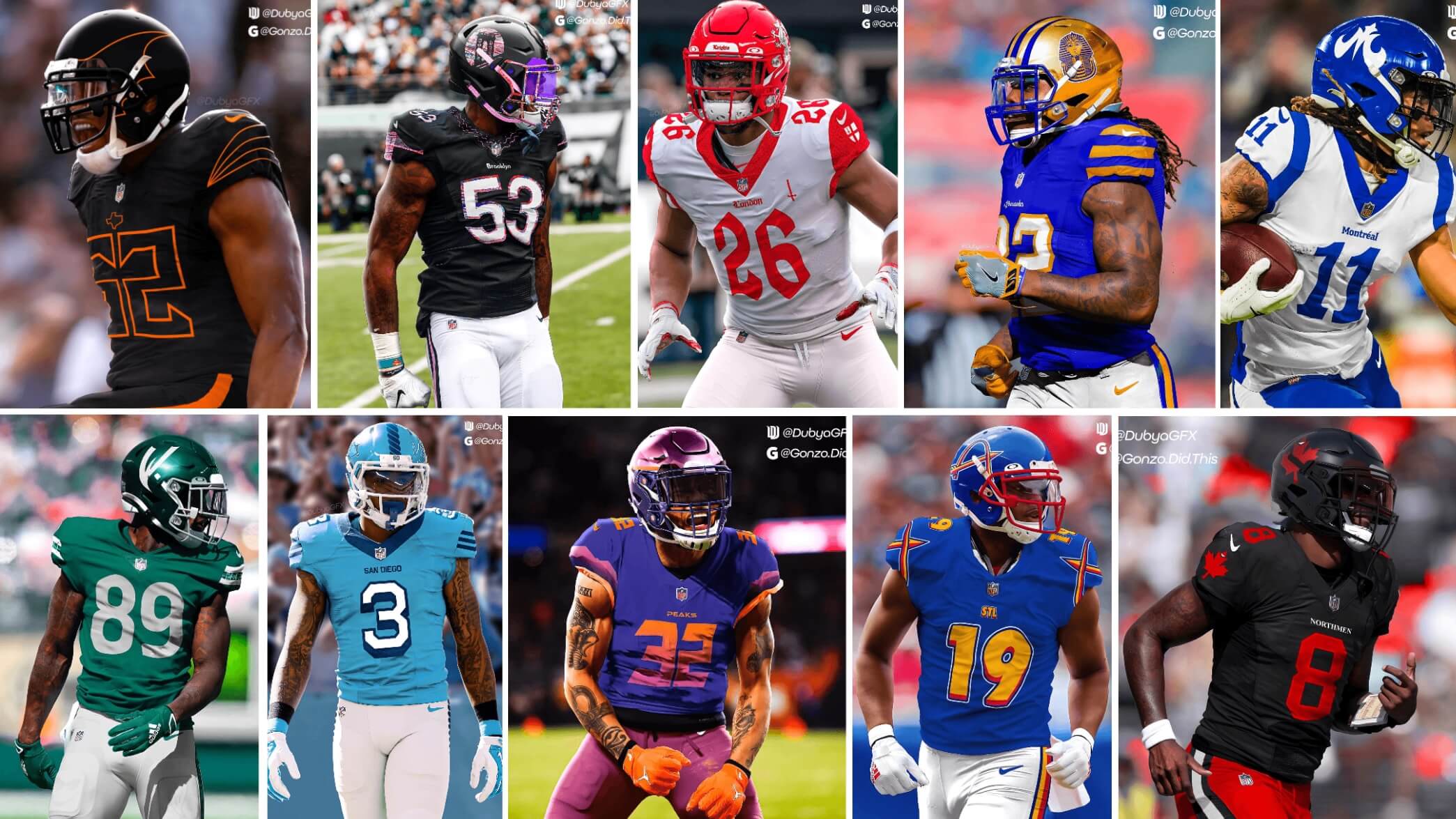
Not only do we have the NFL Conference Championship games today (I always prefer CC weekend to the actual Supe, so today’s really my favorite Football Sunday), but I have a very fun project from designer Jonah Ward (and his collaborator, Steve Gonzalez), in which they imagine the NFL expanding by twelve(!) teams. Obviously, such an expansion, in one shot, could never take place, but they give us a look at some cities that are probably primed for a new team, some places you’d think expansion would work, and some cities you probably never even imagined having an NFL team. As they explain below, there was a great deal of thought that went into selecting the cities, team names, colors, logos, etc.
I’ve featured Jonah’s efforts on Uni Watch previously, including a really fun defunct NFL franchises resurrected, and more recently, a look at World Cup nations depicted as football helmets.
Here’s Jonah:
NFL Expansion Project
by Jonah Ward (with Steve Gonzales)
The NFL is eyeing expansion, both domestically and abroad in the coming decades as a way to grow their global brand. Two designers Jonah Ward, known as Dubya Design and Steve Gonzales, known as GonzoDidThis collaborated in a fun project where they imagined 12 NFL expansion franchises.
The pair of designers wanted to challenge themselves with connecting to city identities, as well as uniquely named teams that gave them unconventional challenges and prompts to roll with. The designers alternated with city and name choices. Both designers collaborated on the helmets, logos, and uniforms, depicted in this series. Dubya focused on jerseys, while Gonzo focused on the helmets. Some teams had traditional design approaches and others were more modern and eccentric.
London Knights
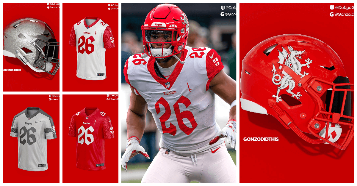
With the first team to be created in this expansion project, Gonzo wanted to jump right out the gate with an international team. London is a major target for international expansion and may as well be the inaugural team for when that day comes. They chose the name Knights because it was a fun prompt for a sports brand.
The uniforms are crimson, white, and feature elements from both the English flag and the City of London flag. The dragon from the city coat of arms was used as the helmet logo. The home and away looks feature a subtle chainmail pattern and a medieval-esque font choice. The designers also opted for a silver alternate uniform meant to mimic a knight’s shining armor.
Portland Pioneers
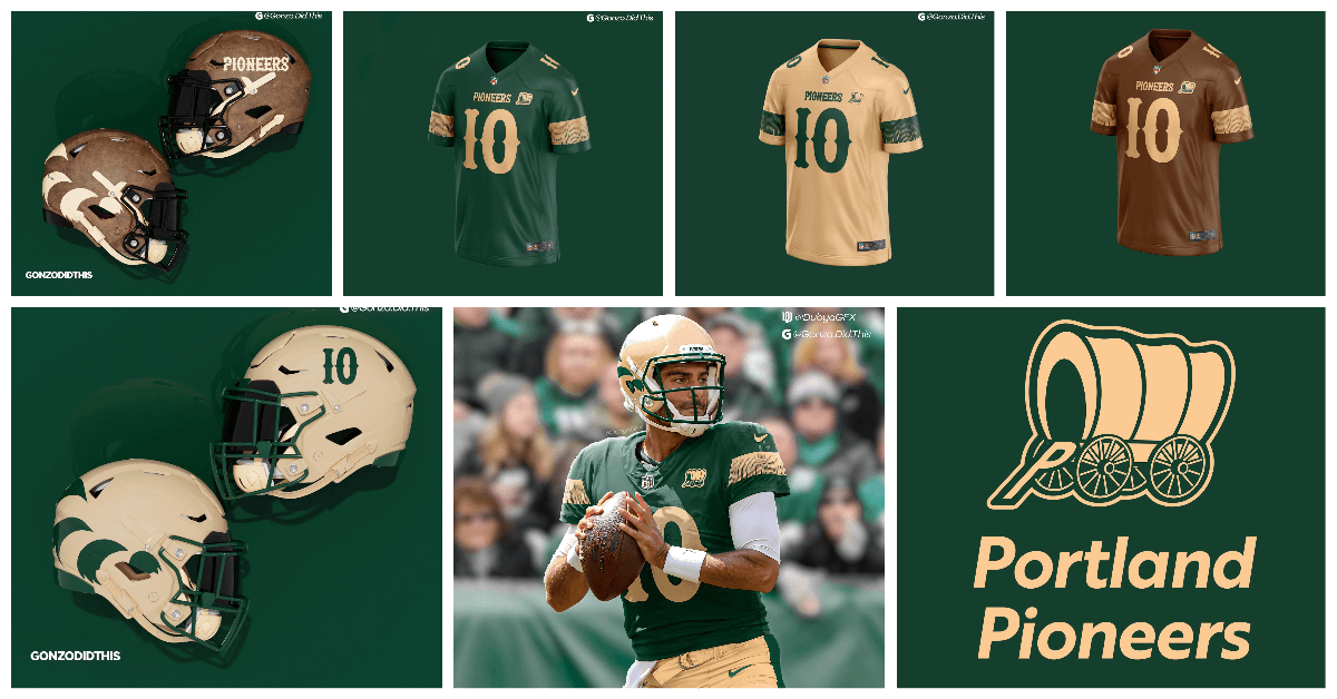
To spice things up, Dubya went northwest with the Portland Pioneers, a team inspired by the Oregon Trail and good old fashioned alliteration. The branding here features rugged, earthy tones of green, cream, and brown to invoke the frontier spirit. The helmets feature the racoon cap that the likes of Lewis and Clark wore on their expedition, the jerseys feature the fringe seen on a Pioneer’s jacket. The alternate all-brown look is to mimic the pioneer’s jacket more accurately and it’s topped off with the faux-leather helmet.
Austin Bats
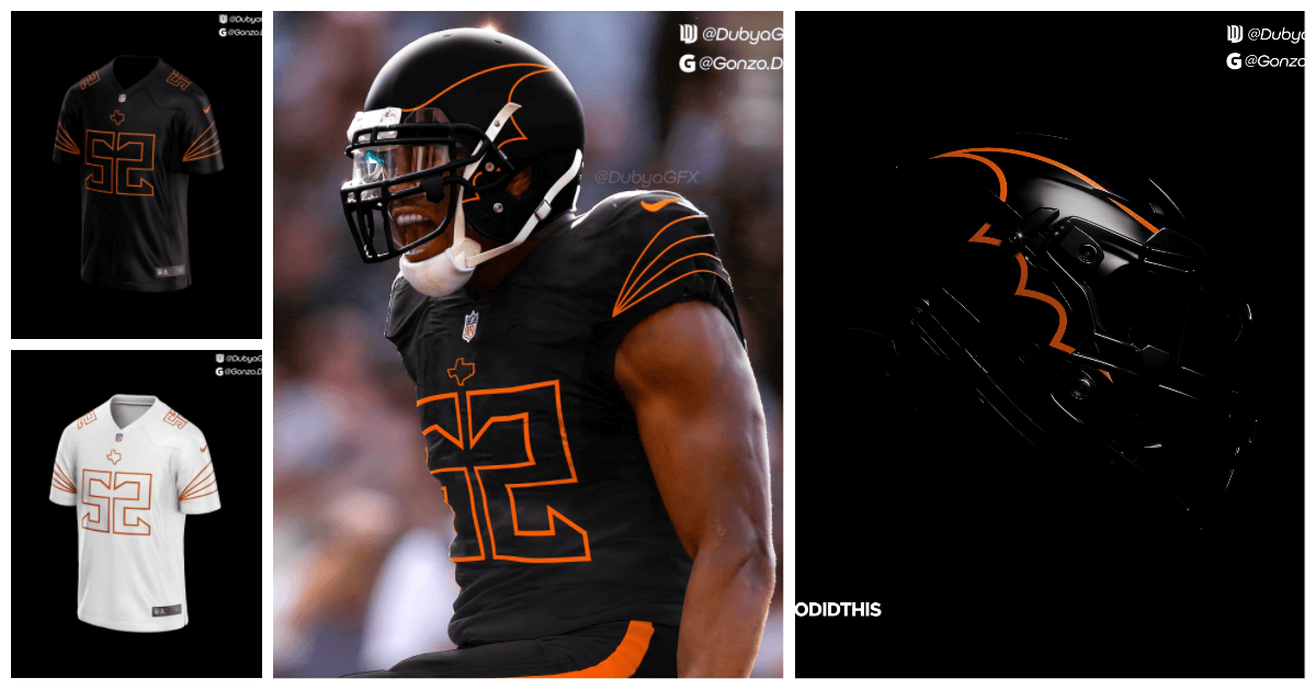
As a unique challenge, GonzoDidThis chose the Austin Bats as his next team name and theme. The goal here was to be very minimal and out-of-the-box when it came to the uniform design. The simple, linear looks of the wing, sleeve stripes, and numbers are inspired by the bones that you can find on a bat’s wing. Dark and mysterious was another goal, especially in the home look. The burnt orange is a nod to Austin’s very own, University of Texas.
Fun fact: Austin, TX. is home to the world’s largest urban bat colony. Might not be a conventional sports name, but it is a fun prompt to build a brand on nonetheless.
San Diego Seals

For Dubya’s next pick, he decided to give love to a city who recently had its beloved team ripped from its hand for Los Angeles. Instead of piggybacking off of the Chargers, the team was named for the local wildlife, as well as the city’s rich naval tradition. The mascot is a saluting Seal with a navy cap. The uniforms feature rope as seen on a ship, a sleeve reminiscent of a sailor’s uniform, and the numbers are a block font that can be found on the side of a naval ship. Details matter here.
Mexico City Aztecas
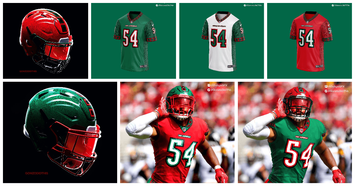
With Gonzo at bat, he decides to create his next international team, this time, just south of the border. Introducing the Mexico City Aztecas. Named for the rich traditions and culture of Mexico, the uniform and colors pay homage to modern day Mexico with the colors and to the ancient Aztec civilization with the rich patterns. Looking closely at the helmets and jerseys you can see these patterns take shape throughout the entirety of the uniform. It was unique challenge building a brand with these colors, as they are not a very common combination in sports.
Memphis Pharaohs
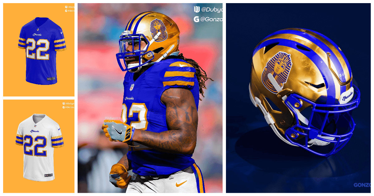
With a few historically named teams already under their belt, why not add another. Dubya decided to bring in the Memphis Pharaohs as his next choice. A solid nod to the city of Memphis being named after the ancient Egyptian city and landmarks in Memphis, like the beautiful Bass Pro Shops pyramid. The uniforms and colors were set to mimic a mummy’s gilded sarcophagus including a gilded helmet with vibrant striping. The goal was to be traditional here, yet still flashy.
Brooklyn Bridges
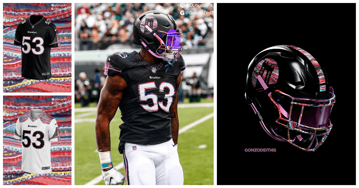
If Brooklyn wasn’t incorporated into New York City, it would still be the 4th largest city in the United States. Gonzo decided to bring a team to Brooklyn for that reason. The team is named the Bridges, yes, it is not traditional for a sports team, but it presented us with a fun theme to revolve around. The patterns shown on the uniform feature the famous coogi pattern that Brooklyn native Notorious B.I.G. wore. The fonts for numbers and the wordmark are also from the NYC subway system.
St. Louis Archers
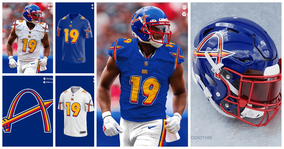
In the same spirit of bringing back a San Diego team, Dubya re-introduced STL to the NFL fold. The team name Archers is a fun play on the famous archway in St. Louis. The logo is an A in the shape of the arch with an arrow running through it. The colors are from the St. Louis flag. Dubya wanted to make a 90’s era uniform and design when creating this team.
Salt Lake City Peaks
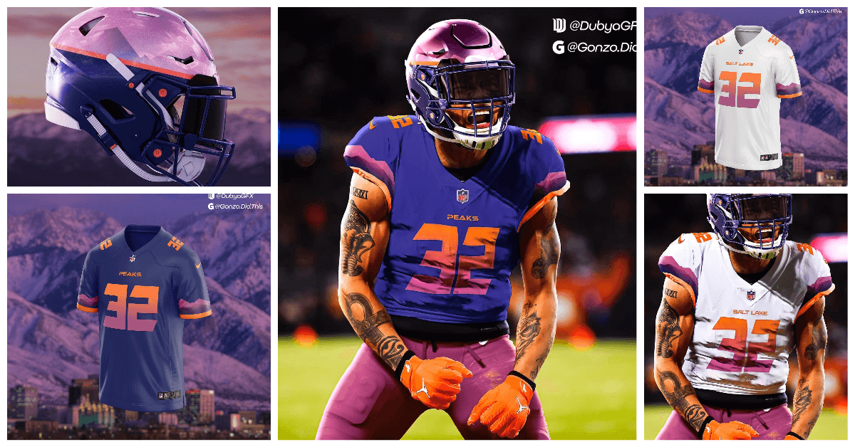
A team that is regularly talked about when NFL Expansion is brought up, Salt Lake, was brought to the table by Gonzo. His aim here was to create a highly modern look reflecting the mountains that surround the city and the beautiful purple and orange sunsets that take place there. The numbers are sharp, just like the mountaintops. Gradients are are used here to also mimic the sunset.
Montreal Musketeers

Dubya goes up north and expands the NFL to Canada, introducing the Montreal Musketeers. Honoring the French heritage of the region and bringing in the colors of Quebec to the fold was the goal. The uniform is designed with a traditional musketeer’s outfit in mind. The logo is a fleur-de-lis flipped upside down and stylized into an M. Traditional is the style here.
Toronto Northmen
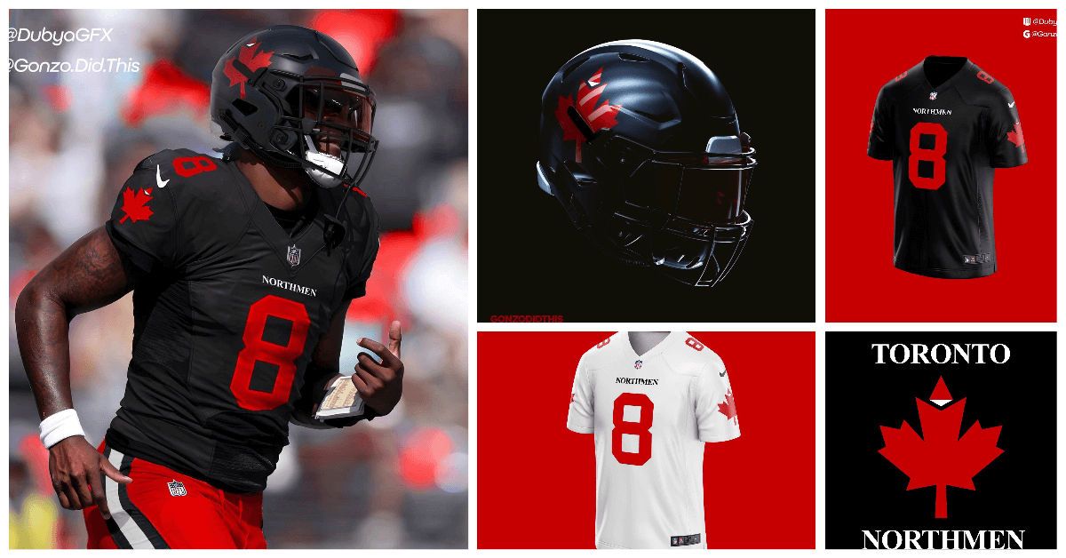
Keeping it in Canada, Gonzo brings the Toronto Northmen to the fold. A team that pays respect to the WFL Toronto Northmen, turned Memphis Southmen. The logo features the famous Canadian Maple leaf, but with a slight twist of a compass pointing North to tie into the name. The wordmark is also close to what you can find on a compass and map font. The colors here are black, red, and white, keeping things simple and traditional here was the goal.
Oklahoma Whirlwinds
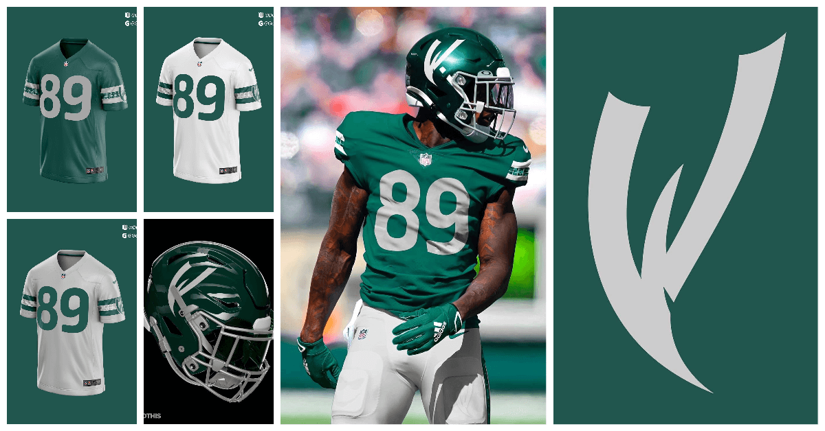
For the final team in the series, Dubya closes us out with the Oklahoma Whirlwinds. A team themed around Tornado Alley. The colors are gray and green, to represent tornadoes and the plains that can be found in the region. The logo is a W fashioned into the shape of a twister. The uniforms feature a doppler radar effect on the sleeves.
This project was all in good fun. Obviously some team names and identities could be realistic choices for expansion, while others were a fun challenge meant to push both designers to unexplored depths in uniform and brand identity for their teams. The mix of classic, modern, and experimental designs is what made this collaboration worth it.
Thanks Jonah! Really fun project. While the NFL at 32 teams (and four divisions of four teams per conference) is mathematically at a good size, I wouldn’t be surprised that their love of money (note how we now have 17-game seasons, ruining the perfect symmetry of a 16-game season) would lead them to expand sooner, rather than later. This project shows where that expansion might head going forward. The league already plays a number of games in Europe (and has played in Mexico as well), so perhaps international expansion is on the horizon. Great stuff!
Readers? What say you?


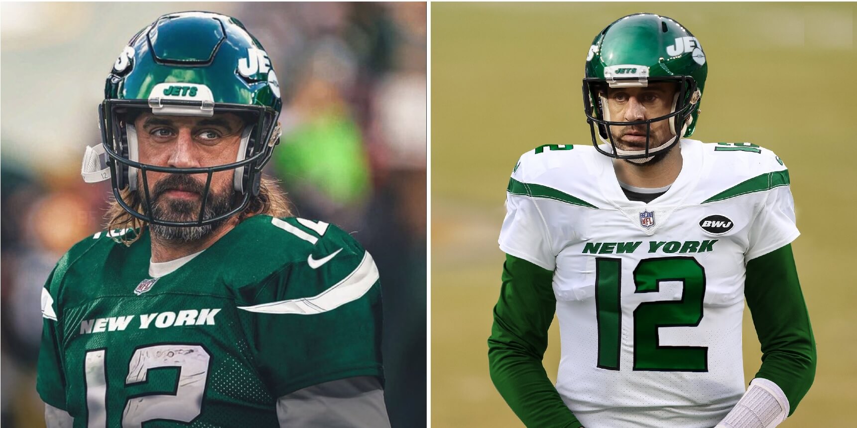
I expect everyone to hate this, but it’s my fantasy.
If I had my way, the NFL would contract by eight teams. Teams that I have no use for are the Baltimore Ravens, Carolina Panthers, Jacksonville Jaguars, Atlanta Falcons, Tennessee Titans, New Orleans Saints, Houston Texans, and Seattle Seahawks.
Then I’d reconfigure some of the divisions like this:
AFC East: New England, New York Football Jets, Buffalo, and Miami
Central: Pittsburgh, Cleveland, Indianapolis, and Cincinnati
West: K.C., Denver, San Diego, and Oakland
NFC East: New York, Philadelphia, Washington, and Tampa Bay
Central: The classics
West: Dallas, Arizona, L.A., and San Francisco
I welcome your abuse.
So…basically all the southern teams (minus Miami/TB), plus Balto and Seattle.
Do you hate the South or something, you damn Yankee?
Yeah, I hate it.
Ravens have won two SBs in their “brief”existence but somehow the Chargers not only get saved but somehow moved back to SD. Sounds like an upset cleveland fan.
Am I the only one who finds it funny that the Aaron photoshops use his regular face mask with the helmets of Riddell speed and idk the cutout one yet
Flexspeed?
Dang… that’s messed up. That mask doesn’t fit those helmets.
Great catch!
And that Photoshop job is really bad on the green jersey. Everything is off.
The photoshopper obviously took a pic of Rodgers in his Packers jersey (which is the old Reebok template) and tried to make it look like whatever ridiculous nickname Nike gives the present chassis used by NYJ. That’s why it looks off. I think some p-shoppers go the other route: find someone in a similar pose in a Jets uni and just swap in Rodgers head/face. I think it’s a decent effort, but uni watchers can easily spot the jersey inconsistencies. Most folks probably wouldn’t even notice.
I envy them.
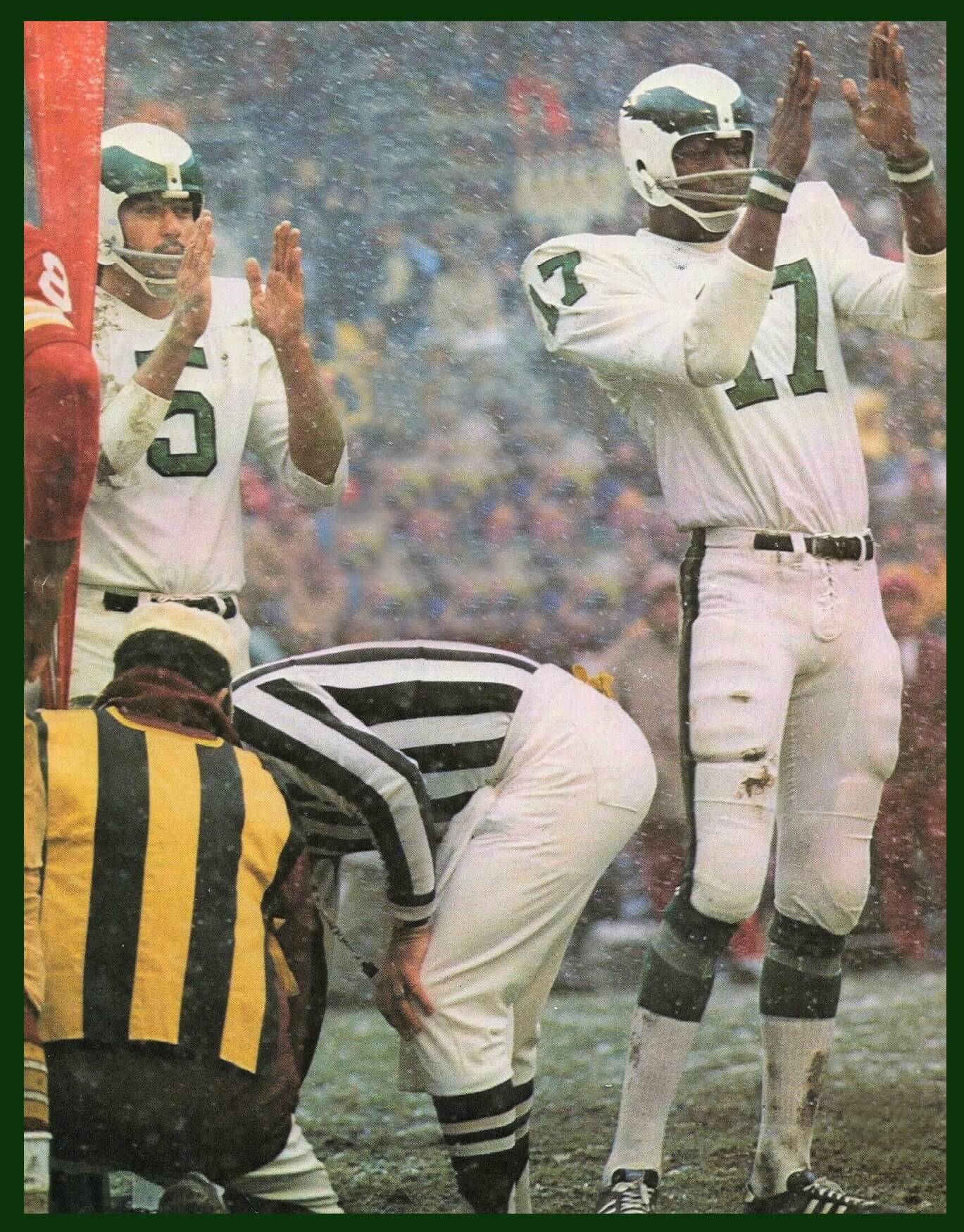
Eagles v Redskins Dec 16, 1973. week 14
Redskins won in the snow 38-20 at RFK.
Larry Brown caught a TD and ran for 3 more.
Actually — that’s the “splash” photo for the GTGFTU series (I’m guessing you’re reading this on your phone). The actual “clue” for today is the picture of the Mets player — that’s the GTGFTU you need to identify.
I don’t get why everyone is so hot on Rodgers to the Jets. He is old, looked bad this year, himself questions his commitment and just seems like a setup for the Jets to give away the farm and he gets injured or plays one season. I just don’t see it going well. Look no further than Russell Wilson in Denver. Give me Derek Carr.
There’s little doubt that the Jets hired Nathaniel Hackett, who proved himself to be a bumbling idiot as Denver’s HC, to entice Aaron to come on over.
Bubbling Brown Sugar is
a stimulating Harlem treat!
Now get “em, Rerun.
Dang it.
I was really excited about this reference, and I though someone would jump on it immediately.
On a day when Phil, like Dwayne, picks by uniforms!
Phil (clap) will be right back (clap) next Saturday (clap)-with more stuff!
Memphis Pharoahs was already a team in Arena football, and they PLAYED in the Pyramid back when it was still an arena and not a Bass Pro shop.
“Austin Bats” and “St Louis Archers” are amazing team names.
Glad to see someone else thought Archers was perfect for St Louis! I’ve been toying with that concept for years in my head, but never put anything on paper.
Bats is a great name, but for the love of all that’s good and holy, lose those awful stealth numbers. Do not give Nike any ideas.
I could live with Archers. Shoot – I want a team so badly I’d even take a name that doesn’t end with an S.
Anyhoo, I’m much bigger fan of our old MISL name. Picture the steam coming off the boat. That would fit nicely coming off the front of the helmet, ala the Eagles.
St. Louis Archers is a great name. But those uniforms with the Archer name seem very Blue McDonald’s-ish to me.
Absolutely! Not even a need for an ad patch!
I recently did this with 8 expansion teams. I used quite a few recycled names, ala Avs and Rockies..
St. Louis Steamers
Memphis Hounds
Toronto Huskies
San Diego Seals
Oklahoma Twisters
Vancouver Dragons
Utah Oquirrhs (Oakers)
San Antonio Strays
No NFL expansion to Toronto and Vancouver please. This is CFL country! Though I would go to a rumoured NFL exhibition game in Vancouver.
They could coexist, no?
No, they couldn’t co-exist. Neither team would be supported well enough if they had to share a city.
We endured lifetimes of doing what we can to keep the CFL alive financially. We are winning in the neverending battle. Protecting our unique Canadian game. Letting the big money NFL machine put a foot in the door and get established in our larger markets will not help.
Besides, don’t really need an NFL team here in Vancouver. Can make a day trip to a Seattle Seahawks game and be back in the office Monday morning.
So wait. You’re against college and pro teams using Native American names, logos and iconography but you want a NFL team in Mexico City called the “Aztecs”?
Are you addressing this comment to the concepter(s)?
If you’re asking me, that’s a different story, but they’re not my concepts. There are also a ton of variables: SDSU (link) uses “Aztecs,” but FSU, CMU and Utah — to name three — use Native American names and iconography with the explicit support of those Tribes. So, I’m honestly not certain about the proposal for Mexico City. It might depend on the sentiment of any remaining ancestors of the Aztec nation. SDSU has addressed this (link).
But I’m just featuring Jonah’s concepts — I’m making no endorsements nor condemnations of his proposals.
“Aztec” is very different from the usual cases of US native imagery. For one thing, it refers to a political entity, not an ethnic entity or a people. The Aztec empire (or Confederation) was a multi-ethnic, multi-lingual political entity that ruled over, or in most cases merely collected taxes and tribute from, subject peoples. The Aztecs are more akin to, say, the late medieval Hapsburgs or Carolingian France than to, say, the Lakota or Cheyenne peoples of the future United States. No one from Spain or Holland or Austria today identifies themselves as being “a Hapsburg” even though each is descended from people who once lived in the same place, which was ruled at the time by the Hapsburg Empire. Similar deal for today’s descendants of the mainly Nahua peoples whose ancestors were once Aztec subjects. For another thing, “Mexico” is derived from a word the Aztecs used to describe themselves and their capital city, the predecessor to Ciudad de Mexico. Mexican national identity is significantly based on an embrace (and romanticization) of Aztec history. For a third thing, relations between the descendants of settlers and of natives is very different in Mexico than in the United States. It is a mistake to apply the standards and expectations of the United States to Mexico in this context. The Mexican Constitution specifically recognizes and enshrines significant protections and rights for indigenous communities, including the right to use and teach their languages and have special representation in local government. Mexico has its own history of violence and genocide like the United States, yes, but Mexico’s history with its native peoples since independence from European colonial rule is very different from ours in the United States.
In short, Mexico City Aztecas is not comparable to Atlanta Braves or North Dakota Fighting Sioux. Although I have no doubt that if such a team existed, willfully ignorant white dudes in the United States would point to it as an example of why the Washington Redskins name was no big deal and the Chiefs are actually a good thing and Native Americans should shut up and be grateful to have a team named in their honor.
Your comment is absolutely spot on. “Aztec” is a very different concept than a Chief Wahoo or using tomahawk chops. Well written.
(I am not endorsing or condemning a hypothetical Mexico City team.)
I’m kind of stuck between a rock and a hard place. I love the design of the NFL expansion San Diego Seals. I would buy all of that merch and support them as my team! (I’m a SD native that dropped the Chargers when they moved). HOWEVER, lacrosse is my favorite sport and the San Diego Seals already exist in the National Lacrosse League! Sure, teams in different cities and different leagues can share a nickname (SF Giants/NY Giants, AZ Cardinals/STL Cardinals). I don’t think I can let the same nickname slide in the same city.
1. That era Eagles helmet should be brought back, even if in the new colors. The current ones are too cartoony.
2. I made up teams and logos back in the day for an NFL board game for cities that didn’t have teams. They included the Phoenix Condors, Oklahoma Ranchers, Rhode Island Rollers (truck theme), Salt Lake City Lakers, among others that I can’t remember.
These Austin Bats look better than the options Madden gives.
Those expansion team brandings are every Nike employees dream. A true mashup of sports identity and chambers of commerce. A far cry from the days where every team was a bear, a pirate, or tiger. But I guess the more teams, the more obscure the mascots gotta be.
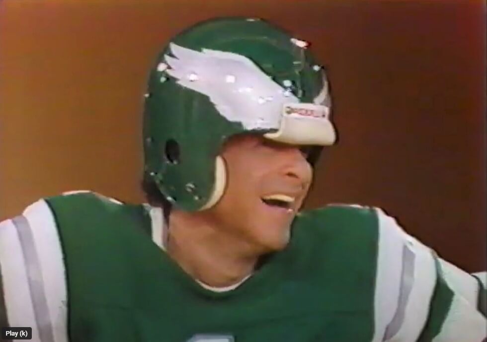
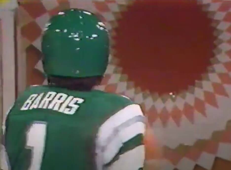
That shot of Chuck Barris’ helmet from behind looks so naked, not covered in contemporary decals (NFL shield, radio dot, American flag, uni #, memorials, etc).
Rodgers would have to pick a new uni # with NYJ. I’d suggest 21: If basically anyone can wear 1-19 now, why not a QB with a non-traditional number, a la Flutie’s #22?
*I know #21 isn’t legal, I’d just like to see it.
John Hadl wore #21 for the Chargers back in the 60s and early 70s.
“Rodgers would have to pick a new uni # with NYJ.”
Namath has already given his approval for Rodgers to wear #12 if he were to join the Jets.
link
I hate the prospect of Rodgers joining the Jersey B-and that hatred is reinforced by the possibility of him wearing that rendered in that dreadful Jet set. He should respect Broadway Joe, decline the offer, and the 12 should stay uncirculated. “Thanks, Joe…but no.”
Should he join the Jets, Rodgers can flip the second digit around and go with 15. Montana made the same move when he joined the Chiefs (16 was retired for Len Dawson, so he went with 19…then again, Joe Cool was always a class act).
I like it when players that can’t get their number choose to put a math equation in the mix. I would go with 1 + 2 = 3.
And lest we forget… 0 + 2 = 1. Race that to the finish line in a dead run.
The Biggie Smalls/Coogi inspiration was already used by the Brooklyn Nets and I still associate Coogi sweaters with Bill Cosby so I probably would have gone in a different direction.
Trademark issues with the old Austin Ice Bats hockey team?
Those were some solid designs, though I would have made the London team’s red a little darker.
Speaking of NFL expansion, the current mayor of Dallas is pushing for a 2nd Dallas team to play within the city limits. Like Jerry Jones would allow that to happen.
What? No love for Oakland in the expansion?
Richard, check out my Instagram page (@dubyagfx) I’m doing another project with a team called the Oakland Oaks. A homage to the old baseball and ABA teams, I’ve got my logo ideas up there and unis to come soon.
Love the St. Louis Archers logo!
GTGFTU-a real tough one, here’s my crack at it:
Marlins @ Mets, 8/29/2011?
Blue BP’s (no sleeve patch) paired with BFBS cap.
Was somebody we know at the game?
link
Well done, Chris
Perhaps you already know this (and not that you should avoid it being a New Yorker), but nobody in San Francisco likes the city being called San Fran.
If the NFL were to expand…my vote would be to put a 2nd team in Chicago(the Victors- the city of wins?)and to place a 2nd team in the Bay Area (San José Reyes/Bay Area Battery?(Spanish for Kings/naval military reference)) and lastly in St. Louis (Slingers? For their famous sandwich and as a football reference.)
I like the Eagles “stripes ad nauseam” jersey Berris wore. In fact, that’s my favorite Eagles throwback.
It could still be done today; the helmet pants and socks would be no problem. The jersey would have to be modified, with maybe just the shoulder “UCLA”stripes and maybe a thinner version of the thick white stripe under it. But the Eagles would still look very good like this.
I like most of these concepts. If the NFL did go to 12 more markets they could do it 1 of 2 ways. 1. All North America with global sister cities or 2. Franchises all over the globe. I’ll go half and half. I’ll also move the Chargers back to SD and that’s basically a 2nd NFL team in LA plus the Jets move back to the city. Then…
1. St. Louis Showboats ( greatest show on turf and the show me state) city flag colors
2. Portland Settlers (brown, light blue, and yellow)
3. Mexico City Aztecs. Red, yellow, green
4. Memphis Egyptians (Pharaohs would work too). Navy blue, light blue, yellow
5. Dallas Texans (stadium on Texas Stadium lot) (Houston gets Oilers back)
6. Chicago Stars- Arlington or Soldier Field. City flag colors
7. London Monarchs- bring back NFL Europe
8. Toronto Argonauts- no need to change brands
9. San Antonio/Austin Armadillos
10. Oklahoma City Twisters
11. Vancouver Mounties
12. Utah Peaks (I like your team name).
Every team has to play 1-3 international or neutral site games.
I love most of these NFL concepts, but Oklahoma looks really good just because of its balance: it’s the only team without a silly wordmark or logo separating the collar and the front number, so the “89” on the front is positioned perfectly, unlike some offenders like the Salt Lake, St. Louis, or Toronto designs in particular. The color schemes are beautiful, but imagine them with the wordmark removed and the number a few inches higher.
Also the use of Helvetica from the NYC subway system is perfect. They could have a 2013 Green Bay Packers-style alternate (link) with a Helvetica number in a colored circle, just like subway signs: link.
Having a team in Utah that is neither blue nor red is the only option. Purple as a primary color is a great choice. Blue + Red
Fun project!! I spent much of my youth imagining new expansion teams / logos across a variety of sports. I love the Austin Bats’ powerfully minimalist design. Though Jimmer certainly hates the stealth numbers, I am impressed with how much is done with simple thin lines.
I like the overall San Diego concept. Just with different colors. Looks too much like the Tar heels for my taste.
They don’t have enough players to field 32 quality teams, as it is.
YESSS!!!!
Bring in the Austin Bats!
RE: NFL Expansion project.
I’ve managed several of my own custom simulation leagues and I’ve used the Memphis Kings (Pharaoh logo) in baseball and Mexico City Aztecas in football (look is similar but the colors are a bit wilder dark magenta and orange) My St. Louis football team is the 88’s. (Eighty-eight keys on a piano as St. Louis, along with New Orleans is a city were ragtime music was developed.)
You would have to bring them by stages, but you could expand by that many. the problem is that that would leave you at 44 teams, Given the NFL scheduling matrixes, it would have to be 4 divisions of 11 to balance it out. So you would have to 36, 40 or 48 teams as they have more possibilities of alignment.
Before you expand there is a couple of issues you need to take into account:
Move Jacksonville to London already.
Make some kind of arrangement with the Canadian government to preserve the CFL. When the WFL tried to put a team there they passed a law banning it.
Move the Chargers back to San Diego.
Find out what it would take to keep the Texans and the Cowboys happy-otherwise forget Texas.
If all That is accomplished then here are the cities
Los Angeles
Chicago-the city will be screaming for a new team if the Bears leave
St. Louis
Portland
Birmingham
Oklahoma City
Salt Lake City
Glasgow
Barcelona
Mexico City
Montreal
Toronto
Vancouver
Berlin
Frankfurt
Amsterdam
That would give you 8 divisions of 6 teams each, with a six team European division.
If someone could give me a lead on free or paid uniform templates- I can map it out.
Late to the party, but I’d go with a different name than London Knights, since there already is a team called, y’know, the London Knights.