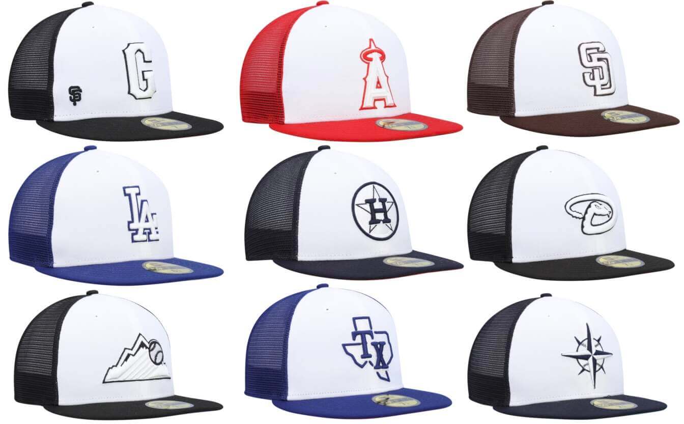
The start of MLB’s spring training is less than a month away, and we still haven’t seen an official release of this year’s BP or spring training caps. Personally, I don’t even care — these caps are just annual merch dumps — but I know a lot of you folks care because you collect these caps, so I feel duty-bound to inform you that new cap designs for 10 MLB teams, all labeled as “2023 On-Field Batting Practice,” showed up yesterday on a bunch of merch sites (like this one). The 10 teams are all from Western Divisions of the American and National Leagues.
I put Oakland’s cap at the top of the page because it’s green and therefore the best. Here are the other nine designs that began circulating yesterday:
You say you’d rather see them one at a time, instead of all grouped together? Can do, buddy:
There’s no sign of the other 20 teams’ designs, at least for now, but they’ll presumably be appearing soon enough.
A few quick thoughts:
- Obviously, most of these look ridiculously bland due to all the whited-out (white-outed?) areas.
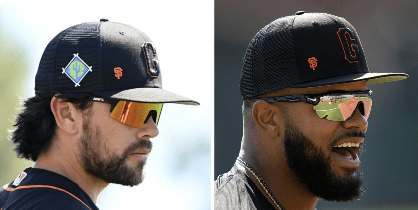
- See how they added the “SF” logo to the Giants’ cap, as if to say, “We just want to make sure you knew it’s a Giants cap, in case you still don’t recognize the ‘G’ from our stupid City Connect uniform”? They also did that for last year’s spring cap (and it looked just as dumb then as it does now):
- I’m assuming the spring caps will be the same as these but with the FL and AZ logos on the side.
Like I said, these are just a silly merch dump, so I don’t really care one way or the other about the designs. Your mileage may vary and all that.
(My thanks to Twitter-er @Metsfan4life, who was the first one to bring these to my attention.)


The Giants sticking the little “SF” at the bottom of the crown is a classic example of not believing strongly in the design to stand on its own. Don’t think the “G” is recognizable enough? Worried that the average fan will confuse them for some other team? Just plop a tiny logo in the corner of the crown and then they’ll know! The second they had to resort to that, they should have known they were making the wrong decision.
My thoughts exactly. What is even the point of having the G on there anyway? Maybe someone from the SF Bay Area could provide insight as to if it is popular there. Why even have a hat with this logo if it is so nondescript that they need to include their normal logo so you can identify what you are looking at?
The funny thing is that the Giants have worn a “G” on their BP hats since around 2000-2008. So it’s not a new concept, and even that “G” was a throwback cursive “G” that they apparently felt didn’t need an “SF” to go along with it, if recognition was an issue. But they did add it to this alternate “G”, which is ironically the current font of the team logo and world mark, which you’d think would be even more recognizable. Idk, I think it’s all for designs and retail purposes. They wanted to do something different for sales and probably tie in with the atrocious CC program. Gross. I actually don’t mind the black and orange 2022 Giants “G” hat but not this years. Terrible.
To echo your sentiments, I thought it was a Guardians hat until I saw the SF in the corner.
Came to say this… My first thought was “Wait, the Guardians are in the Central Division, why are they there with a bunch of West Division teams?”
They could have gone the Rangers’ route of putting a big ass TX on the state – to make sure we knew that was Texas. The Rangers’ cap truly looks like it is from some softball league.
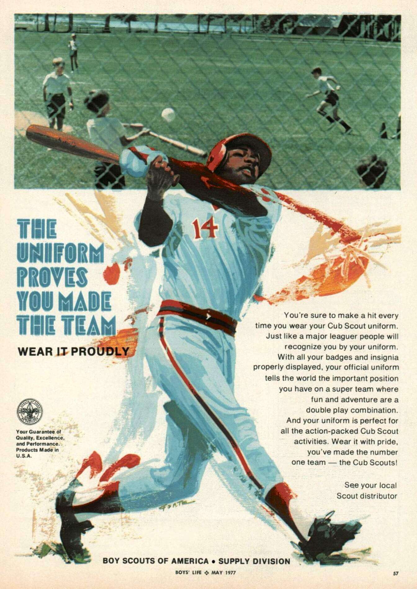
The mystery baseball player looks to me a lot like Dick Allen.
I diasgree. Allen was righthanded and wore Number 15. He also wore glasses.
Why not just go all the way with the trucker hat concept and make them look like these: link
I had that NY trucker hat, got it at Two Guys in NJ. Man I miss that hat.
Those would actually be way better looking that the slop that is being leaked!
When I first looked at the Giants’ cap, my immediate first thought was “When did Cleveland move West?”
Guess they didn’t want an unreadable SF to be confused with an unreadable SD.
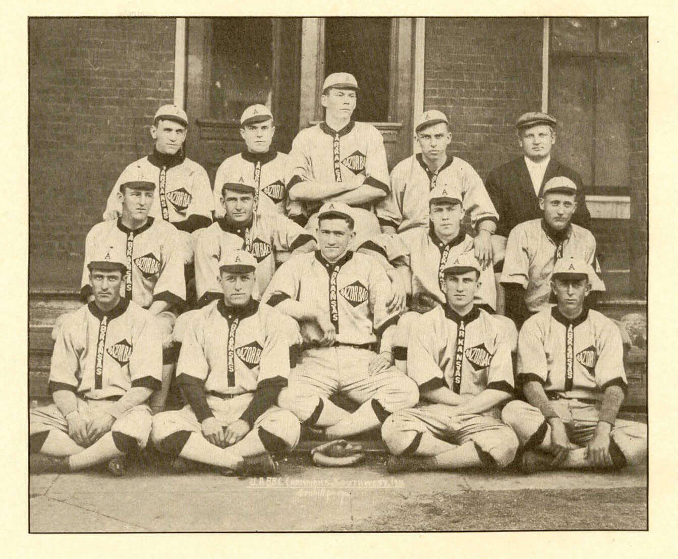
The Arkansas image is amazing. Could the diamond shape on left chest be a reference to their regional significance in regard to diamonds – later adopted on their state flag?
That’s a great idea, JW.
It looks like that the end of sleeves also show some diamond-ness, or the top half of that shape.
Succeeded in making teams wear what typically would be cheap knock offs.
Why are the Mariners and Astros black?
Looks to be navy blue
You’re right! Thx!
I admit I am a traditionalist, but a baseball cap monogram should be for city/state, not nickname. It worked for decades. The SF monogram is distinctive and even sets itself apart from the 49ers (like the Royals and Chiefs have different KC monograms), stop overthinking it and use what has worked for decades. Dammit, Nike.
As far as trucker caps: with more guys going hairless, that’s a lot of burnt scalps coming our way soon…
I tend to agree about cap logos, but Baltimore has been wearing a team mascot on its cap about as long as they’ve existed; the Twins have worn a sort of hybrid geography/nickname logo since they moved west; the Brewers have had their team-name initial on their caps so long most people don’t even know they didn’t used to … nicknames on caps is not some new innovation. I wish none of these teams wore these cap logos, but they do, and have done for many many decades.
Nike isn’t to blame for the caps, though. That’s New Era for you.
*shrug*
Could be Jorge Orta. He never wore #14, but he played for the White Sox when they wore that general uniform, and occasionally sported the BGOTH look:
link
My guess is Cecil Cooper. I pulled up some pictures on Google and they are similar to his batting style.
Speaking of scouts and uniforms, the ad reminded me of one of the sadder parts of my life. I was in cub scouts and really loved all the different badges, arm loops, kerchiefs etc. But being raised by a single mom, we struggled to pay for things. The Webelo year I had to drop out because of needing to buy a whole new uniform.
Thank you for sharing that with us. That really sucks– sorry to hear it.
If they’re going to be so basic, they should at least be a little less boring. Houston’s should be orange, Seattle’s should be northwest green, Colorado’s should be purple (sorry Paul), etc.
agreed. and keeping it single color doesn’t help in most cases. i wouldn’t mind if the giants logo was outlined in orange, or the squatcho was orange. or if the A’s brim was yellow. definitely the rockies should be purple, the M’s “northwest green”, the Astros orange (or orange with navy brim?). it feels like the laziest kind of penny pinching, or someone who is being too rigid about their pet concept.
Since we are speaking of Cub Scouts and organizations alike. Interesting to note earlier this month, the Girl Guides of Canada dropped the name Brownies in favour of Embers for the 7 to 8-year-old members.
link
I bet these hats are much cheaper to produce than 59Fifty’s but will cost within $5 of one.
I don’t think merchandise is priced based on anything other than what the market will bear.
Quality isn’t a factor.
Lee
Have I ever mentioned how much I love VPL?
What do you mean by VPL?
vertical placket lettering
Those spring training hats look like the ones you get at Walmart for $4.99.
My first thought on the mystery ballplayer was Bake Mcbride. I’m not sure if the swing looks like his, but he was a one-glover:
link
That’s a good guess, except all the pictures I find of McBride he is sans ear flap on the helmet. I’m sticking with Jorge Orta for now.
my guess is that there’s something in the wording of the New Era contract that says certain logos have to be on the caps, like the Yankees’ NY and the Giants’ SF.
That wouldn’t explain the Giants’ City Connect cap.
The Giants city connect hat has an SF though?
link
The jersey has the “G”. The caps have the “SF”
link
My bad. Thanks for setting me straight!
These Spring Training/BP hats get worse and worse every year. And I say this as someone who likes buying and collecting hats. I’m the target audience for these. Just…make them not stupid.
Spot on with your statement. The 2023 Spring Training hats are the definition of laziness. They are the front white panel versions of 2022. Understandable that coming up with a new version of a ST cap after 10 years can be difficult, but c’mon man! Add color to the brim. Try a historical logo. Go back to non trucker. Angels lowercase a with halo. Mariners star trident. Astros shooting star.
Or… stop trying to squeeze the paying public out of $30-40 each season for the latest and greatest. Maybe just use one hat or keep the hat the same for a few years. The Yankees seem to be doing well with that “NY” monogram…
I’m kind of curious how well spring training hats ACTUALLY do on the market. It would make sense if they were a slightly different design at a lower price point (IIRC the NHL used to sell practice jerseys at a lower price point than game ones for a bit, had a montreal one). And the older diamond era hats kinda were like that. But these ones don’t seem to go after any market. I’ve never seen a post 2016 spring training hat in the wild
Diehard Giants fan here and for whatever it’s worth, those 2022 black and orange piped “G” BP hats sold almost instantaneously and by the start of the regular season were sold out for the entire year. Don’t know what it was but apparently they were a hit. Never saw them again. Most places never restocked.
And now with this new design it seems like they’re gone if you didn’t get one. I don’t like this NBA style where they get rid of a design after one year. At least keep a design a couple years before scrapping it so fans can get a chance to get something they like. At this pace, if you don’t manage to get gear in the rat race immediately, you’re SOL. Dumb.
This might be the first year I don’t buy a Giants spring training camp. Never liked trucker caps and I wasn’t thrilled with last year’s version, though I do love everything about the “City Connect” jersey and logo.
As for the Indians fan wondering why the cap is with a bunch of western teams, it’s because they’re all in the Cactus League!
To me, the player resembles Dave “Cobra” Parker.
No doubt it’s the Cobra, in a Red Sox / Phillies mash up uni.
Sad state of affairs in BP hats, I never will want to buy one in this style. Happy state of affairs in the Arkansas picture, that uniform is very good and I would love to own it, including the hat.
Looks to me like the illustrator messed up the top hand and decided to cover the mistake with a batting glove. It looks more like an oven mitt than a batting glove. Drawing hands is hard!
Awful hats.
I think the kids in the uniform ad are wearing “Class B” Cub Scout uniforms, so official Cub Scout uniform shorts with a t-shirt. That would be the appropriate uniform while playing sandlot baseball.
I think the shirts might actually be these: link
It’s really hard to tell in the ad because of how blurry the photo is, and the fence is just perfectly overlaying over the one kid whose logo would be visible. But, I agree on the shorts, as it looks like that same kid is also sporting a web belt, which had brass buckles at the time.
Didn’t a bunch of players complain about sunburned heads wearing the mesh back caps last year?
I was just thinking the same thing. Another year of bald players burning.
Confession.
I really didn’t like the spring and batting practice caps when I saw the mesh. And I was really bummed when I saw the All-Star Game caps go that route. But I found one with a design I liked on sale and bought it. And I was stunned to discover it was the most comfortable caps ever. I bought some of the All-Star versions now that you can get them for less than $15.
Obviously it’s a cash grab because there are people out there who will buy this garbage product.
And who designs these or approves of the designs? Do the teams and the league not care since it’s a cash cow for them? I would like to know who designs these and what goes into that process. Do they even get feedback from fans or is it all just designer and trendy stuff?
I miss the days when they would just wear the BP caps at spring training. The same exact BP caps we would see in the regular season. No special patches or cheap designs. And the cost was probably half of what it is today for a much better product. Those flex BP caps from the 2000’s were some of my favorites and I wore them for many years.
Such a disappointment that they continue to roll out these garbage products each year. Then again, should we expect anything less as long as there are people out there who continue to buy this stuff.
Gross.
Why so much white? It makes no sense.
Right? Those things will get filthy in a heartbeat. Not the most practical design.
Those are freaking ugly.
As a Giants fan, these are hot garbage. The older script G was a better one, but I prefer the SF logo on a hat. While the CC jerseys grew on me, I still don’t like the all white.
As someone who is admittedly hard on hats, an all white hat would be cool for roughly one day before it would look like I’d worn it through a dust storm. I guess if you’re a collector who is a completionist, these hats are right up your alley.
Looks like MLB Shop yanked them…thankfully.
I did notice on the site the Twins have a “2023” batting practice flextfit in 2022’s style.
Last year clubs released multiple versions of the BP caps…team color, black, white, and gray (anthracite). Maybe what we saw released this week is just a riff on that.