Good Sunday Morning, Uni Watchers. I hope everyone had a good Saturday.
About a month ago, guest author Chris Diamond embarked on the first of a multi-part think piece in which he imagined every American city giving its sports teams a “Pittsburgh” treatment — that is, what if all the major sports teams from a given city were to adopt the colors of their city flag as colors for all their sports teams, much the way Pittsburgh does today? It’s a really fun project, and Chris returns today with Part II of that. So, I’ll just turn it over to Chris now as he asks…
by Chris Diamond
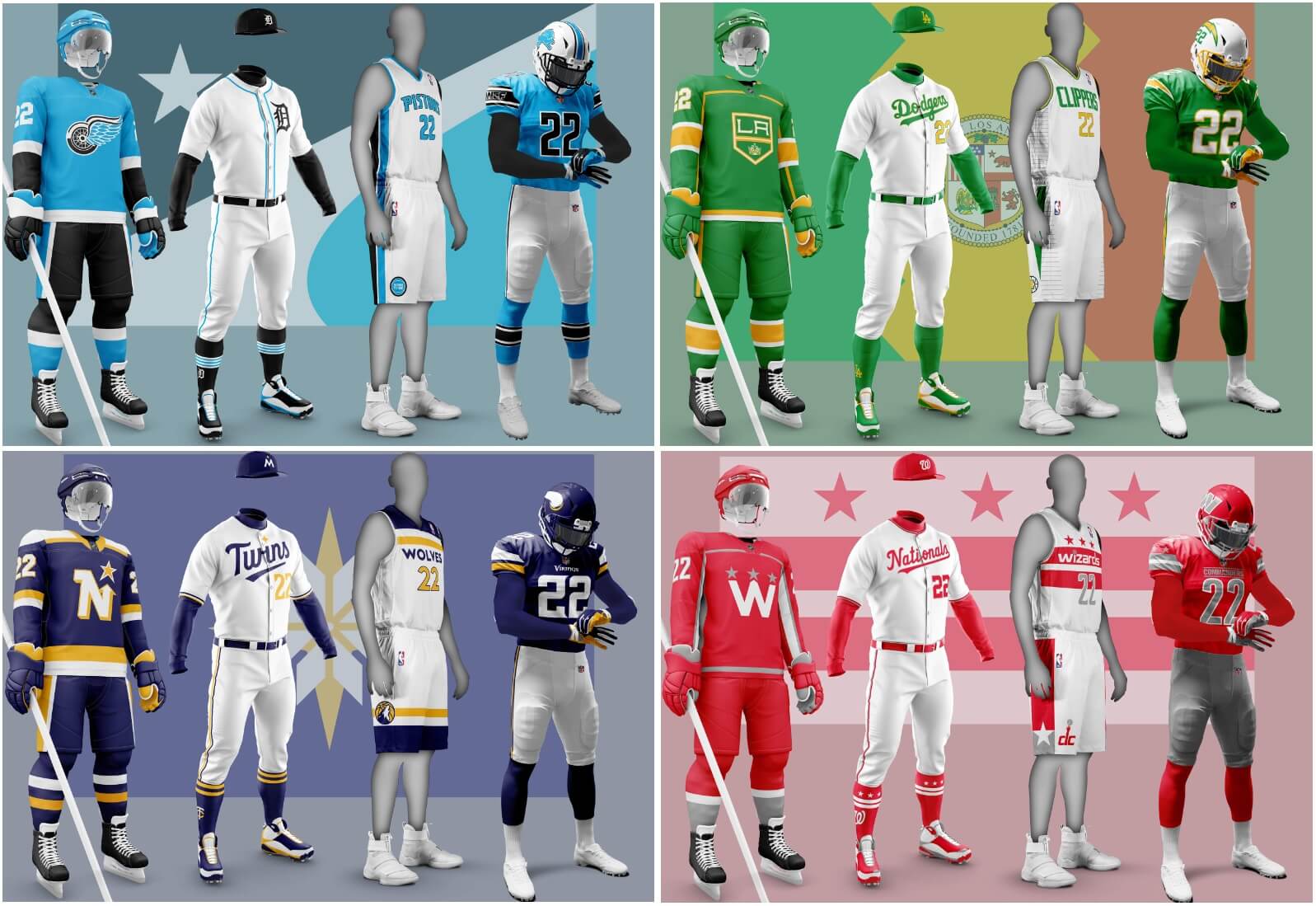
In Part 1 I started to look at what other city’s teams would look like if the all shared the same colour scheme of their host city. Here in Part 2, I look at four more cities that have the “big four” sports teams – Los Angeles, Washington, Detroit and Minneapolis/St. Paul. As some of you have already noted some of these are potentially problematic as we shall see…
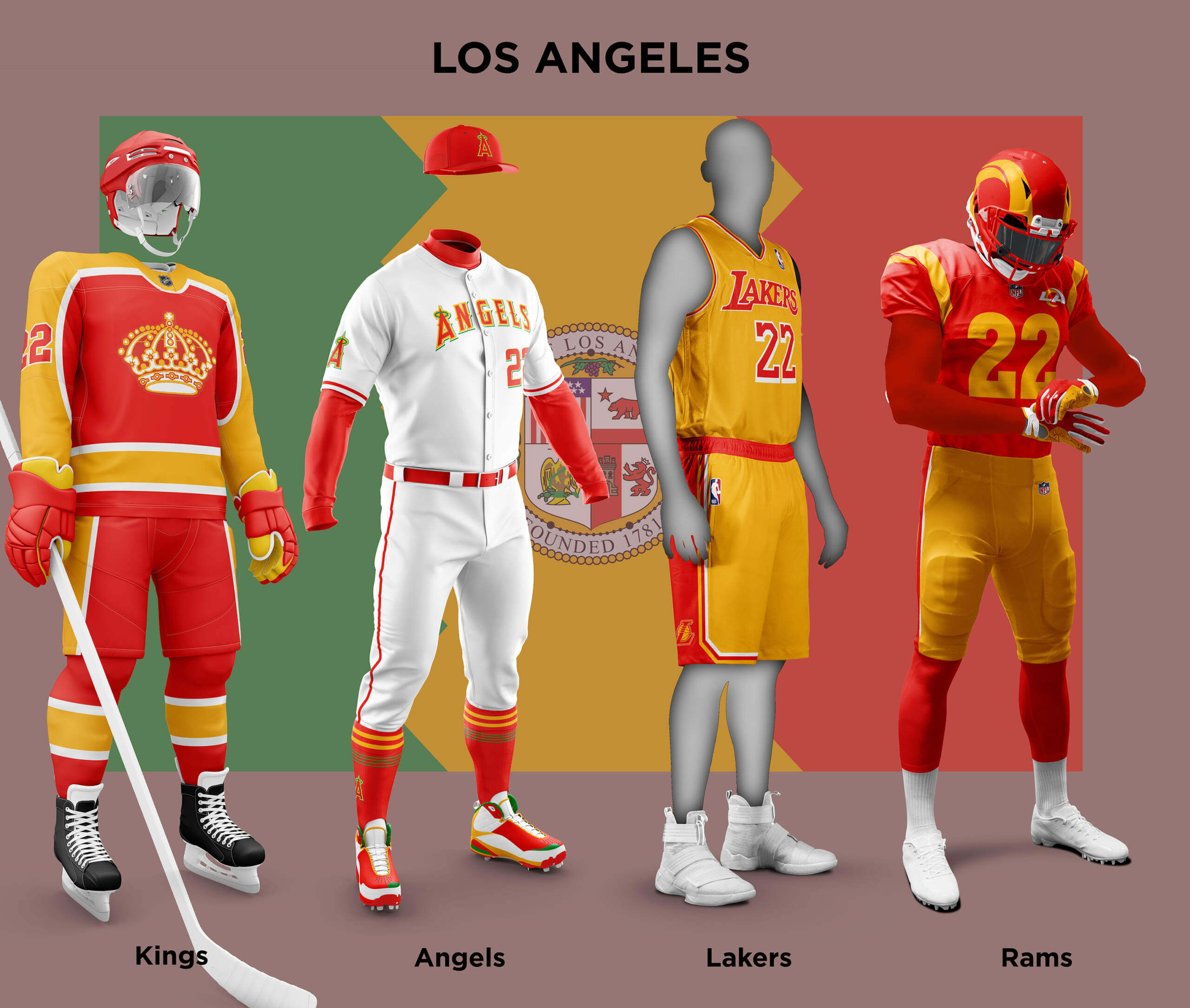
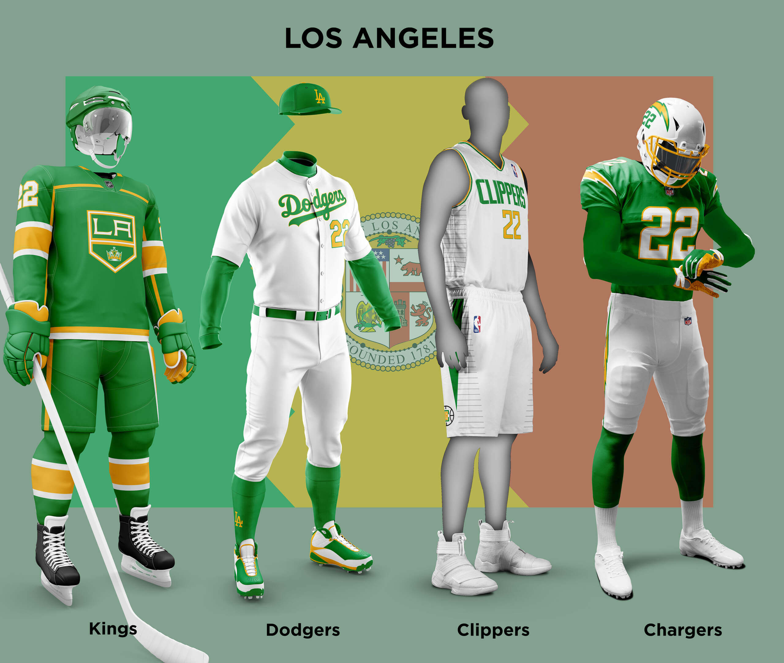
The splendid flag of LA is a green-gold-red tricolour representing olive trees, orange groves and vineyards. Like with New York in Part 1, I have divided the city’s teams into two “camps”, but in this case they are Red+Gold and Green+Gold. As LA has only one hockey team, I’ve done two different versions for them, one in each camp. The LA Rams briefly flirted with red/gold uniforms in 1949 and so this is what they might look like if they’d stuck with that. I’ve also tweaked out some of the fussier elements of the uniform for the sake of my sanity! Like the Rams, the Lakers also have yellow/gold as a colour already, so it’s not a huge jump to image what they would be like. With the Angels, I also added a very small amount of the green as a third colour as their scheme as I felt like it worked better with it. Finally for the Red+Gold teams we have the crown logo version of the Kings, based on their rather nice 2022 Reverse Retros. For the Green+Gold teams, replacing the Chargers’ powder blue with green looks pretty good I feel. The Dodgers in green and gold will probably horrify their fans, although Paul might like it! The Clippers existing uniforms are a bit underwhelming and replacing blue/red with green/gold doesn’t really help! The Kings in green and gold looks quite sharp.
The flag of Washington is based on the arms of the Washington family. It’s already used by some of the Washington teams in various forms. But just using red and white doesn’t really work with the teams’ three colour schemes so I’ve added silver (which heraldically is the same as white anyway). As it’s already a thing, I’ve tried to fully incorporate the design in each team’s uni as well as the colours. As has been discussed at length, the Commanders uniforms are a bit of a car crash. Perhaps because here they aren’t in the familiar burgundy and gold, I think these versions look better. The twin sleeve stripes just needed the three stars above to work. The Nationals already use red as their primary colour, so the red and silver doesn’t look that strange. I managed to include the flag design on the stirrups! The Wizards horizontal striped jersey easily lends itself to the two stripe flag design. The Capitals already have an alternate logo based on the flag so it made sense to use that as the primary. All-in-all I think the Washington teams make for a really coherent set.

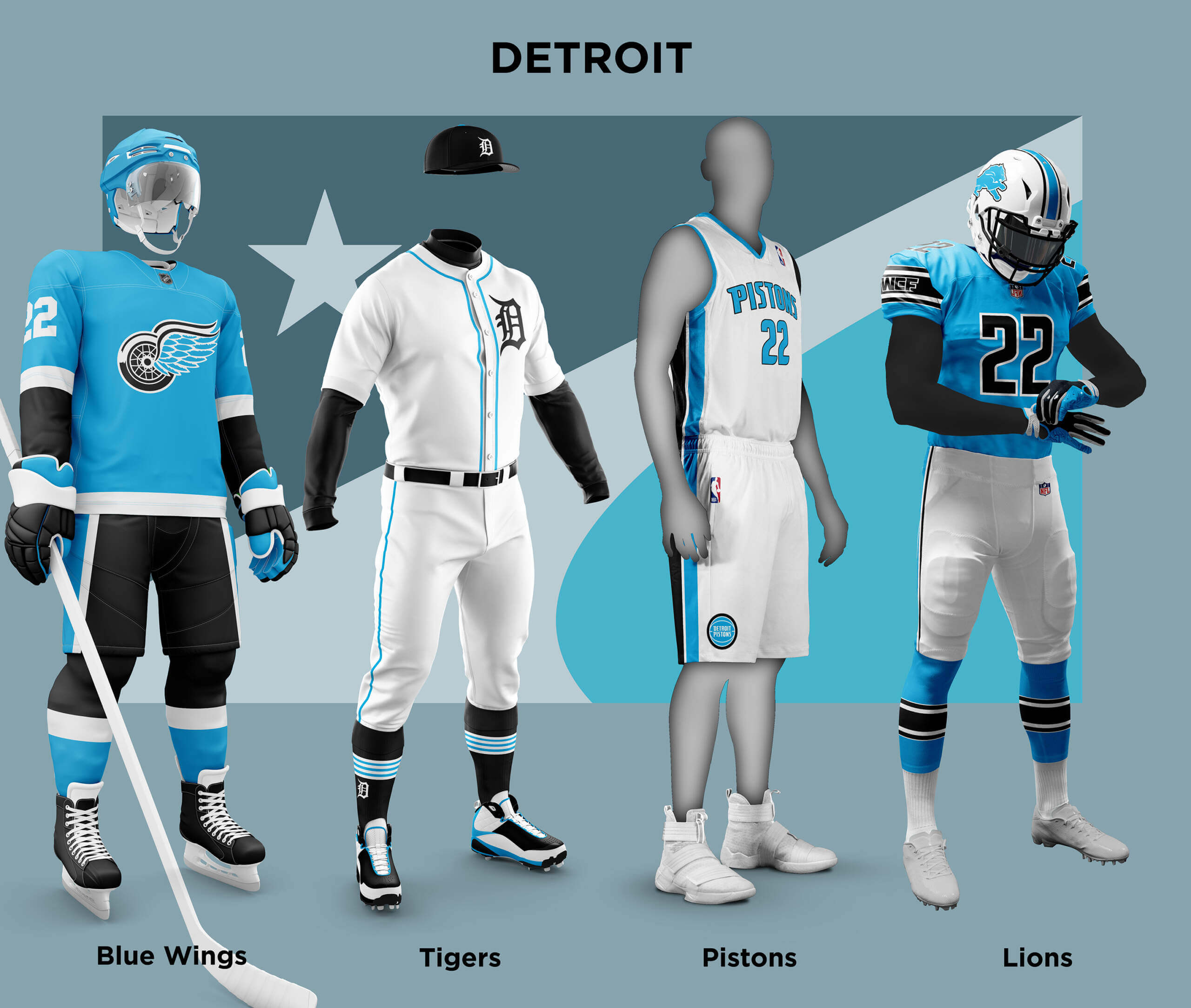
The current flag of Detroit is a bit of a mish-mash with quarters representing the different colonial powers that controlled the city. New designs have been proposed, and one in particular Detroit Rise designed by local artist Deon Mixon stands out. So I have taken this as the inspiration for Detroit’s colours instead. The flag is blue, black and white and the shade of blue is close to the Honolulu Blue of the Lions, so it already feels like a good fit. The Lions have used black as a secondary colour in the past so it doesn’t feel too out of place. For the Pistons it is simply a case of replacing red/blue with blue/black. It also it reminiscent of the 90s Teal jerseys (good or bad!). For the Tigers, mostly using black seemed a better fit with blue as the highlight colour. Finally we have Detroit’s Hockey team. This is a bit of a problem as a team called the Red Wings not wearing red at all is a bit odd. So, just for this I have renamed them the Blue Wings!
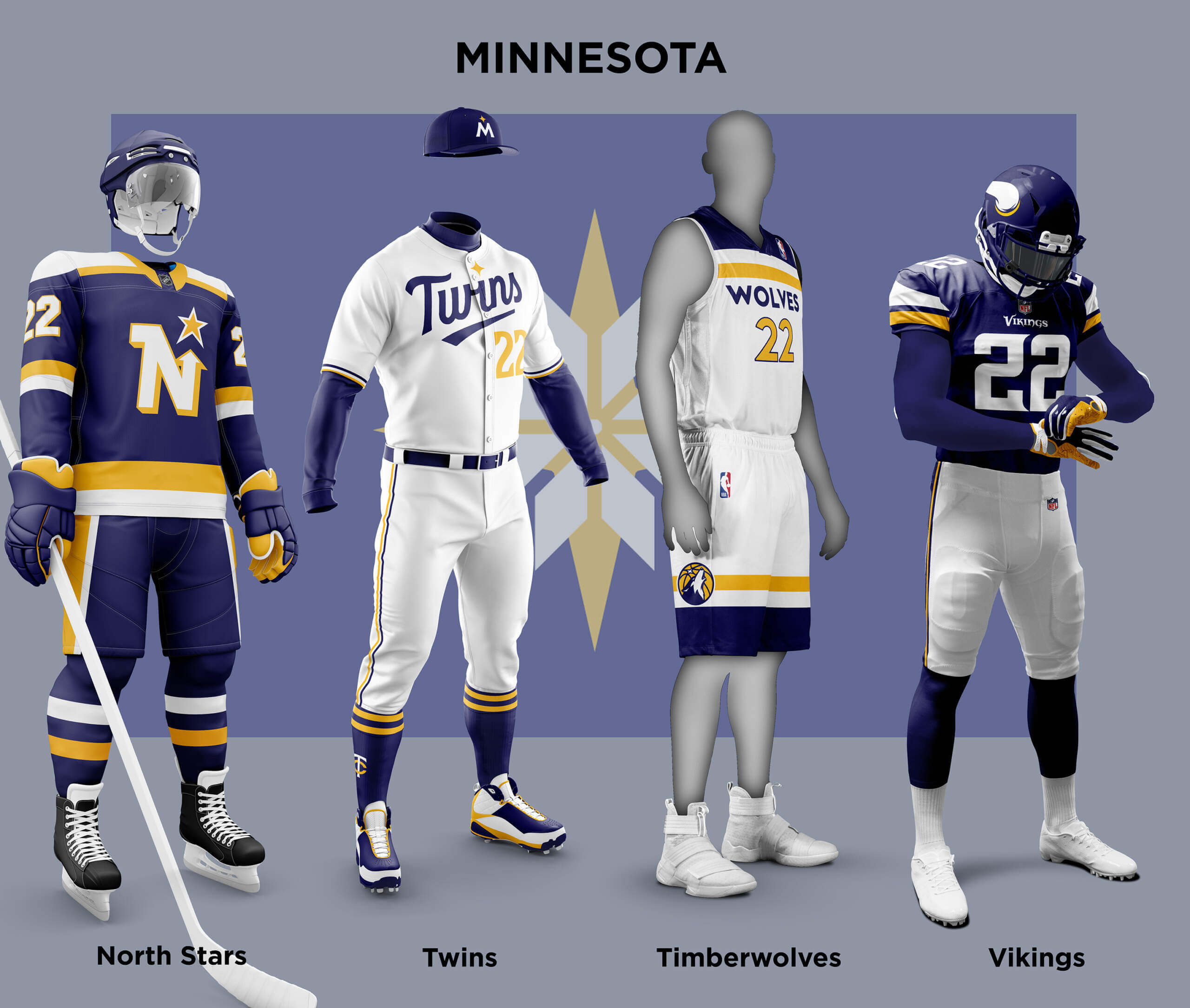
Finally for Part 2, we have the twin cities of Minneapolis and St. Paul, so the single city colours idea doesn’t really work. The four pro teams all use the Minnesota state name and of course that has a flag. But it is just the state seal on a plain blue background so isn’t really a proper colour set and so that doesn’t work either! The Minnesota State Legislature has its own official colour scheme which is very similar to that used by the Timberwolves. Also given the Vikings’ and Prince’s purplephilia, there have been motions to get it recognized as the official state colour, but to no success. There are also efforts underway to change the state flag. A number of designs have been proposed and several feature the North Star, in particular this one. So like with Detroit, I have used a proposed flag (in this case the “Etoile du nord”) as a basis for the teams. As it’s a midnight blue and gold, the Vikings look quite at home, and it’s reminiscent of their old uniforms which had a much bluer purple. The Twins new set already has an alternate cap that uses a North Star based logo, so I have that as the primary here. I’ve also made the dot in the Twins “I” a star as well. For the Timberwolves, it was a simple case of swapping out colours. For the Hockey team you may be wondering what has happened to the Wild? Well with these Minnesota teams identities so bound up with the North Star, the idea of losing that identity would be unthinkable! So I’ve assumed that when the franchise moved to Dallas, they left the North Stars identity behind for the expansion team.
Thanks, Chris! Another stellar job with this. Some of the teams shown here are so classic, with unis unchanged for decades, it’s almost unfathomable to think of them in colors other than what they’ve been wearing for so long — but it’s a really fun exercise and I’m enjoying it immensely.
Readers? What say you? Please let Chris know down in the comments below!

GTGFTU
10/14/2018 NY Jets vs. Indianapolis Colts – Jets win the game 42-34.
You beat me to it! It’s gotta be that game because Sam Darnold only wore those old Jets uniforms during his rookie year, 2018. They changed their look to the awful one they have now for the 2019 season.
When discussing proposed Minnesota state flags, any link to “Particularly this one” should go to the North Star Flag, here: link
This is the design that has come closest to official adoption, has been around the longest, and is most commonly seen in use by the general public.
That’s really interesting Scott, and thanks for the insight. When I was looking at the potential Minnesota flags, it didn’t seem like there was a main contender. I think this would also have worked well as a set – as mentioned mn.gov already use a similar blue/green pairing.
If we’re including the Angels in LA, I’d say that the Ducks (who play across the freeway) would qualify too. Green/Gold ducks uniforms would look good!
Doh! You’re right Skott, I should have included the Ducks!
It’s interesting how many “change the flag” movements there are now. I knew about Milwaukee and thanks to this post, I now know of Detroit and Minnesota. I’m curious who else is trying to change their flag.
The Utah legislature is supposed to be voting on a new flag design this month.
Nicely done. However like I mentioned on Part 1, I’m not a fan of using city flags that most don’t know or care about. For LA, where I was born and raised, royal blue and gold (yellow) is a very easy color to go with. The Rams and Chargers (mostly) stay the same, and the Lakers combine the 1960s blue with the 70s and beyond yellow. The Dodgers keep their Dodger blue, and change the front red number to yellow, along with some slight yellow trim. The Kings going with blue and yellow would look similar to their old purple and yellow. Like the Ducks, the Angels don’t play in Los Angeles, the city or county, so I wouldn’t include them in this. I understand why the Angels went with this name to capitalize on the media and marketing of the entire region, but a better name would be the “Southern California Angels”, or maybe “Southern Cal” to shorten this. Teams being names for a region isn’t unique, like New England, Tampa Bay, and Carolina.
Haha, I forgot about the Clippers, which unfortunately for them is common for LA sports fans. They currently have royal blue, and can replace the red with yellow. This, like the Rams and Chargers, is a problem when you have 2 teams in the same sport/league. Even with the Chargers light blue being different from the Rams royal blue, they both are too similar.
I get your point about certain city flags (and hence colours) not being well known. But it’s hard to see new teams in the same sport picking the colours of an existing team when there is no other connection to the city or area. Obviously the original LA Chargers *did* choose blue/yellow like the Rams, but I can’t find any evidence that this was a direct copy or inspired by them.
Phoenix area has kind of gone with similar colors for their sports teams. The Suns were followed by the Diamondbacks with purple, because of Jerry Colangelo. Also the Coyotes originally had purple. Then the D-Backs and Coyotes went with a darker red that is similar to the Cardinals (Also ASU), so the Suns are the outlier.
As you’re beginning to do anyway, I would agree that a good direction for this series would be to base it around the consistent “sporting colors” of a city or region that may be flag-derived but also may not. Sporting colors may be established by precedent (e.g. as in New Zealand regions) or you could have newer / lesser franchises changing colors to match the dominant team in the city (if there is one).
Don’t forget Golden State.
Thank goodness we never had the Rocky Mountain Express.
Oops.
I meant “Extreme”.
Sorry but using the LA flags is aberrant when you consider LA’s more familiar colors.
For starters, in a city divided between UCLA and the other school you just turned off half the fans by using the ketchup and mustard theme. No sale!
Besides, only the Angels use red, and while I am a long suffering Angels fan, I can’t support that as a primary color for the others.
Blue is the dominant color in LA (remember, it’s Forum Blue, not purple for the Lakers, and formerly the Kings!).
I’d have loved to see this done that way, and agree with the comment above making that point.
It’s interesting to hear such passionate opinions Aron. I should say, none of this work was done to intentionally rub people up the wrong way or because I think the teams should change to these new schemes. It is just a what-if exercise. But it’s clear from your (and others) reaction how much colour and team identity are bound up together for some people.
Thanks Chris – I should have also said that I love this project! Well done!
My take was based on the fact that none of these unis have any foundation in the LA colorways except for “Southern Cal,” and the divide the city in ways few intracity rivalries do.
I get the flag as a neutral foundation but just not sure it works well here.
But again, thanks for the project!
The purple was only called “Forum Blue” because the owner at the time, Jack Kent Cooke, didn’t like the name “purple”. Chick Hearn hated being forced to call it that. They stopped calling it that when Buss bought the team.
Paul: how about a “I still call it Forum Blue” shirt. I’m (mostly) kidding.
So then using the same logic as with the North Stars, a Teal and White treatment could be done for Seattle:
Seahawks
Mariners
Supersonics
Kraken.
Wait and see ;)
Here in Atlanta, we are SO CLOSE to having a Navy and Red pallette. Our Blue and Gold flag isn’t so bad, though.
The younger players on the Braves roster have been wearing the yellow accent color more prominently, and the Thrashers did use two shades of blue with the yellow.
I would LOVE to see what your concept holds for my city, Chris…although we have lost the Thrashers, and thus are no longer eligible for “Big Four” status.
Great work!
Some very tasty uniforms this project has produced. Of this bunch I like the Wolves, Chargers and Lakers the best.
Very nice results overall!
The only thing that makes me cringe is seeing black on the Lions. After the debacle that was the Matt Millen era, that color should never appear on a Lions uni again. It’s okay on the other Detroit teams, though.
And they would look like the Panthers in that uni. Though the Charlotte flag(s) will change that.
I know what you mean Jim, I prefer a Lions uniform without black, but I wanted to stay true to the concept!
I’m surprised how much I like the North Stars version. Having grown up with that team, I would never have imagined anything other than green and gold. But the midnight blue and gold looks really good! A factor – a really good logo will look good when rendered in many color combinations (though not all).
I really liked all of the Minnesota teams, but the North Stars does look especially sharp. I think you’re right that a lot of that has to do with the logo.