Good morning, Uni Watchers, and a Happy (belated) Veterans/Remembrance/Armistice day to all. To those who served, thank you for your service.
Now then.
Last weekend, I took a look back at the NFL’s 75th Anniversary throwbacks, which were worn during the 1994 season. As explained in that article, throwbacks (in any league) were still relatively uncommon, and some teams definitely took much more care in wearing a throwback true to the original than others. By 2009, which marked the AFL’s 50th season (not anniversary, although it was referred to as the “Anniversary Season”), teams did a much more accurate job with their throwbacks.
In 2009, all eight original AFL franchises wore throwback uniforms; while not a part of the AFL, the Dallas Cowboys also wore a throwback uniform that year, as they entered the NFL in 1960. A total of 16 “Legacy” games were played that season — 15 regular season games and one pre-season game. Most games involved AFL teams throwing back against one another, but not all did, and we were also treated to two NFL/AFL throwbacks — the battle of Dallas and a Thanksgiving game — that season. We’ll take a look back at the 15 regular season matchups, as well as the individual team uniforms. First, just a quick rundown of the “Legacy” games.


Let’s now take a look at the individual uniforms worn by the nine teams throwing back in 2009.
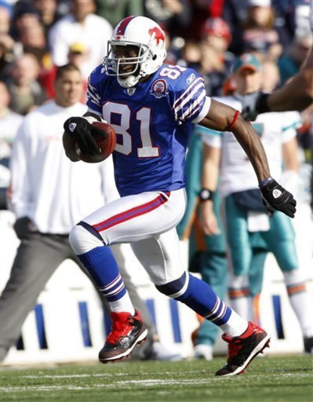
Home (blue):
Road (white):
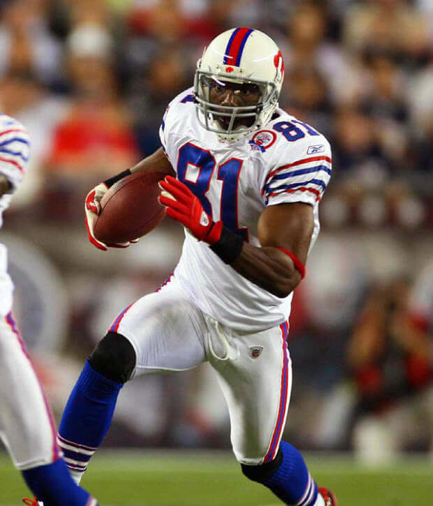
The Bills chose a uniform from 1965, in which they won the AFL Championship. Their uniforms were pretty much spot on, detail-wise (it appears their throwback helmets were slightly more off-white than the originals). Buffalo had worn the blue jersey throwback previously (2005-2009, as well as 2010), but the white throwback was new at the time. They’d add the white throwback to their permanent rotation in 2013, and they continue to wear it to this day. After their 1994 debacle, they took a lot more care with the 2009 throwbacks.
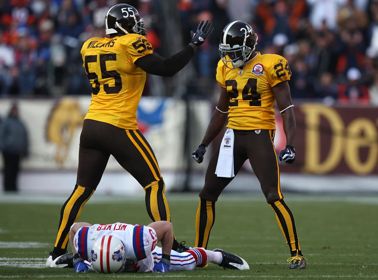
Home (gold):
Road (white):
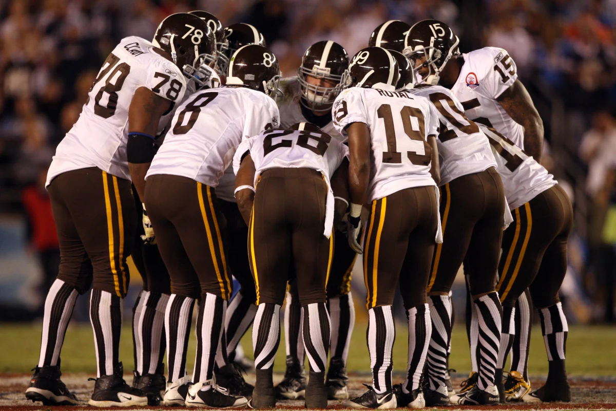
Perhaps the most controversial of all the AFL throwbacks, these uniforms were from the Broncos 1960 season. While the exact origin of the brown/gold color scheme is a bit fuzzy, you can read more about why the team sported this uniform here. It was a bold choice — you’ll recall they chose a different uniform for their 1994 throwbacks. Obviously, the socks were the “star” of this show. Like the Bills, the team did a very good job replicating their original uniforms. The big difference appears to be how the players wore their socks: in 1960, the team wore low-whites over their stripes; in 2009 they ditched the sanis.
Home (red):
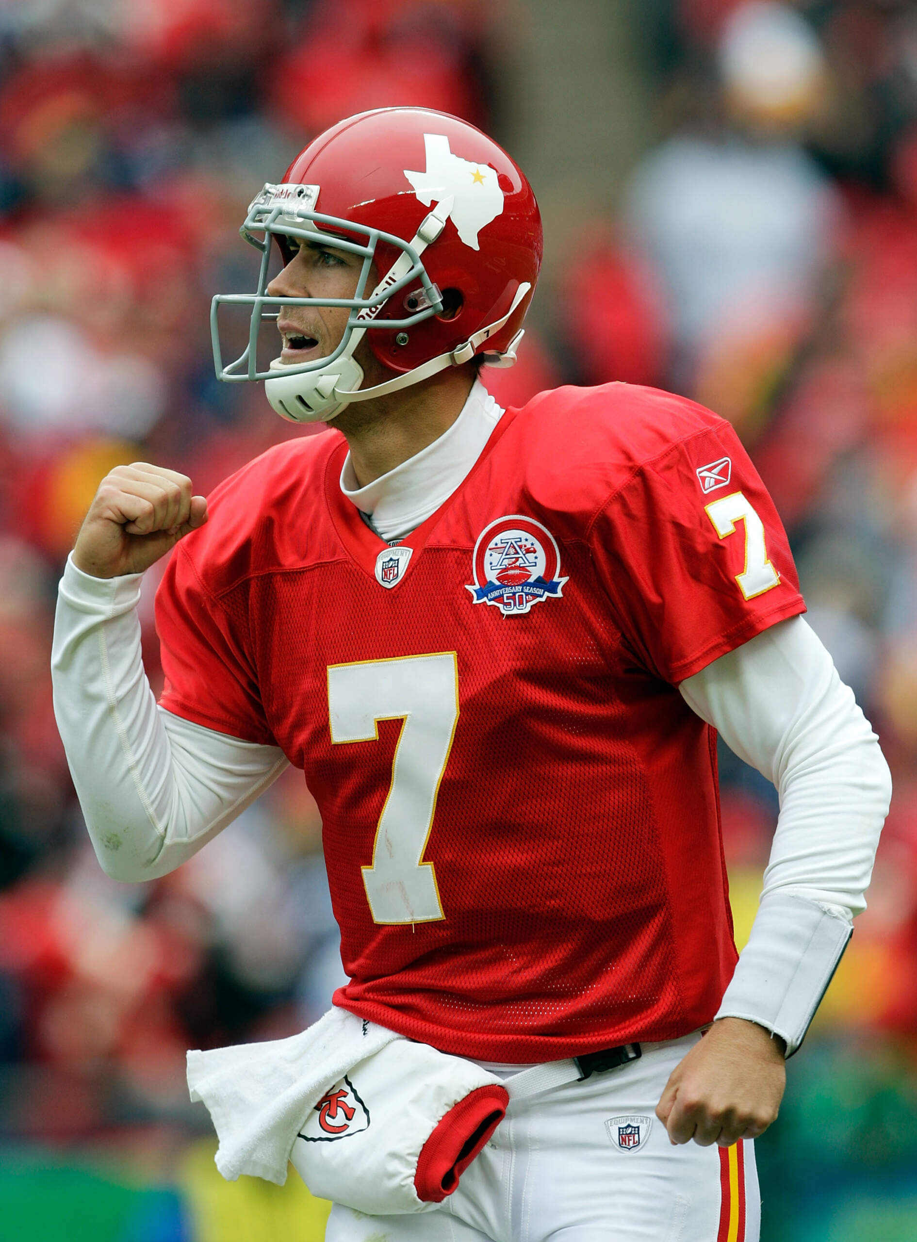
Road (white):
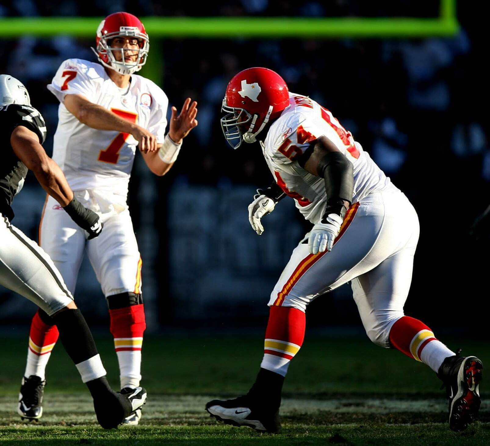
Kansas City began their life in the AFL playing in Dallas, as the Dallas Texans. They selected their 1962 uniforms as their throwback, since that was the first year they won the AFL Championship. As you can see by the photos above, their (then) current uniforms didn’t differ much from their originals, save for the helmet logo. If you look throughout their now sixty-plus year history, they have been remarkably consistent in their uniforms. KC did a good job with their throwbacks, with the exception of the width of the pants stripe, which was thinner in the original version.
Home (blue):
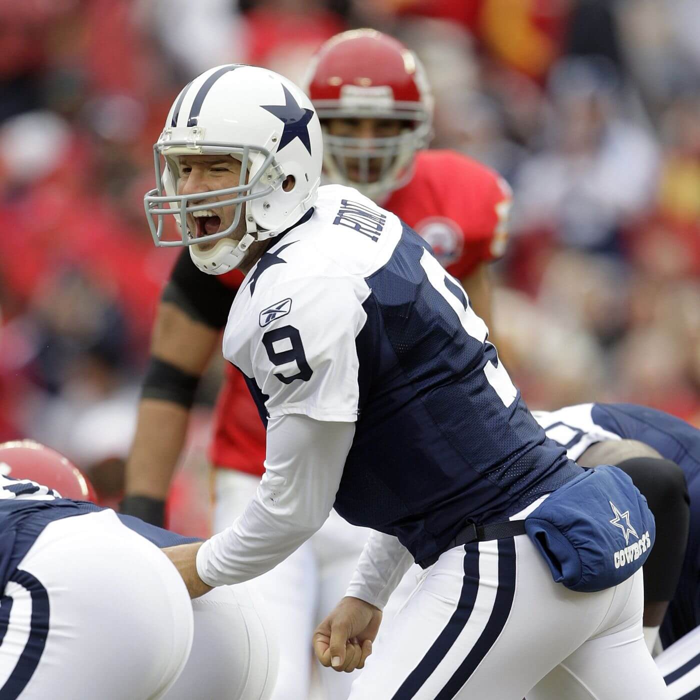
As previously mentioned, the Cowboys were never an AFL team, but did enter the league in 1960, and this was the uniform to which they threw back. After a couple earlier attempts (see 1994, for example) at throwing back — they got this one pretty much correct. Previous throwbacks had used silver helmets and pants, but in 1960, the team wore white hats and britches. This one was pretty good, although their 1960 jerseys were slightly more royal than the 2009 throwbacks, and both helmet and pants stripes were wider. Still, this “new” throwback has become the basis for the Cowboys current throwback, which we’d seen in years past, stopped seeing when the “one shell” rule went into effect, and which they will bring back (again) this Thanksgiving.
Home (Red):
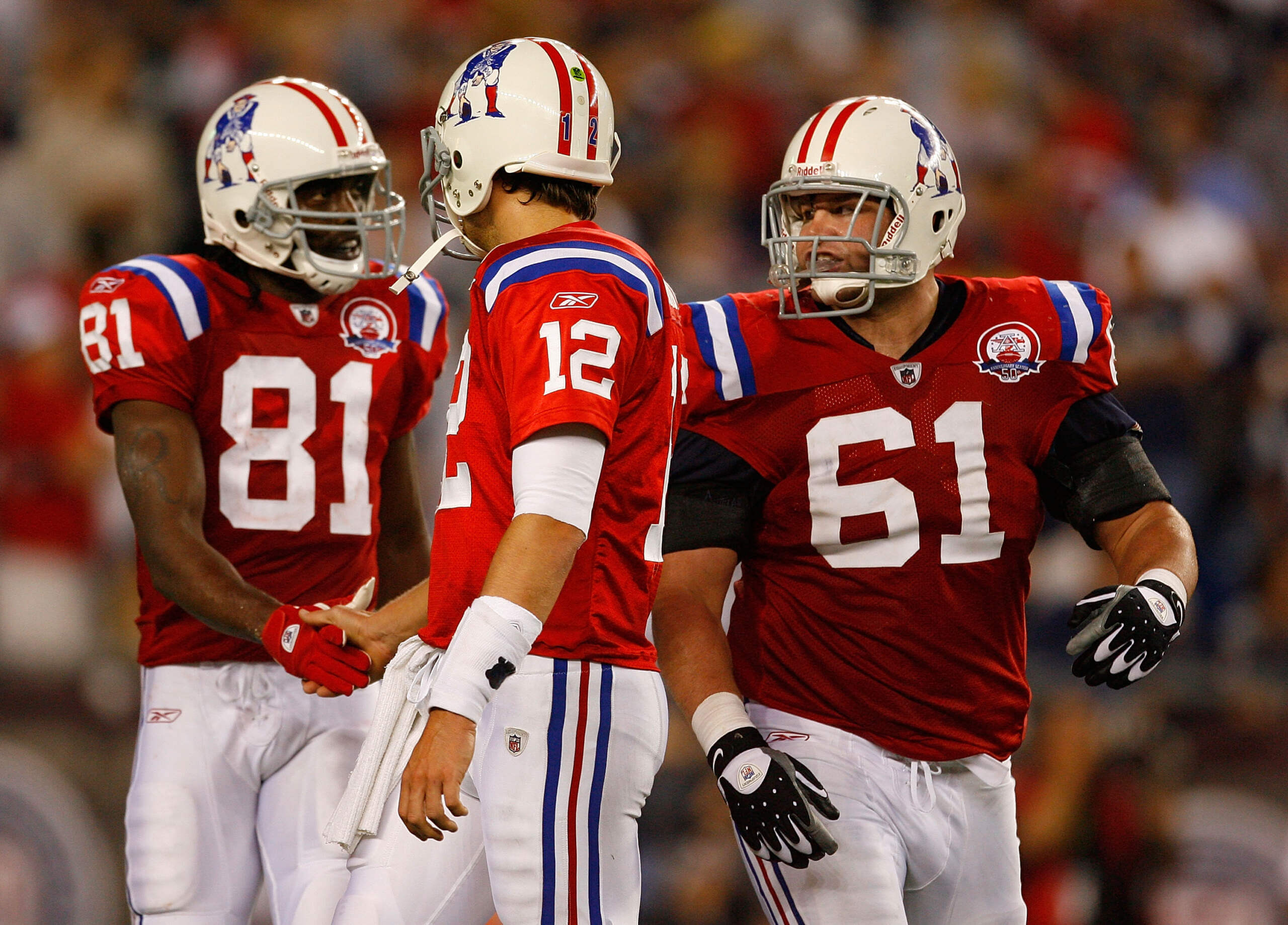
Road (White):
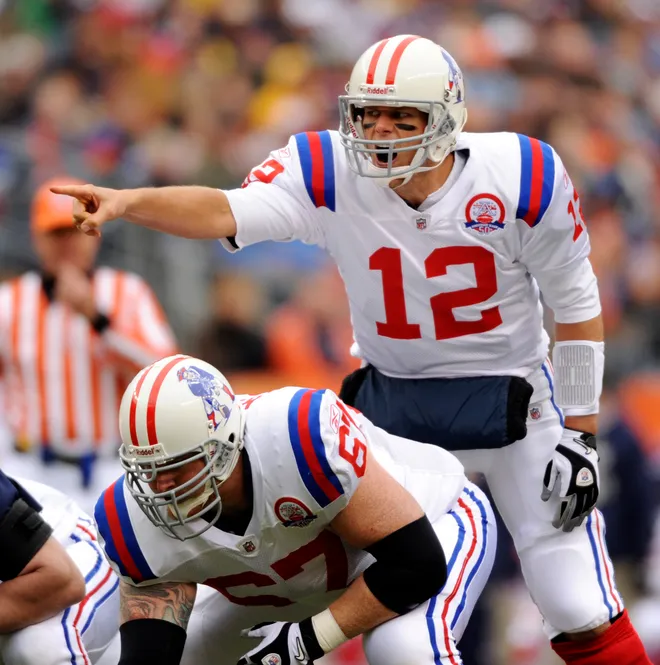
Unlike in 1994, when they had barely jettisoned the “Pat Patriot” uniforms for “Flying Elvis,” time had made the throwback a much more desirable option for the Pats. In fact, they actually re-introduced the red throwback back in 2002 (which was slightly different), but 2009 marked the first time for the return of the white throwback. The team chose 1963 as their preferred year, rather than going back to their one-year 1960 uniform, which featured “tri-corn” logos on their helmets. The team did a pretty good job with these, but the helmet was made an off-white, sock stripes were off, and the striping on the pants was slightly different.
Home (blue):
Road (white):
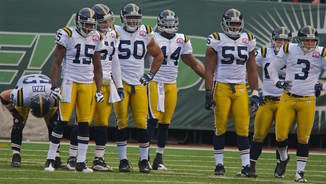
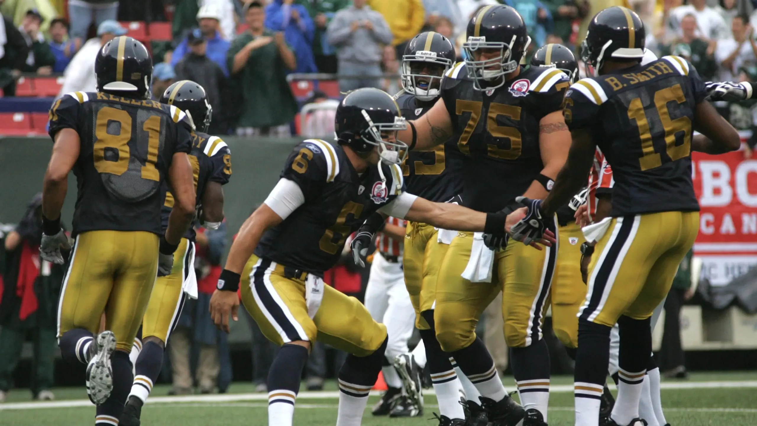
The Jets, like the Broncos, were pretty bold with their throwback choice in 2009 (and after their own 1994 debacle, this was welcome). The team entered the AFL in 1960 as The Titans of New York, and they went with the 1961 uniforms for their throwbacks. Interestingly, the team wore the blue throwbacks in the two prior seasons (2007 and 2008), and reprised them once again in 2012. 2009 was the only year for the white throwback. The team did a nice job with the throwbacks, although it seems as though the shade of gold used for numbers and pants was slightly darker on the throwbacks than the originals.
Home (black):
Road (white):
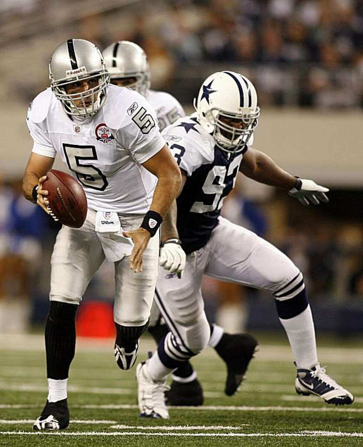
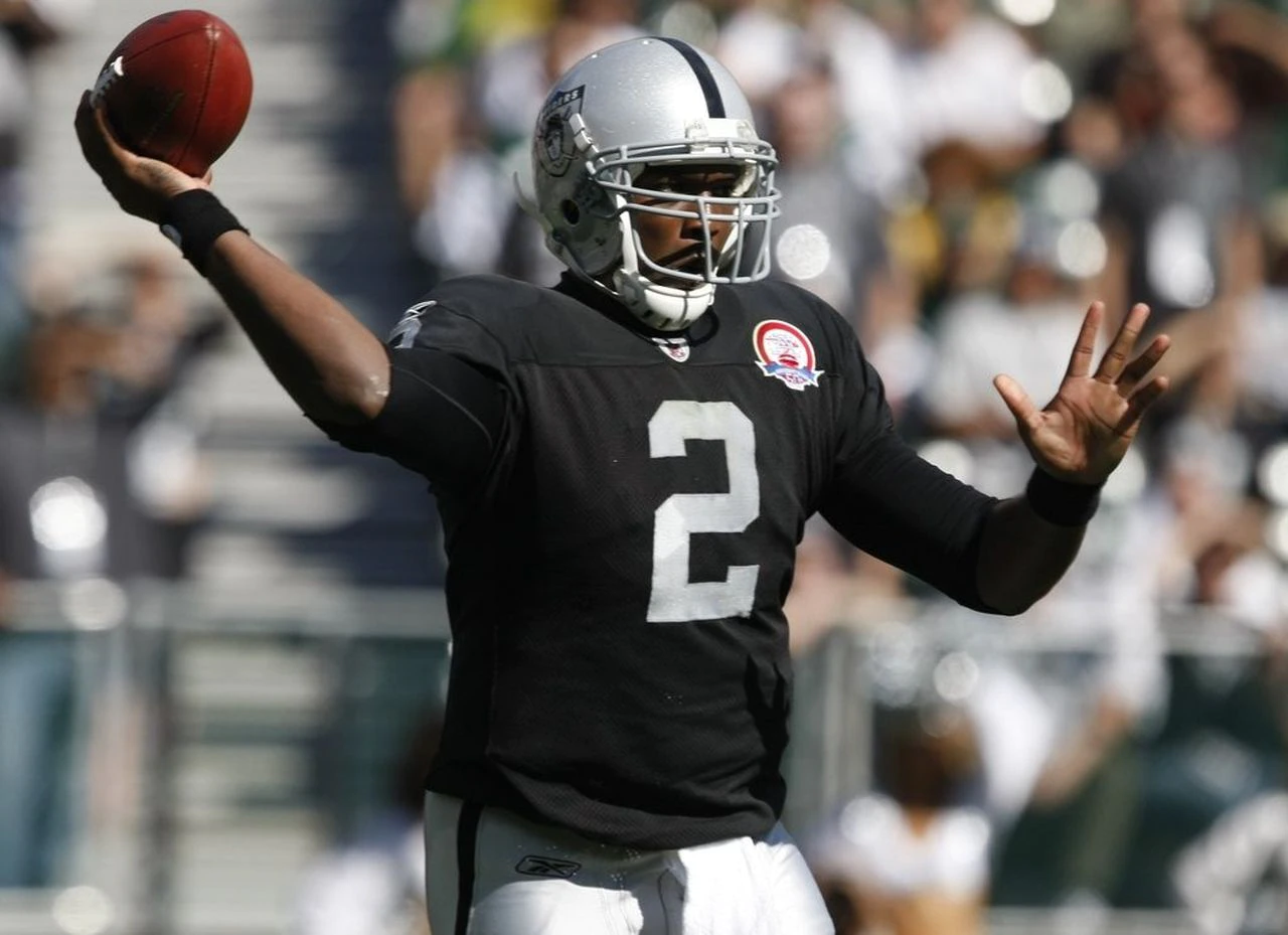
As I mentioned in my 1994 NFL throwback piece, the Raiders (in 1994) chose to play it safe, throwing back to their silver and black era — even though they began their tenure in the AFL wearing black and gold. They kept it silver and black in 2009, selecting their 1963 uniforms for the program. The team did a nice job (albeit their uniforms hadn’t changed much) with the throwbacks, using the original shield logo on the helmets, and fat black outlines around silver numbers for their road unis.
Home (blue):

Road (white):
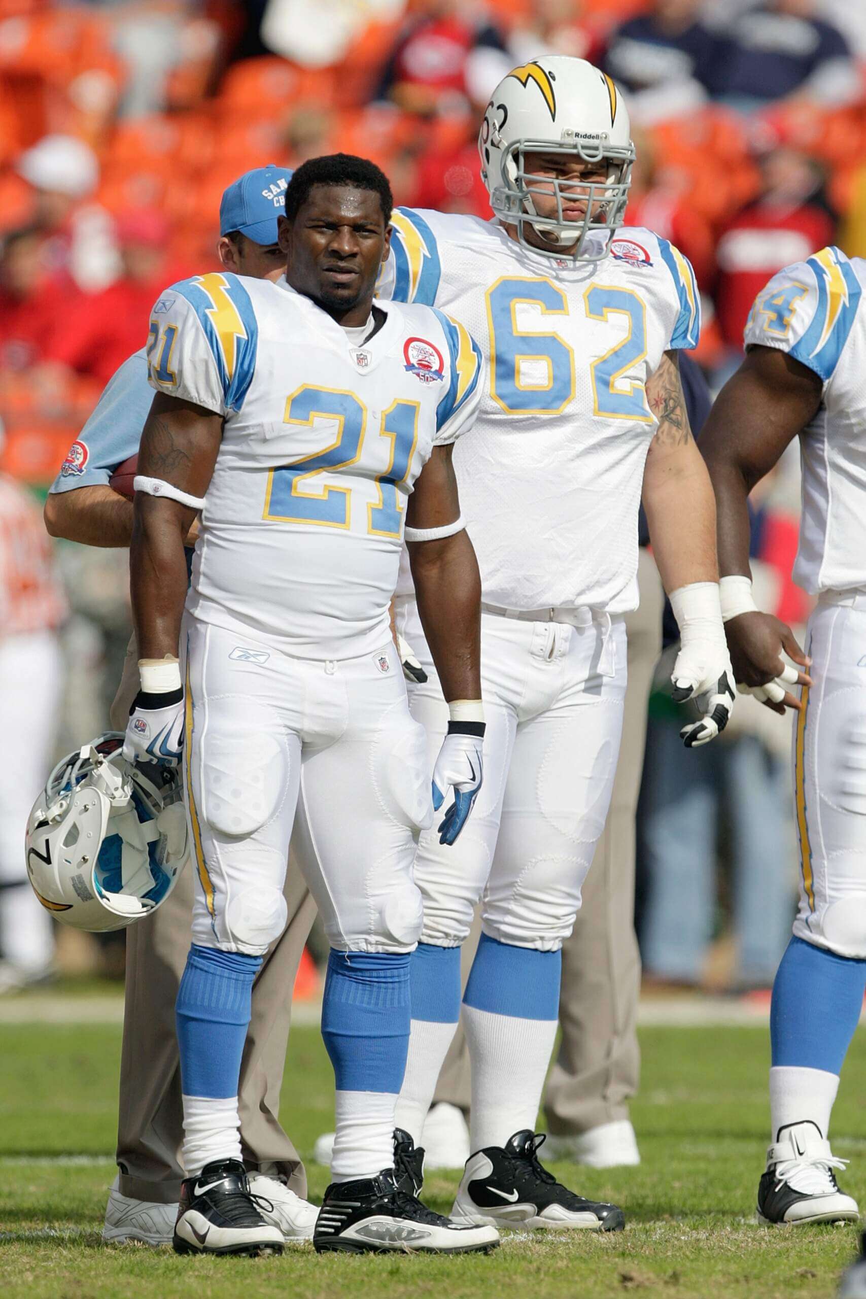
For their 2009 throwback, the Chargers chose to go back to 1963, which was the year they won the AFL Championship. And while these uniforms look as good today as they did back then, the Chargers had gone through several uniform changes between 1963 and 2009. For a portion of that 1963 season, the team wore a helmet decal (here’s a close-up) on the front of their helmets, a shield which read “ALL AMERICAN CITY — SAN DIEGO.” I was disappointed they didn’t bring this element back, but otherwise the team did a very good job recreating the original uniforms. It appears their 1963 blue jerseys were darker than the throwbacks, however.
Home (blue):

Road (white):

As they had in 1994, the Titans/Oilers threw it all the way back to their original 1960 uniforms, but somehow messed up their own history on the road uni. You’ll note that in 1960 the white jersey had red numbers and stripes on the socks, but in 2009, the throwback had blue numbers with red outlines for the white jersey, and they wore the same socks with both home and road throwbacks. That road uniform was more similar to what they wore in 1964-65, but even those years didn’t matchup with what they wore as a throwback. I actually like the “throwback” better, but it doesn’t seem to be as accurate as it should have been.
And there you have it — your look back at the 2009 AFL (and Dallas Cowboys) “Legacy” uniforms. All in all, unlike in 1994, the teams this time around mostly did a great job of accurately portraying their history. Some of the uniforms worn during that season still exist as throwbacks today.
Your thoughts?



Ummm… They were the Oakland Raiders in 2009. They were the San Diego Chargers that year too.
I know Jay. I was using their current cities (2022) rather than where they played in 2009.
I’m with Jay here. I think it was unnecessary here. Given the style is used with other teams who were playing under previous identities, and these two teams were playing under their then-current identities, it also comes off as a little confusing, since as a reader I’m expecting that the content of the article is presented in the context of 2009, not 2022. If I felt it was necessary to acknowledge their current homes, I would’ve done so in the blurbs below the pictures.
I also have to note the style inconsistency with the Kansas City header – “(Throwing back as DALLAS TEXANS)” stands out in contrast to the “(Playing as _______)” of the other teams, especially the Titans as the other team that had relocated by that point.
OK, I made the change(s) to “OAKLAND” Raiders and “SAN DIEGO” Chargers, as the teams were in 2009, so as to avoid any confusion. Also changed the Texans descriptor.
Great post Phil!!! Nice way to wake up on CFB Saturday.
Those Oilers and Pats unis in the snow
Great job Phil! I was thrilled when the NFL recognized the AFL’s 50th anniversary. I still have a lot of that throwback stuff in the hall closet that I purchased back in ’09. The best games on the eyes? Chargers whenever they wore their powder blues, and that game in the New England snow, when the Patriots beat up on the “Oilers”. Just beauteous. I wish the Raiders would have gone back to the black/gold, but I heard that Al Davis wanted to divorce those original colors permanently.
The Dolphins weren’t part of the AFL, and wore their regular uniforms in 2009. I don’t think the games including Miami should be included on the list
The Dolphins were part of the AFL — but not an Original 8 team. They were nonetheless included in “Legacy” (NFL’s term, not mine) games where original AFL teams wore throwbacks. I’m wondering if, when the schedule was created, there were plans to include them in the throwback promotion, but changed it. It’s odd that three of the games the NFL designated as “Legacy” games included throwbacks for one original eight AFL team and the Dolphins. This didn’t happen with any other teams.
It’s also odd that the Dolphins were included in any of these games, while the OTHER AFL expansion team, the Bengals, were left out. Maybe it was for the best, though, given the state of the Bengals’ unis in 2009.
Maybe it had to do with the fact that those were all divisional games against the Dolphins…?
The photo from the Bills-Titans game is from a preseason game
It appears their 1963 blue jerseys were darker than the throwbacks, however.
That was the problem with the San Diego throwbacks, and that’s the problem with Inglewood’s current unis: too light…especially the helmet numbers and jersey numbers.
Go back to the ’63 shade of blue or just go royal. And only wear white pants when you’re throwing back. I like some teams in white over white over white (like the 60s Bills), but the Chargers aren’t one of them. Wear those yellow pants!
Thanks for the look back at these unis. I have to admit Denver’s socks were too much even for me. Absolutely loved the rest of their set, though.
that’s the problem with Inglewood’s current unis: too light
But their current uniforms aren’t throwbacks — harkbacks, absolutely, but not throwbacks. So the issue you have is with their current uniform (and that’s fine), but that’s not germane to the accuracy of the throwbacks.
I’m not saying the current ones are throwbacks. I’m saying what you said…the ’09 throwbacks were too light, and then I added that’s a problem with the current no -throwback unis as well.
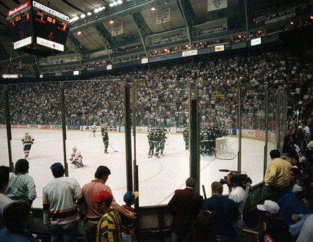
GTGFTSB: April 24, 1994, Game 4 of the Western Conference Quarterfinals. The Dallas Stars defeat the St. Louis Blues, 2-1, to sweep the series. This was the last NHL game at St. Louis Arena, which had opened in 1929 and hosted the St. Louis Eagles (the relocated original Ottawa Senators) for the 1934-35 NHL season.
Great work! One quibble – the Cowboys weren’t part of the 2009 AFL throwback program; those were the same Thanksgiving throwback uniforms that they had been wearing since 2004. The game with the Raiders was of course the Thanksgiving game so they wore that set and the Raiders just decided to wear their throwbacks. What was cool was the Cowboys wearing the Thanksgiving uniforms in KC with the Chiefs playing as the Texans. That’s the only time to date that the Cowboys wore their throwback uniforms on the road and not on Thanksgiving.
The Bills’ white throwback still bugs me – they got the stripes correct on the blue jersey but messed up the white jersey. The stripes should have been the reverse of the blue jersey. The upper and lower stripes do sometimes in photos bleed to red because it’s a very thin blue stripe with even thinner red outlines, and the very thin red outlines on the 2 wider blue stripes kind of disappear.
Thanks John — but one “quibble” back atcha: the Cowboys were NOT part of the AFL throwback program, but rather the “Legacy” program (NFL’s words, not mine). And yes, the 2009 throwbacks weren’t “new” — they first wore them in 2004 (with correct white helmets and pants) against the Bears on Thanksgiving (link); one of the NFL’s modern “color vs. color” games I highlighted back a few weeks ago (link). That was the first year they actually got their throwbacks correct; previously they’d worn silver helmets and pants with their throwback jerseys, which wasn’t period-correct.
It should be noted that the one time they wore the 1960s throwbacks (with white jerseys) before the 2004 Thanksgiving game introduced the navy 1960s throwbacks, the Cowboys did wear white pants with them, albeit with their regular, unaltered silver helmets. Oddly enough, though, those 1994 throwbacks did not have the proper vintage number font, an issue corrected on the 2004 throwbacks. Highlights of that 1994 game here: link
It was the “modernized” double-star jerseys, with the white jerseys worn later in the 1994 season and the navy jerseys worn in 1995 and the 2001-03 Thanksgiving games, that were paired with silver pants. Those jerseys should never be confused with the 1960s throwbacks.
“Legacy Program” – that is some serious marketing-speak from the NFL; I honestly never heard that name, just “Thanksgiving throwback”.
I hadn’t moved to KC at that time, but for some reason we did get that “Texans”/Cowboys game in the Louisville KY market.
The Tenny Titans need to give the Oilers unis & history back to Houston.
Disagree-they already got their hands on the Chiefs’ old monicker…that’s enough. Plus they’ve been around for 2 decades… plenty of time to make their own history or change those look( They have a great modern classic look that doesn’t need to be altered one bit).
The Bills got the blue jersey correct – looks great. But the white jersey, which they still trot out each season, is so wrong it’s barely in the ballpark. The blue jersey succeeds in adding the thin red lines next to the white stripes. But the white jersey says, “Fuck it – good enough.” The white jersey’s stripes should be inverse to the blue jersey: thin red lines on each side of the blue striping pattern. But no… It’s not like pics of O.J. Simpson in the white jersey’s are hard to find. They kept the white jersey in rotation when they should have kept the accurate blue one as a throwback.
Again most of these have the same problem as with the ’94 throwbacks, they gave up when it came to getting the numbers accurate. The Titans and Cowboys got it right, and it looks like the Chargers and Raiders too, if not they came close. Oilers made the effort but the numbers aren’t quite 100%, a little too thick. But the rest mailed it in. If you’re going to make the effort to put together a throwback, go the final mile and get it ALL right.
Am I able to access the list of categories on this site?
Jets need to drop the green, and go blue and gold.
Next time the Raiders do a throw back, they need to stop acting like the black and gold era didn’t exist, Al’s ego was too big to do so, hopefully Mark will let it go.
The Cowboys just HAD to finagle their way into this. Jerry gonna be Jerry I suppose. BTW, did anyone guess the game from the trading card last week?
Raiders @ Chargers my GOODNESS *chefs kiss*
This whole program was so cool. I was so disappointed that the NFL didn’t do any similar program for the 100th anniversary season. Seemed like a total missed opportunity.
It would’ve been great if all original 8 had been throwing back to 1960 unis. But since that wasn’t the case, Miami & Cincinnati should’ve been included in celebrating the AFL’s 50th anniversary.
Agreed. And based on Miami being included in three “Legacy” games, it almost seems like the NFL’s intention was to include them. And who wouldn’t love the Bengals in their original duds with “BENGALS” arched across their helmets? link
Although they DID look like bats from a distance, I wish the Patriots had gone with the tri-corner hats on the helmets. Due to how cheap (or poor) the Sullivans were, it was impossible to keep the uniforms properly cleaned week-to-week, so an off-white helmet was probably spot-on.