
Good Saturday morning, Uni Watchers. I hope everyone has had a good week.
Tomorrow afternoon, at 1:00 Eastern, the Chicago Bears and Dallas Cowboys will play a color vs. color game — a relative rarity in the NFL since 1957, when the NFL made it mandatory for teams to have at least one white uniform. The rule was enacted to benefit TV audiences, most of whom were viewing on small, black-and-white TV sets, to distinguish teams. Since then, there have been only a handful of color vs. color games, a good portion of which have taken place on Thanksgiving. Today’s splash photo features the Bears and Cowboys during one of those Thanksgiving games (and in which both teams wore throwbacks); tomorrow’s game between those same two clubs will have the Cowboys in their regular blue jersey, while the Bears will be wearing their alternate orange helmet and jersey.
According to the awesome @GridironUniform database, this weekend's Cowboys vs. Bears tilt will be color vs. color, with the Bears sporting their new orange helmets and the Cowboys in navy. @UniWatch @alexhider pic.twitter.com/m4tzAMEpde
— Phil Hecken (@PhilHecken) October 24, 2022
The Cowboys will actually be wearing their silver pants (not the white as pictured in the original GUD graphic above) tomorrow.
One of the more interesting aspects of tomorrow’s game is that the Cowboys, who famously (and almost annoyingly) wear their white jerseys almost exclusively at home, and despite this quirk, have been involved in many color vs. color games over the years. For a team who almost always wears white, that’s quite a feat. And also interesting is the Broncos and Patriots also make up a big chunk of those games.
While some of us undoubtedly enjoy (and welcome) color vs. color games, there’s a reason — besides the dated black-and-white TV thingy — that many color vs. color games don’t really work: they’re not always that attractive a uniform matchup. Probably the best and most famous color vs. color matchup in football is the annual USC vs. UCLA tilt, which is often played in the bright Southern California sun and between a light blue jerseyed squad versus a cardinal shirted team. None of the uniform elements (helmet/jersey/pants) matches nor clashes, and it’s often held as the raison d’être of color vs. color. Unfortunately, almost all the NFL matchups aren’t nearly as good.
Below is a rundown of NFL color vs. color games since 1957 — with a couple exceptions: not included are any of the ridiculous forced color vs. color matchups created by the Color Rush (CR) program (remember this, this, this and this?), nor are repeat games for teams who introduced a “light” color alternate which wasn’t white, so games would be considered color vs. color.
1994: NFL 75th Anniversary


In 1994, the NFL celebrated its 75th Anniversary, and many teams wore throwbacks (or fauxbacks) throughout the course of the season. The LA Rams were throwing back to the 1950s with their uniforms, when they wore gold jerseys over white pants, and in two games they played versus red-shirted opponents. The contrast between the gold and red was great, and both these games looked good. The only strike against these games was that both teams were wearing white pants, but the matchups were still outstanding.
2001: Cowboys vs. Broncos, the First Thanksgiving

The NFL would wait another seven years before a color vs. color game would take place, and this one began the “modern” Thanksgiving tradition of the throwback color vs. color game. For the first time, it featured the Cowboys (throwing back to the early 1960s jersey, albeit with then-modern helmets and pants) vs. the Broncos, who only a few years prior had jettisoned these gorgeous uniforms for the current dated template they still wear. With five distinct different colors (royal blue, navy blue, white, silver, orange), this one was another good looking game. The bright orange pairs well with the predominately navy of the Cowboys.
2002: Three Color vs. Color Games
Fresh off the success of their 2001 Thanksgiving Throwback, the NFL decided to do it again in 2002, and both games that Thursday featured color vs. color throwbacks:


The Lions and Patriots, going Honolulu blue vs. red, met up in the early game, with the Lions wearing what we now consider their “traditional” throwbacks: plain (blank) silver helmet, blue jersey, silver/gray pants, while the Patriots wore their (now) traditional “Pat Patriot” look of white/red/white. This was another pretty good looking game (despite the dreary Ford Field dome lighting), and both throwback looks would later become staples for both teams — with the Patriots finally being able to re-adopt the look this year with the lifting of the single-shell rule.
The Cowboys and Washington also wore modified throwbacks — the Cowboys again wearing their 1960s jersey with modern helmet/pants, while Washington went with their 1965-68 uniforms. While the contrast was fine, both teams in “dark” dark jerseys (navy and deep burgundy) under the Texas Stadium lights wasn’t the greatest looking game. The previous color vs. color games all “worked” because at least one team wore a light/brighter jersey (a la USC/UCLA). This featured two teams with two hues on the darker end of the color scale.
The third color vs. color game that year featured a surprise one-off. The New Orleans Saints, for some reason, wore a gold-hued jersey and matched up with the purple-clad Vikings:

Not a terrible looking game by any means (plenty of good contrast), but some questioned why the Saints would wear a gold jersey at all (and notice even then, the team couldn’t match the helmet color to the jersey color). The Vikings eked out a 32-31 victory, perhaps squashing any chance for the team to wear the jersey ever again.
2003 (and beyond): Patriots wear silver alternate jersey

This would be the first of several times the Patriots would wear an alternate silver jersey — and because it’s not white it qualifies the game for “color vs. color.” There’s probably no legitimate reason for the silver alternate to exist (other than to move merch — even back then), and this particular game against the Cowboys ended up looking like a scrimmage: both teams in silver helmets, with navy vs. silver jerseys and pants for each team. There would be better contrast against other teams, but the silver jerseys never looked good nor made much sense. They should have taken a cue from the Saints and made these a one-hit-wonder.
2004: More Thanksgiving Throwbacks
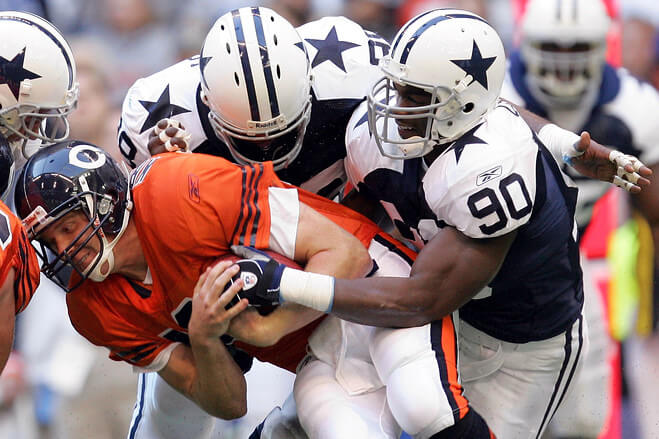

For the 2004 Thanksgiving game, the Bears wore 1950s throwbacks while the Cowboys finally got a full throwback — this time with the early 1960s white helmet (and non-outlined star) and white pants. While the two teams won’t be wearing the same uniforms tomorrow, the orange vs. navy blue will be the same.
2009: AFL’s 60th Anniversary

The eight original AFL teams all wore throwbacks throughout the 2009 season, but only one game — and it featured only one AFL team — was color vs. color that year. The game was the “Dallas Showdown” game, featuring Kansas City throwing back to their Dallas Texans uniforms matched up against the Dallas Cowboys. Once again, the Cowboys wore their “proper” 1960s throwback uniform, while Kansas City’s uniform — save for the helmet logo — is almost identical to what the team wore (and still wears). While the navy vs. red isn’t a great color vs. color tilt, the contrast was fine (even if both teams wore white pants).
2010: One last Turkey Day color vs. color throwback

Reprising their matchup from 2002, the Lions and Patriots again wore color vs. color throwback uniforms. Sadly, this would be the last color vs. color Thanksgiving Day game for both teams.
2012 (and beyond): GFGS color vs. color

Like the Patriots with their silver alternates before them, the Seattle Seahawks introduced a gray alternate jersey, and since it’s not white, games played in these jerseys count as color vs. color games. The team still has the gray jersey in their line up. Like the Patriots before them, there’s not much reason for this jersey to exist (however, the gray pants they wear should be worn more often).
2017: Cowboys Thanksgiving color vs. color, again

The Cowboys and Chargers hooked up on Thanksgiving in 2017 — both in their regular uniforms (although technically the Chargers powder blue jersey was an alternate). This was one of the better color vs. color games, with the Chargers gorgeous powder blue pairing nicely with the Cowboys’ navy. Honestly, the NFL should consider allowing (or encouraging) the Chargers to wear their current powder blue jerseys against (very) dark jerseyed teams. Like UCLA, this would be a good use of color vs. color.
2017 (and beyond): More GFGS color vs. color

This certainly counts as color vs. color but really, there is even less reason for this Lions jersey to exist. This is, I suppose, technically the Lions CR uniform, but they have worn it every season (2017-2021, but not yet in 2022) since in non-CR games. Let’s hope 2021 was the last we’ve seen of it. Perhaps if they paired it with non-gray pants, it wouldn’t look so awful. But that’s not saying much.
2019: What Were They Thinking?

By 2019, the Cleveland Browns were in the final year of their five-year commitment to wearing possibly the worst NFL uniforms of all time, and the one uniform that wasn’t in that awful chassis was their Color Rush kit. Just how bad were their 2015-2019 uniforms? So bad that they petitioned the NFL (and were given special dispensation) to wear the CR outfit seven times. So while I suppose this technically counts as a CR game, I don’t consider it as such. For some reason, the mono-brown was paired with a dark jersey — the Broncos’ orange — in what will no doubt be considered the worst looking color vs. color game in NFL history (non CR edition). Seriously. What could be worse…
2020: It’s worse

Those poor Broncos — involved in some of the best color vs. color games in the relatively short 1957-present history, they’ve also been involved in the worst two. If you thought their 2019 tilt vs. the Browns was bad, their 2020 game against the Buccaneers jumped up and said, “Hold My Beer.” Yikes. Brown and orange look great on one uniform — not against each other — but pewter and orange…don’t. Actually, what the Bucs wear probably is closer to brown than “pewter” — but at least the Browns broke up their look with a different color helmet. The head-to-toe pewter offered us no such relief.
And there you have it — the (almost) complete history of color vs. color games in the color TV era. One team I didn’t include (although you could technically consider playing color vs. color games) is the 2020-current LA Rams. That season they added their “bone” (aka dishwater) jerseys (and often pants) to their new uniform palette, as their designated “road” uniform. Because it’s basically gray, it has the same problems as the Patriots, Seahawks and Lions before them (i.e. no reason to exist), but fortunately is considered a “light” jersey, so any opponents wear their dark jersey against them.
I don’t have a problem with teams going color vs. color, per se, but as you can see, not every color vs. color game actually looks good. Teams who wear a light blue jersey (Chargers, Titans, Dolphins) or orange (Browns alternate, Bengals alternate, Broncos) would make the best candidates for color vs. color games. I’d also love to see a team introduce an athletic gold or yellow jersey (Rams, Packers, Steelers) if an alternate has to be part of a team’s uni scheme as well, and in that instance, those teams would be good candidates for color vs. color. But you can also see, now that 99+% of the country owns a color TV (and more than half own a high-def TV), color vs. color would work. That doesn’t mean it would work well, but there shouldn’t be any issues with differentiating teams.
With that being all said…I’m looking forward to tomorrow’s Bears/Cowboys game. It won’t be the best color vs. color game ever, but it’ll be up there.
Your thoughts?

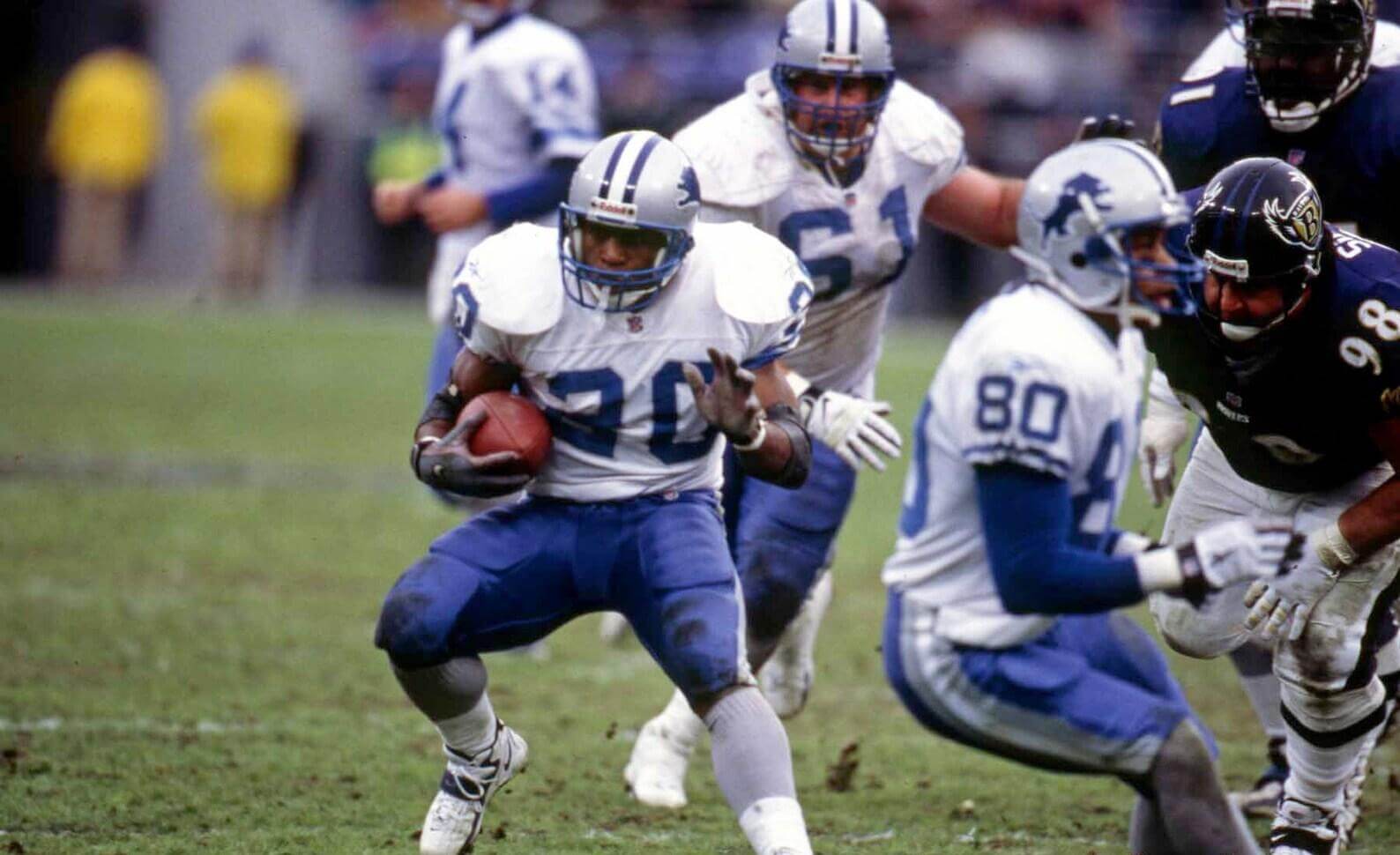

Game is Lions at Ravens from 1998
Last game played by the legendary Barry Sanders-That is why it is significant.
There’s a bit more significance to that matchup…though you are right that it turned out to be the final game played by Barry Sanders, it was a last in other ways as well.
Lions in their rare blue pants from that era and the Ravens in their early seasons’ helmet logo!
Correct me if I’m wrong but I don’t think Dallas’ 2001-2002 Thanksgiving Jerseys are considered a full throwback to the 1960s uniforms
Apparently in 1994, Dallas created what is called the “Double Star” jersey which was essentially a modern take on the 1960s uniforms (It’s then giving another modern update which is the now the Cowboys CR uniforms)
In 1995, the Cowboys introduced the inverse version of the white “Double Star” jersey which was now navy with white stars and white sleeves caps and then red-introduced as the Thanksgiving uniforms from 2001-2003 before they got replaced by the now 1960s throwbacks
Yeah, I probably shouldn’t have referred to those as “throwback” (more like fauxback); clearly they were going for a throwback feel with the jersey, but in keeping the helmets and pants in their (then) current format, it merely had a throwbackish feel. They finally did correct the problem as you note and as can be seen when the team fixed the jerseys and added white helmets/pants as was correct to the early 1960s.
In fact, the ‘Skins uniform pictured was also a fauxback; the entire sleeve design was absent from the ’65 uniform. Though I wish they’d bring back that proper shade of burgundy.
Just a journalism tip. If minutes are absent in the time, write it that way. Example: 1 p.m. Never 1:00 p.m.
The game was rescheduled for 7 p.m., not 7:30 p.m.
Keep up the good work
If memory serves correctly, the first double-star Cowboys Fauxbacks were modeled after the jerseys from the movie Little Giants
The NFL and NHL should reserve color vs. color for the playoffs so long as there is significant contrast between the two teams.
The Lions combo from Guess the Game deserved more playing time.
I’m surprised that colorblindness wasn’t mentioned in the color v color piece. I’m not really sure how various types of colorblindness would matter for color v color, but I’d assume it would. If there are any colorblind readers, I’d love to hear from you on this.
I’m not colorblind (and I did consider mentioning this in the piece), but I have a couple friends who are R/G colorblind. I have asked them about the Jets/Bills game (two said they were able to tell the teams apart, but it was difficult; one described it as “kinda muddy” like this link); but the NFL did receive complaints and decided not to repeat the green/red game(s) anymore: link
I didn’t mention it because 1) I don’t think it would be repeated and 2) green vs. red — even for those with, or perhaps especially for those with full color spectrum vision — is a horrible color vs. color choice.
Yeah, I remember the backlash on that one. I’d never seen that simulation (?) before, but if that’s how it looked to R/G colorblind folks, that’s awful. I work for the government, and we have a whole set of regulations on public-facing products. I don’t know much detail because I don’t do that sort of work but I know that there are rules to prevent disasters like that red/green thing.
Yeah that Bills – Jets game was impossible to watch for me as someone with “red-green colorblindness” (moderate protan here woooo!) Especially since they were both wearing white helmets. I turned it off because even on HD it was incredibly difficult to tell them apart. I remember in the last few years there was a women’s basketball game between UNC and NC State where UNC wore light blue and State wore pink and I couldn’t watch because it all just blended together.
FYI, just because it’s called red-green colorblindness doesn’t mean that those are the only two colors affected or that those are the most affected colors. To me, purple is a concept that people made up. It’s just blue. Pinks and greys are hard to tell apart. Neon green and yellow are nearly indistinguishable. Most of these things aren’t a detriment to everyday life, but I, for one, am glad that color vs color sporting events are not the norm. No need to make it hard/frustrating for some fans to enjoy the game.
Interesting perspective; thank you! I love color on color a lot, but not so much to have particular matchups that can affect people as you describe.
1994 to 2001 is 7 years, not 15.
DOH! Good catch. Now fixed.
A few things.
Those Broncos throwbacks look incredible under the old Dallas lights. The hole in the roof and lighting in Dallas’s old stadium, along with the road teams wearing home uniforms was always a treat. Something was just different about how the colors popped in that stadium. Bummer to see that picture the day before the Broncos go white/navy.
1994 was such a great season to watch football. It was still the NFL as it should be. Still mostly natural grass fields, incredible throwbacks and it was still pre mid-90s uniform overhauls that made teams go dark (Broncos, Seahawks, Eagles, Buccaneers, Bills etc.) That was the peak of NFL aesthetic glory. I miss that NFL.
The NFL missed the mark with Thursday games. Instead of color rash, they should have gone full Throwback Thursday. Everything from the field logos, uniforms and commentator jackets/graphics would have a whole new level to the game. Instead we’re stuck with crappy uniforms and Taylor Swift video teases.
Speaking of throwbacks, another bummer is that Thanksgiving is no longer really about throwbacks either. We might get the Lions in theirs but I’m thinking that’s it.
One last thing. After watching the neckroll video from earlier this week (great thank you for sharing!) and now seeing Jerome Bettis’s pads from his rookie year, it’s incredible how the equipment has changed. How many players could have been 1/10 of a second faster with smaller pads or better cleats? Always fascinates me.
Yeah, for a league that over-markets everything, hard to believe no one in that room has ever suggested Throwback Thursday, not complicated.
I think the Rams and 49ers should play in those uniforms once a year, alternate between each team’s stadium, such a great look. Going tomorrow, should be good, even without the throwbacks.
Agreed about the 2001 Broncos game at Dallas. They looked especially great that day.
It always seemed to me that with teams who had glossy helmets, they looked especially glossy (and that’s a good thing, Phil) when they played at Texas Stadium.
Also agreed about 1994 being a spectacular looking year. I even loved the fauxback Jets and Bills helmets. Speaking of the Bills, the Denver/Buffalo game might just be the best looking Monday Night game ever. Top Five at least.
Thanks for the thorough write up, that was a fun read. The pics reminded me that the old Lions unis with Barry were amazing. I think the new orange Bears helmet looks worse with the orange jerseys than the blue one did.
The Broncos were established in 1960, not 1957
And? Did I say anywhere they were established in 1957? I referenced 1957 as the year the NFL mandated that teams have a white jersey. All AFL teams (the original eight in 1960 plus the Dolphins — added in 1966 — and the Bengals — added in 1968) were obviously(?) founded after 1957.
A few days ago I described a Bills’ color combo (red lids, red jersey, blue britches, white socks) I’d like to see. Another good look would be Chicago Bears in navy helmets, orange jerseys, navy pants and orange socks. I agree that yellow jerseys for Pittsburgh, Green Bay, and Los Angeles would be a useful accessory.
“Teams down in the playoffs by five or more runs won something like 97% of those games,”
This doesn’t sound right.
GAH! That’s what I get for writing that sentence at 1:00 am. Should read “teams down…lost something like…” — now fixed. Good catch.
I think that Chargers vs Cowboys game had too much blue. Maybe if “San Diego” had worn their yellow pants though…
The yellow pants weren’t an option until 2020.
Another great college football color vs. color matchup is: Georgia (Red) vs Florida (Blue).
I don’t know why anyone would want to see color vs color in any sport. The constant reminder of the home team wearing what their fans want to see adds to the sports experience of the fan.. why would the home want to let the visiting team wear their colors .It subtracts from the home team having some phycological advantage.
I don’t enjoy seeing color-on-color in baseball (powder blue/gray for the visitors, home team in white is the way it oughta be), but it should be more than occasionally seen on the other big leagues. I don’t know to what extent home teams actually “wear what fans want to see” – it’s probably more like teams showing what they want fans to buy in a lot of cases. There’s probably some measure of players looking/feeling better thereby playing better, but on the professional level I think the ‘shock and awe’ factor of uniforms is very small
for the GTGFTU: That game has to be from 1998. Lions vs Ravens. immediate answer comes from the fact the lions only wore blue pants for one year in the sanders era.
As a USC alum, I love the color vs color game against UCLA. However, it used to be better when UCLA had a lighter blue. Now their blue is brighter and darker. Yes, I know that seems opposite, but the blue is a darker shade, but brighter. Very similar color to the Chargers. They have changed their blue many times, and also changed their name for the blue. Don’t get me wrong, it’s probably a better blue color, just not for the cross-town rivalry game. Occasionally they have worn retro Gary Beban light blue for this game, and it works better.
I would love all Thursday Night games to be “Throwback Thursdays” and, when sensible, color vs. color. That might mean some strange combos would need to exist on the field, like. throwback to say 2005 versus one from 1972, but that’s part of the fun and we get those mixes of throwback and modern day virtually every week anyway.
Anything to break up the mono vs mono BS.
Ok I guess I’m the only Bears fan who has been screaming for them to wear the Thanksgiving orange jerseys instead of the ones they keep wearing. The orange helmets can go too.
You may not be the only one, but NFL rules preclude it: they currently have four jerseys (the max allowed): blue and white (home & road), orange (alternate) and 1936 throwback. In order to wear the orange (Thanksgiving) throwback, they’d need to jettison the 1936 uniform (either that or somehow redesignate it as CR, which isn’t likely, given they wear blue pants with it). Some teams try to “skirt” the two throwback rule (49ers) by designating one of the unis as CR (in the Niners case, the white throwback jersey with white pants), but I don’t know if the Bears could get away with that. Given they’d need to wait for the five-year rule to expire on the orange alt (first worn in 2018) or the 1936 throwback (first worn in 2019), they wouldn’t be able to wear the 1950s throwback (Thanksgiving uniform) until next season at the earliest, and more likely not until 2024 (since it’s a throwback).
The 2004 Thanksgiving uni is tied with the 1962-72 unis for Chicago’s Best Ever Look. The current throwbacks are a close second.
For some reason, the mono-brown was paired with a dark jersey — the Broncos’ orange
Not mono-brown. It was orange-brown-brown. Helmets count.
I’ve been considering a think piece titled “In Defense of Dishwater,” where I propose that the Rams’ attempt at a non-white alternative (with some tweaking) is a worthwhile endeavor. While I’m at it, I propose that the League should allow light gray, silver and actual gold in place of white jerseys. I’ve become increasingly annoyed at all-white uniforms, especially on sunny and snowy days, and especially with the current “clean” minimalist look. I prefer white in small doses, when it can make a dark uni really pop.
I miss those blue Lions pants Barry Sanders wore. Only on the road, and only against a non-NFC North opponent.
Great read today!
Does everyone else see that last comment as one big disjointed paragraph? I separated my thoughts by hitting the return key, but once it showed up in the comments the spaces went away.
So on my phone I see the spaces, but on my old iPad I don’t. Weird.
Dallas did not wear their silver pants.