By Phil Hecken
Follow @PhilHecken
A good Saturday Morning to you all, fellow Uni Watchers. I hope everyone had a pleasant week!
Throwbacks in the major sports are nothing new these days — let’s face it, in this day and age of maximizing the amount of gear available for sale to the general public, the leagues and their manufacturing partners certainly aren’t discouraging teams from throwing back. But it hasn’t always been this way.
Way back in 1994, when the NFL celebrated its 75th Anniversary season, throwback uniforms were a relatively new phenomenon. The trend started in MLB back in 1990, when the Chicago White Sox celebrated their 1917 World Series win with what would likely be the “first” professional throwback uniforms. The NHL also got on board in 1991-92, when it celebrated its 75th Anniversary by having the “Original 6” teams wear throwbacks.
The NFL first got on the throwback train not in 1994 — but a season earlier, when the New York Jets celebrated the 25th Anniversary of their Super Bowl III win, but ended up wearing a green helmet instead of white. Today we’d criticize the Jets for a terribly inaccurate throwback, but back then, throw/fauxbacks were such a novelty few people seemed to care about the anachronism.
Fast-forward a year, and the NFL (perhaps inspired by the Jets?) decided they’d try to make the throwback thing a league-wide exercise. Again, this was long before throwbacks were a “thing,” and fans weren’t clamoring for throwbacks, nor were they particularly concerned with absolute accuracy. In 1994, the NFL consisted of 28 teams, and the league encouraged all teams to create some form of throwback to wear during the season. Some teams embraced the concept and truly sought to bring the throwback to the viewer, while other teams really half-assed it, and a few basically ignored the whole throwback concept completely (although in some cases that was due to their original uniforms having changed little over the years, rendering a throwback irrelevant).
Let’s take a quick look at those 1994 Throwback Uniforms, and how good (or poor) teams pulled it off. Did they pass or fail?
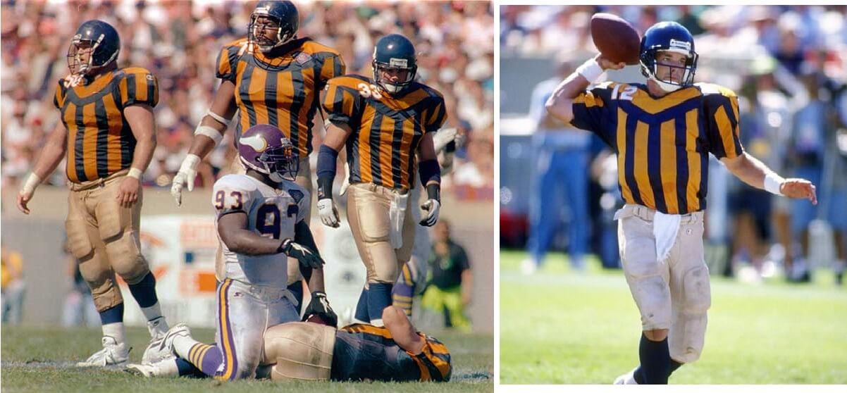
Da Bears really leaned into the throwback thing, coming up with a reasonable facsimile of their late 1920’s/early 1930’s look. Obviously leather helmets were out, but they did fairly attempt to replicate the friction strips on the jersey, as well as the canvas pants common in the day.
Pass
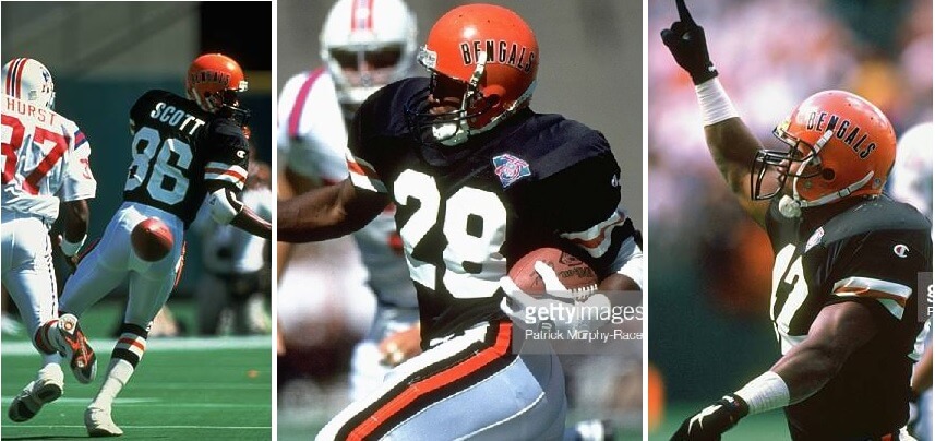
At the time the Bengals were one of the younger teams in the league, having only entered the NFL in 1968, and to that point, had only changed their uniforms once. So they did the best they could do, and created a pretty spot-on throwback to their first uniform, complete with “BENGALS” spelled out on their orange helmets.
Pass
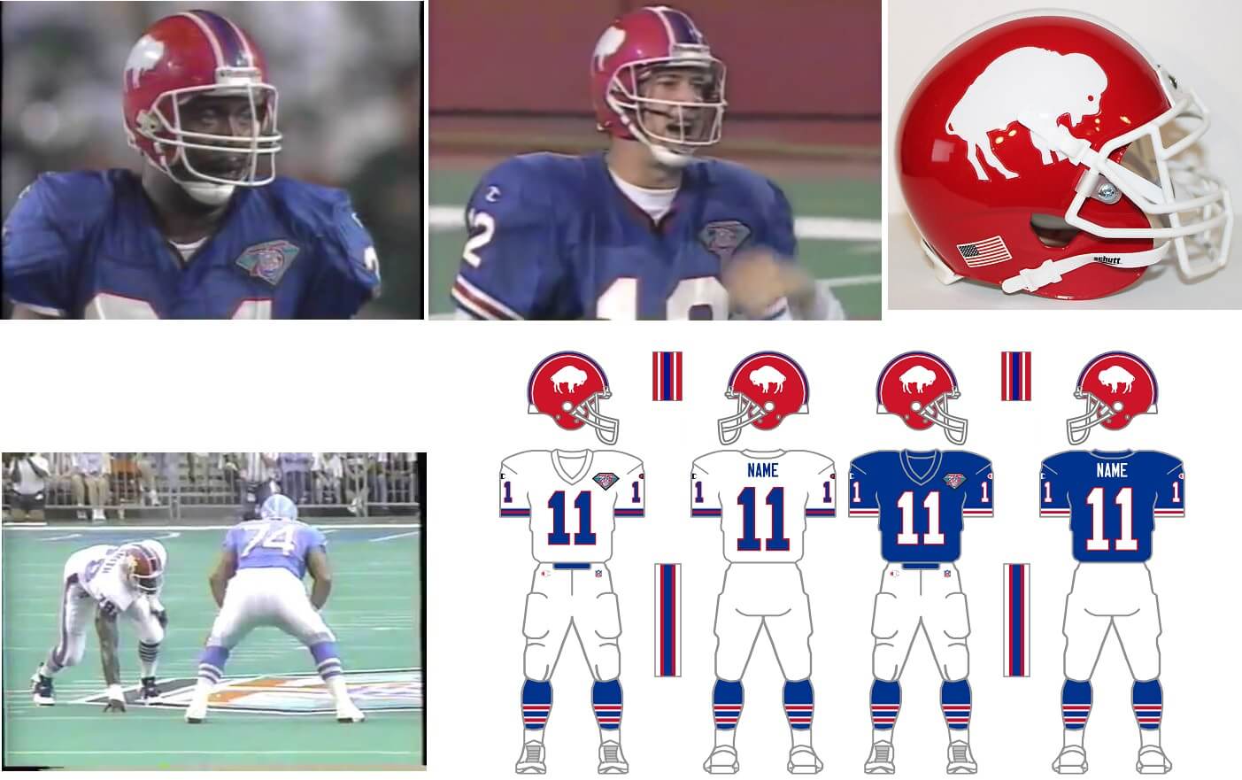
Whether they were taking a cue from the 1993 Jets throwbacks, or simply half-assing it, the Bills definitely didn’t get the whole throwback concept. The team were wearing uniforms with a red helmet shell, and rather than creating a white shell for the throwback, they simply took the decals off their current helmets (although they left the modern center stripe pattern) and placed a white standing buffalo on a red hat. They’ve since created some really good throwbacks (and their uniform today is a modern version of one they wore from 1974-1983), but they really botched the 1994s.
Fail

Rather than throwing back to their very early roots — the infamous brown and gold (which they’d later recreate), the 1994 team decided to throwback to their 1965-1966 uniforms. A very interesting sartorial choice, but they pulled it off quite well. I won’t say the look has stood the test of time, but definitely a fun one to choose.
Pass
The Browns didn’t even try to create a throwback in 1994. They simply said their current uniforms were throwbacks (and to a certain extent that was true — much like George Steinbrenner said of the Yankees in 1999 when the team refused to wear “Turn Ahead The Clock” uniforms), but they certainly could have done something. The team has since learned from their mistake, creating a multi-year throwback, but they just didn’t want to play along back in 1994.
Fail
Like the Seahawks (who we’ll look at below), the Buccaneers really hadn’t changed their uniforms (much) since their inception, so the team didn’t really have anything to throwback to. They were still in their “Bucco Bruce” phase (a throwback NOW that the whole world is waiting to see) in 1994. Slight kudos to the team for wearing their “throwback” white pants with their white jerseys — a look they’d jettisoned in 1992 (wearing only orange pants with the white jerseys). Still, not much there.
Push
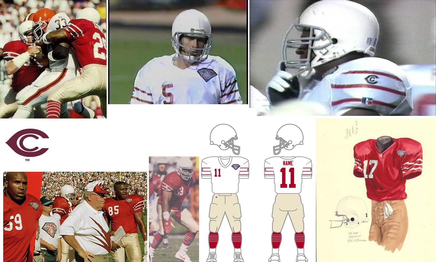
Much like the Bears, the Cardinals jumped into the deep end in 1994, and attempted to create a very early throwback from the late 1920’s/early 1930’s. While there were definitely some inaccuracies, the effort was there and to be commended.
Pass
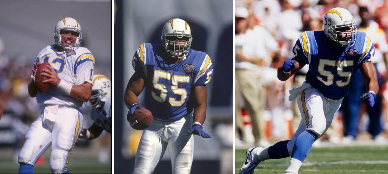
While today we’re used to seeing the Chargers in white helmets and powder blue jerseys, back in 1994 they were basically a navy and white team. Fans (and folks with eyes) absolutely loved the throwbacks, and the team would eventually return to uniforms today that have their roots in their earliest days, and which the team successfully recreated in 1994.
Pass
Like the Browns, Kansas City basically refused to play along with the 1994 throwback initiative. Now, since their move from Texas (where they began life as the Dallas Texans) to Kansas City, the teams uniforms changed little — rendering a “throwback” to their KC days pretty much an impossibility. However, they could have busted out a Texans throwback, as they would later do, but they didn’t back then.
Fail
While their uniforms hadn’t changed that much since their introduction, the Colts basically said, “nah, we’re good” to the 1994 throwback program. They would later figure out they could throwback to different eras, but they chose not to in this instance.
Fail

The ‘boys leaned into their roots for the 1994 throwbacks, and created the basis for the throwback uniform they wear today — from their early 1960’s beginnings. Interestingly, they created a semi-throwback (seen in the first two photos above) with white pants and white star on the shoulder yoke, but also went with a non-throwback featuring silver pants and an outlined star as well. Of course, their original 1960’s uniforms featured a white helmet, not a silver one (something they would later correct) — so this isn’t quite an accurate throwback. It would however, prove very popular and remain a future throwback for the team.
Pass–sorta
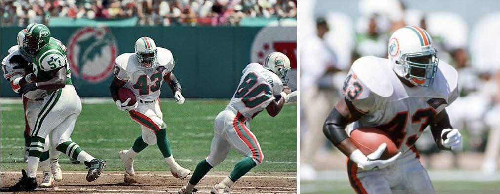
In 1994, the Dolphins unis weren’t all that different from their originals, and to their credit, they changed their helmet logo (from the dolphin head outside the sunburst to one inside it). I’m sure this change was all but missed by anyone but the most astute uni watcher back then.
Pass
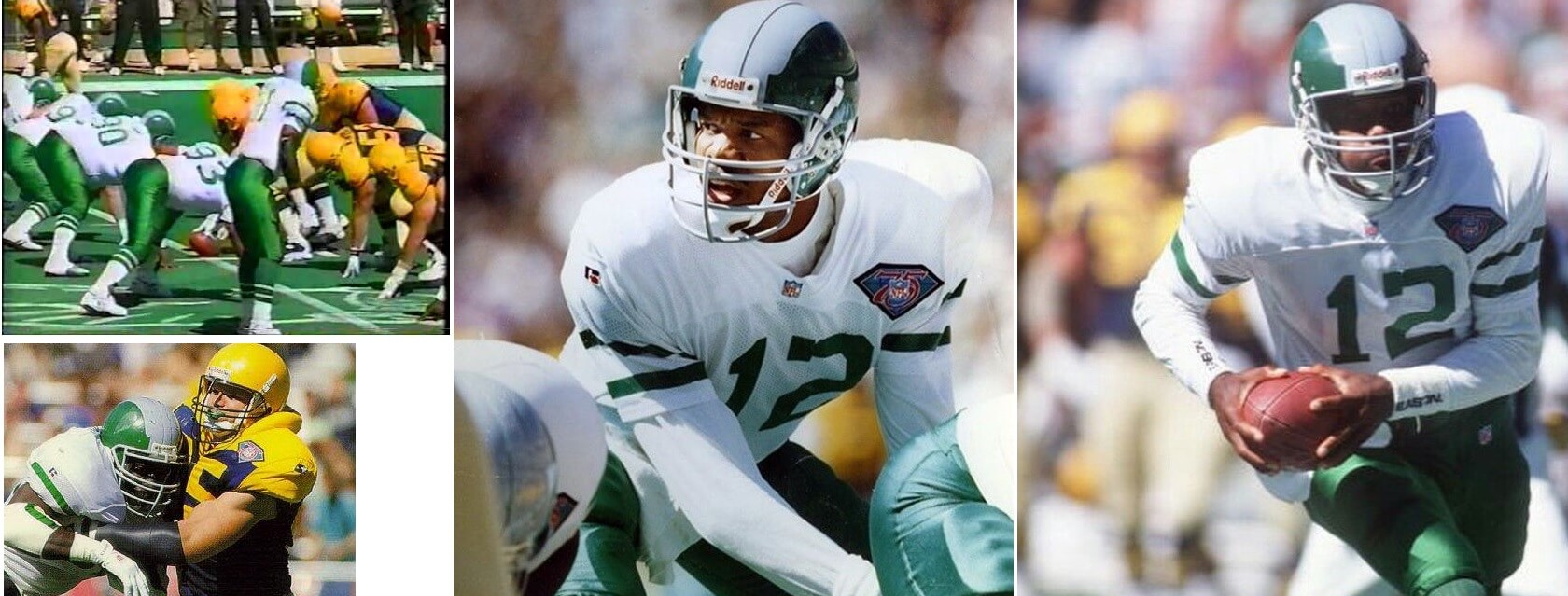
Really nice effort by the Eagles here, who’ve generally tried to make their throwbacks as accurate as possible. For their 1994 throwbacks, the Eagles went with basically their mid-late 1940’s uniforms, right down to trying to replicate the design on the leather helmet. This one was much more visually appealing than their attempt to throwback to 1934, which they’d do a few years later.
Pass
FALCONS
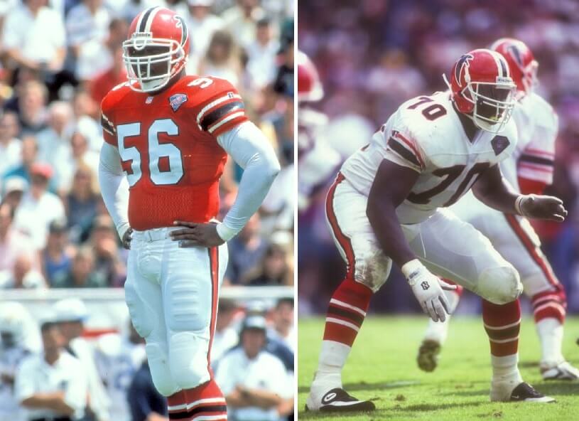
In 1990, the Jerry Glanville-led Falcons ushered in their black-helmet era, so the team didn’t have too far to throwback to with their 1994’s. And they did a really nice job, basically getting everything correct. Why they ever went away from these 1971-1977 beauties is a mystery, to this day.
Pass
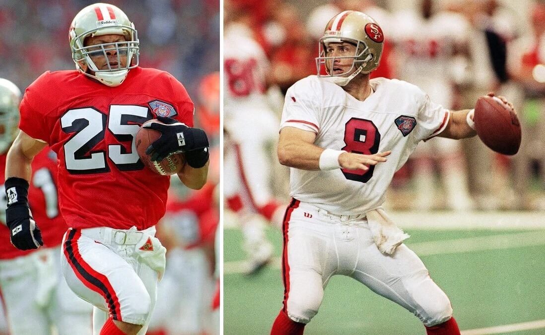
If these look familiar it’s because they are. The 1994 “throwbacks” (and in which they won a Supe) are what the team currently wears as their alternate and throwback uniform today. The problem then, as now, is the team didn’t wear a gold hat with the 1955-56 uniforms to which they are/were supposedly throwing back. That helmet was red. It didn’t look right then, and it still doesn’t look good today, despite the love for the “throwback” set. Maybe if the team adds a red shell going forward…
Fail

If that set looks familiar, it’s because they are. The 1994 throwbacks (which were pretty accurate) proved so popular with the team and fans that the G-men basically returned to this throwback set (from the 1950’s) in 2000 when they ditched the prior set (which had “GIANTS” on the helmets). It looked good then, and it still looks good.
Pass
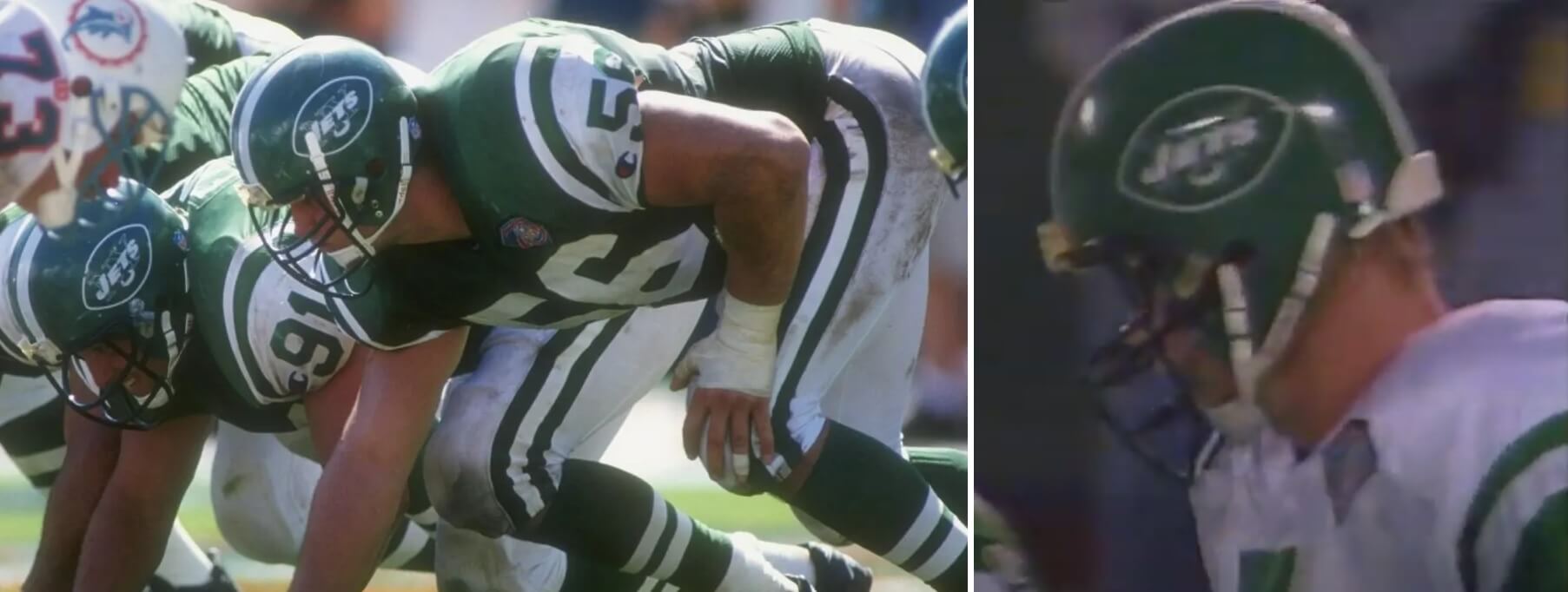
Like they did in 1993 (see above) with their 25th Anny Supe unis, the Jets again wore the inappropriate green shell. Everything else was basically correct, but whether it was sloth or just frugality, the 1994 throwbacks most definitely weren’t.
Fail

What we now think of as the “classic” Lions throwback really got its start in 1994. We’ve seen these beauties on Thanksgiving, and other times of year as well, and this outfit is basically still the Lions go-to throwback to this day. There are probably some better looks (especially nowadays) to which they could throwback, but this one is still fantastic.
Pass

Love ya, Blue! For their 1994 effort, the team threwback to their 1960 uniforms. And those uniforms weren’t all that much different from their then-current duds, save for the blue helmet with white derrick. So, unlike the Jets and Bills, who wrongly slapped a throwback logo on a same-color shell, the Oilers went the extra yard with these. They did an even better job in 2009 (see here and here), but these were just fine.
Pass
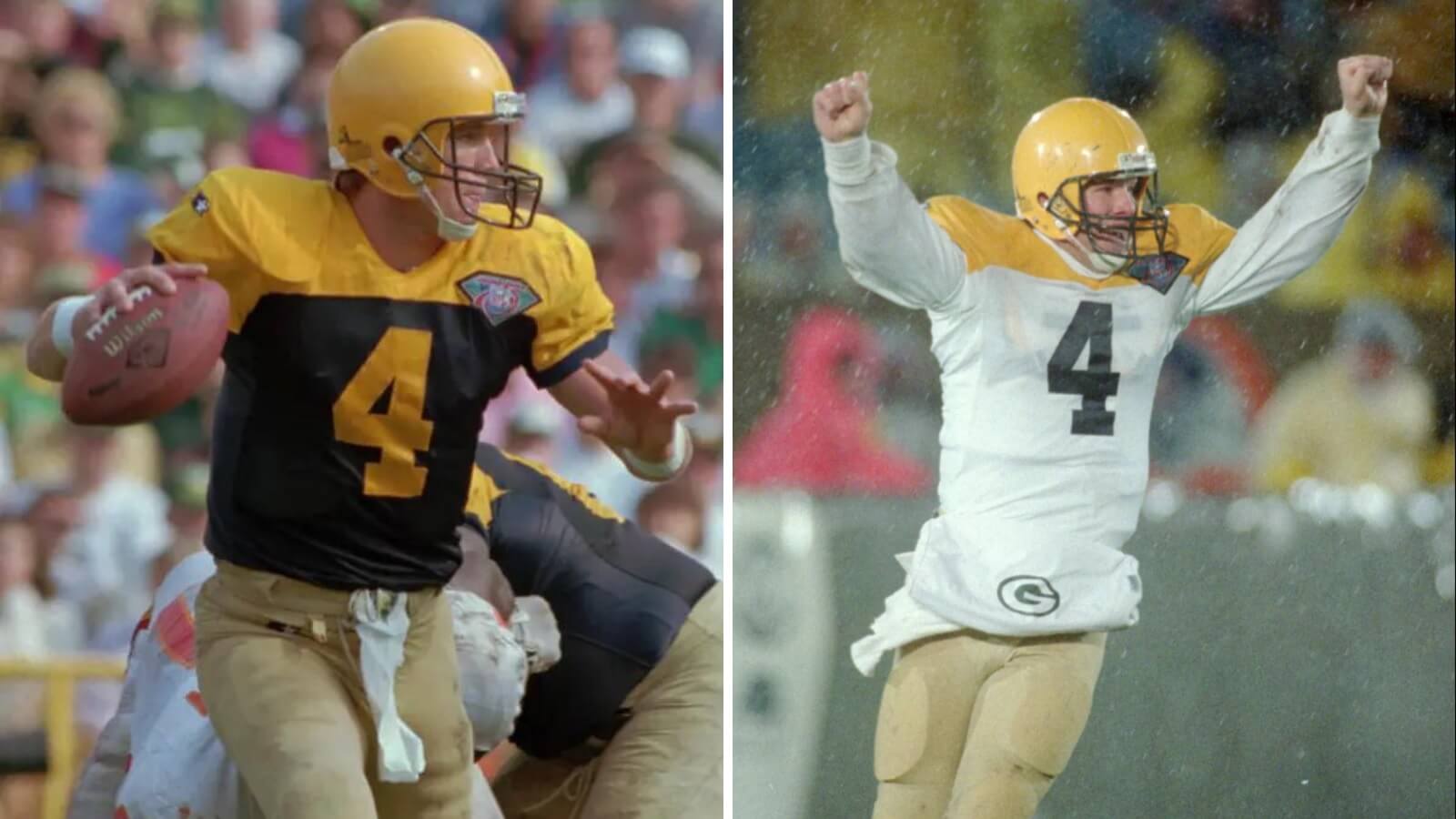
For a team with arguably the most uni history, the 1994 Packers throwbacks were pretty spot on for their 1944-46 unis, save for the color of the font on the white jersey (that was gold back then). But other than that, they did a good job, right down to the tan canvas pants worn back in the day. The Pack are another team who’ve generally done a very good job (although not always) on their throwbacks, and this one started it all.
Pass
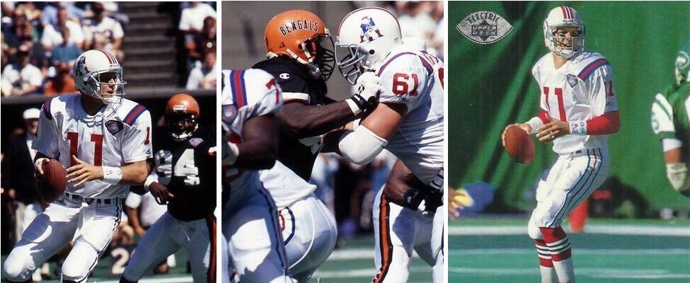
Kudos to the Patriots! In 1994, the team was only two years removed from their Pat Patriot uniforms (having moved to the Flying Elvis in 1993), so I’m sure there were more than a few casual NFL viewers who didn’t even realize they were seeing throwbacks. The more time that passes, the greater “love” there seems to be for these, but back in 1994, there probably weren’t a whole lot of folks who were happy to see this design.
Pass
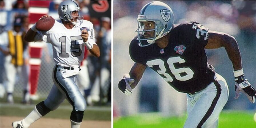
Ever since the team has been owned by the Davis family, they’ve always worn black and silver — and their unis have changed little since then. But the team did manage to create a throwback, especially with the white jersey, which had silver numbers in 1963-64 and 1970. They also attempted to create a throwback helmet, and they did change from the current logo to the 1963 logo, but they inaccurately made the shield white as opposed to silver. Many of us would love (someday) to see the team go back to the black and gold unis worn in the 1960-62 era; they mostly got these 1994 throwbacks correct.
Pass (barely)
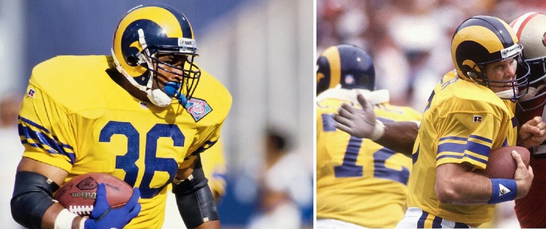
Great job by the Rams in bringing back a look worn from 1951-57. This looked good in the 50s, it looked great in 1994, and it would look especially great today. I keep hoping the promised (but delayed) new uniform for 2022 will harken back to this.
Pass
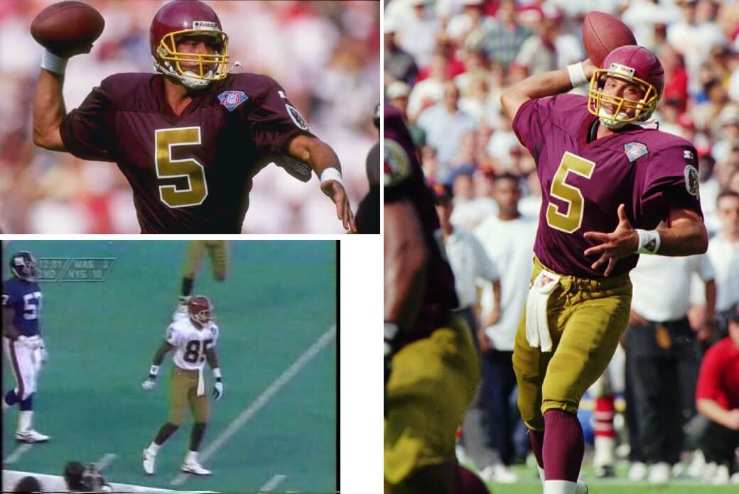
The team now known as the Commanders did a pretty good job of throwing back to their first uniform in Washington, and even went so far as to create a white jersey (which didn’t exist back then) for the set. Racist imagery on the sleeve aside, the throwback was pretty accurate.
Pass
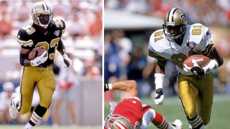
Despite keeping their current helmet (with its more “metallic” than “old” gold shade), New Orleans did a pretty nice job recreating their 1967 (first year in the NFL) uniforms. The team looked great then, and never should have deviated from that original shade of gold. They’ve brought this throwback back before, and should make it permanent (with a new matching helmet) going forward.
Pass
Like the Buccaneers (above), the Seahawks were really still wearing their “original” uniforms in 1994 — one of the few changes involved placing the seahawk logo on the sleeve, so for their “throwbacks” they removed the logo. We’ll give them props for that, but they didn’t have much else to work with.
PUSH
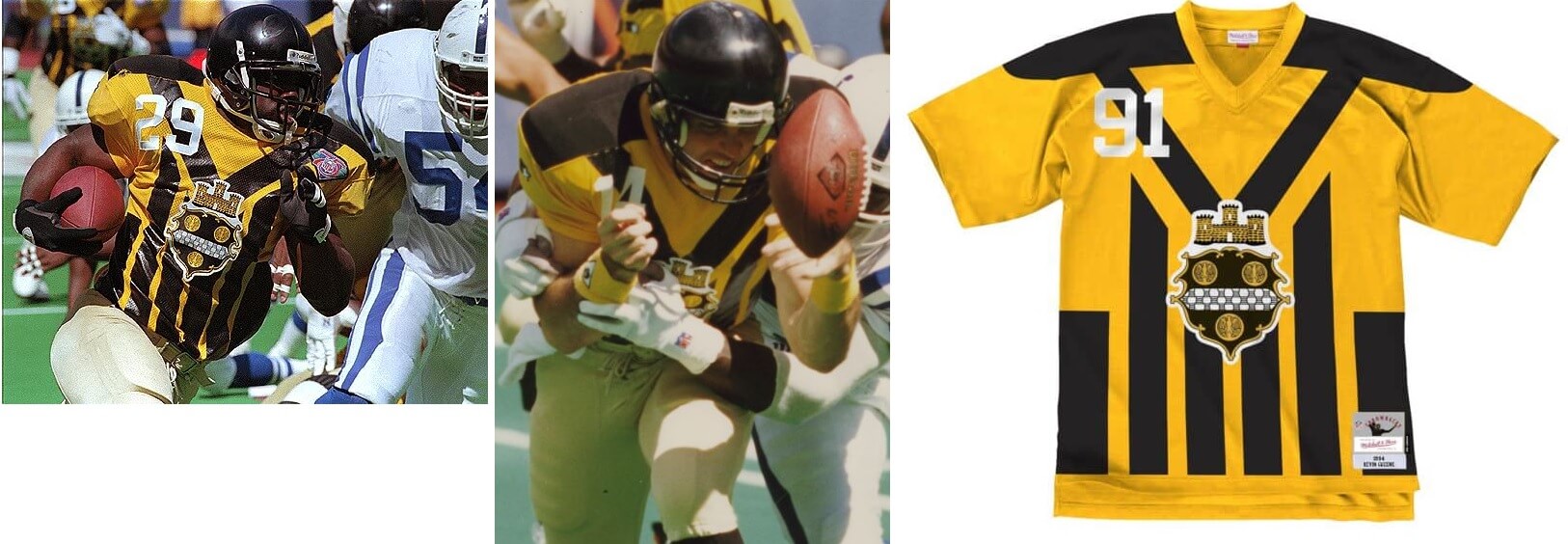
Like the Cardinals, Bears and Packers, the Steelers went deep into their roots for this one, which threw back all the way to 1933, their first year of existence, when they were then known as the Pirates. While this is probably not a uniform we would (or should) ever see again, it was pretty cool they went for it in 1994. But they’ve been known for their out-there throwbacks so…
Pass
The Vikes faced a situation similar to the Colts — their uniforms hadn’t really changed much throughout their history to that point — so they’d be forgiven if their throwbacks were almost identical to their regular uniforms. They removed the UCLA stripes from their road throwback, but otherwise, their unis, other than some sleeve piping, were unchanged. They probably didn’t even realize it, but they missed a golden opportunity to repeat their all-purple mistake unis from 1964. Or maybe it’s good that they didn’t.
Push
What do you guys think? How did the NFL do in 1994? Should they attempt a league-wide throwback program again? Sometime (perhaps soon), I’ll take a look at the 2009 AFL throwbacks, which was the only other time the NFL attempted throwbacks on a large scale. Would you guys be in favor of Throwback Thursdays?
Fire away…

I don’t know if this is a hot take since nobody has ever thought about it, but I think those Broncos throwbacks they wore in ’94 are the best JERSEY they’ve ever worn. Not the best full uniform, because obviously the classic set with the “D” logo is the best full set, but I just think that jersey with the blue sleeves is their best ever
I definitely agree. Love me some contrasting sleeves!
I realize I’m in a tiny minority, but that mid-60s Broncos uniform is my favorite overall Broncos uniform ever, top to bottom. But point taken, those jerseys with the blue sleeves really stand out as arguably the team’s best ever.
The classic D set is only good when they wear orange road pants. Their blue/white/white never did it for me, both now and in the classic D era.
The mid-60s/94 throwback, on the other hand, looked fantastic with white road pants. In fact, the game in Buffalo against the fauxback Bills may very well be The Best Looking Monday Night Game Ever.
To be clear, a lockout delayed the start of the 1990 baseball season by a week. Like 2022, one series got moved to the end of the season, while the other had its games scattered on available dates during the season.
The White Sox were playing their last season at Comiskey, and they decided to take one of those rescheduled single games against the Brewers and do a full Turn Back the Clock Day on Wednesday, July 11. Not only did the Sox wear 1917 uniforms, but ticket and concession prices were rolled back. (Milwaukee wore their regular unis.)
It was a success. Rob Gallas, White Sox vice president for marketing, said “A game like today, a makeup game, might draw 5,000 or 10,000 normally. We hoped for 20,000 and we’re getting 40,000.” 40,666, to be exact.
2016 Uni Watch coverage: link
Shame on the Jets and the Bills.
The Bills were worse, because while the Jets at least got the jerseys right, the Bills completely half-assed it. The sleeve stripes were the same color arrangement as on the 1962-63 unis, but those were shoulder loops, not sleeve stripes.
I liked both helmets.
In fact, that’s my favorite look for Buffalo.
The league wide NFL 75th 1994 less was a nice retroview! Dig the effort some made to make it fan friendly. Besides turning back the clocks…test the smoke detectors and other warnings systems to see if they need new batteries. The life you save might be your own!
My two favorite teams (Giants and Saints) hit home runs in ’94 with their throwbacks. It’s great that they’ve influenced the teams’ uni choices since. I’d dare say, except for the old gold of the current helmets, the Saints’ color rushes are even one step better than my favorite unis of all time, the white ’67-68 originals. I’d love to see them bring back the black jerseys as well.
Three teeny things: The Oilers actually threw back to 1960 with the ’94 throwbacks with the round numbers. The Saints’ first year was ’67. And didn’t the Raiders have gold-on-black numbers on their white jerseys in 1963? (The black jerseys had the silver numbers starting that year …) But 1994 was thee year that set the tone for years to come. And on another note: how many high school, college and (Dolphins) pro teams adopted drop shadows after the Niners broke out the 1955 Hugh McElhennys that year?
fixed the Oilers section. Thanks. And changed Saints to ’67 (that was actually a typo — I remember the year because of the SI cover link)
The Raiders did start out with the silver numbers with thick black outlines at the start of the 1963 regular season, but after a few games wear the silver layer was removed from the front and back numbers but not the sleeve numbers. I have never found out why they removed the silver layer – if the silver cracked or crumbled after a few washes or if the silver used was too shiny and hard to read. They did do the silver numbers with black outlines again in 1964 and they lasted all season that year.
WHAT A TREMENDOUS POST!! Well done. I just commented a week or so ago about how 1994 was the peak of NFL uniform goodness. The 75th Anniversary was one of the most visually appealing seasons the NFL has had. I honestly love that Denver uniform and the real Charger powder blues. Always drove me bonkers when they would wear powder blue in their previous uniform set that looked nothing like the originals but they tried to pass it off as that. Junior Seau and Natrone Means were made for those uniforms and what a great season for them. Only gripe is they didn’t wear them in the SB against the 49ers who wore theirs.
Am I alone in missing “traditional” helmets and facemasks? The game just looked so much better without all of the vents, angles and what I consider ugly new facemasks. Understand that changes have been made for player safety but man how great helmets used to look.
Yeah, I’m another fan who sure misses the clean look of the old helmets. I’m definitely in favor of making the helmets as safe as possible, but to whatever degree the modern vents and bumps are just design flourishes and attempts by the manufacturers to spice up the visuals, I’d sure prefer that they get back to basics and return to a time when what you notice first is the team’s logos and colors, not the manufacturer’s design sense.
One thing that gets lost with the Niners throwbacks is that they missed one detail on the white jersey – the stripes of the 1955 original were black-red-black, while the 1994 uni just had all red stripes – basically just using their regular jersey design. Of course, when they wear the throwbacks in the present day, I see them as throwbacks to that Super Bowl-winning season and not to the 50s, so if you go by that then the modern throwbacks are technically correct.
As was documented at the time, the Jets wore green helmets in 1993 and 1994 because of the insistence of Boomer Esiason. Similar to the reason that the Jets changed their helmets from white to green in the first place, he was concerned about not being able to quickly identify his receivers. So, although I love Boomer and listen to him on the radio every morning, this is solely on him and not the Jets as an organization.
This same concept is what facilitated the Bills’ original change from white to red helmets, so the QBs could see their own guys better in a division in which all five (Colts included) have worn white helmets for long stretches of time.
So perhaps that was part of it as well for Buffalo, even though they wore these against Denver for one of them?
OR could it have been something like “we’ve been to four straight Super Bowls and want one more shot, we’re not messing with a streak”, Ill-fated as it may have been?
This 75th anniversary throwback week in ’94 is what started my obsession with the nfl’s history and unis. In retrospect a lot of teams half-assed it and made mistakes but as a kid i didnt know that and was just blown away by the old unis. Loved reading this brought back a lot of memories.
Sorry Phil but your description of the Oilers doing a 1972-74 throwback is wrong. Those are the SAME 1960 throwbacks they used in 2009. But for some reason they flipped the same pants stripes to red/blue/red when they should have done blue/red/blue – which they corrected in 2009. Still a passing grade.
fixed (thanks for setting me straight)
C’mon, Phil! C’mon!
Haven’t I schooled you enough to know the difference between the Best Ever Set from ’72 and the almost-as-good original uniform?
The second set of Cowboys were modeled after the movie Little Giants.
The movie was released October 14, 1994. The Cowboys wore them for the first time on Thanksgiving.
So either A: The Cowboys had two sets of throwback uniforms made for the season, and allowed a kids movie to debut those uniforms for some reason.
Or B: Jerry Jones saw the movie and asked Apex (who made the uniforms for both the movie and the Cowboys in 1994) to make adult sized versions for the team. Since they already had the templates available, scaling bigger would be decently easy.
I think it was the other way around. I remember the buzz in 1994 was that the Cowboys were going to make a uniform change to the “Modern Double Star” design going forward. The Little Giants movie was a tie-in to help with the introduction even though the movie came out before the team wore them for the first time. Not sure if the blue pants from the Little Giants movie was going to be part of the Dallas set.
The backlash against the Modern Double Star was pretty harsh, particularly after they lost in the playoffs wearing them. The white version was worn in the 1995 preseason and they returned to their traditional white/silver blue (well getting more greenish by then) set. They did finally wear the navy Modern Double Star as their blue jersey for the 1995 regular season.
I obviously love the potential idea of Throwback Thursdays, and it seems to be such a no-brainer promotion for the NFL that could get more eyeballs on a traditionally mediocre Thursday night game.
However – if every team had a throwback jersey, in addition to all of the alternate-helmet uniform options, I fear we’d be approaching NBA territory: home uniform, away uniform, throwback uniform, alternate helmet BFBS helmet nonsense… etc.
I absolutely loved those 1994 75th anniversary throwbacks. How vividly I remember the late-July Saturday at around mid-day when I stumbled across a surprise rerun of the original “Alvin & the Chipmunks” cartoon, which I hadn’t seen since early childhood. And fresh off a first powerful dose of nostalgia, I switched to that year’s NFL Hall of Fame Game and was blown away to find the Falcons in their mid ’70s red uniforms and the Chargers in their all-time classic all-white early ’60s design. Two of my all-time favorites! And as Phil made clear, this was back at a time when throwbacks were new and extremely rare. I was in heaven.
Then on Sept. 18, virtually the entire league broke out the throwbacks and it was perhaps my single favorite NFL uni-day ever. I was thrilled to see the return of Pat Patriot (his departure after the ’92 season was just devastating to me), and I was practically as excited to see the Broncos back in my favorite of that team’s uniforms, ditto the Oilers and Saints. I also really loved seeing the return of the early ’60s Giants and the ’50s Rams, and appreciated the Raiders bringing back the silver numbers on the white jerseys, my favorite element of any Raiders uni.
I remember taping and saving that evening’s NFL wrap-up show on ESPN for both my own future viewing pleasure and to make sure my brother got the chance to see the return of all those favorite uniforms.
Sorry for this repeat post, everyone, my computer “ate” my first version of this post and I couldn’t get it to appear on my screen for a couple hours so I finally re-posted, and naturally that was when the first one finally showed up on my screen. Again, my apologies.
Not your fault Tom — both were caught in our spam filter. I’ve removed your first comment since the second one is identical.
To me, the number font is a huge part of a uniform, as much as the color scheme or striping. It seems like that was mostly ignored in this lookback. To say that the Oilers “weren’t all that much different from their then-current” is way off to me because of the distinct round numbers on the throwback. Conversely, the throwbacks from the Patriots and Cowboys just didn’t look right because instead of using era-appropriate numbers, they used a modern Apex number style. It just looks so wrong. And with the Bills, back then I didn’t think they did anything but change the helmet logo, because if that was supposed to be a throwback uniform, the use of the modern Champion number style completely negated any hint of throwing back.
Forgot to mention the Vikiings – “their unis, other than some sleeve piping, were unchanged”. Not true, the numbers had a yellow border, and did the NOB (which was in a different font). That border is a distinctive change.
Also, three yellow stripes on the purple socks of those ’94 Vikings throwbacks.
I loooove that rounded number font that the Oilers used. A few years later the Cubs and White Sox would put it on their interleague throwback uniforms, and Rutgers put it on their football jerseys for a year before switching to a block font that looked almost exactly like the 49ers’ 1994 look.
It looks good with anything. I can’t think of a team that uses it today.
You’re missing the “Atlanta Falcons” title on their review.
fixed
Phil –
Outstanding post. Looking at the pictures of the Bengals uni – it looks like it was the one-year (1980) iteration with the black face mask. From their inception through 1979, the face masks were grey.
It was kind of a mixture. They kept the black facemasks but the did do the original sleeve stripes without spaces between the stripes. Technically the Bengals had 2 jersey sets in 1968 – in the preseason they wore mesh jerseys with spacing between the 3 stripes and durene jerseys without the spacing during the regular season.
Starting in 1969 they would wear both sets during their regular season. Use of the durene jerseys was down to only extreme cold weather games by the mid 1970s; I think one game during 1977 was the last time the durene jerseys were worn.
Also in 1980 the Bengals finally added TV numbers to their jerseys – not by their jersey manufacturer but by their team seamstress sewing numbers on the jersey sleeves.
Did all those original Raiders unis have full NOB?
Yep.
From link (thanks Paul!)
For the first five weeks of the 1960 season, Raiders players didn’t wear their names on their jerseys. But for the rest of that year, and for all of the following season, they wore their full names — first and last.
Found from Jim Otto’s rookie year, when he wore #50. He didn’t wear 00 until 1961.
link
Was 12 in 1994, so pretty much peak childhood football obsession age. I loved everything about the 75th season, including the anniversary patch that year. Crazy to think what a great job they did in 1994 and miserable job in 2019. It is interesting to see how many of the throwbacks maintained a regular foot hole in the rotation for some of these teams.
With the Jets it is amazing how much better that fauxback helmet looks than their current, could easily improve the current by doing a white outline around their green oval logo on a green helmet like the fauxback did.
Note on the Dolphins throwbacks, not only did they change the helmet logo to the lower placed dolphin in the sun, but also in ’94 the current Fins jerseys had their logo on the sleeves, which was removed for the throwbacks.
Re: Tomas Plekanec Card
I’m stumped right now, but these are the clues I’ve compiled thus far:
-Looks like Montreal is wearing red on the road, because I doubt they would ever have a Chick Fil A board in MTL.
-Reebok unis & CCM helmet (he later wore Warrior).
I’m having a hard time researching games they wore red on the road, probably in the South (Blues/Preds/Panthers/Lightning probably), but I’d wage therein lies the obvious date.
You’re on the right track!
The 1994 throwback program seems to be the genesis of the idea that all canvas pants were khaki-colored. This may be a colorized photo, but it indicates the Packers’ pants in the 1940s were yellow, not khaki. link
Remember, it took the Giants a few more years after 2000 to get the road jerseys right, which they did in ’94. I think the ’94 throwbacks are superior anyway because they had numbers on the sleeves instead of the shoulders, and no metallic paint on the helmets.
One would think, moving to Vegas, the Raiders would incorporate Gold rather than Silver into their scheme. Much like the Golden Knights.
Nevada is The Silver State : )
Surely the A’s will retain what they call gold (cmon, it’s yellow) when they get to Vegas.
It should be noted that the refs in 1994 wore throwback “newsboy” caps. Damned if I can find a pic of it though!
I had a terrible time finding pics. Some of them I had to grab from YouTube videos (of which there are plenty). I didn’t mention the ref’s caps because the article was about teams, but if you find any of the multitude of videos, the ref’s caps are prominent.
The 1994 season was my favorite for NFL uniforms, I thought a lot of the teams’ throwbacks were much better looking than the uniforms they were wearing in 1994. The Atlanta Falcons looked great so did the Chargers. Of course, the teams that entered the AFL in the 1960’s were going to have a more modern uniform than say the Steelers or Bears who go way back to the beginning of the NFL
I owned a Broncos Elway and a Chargers Means jersey, The Elway was Mitchell and Ness and the Means was Russell Athletic. The Chargers jersey was not powder blue, I don’t know the official color, but it was the same exact blue as the Philadelphia Bell jersey I have. I had to sell it because size 52 in Russell Athletic was too tight, their jerseys were almost game cut for that time period, they should have offered a size 54 too.
Another aspect that was very interesting about that season was the jerseys were all made my different manufacturers. I thought Russell Athletic did the best job, Champion used their fonts and teams like the Saints never wore that style on their jerseys. The NY Giants went all out, their jerseys were made by Cosby and were actually the shiny durene materiel that they wore back then.
I don’t know if the Chargers current color codes are the same as the 1994 throwback blue, but they may be. In which case, what they currently wear *looks* very similar and yes, it’s not what we’d call “powder”
link
“Racist imagery on the sleeve”
I appreciated that some teams did home & road throwbacks. It would be nice if they did that today.
I appreciate this very much. 1994 was the first year I followed the NFL truly game by game (I was 7) and this was an absolute shock to my young system that sticks with me to this day. Even remember what I did on that day. So, thanks for the trip back to my childhood.
Also, I’ve been asking the football Gods for almost a decade now: make TNF TBTNF!! And if they could possibly be color v color too, even better. Who wouldn’t want to see the Falcons reds pictures against the Saints oldies, for instance. Make it happen, Rog!
Hockey card was Caps vs Habs, 10/9/14, Trotz’s first game as Caps coach.