It’s been way too long — nearly a year and a half — since I did a roundup of Uni Watch readers telling us how they first got bitten by the uniform bug (or, as I like to say, how they first Got It™). If you’re new to this series, the previous five installments are available here. Ready for the sixth one? Here we go:
Joe Alvernaz
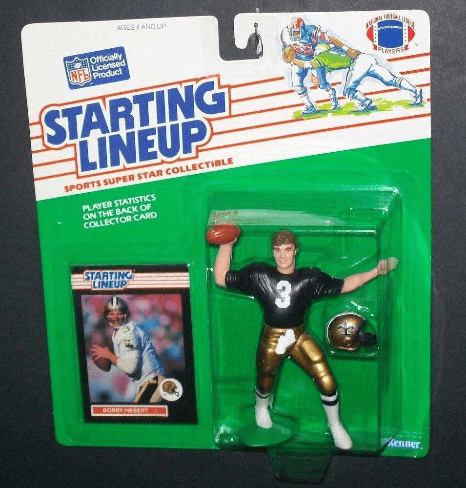
When I was younger, I collected Starting Lineup action figures (like the one shown at right). I used to pair them off in twos, creating a bracket, and have tournaments with my friends and parents, who had to choose which uniform they liked the best. Then I would take the helmets off and have a similar tournament, except they would choose which helmet logo or color pair they liked best. I don’t know if anyone else Got It™, but I sure did! (Incidentally, I chose the Bobby Hebert action figure photo because I once went to a Saints game wearing his uniform, pads and all. A woman asked me for my autograph but I told her I couldn’t because I didn’t know how to write in cursive!)
Wallace Baine
I grew up a baseball fan in the ’70s. Alhough I was nowhere remotely close to Philadelphia, I adopted the Schmidt/Carlton/McGraw-era Phillies as my team, largely because of the maroon pinstripes and the “phat P” logo. Even then, I recognized the absurdity of some of the over-the-top colors and designs (Astros, White Sox, Indians), but the Phillies’ threads looked so sharp on everybody, from tall, long-legged Garry Maddox to brick-wall-like Greg Luzinski. I adore the current Phillies look (the blue stars dotting the i’s are perfection), but I pray to the baseball gods that the cabernet unis of the Bake McBride years will one day be restored in Philly.
Andy Connelly
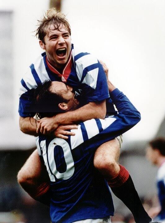
Back in 1992, I was eight years old and my six-year-old brother and I were diehard Glasgow Rangers fans. The Rangers were about to play in the Scottish Cup Final against Airdrien and were set to debut their first kit in a new deal with Adidas, so our mum had ordered two of the new jerseys — one for me and one for my brother. We loved them. But as we sat down to watch the game and saw the Rangers walk out onto the pitch, I was crestfallen — their numbers didn’t look like the ones on our jerseys! Ours were blocky, generic Adidas-stamped numbers, while the Rangers players had much cooler-looking curved numbers. My brother didn’t care, my parents didn’t care, but I cared! That forever sullied that jersey for me.
Brett Thomas
I was six years old for the Dolphins/Niners Super Bowl in 1985 and was absolutely crushed to the point of crying inconsolably because I couldn’t believe a team with such great helmets could lose the big game. That love of logos carried me through childhood and adolescence. When a new set of baseball cards came out, I couldn’t wait to see what logo/wordmark the card would have for each team. I spent way too many quarters to get the full set of gumball helmets and would pass the time in class drawing helmet logos on my papers. I had a nice collection of minor league baseball caps in high school, even though I knew nothing about any of the teams except that they had a cool logo (Chattanooga Lookouts was my favorite). I was crushed in college when two of my favorite teams made mistakes that still bother me — the Jazz ditching the J-note (which they’ve thankfully resurrected) and the Broncos ditching the D-horse (here’s hoping). Then I found Uni Watch on Page 2 and realized other people Get It™ too.
Shawn Dzwonkowski
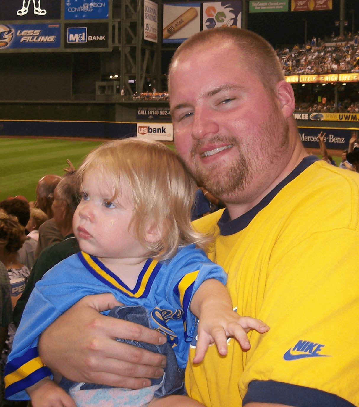
When the Brewers went to the World Series in 1982, my dad somehow managed to get a ticket. I was only four, so I stayed home, but he purchased a replica Brewers road jersey for me at the game. I still have it, and when I took my oldest daughter to her first Brewers game, she wore that very jersey.
Also: When I was 10, my dad had a friend who gave me some old Little League jerseys that were replicas of MLB jerseys from the early 80s. I had a brown Padres jersey and tequila sunrise Astros jersey, but I couldn’t bring myself to wear them ecause they were sullied with a big ad patch on the back! It just didn’t seem right, so they remained in my shirt drawer for a couple years until my mom donated them to Goodwill.
Marty Hick
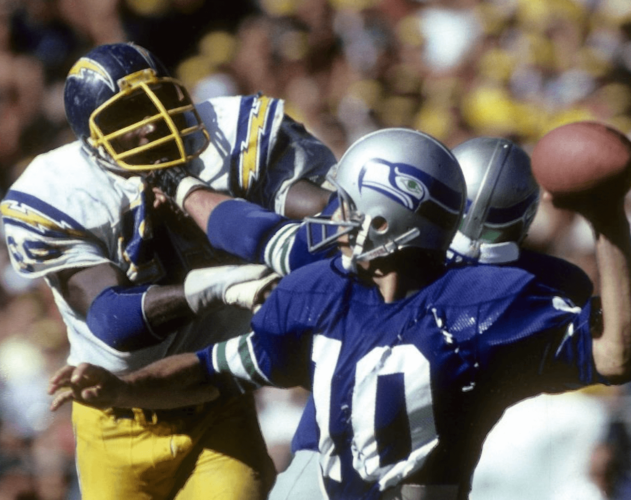
The day I began Getting It™ was during a December 1978 game betwixt the Seattle Seahawks and the San Diego Chargers. On this fine, chilly afternoon, I was watching football on my grandma’s glorious color console — a rare treat, because my dad was extremely thrifty and we still had a black-and-white TV. So when I saw those Seahawks and Chargers uniforms in living color, I was absolutely smitten. At that moment, I decided I would be a Seattle Seahawk for the next Halloween (nearly a year away!). Or at least that was the plan — instead, alas, I ended up with a plastic Boba Fett costume. Did I mention that my dad was thrifty?
Adam Willis
As a kid, I was always interested in what teams were wearing. I think one of the first times I remember was when the Ottawa Senators wore their black alternates in the early 2000s — I was about four at the time. I would also notice when my favorite team, the Leafs, wore their own alts, because the logo on the uniforms was different than the one on my Leafs hats and T-shirts, and I would point it out to my dad. Ever since then, I’ve always been interested in uni aesthetics. I was always creating teams on EA NHL games, trying to find the best color/logo combos. I thought I was crazy and the only person who cared about this stuff (to this day, my dad will give me the eye roll when I point something out), but thanks to Uni Watch now I know I’m not the only one!
Patrick Bourque
I grew up just outside of Harrisburg, Pa., maybe 25 minutes from Hershey, so Dad and I would go to Hershey Bears games. When I was maybe seven or eight in the ’80s, they played in the old Hersheypark Arena, which fans simply called “the barn.” I still remember what it was like to see the Bears in their white jerseys with chocolate brown accents. Dad would get me a program and a puck with the team’s logo, and later I’d go home and draw that logo over and over again. I loved that logo, and that’s when I first noticed the aesthetics of sports.
David Wishinsky
For me, it was as an 11-year-old or so with Baseball Weekly. There wasn’t any fanfare about the team logos changing, but it felt like sometime in February or March, when they had their one column on each team, the logo would change. Part of the excitement, aside from seeing the new logos, was wondering how the black-and-white versions in Baseball Weekly would look in color on the field.
Ian Lee
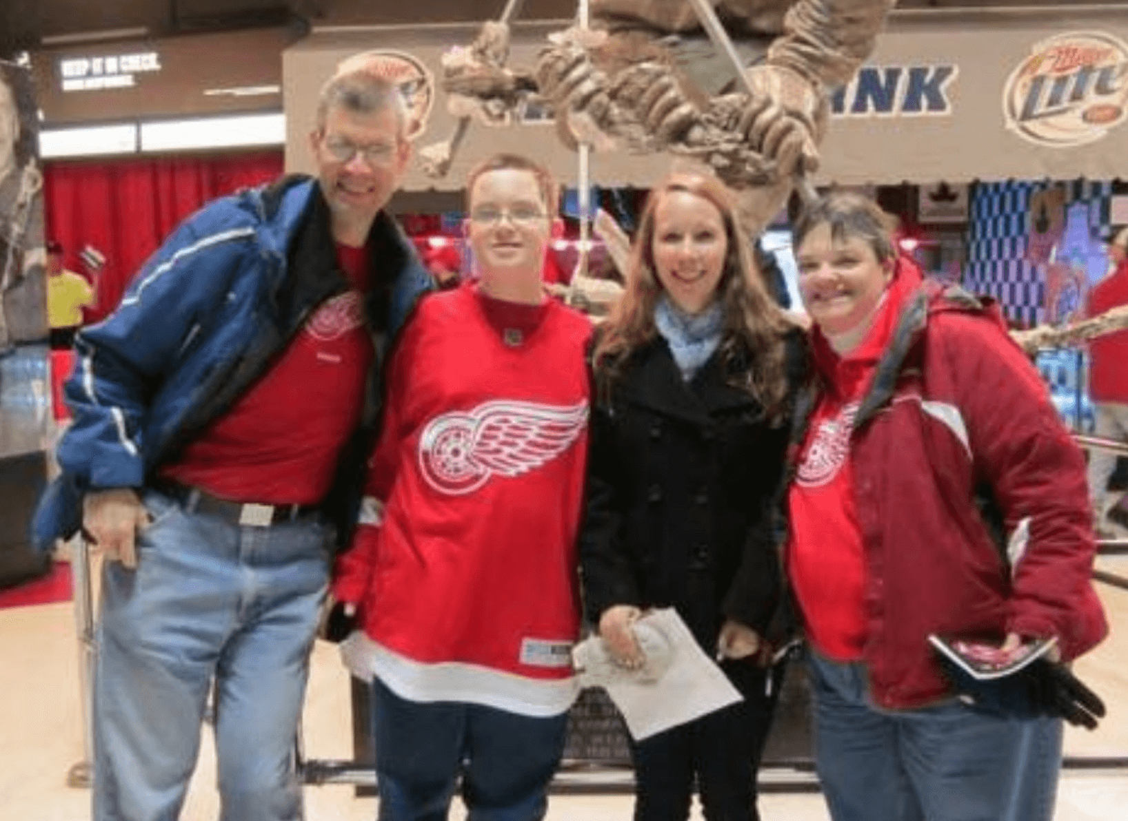
I first Got It™ when I went to my first Red Wings game. It was back in December of 2013, right before the 2014 Winter Classic, so there were posters of the Red Wings up all around the arena showing the Red Wings in their red/cream Winter Classic jerseys, and I was confused because they didn’t look like the standard home jersey I was wearing (as shown at right). We were playing the Pens that night, and this was when they had that metallic gold in their color scheme, which I didn’t like at all.
Denis Repp
My dad always bought a copy of the World Almanac. I noticed that the 1974 version included the mailing addresses of all of the Big Four sports teams. I was also taking a typing class at the time, so I sent a letter to every team (all typed individually – no copier available), asking for stickers or any other goodies they’d care to send me. After that, my house was decorated with stickers from teams across many different sports — Phoenix Roadrunners! Milwaukee Bucks! Washington Caps and Bullets, both clearly designed by the same people. (Later, I found out why.) I even received a press guide from the World Football League. I’d love to have that one back. Despite living in Pittsburgh, I also got on the mailing list of the Cleveland baseball team, which continued to send me newsletters for years, I guess hoping to induce 15-year-old me into buying a season ticket. Felt kind of guilty about leading them on like that.
Brian Miller
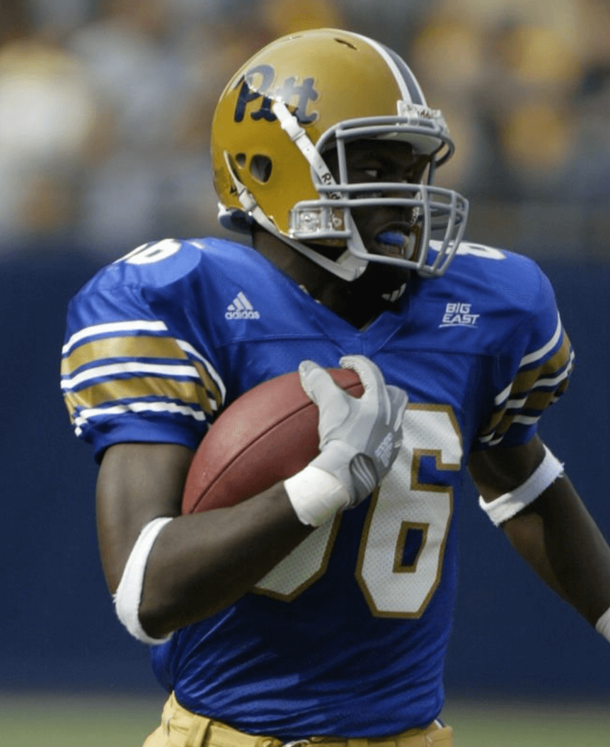
I’m a big Pitt football fan. When I was 10, they wore throwbacks against Youngstown State. When I realized my favorite team could be wearing these beauties full-time instead of their primary uniform set at the time, that’s when I Got It™. Thus began a dive into all things Pittsburgh sports uniform-related. To this day, if I’m watching a game that I have no real rooting interest in, I’ll cheer for whoever has the nicer unis.
Ty Murphy
In 1977, at age nine, I started playing Little League. My dad, being a huge baseball buff who clearly Got It™ much earlier in his life, taught me the proper way to wear a baseball uniform. He was meticulous about showing me how to put on my stirrups, how to blouse my pants, and so on. We also made sure I had appropriate undersleeves and had my belt on correctly. Over the years, I was always appalled whenever I saw another player with his stirrups on backwards. That was an interesting time to be fascinated with uniforms, what with my hometown Padres, the mix-and-match Pirates, the tequila sunrise Astros. After seeing so many periods of uniform transition, many of those ’70s designs still fit into that “so bad, they’re good” category for me.
Rich Wirth
I grew up in the Bronx in the 1960s. Naturally, I was a Yankees fan. I was particularly drawn to the interlocking “NY” on their caps and home jerseys and would forever doodle the logo on whatever scrap of paper I could find. From around the age of seven, I wanted a Yankees jersey in the worst way. But unless you were signed by the organization, there was no way to purchase a MLB jersey back then. By then, I had (at least in my own mind) become somewhat proficient in replicating the “NY” logo, so I took one of my white undershirts and drew pinstripes and a logo on it in navy Magic Marker. To complete my look, I drew a “7” on the back. I wore that “jersey” until it was practically transparent. For a brief period, I imagined myself playing centerfield at Yankee Stadium. Sixty years later, my interest in jerseys has only increased. Not surprisingly, the Yankees’ home jersey remains my all-time favorite. Every time I see that interlocking NY, it brings me back to my childhood and my Mickey Mantle homemade jersey.
Kyle Romine
In 1990, when I was eight, Days of Thunder came out. I didn’t much care for NASCAR (and still don’t), but man, I loved that movie. The different colors and sponsors for all the race cars prompted an infatuation with logos and colors of all types. After seeing the movie, I decided to create a notebook of NASCAR trailers designed by me, from number 0 to 99. I was a terrible artist, but I managed to create 100 custom trailers using real sponsor names. This also sparked my interest in building NASCAR/car/plane models, mostly because the best part was applying the decals.
Nate Schweitzer

I was about 10 years old in fifth grade when I got into freehand drawing. I would draw my favorite cartoon or video game characters, such as Bugs Bunny or Toad from Super Mario Bros. One day, my dad gave me an old sports folder, and on the inside cover were throwback NFL logos — the Houston Oilers, Tampa Bay Buccaneers, Atlanta Falcons, and of course Pat Patriot. I drew them all in one day and showed my dad the drawings. Later that evening we sat down and found some of the most creative and unique logos across the major sports leagues, especially the logos with hidden features (Expos, Brewers, etc.). That’s when I first encountered the Hartford Whalers’ logo. It became my favorite logo and still is to this day. The hidden “H,” along with the royal blue and green color scheme, is unmatchable in my opinion.
Davis Swift
I first Got It™ by following our local high school basketball team as a kid in the late ’90s and early 2000s. We had a couple of state title and runner-up seasons, so there was a lot of community interest in the team and a packed arena for every home game. The uniforms weren’t terribly exciting, although they did have a bold, distinctive side-panel design. What got me hooked was the emphasis on the school colors: cherry and white. Not red and white — cherry. Our school, Williamsport High, calls its teams the “Millionaires” (a reference to the city’s lumber heritage), so it’s fitting that they would be snooty about the colors.
Keith Atkinson
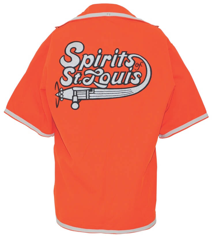
I went to my first ABA basketball game at the St. Louis Arena in 1974. When we arrived, there was a display in the arena lobby featuring the real NHL jerseys of all 16 teams in glass frames. They were beautiful. Then we got to our seats for the basketball game and I was fascinated by the Spirits’ warm-ups, as the logo was silver on burnt orange, and the silver was done in fabric that looked like shiny glitter. They played Dr. J and the Nets, who had their blue uniforms with white and vivid red trim, and I was hooked.
———
I love these stories! If you want to share your own story of how you first Got It™ — no more than one paragraph, please — go ahead and send it here (note that this is not the usual Uni Watch email address). Thanks!
And again, if you want to see all of the entries in this series, they’re available here.


I just noticed the LLC listed at the bottom. Is that something new that goes along with this reformat?
No, it was listed at the bottom of the old side for the past few years as well.
I love these stories! Just tales of like minded people clicking into that thing that makes sports a little extra special.
After living with the new format for the last week, I have one request/suggestion. I consume Uni Watch via the RSS feed. Fortunately, the posts are still showing up in the feed. But now, I just get the headline and first sentence or so of the post, making me have to click into the post to open it. The old feed actually had the full post. I suspect this helps ensure you get your ad revenue, which I understand. In fact, even in the old format, I’d usually click into the post as it was easier to see photos, links out, etc. I just appreciated the flexibility.
Always love reading these, thanks to everyone who contributed and to Paul for publishing. Stuff like this really builds the sense of comm-uni-ty here.
And I love that Pistons card. As teenager when they switched to that design I absolutely loved it. Now looking back on it you certainly shake your head, but at the same time it fit that era. The Pistons transforming from their traditional look and colors to this design was peak 1990s.
Either Donald G. Pelsis’s last name is spelled wrong in the body text or the membership card — hope it’s the body text!
Text. Now fixed! (Thanks, Mike.)
Great stories, all!
Here’s hoping Kyle Romine still has that notebook and/or some of those stock car models and would be willing to share with the comm-Uni-ty some time.
“Days of Thunder”..a ‘so bad it’s good’ film for sure…played a part in my love for NASCAR, though lately the sanctioning body has made it more difficult for me to enjoy Cup the way I used to.
Ian Lee, I feel you. Never cared much for the “vintage/antique white” on throwback/fauxback hockey jerseys. I prefer to stick with the classic winged wheel jerseys, or the 1991-92 throwback (on which my membership card is based, and I still have my Konstantinov throwback). As for the Penguins’ gold, I prefer the classic Pittsburgh (athletic) gold first and foremost, but I liked the metallic gold they wore pre-Edge, because the gold striping on the uniforms was actually metallic. The Edge unis just had non-metallic, tannish blobs, and I absolutely hated that template (which the Lightning and Senators also wore, though the Sens kept the overall design the longest).
There are two Joe Alvernaz’s that follow this website?