
Lots of uni news emanating from the NHL draft yesterday. Let’s start with this: Back in March, word began circulating that the Oilers would be going back to their classic shade of royal blue for their primary home and road uniforms in the 2022-23 season. That was confirmed yesterday, as the team announced that it is bringing back its original jersey designs, complete with the shade of blue changing back from navy to royal. (That noise you hear in the background is everyone — myself included — saying, “Never should have changed it in the first place!”)
In other NHL news:
• It appears that the Devils’ 40th-anniversary logo, which I wrote about yesterday, will be worn as a shoulder patch on the team’s jerseys:
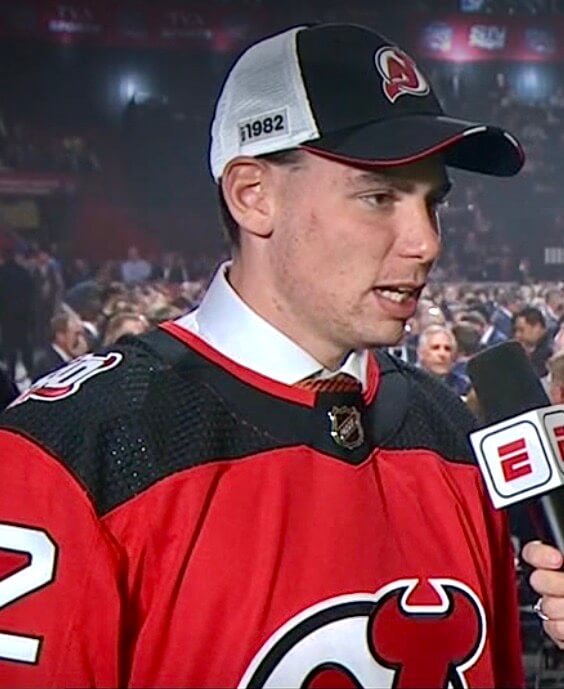
I’m wondering if all commemorative patches will now be worn on the shoulder in order to make room for the ad patches that are coming this fall. I had hoped to test that hypothesis by seeing where the Islanders and Hurricanes put their respective anniversary patches, but those two teams didn’t have a pick in last night’s first round, so we’ll have to wait at least one more day to find out.
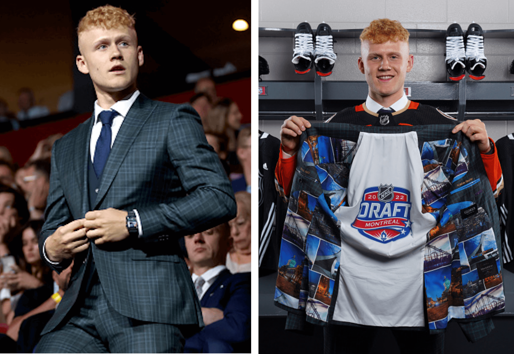
• The first overall pick in the draft — Slovakian left winger Juraj Slafkovský, who was chosen by the Canadiens — had the accent included on the NOB of the jersey he was presented with. Maybe it’s just me, but I feel you don’t often see an accent over a Y:
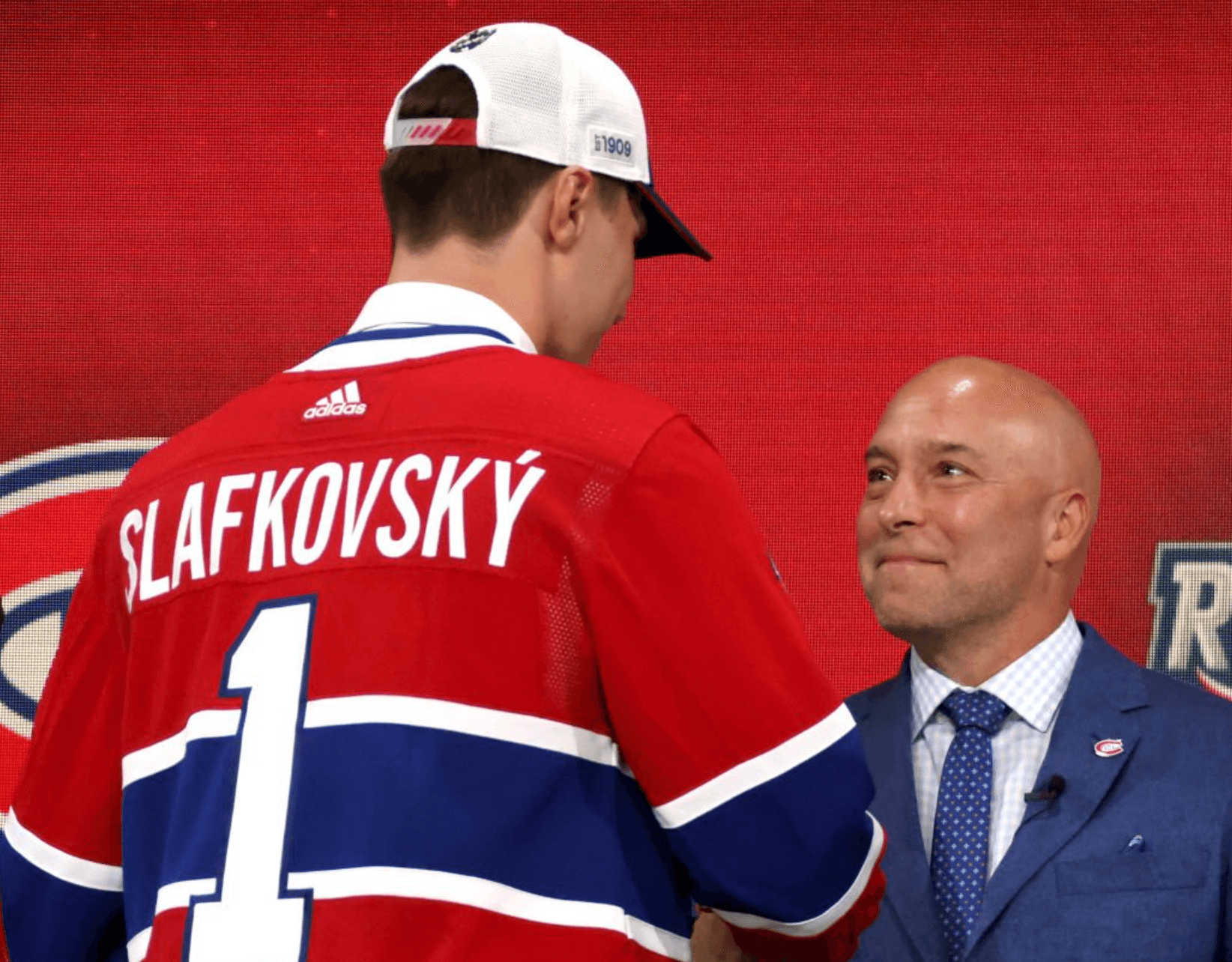
(As an aside, I just can’t look at a No. 1 hockey jersey without thinking that the player has to be a goalie.)
• Another Habs pick, Filip Mesar, had the tag sticking out of his jersey collar when he walked up onstage:
Can't have the tag in the photo! 😅 #NHLDraft #RepêchageLNH pic.twitter.com/IXFVSSvGFB
— NHL GIFs (@NHLGIFs) July 8, 2022
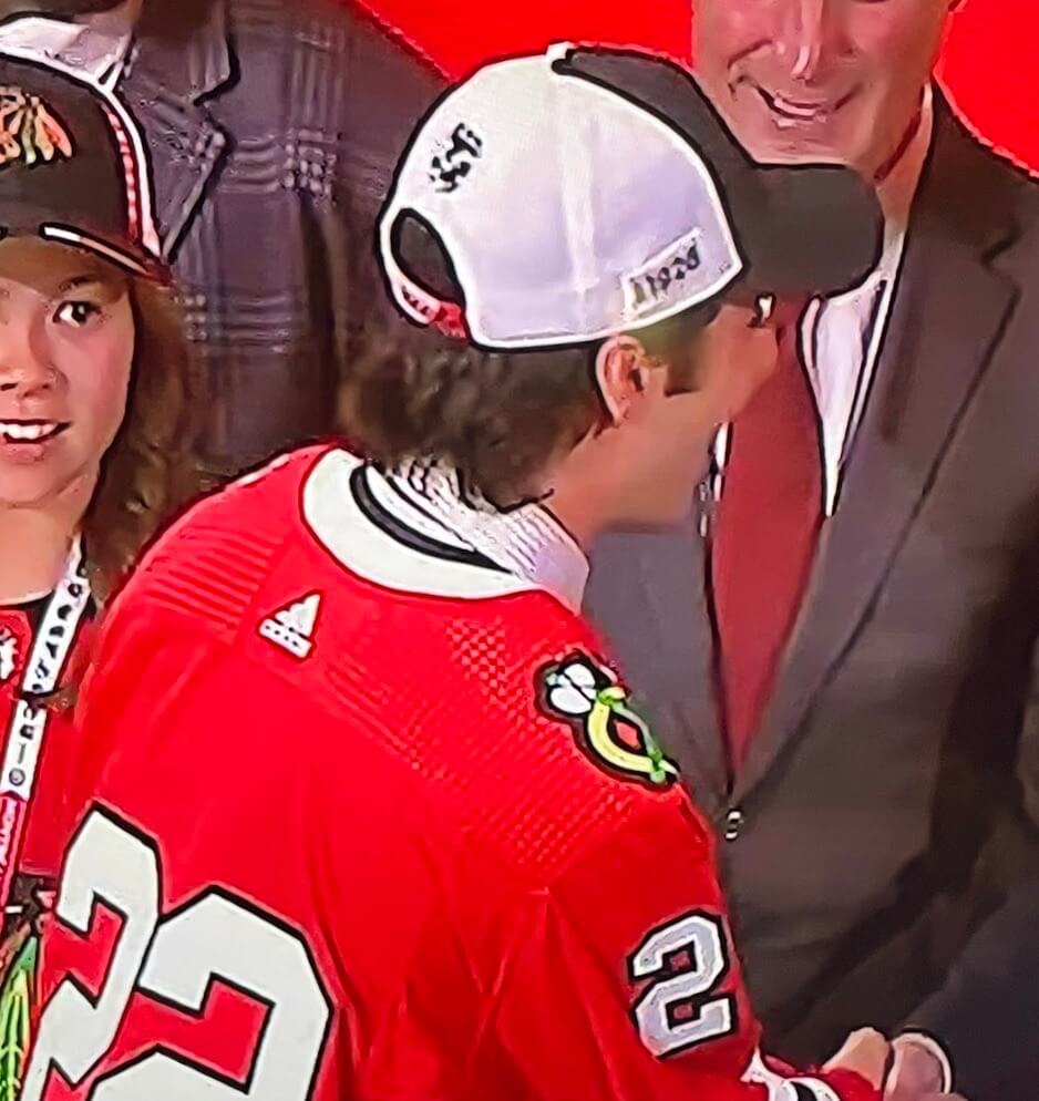
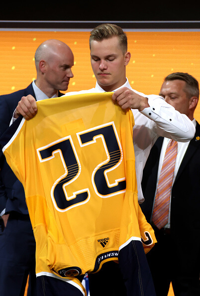
• At least two teams — Chicago and the Predators — used NNOB jerseys:
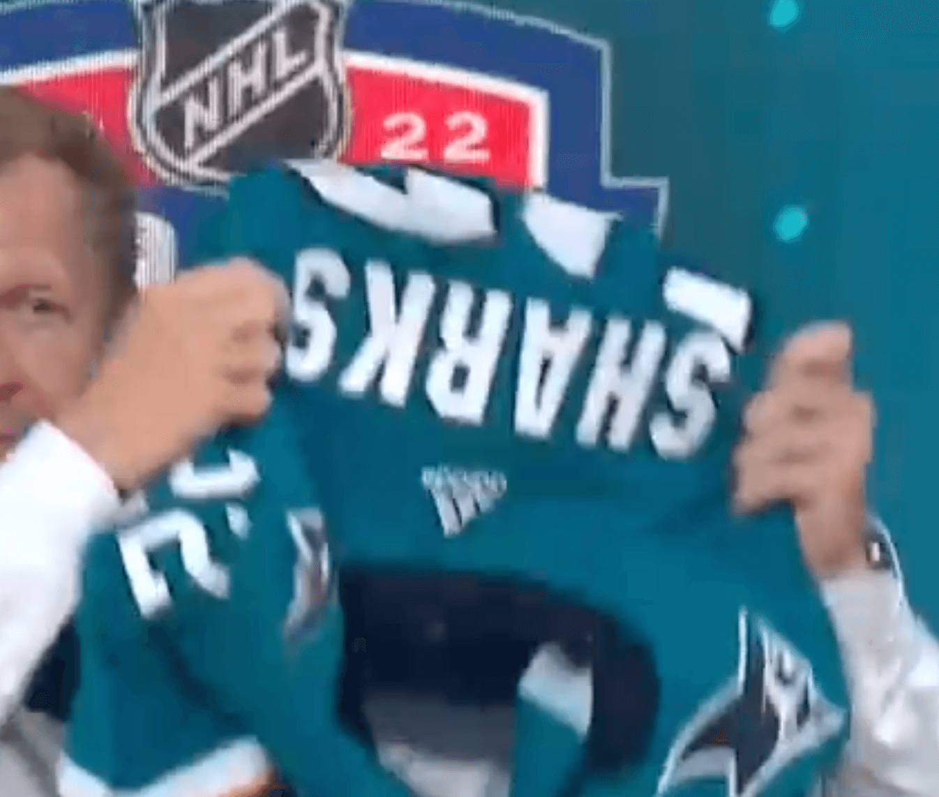
• At least one team — the Sharks — used TNOB instead of the standard NOB:
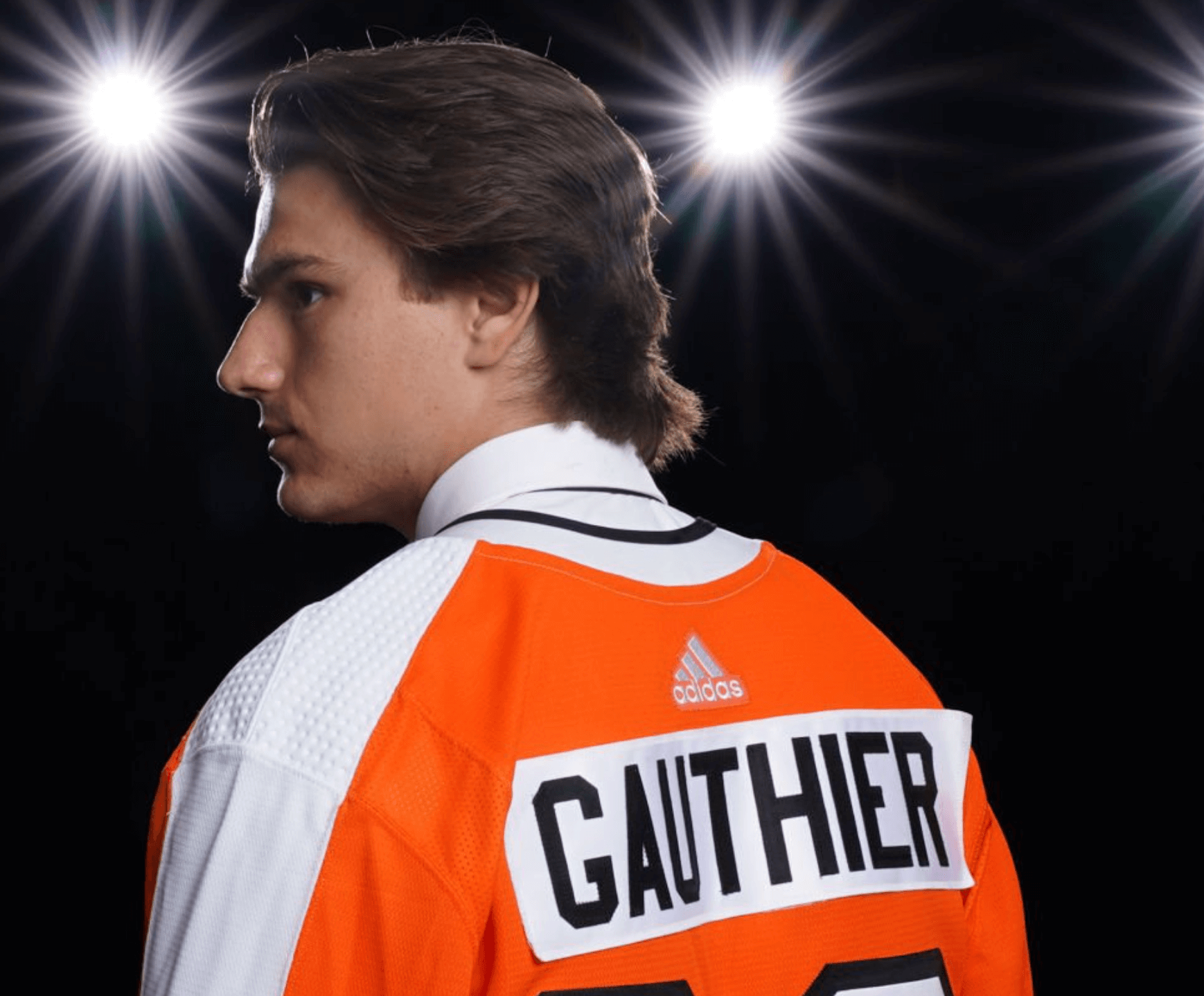
• Looks like the nameplate on Flyers first-rounder Cutter Gauthier’s jersey was applied pretty sloppily:
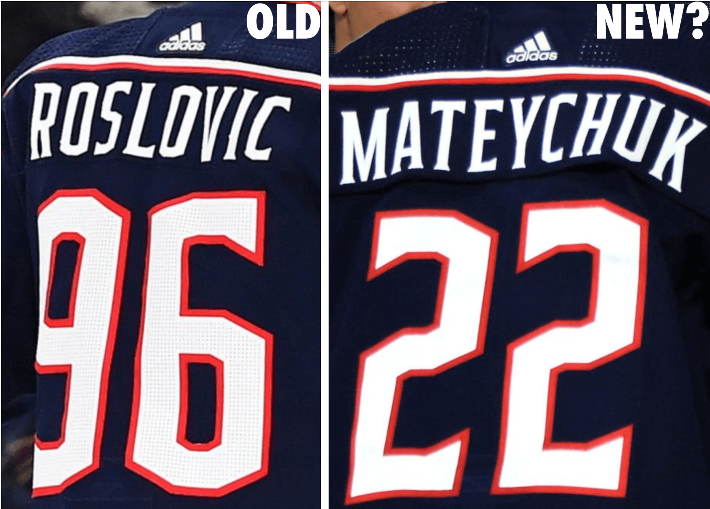
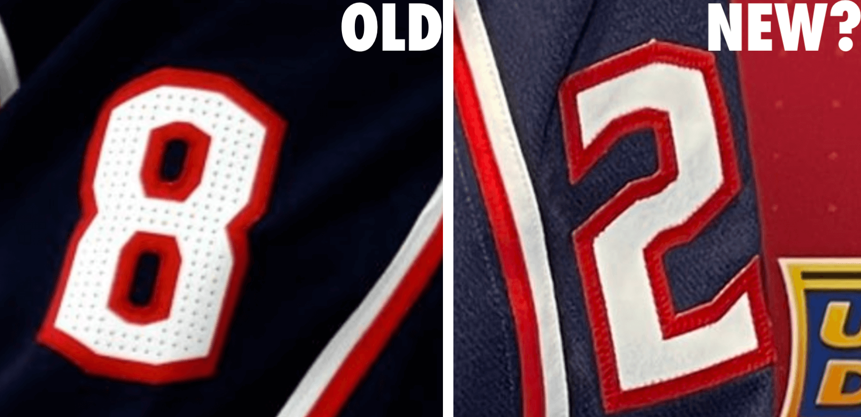
• It looks like the Blue Jackets might be eliminating the pinholes in their numerals, both on the back of the jersey and on the sleeves (or maybe they just didn’t bother with the pinholes for the draft jersey — we’ll have to wait and see). For the first pair of pics, you’ll definitely want to click to enlarge:
• Ducks draftee Nathan Gaucher had a draft-themed lining in his suit jacket:
• The Coyotes’ front office staff wore matching blue suits with red neckties (additional info here):

(My thanks to Michael Brighton, Colin Davis, Jase Greenberg, Craig Pritchard, Adam Minnick, and @_ynnhoJ for their contributions to this section.)
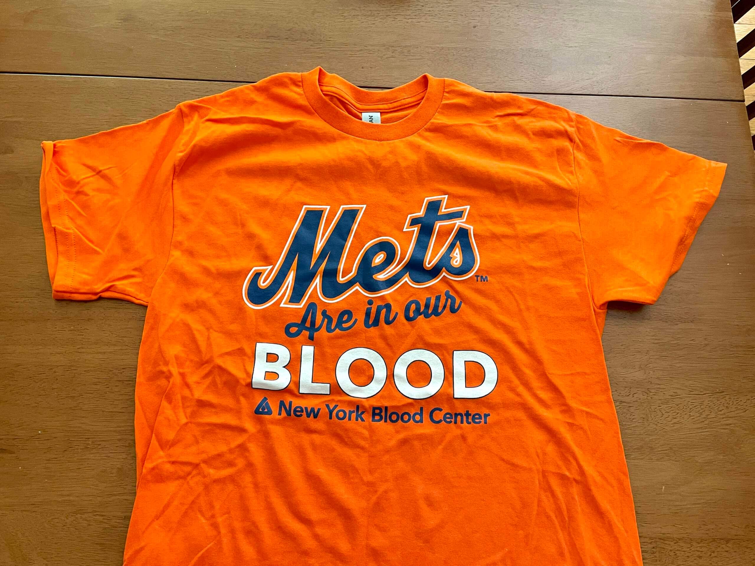
Freebie from an unlikely source: As many of you know, I regularly donate blood. I’ve been doing that for over 20 years now, but yesterday was different: They sent donors home with a free T-shirt. First time that’s ever happened!
There was only one design available (shown above). Not sure how that went over with the woman who was donating right after me — she was wearing a Yankees cap.
Bulletin reminder: For last week’s Bulletin column, I looked at the best throwback uni option with a non-primary helmet color for each NFC team. This week I’ve turned my attention to the AFC. My premium subscribers can read the AFC article here. If you haven’t yet subscribed, you can do that here (you’ll need a Facebook account in order to pay). Don’t have or want a Facebook account? Email me for workaround info.
Speaking of reminders:
• In case you missed it last week, Uni Watch is once again partnering with Grey Flannel Auctions to offer free, no-obligation appraisals of your sports memorabilia. Have a cool item and want to know what it’s worth, or maybe even want to put it up for auction? Get the full scoop here.
• I’m now accepting entries for a new design contest. The challenge is to create a set of MLB All-Star uniforms that don’t suck. Yes, of course it would be better for players to just wear their regular team uniforms, but Nike and MLB have abandoned that approach, so let’s see if we can do better than what they’ve come up with. Full details here.
The Ticker
By Anthony Emerson

Baseball News: Mets SS Francisco Lindor had some trouble putting on his oven mitt after reaching base during last night’s game (from Edward Lee Lauchlan). … Always fun to get a look at the prototype Marlins unis their draft picks wore to camp in 1992. … The Cardinals have unveiled a logo for Yadier Molina’s final season. It will appear on assorted merch. … Reds P Robert Dugger, making his 2022 big league debut last night after being called up from the minors, wore stirrups (from Kevin Cearfoss). … Although the Albuquerque Dukes no longer exist, their cartoon logo is still popular. Now the logo’s designer has been inducted into the Albuquerque Baseball Hall of Fame.
College Football News: It appears Texas is scrapping its TV numbers this season, if this promotional image is to be believed (thanks, Phil). … Ohio State groundskeepers have laid down new turf at Ohio Stadium (from Jason Hillyer).

Hockey News: The QMJHL’s Acadie-Bathurst Titan — yes, it’s a singular team name — have unveiled a 25th-anniversary logo (from Wade Heidt).

Pro Hoops News: Pro tennis star Nick Kyrgios was practicing in a Jayson Tatum Celtics jersey yesterday at Wimbledon. … The WNBA’s Indiana Fever split their home games between the Indiana Farmers Coliseum and the Gainsbridge Fieldhouse. Earlier this week while playing at the Coliseum, the Fever’s floor had the logo of the Fieldhouse.

Soccer News: Goal.com has a rundown of the some of the more prominent European clubs’ new kits (thanks, Phil). … Also from Phil, the Bundesliga’s official website has all Bundesliga teams’ new kits in this article. … The English women’s national team has asked Nike to switch their short color from white, due to concerns about visible menstrual blood for players on their period (from Trevor Williams and our own Jamie Rathjen). … New kit for English fourth-tier side Hartlepool United (from Ed Zelaski). … Manchester United vice-captain Bruno Fernandes will assume the No. 8 shirt this season, after having worn 18 for his first two and a half seasons at the club. Fernandes was unable to wear the No. 8, his preferred number, due to the presence of Juan Mata, who has recently departed the club (from Johnny Jatt).

Grab Bag: Here’s one writer’s picks for uni numbers from Philadelphia teams that should be retired. … Here’s an analysis of why the various Star Trek shows rotate their uniforms so much. … Cross-listed from the basketball section: Pro tennis star Nick Kyrgios was practicing in a Jayson Tatum Boston Celtics jersey yesterday at Wimbledon.
And that’ll do it for this week. Stay well, enjoy Phil’s weekend content, and I’ll see you back here on Monday. Peace. — Paul
The first Flyers pick also had a NNOB jersey
What makes Juraj Slafkovsky’s accent placement unusually positioned? It looks right above the middle of the letter…but I guess it falls right in the “hole” of the Y. Funny enough, when I hold down the Y on my iPhone to get the accent marks, I don’t even have his Y with an accent mark!
I just meant having it on the Y was unusual. I’ll rewrite that sentence.
There are likely exceptions, but it’s rare that a Czech or Slovak surname ending in “y” (especially -ský) DOESN’T have an acute accent over the letter! As a born Atlantan I no longer follow hockey, but wonder if Eastern European players are starting to insist more on the unfamiliar (to us) diacritics that so many of their names include.
Did know that — thanks for schooling me!
Funny enough, when I hold down the Y on my iPhone to get the accent marks, I don’t even have his Y with an accent mark!
You might need to program your iPhone to have a Slovak keyboard in order to get that specific character.
Yep, in Czech it’s not unusual or uncommon at all. The Y with the diacritical is just a letter of the alphabet, so it’s equivalent to commenting no how Greg Maddux gave us a look at the unusual letter X on his NOB.
My “unusual” letter-in-NOB dream is to see a Dutch player with the little I-nestled-in-J letter in his name. It’s common for Dutch folks to render that letter as Y when writing for non-Dutch speakers, so for example the cafe in my old Amsterdam neighborhood called it self Ijsbreker on the awning above the door but Ysbreker on its website.
The Seattle Kraken draft hat is saying that 2022 is the founding year of the team
The royal blue Oilers jersey does look great, but I did prefer their orange jersey, if only because the blue with orange accents felt derivative of the Islanders.
Additionally, I feel like to so many younger fans, they see that jersey and think of 4 first overall picks in 6 years, not 4 cups in 5 years. Yes, those 1980s oiler teams were great, but the 2010’s one were so historically bad.
I’m eager to see if the breezers’ striping is shaped like an inverted “Y”.
I think a great decision for the Oilers to go back to these royal blue and orange uniforms. Notable that the shade of orange is a bit different than the orange they have been wearing for the recent orange uniforms with navy trim.
A call out to all NHL California teams. These teams are high on the list for needing a uniform change and I am all for all of them to go back to original colour schemes:
-Kings back in purple/yellow
-Ducks back in eggplant/jade/silver
-Sharks back in the original uniforms. Drop the orange trim for silver.
Also a call out to the Original 6 Boston Bruins to embrace some tradition and consider going back to their original colour scheme for a regular alternate. Back in the brown and yellow a few times a season.
Agree 100% Would love to the see Bruins in brown, like a bear. Hard watch when they play the Pens. Plus they would be the only NHL with brown.
I’ll offer up Florida Panthers in the originals too. We can go on forever. I’ll stop here.
As a longtime Bruins fan, the brown just does not appeal to me whatsoever. The team was brown for a short period of time during the proto years of the NHL, when the sport barely resembled what it does today. The team has been black and gold for nearly a century at this point. I feel no connection whatsoever to the brown.
For some reason the Bruins (and to a lesser degree, the Maple Leafs) redesign their uniforms on a fairly recent basis. The other members of the Original Six recognize their charter status, and that is reflected in the unchanging character of their outfits. I was particularly concerned when the B’s dropped the gold socks. All that does is make them look even more like the Penguins.
Which is the logo creep, the Mets or New York Blood Center?
I wish the Mets would make some attempt to eradicate that stupid version of their wordmark. The letters are just not aligned in any aesthetic way. This one is more true to their original wordmark, though the orange border on the M used to have sharper edges:
link
^^^ What he said.
I never picked up on that before, so there are essentially two versions of the slanted wordmark? One where the M is slanted and one where the M remains normal but the rest of the wordmark is slanted?
The version you linked to is superior to either of the slanted versions.
Yes Greg. Remember the Mets changed their script in 1993 to add a swoosh tail, but they also altered the main script a bit too:
link
What a mistake. They corrected the mistake in 1995 and restored the original script. However, I guess in a effort to highlight the return of the original uniform script which is slanted up, they created a slanted wordmark and slapped it all over the 1995 Yearbook. maybe they thought it would sell merch? Unfortunately, whoever created this wordmark botched it up and we have lived with it since. At one point the uniforms started mimicing the botched wordmark in what Paul called the “Wilpon Script.”
link
Anybody still interested should also read this Uni Watch classic post:
link
Same for the Nats. In 2005, the team reconstructed the old expansion-Senators curly W, which had some obvious drafting errors that persisted on the new logo. In 2011, the team updated its curly W to fix those mid-1960s drafting errors, and it’s a much improved logo. It’s even marginally less Walgreensy! But the team permits the old curly W to persist in all kinds of branded uses, and has never updated their caps to feature the “new” curly W that’s now been the team’s logo longer than the 2005 curly W was.
Re that OSU turf replacement video, any idea why the “O” was removed last? Is there something different about that piece or is it just some silly “respect for the O” thing?
I know they sold sections of the terf (link) so maybe that piece was especially valuable like the NY logo when the old Yankee Stadium was torn down and they removed it last to preserve it for transplant?
So, on that Twitter photo that had the batting jersey that looked like a “Franken-jersey”. Does anyone have a clearer image? Or possibly and answer to why the Marlins would even throw something like that out there?
Should be mentioned that in addition to no sleeve numbers for Texas, they also got rid of the Longhorn logo on the collar.
My dad has donated blood for as long as I can remember. On rare occasion, he has been given a t-shirt, but never anything like the one you got. Usually something like this: link
He (and my grandfather) also used to get pins (link) when they reached certain amounts donated.
—————————————————-
Also, last night was not Robert Dugger’s debut (link), although it was nice to see the stirrups!
If the Coyotes brass wanted to dress in sync, why not do it team colors?
As for the Oilers, why can’t they let it sink in what the fans want? It’s like if Coca-Cola tried to keep swapping in New Coke every few years.
Now that the Oilers seem to have come full circle to their glory days uniforms, I wish the Islanders would reverse the colours of the white and orange stripes on their blue to match those of their dynasty teams. The orange was on the hem when they won their Cups; for some reason, in recent years they’ve gone with white on the hem, a call back to their early-years struggles, and sporting what I think is unattractive look.