
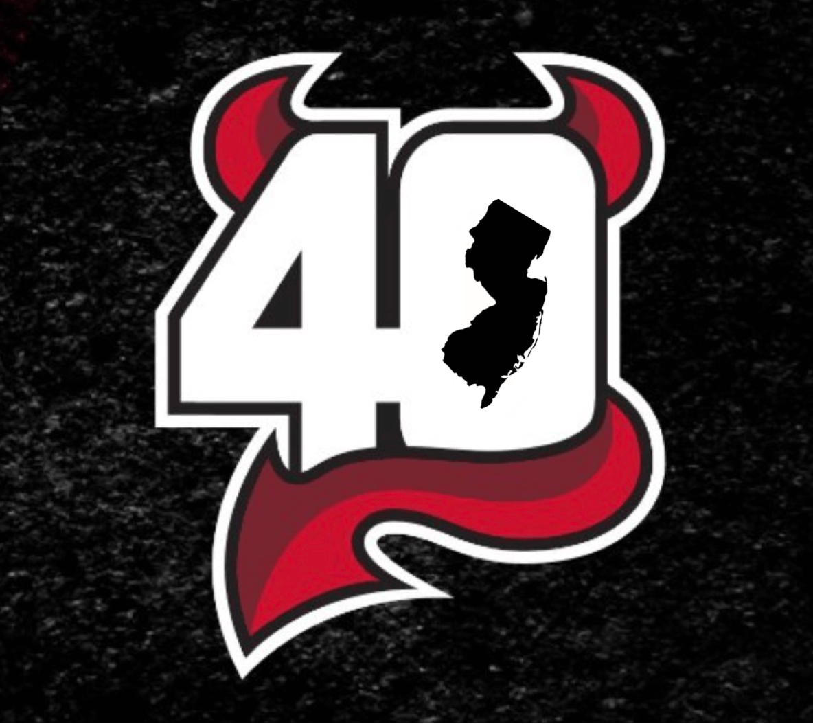
The Devils yesterday unveiled a new 40th-anniversary logo. No word yet on whether it will be worn as a jersey patch and/or helmet decal.
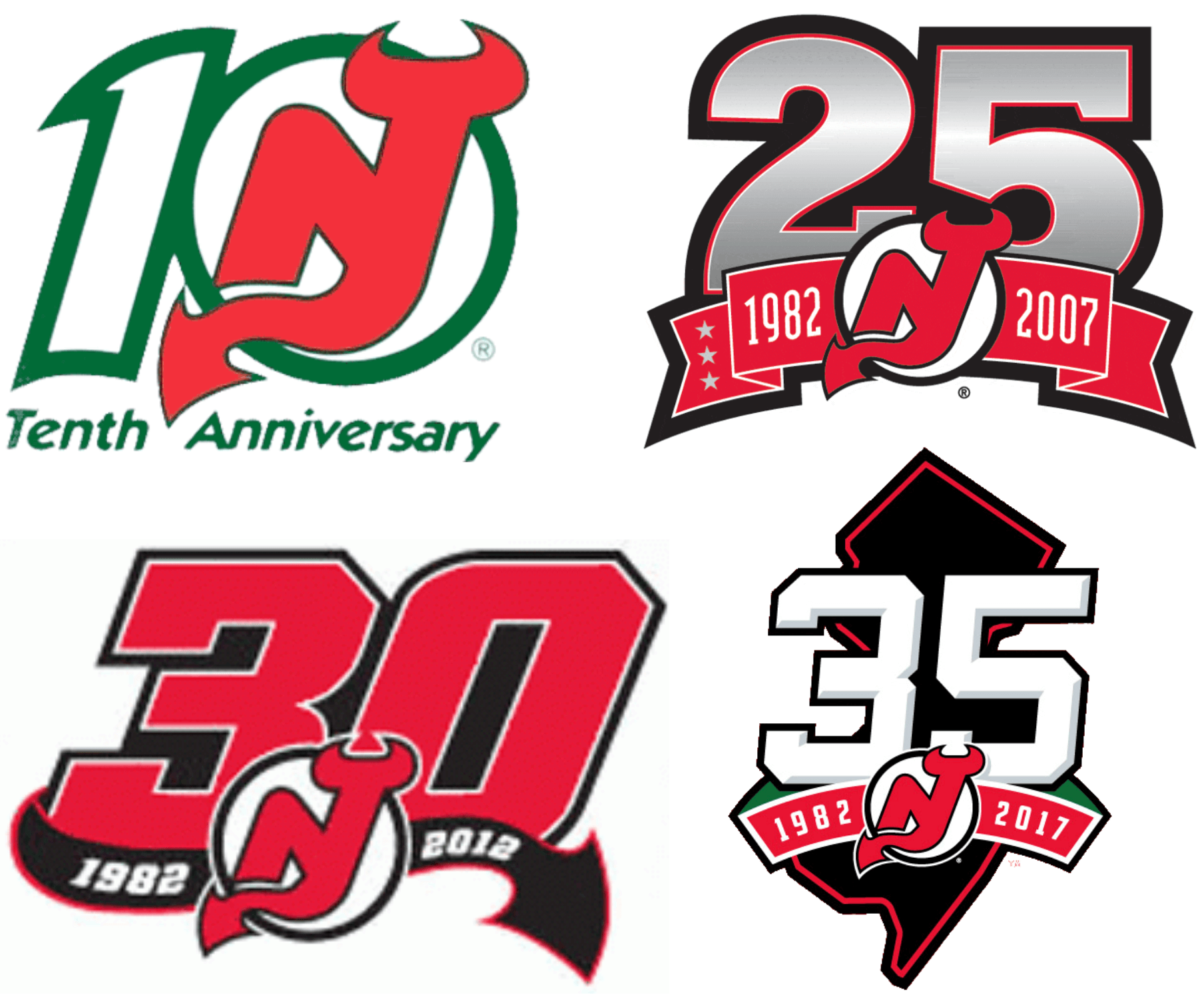
The Devils have been treating themselves to a lot of anniversary logos in recent years — too many, in my opinion:
After the logo was released yesterday, I saw someone on Twitter mention that the negative space in the “0” should have been shaped like New Jersey. That was an intriguing idea, so I decided to try it:
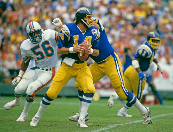
ITEM! New Bulletin article: For last week’s Bulletin column, I looked at the best throwback uni option with a non-primary helmet color for each NFC team. This week I’ve turned my attention to the AFC.
My premium subscribers can read the article here. If you haven’t yet subscribed, you can do that here (you’ll need a Facebook account in order to pay). Don’t have or want a Facebook account? Email me for workaround info. Thanks!
Click to enlarge
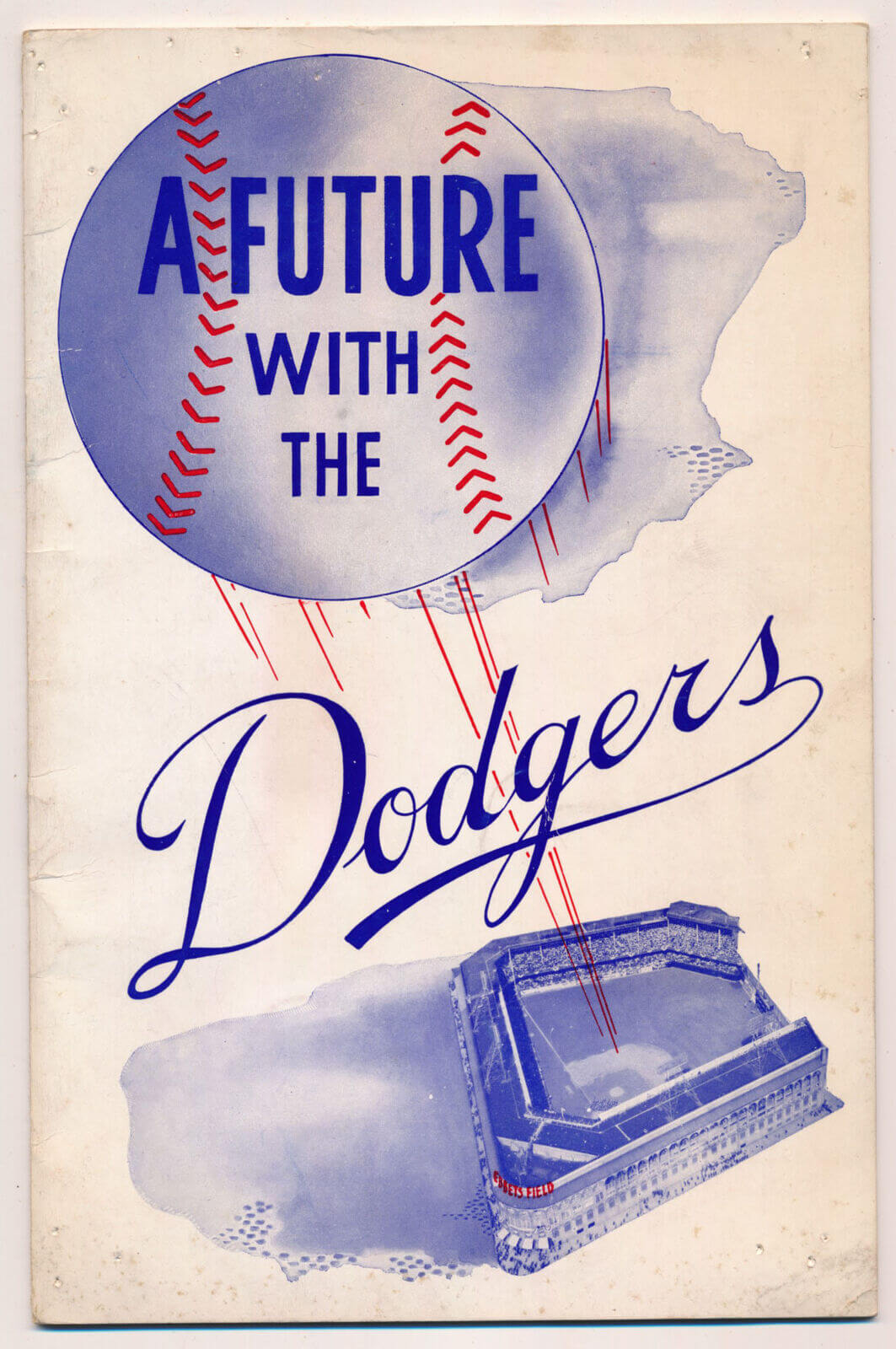
Come play for us: Three years ago I wrote about an MLB recruiting booklet from 1963. Now I’ve learned about a similar item, published by the Brooklyn Dodgers in 1949, called A Future with the Dodgers. It’s full of faaaascinating info on why young ballplayers should aim toward a career in baseball in general and a roster spot with the Dodgers in particular. (My favorite section is labeled, “And Excellent Food.”)
I don’t have a copy of this publication (vintage copies are kinda pricey), but there’s a thorough page-by-page breakdown of it on the Night Owl Cards blog. Recommended!
A few reminders: In case you missed it last week, Uni Watch is once again partnering with Grey Flannel Auctions to offer free, no-obligation appraisals of your sports memorabilia. Have a cool item and want to know what it’s worth, or maybe even want to put it up for auction? Get the full scoop here.
Also: I’m now accepting entries for a new design contest. The challenge is to create a set of MLB All-Star uniforms that don’t suck. Yes, of course it would be better for players to just wear their regular team uniforms, but Nike and MLB have abandoned that approach, so let’s see if we can do better than what they’ve come up with. Full details here.
By Paul

Baseball News: The collegiate Northwoods League’s Kenosha Kingfish will wear Chewbacca-themed jerseys this Sunday for Star Wars Night (from Geoff Poole). … New logo, apparently, for the World Baseball Classic (from @jose89). … Here are the High-A Jersey Shore BlueClaws’ Bruce Springsteen appreciation jerseys for this year. They’ll be wearing them on July 23 (from Dan Cichalski). … Buttonwood Brewery in Cranston, R.I., has a “Pilsners” cap that’s clearly patterned after the Dodgers’ logo (from Andy Chalifour). … New “Earth Green” jerseys for the Rakuten Eagles (from Jeremy Brahm).
College Football News: Virginia Tech is removing the center striping from its helmet. Andrew Cosentino is pleased: “They added it in 2016 and it just never felt right.” … Gross: Part of NC State’s stadium will now be named after a bank (from TurnoverBone).


Basketball News: Sue Bird and Diana Taurasi will be on the cover of the NBA 2K23 WNBA video game (thanks, Jamie).
Soccer News: New home kit for the Premier League’s AFC Bournemouth (from @rindle247). … New sleeve advertiser for Manchester United (thanks, Anthony). … The rest of these are from Ed Zelaski: New home kit for second-tier French side Guingamp. … New kits for Polish side Stal Rzeszów. … New away shirt for the Premier League’s West Ham. … New home shirt for Serie A side Sassuolo. … New home shirt for German side Osnabrück. … New home shirts for Danish club Brøndby’s men’s and women’s teams. … New kits for Turkish side Trabzonspor.

Grab Bag: This is pretty cool: The medal design for the upcoming World Athletics Championships Oregon22 feature a tree ring design (from Jeremy Brahm). … This is pretty great: A letter carrier in Chicago is getting some well-deserved attention for his snappy attire (big thanks to Jonathan Safron). … The Milwaukee Police Department apparently doesn’t know the difference between “oriented” and “orientated” (from @mikeobs).
Totally the Binghamton devils logo replaced by the 40
that was my first reaction when i saw it. totally the same thing.
Make the negative space a little wider, add blue lines, a center ice line, and a faceoff circle. It’s best as a rink and almost already one
The Postal Service letter carrier in Chicago in the summer heat and humidity wearing that…..I’m sweating just reading it. Enjoyed the Bulletin. Finding out KC had a football team in 1924 was interesting!
I loved the “A Future With the Dodgers” booklet. I think the player being handed a jersey in the first photo is Chuck Conners, who went on to TV fame as The Rifleman. Conners was in the Dodgers camp in 1948 and played in Montreal in ‘48 and ‘49. He had a cup of coffee with the Dodgers in ‘49.
I agree that the anniversary logo is very non-Devils-like, and the part that seems most odd to me is the positioning of the tail. Rather than having it sort of thrust out like in the primary, they’ve used it to curl around the 40 protectively. It’s almost catlike or even vaguely seductive. What secret is this devil hiding?
These may have been covered previously, but along with the Devils I noticed new anniversary logos for the Isles (50) and Canes (25) with the NHL sched announcements.
Isles’ anniversary logo was revealed in March:
link
Canes in February:
link.
The Dodgers have an alternate logo of their name script and a ball with red speed lines (which I always thought looked amateurish). Is this book the origin of that logo idea, even though the ball is moving in a different direction?
The Dodgers pamphlet is great! In my youth in the 1970s, I remember reading the autobiography of Brooks Robinson. The MLB draft didn’t start until 1965; prior to that, players started out as free agents and could sign with the team of their choice. (Of course, the reserve clause meant that once they made that choice, they were stuck with it.) Brooks told of considering offers from a couple other teams as well as Baltimore — maybe the Reds and/or the Cardinals were involved, but I don’t remember the specifics.
So the Dodgers pamphlet clearly recalls this era when teams were promoting themselves to star prospects just as much as the players were trying to join the teams.
I read that book many times and it was some time before I realized that players were no longer making the choices Robinson and his peers had made.
Is it odd that despite living in the Raleigh area for nearly 30 years, I’ve never heard of this bank that bought naming rights? Nor care about it?
Love and pride for my home state aside, the southern half of New Jersey is Flyers country, the team doesn’t represent the state as a whole. Never really did. We look at it more as a North Jersey team than a New Jersey team. And the design is meh, not NHL-level.
Love the pamphlet for:
– two versions of Satin uniforms (white and blue)
– Burt Shotton wearing his “managerial” uniform (Bow Tie and Hat)
– Pitching “Strings” to train pitchers on the strike zone (the stone age implementation of the inaccurate box we now see on our TV’s while watching baseball games)
The collection of anniversary logos best serves to demonstrate how the Devils should have never switched from green to black.