
For all photos, click to enlarge
When I’m editing Brinke Guthrie’s weekly “Collector’s Corner” column, every now and then I spot something that I decide to bid on myself instead of including in the column. That was the case with the amazing set of NFL rejection letters that I wrote about last year (in case you missed that, look here and here), and it’s also the case with the subject of today’s entry: a 44-page booklet published by the baseball commissioner’s office in 1963, called Baseball: The Game – The Career – The Opportunity. The opening price on eBay was $5; I was the only bidder.
The booklet’s basic premise is that baseball is a great career avenue for a young man to pursue. For example:
• In other industries, young employees have to spend years working their way up the ladder. But in baseball, youth is prized and rewarded!
• In other industries, young men are rarely if ever sent on business trips and don’t earn enough money to travel much on their own. But in baseball, you travel all the time — with room and board paid for!
• In other industries, you’re just a faceless cog in a machine, with the individual rarely getting much recognition. But in baseball, individuals are showered with praise, and even applause from large crowds of people, all the time!
And so on. You’d think all of this would be pretty obvious, right? But while it may seem odd to see the baseball “industry” competing for bodies in the labor market, it’s worth remembering that the players’ union didn’t yet exist in 1963 (it was founded three years later, in ’66). Except for big stars, player salaries weren’t that different from basic white collar salaries, which is why most players had — and needed — off-season jobs. So while there were certainly plenty of kids in 1963 who dreamed of growing up to become ballplayers, there were probably lots of high school players who were taking a good, hard look at whether professional baseball was their smartest career option.
The booklet begins with a note from then-commissioner Ford Frick, whose idea of a recruiting pitch was apparently to mimic the look of an elderly attorney who’d just downed a spoonful of cod liver oil:

Yessir, you can see why your average 18-year-old would find ol’ Ford super-enticing. His little introductory essay begins, “Of all the phrases that have been used to describe the United States, none has lasted as long, or proved as accurate, as ‘The Land of Opportunity.'” And then it’s pretty much off to the races from there.
It’s not clear who wrote the rest of the booklet, as no authorship or byline is indicated. The editor is listed as Frank Slocum, a former Brooklyn Dodgers exec who later worked in the commissioner’s office and also wrote several books about baseball cards, so he may have written the text. It’s also not clear how the booklet was distributed — maybe through high school guidance counselors? Through American Legion baseball programs? Some other way?
As you can see at the top of today’s entry, team logos have been scrubbed from the photo on the cover. I’m not sure why, because plenty of team logos appear in the interior photos. Let’s take a look at some of those shots:
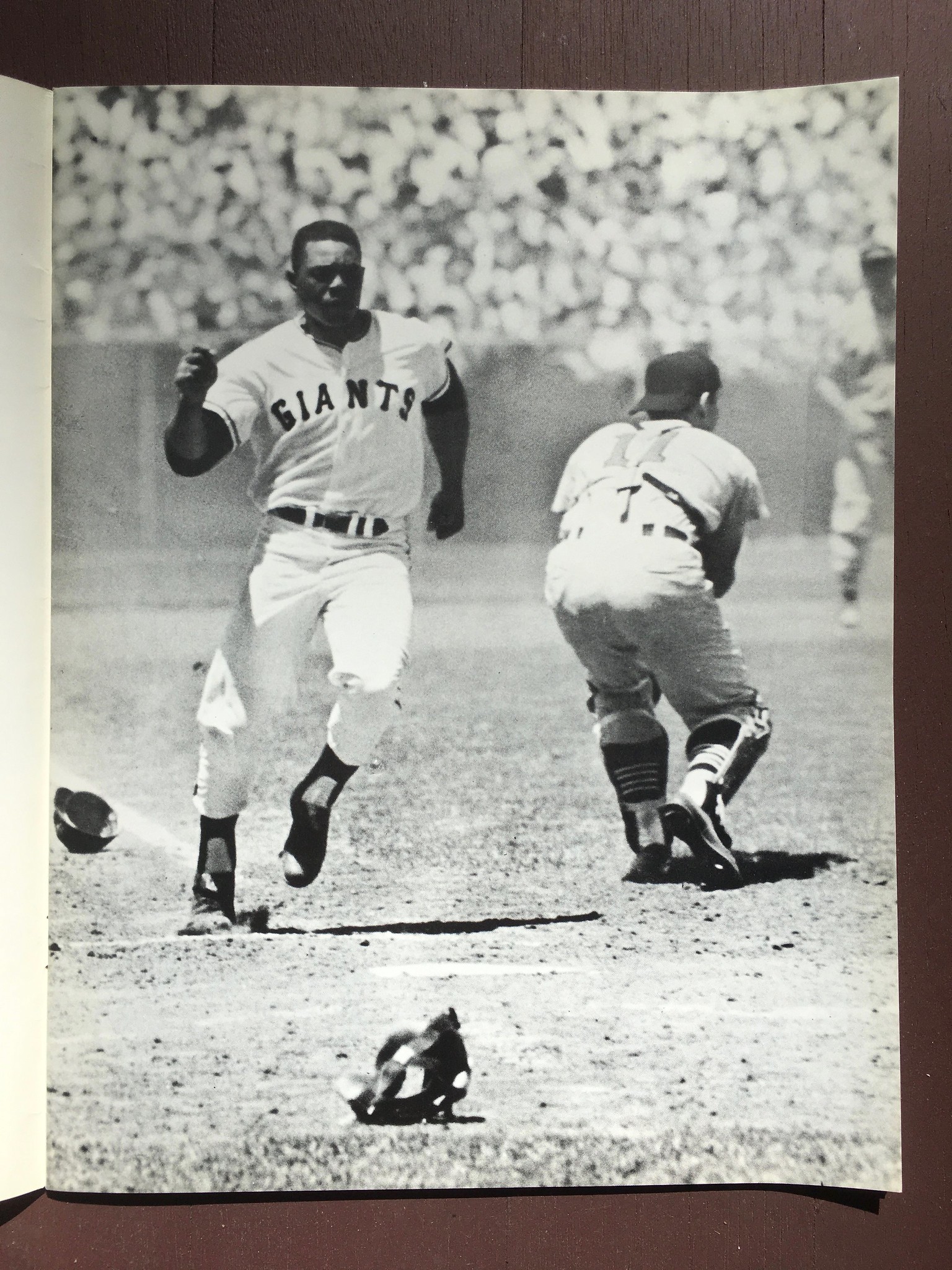
• Early on there are two Giants photos — one showing their home uni and the other showing the road. Both are virtually unchanged today (although the team veered off into other designs before returning to this one, obviously):

• Later on, there’s a photo of a very young Tigers catcher Bill Freehan getting tutelage from former catcher Rick Ferrell — with the two of them wearing caps with completely different old English Ds:

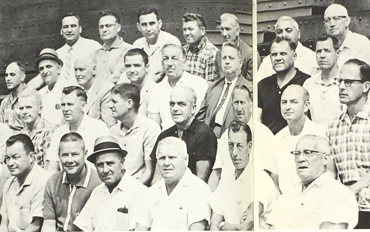
• In order to be a baseball scout in 1963, you apparently had to be a middle-aged white guy who looked like your face had been lifted from the FBI most-wanted posters down at the Post Office:
• Here’s a great one — then-Mets pitcher and future pitching coach/manager Roger Craig looking a bit like LBJ at his cattle ranch:

• Who’s that in the Minnesota Gophers varsity jacket? None other than Cleveland infielder Jerry Kindall, who was taking advantage of baseball’s education-assistance scholarship program at the time:

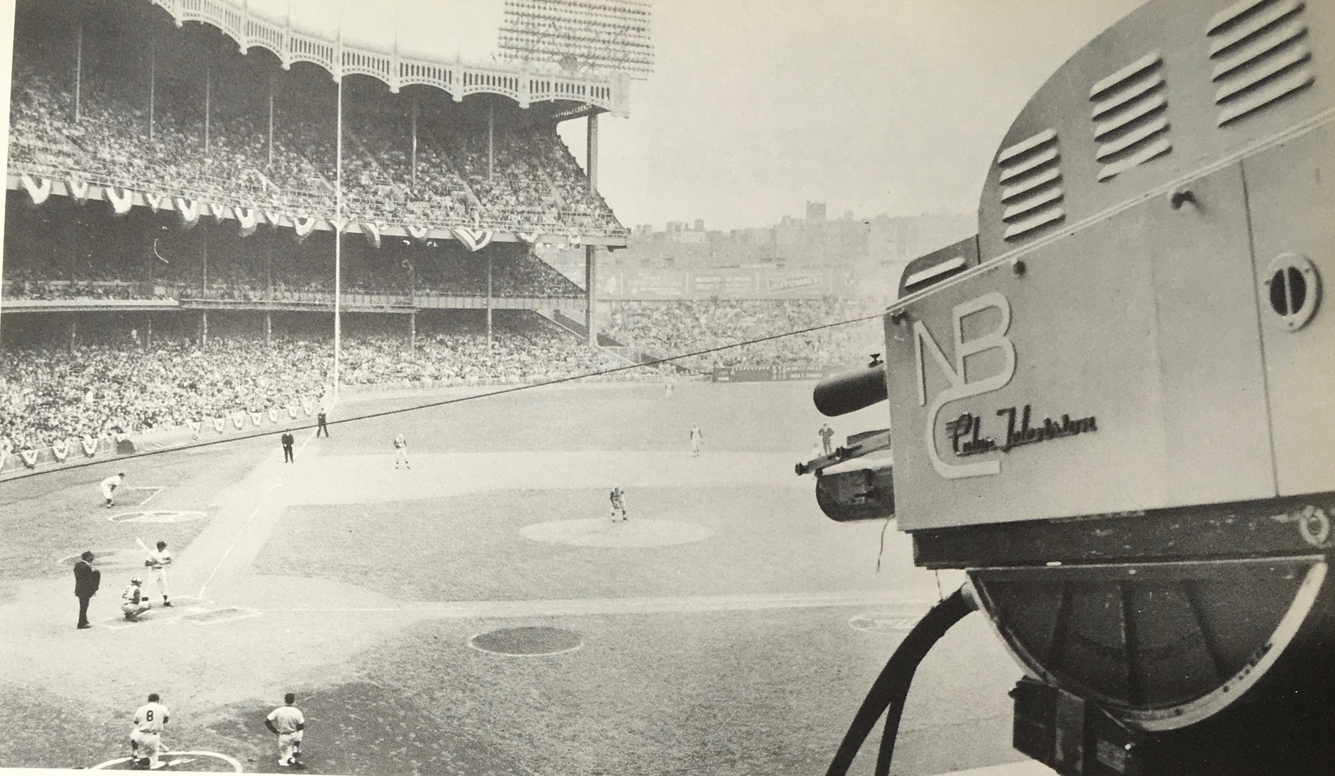
• Love this shot of an “NBC Color Television” camera shooting a game at the old Yankee Stadium. Dig that logo!
• Speaking of the Yankees, here’s Joe D imparting pearls of wisdom to four young players during spring training. Note that they’re all wearing road uniforms — not sure if that was common for the Yanks during spring training at the time:

As for the text, it’s organized into short chapters that try to make the case that baseball is fun (“One of the problems faced by young men who are about to embark on their careers is whether or not they will like their work, but in baseball, that doubt is eliminated”), good for the ego (“[T]here can be no dispute that there are some fields of endeavor in which respect comes more easily than in others — baseball is such a field”), a good gateway to higher education (“First of all, there is the availability of free time during the off-season”), a good way to see the world (“Travelling with a baseball club also gives a young man the opportunity of meeting new friends,” but no mention of uncomfortable minor league bus rides), and a pathway to financial security.
The financial chapter is the most interesting, for several reasons. First, check out the opening page:

Faaaascinating that they choose 50-cent pieces — a denomination that has now faded almost completely from public use — as the symbol of wealth. The JFK half-dollar didn’t yet exist (it would be introduced in 1964), so they used then-current Franklin halves, along with some walking Liberty halves (they were used from 1916-47 but were apparently still circulating when the booklet was published in ’63).
The chapter’s text consists of two pages about baseball’s “benefit plan” (health insurance for an active player and his family would cost “less than $350 a year”):

And then there’s the doozy — a chart that shows the pension plan that baseball was offering at the time, broken down into monthly payments based on years of service and the player’s age when he began drawing on the plan. Again, this was before the advent of the union, so the benefits are pretty low. Then again, most non-union jobs today don’t offer any pension:

The booklet then moves on to a pair of chapters featuring testimonials. The first one features several pages’ worth of then-current ballplayers (all of them white except for Ernie Banks) explaining why they love baseball. This is followed by a few pages’ worth of former players (all of them white except for — of course — Jackie) explaining why baseball was good for their lives and careers.
The booklet then concludes, rather bizarrely, with a quote from former president Herbert Hoover:

Hoover was indeed a baseball fan, but he was also a deeply unpopular president who was largely blamed for the Great Depression (still a relatively fresh memory for many people in 1963). Why would you put a quote from him — or, really, from any politician — on your career guide?
In any case, it’s a fascinating artifact. Given all the recent reports about today’s kids preferring soccer over baseball, maybe they should bring this one back into print! You see the entire publication here.
(Big thanks to Brinke Guthrie for making today’s entry possible.)

Click to enlarge
In-Sanny-ty!: Reader/illustrator Gene Sanny recently whipped up this great rendering of 1960s AFL quarterbacks. Feels a lot like the Jack Davis illos that Phil recently featured on the site, right?
“Just in case anyone asks, I know Len Dawson was right-handed,” says Gene. “The reference photo I used showed him with the ball switched over to the left hand and pointing, and I loved the pointing so I used it. It might be Photoshop though — that pointer hand looks a little sketchy.”
Interesting. Keep up the good work, Gene!
Click to enlarge
Collector’s Corner
By Brinke Guthrie
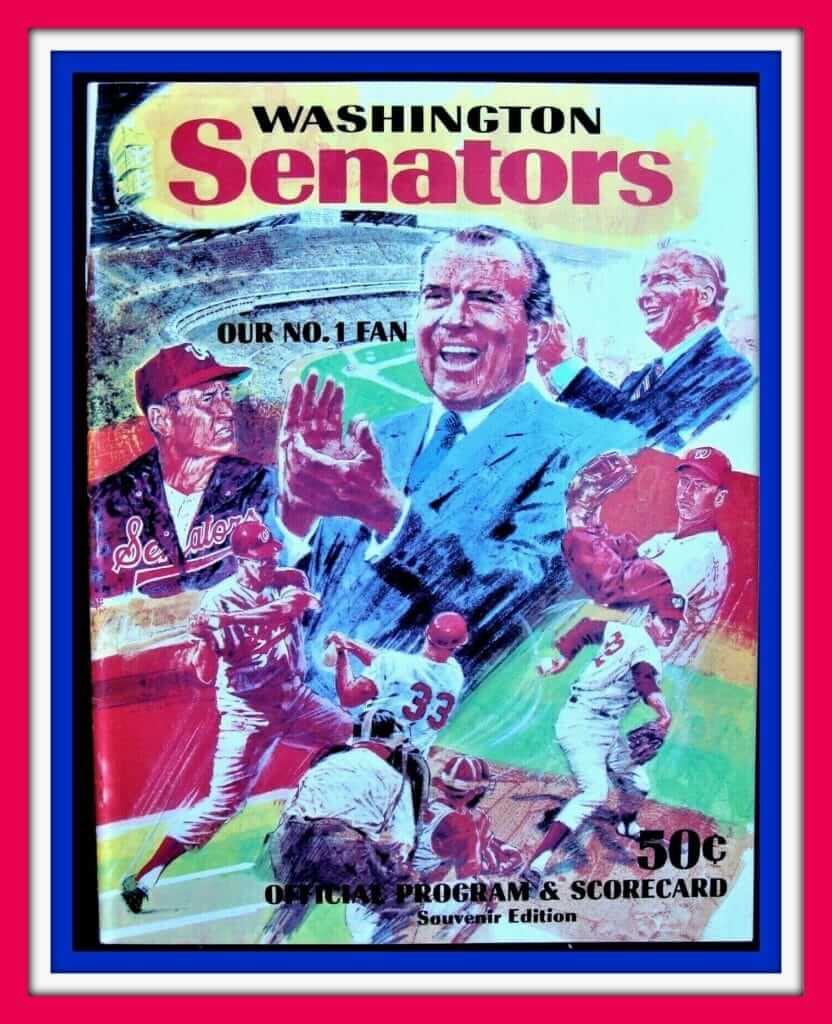
Kids, ya might not know this, but the present-day Texas Rangers used to play in Washington, DC, where they were known as the Washington Senators. They moved to Texas for the 1972 season. Here’s a program from July 1970 for a Brewers/Sens game, and the cover art features none other than then-president Richard Milhous Nixon, also known as “Our No. 1 Fan.” Others included on the cover include Sens manager Ted Williams, slugger Frank Howard, pitchers Darold Knowles and Dick Bosman, and owner Bob Short.
Now for the rest of this week’s picks:
• Here’s a great-looking 1980s NFL school binder. Ah, look at those helmets.
• Speaking of NFL helmets, here they are again, but this time on some school book covers. Now, am I reading this auction right — you get 12 pounds’ worth of book covers here? At least shipping is free.
• If you want still more NFL book covers, check out this 1965 design. Look at those helmets and logos! You can almost hear The Voice, John Facenda, in the background. “Third and goal as Bart Starr brings his team up to the line of scrimmage, the Colts bracing for one final offensive surge…”
• This is a ceramic replica of the RCA Dome, the Colts’ first stadium in Indianapolis. Sponsored by Marsh grocery store, (official supermarket of the Colts, don’tcha know) it’s missing a goalpost but still lights up. My sole memory of the Hoosier Dome was a January 1987 Genesis concert when it was about ten below and we had to walk several blocks from the parking lot to the stadium!
• Here’s a kinda strange-looking 1970s NFL mug. It’s got all the team fonts of the period, but what’s up with that strange red mug handle?
• This NFL Alumni polo shirt comes in Steelers colors and trim.
• How about a set of 26 1970s MLB pencils? As the package says, “Collect ’em!” “Swap ’em!” “Use ’em!” (No “Sharpen ’em!”?)
• Just listen, baby: How ’bout this 1970s Raiders stereo helmet!
• This Eagles sticker has the eagle with a football resting in the top of the “g.” The seller says it’s from “1950s-1962,” which looks right according to SportsLogos.net’s Eagles page.
• These 1960s NFL shield “cloth” stickers illustrate how the logo made use of pinstriping during that time.
Seen an item on eBay that would be good for Collector’s Corner? Send any submissions here.
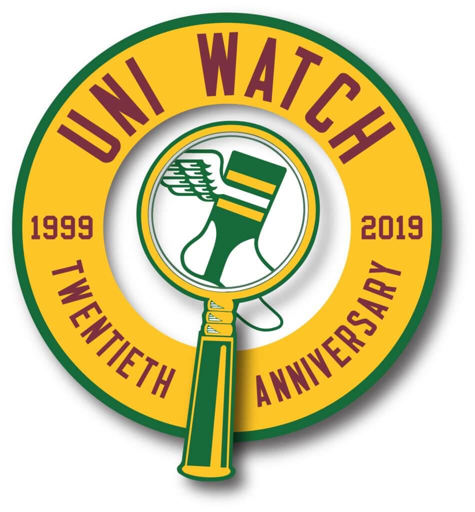
ITEM! Uni-versary party update/countdown: We’re now just four days away from June 29, when Uni Watch 20th-anniversary parties will be happening literally around the world (additional info here). A few notes on that:
• June 29 will be a uni-notable day, especially here in NYC. The Yankees and Red Sox will be playing the first of their two games in London, with both teams wearing their home whites, and the Mets will have an extensive pregame salute to their 1969 championship team (which unfortunately means some key friends of Uni Watch will be at the ballpark instead of at the party, but whaddaya gonna do), and I’m assuming that surviving team members who’ll be on hand for the festivities will be wearing ’69 replica jerseys. I’ll make sure those games are on the TVs at the 773 Lounge, where we’ll be having our flagship Brooklyn party, and you might want to have them on the tube at the satellite parties as well.
• Speaking of the Brooklyn gathering: I was initially hoping to have lots of special out-of-town guests on hand, but the satellite parties have made that a harder sell (why pay for airfare and hotel when you can just go to a gathering in your own city?). But of course Phil and I will both be there, and so will Ticker assistant Jamie Rathjen, who compiles the Tickers that appear on Mondays. Jamie’s been part of the Uni Watch team for close to two years now, but we’ve never met in person, so I’m really looking forward to that. He and his twin brother, Nate, are making the trip up from Virginia.
• Feel free to post photos from your gathering on Twitter, instagram, or Facebook with hashtag #UniWatch20. Be sure to mention your city in the post, so we know which party you’re at!
• If you’re not into social media, you can also email photos to Brinke Guthrie, who has offered to post people’s photos to the Uni Watch Facebook page.
• Finally, due to circumstances beyond our control, the party that had been scheduled for Green Bay has been cancelled. Sorry about that.
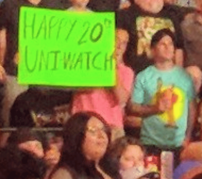
ITEM! WWE mystery solved: Yesterday I mentioned that someone was spotted making a shout-out to Uni Watch at Sunday night’s WWE event in Tacoma, and I invited that person to get in touch with me. Sure enough, last night I received the following email:
My name is Andy Schmidt, a 29-year-old from Yakima, Washington, and I was the guy at the wrestling show last night. I’ve been a Uni Watcher since 2010. I always loved seeing the odd quirks in uniforms and how they reflect a certain city, time, era, or event. BFBS is by far my favorite and least favorite quirk at the same time, as the Oregon “ninja duck” uniforms rank amongst my favorites and the Mets’ black uniforms rank almost dead last.
My road to a little Uni Watch representation has taken an odd path. As my wife and I traveled to various baseball stadiums (Cleveland, Pittsburgh, Cooperstown, Yankee Stadium, Citi Field, and Fenway this year alone), I badly wanted to reach out when we were in New York, so I could at least buy a drink for the man who has entertained me through most of the last decade — but I didn’t, because I felt it was out of bounds for someone you had never met in person before.
Yakima almost perfectly triangulates the cities of Spokane, Portland, and Seattle, so I was disappointed that no one from those towns wanted to host a Uni Watch party, which I would have happily driven to and attended. So when I got a nice seat the wrestling show, I knew I had a chance to represent and reach out to the people who entertain me.
I actually had signs for both Uni Watch and YouTuber Brian Zane who has the channel Wrestling with Wregret. I was thrilled to get a retweet of my signs from both you and Mr. Zane (who also mentioned my sign in his review of the event).
I was actually disappointed that no one at the show said anything to me about the signs, just so we could talk and connect. Being a part of this internet community has been awesome, but it’s a passion that so few people really get or understand. I’ve worn my Uni Watch shirt at all nine big league stadiums I’ve been to and have been disappointed to have only one person acknowledge it. To have even a minute to talk about the local team switching to matte batting helmets or 3D helmet logos would’ve made my travels quite a bit more fun. I would just ask the community to come up and say something if you see another one of us in the wild.
Thank you for all the entertainment,
Andrew Jay Schmidt
Oh, man — how awesome is that? I love this story! It’s gestures like Andy’s that make the Uni Watch community so special. And let’s take his request to heart — if you see another Uni Watcher in the wild, step up and say hi. #comm-uni-ty

ITEM! Raffle ticket mystery solved: Back in the blog’s first year, I would occasionally raffle off cool stuff, just like I do now. A reader named Ben Thoma thought it would be fun for me to have a graphic to use when running these raffles, so he made a little Uni Watch raffle ticket image and sent it to me. That was in May of 2007 — more than 12 years ago. I’ve been using that graphic ever since.
More than a decade went by without anyone asking if there was any significance to the number on the ticket — 0202401 (a question that, frankly, had never occurred to me). But then, in the past few months, three different readers asked me about it. I told them I had no idea.
Then reader/commenter jaweh (I don’t know his/her real name) noticed that the same ticket number appears on the cover of a popular religious tract:
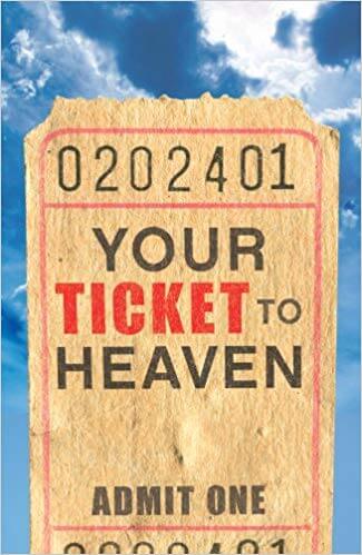
Interesting, right? I hadn’t heard from Ben Thoma, the guy who designed our little graphic, in many years, but I looked up the last email address I had for him and sent him a note (with the subject line “blast from the past”). I attached a copy of the graphic and a link to the tract, explained the situation, and asked, “Did you choose the number because you’re a fan of that book? Some other reason? Details, please!”
To my very pleasant surprise, Ben wrote back, as follows:
Hey Paul,
Thanks for emailing — this really is a blast from the past! If you had emailed me and just asked, “Hey, what was going on with that ticket image you sent me?,” I probably would have been at a complete loss for what you were referencing. So, the visual went a long way!
Anyway, I wish that I had a great story for an answer to your question. Most likely, the reason is that the Uni Watch ticket image and that book’s image were both taken from the same stock image. That’s my first best guess. A more interesting story will be that I did actually build that number in and they stole it for their book cover. I give this a less-than-50% chance of being correct, but I’m intrigued enough to research a bit when I get home. Off the top of my head, I can’t think of what significance the number may have to me personally, as it doesn’t include the jersey numbers of any of my favorite players and has too many digits to be a date (which is something I would have done). It also doesn’t correspond to any numbers on a phone keypad (because of the zeroes), which is another thing I would have done.
I’ll see if I can open the original file to even see if they were numbers I typed in in the first place (and will also check a few ticket stubs I have on my wall to see if I went that route).
Hmmmmm…
BenP.S. While I don’t always read the blog anymore, I do keep up with y’all on Twitter and continue to appreciate the obsessive study.
I loved that this was as much of a mystery to Ben as it was to the rest of us. A few days went by (turns out he was traveling with his family), and then I heard back from him yesterday:
I was able to open the file this afternoon… and it’s far less interesting than we could have hoped. 😕 It was simply a cheap stock image that I modified and the numbers were already part of the image. Sorry it’s not more interesting.
So there you go — Ben and the religious tract’s cover designer both used the same stock ticket stub image. Now if we only knew who designed the stock image, and why they used that number. Hmmmmm…..

Click to enlarge
Chain-stitch update/reminder: We’ve had a recent spike in orders for the beautiful chain-stitched patches that master embroiderer Amy Bengtson makes for us, so I’ve ordered a new batch from her. They’ve now arrived and are ready to ship.
The patches are gorgeous and measure about 6″ by 6″ — perfect for sewing onto a jacket or sweater, or just for displaying. Amy makes these by hand, so no two are exactly the same. If you want one, the price, including shipping, is $35 (80% of which goes to Amy). You can send payment via Venmo (use @paul-lukas-2 as the payee), Zelle (plukas64@gmail.com), or Cash App (plukas64@gmail.com). To use Apple Pay or a paper check, shoot me a note and I’ll fill you in. Once you pay, let me know your shipping address. Thanks!
The Ticker
By Alex Hider

Baseball News: The Yankees’ Players Weekend jerseys for the past two years have been dark navy, so it’s not such a big deal that this year’s edition will reportedly be BFBS. The bigger news from that article is this quote: “The home team [for the Yanks’ Players Weekend series against the Dodgers] got to pick between white and black uniforms, and the Dodgers opted for white [which is why the Yanks are wearing black].” So are all of this year’s PW games going to be black vs. white? Hmmm. … The Mets are changing the address of Citi Field to 41 Seaver Way and have a logo to commemorate the occasion (from Steven Dodell). … The Triple-A Norfolk Tides wore Norfolk Tars throwback uniforms last night (from @b1205). … Jamie Dismuke, the hitting coach for the Class-A Winston-Salem Dash, had an badly lopsided NOB during a recent game (from Jeff Manter). … The Ogden Raptors, a Dodgers’ short-season Rookie ball team, wore Expos-inspired fauxbacks over the weekend (from Brice Wallace). … The Somerset Patriots of the unaffiliated Atlantic League wore pink jerseys for a belated Mother’s Day and to honor women in sports on Saturday (from John Cerone). … The St. Paul Saints and the Texas AirHogs played black-on-black last night, and the Saints were wearing military appreciation uniforms to boot (from Casey Common). … Why lug a bat around when you can carry it in your pants? (From Brice Wallace.) … American Legion teams in New Hampshire are wearing a patch this season to honor the organization’s 100th anniversary. “It features the outline of rocky outcropping once known as the Old Man of the Mountain, which collapsed in 2003 but somehow remains a state symbol,” says Tris Wykes.

Football News: Reader David Kendrick reports that he was unable to purchase a custom Archie Manning No. 8 Saints jersey on the NFL Shop website. I decided to try it and was also denied. David ended up going FiNOB, but does anyone know why the NFL wouldn’t allow a Saints Manning jersey? … Here’s how the CFB 150 patch will look on Louisville’s jerseys this year (from Andrew Wiemels).

Hockey News: New mask for Rangers G Igor Shesterkin (from Al N. Kreit). … It seems the Islanders and Canadiens each sent one of their draft picks an older Reebok jersey this weekend (from John Muir). … The ECHL’s Board of Governors, copycatting Major League Baseball, has approved a proposal to make February “Players’ Month,” with players wearing nickNOBs for home games that month (from Denny Majeske). … Jeff S., a lifelong Whalers fan, recently got himself a license plate with his favorite team’s logo.

Basketball News: Will the Thunder wear these orange jerseys on the court this year? It’s unconfirmed and we don’t know the source, but those photos showed up online yesterday (from Jedd). … According to this shot from BYU’s arena, the West Coast Conference has a new logo (from Sam Schroeder). … New floor for Colorado Christian University (from Landon Troka). … Looks like the NBA used the wrong league logo on the Rookie of the Year trophy (great catch by @marcomanipon).

Soccer News: Mali has two players named Adama Traoré at the Africa Cup of Nations. One wears No. 14 and “Traore.A” as his NOB, while the other wears No. 21 and is apparently known for now as Adama Noss, so his NOB is “Noss.” Also of note, “Traore.A” subbed in for “Noss” during a game in which both scored (from our own Jamie Rathjen). … As they’ve done for the past two years, Italian club Fiorentina unveiled four solid-color change kits that represent the different neighborhoods of Florence (from Josh Hinton and Ed Zelaski). … Italian club U.S. Salernitana 1919 has a new logo and jersey to celebrate their 100th anniversary (from Ed Zelaski). … Also from Ed: New uniforms and kit maker for APOEL FC, a club from Cyprus. … This Twitter thread has all the West Virginia women’s new looks (from P Maramba). … Ryan Keberly found this US women’s national soccer team cereal box from 1999 at a store in West Branch, Mich. … Red Star is asking fans to vote on this season’s jersey font (from Ed Zelaski).

Grab Bag: Reader Ryan Keberly found these vintage bowling patches at a shop in West Branch, Mich. If that patch on the right looks familiar, it is! Jason Collins found the same patch in his grandmother’s collection last year! … Not sports-related, but similar to Paul’s old Permanent Record project: A plumber stumbled upon 13 wallets hidden in an Illinois high school’s bathroom wall, and there’s some great stuff in there (from Tyler Kulasza). … Chris Flinn’s local Burger King did away with its boring old door handles and turned them into spatulas. … Pizza Hut is reviving its vintage logo. … Speaking of vintage logos, beer brands — Miller Lite, Tecate, Narragansett — are all dipping back into their old logos and can designs.
The NFL (not sure about other leagues) has long had a policy that you can’t customize a jersey with the name and number of a player if they retired from that team. Looks like if you try to order a Manning 8 jersey for the Vikings it will let you do, that so perhaps Manning officially retired with the Saints?
link
What is the reasoning behind that?
Paul – might be licensing and revenue sharing – the NFLPA’s website (link) notes that “Retired players are not part of the bargaining unit and, therefore, the NFL Management Council is not legally obligated to bargain in good faith over any improvements in already-earned player pension benefits.”
The same issue happens to come up in sports video games – when companies started to do ‘throwback teams’ they had to negotiate with each former player individually, or any player that voluntarily opted out of the licensing deal (link)
Ah, interesting. Thank you!
Same thing happened when I tried to get an AJ Pierzynski White Sox jersey made. No dice.
says this right on the NFL shop under product details
“Player names cannot be printed on the team’s jersey from which they retired”
they have a “retried player” line
link
His last team was the Vikings in 1984.
Maybe he signed a one day contract to retire as a Saint? I’ve long thought that licensing issues were why players really did that.
Forgot to note, Archie wore #4 for the Vikings. The punter Greg Coleman has #8.
I’d so wear a Greg Coleman jersey!
That may be because Manning wore number 4 with the Vikings (punter Greg Coleman had 8)
Ugh sorry — didn’t see later replies
“My sole memory of the Hoosier Dome was a January 1987 Genesis concert when it was about ten below and we had to walk several blocks from the parking lot to the stadium!”
I was at that concert too! It was my senior year in high school and a bunch of us went.
Invisible Touch tour?
…not their finest hour, in my opinion.
I was at the concert at Exhibition Stadium in Toronto where they filmed the Invisible Touch video. I thought the tour was pretty good. I seem to recall a lot of people not happy that they focused on 80s Genesis and didn’t play much Peter Gabriel era.
I think Invisible Touch was the group’s undisputed masterpiece. It’s an epic meditation on intangibility. At the same time, it deepens and enriches the meaning of the preceding three albums.
@Daniel / Patrick….how do you feel about Huey Lewis
Their early work was a little too new wave for my tastes…
I wondered how long it would take for somebody to pick up on that reference. :-)
Sat Jan 24, 1987. I just looked it up- it was -3 for the low. Brutal. Working in radio, tix were free. But it was still cold!
Not only is Jamie Dismuke’s name noticeably off-center, they used a W for the M.
I wonder if it’s off-center because the person sewing it on was unconsciously thinking of Negro League legend link and expecting to put a S on the end, which would balance it much better.
I love that people seem to be more upset that the Yankees are going to wear black for Players Weekend, than they are going to have the Nike symbol front-and-center next season – or is that not “common knowledge” yet?
Been watching a lot of MLB lately, and noticed most managers don’t bother to wear jerseys. Looked up the rule, and apparently, they don’t have to, but base coaches do (Rule 5.03(b)).
Anyone ever remember a base coach running afoul of that rule?
Also, Rule 3.09 – Undue Commercialization — Is there such a thing as “due” commercialization?
Also, Rule 3.09 – Undue Commercialization — Is there such a thing as “due” commercialization?
Apparently that would be when a game takes place overseas. ;)
If you look at the photo of Len Dawson, you’ll see the Vikings player jersey numbers are backwards.
That is just a very weird pic. The link labels it “mixed media” so it’s obviously an artwork, not a snapshot. Everything else about Dawson looks right; helmet logo and numerals look right and the AFL patch is link. But look at his fingers on the laces; that’s how a QB holds the ball in his throwing hand. The center snaps the ball to put the laces near the fingers of the QB’s top hand, which if he’s right-handed is his right hand. If Dawson had set up or was scrambling with both hands on the ball and pulled his right hand off of it to point (which as a former QB I can’t imagine doing), his left hand wouldn’t be there; it’d be away from the laces. The only reason to hold it like that in his left hand is if he’s going to throw it with his left hand. Although it’s not impossible or unheard-of, I’m not aware that Dawson made a left-handed throw in Super Bowl IV. Did he?
Just a weird, weird pic.
Just curious…did anyone listen to the Broadway Joe interview on Howard Stern? He talks about the origin of his white Jets shoes. Basically he said he liked the feel of his broken-in shoes (which were black) and he did not want to get rid of the shoes. So he taped them (with white tape) to extend the life of his shoes. After a while, he found that the team replaced his taped shoes with a new white pair. Listen to the interview for the full story. It was interesting.
The AFL QB illustration is fantastic. However this is the uni-watch site, and I don’t remember the Oilers having a royal blue uniform and helmet.
It’s not royal blue… It’s on par with the blue of the chargers in the pic. Things get a little darker in photos
Gene, congrats on yet another masterpiece. It screamed Jack Davis to me at first glance.
Nice to see Frank Tripucka representing the Broncos. The pickings were pretty slim for the AFL’s worst team seeing as Steve Tensi was the only other choice.
Oh yeah definitely… Davis is a hero of mine
Can we put this on a T-shirt? Great job Gene. I’d be even more inclined to buy one if you put Lamonica on a shirt by himself.
What about Marlin the Magician? Miami moves him outside but he played QB in Denver.
Gene, hypothetically, what would you charge for a USFL kickers/punters illustration?
Well, there’d be 19 of them all crammed into one drawing…. Based on the time involved I think I’d be ok at $150. The AFL one I was offered$100 for and that’s about what I was thinking on it.
The Washington Federals alone went through five placekickers in 1983 alone and then three more in 1984… never mind three punters in ‘83, the holdover into ‘84 changed his jersey number and they went through two more punters after that, that’s a total of fourteen guys wearing green and black. That’s not an illustration. It’s a cathedral ceiling.
Great content today. As a kid in the early 80’s, like many I’m sure, I used to draw all kinds of MLB, NFL, etc. logos, jerseys, players and such. Wish I still had them because there were over a thousand and I’m not exaggerating. I ALWAYS used black for the Yankees, Tigers, and Bears. I think I new they were all very dark blue but on TV they came across as black. My magic marker packs never came with navy/midnight blue but I don’t think I’d have used it anyway. Many of you will probably cringe but I still consider the Yanks and Tigers as black teams. And I still kind of waffle on the Bears.
Speaking of the New Era CFL jerseys, link I love, love, LOVE how the Argos use the Columbia Blue numbers on their jerseys, especially the home Navy, but why did they get rid of the sleeve stripes? Put sleeve stripes back on those jerseys, and paiir them with white pants, and you have the best look in the CFL!
Found the source for that stock ticket photo:
link
Good work! Pretty funny that it’s still out there, a dozen years later.
thanks to one and all for taking the time to tack down the 0202401. I am one of the three, and this post has made my day.
“The booklet then moves on to a pair of chapters featuring testimonials. The first one features several pages’ worth of then-current ballplayers (all of them white) explaining why they love baseball.”
The first testimonial by a then-current player was from Ernie Banks.
Oops, missed that — my bad. Will adjust text pronto. Thanks for the catch!
Surprised no one mentioned that the CWS game last night was Michigan in throwbacks and Vandy in flag desecration. Will be interesting to see what each team wears tonight in Game 2.
link
Well, they’ve both worn those uniforms quite a bit over the past few weeks. Is it noteworthy that they wore them again last night? Maybe it is — I confess that I don’t have a good feel for the CWS, or college baseball in general. As I mentioned a few days ago, people seem to be paying much closer attention to it this year compared to past seasons.
How can I connect with the 3 other San Diego folks hoping to celebrate Uni Watch’s anniversary?
Contact party coordinator JohnMark Fisher — he’ll put you in touch with them.
JohnMark Fisher
Re: the Manning jersey. I wanted to order a Curt Flood Cardinals jersey a few years ago and the MLB site said I could only get a personalized jersey with names of players who were currently active members of the MLBPA. I went ahead and filled in FLOOD 21 on the order form anyway — and they sent it!
Unfortunately the NFL site will disable its own submit buttons if you fail to comply.
Proofreading: Unless I’m missing something such that one of the people with Joe DiMaggio is a coach or something similar isn’t he imparting wisdom to four young players?
Also, I’m guessing that the team logos on the front cover were scrubbed so as to not imply, or cause anyone to infer, that the book was about careers in baseball with any one particular team. Just trying to keep it generic since the booklet would be placed in many markets around the country. Once one was perusing the inside of the booklet the focus would be on the information with it more than obvious that it was about MLB as a whole and the photographs (with team logos shown) that accompanied the information were of visual interest but secondary in nature to the information conveyed via text.
Yes, four. Fixed.
Chris Flinn’s local Burger King did away with its boring old door handles and turned them into spatulas. … Pizza Hut is reviving its vintage logo. … Speaking of vintage logos, beer brands — Miller Lite, Tecate, Narragansett — are all dipping back into their old logos and can designs.
My local BK has the spatula door handles too. Pretty sure they all do, and I approve wholeheartedly.
Now Pizza Hut needs to bring back the checkered tablecloths and high quality pizza…
I have to admit the Miller Lite throwbacks have tickled my “Less Filling! Tastes Great!” fancy. If only Natural Light will bring back its logo from when they were “the beer with the taste for food.”
link
A Dairy Queen near me in Oklahoma City uses spoons as door handles.
+100 on the Pizza Hut comments!
I wish Miller Lite would bring back the “Tastes great, less filling!” commercials. Maybe bring a more recent crop of ex-jocks onto the set.
Regarding the shot of an “NBC Color Television” camera shooting a game at the old Yankee Stadium… I assumed that most TV programs – including baseball games – were still broadcast in B&W.
However, by 1963 the only network actively pushing color programming was NBC, which had 179 affiliates broadcasting in color by February of 1961. NBC “color days,” which started in November of 1960, saw the bulk of an entire day’s worth of programming broadcast in color. The camera pictured was simply part of NBC’s ongoing foray into color TV.
Of course the true “color television breakthrough” started in 1965.
I’d LOVE to see some TV footage of MLB games from 1960-1965.
Lee
PS – This is some high quality & enjoyable content today!
I understand where Andy Schmidt is coming from, leaving NY now and the whole week I was here I thought about hitting Paul up, but it seemed weird and stalky. Anyway for what it’s worth, first time here, I loved it. Have to come back.
I recall seeing a few years back posts from an artist that did drawings of women wearing hockey sweaters or baseball jerseys & stirrups. I can’t remember his name but his website had atomic in the title somewhere. The art was neo-pinup style, for lack of a better term. Ring a bell with anyone?
link
Yes! Thank you, Jim. It’s been a while.
That’s a particularly older Habs jersey for Rafaël Harvey-Pinard, since it has the two-color Edge V-neck, and “NHL” on the shield instead of “LNH”.
With the Tour de France starting in 12 days I was curious if anyone would like to team up to possibly put together a decent team kit preview? I don’t really know how to go about it, but would like to see some representation of one of the world’s biggest sporting events even if it is fairly “Euro-centric” if you will.