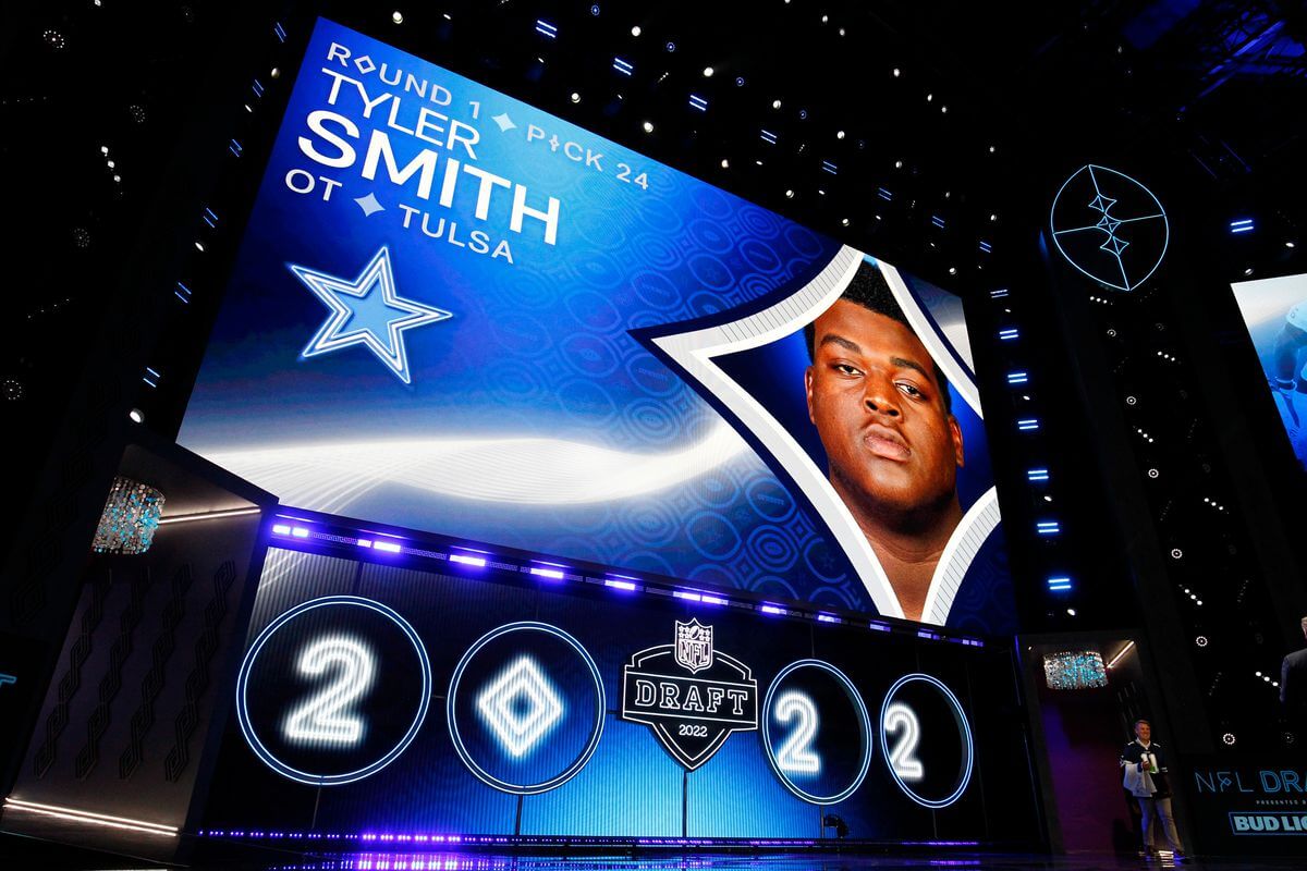
Click to enlarge
This has been a surprisingly uni-uneventful week for the NFL. Usually we see lots of unveilings and news in the days leading up to the draft, but this year we just had the 49ers’ tweaks. Yesterday afternoon Phil asked me if I thought there would be any uni news at the draft itself (I said no), and I could almost feel how hungry he was for some sort of NFL uni morsel.
As it turns out, there was a fun uni-related development at the draft last night, but not in the traditional sense. It came when the Cowboys drafted Tulsa offensive lineman Tyler Smith with the 24th pick. Why is that uni-notable? Because the Cowboys already have have a starting offensive lineman named Tyron Smith, setting up a possible double-FNOB situation on the team’s offensive line.
I’m trying to think of the last time we had NFL players with FNOB — seems like it’s been a while. (Anyone..?) And I’m pretty sure having two of them on the same offensive line would be unprecedented.
And wait, it gets better! Look at the third letter of each Smith’s name: TyLer and TyRon. They really need to play Tyler at left tackle and Tyron at right tackle. Unfortunately, that’s apparently not the plan for now, but it’s still early days — a lot can happen between now and the start of the season.
Other notes from the draft:
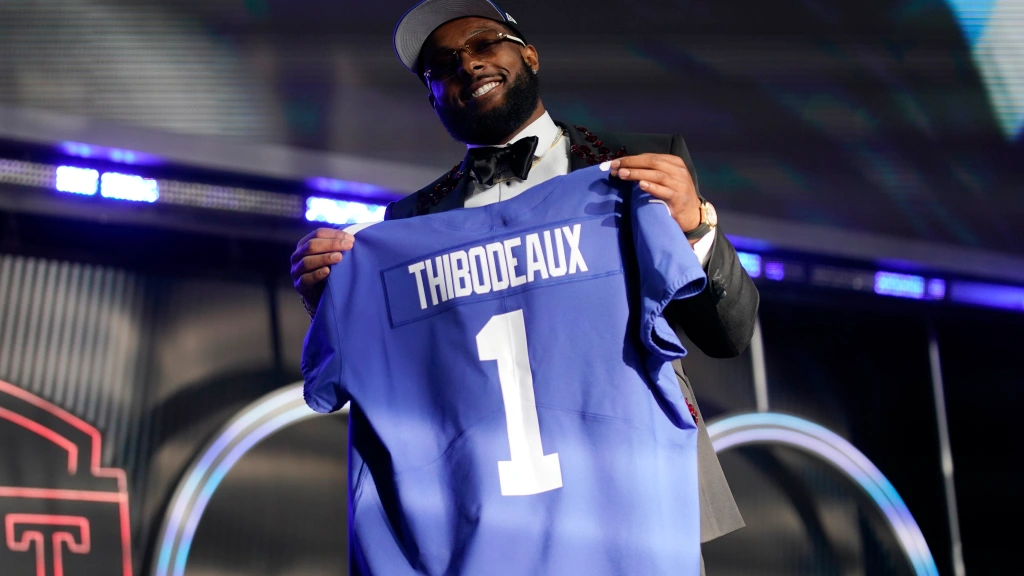
• Looks like they used compressed lettering for Giants draft pick Kayvon Thibodeaux’s NOB:
• I was surprised to see commish Roger Goodell going without a necktie:
Aside from 2020, when he famously hosted the draft from his basement due to the pandemic, I think this may be the first time Goodell has gone open-collared.
• Although I didn’t see this myself and couldn’t find a screen shot of it anywhere, I’m told that ESPN inexplicably had a graphic showing a Steelers helmet with a grey facemask.
• Ice Cube got the crowd worked up while wearing a Raiders jersey:
• Here’s the annual mandatory story about how they letter up the onstage jeseys so quickly.
• Here’s a short but informative article about the caps that the draftees wear onstage. Interesting note: After the player leaves the stage, his cap “is taken away so it can be chopped up and its pieces used in collector’s edition football cards.”
(Thanks to Phil for the cap article.)
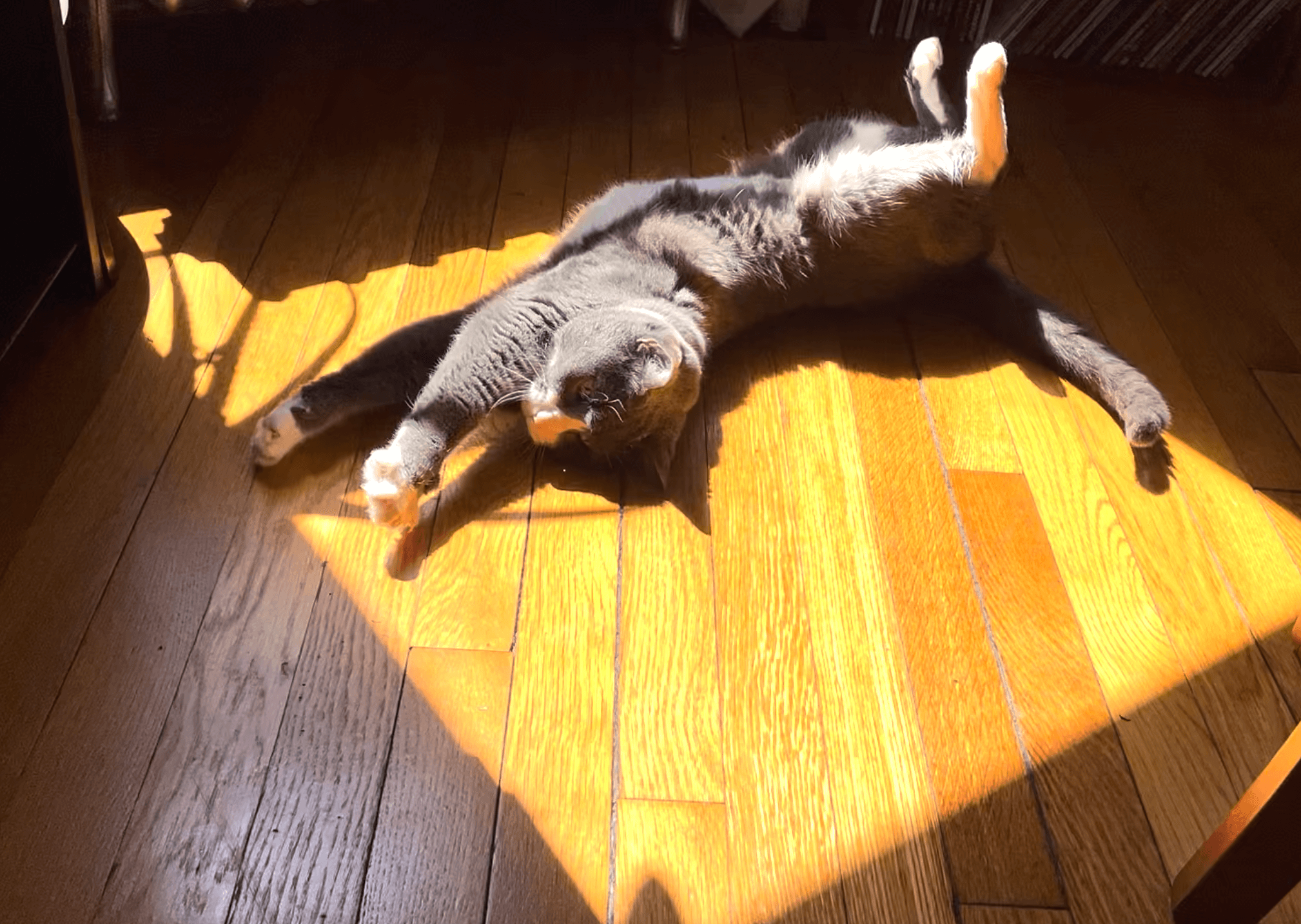
Click to enlarge
Birthday girl: Uni Watch girl mascot Caitlin turns 17 (!) tomorrow. Despite her advanced age and a recent bout of pancreatitis, she’s still pretty frisky and endlessly kitten-ish. The photo above, which I took yesterday afternoon, captures her goofball spirit nicely.
Caitlin loooooves laying down in the sun. Here’s a short video, also from yesterday, showing her asleep in the sun while the wind blows the branches outside our window:
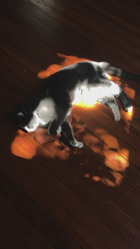
I know she won’t live forever, even though her youthful character sometimes makes it seem that way. I feel so lucky to have had her in my life for so long — happy almost-birthday, cutie!
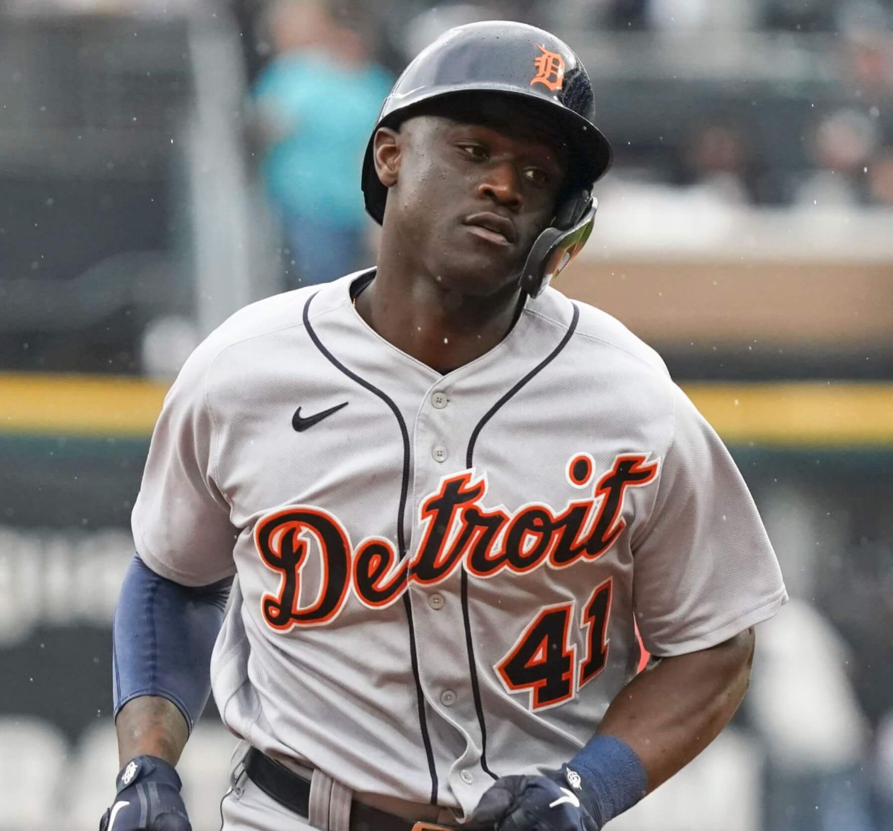
Power Rankings reminder: In case you missed it, my latest Bulletin article is a worst-to-first Uni Watch Power Rankings assessment of MLB road uniforms. My premium subscribers can check it out here. If you haven’t yet subscribed, you can do that here (you’ll need a Facebook account in order to pay). Don’t have or want a Facebook account? Email me for workaround info. Thanks!
Click to enlarge
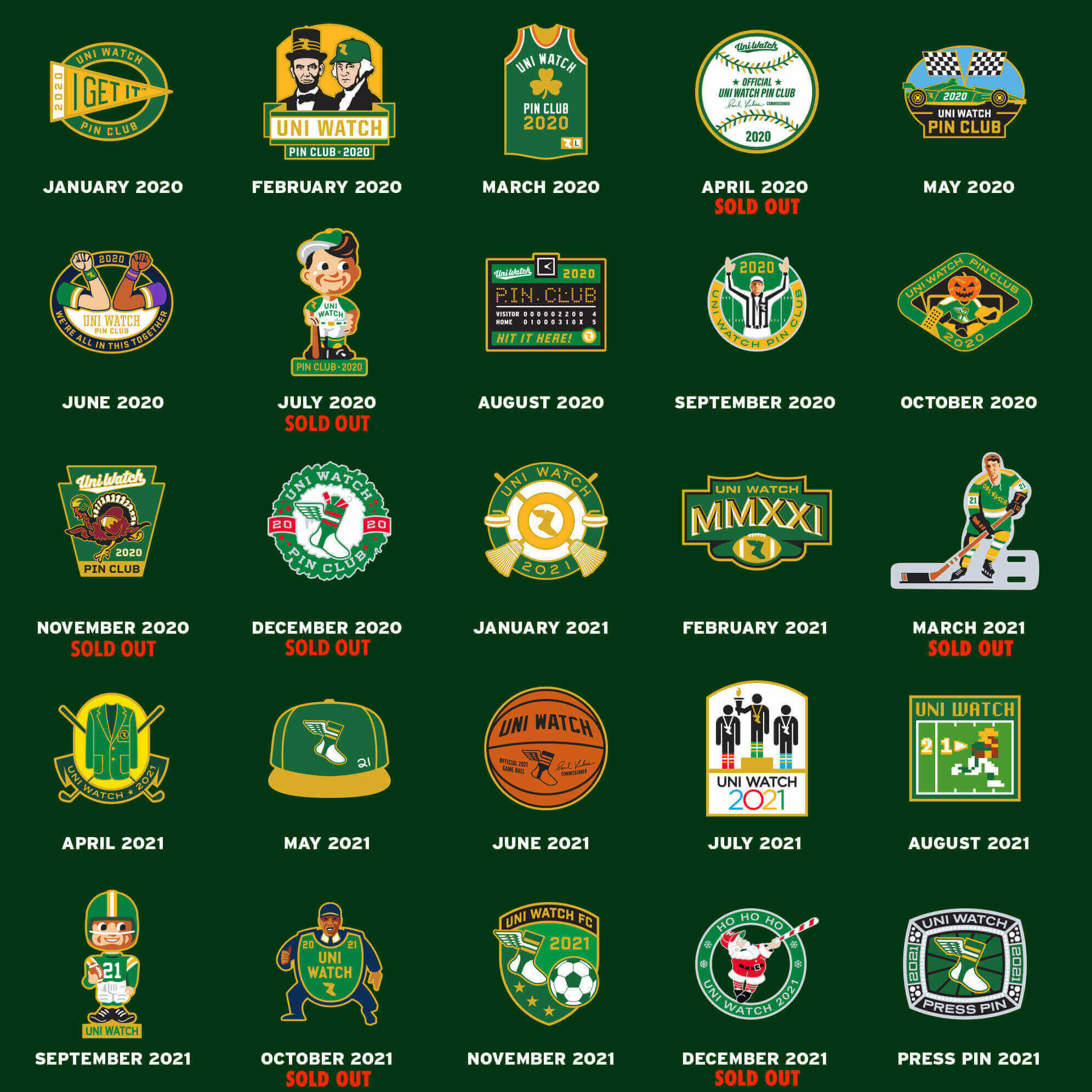
ITEM! Pin sale update: Thanks for the big response to this week’s pin discounts. The November 2020 and December 2020 pins have now sold out, and I’m also down to the last three of November 2021, so snap ’em up while you can.
Uni Watch News Ticker
By Anthony Emerson

Baseball News: The Rangers will wear 1970s throwbacks tomorrow evening (from Mike Chamernik). … It appears the Mariners have a kerning issue on OF Julio Rodríguez’s blue alternate jersey. Check out how close the “G” and “U” are, and how far away the “E” is. Might just be jersey wrinkles, but it doesn’t appear so at first glance (from Tim Dunn). … New logo for the independent Frontier League (from Kary Klismet). … The Twins’ ballpark hosted a high school game yesterday following the Twins’ day game. The Anoka High team wore a very nice uniform set with the school’s old team name, Maroons. “The name was changed to Tornados after a tornado destroyed much of downtown Anoka in 1939, although the school colors are still maroon and white,” explains Jimmy Lonetti.

Pro Football News: Apparently the CFL doesn’t have as stringent uni rules as the NFL, because the Winnipeg Blue Bombers’ new alternate uni features a large “W” on the front, where the number would normally be, with the number relegated to the front left shoulder (from Adam Peleshaty).

Hockey News: New alternate jersey for the AHL’s San Jose Barracuda (from Wade Heidt). … The Blues are the latest NHL team to announce a jersey advertiser (from multiple readers).

Basketball News: If you’ve always wanted to make a pancake shaped like an NBA player’s jersey, now you can do that (from @kcequipmentfar1). … The LA Sparks have a new jersey advertiser (thanks, Phil). … Reader Glenn Riley has designed the uniforms for the Shining Star AAU program for over 20 years, and this year’s uni theme is 1980s Apple computers. More looks here. … New unis in the pipeline for Purdue men. Note that the uni pictured in the article is just fan speculation and not what the final design will look like (from Kary Klismet).

Soccer News: New away kits for Brazilian side Flamengo (from Kary Klismet). … The USL W League is holding a vote on the league’s best crest (thanks, Jamie). … I absolutely adore this new alternate kit from Racing Louisville of the NWSL (from Michael Kinney). … During Wednesday night’s Late Late Show with James Corden, Corden (a West Ham fan) made an audience member in a Manchester United jersey cover it up with a show T-shirt. Knowing what we know about late night TV, I’m 95% certain that this was cooked up in the writer’s room and that audience member is a plant (from Max Weintraub).

Ukraine News: The Russian government has installed a sculpture in St. Petersburg depicting the logos of companies that have pulled out of the country following the invasion of Ukraine. The logos spell out “zamestim” which translates to “we will replace them” (from @bucky1382). … A costume shop in Newport, Ky., is soliciting donations of old uniforms and military-style clothing to send to fighters in Ukraine (from Kary Klismet).

Grab Bag: New athletics logos for Gardner-Webb. … The Delhi Capitals of the Indian Premier League wore alternate uniforms in yesterday’s T20 cricket match against the Kolkata Knight Riders (from Kary Klismet). … Disney has revealed the new Haunted Mansion franchise logo ahead of the rebooted movie to come out next year (from John Cerone). … Here are this weekend’s IndyCar liveries (from Tim Dunn). … A handful of old Chicago neon signs are going up for auction today (from multiple readers).
Comm-uni-ty assistance: Reader Dan Pepper is in the market for some of the sold-out Uni Watch pins: April 2020 (signed baseball), July 2020 (baseball bobble), March 2021 (table hockey player), Oct. 2021 (umpire), and Dec. 2021 (swinging Santa). If anyone has extras that they’d be willing to sell or trade with him, give him a shout. Thanks.
That’ll do it for this week. Stay well, enjoy Phil’s weekend content, have a happy May Day, and I’ll see you back here on Monday. Peace. — Paul
Happy link to Caitlin!
How old is that in dog years?
119
Yes, happy early birthday Caitlin!!!
Even though the Cowboys have Tyler and Tyron Smith, there’s no guarantee there will be any interesting nameplate treatment. When the Packers had Aaron Rodgers and Richard Rodgers at the same time, both players went simply as “Rodgers” with no first initial.
That’s why I said it’s a “possible double-FNOB situation.”
I’d downgrade that to doubtful. Emmitt Smith had the ‘E. SMITH’ nameplate his whole Dallas career, but more recently there were no initials when Tyron and Jaylon were both there.
For some time, the Broncos had brothers Doug and Dave Widell on the OL, and both went FNOB.
Ah, excellent — thanks for that!
Jeff,
I guess that’s why numbers exist, right? Boring. But makes sense. -C.
I think the Blue Bombers jersey is a case of merchandise driven jerseys. I’ve noticed that the CFL teams seem to sell most of their fan jerseys without numbers, presumably because of lack of star players/high player turnover. So when buying a jersey, fans are buying the team’s jersey and not a player’s jersey. The giant W makes and small numbers promote this way of thinking.
Logo on the front for an alternate uniform in CFL initiated by the Reebok Signature alternate uniforms program that was introduced for every team in 2014. The uniforms experimental. Toronto, Ottawa, and Edmonton have worn alternates with the logo on the front like that as part of the Signature uniforms.
The look has stayed with Edmonton as they maintained that jersey as a long-time alternate. Was worn last year.
link
One thing about these jerseys. Usually have TV numbers compared to recent trend of jerseys no longer having the TV numbers.
Winnipeg too!
link
True Winnipeg did as well before in the past. The digital camo debacle as part of Signature unis. Think Bombers only wore them for 1 game because of negative reception IIRC?
A look at the big logo on the front as a kind of old timey nod. Looking at old NFL unis it the 1920s and they had logos on the front. Often a letter.
I am fine with this Winnipeg look because it is an alternate. Will be worn 2 times a year. It is out of the box but has traditional style striping.
This also isn’t the first time the league has done this. I believe in the last years of the reebok deal, most of the teams in the league had these
What do you think of removing white from the Tigers’ road unis? I feel like orange would do just fine as the outline.
I agree
I’m OK with the white, but I agree that they’d probably be fine without it.
If the road cap’s orange D had a white outline, the white outlines on the jersey might make some sense to me. But I just find the white unnecessary in this case. I believe no white outlines would give the road unis a cleaner look.
Remember the beautiful player-name vertical-arching on the Phillies’ jerseys during the ’70s? And in two colors for the road blues! That’s how “Philadelphia” should appear on the Phils’ visiting uniforms; maybe even stitch it to a nameplate. That would be unique.
Yes, that two-color combo looked good in the 1950s with the Detroit script and in the 1980s with the block lettering.
link
link
Did we see the Buffalo Bills jersey in the draft? Curious to know if the navy blue has been removed from the numbers. It has been speculated this may be happening.
Looks like the navy is still there to me.
link
The last NFL FNOB I remember is when the Cardinals had a Lance Smith and a Leonard Smith in the mid=late ’80s (IIRC, across the St. Louis/Phoenix threshold).
Regarding the Steelers grey facemask.. all of their graphics showed every team in a grey facemask. Seems lazy, not sure why you’d take the time to render each helmet then not pay attention to the facemask color.
The “making fans wearing your merch” has been going on with the WWF/WWE since the mid to late 80s, when fans wearing T-shorts starting being a big thing.
The last NFL FNOB I remember is when the Cardinals had Lance Smith and Leonard Smith from 1985-88 (St. Louis and Phoenix).
link the only image I could find of either one; you can kind-of-sort-of see Leonard Smith’s FNOB.
NFL got rid of first initials years ago. If you have two Smiths, they believe having different numbers is sufficient.
Rob and Ron Moore were also both on the Cardinals together from 1995 until 1998.
link
It’s not just Julio’s jersey, the Mariners can’t get the kerning right on many of their away blues (for whatever reason it doesn’t seem to be an issue with their other jerseys). Another good example is here:
link
No pic, but Adam Frazier’s name was also butchered this week. It’s very annoying, especially given how often they wear those jerseys. Makes the team look very minor league.
Yeah, I saw a couple of others as well.
Torrens
link
Winker
link
Suarez
link
Seems to be a problem with the Navy blue jerseys/font…home and road greys seem fine.
link
Latin serifs (triangle-shaped) will be the undoing of any player names, owing to the curved baseline. Two- and three-color layering will make it worse. Serifed typefaces, particularly ones with thick downstrokes, belong on the front of a jersey, not the back.
I noticed the Mariners’ kerning issues last year too
The CFL has experimented with logos on the front before instead of numbers.
The “Signature Uniforms” from 2014 were a mixed bag – I won’t link them all but Edmonton and Ottawa were straight-up awesome.
link
link
Winnipeg did something similar to what they’re doing this year, but with an ice camo theme
link
The league also experimented in the 1990s. The less said about that the better.
link
NFL FNOB — First ones i thought of were Jim and Jack Youngblood
Reader Scott Rogers is also looking for an October 2021 umpire pin. If a second person has one they’d be willing to sell or trade, I’d love to be in line behind reader Dan.
Happy Birthday Eve, Caitlin!
Happy Birthday Caitlin and many more! From the Frank Cats of NY & the Fabulous Florence of Philadelphia.
Every team’s helmet graphic had a gray face mask, not just the Steelers. It was weird.
I hate the hockey sweater look on football jerseys. I love the classic W logo but not ten inches of it on the front of the jersey.
Happy Birthday, Caitlin!
John, think of it as real old school throwback. Big “W” on the chest for Winnipeg ‘Pegs in 1935 Grey Cup.
link
link
Last FNOB has to be Rob Moore and Ronald Moore on the Cardinals, right?
Yeah, I saw a couple of others as well.
Torrens
link
Winker
link
Suarez
link
Seems to be a problem with the Navy blue jerseys/font…home and road greys seem fine.
link
Pancake mold for the Lakers makes it look like a generic jersey used by companies without an NBA Players Assoc. license.
CFL also did this type of numbering in the mid 1990s.
Toronto, Memphis and Birmingham all had a logo on the front and number near the left chest.