Last month we Ticker-linked to a video report on how the 76ers’ 1997 uni set was developed. That reminded Kevin Clark of a fun story about those uniforms — a story that I’m pretty sure has never been told before.
Some quick background: Kevin, as you may recall, has previously been featured on Uni Watch as the P.A. voice of the New Jersey Devils and Monmouth University football. He’s also a sports artist whose work has been featured on the cover of the Devils’ 1999-2000 media guide and during on-ice ceremonies.
Today’s story is about his artwork, with a very uni-centric twist. I’ll let him tell it:
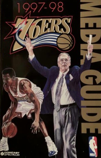
Back in 1996 I was really moving along with my artwork career, having had commissions from several teams and players. I had reached out to the 76ers, offering my services, and they eventually contacted me to create a painting they could use for the cover of their 1997-98 media guide. The sticking point was that this was the offseason prior to a major uniform change, and I needed something to paint from so I could show the new duds in the painting.
Secrecy was of the utmost importance, and this was before the internet and email exploded. So the Sixers actually had a staff member bring a prototype uniform from Philadelphia to my house at the Jersey Shore — a 70-mile trip. Unfortunately, I didn’t take any photos of it (again, this was before we all had cell phones with cameras).
They said the artwork had to include Allen Iverson [who had just won Rookie of the Year honors the previous season — PL] and coach Larry Brown I had one week to complete the painting, which was a pretty tight turnaround. I actually took time off from my regular job to get it completed and am still proud of it to this day [click to enlarge]:
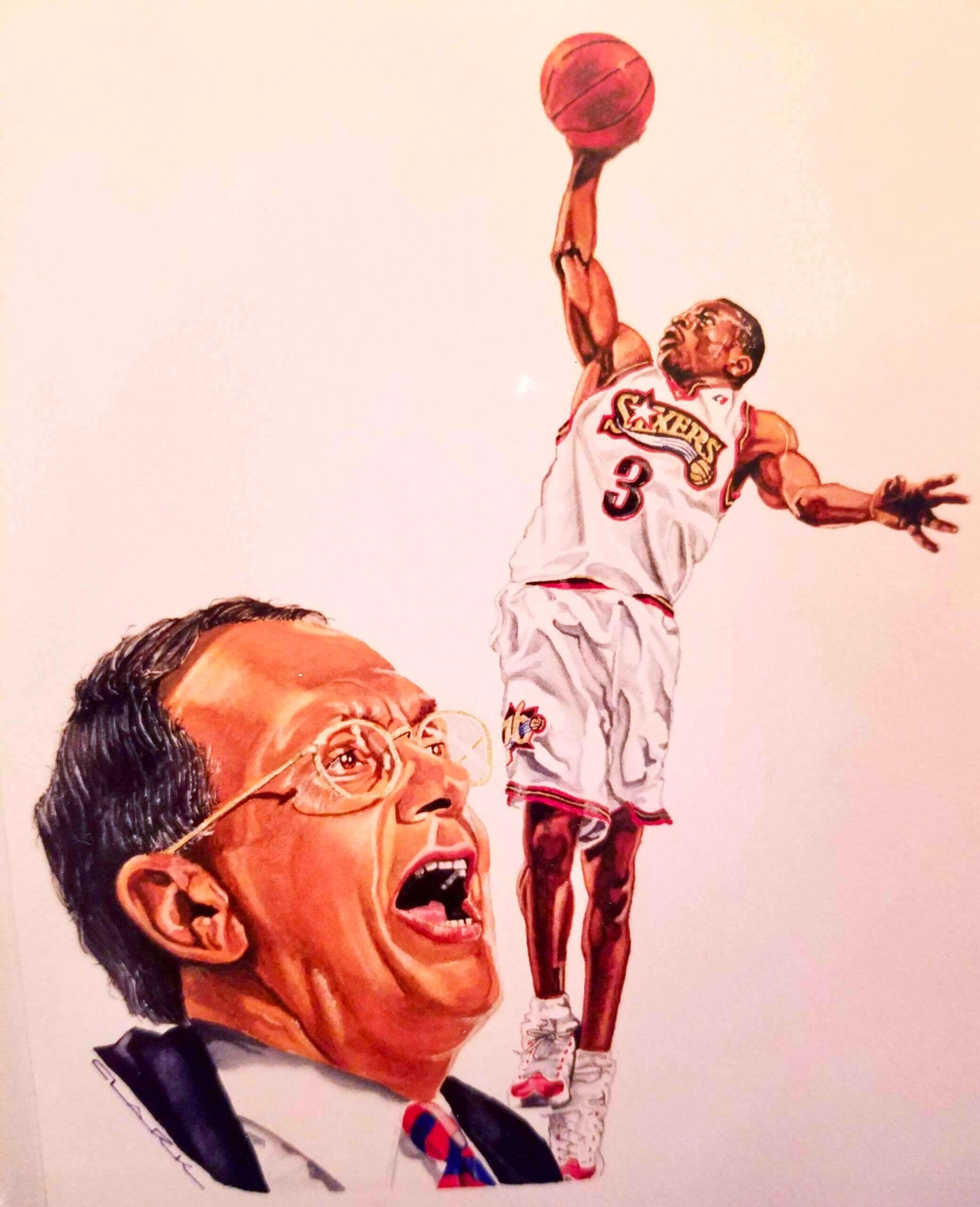
But as it turned out, they didn’t use it! A few weeks after I submitted it, they called to let me know they were using a different painting. They didn’t say why, but after looking at the painting and mulling it over, I figured it was because I painted Larry Brown’s face a little too ruggedly. It was accurate to the picture I based it on, but maybe not flattering.
They still paid me, though, and gave me suite tickets to two games that season. It was well worth the effort and makes for a fun memory.
Fun story! Here’s cover artwork they went with instead of Kevin’s (click to enlarge):
I definitely prefer Kevin’s in part because it shows the new uniform more clearly!
If you want to see more 76ers media guide covers, there’s a nice assortment of them here.
Click to enlarge
Collector’s Corner
By Brinke Guthrie
Follow @brinkeguthrie
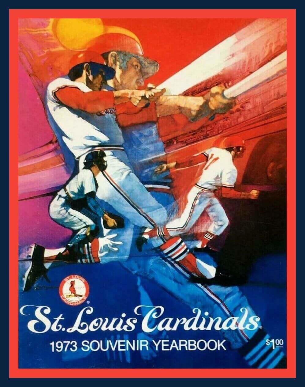
Throughout the years, from their uniforms to their publications, the St. Louis Cardinals have always taken their aesthetics seriously, and it shows. Tim McCarver, Lou Brock, Bob Gibson, and Joe Torre are just a few of the Cardinals featured on the cover of this great-looking 1973 souvenir yearbook. Just $1!
Now for the rest of this week’s picks:
• When you’re a slick-fielding Hall of Fame first baseman like Mr. Frank Chance (as in “Tinkers to Evers to Chance”), you can snag all sorts of primo endorsements. Here he is in a 1910 Coca-Cola print ad. “You may use my name as one of your many customers who have derived benefits from drinking Cola-Cola,” the infielder said.
• Here we have a 1953 memo from Bill McKechnie Jr., “Supervisor of Minor League Clubs” for the “Cincinnati Baseball Club Company,” inviting “farm club directors” to a July 13 meeting at the Netherland Plaza Hotel, 1:30pm sharp.
• Here’s a set of six 1950s Knickerbocker Beer New York Giants coasters. It occurred to me, “Which Giants are they referring to, baseball or football?” A Google search shows that WMCA, which is mentioned on the coaster design, broadcast Giants baseball, so there you go.
• I think DeLong missed the design mark with this early-1990s Philadelphia Phillies jacket. Why would you do the jacket in grey instead of that rich, dark, Phillies burgundy?
• Really nice-looking artwork on this 1970s Chicago Cubs poster.
• More really nice artwork on the cover of this 1972 album, Yankee Stadium: The Sounds of a Half Century. The cover includes Babe Ruth, Lou Gehrig, Mickey Mantle, and Y.A. Tittle.
• The New York Giants of the 1970s wore some pretty bland looking sideline attire, as you can see from this plain blue sideline jacket made by Rawlings.
• Travel like a old-school NBA exec with this 1970s “faux suede” NBA-logo attache bag.
• Puma had an NFL license for uniforms and apparel back in the late 1990s. Here’s one of their jacket designs for the Green Bay Packers.
• The Baltimore Orioles are celebrating Camden Yards’ 30th anniversary this season. Five years ago, they marked the 25th anniversary with this nifty-looking scale model giveaway of the famous ballpark.
• And we’ll close things out with one from Paul: This sharp-looking box for a pair of Jerry West All-Pro Sneakers has Jerry shown on the top and “exclusive tips” to improve your game printed on the bottom.
Click to enlarge
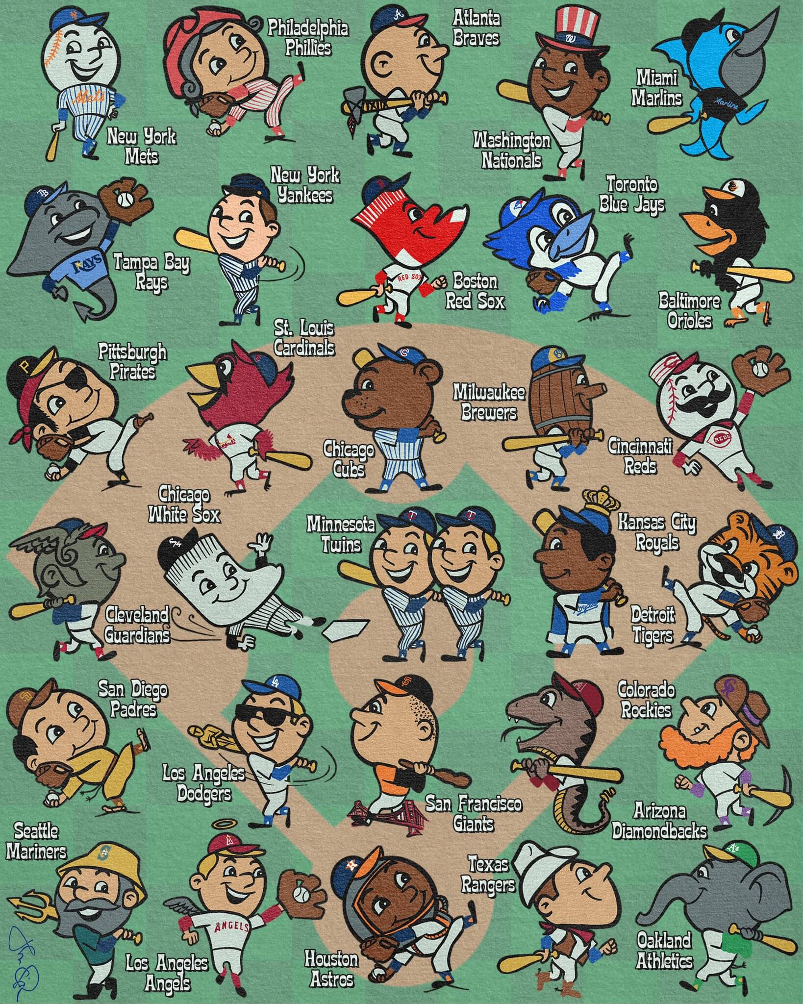
Too good for the Ticker: “I got a little overexcited about the arrival of the 2022 MLB season,” says John Viola. “So I asked myself what Mr. Met would have looked like if he was working for one of the other 29 teams.”
(My thanks to Jim Brunetti for putting this one on my radar.)
Click to enlarge
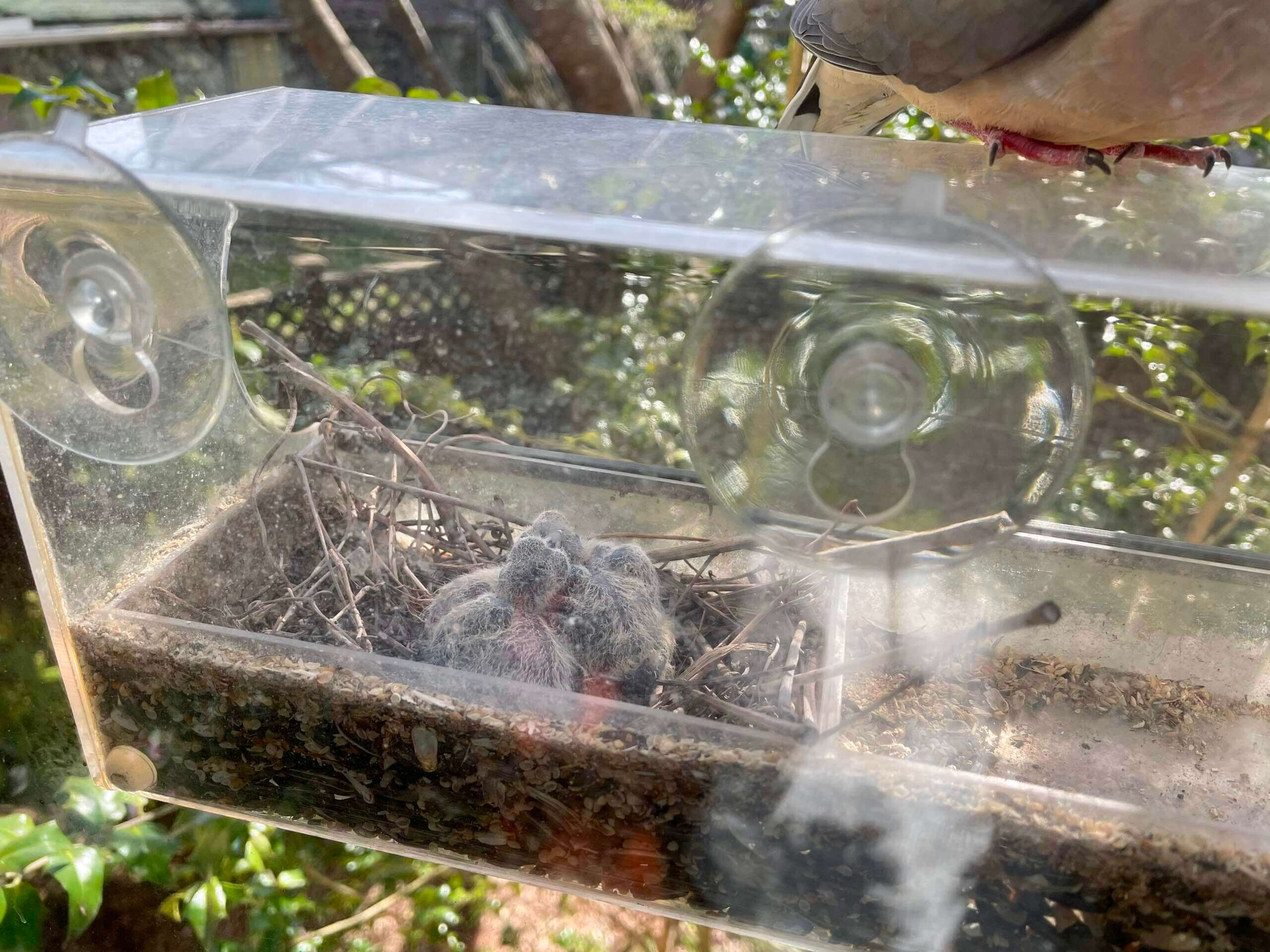
Nest update: For now, the only way we can see the baby doves is when there’s a shift change (i.e., when one the adults replaces the other on nest-sitting duty), and I was lucky enough to catch one of them yesterday afternoon. As you can see, the babies are still helpless little runts, and frankly kind of pathetic-looking, but they’ll supposedly be ready to leave the nest in about 11 more days. I’ll keep posting photos as circumstances allow.
The Ticker
By Paul, pinch-hitting today for Alex Hider

Baseball News: Red Sox OF Alex Verdugo, whose father is from Mexico, uses a glove with Mexican flag colors, including white webbing that often makes it look like he’s snow-coning the catch when the ball is actually securely in the glove (from @ohhhsourry). … Giants rookie OF Heliot Ramos wore a pair of teammate Brandon Crawford’s cleats in his MLB debut on Sunday (thanks, Brinke). … Here’s a recap of the copyright battle over the Phillie Phanatic (from Kary Klismet). … The reason some teams’ alternates aren’t available at the beginning of the season is that spring training was much shorter this year. Note that the explanation is coming from Fanatics, not Nike, which apparently means that Fanatics is producing the on-field uniforms. That’s a surprise to me, so I’ll try to find out more about that. … Giants radio broadcaster Jon Miller wore a Yomiuri Giants cap while working last night’s game (from @MixMastaB).

Football News: New uni number assignments for the Browns. … Here are the costumed mascots for USFL 2.0. … Ohio State QB C.J. Stroud gave a shout-out to former OSU QB Dwayne Haskins, who died over the weekend, by writing a message on his jersey during Monday’s spring practice session. … Here are LSU coach Brian Kelly’s plans for Nos. 7 and 18, which have special significance for the team.

NBA News: Rockets G Jalen Green is changing his uni number from 0 to 4 next season.

Soccer News: Here’s a 2022 kit recap for all 27 USL Championship clubs (from Cory Soble). … The rest of these are from Kary Klismet: New third kits for Argentinos Juniors of the Argentine Primera División. … Paraguayan club Sportivo Luqueño has unveiled new home and away shirts. … Brazilian side Fortaleza has new kits for this year’s Copa Libertadores. …South Georgia Tormenta FC has unveiled their new away kits. … New kits for Brazil’s EC Bahia.

Grab Bag: New uniforms for Croatia Lacrosse. … Disastrous new logo for Baskin-Robbins (thanks to all who shared). … The New Yorker has a great article about Baltimore salt boxes, which I’ve written about a few times. … Here’s a ranking of ultimate kits. … New Indigenous-themed kit for the NLL’s Toronto Rock (from Michael Sullivan). … Here’s a pretty amazing video clip of a five-year-old kid who can write in lots of different fonts (from Ted Taylor). … New uniforms for Nigeria’s Civil Defense Service (from Kary Klismet).
Our latest raffle winner is Ryan Burns, who’s won himself a Uni Watch pin. Congrats to him, and thanks again to Bill Fenbers for making this one possible. — Paul
Wow, Kevin’s painting is quite amazing. Portrait paintings such as that just astound me. Not to take anything away from various other art styles or subject matter, but to recreate a person so accurately, that is quite a talent. As to why his wasn’t chosen, perhaps the layout infers some opposition between Iverson and Brown?
Also John’s Mr Met drawing is great, and I especially love what he did with the Guardians. Not sure what kind of mascot they have in Cleveland, but they should adopt that guy immediately.
Yes, that little Guardian is fantastic! I really love Viola’s animals, especially the Ray and Diamondback. Gotta love the Mariner swinging a trident too. Inspired work all around!
I love the Mariner as well. Was a little surprised he didn’t try the SD guy as more of a Swingin’ Friar. Really great stuff.
Just noting the SD guy is in a monk’s robe and sandals.
The monk’s rope belt is a great touch!
The Mr. MLB characters are probably my favorite thing ever posted here.
The Rays and Marlins are adorable, and the Padres is absolutely hilarious (the hair!).
I love that baseball drawing! Any chance prints of those could be made for sale??
Second that.
About the only thing that could have made it better would be if instead of the barrel head, he rendered the Brewers mascot as the standard/cliche 21st century hipster brewer. (This coming from a craft brew enthusiast).
Not so sure if that would be better.
It would be quite hard to pull that off in an easily identifiable way while fitting in with the overall theme.
In the Twitter thread in which the drawings and their sale was discussed, the artist expressed concern about running afoul of MLB copyright laws and welcomed anyone to print out the sheet as they wished.
While I appreciate the work and ingenuity which went into Kevin’s artwork, the Reds’ Mr. Redlegs predates Mr. Met by more than a decade.
I think you’re referring to John Viola’s artwork, not Kevin Clark’s.
You’re right! Sorry John. I do appreciate the artwork.
Love the John Viola artwork!!!
Just saw news of the goings on in Brooklyn. Hope everything is safe with you, Paul.
Thanks, Chris. We’re fine — the incident was in a different neighborhood, not ours.
I’d love to know why Kevin is no longer the PA voice for the Devils. The new guy is so beyond horrible.
From New Jersey 101.5:
“The New Jersey Devils are looking for their next public address announcer after long-time announcer Kevin Clark retired over the summer.”
link
“former OSU QB Dwayne Haskins…”
Wouldn’t “late” be a more accurate term there? Haskins was killed when he was hit by a car a few days ago. I realize he was already a former QB when he died but I feel that his recent death shouldn’t be ignored in the description.
Good critique. Text now adjusted.
My first ever “too good for the ticker” submission! I feel like that’s Level-2 of membership!
TGFTT…it sure is!
Thanks for sharing that, and high praise to John Viola!
I wouldn’t call the Baskin-Robbins brand “disastrous”, at least this soon. I’ve actually seen comparable levels of favorable and unfavorable reaction, so “divisive” would probably be a better word at this point (which is an amusing word to use regarding an ice cream parlor chain, but there you go).
One criticism I can definitely say is fair is that the new B/3 makes it look more like an 8, probably due to the fact that they rounded the corners against the vertical stroke of the B. I did a quick fix that fills in those corners to make the 3 stand out much more: link
I think I just have a generally strong dislike for the Variex font, so that’s likely why I never cared too much for the outgoing logo. The 31 in the BR was clever, but I just always thought that font for the wordmark was trying way too hard to be “playful”. Then again, I grew up with the original pink-brown circus theme, and thought the 1990s rebrand was a little disappointing (that font screamed “Circa 1980” to me more than anything).
I wouldn’t call the Baskin-Robbins brand “disastrous”, at least this soon. I’ve actually seen comparable levels of favorable and unfavorable reaction, so “divisive” would probably be a better word at this point (which is an amusing word to use regarding an ice cream parlor chain, but there you go).
I wasn’t trying to describe the public reaction to it; I was expressing my own thoughts about it. That’s all.
Didn’t notice that was you doing the comments today until seeing the reply and going back up to look at the header.
Looks okay to me.
Thanks, Brinke, for flagging the line in that Frank Chance ad: “You may use my name as one of your many customers who have derived benefits from drinking Cola-Cola,” the infielder said. I guess admen were still honing their slick craft back then. Perhaps that line won out over their second most persuasive choice to win customers over: “I hereby permit you to use my name and likeness to promote your product.”
What kind of benefits did he derive from drinking Coca-Cola? Health benefits? Financial benefits?
Fanatics and MLB bought the Majestic production plant that had been the hub for both on field jerseys and the retail authentic.
As part of the substitution of Nike into the jersey contract for Under Armour the jerseys would continue to be made at the Majestic plant by Fanatics with the Nike logos just sewn on.
Fanatics phantom manufacturers a lot of merch for Adidas in the NHL and Nike in NFL, MLB and NBA and just slaps the “maker’s” mark on the product.
Got it. Thank you for clarifying!
I got a good laugh out of the description of the baby birds as “frankly kind of pathetic looking.” They were born like four days ago!
But anyway, good post as usual and look forward to the next Bulletin post, having recently subscribed.
Harrison! Great to hear from you — been a while! Hope you’re well.
John Viola’s Mr. MLB artwork is sweet music to my eyes. One of the best things I’ve seen in a while. Among the other area specific features already mentioned, I thought the LA Dodger swinging an Oscar was pretty funny.
I have to say I’m not really seeing Gibson, Brock, or any other identifiable Cardinals in that yearbook cover. Torre maybe, with the sideburns, but even there the uni number is wrong (he wore #9 with St. Louis). It’s a nice design, but those are just generic ballplayers in Cardinals’ uniforms.
John Viola’s Mr MLB artwork is incredible. Put it on a poster and I will buy it.
In the young of most bird species, fear of humans develops rather suddenly and typically corresponds with the ability to fly. But in Mourning Doves, that fear response is often delayed by a week or two, for reasons that are unknown to me. So you may find that the young doves are remarkably approachable for a while even after they’ve left the nest and look “grown up” for the most part.