Click to enlarge
The run-up to the Super Bowl is often a lot of hype with relatively little substance. But if you’re a uniform fan, the Supe provided some some tasty morsels yesterday.
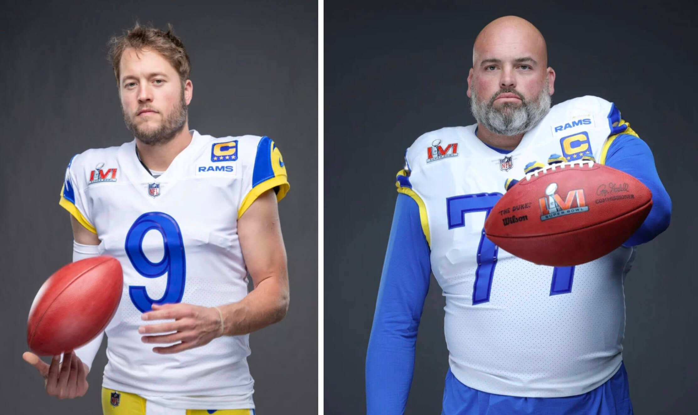
Let’s start with this: As noted in my Super Bowl Preview, the Rams’ captains will be wearing their “C” patches above the “Hi, My Name Is Rams” patch this Sunday (above left). But a promo photo posted on the team’s website shows offensive lineman Andrew Whitworth wearing the “C” below the team patch. An irksome inconsistency!
But wait, it gets better: Last night Whitworth was named as this season’s winner of the Walter Payton Man of the Year Award. If he keeps playing beyond this Sunday (he’s currently 40 years old, so this could be his last hurrah), he’ll get to wear the Payton patch on his jersey chest for the rest of his career, just as past Payton winners Russell Wilson, Calais Campbell, and J.J. Watt do.
But the bigger question, of course, is whether Whitworth will wear the Payton patch this Sunday in the Super Bowl. That issue has never come up before, because Payton winners didn’t start wearing the patch until 2017, and none of the award winners since then have played for a team that was about to appear in the big game. So we’re in uncharted territory here.
As soon as Whitworth was named as the Payton winner last night, I sent emails to an NFL rep and a Rams rep. No response yet. Now, realistically, they’re both going to be busy with a lot of other stuff right about now, so I don’t really expect to hear back from them (and even if they wanted to help me out, they might not know yet about Whitworth’s patch), but we’ll see — stay tuned.
If Whitworth does end up wearing the Payton logo, it would likely set a record for the most pieces of flair on an NFL jersey:
- • Payton patch
• Super Bowl patch
• Captaincy patch
• “Rams” patch
That’s what I’m rooting for, just because it would be so bizarre-looking.
Update: Several outlets are reporting that Whitworth may indeed get to wear the Payton patch on Sunday, because it may be his last game.
Meanwhile, as you probably know, the NFL always puts together some sort of exhibit to go along with the Super Bowl, and this year it included a uni-clad mannequin for each team. Here’s a glimpse (click to enlarge):
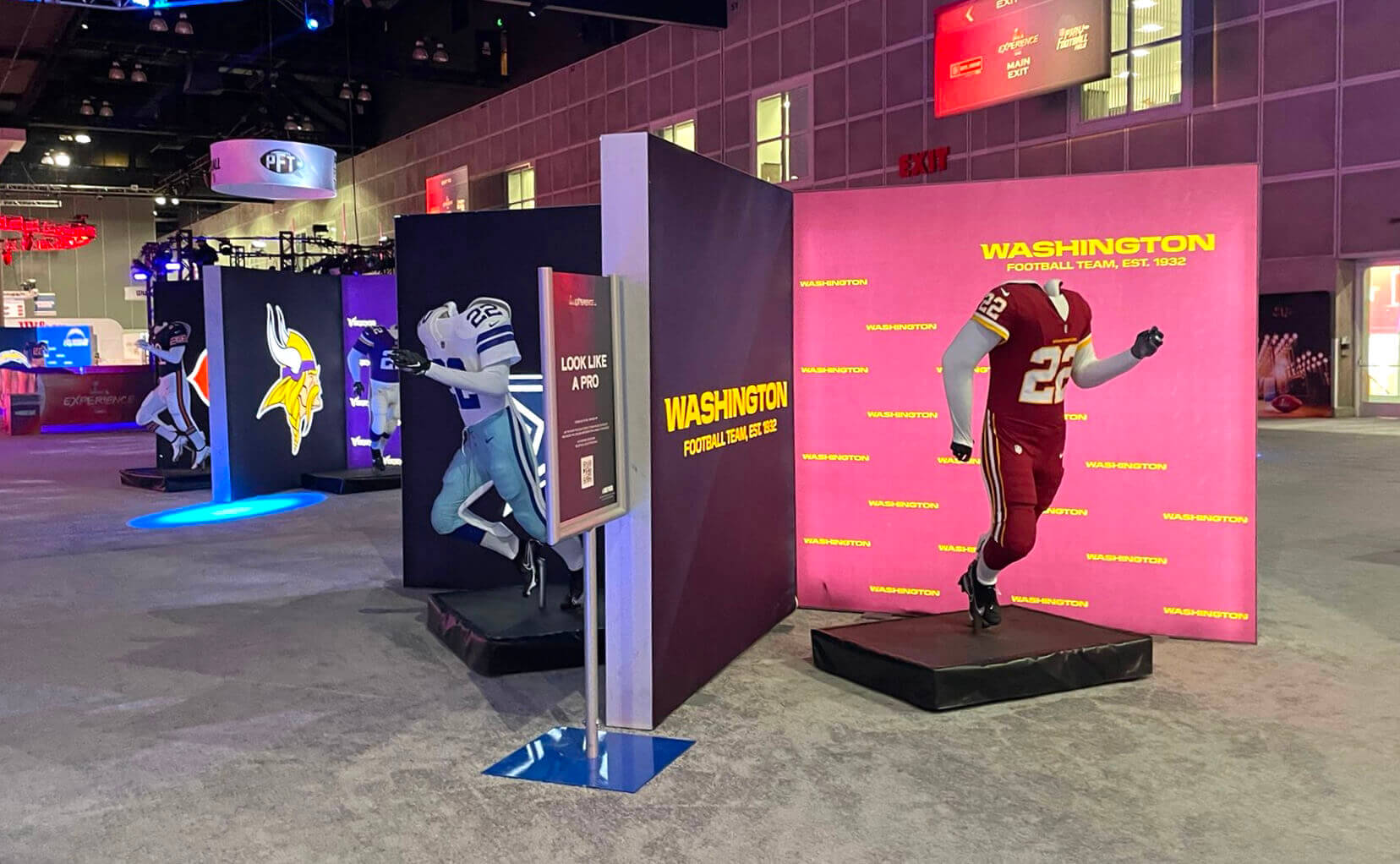
It’s not so surprising that Washington’s mannequin wore a WFT uni instead of a Commies uni (the exhibit was probably put together before last Wednesday’s unveiling), but take a closer look at those pants — the team never actually wore those!
WFT’s actual burgundy pants look like this:
The pants on the mannequin have a completely different stripe pattern. Looks like it’s based on the Giants’ grey pants. (At first I thought it was based on the old ’Skins helmet striping, but the helmet stripes were white-yellow-white, while the mannequin’s pants are yellow-white-yellow.)
Pretty weird, right? I guess this was some sort of prototype design that never made it onto the field. But how did it end up on a mannequin at the Super Bowl? Of course, they could have avoided all this intrigue if they’d just put white or yellow pants on the mannequin instead of going with the stupid mono look.
Anyway: Not a bad day for NFL uni news!
(My thanks to Mance Fine for bringing Whitworth’s “C” positioning to my attention, and to Brian Simpkins and @DCSportsNut202 for spotting the WFT pants.)
Click to enlarge
And speaking of the Super Bowl: In case you missed it on Wednesday, the Uni Watch Super Bowl Preview is now available for your enjoyment, and I don’t mind saying that this year’s edition is a doozy, jam-packed with deep-cut fun facts about the Rams’ and Bengals’ uniforms, including the annual knowledge-drop by Super Bowl scholar Jay Braiman — perfect for impressing and/or annoying your friends while watching the big game on Sunday.
My premium subscribers can read the article here. If you haven’t yet subscribed, you can do that here (you’ll need a Facebook account in order to pay). If you want more info on what you’ll get for your money, you can find that here. And if the Facebook requirement is a dealbreaker, email me and I’ll keep you in the loop about developments regarding non-Facebook payment options and possible workarounds. Thanks!
Click to enlarge
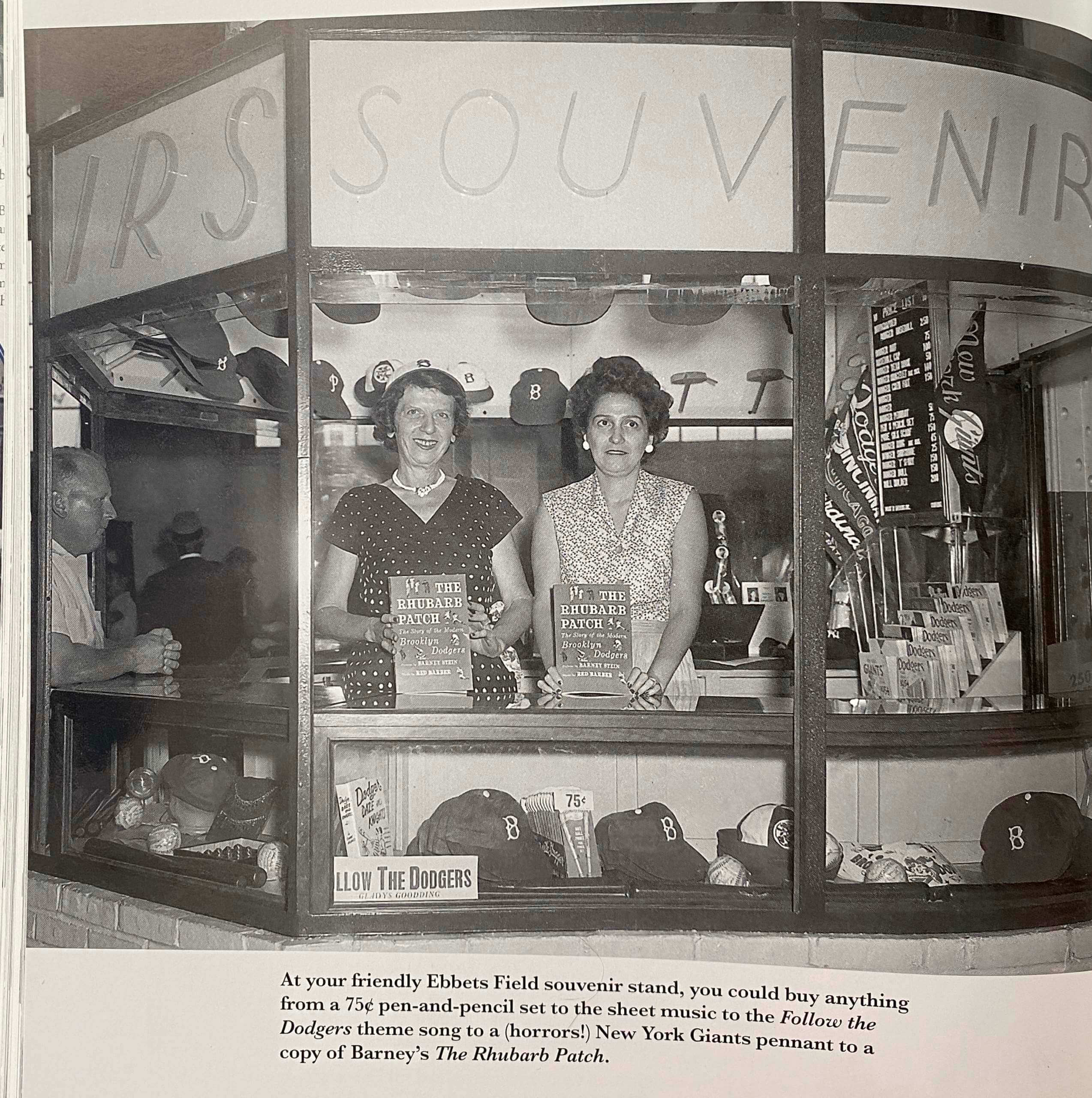
Early merch: In yesterday’s post about the Milwaukee Braves, I showed a photo of fans who appeared to be wearing Braves caps at a ballgame. I wrote, “This crowd shot caught my eye because it appears to show several fans wearing Braves caps. Were retail caps available in 1954? That would be news to me.”
That prompted two great responses. The first was from Jordan Weiss, who sent me the photo shown above (from the book Through a Blue Lens, a collection of photos by Dodgers photographer Barney Stein). As you can see, they had plenty of Dodgers caps for sale — and a Phillies cap to boot! The price listing on the pegboard indicates that they were selling the caps for the princely sum of one dollar. I had no idea!
In addition, reader Darren Jones posted the following comment to yesterday’s post:
From the website MLBCollectors.com:
American Needle and Novelty Company (ANNCO) — Founded in 1918 as an importer of sewing needles, American Needle evolved into a major headwear manufacturing company. In 1946, the company approached the Chicago Cubs with the idea of selling fans souvenir caps like the ones the players wore on the field. The Cubs agreed to the proposal, with the team’s ownership, noting, “Who would want to buy the hats that the players are wearing?” The first run of Cubs hats sold out in one day and a second lot sold even faster. Soon the company was supplying souvenir melton felt caps with metal eyelets and sewn-on-patch-logos to fans of all MLB teams.
Who knew? Not me! Frankly, I have no recollection of retail caps being available when I was growing up, but maybe I’m misremembering. Anyway, thanks to Jordan and Darren for setting me straight!
Click to enlarge
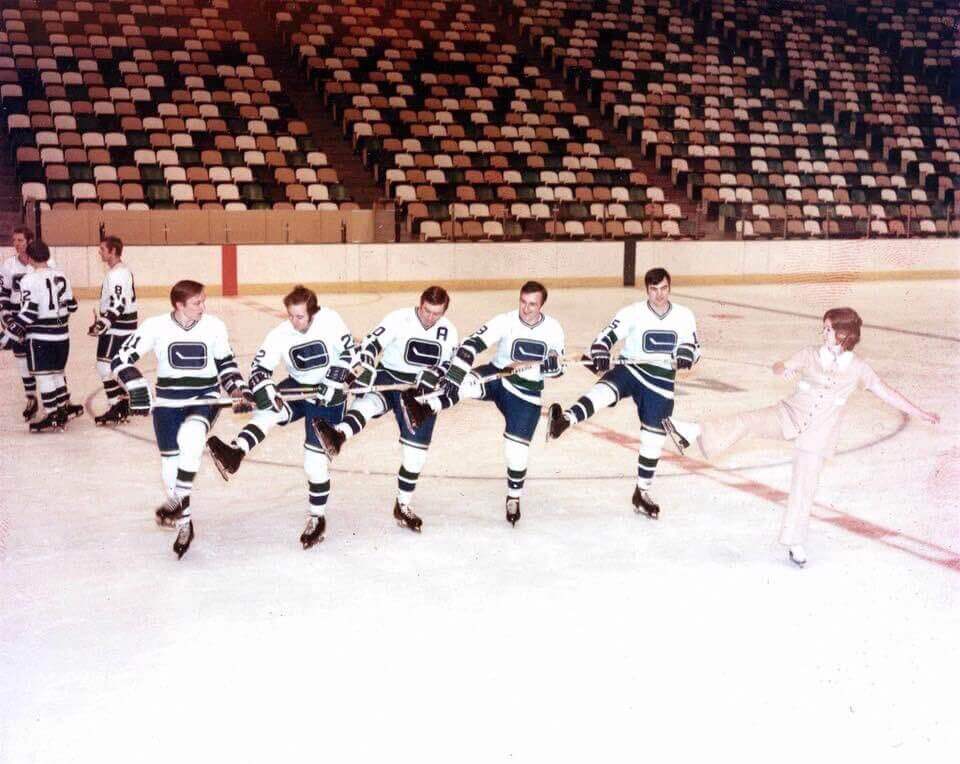
Too good (and weird) for the Ticker: This Canucks photo, which appears to be from the early 1970s, is even weirder than it initially appears. First, the Canucks are wearing their home uniforms (their first season was 1970-71, which is also when the NHL switched to wearing white at home), but that’s not their home arena. It’s the Met Center in Minnesota, as you can tell from the multi-colored seats and the glimpse of the North Stars’ logo at on the ice. Why would the Canucks have brought their home whites to Minnesota?
But the bigger question, of course, is why they’re making like the Rockettes. Maybe the Ice Capades was in town and the players were having fun with one of the skaters? Weird!
(big thanks to Alan Tompas for this one.)
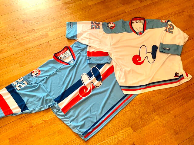
Sacre bleu: Got a note yesterday from longtime Uni Watch reader/pal Ron Roza, as follows:
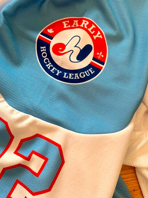
For many years I’ve been playing in a hockey league up in Montreal. It’s called the Early Hockey League, because we play at 7:30am every Saturday. I designed an EHL logo many years ago, inspired by the Expos.
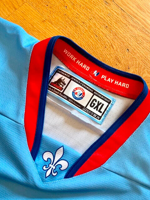
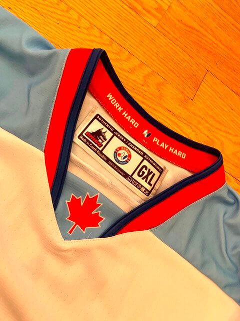
Last year the league decided we needed to update our uniforms, so I come up with a new look. The idea was to incorporate the Expos’ baby blue and the Canadiens’ uniforms as a template. The Socks were designed to work with either jersey.
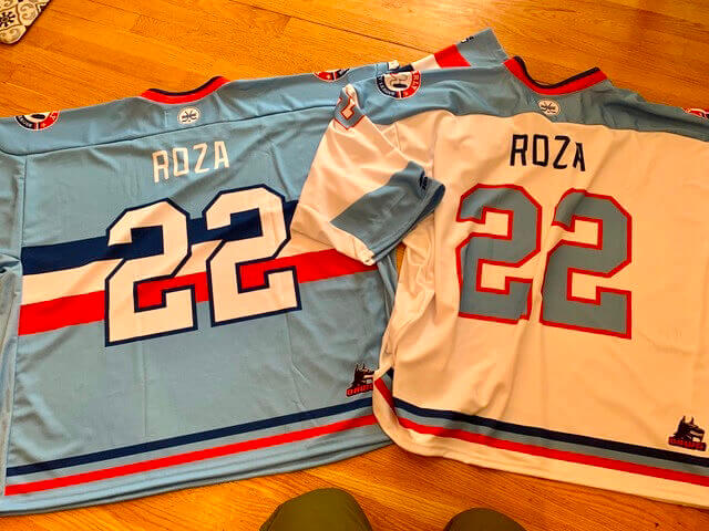
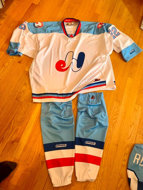
Pretty cool, right? In addition, Ron created stickers for the players to put on their helmets and water bottles, and he used the old Expos number font:
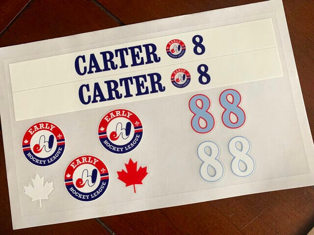
“And yes,” says Ron, “someone in the league actually wears ‘CARTER 8’ on his jersey!”
Click to enlarge
Patch reminder: In case you missed it on Thursday, Uni Watch chain-stitched patches are back in stock. As always, they feature spectacular texture and are perfect for putting on a jacket, on a sweater, or just on display. I’m already down to just four of these remaining, so move fast if you want one.
The Ticker
By Anthony Emerson

Baseball News: The St. Paul Saints, Triple-A affiliates of the Twins, have a rather unique 30th-season logo (from Mike Menner). … A blog has ranked the five “most incredible” baseball fields in the world (from Wade Heidt). … When Louisiana-Lafayette was known as the University of Southwestern Louisiana, its baseball team wore Cardinals-style caps (from @FittedsFlannels). … Oh man, check out Arkansas’s unis from 1958. That lettering, that razorback, gorgeous. Don’t understand what the “C” cap was for, though (from @charliehog). … A new line of Negro Leagues bobbleheads is launching today. Additional info here.

NFL News: Get this: The Super Bowl could take place in London four years from now. … Speaking of the NFL’s international push, the league will start playing one regular season game per year in Germany next season. … The longstanding Broncos- and uni-centric site Endzone Sports Charities, co-founded by Patrick Scroggin and longtime Uni Watch pal/mensch Tom Jacobsen, has received a full makeover. If you care about Broncos uniforms, or NFL unis in general, it’s an essential bookmark. … The San Diego Union Tribune has a fascinating article about 1972 NFL Rookie of the Year Willie Buchanon, who’ll be the league’s top uniform regulation enforcer at the Super Bowl (from Russ Havens). … The Pro Football Hall of Fame has a series of videos about the design history of Super Bowl rings (from Kary Klismet). … NFL commish Roger Goodell says one of his top priorities is getting a new stadium for the Bills.

Hockey News: The Coyotes will play at least the next three seasons at Arizona State’s arena, which seats only 5,000. … Would you go skating with the first steel ice skates, from the 19th century? Yikes (from Brandon Weir). … An Indigenous artist’s Blackhawks logo redesign from a few years ago is now being used by a Chicago-area towing company (from Kenneth Traisman). … My goodness, check out this apparatus Jets player Mats Lindh wore to protect his broken jaw in 1976 (from Mike Styczen). … Brutal high school game in Minnesota, as Duluth East and Duluth Denfeld went black vs. camo (thanks, Phil).

NBA News: James Harden, who was traded to the 76ers yesterday, has worn No. 13 for his entire career. But he can’t wear No. 13 in Philly because it’s retired for Wilt Chamberlain, although not all media outlets knew that when yesterday’s trade was announced. It turns out that he’ll wear No. 1. … ESPN Photoshopped Harden and Ben Simmons into their new unis for this graphic, but for some reason didn’t bother with Seth Curry (from Micah Burk).

College/High School Hoops News: South Dakota State women went pink for breast cancer awareness last night (from Steve White). … Boston College and NC State women also went pink last night in Chestnut Hill (from Gabe Cornwall). … It must be Pinkuary, because George Washington women are also going pink (from Matt Eliot).

Soccer News: New jersey advertiser for Sporting Kansas City (from multiple readers). … Manchester United have a new training kit advertiser, which of course necessitated a whole new training kit design to be released. … Paris Saint-Germain has unveiled a very clean new fourth kit design, inspired by the Chicago Bulls as PSG has an agreement with Jordan Brand (from multiple readers). … The ball design for the 2022 Copa Libertadores has been unveiled (from Kary Klismet).

Grab Bag: The Aston Martin Formula One team has unveiled its livery for the 2022 season (from Kary Klismet). … The USS Kitty Hawk had an upside-down second “k” on her fantail for her entire service career (from L.J. Sparvero).
And that’ll do it for this week. Stay safe, enjoy Phil’s weekend content, and of course enjoy the game on Sunday. We’re gonna make some lamb chili — chili for Cincinnati and lamb because rams are sheep, so we’ll have both teams represented. See you back here on Monday. Peace. — Paul
At first glance of that EHL jersey I thought the logo was “eh!”, like the stereotypical Canadian speech convention; “Nice jersey, eh!” Pretty cool.
Me too!
Those Expos-based hockey sweaters, etc. are GD awesome. That uni design would look fantastic on NHL ice!
Same here! But those are amazing jerseys either way. Very well done.
Re: the seats at the Met
Am I the only one who tried to find a color pattern amidst the randomness? I can’t find one, so I’m wondering how they chose what seats to install in order to maintain a balance to the eye.
OK … gonna go now … Judge Wapner’s on in five.
-C.
The builders of Met Center originally planned to put the seats in a pattern but they were up against deadline for opening by the start of the 1967-68 hockey season. The planners decided to just install them randomly, “just make sure they fit”. I read this in a newspaper article around the time it was demolished.
Popular belief was that they were done that way to make the building look “fuller”. That proved to not be true.
When I first looked at the EHL/Expos logo, I thought it said “Eh!”, which coincidentally would also work for a Canadian adult league team.
I guess if I had a time machine, and didn’t want to disrupt the space-time continuum too much, I’d take $20 to the ball park in Brooklyn in 1954 and buy one of everything!
The helmets are the coolest part of the NFL jersey, they should have included those!!
The helmets are the coolest part of the NFL jersey…
Sigh. Et tu, Tanner?
You know what he meant.
Looks like its some sort of AR experience for selfies – scan the QR code, stand behind the mannequin (you’ll notice the mannequins are split open at the back) and an app will put the helmet on your head.
The Vancouver Canucks photo at Met Center.
The Canucks back then were owned by Minnesota businessman Tom Scallen. Scallen also owned Ice Follies and other ice shows. This appears to be related to why this photo is what it is.
Here is Canucks team photo at the Met Center in white unis:
link
Great info, Wade — thanks!
The Canuck’s photo was from either the 1970-71 or 1971-72 season. #15 is Rosaire Paiement. He only played for Vancouver those 2 seasons. He also played for my hometown Indianapolis Racers in the 1976-77 and 1977-78 seasons. I’m thinking it is 1971-72 because the #8 pictured looks like Wayne Connelly.
No. 10 in ’70-71 was Ray Cullen, who is easy to imagine with an A. ’71-72 was Fred Speck, who was much less likely to be part of the captaincy.
That Payton patch with all the others is going to look like a CFP Championship jersey!
I love reading historical comments like “who would want to wear the caps the players wear.” It’s like the Decca guy who passed on the Beatles because “guitar groups are on the way out.”
I watched GMFB this morning and they actually talked about Whit’s patch. They said the NFL has allowed for him to wear the patch for the Superbowl since it could potentially be his last game.
Who would want IRS Souvenirs?
Haha. I noticed that, too. Then realized, “Aaahh, yes. ‘IRS’ is the end of the other sign for ‘SouvenIRS'”. Took me a moment, though. :-)
The Cubs were selling Caps and Jackets at Wrigley at least as far back as 1952. Here is a 1952 that I have and you can see the prices of caps (75 cents) and even Cubs Jackets ($6.95…$7.20 if you want them to mail one to you) link
I have a Cubs scorecard and game program collection that goes back to 1939. The first mention of a cap for sale was in the 1948 scorecard. It went for 75¢.
That is awesome. “Gimme an Egg Sandwich, a Big Wedge of Pie, and a Beer…and I’d like the change back from my dollar please. Aw heck, keep a dime for yourself.”
A few thoughts this morning:
1. My thoughts too went right to the jersey patch after I saw Whitworth won Man of the Year
2. Amazing uniform for the Early Hockey League!!
3. I haven’t heard the Ice Capades referenced in years! Are they still a thing? My parents would take us to that almost every year they came to town!
I look at those WFT display pants, and I’m wondering if the striping was meant to emulate the striping from the gold pants (last worn by Washington in 2018 according to the GUD), just with the base color changed from gold to burgundy but retaining thin gold stripes on the outside of the original burgundy-white-burgundy stripe pattern. The gold stripes are noticeably thinner than the other stripes.
That’s the first thing I thought; the second thing was “Is this an issue with red, yellow, and white teams?” since the Kansas City Chiefs put the stripe of their white pants against a wide white stripe on their red pants, rather than merely reversing the colors.
The link to the SB rings got me wondering if anyone knows of a good visual resource for the SB losers’ (i.e. conference championship rings). I’ve Google searched before, and can’t seem to find anything that really shows all of the losers’ conference champ rings. I’ve always been curious what they look like year to year. I don’t know when awarding those rings became a thing, but I believe it’s been quite a while. Anyone have info?
I met Joe Theismann years ago and I asked about his Super Bowl ring. He took it and his conference championship ring off and let me see. Like total trust in some corporate partner schmuck! (Great photo of both on Wiki)
Also, he took a photo with a female coworker of mine and hit the prom pose in an instant with her wearing the Super Bowl ring!
I have a picture of a stadium merchandise page from a 1950 Yankees yearbook that offers caps for sale.
link
Said image:
link
To the comment in the ticker that “It must be Pinkuary”: The Kay Yow Cancer Fund (founded by NC State coach Kay Yow, who battled breast cancer for 22 years) has a Play4Kay fundraiser Feb 10-20.
From the Women’s College Basketball Coaches Association website:
“Play4Kay has been called Think Pink, Paint It Pink, Pink Zone, Pink Game and Pink Out. While these games have raised money and awareness of the cause, the fund is committed to all women’s cancers and understands that it’s more than a pink game. The Kay Yow Cancer Fund has six elements to unite all coaches and teams participating in order to brand a united front across the country. The Play4Kay dates are Feb. 10-20, but coaches also have the option to choose their most marketable date.”
link
MLBCollectors.com is a fascinating website run by Clint Farrell of
Somers, NY (Westchester Co.) chronicling the history of MLB uniforms and caps, although it is only updated to 2017.
I have no partiality to Mr. Farrell, but know that an exploratory story on the work to create the site would be something Uni Watch readers would enjoy.
For consistency, should we refer to the “Bengals” wordmark below the NFL logo as a patch? I don’t think so, but essentially the Rams “patch” is their version of this. They have no one but themselves to blame for placing it in a patch location.
Rams patch is literally a patch — a strip of fabric applied to the jersey.
Bengals wordmark letters are embroidered onto the jersey. Not a patch.
Great point.
Hell yeah, that catch was not only Ticker worthy, it was lead article-worthy, haha. Interesting nuance with the Payton patch!
Those seats at the Met are INCREDIBLE.
Are you planning to make Cincinnati style lamb chili? It is a completely different food than regular chili. Regular chili has no greater significance to Cincinnati than pizza or hamburgers.
If I remember correctly – no guarantees – the multicolor seats at the Met were to were introduced to conceal low attendance at games. Seems like I heard on a Blues broadcast from that era.
Back then, there was more interest in college hockey (University of Minnesota), and the local high schools, even, than in the North Stars.
An aside here – I played for the Florissant Valley North Stars in St. Louis in the mid 70’s.
Our logo was the same as Minn. but but with a “V” instead of the “N” pointing to star.
First year we wore green. The Second we got new yellow tops like the California Golden Seals. Man, there were SWEET.
I’ll try and find a picture to post. It was very high quality for a club hockey team back then.
The Expos-esque hockey sweaters are of course gorgeous but my only gripe is the break in the striping on the side panels
That’s because this is the Goalie Cut. The rear of the players jerseys do not have.
That’s because this is the Goalie Cut. The rest of the players jerseys do not have.
That’s because this is the Goalie Cut. The rest of the players jerseys do not have.
I’ve never heard those signs in the vendor booth photo referred to as ‘pegboards’. That term conjures up a whole ‘nother image.
This looks like a ‘felt letter board’ design that is still being used today.
Heck with that laundry list of things Willie Buchannon is ‘looking for.’ Put him on permanent ‘sock’ duty – especially for Chiefs and Niners games.
Probably not the case with the Canucks but there has been NHL players that did train with women figure/power skating coaches. One likely rare example from around that same era was Bob Nystrom of the New York Islanders – mentioned about half a dozen paragraphs down in this NHL online article:
link
another link – this one from Laura Stamm:
link
I do think your recollection about caps not being for sale is a bit fuzzy, Paul. I started going to games at Shea Stadium in 1969. I recall at that time and through the 70’s you could buy a Mets cap at the ballpark. Far from an authentic cap, but a cap nonetheless. In my recollection you’d just see a kid (like me) here and there wearing one– not many adults. I got my first authentic Mets cap around 1978 when someone bought it as a gift from Manny’s Baseball Land, across from Yankee Stadium. Manny’s and Crosby’s at Madison Square Garden were the only places that sold any kind of authentic gear in those days, I think.
Thanks, David. The main thing I remember is that nobody at elementary school was wearing Mets or Yankees caps. Some of us wore our Little League caps, and my memory is that those were the only caps we had access to. But it’s entirely possible I’m misremembering!
Yes, I remember that as well. Kids at school also wore those baseball jackets with six or eight baseballs on the front with team names (no logos!), but no Mets or Yankees gear.
Ten years after Paul, but I distinctly remember little-league caps being ubiquitous among boys my age in Iowa before we moved to Philly when I was six. With the exception of one kid who had a Cedar Rapids Raiders cap, the local minor-league team at the time. Then in Philly, circa 1980-83, a fair number of boys wore pillbox-style Pirates caps. A couple kids had Orioles caps. (It struck me at the time as odd that the Phillies had just won the World Series but nobody wore Phillies caps, at least at my suburban school.) Little league caps were still pretty common. When my dad got a 1984 Team USA Olympic baseball cap for me through a corporate sponsorship deal, the cap was notable to me for having solid cloth on all six panels, no trucker-style mesh. First cap of that type I ever owned. Wore the heck out of that cap a couple of summers visiting Philly friends on the Jersey Shore. I was so proud to have a pro-style cap to wear!
By the late 1980s, we’d moved to Minnesota, and caps styled to look like on-field MLB caps were really common, and increasingly common to see on adult heads too. It felt like an evolution in the zeitgeist. But it seems like more of an issue of social acceptance rather than potential retail access. I saw a lot of Pirates caps on the playground circa 1981, so they must have been coming from somewhere.
If you watch “Brighton Beach Memoirs”, Eugene wears a Yankee’s cap, and that was set in 1937. I don’t know how accurate they were with the costumes, but it was based on Neil Simon’s memories, so that may be accurate
I had a satin jacket with Yankees in script when I was a kid in the 60s. I also had a Tigers cap and a Twins cap and have no idea where or why I got them (I was a Giants fan). I remember Shea Stadium selling caps for the Mets and the visiting team they were playing.