By Phil Hecken
Follow @PhilHecken
Greetings, and good morning Uni Watchers! I hope the first week of the double-deuces is treating you well (and you’re staying as safe and COVID-free as possible).
Early last year, there were rumblings that the 2022-23 NFL season would include the “elimination” of the one-shell rule (which they ended up doing in June, and Paul had a great detailer here on what that entails). But before that happened, I did a couple pieces on potential alternate helmets for both the NFC and AFC. There were obviously a bunch of possible “alternate” helmets in those pieces even I wouldn’t want to see on the field, but it was just for fun. Once the NFL announced the one shell rule was lifted, this opened the door to all 32 teams having a second color shell to use either with an alternate uniform, or with a throwback.
Fast forward to December of last year, when Paul broke the news that only 15 teams would be adding alternate helmets for next season. While we can probably guess several of those teams (Patriots, Buccaneers, Falcons, Steelers — teams who have previously worn throwback uniforms with different color shells from their current ones), that still leaves a bunch we can only speculate about.
Enter today’s featured guest, Jordan Grimes. In what I’m pretty sure is a first for Uni Watch, most of the remainder of this article will be in the form of a fairly short (17 minutes) video, where Jordan will give a brief synopsis of the current helmet rule, and then proceed to tell (and show) us what he thinks (or in some cases, hopes) the 15 teams who will wear alternate shells next year will be. I think you’re really going to like this — I’m not sure if the video-heavy format will work well for UW, but this is a great quality piece and well worth the less-than-twenty-minutes of your time. I’ll turn it over to Jordan now.
15 Possible Alternate NFL Helmets
by Jordan Grimes
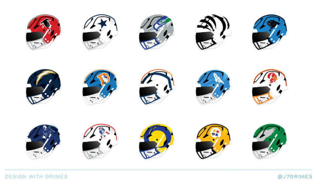
I was intrigued to see the Uni Watch article in early December about there being 15 teams wearing alternate helmets next year. The first year where the “one helmet rule” is lifted. My mind went spinning on which teams it would be so I created my own set of teams (in no particular order) that I’d like to see! Behind each concept is a reference photo for the whole uniform. I have a fun reveal and explain more in my YouTube video so check that out. Enjoy.
Here are the helmets depicted in the video:
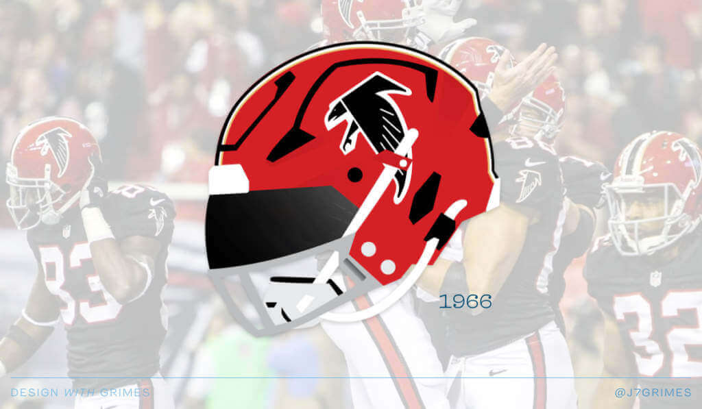
Atlanta Falcons
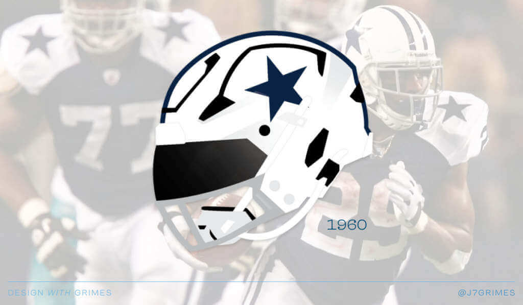
Dallas Cowboys
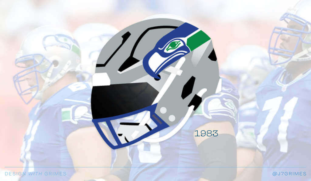
Seattle Seahawks
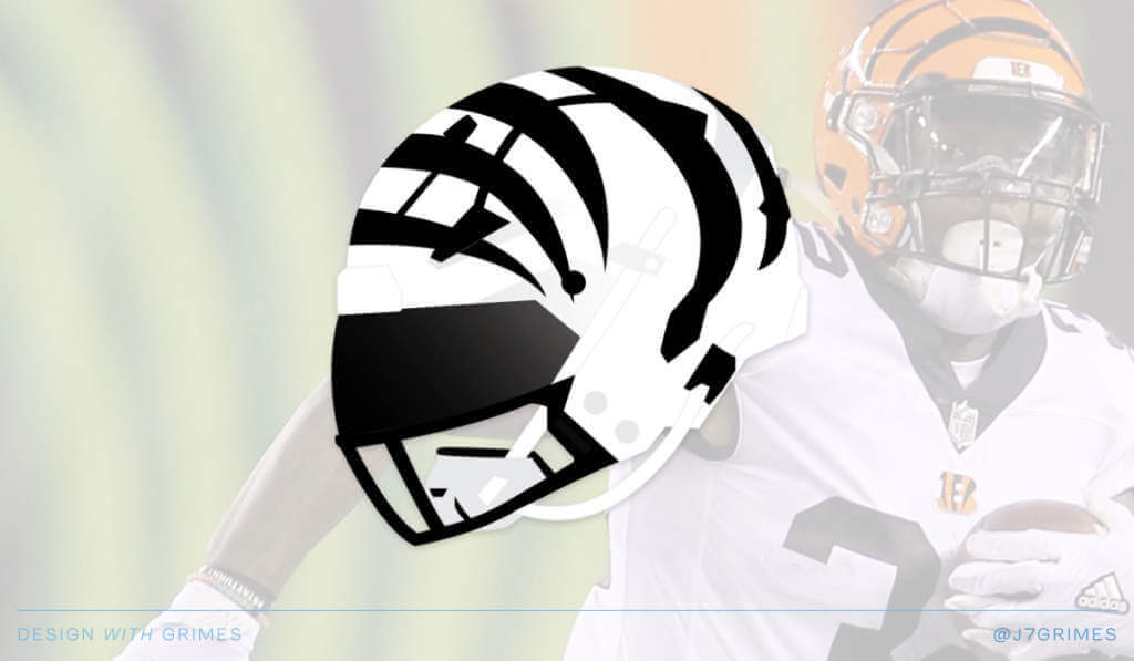
Cincinnati Bengals
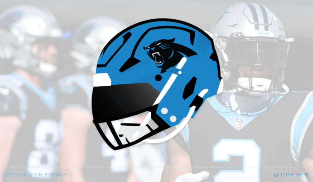
Carolina Panthers
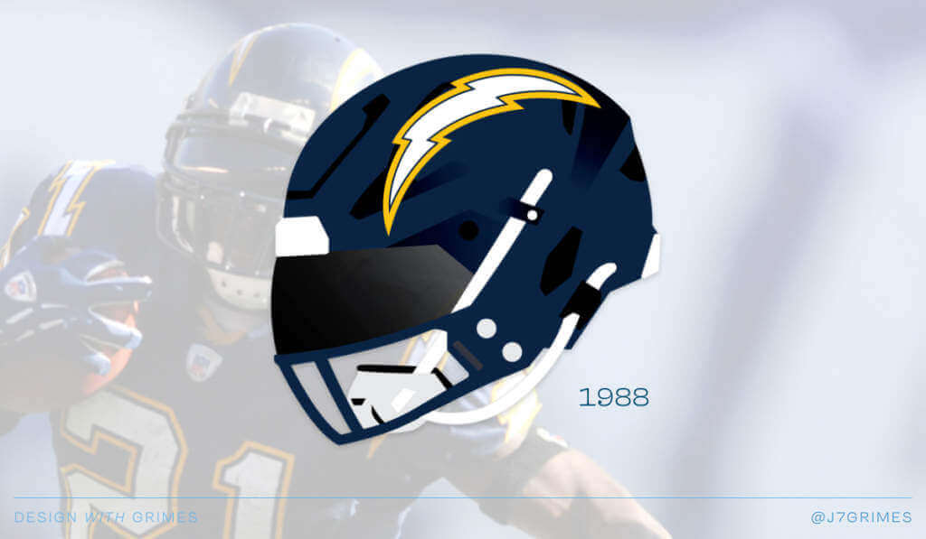
Los Angeles Chargers
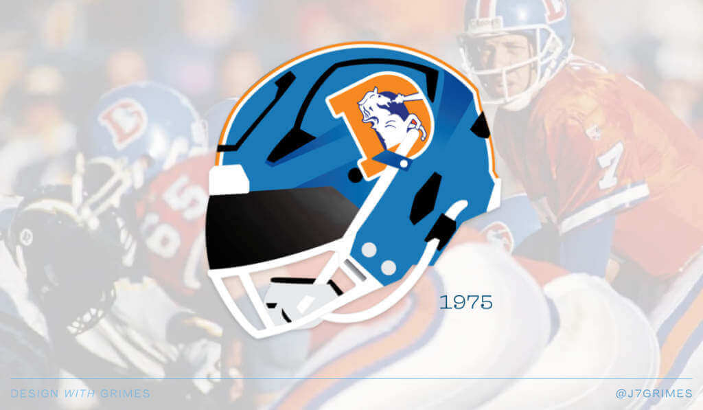
Denver Broncos
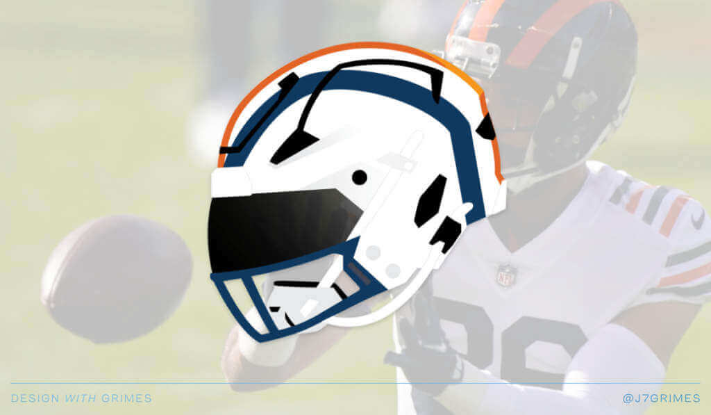
Chicago Bears
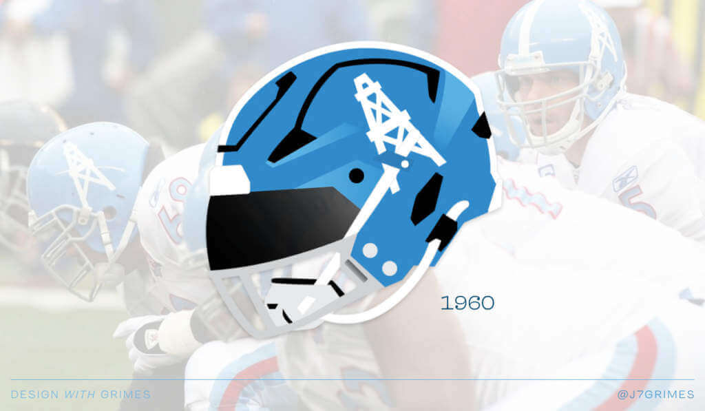
Tennessee Titans/Houston Oilers
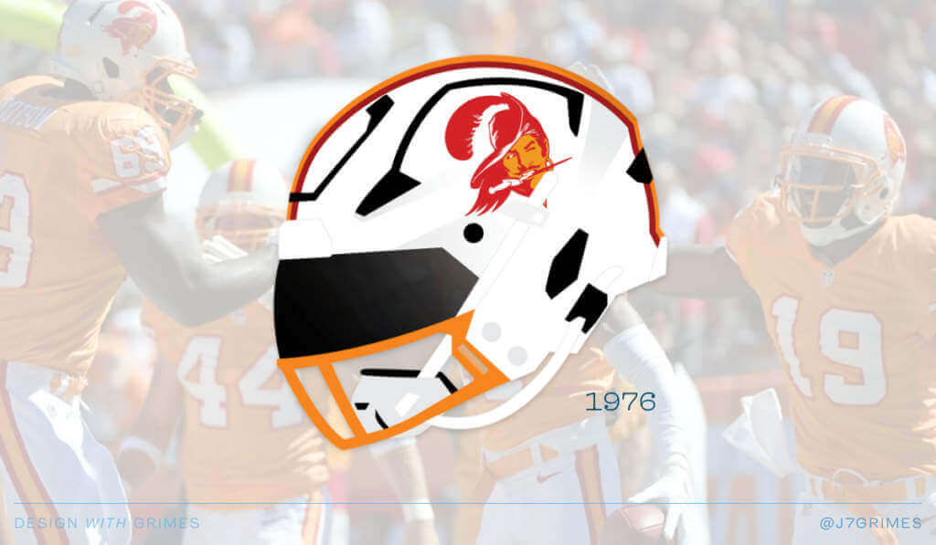
Tampa Bay Buccaneers
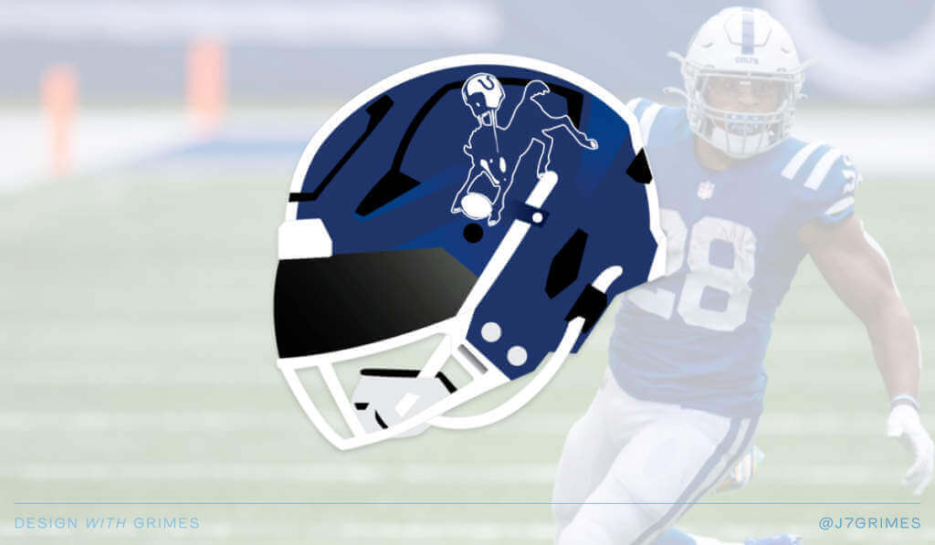
Indianapolis Colts
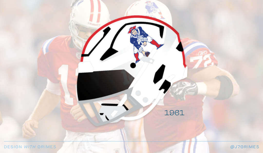
New England Patriots
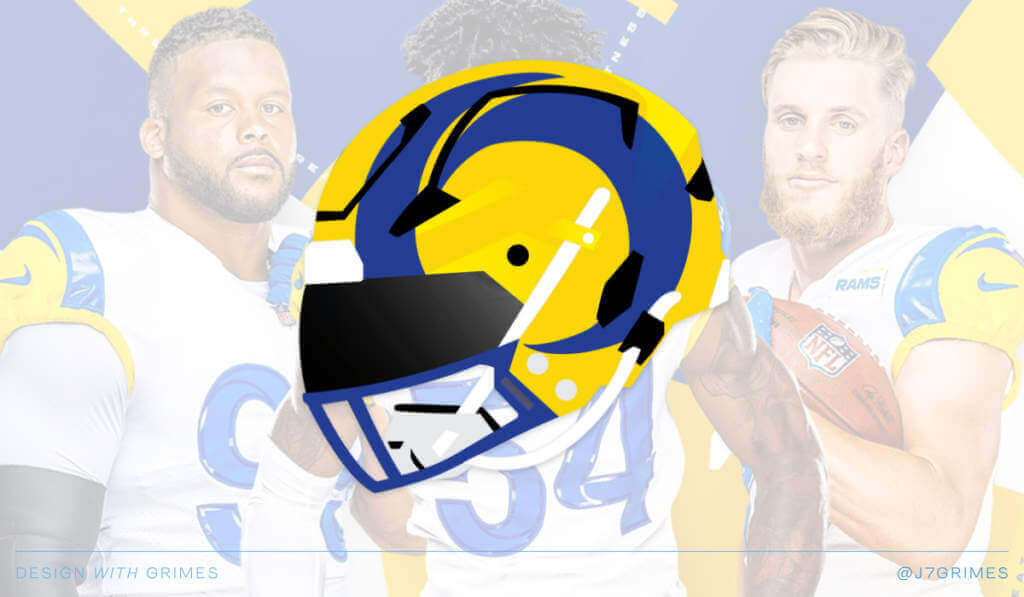
Los Angeles Rams
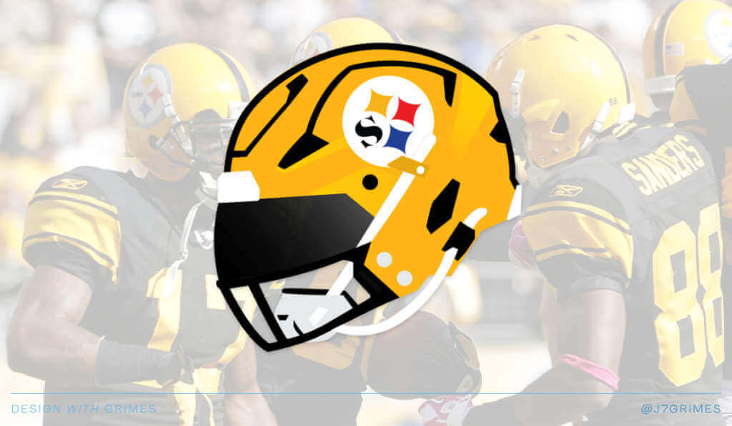
Pittsburgh Steelers
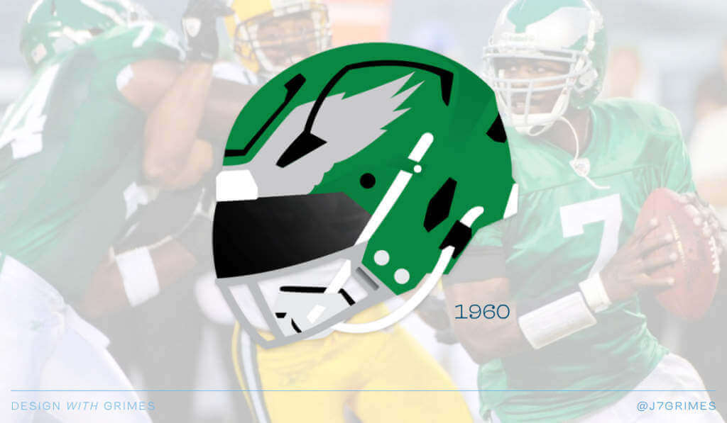
Philadelphia Eagles
There you have it. 15 possible alternate NFL helmets that we may see next year. If interested, here is an interactive link to click around yourself.
Can’t wait to see how the actual teams reveal their alternate shells!
And there you have it. Thanks, Jordan!
What do you guys think? And almost as importantly — what do you think of using video as the main portion of the lede story? Would this be something you’d like to see more of — or is this format better suited to the usual text/pictures? I’m curious whether or not this would be something that appeals to you as readers — please let me know in the comments below. I happen to love it (and Jordan’s piece was very well done), but I’d love to hear what you think too.


Guess The Game…
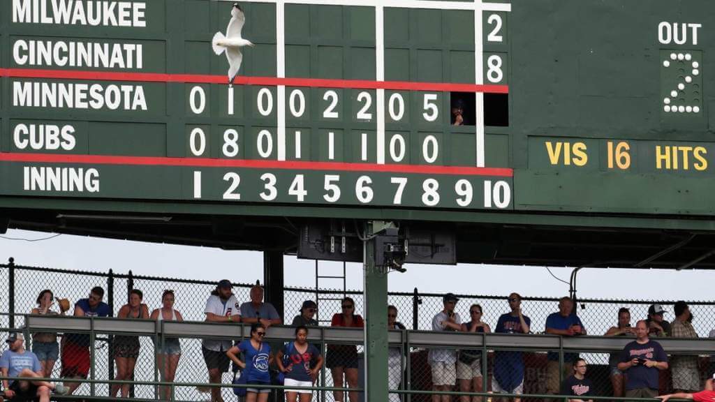
from the scoreboard
Today’s scoreboard comes from Kelly Howard.
The premise of the game (GTGFTS) is simple: I’ll post a scoreboard and you guys simply identify the game depicted. In the past, I don’t know if I’ve ever completely stumped you (some are easier than others).
Here’s the Scoreboard. In the comments below, try to identify the game (date & location, as well as final score). If anything noteworthy occurred during the game, please add that in (and if you were AT the game, well bonus points for you!):
Please continue sending these in! You’re welcome to send me any scoreboard photos (with answers please), and I’ll keep running them.

Uni Concepts & Tweaks
Time for more Uni Tweaks from the UW readership.
I hope you guys like this feature and will want to continue to submit your concepts and tweaks to me. If you do, Shoot me an E-mail (Phil (dot) Hecken (at) gmail (dot) com).
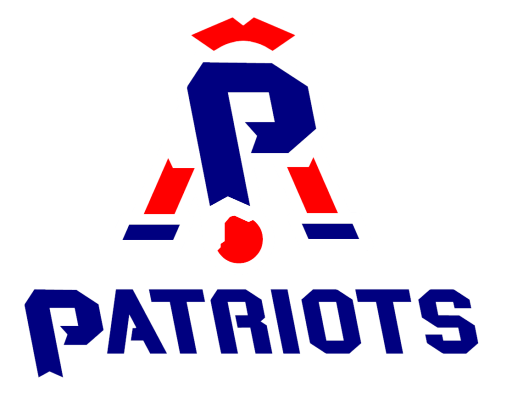
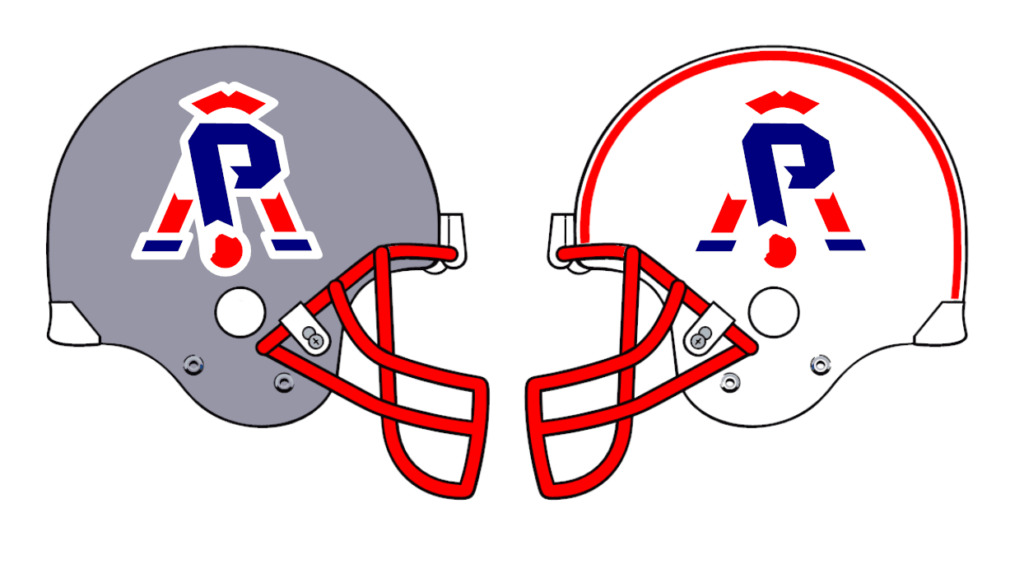
Today’s concepts come from John J. Woods:
Hi Phil,
As a kid, drawing the Patriots logo was difficult because of all the detail.
The logo starts with shoulders. One arm is straight to the ball. The other is bent on the knee. Like the letter P.
Note: people talk about not using Native American imagery in logos. They also cannot create logos with, well, Caucasian imagery either. This logo avoids that.
John
OK readers (and concepters). If you have some tweaks or concepts, shoot ’em my way with a brief description of your creation and I’ll run ’em here.
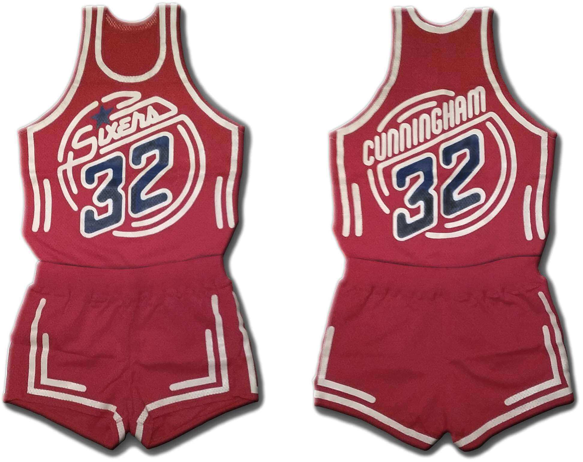
And new a few words from Paul Hi there. In case you missed it on Friday, my latest piece on Bulletin is an exclusive interview with the designer who created a prototype uniform for the 76ers in the early 1980s. As you can see above, the design had a neon sign motif, but it was more involved than that — it was meant to shimmer under black light — yowza!
It’s a fascinating story, loaded with photos and original mock-up drawings. I hope you’ll check it out here.
The Ticker
By Anthony Emerson


Hockey News: The logo for the 2022 Heritage Classic, to be held in Hamilton, On., has been revealed. … The Premier Hockey Federation has revealed their 2022 All-Star Game logo (thanks, Jamie). … The ECHL’s Kalamazoo Wings painted their ice in rainbow colors for pride night. The Wings will also be wearing rainbow-accented sweaters (from Wade Heidt).

NBA News: This New York Daily News article discusses how the Knicks have seemingly nixed their “Classic Edition” unis for the foreseeable future, being pulled for the league’s jersey schedule site (from Nicklaus Wallmeyer).

Soccer News: A small club from the Brazilian state of Tocantins, Taquarussú EC, has completely stolen Toronto FC’s crest (from Andreas Papadopoulos). … Borussia Dortmund are letting anyone submit a design for their 2023-24. Submissions will be accepted until February 6. After that, a jury of nine, including club captain Marco Reus, will pick nine favorites which will then go to the public for a vote in March.

Grab Bag: The town of Bath, Maine, has a new logo. … The superintendent of Edina, Minn., public schools has decided to drop the school system’s hornet logo after the former student who designed it filed a copyright infringement lawsuit on Monday (from Aaron Richards).
Uni Tweet of the Day
Screw the throwback helmets…just have the ‘pokes wear these shades again.
Staubach. The 1978 NFC Championship. 43 years ago today.
No blue jersey curse on this day for the #Cowboys, just a stud in a gorgeous uniform. pic.twitter.com/QAv0Mt3OkC
— Kevin Gallagher (@KevG163) January 7, 2022
And finally… that’s all for today. Big thanks to Jordan for that really neat presentation. I’d bet at least half the helmets he’s identified will end up being worn next season.
Everyone have a great Saturday and I’ll catch you back here on the morrow. Until then…
Peace,
PH
Grimes had zero new or original helmet design ideas.
My thoughts exactly. We’ve seen all of these, many times.
In addition, Bucco Bruce should be facing the other way. The feather goes toward the back of the helmet. The logo is mirrored.
And there’s a logo on the left side of the Steeler’s helmet. That’s gotta be a mistake. If it wasn’t, then i’s gonna be one.
The thunderbolt on the Chargers’ helmet is backwards, too.
A white Bears helmet for a throwback 1936 uniform that included a navy helmet? Absolutely not.
Taquarussú EC didn’t think things through. They left the stylized maple leaf at the top of logo. There are no maple trees in South America.
Would love to see a white Browns helmet.
For me I prefer the images to the video so I can quickly see the concepts since that’s what I’m really interested in. 17 minutes is too long so I was thankful the images were also included.
I agree. I’m not always in a place where i can play a video without disturbing other people around, or have that much time to commit to sitting and watching a video.
I agree as well. I’m not a fan of the video.
Another vote of support. Pics > videos. Thanks for the screengrabs.
Count my vote for the pro-text/pic – anti-video camp. Links to interesting videos are great, so we can watch them (or not watch them) as we desire, but a long video is not what I come here for. That being said, I love that uni-watch is willing to both try new things and take community feedback!
And that Patriots logo is a lot of fun! I’d loved to see it as as an alternate or secondary.
Jordan’s alternate helmet’s piece is good. Thanks for the time to put it together!
While the Pat Patriot logo will always be my favorite, John J. Woods’ Patriots design is really clever and would be a stratospheric improvement over the team’s current logo. And yeah, Pat Patriot is hard to draw, especially in childhood but also in adulthood.
Regarding videos, in my case, I’m about one-tenth as likely to watch a video as read a text entry, though certainly some videos are well worth prominent placement.
Creative concept. Not sure I would like it as a primary logo but it’s a nice secondary or alternate for sure.
My first reaction scrolling down the page was “what is that” and then as soon as it clicked, instantly liked it, really clever, definitely an improvement over the current logo.
Easier to read an article and not get caught by your employer.
July 1, 2018. Cubs 11, Twins 10.
Bucco Bruce being backwards in his mockup drives me insane.
Guess the game:
July 1, 2018, Wrigley Field, Chicago. Final score Cubs 11, Twins 10
Cubs Pitcher Jon Lester hit a three-run homer in an eight-run second inning and got the victory to complete a three-game sweep for Chicago.
Would like to see more unique helmet designs like the Rams and Bengals, and not just throw-backs. We know what the throw-backs are. Also we know the newer helmets have venting, but the black lines are very distracting when looking at these helmet designs.
Love that Pats logo concept
Two reactions:
1. Prefer visual to video so I can move at my own speed. IF there is a video, 17minutes is waaay too long.
2. Hate seeing the Titans in Oiler blue. That belongs only in Houston.
Johnny Woods~
That is one of the best, if not the best, concepts I’ve ever seen posted here. Well done.
Here is the game story: link
Video can supplement static images, but shouldn’t replace. It’s not usually possible for me to watch a video when I’m browsing the site, and even if I could, I don’t want to have to constantly pause it when I want to ‘take in’ a graphic.
That being said, recordings of some of Paul’s interviews would be nice to post along with the transcript. It would be nice to hear if the tone is joking or stoic when they answer some of his questions. I know that might require too much editing though.
That Patriots concept is really clever! I dig it.
I too vote for more text and images and fewer videos. Enough of the web is saturated with (largely unnecessary) videos already.
The most absurd example is illustrative. I once played a video on a local news site because the story had a plausible visual element that I wanted to see. The entire video consisted of the reporter reading the story with the news orgs logo as the sole visual.
Right, wrong or otherwise — I bet you a dozen donuts Bills pair their red helmet with the red color rush.
I only got through a few minutes of the video. But my short attention span is not very suitable to be a litmus for the masses.
Steeler logo left threw me for a loop. That’s uni-watching 101.
The Pats design is very clever. I’ve been opposed to Caucasian logos for years. Not because I find them offensive, but rather exclusionary. I think they are subtle (or not so subtle) examples of white supremacy. Like before the JUMBLE illustrated people of color. Those little privileges that speak volumes.
If a Black player on the Raiders wants his pirate to be Black, make it happen. With the onset of multiple helmets coming into play, why not a minor variance in a logo.
When Randy Moss was a Raider, there was a shirt that had his face in the Raider logo with RANDY instead of RAIDERS and it was pretty cool looking. I will see if I can find a pic.
why not a minor variance in a logo.
Then it isn’t uniform. The better way for you to fix the problem you claim exists is to change the logo itself for all players, all uses.
The problem exists.
My solution was hyperbolic.
Your solution is what I wish for.
“people talk about not using Native American imagery in logos. They also cannot create logos with, well, Caucasian imagery either. This logo avoids that.”
This isn’t the issue. The issue with so much Indigenous imagery in logo is that it uses their culture as a mascot, and the images that are used are dependent on the image being of someone Indigenous. When you use a white person, that’s not critical to the design. For example, if the Patriots logo was a person who is black. But if the old Cleveland baseball team was a white person, that changes things because it’s dependent on the Indigenousnous.
Can you show me a logo that includes a person who is white that is offensive?
Well, not offensive. He said “cannot create logos.”
I don’t think you’ll see a logo with a white cavalier or a white prospector or a white Bob Weiss with a rocket pack on his back. The NBA has a good number of teams that are either animal or concept (Magic, Heat, Thunder). And who can forget a warrior that was neither white nor black but blue. A blue warrior.
“Can you show me a logo that includes a person who is white that is offensive?”
Nobody finds the Ottawa Senators’ logo offensive, but it checks all the same boxes as the Native American logos that bother people. It is culture-specific (a non-white Roman soldier wouldn’t make any sense), and it’s being appropriated by people who may or may not be of Roman descent.
Not offensive, but puzzling: a Centurion is not a Senator, but that’s what is pictured on the sweater.
Notre Dame Fighting Irish
No, because a leprechaun is a mythical character, not an actual human being.
Why is it offensive to you?
I’m Irish.
I’m fine with the pics over the video.
The Bucs and Pats are no brainers. I think the Eagles should either be early 70s (white with green wing) or the Randall Cunningham-era.
I like the idea of that Bengals no orange to go with the white color rush type uni. But at some point I wouldn’t mind a scaled back throwback to the BENGALS helmet. Maybe a mashup of the late 90s uni (which I think is their best look) with that older helmet.
I like the concept of having video sometimes. I think having some video content is a nice deviation from pics/text that we are used to.
I caught a Liga de Béisbol Profesional Roberto Clemente game on cable last night where the Gigantes de Carolina played the Indios de Mayagüez. Are Los Indios another misappropriation of native iconography, or are conditions different because they play in Latin America?
The new Washington team has already announced and shown 2 different helmets for the upcoming year, burgundy and black.
Caucasian Imagery? I guess the Fighting Irish logo is out. SMH.
Would love to see the Eagles start off with the Kelly green as an alternative but ultimately flip flop with the midnight and have it as their primary. I find the current set to be dark and gloomy. Ready for a change, any change really.
Love that Patriots concept! Great work!
No one calls the cowboys the “‘pokes” unless we’re talking about Oklahoma State
Great Patriots concept logo!
Good content!
I generally prefer text and photos to video (though occasionally video is just fine).
The alt helmets are underwhelming…and too many gray facemasks!
The Patriots concept logo has a “Terrance and Phillip” vibe; it’s ok but there’s no topping Pat.
And yes, Staubach looks terrific in bad luck blue, that day and today.
I rarely comment here, but read and enjoy often, and I have to say that I’d rather not see video content taking over the regular column space.
NO to video. I am all about pics and not vids
Staubach was GORGEOUS in blue
eom
I am perhaps getting old, but I still like to read articles and look at images for most things on the interwebs. Still stubbornly have the local paper (now more of a pamphlet) delivered everyday even if I usually read it online.