For all photos, click to enlarge
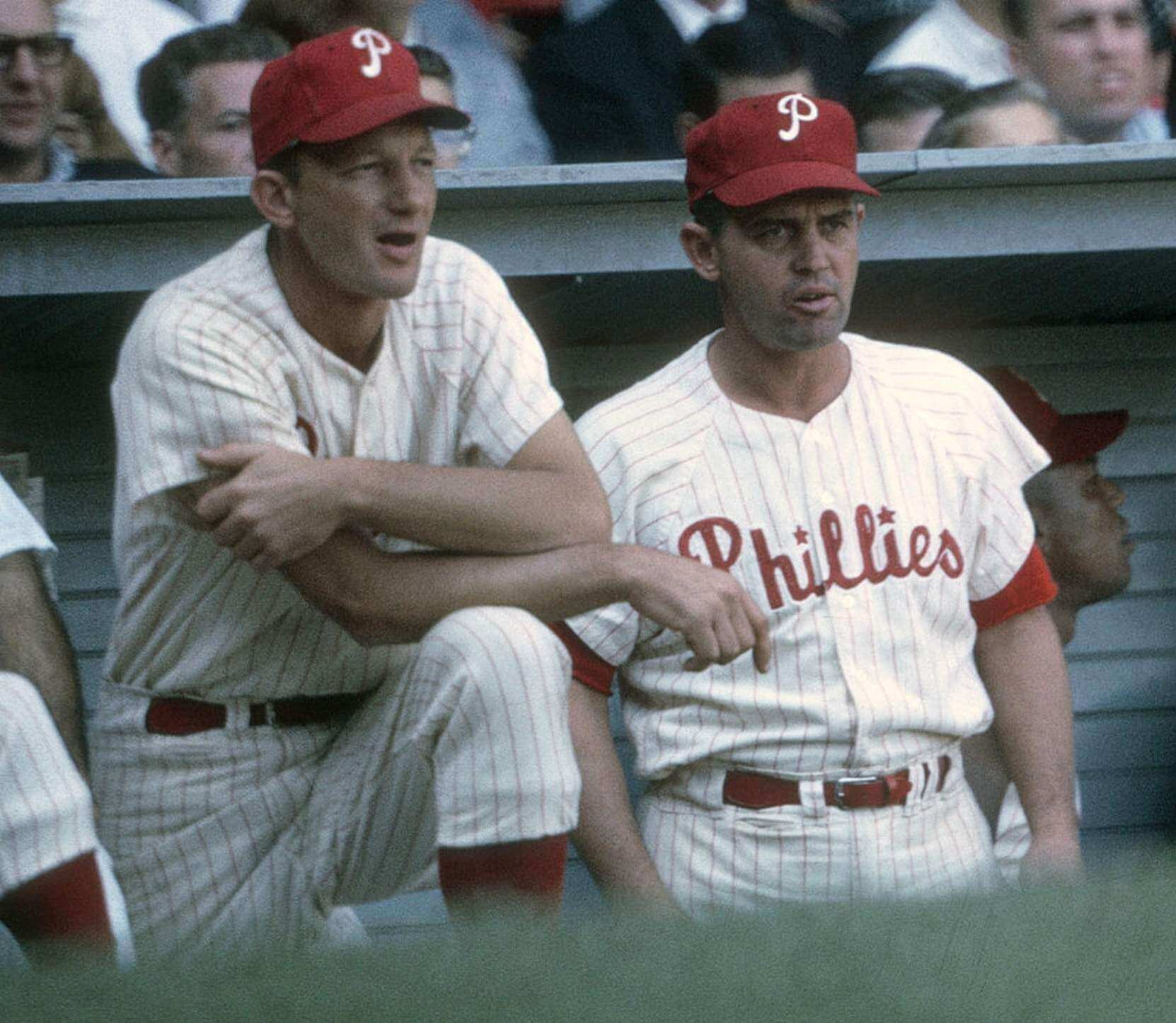
The gent on the right in the photo above is Phillies manager Gene Mauch, who skippered the Phils from 1960 through 1968. Why am I putting that photo at the top of today’s post? Because if you look closely, you can see that Mauch’s pants had the exact same type of front pocket that I wrote about in Tuesday’s post about Expos coach Duke Snider’s pants. In fact, the coach next to him appears to have the pocket as well!
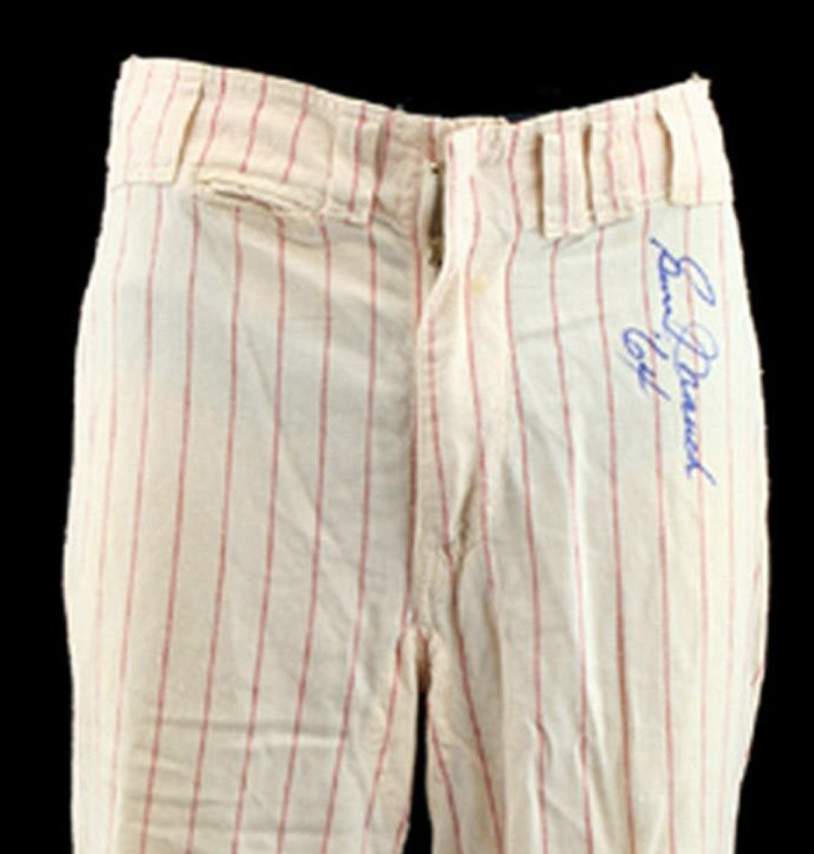
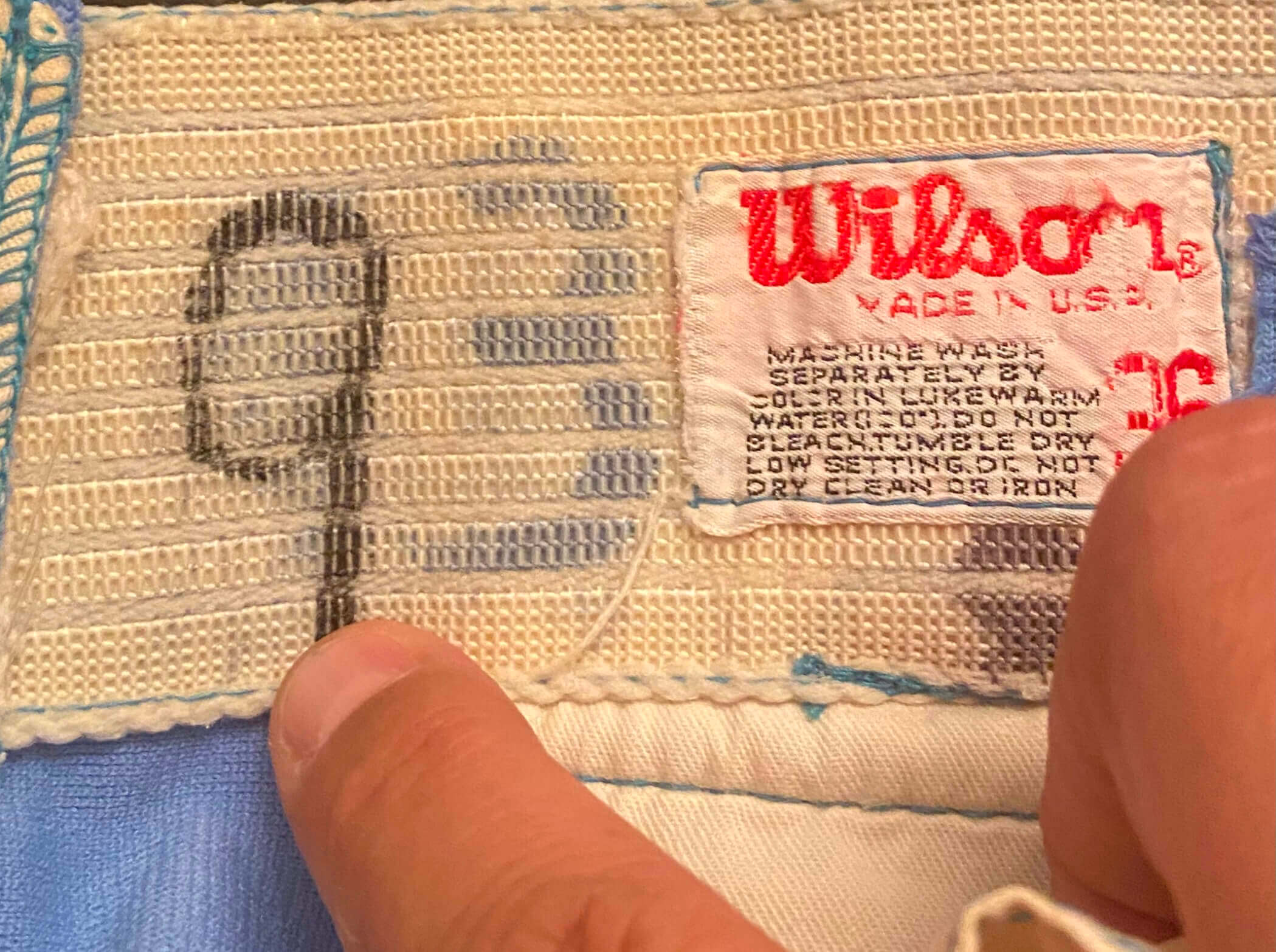
I know some of you may be thinking, “That might be a fold or wrinkle, not a pocket.” But it’s definitely a pocket, and here’s a pair of game-used Mauch pants to prove it (photo taken from this auction listing):
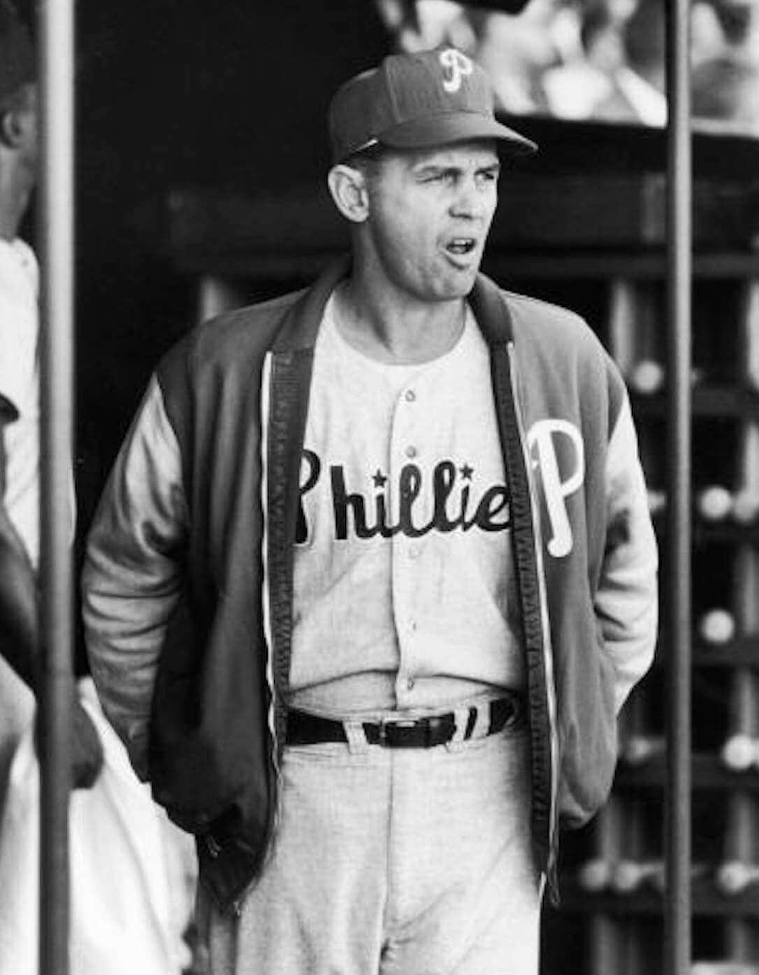
Did Mauch also have the pocket on his road pants? He sure did! Dig:
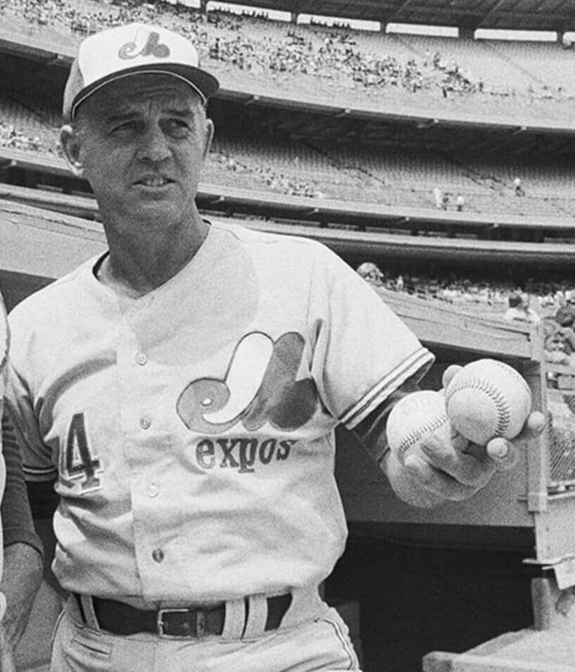
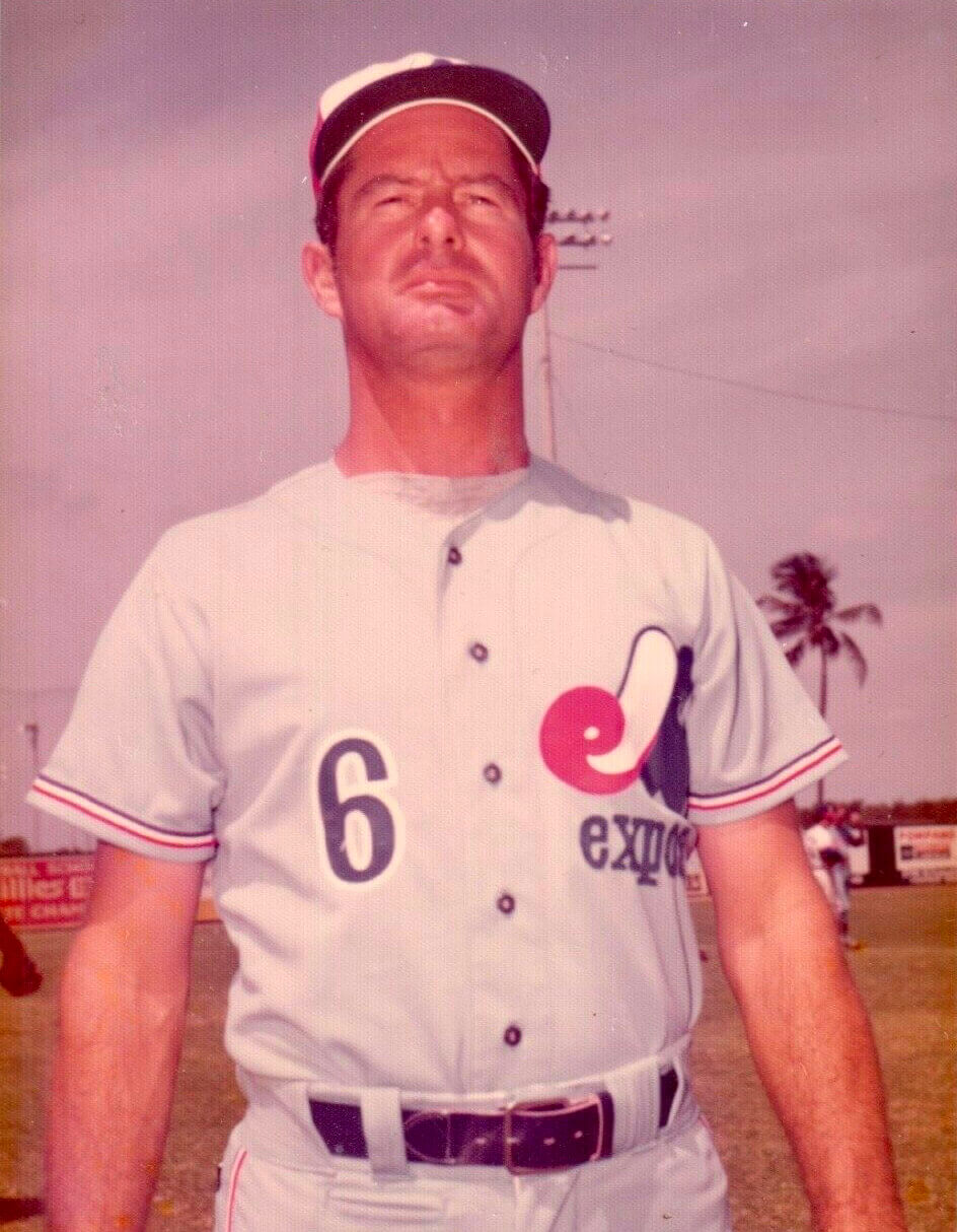
If you know about baseball history, then you probably know that the next team Mauch managed after the Phillies was the Expos — where his hitting coach for part of his tenure was one Duke Snider. Did Mauch also wear the pocket in Montreal, and is that where Snider got the idea? We’ll probably never know the answer to the second question, but Mauch definitely wore the pocket while skippering the ’Spos:
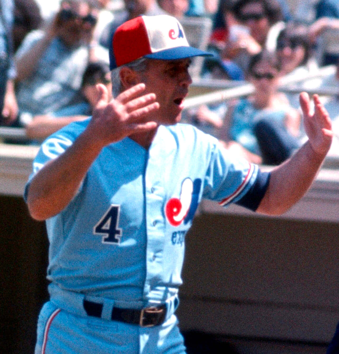
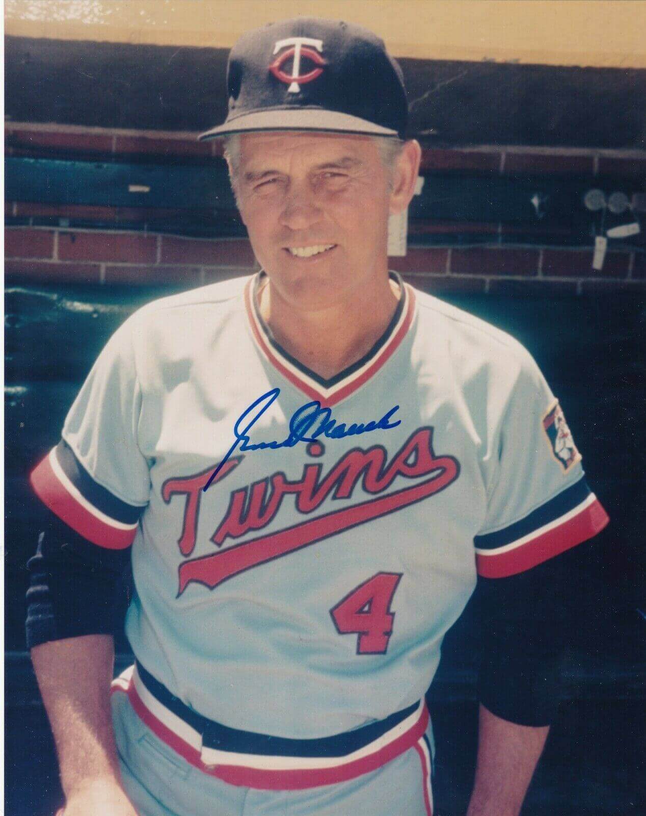
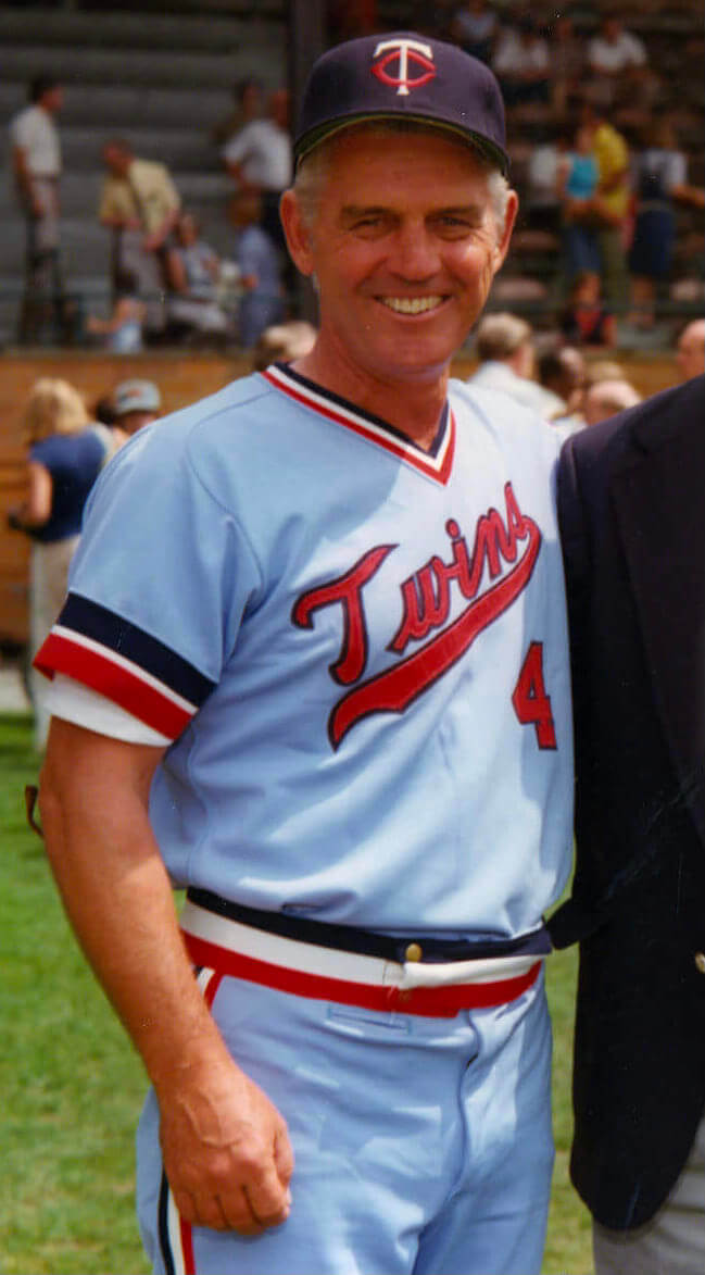
The next team that Mauch managed? The Twins. Did he wear the pocket with them as well? Yup:
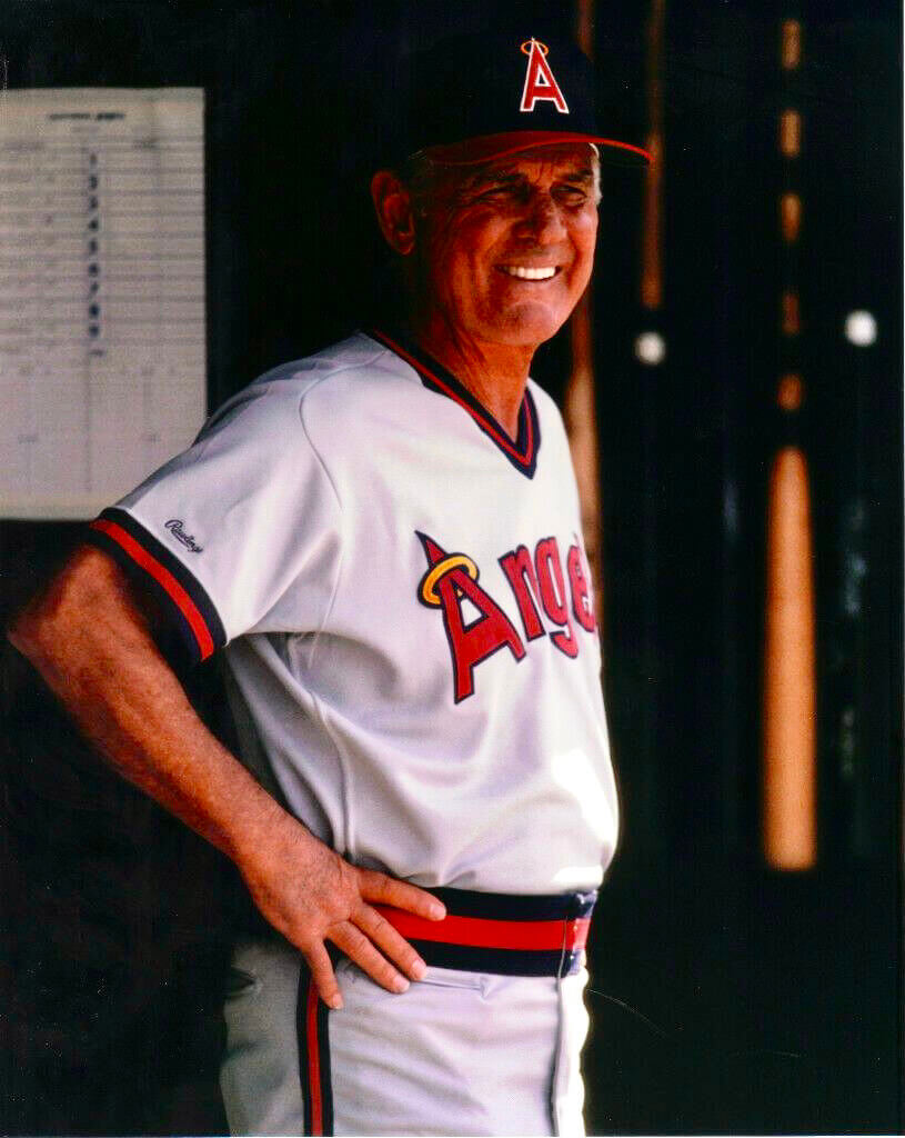
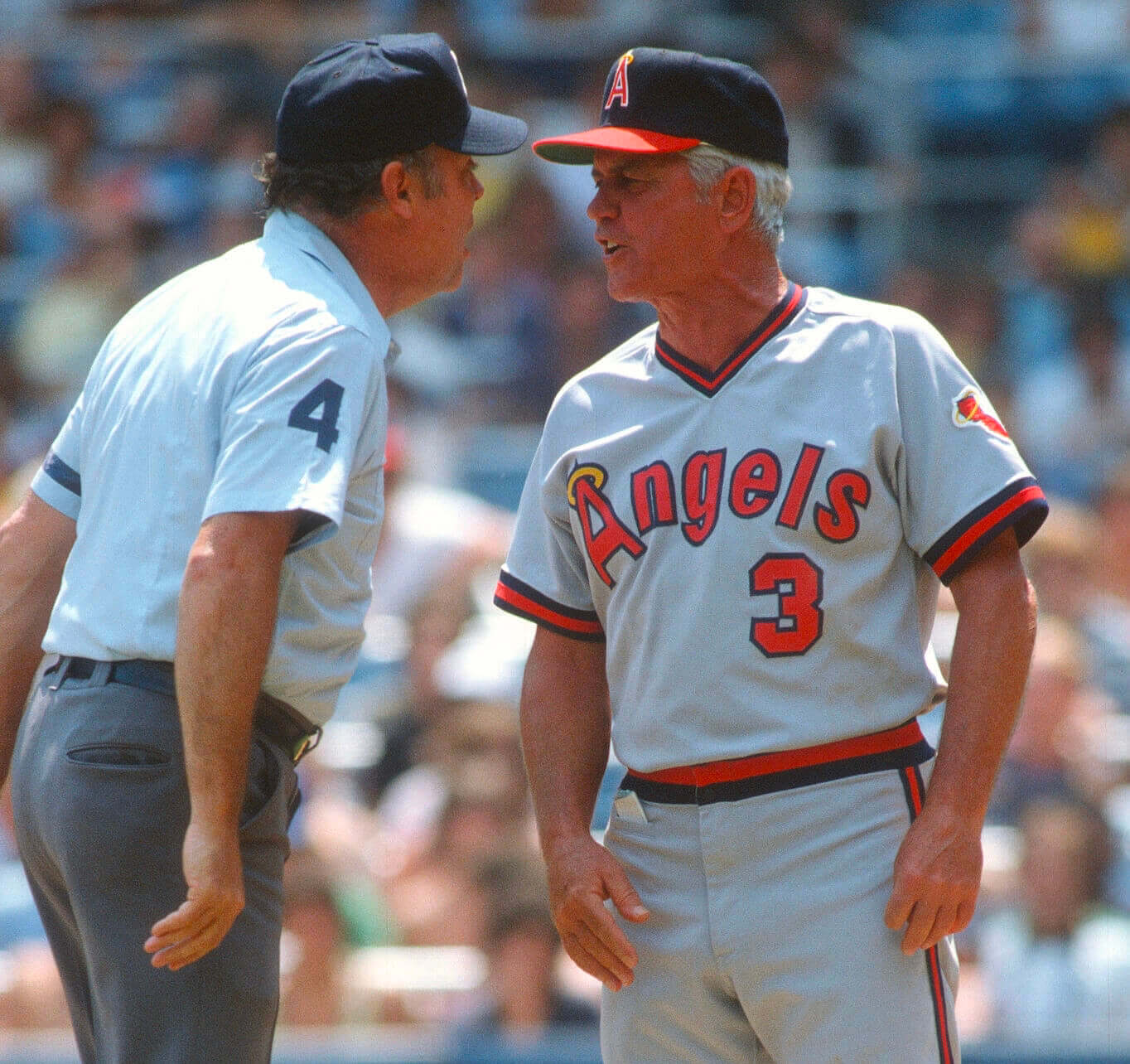
After spending the late 1970s in Minnesota, Mauch spent two separate stints with the Angels in the 1980s. And by now you can probably guess what little bonus feature he had on his pants:
So we now know that Mauch was a consistent pocket partisan over a span of four teams and about a quarter-century. But the question remains: What was this pocket for? What did Mauch keep in it?
We have a hint of an answer in these next two photos:
It’s hard to be sure, but that looks like it could be Mauch’s lineup card, folded in half. Whatever it is, it’s good to see the pocket in use, right? (Also, it’s worth noting that Mauch was a longtime smoker before kicking the habit in 1988, so maybe he also used the pocket for his lighter.)
But wait, there’s more! It turns out that yet another Expos manager — Karl Kuehl, who skippered the team for most of 1976, after Mauch was fired — also wore the pocket, at least in this spring training photo:
Kuehl didn’t even make it through the 1976 season before being sacked. He was replaced by interim manager Charlie Fox (I couldn’t find any pics of him in a Montreal uni), and then the Expos hired Dick Williams in 1977. Did Williams also wear the pocket? Possibly! Take a look at this photo:
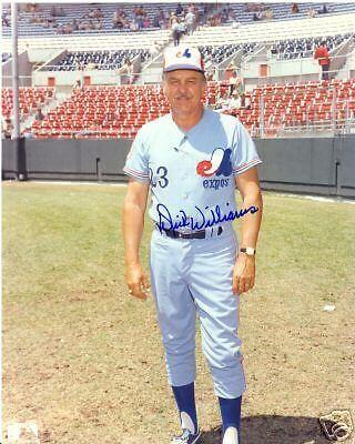
It’s hard to be certain, but that sure looks like the pocket, no? As you can see from that watermark, that photo is for sale on eBay, so I’ve asked the seller if he can take a look at the original photo and let me know if Williams had the pocket or just a wrinkle. (No response yet — will advise.)
————
At this point in the story I’d like to introduce Expos collector extraordinaire Perry Giannias. He tells me that the Expos were “notorious recyclers,” so it’s possible that Kuehl was just wearing an old pair of Mauch’s pants, and/or that Williams was wearing an old pair of Kuehl’s (their listed heights and weights are similar). Similarly, pitcher Clay Kirby’s pocketed pants, which I showed in Tuesday’s entry, may have been recycled from one of the coaches or managers.
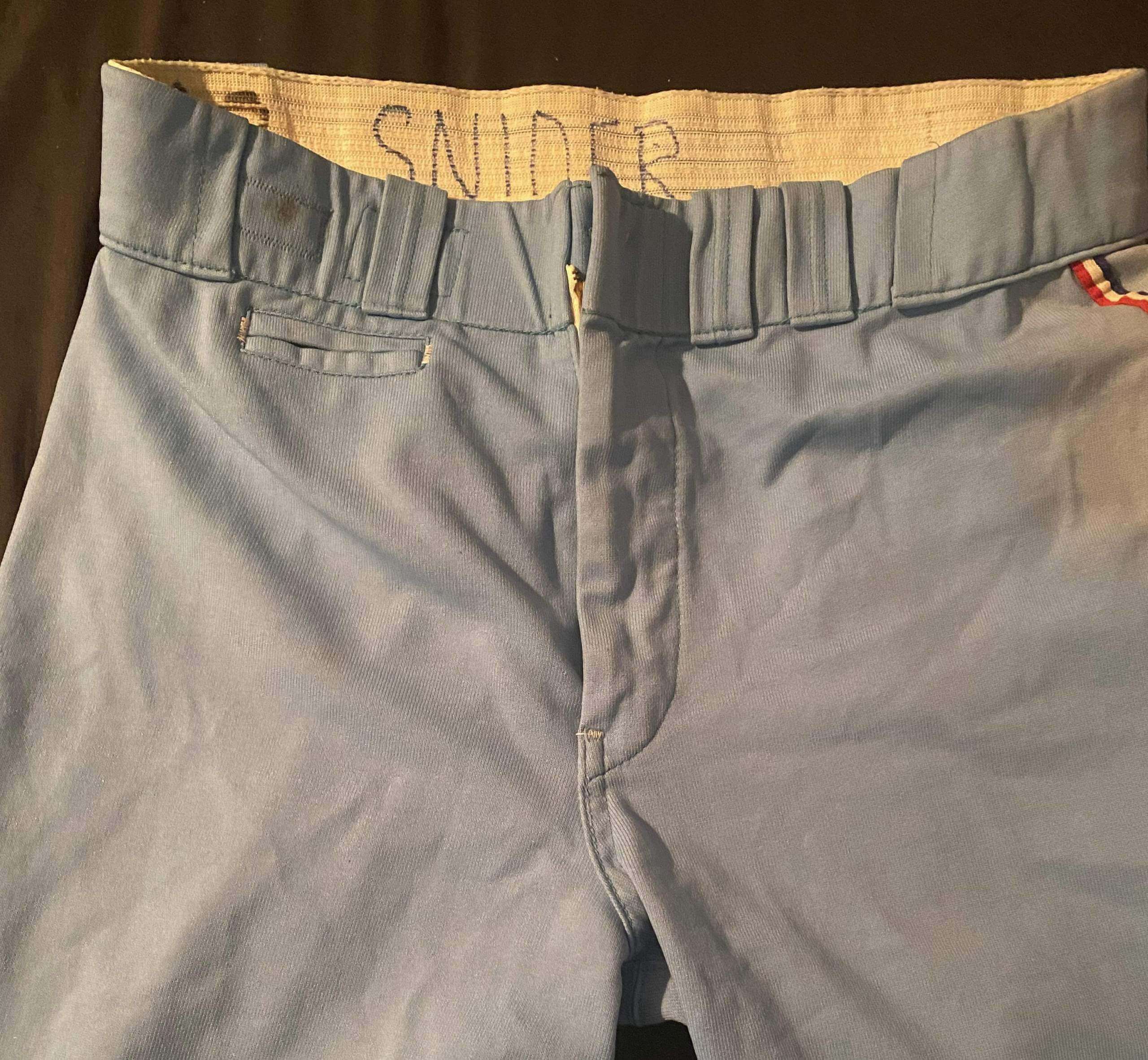
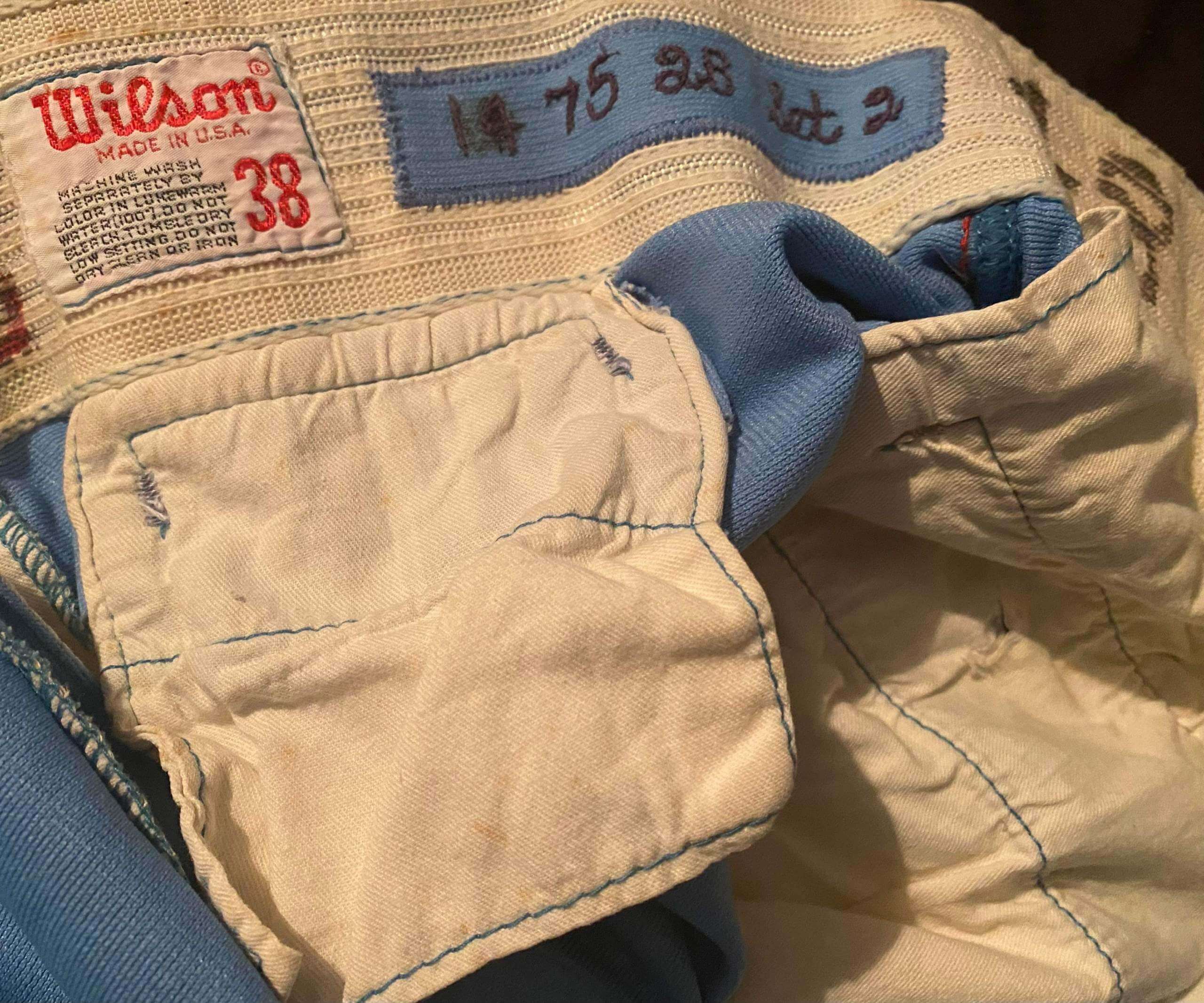
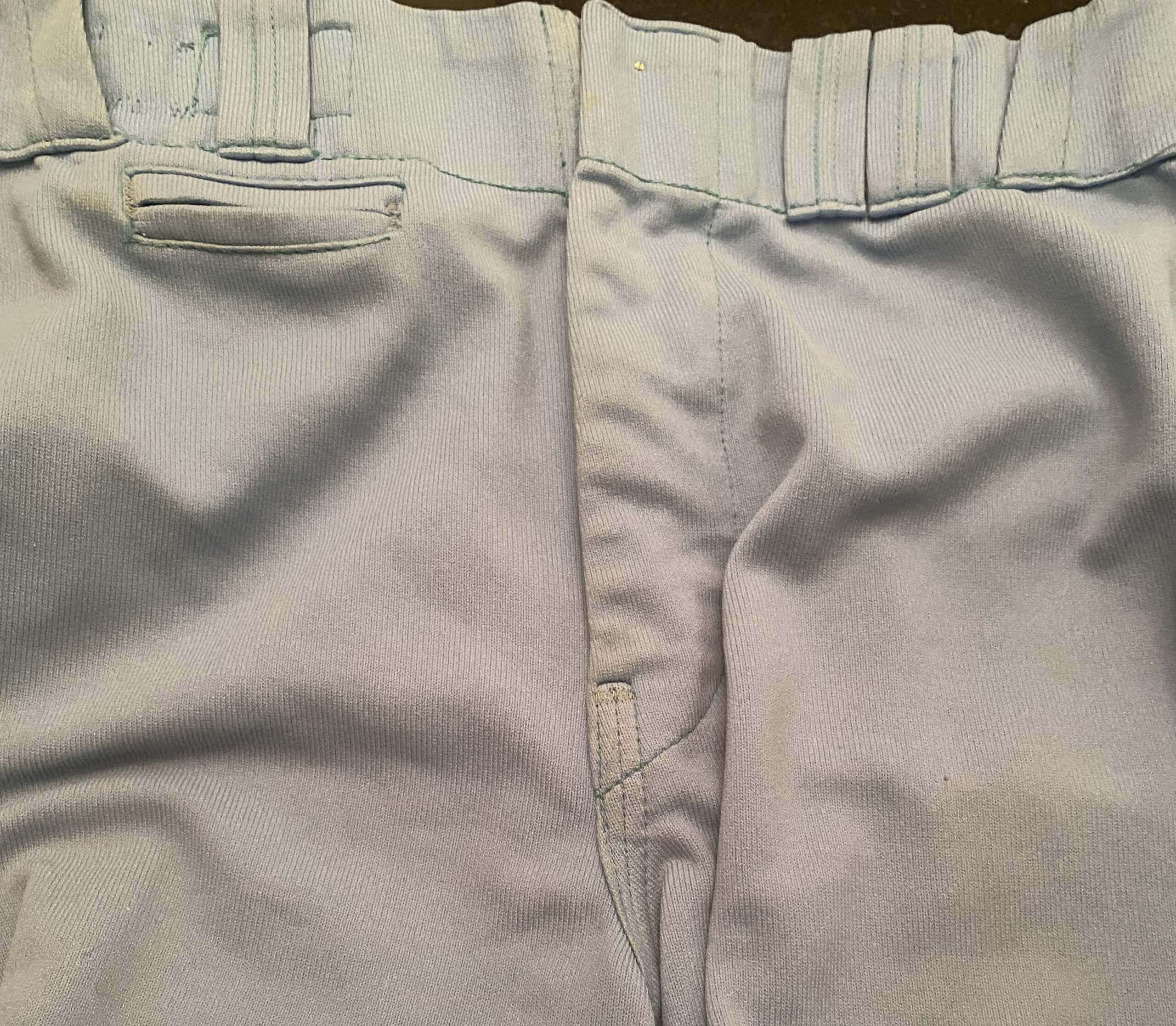
Giannias says he wasn’t even aware of the pocket phenomenon until Tuesday’s blog post was pointed out to him. He knew he owned a pair of 1975 game-used Duke Snider pants, so he pulled those out of his collection and sure enough — there’s the pocket:
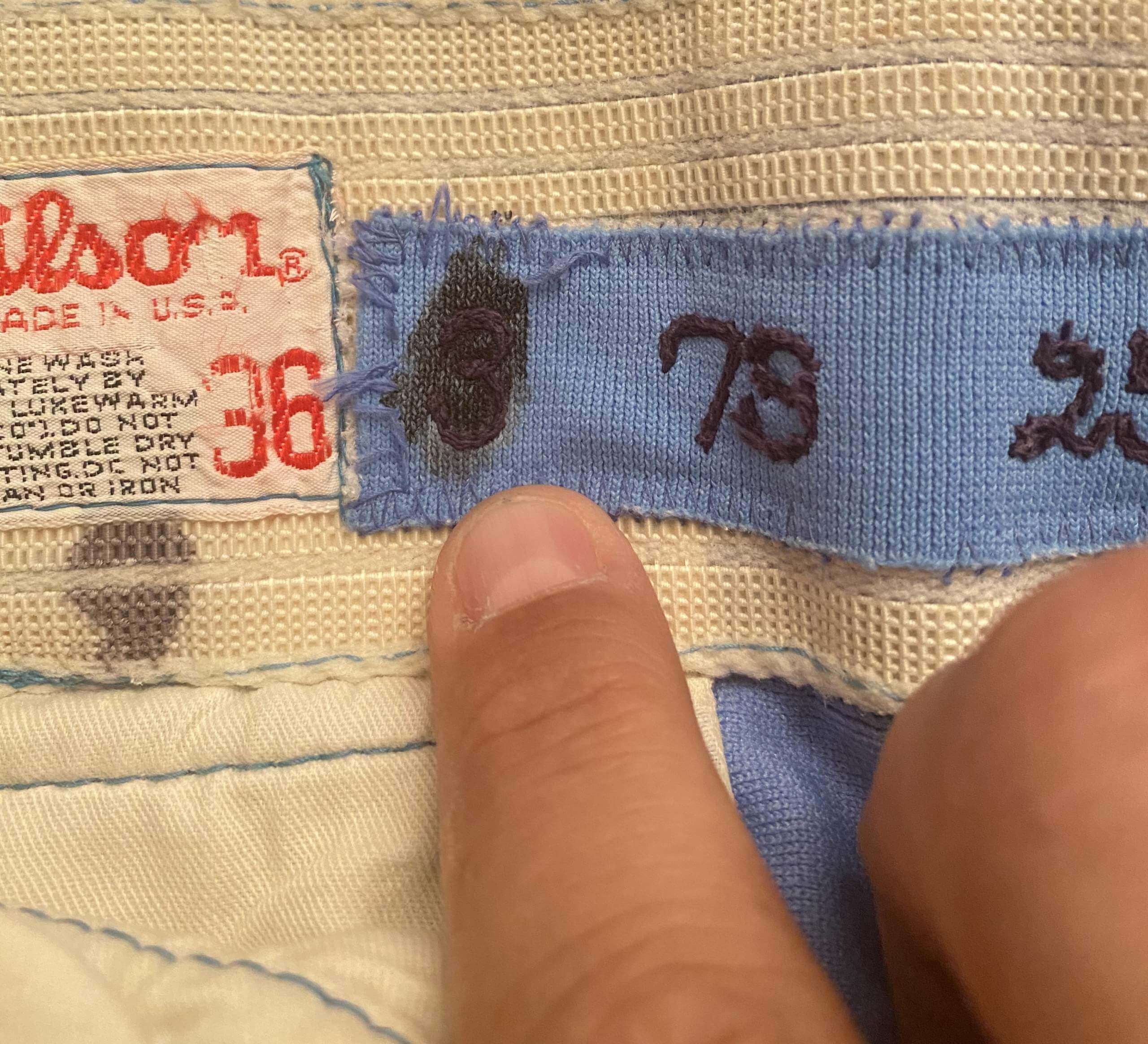
Giannias also has a pair of front-pocketed game-used pants that were originally issued to infielder Rodney Scott (No. 3) and then given to coach Vern Rapp (No. 9). On the inner waistband, you can see Scott’s original number crossed out and replaced by Rapp’s:
Since the pocket seems to have been worn mostly by coaches and managers, Giannias theorizes that it was added to this pair of pants when they passed from Scott to Rapp. He also says the pockets on all these pants were almost certainly added by longtime Expos equipment manager Harvey Stone (who, alas, is now deceased).
One final note (for now): If you scroll back up, you can see that almost all of the pocketed pants shown in today’s blog post — and also Snider’s and Kirby’s pants from Tuesday’s post — have asymmetrical belt loop arrangements, usually with two loops on one side of the belt buckle but only one loop above the area with the pocket. This suggests that one of the original loops may have been removed to provide easier pocket access.
To sum up: Gene Mauch appears to have been the prime pocket progenitor on an individual basis, and the seed he planted while passing through Montreal ended up sprouting throughout the Expos’ coaching corps.
As you can probably tell, I’m now pretty obsessed with this little uni detail, and I’m hoping we find more examples of it in the weeks and months to come.
(Extra-special thanks to Mike Engle, Samuel Barrett, and Chris Hickey for their invaluable contributions to this entry.)
Double feature reminder: In case you missed it yesterday, I have two new feature-length pieces. The first is about Buck Showalter’s surprisingly complicated uni-related history. I don’t mind saying that it’s one of the best things I’ve produced in a while, and I hope you’ll check it out over on Bulletin.
Also, with the NBA’s annual slate of Christmas games coming up this Saturday (pandemic willing), I’ve ranked the league’s Christmas uniforms from years past and also ranked this Saturday’s uni matchups. You can read this one over on InsideHook.
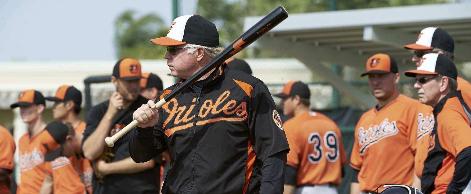
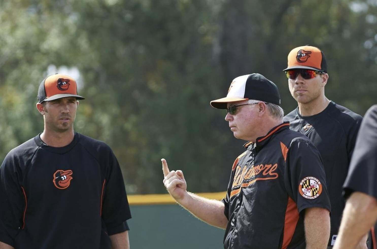
Speaking of Showalter: In the Bulletin piece, I mentioned that when he managed the Rangers, he and his coaches wore red caps, instead of the team’s usual blue, during spring training. It turns out that he had a similar protocol when he skippered the Orioles, with he and his coaches wearing white-paneled caps instead of the team’s usual orange-paneled spring/BP caps:
In addition, it appears that when Showalter managed the Yankees, his coaches — but maybe not Showalter himself? — may have worn white caps during spring training, at least judging by this photo of Showalter (blue cap) and coach Frank Howard (white cap):
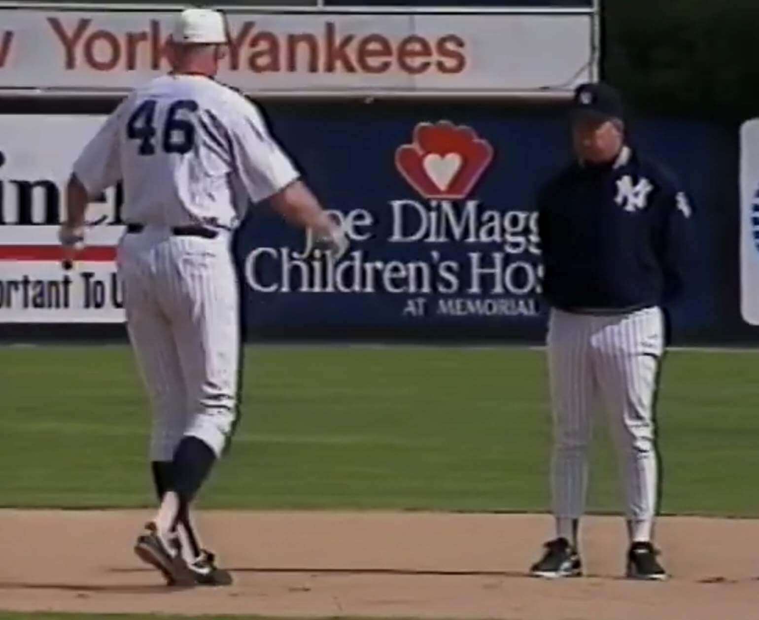
Also of note: That last photo shows Showalter wearing high-cut or ribbon stirrups, instead of his usual low-cuts. Shocking!
Meanwhile, here’s something I had forgotten about: Showalter thought the original “A” logo on the Diamondbacks’ caps was too big, so he had it reduced!
(My thanks to Keith Adelsberger, Brian Cheung, and Twitter-er @jmalex42 for helping to fill in the Showalter historical record.)

Bracketology, Naming Wrongs-style: I received an email the other day from reader Billy Ballas, as follows:
After it was announced the Staples Center was being renamed to the Crypto.com Arena, some friends and I started discussing the some of the worst venue names out there. Within this group of friends, I enjoy creating brackets and having debates and discussions to determine a winner. So I decided to create a bracket to determine the worst venue name among major North American men’s sports teams.
The four “regions” in my bracket were MLB, NFL, NBA/NHL (since there are multiple venues that host both sports), and MLS. I attempted to pick the 16 worst in each region, and randomly seeded them. (If I’d had more time, I would have attempted to put more thought into the seeding.) For each matchup, our group would vote on which venue name we thought was worse to determine which name would advance.
For the first three rounds, we used a binary method of voting, just selecting the worse name. But once we got into the regional finals, we used a linear scale of voting, ranking each venue from 1-10, with the lower score advancing. This was done to prevent ties, since there are 10 of us.
We finished a couple weeks ago, and you can see the final results here. (The formatting in some of the cells gets a little funky, like test being crossed out when it shouldn’t be, but I think you can get the idea.)
Ha! Fun stuff there. And there may be more to come — Billy says he and his friends are working on a similar bracket for the worst college football bowl names.
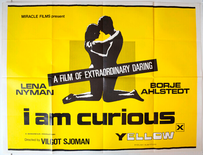
Too good for the Ticker: In 1967 there was a somewhat controversial erotic comedy movie called I Am Curious (Yellow). Here’s what the poster looked like (click to enlarge):
What does this have to do with Uni Watch? This: The longtime indie-rock band Yo La Tengo’s name is based on a story about the 1962 Mets, and at least two of the band members are big Mets fans. So for their annual slate of eight Hanukkah shows this year, they did a riff on the old movie poster, but with the two silhouetted figures replaced by two characters who look a lot like Mr. and Mrs. Met (click to enlarge):
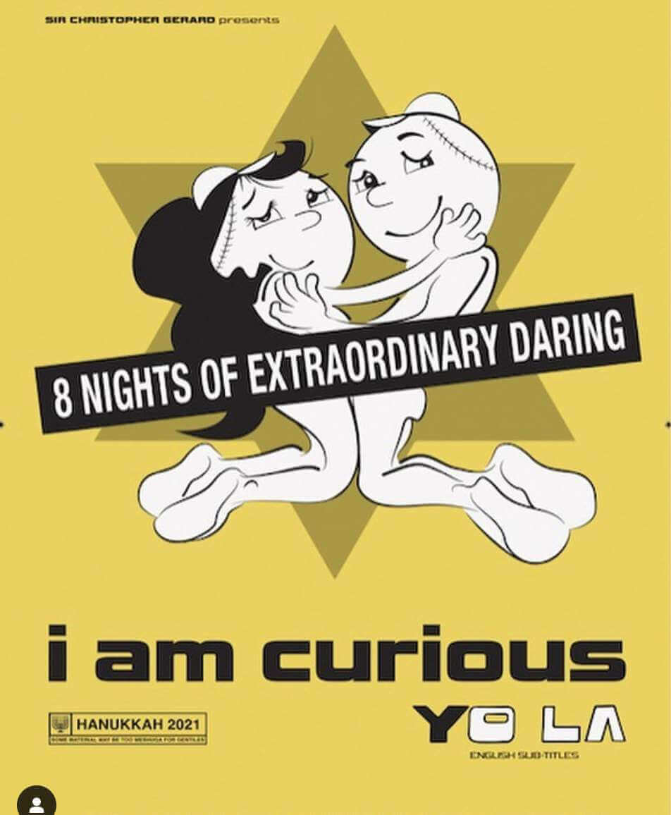
That’s really clever, even if only serious movie buffs will get the joke. I actually attended one of Yo La Tengo’s Hanukkah shows this year but didn’t see this poster. So cool!
(My thanks to Mike Ortman for this one.)

LAST CALL for the year-end raffle: Today is the final day to enter our annual year-end raffle. Full details here.
The Ticker
By Paul
Indigenous Appropriation News: The Blackfoot Hockey Association — a Calgary youth league that includes several teams called the Chiefs — will no longer use “Blackfoot” or “Chiefs” going forward (from Mike Styczen). … Remember the guy who publicly assaulted a Connecticut school board member last week during a hearing about whether to change the local school’s team name from “Tomahawks”? The school board has voted to go ahead with the name change.

Baseball News: Fun look at the history of the bullpen phone (thanks, Brinke). … Longtime A’s equipment manager Steve Vucinich, who’s getting set to retire, was cleaning out his desk and found this cool 1970s sticker featuring the logos of all of Oakland’s teams at the time (from Jimmy Lonnetti). … The Pirates have hired their first uniformed female coach (thanks, Phil). … There was talk of a new ballpark in Toronto, but instead the Blue Jays are going to renovate the one they already have. … Drummer John “Pugwash” Weathers of the prog-rock band Gentle Giant explained why he wore an A’s jersey and cap onstage (from Joe McGinty).

NFL News: Back in 1996, the Panthers’ costumed mascot, Sir Purr, was rebuked by the officials for downing a live punt in the end zone (from Trevor Williams). … Sports radio guy Rich Eisen thinks Colts fans are more likely to wear jerseys to games than fans of other teams. … Mono-white this weekend for the Bills (thanks, Phil).
College Football News: A Kent State offensive lineman was penalized for a false start two nights ago when he vomited on the field just before the ball was to be snapped. … For reasons that are unclear, at least to me, one of Army’s sideline play-calling cards is a photo of Houston Texans QB Deshaun Watson (from James Gilbert).

Hockey News: Here are Team Canada’s goalie masks for the upcoming World Juniors (from Wade Heidt). … Speaking of goalie masks, here’s Blues G Jordan Binnington’s design for the upcoming Winter Classic (from @CardsandCustoms). … Never seen anything like this before: Wayzata High School in Minnesota has their team slogan embroidered on the sleeve cuffs (from @tinger_3).

NBA News: This week’s episode of the great design podcast 99% Invisible begins with a segment about the NBA logo. Good treatment, although there’s nothing in there that the typical Uni Watch reader doesn’t already know.

College Hoops News: The Ford ad on Mercer’s court is, uh, subtle (from @BenOnSports). … Duke debuted their new white “Gothic” uniforms last night. “This design uses the deeper blue the school wore 30-40 years ago, instead of the more recent royal blue,” notes Gabe Cornwall.

Soccer News: Yesterday’s Ticker had the new home and away kits for the J1 League’s Sanfrecce Hiroshima. Today we have the keeper’s kits (from Jeremy Brahm). … A UK regulatory agency has ruled that Arsenal violated rules when it promoted crypto-based fan tokens (from Trevor Williams). … Interesting article on the history of captains’ armbands (thanks, Jamie). … Here’s a video discussion of L.A. Galaxy kit history (from @ScottyBeats86).

Grab Bag: Due to a fabric shortage, Air Force enlistees graduating from basic training will be temporarily issued fewer uniform items. … A Nebraska energy company issued a fraud alert after someone stole one of the company’s uniforms, which could be used to gain access to a customer’s home. … Design-centric site Creative Bloq has named its worst logo of the year. … Marvel recently changed its controversial Punisher logo, and some fans aren’t happy about it. … Amazon added its smile logo on the new Echo Buds 2 — in part for branding, but also because people were putting the buds in upside-down. … Here’s a fun site devoted to motorcycle brand logos (from Jerry Pemberton). … One of Jaguar’s Formula E drivers, Mitch Evans, has a new helmet for next season (thanks, Jamie). … Here’s a great site devoted to curling pins from around the world (big thanks to Tim Wood). … Fun article about Funko Pop! figurines (from Andy Moeschberger).
Billy Ballas’ naming wrongs bracket is exactly what Google Sheets is for. Awesome stuff, thanks for sharing!
Thanks, glad you like it!
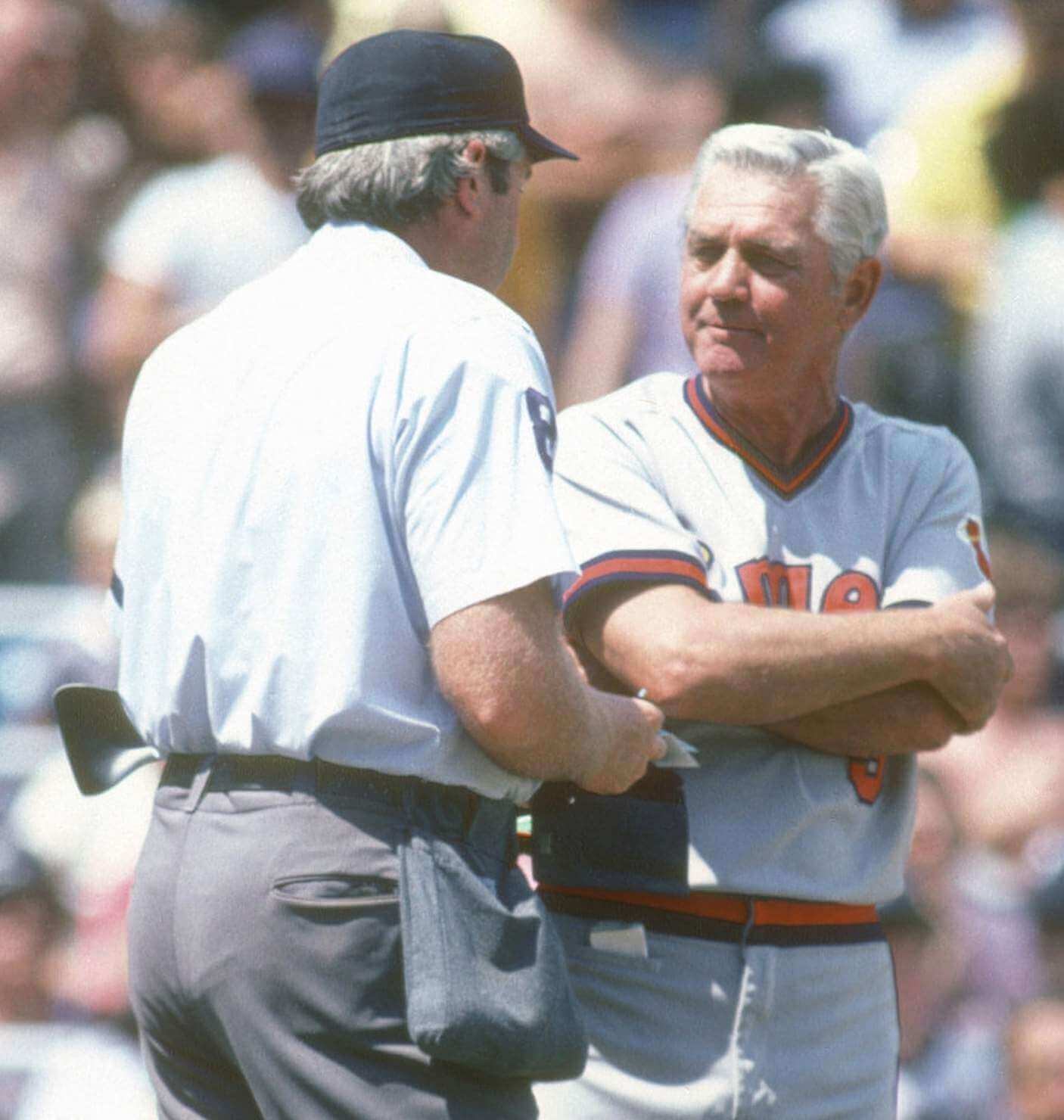
Is it just me or does Mauch look like a doppelgänger for actor R. Lee Ermey in the Angels photo with his arms crossed
I’ve never understood why hockey teams put their slogans anywhere other than the sleeve end or cuff. That’s literally the place where our idiom about how one displays one’s values says we should put our slogans! And as a practical matter, it’s a spot where the players themselves will see the motto. Inside the neck or on the back or behind the crest, these spots are invisible to the player wearing the jersey. As much as the Eden Prairie alum in me would rather take a dig at Wayzata, my hat is off to the Trojans for wearing their slogan on their sleeve.
Honorable mention for Stadium Naming Wrongs. From 1999 to 2002, the Baltimore Ravens called “PSINet Stadium” home until the company filed for bankruptcy.
Let’s not forget the Houston Astros played in Enron Field for a time.
That worked out well for all involved.
They probably could have created a separate bracket that strictly for all the names that the Miami Dolphins stadium has used over the years.
Maybe also Vegas could allow people to bet on which major league stadium will be the last one remaining that doesn’t feature some sort of corporate name?
Lambeau Field.
I would bet just about anything ..
For simplicity’s sake, I kept it to current names. If it were expanded to all time, or included other leagues, there would have been a lot more competition for who was included in the bracket!
The Sacramento Kings old arena could have two entries in a classic Naming Wrongs bracket: Power Balance Pavilion and Sleep Train Arena.
Along with Buck Showalter being picky about the size and placement of the original Diamondbacks logo he was also particular about the shade of purple the team used. He appreciated the fact that as a new expansion team he was able to choose the precise shade.
What a fantastic looking bracket! Great job Billy Ballas and great choice for the “winner” of the tournament.
Thanks!
Looking at the final four of the Naming Wrongs bracket, there seems to be a bit of recency bias… Crypto.Com and GEHA are brand new changes, while DRV PNK and Guaranteed Rate are also pretty recent. Perhaps this is a clue that new corporate names really get under our skin while we shrug off and forget the older ones over time. It seems corporate names fall into the categories of “freshly annoying/time to boycott” or “who cares/already forgot.” Not a good investment when the two likely outcomes are to have your company name reviled or have it ignored.
Also, re: Curious Yo La… I can never unsee that. And I need it on a shirt.
There are also some cases where it’s not totally obvious that a stadium does have a corporate name at all. I had no idea as a kid growing up that Buffalo’s Rich Stadium involved a naming-rights deal, for example. Other names that come to mind are the Rogers Centre, Carrier Dome, the Spectrum Center and especially Denver’s Ball Arena.
That might also reflect the fact that truly terrible stadium names aren’t likely to stick around for long.
I’d vote for the “O.Co Coliseum” if I could, but I can’t.
Most of our group is based in LA, so that could have played a part in why the Crypto.com Arena made it to the Final 4. Also, having a website in the name seemed to make it worse.
And I’m not sure if it is recency bias, or just worse names these days. Something like Chase Field, while a corporate name, is much more natural than Guaranteed Rate Field.
If those refs think that losing one’s lunch is considered simulating the start of a play, that’s one game I don’t want to watch.
The false start was called on WR #14 toward the top of the field, who clearly flinched before the snap. He may have been drawn off by the vomit, but the penalty wasn’t on the LT.
Gil Hodges and Rube Walker had the pocket in Washington…initial check did not see it with the Mets.
link
Although seems to be here:
link
Yogi had it in 1967 as a Mets coach and into the 70s from other auctions I saw.
link
and into the 80s.
link
Great find, Steve!
Here is Rube where it looks like he has an item (stopwatch?) tied to his belt and sitting in his pocket!
link
There it is!!! The pocket in use
It sure looks to me like the gentleman standing next to Mauch in the top photo also has a pocket. At the very least, there is just the one belt loop on that side.
Pretty sure that’s Al Widmer next to Mauch.
Paul, if you haven’t already and if it hasn’t been suggested already, you should reach out to Steve Vucinich about the pockets. Even though we’re not seeing this as an A’s thing – I bet he at least knows what others used the pocket for. Has to have seen it, right? Especially as a visiting clubhouse guy in his earlier days.
While I am generally against corporate stadium/arena names, it still irks me that there is a MetLife Stadium and it is not the home of the Mets.
Never thought of that. Would have been a fun synergy.
So if they ever sold the naming rights to the baseball stadium in LA (which would be a travesty), a certain American auto company would make the most sense?
The pockets look a perfect fit for a chewing tobacco tin, but that doesn’t work in Mauch’s case as a smoker (~70 a day!) Also, you’d see the round outline of a tin at least sometimes. The lighter theory makes great sense, as he’d surely have had a Zippo type lighter, maybe a nice one, and you wouldn’t stash that in your back pocket. (The LA Times story mentions “Zippo thumb.”) Zippo lighters were fairly compact and would fit discreetly in the pocket along with a lineup card.
The FLA Center, where the Florida Panthers play, used to be the National Car Rental Center, which sounds more like a place one goes to rent cars.
Right? Probably should have used ARENA in this context.
I have always thought the use of such terms always kind of carried a connotation, and it’s always kind of bugged me when it’s not used correctly.
For instance, I do think of an indoor building where athletic events are held as an arena. A center, to me, is a more versatile facility, kind of short for convention center, a central location where people convene.
This is where the problem comes in with corporate sponsorship names, though. If you do want to imply the building is more than simply a sports arena, calling it a center makes sense. But if the corporate sponsorship name is such that it sounds like the facility is actually where corporate operations occur, not simply a facility they’re sponsoring, then yeah, there’s a problem.
No one ever thought Staples Center was an office building. But having a National Car Rental Center sounds like it could be a thing.
Related: My rant about how bowl games should only be held in stadiums that form a complete bowl. No stands at both ends and no curvature to your main grandstands? You lose the right to call it a “bowl game” because your stadium does not form a bowl.
Remember the guy who publicly assaulted a Connecticut school board member last week during a hearing about whether to change the local school’s team name from “Tomahawks”? The school board has voted to go ahead with the name change.
Punching people who disagree with you is not very persuasive (It is, however, intellectually honest and can’t be considered a logical fallacy!) I would have just called the team “The Hatchets.”
They’ve decided to follow Cleveland’s lead. They’re going with Guardians.
Can’t wait to see them have a Guardians of the Galaxy promo…
As far as the worst logo of the year, the company that designed it is called Pentagram… Probably not a company that any spiritual person should be associated with on name alone.
Pentagram has been the world’s foremost graphic design firm for about half a century now.
I’ll take “Soulless Advertising” for 200. ;-)
It’s cancelled out by using Cross brand pens in the office.
I always wondered what Mr. Met did during the offseason. That wasn’t what I would have guessed, though.
Even more shocking is Mr. Met’s OnlyFans account and the many uses he has for baseball rubbing mud.
I really like the bound pockets on these uniforms, it’s such a nice way to finish them. Bound buttonholes also exist, usually on really nice garments.
Who knew that one of our uni readers would actually have a pair of Duke Snider game used pants? And all the other evidence of uni pants pockets now coming out of the woodwork. It’s sort of like when you buy a new car and then realize every third car on the road is the same model. You can’t not notice it! I’ve definitely enjoyed this rabbit hole and am anxious for baseball season to start now.
As a Calgarian who resides in the Blackfoot minor hockey area, I really don’t understand why they’re changing the name of the hockey association? The Blackfoot are one of the nations in this area, and our city has many many streets and other things named after these nations. Just off the top of my head we have Deerfoot Trail, Blackfoot Trail, Stoney Trail, T’suu T’ina Trail. Just to name a few. And there are several hockey associations named after Treaty 7 bands/Chiefs.
I think dropping the Chief name is reasonable, but the Blackfoot association name being dropped seems like change just for the sake of change. Blackfoot is a name honoring one of those nations. Much like the Crowfoot Hockey Association is named after Chief Crowfoot of the Blackfoot nation who agreed to Treaty 7.
I really like the bound pockets on these uniforms, it’s such a nice way to finish them. Bound buttonholes also exist, usually on really nice garments.