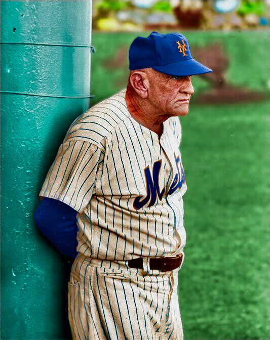
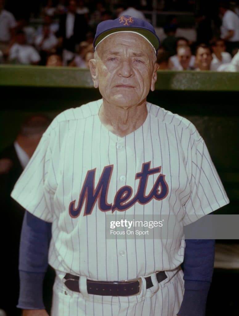
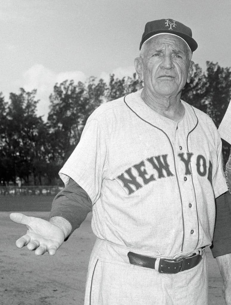
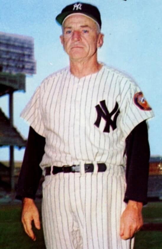
It all started when one of my Twitter followers, Dwayne White, tagged me while retweeting the Casey Stengel photo shown above and asked, “Ever seen a watch pocket on a pair of MLB pants?”
At first I thought, “Eh, that’s just a wrinkle in the pants that makes it look like a pocket. But the more I looked at it, the more it did indeed seem to be a watch pocket. And no, I’d never seen that element on a pair of MLB pants before. So I decided to investigate further.
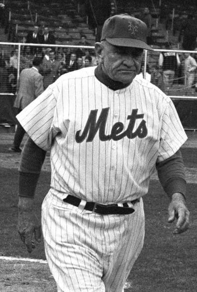
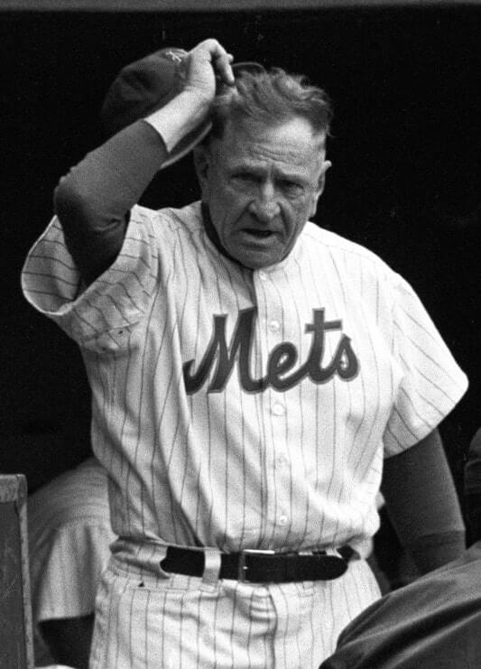
I found that Stengel does appear to have had a pocket on his pinstriped pants for at least part of his time skippering the Mets in the early 1960s. You can see it pretty clearly in these next three shots (the last of which you can click to enlarge):
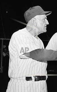
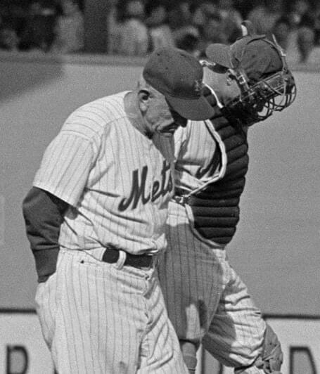
There are also several photos that appear to show the black (or dark) tip of something poking out of the pocket:
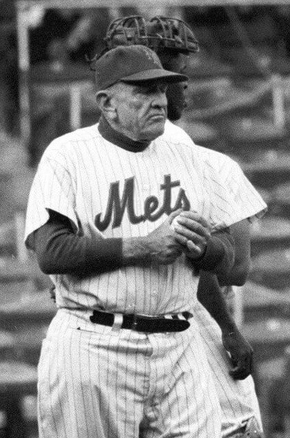
Interesting, right? The pocket isn’t evident in every shot of Stengel wearing a pinstriped Mets uni, but it’s definitely there in most of them. The weird thing, though, is that I see no evidence of the pocket in any photos of Stengel wearing a Mets road uniform (click to enlarge):
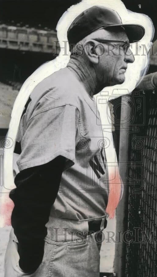
Then I had a thought: What about Stengel’s time skippering the Yankees? I immediately found this (click to enlarge):
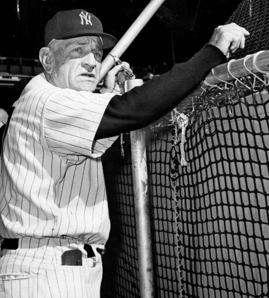
Ding-ding-ding! There’s our clearest evidence yet that Stengel liked having a front pocket in his pants. And he used it to keep his sunglasses! I’ve never seen anything like that before.
I found that pic on the Hall of Fame’s website, so I asked HoF curator Tom Shieber about the photo. He told me it was taken at Game Five of the 1960 World Series, on Oct. 10 of that year. He also found some additional shots of Stengel wearing a pocket during his Yankees tenure:
And then there this shot, which appears to show Stengel wearing a flap pocket, although it’s hard to be sure:
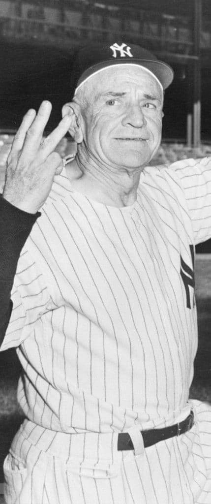
All of these show Stengel in the Yanks’ home pinstripes. But wait — here’s one that shows the pocket on a road uni:
Most of those shots are from the 1950s. To drive home that point, Tom told me, “We have a Yankees uniform [at the Hall] that Stengel wore in 1953 and, likely, in 1952 — and the pants have a front pocket that buttons! So, apparently, this was a thing with him for quite a while.”
Here’s a photo of pants Tom was referring to (courtesy of National Baseball Hall of Fame and Museum; click to enlarge):

“I checked the pocket to see if there was anything in it,” says Tom, “but in Geraldo-esque fashion, it was empty.”
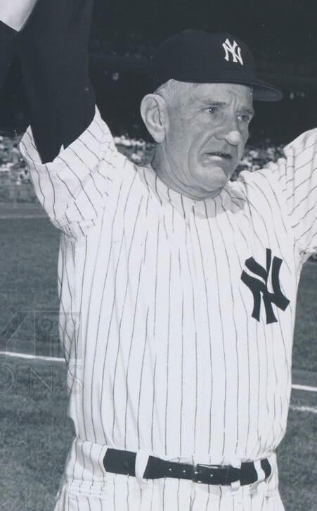
So it turns out that Casey Stengel, in addition to his other eccentricities, liked having a front pocket on his uniform pants for the last dozen years or so of his managerial career. What a nut! I’ve never seen that before. Does anyone know of any additional examples?
(Big thanks to Dwayne White for sending me down this rabbit hole.)
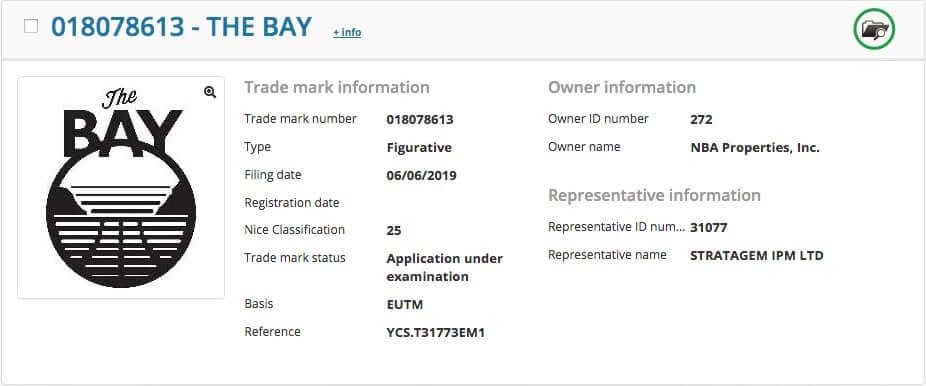
Golden State changes in the works: SportsLogos.net broke the news yesterday that the NBA quietly registered several new trademarks for the Warriors last week. It’s nothing earthshaking — a new alternate logo (shown above) and some very minor tweaks to the team’s existing logos, some of which will presumably be reflected on the team’s uniforms.
You can read the full story over on SportsLogos.net.

Click to enlarge
Sock it to me: Heroic work by reader Jason Whitt, who’s chronicled Cleveland reliever Adam Cimber’s remarkably varied lower-leg stylings over the past two weeks or so. “I’m hoping for a two-in-ones appearance next!” says Jason.
I asked a team spokesman if I could interview Cimber about his pants/hosiery habits and was basically told that they’re all too busy until after the All-Star Game. So maybe then — stay tuned.
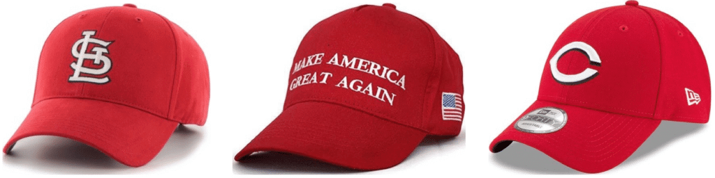
Cap conundrum: I got a note yesterday from a friend from Cincinnati, as follows: “All my friends who are Chiefs/Reds/Cardinals fans won’t wear their traditional gear or are scared to because people are mistaking them for MAGA hats. This came up in four different text conversations.”
As you know, I don’t usually care about fan apparel, but this is interesting. If true, it speaks to the power of the MAGA cap. Seriously, has there ever been another piece of apparel out there that made sports fans think twice about wearing their team merch?
Also, conversely, I wonder if there are any pro-Trump people who’ve found themselves more drawn to teams like the Reds and the Cardinals because of their red headwear.
If you fall into either of these categories — anti-MAGA and therefore skittish about wearing your red team caps, or pro-MAGA and therefore more drawn to red-capped teams — I’d like to hear from you. Anonymity assured if you prefer it that way. Thanks.
(As an aside, let’s please avoid any political vitriol on either side if this comes up in the comments. Thanks.)
Click to enlarge
Collector’s Corner
By Brinke Guthrie
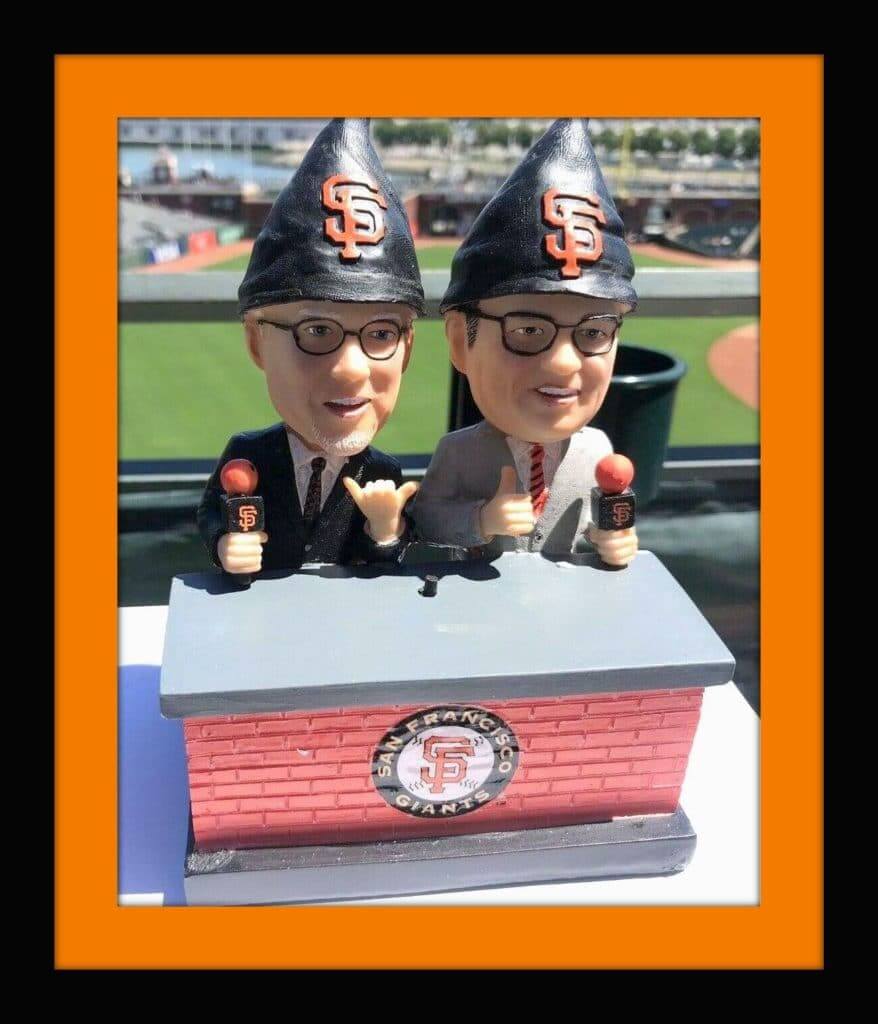
My wife and I live in the San Francisco Bay Area, and I’ve been a Giants fan for many years. Interestingly enough, though, I don’t have a favorite player. My guys are Manager Bruce Bochy and broadcasters Duane Kuiper and Mike Krukow, along with in-game reporter Amy G. (I was fortunate to meet both Boch and Amy last year at the San Francisco New Balance store.)
Which brings us to today’s featured item. Back in 2003, you could buy a dual-figure bobblehead of “Kruk N Kuip,” as they are known, for just 25 bucks or so. It was a promo item that you could order, not a stadium giveaway. However, I had just been laid off from my tech job and thought we’d better not spend $25 then.
That was a crucial error on my part.
Those bobbles regularly go for two to three hundred dollars these days. So imagine my excitement when the Giants announced they were doing a similar set this season — though this time, both guys would be gnomes. Perfect, I love gnomes and they would match the one Bochy signed. I bought one from Charles, a big Giants fan and co-worker, who went to the game this past Saturday. And there they are in the video below (just like the original 2003 edition, they both say their signature phrases — Kuiper’s “It…is…outta here,” and Krukow’s “Grab some pine, meat”):
As an aside, the Giants created the bobblehead giveaway craze with a Willie Mays bobble 20 years ago, and naturally did a 20th-anniversary Mays giveaway bobble recently. So you can credit them with all the bobblehead wackiness.
Now for the rest of this week’s picks:
• This 1970s Rawlings Broncos youth helmet sure makes you long for a return to the big orange D, right?
• Here’s something unique from the 1960s, a wooden rain check token bearing the image of Mickey Mantle. Did the Yankees pass these out if the game was called?
• Here’s one more for the Mick: This green plastic coin dates back to 1960, as it has his 1959 batting average on it.
• “This is a new Vikings logo to me,” says reader Matthew E. If I’m not mistaken, these New Era “Classic Team Collection” hats all had alternate, made-up-just-for-this logos that weren’t used in any other capacity.
• This is a 1950s charm bracelet for the Cleveland Indians.
• One more from the 1950s: How about this Cincinnati Red Legs button?
• This button is even older (1930s) — it says, “Go! Go! (White) Sox Club” and was a newspaper giveaway.
• Great artwork (which I’ve seen on other items) on this 1980s 49ers plastic cup.
• Tremendous-looking Texas Rangers bobblehead. This was originally listed as a 1960s item, but I wrote them to let them know it was 1972 at the earliest.
• Here’s another bobble from way back, this time a decidedly feline-looking Detroit Tigers model.
Seen an item on eBay that would be good for Collector’s Corner? Send any submissions here.
Click to enlarge
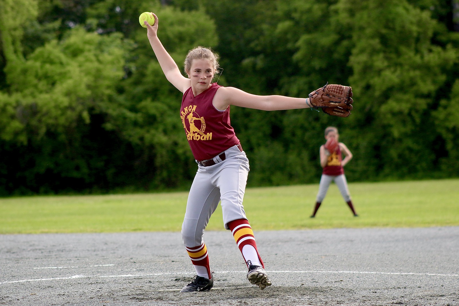
Picture perfect: Oh man, is that a softball player who Gets It™ or what? The striped stirrups, the bloused pant cuffs, the eye black — uni-riffic!
That’s Rya Wykes, the 12-year-old daughter of longtime Uni Watch reader/contributor Tris Wykes. She pitches for the Lebanon (N.H.) Lightning, a team of fifth- and sixth-grade recreation department softball players. “After watching all the stirrups-clad NCAA softball teams this spring, she asked if we could get some for her team,” says Tris. “We watch sports together on TV and while she’s interested in what happens, we usually discuss uniforms and equipment more. It’s become a cool little topic that we share. How lucky am I?”
While the stirrups are indeed impressive, it’s the blousing that really gets my attention. So much better than the bunched-up look that so many players have. Nicely done, Rya!
Glove-repair auction reminder: In case you missed it on Monday, Jimmy Lonetti of D&J Glove Repair is generously auctioning off a full glove re-lacing and reconditioning, plus a glove-leather wallet, with the proceeds going to Uni Watch.
This is a $150-$175 value, with the bidding starting at just $75 — perfect for Father’s Day.
For full details, look here.

And now a few words from Phil: Phil here. Sunday is Father’s Day, and I’ll once again be posting photos of Uni Watch readers’ “Dads In Uniform,” a tradition that began in 2013 (and has continued in 2014, 2015, 2016, 2017, and last year). This is always a very special day, and I’d love for as many readers as possible to participate — especially those of you who haven’t done so before.
To take part in this annual tradition, select one photo of your father in uniform (it can be sports, military, work — as long as it’s a uniform) along with a short description of 100 words or less (refer to our prior years’ entries to get a feel for the style of the descriptions). Then email the photo — again, only one, please — and text to phil.hecken@gmail.com with the subject line “Uni Watch Father’s Day 2019” by this Thursday, June 13, midnight Eastern. I’ll run all of the submissions this Sunday. Thanks!

Membership update: A bunch of new designs have been added to the membership card gallery. We’re now done with all of the Purp Walk designs, thankfully.
The new batch includes Rob Yasinsac’s card, which is based on Slovakia’s 1994 hockey uniform. The cool thing is that Rob opted to have the Slovakian version of his family name — Jacenčák — as the NOB. I like that.
Ordering a membership card is a good way to support Uni Watch (which, quite frankly, could use your support these days). And remember, a Uni Watch membership card entitles you to a 15% discount on any of the merchandise in our Teespring shop and our Naming Wrongs shop. (If you’re an existing member and would like to have the discount code, email me.) As always, you can sign up for your own custom-designed card here, you can see all the cards we’ve designed so far here, and you can see how we produce the cards here.
Uni-versary reminders: In case you missed it last week, Uni Watch 20th-anniversary parties will be taking place literally all over the world on June 29 (although the Paris party will be on June 27, so they’ll get a head start on the rest of us).
There’s an interactive map of all the gatherings here (click on the party locations for more info), and a spreadsheet of the various parties is here. Remember, if you want to organize or attend a gathering in your city, contact party coordinator JohnMark Fisher.
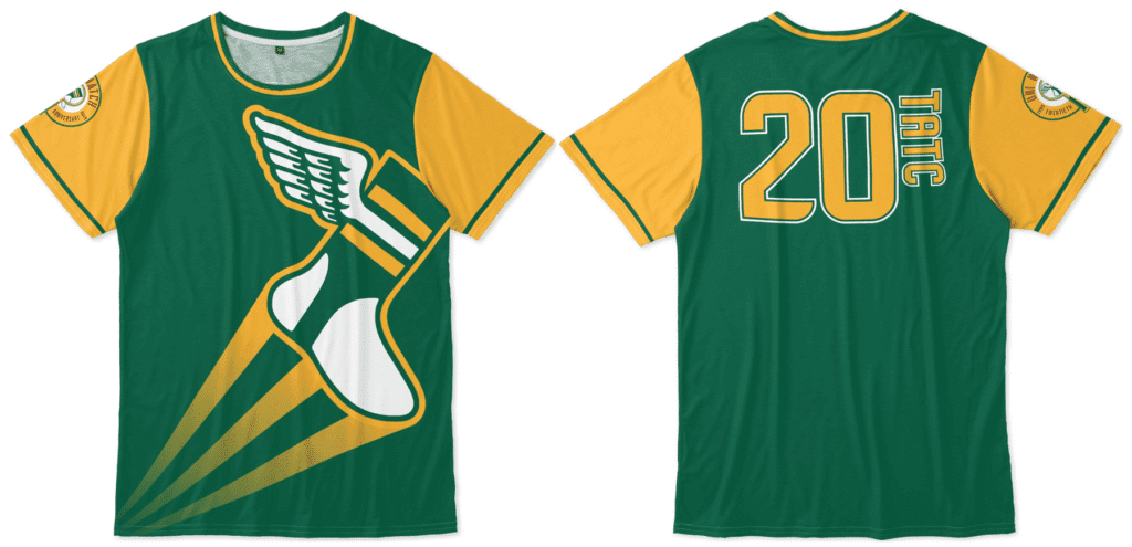
Meanwhile, I hope by now most of you are aware of our awesome “Turn Ahead the Clock Shirt,” which celebrates the dual 20th anniversaries of Uni Watch and MLB’s infamous 1999 TATC program. You can order it here.
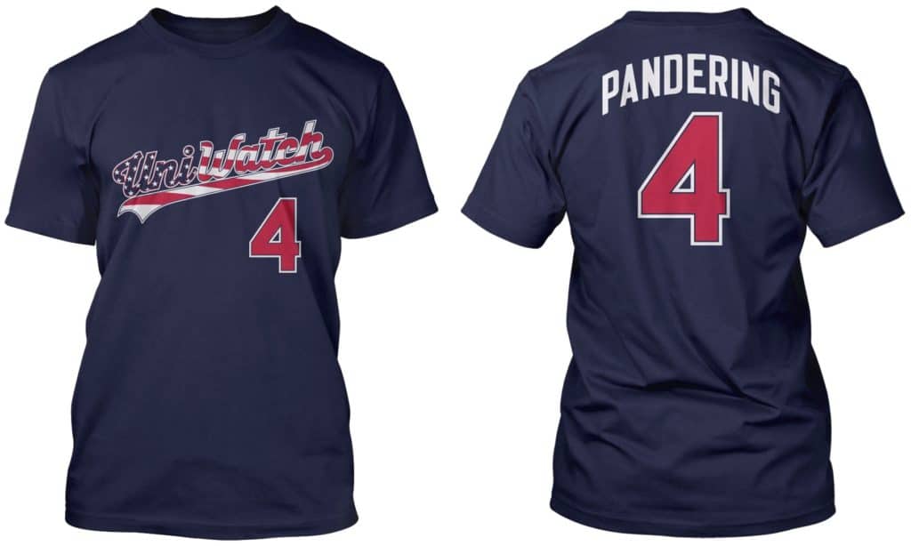
We have other anniversary items — and, of course, non-anniversary items — in the Uni Watch Teespring shop. My thanks, as always, for considering our products.
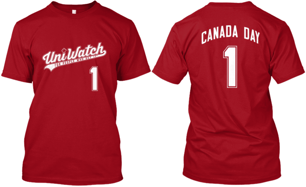
And while we’re at it, don’t forget that ’tis the season for our stars and stripes shirt and our Canada Day shirt. Thanks.
The Ticker
By Alex Hider

Baseball News: The side patch on the caps for the 2019 All Star game will be rendered in team colors (from Noah Kastroll). … The Mariners are giving away a Jimi Hendrix bobblehead on June 22. Not only that, the design has Hendrix in a Pilots jersey! (From Josh Claywell.) … On Netflix’s World’s Toughest Prisons, two teams in Mexico’s El Hongo Prison faced off in Red Sox and Yankees uniforms (from Damon Hirschensohn). … The Lake Elsinore Storm, a Padres affiliate, will give away Star Wars caps on June 22 (from Becker. … Selena Night uniforms this Saturday for the El Paso Chihuahuas.

Football News: The Toronto Argonauts delivered their 2019 season tickets in a team-branded tin, and sent along a team scarf (from Ted Arnold). … The 49ers will wear their 1994 throwbacks at home against the Panthers on Oct. 27 (from Brinke). … A waste management company in Fairfield, Conn., is poaching the Patriots logo (from Scott Boroczky). … Speaking of, a drywall company in Charleston, S.C., is using Pat Patriot (from Matt Grandi). … Here’s a very detailed breakdown of the Bears’ new throwbacks (from Jordan Grimes). … In a related item, here’s a ranking of the various throwback uniforms that the Bears have worn over the years (from Adam Childs). … This blog speculates (without evidence, frankly) that the Vikings may wear a throwback this season (from Phil).

Basketball News: Raptors PG Fred VanVleet wore a mouthguard last night after he took an elbow to the face and lost a tooth during Game four (from Mike Chamernik). … University of Memphis’s practice uniforms include the personal logo for their coach, former NBA star Penny Hardaway (from Rob Montoya). … New logos for Rochester University of NAIA (from @secretrock). … Check it out: a basketball coach in full uniform (from @MATHnBASKETBALL). … An ESPN promo graphic for last night’s NBA Finals Game featured some remarkably generic-looking jerseys (from Chris Mycoskie).

Soccer News: These are the uniforms Cameroon will wear in the Women’s World Cup (from our own Jamie Rathjen). … A number of items from Josh Hinton: Italy’s Women’s World Cup squad removed the four stars from the national team’s crest that represent the men’s four World Cup titles — but the star-clad version still ended up on the women’s team’s shorts; Nippert Stadium, home of FC Cincinnati, laid down sod on top of its synthetic turf when it hosted a USMNT friendly on Sunday. However, Nippert will return to artificial turf when it hosts an FC Cincinnati game on Wednesday; new second and third kits for Serbian club Red Star Belgrade; Premier League teams will wear redesigned sleeve patches this season, which will include (along with the numbers), smart labels that can be scanned with a smartphone.

Grab Bag: Here’s what the top-ranked golfers will be wearing at the US Open this weekend (from Phil). … The Premier Lacrosse League has announced a league-wide ad patch deal (from Jared Buccola). …This Washington Post writer thinks there are too many presidential candidates with boring campaign logos (from Justin C. Cliburn).
Our latest raffle winner is Matthew Samilow, who’s won himself a membership card. Congrats to him and big thanks to Pete Garofalo for sponsoring this raffle.
Ticker note: the new logos for RU are actually for Rochester University and not Richmond.
Thanks. Fixed.
Typo: “Here’s a very details breakdown of the Bears’ new…”
Fixed.
Being afraid to wear a red hat is idiotic.
Assuming every red hat is a MAGA hat is idiotic.
Dumb Guy, you’re assuming that folks who are avoiding red hats are afraid to wear them. What if they just don’t want to seem (albeit incorrectly) that they are part of that crowd? Especially in a political town like Washington DC, where there are teams that feature red but also tons of tourists wearing MAGA caps, it’s worth staying out of that morass, I’ve found. The Nats and Capitals both sell caps that aren’t solid red.
I should add that I wore a DC cap, rather than the Curly W Nats version, when George W. (“W”) Bush was in office, too.
If you grew up here, Politics (and avoiding it) is something you can be keenly aware of.
Maybe it’s because I’m “obsessive”, but the ball caps and MAGA hat are so different in structure (beyond the obvious logo differences). I’d be hard pressed to confuse them, but could see how those who are not a neurotic might make that mistake.
It really is amazing how a simple piece of merchandise/branding can infiltrate the current zeitgeist with diametrically opposing reactions.
The original correspondent explicitly describes his friends as being “scared” to wear caps that might be mistaken for MAGA. Literally every one of my pro-Trump friends has told me of their belief that people wearing MAGA caps are routinely targeted for violent assault by anti-Trump mobs and harassment by anti-Trump cops and bureaucrats. This narrative of MAGA-cap-based persecution is ubiquitous among at least a subset of the political right.
Personally, I’m hesitant to wear royal blue Brewers caps here in Wisconsin, since I’m fairly frequently mistaken for a Cubs fan by strangers when I do. People make all kinds of assumptions about a person when they only see the back of one’s baseball cap!
I spent 25 years in Alexandria, albeit not so recently.
It (both things) just seems silly to me. That’s all.
Paul mentioned people being scared to wear them.
As a guy who lives in Montgomery County, MD, there are plenty of folks wearing red Caps and Nats caps. Nobody throws a double take. Most of us living in this area are not thinking politics with our wardrobe choices.
Mo County! I used to work in Gaithersburg :)
Exactly.
-C.
As a native of St. Louis I can say that I know of nobody, here or in other parts of the country that are afraid to wear a red Cards hat, because of MAGA hats. It sounds to me like the person who said this has a lot of friends who are creating things that aren’t really there.
“Here’s a very details breakdown of the Bears’ new throwbacks ”
*detailed
the Pats dumpster pic is sideways, btw.
Another Stengel pocket pic. Logo mania!
link.jpg
Also, perhaps the tiny black thing poking out of the other pocket shots is the edge of his glasses (not in a case).
Link not working (at least for me).
link.jpg
Dangit, I can’t get “jpg” part of the address to stick.
No worries Dumb Guy – I’ve got this.
link
The parentheses end the link before the .jpg. Obviously, not your fault. Copy and paste works.
I agree. There are numerous photos of Casey wearing glasses in the dugout during his time with both the Mets and Yankees, plus he always seemed to wear glasses off the field.
Of course this doesn’t explain why there is no pocket in his grey pants.
Does the home dugout face the sun?
Back in 2006, I attended a late-October campaign rally in Virginia where Bill Clinton stumped for Jim Webb’s campaign for Senate. Webb’s campaign was mainly about opposition to President George W. Bush, a Republican who was widely known by his middle initial. The Nats were still pretty new, and at the time wore both all-red and all-blue home and road caps, and a few people in that very partisan area had taken to regarding the color of a Nats cap as a political statement. The whole red/blue thing was still new to American politics, having arisen after the 2000 presidential election. Anyway, I wore a 1963 Senators cap, navy with a red curly W and red piping, to the campaign rally, and twice had strangers assume that my W cap was expressing support for President Bush and the Republican Party. One of these encounters was well-mannered, with the stranger noticing my cap and asking me about my interest in the Webb rally on the assumption that I might be a persuadable Republican. (Note: This is always the correct way to approach a conversation with someone you believe to support a party or politician you don’t.) The other person was quite hostile and aggressive, as if the mere sight of the letter W was a physical assault on them, and the letter W could have no possible other meaning than expressing enthusiastic support for the incumbent president and his party and policy platform.
As a fellow New Yorker, Paul, you know this is not the first time Reds hats have carried extra meaning.
While the Penny Hardaway thing doesn’t surprise me, I’m still amused at Nick Nurse’s hat that I’ve seen several times during the playoffs. Is that really a personal logo for Nick Nurse?
…I’m just trying to imagine Red Auerbach’s ideas on a personal logo. Or what Pat Riley’s would have been…
Winter – that would be an amazing exercise – designing personal logos of sports personalities pre-1970.
Before Game 7 against the Sixers, ESPN’s Dave McMenamin, bless him, asked the question the rest of us were dying to pose when he said to Nurse: “What’s the deal with the hat?” Nurse played along. He laughed and explained that earlier in the season he was wearing a TravisMathew hat with a similar color scheme and design until a Nike rep told him he should wear his own gear and had the “nn” hat custom made for Nurse. “It’s all black,” Nurse said. “I can wear it with anything. Fits real good.” He added “there are four total” in existence but declined to say who has the other three. I assume Drake got at least one as payment for the back rubs.
My cousin who lives in DC said when the Nationals started playing, his Republican friends would wear the red home hat and the Democrats would wear the blue away hat. Now that the Nats have shifted to mostly a red identity. I wonder if its still true.
This button is even older (1930s) — it says, “Go! Go! (White) Sox Club” and was a newspaper giveaway.
Mis-dated. The Go Go Sox, and that particular logo, were 50s vintage.
That Sox pin is definitely not from the 30’s.
The Go-Go Sox cheer didn’t come into being until the Nellie Fox teams of the 1950’s. Plus, the diagonal, rounded S-O-X logo didn’t show up until the 1960’s.
I’m guessing early to mid 60’s on that pin.
Any day that starts with a gallery of photos of Casey Stengel is a good day indeed! The pocket thing is one of those details that I can’t stop obsessing over once I see it. How deep were the pockets? If they’re deep enough to hold his sunglasses, then either Stengel had sunglasses that folded at the bridge or the pocket was too deep to work for a pocketwatch. (My grandfather had a pair of sunglasses that folded at the bridge, and so could fit in a square pocket, in the 1970s.) And who put the pockets in? Someone in the clubhouse, or did Stengel take his pants to a tailor? Either way, some of the photos show that the lining of the pockets on his pinstriped pants was pinstriped, so where did the extra material come from? So many questions! If the Professor was still around to ask, I bet he’d dismiss the question as a silly thing to care about, and then share an obsessive amount of detail about the hows and whys of his uniform pockets.
Sent my response to Paul, there is something there since 2016.
Regarding the beautiful softball uniform, from my experience watching Auburn softball, most teams wear pants that have elastic around the cuff at the bottom. So basically, there’s zero effort involved to obtain the high-cuff look – that’s simply where the pants end!
Kudos to Rya for taking the time to correctly blouse her pants. I do wonder if her normal game pants are sans elastic or if they had to get new pants to achieve the look.
Paul – this isn’t sports related so didn’t want to email you but it does fall under the MAGA hat topic. This past halloween I dressed up as Forrest Gump and wore a Bubba Gump Shrimp hat to a party. I was asked by 5 different people if it was a MAGA hat so I eventually took it off.
I understand why people see a resemblance but as a uni watcher it seems obvious to me that the hat had a logo with a shrimp on it while the MAGA hats are just text, but I guess the general public isn’t as discerning.
Were the people who asked if it was a MAGA hat illiterate or something? They took the time to approach you and ask about the hat, but couldn’t be bothered to take the time first to, you know, look at the front of the hat and read it?
“Stupid is as Stupid Does”
-Forrest Gump
There are a zillion red hats, and to worry that their favorite team hat might be mistaken for a MAGA hat is ridiculous.
People make jump decisions all the time – sometimes it’s because of where you’re from, sometimes it’s about your religion, and sometimes it’s about what time of clothing you wear.
Like I said in an post above, I wouldn’t mistake the team caps for a MAGA cap, but can see how some would. Because this particular cap is polarizing it wouldn’t be out of bounds for people to be concerned about confusion.
Bringing it down a level – I won’t wear a link. Why? Because the colors and design ‘could’ make someone think I’m wearing a link one and as a Islanders fan, I can’t abide that kind of confusion.
You wouldn’t wear a USA jersey because it’s too close to a Rangers jersey and someone “could” mistake it? That may be a bit paranoid. Anyone gives you static about it, you can turn around and educate them. Ask them if they didn’t like the 1980 Miracle on Ice. That should back them down.
As a Cardinals fan, I wear a red StL cap quite often. If anyone ever asked me if it was a MAGA hat, I’d laugh at them and say “**** Trump.” Maybe ask them if they’d had their eyes checked lately. They’d get the picture.
I root for teams with many different colors. None of those teams own those colors. No politician or psuedo-authoritarian will change my palate.
Yup – it’s similar enough that I don’t even want someone I’ve never met who may not say anything to me to even THINK I’m wearing a Rangers Jersey.
And I honestly feel that strongly about my political affiliation these days too. If a Met’s cap looked close enough to either political party’s leadership logo/cap, I wouldn’t wear it. It’s just not worth any of the trouble it could bring.
Seriously? I guess if people are that fracking stupid and can’t read I don’t care what they think.
1. Great story today on Stengle’s extra pocket.
2. I’m from Cincinnati and I’ve been a Reds fan since at least 1967. I know of NO ONE who is “scared” to wear a Reds hat or would not consider wearing a Reds hat because of some alleged confusion with someone’s political identity. This includes all my friends who are Reds fans and who’s political leanings run from rabid Trump supporters to Sanders socialists.
I think Jimi in a pilots jersey is the only baseball jersey that would make sense.
So Hendrix played Sicks Stadium a year after the Pilots moved to Milwaukee. Doubtful he wore a Pilots jersey during that performance; any photos of him in baseball uniform?
Cardinals fan here who owns both red and navy Cards hats. I was always more likely to wear the navy, just because I’m more of a dark colors guy in general, but I have to say the association of red hats with Trump has made me especially reluctant to wear red. I think the only time I’ve worn a red one in the last two years was when I actually attended a game at Busch.
Lifelong Phillies fan and lifelong Democrat. Been wearing the same red Phillies gamer since they changed from the old maroon to the current design in the 1990s. I also have the royal blue alternate cap but the red one is my go-to. Even in one of the most Democratic cities in the country (D>R by 8:1), the town is awash in red caps. Never even gave it a second thought until today. I did stop wearing my Indians gamer with Chief Wahoo on it, and that’s about it.
Love the story about Casey’s sunglasses pocket. Earl Weaver has him beat hands down with the cigarette pocket in his jersey (as chronicled by Todd Radom).
link
As a Louisville Cardinals fan in northeast Kentucky I tend to stay away from anything royal blue. FC Cincinnati has made that more difficult so I tend to stick with heavy a orange presence on any blue shirt or hat
Nothing to do with today’s post but I’m currently at the Smithsonian and literally ran across a Brannock device. Oddly enough it was purple.
Is there a team that embraces their past identity more than Seattle? I don’t see why they don’t just simply go back to being the Pilots.
Technically, the Mariners were never the Pilots.
Lee
Mariners embrace their past (basically 1995 and 2001) because there’s usually no future.
The membership card looks great! Thanks Paul!
Today’s note about the MAGA hats made me realize that I don’t think I have actually ever seen one in real life.
I live in San Francisco. Not that I spend a lot of time in the tourist areas, but with as many tourists that we do get, you’d think I’d have come across a couple by now.
Lee
I live in the heart of Trump country and I honestly cannot recall ever seeing someone wearing a MAGA hat in public.
My Dad has one and wears it. But usually, nobody messes with an 90 year old.
Re the Fairfield CT waste company with the Patriots logo: Fairfield is the part of CT next to NYC. The folks there often commute to NY, and are largely part of the NY mediascape.
In my state, wheree a mixed marriage often refers to a NY fan and a Boston fan, the mythical “Giants/Yankees” v. “Patriots/Red Sox” border is quite east of there.
I’m curious if the company is owned by a geographic “outlier”.
I’m in Bridgeport, and while the area is still mostly New York fans, the number of Pats/Bosox fans has increased seemingly exponentially in recent years, as you might expect.
There have been many instances where I have had to consider my team-affiliated bc attire due to the co-opting of teams and colors by street gangs. Beginning in middle school in 1994 to some of the locales I visit today, it’s something I’ve had to be cognizant of depending on my surroundings.
Has anyone ever done a post on why/how softball players choose whether or not to wear a visor or mask while pitching?
It’s not just pitching, right? Don’t most softball players, regardless of position, have the option to wear a cap, visor, or no headwear at all?
Or am I wrong about that?
You are right about that. Watch most NCAA softball games and you’ll see a mix headwear styles (or lack thereof). I suppose there are
But if any player on the field should be wearing a mask (besides the catcher, of course) it’s the pitcher.
Hell, on the team I coach, we even make our outfielders wear masks.
oops. My third sentence got hacked up. Should say “I suppose there are leagues/teams that require a consistent style.”
That was the case when I played in high school (10+ years ago). Most players went with visors and a few went hatless, but caps were allowed as long as the color/logo matched that of the visors.
You’d think people wouldn’t mistake a cap for one that’s VERY different, but you’d be wrong. One time I wore a Bridgeport Bluefish cap to a Mets game vs. the (then) Florida Marlins at Shea. A guy (with his kid in tow, no less) gets in my face and demands to know if I’m wearing a Marlins cap. I told him “Well, it’s got a B rather than an F, a bluefish rather than a marlin, and it’s navy blue rather than black, but, other than that, you’re right, it looks EXACTLY like a Marlins cap.” ;)
That having been said, everyone should just wear whatever they like. Simple.
Interesting how they changed the Warriors logo from the western span of the Bay Bridge to the eastern span. Now the portion of the bridge in their new logo is even closer to Oakland than their previous logo, but they’re in San Francisco now.
I just emailed Paul about this. I think it’s the Golden Gate Bridge, not the Bay Bridge. The Bay Bridge has two spans. The current logo appears to utilize the Eastern Span.
link
The Western Span has “X” shaped trusses.
link
Now look at the new logo. The trusses do not have an “X” shape. The trusses are horizontal:
link
I think the new logo is the Golden Gate Bridge.
The new version is definitely not the Golden Gate Bridge. I don’t know why they changed it, but that logo is still of the eastern span of the Bay Bridge.
Lee
To me, the old logo looks like the Eastern Span of the Bay Bridge and the new logo looks like the Golden Gate Bridge. Look at openings in the horizontal trusses of the new logo. The Eastern Span of the Bay Bridge has closed trusses while the Western Span has “X” trusses. I guess we’ll know when they officially unveil the new logo!
The new logo doesn’t look anything like the GGB. Neither the trusses or support cables (which are straight down on the GGB).
link
Also, even tho they are moving to SF, there is no way in heck they’d symbolically (or otherwise) cut themselves off from Oakland, good heavens.
Lee
Here is (I hope) a good look at the trusses on the eastern span of the Bay Bridge, this is what it looks like in the new logo, with staggered trusses.
link
Lee
You convinced me! I see it now! It looks like both the new and the old logos are of the the Eastern Span of the Bay Bridge. Thanks for all of the links! I love unnecessarily deep dives like this.
I didn’t finish my post:
It appears that they changed the logo from the Bay Bridge to the Golden Gate Bridge to commemorate their move the San Francisco.
link
The new logo is definitely a more detailed version of the Eastern span of the Bay Bridge (I ride a bus over that bridge most days). The single tower on that bridge is made up of 4 steel box girders tied together in a rectangular arrangement by a series of cross beams below the top of the tower. You can see the 3 of these box girders in the new logo. Furthermore, The main cables are arranged in an X pattern from the tower as the roadway flanks either side of the tower, resulting in the suspension cables attached to the main cables running at an angle rather than perpendicular to the span as seen in the new logo.
The towers on the GGB on the other hand are a more conventional design where two vertical tower supports flank either side of the span with cross beams at regular intervals and a cross member at the very top. Its main cables are parallel to the bridge and the suspension cables run straight down perpendicular to the ground.
I’m surprised they changed the logo as the older one, while still clearly the Eastern Span, was more stylized and could be more easily construed as symbolizing any of the 3 main suspension spans in the area. The new logo can’t be seen as anything other than the Eastern Span of the BB to locals, which I find interesting given it’s widely seen as a symbol of the East Bay (In fact, the current bridge’s design is largely a product of East Bay movers and shakers pushing for a ”signature span” to compete with SF’s two famous spans—the old eastern span was a ugly cantilever design).
I’m assuming it’s a sop to those East Bay fans that will sit stuck in traffic trying to cross it to get to the new arena. (At least the ones who can afford to get in the door)
Great stuff, NOLAWildcat! You and Lloyd definitely convinced me that it’s the Eastern Span.
Guess I messed up on my last post. Indeed both the current logo and the new logo are the eastern span of the Bay Bridge, with the new logo just another, more detailed version of the eastern span.
I haven’t driven on the Bay Bridge in ages, but the last time I did it was after a Giants game through the eastern span, and I’m sure that’s what this new logo is depicting, considering how the cables are oriented in the logo. The GGB’s cables are more traditional and go straight down.
Ok, I don’t see it mentioned, and maybe it’s just over my head, but is the lede misspelled intentionally?
You mean the word “lede”?
Maybe he meant “title,” as in “Perfessor.”
Ah, the headline. Yes, that’s intentional. Casey’s nickname was the Old Perfessor (not Professor).
Actually, check that — I just looked it up and it was actually “Perfesser”! I’ll change the headline.
Whoops, said lede, meant headline. Thanks for the answer!
The guy writing about the 49ers throwbacks ends the piece by saying the Color Rash unis are his favorite. I immediately question his entire article!
The original Met script was a thing of beauty. Very balanced, just the right size and thickness of strokes. Design had some artistry back then. Today, the script looks grotesque to me…the e is way too fat…the strokes too think…the script too large. Of course, they ruined the logo for me as well by altering the buildings which had meaning to them and deleting the little NY.
Mick Jagger is older than Casey Stengel in those photos
A broader question regarding Casey Stengel – why is baseball the only major US sport where coaches and managers wear uniforms like the players?
Two main reasons:
1) For a long time, it was common for the manager to also be a player.
2) Unlike in other sports, baseball coaches and managers routinely go onto the field of play (to coach first or third base, for conferences on the mound, to argue with umps).
The cap color confusion…reminds me of when you see a bad person arrested for robbery or worse and they’re wearing a team’s cap. Does that mean that team endorsed the violence or is somehow connected? Of course not. People make weird associations. Are our hardships so few that we have to manufacture drama to remain interested?
I work in retail, not far from Trump Tower, in NYC. My work allows me to wear a baseball hat on the floor, as long as it is a logo’d design. Fortunately I have a few in a variety of colors. Early on, wearing the red version would prompt discussion with my fellow employees and I was not comfortable appearing to align with the MAGA theme. In that moment I felt resentful that political branding had taken away my desire to wear a red hat! So I can definitely empathize with your Cincinnati reader.
It seems we live in a world surrounded by triggers. Where red hats (and even the word “trigger”) can set people off.
Thanks for the great article!
-DW in Cincinnati