For all photos, click to enlarge
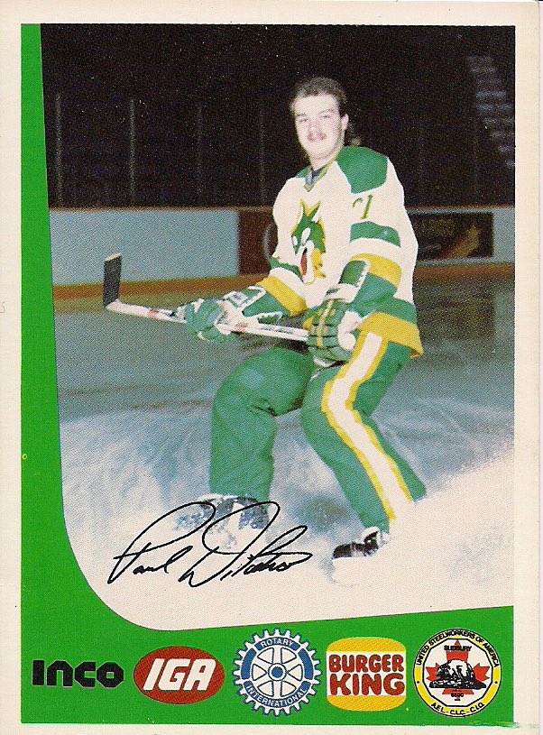
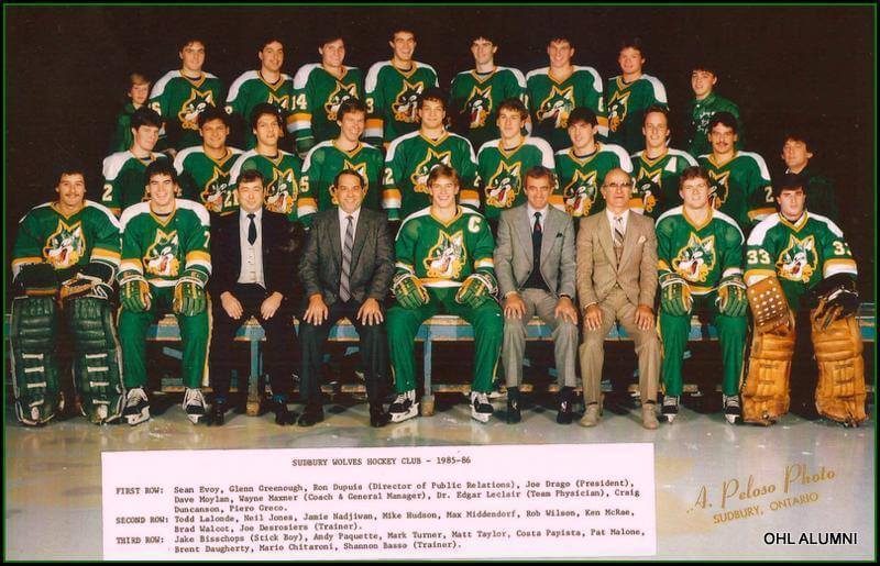
Meet Paul DiPietro of the 1986 Sudbury Wolves, a team in the Ontario Hockey League. I’ve probably seen this photo before (reader Wade Heidt linked to it in a comment back in June), but I didn’t really see it and feel it until Twitter-er @JasonDiebold8 recently pointed me toward it. My god — the North Stars-esque colors, the chest logo, the green Cooperalls — it’s like heaven on a stick.
Let’s get a closer look at that chest logo (albeit on a green jersey this time):
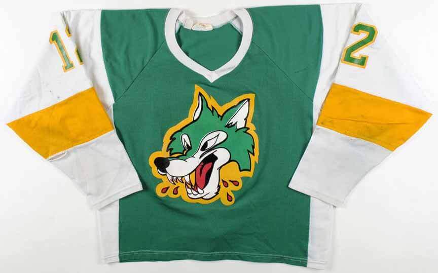
Is that great or what? I love how absurdly cartoonish-looking he is. You can’t really take him seriously as a ferocious, intimidating mascot — he’s too ridiculous. Perfect. (They still use that jersey crest today, but with a much less interesting color scheme.)
Do we have any other photos of Wolves players wearing the green Cooperalls? Glad you asked! Here are some with the white jersey:
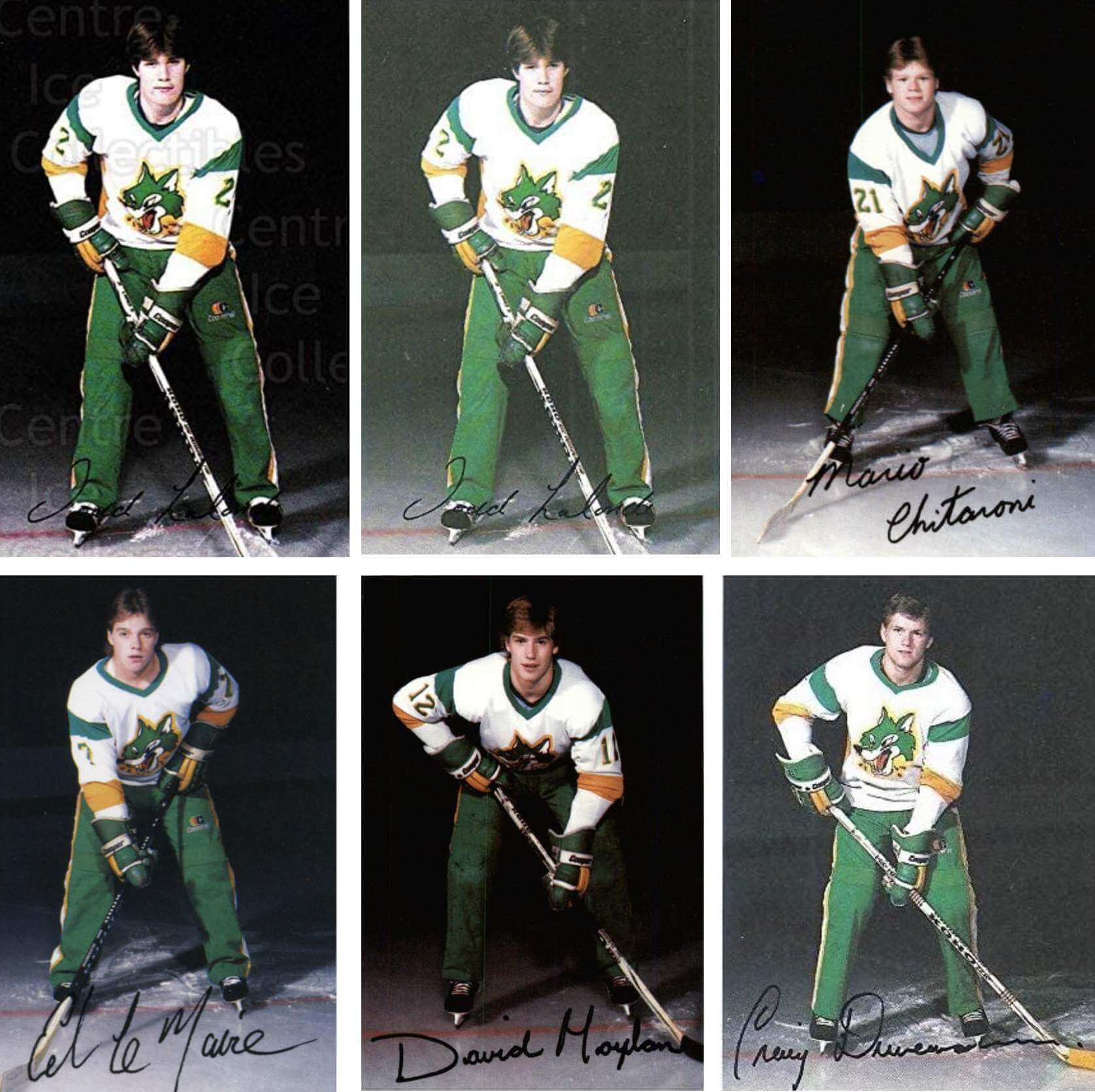
What’s that — you say you want to see the green Cooperalls with green jerseys? With a green border around the photo to boot? Happy to oblige:
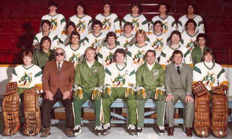
All these posed photos are nice, but I couldn’t find any game pics from this period in Wolves history, so I contacted the team’s historian, Mike Commito. “Unfortunately as I’ve learned over the last few years, the team hasn’t kept a ton of documents or pictures over the years,” he responded. (He didn’t know who designed that wonderfully over-the-top logo either, but he said he’d reach out to a few contacts who might know more.)
Fortunately, there’s an obvious solution for the dearth of game photos: The Sudbury Wolves must begin plans for some 1980s throwback games, complete with the green Cooperalls, right this instant. Make it happen, cap’n!
Click to enlarge
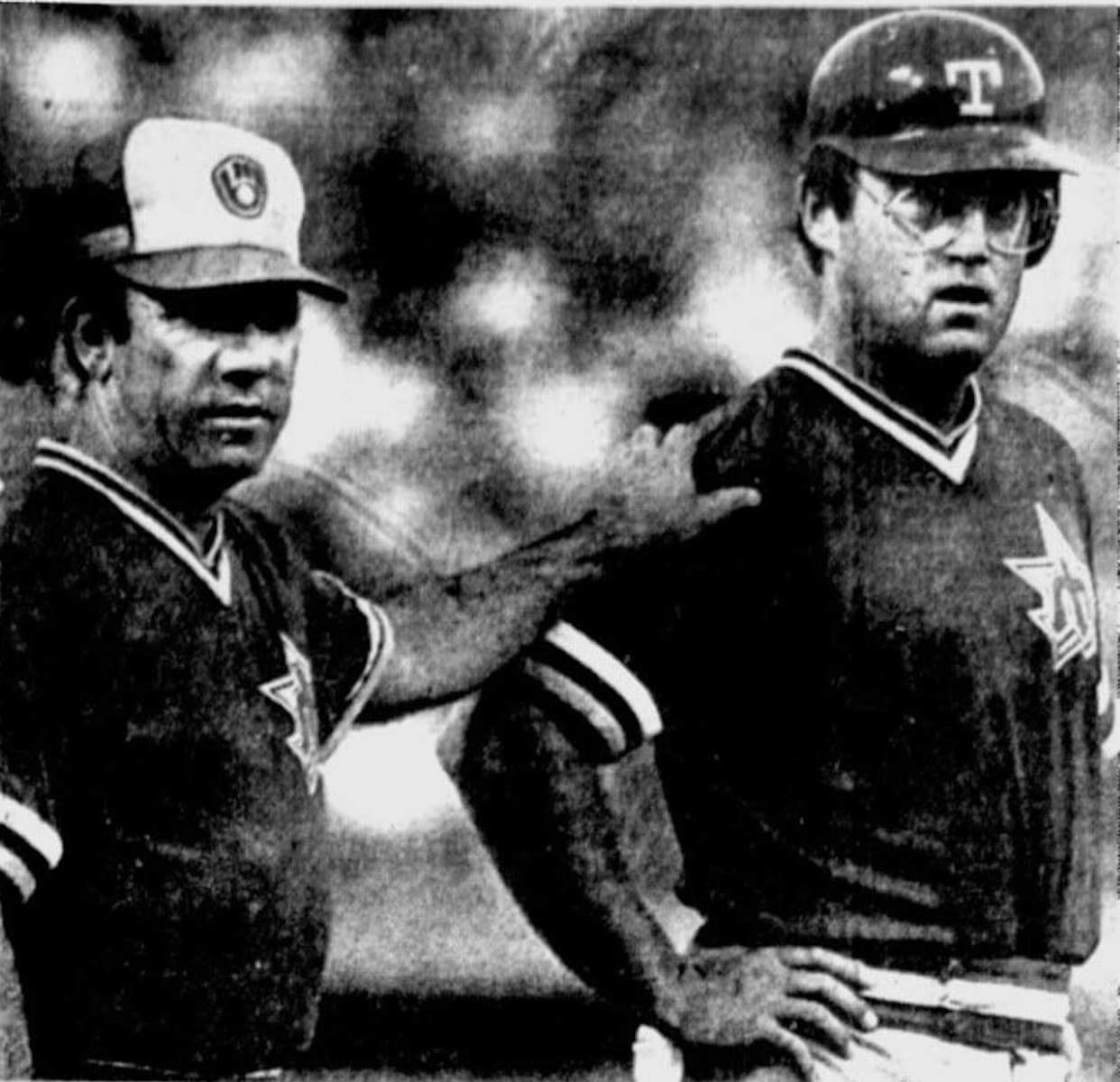
What’s going on here? There’s a lot to process in the photo shown above. The coach is wearing a Brewers cap, the player is wearing a Rangers helmet, and both of them are wearing jerseys with the Mariners’ old trident logo. Was this some sort of celebrity all-star game? A beer league game? A misguided pair of Halloween costumes?
Nope — those are both big leaguers taking part in an official MLB game. The date was May 31, 1981, and that’s Mariners third base coach Cananea Reyes on the left and Mariners outfielder Jeff Burroughs on the right. They’re dressed like that because Seattle’s jerseys, caps, helmets, and other gear were stolen from the Rangers’ stadium prior to the game, forcing the M’s to take the following steps:
• Their BP jerseys weren’t stolen, so they wore those for the game.
• They wanted to buy and wear retail Mariners caps, but the Rangers’ concessionaires were sold out of those, so they bought Brewers caps instead because Milwaukee’s blue/yellow color scheme was a fairly good match.
• They wore the Rangers’ batting helmets (and so did the Rangers, obviously, so the two teams were basically trading the helmets back and forth between their dugouts each half-inning).
A few moments after that photo was taken, Burroughs was tagged out at the plate by Rangers catcher Larry Cox, providing the odd spectacle of baserunner and catcher both wearing the same headwear logo:
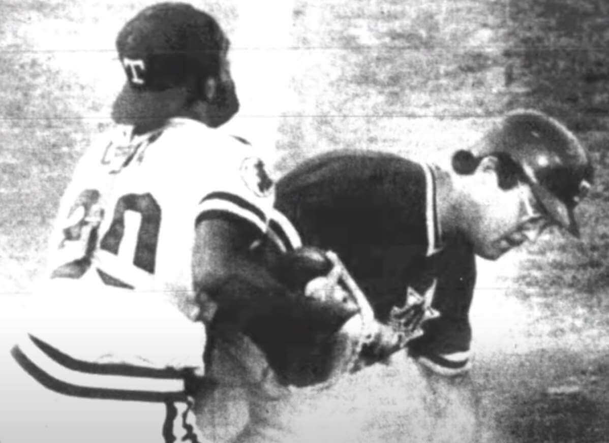
Footnote: Despite the mismatched attire, the Mariners won, 5-3.
(My thanks to Brandon Curtis for this one.)
Click to enlarge
Collector’s Corner
By Brinke Guthrie
Follow @brinkeguthrie
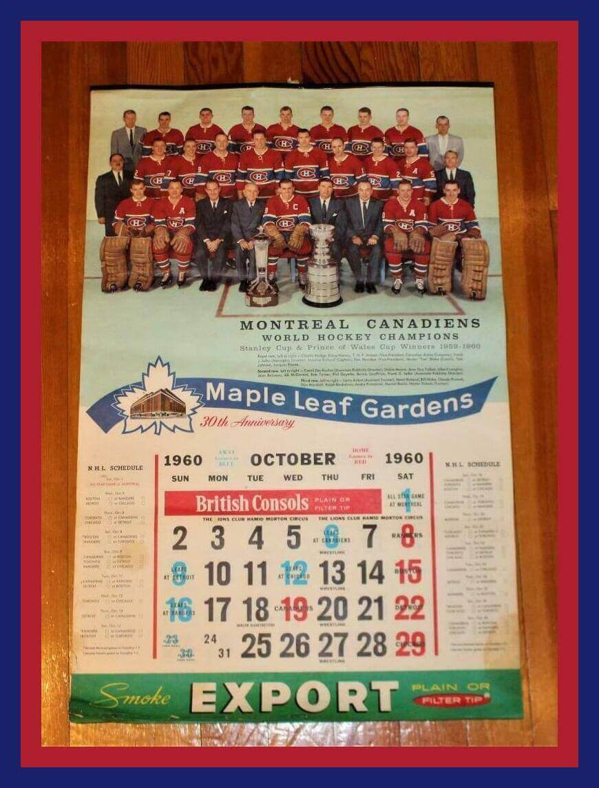
Leading off the last week of the year with, appropriately enough, a calendar — in this case, a 1960-1961 Maple Leaf Gardens calendar. While I’m no hockey expert, I did wonder why the Leafs would feature the champion Canadiens on their calendar. The seller says, “On the momentous occasion of their 5th Stanley Cup, their arch-rival Maple Leafs honored the Canadiens with the first page of Maple Leaf Gardens Calendar that year.” A gracious sporting gesture!
Now for the rest of this week’s picks:
• Speaking of the Canadiens, check out this 1950 Eagle Toys “Hockey Shoot” metal sign game, pitting Montreal against a team of all-stars.
• Amazing cover artwork for this 1954 Detroit Red Wings magazine.
• This mini-hockey stick commemorates the “Greatest Showdown” — Team Canada’s win over the Soviets, Sept. 15, 1987.
• “Let’s Go Again! Year Of The Tiger ’69,” proclaims this vintage Detroit Tigers bumper sticker, brought to you by the “Boys in Blue” (the Detroit Metropolitan Buick Dealers Association). For the record, the 1969 Tigers ended up 90-72 — not a bad record, but it left them 19 games behind the Baltimore Orioles, who won a staggering 109 games!
• When your ballpark’s name is an ad for a phone company, you end up with decidedly non-sexy promo giveaways, like this San Francisco Giants phone jack. First 20,000 fans get one, yay, so arrive early!
• Here’s a 1972 training camp Cincinnati Bengals Official Roster from the folks at KFC and Burger Chef. (I still have one of these for the 1973 season!)
• In a bit of ominous foreshadowing, notice that this 1985 Los Angeles Rams helmet-shaped matchbook schedule was printed by Universal Match — of St.Louis.
• Probably the first jigsaw puzzle ever featured on Collector’s Corner: This one is from 1994 for the Buffalo Bills.
• “Welcome to Metropolitan Stadium” is printed on the side of this 1960s Minnesota Vikings Football Club popcorn megaphone. You could also keep score on it, too — if the ink would flow on your frozen pen, that is.
• Here’s a pair of 1987 Jim Rice-Wade Boggs promo cups from Burger King and Pepsi. Since this was an MLBP product line, no team logos — all you get are dopey plain blue caps. Not even the right shade for the Red Sox, either. Drove me nuts.

Membership update: If you looked at our list of this year’s year-end raffle winners, then you saw that reader Alex Shirley won himself a Uni Watch membership card. He lives in Oklahoma City and is a graduate of Oklahoma Baptist University and the University of Oklahoma College of Law, so he chose the Thunder’s 2020-21 City uniform as his design motif and “Okie” as his NOB. Cool!
If you weren’t lucky enough to win a free card like Alex did, ordering a membership card is a good way to support Uni Watch, and fun to boot. And remember, a Uni Watch membership card entitles you to a 15% discount on any of the merchandise in the Uni Watch, Uni Rock, and Naming Wrongs shops. (If you’re an existing member and would like to have the discount code, email me and I’ll hook you up.)
As always, you can sign up for your own custom-designed card here, you can see all the cards we’ve designed so far here (now more than 3,200 of them!), and you can see how we produce the cards here.
The Ticker
By Alex Hider

Baseball News: Apparently, only Mrs. Met gets punctuation in her NOB — none for Mr. Met (from @ColHapablap). … Actor Tim Kazurinsky sported a slick White Sox jacket during a 1982 appearance on Saturday Night Live (from @BallparkHunter). … Also from @BallparkHunter: Check out these concept logos for the Albuquerque Dukes.
College Football News: This blog recounts some of the most notable new unis and helmets from the past season (from Phil). … It’s no surprise to see a “P6” decal on this giant Cincinnati football helmet in Dallas — all AAC teams have been wearing it for a few seasons as a subtle jab at the “Power 5” conference system that dominates the upper echelons of college football. But the message is amplified after the Bearcats defied the odds and qualified for the College Football Playoff and the Cotton Bowl. Also of note in that photo — the bike shorts worn by a Cincinnati player (from Chris Brantley and Matt Snyder).

Hockey News: Here’s a close look at the Wild’s Winter Classic gloves, breezers, and helmets (from Wade Heidt). … Rangers equipment manager Tim Webb put on Henrik Lundqvist’s old pads and stared down some shots from the cage yesterday (from Luke Feliciano). … This page offers a look back at the Croatia’s checkerboard sweaters through the years (from Will Scheibler). … The Russians are wearing a patch to commemorate the 75th anniversary of the first USSR ice hockey championship (from John Muir).

Basketball News: At the moment, the Lakers’ entire roster fills every available uni number from 0 to 15 (from @LakerGOAT17). … Speaking of numbers, NBA numerologist Etienne Catalan is staying busy with COVID-related signings. Keep track of all the NBA number changes on his Twitter page. … Michael Jordan and his son Jeffrey filed several trademark applications for a new brand (from Trevor Williams). … Jessie Kavana, the Nets’ art director, shared a concept that rendered the team’s players’ names in the style of iconic band logos, which was pitched as a potential promotion ahead of this season’s All-Star Game in Cleveland (from @RussellGFlynn). … Boise State men’s has new white uniforms (from Aaron Bernstein). … Talk about bizarre on-court ads: A Japanese high school basketball tournament featured floor mops shaped like Cup Noodles (from Jeremy Brahm).

Soccer News: Tottenham warmed up in their third kits Sunday as part of the No Home Kit initiative, which sees English clubs wear their second or third jerseys on Boxing Day in support of the homelessness charity Shelter. However, Spurs’ gesture was limited to pregame activities because the Premier League won’t allow home teams to wear change kits without a rule change (from our own Jamie Rathjen). … The next two notes are from Trevor Williams: Comoros will have new uniforms for the Africa Cup of Nations. … Ireland’s 1986 team photo features a uniform that the team never wore on the field in a senior game. … Earlier this month, NYCFC fans were upset that their new replica jerseys didn’t include a star to mark the team’s first championship. Now, fans are reporting that the jerseys have a star — but they’re positioned above the maker’s mark, not the team crest (from @bryant_rf).

Grab Bag: Each year, English rugby union club Harlequins play a men’s and women’s doubleheader called “The Big Game” at Twickenham. They typically wear a one-off shirt for the occasion, and this year the club got the exact same shirt for the men’s and women’s teams — the exact same because what was fine for the men was too baggy on the women (from our own Jamie Rathjen).
The Cincinnati helmet looks to be a player helmet just the depth of where the shot was taken from makes it seem large, chances are it’s probably biker short player helmet
Some black-and-white game photos of the 1985-86 Sudbury Wolves: link
Thank you!
Love this Paul! Major junior hockey uniforms from the 1980s have many interesting quirks. Teams with many stars on unis for what seems like no reason. Regina Pats having their nameplate below their numbers on the back of the jerseys. So many interesting stories.
Sudbury Wolves had company in major junior hockey back in the 1980s for teams wearing green and yellow. Complete with green and yellow Cooperalls. London Knights, Lethbridge Broncos, Prince Albert Raiders come to mind.
Prior to this uni, the Wolves were more green and white:
link
They have thrown back to the green and white jersey about 10 years ago:
link
As well, the Wolves went green and white again with some alternates that were worn in the design of their then-current Reebok-inspired unis at the time. Both a green uni and a white uni:
link
link
Heir they go again…
Piggybacking on the Albuquerque Dukes sketches…
Last year, Dick Moots (the original artist) made a video describing the process of working for the Dukes in the 1970s. Very interesting window into how graphic design functioned in those days and even more images to check out.
link
I’m sure this has already been thought of but, just in case, it might be worth researching the teams the Wolves played in the past. Maybe one of those teams kept a good/better archive of photos. There might be a gem in THEIR collection? Just a thought.
Are you praising the concept, the nostalgia, or the aesthetics of Cooperalls? Because not so long ago, on these very pages they were singled out as bad design since they made their wearers more susceptible to injury.
I like the aesthetics, although probably in a way that’s nostalgia-freighted.
As for injuries: That’s because the original Cooperalls fabric was so slick that players would slide into the boards faster than they would with breezers/socks. Obviously, sports fabrics have come a long way in 40 years, so that problem could presumably be solved if a team wanted to wear something akin to Cooperalls today.
Cooperalls are a fun visual quirk, but seem like they’d be really uncomfortable to wear while actually playing hockey. Skating is all legs, and in particular the knees. I’d hate to have fabric between the pads on my legs and the pads on my shins/knees, even if that fabric was super stretchy. The pants would have to be really baggy, which seems like a bad idea.
Long story short, there’s no good reason for even the slightest bit of restriction in the legs while skating. I think hockey pants and shin guards have evolved to match the needs of the players pretty well. Long pants seem like a nightmare.
The referees don’t seem to mind wearing long pants.
My favorite thing about the Sudbury Wolves logo from that era is the little drop of blood dripping from his fangs.
Loved the MLB uniform game intel. Can only imagine everyone scrambling
The wolves crest is based on the wolf from the Disney three little pigs cartoon
This is one of the best posts ever. I do like the Sudbury Wolves in blue and silver, it is one of the few CHL jersyes I’ve had since the 1990s. I agree that the green-yellow-white combination is just fantastic and ought to appear on the regular. The Mariners’ in mis-matched head gear is hilarious. And the MLG-Canadiens calendar is bizarre yet awesome.
The Sudbury Wolves logo looks a lot like the slobbering wolf logo of NC State. And they both remind me of Tex Avery’s wolf, although not as dapper.
Tim Kazurinsky was a Chicagoan and member of its Second City cast. Second City, particularly in Chicago and Toronto, became a feeder system for SNL.
2nd time this week I’ve seen the 1981-82 “SNL” represented after the “All Madden” show Saturday had clips of John Madden’s hosting turn in January ’82 and Dick Ebersol calling it “the heyday” of the show
Anyone else notice the irony of the Seattle Mariners wearing Milwaukee Brewers caps, in view of the Brewers franchise originally being the Seattle Pilots?