Click to enlarge
Good morning, and happy Indigenous Peoples’ Day! Hope everyone had a good weekend.
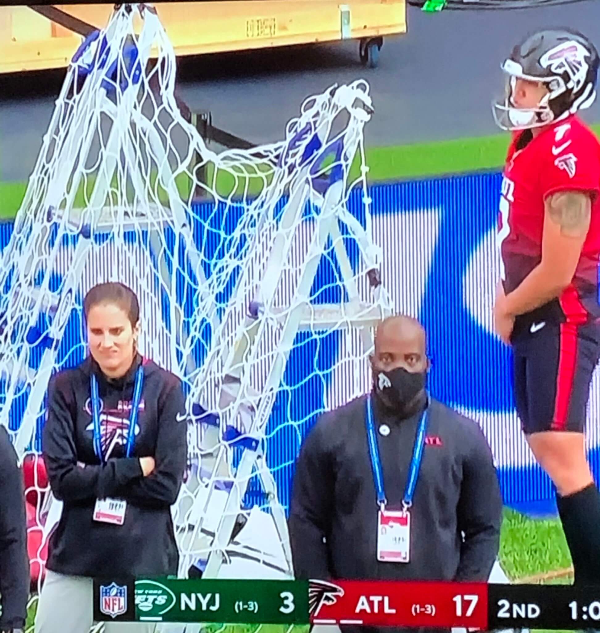
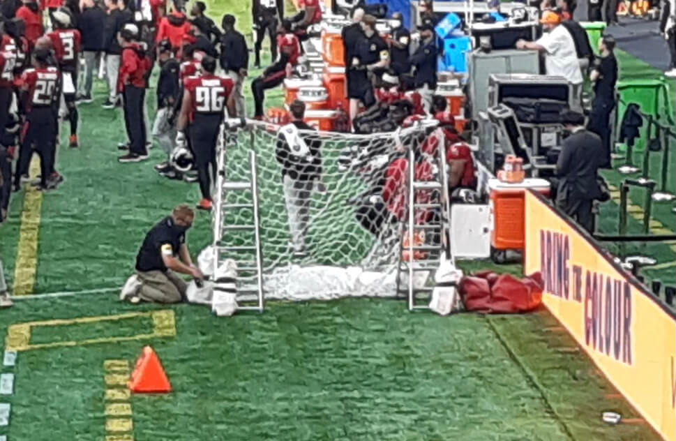
Now then: My favorite visual moment from yesterday’s slate of NFL games took place in London, where the Falcons apparently forgot to bring their kicker’s net, so they created a makeshift version out of some netting and a pair of stepladders. Here’s another view:
Way to show those Brits about old-fashioned American ingenuity! Unfortunately, the Brits were also subjected to the Falcons’ gradient alternates:
In other news from around the league yesterday:
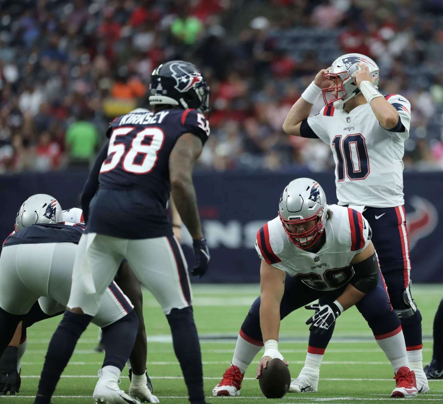
• The Texans and Pats wore uniforms that were basically inverted versions of each other — navy/white vs. white/navy:
⚠️ 18-play drive ends with a TD ⚠️
📺 » @NFLonCBS pic.twitter.com/jbYDGqfTEp
— Houston Texans (@HoustonTexans) October 10, 2021
• In that same game, Pats linebacker Jamie Collins was signed last week for his third stint with the team. This time — unlike the previous two times — he’s wearing SrOB:
New look for Jamie Collins, who added a "Sr." to his jersey for his third stint with the Patriots.
He wore the "Sr." in Cleveland and Detroit but didn't with the Pats in 2019.
(photo via @Patriots) pic.twitter.com/TqC4UrcXYX
— Zack Cox (@ZackCoxNESN) October 10, 2021
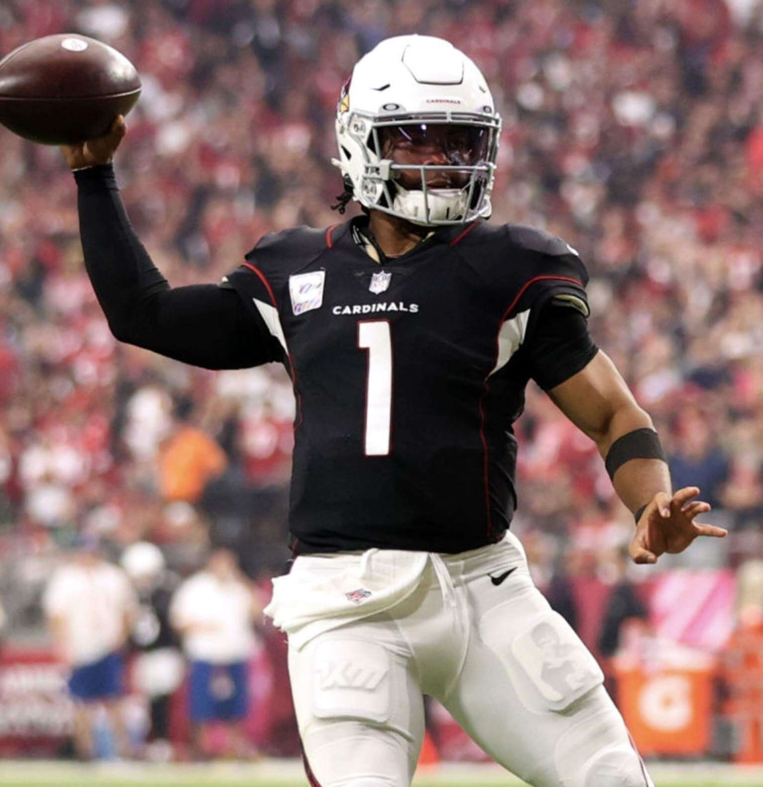
• The Cardinals wore their accursed black alternates:
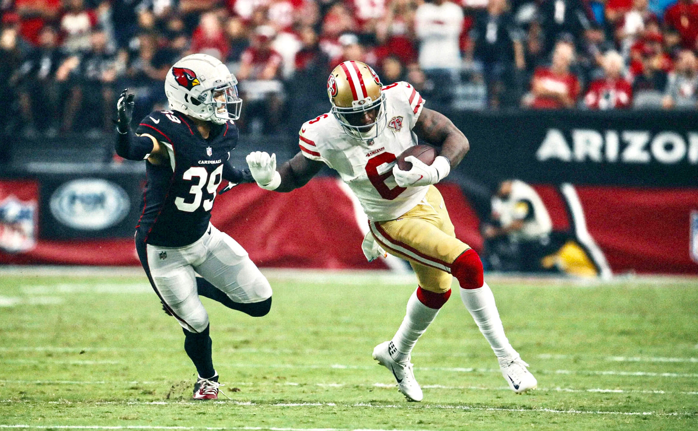
• In that same game, Cards quarterback Kyler Murray wore a Bruce Lee-themed thigh pad. Some quick photo research reveals that he’s been wearing it for most of this season, but this was the first time I’ve been aware of it:
• In an unfortunate development, the Jags went mono-teal:
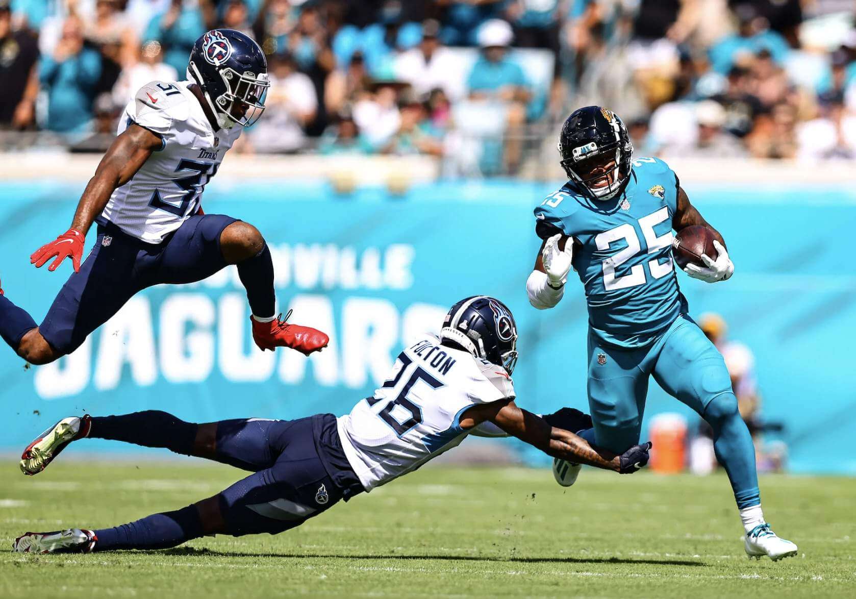
J-Rob gettin’ loose!#DUUUVAL pic.twitter.com/JRt0YAy3jl
— Jacksonville Jaguars (@Jaguars) October 10, 2021
• In an even more unfortunate development, Kansas City did the blood-clot thing:
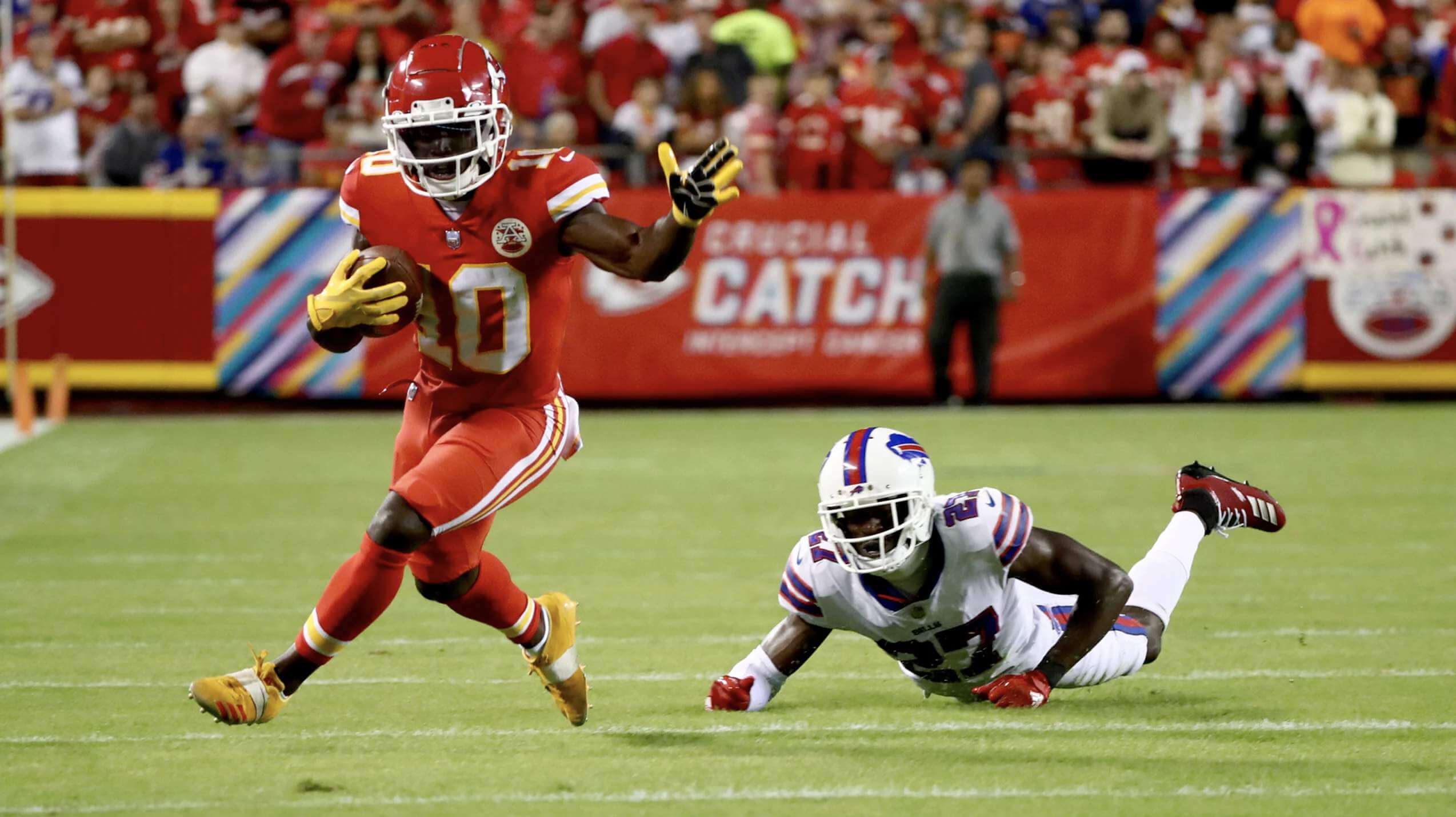
Talk about BEAUTIFUL.
📺: @SNFonNBC pic.twitter.com/4Q8GpskOlZ
— Buffalo Bills (@BuffaloBills) October 11, 2021
• Chargers defensive lineman Linval Joseph wore an elbow brace that appeared to be held in place by several strips of white tape, creating an interesting stripe effect on his undersleeve:
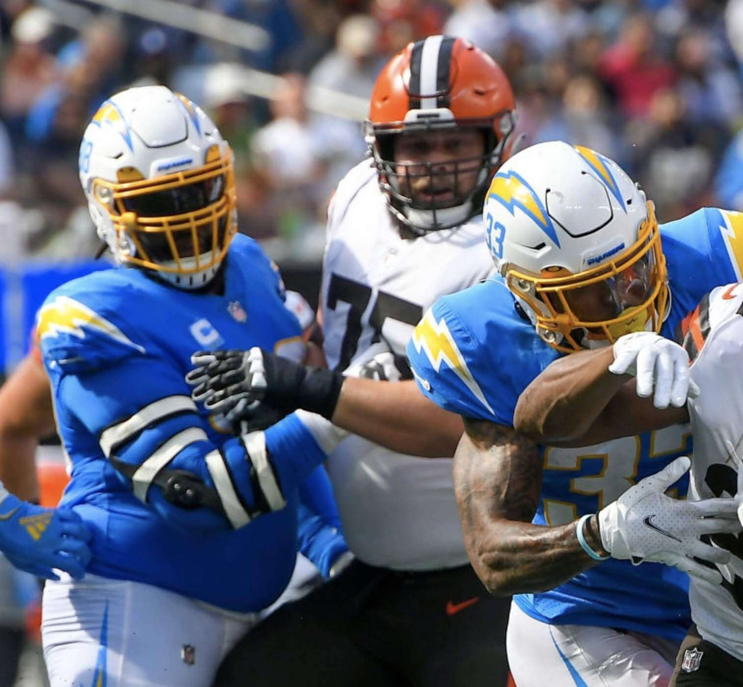
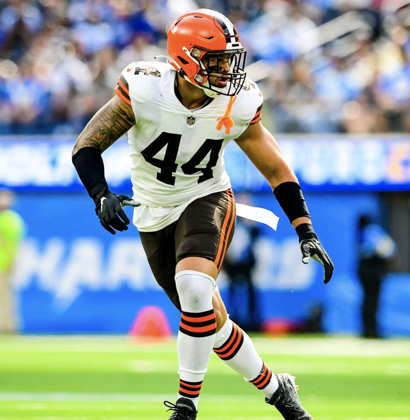
• In that same game, Browns linebacker Sione Takitaki had, well, a lot of stuff going on:
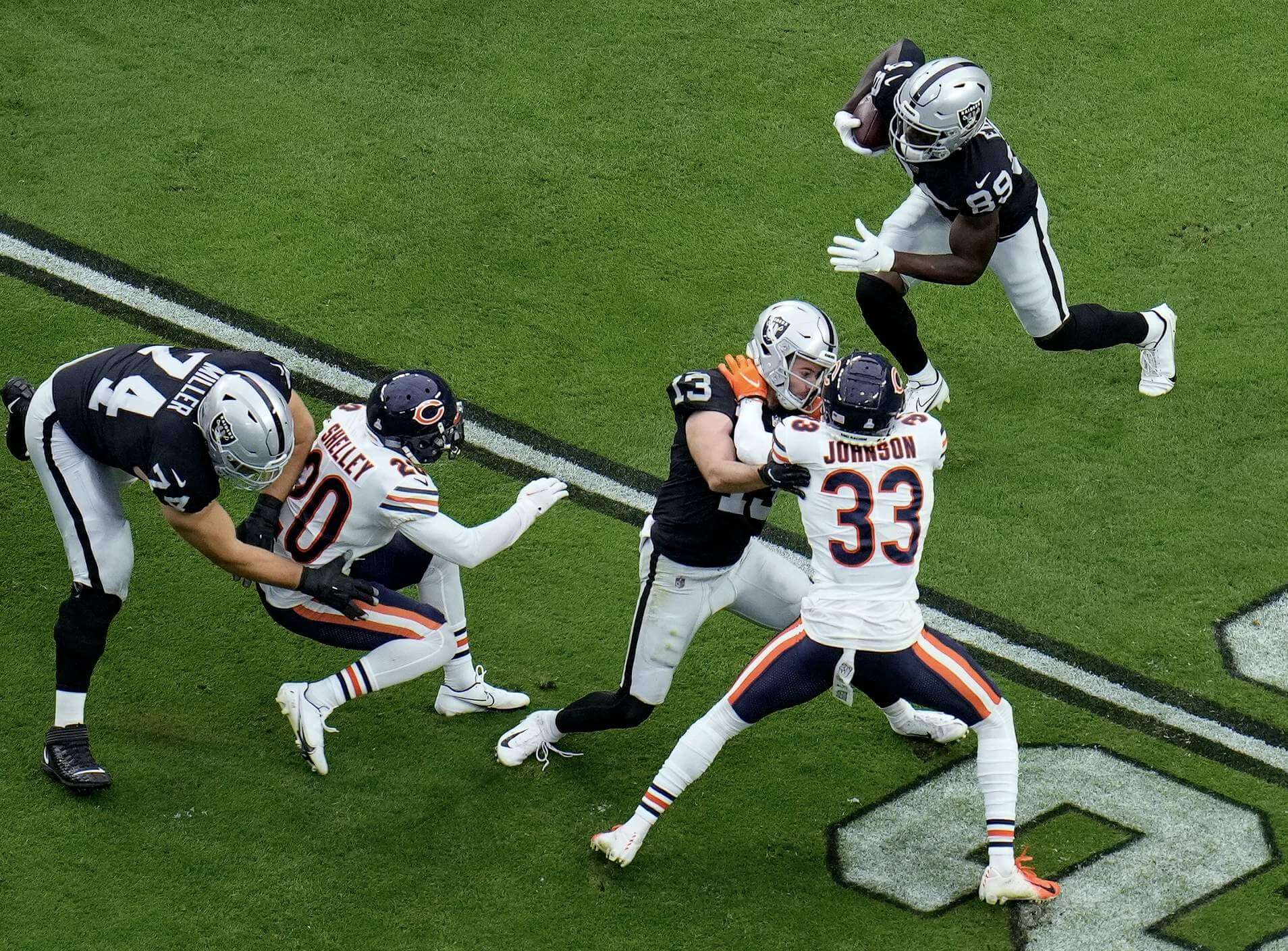
• The Bears and Raiders don’t play each other very often (yesterday’s game was only the 16th time ever), but they provided us with a very good-looking game:
Great pass. Great catch.@justnfields 🤝 @Darnell_M1 #CHIvsLV | #DaBears pic.twitter.com/CZkwiyXnmL
— Chicago Bears (@ChicagoBears) October 10, 2021
• Washington’s Pinktober graphics included helmet ribbon decals and pink end zone lettering:
Repping the pink for our Think Pink game 🎀 pic.twitter.com/gq1wjnFhBn
— Washington Football Team (@WashingtonNFL) October 10, 2021
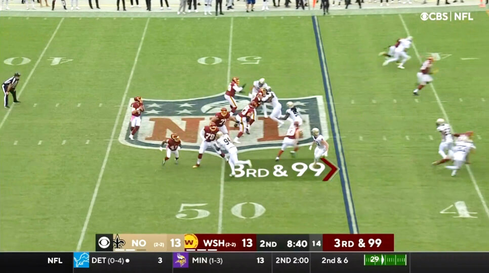
• In that same game, CBS’s graphics department mistakenly took the concept of “third and long” to its extreme:
• Only two teams wore white at home: the Bucs and, of course, the Cowboys.
(My thanks to all contributors, including Moe Khan, Casey Mizzone, Chad Ryan, @NFL_Journal, and our own Jamie Rathjen.)
Click to enlarge
ITEM! NHL Season Preview now available: Don’t look now, but the NHL regular season begins tomorrow, which means it’s time for the annual Uni Watch NHL Season Preview, with all the uni and logo news for the new season.
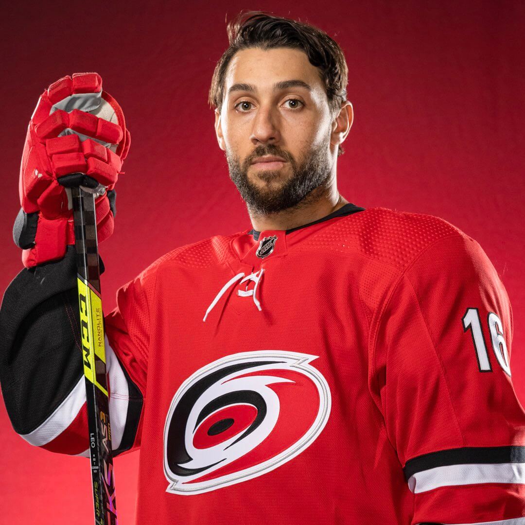
The biggest uni-related storyline this time around is that most teams have added raised-embroidery highlights to their jersey crests (as you can see in the raised ridge that runs just inside the border of the Hurricanes’ crest, shown above). I have the full scoop on that, and everything else you’ll see on the ice this season, over on InsideHook. Enjoy!
Click to enlarge
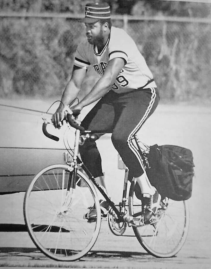
Just me and the boys bikin’: Oh man, how awesome is this spring training shot of Pirates outfielder Dave Parker riding a bike in full uniform? And how had I never seen it until Scott Chamberlain shared it with me yesterday? So good!
Click to enlarge
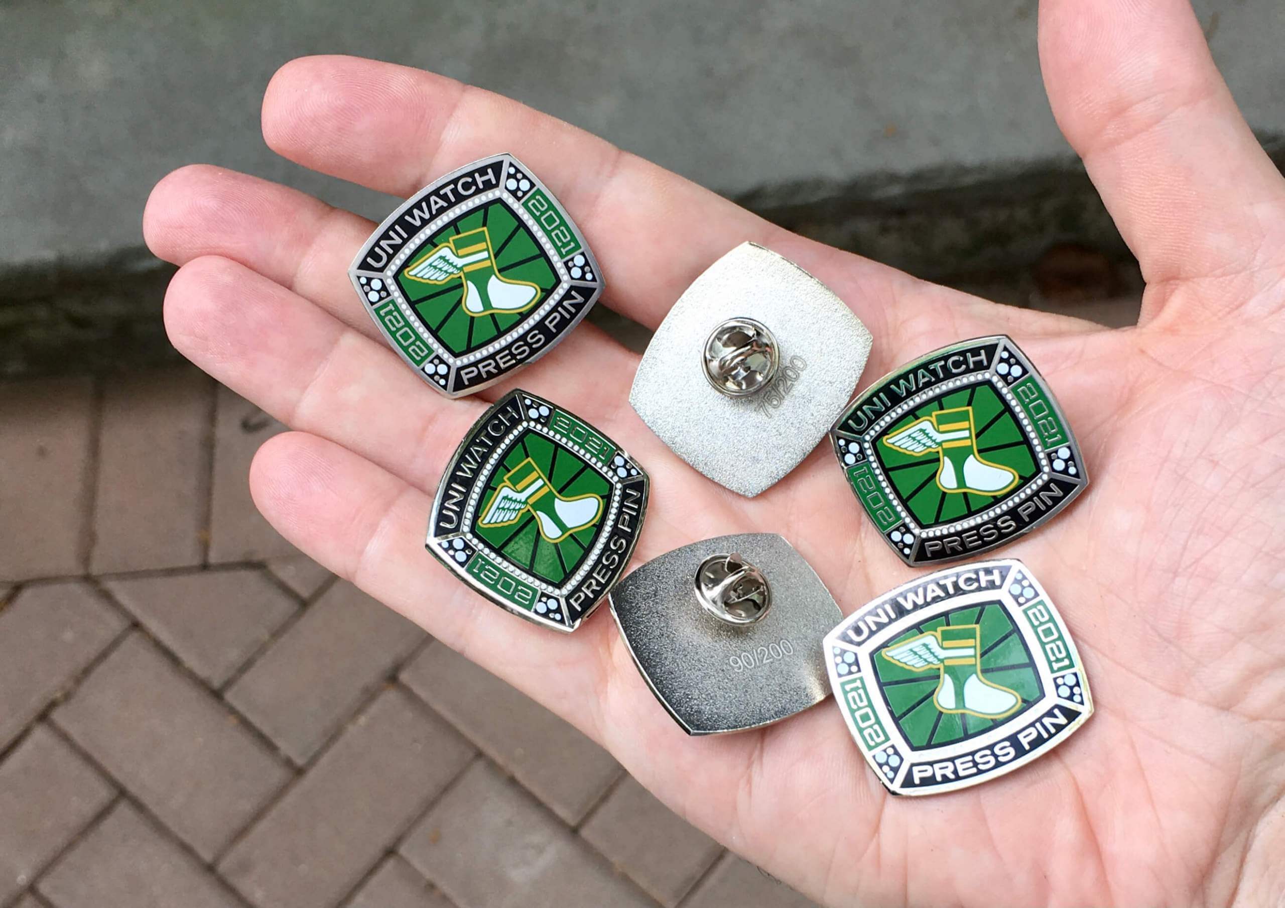
Press Pin reminder (and bobble sale): In case you missed it on Friday, the annual Uni Watch Press Pin is now available. This pin is not part of the monthly Pin Club series (and you do not have to purchase it in order to qualify for the Pin Club’s “Collect ’Em All” bonus prize) — rather, it’s an annual pin that Todd Radom and I do each October to coincide with the MLB postseason, inspired by the rich history of World Series press pins. The idea is that everyone in the Uni Watch comm-uni-ty can legitimately wear our Press Pin, because you all contribute information, feedback, and knowledge that helps me do my job of covering the uni-verse.
As you can see above, this year’s Press Pin is based on a championship ring. Since many sports rings these days are either white gold or platinum, we went with a silver-tone finish instead of gold. Here’s a closer look (click to enlarge):
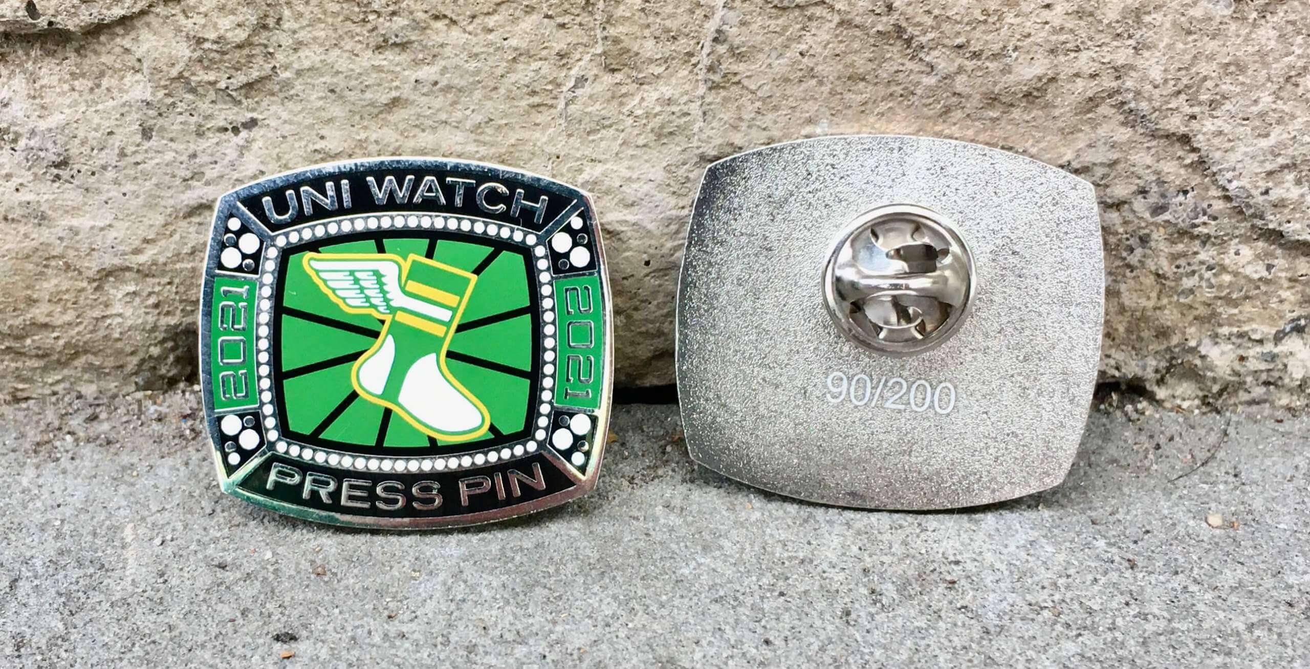
This pin was produced in a numbered edition of 200. As of this morning, there were just 74 remaining. It’s available here while supplies last.
In addition, it turns out that I manufactured too many of our September bobble-pins. But my misjudgment is your gain, because I’ve now reduced the price on that pin from $13.99 to $9.99. It’s available here. My thanks, as always, for considering our products!

Membership update: A new batch of designs has been added to the membership card gallery. That includes Andrew McPherson’s card, which is based on Sporting KC’s home shirt.
Ordering a membership card is a good way to support Uni Watch, and fun to boot. And remember, a Uni Watch membership card entitles you to a 15% discount on any of the merchandise in the Uni Watch, Uni Rock, and Naming Wrongs shops. (If you’re an existing member and would like to have the discount code, email me and I’ll hook you up.)
As always, you can sign up for your own custom-designed card here, you can see all the cards we’ve designed so far here (now more than 3,200 of them!), and you can see how we produce the cards here.
“What’s It Worth?” reminder: In case you missed it last month, our friends at Grey Flannel Auctions are once again inviting Uni Watch readers to submit items of memorabilia for appraisal, with no charge and with no obligation (sort of like an online version of Antiques Roadshow). Full details here.
The Ticker
By Jamie Rathjen

Baseball News: Longtime Uni Watch reader/pal Jimmy Lonetti, proprietor of D&J Glove Repair, has designed an excellent D&J baseball jersey for himself, modeled after the late-’60s White Sox’s road uniforms. You can see the full progression in this Twitter thread. … Here are some Indigenous Mexican women playing baseball while wearing huipiles, or traditional blouses (from Elena Elms). … With the Boston Marathon taking place today, the Red Sox are expected to wear their Marathon-inspired City Connect alternates for tonight’s playoff game against the Rays.

Football News: Here is a ranking of NFL helmets that you’ll inevitably disagree with (thanks, Phil). … Left over from Saturday: Alabama LB Henry To’oTo’o had the wrong collar logo (from multiple readers). … If you’re not familiar with Iowa’s new tradition of fans waving at the children’s hospital overlooking Kinnick Stadium at the end of the first quarter, here is an explainer (from Kary Klismet). … Reader Wade Heidt has some Canadian college uni tracking in yesterday’s comments. … Color-vs.-color high school games this weekend included Bennington/Elkhorn in Nebraska (from Brett Baker) and East London/Guildford in Connecticut (from Bryan Brennan).

Hockey News: Sports Illustrated has an article on the abortive mid-’90s Nordiques logo/uniform changes (thanks, Phil). … The Junior A British Columbia Hockey League started on Friday. Three teams have new white jerseys: Chilliwack, the Trail Smoke Eaters, and the Wenatchee Wild, who didn’t play last season and are the league’s only U.S. team. A fourth team, the Salmon Arm Silverbacks, wore black helmets with purple jerseys. “Would have assumed the helmets would be purple,” says Wade Heidt. … Also from Wade: An AHL Syracuse Crunch/Utica Comets matchup was color-vs.-color.

Basketball News: Rookie PF Romeo Weems will wear No. 00 for the Grizzlies. Since Memphis already has PG De’Anthony Melton wearing No. 0, that means they become the latest NBA team to have a zero and a double-zero on the roster simultaneously, a feat that’s unusual but not unheard of.

Soccer News: NWSL teams in some of the games this weekend continued to stop matches for one minute in the sixth minute and gather in a circle on the center circle, and OL Reign left-back Lauren Barnes said it wouldn’t be a one-time thing. Players in at least six matches in England’s top two tiers, including four in the Women’s Super League and the second tier’s Lewes/Blackburn Rovers and Sheffield United/Liverpool, also formed circles or lines, but before kickoff. … Wake Forest’s women’s team wore warm-up shirts supporting NWSL players and the NWSL’s Orlando Pride and OL Reign wore “No More Silence” warm-up shirts. … Polish goalie Łukasz Fabiański played his last match with the men’s national team on Saturday, so he received a framed No. 57 shirt representing his 57 appearances (from Ed Żelaski). … USL League One’s North Carolina FC held a throwback night on Saturday and dressed as their former identity, the Carolina RailHawks (from Kary Klismet). … Tottenham Hotspur goalie Pierluigi Gollini has mostly been appearing in the Europa Conference League and last played a few weeks ago. He wears gloves with a maker’s mark that is allegedly too big for UEFA’s liking, but he also wore them in last season’s Champions League with Atalanta apparently without problem (from Rich Fuller).

Grab Bag: College field hockey teams that wore pink shirts or socks included California and Penn State. … The Formula One YouTube channel has a video on Red Bull’s one-off liveries. … Premier Rugby Sevens, a new competition that held its first men’s and women’s tournaments in Memphis this weekend, apparently had huge problems with its players’ numbers staying on (from multiple readers). … Japanese women’s volleyball’s V.League’s Toyota Auto Body Queenseis showed off new warmup jackets and pants, which aren’t usually part of reveals in sports where those are a thing (from Jeremy Brahm). … France’s Olympic and Paralympic teams have new logos (from Kary Klismet). … The Army is starting to distribute body armor in three new sizes (from multiple readers). … “I was surprised to see that the blue collar movement has infiltrated the craft beer industry just like pro, college, and high school sports!” reports Craig Maki after visiting a brewery in Maryland. … Edinburgh Castle was lit in green yesterday for World Mental Health Day.
Thanks for the thorough NHL preview – lot going on this year!
On “dimension embroidery,” I wish we’d call it what it is, raised embroidery, not the manufacturer’s silly hype name. And I wish most teams would eschew it. It detracts from, rather than enhancing, most of the crests it will be used on. Mostly, it’s making outline elements more prominent, and in only a few cases is an outline a key part of the design that benefits from being made more visually pronounced. A few teams are using raised embroidery to enhance the look and feel of their crests – Islanders, Caps, Knights, Panthers, Yotes – but for most teams, it just looks like thoughtless me-too-ism.
Other than that quibble, which is pretty minor in terms of overall uniform aesthetics, it amazes me every year how consistently excellent the NHL continues to be on the uniform front. Between uniform changes and special-event uniforms, uni modifications in the NHL are just so consistently for the better.
On “dimension[al] embroidery,” I wish we’d call it what it is, raised embroidery, not the manufacturer’s silly hype name.
Honestly, I find this name refreshingly straightforward, non-hype-y, non-brand-y, and non-cringe-y. It doesn’t even have capital letters! (Although I fully agree that your proposed name — raised embroidery — is better, and I wish I had thought to simply use that.)
Fair! I had assumed that it was capitalized, and “dimensional” reads to me as sci-fi technobabble. “Captain, we need to restore the quadrodimensional stability of the dilithium core!” “Suggestions?” “We could reverse the polarity of the quantum embroidery field – it’s never been tried, but in theory it should work.” So the phrase had a different emotional connotation for me. I love the idea of it; first time a modern sweater-construction element has improved the physical quality of the garment. But so far, the execution leaves a lot to be desired for me. I’ll be curious to see how the first post-2021 all-new crest design makes use of dimensional/raised embroidery, since it will be technology available to consider from the very start of the design process.
Oh, and in my book, the biggest upgrades of the season are the new metallic silver accents for the Kings and the Kachina for the Coyotes. Chef’s kiss to both.
It’s really a shame the Bills insist on wearing all white socks. It’s just not a good look.
Love the NHL Preview! Like the full Kachina coyote as the center ice logo. But really disappointed nobody has two little logos anymore…always one huge one that gets sliced by the red line. It would have been MY FAVORITE THING if two Coyotes logos looked like they were at the faceoff dot against each other!
What is disappointing now is the centre ice logo art has been restricted to a single style. A single team logo at centre ice.
Used to be so much more creative in the NHL when I think back from 1970s-1990s. Could have 2 logos in centre ice circle. Sometimes team logos were outside centre ice circle and it might be arena logo in to the middle (Thinking Oilers and Canucks). I miss the creativity of NHL centre ice art.
link
That great photo of Dave Parker on his bicycle reminded me of when Cubs pitcher Steve Trout fell off his bike and missed a start. Reggie Patterson started instead. Pete Rose had two hits in the game to tie Ty Cobb’s all-time record.
The Steve Trout story reminded me of this Shawn Estes bicycle story. Even though he was a pitcher he “went for the cycle” this night.
Man, how lit do you have to be to steal a cops bike?
shorturl.at/xCX16
About the Los Angeles Kings and the new third jersey. Due to a temporary leak of it on Facebook yesterday, heard there is a possibility the jersey may be unveiled today.
A little bit more about the Salmon Arm Silverbacks in the Hockey Ticker.
The new purple with silver trim uniforms were unveiled earlier in a promo video. In the video the players were not wearing helmets. The Silverbacks also introduced a black 3rd uniform.
The primary purple and white sets have no black trim. Surprised to see them skate out in the regular season with the black helmet rather than purple.
Possible they have ordered purple helmets and they have not shown up yet? The Silverbacks have worn a set of alternate purple helmets in recent years when their primaries were black and silver, and they had 3rd uniforms with purple trim.
link
Yet another “ranking all 32 NFL helmets” article. Why are these people given a platform? Ugh.
I’ve warmed up a bit to the Jets’ uniforms, especially the white jersey/green pants. They look perfect from the back. The pointies don’t bother me that much but I wish they were gone. Only element I’ll never get over is the big italicized “NEW YORK”.
Love the term “pointies” — don’t think I’ve heard it before!!
I also like the Green/White/Green look. The helmet logo is stupid/boring/dorky (how about something with a jet theme dipshits?) and I like the green lids much more than I thought I would. As much as I hate the black elements (and the inevitable black jersey and pants crap), if they insist on wearing the black jersey, they should pair it with the green pants, not the black ones. You know, let’s have some damn contrast. I know a lot of folks hat the “New York” thing, but it doesn’t bother me as much as that helmet logo. I would agree that if you have to put something on the jersey, just NY would look better. All that said, the Namath-like version of their unis and logo still kicks the crap out of what they are wearing now.
One small fix would improve the look for the Jets. Get the minimal black trim out of the uniforms. Especially the mask. Need a white mask. There is no black in the decaling on the green helmet. White mask would work so much better.
+1
I love the Jets’ current shade of green. What I don’t like is the helmet logo. They took their previous two helmet logos, stripped them of everything interesting about them, and came up with what may be the most plain and boring logo in the NFL. Even that gorgeous high-gloss shade of kelly green on the helmet can’t save it.
They would have been better off going with the logo they wore on their infamous fauxbacks in 1994 or even just reviving the Jets wordmark they used from 1978 to 1997. At least that logo, with its elongated winged serif thingy extending from the “J,” provided a small visual link to the team’s name, which the current logo does not.
Judon has worn those sleeves in every game with NE. (I don’t know what he did in Balto.)
Didn’t realize. Will remove!
Meh on the NFL helmet rankings. I’ve seen lists I disagree with more. In this one, the stupid Jets helmets are rated way to high, though. I totally cracked up at “The raven should look a lot scarier. This one looks like it’s waiting for you to drop your sandwich.”
Ranking the NFL helmets is pretty much pointless. With 4 exceptions (Bengals, Eagles, Rams, Vikings), they’re all just the team logo on the side with maybe a stripe down the middle. (Or in the Browns case, the whole thing is the logo). There are very few bad ones, and none that really stand out as excellent. As far as I’m concerned the rankings are:
32: Titans (because that 2-tone “sword” helmet stripe is dumb)
31-2: All of the other teams tied
1: Giants (Because I’m a Giants fan and I have an emotional attachment)
Well, Eagles need to change their shade of green. Bigger question is what was better. Kelly Green Helmet with Grey Wings or White Helmets with Green Wings?
Besides the makeshift kickers’ net, I found something else notable about today’s lede photo. Falcons kicker Younghoe Koo, with the positioning of his left hand down around his groin and the red-to-black gradient pattern of the team’s alternates around his midsection, looks like he “had to go,” was trying to “hold it,” but nonetheless wound up wetting himself. Just one more example of Nike’s “edgy” designs going from bad to comically bad.
Were the Buffalo Sabres sort of pioneers of the dimensional embroidery? They have used it to add detail to the bison in the logo the last couple of years. It was introduced on the 50th season crest and then incorporated into the main uniforms the following year.
link
link
Maybe it’s not QUITE the same thing, but this detail is not found in the graphic of the logo or on any other branding except on the jersey itself.
“With the Boston Marathon taking place today, the Red Sox are expected to wear their Marathon-inspired City Connect alternates for tonight’s playoff game against the Rays.”
As an amateur vexillologist I have been vexed (pun intended) since the City Connect uniforms were released that even here on uniwatch we’ve accepted Nike’s story telling that the Boston Marathon was the inspiration, hence the inclusion of the bib on the sleeve. Any yes the colors of the Marathon are blue and yellow, but why? Because both the Boston city flag and the Massachusetts commonwealth flag are blue and yellow. Acknowledging that fact seems relevant to me.
Well put!
That NFL helmet rankings article, while generally as forgettable as most helmet rankings articles, did serve one useful function for me: a couple of the photos it uses really highlight how much helmet logos have to be moved off of center to accommodate all the ridges, vents, and extended facemask bracketing of the modern “high-tech” helmets.
If you scroll through the photos on the article:
link
…the Jaguars, Panthers, Packers, Seahawks, and Raiders’ helmets are all particularly egregious.
I usually, if not always, don’t like the matching colored jerseys & pants. However I think I might like the Jacksonville combo if they had black socks to match the helmet. Not sure why this leotard look as become so prevalent?
In reference to the Raiders and Bears being a rare matchup;On the old Nintendo Techmo Bowl, the most common matchup in my house was actually the raiders and the Bears.Bo Jackson gets all the attention but Walter Payton was just as good
Indigenous Peoples Day reminds me that last night we were again treated to the sight of fans of the Kansas City CHIEFS at ARROWHEAD stadium singing their WAR CHANT at the top of their lungs while doing the TOMAHAWK CHOP — and again being praised profusely for being such great fans.
Meanwhile, the Cleveland Ind . . . er, baseball team and its fans are terrible racists.
Actually, many of us have been opposed to KC’s team name, logo, war chant, chop, etc. for many years, and nobody ever said the Cleveland fan base consisted of “terrible racists.”
Let’s please stick to reality and avoid bad-faith distortions. Thanks.
Okay, Paul, message received. But Al Michaels and Cris Collinsworth certainly didn’t object to the Chiefs imagery; in fact, they praised the fans. And it wasn’t the first time those fans have been lauded on national TV this season.
And it’s not true that “nobody” ever said that the Cleveland fan base consisted of “terrible racists.” I live here; I know.
You’re painting with way too broad a brush. Does everyone praise KC’s fans? No. Did anyone ever condemn everyone in Cleveland’s entire fan base? Also no.
Now, do you want to say that KC’s football team has generally endured less scrutiny than Cleveland’s baseball team? I’d say that’s true — in part because Cleveland’s logo and team name were magnitudes worse than KC’s. Does that make KC’s name/logo/chop OK? Some people apparently think so; others (myself included) disagree, and we’ll continue to advocate for our position. We’d welcome you joining the cause (assuming you’re sincere and not just expressing sour grapes about the renaming of your city’s baseball team).
If you have a gripe with Michaels and Collinsworth, maybe you should say that instead of posting bad-faith distortions that don’t reflect reality. I don’t want that on my website because it doesn’t lead to good discussion, so please don’t do that again. Thanks.
Contrary to your preview, the Blackhawks did adopt the “dimensional embroidery” in their crest:
link
My info came straight from Adidas. I believe Chris’s post, which is based only on his observations (not on official info), is incorrect.
Error (I assume) in the NHL Preview:
“the Leafs did not have a helmet advertiser during the postseason.”
I assume you mean preseason, since you later state that hopefully it will continue in the regular season.
Thanks. I’ll get my editor to fix.
Happy Thanksgiving to Wade and any other Canadian readers.
It’s weird to think that the Bears and Raiders have only played each other 16 times! I understand being in separate conferences but 50+ years in the league you’d think it would be higher than that. Makes me wonder if any other teams have played fewer games against each other.
Ugh — I totally spaced on Canadian Thanksgiving!
My bad, and thanks for mentioning the holiday!!
It’s cool. I wished it yesterday ;)
Thank you Patrick! I’m enjoying my day off work and a beauty of a day it is here on the West Coast. Lots of football for us with the CFL doubleheader on this holiday Monday and still have NFL Monday Night Football coming up.
The picture of the Winnipeg Jets’ alternate uniform reminds me that the team wore red helmets, not blue, in its WHA tenure.
Only they are not the team that played in the WHA.
And what a shame that the Hurricanes will only wear their Hartford Whalers uniforms but once…and why did they pick their matchup against the Devils to do so?
On the Red Sox radio broadcast, it was said that the City Connect uniforms were not available to wear because they’ve been sent home with the players already.
Probably not the place to comment on the NHL preview, but: is the Heritage Classic actually going to be annual now? I thought it was on and off every 3-4 years or so.