For all photos, click to enlarge
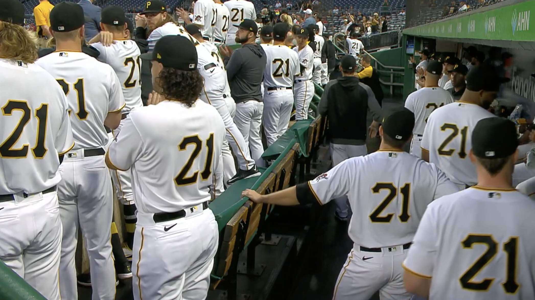
Yesterday was Roberto Clemente Day across Major League Baseball. As you can see above, all Pirates players wore No. 21 — nothing new about that, as they did the same thing last year. But there were some new wrinkles this year, as follows:
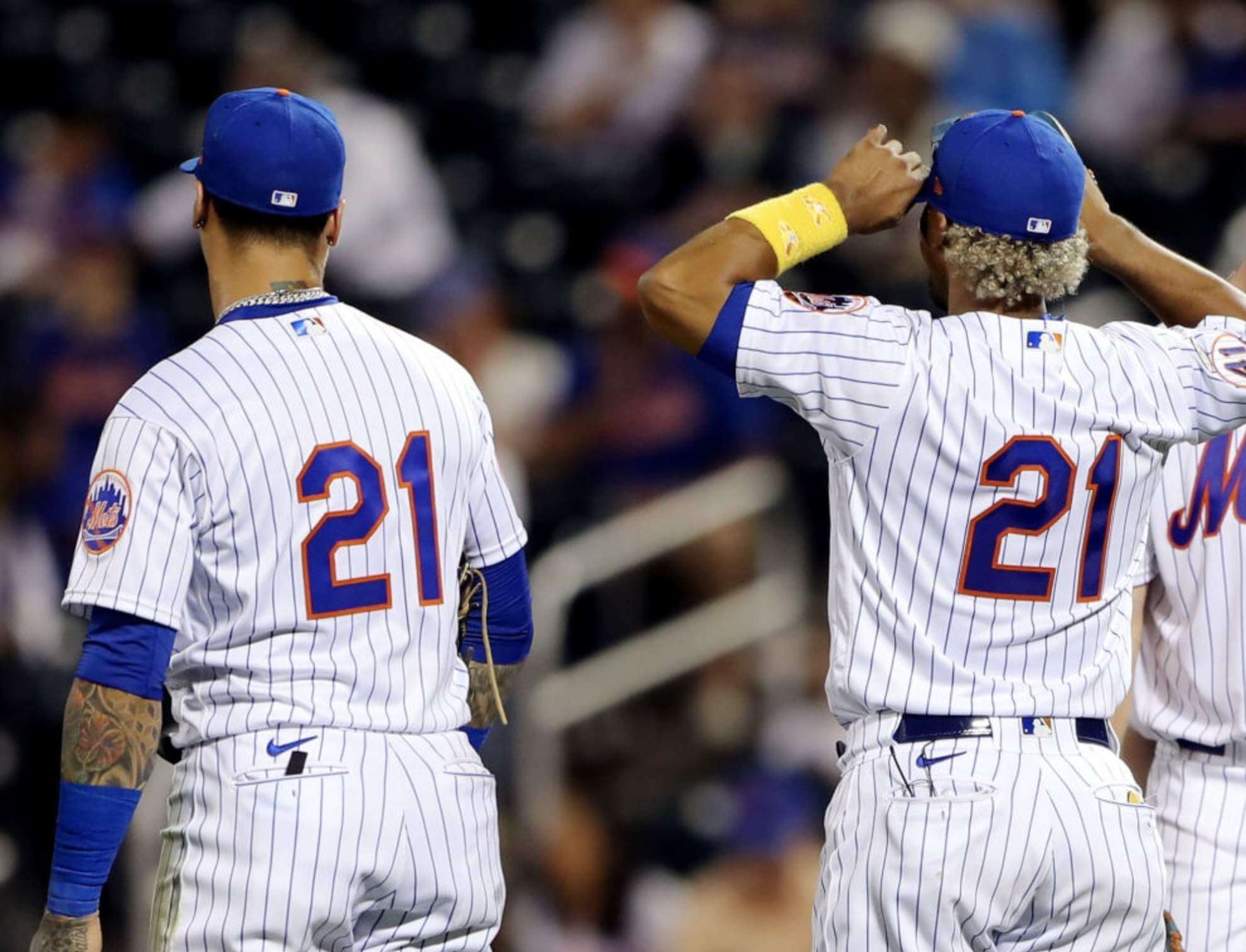
• Last year the Pirates all wore No. 21 and went NNOB, but non-Pirates players who wore No. 21 (some by virtue of being Puerto Rican, others because they were 2020 Clemente Award nominees) wore their regular NOBs. This year, however, all 21-clad players on all teams went NNOB, as seen here on Mets infielders Javier Báez and Francisco Lindor:
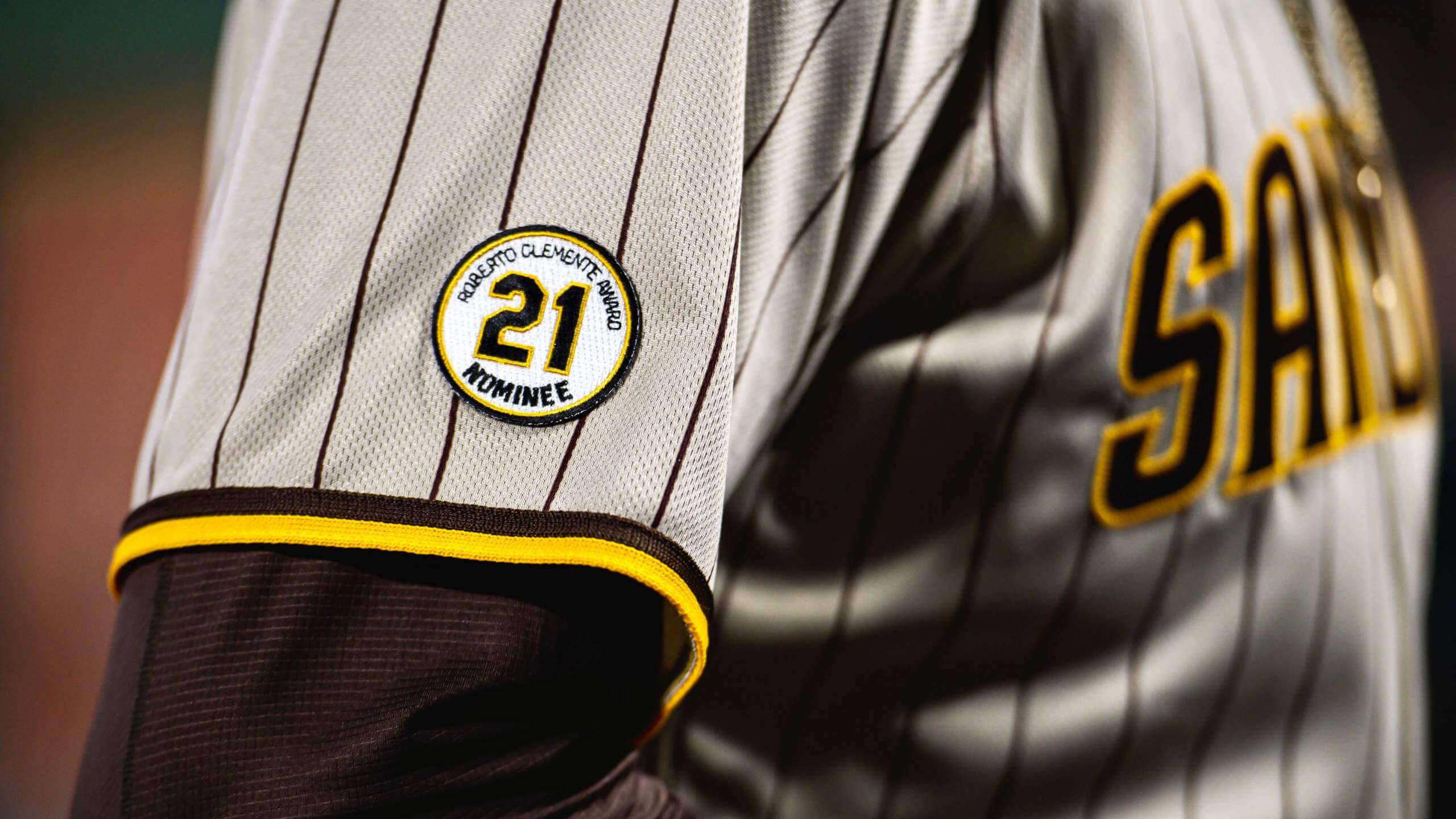
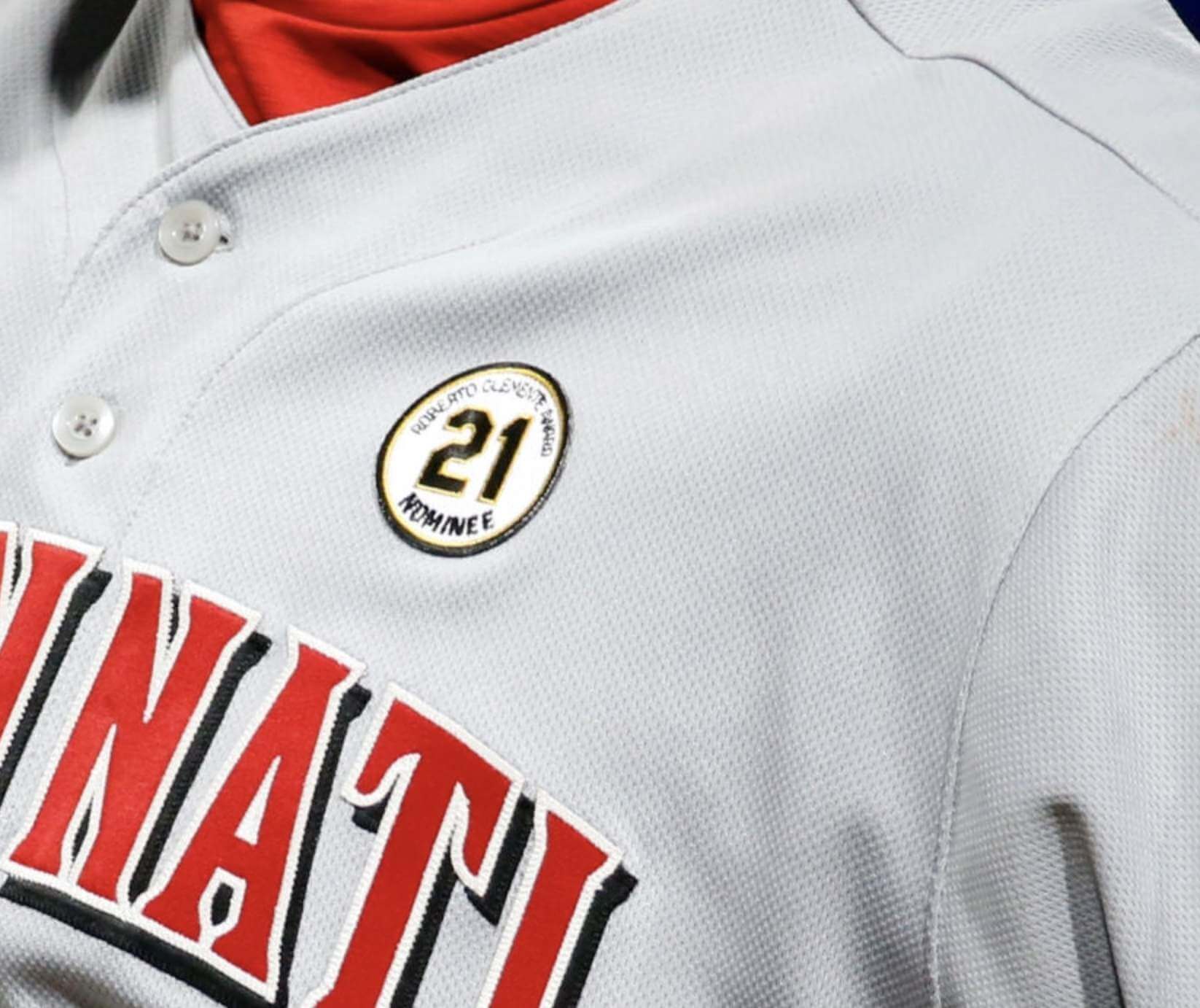
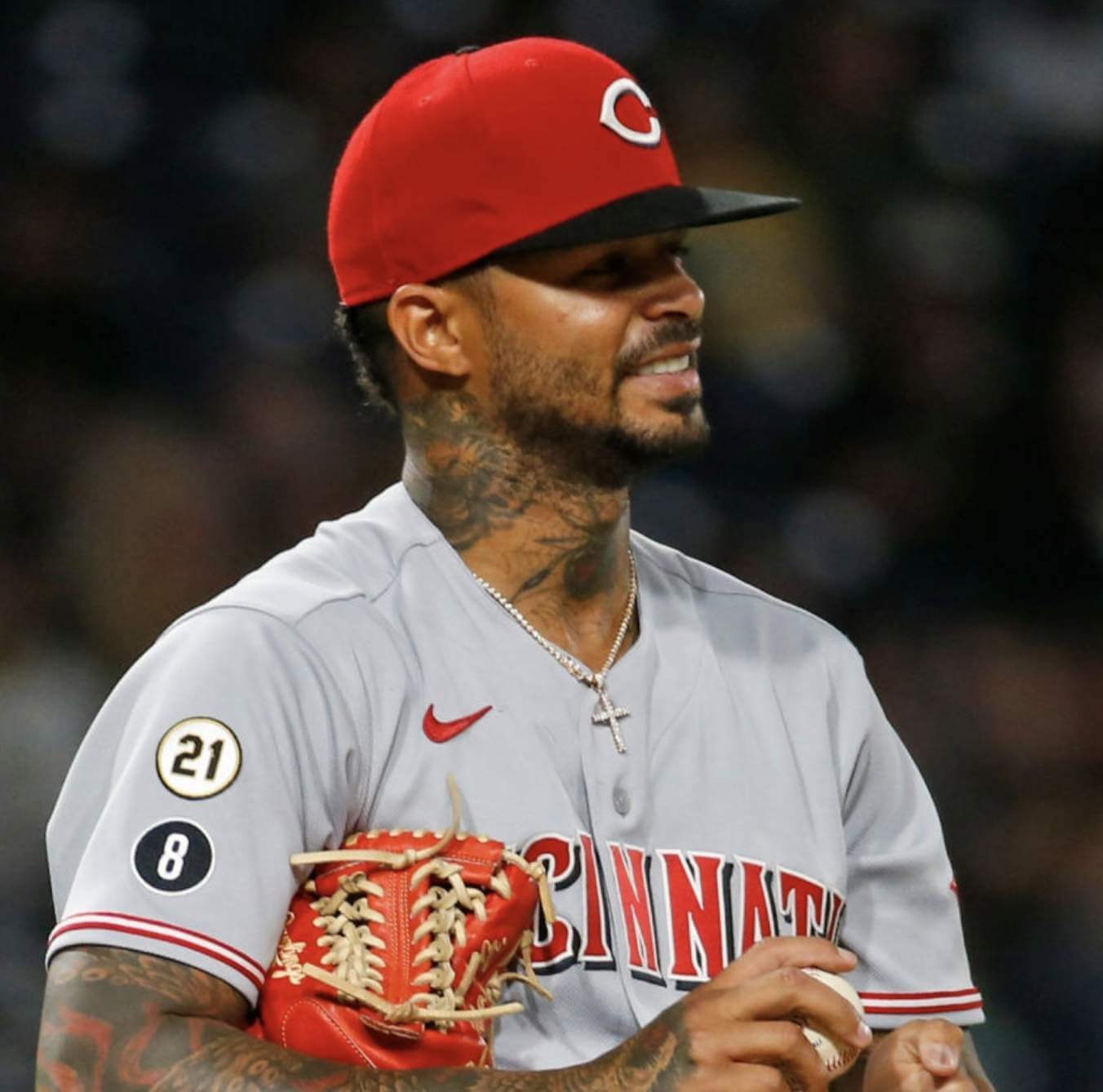
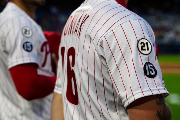
• Just like last year, everyone wore a “21” patch (well, almost everyone — I’ll get to the one major exception in a minute). But this year’s Clemente Award nominees — one per team — got to wear a special nominee’s patch. Some nominees wore it on their sleeve, just like the regular “21” patches, while others wore it on the chest:
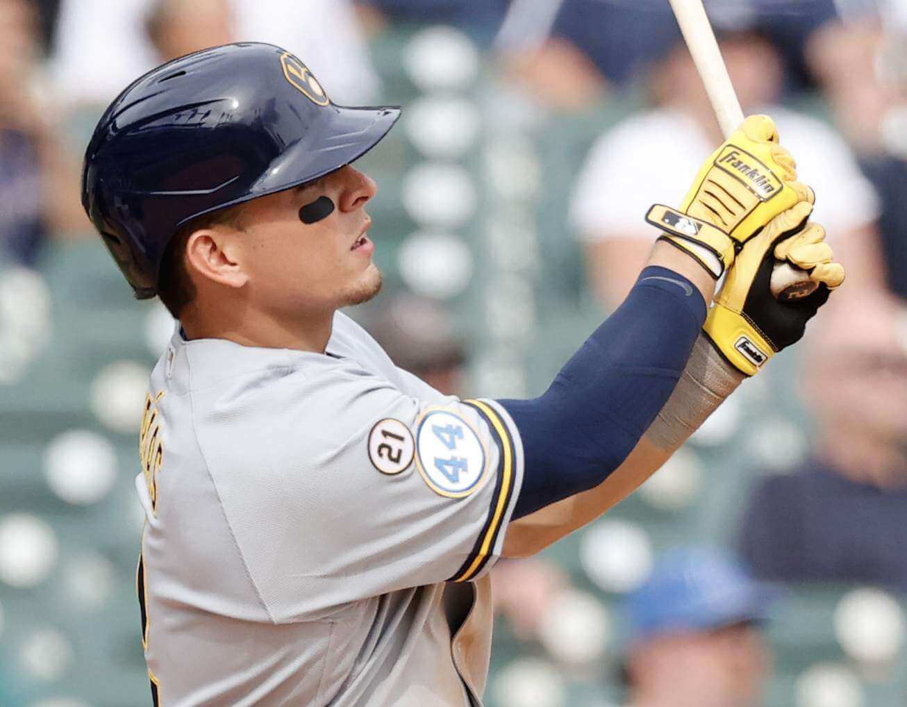
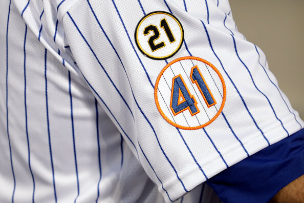
• The “21” patches shared sleeve space with teams’ existing memorial patches:
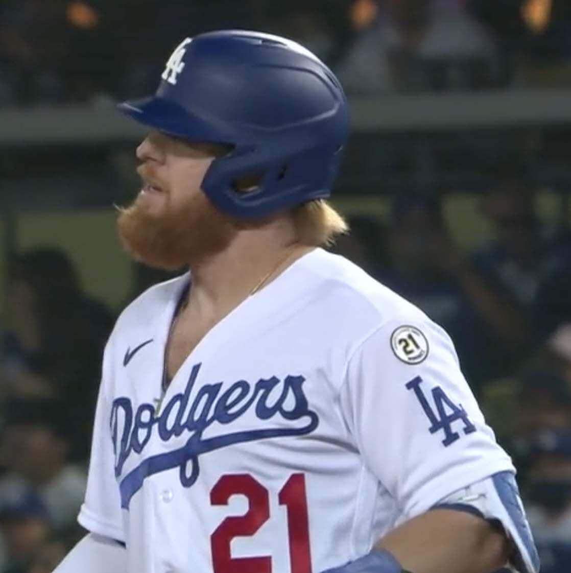
• Here’s that one major exception I was referring to: The Dodgers took a completely different approach. As far as I can tell, they did not wear the standard “21” patch (maybe because their sleeves were already maxed out on patches due to the Tommy Lasorda and Don Sutton memorials). But their current Clemente Award nominee, Justin Turner, wore the nominee patch in a rather awkward spot on the left sleeve:
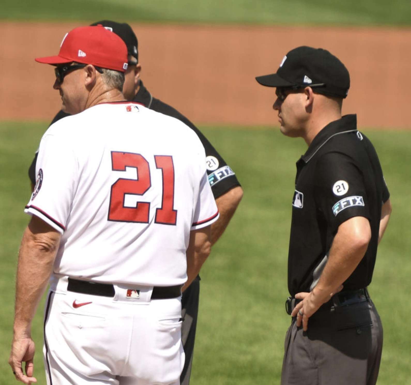
• Speaking of awkward, the umps also wore the “21” sleeve patch — right above their cryptocurrency ad patch. Ugh:
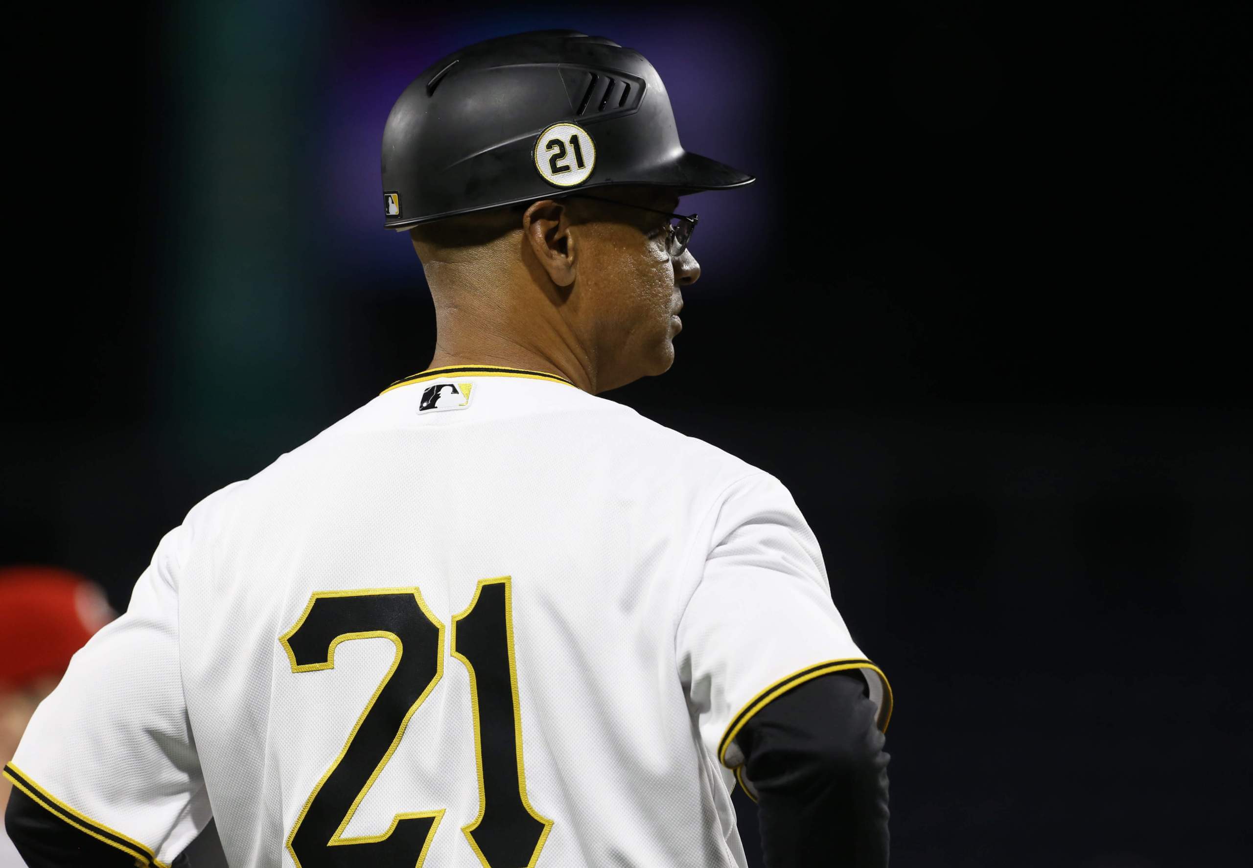
• Pirates third base coach Joey Cora wore the “21” patch on his helmet:
• Many players wore yellow/black batting gloves as a shout-out to Clemente:
Nice. Turner flashing the Pirates black and gold gloves for #RobertoClementeDay #Dodgers pic.twitter.com/z0K1EfpObm
— Mr. Diaz® (@IEdoyer) September 16, 2021
That’s what I was able to figure out from looking at game photos and video. Were there any other details that I missed?
Up until now, Clemente Day has not had a fixed date. Going forward, however, it will always be observed on Sept. 15.
Click to enlarge
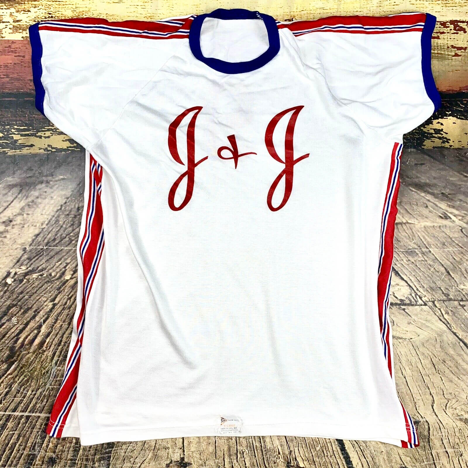
Interesting vintage find: I routinely search for vintage durene jerseys on eBay. This one turned up yesterday — not sure if it was for a Johnson & Johnson company softball team or what, but it might be good if you got the J&J vaccine, right? And man, that striping! Full eBay listing here.
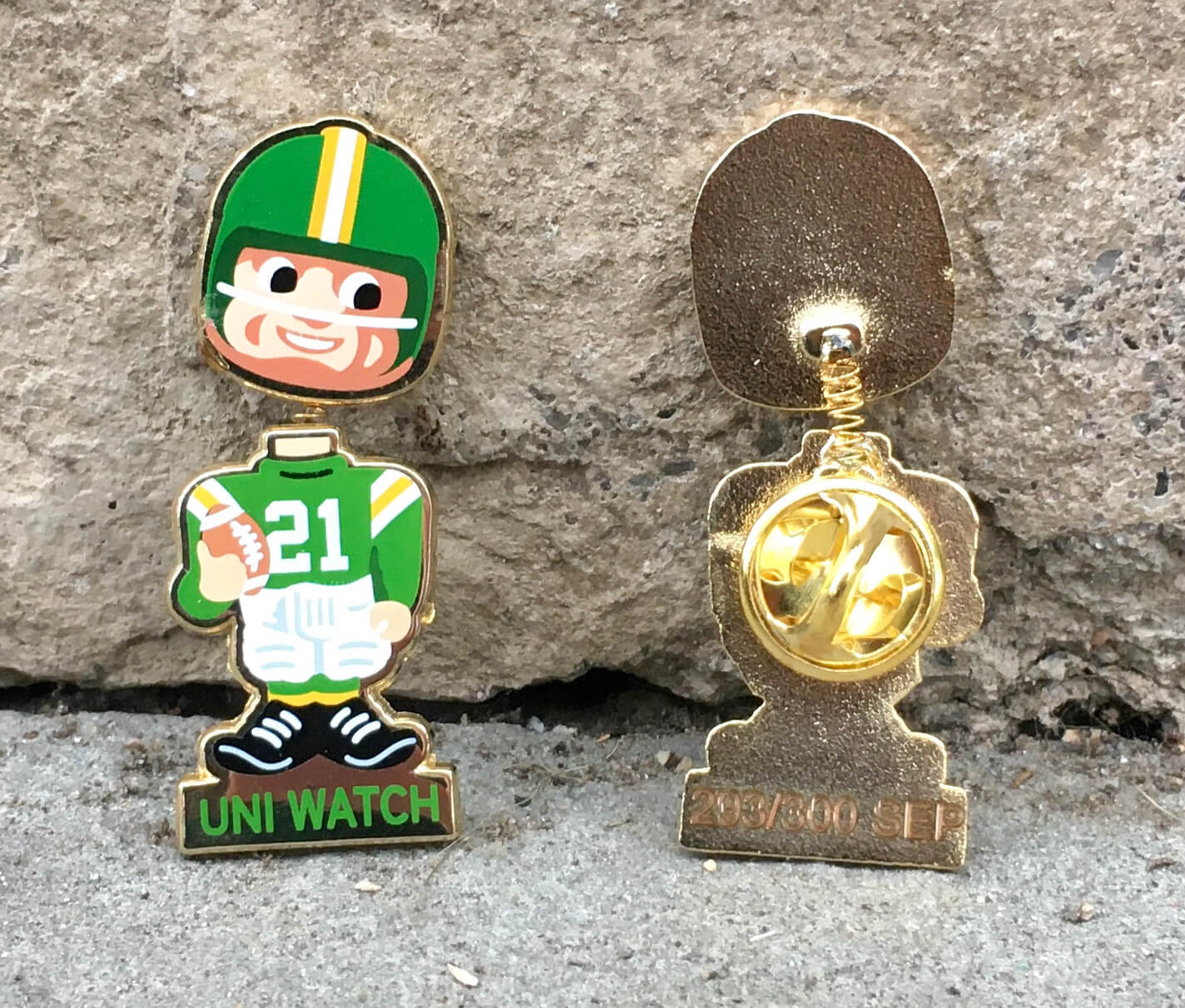
Flash sale reminder: In case you missed it on Wednesday, you can now save 20% on our September bobble-pin (and on everything else I sell on Teespring) by using the checkout code BOBBLE20. You know what to do.
“What’s It Worth?” reminder: In case you missed it earlier this week, I’m once again partnering with Grey Flannel Auctions to offer free, no-obligation appraisals of your vintage sports memorabilia items. Full details here.
The Ticker
By Paul
Indigenous Appropriation News: The Squaw Valley ski resort is now known as Palisades Tahoe (from Blake Jackson). … National Geographic has a big article on how Native-based team names and imagery are still used by lots of schools (from Dave Sikula).

Baseball News: Here’s a weird one: an old shot of A’s OF Rickey Henderson wearing Red Sox batting gloves (from K. Richardson). … Speaking of Baltimore, there’s a beautiful new Negro Leagues mural at Camden Yards (from Andrew Cosentino). … Also from Andrew: O’s pitcher John Means now has his own brand of coffee. … The Yankees may be the Evil Empire, but a recent Star Wars fan event featured Red Sox-branded storm troopers (from Michael Hochman and Nate Swick). … The Mets-centric ESPN documentary Once Upon a Time in Queens includes a shot of someone wearing very unusual striped baseball pants (from Mike, who didn’t give his surname). … Speaking of the Mets, if you’ve ever wondered what their 1986 stars would have looked like in the team’s BFBS uniforms, today’s your lucky day (blame @KCNep95). … One more Mets item: All MLB teams wore yellow ribbons and wristbands for pediatric cancer awareness on Sept. 1, but the Mets were rained out on that day, so they wore the gold accessories on Tuesday night. … New 15th-season logo for the High-A Great Lakes Loons.

NFL News: In case you didn’t know: You can always see which uni combos NFL teams will be wearing — at least based on info that’s been publicly announced so far — on the Gridiron Uniform Database. Here, for example, is what we know so far for this week’s games. You can also click on any week in the season to see what’s in store. … Speaking of, Jason Von Stein used the GUD guide, plus a few educated guesses, to create his latest uni-driven illustration for this week’s games.
College Football News: New uniforms for Northwestern State (from Mike McCorkle). … Here are this week’s uni combos for Iowa State, UCF, and Louisville (thanks to all who shared). … If you like Tulane’s “Angry Wave” retro mascot, wait until you see the 1940s-60s throwback helmet they’re wearing this weekend (thanks, Phil). … Also from Phil: New field design this week for Florida.

Hockey News: I’ve been writing for years about how teams will do anything to avoid referring to uniform advertising as, you know, advertising, but the Red Wings’ new helmet ad announcement is really a master class in linguistic bullshit (from Jeff Nichols). … The SPHL’s Peoria Rivermen will have a whopping 14 specialty jerseys this season (thanks, Phil). … New mask design for Flames G Jacob Markström (from Jeremy Robinson). … Looks like the Kings have a new alternate in the works (from Moe Khan). … Officials in the Central Collegiate Hockey Association will wear NHL-style zebra stripes this season (from @pkpouttu). … “With the Reverse Retro program, the 2020-21 NHL season likely showcased more jersey colors than any previous season,” says Daniel Estabrooks, “so I decided to make up a graphic representing that. I’m especially intrigued by how non-standardized the blues and greys were across the league.” … When the Kraken revealed their jersey designs last year, we only saw how the numerals 2 and 3 looked in their number font. But if you go to the last image in this Instagram gallery, you can see all of the other numerals (from Mike Engle).

Basketball News: New BFBS-themed practice facility for the Jazz (from @HitTheGlass). … New home whites for Appalachian State (from Thad McKinnon).

Soccer News: New Hispanic Heritage Month kit for the Houston Dynamo (from Ignackoi Salazar). … New third shirt for Tottenham Hotspur (thanks, Jamie).

Grab Bag: USA Curling will now be outfitted by Columbia Sportswear (from R. Scott Rogers). … I think this has been circulating for a week or so, but if you haven’t seen it yet, Disneyland Paris’s 30th-anniversary logo is a really clever and effective piece of design (from Adam Vitcavage). … New lacrosse uniforms for Iroquois Nationals (thanks, Phil).
The annual mowing of 21 in right field of PNC Park.
link
RE: Gross Red Wings ad – It just dawned on me that all of these ad patches and helmet stickers are just product placement. I read this recent Fast Company article (below) about product placement in TV shows and movies. It’s a booming business now because commercials are becoming less of a thing thanks to streaming so I wonder if the teams are using that sort of language to lock in deals. Sports still have a lot of commercials, but many solely consume sports through YouTube highlights, so this is a decent way to get their product shown to their sports-loving audience outside of traditional means.
link
It isn’t product placement because Meijers doesn’t sell helmets.
Strictly speaking, of course. I guess my point was more so regarding the idea that in-game marketing is perhaps a reaction to lack of traditional commercial watching by the audience. Need to find new platforms to sling their products.
Meijers? Yup, you’re from Michigan.
So, the Tulane throwback helmet demonstrates that military pandering in sports dates at least back to WWII. Unlike the “HEALTH” patches in Major League Baseball, Greenie on the helmet is definitely recognizable as a soldier.
Sorry, I don’t see it like that. It’s clear to me that Greenie is wearing a football uniform that happens to be mostly green. The helmet is clearly a hardshell football helmet (though with those proportions, it looks more like the Great Gazoo’s helmet), and the jersey has a light blue T on the front (mostly covered by the chin strap in that photo).
You’re correct. I didn’t enlarge the image and get the appropriate look at the helmet. I’ll just show myself out and head down to the bakery to order up a humble pie. Thanks for setting me straight.
“I’ll just show myself out …”
Hilarious!!!
Great post, sir!
-C.
The only thing worse than ads on uniforms is the length teams are going to make it sound like they’re not ads.
Weird that one of the Red Sox Stormtrooper photos also has a dude dressed in a Star Trek: The Next Generation-era sciences division uniform with lieutenant j.g. rank pips. Was he cosplaying as Deep Space Nine’s Dr. Julian Bashir when he first arrived on the station in the pilot movie “Emissary”?
That is the first time I have ever seen the word educated close to my name. How cool. Thank you for sharing Paul. Hope everyone has a great NFL week 2 weekend.
I thought the same thing at first. Actually my thought was, He looks like the Baby General from those crappy insurance commercials with Shaq.
But after looking again, it’s definitely a football helmet (from the time before facemasks were invented). The green matching the Army is purely coincidental as Tulane is known as The Green Wave.
Regarding the Disneyland Paris anniv logo, it is similar in design to the Disney Vacation Club 30th anniv unveiled earlier this year
link
Seems to me that the reason sports teams and universities prefer the word “sponsor” to “advertiser” is that, for whatever reason, “sponsor” has a positive connotation while “advertiser” has a more negative one, even though both words pretty much mean the same thing. It’s the same reason why Paul does the opposite when writing here.
Actually, (a) they do not mean the same thing, and (b) I use both “advertiser” and “sponsor,” depending on the circumstance. For example, when someone provides funds for me to raffle off a membership, I thank them for sponsoring the raffle, because that is an accurate and appropriate use of the term. When referring to a Uni Watch advertiser, I refer to them as an advertiser, because that is an accurate and appropriate use of *that* term. And so on.
More: link
The Oxford dictionary definition of a sponsor is “an individual or organization that pays some or all of the costs involved in staging a sporting or artistic event in return for advertising.” To me this means that the NBA (for example) referring to the companies that pay for their logos to appear on jerseys are accurately described as sponsors.
So I said that the two terms mean “pretty much” the same thing, although admittedly it would be more accurate to say that all sponsors are advertisers but not all advertisers are sponsors (for example a highway billboard is an ad but not a sponsorship).
I’ll continue to maintain that in most people’s minds a “sponsorship” is a more positive/noble endeavor than an advertisement, but that’s just opinion and it’s fine if you don’t share that one.
I’ll continue to maintain that in most people’s minds a “sponsorship” is a more positive/noble endeavor than an advertisement, but that’s just opinion and it’s fine if you don’t share that one.
I completely agree with that opinion. Indeed, it’s right there in the article I linked to in my previous comment: “[Teams and leagues] know ‘sponsor’ is a warmer, fuzzier term, a term that sounds like it’s based in fellowship and partnership and goodwill, not in commerce or greed. The repeated use of ‘sponsor’ [rather than ‘advertiser’] is just another form of marketing spin — a subtle one, and therefore a particularly insidious one.”
So yes, that’s why teams and leagues continue to use the word “sponsor” instead of “advertiser” — even when the latter term is more appropriate and accurate. Which in turn is why I will continue to call them out for it.
We’ve been thru all of this countless times. Let’s please move on. Thanks.
The dictionary definition doesn’t mention one of the implied connotations to “sponsor”: namely that the existence of the team or event would not be possible without the sponsor’s money.
This is true for Little League and municipal youth leagues who have to scrap for every penny, but is manifestly untrue with big-time professional sports teams.
It is a pretty significant, and easy to tell difference.
Sponsor: local pizza place pays $200 and get’s their name / logo on a rec league basketball jersey to reduce the cost of uniforms for the armature athletes.
Advertiser: Corporation pays a for profit professional team to put their logo on a jersey.
So much for the 1960 Olympics at Squaw Valley.
Interesting now that any Native American reference is bad. I wonder how the word squaw [meaning wife] is offensive.
Actually, nobody said that “any Native American reference is bad.” Let’s please stick to reality and not exaggerate.
As for “squaw,” it has often been used as a sexist/racist slur. Not always, but often. Hope that clears things up. If you think it’s a neutral, harmless word, I suggest you use it the next time you’re speaking with a Native American woman. Be sure to get back to us and let us know how that went.
In the area where I grew up, there were a bunch of geographic signifiers (bay, point, road, etc.) that had this particular slur attached to it. Many years ago, after some pressure and input from local Tribal members, the word was officially replaced with a local Indigenous word meaning “weeping woman.” It was a powerful choice to say the least.
link
Yep, there’s an offensive interpretation. There’s also a “North American” interpretation. Even Native Americans don’t agree on usage
link
As you yourself now admit, that word can be problematic. So you just answered the question you originally asked.
Let’s please move on. Thanks.
Not all reference to Native Americans is bad. Here are some team names whose use of indigenous peoples is respectful: Saginaw Valley Cardinals, Mamaroneck Tigers, Kankakee Cavaliers, Oklahoma Sooners, Iowa Hawkeyes. Think outside the box.
It was a derogatory term whites used to describe Native American women. Many pointy mountains were named “Squaw Peak” because of their appearance resembling breasts.
I hope I’m wrong about this, but the cynic in me wonders if the Dodgers skipped the Roberto Clemente patch as sour grapes for losing him to the Pirates in the Rule 5 draft back in the 50s.
You think they’re carrying a grudge after 67 years?
Can’t wait for the annual sponsor/advertiser patch-free day. Now that would be a true throwback.
I guess calling it “Means Beans” was too obvious!
I think the idea of a Roberto Clemente day is a great one. He was an exceptional player and an even better humanitarian. My beef is with the nominee patches. It just reeks of participation trophy syndrome. As Robert De Niro once said “I didn’t know they made ninth-place ribbons.”
Congrats to Iowa State for remembering their ACTUAL school colors instead of the garbage they wore last week when they crapped the bed against Iowa.
I will never understand why some schools seem to dislike their own colors so much.
There’s no link in the Hockey section for the Flames goalie’s new mask.
Seeing that big bold number 21 on the back of the Nationals’ jerseys really makes me wish they were NNOB all the time.
I sincerely doubt that ESPN got permission from Strawberry, Gooden, or from Carter’s family to use their likenesses in those Nike ads. Or compensated them.
Sure. This is baseball after all.