[Editor’s Note: Paul is on his annual August break from the site. Deputy editor Phil Hecken is in charge from now through the end of the month, although Paul may be popping up here occasionally.]
By Phil Hecken
Follow @PhilHecken
A good Tuesday morning to you all! This being the final day of August, it will be my last weekday post for a while — I’ll be off Labor Day weekend, but returning to my usual Weekend duties the weekend after that, when we kick off another college football season with a very special Saturday Morning Uni Watch (wrapping up all the games played through Labor Day weekend), followed by our usual Sunday Morning Uni Watch the day after that. It has been both an honor and a privilege to step in for Paul during his annual August sabbatical, and I will GLADLY hand the reins back over to him tomorrow.
I wanted to end on a “high” note, and I think today’s post will fit that bill. I’m joined by longtime reader and contributor Steve Dodell, who brings us a VERY special look today at the use of the Sand Knit font in professional (and college) sports uniforms. The McAuliffe font (today worn only by the Boston Red Sox) may get more love on UW, but the Sand Knit font has stood the test of time, and is still used by many teams today. Steve has done some incredible research (with a nice fact check by Chance Michaels, another longtime reader/contributor), and I’m pleased to present his efforts to you today. Steve? Take it away!
The Sand Knit Number Font
by Steve Dodell
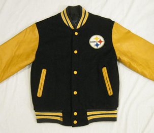
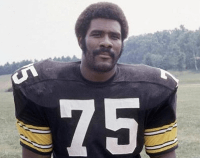
While usually known as a contributor of NY Mets related items on Uni Watch, today I’d like to pay homage to what is primarily a football font that permeated the NFL in the early 1970s, when I was a kid growing up in Brooklyn. The Jets and Giants were not exactly playing an impressionable brand of football. By a twist of fate, the Steelers had just won Super Bowl IX, when a family friend asked if I would like a Steelers jacket…the same ones Brinke always highlights, with leather-like sleeves. That was it…I had become a Steeler fan and enjoyed winning Super Bowls 3 of the next 5 years.
Their uniforms were visually appealing to me as well and their block number font played a huge role. For me, it was modern, yet traditional and utilitarian all at once, while coming to symbolize excellence. Being a fan of Bradshaw and Harris, I always noticed the TV number 2 was unique in that it had no bottom serif like the bigger number 2s in the font.
Year after year, into the 1990s, this little quirk reassured me these were my Steelers and they had kept their uniform traditions. Upon further review, we should acknowledge this font transcended the Steelers and absolutely dominated the NFL in the late 60s into the early 70s. It appeared in other sports as well and is still in use today.
I did some research for this piece, but I am not a professional writer or researcher and if there are gaps or errors, I welcome input from the comm-uni-ty as we document this historically important font. The font was the house font of a company known as Sand Knit (sometimes known as Sand-Knit) which is celebrating their 100th year this year! A good number of you probably grew up rooting for teams that also wore this font and you might have some Sand Knit gear in the back of your closet. They are now a part of Ripon Athletic and their recent warehouse sale was profiled on Uni Watch. Here is some more on the history of Sand Knit, though this page is a bit wonky. It is meaningful, I believe, that they moved to Berlin, WI in 1953, about an hour outside of Green Bay.
Based on team photos from the 1950s, the Packers may have worn Sand Knit jerseys some years, but I can’t say for sure just based on the fonts. However, being so close to each other, maybe it was inevitable that the Packers would eventually settle on Sand Knit to supply their uniforms as they became a dynasty. From this History of the Green Bay Packers Jersey.
According to the Oshkosh Daily Northwestern, (August 15, 1964, p.19) the caption reads, “Packers to Wear Sand-Knit Uniforms.”
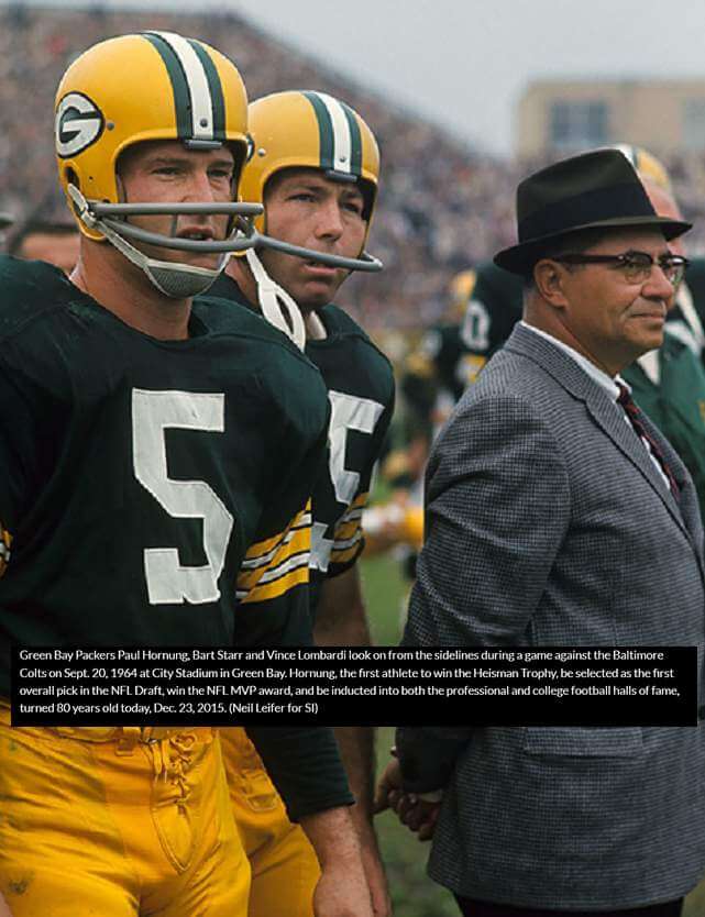
So what did they look like in that 1964-65 season? The font did not yet have the familiar Sand Knit look.
The 2s had a slanted cross piece and many numbers had additional serifs, like the bottom of the 5 in this shot of Paul Hornung:
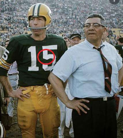
By 1965 though, the font changed to the more familiar Sand Knit look.
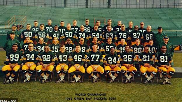
Pay attention once more to the 5…it had an angled piece (left side, middle) that gave it a rounded effect.
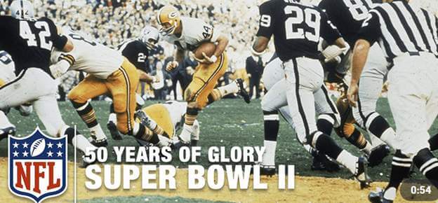
At this point, the Packers became a dynasty and based on the proliferation of this font, Sand Knit prospered as well. Both teams had the font in SB II…you can tell from back numbers, which had a different aspect than the front numbers – narrow number 4s and on numbers with cutouts like 8s, the cutouts are taller than they are wide.
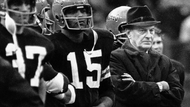
So far we have seen the Packers, the Raiders and as I mentioned earlier, the Steelers used the font by the late 60s, early 70s. Here is a young Mean Joe Greene:
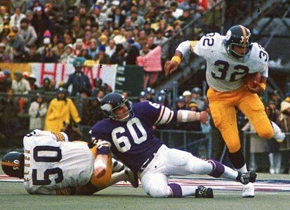
The Steelers won SB IX in the font and most, but not all, the Vikings wore it in that game as well.
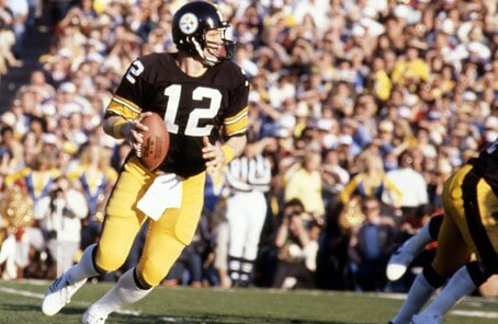
The Steelers, now a budding successor dynasty to the Pack, wore the font again in SB X, but with one change…the 5 lost its rounded part!
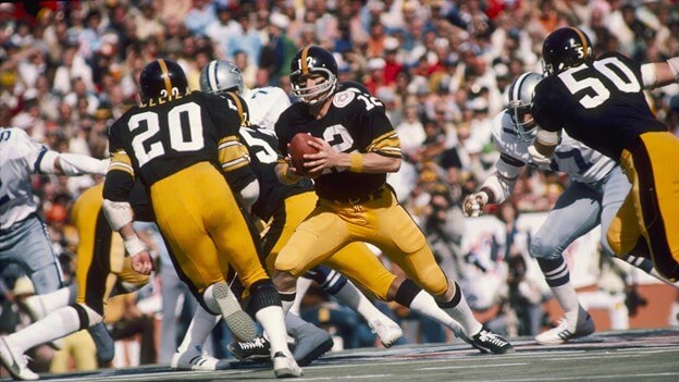
The font now stayed consistent and the Steelers used it for 22 more years until they lost their minds broke my heart in 1997 and went to “Futura Condensed Italic”…this was an improvement?
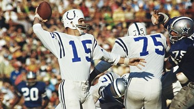
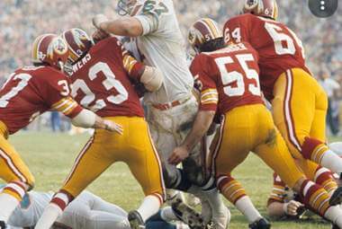
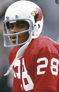
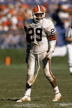
So how many other teams wore the font? What is the big deal? The Colts, Washington, Browns and St. Louis Cardinals used the font:
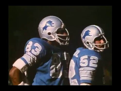
The Lions had a two color usage at home.
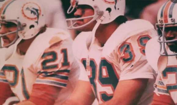
The Dolphins also had a two-color usage, but as seen in this photo, it was not a consistent or prolonged use.
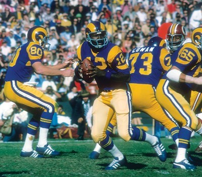
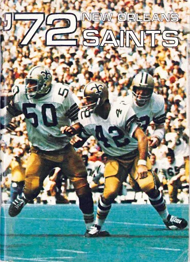
The Rams and Saints also used it for a short time in the early 70s.
The Bengals wore it, usually without TV numbers.
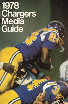
The Chargers used a version with a floating outline.
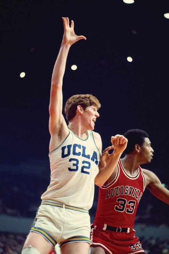
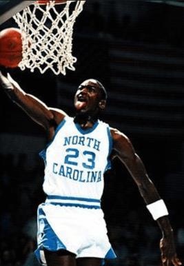
You know it was an important font in College Basketball when it was worn by the UCLA Dynasty (seen vs. Louisville who were also wearing it) and Michael Jordan at UNC.
In 1977, the Astros changed the font on the Tequila Sunrise from the initial circus looking font to the Sand Knit font and wore it into the 80s, in some years complete with TV number on pants.

The White Sox used it on their beach blanket unis, also with TV numbers on their pants.
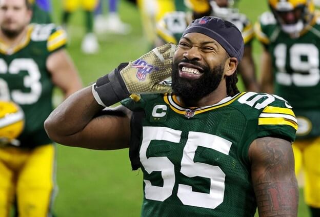
At some point, following Pittsburgh tradition of sharing uni aspects, the Penguins switched to the font and still wear it today, even while the Steelers are currently off the rails.

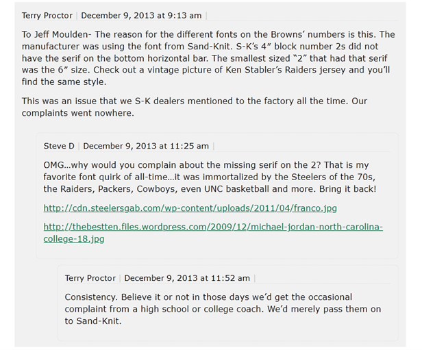
The Penguins may be the only team today still true to the original TV 2. So why did it not have that bottom serif? An interaction I had in the comment section a few years back with sporting goods legend and Uni Watch contributor, the late Terry Proctor could shed some light:
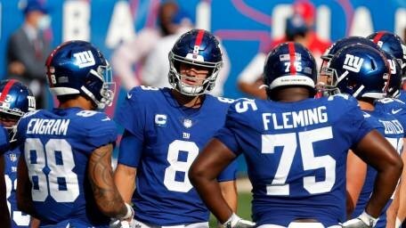
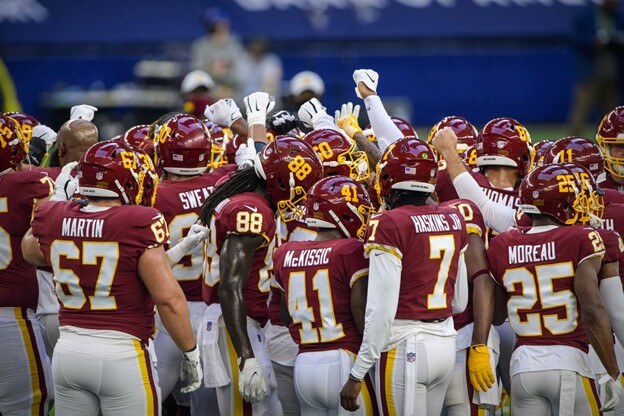
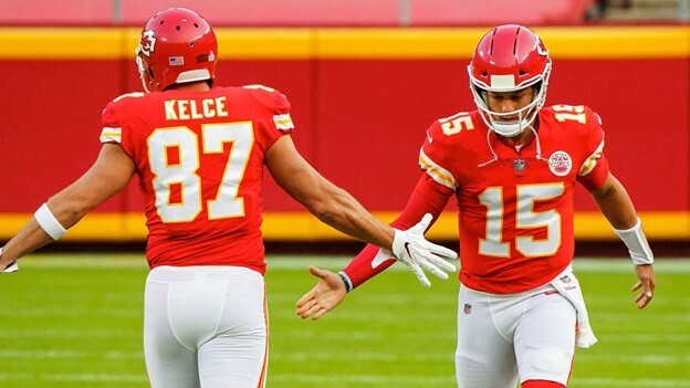
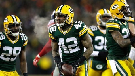
So while this font was so dominant in the NFL of the 1970s, its use waned over the years as teams like the Steelers introduced proprietary fonts. Still, the Giants, Washington, Chiefs, Raiders and of course the Packers wear it today.
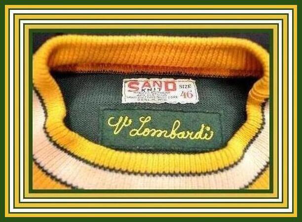
The Packers even brought back the rounded 5s in 1995 when they returned to tackle twill from many years of using silk screened numbers. This gave them a distinct look at that time.
But alas, due to the lack of sleeve space on today’s jerseys, it is hard to fit the original TV numbers and the teams that try, including the Packers, all added the serif on the TV 2 at some point…somewhere Terry is smiling.
Wow! Thanks Steve! Tremendous research and work, as always. It’s stuff like this that really gets into the weeks of uni minutia — I love it, and I’m sure many of our readers do as well.
If you enjoyed Steve’s piece, here are some interesting NY Mets posts he has had a hand in on the site: Uni Watch DIY Project: Letter Perfect; Possibly the Most Teeny-Tiny Uni Detail Ever; and, Yet Another Quirk Involving the Mets Logo. We’ll gladly add this one to your impressive roster!
Readers, how great is this? Clearly Steve GetsIt®! Please let him know what you think and share your thoughts in the comments below.
Collector’s Corner
By Brinke Guthrie
Follow @brinkeguthrie
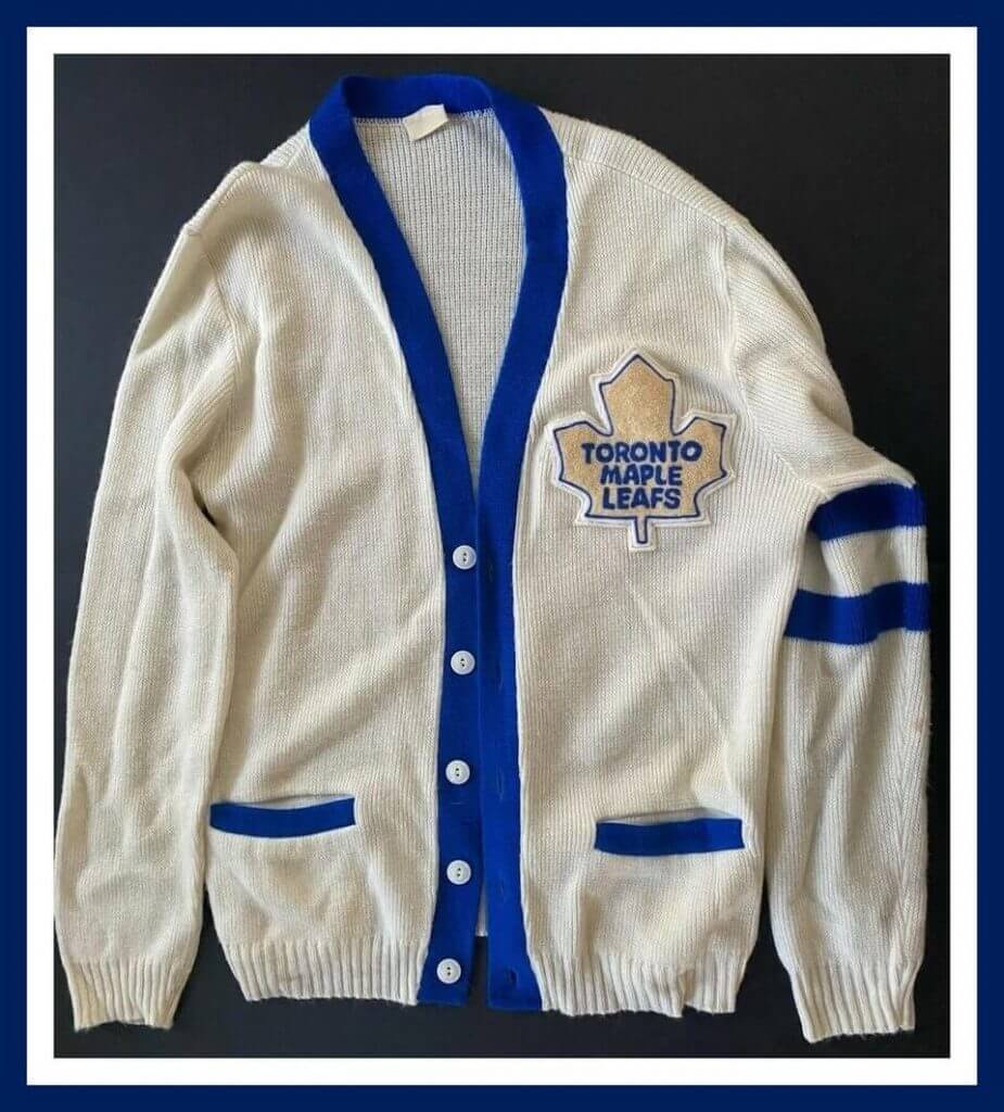
“Man, that Leafs sweater is awesome!” -PL.
I figured that this week’s leadoff item would hit Paul’s sweet spot, and as you can see, it did. We’ve got a 1960s Toronto Maple Leafs staff cardigan sweater here, and other than a couple of spots on the left sleeve, this one’s a winner, eh? The seller notes “Sweater was worn by staff while cleaning the ice at Maple Leaf Gardens.”
Now for the rest of this week’s picks:
• One more 1960s Leafs item here; this iron-off transfer decal has both the logos for the Leafs and le Canadiens, n’est-ce pas?
• Hope you checked out yesterday’s US Open tennis gear preview; let’s sneak this retro Bjorn Borg Fila item in. Here’s a 1980 or so terry cloth Borg shirt; I had this one, and it was my very favorite. That large “F|Bj” badge on the chest may have been added after the fact, I don’t know. The style meant for the consumer had that badge on the sleeve only. Just the pro players had the badge on their chest as well as the sleeve.
• Will you look at this! This 1950s Blatz Beer promo item is cast iron and shows an umpire, base runner and fielder. The text says “Impressive late 1950s Blatz Beer Milwaukee Braves three-dimensional pub tavern bar back cast metal piece with baseball scene. Size: 19″x 20″x 10″. Includes reproduction flags.”
• This 1960s Detroit Lions mug looks very heavy-duty and displays their old-time logo.
• Here’s a 1970s storage box covered in NFL team logos.
• You need these 1960s Green Bay Packers cushioned folding seats for the bleachers at The Frozen Tundra.
• This 1960s MacGregor LA Rams youth helmet has some big and bold yellow horns!
• Chicago White Sox fans can plug this 1989 “Collectable Team Night Light (with the “modern batter guy”) right in!
• Look at the quaint (by today’s standards) artwork on this 1960s “Bob Cousy – Mr. Basketball” sneaker shoe box.
• Kind of an unusual look to the font and helmet of this 1970s San Diego Chargers heat transfer.

Guess The Game…
from the scoreboard
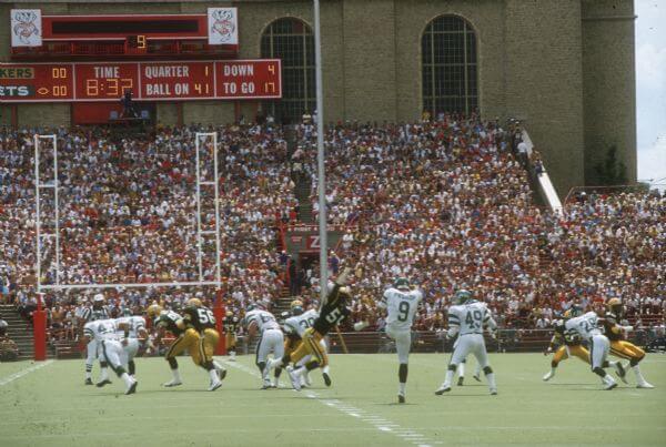
Today’s scoreboard comes from Nicholas Bartell.
The premise of the game (GTGFTS) is simple: I’ll post a scoreboard and you guys simply identify the game depicted. In the past, I don’t know if I’ve ever completely stumped you (some are easier than others).
Here’s the Scoreboard. In the comments below, try to identify the game (date & location, as well as final score). If anything noteworthy occurred during the game, please add that in (and if you were AT the game, well bonus points for you!):
Please continue sending these in! You’re welcome to send me any scoreboard photos (with answers please), and I’ll keep running them.
If Uni Watch had a football team…
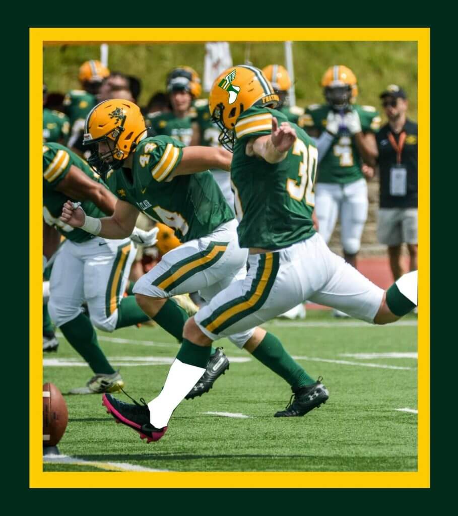
…this could be it.
Got that photo and a note from my buddy Jimmy Corcoran, who wrote…
I saw this picture on the site today and thought, if Uni Watch sponsored a football team these could be the uniforms? With a few modifications to give it more of a traditional look like adding white socks, making the stripes go to the top of the pants and adding the iconic Uni Watch logo to the helmet. This is the uniform for people who get it!
Thanks Jimmy!
The Ticker
By Alex Hider

Baseball News: The Reds hosted an alumni softball game over the weekend, and the uniforms — gloriously — included no black trim (from @FloydNimrod).
.

NFL News: Cleveland.com is holding a contest to determine the best-dressed Browns fan (from John Flory). … Worcester Raiders FC, an English soccer club in the lower levels of the professional ranks, is poaching the Raiders’ logo (from Ed Żelaski). … Spotted at a baseball game in Tampa: A Tom Brady Pats/Bucs frankenjersey (from Zac Blobner).
College/High School Football News: Ohio State coach Ryan Day revealed yesterday that while he sports a beard in the offseason, he’s too superstitious to sport one during a game. He shaves his beard off before Week 1 and keeps it that way until the season ends (from Jason Hillyer). … Speaking of Ohio State, players will receive a new pair of LeBron James sneakers ahead of their game on Thursday (from Phil). … New uniforms for Miami (Ohio) (from Phil). … Samford will wear helmet decals in memory of Bobby Bowden this season (from Clint Richardson). … New helmet design for Rice (from Brad Blunt). … Bishop Sycamore High School — a school that appears to have fabricated the recruiting acumens of its players in order to score an appearance on Sunday on ESPN — also played a game on Friday night against Sto-Rox High School in Pennsylvania. Both teams wore black uniforms in that game (from Jonte Robertson). … Some Indiana fans have been having difficulty finding a jersey for sale. Ryan Cotter compared IU’s offerings to the rest of the top 25, and Indiana is 1 of 4 top 25 football teams that does not sell a Football Jersey on Fanatics.

Hockey News: The Stars confirmed yesterday that they’ll use a brighter shade of green moving forward. … The QMJHL’s Quebec Remparts have four new jerseys, including a Nordiques-style fauxback (from James Beattie). … Speaking of the Nordiques: Back in the ’80s, a show ran on SRS TV in Canada called “Lance et compte” (“He Shoots, He Scores”). The show followed a club called the Nationals, and featured B-roll taken from Nordiques games. Steven Schapansky was watching highlights from an 1986 Nordiques game and spotted a fan holding a “Nationals” banner from the show.

Basketball News: Update from NBA numbers guru Etienne Catalan: New Cavs C Lauri Markkanen will wear No. 24, and new Sixers G Grant Riller will wear No. 5. … Tennis star Naomi Osaka warmed up for the U.S. Open yesterday in a Sabrina Ionescu New York Liberty jersey (from Phil).

Soccer News: With Cristiano Ronaldo joining Manchester United, several players have changed jersey numbers to get Ronaldo his No. 7 (from our own Anthony Emerson). … New uniforms for the University of Illinois Chicago men’s soccer team (from Dan Yopchick). … Reposted from NFL: Worcester Raiders FC, a club in the lower tiers of the English system, is poaching the Oakland Raiders’ logo (from Ed Żelaski). … Spanish soccer giant Real Madrid has seen some pretty impressive e-commerce merch growth from Instagram, after gaining 12 million new followers from 2020 to 2021 (from John Cerone).

Grab Bag: New York’s State Park system has a new logo (from James Gilbert). … YouTuber-turned-boxer Jake Paul wore a shirt featuring a mishmash of Browns, Indians, Cavaliers and Ohio State jerseys prior to his fight in Cleveland over the weekend (from Paul Simpson). … Did you know the Culinary Institute of America has an athletic program? They play as the Steels, and their logo includes a Honing steel! … Sportscaster Keith Olbermann infamously wore a leather jacket during the debut of ESPN 2 in 1993. Turns out that jacket sold at auction a few years ago (from Matthew Reichbach).
.
Uni Tweet of the Day
I’d rather see these than any more “City Connect” uniforms next season…
Who else LOVES these uniforms designed by Penn State Children’s Hospital patients?!☺️ @UniWatch pic.twitter.com/zEQSnZRtig
— Lancaster Barnstormers (@gobarnstormers) August 29, 2021
And finally… that’ll do it for me for today and for weekdays for the foreseeable future, as Paul returns from his annual August sabbatical tomorrow (YAY!). Big thanks to Steve for today’s amazing lede article. Great stuff.
I want to thank all you readers who stuck with me this month, and I hope I was able to bring you some quality Uni Watching. Big thanks go out to all the contributors who shared the several main pieces I was able to feature this month — you guys are all aces, and I couldn’t make it though the month without all your help.
And I’d also like to thank Brinke for not just providing his usual Collector’s Corner pieces, but also for yesterday’s US Open special, and of course, all the guys who bring you the ticker on a daily basis: Jamie Rathjen (special thanks to Jamie for not just one, but TWO great pieces this month), Alex Hider, Lloyd Alaban and Anthony Emerson. Great work guys!
Everyone have a great day, and I’ll be back doing weekends after Labor Day — in case you missed it, the full SMUW crew (plus newly-unretired Jimmer Vilk returning to the 5 & 1) will return to bring you the best NCAA Football uni watching there is every Sunday as well.
And of course, thanks to Paul for once again entrusting me with the blog for the month. But now I’ll gladly hand you back the keys to the car. There may be a dent in the right front fender and some scratches on the hood, but I gave her a wash and topped off the tank.
Peace,
PH
Great job as always Phil!
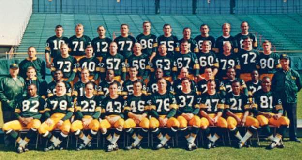
GTGFTS: Packers 38, Jets 14. 8/9/86, at UW.
What on earth is up with those goalposts?
Not too many years ago college goalposts were 23’4” wide. It looks like they just added temporary uprights for the pro game which uses 18’6” wide uprights. College and pro use same width uprights now.
I’m guessing they retrofitted the (at the time) wider college goalposts with the narrower NFL posts. Probably cheaper than having to get a whole new set of goalposts for an exhibition game.
Phil thank you for making August a better month. Between variants, political debates, weather disasters, and losses, you got everyone through with a fine example of community!
Guess the game… Packers vs Jets at Camp Randall Stadium in Madison WI (home of the Badgers) played on August 9, 1986. Packers won 38-14, not that it really matters as it was pre-season. Something noteworthy: at the time it was the largest crowd ever to see a Packers game in Wisconsin.
I thought I commented before, but I don’t see it, so sorry if this is a redundant comment. The guess the game… Packers vs Jets, pre-season game played at Camp Randall Stadium in Madison Wisconsin on August 9, 1986. Packers won 38-14. Of note: at the time it was the largest crowd ever to see a Packers game in Wisconsin.
Why would a soccer team choose to poach a logo with a football (American) helmet in it????
Laaaaay-Zeeeeee!!!
Not exactly uni-related, but that Bishop Sycamore High School football program just seems to be all kinds of hinky. Shame on everybody who is choosing to promote them.
Great job, Phil. No sunset for the sunset of your August duties?
Great Job LI Phil!
Phil, we appreciate the work you put in to keep this site running in August. Fantastic work! Read lots of interesting stuff I have not thought about.
I love that font. It’s perfect, just absolutely perfect. So balanced, so harmonious.
If I had to guess, I would hypothesize that the TV 2 got its bottom serif when other manufacturers started making jerseys. Either that, or when the cutting machinery got more precise (CNC?) to cut the digits out. Maybe both.
I can’t stop staring at that cast-iron Blatz Beer um, statue(?).
I love that the umpire is wearing a barrel in lieu of a chest protector (ok, at least in my mind).
The Cowboys also still use the Sand Knit font on their game jerseys. Use of it on replicas has been haphazard.
Thanks for a great month, Phil!
Had a crazy morning at work, but I’m super excited to dig into this article this evening!
Well done, Phil! Thanks for all you do!
Honestly I never noticed font unless it was some really unusual or weird font. My rule for font is that I shouldn’t notice it. I would never have noticed that the Steelers changed their font over the years.
Great job Phil (and team), no loss of fidelity at all.
Great job this month as always Phil Hecken!
Great piece on the SK font! It’s a true staple in sports. Adding some additional context and notes:
Regarding the Dolphins photos- the numbers are “consistently inconsistent”. This is because the #21 uniform is SK manufactured, and the #39 is likely Wilson (Could be Russell). This is a more common example of older days when teams wear not only sourcing uniforms from multiple suppliers, but lettering was completed by a multitude of people/companies!
Teams wearing the SK font- I’d included Cowboys and Saints also. Cowboys white jerseys usually go unnoticed, but are just a thicker stroke of the SK block (specifically, Dallas uses what is typically the style for TV numbers. This is easily noticeable with the longer middle bar in the #3). The font is more identifiable with the blue jersey, which uses a thinner stroke stacked with double outlines. TLDR: All these teams use a varation of the SK Font Family as their baseline font.
As alluded, many fonts changes over the years are a direct result of when SK/Ripon started manufacturing the uniforms. In more recently history, you can see this with teams like the Chiefs and the Saints. The Chiefs used “Reebok” in the mid-late 90s, who I belive were manufactured by Shaffer Sprotswear *at that time* (Ripon would later make some and then most of “reebok” branded jerseys). When Kansas City began wearing “Puma” on field, the uniforms began showcasing the Sand Knit block font. This is because… you guessed it… Sand Knit/Ripon was the manufacturer of Puma NFL on-field jerseys. Similar situation with the Saints, around this time period also.
There likely a bunch of other details I’m missing, but I hope this contribution is helpful. The Sand Knit block font deserves more appreciation :)
Thanks FK…I agree…I did not research all the overlapping years, but in the early 70s, maybe half the NFL or more wore the font at some point.
You starte an important conversation in the Uni-verse. Hats off for your efforts. I’m sure there can be pages of history with just this one font alone!
In the Dolphins’ photo, Larry Csonka is wearing a jersey made by Wilson. It’s not a case of inconsistent use of fonts from Sand Knit.
Thanks Mark…I did not mean to imply Sand Knit was inconsistent…but the fact that multiple jersey manufacturers were used, caused an inconsistent font look. I just noticed that Csonka doesn’t even have sleeve stripes in that picture! It appears the Dolphins played games with some players with stripes and some without!
link
Uniforms are a weird obsession. Back in the day I worked in a sporting goods store. I spent my time learning how to differentiate among the fonts used by Rawlings, Wilson, Sand Knit, Southland, and few others.
As others have pointed out, multiple suppliers outfitted teams. Local lettering shops filled in gaps.
Aside from the unique font, Sand Knit stood out for the quality and designs of its offerings.
Thanks for taking the time to compose a detailed, fascinating post.
Is that Sidney Crosby wearing a number 22 sweater? If so, I cannot find any record of him doing so. While I have always rooted for the Pens, as a West Coast resident, I did not have, nor do I have the same access as a local fan to the team to know such details. Was it a Rick Tocchet tribute, or a bloody sweater issue, or Sid the Kid’s duffle get stolen? Is there a Yinzer puckhead out there that can either verify this as Crosby or put me in my place?
I think it’s Sam Poulin.
I found a blogger who visited the Haliburton House museum in Windsor, NS that in addition to Sam Slick, celebrates the local hockey history of the area, including the claims of Windsor as the birthplace of Hockey. One part of the museum has an area dedicated to the (Pre-Nazi era) championship team of Windsor Swastikas. Check out his blog here. link
is that NY State Parks logo really official, or merely a concept? I am not finding any official reference or announcement online.
Loved the piece on Sand-Knit. Minor correction on the date given for the leafs sweater; it’s listed as being from the 60s but the version of the leafs logo on the breast did not debut until the fall of 1970
I really enjoyed my visits to Uni Watch this month…thanks to Phil, Ekdahl, contributors and reply-leavers!
Very impressive research on Sand Knit, Steve!
I especially loved the example photos you selected.
Some Ebay sellers just don’t Get It…that NFL logo storage box is an ’80s product (the striped Bengals helmet is the giveaway).
GTGFTS: I sure wish the Jets would throwback to the Sack Exchange era.
Good ‘Shop work, Jimmy (but If Uni Watch had a football team…would anyone be wearing cleats with a pink accent? I think not.).
I understand your point about the cleats, but I stuck strictly to the uniform, cleats are a personal choice of the player and they always look different depending on the position. My Father had a ten year career and almost always bought his own cleats because he liked Puma Rockets, and at the time most teams were wearing Riddell. So even on the Uni Watch Football Club, I was assuming players would pick their own cleats.
UW (University of Washington, not Uni-Watch) unveiled their 1991 “throwback”. I like it, but I’d call it more of a nostalgia uniform than a throwback. The panting husky logo is from the time period, but putting it on the helmet is a completely new thing.
link
The Nordiques sweater is one of my favorites. The Remparts emblem looks like a faucet, however.
For those curious, the 4 jerseys are in relation to the 25th anniversary of the Remparts version 2.0. Green jersey represents the predecessor for junior hockey in Quebec City before Remparts version 1.0. The Quebec Jr. Aces:
link
Phil, you deserve a standing ovation. Fabulous content and variety! Sunset pictures are a nice cap to each day.
Like everyone else in the comments section today I want to thank Phil for the terrific job he did and appreciate all the effort he puts in to make August such a fun month at Uni Watch!
I really liked the Sand Knit font piece, as a kid I was able to tell the makers of all the WFL jerseys by the number fonts. Most wore Sand Knit, but other teams wore Red Fox, Russell and Rawlings. I wasn’t sure about the Memphis Southmen, I thought Champion? but as the game went on and some of the players had their jerseys hanging out I could see the Rawlings tags on them.
Good post today. I never realized there was this level of nuance to a “block number”. I always just thought of it as the default option for those who didn’t want a custom font
“Futura Condensed Italic”…this was an improvement?
Hell no, and it’s the uniform hill I’ll die on
Great job keeping the ship afloat this month, Phil!