For all photos, click to enlarge
[Editor’s Note: Today we have a guest entry from Jake Jahimiak, who’s going to tell us about some very unusual shopping experiences he recently had. Enjoy. — PL]
By Jake Jahimiak
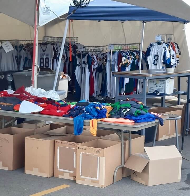
On May 6 and 7, Ripon Athletic — the longtime uniform manufacturer located in Berlin, Wis., which has made many NFL jerseys over the years — held a warehouse sale. As a Wisconsin resident and a longtime collector of game-used and -issued items, I decided to check it out, so I made the roughly 90-minute drive from my suburban Milwaukee home.
On the morning of May 6, I was first in line. Right before the sale opened, I saw racks of jerseys roll into the pop-up tent that was serving as the “warehouse,” including a Jerry Rice 2003 Raiders sample jersey, a Josh Sitton Packers throwback jersey, and Kahlil Mack’s 2020 Pro Bowl jersey — all jerseys not usually available to the public. At that point I realized that this would not be like a typical team garage sale — it was going to be a sumptuous buffet of product.
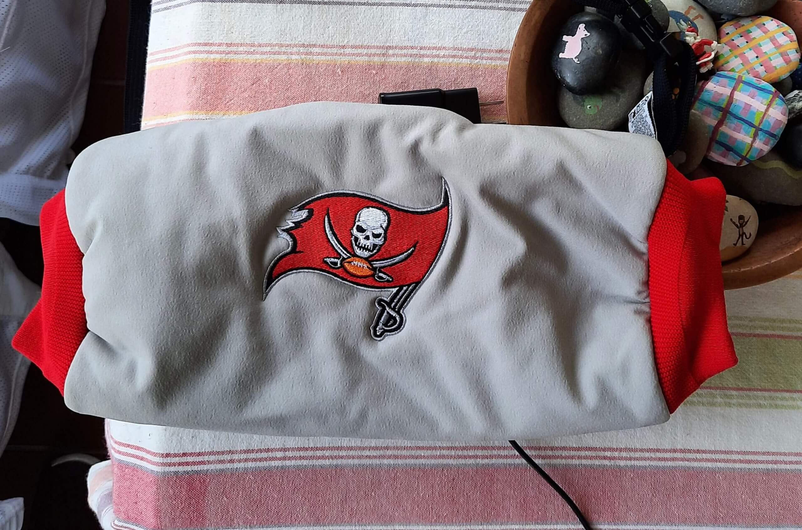
Once they opened the doors, it was fairly hectic, sort of like the Black Friday news footage of people running amok. Definitely not a casual shopping experience (which is why I didn’t get many photos on-site). You might think I felt like Charlie in the Chocolate Factory, but I actually felt closer to Augustus Gloop. I came across all sorts of unexpected treasures, like a prototype Buccaneers hand-warmer pouch that was not the correct shade of pewter — a real gem for a Bucs fan like me.
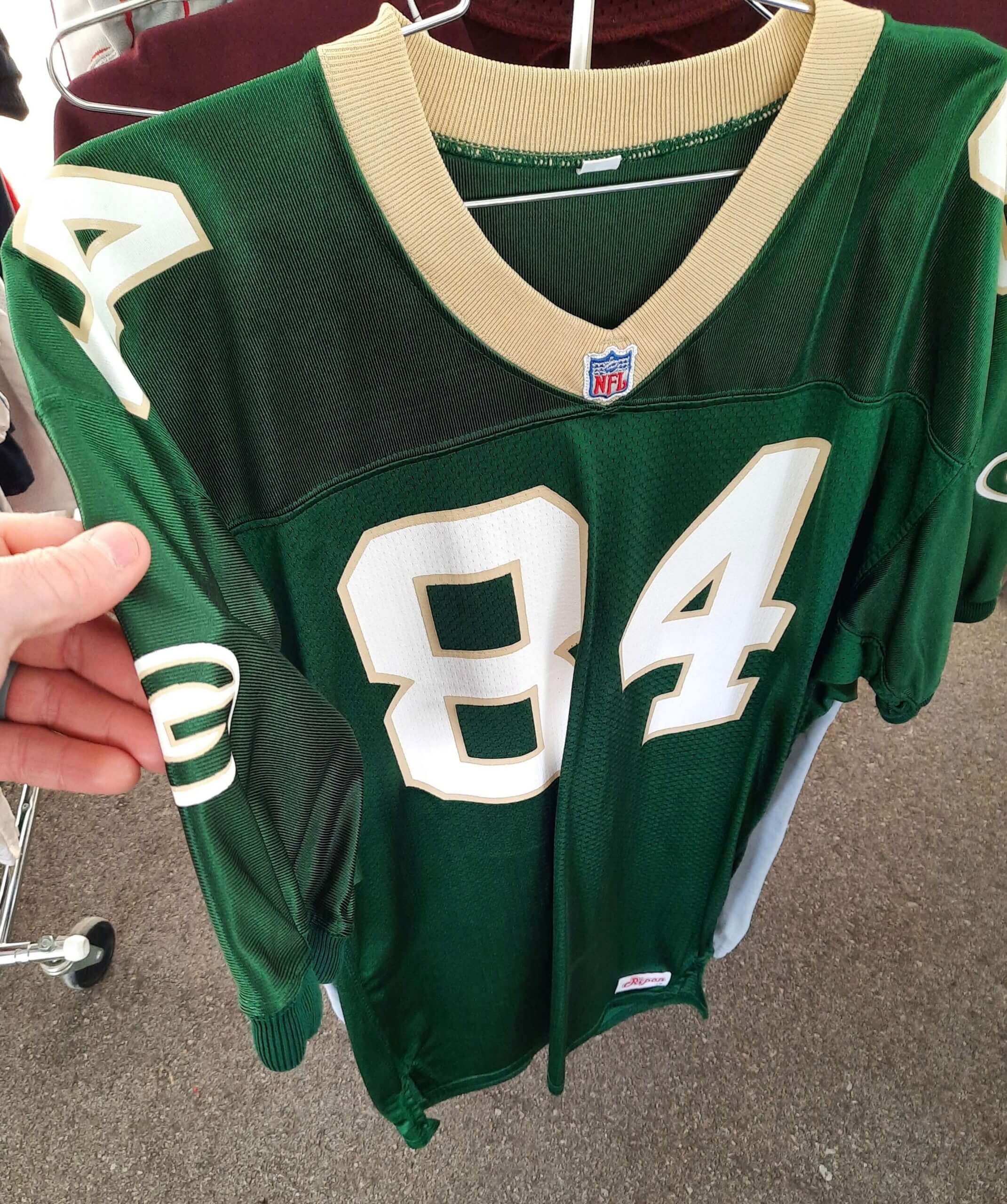
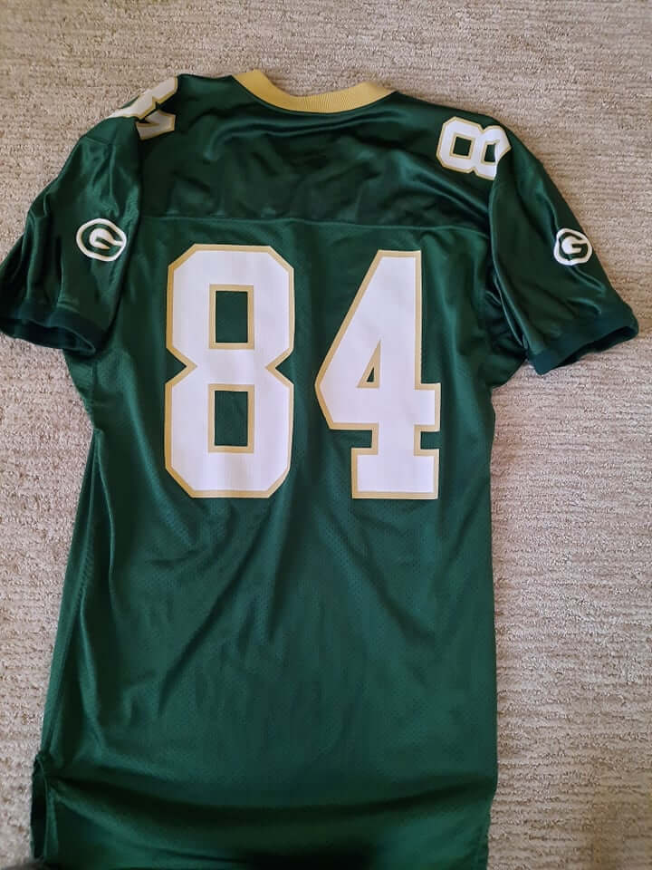
And that wasn’t the only prototype I snapped up. As many uni fans know, Packers GM Ron Wolf tinkered with the idea of changing the team’s yellow to gold in 1993. Although they eventually thought better of it, I found what appears to be a prototype version on the racks at Ripon:
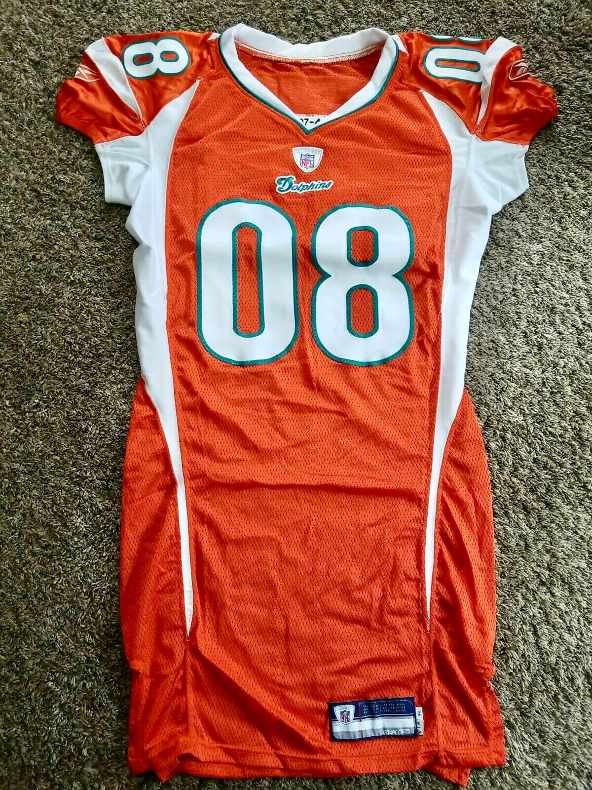
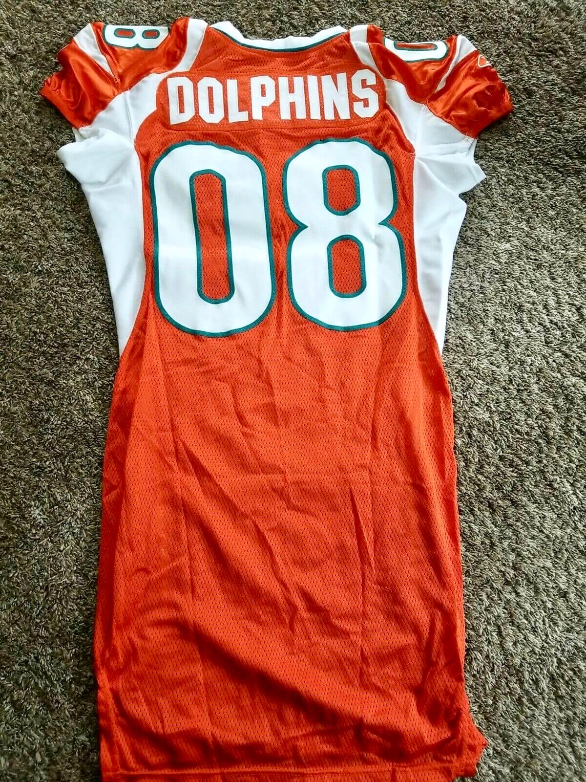
Next to that jersey sat a couple hideous Dolphins prototypes, circa 2008. They looked like, at best, bad Miami Hurricanes concepts — so distant from the Dolphins’ visual DNA that I’m surprised they took the time to convert the design to a physical product. I didn’t purchase these, but one of them later showed up on eBay:
The most entertaining thing I saw were a couple of sample Pro Bowl jerseys. Nothing overly special about them, but I smiled at the thought of someone wearing a jersey with “Sample” or “Player Name” as the NOB.
I believe this was Ripon’s first warehouse sale. The morning of the sale, their Facebook page had fewer than 100 followers; within 24 hours, they had nearly 1,000 and were being flooded with calls asking when the next sale would occur, so they scheduled another sale for June 23. I made the trip for that event as well.
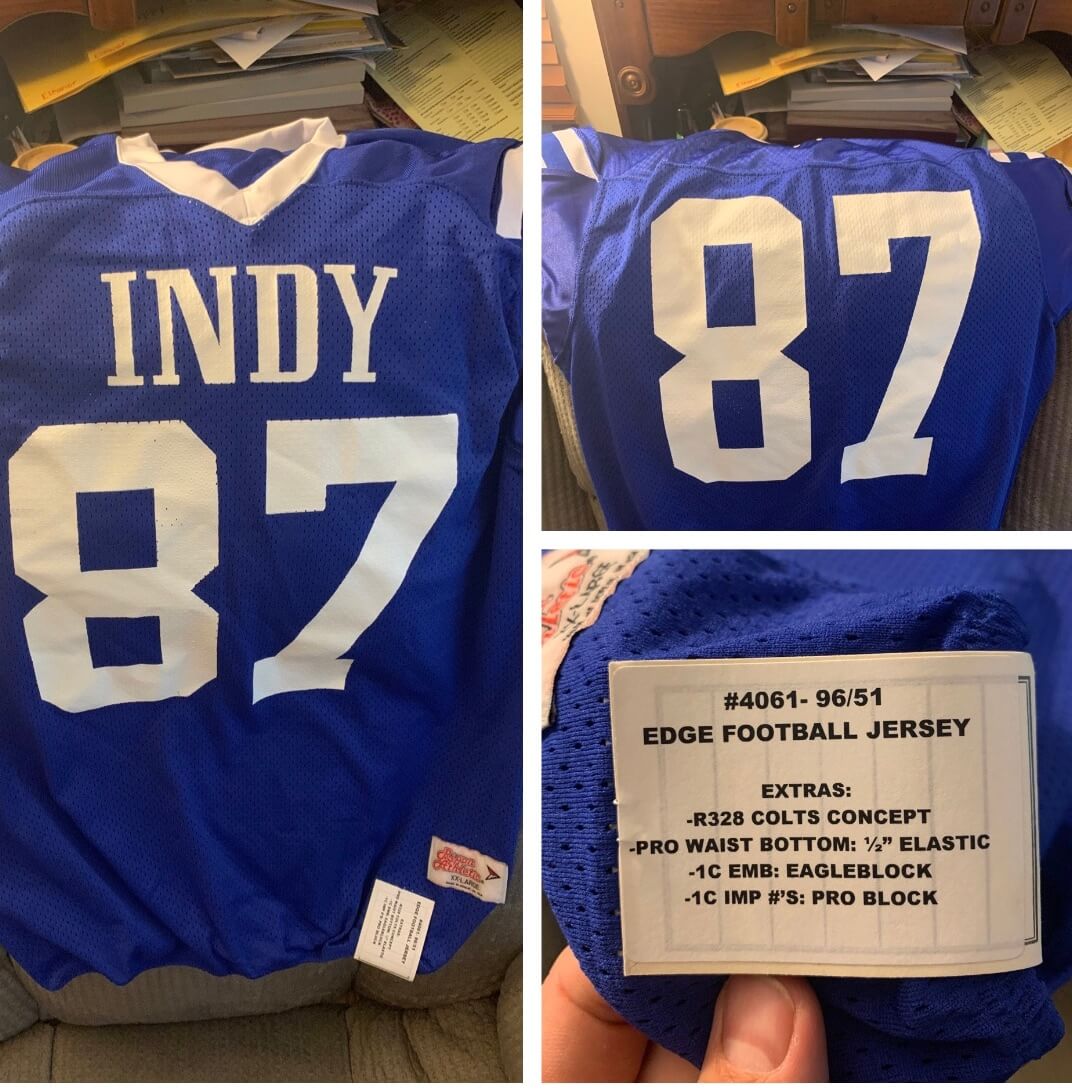
This sale had 10 times the attendance of the first one (I know some people who traveled from as far away as California). The most unusual item this time was a blue Colts prototype. Much like the Dolphins prototype, I would have taken this for a fan-made fake or an amateur jersey if I hadn’t seen it at Ripon:
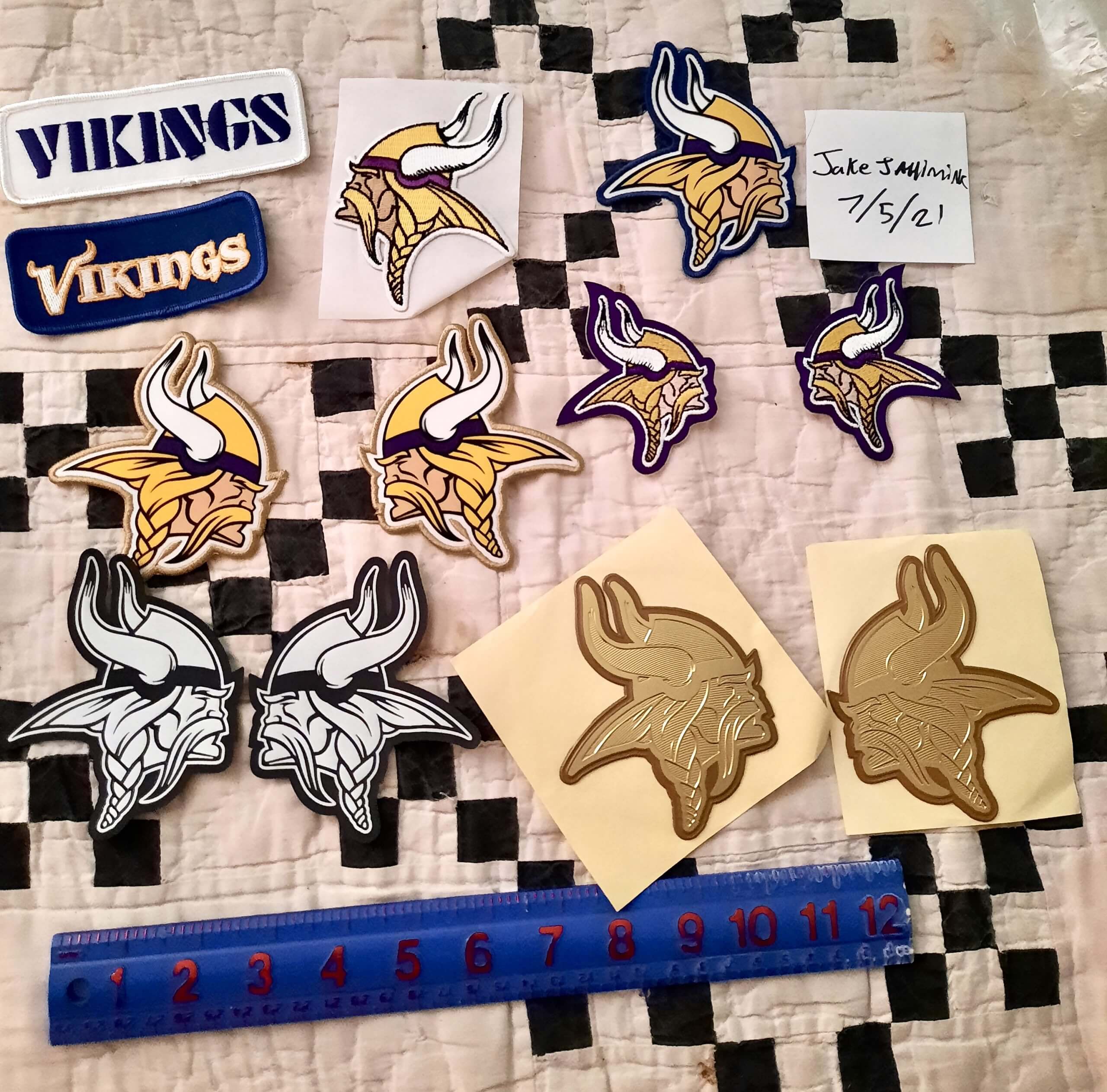
For a uniform fan, it was more like a museum experience than a sale, although I did come away with a few thousand team-issued Pro Bowl patches — product that’s never available to the public as standalone items:

All in all, these sales were like a visit to the island of misfit jerseys. I’m just happy my hands will be kept warm this winter in my slightly mis-colored Bucs hand-warmer.
———
Paul here. Please join me in thanking Jake for sharing all of this with us.
As an aside: Uni Watch didn’t yet exist in 1993, but I was already very uni-aware and, of course, was a big fan of the Packers’ green/yellow color scheme. So when word began circulating about them changing their uniforms, I sent a note to the team (I didn’t save a copy, unfortunately) and received a response from team prexy/CEO Bob Harlan, as follows:

Note that the description of the jersey matches Jake’s prototype!
Click to enlarge
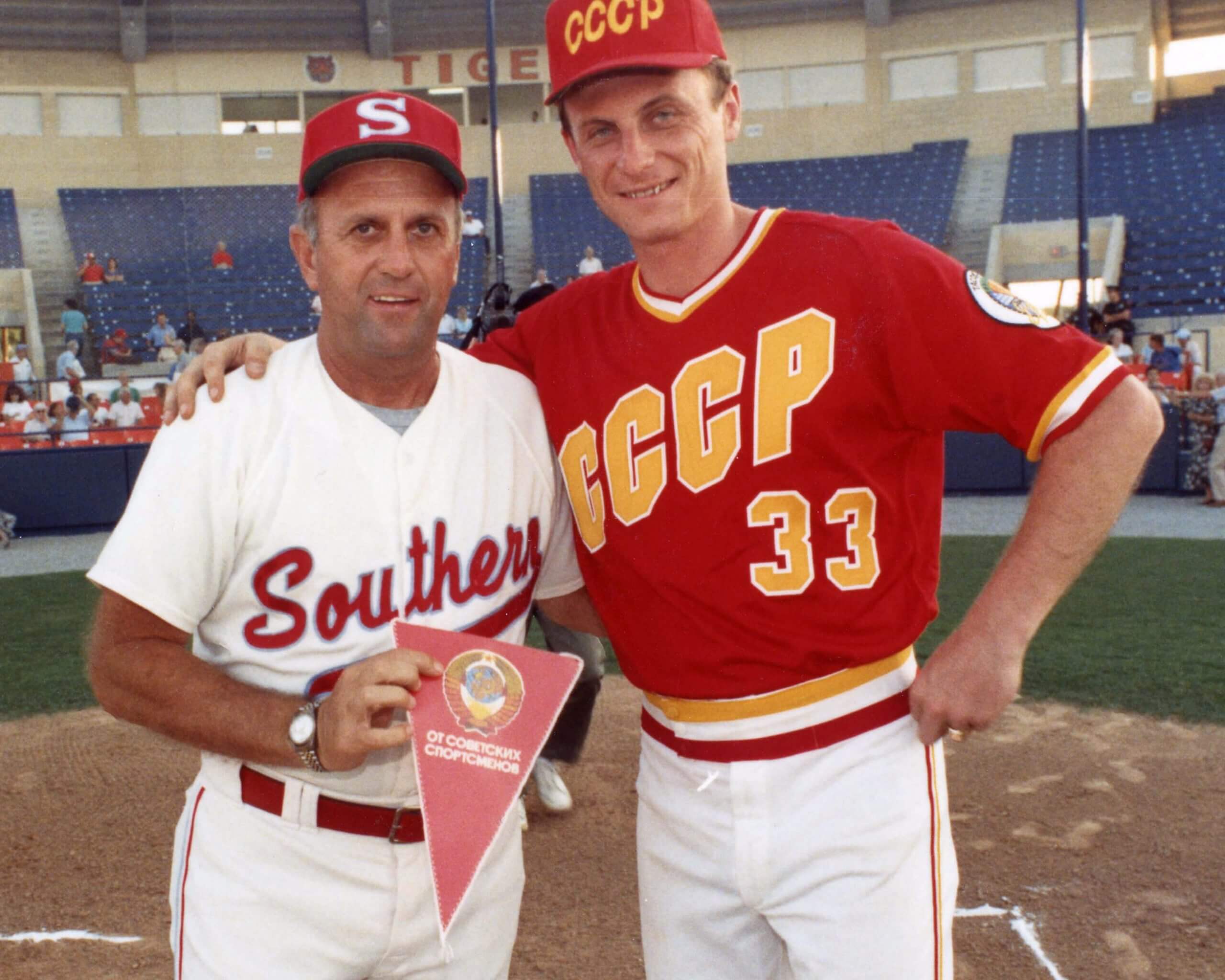
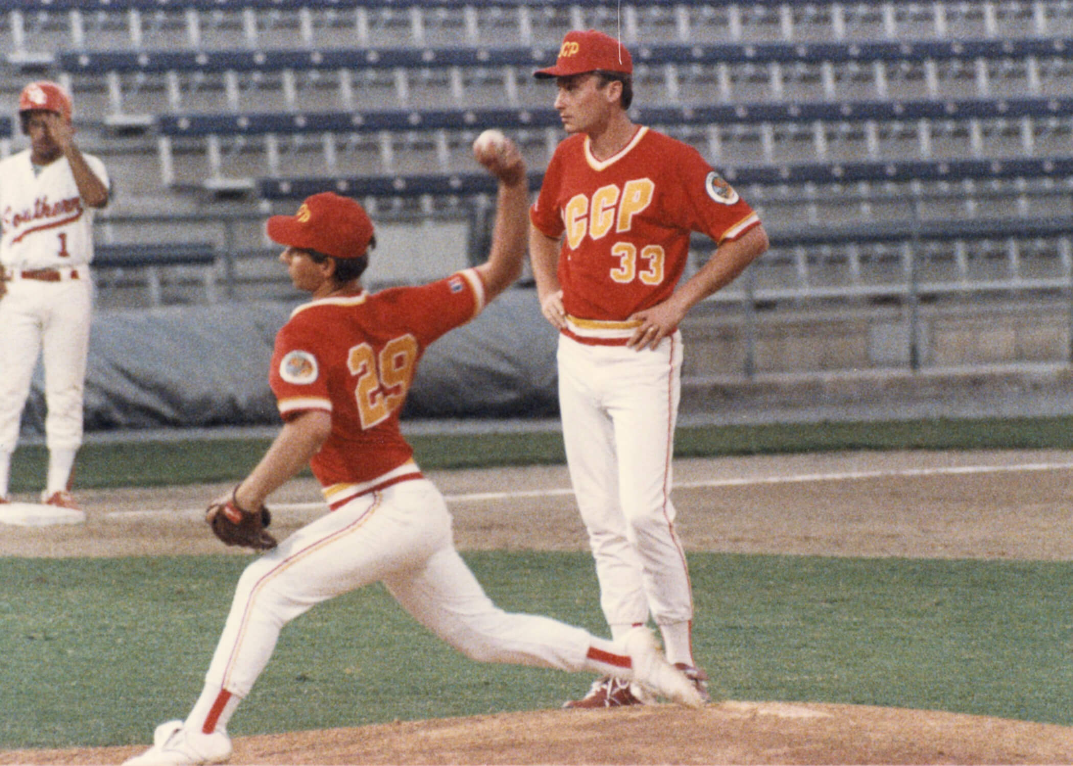
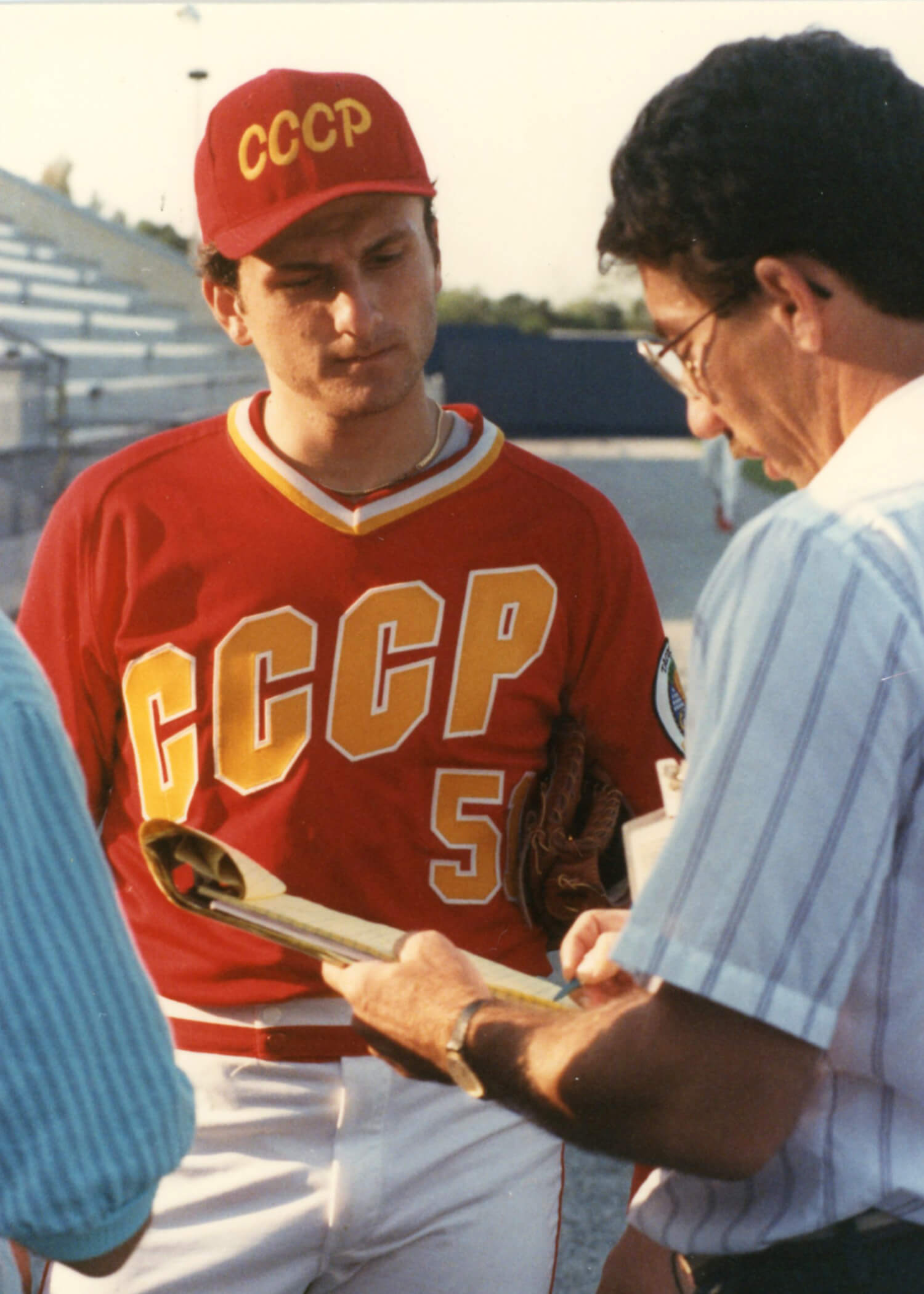
Back in the USSR: Yesterday’s post about a goodwill tour of the United States by the Soviet Union’s national baseball team prompted a nice note from reader Wayne Koehler:
In 1989, Florida Southern College hosted the Russian Olympic baseball team for two exhibition games at Joker Marchant Stadium (spring training home of the Tigers). Florida Southern won both games, 23-0 and 8-0. We were lucky enough to find a PA guy who spoke Russian, so he would throw in various baseball terms in Russian throughout the game.
The first game was televised on a regional cable channel. At one point, a Russian player broke his leg while attempting to slide into second base and the game was delayed as an ambulance was called and drove out to second base. Not exactly must-see TV.
The photo above shows Florida Southern head coach Chuck Anderson and his USSR counterpart, Alexander Ardatov. I think we’d have to say that Ardatov had the better uniform!
Here’s a shot of Ardatov watching as reliever Alexey Ovsyannikov took his warm-up tosses. Looks like they were wearing two-in-ones:
And here’s a nice shot of the Soviet jersey and cap, as worn by first baseman Nugzar Pophadze:
Big thanks to Wayne for sharing all of this with us!
Click to enlarge
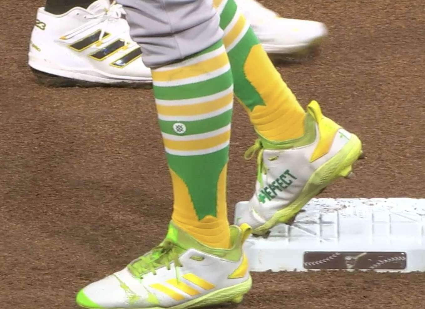
Sock it to me: Oakland pinch-hitter Tony Kemp’s two-in-ones were the subject of some uni-related chatter by San Diego broadcasters Mark Grant and Don Orsillo during the seventh inning of Tuesday night’s A’s/Padres game. Here’s how it went:
Mark Grant: You know, I’m a big fan of these uniforms for Oakland. I love Tony Kemp rockin’ the two-in-one stirrups, but I’m not a big fan of the two-in-one. Two-in-one is the sock with the stirrups knitted in, as one. It’s not a separate sanitary sock and then a stirrup. Love the look, though — the green and yellow.
Don Orsillo: So you like the uni, you just don’t like the socks.
Grant: Yeah, because it’s two in one. One sock with the appearance of wearing st — see, the stirrups don’t go down all the way to the shoe!
Orsillo: Right.
Grant: Yeah. But I love the look, though.
Orsillo: Yeah, that’s a fugazi stirrup.
Grant [laughing]: Right, exactly!
———
Footnote: Grant, who was a journeyman MLB pitcher in the 1980s and ’90s, does appear to have worn real stirrups throughout his career, but he usually went so low-cuffed that his stirrups were essentially rendered moot. Too bad he didn’t practice what he now preaches!
(Big thanks to Aaron M. for letting me know about this broadcaster banter.)
Click to enlarge
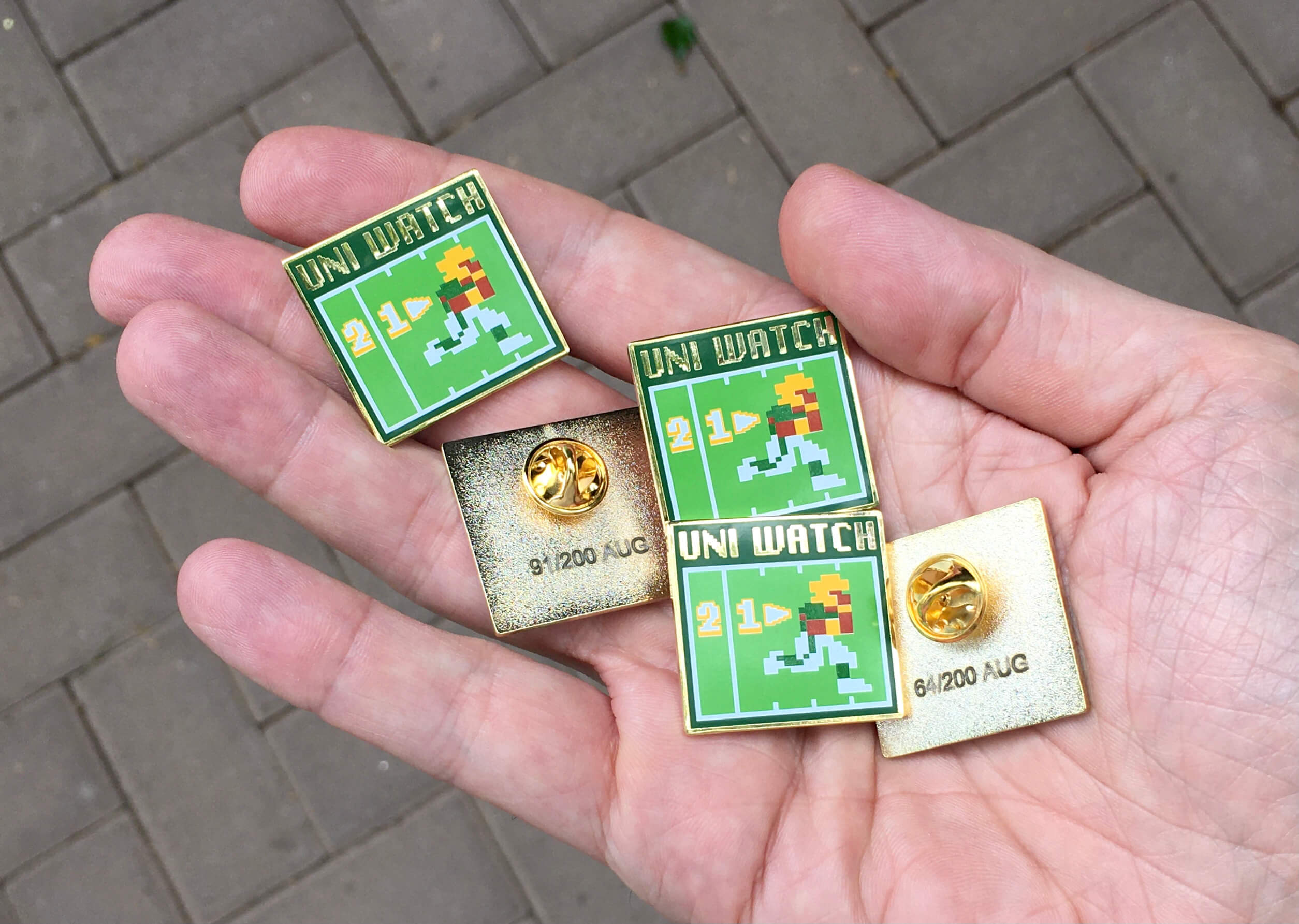
ITEM! August pin launch (a few days early): Okay, so it isn’t quite August yet, but I’m going to be taking my annual break from the site next month (more on that tomorrow), and I know some of you don’t follow the site as closely in August either, so I wanted to get the new pin out there while I still have your attention.
So: With football training camps gearing up, Todd Radom and I thought it would be fun to do a Tecmo Bowl-style pin, complete with 8-bit graphics. I really love how this one turned out. This is a numbered edition of 200 pins. You can order it here.
Need to get caught up? Here are this years pins from January, February, April, May, June, and July (sorry, March is sold out!), plus all of our remaining pins from last year are available at a discounted price.
My thanks, as always, for considering our products.
The Ticker
By Paul
Indigenous Appropriation News: Schools in Wilson, Pa., will no longer use Native American iconography. … Indigenous New Zealand communities will give input in the design of Christchurch’s new multi-sport stadium (from Kary Klismet). … Reprinted from yesterday’s comments: After consulting with a local tribe, La Conner High School in Washington State will keep calling its teams the Braves but will change some of its imagery (from Matthew Williams). … The rest of these are from Kary Klismet: The good news is that the Mitchell Hawks of the Provincial Junior Hockey League in Ontario are no longer using the Blackhawks’ logo. The bad news is that their new logo features a stylized hawk head that still incorporates significant Native imagery, including ceremonial feathers and warpaint. … The Oklahoma School for the Deaf has changed its team name from “Indians” to “Bisons.” … Toledo (Wash.) High School is seeking an exemption that would allow it to keep “Indians” as its team name based on the school’s relationship with the nearby Cowlitz Tribe. … A group of San Diego State supporters and alumni is fighting to save the school’s costumed Aztec Warrior mascot.

Baseball News: Not so fast: According to this fairly in-depth analysis, the Indians/Guardians could face some substantial legal hurdles — or at least a major financial payout — in order to secure the trademark rights to “Cleveland Guardians” from that men’s roller derby team with the same name. … In addition, Cleveland.com has this (paywalled) article about the current state of the trademark situation (from Peter Gill). … Meanwhile, it appears that “Guardians” was chosen as the new team name at least as far back as early April. … In a related item, here’s a writer who thinks the “Guardians” moniker “is a win for architecture nerds and preservationists” (from Gordon Blau). … And in yet another related item, here’s the backstory on how the team settled on the new name (from Chuck Ryals). … Still more on the Cleveland Baseball Team: They wore the Lou Gehrig Day patch yesterday, because their original LGD game was rained out (from Peter Gill). … Fans are being invited to help choose the name for a new minor league team in Staten Island (from @MiLBpromos). … Oooh, look at this sensational 1949 baseball/softball uniform fabric swatch book that @spesh98 just scored. I’m officially envious! … The burning question of our age: Can Mets players paint their faces to look like Mr. Met? … Nine rest stops on New Jersey’s Garden State Parkway are being renamed, including one for former MLBer Larry Doby (from William Yurasko). … The Single-A Fredericksburg Nationals have absurdly small NOB lettering. … The batter’s eye at the St. Paul Saints’ ballpark has an ad for an eye clinic (from Segev Goldberg).

Pro Football News: The Jets are adding a memorial decal this season for assistant coach Greg Knapp, who died last week from injuries sustained in a bike accident (thanks, Phil). … Longtime Bills beat reporter Vic Carucci recently announced that he’s retiring from full-time NFL coverage, so the team presented him with a personalized jersey (from @mrmichael21). … Ravens QB Lamar Jackson, who wears No. 8, says he’ll switch to No. 1 if/when he wins the Super Bowl (from Andrew Cosentino). … A trading card autographed by KC QB Patrick Mahomes has sold for $4.3 million, a record price for a football card. … New helmets for the CFL’s Toronto Argonauts who are going with an updated version of their old boat logo (from Wade Heidt).
College and High School Football News: Washington’s No. 44 has long been retired for Roland Kirby, but the number will be worn this season by CB Bookie Radley-Hiles. Kirby’s family OK’d the use of the number. … Interesting uni-related quote from Arizona coach Jedd Fisch, buried in the middle of this article: “I do believe in tradition. I do believe in basics. I believe in being able to wear the same helmet for every game.” That certainly goes against the current trends in college football (from Rocky De La Rosa). … Jamie Rathjen, following up on an earlier Ticker item, says: “A few weeks ago I sent in an item about Iowa wanting to rename its football field after Duke Slater, a pioneering Black player from 1918-21. They’ve now officially said they’re doing so and that article includes a mock-up of the field with the new name added on the 25-yard lines.” This means the team’s stadium and field will both have non-corporate names — imagine that. … Wanna see a doozy of a signature? Check out Big 12 commish Robert A. Bowlsby’s John Hancock (thanks to all who shared).

Hockey News: New road jerseys for the SPHL’s Vermilion County Bobcats. … Here’s a great 1973 patent-application drawing for a goalie mask (from TR Herzog).

Basketball News: The Rockets’ jerseys were blissfully ad-free last season, but that won’t be the case going forward. … The Cavs’ D League affiliate, the Canton Charge, is moving to Cleveland. They’ll still be called the Charge but have a new logo. … I don’t usually share jersey concepts, but here’s an above-average set of NBA mock-ups from Roberto Custodio. The Bucks design is a particularly nice mix of old and new, and several of the other designs are similarly sharp — nicely done.

Soccer News: American player Gio Reyna is now wearing No. 7 for Bundesliga club Borussia Dortmund following the departure of Jadon Sancho (thanks, Anthony). … English clubs Wycombe Wanderers and Leicester City both wore new second shirts for a preseason men’s match yesterday (thanks, Jamie). … New kits for Polish club Widzew Łódź and Ukrainian club Dynamo Kyiv (both from Ed Zelaski).

Olympics News: Want to look ahead to the 2024 Olympics? The logo for those Games has received a lot of online mockery. … Looking even further ahead, cheerleading could become an Olympic sport in 2028. … French men’s handball player Ludovic Fabregas lost part of his front jersey number yesterday (from Bernd Wilms). … Here’s an article on the helmet rules for Olympic skateboarders (from Kary Klismet). … Also from Kary: Good articles about the history of sexist uniforms for women Olympians here and here. … In a related item, here’s a funny cartoon about the sexist uniform thing (from Jeremy Brahm). … USA women’s BMX cyclist Felicia Stancil has daisies on her helmet because that’s the name of her Covid puppy (thanks, Phil). … During the medal ceremony for the women’s individual time trial for road cycling, two Netherlands cyclists — Annemiek van Vleuten, who won the gold, and teammate Anna Van der Breggen, who won bronze — wore different shirts. “I couldn’t determine why they were dressed differently,” says Peter Hymas. “During the competition itself, they wore identical skinsuits issued by their federation.” … Allison Schmitt, a swimmer on the Team USA relay team, appears to have covered up the maker’s mark on her swimsuit. Also, it’s weird that the relay team members all wear different uniforms (thanks to all who shared). … The Chinese water polo team has really nice warm-up bathrobes (from Steve B).

Grab Bag: Students in the Cleveland Metropolitan School District will no longer wear uniforms and will instead follow a gender-neutral dress code. … New jerseys for the the East and West divisions of Minor League Cricket (from Peter Kurilecz). … The next two are from Kary Klismet: New girls’ volleyball uniforms for Nederland (Tex.) High School. … New athletics logos for John Paul II High School in Greenville, N.C. … Wade Heidt writes: “Looks like players in the MSL Classic — the Ontario-based Major Series Lacrosse’s month-long return-to-play tournament — brought their own helmets and gloves. Makes sense from a cost-saving perspective, as it is not a complete season. Interesting visuals from a uni-watching perspective.” … Here’s a really great story about a retired couple who recently learned that the gorgeous neon sign from their old corner store in Vancouver had been saved by a local collector, so they got to have a reunion with the sign (from Wafflebored). … New uniforms for Japanese men’s volleyball team VC Nagano Tridents (from Jeremy Brahm).
That mock-up of the field at Kinnick Stadium shows the team area extending to the 20 yard lines, a change this year. Now the cutout area of the stands, a unique feature of the field, won’t align.
Just a comment on the item regarding Knapp passing away. I’m a cyclist, so of course I see a lot of content, which unfortunately also covers collisions with cyclists. The big movement is to move folks away from using the term accident, especially when paired as ‘bike accident,’ since that suggests the cyclist is at fault somehow and had an error in riding, as opposed to a motorist colliding with the cyclist. I won’t belabor because I know you ride and totally get it. Just thought I’d share since the ticker item states bike accident. Thanks!
I made my own comment (Doesn’t seem to be showing up?) so instead of risking double posting it I’ll just agree with you here. Calling it a ‘Bike accident’ removes the fact that the fault lies with the driver.
My dad was friends with the then-commandant of the Minnesota State Highway Patrol, and Colonel Letting was adamant in insisting on referring to auto crashes as crashes, not accidents. The colonel used to say that in decades responding to mishaps on the roads, the only accidents he ever saw involved falling tree branches.
Good catch.
In my city, there’s a dedicated group of cyclists (of which I’m one) that call out the news organizations when they use the passive voice and when they de-emphasize the role of the driver e.g. “the cyclist was struck by a vehicle”. And also when they put in paragraph 1 that the cyclist was not wearing a helmet and in paragraph 5 that the driver has been charged with impaired driving.
Its a slow process LOL and it frequently brings out the trolls.
The note about La Conner High School deciding to keep the name Braves made me curious. Can “Braves” be used generically (like warrior) or does it exclusively refer to indigenous people? It turns out that the noun “Brave” was initially what the English called the Indian warriors according to the article here: link
Note, the high school kept the name because it was supported by the Swinomish Tribal Senate.
my alma mater plays on Frank Kush Field at Sun Devil Stadium, and I don’t think I’ve ever really given it second thought.
Similarly, Mizzou plays on Faurot Field at Memorial Stadium. No idea if they’ve tried to sell naming rights to the stadium. But, if they tried to sell naming rights to the field, unpleasantness would ensue.
I STRONGLY disagree with phrasing what happened to Coach Knapp as a ‘bike accident.’
The bicyclist did not have an accident. He was struck and killed by a driver. He was in a protected bike lane. While the driver most likely did not do this on purpose, it is negligence at best. Too often we absolve drivers of their responsibility in this country, and just assume that bicyclists should just deal with the risks.
Bicycling phrased it best IMO. Calling it a bike accident “[…] irresponsibly renders the driver’s role passive and places undue responsibility on the cyclist. “
About the Argonauts helmet in the Football Ticker. I saw a CFL Pick ‘Em ad recently. Whoever put the ad together had the new boat logo sailing the wrong way on the right side of the helmet.
The Ticker item shows how it actually looks. Boat sailing forward towards the facemask. Some egg on the face for the creator of this ad as boat going the wrong way:
link
I love the stirrups with sanitaries, but I will say that when I played the sanitaries were so thin it was practically like wearing no socks. Always wondered why they didn’t have more cushion.
The Packers should have made that switch to green and gold. Something about their dark green and “mustard yellow” just looks…lurid. It’s the visual equivalent of nails on a chalkboard to me.
As a die-hard Packers fan I’m glad they listened to Paul (and many, many others) instead of you. Lol
I’m glad the Packers didn’t change their colors. However I imagine they still would be metallic gold today if the color change had happened. From 1973 to 1992, the Packers only made the playoffs once. With a Super Bowl win, the color change would have coincided with success.
It would have been a mistake to have changed their colors. Most people in Pittsburgh hated when the Penguins made the same move and are glad they’ve returned to the Pittsburgh Gold color shared with the Pirates and the Steelers.
That prototype Packer jersey also looks too plain without the collar and sleeve stripes.
I’m glad they didn’t switch but I think these color would have looked pretty good. It’s consistent with that 90s trend of going to more muted colors and earthtones, like the when the Rams went to the darker blue and gold. Now that that trend has reversed, I wonder if the Packers would have switched back by now. In any regard, it’s awesome seeing an actual prototype jersey after all these years of just seeing mock-ups. I wonder if there’s a prototype helmet out there somewhere.
Glad the Packers stuck with the forest green and yellow. Though gold helmet, green jersey, gold pants not a bad look.
Edmonton Eskimos in 2009 threw back to the 1960s. Days when they wore metallic gold instead of yellow with their green. Imagine Packers would have used a similar uniform combo:
link
That’s more pleasing to the eye. Mine, anyway.
I’m curious what the prices were like at the Ripon event.
They varied – college team-issued jerseys were about $20 – $40. Some of the pro jerseys were $40-$100. The real “gems” were $150. I got the white Green Bay prototype – I think it was $25.
The “Indy” jersey is not a prototype commissioned by the team. It is a sample that Ripon made themselves and was among many samples included in the $1 bins at the sale.
Some of the samples they had were cool, even if not official prototypes. I got a sample that is basically a Packers jersey with “Green Bay” embroidered above the front number. For $1, totally worth picking up!
Came here from Twitter.
Evan is correct.. Ripon will make items to show their templates and manufacturing capabilities. Although the INDY jersey is cool, it is not a commissioned prototype like the Dolphins or Packers items.
I own some examples of their basketball and baseball stuff that is “inspired” by pro teams.
Hey Joel. First go around the most expensive items were $50. But due to some drama involving members of a Facebook collector’s group, Ripon jacked the prices up for the second sale. Most expensive items were $500.
I think they had some durene samples that were $100 on Day 1 of the first sale. Day 2 of the first sale, I think they had raised prices on some jerseys to $150, because of the folks who were buying as many as they could to flip on ebay.
I believe Ripon owns Sand Knit, which developed the most influential font in the history of football, made famous by the Packers and Steelers of the 60s and 70s. I could probably name a dozen other teams who wore it at some point, key ones being the Browns, Cardinals and Raiders. In other sports, the Penguins still wear it, I guess as an homage to the Steelers, who ironically don’t wear it anymore. Michael Jordan wore it at NC…the Chicago White Sox wore it among others. You can always spot it from the TV number 2, which oddly had no bottom serif…a quirk I loved.
link
Has Uni Watch ever wrote about this font? Would make good summer reading while Paul is away.
Hey Steve
If you’re up for doing the research, I think it would be a good post for August! LMK (phil.hecken@gmail)
Sand Knit also made many of the WFL jerseys in 1974, besides the 2 you can also tell a Sand Knit jersey from the 70’s by the wide gap they would leave between numbers 10-19. If you look at a Dan Fouts jersey from that era you could literally put a 1 in the middle and it would be 114. As a kid I asked the equipment guy why there was a huge space in the middle of the number, the answer I got was “I don’t know, that’s the way Sand Knit prints them kid”
That’s a great assortment of patches you bought Jake! I bet that had to feel great to get your hands on those Pro Bowl ones.
After a second day of fascinating Soviet baseball uniformery, I now very much want The Americans to make a sequel movie set in the early 1990s involving the Soviet baseball team touring America while the state crumbles back home.
So wait a second…if Ripon Athletic has made “many” NFL jerseys in the very recent past, does this mean that Nike, Reebok, etc were just having their logos slapped on the sleeve (for example, the Dolphins prototype has Reebok logos)? And if this is the case, doesn’t that eliminate all doubt that the so-called “maker’s marks” are in fact simply advertisements, as I’ve long contested anyway?
Big companies (in all sorts of industries) contract out their manufacturing to factories that they don’t necessarily own, but the manufacturing is done to the big company’s specs. Nothing unusual about it.
At the dining room table last night, I was idly scribbling some Cleveland Guardians prototypes, and hit upon the idea the Guardies would do well to employ the discarded Todd Radom lettering used on the first Nationals’ uniforms. After all, that was the most Art Deco design ever to grace a baseball jersey. Then I clicked on the XFL Guardians link, only to find it had already been pinched by the football team. Sigh.
If the Cleveland American League Ballclub runs into trademark difficulties from the use of “Guardians,” I can handle “Guards” as a viable alternative.
Heck, I like that better than “Guardians”!
What’s a fugazi stirrup?
If only there were a resource, perhaps on the internet, where a person could look up the definition of a word, like, say, “fugazi”……
Donnie Brasco can help explain.
link
I can’t speak to the other trademark issues, but the team probably won’t be worried about not having “clevelandguardians.com” as their web address — nearly every team in the MLB is just “team name dot com,” i.e. cardinals.com, marlins.com, yankees.com. One of my favorite exceptions is the Rays, where “rays.com” takes you to the website for a quite nice restaurant in Seattle.
All of the pin designs have been excellent, but this 8-bit one stands out to me as incredible. Kudos for absolutely crushing it with the whole pin project and especially this latest creation. Very cool.
Cheerleading will NOT make the Olympic Program anytime soon. There are 35ish sports, including Motorsports and American Football, on that list of possible sports. LA2028 has already indicated that Cricket and Flag Football are being considered for possible inclusion. Lacrosse and Teqball have said the same thing that they will be in 2028. Here’s the list of approved sports by the IOC prior to Cheerleading’s addition:
Air sports (including aerobatics, air racing, ballooning, gliding, hang gliding, and parachuting/skydiving)
American Football
Auto racing
Bandy
Baseball and softball
Basque pelota
Billard sports
Boules sports
Bowling
Bridge
Chess
Cricket
DanceSport
Floorball
Flying disc
Karate
Korfball
Life saving
Motorcycle sport
Mountaineering
Netball
Orienteering
Polo
Powerboating
Racquetball
Roller sports
Squash
Sports climbing
Sumo
Surfing and bodyboarding
Tug-of-war
Underwater sports
Water skiing
Wushu
There is 0 percent chance of cheerleading making the games. Now a Youth Olympics? Very possible.
While the chances of Cheerleading becoming an Olympic event are low, the are never zero.
See:
Plunge for Distance
La Canne
Jeu de Paume
One-Handed Weight Lifting
Roque
Lee
Not my point of the absurdity of cheerleading being in the Olympics, but my point that it’s a long shot in the number of sports that there are.
I’m assuming that if Cricket made the cut, a new venue would be built for LA2028 because last I heard the only true cricket ground in the states is in the Miami area. I think I heard this when Aussie Rules was looking to have exhibitions in the states.
That current Paris 2024 logo is a textbook case of “once you see it, you’ll never unsee it”. Meanwhile the original logo is a stroke of graphical genius incorporating two meaningful, relevant elements into one eye pleasing design. Poor decision to go with that hairstyle logo.
Those USSR baseball jerseys are reminiscent of the Tackla hockey jerseys worn by the Soviet national team of that time. Very nice!
Is it possible to both like the Green Bay prototype BUT be glad THEY never did it? Like, it’s a solid Notre Dame uniform. Or a high school uniform for a school with those colors. But it would have been jarring had they made that change. I am glad they didn’t.
Regarding the mascot change for The Oklahoma School for the Deaf from “Indians” to “Bisons.”
Bison with an s is not grammatically correct, the plural of Bison is (sigh) Bison. North Dakota State does it right, the official mascot for Lipscomb University (Nashville TN) is Bison but they use Bisons for the uniforms and merch.
“New athletics logos for John Paul II High School in Greenville, N.C.“
I Still Call Him Pope.
The story on the Ripon Warehouse Sale brought back memories….many years ago I was working as a contractor in the Sacramento area, and a small outlet mall right down the street featured a Starter Outlet store, chock full of misprints, traded player jerseys/tees and prototype products that never got to market. Each week when I got to town I’d make a run down there to see what strange new “stuff” had come in….think my favorite was a Mark Brunell Jaguars jersey in which his number 8 was not centered….instead, printed on the left, as if waiting for a zero on the right. Good times…..
When name fights like this Guardians thing pop up, I find it amusing that the New York Giants once co-existed in MLB and NFL and later the St. Louis Cardinals did the same. I’m assuming it was a peaceful co-existence, both came into being before my time.
A less litigious time, would be my conclusion. I’ve often wondered about the relation between the Hockey and Football Jets, as well as the Hockey and Football Panthers. Like the Cardinals and Giants, they now play in different cities. But I’m surprised the team which came first allows it to happen.
Bob Bowlsby’s signature looks like Radio’s
The most Art Deco baseball uniform was Todd Radom’s inaugural-year Nationals’ design, but it was hamstrung by an inability to spell the Nats’ name right on a consistent basis. It would make a good-looking Guardies’ uniform, but I don’t think MLB is into remakes.
I rather like the number font on that prototype Dolphins’ jersey; the rest of it is crap, though.
1) As for the first issue discussed earlier in the comments, it’s a “wreck” or a “crash.” Not an “accident,” especially when factoring in that a cyclist in the incident is now dead.
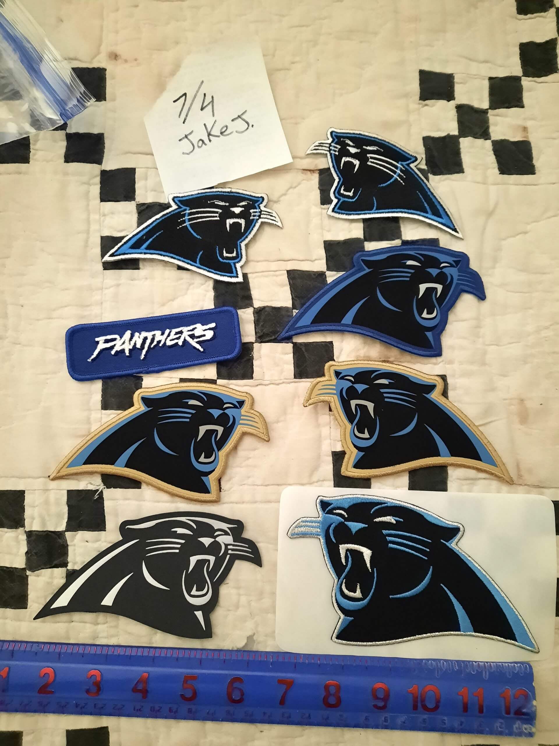
2) That’s a nice collection of Carolina Panthers patches near the end of Jake’s entry. The two at the top are first generation before the logo was tweaked about a decade ago when Nike took over the uniform and apparel deal from Reebok. The ones with the gold borders are for the season culminating in Super Bowl 50 (gold has never been a team color). The logo, if only one on an item, is supposed to point to the right side (think the outline of North Carolina and South Carolina).
3) The John Paul II High School logo in the ticker is … interesting. I believe they were putting the fleur-de-lis on some of their stuff before pivoting to a St. Bernard. It’s more original if nothing else.