[Editor’s Note: Paul is on his annual August break from the site. Deputy editor Phil Hecken is in charge from now through the end of the month, although Paul may be popping up here occasionally.]
By Phil Hecken, with OC Osprey Designs
Follow @PhilHecken
Greetings and good morning, Uni Watch faithful.
As most of you know, I’m a “uniform” guy — not a cap guy, not a helmet guy, not a shoe guy — not that I’m not familiar with those accoutrements, it’s just that I tend to focus on what players on the field wear between the neck and ankles. However, I know many of you out there do live and die with head and footwear, and even if we don’t normally discuss such things here, many of you are into cap concepts (and I’m sure there are a few of you who are big-time cap collectors). Today’s post is for you.
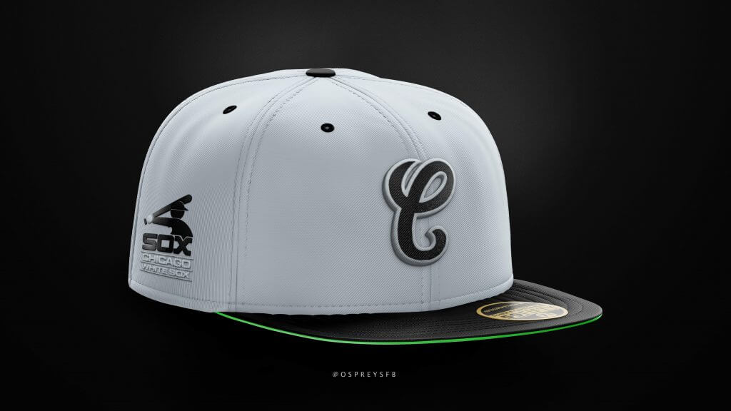
I’m joined today by reader (and graphic designer), the pseudonymous OC Osprey, who tweets as @OspreysFB, and whose additional designs you can check out there. When I put out the call for some “help” during the month of August, OC came through with the following piece. While it’s a bit heavy on Chicago White Sox cap concepts, there are some other MLB, plus college, designs he has created. I’ll let him take it from here!
Cap Concepts
by OC Osprey Designs
In early 2020, I made the decision to learn something new that with enough wishful thinking, could be categorized as “self-improvement”. I could have learned a foreign language, a musical instrument or how to make sushi, but instead I decided to devote literal hours of my time every day to learning as much as I could in photoshop specifically so that I could create some cool sports-related content to share with virtual strangers on Twitter. Well, what started as a fun hobby immediately morphed into an obsession and many of those strangers have become friends, especially in the fitted hat community. It’s opened up a new world to me and also led to some amazing opportunities that I never would have imagined…including being here on Uni Watch!
Along the same lines, Joe Binder runs the White Sox blog Soxon35th, which is honestly one of the best sports blogs I’ve ever come across (tons of thoughtful content every day and super easy-to-navigate, I must say). Joe’s a Uni Watch reader and happened to stumble onto some of my White Sox concepts on Reddit. He reached out and graciously invited me to share a few on his site. I’ve pulled a small selection of Sox cap concepts from the two pieces I wrote for his blog and am thrilled to share a few with you all below.
White Sox Design 1
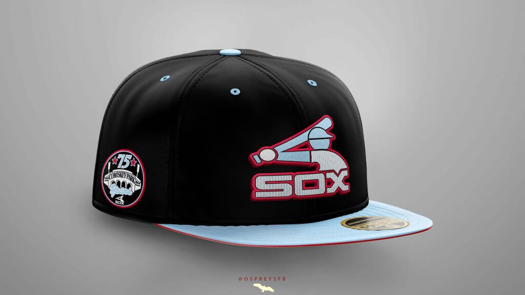
This cap features the iconic “Batterman” baseball player-logo the team used from 1976-1990 and pinstripes as a calling to the current uniforms, but shaded powder blue (like Bill Melton is sporting here) instead of black or white. The “Batterman” logo is one that resonates with fans for so many reasons. I think it perfectly encapsulates 70’s style. Let’s face it, the era that somehow managed to make brown and tan gaudy didn’t produce many other fashion choices that people would consider “timeless”, but this is one that holds up and is quite popular in the fitted hat collector community.
White Sox Design 2
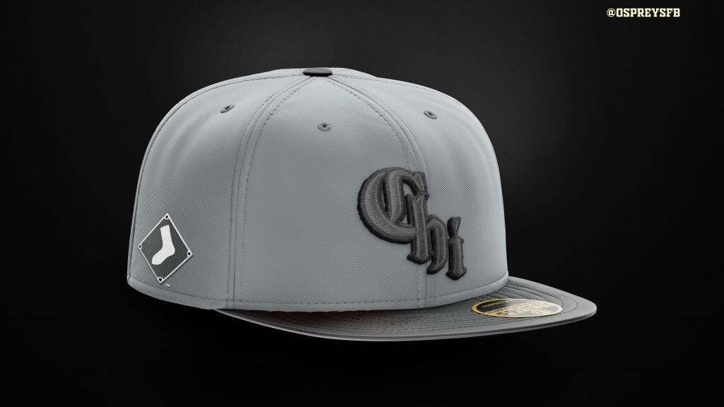
Fast forwarding to present day, the new City Connect uniforms were pretty well-received and I have to agree with the overall fan sentiment. In fact, I think the Sox hit a home run with these designs (get the joke guys? It’s a baseball joke. I can explain it later)
Anyway, I wanted to use the Chi logo in a way that didn’t depart too much from the team’s current bad-ass, black, white and silver/gray scheme. I figured, if all three of those colors look great together, why not mash ‘em together into a dark grey? Joking-aside, I could see the Sox rolling with this look and thought it didn’t went away too far from the general direction / intent of the City Connect theme.
White Sox Designs 3 and 4
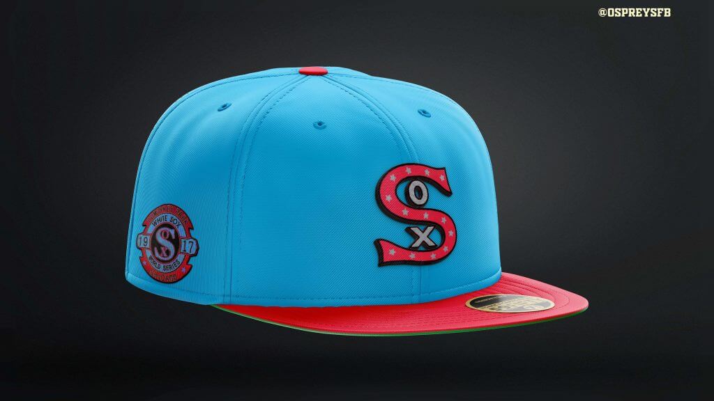
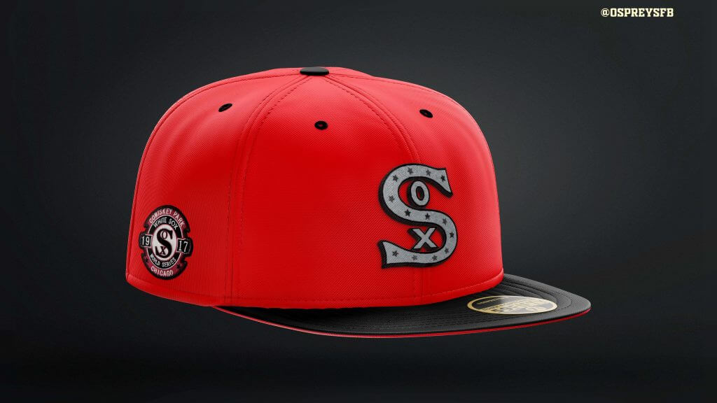
These two Sox designs incorporate the embroidered jersey logo from the 1917 champs and one of the more-pleasing World Series patches that I can remember coming across. Bringing together two sets of eras respectively, I used the lovely retro powder-blue-and-red scheme for one of the caps and the other features the black-and-red combination the team wore in the 1950s.
By the way, speaking of the 1917 Champs have you ever looked at some of the batting statistics from the “Dead Ball Era”? They are MIND-BLOWING. The Sox leading home run hitter in 1917 and had SIX home runs in 575 at bats — the immortal Happy Felsch famously portrayed by Ricky “Wild Thing” Vaughn before he became a pitcher for the Indians 70 years later.
White Sox Design 5

This cap is a hybrid of the Sox current away uniform colors and their logo set from 1987-1990, which I consider one of the hidden gems of baseball past. Just look at the script across Big Hurt’s (pre-Nugenix) chest. He looks happy, because ANYONE would be happy wearing these. Amazingly, I still consider the pinstripe set the team adopted two seasons later an upgrade.
While the articles on Soxon35th also feature some teams from outside the Windy City, I wanted to share a few new ones that I believe align pretty well with the spirit of Uni Watch. To clarify, I normally post new concepts multiple times a week and while more wild projects are a lot of fun to design and discuss, such as this MLB crossover inspired by pro wrestlers of the 1980s and 90s, these sort of sets have very little to do with each team’s respective histories or established identities. Personally, it is more rewarding and challenging to work within the bounds of the traditional colors of the game and I try to stay true to that with most of what I put out there. My goal is to mock-up caps that fans of that particular team would enjoy and in theory want to purchase, as well as the hardcore fitted collectors.
ORIOLES
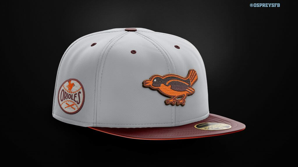
This 2019 Uni Watch article was an inspiration for the next concept. In the article, Paul dives into the St. Louis Browns’ aesthetic history and shows off some absolutely stunning patches and uniforms from the team’s 51 years in St. Louis before their move to Baltimore in 1954. This concept works in the burgundy brown and grey from the St. Louis years and features the cap logo from the team’s inaugural season & this patch which was originally produced for a series of jackets for kids and teens. For this design, I imagined the Orioles’ bus breaking down on the trip to Baltimore and the team decided to play a season halfway between the two cities. According to Trippy.com, that’s Columbus, OH, so that is how I am going to refer to this project — the Columbus Orioles.
BUCKS
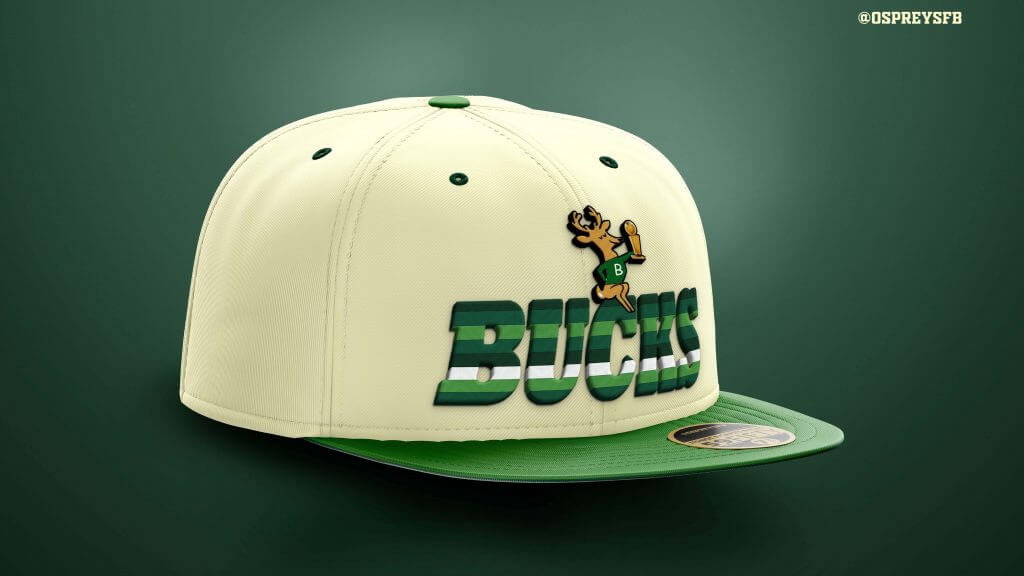
I am native to the Philadelphia area and an avid 76ers fan, however my unending fixation on sports logos, uniforms, etc. really begins with the Milwaukee Bucks. As a young tike in the mid 1980s, I used to stare at the logos on this Bas-Ket tabletop playset (yes, all 23 of them), and the one that always stood out was the happy little deer who could spin a basketball on its hoof. I also remember going to my first 76ers game at the old Spectrum, which happened to be against Milwaukee, and being totally enamored with these multi-colored green beauties. 35 or so years later, my appreciation for these uniforms has only intensified. This cap pays tribute to the Bucks thrilling title run and mixes in old “green rainbow” look (along with minor tweak to the logo). I would like to point out that there is another version of this which features the purple color scheme from the 90s/early 2000s, but I know better than to include that here.
UCONN, VILLANOVA, GEORGETOWN
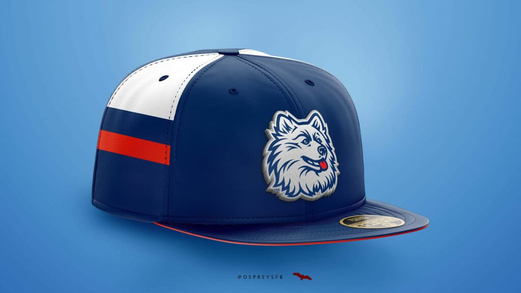
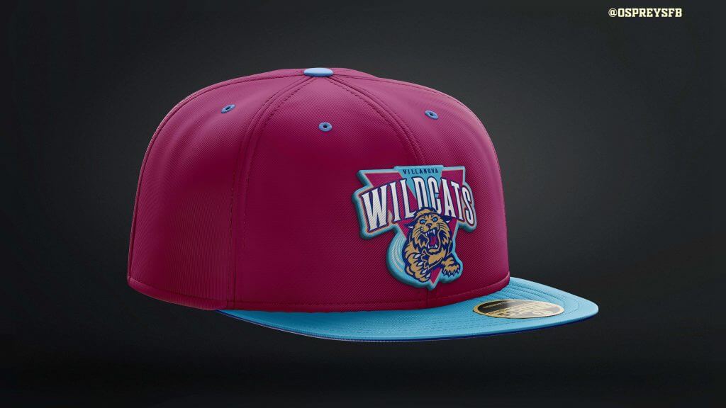
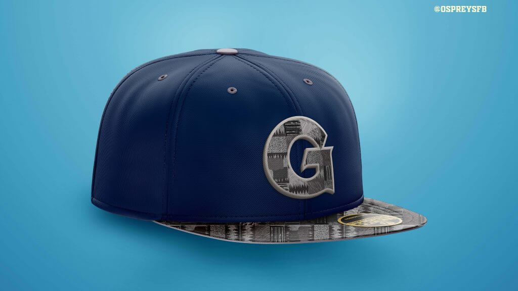
Switching gears once more, this time to the college ranks, I’ve included some concepts for three teams from the “old Big East” — Georgetown, Villanova and UConn. The UConn concepts were inspired by the uniforms the team wore in 1999 when the Huskies secured their first National Championship, as well as the old husky logo they never should have changed from. Similarly, the Georgetown cap here includes the iconic kente pattern many identify with the basketball program (shown here on a young Allen Iverson). I’m sure no one is clamoring for the Wildcats to go back to the maroon and navy look from the Kerry Kittles years, but I think the colors work a lot better on a cap than they did on the court.
METS and PHILLIES
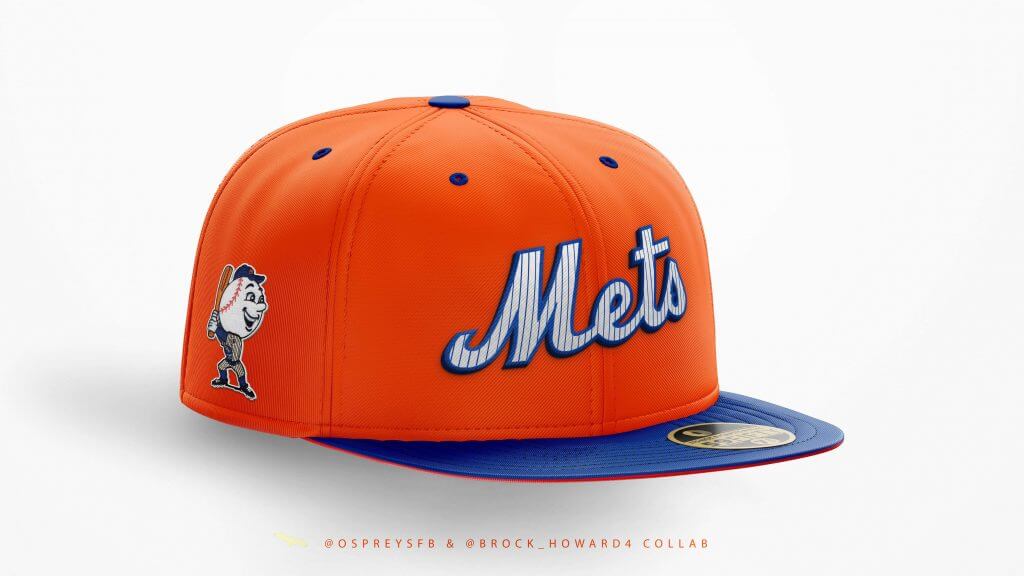
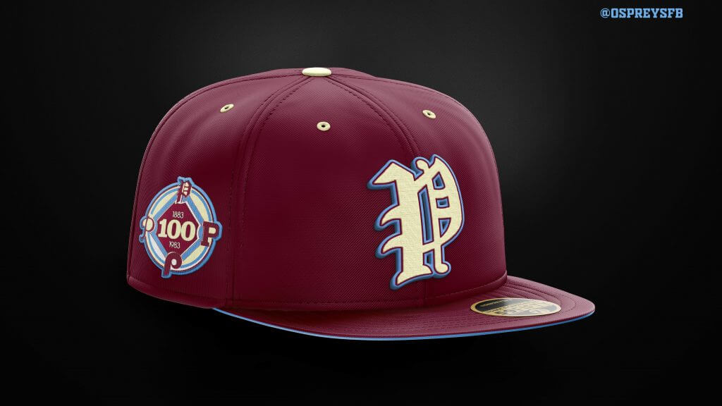
Finally, I may be a Phillies fan, but I can appreciate a healthy rivalry as well as the beauty of pinstripes, royal blue and bright orange, so here are two quick concepts for both teams I thought were worth sneaking in.
Before I go, I just want to add that it does sound like a few of my concepts are going to eventually make it onto the retail shelves at some point. I cannot say too much right now, but will be sure to keep you all posted the moment I’m able to. I honestly cannot wait for that day.
Finally, making any appearance on Uni Watch is something that I really would not ever imagined. I’m a card-carrying member and have been reading Paul’s content since the ESPN Page 2 days. I still look forward to Uni Watch’s “Season Preview” articles literally more than the actual season and visit the site every day, over 15 years later.
Needless to say, it’s a surreal privilege to have been able to share these designs with you all here and want to thank Paul, and Phil for the opportunity, the hospitality and most of all for all of the amazing content over the years.
Thank you for reading!
Thanks,OC! Definitely some interesting looks there. Like I said, I’m not a cap guy, but I’m sure those who are can appreciate these a lot. Readers? What do you think?
First Look: New Bengals Uniforms
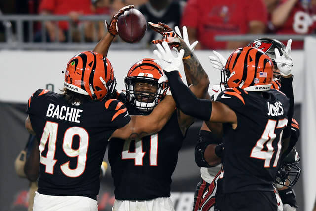
In case you missed it, the Cincinnati Bengals played their first preseason game Saturday evening, taking on the defending Supe champs, the Tampa Bay Buccaneers. A scant few years ago, this would have been one of the more brutal looking games (and those are probably those two teams’ best looks at the time) — but with the Bucs getting new unis last year, and the Bengals sporting new duds this season, the game was actually one of the more aesthetically pleasing (still, not great, but much better) the teams have played in recent years.
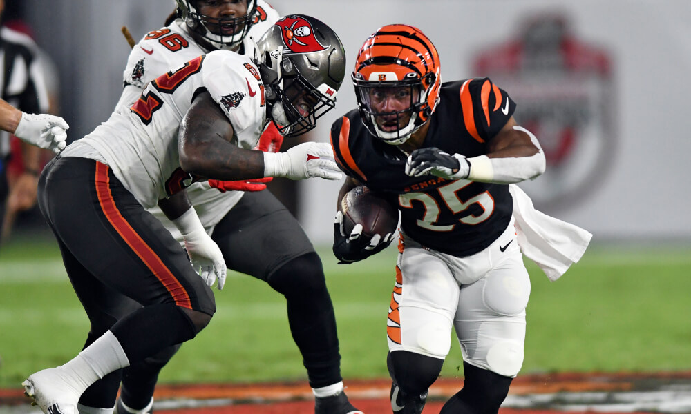
Unlike some of you, I really like the Bengals new uniforms — but I wanted to reserve final judgment until I saw them on the field. Well, I think they look pretty good! I love the shoulder stripe treatment, and the new font (many think it looks “too much” like da Bears) is fine.
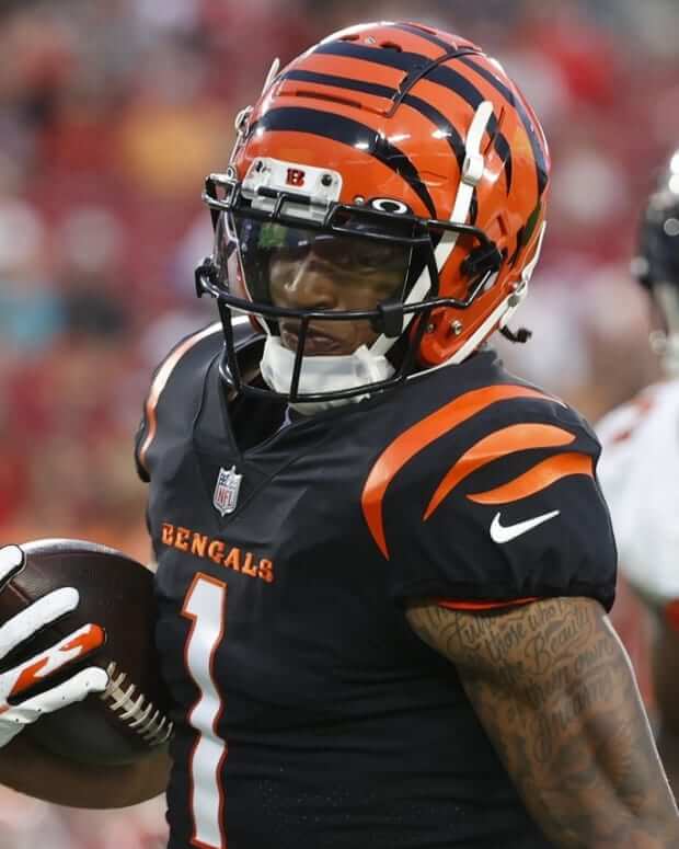
I wasn’t sure about the pants striping when these were first unveiled, and now that I’ve seen it, that’s really about my only complaint — I get where they are trying to go (and it seems they couldn’t totally divorce themselves from their previous look completely), but they something just seems “off.” (Here’s how Paul covered the unveiling, in case you missed it.)
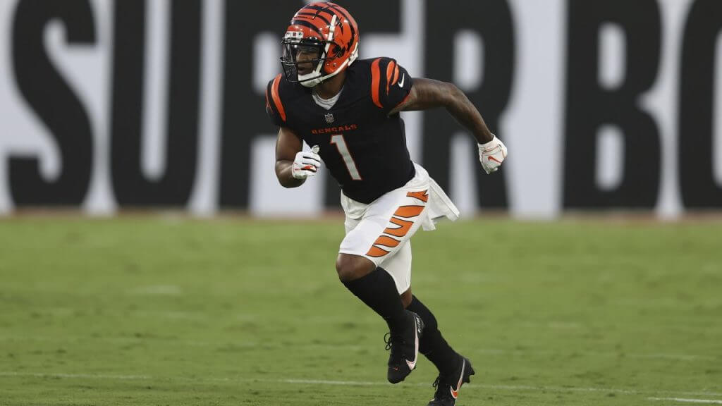
I’m not sure what it is, but it’s like they decided the “wider” tiger stripes (with minimal black outlining) shouldn’t even come close to matching either the stripes on the shoulders or the helmets. It’s not a bad look, per se, just to my eye it doesn’t seem to follow the flow from the head and shoulders.
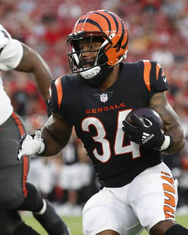
What do you guys think, now that we’ve seen (at least one combo) on the field? In Paul’s review, the black jerseys were also shown paired with pants having only black stripes — which I think looks infinitely better (and I hate to say it, but the best pairing seems to be the black pants). These pants seem designed to be worn almost exclusively with the orange alternate jersey, but they’re being used with the black. Perhaps they’ll change this up as the season progresses.
The “BEST OF” Kreindler’s Korner
Hey guys & gals. You’ve enjoyed Kreindler’s Korner for several years now, mostly on the weekends, on Uni Watch, and we’re still doing the “Best of” until Graig can re-devote his efforts to new writeups for paintings you haven’t seen. Hopefully that will be soon!
Here’s today’s offering:
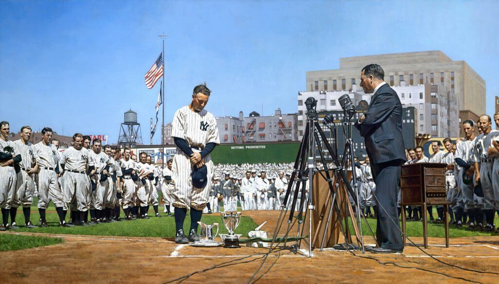
Title: “The Luckiest Man”
Subject: Lou Gehrig, 1939
Medium: Oil on linen
Size: 48″ x 84″I think I’ve painted the scenes of Lou Gehrig’s farewell more than any one specific moment or game in my career. After all of these years, I still find it amazing how much what happened on that day transcends the sport and how many people gravitate towards it as subject matter for a piece of art. It’s also still remarkable to me that it’s what we remember most about Lou Gehrig. Forget the fact that he was one of the greatest players ever in the history of the sport, both in the years 1939 and 2018. Still, whenever see his name, what automatically gets conjured up is his New York-accented voice echoing throughout Yankee Stadium on that July 4th afternoon.
Because of the ubiquity of the event in the annals of baseball history, I really wanted to make sure everything was as historically accurate as possible. Of course, I strive for that in every painting I make, but because the date coincides with the beginnings of when color film was made available to the public, I knew that there might be a chance that I’d be able to find that kind of smoking gun to base my color choices off of.
Luckily, I was able to find four different sources of color home movie footage from Yankee Stadium during that year, one of which was from that very day, even. The quality of the films in general wasn’t the greatest, so it did require some educated guessing on my part. But in the end – and especially in this painting – I’m confident that I was able to create an accurate window into what the stadium was like on that day: what the quality of light was like; what hue he sky took on; the myriad of colors depicted in those advertisements; the look of the Seventh Regiment Band and their instruments; and of course, what those players and executives looked like.
And in the end, I hope that if people choose to remember Lou Gehrig this way more than any other, that they’re able to feel like they’re getting a front row seat for it through my work. It sounds corny, I know, but I feel like it’s the best tribute to the man that I could possibly make. To make people realize that he’s more than the grainy black and white newsreels they know him for and was actually of flesh and blood, means more to me than anything.
Thanks, Graig! You can (and should!) follow Graig on Twitter.

Guess The Game…
from the scoreboard
Today’s scoreboard comes from Shea Lebuff.
The premise of the game (GTGFTS) is simple: I’ll post a scoreboard and you guys simply identify the game depicted. In the past, I don’t know if I’ve ever completely stumped you (some are easier than others).
Here’s the Scoreboard. In the comments below, try to identify the game (date & location, as well as final score). If anything noteworthy occurred during the game, please add that in (and if you were AT the game, well bonus points for you!):
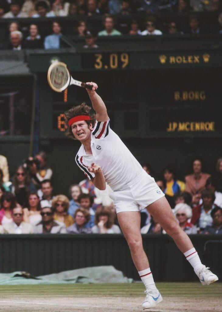
Please continue sending these in! You’re welcome to send me any scoreboard photos (with answers please), and I’ll keep running them.
The Ticker
By Jamie Rathjen

Baseball News: The Mets wore blue at home for the first time this season (from multiple readers). Additional photos here.

Football News: Two CFL items from Wade Heidt: Edmonton Elks RB James Wilder Jr. had the bottom of his jersey tucked under his shoulder pads last week, which is illegal. Elks coach Jaime Elizondo publicly said he told Wilder not to do that, and it was fixed by the second game. … Meanwhile, the league also has a league-wide ad patch on the right chest which has a new advertiser for this year. The company in question uses a different name in Quebec, so the Montréal Alouettes have a different one than everyone else.

Hockey News: A Kings blog reported several uni-related developments on Saturday, including that the Reverse Retro program might return for the 2022-23 season at the earliest and that the Kings’ silver alternate is to be replaced (from Derek May).

Basketball News: NBA numerologist Etienne Catalan has more new and changed player numbers.

Soccer News: Wolverhampton Wanderers striker Raúl Jiménez returned this weekend after suffering a bad head injury at the end of 2020, so he was wearing what looks like a large padded headband (from Max Weintraub). … In MLS, CF Montréal wore rainbow numbers on Saturday. … The NWSL’s Orlando Pride wore “Prioritze Mental Health” warm-up shirts on Saturday. It’s possible but unclear that was a reference to the verbal and emotional abuse of Washington Spirit players by coach Richie Burke reported in WaPo last week. … New first shirt for the second-tier English women’s club Durham. … A New Hampshire boys’ high school player did a sub-five minute mile in his preseason fitness program while wearing Crocs (from Tris Wykes).

Grab Bag: Iowa’s athletic department is holding an auction of men’s and women’s equipment from several sports, including two football helmets (from Dane Drutis). … Providence has a new 50th-anniversary logo for women’s athletics. … Athletes Unlimited lacrosse players wore these pride shirts when arriving to their games on Saturday. … A photographer is documenting Muslim American women athletes as part of a larger project (from Jason Hillyer). … Michigan State men’s golfer James Piot won the U.S. Amateur yesterday, and his shirt featured a golfing Sparty (from Lenny Vangilder). … Division III Southwestern University has a new logo (from Scott Towery). … This article looks at the rise and fall of Reebok as a brand (from John Cerone).
Uni Tweet of the Day
They have to bring this back in 2022, when the one-shell rule is lifted. They just have to.
Every time I watch the #Falcons I can't help think about these uniforms. They really need to go back to their RED duds. So much nicer. #RiseUpATL pic.twitter.com/uzaymsLe0c
— Ken Gelman (@kengfunk) August 15, 2021
And finally… that’s going to do it for this fine Monday — big thanks to OC for sharing his cap concepts — hope you enjoyed.
I actually spent a rare Sunday evening at the summer place, and just when I thought there’d be another cloud obscura, at the last minute the sun poked through the clouds right at sunset.

Nice.
Everyone have a good Monday, and see ya tomorrow.
Peace,
PH
I am not a Mets fan, but if I were, I would want that Mets concept on my head right now. Not the kind of design a team should wear on the field, but wow what a fan/fashion cap design!
I’ve seen youth players around town wearing padded headbands like Jiménez in the Ticker for a few years now. Even tried tracking down adult sizes at a couple of local soccer shops, to no avail. Seems like it would be a good safety accessory for curling, where the biggest physical danger is hitting your head on the ice or a rock in a fall.
Scott, thank you so much! The Mets have a beautiful, vibrant color scheme and a classic set of logos – they are a fun team to work with (even if my fandom rests with the Phillies). I really appreciate you reading and the kind words!
Bengals got pretty close with the new look – but….the pants don’t match anything on the new duds. They match the old set. They should have gotten the new shoulder stripe treatment. One color on one color. My only other beef is that the shoulder stripes looks great from the front and not great from the rear. A minor tweak would fix that. Here’s to waiting another 20 years…
For the Bengals, would have looked more consistent with the rest of the uniform with 1 small change. Pants should have a black stripe down the sides with the orange tiger stripes in them. Would match better with the black jersey.
I like the Bengals new shoulder stripes but really wish they would have gone with standard block numbers. There are enough curves on the helmet and shoulders. More curves on the front and back of the jersey is visual overload.
And you’re right about the pants being off, Phil. They would be better off with simple white pants without any stripes whatsoever.
Those are some fantastic concepts Osprey! Way better than the garbage New Era has been rolling out lately. You hit the right touch of retro and vintage and new that I think a lot of people would love to see, but just isn’t executed well by manufacturers.
I’m so glad to see the elements I hated about the Bengals old set that I’m in love with this new set. Maybe in a year or two I’ll share some of the other complaints I’ve read on here about them.
Thank you Memal! I am with you – I’m always more interested in creating designs that have something to do with the team’s respective past. I do make some concepts that are “just for fun” as well, but there are plenty of those options out there in the retail world. Thank you for reading and commenting!
Between the Bengals unis and the Riggs photo, I went back and looked at the GUD for 1987, and wow. There isn’t a single team who has improved their look since then. Maybe at one point you could’ve said the Chargers, but I’d take their ’87 unis over the current ones. That era (until the switch to Flying Elvis in 1993) is probably the NFL’s Golden Era of uniforms.
Some great designs OC. I’m also inspired by your commitment to learn a new skill over the last 18 months and develop your creative side. Very nice!
Thank you, Dave. It has not been easy, but it’s certainly been personally very rewarding personally. I still have a lot to learn too!
I remember seeing Graig’s Gehrig painting back when it originally ran and being knocked out. Thanks for the reminder of his IG page… so many amazing pieces!
stickers on the brim of caps is still a thing? :facepalm:
I take them right off after I purchase, but know many other prefer to leave them on. Different strokes..
For me the Bengals pants don’t look like bengal stripes. Maybe it too zoomed in looking or the small black outline. When my eye sees it I think “orange camouflage” before I think “thats a bengal.”
Agreed. That wonky orange pants splotch was the one huge eyesore of the redesign. It looked initially they would save that for color-rash but OF COURSE they put them front and center.
I’m not a big concepts guy… but I have to say today’s White Sox concepts are wonderful!
Thank you! As I mentioned in the article, the insanely wide-ranging history of the White Sox includes so many different colors, logos and themes. They are a fun team to create mock-ups for – lots of possibilities!
Today I learned that there exists a “fitted hat community”. :)
GTGFTS
1980 Wimbledon Final. Borg beat McEnroe in 5. Maybe the most exciting match ever played to that time.
Was it a clue that Shea LaBuff submitted the GTGFTS and Shia LaBoeuf played McEnroe in the 2017 movie based on this match? Who can say?
link
Sometimes I don’t give you enough credit, Styczen ;)
99% of the time you’d be right. But here, where Every Detail Matters™, you gotta be on your toes all the time.
I don’t understand “not a helmet guy” and “not a cap guy”. I understand not being a helmet guy in regards to the make and model a player wears (I’m pretty sure that’s what Paul means), but the design itself is essential to the uniform. Same goes for the ball cap.
The cap bears a significant logo for each team, and the team helmet often serves as the visual representation for each team. “Between the neck and ankles” sounds like it would be ok if players didn’t wear the matching caps or helmets.
Perhaps I worded that poorly. I guess what I mean to say is I don’t obsess over caps/helmets/shoes like some folks do, and certainly not the way I obsess over unis. Of course I want the caps/helmets and shoes to tie into the uni, and I do pay some attention, just not nearly as much as I do to uniforms.
But the helmet and cap are essential parts of the uniform. Scrolling down and seeing the Bengals helmet punctuates that point. I just feel as Uni Watchers, we are all helmet and cap people.
Wonder why Bill Melton posed with a bat with #18 on the knob. He only wore #14 with the Sox. Unless they just used one bat for a rotation of players…
The Bengals unis are an overall improvement (how could they not be?) but those pants stripes look completely out of place. They look more like some kind of artsy design than what they’re supposed to be.
I really liked Osprey’s cap designs. Well done!
That Orioles cap concept is very similar to the Spring Robins hat designed by Chad B Stilson (CBS-Ink) and produced by Ebbets Filed Flannels:
link
So glad I saw his posts and ordered a fitted hat! It’s beautiful.
I happened to see that last month after my original post and agree – it is very similar (and a beautiful cap to boot!)
Thank you for reading and sharing!
Here’s the problem with the Bengals’ pants stripes (apart from not matching the helmet or jerseys), viz., why they look “off”: there are link, and there are link, but there are no orange tigers with white stripes or white tigers with orange stripes.
Exactly!
Those pants yesterday were just terrible.
For that matter, there are no black tigers with orange stripes as you see on the shoulders of their jerseys.
But that’s just an inversion of the helmet. And I suppose one could argue that the tiger is black and the stripes are orange, rather than vice-versa, although I wouldn’t agree with that.
The point is that Bengal tigers are either black and orange or black and white, not orange and white.
When we first saw that leaked Bengals jersey, it definitely had a Bears vibe because of the number font and if I recall, the color of the jersey looked a little blue-ish in the photo. But seeing the whole uniform, there’s no way you’d confuse the Bengals with the Bears so I don’t think it’s a problem at all.
I think the Bengals’ previous font was closer to the Bears’ than this one.
I will echo what many others have said. The Bengals uniforms overall are an improvement.
The designed wide panel on the pants are overkill. Plus the white pants were the worst of the bunch, the colors and stripes are not right for a bengal tiger. I look at that side panel & I see a clown fish pattern. I guess we found Nemo.
Solid pants, or plain pant with the tiger B logo on the pelvis area, or a more traditional orange & black thin leg stripe all would have been better.
I am not against their look like some, I actually like the striped helmet & this version of the shoulder/sleeves. The pants are just too much. Not every element of the uniform needs tiger stripes!
The recolored version of the Phillies centennial patch on that concept cap is beautiful! I always liked that logo.
I’m not sure why, but the 1925-1933 P looks too bulky/less refined…maybe it’s the nature of the letter itself when given the Gothic treatment, maybe it’s additional powder blue outline.
The White Sox Design 5 cap painfully reminds me of Pirates and Orioles late-’90s flirtation with gray road caps.
“I hate to say it, but the best pairing seems to be the black pants.”
I’m glad you said it – I agree.
How soon can the Bengals correct their white pants striping problem?
Right away. They can wear the black pants or the white ones with black only stripes. Feels like the hideous orange ones will be go-to, because Bengals…
To the Los Angeles Kings. If you are not going to change to the purple and yellow Reverse Retro as your full-time look, then it is clear it must become the regular third. Fans love it.
I would absolutely purchase the White Sox Concept 5 hat.
The Bengals uni – helmet and jersey look great together. It is as if they used pants from a completely different uniform set.
Good afternoon OC…. I love the concept hats. A lot. Especially the Baltimore one. My grandpa was a Browns fan, he told me he threw a fit when they moved and not the Cardinals. Lol. I’m a die hard Seattle sports fan and would love to see you do some Mariner, Seahawks, Kraken and Sonics concepts if you got the time.
Thanks!!
Thank you Sean! I was a Mariners fan as a kid (and still root for them, just not as much as I do for the Phillies), so there are definitely some M’s concepts in my portfolio, as well as one for the Kraken.
If you check out my portfolio page, you can find them there: link
The Mariners are in the “MLB / NBA / NFL” folder and the Kraken are in the Hockey folder. Send me a tweet or reply here once you’ve checked them out if you don’t mind. I’d love to hear your thoughts! Thanks again for reading and commenting
Those are awesome!! The Mariners one brings me back to when I was a kid. I grew up just in the end of the Trident/star era. Right before JR came to the big leagues. Love the Kraken one. I could see a third jersey with that logo on it.
AWESOME WORK!!!!
Sorry it took a bit to get back to you.