By Phil Hecken
Follow @PhilHecken
Yesterday, the Chicago White Sox became the third team (out of seven total) to unveil their “City Connect” jersey uniform(!), which they will first wear June 5th (next Saturday) against the Detroit Tigers. Unlike the previous two unveilings (Boston and Miami), this time we were treated to a real, actual uniform unveiling, rather than a cap and a softball jersey. Of that, I am both surprised and delighted.
Before we go any further and I share my thoughts on this particular Nikereation, lets look at the full uniforms and the details therein. We’ll get the excruciating “storytelling” out of the way first.
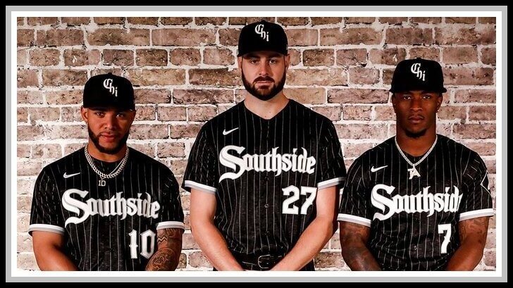
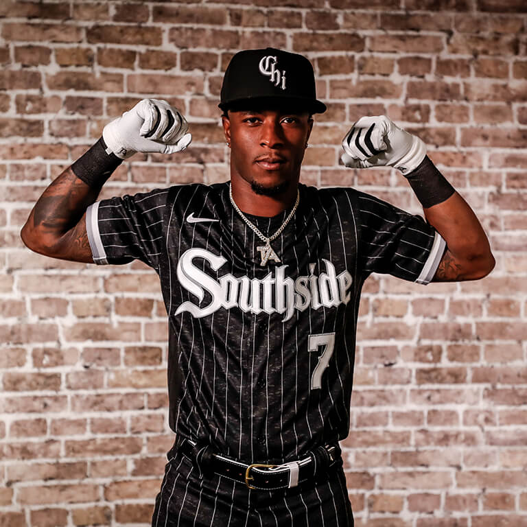
First, as you can see, the jersey neither reads “Chicago” nor “White Sox,” nor does it feature a logo across the chest. What it reads, in “Gothic” font, is “Southside,” (one word), which is an obvious reference to South Side, Chicago, the section of the city where the team has played for well over 100 years. Whether or not this should actually be two words is probably of little concern to anyone but grammarians, but it is what it is.
According to the White Sox, the design of the uniforms is intended to “represent the hard-working nature of the South Side of Chicago” and the identity of the team’s fan base. White Sox Vice Prexy Brooks Boyer notes, “Every aspect of this collaboration is meant to connect with people who understand what the South Side represents. It’s not just about where our ballpark is located or where people from the city or suburbs live. It’s a mentality and a culture shared by many who love the White Sox.” He continued, “The Nike MLB City Connect Series created a rare opportunity to transform a concept for all people who understand what it means to represent the South Side into an on-field look and style. We are grateful to Nike, who helped us create a uniform that embodies the team’s historic legacy and connections to our fans and the mentality.” Additionally, it was explained the unis are nods to Chicago architecture and the legacy of the team’s logo being connected to hip-hop culture.
I’m NOT a fan of storytelling when it comes to uniforms (most of it is just trite clichéd bullshit anyway), but Nike in particular feels compelled to accompany most new uni unveilings with it, especially when the new uniform bears little resemblance to a team’s current identity — as was the case with both the Red Sox and Marlins. However, this particular City Connect uniform (and it is an actual uniform) is rendered in actual team colors and as such, was far more than I was hoping for.
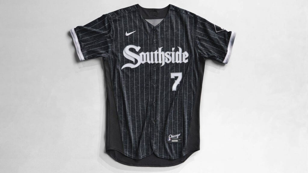
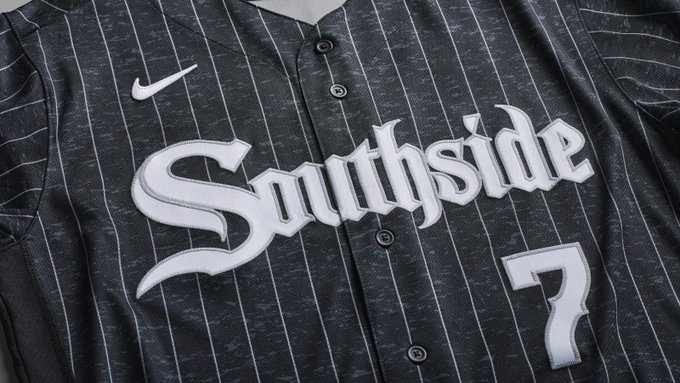
The uniforms are actually a “dark gray” rather than black, but it’s such a dark gray that it will definitely look black on the field. As you can see from the photo above, not only is “Southside” rendered in a gothic script, so too is the front number font. “Providing a fresh take on the iconic White Sox pinstripes, the color scheme and pattern create texture to symbolize the team’s brand identity,” said Nike’s Senior Creative Director Wil Green. It will also “pay tribute to the look that has permeated through Hip Hop and youth culture.”
Not to be outdone on the hyperbole, Nike tweeted this: “The South Side mentality: It’s grit and hard work. Ready to change the game. The jersey’s dark grey body sets a serious tone; the subtle, pinstripes shows that sense of style that runs through everything. An old-school look, a new-school mentality. The Southside. Forever.”
Here are some closeups, starting with the front of the jersey:
A closer look reveals the jersey pattern features some sort of solid (moisture wicking?) material along the sides of the jersey…
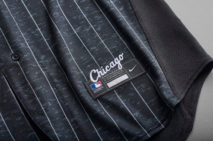
… as well as that same material on the rear base of the jersey (note the classic White Sox logo on the left sleeve):
Fortunately, most baseball players always keep their jerseys tucked in, so the solid black tail shouldn’t be visible during game play (note: this feature is common to MLB jerseys, but is only noticeable when the jersey contains pinstripes). Do we still refer to this as a “diaper”?
Anyway, the slight color difference (between black and dark gray) is apparent. You can also tell from those photos that the jerseys contain some sort of sublimated pattern (the nod to the city’s architecture most likely).
The cap is also new and simply reads “Chi” — also rendered in a gothic script font.
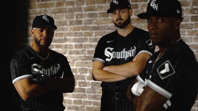
Let’s see how the uniforms look on some players (this is also why I believe the unis will look black on the field):
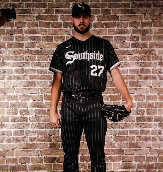
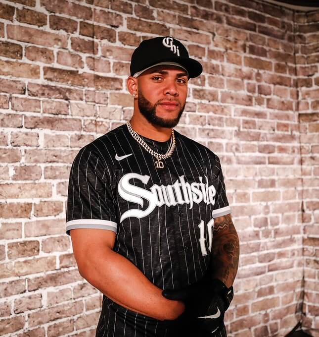
Not bad right? Let’s take a look at the back of those jerseys:
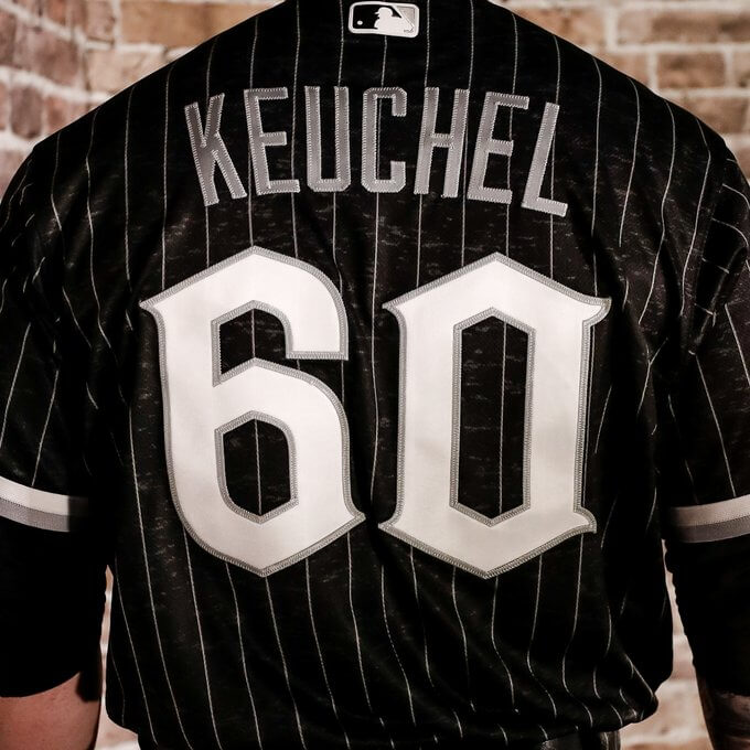
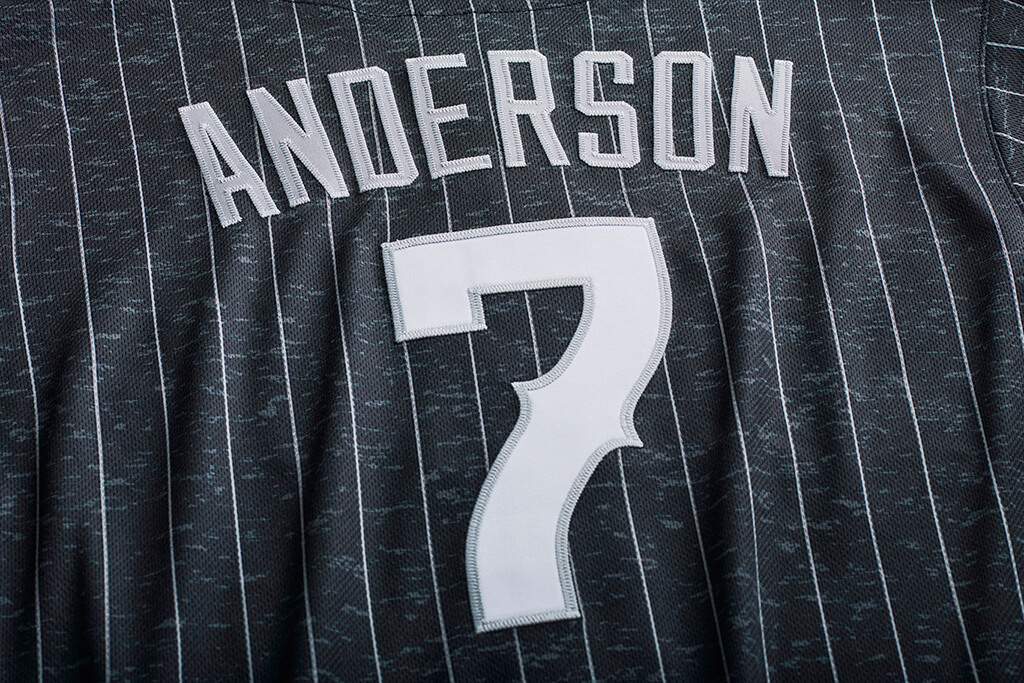
As you can see, the numbers on the rear are also rendered in the gothic script font. NOB’s are in silver block letters.
It’s difficult to divorce the “storytelling” from the actual uniforms where “City Connect” uniforms are concerned. Because otherwise it would be too easy to criticize the gothic font and numbers, the “Southside” (one word) wordmark, and the references to architecture and hip-hop culture. All of those things undoubtedly contributed to the design of the uniforms. And I feel any criticism I might heap upon these uniforms can be deflected by such justifications. But how does this work as a uniform? I bet you think I hate it.
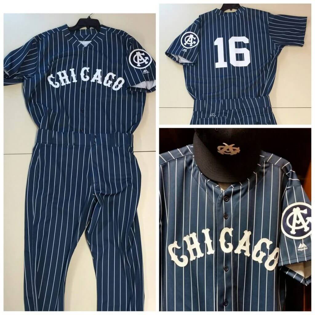
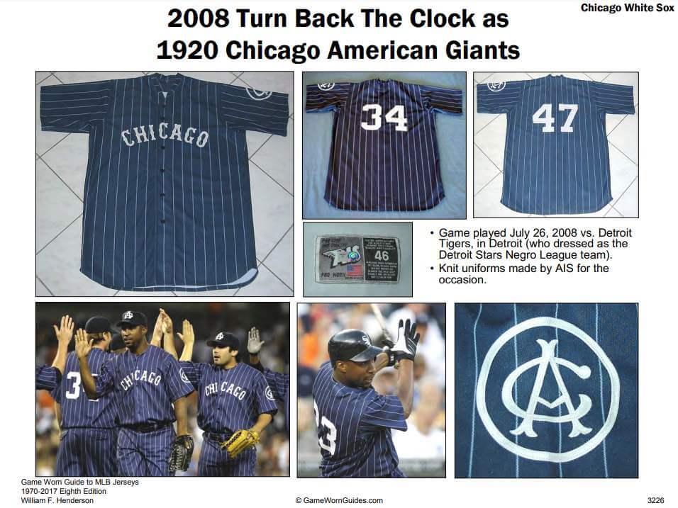
Actually, I really like these a lot. My greatest fear (that Nike would create the cap and jersey and pair it with white pants, as they had done with the Boston and Miami uniforms) was not realized. Nike went ahead and created a FULL uniform, and this alone earns them props. I immediately thought back to the Negro League Chicago American Giants throwbacks the team wore for several years beginning in 2008. I absolutely loved this look:
Also, the Chicago White Sox have a history of wearing a black (or dark blue) uniform — including a dark pinstriped uniform in 1917. So this “City Connect” uniform is a bit of a natural for the team.
Unfortunately, I was also reminded of the Northwestern University (located in Evanston, a few miles from Chicago) “Gothic” uniform, which directly or indirectly, I am certain had an influence upon the ChiSox’ City Connect duds (you don’t think Nike designers saw “Northwestern” which is correctly one word and thought, “Hey, Southide would look good as one word too” do you?):
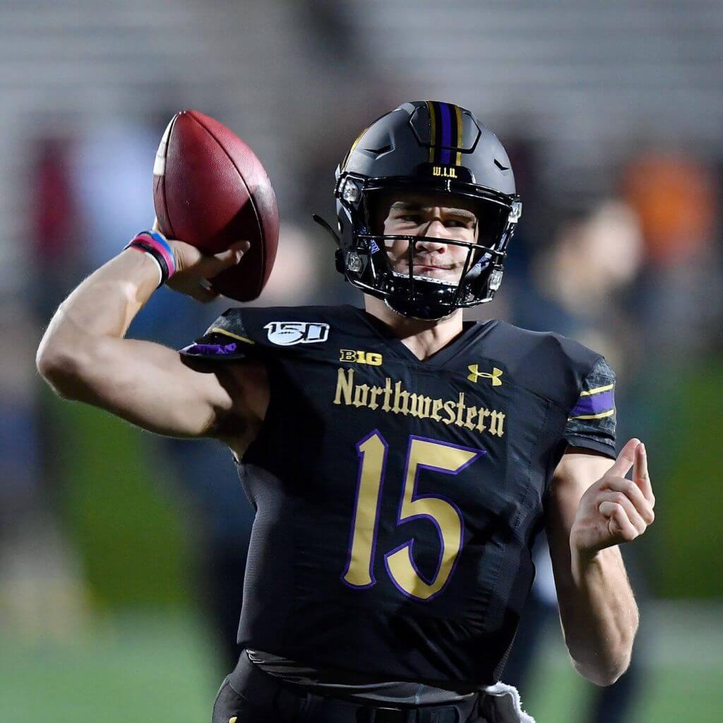
And that’s actually what I dislike about this uniform: in an effort to tell a story (referencing the city’s gothic architecture), Nike basically borrowed a design element from Under Armour. I dislike the gothic font on those football jerseys, and I’m not a fan of it on the City Connect unis (and that goes double for the number fonts). This uniform could have been SO much better (and believe me, it’s pretty good regardless) if Nike’s designers had used that old school Chicago font (used several times throughout their early history, as well as the infamous 1976-81 uniforms — the first and only MLB uniforms to feature shorts). That’s where, in my opinion, the storytelling really diverges from good design.
This is still a really nice City Connect uniform — I hope Nike continues to create uniforms and not just caps/jerseys — but with just some minor tweaks to the font it really could have been incredible. I don’t love the cap, but obviously it is something to sell (as is the jersey). Yeah, I *get* where they’re going with this one…I only wish their story could have been a nod to the early Sox and Negro League American Giants, and not to the “architecture” and “culture” aspects. Still, big props to the Sox and Nike for this one. Can’t wait to see it on the field!
Of course, what would an unveil be without a hype video?
Your thoughts?

Disco Turkeys Unveil Inaugural Uniforms
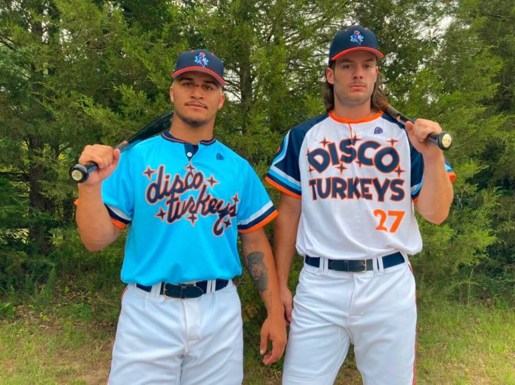
Yesterday, the Carolina Disco Turkeys, a new AAABA team based out on Winston Salem, North Carolina, unveiled their uniforms for their inaugural season. I have a feeling that this is one of those teams whose nickname you either love or hate — with pretty much nothing in between.
The team announced their presence with authority earlier this year (and in a rare move, began following me even before I had realized the team came into existence).
The Carolina Disco Turkeys are the newest team in Winston-Salem, NC, and begin play this summer! We're excited to play our home baseball games at Truist Stadium as summer roommates of the @WSDashBaseball! More info: https://t.co/1mb9OBBdzh @MiLBPromos @UniWatch @sportslogosnet pic.twitter.com/WYv34sR3AC
— Carolina Disco Turkeys (@discoturkeys) March 24, 2021
Like many new teams, there were no uniform announcements upon the announcement (although there was still plenty of fan merch to purchase). Unlike MLB, I have no problem with MiLB teams, particularly at the lower levels, promoting themselves in any and every way possible, and that includes as many multiple caps and jerseys (think “theme” nights) as they want to wear, especially when merch sales are in some cases one of their primary financial drivers. And the Disco Turkeys (can we shorten that to “Discos” … “Turkeys”? — nah, best leave it as two words) definitely captured my imagination after their launch. The colors are navy and powder blue, and coral.
Anyway, yesterday they unveiled the two uniforms above. If you look closely at the sleeve of the white jersey, you’ll notice what could be a familiar looking feature:
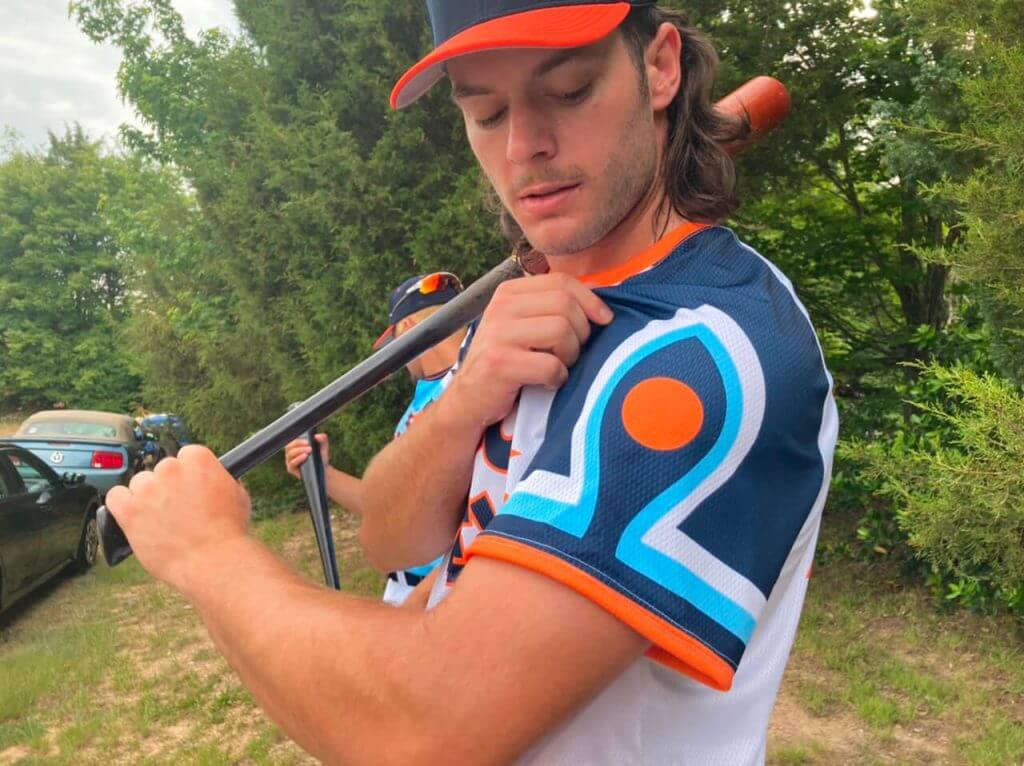
If that reminds you of anything, it’s intentional. “The home jersey is heavily inspired by the iconic 1974 Braves’ home uniforms worn by the home run king Hank Aaron,” said Brittain Peck, who designed the uniforms (you may remember Brittain won the Uni Watch “Rename the Washington Football Team” contest I ran about a decade ago). “Wanting to make the feather on the sleeve our own, we referenced the recognizable ‘eye’ of a peacock’s feather and bands of colors.”
Brittain also says the letter stylings of the home (white) jersey take their cues from the 1976 Cleveland team as well as the 1982 Houston Astros. “From the Cleveland jersey, we loved that this lettering wasn’t afraid to be big and take up space, stretching nearly from armpit to armpit,” he notes. “From the Houston jersey, we loved the bold, geometric simplicity that feels like it could be read at the plate from the outfield. With these two inspirations, we added the disco sparkles and felt like it was our own.”
The road uniform also takes its cues from old school baseball — the jersey is powder blue (which of course many teams had in the 1970s and 1980s) with white pants, and although the Mets never wore powder blue, the Disco Turkeys script takes its cue from the 1987 New York National League team. “We love the script, and especially love the novelty of it being one of the only years that the Mets wore script lettering on their away jerseys,” says Brittain.
The team begins play this weekend (on the road) and will play their first home game June 4th.
Here’s a look at the full home and road uniforms, graphically:
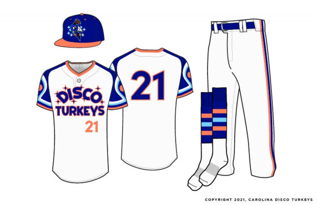
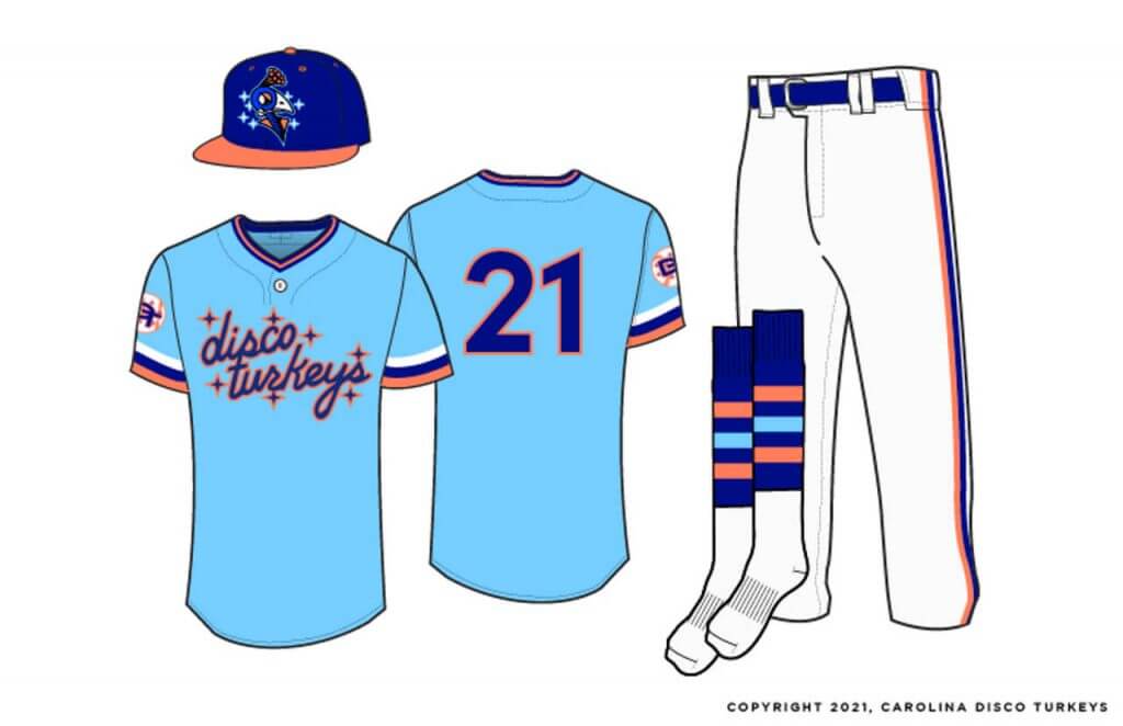
Personally I love these, and it’s great to see designer Brittain Peck showcase his work! Congrats.
1974 BoSox Multipanel Cap Updates
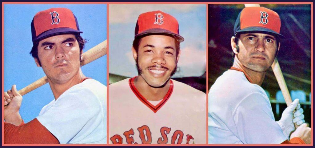
Last weekend’s guest post by the great Keith Olbermann, “The Famous Disappearing Red Sox Cap of 1974” (which is a must read if you didn’t see it), generated a lot of great comments, but I also received several e-mail follow-ups to that post I’d like to share.
The first comes from Craig Mellish who writes,
Phil,
I knew keeping this ripped, water damaged relic that I’ve had since I was a kid would someday pay off. Clearly the 1974 team photo that Mr. Olbermann has yet to see. Until today I had always remembered this poster as something my uncle brought back from one of his trips to the Red Sox during Spring Training. Maybe he did (possibly 1975?) or maybe not.
Take care,
Craig
And here are some pictures of that poster (which Keith told me later he hadn’t been able to find!):
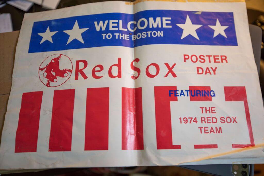
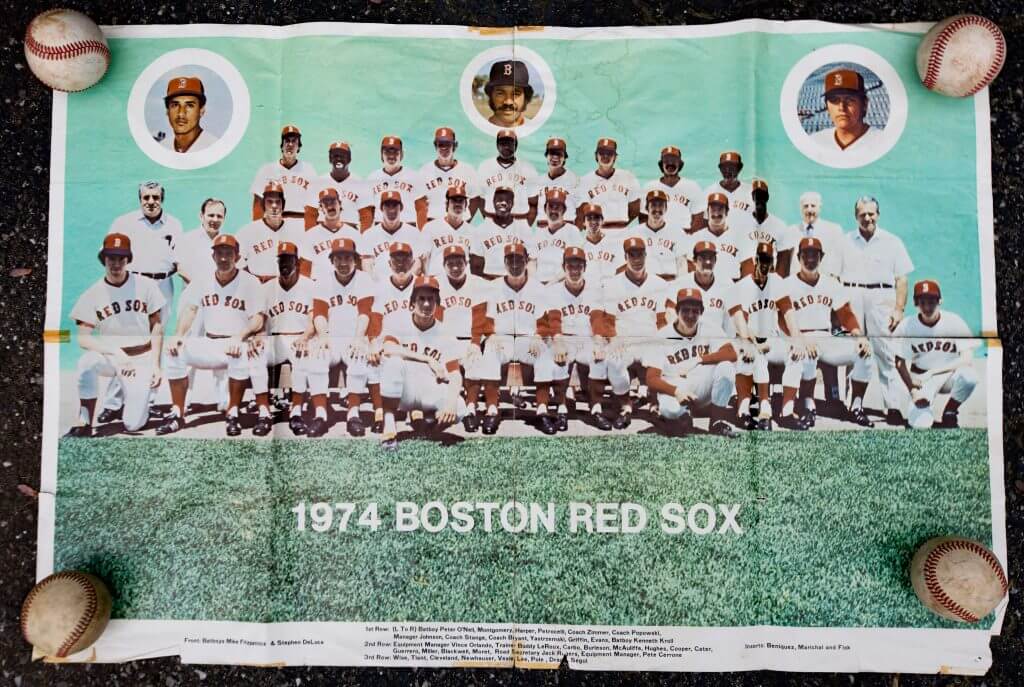
And here are some “close ups” of the poster details:
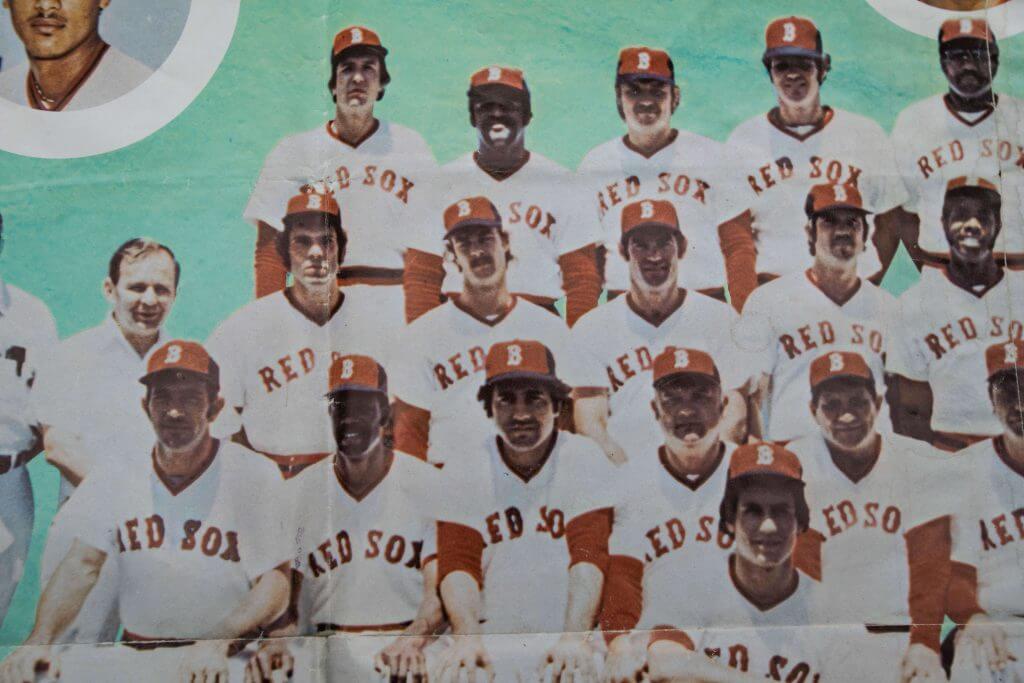
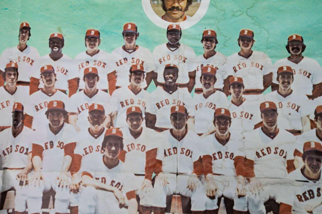
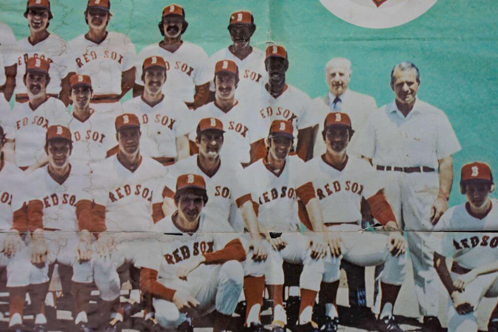
How great is that. Thanks Craig!
Several readers also proudly own those very multi-colored panel caps Keith wrote about.
Next up is David Demsey, who wrote directly to Paul, and which Paul forwarded to me.
Dear Paul,
Thanks to you, Phil, and Keith Olbermann for Keith’s great article on the infamous 1974 Red Sox caps. Those caps were certainly one of the jarring experiences of my Boston childhood.
Several years ago, my band (I’m a saxophonist) was asked to be on the Cooperstown Concert Series. I put a band together made of New York jazz players who were serious baseball fans, and we played a concert at the Otesaga Hotel in town. Thanks to then HOF Director of Research Tim Wiles, we were given an underground tour of the Hall of Fame holdings.
I asked specifically if I could see any of the Red Sox caps they had in storage, and that 1974 cap was among them. I had no idea until I read Keith’s article that this is the only known original. I have attached a copy of two photos I took that day.
All the best, and thanks for your continued great work,
David Demsey
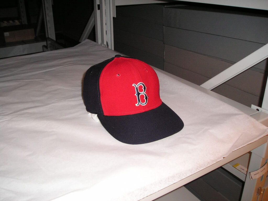
Next up is Keith Conforti
Hi Phil,
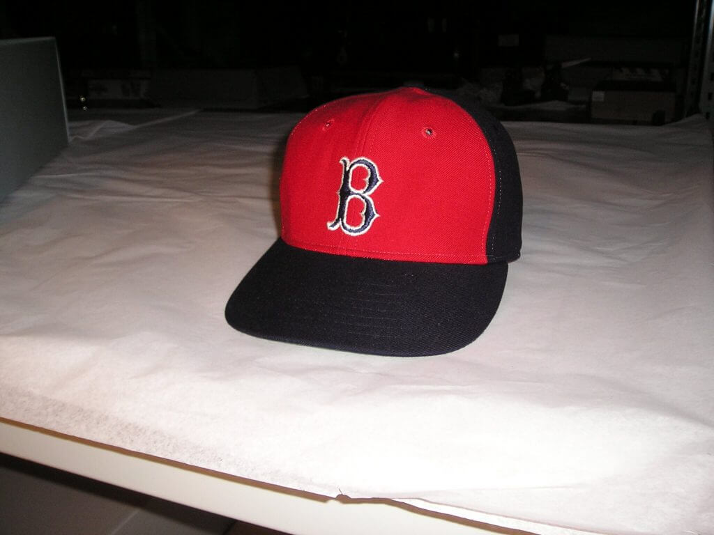
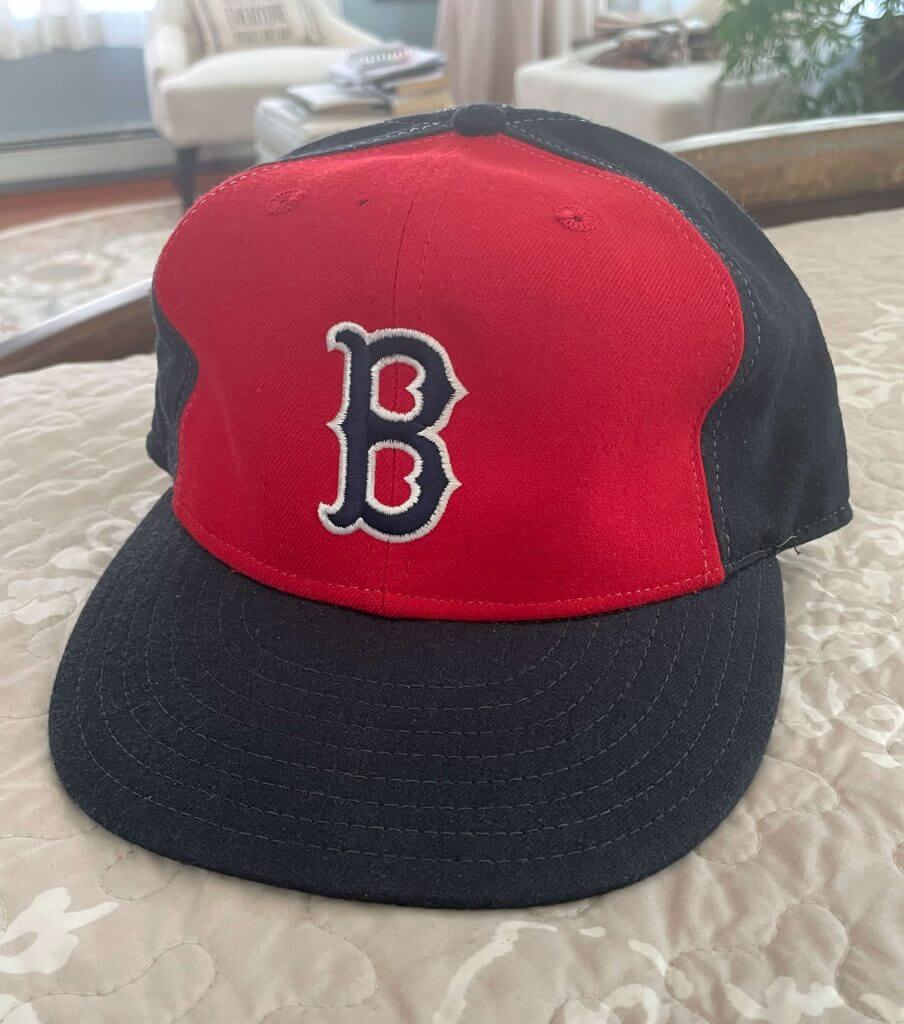
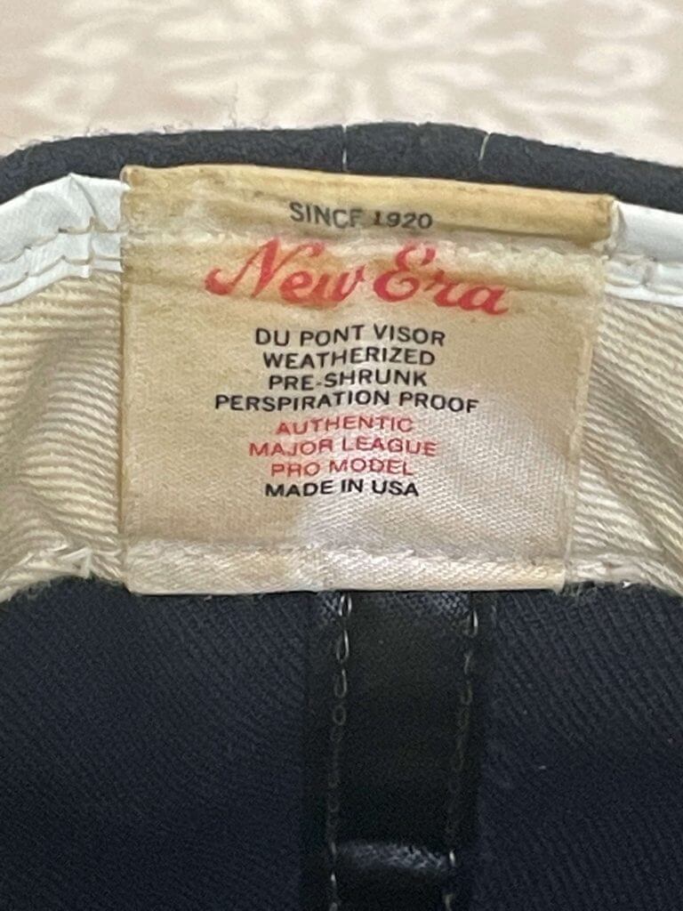
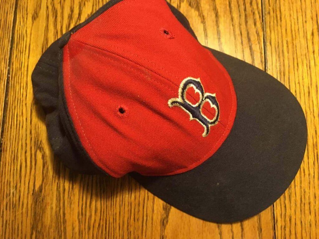
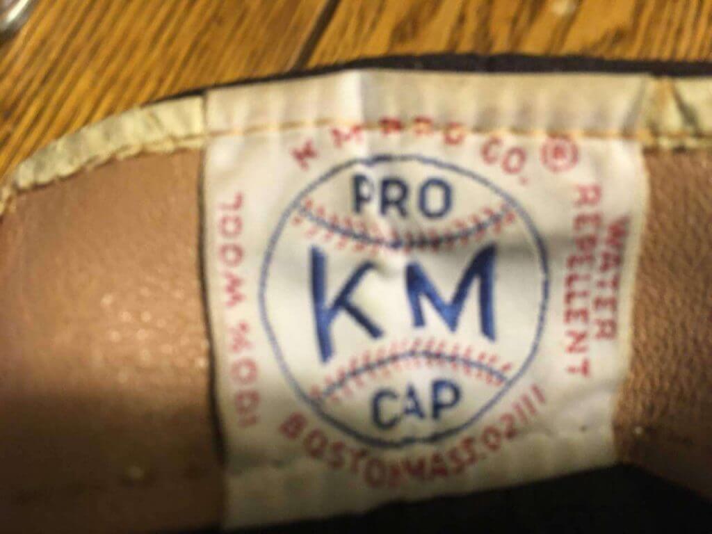
Here are a couple pics of the hat. I definitely bought it at Twins on Yawkey Way in the winter of 1988/89, or possibly in the fall of 1989 after the season ended. I used to visit often back then and bought several vintage hats from their old stock.
The hat has a green fabric underbill and the stitching thread is clear (like thin fishing line). I have many other other 1970s New Era caps and this one has the same tagging, and stitching. The headband is fabric (not leather) with a white vinyl lip at the base where it meets the wool crown. That vinyl strip is only on my 1960s and 70s New Era hats, not any from the 80s or newer, though it is usually accompanied by a leather band. You can see the headband on the photo with the tag.
If you want to see any other photos or details, just let me know.
It’s nice to finally connect with you. I have been reading Uni-Watch for at least 10 years, but until now, I never felt compelled to comment.
Best regards,
Keith
Next up is Tony Bram, who wrote to both Paul and me:
Hi Paul and Phil,
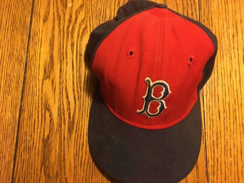
I really enjoyed Keith O’s post this past Sunday on the mystery of the disappearing ’74 Red Sox home hats. In 1974, I was a 9-year-old baseball/Red Sox/uni obsessive. My dad took me to a game in April or May that year, and the Sox were wearing those brand-new caps (it may have been the April series vs. Cleveland when they debuted). I longed to have one for myself but, as I recall, they were nowhere to be found at the souvenir shops around Fenway, even the hallowed Twins Enterprises across the street from the park. It’s hard to imagine now a time when marketing was a uni after-thought rather than the primary driver. In the weeks following the game, my ever-supportive dad made some phone calls (possibly to John Alevizos, a former professor in his MBA program who was a Red Sox VP at the time) and learned that the caps were produced by the KM Pro Cap company located in Boston. I wish my dad were still alive to recount details of the story, but I recall him telling me that he drove into Chinatown where the company was housed in a nondescript building. He drove around the neighborhood a few times before he could find the address. Someone in the office found and sold him a cap in my then-6 3/4″ size. I could not have been more surprised and excited when my dad gave it to me. I had no idea that the local press was so down on the new caps and was shocked and disappointed when the caps vanished before August. But that disappointment was later overshadowed by the Sox blowing an 8-game lead over 3rd-place Baltimore on 8/29 and losing the AL East to the O’s by 7 games.
Pictures of my ’74 Sox hat are below. I don’t believe these on-field caps were ever marketed to the public.
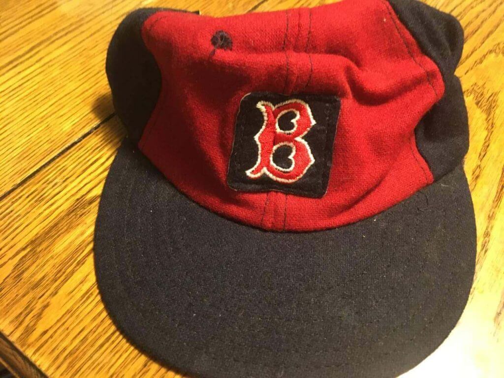
As Keith wrote: “There’s no evidence that any of the Fenway souvenir stands or the memorabilia shops around Kenmore Square ever had any available for sale to the public.” However, this was actually not the case. Sometime over that summer, the Fenway souvenir stands did sell a cheapo version of the hat–my little sister wanted one too. It is not too difficult to identify which one that is in the photos below–notice the clumsy square blue patch with red ‘B’ from the traditional all-navy caps sewn onto the red front panel and the inaccurate blue eyelets.
Please convey my appreciation to Keith for writing about this and for bringing back some treasured memories. And thanks to you both and all the other UniWatch contributors!
Kind regards,
Tony B
Thanks Guys!!
And finally we have Chris Geis, who found something very interesting amongst his Topps baseball card collection. First, the initial e-mail portion:
Phil,
I enjoyed the Red Sox piece over the weekend. That’s my favorite team. I started following them in 1975 and really had no idea until years later that they briefly went with the red-front hat (or that they switched to red sleeves and all-red socks). For some reason the hat strikes me as off, unlike the Orioles’ black-orange hat that debuted the following year with their orange jerseys. That was my favorite hat, actually. I think I have some Topps cards with the red-front hat, and I can look if you want me to, but maybe I’m just confusing that with my memory of what’s in the Okkonen book.
Chris
There was a bit more to that e-mail, but what intrigued me was his comment on the Topps cards. I reiterated Keith’s contention that there were no cards showing players in the panel cap, but Chris offered look through his collection nonetheless. While he confirmed Keith’s supposition there were no front panel cap photos, he did find this:
Phil, I looked and didn’t see any with the hat, but found this strange Sox uniform.
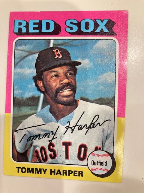
I’ve never seen that uniform before — and we both agreed it doesn’t appear to be photoshopped airbrushed, as was common for Topps artists back in the day. He looked through the remainder of his cards and confirmed this was unique:
It is the only one like that.
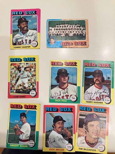
Interesting! I’m not sure if there’s a simple explanation for this uniform or if we have another uni mystery on our hands.
Have any of you ever seen that uniform or have an explanation as to why Tommy Harper appears to be wearing a uniform never worn by the team? I admittedly didn’t do much research on this one, but if anyone can help out, that’d be great!
OK — that’s a wrap on this follow-up. Thanks to Keith for his tremendous piece and everyone else for their follow ups! You guys are truly all aces!!!

Guess The Game…
from the scoreboard
Today’s scoreboard comes from Patrick_in_MI.
The premise of the game (GTGFTS) is simple: I’ll post a scoreboard and you guys simply identify the game depicted. In the past, I don’t know if I’ve ever completely stumped you (some are easier than others).
Here’s the Scoreboard. In the comments below, try to identify the game (date & location, as well as final score). If anything noteworthy occurred during the game, please add that in (and if you were AT the game, well bonus points for you!):
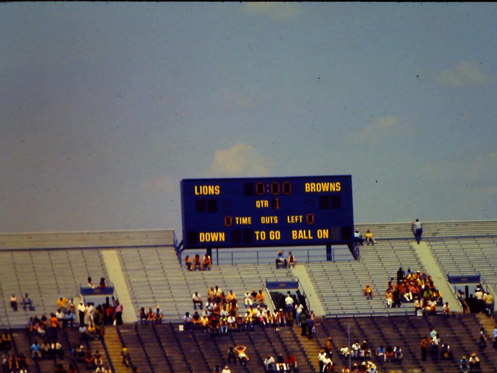
Please continue sending these in! You’re welcome to send me any scoreboard photos (with answers please), and I’ll keep running them.

Click to enlarge
And now a few words from Paul: Hi there. In case you missed it on Friday, Teespring is running one of their site-wide sales. That means you get save 10% off of anything in the Uni Watch, Uni Rock, and Naming Wrongs shops by using the checkout code SUMMER21. You’ll save 10% and Uni Watch will still get its full cut of the profits — a win-win!
This sale is in effect now through midnight Eastern on Monday. My thanks, as always, for your consideration of our products.
The Ticker
By Anthony Emerson

Baseball News: The Spokane Indians, the AAA affiliate of the Mariners, have announced a partnership with nearby Fairchild Air Force Base called “Operation Fly Together” that includes alternate uniforms for Spokane to wear that look like Air Force uniforms and a cartoon mascot called “KC,” designed to look like the KC-135 Stratotanker aircraft flown at the base (from Kary Klismet). … @MangoJonah14 found a Pez dispenser at a San Diego 99 cent store that had both the old and current Astros logo on it.

NFL News: The Vikings wore what appear to be rugby scrum caps during a drill yesterday (from @SPTO). Kary Klismet provides us with the details behind them. … Also from Kary, what are the top 15 NFL throwbacks of all time? One blog thinks it knows. … Andrew W. Greenwood notes that highly-touted rookie Pats QB Mac Jones is wearing No. 50 in camp, even though the No. 10 he wore at Alabama is available. The Patriots don’t give rookies permanent numbers until the absolute last moment, and have a system for who gets what seemingly random moment. Also note that the Pats did not have helmet logos. … Staying in Foxborough, new Pats TE Hunter Henry is wearing No. 85 in honor of Antonio Gates. … Giants WR Sterling Sherpard is switching to No. 3 this season, and honoring his father with that number (thanks, Brinke).
College/High School Football News: USA Today‘s Ohio State blog has ranked the helmets in the Big Ten. And no, it’s not who you think at the top spot (from Kary Klismet).

Hockey News: Justin Sheffield found a circa 2000 NHL coloring book that features a bunch of weird designs, especially for the Wild and Blue Jackets, who joined the league in 2000. … Is this the worst shirt ever or the best shirt ever? I honestly cannot decide (from Brandon Weir, who thinks it’s the worst shirt ever).

Soccer News: It’s that time of year again. Time for Premier League kit rankings. Note that many kits have not even been formally launched yet (from Kary Klismet). … Nike has terminated its endorsement deal with Neymar, citing the allegation of sexual assault levied against him in his native Brazil. Neymar is claiming Nike is lying about why it ended the deal (thanks, Brinke). … English League One side Lincoln City have unveiled their new kits (from Ed Żelaski and our own Jamie Rathjen). … Also from Jamie, League Two side Tranmere Rovers have revealed their kits. … After leaking on Thursday, Athletic Bilbao confirmed their new kits yesterday. … North Macedonia has unveiled their Euro 2020 kits (from Germán Cabrejo). … The Colorado Rapids will retire Pablo Mastroeni’s No. 25 on July 4 (thanks, Phil).
Uniform Tweet of the Day
Man, I’d love to know more about these…
Unknown Star of David Jewish Player in Uniform ca. 1908. pic.twitter.com/FfuV2K8MaE
— The Skimmers (@TheSkimmers) May 27, 2021
And finally… that’s all for today (sorry for such a big post to kick off your Memorial Day weekend). I hope all you guys are doing well and staying safe. I finally got my COVID vaccination yesterday — long story, but I have recently had several bad reactions (vasovagel syndrome) to injections, including one where I required hopsitalization, so it took every ounce of fortitude I could muster to get my (J&J) shot, but I know how important it is that we defeat COVID and vaccinations are the way it’s going to happen. Fortunately, I had an excellent pharmacist, who was prepared with both an ice pack and water. After the shot, and about three minutes of profuse sweating and dizzyness (fortunately I did NOT lose consciousness or anything like that), I was fine. As of late last night, I actually felt great, and not even any soreness or pain in my arm. Thank the lord that’s over with. I plan on attending several ball games and concerts this summer, and (even if unvaccinated folks were allowed in), I wouldn’t have felt comfortable enough to do so without the vaccine — both for myself and others around me. Now I don’t have to worry any more!
Everyone have a great Saturday, and I’ll catch you all back here tomorrow!
Peace,
PH
Guess the game from the scoreboard: 1972 NFL preseason game, Lions vs Browns in Ann Arbor.
Forgot to include URL…
I guess my screen name gave it away? The Lions had to play in AA that day (Sunday, August 20 1972) since the Tigers were hosting the Angels.
August 20, 1972, 34-7 Lions. link
Your screen name piqued my interest but Michigan Stadium’s old scoreboard (it remained through 1997 and was replaced when Michigan added seats in 1998 with the much hated “Halo” upgrade) is very easy to recognize. Googling then is quite easy.
link
I could be wrong but I suspect the “Southside” verses “South Side” has a lot to do with font size. If you capitalize the second “s,” the word mark becomes really long and much harder to fit into the space on the jersey. Just look at how much horizontal space the first capital “S” takes up. I’m ok with it as a compromise for expediency (and also smushing letter together like that is fairly common in actual Medieval scripts).
As for the storytelling, the hyper video specifically connects the culture to the White Sox cap and uniforms. So really, it’s a uniform tradition, influencing music culture, coming back around to influence uniforms. The number font is really the first time anyone has tried to render the teams classic logo (which first debuted in 1949) into a number font. As far as storytelling goes, I find it pretty natural since it’s really referencing the uniforms themselves.
It’s certainly connected with the fans. According to the Sox, the team sold out its entire supply of jerseys in 3 hours.
I only have one quibble:
They should have added an “rs” to the end of the lettering.
This is a perfect opportunity to rebrand the team. Call them the Chicago Southsiders, keep this uniform and make a corresponding white version. Boom. You’re good to go.
As RS Rogers said below,
Personally, I really dig the Sox City Connect uniform, despite how much I generally want to hate anything about either the White Sox and/or Nike event uniforms.
Credit where credit is due. Now finish what you started, Chicago and Swooshtown.
I wouldn’t mind if they had to stack “Southsiders”, like the
“disco
turkeys”
powder blues…which (I also have to admit), I’d wear.
The dark pants would look pretty good with actual white socks.
Rebranding would be imbecilic. “White Sox” has deep roots in Chicago baseball history. It was the Cubs’ original name, which they abandoned for Colts, Orphans, and eventually Cubs. The only change that really needs to be made is, you know, actually wearing white stockings.
Perhaps in the Field of Dreams game….
The Tommy Harper Red Sox uniform is the road uniform they wore from 1969 to 1972. link
When I googled “1974 Boston Red Sox”, a bunch of pictures appeared including this one of Luis Tiant wearing this uniform. The card doesn’t reference a year, but below it it says “1974 Style”. No idea if this is accurate.
link
I thought so too, but Harper’s jersey has a drop shadow unlike the commonly seen uniform: link
Could it be from spring training? A prototype?
link
link
I’ve never seen that before
Looks to me like a registration error in the four-color printing process; if not in the card, then in the source photo.
Also on that site is Carlton Fisk with this uniform, and it says 1973. Of course the picture could be from the previous year.
Also the Medieval historian in me would be remiss to point out Northwestern and the White Sox use different types of Gothic script.
Northwestern is more the small type you’d be apt to find in a book of hours while the Sox use the more open font you’d expect in a choir book.
Love the follow up on Keith’s piece from last weekend. I’d love to track down one of those hats myself.
And congrats on getting your shot Phil!!
Unfortunately, I was also reminded of the Northwestern University (located in Chicago) “Gothic” uniform, which directly or indirectly, I am certain had an influence upon the ChiSox’ City Connect duds
Evanston. Northwestern is located in Evanston, not Chicago.
And were Northwestern’s uniforms really an influence? Gothic script has been a part of the White Sox “toolkit” since 1950 (with a few years off). Despite the fact that Northwestern has gothic script all over campus (UA did a great job in reproducing it), it never found its way into a Northwestern uniform until 2014, when UA took over the Northwestern contract. If you want to play the chronological game, you’d have to say Northwestern was inspired by the White Sox.
Personally, I think “Gothic” is a big enough style to allow independent usage and inspiration.
Evanston. Northwestern is located in Evanston, not Chicago.
Good catch, DJ. Text now reflected to indicate Evanston (which is close to, but not in, Chicago).
But I thought Northwestern was “Chicago’s Big Ten Team(tm)”.
Yeah, but there are more than ten teams in the Big Ten, so I’m not surprised their grasp of geography is as bad as their grasp of mathematics.
Just like Rutgers is the “New York team” and Maryland is the “DC team”. :-/
Just because you say you are does not make it so.
Trying to stake a claim in opposition to the University of Illinois. Or is it akin to Syracuse and St. John’s arguing that they’re New York’s team.
It wasn’t mentioned here, but I’ve seen a lot of people on Facebook say that they feel that the White Sox city connect uniforms are also a nod to the gangsters of Chicago. I assume that they’re picturing the black, pinstripe suits.
Prohibition-era mobsters? I can see that, sure, but honestly these days when I think of dark pinstriped suits, I think of a certain politician:
link
President Biden has worn pinstriped suits commonly ever since he came to Washington in the 1970s, and he’s the latest in a small club of oft-pinstriped presidents that traces to Bush the Elder, Reagan, and the original presidential style plate, the ex-haberdasher Truman.
Personally, I really dig the Sox City Connect uniform, despite how much I generally want to hate anything about either the White Sox and/or Nike event uniforms. Something like these uniforms should be the regular Sox road uni. My only real quibble is that in this instance, I think the jersey would look better paired with the team’s regular white pinstripe pants. Nike finally gives us a non-softball-too CC uniform, and I wish it were a softball top. Go figure!
Disagree with you about the font choice. Gothic font isn’t an “under armor” design choice, it’s a extremely common font, and something the White Sox have been using for a long time now. If it had just been the throwback Chicago script, it wouldn’t have stood out (in a good way).
Thanks for getting your jab, Phil! We should celebrate every vaccination, but especially those who take greater than usual risks to help protect our communities.
Also super thanks to everyone who shared stories and photos expanding our knowledge of the 1974 Sox cap. I didn’t know about that cap at all until Keith’s article this week, and now it’s one of my favorite caps and cap stories of all time. So fascinating, and such great stories added to the legend today. The red-front Sox cap now has a special place in my imagination alongside the mid-60s white Senators cap.
Also also, much as I dig the new Lincoln City uniform, man I am tired of hype video unveilings. Especially at that low level of league, give us some photos of the darn uniform. If you need to make an overproduced nonsense video, go ahead, your marketing intern needs something to do, but also give us photos. Doubly frustrating to me is that usually, a team will share the video and nothing else, but if you go to the team website and click on “shop,” you’ll see plenty of still photos of the new kit for sale. With European clubs, you’ll usually even see the shorts and socks for sale, so the team has still photos of the whole kit. They just refuse to share them when they announce the new unis.
As a life long White Sox fan ( I’m in my mid 50’s), I don’t hate these uniforms. I really need to see them on the field. I’m not a fan of the gothic font but I always loved the collared jerseys of the 70’s. As for the hat, I have never nor has any person I know or have met in my life, ever referred to Chicago as “Chi”. They could have just as easily left the SOX or batter logo on the hat.
Observation from an Unqualified Outsider: I’ve heard the Windy City referred to as “Chi-Town” dozens of times.
In suburban Detroit there is a scale-model railroad museum called Chi Town Union Station. Maybe the owners were from the windy city? “Home to the world’s largest and longest two rail, O-Scale model railroad.” link
It’s rather like “Frisco.” No one from San Francisco uses that term.
Nobody who is a native Chicagoan refers to CHicago as Chi or Chi-town. It’s like nails on a chalkboard. Sorta like how people from San Francisco hate “Frisco”.
Typo in Baseball Ticker. Spokane Indians are High-A level and not Triple-A.
They are also affiliated with Colorado.
Sox fan here, I was surprised when reading this that there was no mention of the first S in the Southside font being a hack job of the primary White Sox logo, which I feel is too choppy and for some reason makes me think of the Disney font.
the S makes me think of the seattle kraken logo ……might even be the exact same
also, if this is a nod to old time mob gangsters it comes across as more ‘gangsta’ and is trying too hard to be ‘cool’
Good write up on the White Sox unis. As a long-time Chicagoan, my opinion is that these will sell like hot cakes. Sox fans really embrace that south side identity, in no small part because the Cubs get more love in Chicago—and are the team of the north side.
Phil, props to you for overcoming your worries and fears and getting vaccinated. I hope you enjoy a fun, normal-ish summer as a result!
Some intelligence from some family who went to the game today, all the stores are sold out and everybody is wearing the Chi cap.
I love this CC White Sox uniform! It’s already the best one they’ll wear all year. But that doesn’t mean it couldn’t stand some improvement: 1) Radial-arch the “Southside” script, 2) Set “Chicago” in Old English type, or 3) Use the “CHICAGO” Tuscan lettering.
As a Sox fan born on the South Side and lived there for 35 years, I feel compelled to comment on the CC Sox uni. I am going to ignore the storytelling aspect because it’s complete bullshit.
Just looking at the uniforms it is hard to come up with a specific complaint other than I do not like the side panels.
It has enough of connection to the Chicago American Giants to satisfy me. The team has long been known as the “Southsiders,” so it does not seem forced. The design is a pretty solid baseball jersey. I agree with the comments about the font but am not offended by their choice. It uses my favorite sleeve patch. I’m very happy it does not play on some well-trodden Chicago-ish themes (other than the hard-working city theme, but you can say that about almost every city).
I guess I like it. With a city and fanbase as broad as the Sox, I think that’s a win.
Uniforms are solid but what a missed opportunity to pair it with white stirrups or white high cuffed socks.
Those “Southside” White Sox uniforms are most definitely the ugliest costumes that any MLB team will wear this year. Yikes! To me this looks more like a “softball” outfit than if they had gone with just the black jersey and white or gray pants. And of course no pinstripes, they only belong on a white uniform. What we have here looks like something that belongs on a prison team, not a MLB squad.
Can’t believe you said that. My dad, upon seeing the all-dark navy Sox road uniform in 1976 said “It looks like a prison team!”
For full disclosure, I am a Cubs fan.
I’m not a Cubs fan and I agree
Re Tommy Harper’s BOSTON jersey – the Red Sox used that uniform from 1969 – 1972. I distinctly remember them and confirmed these years with the Hall of Fame’s “Dressed to the Nines” web page. It was a subtle change that not everyone noticed. A lot of homes still had black and white TVs back then.
Spokane Indians are actually the High-A affiliate of the Colorado Rockies, not AAA affiliate of the Seattle Mariners
you misspelled “Southide”:
(you don’t think Nike designers saw “Northwestern” which is correctly one word and thought, “Hey, Southide would look good as one word too” do you?)
One word. Awful.
Cubs next up for CC/Nike…..2 (Miami and White Sox) have a retro-ish style with Boston completely off the radar. My call: Cubs get CC that looks like Red Sox edition. Maybe City flag colors with The Loop or a district flavored imagery….
Re: Tommy Harper card.
First thought was 1967 when they played Stl. in the world series.
But memory fades, of course.
I’ve seen various sources spell “Southside” as one word when referring to the southern portion of Chicago. Yes, the Sox’s City Connect promotional materials spell it as two words (which I think is the more prevalent spelling anyway), but I think both renderings are acceptable.
That should tell you all you need to know. South Side is grammatically correct. Anything else is just storytelling gone awry. I don’t have a problem with it, per se, as team nicknames (rather than proper names) has been a trend in the NBA for a few years, and I’m sure Nike was also a prime driver of that. I’m of the opinion that if you want to put a nickname on your jersey, be my guest, even if it’s technically not grammatically correct.
The more apt collegiate inspiration for the White Sox would be the University of Chicago, which is on the South Side and has been using gothic typography for a long time.