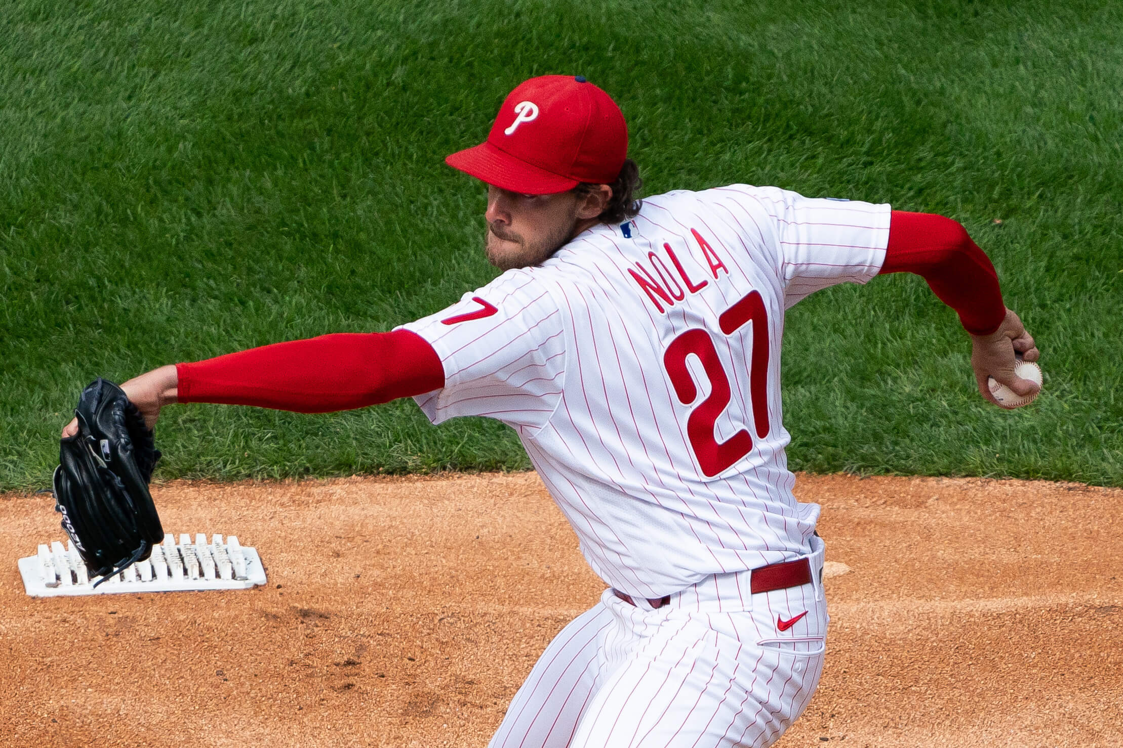
The strange saga of Aaron Nola’s red cap has just gotten even stranger.
In case you missed it when I first wrote about it three weeks ago (or just need to refresh your memory): For nearly the first two months of the season, Nola’s red cap — the one the Phillies wear for home night games and all road games — did not have the New Era logo, which has been standard on all MLB caps since 2017. His other caps this season (the blue cap worn for home afternoon games, and the various holiday caps) all had the logo, and all of his caps, including the red one, had the logo in 2020, 2019, 2018, and 2017 — but not the red cap he was wearing this season. Lots of players are superstitious about their headwear, so it’s not surprising that Nola might have been wearing the same red cap all season long — but why would the Phillies have issued him a cap that was at least five years old?
The streak finally ended on May 26, when Nola wore a red cap with the New Era logo. I was going to contact the Phillies at that point to ask about all of this, but I decided to wait and see what Nola did in his next start. That was on June 1 — and sure enough, he wore the logo. At that point it seemed apparent that the no-logo cap had been retired, so I contacted the Phils, spelled out the whole situation, and asked if they could explain what was going on.
I did not receive a response. That didn’t surprise me — on the scale of geeky media inquiries, asking about the maker’s mark on a pitcher’s cap ranks pretty high. Whaddaya gonna do.
I figured I’d follow up with the Phils at a later date, but I stopped paying attention to each of Nola’s starts — which, as it turns out, was a big mistake. Fortunately, Uni Watch reader Kyle Mackie was on the case.
Mackie was intrigued by my original blog post about Nola’s cap and had been anxiously awaiting to hear more. “Did you ever get an update/answer on Aaron Nola?” he asked me yesterday. “I think about it almost daily and want to make sure I didn’t miss anything.”
Before I could respond, Mackie looked up photos of Nola’s recent starts on Getty Images and discovered something surprising: During Nola’s start on June 8 — the first of his starts that I didn’t pay attention to — his cap had the New Era logo in the first inning but didn’t have it in the third inning!
I wanted to know more, so I looked up the game video. Nola lasted only five innings in that game, and here’s how his cap appeared in those five frames (click to enlarge):
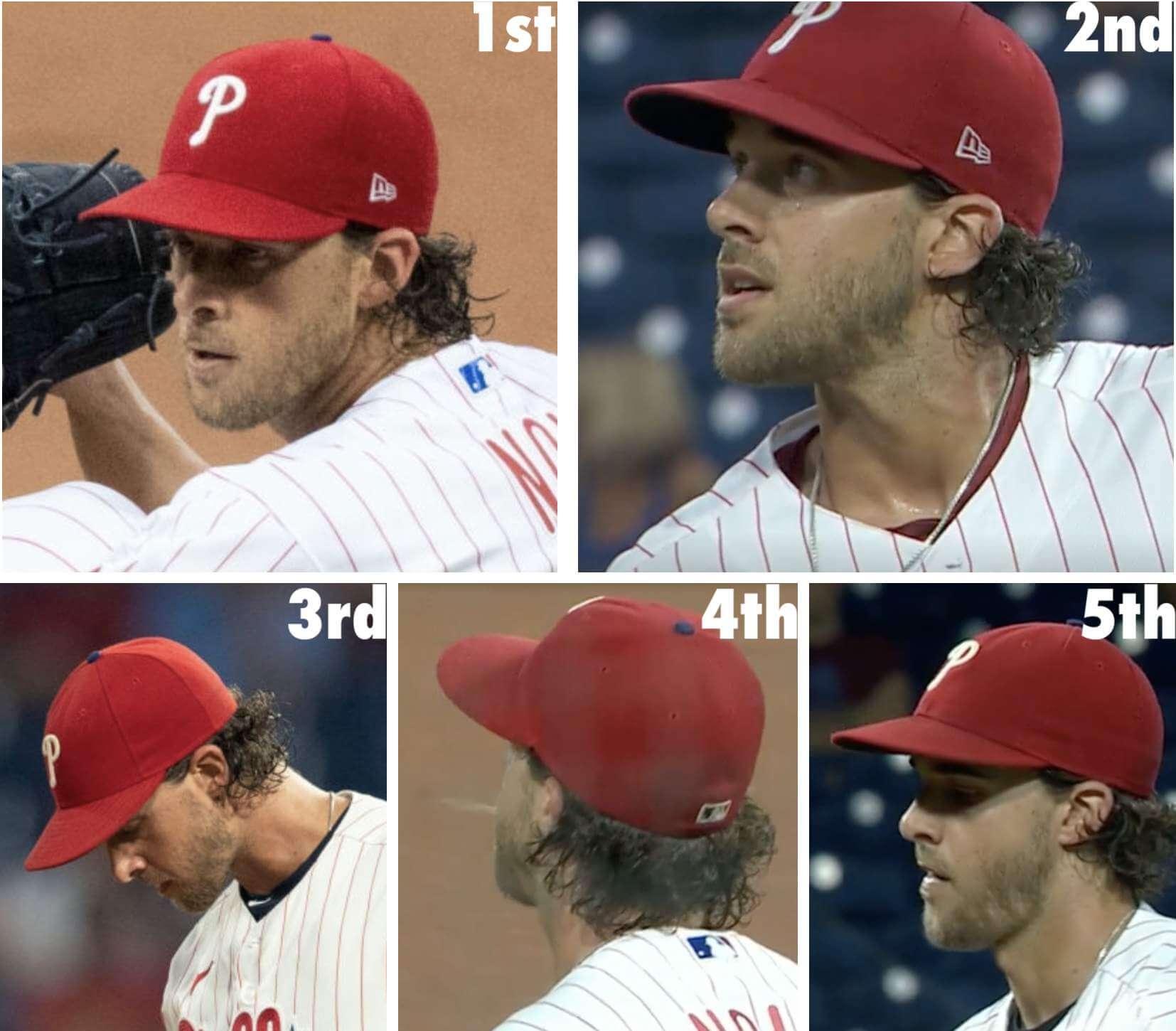
Given MLB’s dominant storyline at the moment, I’m sure many of you are thinking that this all has something to do with Nola keeping a foreign substance on his cap. And sure, that might be the case — or it might not. Let’s please not jump to conclusions.
Nola has had one start since that June 8 outing. That was this past Sunday — an afternoon home game, so he wore the blue, logo-clad cap. Pfeh — we can’t learn anything from that.
Nola’s next start is likely to be this weekend in San Francisco. Here’s hoping it’s on Saturday, when the Phils will be wearing their standard red caps (as opposed to Sunday, when they’ll wear the Father’s Day caps). I’ll definitely be watching.
Meanwhile, here’s a thought: If Nola pulled a cap switcheroo on June 8, who’s to say he didn’t also do it during his other starts? I’ve been checking on his individual games, not his individual innings. Hmmmmmm.
(Big thanks to Kyle Mackie, who deserves all the credit for today’s post.)
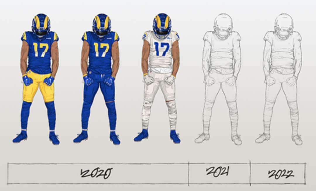
Rams alternate uni update: We’ve known for a while now that the Rams were planning to add an alternate uniform this year (and, based on the graphic shown above, another one next year). Yesterday Rams COO Kevin Demoff told The Athletic that the new uni would be unveiled at some point in July, and he cited an interesting reason for the timing:
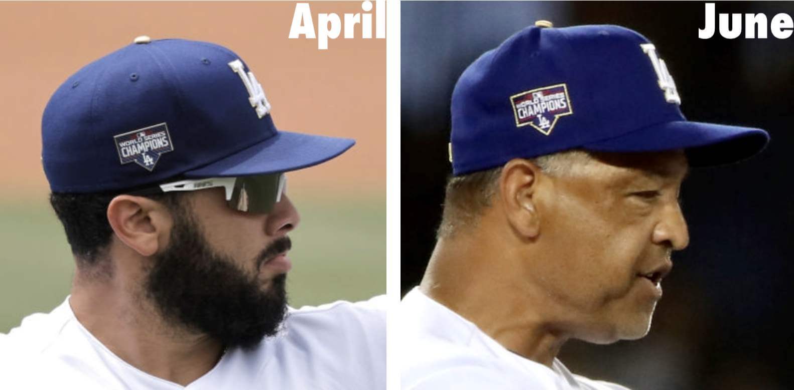
There’s gold in them thar uniforms: Yesterday was the first time this season that the Dodgers were able to have a full-capacity crowd in their ballpark, so they called it ReOpening Day and broke out the gold-trimmed championship uniforms that they originally wore back in April. But eagle-eyed Uni Watch reader Jeff Long spotted one difference in the uniforms (click to enlarge):
Click to enlarge
ITEM! Pint glass update: Thanks for all the feedback yesterday about the Uni Watch pint glass. The response on the blog, and also on Twitter, was overwhelmingly positive, so I’m gonna go ahead with it despite the slightly imperfect print quality. (If you missed my explanation about that, look here.)
The glass is available here. My thanks, as always, for your consideration of our products.
Click to enlarge
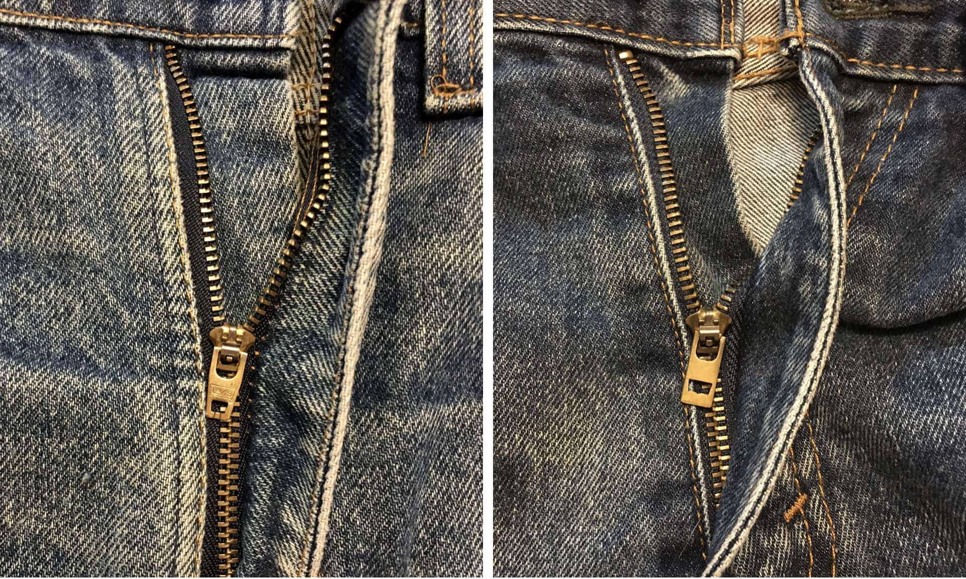
Another classically inconspicuous detail: I’ve been wearing Levi’s jeans almost every day for most of my adult life. I almost always buy them used/thrifted/vintage, so if Levi’s makes a small design change — an alteration to the tagging, say, or a change in the pockets’ depth — I’m usually not aware of it until a few years after the fact, when the design change filters its way down into the used/vintage inventory.
I’ve recently become aware of one such design change, and it’s freaking me out a bit. Here’s the deal: For years and years, the pull tabs for the Levi’s zippers had a tapered tip (above left). But at some point semi-recently-ish, they changed to a rectangular pull tab (above right). Again, I’m not sure exactly when this change happened — I only discovered it when I bought myself a pair of used jeans about two weeks ago, so it’s a new thing for me, even though Levi’s probably introduced it a few years ago.
And let me tell you, it feels so different. Every time I zip or unzip these jeans — mostly, you know, in the bathroom — the zipper tab feels gigantic compared to the old zippers that I’m used to. It doesn’t feel bad, but it definitely feels weird and unfamiliar. At first I actually thought, “Oh, someone must have replaced the zipper on these jeans!” Then I saw that the zipper has the little cutout shaped like the Levi’s logo, and I later confirmed that they’re using the rectangular tab for new Levi’s these days. So this is just how Levi’s zippers are now, and I guess eventually all my jeans will have zippers like this one, as I cycle through older pairs of jeans and acquire new (used) ones.
Much like the caps on soda bottles that I recently wrote about, this is another case of a very small physical interaction — pulling on a zipper tab — whose nuances I’ve internalized to a much greater degree than I realized, or would even have thought possible. Interesting!
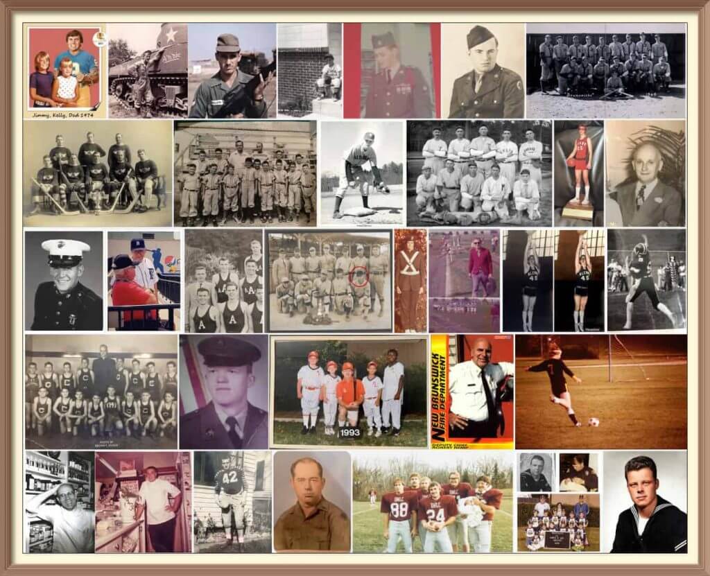
Father’s Day reminder: Phil here. Sunday is Father’s Day, and I’ll once again be posting photos of Uni Watch readers’ “Dads in Uniform,” an annual tradition that began in 2013. This is always a very special day on the site, and I’d love for as many readers as possible to participate — especially those of you who haven’t done so before. A few of you have reached out to me saying “I’ve run out of photos of my Dad,” so if you want to resubmit a photo that we’ve used before, please feel free to do so!
To take part in this annual tradition, select one photo of your father (or grandfather or uncle) in uniform (it can be sports, military, work — as long as it’s a uniform) along with a short description of 100 words or fewer. Then email your description along with the photo — again, only one, please — to me by this Thursday, June 17, midnight Eastern. I’ll run all of the submissions this Sunday. Thanks!
By Lloyd Alaban

Baseball News: Tigers P Casey Mize changed gloves between the 1st and 2nd innings from darker to lighter (from Mark Kunz). … Here are Little League’s Baseball and Softball World Series unis (from our own Phil Hecken). … Really fun story on Red Sox P Rob Murphy’s unusual 1990 trading card, which showed Murphy sitting down with an early laptop computer (from our own Brinke Guthrie).

Football News: The latest creation from the great Paper Stadiums is a paper model of the Rose Bowl (from Kary Klismet). … UL-Lafayette’s stadium is getting a new advertised name (from Timmy Donahue).


Hockey News: New advertised name for the Jets’ arena (from Wade Heidt). … Also from Wade: The Canucks have released a shortlist for the names of their new AHL affiliate in Abbotsford.
Basketball News: WNBA teams are wearing Juneteenth-related warm-up shirts starting today (from our own Jamie Rathjen). … New unis for Emporia State (from Robert J. Osvak).

Soccer News: The new U.S. shirts mentioned in Monday’s Ticker are coming out today (from our own Jamie Rathjen). … New advertised name for the Columbus Crew’s stadium (from Timmy Donahue). … New home shirt for Brazilian side Corinthians (from Ed Zelaski). … Also from Ed: Third-tier English side Shrewsbury Town has inked a new four-year kit deal with Umbro.

Grab Bag: Here’s an analysis of boots worn by Australian rugby league players (from @LeagueEyeTest). … Police officers in Hopewell Township, N.J., can now wear Pride patches (from Timmy Donahue). … This looks painful: Lego and Adidas have teamed up to introduce a shoe made of Legos. … The city of Reno is building a new home for the Reno Rodeo (from Kary Klismet).
Tomorrow: The return of the Unified podcast! See you then. — Paul

Paul you’re gonna love this one. Cristiano Ronaldo moved Coca Cola bottles away from himself during a press conference at Euro 2020 and advocated for drinking water. Coke share prices subsequently fell (a drop in the bucket for them really)
link
I absolutely loved this move. If we should have learned any lesson during the pandemic it is how important healthy lifestyle choices (like exercise, what we eat and drink) are to your immune system.
Glad to see someone so prominent actively advocate for drinking water instead of shilling for an incredibly unhealthy product.
I may be the wrong person to condemn soft drink companies because I do enjoy me quite a bit of Diet Pepsi and the various sugar free Coke products lol
Then again I also do stuff like ride 100 miles in 5hrs on my bike like I did this past weekend, so it kind of balances out!
Coke is not “incredibly unhealthy” any more than gasoline is bad for your car. It’s simply sugar, which is the basic fuel of most biological life. Whether it’s good for you or not depends on the quantity you ingest. It’s no different than the choice between filling your car’s tank with gas and then stopping (good) and filling your car’s tank and then continuing to fill the cabin with gasoline as well (bad).
Thank you, Daniel. I’ll hit you up on Venmo like we discussed. -JQ
Paul Pogba of France did a similar move, removing a Heineken bottle off the podium, during his post game media availability.
Can’t wait to enjoy a porch cocktail when my pint glass comes in!
Just when I’d stopped using pint glasses entirely. Even switched the pint glass in my Boston shaker setup for a second metal cup.
A lidded stein, though, that’s UW belogoed glassware I’d be all over!
Getty link for first inning of 06/08 game brings up a picture from 06/01.
My bad. Proper link (June 8, 1st inning, New Era logo clearly visible) now swapped in. Here, so you don’t have to scroll back up:
link
Two things for you, Paul.
The Giants/Phillies series this weekend is streaming on NBC’s Peacock service exclusively, so that’s where you can look in on Aaron Nola’s next start.
Second, two pint glasses ordered! I look forward to sharing my first pint of Guinness from them!
About Nola’s caps, comparing the pictures of the two caps, it looks like there is a difference in the construction of them. The old one seemingly has a lower crown than the current one. Is this a low crown cap, or has New Era changed the shape a bit?
It’s interesting to see in that paper Rose Bowl stadium video he has football field templates from both the 1997 Rose Bowl And Super Bowl XXVII… Incredible work!
Hi Paul,
When a team like Emporia State just outright jacks a pro team’s uniform (all 3 are clearly based on the Nets’ designs) does Adidas have to pay a fee of some sort to Nike?
Yes, I do realize that design was actually created by Adidas years back, but what are the ground rules here? Might be an interesting premise (college uniforms that clearly copy pro uniforms) for an upcoming piece.
Just curious.
Honestly, I have no idea what the IP logistics are like for a situation like that. Sorry.
Re Levi’s zippers, what zipper is on the Sticky Fingers cover? Assuming those are Levis? Paul’s pics immediately reminded me of that cover art.
As I was scrolling down the page, I initially thought Paul was writing about Sticky Fingers.
The Sticky Fingers zipper pull is straight with 90 degree corners, and doesn’t have Levi’s branding.
My comment was meant to be tongue-in-cheek, but I’m loving the UniWatch-esque analysis!
In that article about the Jets’ arena name is this:
“As part of the deal, the Bell logo will remain on the Winnipeg Jets’ helmets for the next five seasons”
So much for this being a one year helmet deal in the NHL.
I was just about to post and ask this. Seems like a severely buried lede, at least on this site. I was wondering if I missed a post along the way and this was old news to Paul. Douchebags (the Jets/Bell/NHL/etc.)
I didn’t read the whole article and didn’t see that note.
Bettman had already said several months ago that the helmet ads would probably be retained beyond this season, so it’s not really a surprise. But this is the first instance (at least that I’m aware of) of a team confirming their future helmet ad plans.
Good to hear this, let’s hope that the sponsorship opportunities remain in hockey and make their way into the NFL and MLB.
My bet is that Aaron Nola is the proud owner of a Uni Watch seam ripper.
I still haven’t gotten my confidence up to removing the New Era logo with a seam ripper – the time I tried it, I absolutely shredded the cap – but if I were a big leaguer, I would absolutely pay some teenager every year to take a box of caps in my size and de-structure them with tweezers and scissors. Takes about 20 minutes per cap, and I just cannot wear a 59Fifty without first removing the plastic backing that makes the front panels stick up like a billboard. Even low-crown 59Fifty caps are more comfortable for me destructured.
Re: Jeans/Denim
I recently looked on the Levi’s site for new jeans and almost all of their options now include Elastane. I hate that material very much and prefer rigid, 100% cotton. I ended up buying another pair of Naked & Famous jeans, my favorite denim brand.
Have you ever gone down the raw denim rabbit hole? Wearing in and developing fade patterns, appreciating different Japanese shuttle methods, different dyes, different weights… it’s all pretty fascinating stuff.
One additional vote for Naked & Famous—I actually just bought another pair of their duck canvas jeans this morning.
Johnny, like you mentioned above, my interest in denim and my interest in uniforms comes from the same place—the details, the way it changes over time, and the timelessness of it are really interesting to me. It’s a bit tangential, but might be an interesting thing to cover on Uni-Watch some day.
“And let me tell you, it feels so different”
“Every time I zip or unzip these jeans — mostly, you know, in the bathroom”
“feels gigantic”
“It doesn’t feel bad, but it definitely feels weird and unfamiliar”
– Folks, I think Paul might finally have reached puberty.
LOL.
Interesting that the NFL doesn’t see the need to have new uni’s at the draft. I guess all the hype is all about the hats at the draft?
Re: Little League World Series uniforms.
So, I guess the regional names are no longer part of the uniforms? No mention of Northeast, Asia-Pacific, Canada, Caribbean, Mexico, Southwest, etc.? All you see is LITTLE LEAGUE on the fronts of the jerseys.
Little League may as well start plastering even bigger corporate logos on its uniforms, gloves, bats, pants, etc.
These may not be the final versions- still add the region names.
But if they don’t add the region names, it might be because no international teams are playing this year, and instead, the top two teams from each US region will go. So this may be a one-year thin
The article stated that all participating teams are solely from the United States.
“Little League” on the front is a one year thing. With two teams per region the teams will be referred to by their state names as opposed to the region names.
The new name of the UL-Lafayette stadium raised my eyebrows. Though it seems “Our Lady of Lourdes” is the name of a major regional medical center, it strikes me as very odd to have a state-owned stadium at a state university bearing an overtly religious name.
I don’t know if it’s been noted here yet. I am watching the Italy-Switzerland match and I saw for the first time that the number and NOB font for the Swiss unis is Helvetica. Not only that, the NOBs are in all lowercase. That is absolutely perfect.
Yes. I noted this in Sunday’s ticker.
Great. Now I’m going to notice all my pants zippers from here on out.
The 49ers State of the Franchise will be Wednesday June 30th. The last two times the did an alternate uniform was 2015 with the black alternate and that was on Draft Day that year. The 56/94 throwbacks were at the State of the Franchise on May 23, 2018 (had to look at my photos from the night). So unless this a new NFL rule I think we will see the red 56/94 throwbacks in two weeks.