For all photos, click to enlarge
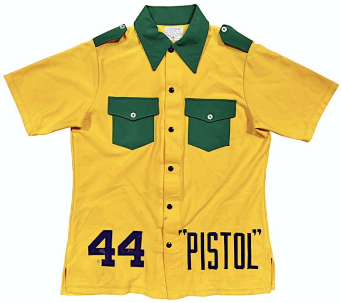
As you may have noticed in the left-hand sidebar, our friends at Grey Flannel Auctions have another catalog auction in progress, so today we’re going to look at some of the more interesting items, beginning with this absolutely ridonkulous mid-1970s New Orleans Jazz warm-up top. Have you ever seen anything so wonderfully absurd? I mean, what the hell was the player supposed to keep in those pockets? It looks like a misguided Boy Scouts uniform or something. What a doozie!
Here are some of the other items that caught my eye:
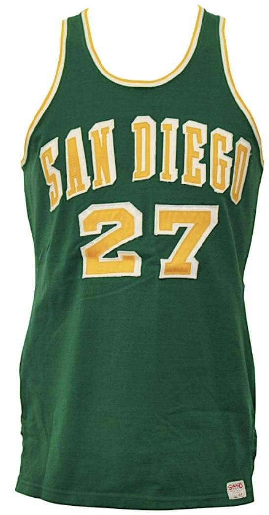
• I love the Uni Watch colors on this late-1960s
San Diego Rockets jersey, but check out the oddly inconsistent block-shadowing on both the front and back typography.
• It’s always fun to see old Kentucky Colonels jerseys, because they were among the very few teams to include lowercase lettering on their NOBs. Some gamers are available here and here, plus there’s a really nice set of warm-up gear, complete with the team’s championship patch, here.
• There are a million game-used Michael Jordan jerseys floating around about there. But this one is different, because it’s from a charity game arranged by Larry Bird.
• Interesting to see a Kareem Abdul-Jabbar Lakers jersey that doesn’t have the hyphen on the NOB. But sure enough, he sometimes wore it that way on the court.
• Speaking of NOB peculiarities: Some people hate the use of first initials on NOBs, while others are okay with it. But I hope we can all agree that if you’re going to include the initial and a period, you must include a space in between the period and the surname — unlike, say, the situation on this Andruw Jones jersey. I hate that!
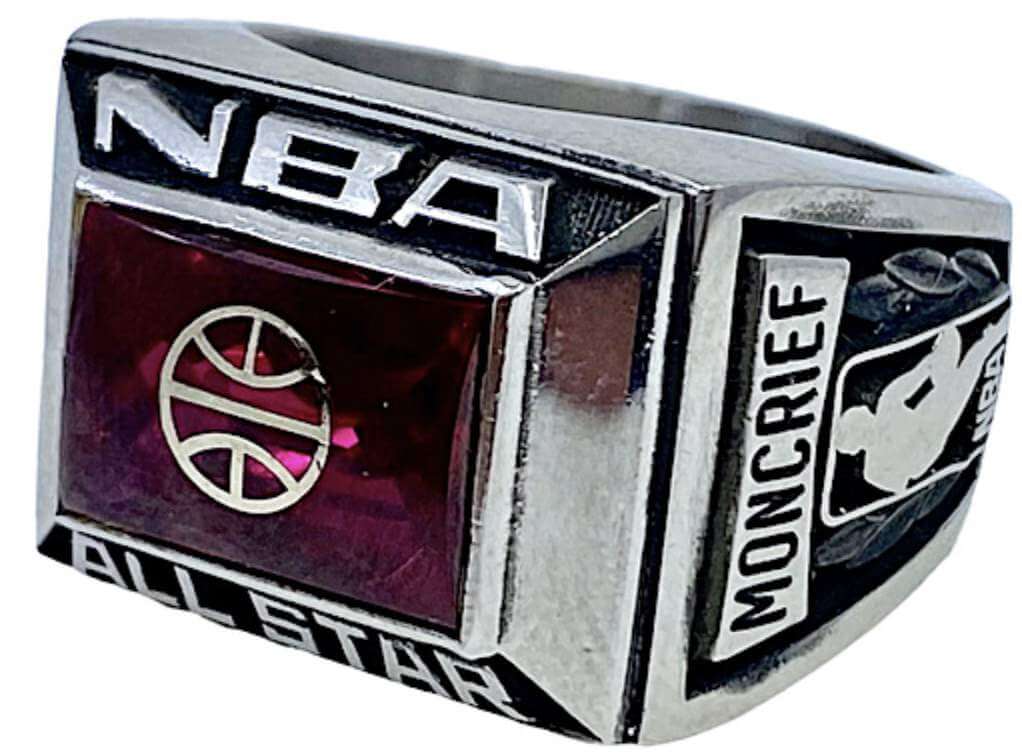
• Did you know NBA All-Stars receive rings? I didn’t! Here’s one from 1984 (shown at left) and from 1952.
• Speaking of rings, here’s a really nice Mets ring that was apparently given to office staffers in the pre-Miracle 1960s. Shea on one side, Mr. Met on the other!
• What’s better than a barber pole-striped 1992 NHL All-Star Game jersey? A barber pole-striped jersey that was worn by Wayne Gretzky!
• Not sure I’ve ever seen these up for sale before: two of Bear Bryant’s famous hats.
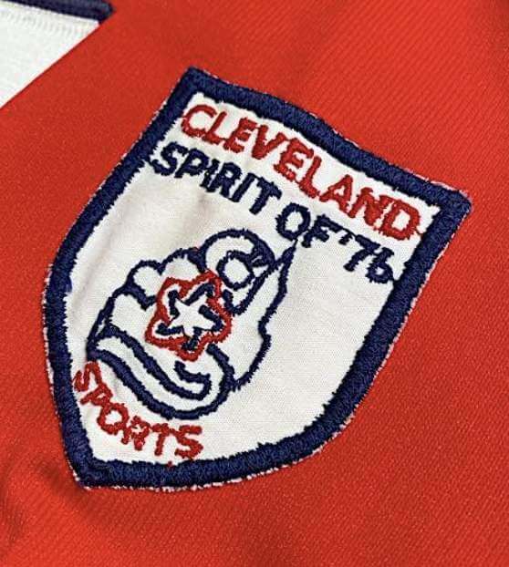
• This Frank Robinson jersey, from the period when he was managing in Cleveland, includes the rarely seen “Cleveland Spirit of ’76” sleeve patch (shown at right).
• Here’s a 1959-60 Philadelphia Warriors jersey. Definitely not a well-known design!
———
Want you see more? You can browse through the entire auction catalog here.
Click to enlarge
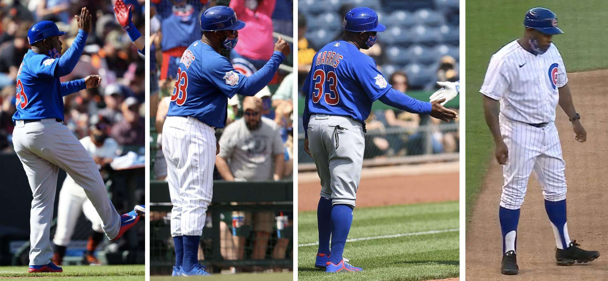
Cubbie coach: MLB coaches don’t tend to vary up their uni stylings. But Cubs third base coach Willie Harris has sported at least four different pant/sock formats so far this season. He leads in the league in coaching uni variety!
(My thanks to Ron Roza for pointing out Harris’s stirrups, which in turn led me down the Harris rabbit hole.)
Click to enlarge
Collector’s Corner
By Brinke Guthrie
Follow @brinkeguthrie
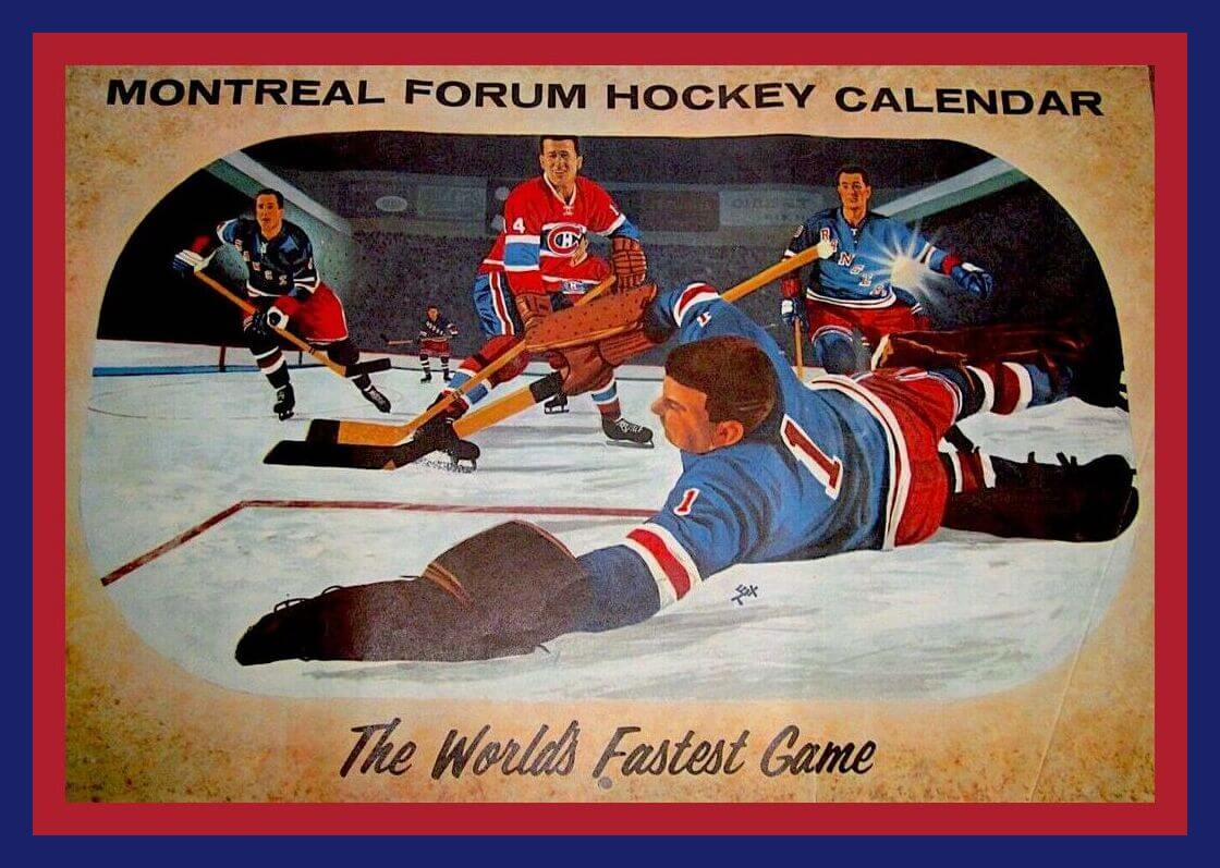
Let’s go back to the 1962-63 season for this Montreal (Canadiens) Forum Hockey Calendar. Some terrific artwork on this one! Also have one here for the 1964-65 season.
Now for the rest of this week’s picks:
• What a great hockey promotion for McDonalds back in 2003 with this set of six NHL Trophies (including the Stanley Cup, of course). Look how detailed these are! You also get a display stand and 32 gumball goalie helmets.
• J-E-T-S Jets Jets Jets! Check out this set of four unopened New York Jets book covers — just 59 cents! Well, that’s what they went for in 1971, anyway.
• This 1950s Green Bay Packers beer stein is in great shape.
• How about this 1930s New York Yankees fountain pen and pencil set?
• Here’s a nice-looking NHL hockey puck lamp of indeterminate vintage.
• This Pittsburgh Penguins Lucite hockey puck is from the 1972-73 season and says, “Many Thanks.” Maybe it was given away at the last home game for a fan-appreciation promotion.
• Isn’t the spacing on this 1970s-80s Felco Cincinnati Reds jacket just a bit off?
• Detroit Red Wings fans, how ’bout this cute DIY/handmade needlepoint keychain?
• This Atlanta Falcons poster is part of the 1968 NFL Collector’s Series. Says so right there on the bottom!
• Gonna go out on a limb here and say this “Pgh. Steelers Super Bowl Champs” coffee mug was unlicensed.
And now a few words from Phil: Phil here. Sunday is Father’s Day, and I’ll once again be posting photos of Uni Watch readers’ “Dads in Uniform,” an annual tradition that began in 2013. This is always a very special day on the site, and I’d love for as many readers as possible to participate — especially those of you who haven’t done so before. A few of you have reached out to me saying “I’ve run out of photos of my Dad,” so if you want to resubmit a photo that we’ve used before, please feel free to do so!
To take part in this annual tradition, select one photo of your father (or grandfather or uncle) in uniform (it can be sports, military, work — as long as it’s a uniform) along with a short description of 100 words or fewer. Then email your description along with the photo — again, only one, please — to me by by this Thursday, June 17, midnight Eastern. I’ll run all of the submissions this Sunday. Thanks!
Click to enlarge
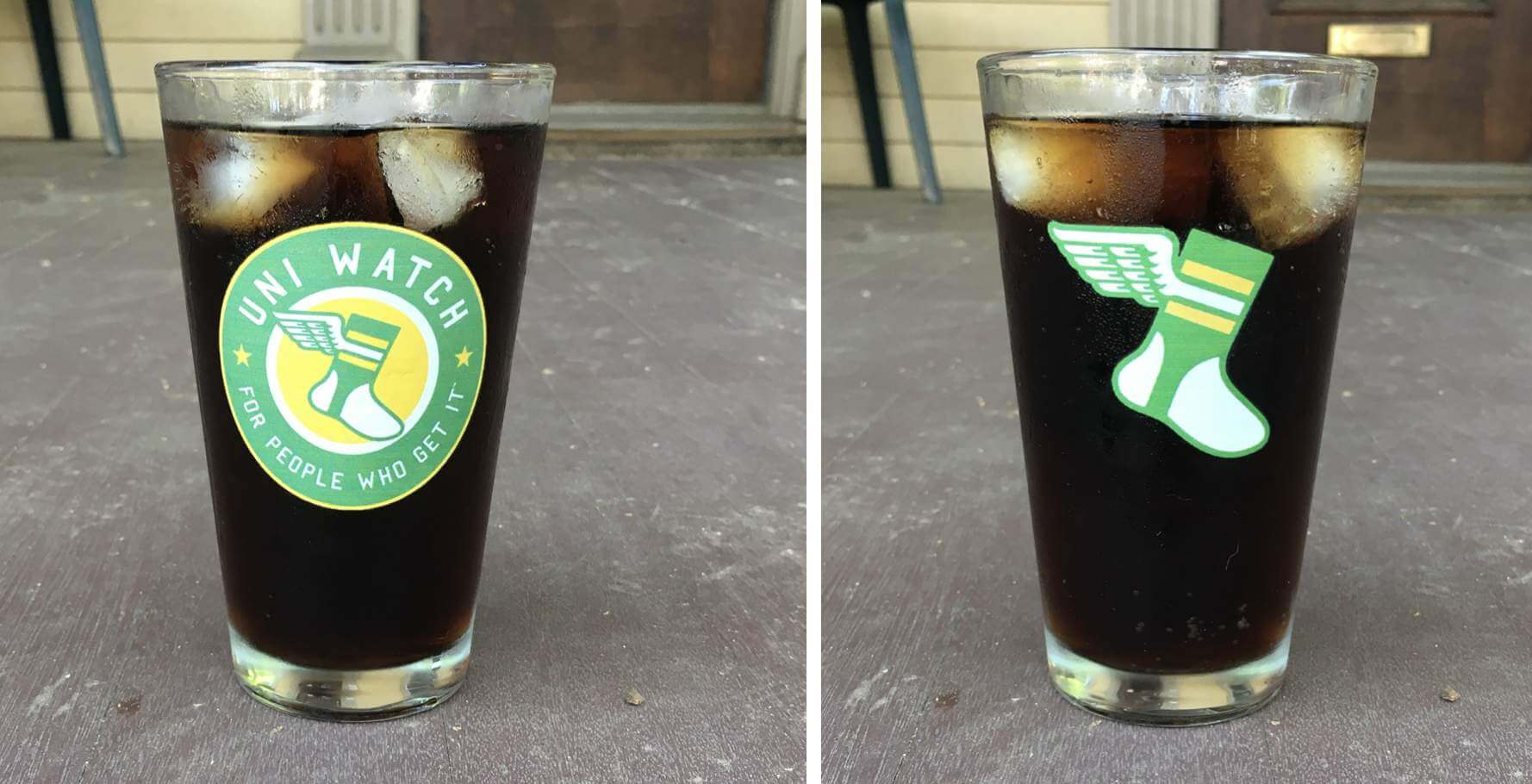
ITEM! Possible new product: For years I’ve wanted to offer Uni Watch pint glasses. Two things have kept me from doing that: First, most places that offer custom glasses have fairly large minimum orders. And second, I really didn’t want to deal with stocking and shipping lots of fragile glassware.
So I was excited when Teespring recently told me that they were adding pint glasses to their print-on-demand product line. It seemed to solve both of the problems — the on-demand aspect would eliminate the need for minimum quantities, and Teespring would handle the fulfillment.
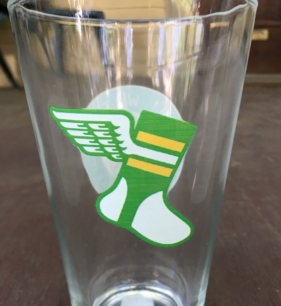
So I created myself a sample glass with our round logo on one side and the winged stirrup on the other. As you can see above, it looks good. But here’s the thing: If you look closely, you can see faint little horizontal white lines running through the logos, sort of like what you’d get with an inkjet printer. That’s because Teespring is digitally printing the logos, not screening them. Here’s what I mean:
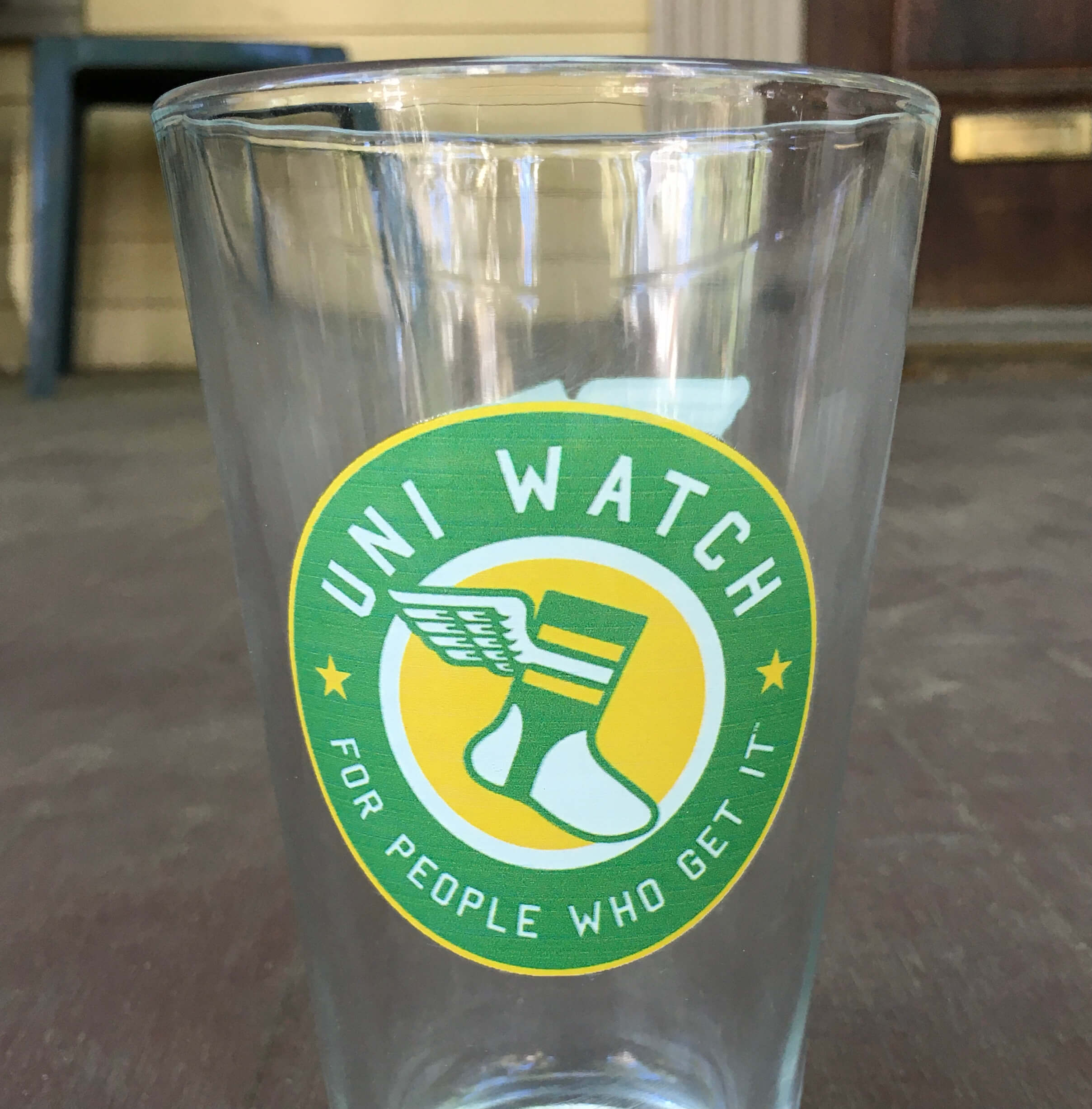
I was hoping this might be a glitch, so I talked to my Teespring rep, who arranged to send me a new sample — same thing. So this appears to be the nature of the beast.
On the one hand, it’s not terrible. You have to hold the glass really close to your face to see the little lines, and the lines are less discernible if there’s liquid in the glass. Honestly, it looks worse in those photos than it does in real life.
On the other hand, it’s definitely not Perfect, and I want to be as transparent as possible with you folks regarding the product quality. What do you think — would you be interested in this glass, even with the digital printing? (The price would likely be $18-ish.) Thanks in advance for your feedback.
(As an aside: I’m trying to keep life as simple as possible these days, so I’m not really interested in finding another source for the pint glasses. For now, it’s Teespring or nothing. Thanks for understanding.)


ITEM! New raffle: It’s been a few weeks since we raffled off a membership card, but reader James Flagg has generously donated one for me to give away, so that’s what we’re going to do today.
This will be a one-day raffle. No entry restrictions. To enter, send an email to the raffle in-box by 8pm Eastern tonight. I’ll announce the winner tomorrow. Thanks to James for sponsoring this one!
Click to enlarge
Cap update: We’ve sold so many Uni Watch caps over the past four days that we’ve run out of shipping boxes! We have more boxes on the way, but orders placed over the next few days may not ship out until this weekend or next Monday. Thanks in advance for your patience.
Here’s what we have left, broken down by size:
7: 1 cap
7-1/8: 1
7-1/4: 6
7-3/8: 4
7-1/2: Sold Out
7-5/8: Sold out
7-3/4: 6
7-7/8: 6
8: 2
Adjustable: Sold out
Once they’re gone, they’re gone! So if you want one (or more than one), get your order in now.
The Ticker
By Alex Hider

Baseball News: Beginning tomorrow, the Phillies will start wearing their red spring/BP jerseys sporadically on the road. Players, including OF Bryce Harper, have been lobbying to wear them in games (from Matt Breen and Joe Mays). … Lots of player/team logo errors with this graphic that aired on MLB Network yesterday (from Dave Holz). … Speaking of graphics, SNY used a logo the Angels haven’t used since 2004 in a graphic yesterday (from Jake Elman). … MLB yesterday formally unveiled this year’s Independence Day caps, although friend of the site Chris Creamer had the scoop on that a few weeks ago (thanks to all who shared). … Subscriber exclusive: Cleveland.com examines some of the difficulties Cleveland’s baseball team faces in renaming the club (from Pete Gill). … The Altoona Curve, the Pirates’ Double-A affiliate, will play as the Altoona Brookies from June 25-27 in a fishing-themed promotion (from Matthew Lourdeau). … The Somerset Patriots, the Yankees’ Double-A affiliate, had a recent BBQ apron giveaway ahead of Father’s Day (from John Cerone). … The new Oconomowoc, Wis., team in the independent American Association in will be called the Lake Country DockHounds and will play in a new ballpark slated for completion in 2022 (from Kary Klismet). … Notre Dame wore white as the visiting team during a NCAA tournament game last night. Mississippi State wore red as the home team (from Chris Mycoskie). … Gwinnett County in Georgia is named after Button Gwinnett, one of the signers of the Declaration of Independence. So on July 9, the Triple-A Gwinnett Stripers will wear jerseys featuring his signature as the chest insignia.

Football News: A Vikings blog has ranked the team’s various uniforms through the years (from Kary Klismet). … Although the Falcons have not officially retired No. 10 for former QB Steve Bartkowski, they recently blocked WR Russell Gage from wearing it. … Georgia Tech appears to have added an “ATL” logo to its front helmet bumper (from @TheLumberJacket).

Hockey News: Niagara Falls was lit up in Canadiens colors on Sunday night in honor of the team’s postseason run (from Wade Heidt). … Looks like Memorial Healthcare may have poached their 100th-anniversary logo from the NHL’s 100th-anniversary patch, which all teams wore in 2017 (from @Nas_160).

Basketball News: According to this blog post, the Knicks played their best basketball in 2020-21 in their white “Association” uniforms (from Phil). … New jerseys for both Japan and the Philippines. The teams will wear those during the FIBA Asia Cup (from Jeremy Brahm and @marcomanipon). … Mountain View High School in Virginia — a school that was formerly known as Stonewall Jackson High School — has a new midcourt logo to match the school’s new name (from Kary Klismet).

Soccer News: Costa Rica has a new dark blue 100th-anniversary shirt. Jamie Rathjen notes that the women’s team debuted the kit Sunday and that the men’s team will wear it first next month at the Gold Cup. … Also from Jamie: Here’s next season’s Premier League ball. … The next three items are from Kary Klismet: The Crew have unveiled their championship rings from their MLS title last season. … FC Tulsa of the USL Championship has unveiled a new jersey featuring design elements inspired by a mural project at a local public middle school. … MLS expansion club St. Louis City SC has released new renderings of its planned stadium. … New kit outfitter for top-level Spanish club Cádiz, which is switching from Adidas to Macron next year (from Jonathan Sluss). … New home and away uniforms for Czech First League club AC Sparta Prague (from Ed Żelaski). … Mike Pendleton notes that Fox Sports used three different scorebug styles in a 24-hour span during Copa América coverage. …

Olympics News: Great Britain has unveiled their opening and closing ceremony uniforms (from Phil).
.

Grab Bag: Ever wonder where mascot costumes are made? Many of them are created by a small business in Marion, Ohio (from Kary Klismet). … Prada is selling a $995 volleyball for some reason (from @bryanwdc). … The next three items are from Timmy Donahue: The Air Force has officially added camouflage ballcaps and green coveralls to its uniform (also from Sean Gierke). … New badge design for the Laredo Police Department in Texas. … The Manly Warringah Sea Eagles of Australia’s National Rugby League have a new stadium advertiser. … The PRO14 — an annual rugby union competition involving professional sides from Ireland, Italy, Scotland, South Africa, and Wales — will now be known as the United Rugby Championship.
Petition to have the Angels start using that logo again though
Possible missing word:
“…I really didn’t to deal with stocking and shipping lots of fragile glassware.”
Thanks! Fixed.
I’d order a pint glass or three
The last two FOX score bugs look pretty much the same style to me.
Hate that the Phillies are succumbing to player lobbying and wearing softball shirts for some games. They are one of the few teams never to have done so, always playing in traditional baseball style uniforms.
Not true! Phils had red alternate jersey just a few years ago:
link
Never on the road, though. A shame that the perfect gray jerseys and pants that have been part of the Phillies wardrobe will be ruined by a softball top.
“FORMALLY unveiled…”, not “FORMERLY unveiled” regarding the Independence (and Canada) Day MLB caps.
Kee-reck.
Is there really a market for $42 umpire S&S caps?
Yes… I’m not much of a cap guy but I had to really talk myself out of that one. They don’t always sell the umpire caps and I’m an umpire with a light gear addiction so that speaks my language.
might not a big market for it.. but got to admit its not a bad design
$42 umpire S&S caps
They can’t use that price. They retired 42…but I’m sure they’ll soon start charging that much for *everything* each mid-April.
Suggestion, since the white lines might not show up on white: what if you just do a one-color white print on the pint glasses? Your two logos would be easy enough to convert to one-color.
Disappointed that the Phils are adding BP tops to their away-game wear. Always liked that they resisted doing so and remained traditional…those road jerseys are superb.
Red-over-gray won’t be a terrible look, but I would love to see them go Pete Rose ’79 ASG (maroon over powder blue) sometime.
Phillies were one of the few teams that didn’t succumb to pullover jerseys and elastic waistband pants in the 1970s. So much for sticking with tradition.
Diacritical marks in NOBs alert: I spotted a macron (a long vowel mark) on the NOB of Yoshinori Sato (that is, Satō), who used to play for the Orix Blue Wave, on link.
It’s very rare to see this in Japanese baseball, because one of the most prominent players who should have one, and who was the game’s biggest star when NOBs first became popular, was Sadaharu Oh, who spelled his name “Oh” rather than “Ō” (which would have meant a single digit topped by a single letter on his back). Thanks to him, long o sounds are almost always written without the macron or as “oh” in NOBs.
Good spot. Never seen that before.
I like those pint glasses. I’d buy one. The printing lines don’t bother me much.
I know that you are not looking for a different supplier…with that being said I would totally buy a Uni Watch silipint glass (link). On the glass option, I would be less inclined with the lower quality to spend $18 on a pint glass. Uni-Watch represents a high bar of quality to me.
Agreed, Dustin!
In my younger days I used to borrow without the intention of returning pint glasses from some establishments, because I was broke and I loved logo’d pint glasses.
Long story short…for 18-20 bucks I def would order one of those pint glasses if you started selling them.
I know not of this technique of “borrowing” pint glasses or glass pitchers from bars, especially during my college days, when I surely never did that at least once a week or so. :-)
A lot of beer snobs turn their nose up at the shaker pint style glass (that’s the name of the style posted). It’s really one of the worst shapes to drink out of for craft beer. Does Teespring off any other styles? If they offer something like a Willi Becher glass, I’d buy one. They’re not nearly as pretentious as some of the other popular styles (e.g. Teku or other stemmed glasses) but still offer a nice way to drink.
This is the only style they currently offer.
That’s unfortunate. But I completely understand not wanting to deal with another supplier and all the hassles that could bring.
Honest question: why is that style of glass a bad or worse way to drink?
TIm, as Joe W notes, it is a beer snob thing. Supposedly the shape of the glass is relevant for getting the aroma of different types of beer to you quicker than other types.
As a craft beer fan myself I’ll say I dont think it does much of anything, and in my experience is not noticeable. The freshness (when applicable) and whether it is draft or not have far more to do with the flavor than the glass.
If anything the different glass types are just helpful at bars for pouring the correct size, given the wide range of ABVs in craft beers, a smaller tulip glass, or something similar is appropriate for serving a really strong beer as compared to a standard pint glass.
Honest question: why is a shaker pint style glass one of the worst shapes to drink from?
It’s not.
It’s perfectly fine.
CD’s and cassettes are okay too. You don’t have to go vinyl.
Nobody’s idea is better than your own.
Unless you’re mean.
I enjoy a good craft beer (or several, or even a cheap beer or three, for that matter!), and I have always liked the appearance of the shaker style glasses, witnessed by my sizable collection. Much to my wife’s chagrin, I would add one of these to my collection, even if the print is not quite perfect. But from the beer enthusiast side of things, could you please give a quick primer on the better styles of glasses to drink from?
IMO the shape of the glass makes no difference, but supposedly you use the standard (shaker) pint or the slightly different version you see with guinness for porters, stouts, and ales. The stemmed variety of glasses (tulip, goblets) for IPAs or belgians. Lagers would be in your mugged types glasses. And things like wheat beers, pilsners, and other light beers in the taller, thinner glasses.
Sours go directly down the drain.
Not true. Apparently in 1992 they wore the red batting practice jerseys with the grey pants in some road games according to the Phillies radio broadcast.
I’m holding out for a schooner/goblet glass.
You guys haven’t lived until you enjoy an Iron Maiden Trooper IPA from an Eddie tankard stein.
file:///storage/emulated/0/Download/61b2P60NpEL._AC_SL1000_.jpg
Too bad there aren’t custom glassware that could be made. Get the big boots but shaped like the winged stirrup logo lol
I have a boot stein from a restaurant in Pismo Beach Ca. It holds maybe 16 ounces or so. Had it for 30 years so not sure if the restaurant sells it still or who the manuf is.
Sorry Vikings blog: you have the rankings backwards! The original unis are the best looking/design!
I stopped reading after seeing that.
I found it a little strange, in that the #1 selection was the Favre era throwbacks, which were the home/originals they ranked last.
I would buy at least one pint glass, probably two.
Here’s next season’s Premier League ball.
Meh.
Bring. Back. The. Telstar. Ball.
For a sport so obsessed with tradition that they won’t even use scoreboard clocks (which should be stopped during injuries…and “injuries”), why must they constantly tinker with the design of the ball? Yes, the Telstar was a tinker as well, but it’s become so universally associated with the sport that they might as well stick with it.
And yes, I know it was an Adidas thing, but if the NFL switched from Wilson to Nike to make their footballs, you think they’re going to let them mess with the look? Even Manfred League Baseball…wait…they have changed the color of the stitching for Mothers Day (Fathers Day too?).
Even though I’m a loooong time Cal Bear football season ticket holder, why the heck would the Falcons retire Steve Bartkowski’s number?
Well, he was the 91st best NFL QB ever, judged by passer rating!
link
I posted this as a joke at first, but when you think about it, being #91 out of the thousands of guys who have played QB over the years in the NFL is really pretty impressive.
Yup. For sure. Just making the league is off the charts awesome. But …
From the baseball Ticker: “Notre Dame wore white as the visiting team during a NCAA tournament game last night. Mississippi State wore red as the home team”
I’m fairly confident that any maroon-blooded Mississippi State fan would take umbrage with their uniforms being described as “red” (an Ole Miss, and thus, losing color these days).
Also, pint glasses look great. I don’t think I would’ve noticed the horizontal lines if they hadn’t been pointed out.
I would buy a glass. The small imperfection in the printing feels very Uni Watch-ish to me in that it’s the kind of detail that our community likes to notice, so I see it as a feature, not a bug.
Does every one see what was lost when design of Pro Basketball warm-ups was ceded to the apparel makers? There is nothing cooler than a gaudy polyester roundball shootaround.
Yeah, I’d probably buy a glass.
It didn’t escape my attention “ANA” was used as the score bug on the side of the July 4th Angels’ hat. What say you, Rick? Should it be changed to “SCA”?
However, the “NYC” locators on the Mets’ and Yankees’ hats are the first time I’ve ever seen specific reference to New York CITY on either of their uniforms. Fans will eat it up!
Here’s a 1959-60 Philadelphia Warriors jersey. Definitely not a well-known design!
The “A” is sewn on backwards.
I like the “Gwinnett” signature on the jerseys, but they should have had a button-down jersey instead of the pullover. His name is Button Gwinnett, not Pullover Gwinnett.
I probably won’t buy a Uni Watch pint glass, just because I have an excess of pint glasses already. But if I were going to, the lines wouldn’t bother me. My concern would be how the print holds up in the dishwasher.
I’ve started hand washing all of my printed pint glasses lately just because of this concern. I had a couple with what I thought were well-printed, screened on graphics start to fade. I think that some of the newer dishwasher detergents have become very harsh, bordering on caustic. My wife had a set of decorative measuring spoons that the nickel plating got stripped right off down to the copper layer after one ride in the dishwasher.
I would definitely not buy a pint glass with the lines. That was the first thing I noticed, before I even read the description. Especially for $18. If they were perfectly printed I’d probably buy one, but at that price the printing quality is too poor.
Obviously, just my personal opinion and it doesn’t seem like anyone else has qualms with it.
I’d order a glass or two for sure.
Pint glass: $18 is way more than I usually spend on them so I’d be out. We do use them as water glasses also and already have a lot as I think they multiply at night in the cabinet.
I also noticed that all my pint glasses are from actual breweries, so it’s more of a souvenir type thing to me anyway.
Just my two cents, er ounces.
Just a question (curiosity);
You’ve been very open and consistent about removing any and all imagery with Native Americans.
Do you feel the same about sponsors who still sell or display items with historical context?
I ask because I saw an old banner of Cleveland’s on the Flannel auction site and am just curious where this would fall?
*Note: I know you would never display it openly, but if there was an image / uniform from an earlier era, would you put it up in the ticker or kind of let it fade away?
Thanks
What would Jazz players be putting in those pockets?
In the 70’s?
Bagged grasses and powders?
I received my Purp Walk 2021 t-shirt today, thank you very much! Glad to add it to my rotation. And the matching shipping bag! Nice touch!
Sorry but I would pass on the $18 pint glass, unless it actually came with a pint of beer ;-) On a related note, my wife wishes for me to box up all my Mobil/NFL drinking glasses to make room for “real” drinking glasses. I should document this and send in some photos.
I’d order a glass