Click to enlarge
I’m a huge fan of the late-’90s/early-aughts cartoon series The Powerpuff Girls. I love the writing, the animation style, the vocals, the sound effects, the colors, the overall aesthetic, and more — but that’s not what I want to discuss today. Instead, I want to talk about The Powerpuff Girls because I think it’s the most Uni Watch TV show ever.
What do I mean by that? I mean that The Powerpuff Girls (let’s just say PPGs for short) is the most intensely programmatic TV show — and maybe the most intensely programmatic work of art, period — I’ve ever encountered. It’s loaded with all sort of uni-like rules, guidelines and protocols, all of which appeal to me in exactly the same way that uniforms appeal to me.
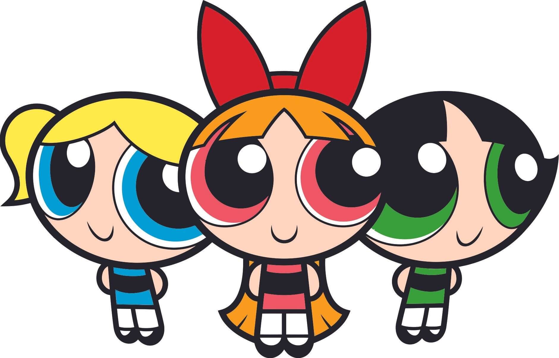
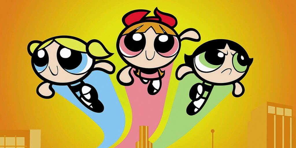
The PPGs themselves, for example, are strictly color-coded: Blossom is pink, Bubbles is blue, and Buttercup is green. As you can see in the header image on this post, those color assignments apply to their clothing and their eyes, but it goes beyond that. The colors also apply to their contrails:
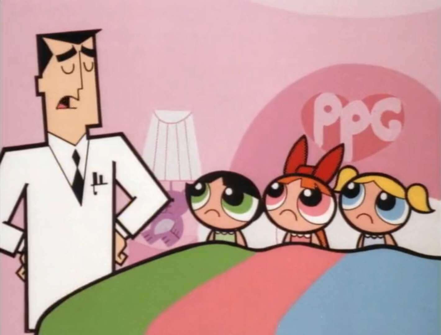
They even sleep together each night under a color-coded blanket (as shown here with their creator/father, Professor Utonium):
But that’s just the tip of the show’s programmatic iceberg. Among its many, many, rules and quirks:
• Every episode begins with the narrator saying, “The city of Townsville…”
• Every episode ends with the narrator saying, “And once again, the day is saved…” (or, occasionally, some variation thereof).
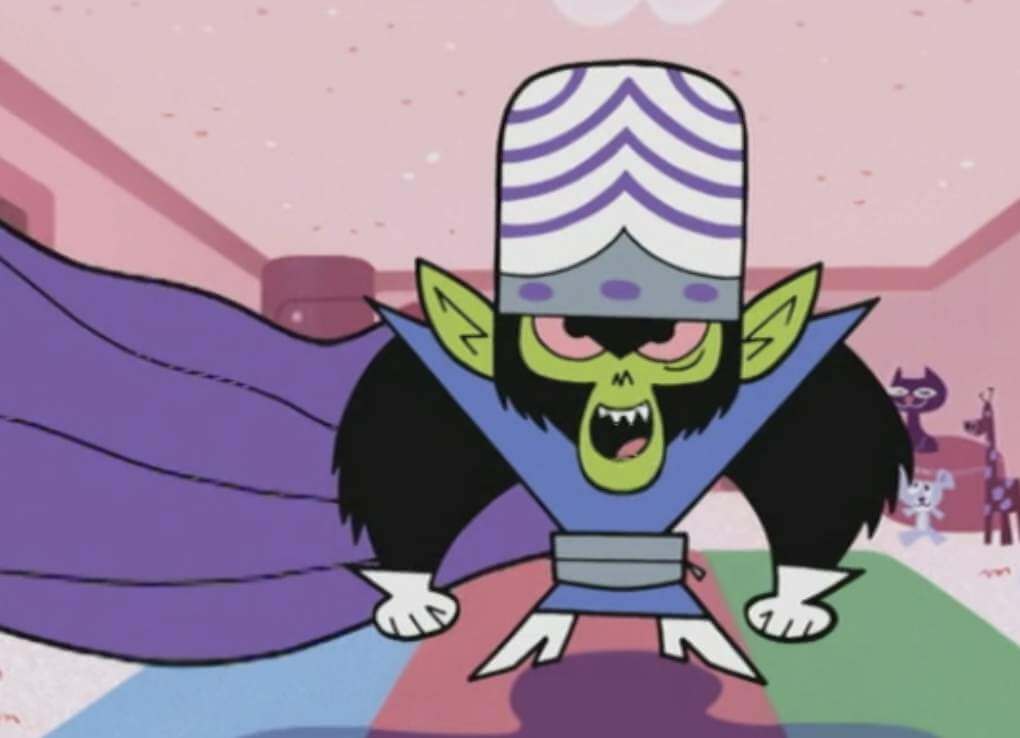
• The PPGs’ primary nemesis, Mojo Jojo (a singularly brilliant character, in part because he once stormed out of his lair, ready to destroy the PPGs, but then realized he had to stop and go back because he had forgotten his wallet), is always shown with his cape flapping in the breeze, even when he’s standing still and indoors:
• Another one of the characters — the mayor’s secretary, Miss Bellum — is always shown with her face cropped out of the frame or otherwise obscured:
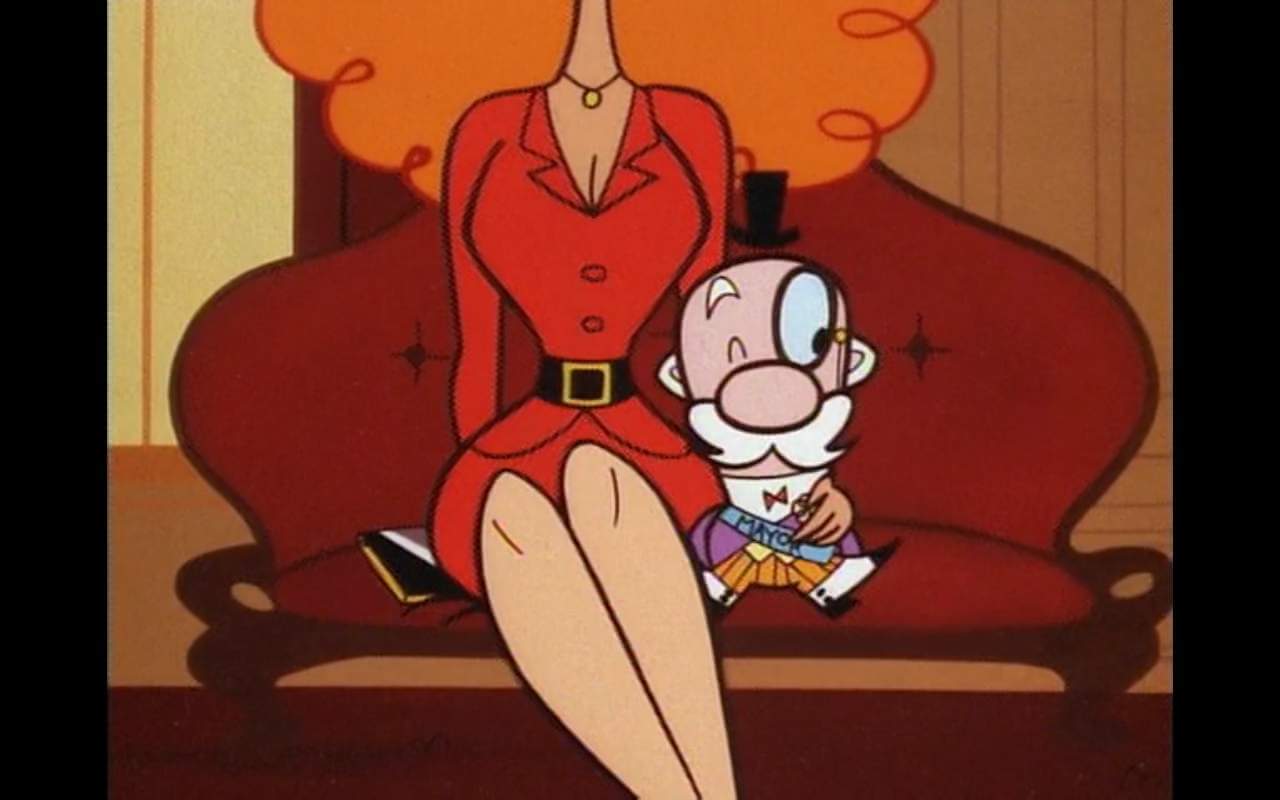
And so on. I was recently discussing all of this with my friend Nate, who’s an animator. As I tried to explain why all these programmatic rules and guidelines appealed to me, I said, “That show must’ve had one hell of a style guide.” To which Nate replied, “Oh, sure. You haven’t seen it?”
He then whipped out his phone and cued up the following pages from a PPGs style guide. Check these out (for all of them, you can click to enlarge):
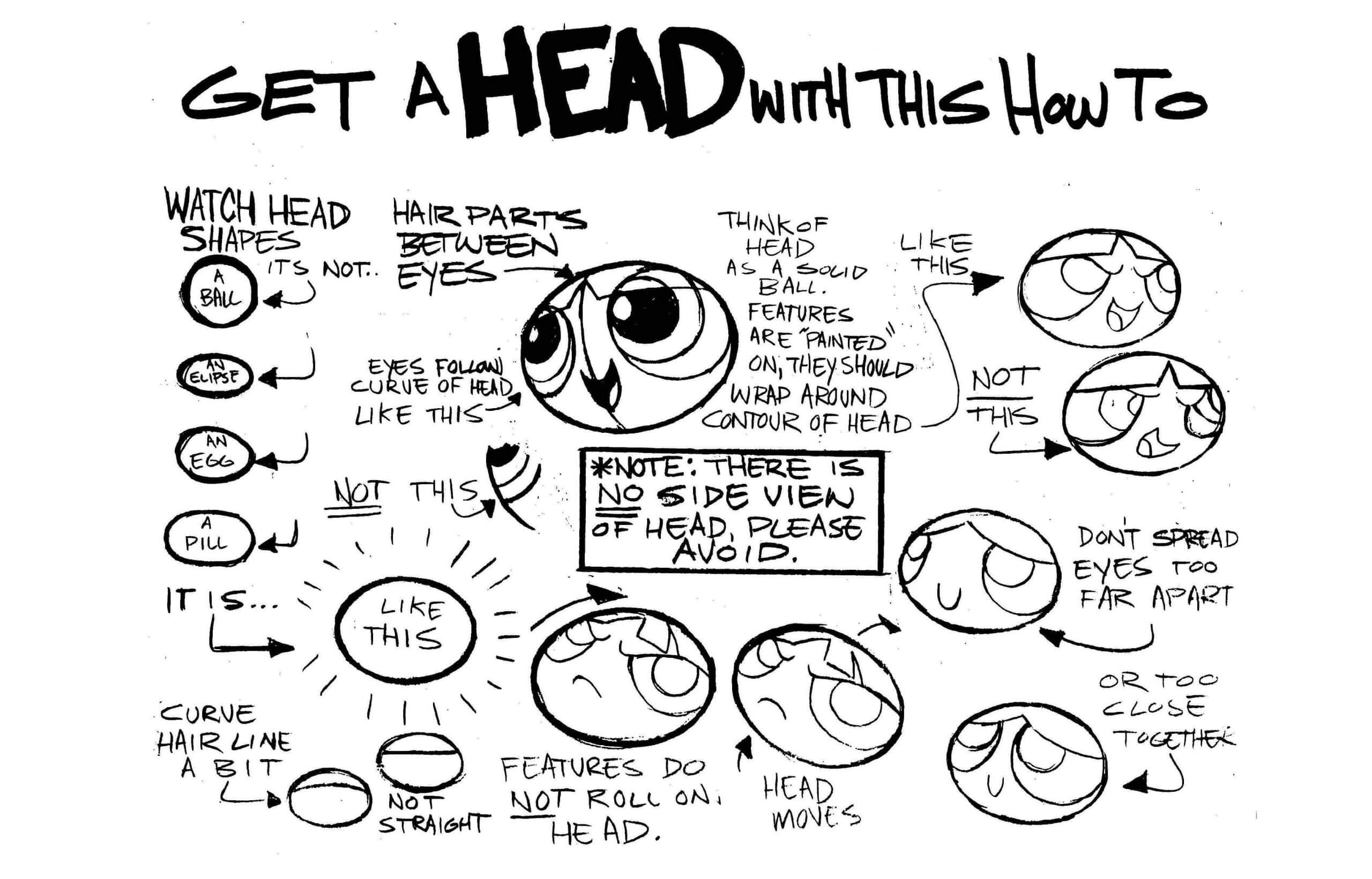
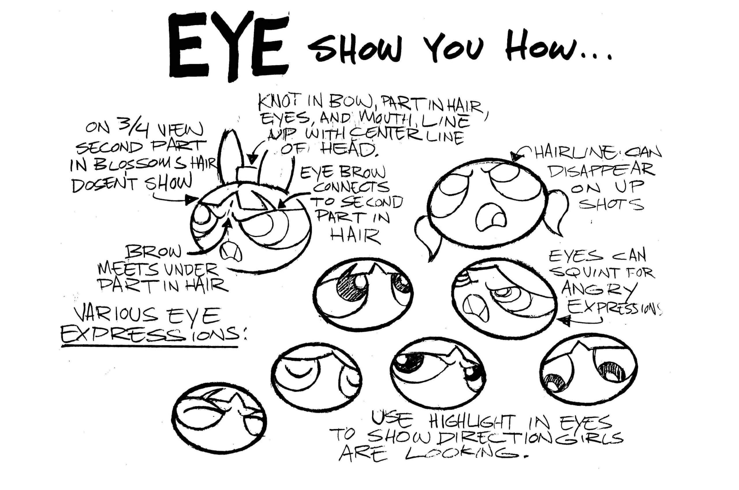
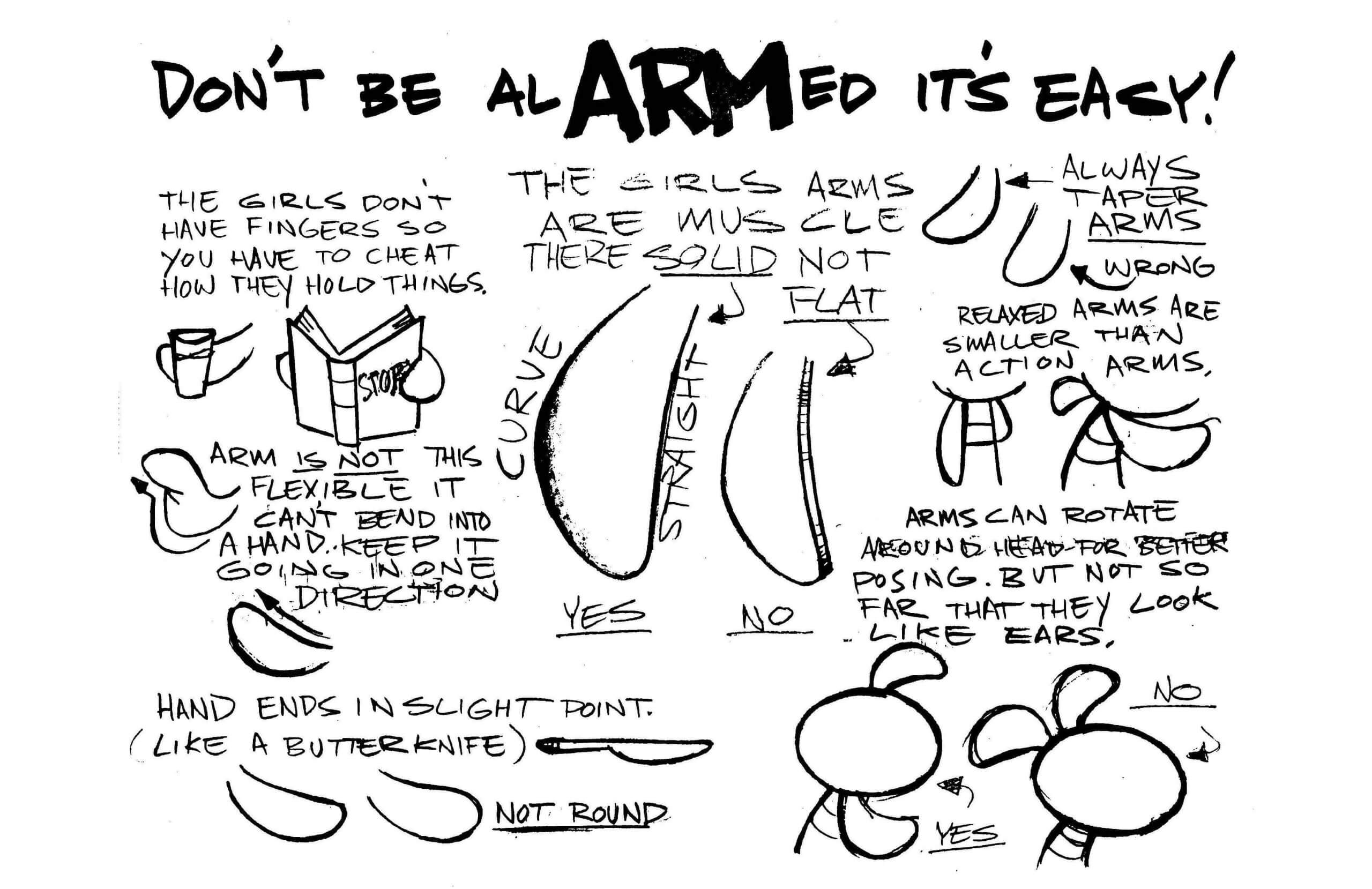
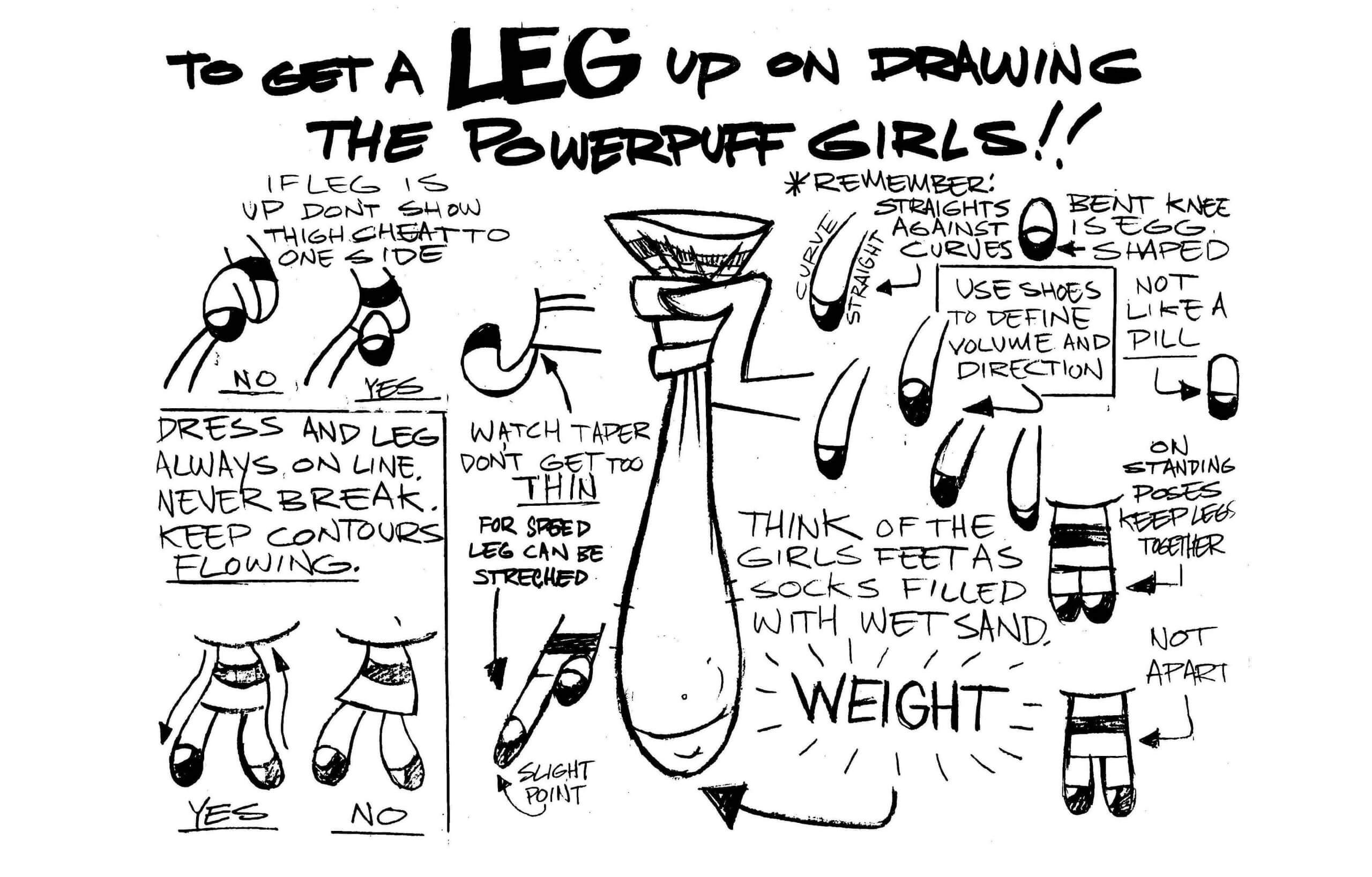
Aren’t those great? My favorite bit is in the last one, where it says that the artists/animators should “think of of the girls’ feet as socks filled with wet sand” — brilliant!
These pages appeal to me in precisely the same way that a uniform style guide or brand style guide does. They help create order out of chaos and impart a sense of “a place for everything, and everything in its place.” There’s something satisfying about all of it.
The Powerpuff Girls isn’t the only cartoon show with a style guide, of course (in fact, it’s not even the first one I’ve written about in this same context), but it’s hard to imagine another show that would have such a good style guide. If you’ve been wondering what to get me for my next birthday, a PPGs style guide would definitely be a big hit here at Uni Watch HQ.
On the one hand, I realize that this is a very different kind of Uni Watch entry. On the other hand, the connection between uniforms and the PPGs feels like a very straight, direct line — at least to me. Does anyone else get what I’m talking about here, or is this one of those things where it makes sense to me but not to anyone else? I’m genuinely curious to know!
Click to enlarge
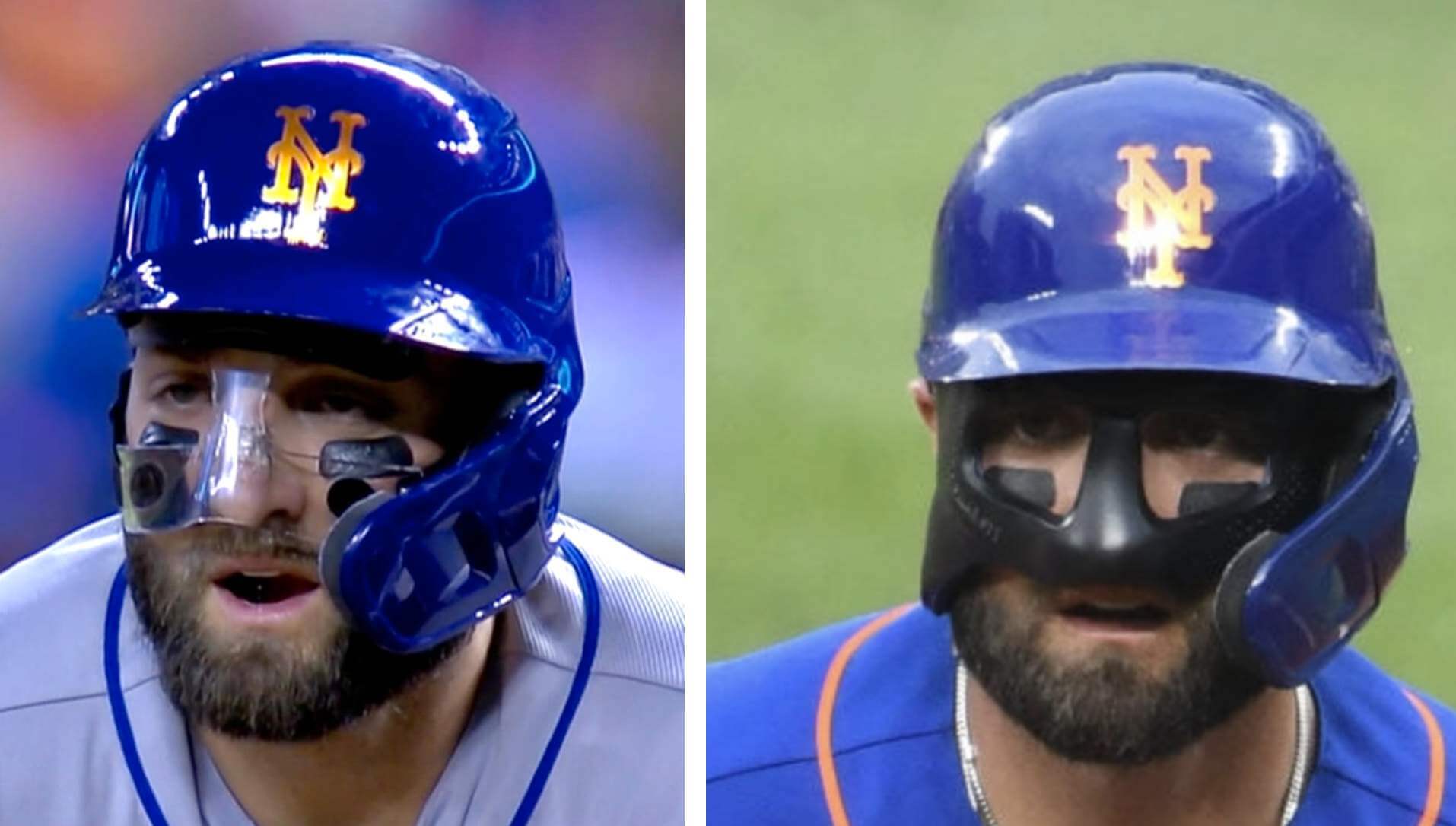
Mask machinations, continued: Last week I wrote about Mets outfielder Kevin Pillar’s new clear mask (above left), which he was wearing in the field and while running the bases as he nurses a broken nose after taking a pitch to the face in mid-May. This week he swapped out the clear model for a black mask (above left), which appears to be thicker and also seems to have a maker’s mark, although I can’t make out what it says.
The Ticker
By Paul
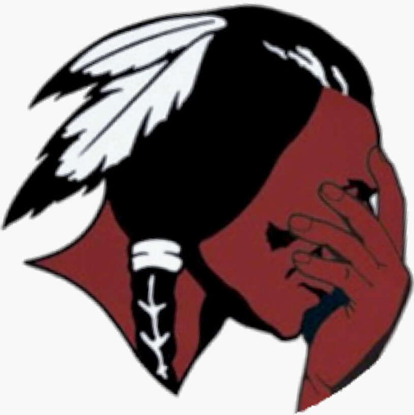
Indigenous Appropriation News: Sports teams at public schools in Jamestown, N.Y., will no longer use Native American imagery. … A new law just enacted in Nevada “will require schools to change any name, logo, mascot, song or identifier that is ‘racially discriminatory’ or ‘associated with the Confederate States of America or a federally recognized Indian tribe.'”

Baseball News: Trivia question: All good uni-watchers should know that the last MLBer to wear a flapless batting helmet was Tim Raines in 2002. But who was the last player eligible to go flapless, even though he opted to wear an earflap? Answer at the end of the baseball section. … Uni Watch proofreader Jerry Wolper attended Tuesday night’s Pirates/Dodgers game in Pittsburgh. The good news: He got actual physical tickets! The bad news: Ads in the on-deck circles. … The Bowling Green Hot Rods were supposed to host last year’s Midwest League All-Star Game. Obviously, that game never took place due to the pandemic, and the Midwest League no longer exists due to MiLB’s restructuring, so the Hot Rods and the Aberdeen IronBirds will wear the phantom 2020 All-Star jerseys this Friday and Saturday. … The independent Frontier League’s New York Boulders are giving away a 10th-anniversary coin this Saturday (from John Cerone). … Whoa, check out this Padres-themed minivan (from Dave Dahl). … Speaking of baseball-themed vehicles, check out this MLB logo-emblazoned car! … The Nashville Sounds gave away a cap with four different Velcro-backed logo options last night. Not sure I’ve ever seen that type of product before (from Timmy Donahue). … The Frisco RoughRiders wore jerseys festooned with bluebonnets — the Texas State Flower — for Texas Forever Night yesterday (from Timmy Donahue). … Something I hadn’t noticed until Christian Berumen pointed it out to me: Atlanta third base coach Ron Washington wears his cap under his coaching helmet. … Trivia answer: Earflapped helmets became mandatory for new players in 1983, but veteran players were grandfathered. The last remaining 1982-active MLBer was Julio Franco, who finished his career with the 2007 Mets at the age of 48. He did go flapless early in his career but had added a flap by 1987 and kept wearing the flap for the balance of his career, even though he was flapless-eligible (big thanks to Twitter-er @schwyy for this excellent trivia question!).

NFL News: The moderator at the Williamstown, Mass., annual town meeting, which took place at a local football field due to the pandemic, wore an NFL official’s jersey (from Lace Harris). … Cardinals S Budda Baker is changing his uni number from 32 to 3 as a tribute to former NBA star Allen Iverson (from Timmy Donahue). … The NFL is looking into playing some games in Germany.

Hockey News: A Jets fan says he was assaulted and had his Jets jersey ripped off his body while walking home from Monday’s Jets/Canadiens game in Montreal (thanks, Phil). … The Colorado 14ers, a new girls’ youth hockey team in the Denver area, have unveiled their jerseys (from Kary Klismet).

Basketball News: The Jazz, who had already been wearing a “1223” memorial band to recognize the number of career wins by former coach Jerry Sloan, added “53” to the band on Tuesday night as a memorial for former player Mark Eaton, who wore that number while playing for the Jazz (from Cody Eden). … Lakers star LeBron James will reportedly change his uni number from 23 to 6 next season. He wore No. 6 for four seasons while playing for the Heat and has routinely worn it for many years for team practices. … Valley Christian High School in Arizona has debuted a new uniform set that’s basically a recolored version of the Suns’ “The Valley” alternates (from @andypage117 and Zak Buncik). … UC-Santa Barbara unveiled their championship rings for winning the Big West regular season and conference tournament titles (from Kary Klismet). … Also from Kary: New floor for Hartselle (Ala.) High School. “I hope they have a licensing agreement with the University of Missouri for that tiger logo,” adds Kary.

Soccer News: More Euro 2020 kit rankings here, here, and here. … MLS has a new Pride logo and Pride-themed pre-match shirts (from Trevor Williams). … New home shirt for second-tier English side Middlesbrough (from Ed Zelaski and R. Scott Rogers). … Also from Ed: New home kit for top-tier Scottish side Hibernian, which has switched from Macron to Joma. … Here’s an article on America’s soccer jersey subculture — or, as the author calls it, the kit-industrial complex (from @coachganzer). … The “Greenwood” patch recently worn by Tulsa FC to mark the 100th anniversary of the Tulsa race pogrom will also be worn by the world-class LA-based cycling team L39ION during the 2021 race season (thanks, Phil). … New mascot for Italy’s national team (from Kary Klismet). … New shirt for Scottish club Aberdeen (thanks, Jamie). … Also from Jamie: “One of the teams that signed up to relaunch the USL W League was the South Georgia Tormenta. They consider ‘Tormenta Women’ a placeholder name and want suggestions for a replacement.” … And hey, the rest of these are also from Jamie: A new shirt for Scottish League One’s Dumbarton can be seen at the end of this announcement on a new signing. … New title advertiser for Scotland’s men’s top four tiers. … Following up on a Ticker item from a few days ago: Norwich City has ditched their new shirt advertiser, which had caused controversy by posting NSFW images on social media.

Grab Bag: The design of the Progress Pride flag has been updated to better represent intersex people (from Trevor Williams). … Dixie State University in Utah is removing the “Dixie” from its name (from James Gilbert). … New athletics branding for the Citadel (thanks to all who shared). … Cross-listed from the soccer section: The “Greenwood” patch recently worn by the soccer team Tulsa FC to mark the 100th anniversary of the Tulsa race pogrom will also be worn by the world-class LA-based cycling team L39ION during the 2021 race season (thanks, Phil). … At yesterday’s NCAA track and field 800-meter semifinals, two Texas A&M runners wore different-colored uniforms (from Tony DiRubbo).
I’m sure it doesn’t hurt that the “bad guy” wears purple.
I can’t believe Paul didn’t mention that!
Hi Paul, Alert from the Department of Redundency Department, you might want to edit your opening sentence.
Done. Thank you!
Thank you for “Department of Redundency Department.” I literally laughed out loud at my desk this morning!
You sure that’s not just a tribute to Mojo Jojo?
XD
Alert from the Department of Spelling: “redundancy” is an incorrect spelling.
Don’t forget the episode called “Town and Out” when they all move to the Town of Cityville. . .
You may or may not know (or be thrilled at the prospect) that they are working on a live-action PPG series. The idea is that the girls have grown up to be twenty-somethings and have become disillusioned with the fame they earned and the superhero life they lived as little girls. Apparently, they are re-shooting the pilot because they were worried they didn’t get the tone right.
link
I am well aware. Sounds like a fiasco. I’ll stick with the animated series.
Wow, that looks horrible.
As far as Pillar’s mask, I think Gary, Keith & Ron had said something about the clear mask was a temporary solution while his custom molded mask was being made.
Yes, on Tuesday night’s broadcast, Gary and Ron were discussing it. The clear mask was an off-the-shelf version that actually obstructed Pillar’s peripheral vision. They mentioned the clear mask was the likely cause of when he had a ball drop in front of him in Atlanta.
The black mask is custom-made. Gary made a reference to it being “from a machine,” which I assume means some kind of software was used to take measurements of Pillar’s face. Pillar said the black mask is vision-perfect. No obstructions.
Ah, I missed Tuesday’s game. Thanks for that!
“From a machine” probably means 3D-printed.
I’d assume its not 3D printed. I’d guess the mask is made of some multi-layer carbon fibre or fibreglass epoxy material designed to be light and absorb impacts safely. I don’t think 3D printing is there yet for impact-absorbing safety gear.
Learned something today: LeBron switched to #6 when he joined the Heat because Miami had retired #23….for Michael Jordan. Who, aside from popularizing basketball, had diddly/squat to do with the Miami Heat.
Aside from the Jackie Robinson thing, was there precedence for this?
In 2000 the NHL retired Gretzky’s 99 leaguewide
Interesting. Was #99 a particularly used number in hockey before Gretzky? #23 and #42 are useful numbers in just about any sport.
I’m going to go ahead and believe that an individual pro team has never retired the number of a player who never played for them.
LeBron had actually declared he was switching to number 6 during the 2009-10 season, before signing with Miami. He would have worn number 6 in the 2010-11 season even if he had stayed with Cleveland.
link
“James first brought up the idea in November, saying he wanted to give up No. 23 out of respect to his hero, Michael Jordan.”
So….he went back to #23 when he lost all respect for Jordan???
Nice deviation from the usual entries today. Until reading this it never really occurred to me the crossover in appeal here. I have been aware of the show, and have always appreciated the style of it, even if I was never actually a fan of the show. I guess this explains why the style appealed to me.
My kids loved that show when they were little. In fact, it you go to this website – link – you can Powerpuff Yourself and create your own PPG avatar.
Well, there goes my productivity for the rest of the day:
link
Thanks, Jeff! :-)
I get what Paul is saying about the deliberate and careful consistency of PPG’s aesthetics and storytelling. But I have long regarded the 1980s drama-ish The Greatest American Hero as a uni-watching ur-text. The premise of the show is that a schoolteacher finds a uniform, and when he wears it, the uniform grants him comic book superpowers. The show revolves around a uniform and the lead characters’ quest to understand the ins and outs of the uniform. And, as with sports uniforms, the GAH uniform evolves and its “rules” are not really rules but are broken by the writers whenever it’s convenient to the plot to do so.
Speaking of that show (I have the whole series on DVD, by the way), if I could give an Emmy for Worst Sports Uniform Design in a TV episode, it would go to the season two opener, The Two Hundred Mile an Hour Fastball.
link
At least no plackets were disrespected because they wore pullovers. That was the only redeeming quality to them. Peeling numbers, poorly matched lettering…it’s as if the unis were the very last item of business in putting together that episode.
Boy, they used to let Dodgers Stadium be used for just about anything on its off-days, didn’t they?
And the “Oakland Mets” catcher doesn’t even have a number. Or maybe he started the game with tissue-paper numbers like his teammates and the straps on his tools of ignorance rubbed them off. Even by 1980s TV standards, that’s some terrible uniformery. I’m thinking of a couple of near-contemporary episodes of Magnum PI with uniforms and even that very cheap-production show did better than this. Thanks for sharing it!
Terrible uniformery for sure… but it might make for a good UW membership card.
Now the theme song to Greatest American Hero will be stuck in my head all day, as will George Costanza using it as his answering machine message.
Haha. Yes. I can’t hear the song now w/o thinking of George either.
Believe it or not George is not at home…
Where could he beeeeeeeeee?
I was a Mad Magazine reading preteen when GTA came out, and I still remember that the Mort Drucker Mad parody of the show gave new lyrics to the theme song: “Believe it or not, he’s still on the air / We never thought he’d hang on so long / With his silly suit and curly blonde hair / So much was wrong … / Including this hot, rot-ten song” When I think of the tune, the parody lyrics are what come first to mind.
Oh, and check out the “California Stars” uniform in this newspaper ad for the episode:
link
this hot, rot-ten song
I’ve always loved the theme song. These days I call Ralph the first Yacht Rock superhero. Still waiting for the second, by the way…
I like how even the drawing in that ad shows the discrepancy between “California” and “Stars” on the jersey. Looks as if they took an old UC Berkely jersey and slapped a very cheap “Stars” patch underneath it. The quality between the two sets of letters isn’t even close.
Neat question about flapless helmet. We should do the same some year regarding visors in NHL. Or even helmetless eligible.
Every Canadian knows the answer to part 2, Craig MacTavish in 1997.
Looks like the link for the MLS Pride logo/pre-match shirts isn’t formatted correctly.
Fixed. Here’s the proper link:
link
MLS pride logo and shirts link doesn’t seem to be active.
Mrs Bellums first name was Sara(h)…. Because she’s the brains of the operation
“connection between uniforms and the PPGs feels like a very straight, direct line”
Yeah not getting it. However I have been know to take time to appreciate good animation shows, having come to South Park and Bob’s Burgers after they had aired for a number of years. But my love for uniforms doesn’t translate to this.
When I need a good chuckle, as I read Paul’s writings on this site, in my head I will do so in the voice/style of Archer.
Holy crap that’s brilliant! I couldn’t get through those old Arby’s commercials since the pitch-guy was Archer’s voice actor for a while. I still chuckle at how different the animated Archer looks than the voice actor himself. One of those, voice doesn’t fit the look type of things.
Haha, yeah I turned to Bob’s Burgers after I finished Archer.
Tangentially related to PPG/Mojo Jojo – link
I usually read this site at lunch time but when today’s entry popped up on my FB feed I had to read it at once.
I too was captured by the lure of The Power Puff girls 20+ years ago, I couldn’t ever figure out why this cartoon appealed so much to me when I rarely watch cartoons or the like at all. But everything about the show was spot on. The style, writing and the consistency of the show, and more that Paul writes about. I know zero animators but I know the name Craig McCracken being the creator, even just because he’s got a cool last name.
I did try to get my kids into it some time ago but they may have been too young to appreciate it at the time, might try again. And if they don’t like it I’m going to watch it anyway.
The independent Frontier League’s New York Boulders are giving away a 10th-anniversary coin this Saturday
That’s a great nickname. Well, at least for a sport with lots of standing around like baseball. But I wouldn’t mind that name for any of the faster-paced sports. After all, a rolling boulder would be a powerful and formidable danger to anyone in its way.
In regards to the new Nevada law on school mascots and team nicknames, I wonder if this will prompt further changes at UNLV. A quick search reveals that they abandoned a mascot directly associating their nickname with the Confederacy back in the ’70s, and just this year got rid of another mascot who was supposed to represent white settlers. But the team nickname endures.
It’s so weird to me that mascots representing people we perceive to be bad (e.g., the Confederacy) are viewed as honorific and thus offensive while mascots representing people we perceive to be good (e.g., Native Americans) are viewed as mocking and thus offensive.
At a certain point, it starts to look like people are just trying too hard to be offended, especially when those people have no personal skin in the game (e.g., white European-Americans whose ancestors were not Native American or enslaved under the CSA).
Craig McCracken, the creator of PPG and other acclaimed animated series, deserves a mention. I bet you’d appreciate some of his other work.
“At yesterday’s NCAA track and field 800-meter semifinals, two Texas A&M runners wore different-colored uniforms”
I assume the NCAA has a T/F uniformity rule, but does enforcement apply for qualifying events?
That was a nice catch by Tony. I am used to seeing different uniform styles but not usually different colors in the same event. The different types of uniforms is very common in track & field, as athletes wear certain styles based on their event. (sprinters were spandex one piece, distance runners wear singlets & shorts, some wear traditional running shorts some wear bike short style, etc)
The 800 is a middle distance or crossover race. Of course at this level you have mostly 800m specialists, as you need fast times & regional results to qualify for nationals. But the runners in this event often come from different event backgrounds: you get a lot of 400 runners that move up and some 1500/milers that have moved down to this race based on team’s roster depth or need from season to season or even in earlier season meets. They may be comfortable or accustomed to wearing certain styles of uniform based on their race history or distance background?
Well, that was a lovely and unexpected surprise this morning! That Beatles-centric episode of Powerpuff Girls is amazing punsmanship.
Boy, they used to let Dodgers Stadium be used for just about anything on its off-days, didn’t they?
Whoops! That was supposed to be under the Greatest American Hero discussion above. Copied, pasted, and posted accordingly.
link
Must kill the Queen
Seriously, right? I mean, you couldn’t be bothered to travel the extra thirty miles or so all the way down to Anaheim to film that scene? Cringe-inducing.
The Power Rangers in the early to mid-90s used to wear their Power Ranger colors in their civilian clothes too. (Black, Yellow, Red, Green, Pink, Blue). I found that very satifying.
link
Although I’ve seen very little of the Power Rangers, I can appreciate their uniformity (as mentioned here today), however the balance of the production of the show just seems awful. Filming locations, costumes, and the annoying mouths-that-don’t-move when they talk.
I had no idea who the trivia answer would be, but it seems obvious in retrospect!
Same
Paul, I totally get you on the PPG thing. I know about the show, but can’t say I’ve ever watched it, but the “order out of chaos” part makes perfect sense to me, as does the matching colors, etc. Although it’s less of a direct line so to speak, it’s one of the things I like about the films in the “Cornetto Trilogy”, Shaun of the Dead (Red), Hot Fuzz (Blue) and World’s End (Green), and how they are loosely tied together.
Re the PPGs, there’s no way I would have ever put my finger on why how all the colors, etc. align would be appealing. Great work pointing it out. Gonna have to start watching that show now!
“On the one hand, I realize that this is a very different kind of Uni Watch entry. On the other hand, the connection between uniforms and the PPGs feels like a very straight, direct line — at least to me. Does anyone else get what I’m talking about here, or is this one of those things where it makes sense to me but not to anyone else? I’m genuinely curious to know!”
I’ve never been a Powerpuff Girls fan. I have nothing against it, and in fact know several people whose opinions I respect who say it’s fantastic because of its snappy wit, clever writing, and keen social commentary. In all those regards, it strikes me as similar to the My Little Pony television series – another show I don’t watch but know several smart, discerning consumers of media who do. So I can’t speak specifically to either of those shows, but I understand what you’re talking about, Paul, about how the observational proclivities of uni-watchers lend themselves well to other types of pastimes and entertainment content.
In my youth, my frequent outlet for those inclinations was the original Star Wars movies. I was keen on noticing the “rules” about the various uniforms worn by the Rebellion and the Imperial forces. In particular, I was fascinated by the Rebel pilots’ helmets. I thought it was cool how link in the Death Star dogfight sequence all had individual differences in terms of colors and design elements, but seemed to follow a set of rules as far as the range of symbols available to them. I used to draw helmets that I thought conformed to those rules but still showed lots of individuality.
The flip side of that was that in the medal ceremony scene at the end of the original Star Wars, all of the assembled Rebel pilot participating in the ceremony wore pristine white helmets with link. I always wondered why their helmets were identical, but the pilots flying the Death Star mission had helmets with so much variability? Did the ragtag Rebels really have enough resources for their pilots to all have ceremonial “dress helmets”? Or was it simply a production decision that no one bothered to explain in terms of in-film continuity? (Yes, even as a six-year-old, I wondered about such things.)
Every episode ends with the narrator saying, “And once again, the day is saved…”
Wow, spoiler alert!
Can anyone who’s a PPG fan explain what the deal is with the Powerpuff Girls’ hands and feet? It seems that every other character in the show has discernible hands and fingers except for the girls themselves. Is that peculiarity ever explained within the continuity of the show, or is it just a stylistic preference that’s never addressed?
The latter. Just part of the girls’ minimalist style.
Cool. Thanks!
Pillar’s mask is a good item.
The fact he hit two dingers with the bloodied bat he was using when he was hit is a GREAT item.
link
RE: the Nevada law:
I wonder if this is the beginning of forcing a change to the UNLV Rebels name/mascot
Not sure I’d call le39ion world class, they’re a uci continental team and as far as I know have mainly competed domestically. They’re very good, but I don’t think they’re quite world class, definitely not world tour level
So who’s the Julio Franco helmet answer for the NHL? Could it be Mark Messier? Wikipedia (I know, I know) says that the NHL helmet exemption was for anyone that had signed a professional contract prior to June 1, 1979. Messier played in 1978-79 for the WHA and then entered the 1979 NHL draft after the WHA folded. Which means Messier would have been eligible to not wear a helmet when he retired in 2004.
I didn’t do much research so I could be wrong but that name stood out to me as being the most likely answer.
I think Craig MacTavish was the last NHL player to not wear a helmet in a game.
Although I’m probably missing your question on who the last player eligible to play without a helmet was. Don’t know that specifically.
Yes, Craig MacTavish was the last NHL player to not wear a helmet. Just like Tim Raines was the last MLB player to wear a flapless helmet.
But Julio Franco could have worn a flapless helmet and chose to wear an earflap. So my question is if Mark Messier was the last NHL player that could have chosen not to wear a helmet.
I think you’re right about Messier. He was the last active player who played in the 70s, and signed his contract prior to the exemption deadline. Cool. I learned something new today!
Also bad news about Jerry Wolper’s real tickets: the Pirates have sold ads on the stadium’s entrance gates too. Peoples Home Plate Gate is sponsored by Peoples Gas. You could also enter through the Allegheny Health Network Left Field Gate.
I went in through the left field gate (because the one by the box office is closed) without noticing or caring about which advertiser put a name on it.
Absolutely love this post – one of the best I’ve seen on here. I watched PPG a lot when I was in my early college years. I never found it that funny (with the exception of the hilarious episode dealing with daylight savings time), but it was always incredibly visually appealing.
Paul’s exactly the type of person who’d be posting on Powerpuff forums 20 years ago. I bet we crossed paths then.
Met Craig McCracken once, an absolute stand-up guy. Check out Wander over Yonder or the new Kid Cosmic for stuff that will scratch this itch.
I assure you that I have never posted in a PPGs forum (or pretty much any other forum). But I’m envious that you’ve met McCracken!
I LOVE the PPGs, Always loved the show and the style. Never thought it would cross over to Uni-Watch but it makes total sense. The animation style and colors always felt so satisfying.
I love the PPGs’ snark. It was a funny show. The Meet the Beat Alls episode was the best one.
It didn’t escape my attention when they introduced the RowdyRuff Boys, their colors were saturated versions of the PPGs’ pastels. The most terrifying villain was “HIM!!”, with his swishy devil getup and unexplainable lobster claws: He struck me as a cross between Captain Hook and Marilyn Manson.
Fun callback to 20 years ago. My niece was in the PPG demo then so I watched along with her. Smart writing, fun plots and great villains. To this day my ringtone for my niece is the theme song. But of course Paul forgot to mention the purple PPG, Bliss. “Bliss (The Powerpuff Girls) | Warner Bros. Entertainment Wiki | Fandom” link