For all images, click to enlarge
Most of you have probably heard of sports auction houses like Grey Flannel, MeiGray, Steiner Sports, and a bunch of others. Those companies specialize in sports memorabilia, and their auction listings tend to get a lot of play in sports media outlets, including Uni Watch. But there are also lots of non-sports auction outlets that specialize in art, photography, collectibles, and so on but occasionally feature really good sports items.
My friend David Brown has been really into that art/collectibles auction scene for many years (at one point he even worked for Sotheby’s). He doesn’t necessarily bid on lots of stuff; he just likes to follow what’s going on, similar to how some people like to follow real estate. Anyway, he’s always attuned to interesting sports items that might be good for Uni Watch. Just last month, in fact, I wrote about some sensational baseball uniforms he discovered on an auction site, and that was just the latest in a long line of David Brown specials.
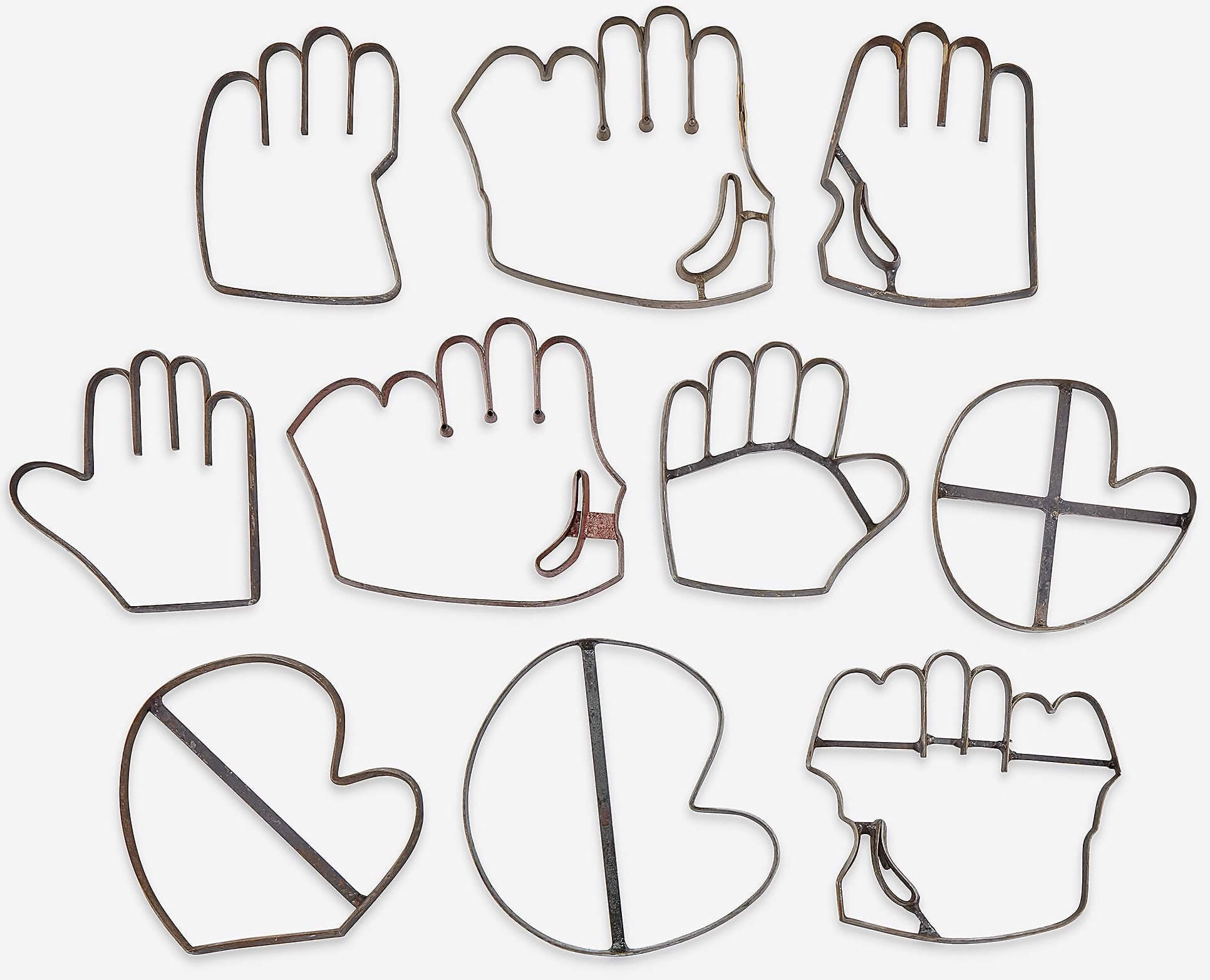
David’s newest find, which he shared with me a few days ago, is shown above. Can you guess what they’re for?
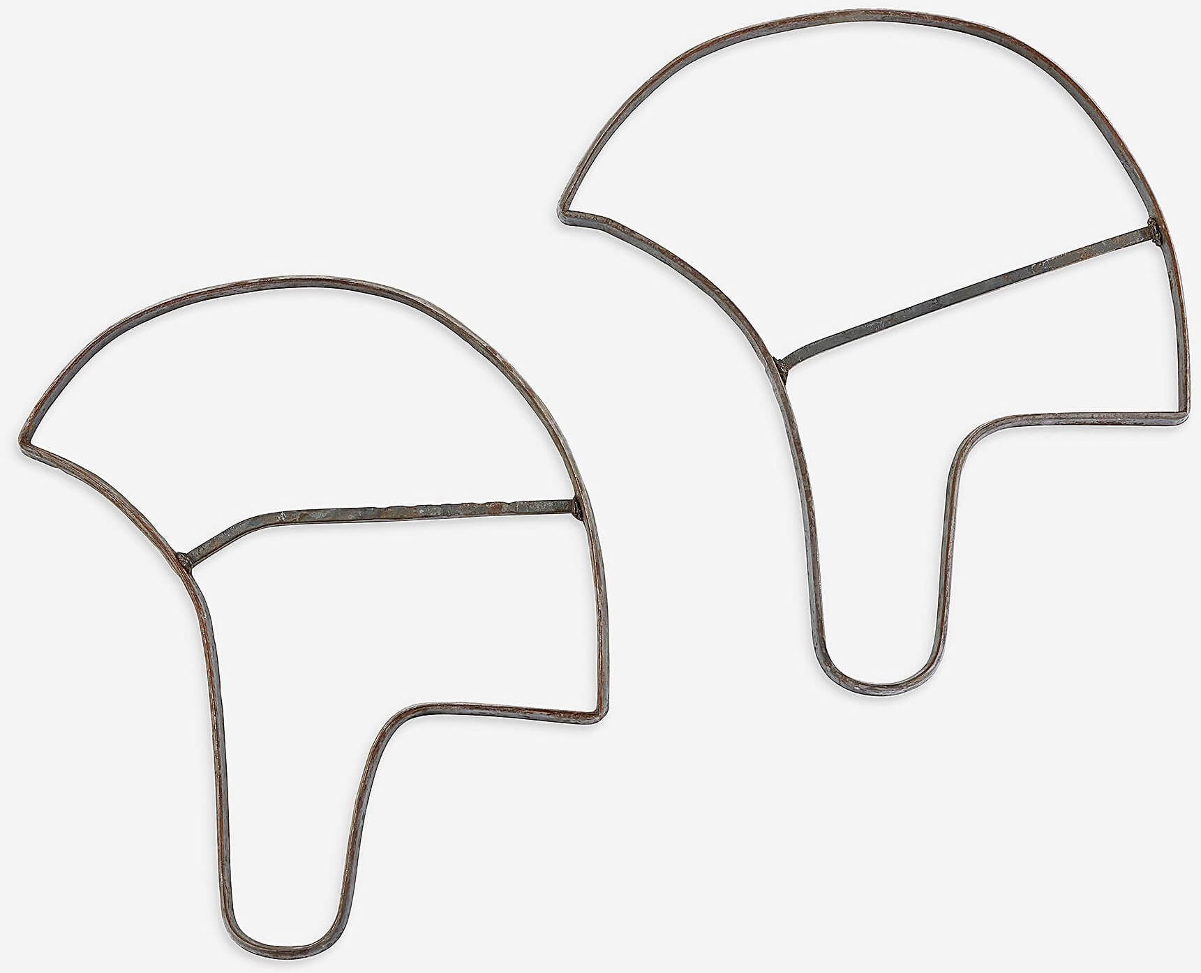
Answer: They’re steel stamping dies for cutting out leather for baseball gloves! Aren’t they amazing? So gorgeous, so pleasingly industrial!
And that’s just one set — there’s another set available (go ahead and click to enlarge — it’s worth it to see the texture and details):
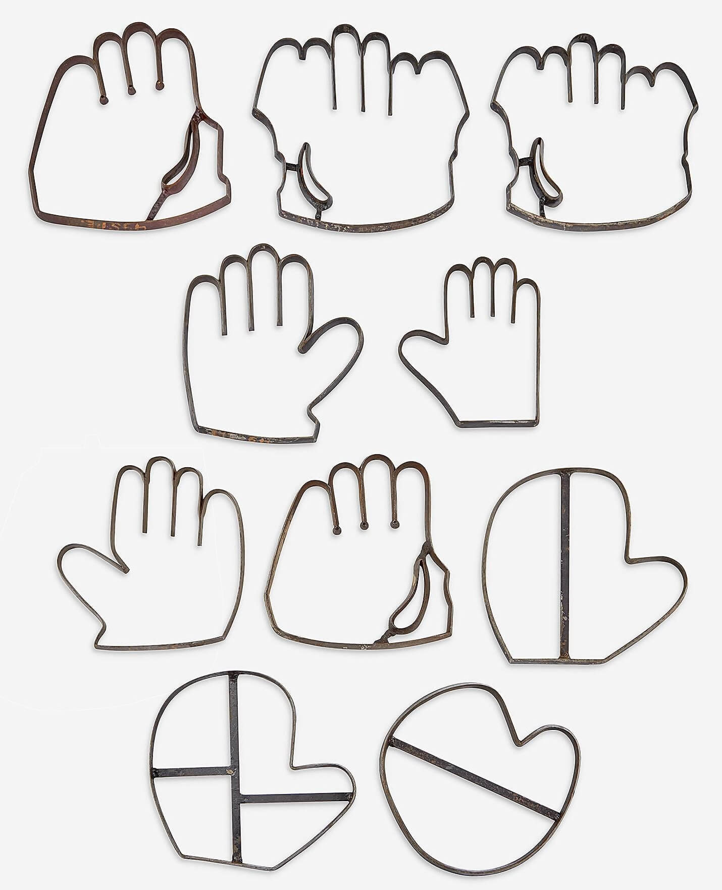
I love how catcher’s and first baseman’s mitts are included, and I especially love the little cutouts for the index fingerhole. So cool! I’d definitely enjoy owning these — they’d look so cool mounted on a wall, or even hanging like a mobile — but the price is way too high for me.
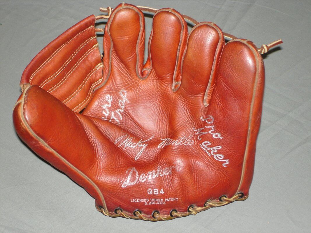
According to the auction listings, these items come from a now-defunct glove manufacturer called M. Denkert & Company, which operated in Johnstown, N.Y., from 1909 through 1973. I’d never heard of them, but it turns out that their gloves are all over eBay. You can even get a wallet made of leather from a Denkert glove.
Here’s one of their Mickey Mantle signature models (perhaps made with the same stamping dies I just showed you!):
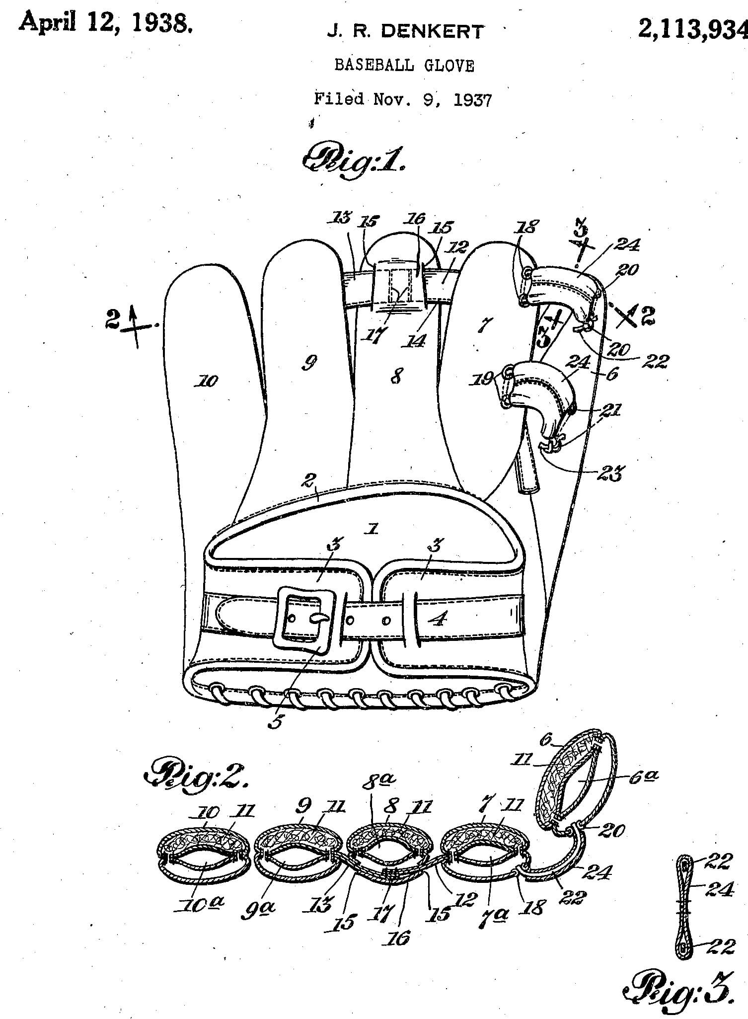
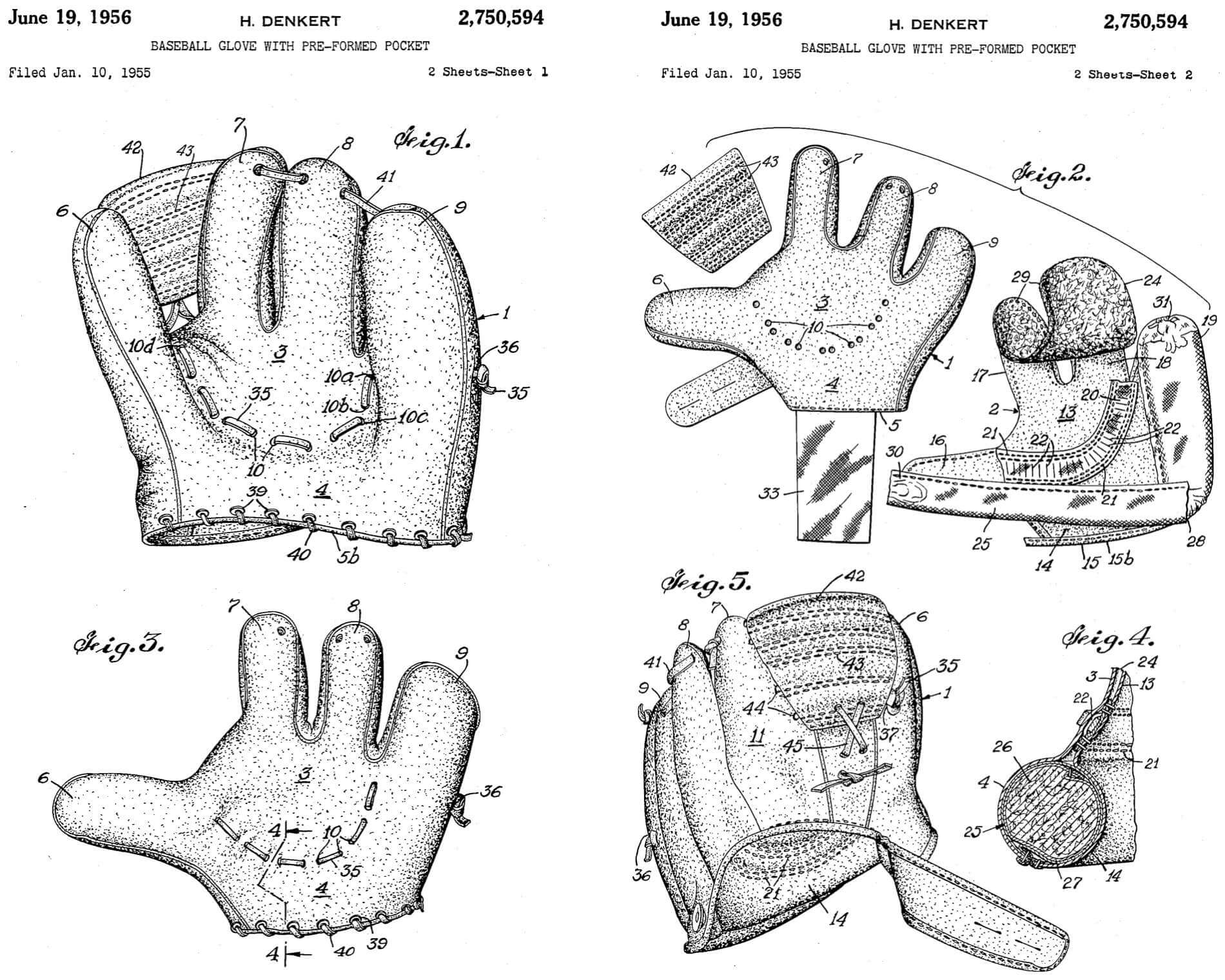
Denkert also held several glove-related patents, like this one for a glove design with a buckled strap on the back and another strap running through the fingertips:
And then there’s this patent, for a (four-fingered!) glove with a pre-formed pocket:
Again, I had never heard of Denkert, so I contacted Uni Watch reader Jimmy Lonetti, head of D&J Glove Repair, and asked if he worked with a lot of Denkert gloves. “I’ve repaired a few, but it’s not a real common brand,” he said (so then I didn’t feel quite as bad about not having heard of it).
But wait — there’s more! Since Denkert was essentially a leatherworking company, they also made leather football helmets — and some stamping dies for those are up for auction as well. They’re not as cool-looking as the glove stampers, but they’re still really interesting:
With some quick googling, I also found Denkert footballs, Denkert basketballs, and Denkert boxing gloves. According to this article, they also made baseballs, volleyballs, soccer gloves, boxing speed bags, gun holsters, and leather jackets for the military.
That article also says that Denkert made a larger glove for Yankees pitcher Red Ruffing, which helped Ruffing disguise his pitch grip during his windup, and also designed a new kind of mitt that reduced the strain on Yankees catcher Bill Dickey’s hand. The company was also known for dying their gloves “in unique colors such as red, orange, black and different shades of brown.” (If you want to know more, that article is definitely worth reading all the way through.)
What a fun rabbit hole! All because of my auction-obsessed friend David Brown. Thanks, buddy!
You say it’s your Earth Day: One of the uni-verse’s stranger phenomena was revived last night, as the Red Sox resumed their periodic observance of Earth Day. This is something they’ve done on and off over the past dozen or so years. Here’s a chronology:
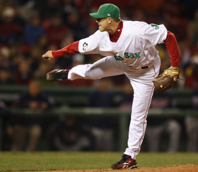
April 20, 2008
The Sox wear their standard home whites but add a green recycling logo patch to the left sleeve. (Sorry, that’s the only photo of it that I have.)
———
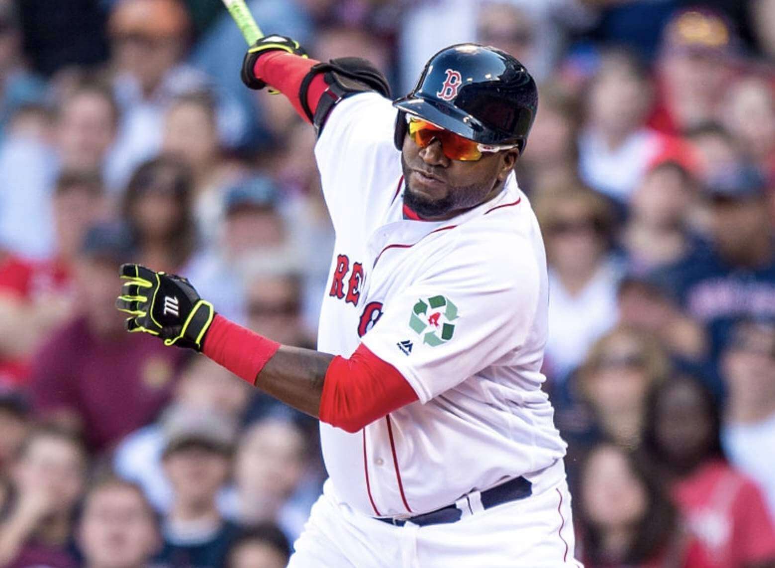
April 22, 2009
The Sox recycle (get it?) their green-trimmed St. Paddy’s Day BP pullovers for Earth Day and add the recycling patch to the right sleeve.
———
April 21, 2016
After a seven-year absence, Earth Day returns to Fenway, as the recycling logo reappears on the left sleeve.
———
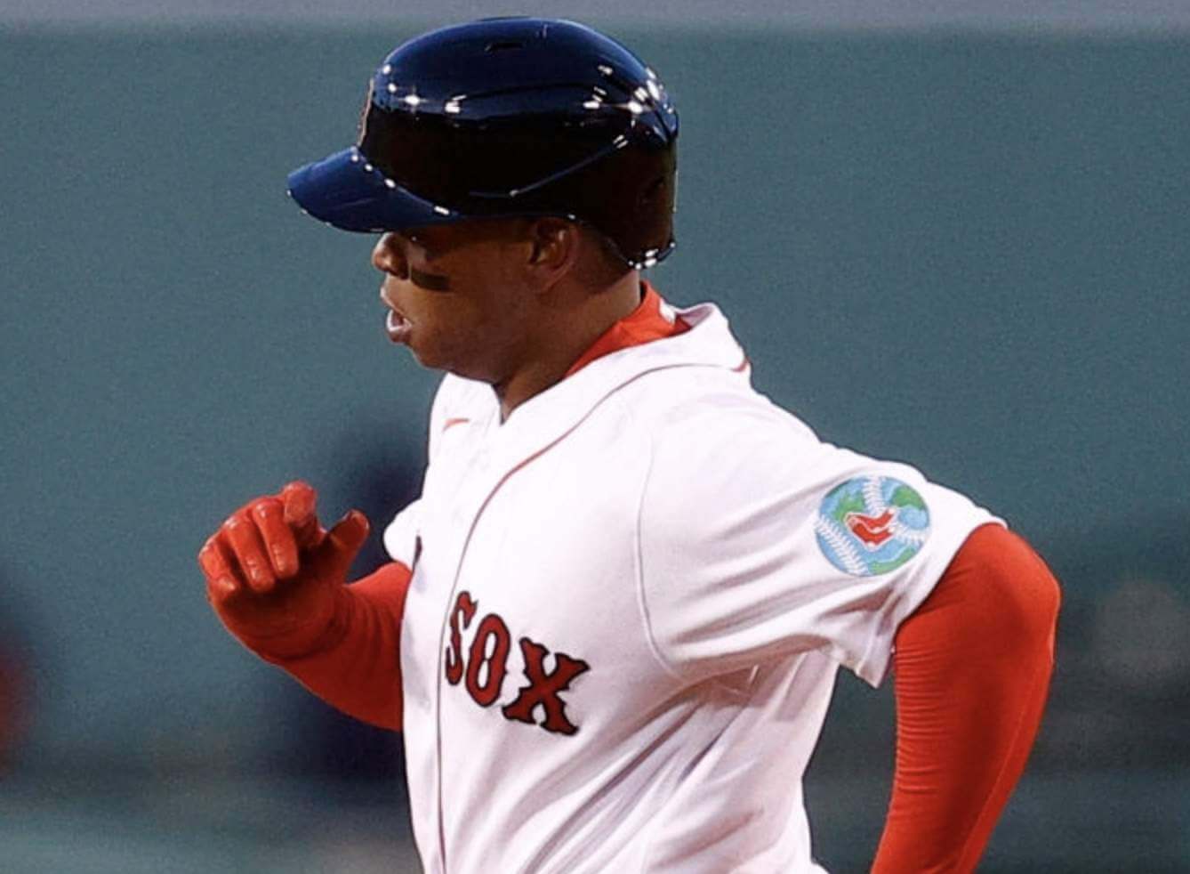
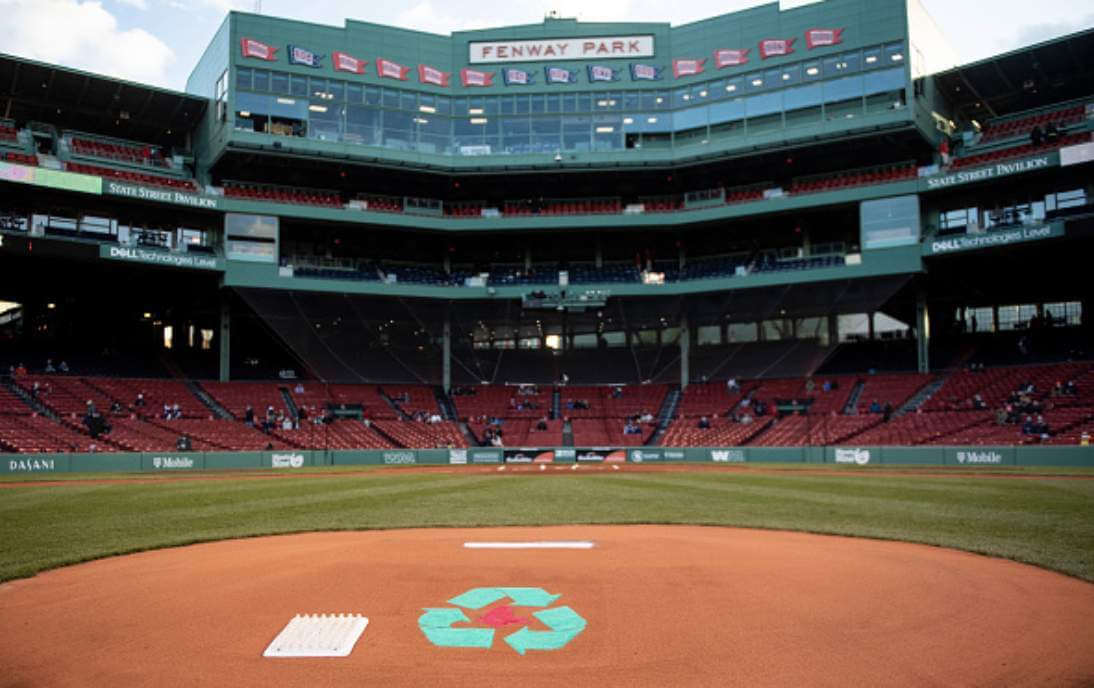
April 22, 2021
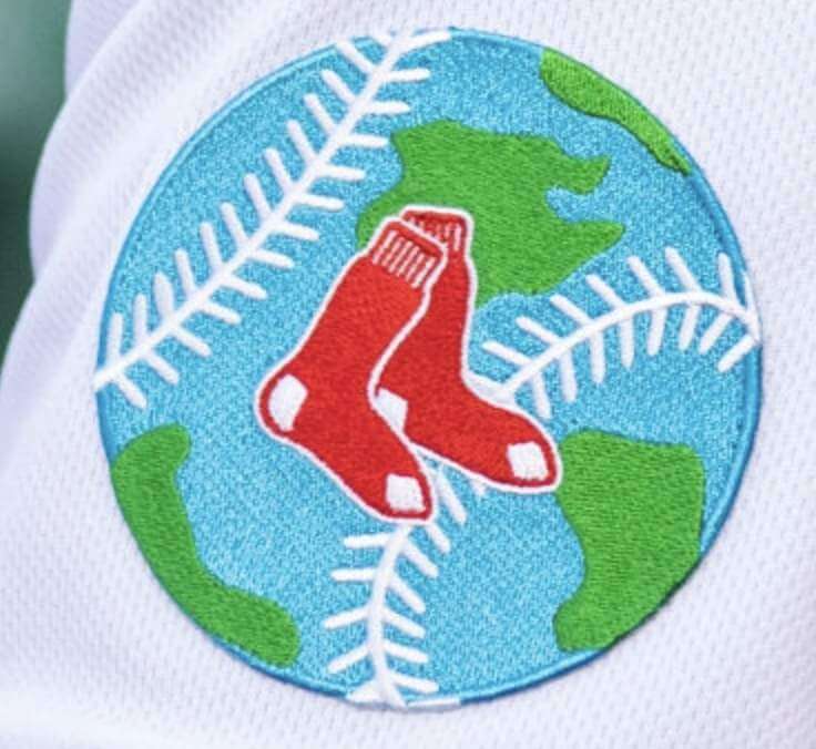
Earth Day is back, baby! But instead of going with the boilerplate recycling patch last night, they created a new patch design. Here’s a closer look:
They did, however, put the recycling logo on the mound, as you can see in the photo at the top of this section.
———
I can think of only two other MLB teams that have ever worn anything Earth Day-related. First, in 2008 — the same year the Red Sox wore the recycling logo for the first time — the Astros wore green caps with “Play Green” on the side:
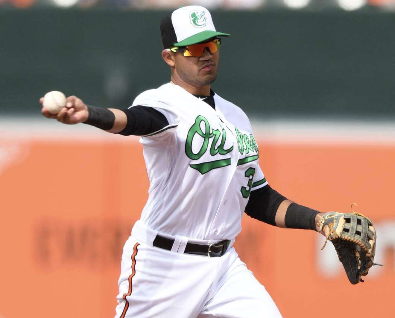
And in 2018, the Orioles wore green-trimmed caps and jerseys (but not pants):
Have there been any other MLB Earth Day uniforms that I’m overlooking?
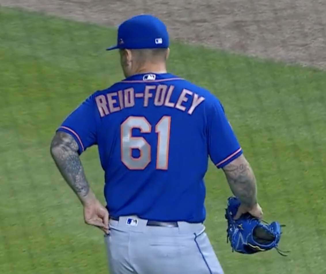
ITEM! Uni Watch gets on-air shout-out: Pitcher Sean Reid-Foley, just recalled from the Mets’ alternate training site, made his debut with the team last night. In the Mets’ radio booth, broadcaster Howie Rose noted that the team could end up with two hyphenated-surname players on the roster if top 2020 draft pick Pete Crow-Armstrong (whose NOB I wrote about in early March) makes it to the bigs.
That prompted Rose’s broadcasting sidekick, Wayne Randazzo, to say, “Sounds like something Paul Lukas would have to look into, the Uni Watch guy, about hyphenated jerseys on Mets players over the years.”
Both Rose and Randazzo are Uni Watch membership cardholders (here they are literally holding their cards, along with Padres radio guy Jesse Agler and yours truly), so of course they Get It™, but it’s always nice to get a mention on the air. Thanks, Wayne!
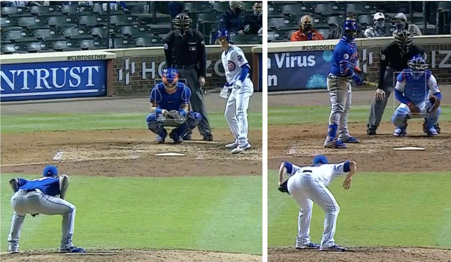
Speaking of Reid-Foley: He goes into an exaggerated squat as he looks in for the catcher’s sign. It’s even more pronounced than the pose struck by longtime MLB reliever Craig Kimbrel — who’s now with the Cubs and also appeared in last night’s game, creating a battle of the squatters! Check this out:
(Thanks to my pal Sujan Hong, who let me know about the radio banter while I was watching the game on TV.)
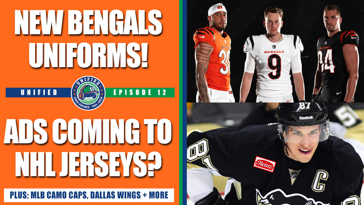
Podcast reminder: For this week’s episode, Chris Creamer and I talked about the Bengals’ new uniforms, plus we discussed the possibility of the NHL adding jersey ads, the leak of MLB’s G.I. Joke caps, the WNBA’s Dallas Wings having to scrap their just-revealed uniform due to a major research oversight, our Question of the Week, and more.
As always, you can listen to us on Apple, Google, Stitcher, TuneIn, and Spotify, or just use the player below:
The show notes for this episode, which include photos of many of the things we discussed (including a really sensational photo of Chris’s son having what appears to be a formative logo-related experience), are here. Those photos (and some additional ones) also appear in the video version of the episode, which you can see here:
Please consider supporting this episode’s advertisers, Streaker Sports (get 20% off any order with checkout code UNIFIED) and Homefield Apparel (15% off with checkout code UNIFIED).
Enjoy the episode, and thanks for listening.
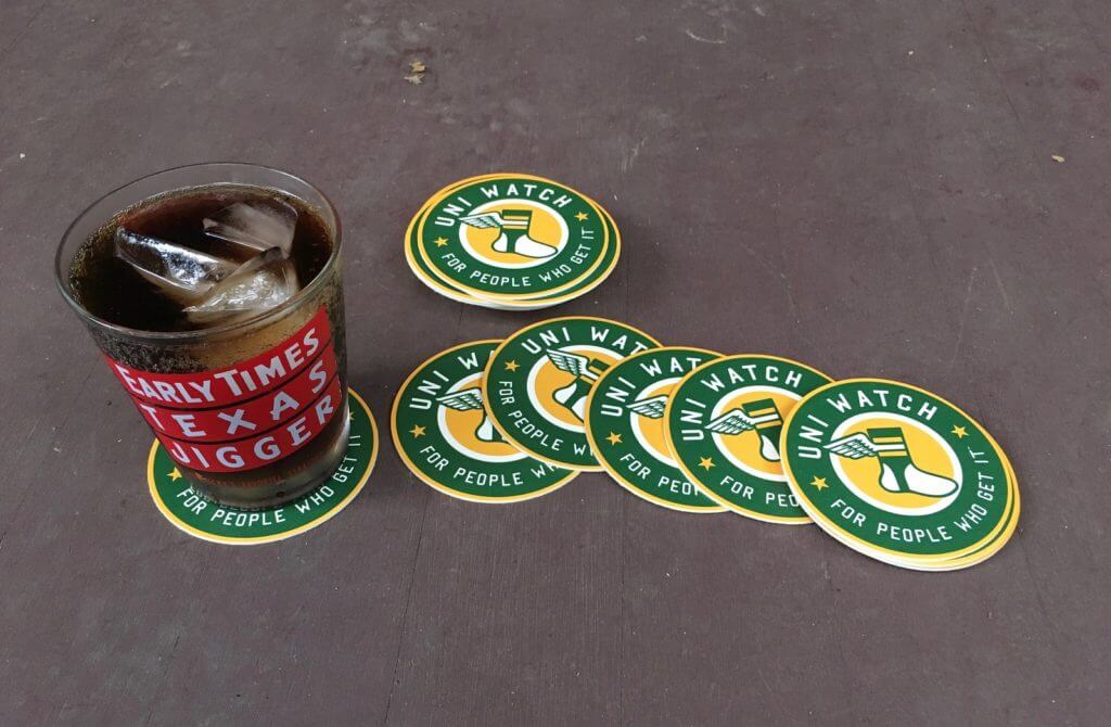
Coasters reminder: I’m down to five remaining sets of these great-looking Uni Watch coasters. They’re made in the USA from sturdy pressboard and measure 3.7″ across.
Ordering instrux are available here.
For all photos, click to enlarge
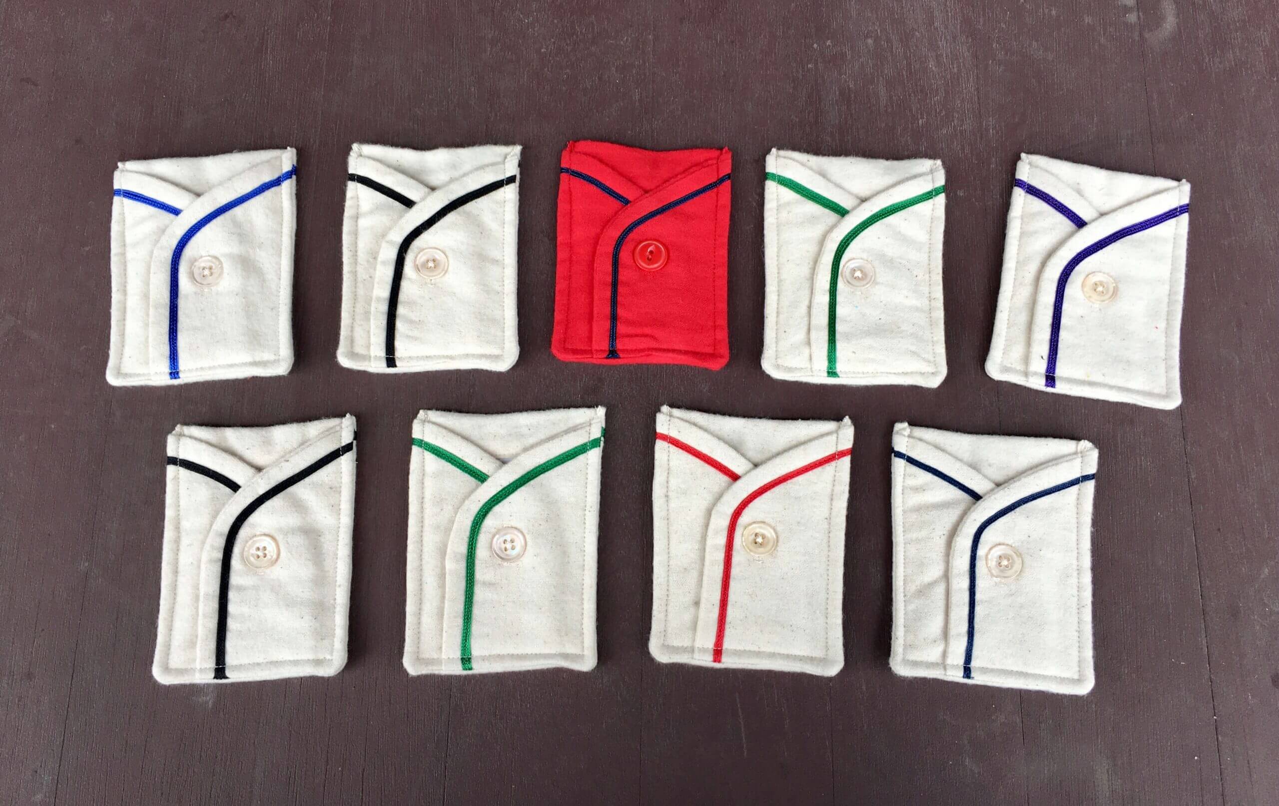
LAST CALL for the membership drive: Today is the last day to get in on our April membership drive. Out of all the people who order a membership card this week, three randomly chosen enrollees will get to choose one of the Wafflebored-made card pockets shown above (except for the purple one, which I’m saving for Purple Amnesty Day).
You know what to do!
The Ticker
By Anthony Emerson

Baseball News: A Mariners player — not sure who — had a wayward helmet logo last night (from Joel Hooper).

NFL News: Tom Brady is really unhappy with the NFL’s new uni-numbering rules (from multiple readers). … In a related item, Vikings RB Dalvin Cook is switching to No. 4, which he wore in high school and college (from our own Brinke Guthrie). … USA Today has revised its NFL uniform rankings to reflect the Bengals’ new set (from Kary Klismet).
College/High School Football News: A new NCAA “point of emphasis” (scroll down to the lower part of the page) takes aim at exposed undershirts, encouraging officials to have players to leave the game in order to correct them (from James Gilbert and our own Jamie Rathjen).

Hockey News: Maple Leafs F Nick Foligno wore his dad Mike’s 1993 team-issued Leafs cap during a press conference. It looks good for 28! (From multiple readers.)

Basketball News: Here’s an analysis of the Washington Mystics’ 19th Amedment-themed alternate uniform (from Kary Klismet). … New Nuggets G Austin Rivers will wear No. 25 (from Etienne Catalan).

Soccer News: Manchester City’s new home kits, featuring a clock motif, have been leaked by FootyHeadlines. The 93:20 is a reference to the famous goal Sergio Agüero scored to win City’s first Premier League title in 2012. … FootyHeadlines has also leaked Atlético Madrid’s forthcoming away kits. … Ever wonder why 1. FC Köln have a goat as their mascot? Here’s your answer (from Kary Klismet).

Grab Bag: Australia’s Super Netball’s New South Wales Swifts are wearing a throwback to their original yellow-centric color scheme as the Sydney Swifts later this season (from our own Jamie Rathjen). … New Gaelic games kits for Galway GAA (from Phil Santos). … These last few items are from Kary Klismet: The College of the Florida Keys has introduced its new mascot and logos. … The new North Fork High School in western Colorado has chosen its mascot — the Miners. … This article from the St. John’s University student newspaper discusses 150 years of mascot history at the school.

That’s a wrap for this week. Stay well, enjoy Phil’s weekend content, and I’ll see you back here on Monday, when I expect to have a minor NFL scoop. — Paul
The Tom Brady comments sure are bizarre/interesting. Essentially he’s saying that players have a psychological reaction to their opponents’ numbers and adjust their play accordingly. I’m trying to imagine this playing out in real time. Like a lineman seeing a blitzer wearing number 20 and setting their feet for a speedy corner blitz only to be steamrolled by a linebacker. Does this make sense to anyone who has played football at a higher level?
Yeah, I took it to mean that lineman have become conditioned on what players to keep an eye out for by there numbers. And it makes sense with regards to blocking schemes, etc. Lineman are assigned to pick off various players, it is certainly easier to be on the lookout for the linebacker crashing in vs the blitzing defensive back when you can differentiate by their numbers.
It’s poppycock. The way offenses spread out the defenses these days, you can hear QBs picked up by the field mic calling out the Mike Linebacker and many times it’s not traditional LB number.
Also, the speed of the game at the professional level…. I mean if you think OL have the to a) look at the number on a jersey and b) process what position that player is and how to block them.. well you have must also think they have time to have a burger!
I’ll tell you like one of my high school coaches said it “find some asshole in the other uniform and knock them down.”
EDIT, second paragraph:
I mean if you think OL have the TIME to…
I agree with Kek about it being “poppycock” (a nice way of putting it). Mostly because NFL teams spend nearly a week before each game going through very intense and detailed preparation of their opponents, both as a team and as individual players. Offensive linemen at the NFL level are going to know who the players are on defense they are assigned to block as well as the schemes and blitz packages they are likely to face. Nobody is going to be confused as to whether or not a guy wearing #8 is a linebacker or cornerback.
That makes sense to me, BUT then why is Brady so worked up about it? He’s not the most likable guy in the world, so I get the ad hominem part, but the guy has been in the NFL for 20 years and is the most successful QB of all time. If anyone is qualified to have a hot take on this topic, it would be him.
I’m baffled by the whole thing.
Agree, with Almafi on this. I can’t stand Brady, but, why would he specifically point out this being a bad rule unless there was something to it, especially given you don’t hear many hot takes from him. We average folk might think his reasoning about making it hard on lineman to be nonsense, but we aren’t out there playing, he is.
college teams deal with it, right? C’mon Tom
I wonder who’s the linebacker, who’s the QB in this instance from last night’s SpaceX launch? :-D
link
I could have sworn that the Nationals wore a green hat sometime between 2009-2013 for Earth day. I’ve been looking through some photos on my computer and have been searching google. Anyone else remember this?
Paul,
Can’t believe you linked to the USA Today uniform ranking when they said this about the Green Bay Packers, “However, the green and yellow is too much of a color clash”
I can picture you gritting your teeth while linking to it.
Continued good health to you and your loved ones.
We always see many uniform rankings like this that seem really out to lunch. Some teams that should be in the lower echelon are ranked higher than they should in this list. Cardinals are in the middle of the pack on this list but ranked number 32 on my list.
Yeah, the author Mark Lane doesn’t “get it”. He criticizes both the Colts and Packers for wearing basically the same uniforms forever, He says that the Colts are “wearing the same getup as Johnny Unitas”, like that’s a bad thing. Also he criticizes Washington’s colors, which I think most here want kept when they come up with a new team name. Having the Cardinals at #17 is crazy, and he says they pull off wearing black, which we all know is just wrong. Hard to believe this guy is writing articles about uniforms.
To be fair, any such ranking is going to be totally subjective and I doubt any of us will see such a list that doesn’t feature a few selections that we’d not find totally out of whack with our own opinions.
The USA Today rankings linked here seem pretty reasonable, the top five are NYG, PIT, SF, LV, and LAC while the bottom of the list includes ATL, LAR, and JAX. These opinions seem pretty much in line with the general views of Uni Watchers.
Even though I love the Packers’ uniform, I find myself wanting to change everything about it. In other words, I wish there were two green+gold teams.
Yeah, the USAT effort is the Atlanta Falcons of rankings.
Ah well, different strokes . . .
As a social studies teacher nothing annoys me more than a lazy depiction of Earth like that Sox patch. The “land” on that Red Sox patch is just a hodgepodge of giant islands that don’t exist. They didnt even try to give a shape to the Americas or the eastern hemisphere. It looks childish.
Yes that is a terrible depiction. Players from Ecuador may look at that patch and wonder why their home country has sunk beneath the waves.
I still like the earth design better than the recycling logo. Especially now that China isn’t buying our recyclables and most just go straight to the landfill anyway.
As a cartographer, I came here to make this exact comment!
Pretty great that both Mets radio guys are a part of the comm-uni-ty.
The article about Denkert mentions a town called Gloversville. Ironic eh? I suppose the town was named, or maybe renamed, for the main employer.
As an aside, will you be restocking the brown Brooklyn Branches T-shirt in size XL?
Weird that Teespring doesn’t have that color in XL. Let me check with them — will advise!
Readers of Richard Russo will recognize the Mohawk Valley area of New York as the setting for many, probably most, of his novels. The history of the town’s name is a frequent topic in them. The books are all remarkable for their detail, empathy and obvious endearment Russo has for his home town.
Indeed Gloversville and nearby Amsterdam and other towns along the Mohawk River were once home to many leather and glove factories.
Good photo-essay here:
link
The Sox “recycled” St. Patrick’s Day uniform makes a lot of sense. Never thought of that before!
On another note, don’t forget FCS playoffs start this weekend. There’s Division I football being played this spring!
I’m Still Calling It I-AA.
Not Earth Day, but the Phillies wore green caps April 30, 2008 — their second home game after Earth Day, but more likely to celebrate a new initiative. (I have no idea how to post a picture from that game, but here is the green energy announcement:)
link
I was able to find this one photo from AP.
link
Thanks! I was at that game and have some photos from it on my website but wasn’t sure of the process to post it here.
“You say it’s your Earth Day!” Awesome heading!
It’s my Earth Day too.
I must admit, until now I’ve never given a moment’s thought to how the leather is cut to make baseball gloves. Interesting!
Looks like 1B Evan White…with the floating helmet logo…FWIW
Some good stirrups/ sanis talk during the Marquee Cubs-Brewers telecast today- with 3B coach Willie Harris wearing them
Dalvin Cook is NOT changing his number in 2021. Because of the ridiculous rule that NFL players need to buy the entire inventory of the old jersey still in stock in order to change numbers that year. For him the number came in at over $1 million and he decided not to switch.
side bar: The April 21 and 22 photos are a stark reminder of how much I hate the matte batting helmets in the MLB (a minority opinion, I’m sure). The shiny (but not chrome) gleam, reflecting the stadium lights…that’s a batting helmet for Pro Baseball, if ya ask me.
(and no one did)