Click to enlarge
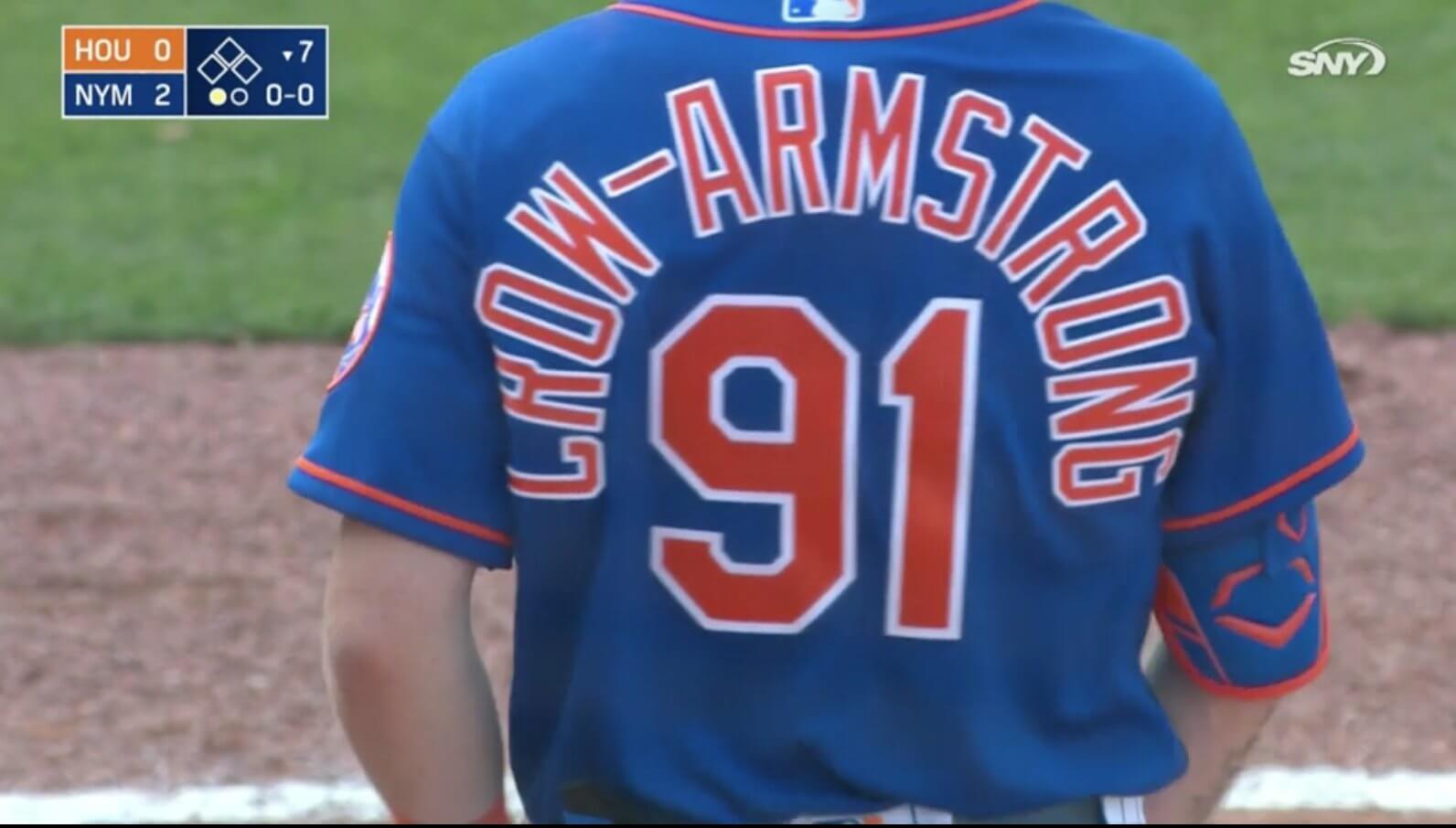
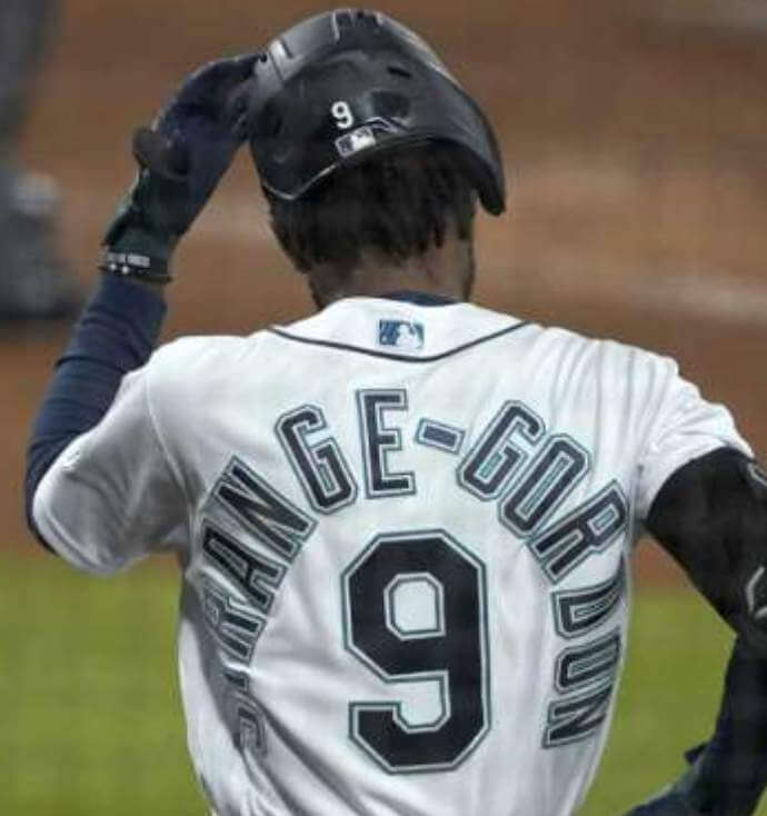
Mets prospect Pete Crow-Armstrong — the 19th overall pick in last year’s MLB draft — made his Grapefruit League debut yesterday. There was lots of chatter about his plus-sized NOB, how they should have used compressed lettering, blah-blan-blah.
But you know what really stood out to me? The hyphen.
I mean, look at the size of that thing — it’s more like an em dash! It could easily have been half that length and still gotten the job done. Granted, a smaller hyphen wouldn’t have made the NOB look smooth and elegant all by itself, but the lengthy hyphen definitely made the situation clunkier than it needed to be.
That got me thinking. We’ve talked a fair amount in recent years about the NOB challenges presented by the growing number of athletes with hyphenated names, but I don’t think we’ve ever discussed the hyphens themselves. What sorts of hyphens have other teams used?
Was Kareem the first athlete to go HNOB (that’s hyphenated name on back)? I’m not 100% sure, but he was certainly one of the first, so his HNOB treatment can be considered at least somewhat foundational. Let’s take a look:
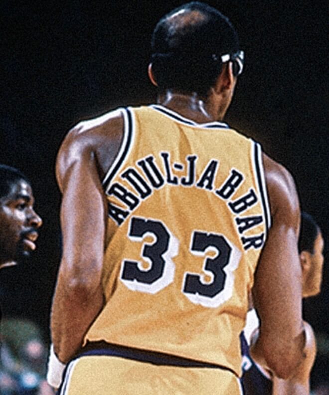
That’s pretty good. The hyphen is a reasonable length, plus it’s able to nest within the negative space of the two surrounding letters — a nice case of surname serendipity.
Obviously, lengthy NOBs, whether hyphenated or not, are easier to handle with one-color lettering. Similarly, one-color hyphens tend to look cleaner and properly stubby:
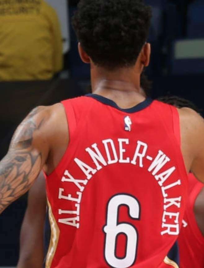
By contrast, two- or three-color hyphens tend to look particularly bad. Even if they start out at a reasonable length, the colored outlining usually makes them too unwieldy:
Still, even a two-color hyphen can look fine if it’s kept short and simple:
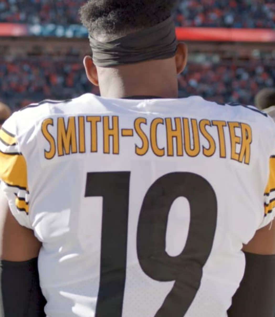
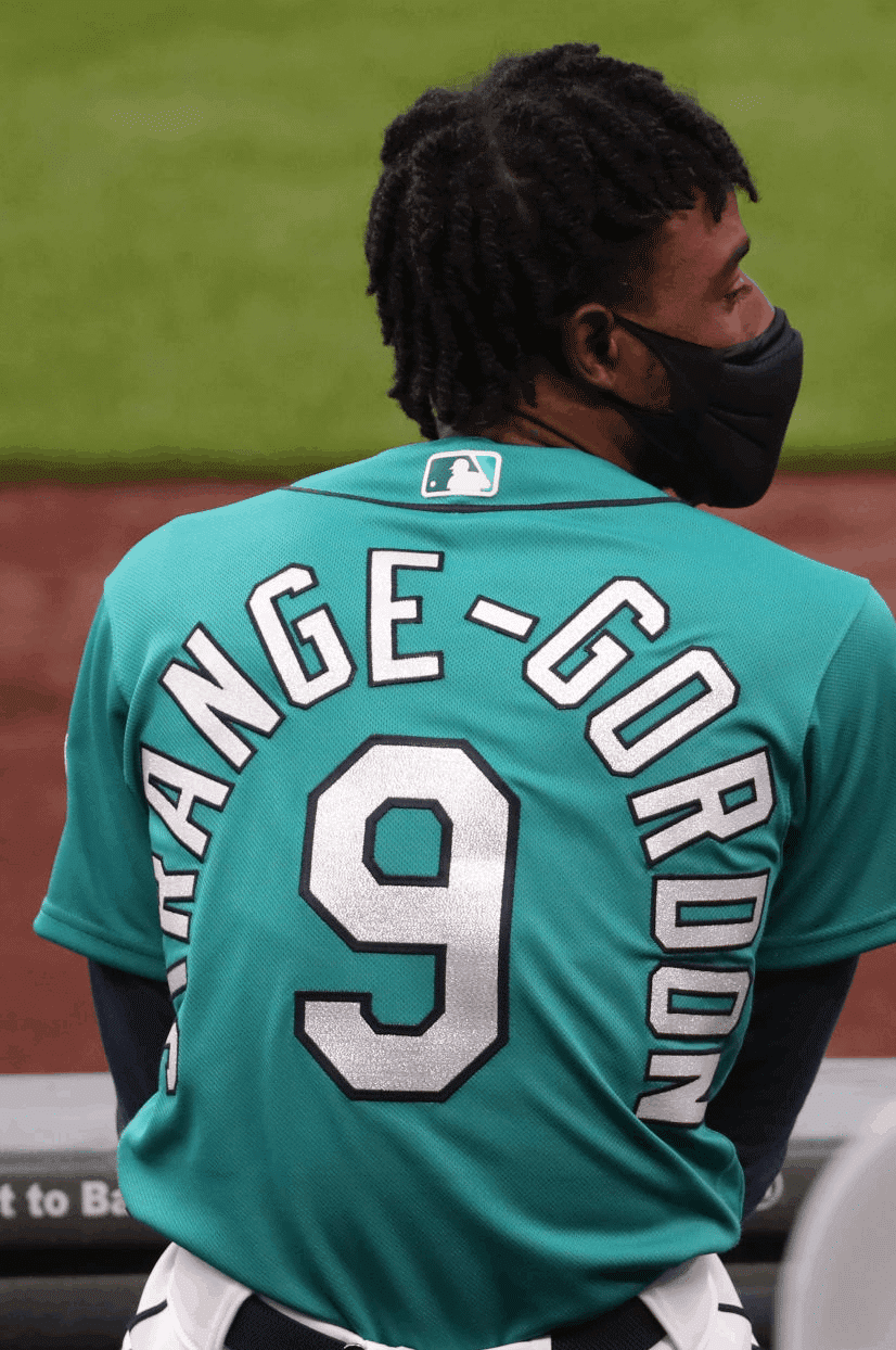
There’s also the double-decker option, which makes the HNOB more manageable but leaves the hyphen hanging at the end of a line:
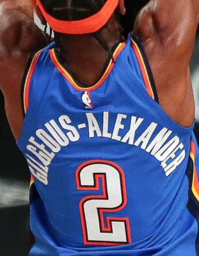
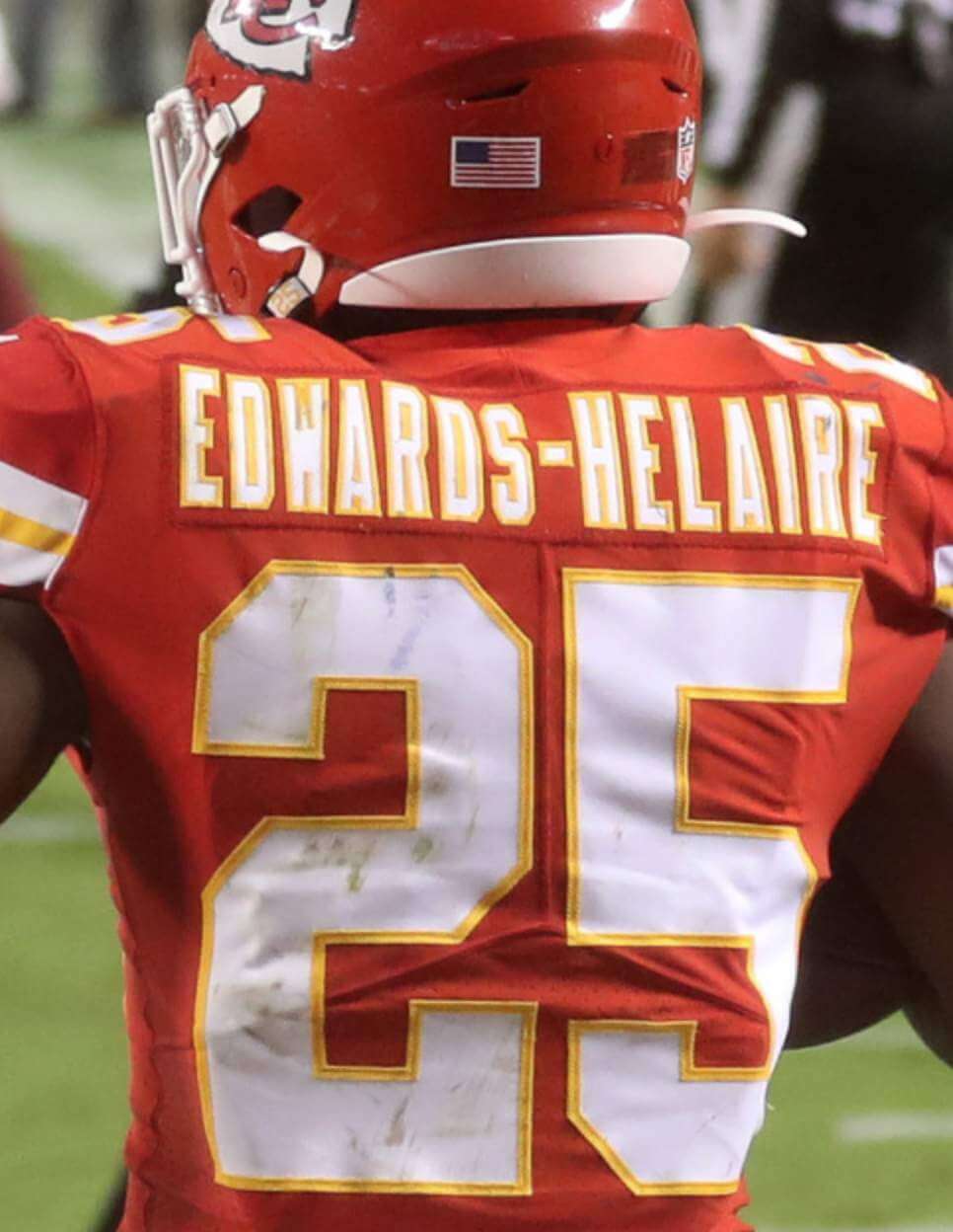
As you can see in those last several shots, hyphens of any length tend to look better in straight NOBs. For an arched NOB, the length of the hyphen can make all the difference:
Ugh — that hyphen looks really bad.
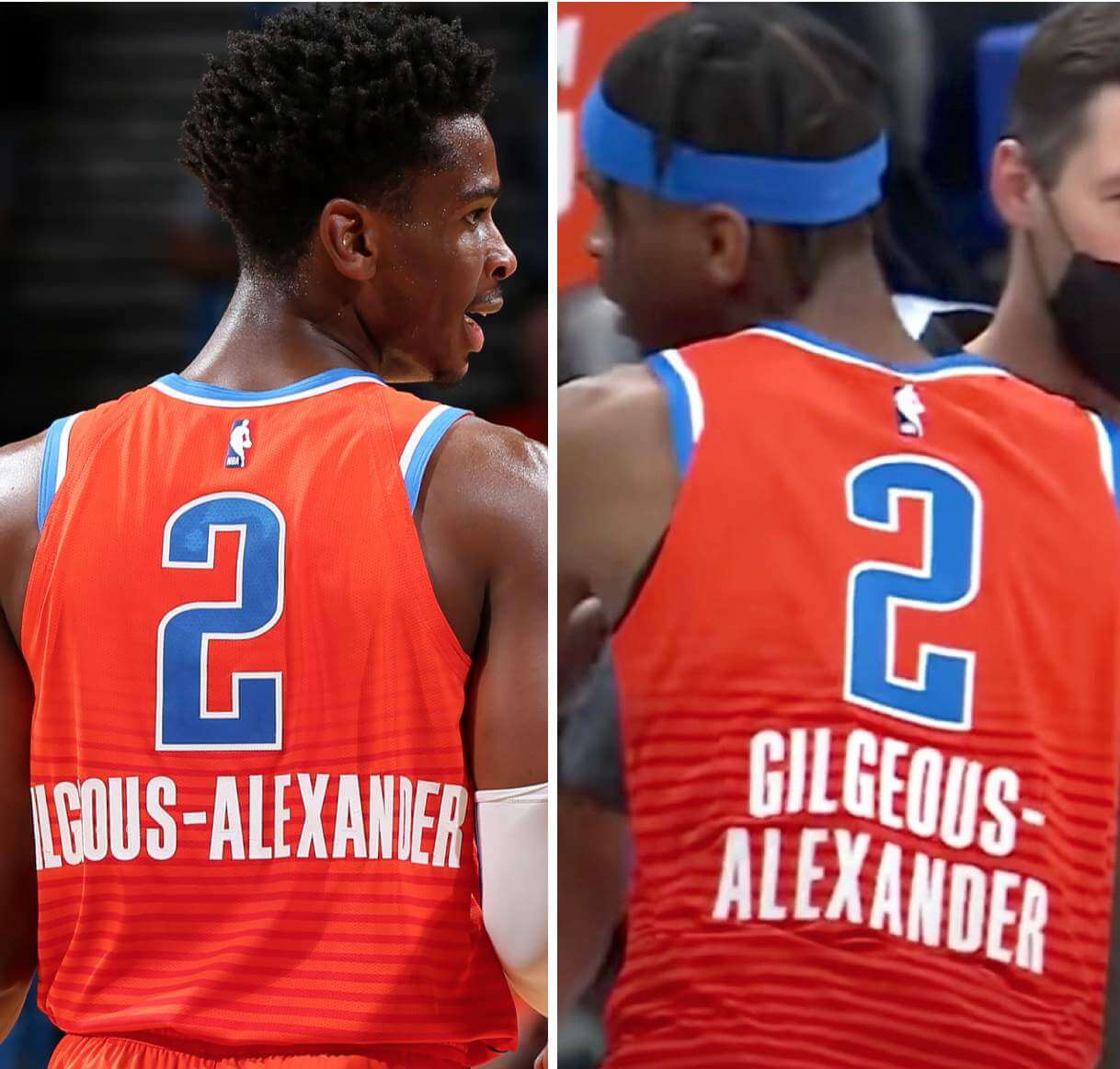
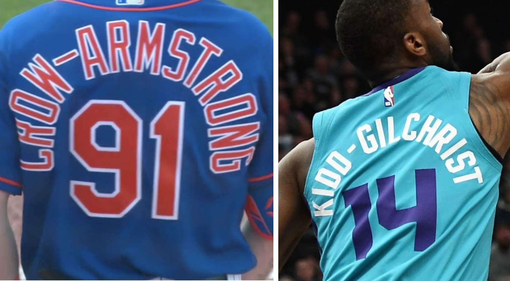
Let’s look at Crow-Armstrong’s hyphen again — the one that got me started down this rabbit hole — and compare it to a much shorter hyphen appearing in essentially the same spot on Michael Kidd-Gilchrist’s NOB:
That side-by-side pairing is particularly instructive because the two surnames have the same basic format: four letters, then a hyphen, then nine letters. It’s not a perfect apples-to-apples comparison (three of Kidd-Gilchrist’s letters are “I,” which doesn’t take up as much space), but the two photos nonetheless show how crisp typography — including a reasonably sized hyphen — can really make a difference. Kidd-Gilchrist’s HNOB doesn’t seem like a tight squeeze at all, while Crow-Armstrong’s is a mess.
I could go on, but you get the idea. I looked at a lot of HNOBs while working on this blog entry, and not a single one of them included a hyphen as long as Crow-Armstrong’s. It’s truly a hyphen of Ruthian proportions (or maybe we should say McGwirean proportions, since it’s like a hyphen on steroids).
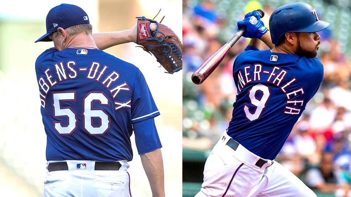
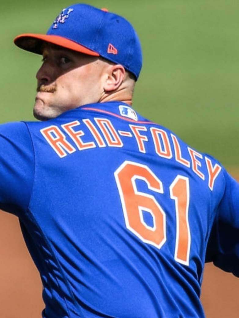
According to the Mets’ all-time roster, they’ve never had a player with a hyphenated surname (although there could have been other players like Crow-Armstrong — minor leaguers who got to attend the big league camp during spring training), so they don’t have much experience with HNOBs. But they’re getting some now — in addition to Crow-Armstrong, they also have newly acquired pitcher Sean Reid-Foley in camp. His hyphen is a smidge longer than I’d like, but nowhere near as egregious as Crow-Armstrong’s:
Thus ends, at least for now, one of the geekiest topics in Uni Watch history — and that’s saying something!
Click to enlarge
ITEM! New NBA feature: My latest piece for InsideHook is about contemporary artist Daniel Arsham (shown above), who was recently named creative director of the NBA’s Cleveland Cavaliers, and how he represents the leading edge of the league’s blending of sports and non-sports culture. It was a really interesting piece to report, and I think it gives a good glimpse of where the NBA (and maybe the sports industry in general) is heading in terms of marketing, promotion, and branding. You can check it out here.
Numbers game: Couple of interesting developments yesterday regarding retired numbers. First, the daughter for former Chicago Cardinals great Marshall Goldberg (shown above), whose No. 99 was retired by the franchise in 2006, gave her blessing for newly signed defensive lineman J.J. Watt to wear that number if he chooses. By day’s end, the Cardinals had officially un-retired the number and issued it to Watt. This isn’t the first time a retired number has been brought out of mothballs, but it’s still an uncommon situation.
In another uncommon development, Houston Rockets owner Tilman Fertitta announced that the team will retire James Harden’s No. 13 later this season. This isn’t the first time a player has had his number retired by a former team while he’s playing for another team (you can see additional examples in this thread), but it always strikes me as an odd honor for an active player. It’s one thing if you want to take a number out of circulation, but save the official number retirement until after the player himself has retired.
Meanwhile, a nitpick: That Harden article I linked to (and some of the Watt articles I saw, although not the one I linked to) erroneously referred to retiring the player’s jersey instead of his number. We’ve already seen “jersey” used as a synonym for “uniform,” and now it appears to be morphing into a synonym for “number” as well — ugh. Fight back against uni-illiteracy!
Click to enlarge
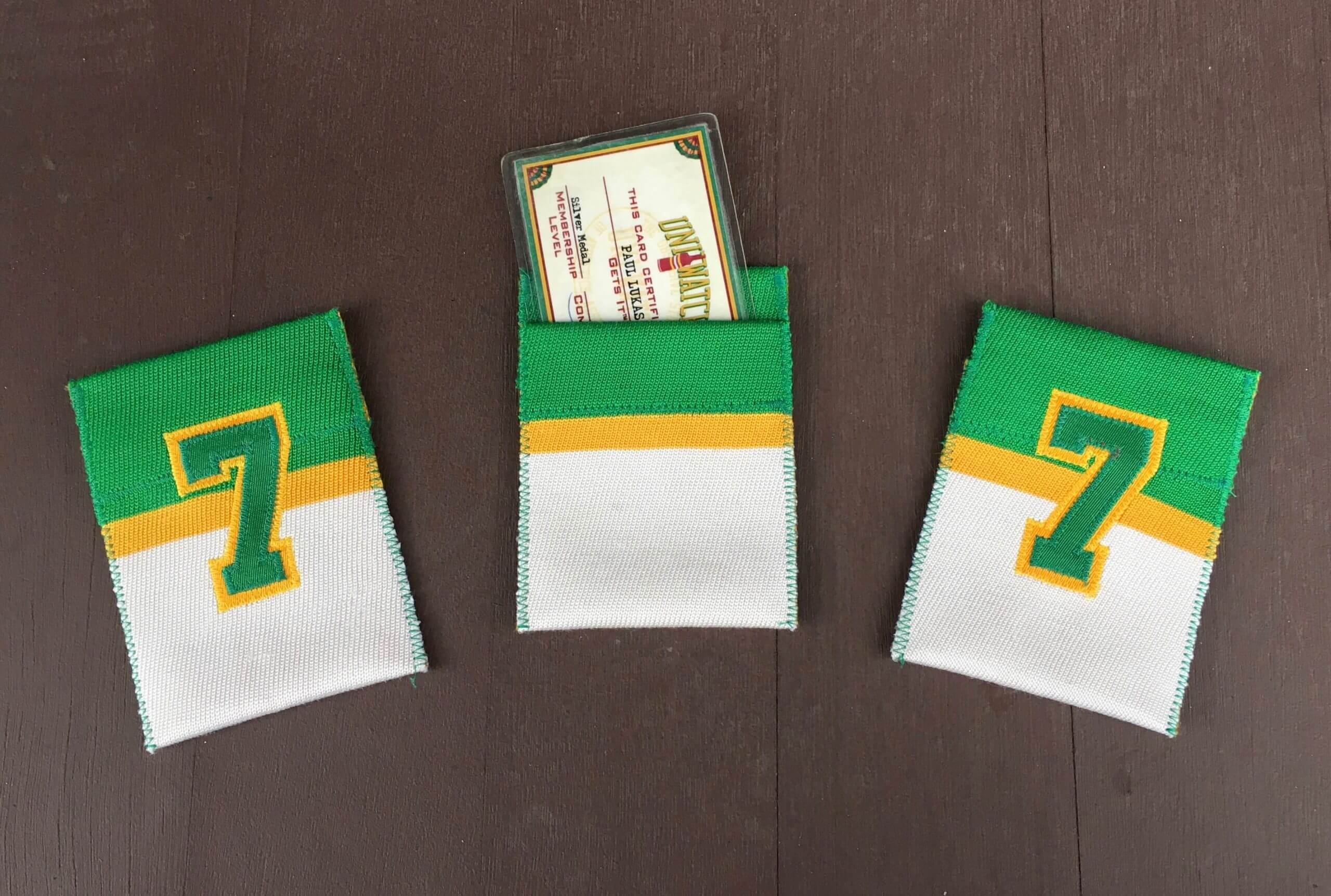
Membership drive reminder: In case you missed it on Tuesday, we’re running a membership drive this week. I will pick three people at random from everyone who orders a membership card this week, and those three people’s cards will come with one of these beautiful card pockets hand-sewn by DIYer extraordinaire Wafflebored.
Also: About a year ago, as a gesture of pandemic solidarity, I lowered the membership price to $20. After this week, the price will go back to $25. So signing up this week is a good move — you’ll get in at the discounted price and will also get a shot at one of the card pockets. You know what to do.
Click to enlarge
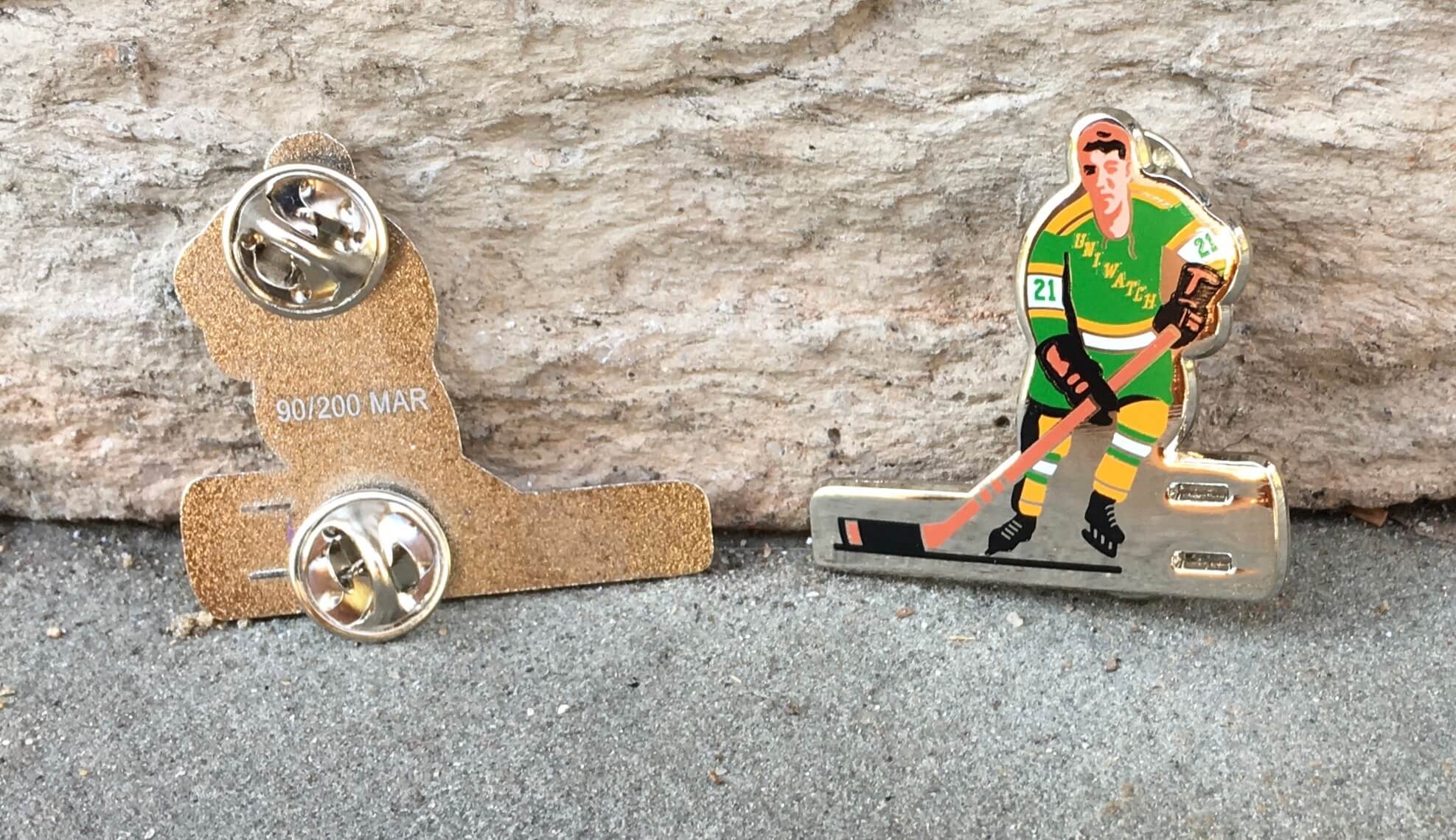
Pin Club reminder: In case you missed it on Monday, the Uni Watch Pin Club’s design for March is a shout-out to classic table hockey players. It’s one of my favorite designs of the entire Pin Club project, and it’s available here.
This is a numbered edition of 200. As of this morning, we’re already down to 48 of them remaining, so move fast (or at least fast-ish).
Meanwhile, another thing you might have missed earlier this week is that we now have a small assortment of T-shirts and stickers for the Unified podcast — you can see them here.
We’ll be adding more designs soon, and also hope to have ballcaps similar to the one shown in our primary logo — stay tuned. Thanks for all your enthusiastic support of this new project!
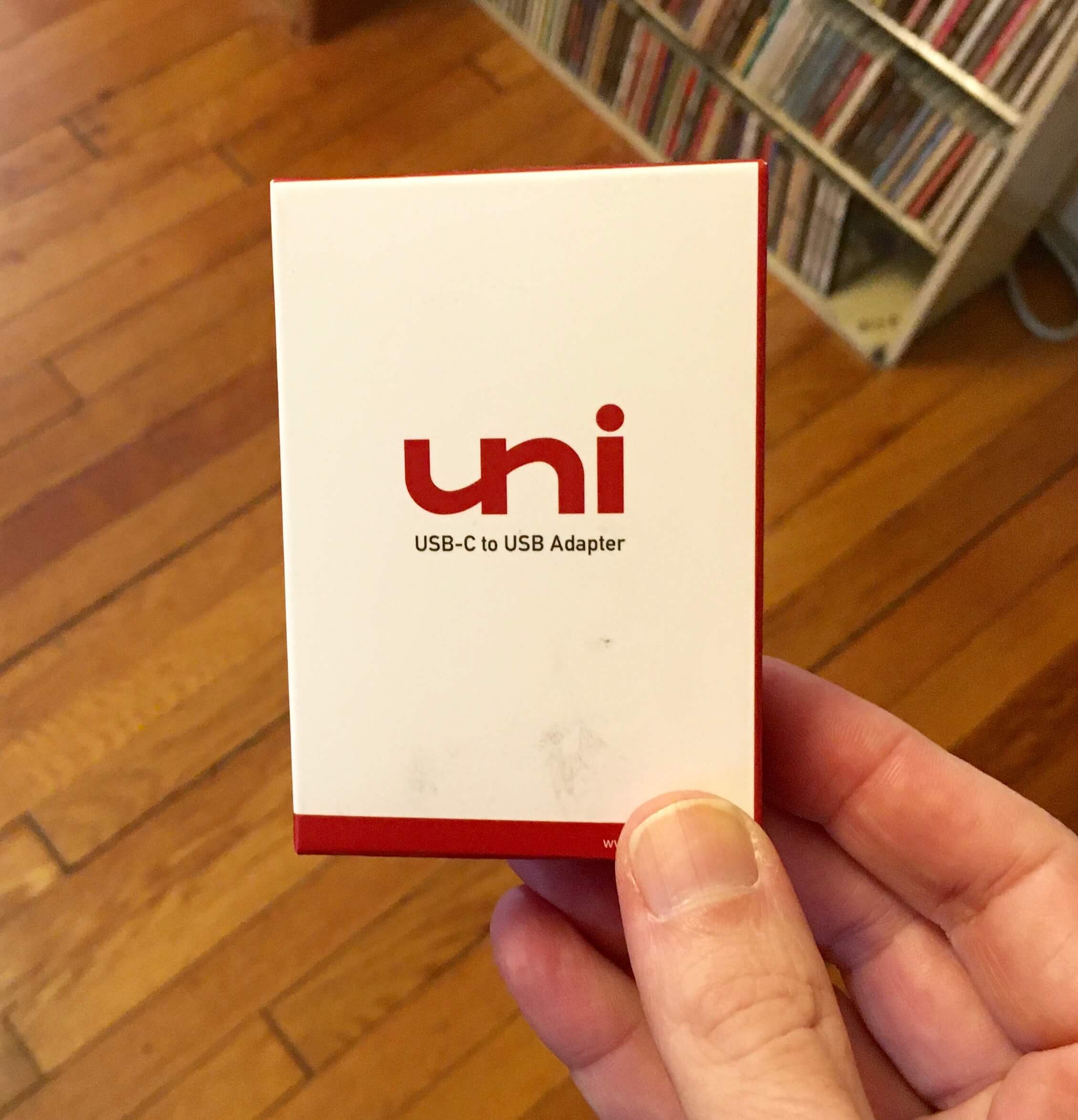
Like it was made for me: I recently got a new laptop and quickly discovered that its ports weren’t compatible with my printer or podcasting mic, so I needed some adapters.
Wasn’t hard to figure out which brand to get.
The Ticker
By Lloyd Alaban

Baseball News: This year’s World Series logo has leaked (from Mike Chamernik). … The Cubs have player-themed social distancing markers at their spring training facility (from Steve Sher). … A sportswriter has given a uni-centric review of Starting Lineup figures from the 1980s and ’90s (from James Griffin). … Oklahoma State has inconsistent pants piping (from Justin Southwell).

Football News: This Twitter thread has some reasonable assumptions about Arizona State’s uniforms for 2021, based on the team’s schedule.

Hockey News: The Rangers wore Women’s History Month-themed warm-ups last night (from Alan Kreit). … Long Island University women’s, which usually goes NNOB, wore NOBs for their conference championship game (from John Muir). … Wade Heidt found three really great vintage photos of the Drumheller Miners and the Saskatoon Quakers. Worth the click! … Bold-looking new playoff uniforms for HC Traktor Chelyabinsk, a Russian team (from James Paterson).

Basketball News: New logo for the WNBA’s Seattle Storm (from multiple readers). … The Indiana Department of Transportation has installed temporary basketball-themed highway signs ahead of March Madness (from William F. Yurasko). … Speaking of March Madness, the JW Marriott in Indianapolis has a massive bracket projected onto its exterior (from @mrmichael21).

Soccer News: Lots of MLS news yesterday, beginning with new kits for the Columbus Crew (from Jay Mazzone). … New kit for the Vancouver Whitecaps (from multiple readers). … New shirt for NYCFC (from multiple readers). … New shirt for FC Dallas (from Gabriel Hurl). … The San Jose Earthquakes were set to unveil their new unis yesterday, but decided to postpone the announcement due to the death of head coach Matias Almeyda’s father. … MLS has a new championship badge (from @tmclaughlin79). … Here are some details on the Chicago Fire’s new crest (from T.J. Zaremba). … Inter will not have Pirelli ads on their shirts next season (from Bridger Deschamps). … The NWSL’s Angel City FC now has a sleeve ad. That’s two ads so far, and the team is still more than a year away from playing its first game (from our own Jamie Rathjen). … Here’s why Huddersfield Town keeps changing its shirt ad every week (from Scott Rogers). … New 125th-anniversary kit for German side Hannover (from Ed Zelaski).

Grab Bag: Our own Jamie Rathjen enjoys writing about “cap numbers,” which are permanent numbers assigned to each successive player in a team’s history (so the 240th player to appear in a game for a given team would wear a small No. 240, in addition to their regular uni number). He spotted Australia’s netball team wearing them high on the back of their uniforms. One of the players at the far right, Kiara Austin, doesn’t have a cap number, because she was making her first appearance and therefore couldn’t have her cap number assigned until after she entered the game. … New PT uniforms for the U.S. Air Force (from Timmy Donahue). … Also from Timmy: The Denver City Council approved a $1.1 million expenditure for police uniforms, accessories, and riot gear. … Washington State-based Oly Town Artesians is holding a bracket tournament for the best-looking county seal in the state (from Brandon Sparks).

Interesting stuff on the hyphens!
Retired numbers-I loathe the practice of reissuing a retired number when a team acquires someone whose worn that number. Denver unretired 18 for Peyton Manning. Seattle unretired Steve Largent’s number for Jerry Rice. Maybe it’s time to do away with the practice as retiring numbers looks to be an insincere gesture. Rings of Honor may be the best way to go.
The answer is to stop retiring numbers.
An example: the St Louis Blues, where they number 7 is not retired, but honored for Red Berenson, Gary Unger, Joey Mullen, and Keith Tkachuk. Other players can wear the number (Hello Pat Maroon!) and look to live up to the tradition of it with the club. The Blues do have several numbers in teh rafters (2,3,8,11,16,24), but I quite like what they did with number 7.
I really like the “honor but not retire” concept.
As a fan of a team with a 145-year history (the Chicago Cubs), I expect my team to be around for many more decades and centuries. Eventually (as we see with the Yankees) the lower, more “natural” numbers (with which people feel more associations in life) start to disappear.
One solution I proposed here was to only allow one retired number at a time. That way the people who remember seeing the man play until recently now notice that the number is gone, but you don’t have decades of jersey numbers of past stars all being banned to future players.
This system would also allow teams to honor players who would never merit a long-term number retirement but who made big contributions (particularly in the short term) and are now retiring.
And there would even be a second special moment for that player because they could make a big deal about his number coming back, and who got to wear it next.
Agreed.
Hi Paul, the table hockey player might be my favorite pin so far too, and I’m embarrassed to say that I waited a full day to order mine! I’m a member of a table hockey group on Facebook, and this pin has been getting some attention there too. I believe someone even tagged your personal account in one of the comment replies.
Question about future pins: Has any thought been given to a track & field and/or wrestling (the scholastic variety, not the professional variety, although that could be fun too!) oriented pin?
We have discussed t&f (might happen down the road). Have not discussed wrestling but will consider!
A Uni Watch lucho libre mask pin would be top notch
Rugby? After all we wouldn’t have American Football without it!
Many times the UW logo magnet on my car has been mistaken for a T/F team one by those who don’t Get It.
Hey Paul…are they still in stock?
Yes — the winged stirrup version (not the round version).
On the new World Series logo, the “world” is set within the seams of the baseball to North America and the very top of South America where all the teams play and where the overwhelming majority of players come from. No acknowledgement to the other continents, especially Asia with the popularity of the game and the players who have come from Japan, Korea and other countries.
Can we just agree the World Series needs to be renamed? Because the logistical problems of playing a literal world series are just too big to overcome.
The University of Arizona has had a long-standing policy of “jersey recognition” instead of retired numbers. The unofficial practice is for those numbers not be issued. Exceptions can be made, such as this year’s Steve Kerr – Kerr Kriisa situation.
link
My take is that the “hyphen” on Crow-Armstrong’s jersey is not a hyphen. It’s something else that was pressed into hyphen duty. Much like how the “d” in deGrom looks like an upsidedown “p”. If the Mets continue to acquire players with non-standard names, they will have to up their lettering game.
Actually, deGrom’s “d” is a true lowercase letter, complete with a little notch at the base that doesn’t appear in a capital “P”:
link
I stand corrected. I still think the Crow-Armstrong’s hyphen is a repurposed “i”. I am still waiting on Mr. Met to get back to me on the “99” number issue. I will ask him about this too.
If I remember correctly though around 2013-2014 when the Mets first started having players with a lower case “d” in their name they originally used an upside down “P” before switching to what they have now with the proper “d.” d’Arnaud and den Dekker come to mind.
Here’s the full story:
link
Today’s lead piece is so gloriously Uni-Watchy. Sharing today’s blog with someone who doesn’t “Get It” would be completely lost. Niche interests rock.
Kareem Abdul-Jabbar was a 2-colored NOB. But the hyphen was small and his name is only 11 letters total. The big difference between the MLB and NBA uniforms seems to be the size of the lettering. The NBA NOBs appear smaller in height relative to the numbers. Also, NBA players are on average much larger than MLB players.
Maybe the answer is to eliminate NOBs altogether. It’s worked for the Yankees. After all, it’s why uniforms got numbers to begin with.
If you’re settled in to watch an entire game, NOBs are a little less necessary. Even then, they may help to identify a player quickly.
But if you’re flipping around the MLB package, or watching highlights online, it’s nice not to have to figure out who number 27 for the Rockies is.
Alternate question: If you have NOBs, is there any need for numbers?
Yes. Because take those away and that’s an awful lot of space they could fill with ads. Don’t give them ideas, Paul…
Plus it’s a lot easier for the folks in the stands to see a number than a name.
For sports that have penalties/fouls, the refs use the numbers with their fingers when announcing and letting the scorers area know. Less chance for mistake and no shouting needed I would think.
For baseball, probably not needed but don’t you dare take away any baseball traditions. (/sarcsasm).
Agree with Jim on being in the stands as well.
Regarding the morphing of the terms “jersey” and “number:” not sure if this applies to the Cardinals or Rockets, but many teams, especially college teams who are dealing with limited number options, actually do retire jerseys as opposed to numbers. Kentucky Basketball, for example, has retired 33 jerseys, including several pairs and even a trio that share the same number.
It always makes me wonder. If Syracuse has retired the #3 *jersey* of Gerry McNamara, but not the actual number, that means Dion Waiters can still wear #3. But what if a future player with the surname McNamara comes around and wants to wear #3? Isn’t the “McNamara, 3” jersey retired?
What happened to the layout? Header image is oddly cropped, black text on dark green background…Is it just me?
Happening to me too. Tried to refresh the page with no luck.
Not just you. Working on it.
Yep, hard to read.
Now fixed.
Anyone else having issues viewing the site this morning? The layout is screwed up quite a bit.
Yes, the main page does not display correctly but the other pages do, maybe something to do with ads?
Not ads. Working on it. Please be patient.
Anyone else thinks the new Seattle Storm logo would be better suited for an MLS team?
The Storm can say the peak is associated with mountains. I’m not buying it.
To me it looks like the Space Needle superimposed in front of the roofline of the new Climate Pledge Arena (formerly The Key).
link
Storm will play there when the arena redevelopment is completed.
Awesome UNIFIED Logo. Great show all.
Thank you guys for doing this podcast.It is really very natural and great.
Your friendly neighborhood Spider-Man approves of today’s column… link
Retiring uniform numbers should be retired. Just have a ring of honor or wall of fame that has the name of the players.
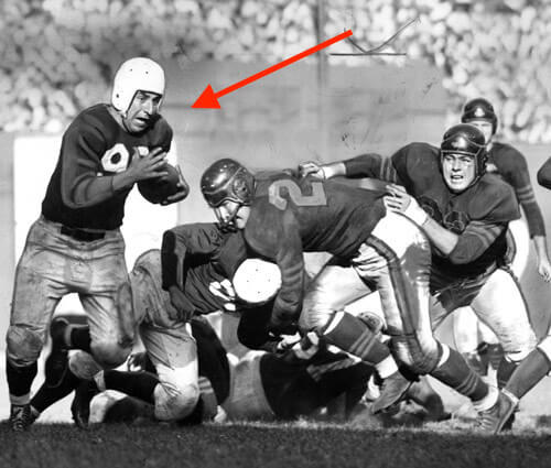
IIRC, the first hyphenated NOB in the NFL was link in 1973. His brother link debuted a couple of years later (can’t find a pic of his NOB), then there was link in 1983 (from that angle his hyphen appears rather tiny).
Hyphenated NOBs have become more common since then, but I wonder if it’s less of an issue in the NFL because the NOBs are all horizontal rather than arched, and the shoulder pads provide more space (although more so in the days of the Mike-Mayers and Haj-Shiekhs of the world).
I had forgotten about Ali Haji-Shiekh, thanks for reminding me. I enjoyed hearing announcers say his name. Another kicker name from the 80s that I found aurally pleasing was Rafael Septien.
The USFL in mid-’80s had some kickers whose names were even more fun, like the Michigan Panthers’ Novo Bojovic (Bo-HO’-vic) and the Tampa Bay Bandits’ Zenon Andrusyshyn (Andrew-zishin).
I would wear a Zenon Andrusyshyn jersey.
He belongs in the Pantheon, with Bart Crashley and Urban Shocker.
There’s an article this morning over at The Athletic going through the various Patriots hitting free agency, and the header image is a picture of Joe Thuney (#62, new font) standing next to David Andrews (#60, old font). The top comment on the article (not from me) is someone complaining about that discrepancy. :)
Amazing what a difference the size and orientation make on the aesthetics of the hyphen for NOBs.
RE: retired numbers.
Totally agree on the Harden thing. Seems foolish to retire a number of a guy actively playing on another franchise it. Simply don’t issue it and wait until he actually retires it to make it official.
Unretiring numbers makes no sense to me. Even in the case of an future hall of famer (or one of the ever in the case of Jerry Rice) coming aboard. I remember Montana going to KC when I was a kid, and him changing numbers because of Len Dawson helped me learn about the history of the sport, but also actually made sense for the transition. It is rare an all time great changes teams, changing uniform numbers actually seems appropriate in those cases.
Regarding Harden specifically, what did he do that merits retirement at all, much less ASAP while still alive and still active?
1 MVP, zero titles. The Rockets built a team around him and then he pouted his way out of town.
We’re cheapening the honor of retiring a number. People rip on the Yankees, Celtics and Canadiens for having a lot of retired numbers but most of the guys in their rafters are true legends and Hall of Famers.
What makes the hyphen look so out of place to me is that it’s a straight line inside an arch. My brain wants to see a curved line along the arc. It looks like the nameplate is resisting being bent or something.
Yeah, but again, that doesn’t look as bad with a short hyphen. A *long* hyphen, like Crow-Armstrong’s, really accentuates that issue.
I think the hyphen on Crow-Armstrong looks bad as it’s on the curve. Not sure if it would look better if it was curved a bit also or at least rotate it a smidge counter clockwise.
Poor S-G why is it crooked?
Abdul-Jabbar’s hyphen looks like it’s been added to ABDULJABBAR. It needs space like it’s a letter but not too much like Nicolas AUBÉ – KUBEL (link).
The apostrophe is too close to the first letter in Joel L’ESPERANCE’s name (link).
Man, I remember those Kenner sports figures. They were considerably less accurate than the Batman toys they also made. The sports figures never looked like the people they were depicting. Plus there were always uni mistakes on the paint jobs. I always thought the final product shape looked a little blobby. A pretty crappy product all in all, but a fun trip down memory lane. Anyone remember the going rate for one back in the day?
The quality of uniform depictions did get much better over time, although they never figured out how to put pinstripes on them which kinda sucks. Here’s the retail prices for the originals: link
They were 7.99 in Canada and a buck or two less in the US.
the very idea of a retired number is ridiculous. and then to un-retire? it just points to the lunacy in the first place, when the player is long forgotten, so is his god-like hold on a digit.
since the site is gearing up for beisból, how stupid is it to see shortstops wearing 78 because every digit is missing. just have a little museum or whatever for past glory, and be done with it. the hoover wasn’t 5, he was brooks robinson. let’s see someone try to live up to it.
while i’m on the subject, whoever responded to me late the other day about how the game has become unwatchable, and said, “baby/bathwater”, you missed what i was saying. not only is the game now visually unwatchable, it is stylistically and practically unwatchable in every manner possible, the visuals just punch my sack. the game is unrecognizable and a complete joke. don’t confuse me, i have a great affection for the game, but the day i divorced myself from the anchor of the sport, i was liberated. so the uniforms are just one foul stench of the baby i discard with the bathwater.
“when the player is long forgotten, so is his god-like hold on a digit.”
Presumably that shows that some numbers are retired for players who do not have meaningful legacy such that they are always known by fans of the team. I think this is certainly the case. Unless a player is a sure fire, first ballot hall-of-famer, perhaps it doesn’t make sense to retire their number.
As others have said, it makes sense to have a ring of honor, or a team hall of fame for most of these significant players in a franchise. But retiring a number should be reserved for someone who’s legacy is never going away.
Tom Brady won 6 championships, safe to say you can retire his number. Isaac Bruce? Great receiver, won a championship, NFL hall of famer, yep. All time great that the Rams retire his number? Don’t think so.
It’s time to get rid of NOB on jerseys altogether. The overly long hyphenated names and the proliferation of “Jr.”, which isn’t even an actual part of an individual’s last name, is too much for this grumpy old man to deal with. Now get off my lawn, you rotten kids!
I don’t have a problem with retiring numbers.
The problem is when teams don’t have the b***s to say, “Sorry, #x isn’t an option.”
If the person honored is such a legend, stand up for that history. Case closed. End of discussion.
I would like to think, for example, the Packers would never consider giving Stefon Diggs #14. Just shouldn’t happen.
That USB cable package is driving me crazy! I’m assuming it’s a “USB-C to USB-A Adapter”. Both ends of that cable are USB! Fight back against usb-illiteracy!
link
(I guess this is what happens when you cross an engineer with a uni watcher.)
In the arched lettering hyphen examples the ones done the worst also don’t line up the hyphen between the middle (top to bottom) of the two letters. Looks really sloppy.
Agree. I think the way to make it work is, as you said, line it up in the middle (top to bottom), don’t make it too wide, and also when orienting (rotating) it, start with it at the base of all the other letters, so it is on the correct rotational angle, then properly align it top to bottom.
Intersting news out of English soccer – Premiership sides (plus AS Roma in Italy) are taking the animals off various club crests to raise awareness of decreasing numbers of wildlife species around the world:
link
West Bromwich Albion are down a bird on twitter: link
Back in the 70s, the Reds and Tiger had abnormally large NOB fonts. It was cool on a limited basis, but really a bit too large logistically. I feel the Mets NOB lettering is almost as big at this point. I think some shrinkage is in order. This looks right to me…a bit shorter and in case of a longer name slightly condensed:
link
I wonder if any players for the Winston-Salem Dash have ever gone HNOB?
link
The worst example of a number being un-retired was when Duke brought back Danny Ferry’s #35…to give to a incoming freshman, Marvin Bagley. Who only stuck around for one season.
After beta-testing the concept for a few decades, it has turned out that retiring numbers is a bad idea. It was predicated on a team retiring one (two, maybe) number in its history; retiring dozens of them makes the custom of numbering players unworkable.
Is there really evidence that there is a “growing number” of players with hyphenated last names. If anything, that convention was popular in the 1980s, and has virtually disappeared in recent years.
Yes, there is:
link
This post has reminded me once again that if I had the money to own a professional sports franchise in the first place then I would spring for the vertically arched NOB lettering. If you can’t afford vertically arched NOB lettering for your jerseys, then you can’t afford a pro sports team!!!!!!
An article about long NOB without ‘Vennegoor of Hesselink’ picture? C’mon man!
Actually, this isn’t an article about long NOBs; it’s an article about *hyphenated* NOBs.