Click to enlarge
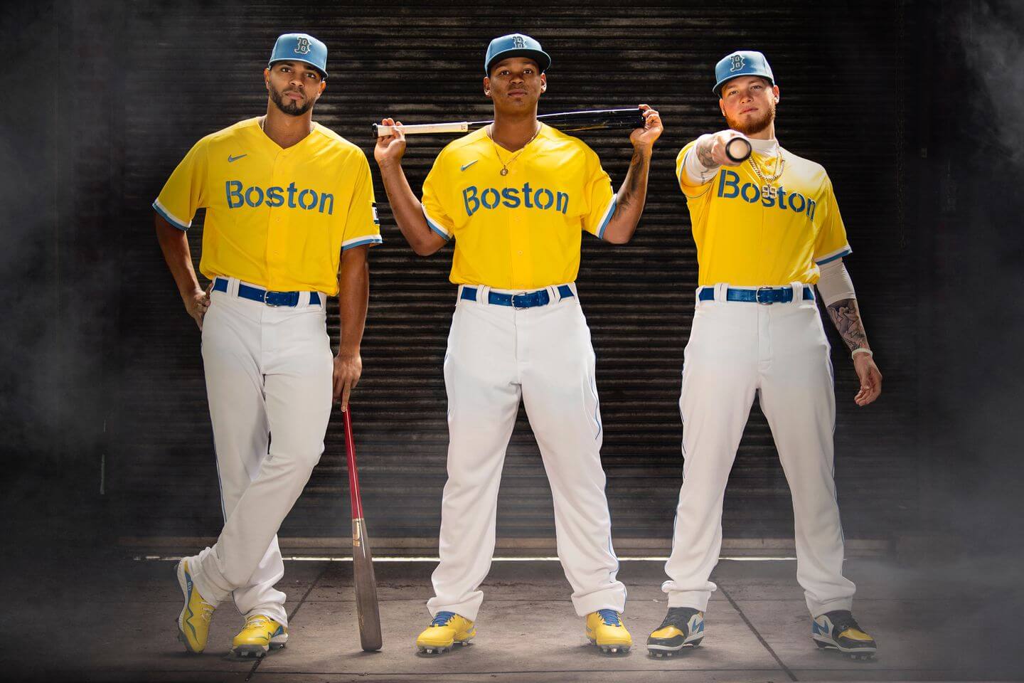
We’ve known for a while now that MLB would be adopting some of Nike’s NBA-style uniform programs, but we didn’t know when those programs would launch. We got our answer yesterday, as the Red Sox became the first team to unveil a uniform as part of MLB’s new “City Connect” series.
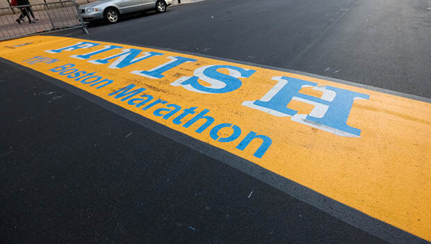
The simple yellow/blue design, shown above, references the finish line at the Boston Marathon:
I didn’t have advance access to this one, but ESPN and SportsLogos.net did, so I strongly encourage you to read their articles on this uniform, which includes good background info and quotes from various connected parties.
Let’s shift into FAQ mode:
When will the Red Sox wear this uniform?
On April 17 and 18 — the Saturday and Sunday of Patriots’ Day weekend — when they host the White Sox.
What about their traditional Patriots’ Day game on April 19, which is also the day of the Boston Marathon?
They’ll wear their “Boston Strong” alternates that day, as usual.
Will every MLB team have a “City Connects” uniform?
Yes, but not all at once. Six other teams besides the Red Sox will be part of the program this season: the Marlins (whose alternate will make its on-field debut on May 21), White Sox (June 5), Cubs (June 12), D-backs (June 18), Giants (July 9), and Dodgers (late August).
When will those uniforms be unveiled?
It’s not yet clear, but presumably shortly before their respective on-field debuts.
What about the other 23 MLB teams?
Some will join the program in 2022, and the rest in 2023. By the end of that season, all 30 teams will be participating.
Even the Yankees?
Yes, even the Yankees.
In the NBA, City alternates are worn for only one season. Will that be the case with these uniforms too?
No. The plan is for them to stay in each team’s wardrobe for three seasons.
For the seven teams that are part of the program this season, why did they wait until the season had already started to unveil the designs?
Good question (sure would have made my MLB Season Preview more interesting!). Might have had something to do with retail production issues, or maybe they just wanted to space it out.
Those aren’t Red Sox colors.
Sharp eye! But as we’ve seen in the NBA in recent years, a team’s established color program doesn’t matter that much for this type of alternate uniform program.
Didn’t Boston once have a team with those colors?
Good memory! In the late 1930s, the new owners of the Boston Braves (forerunners of today’s Atlanta franchise) rebranded changed the team’s name to the Boston Bees, and they did indeed wear blue and yellow. (They later went back to the old Braves name and colors.) But that was a National League team that had nothing to do with the Red Sox, and the Bees weren’t referenced at all in yesterday’s Bosox announcement, so that historical antecedent is just a coincidence, not a “storytelling” detail.
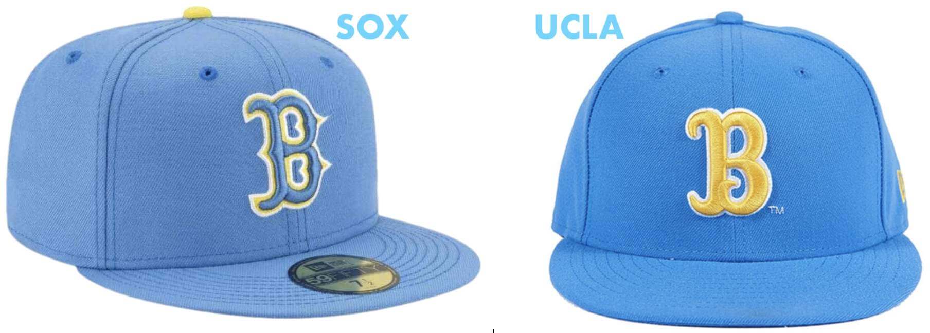
It looks like a UCLA uniform!
That was the most common reaction I heard yesterday, especially because UCLA has a cap with a “B” logo (for “Bruins”) that looks a lot like the Red Sox’s “B”:
It looks like the Eagles’ 1930s throwbacks!
Yeah, kinda.
It looks like a maintenance staff uniform!
You’ll get no argument from me on that point.
So you hate it?
I don’t think it’s a terrible uniform. But I do think it’s a fairly terrible Red Sox uniform.
Do you have anything good to say about it?
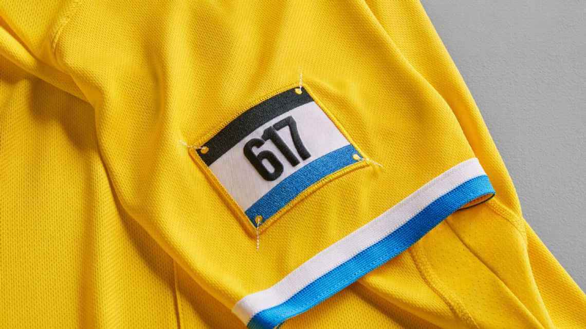
Sure. The design of the “bib number” sleeve patch is very nice:
Also, I’m thrilled that the team I root for won’t be part of this program until at least next year — and maybe not until the year after that!
I haven’t seen a rear view yet. What do the uni numbers look like on the back? Will the jerseys be NNOB?
Here’s a screen shot from the hype video (poor image quality because of all the fake smoke, but it’s enough for you to get the idea):
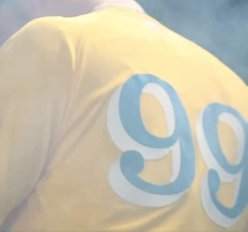
You can see how other numerals look in that font by checking out the retail versions.
What do you think of all this in the big picture?
A few thoughts:
1. This is obviously where MLB uni design is heading, at least for the near future. Or to put it another way, this is why MLB hired Nike — to do stuff like this. MLB exec Noah Garden said as much in that ESPN story I mentioned earlier: “This is what we expected, and this is what we wanted. This is the plan we always set out for.”
2. The league, the teams, and Nike understand that not everyone will like this approach, and they’re fine with that. Red Sox exec Adam Grossman told SportsLogos.net, “These were not designed for the traditionalists, we recognize it may not be everyone’s cup of tea, and we’re okay with that. That’s something that we talked to Nike about. They said, ‘These are designed to push the envelope and it’s okay to acknowledge that not everyone’s going to gonna like these.'” So if people like me (or you) don’t like it, I’d say they’d consider that a feature, not a bug.
3. Further to that point, Grossman also specifically said that this uniform is intended to appeal to “younger, more diverse crowds” — in other words, not a middle-aged White guy like me. MLB has the oldest fan base of any of the Big Four leagues, so this is part of a big push to change their fan demographic because they’re worried that their core fan base will literally die off and they’ll be left as an also-ran sport while everyone else plays soccer and watches football and basketball. They realize this approach may be a turn-off to some longtime fans, but they believe they have more to gain than to lose by going this route, and that the risk of sticking with the status quo outweighs the risk of shaking things up.
4. Here’s another Grossman quote from that jumped out at me from the ESPN article:
Grossman said that the City Connect series provides baseball an opportunity to grow its audience among casual fans and become a part of daily lifestyle culture.
“When you see this convergence and for us and the sport, we want to be more part of the lifestyle,” Grossman said. “We do as a game, but getting outside the white lines of the diamond, that merch and hats are part of everyday culture is essential to growing the game just as the game itself.”
The approach he’s articulating there — reaching the casual fan or even the non-fan via merchandising, and calling it “lifestyle” — is consistent with what I reported in my recent InsideHook article about NBA marketing. Compare Grossman’s quote above with this one from Cavs exec Tad Carper:
Our brand really is bigger than basketball, and it’s bigger than sport. We want to be at the intersection of lifestyle, culture, sport, fashion, music, food — all of those things that fit into that equation. When you look at it that way, our potential to reach fans expands beyond wins and losses.
And then check out this quote from Cavs creative director Daniel Arsham, describing the approach he’ll be bringing to the team’s new uniforms:
A lot of people looking at basketball overseas, they don’t really follow the games or the season — they’re more interested in the idea of this American sport. So you could see a kid walking around in Tokyo wearing, say, a Lakers jersey, and they don’t know anyone who’s on the team and [have] probably never even watched a game. That’s the kind of interesting universe that I’m trying to push toward.
So I think there are two things at work here: First, there’s MLB’s attempt to grow and diversify its fan base (an understandable and commendable goal, even if I don’t much care for the resulting aesthetics). And then there’s MLB’s attempt to sell baseball as a consumerist experience to people who don’t actually care that much about baseball (a goal for which I have much less sympathy, at least to the extent that it affects the on-field look of the game).
5. HOWEVER … despite all of the above, here’s something worth keeping in mind: History shows that when it looks like the uni-verse is heading off in a new direction, the pendulum often swings back toward established norms — not just in baseball but in most sports. For example:
• MLB: In the 1970s and ’80s, most MLB teams wore some combination of pullover jerseys, sansabelt pants, and powder blue road uniforms, plus we had the Astros’ tequila sunrise, the White Sox’s leisure suits and shorts, and a lot more. By 1993, all of that — all of it — was gone and everyone was back to wearing buttoned jerseys, belted pants, grey on the road, and and fairly conventional designs.
More recently, after the Diamondbacks introduced an “innovative” uniform set in 2015, all of the “innovative” elements — the blood-stained pant cuffs, the snakeskin fabric pattern, the charcoal road uniforms, the half-length pants piping — had fallen by the wayside within a few years.
• NBA: In the 1990s, as sublimation opened up new design possibilities, lots of NBA teams came out with fairly gonzo uniforms. Within a decade, all of those teams had moved to something more conventional.
More recently, in 2015, the Hawks launched the most outré NBA uni set in a generation. A mere five years later, they scrapped that and returned to a much more traditional approach.
• NFL: From 2013 through 2015, the Browns, Buccaneers, and Jaguars all pushed the envelope in terms of NFL uniform design. By 2020, all of them had gotten back to basics. (Jury’s still out on the Rams and Falcons, but I’d be willing to bet that at least one of them will ride the pendulum back in the other direction in a few years.)
In short, despite all the branding nonsense and marketing mumbo-jumbo, it appears that fans often have a somewhat stubborn notion of what a sport is “supposed to look like,” so attempts to redefine the look of a sport often meet with a fair amount of pushback (and not just from middle-aged White guys). That’s not always the case — the Broncos and Seahawks are examples of teams whose newfangled designs have stuck, for example — but it’s an indication that new trends don’t always pan out in the long run.
Still, all of those pendulum-swing examples I just listed had to do with primary uniforms, which fans tend to feel more strongly about, while this new MLB program is about alternate uniforms, where there tends to be less resistance to tinkering. I think that’s probably what we’ll be seeing a lot more of, in all of the major pro sports: fairly straightforward primary uniforms, at least for most teams (there’ll always be a few outliers), and lots of wackadoodle stuff for the alternates.
———
So that’s it for now. The next team up is the Marlins. Miami Vice, MLB version?
Click to enlarge
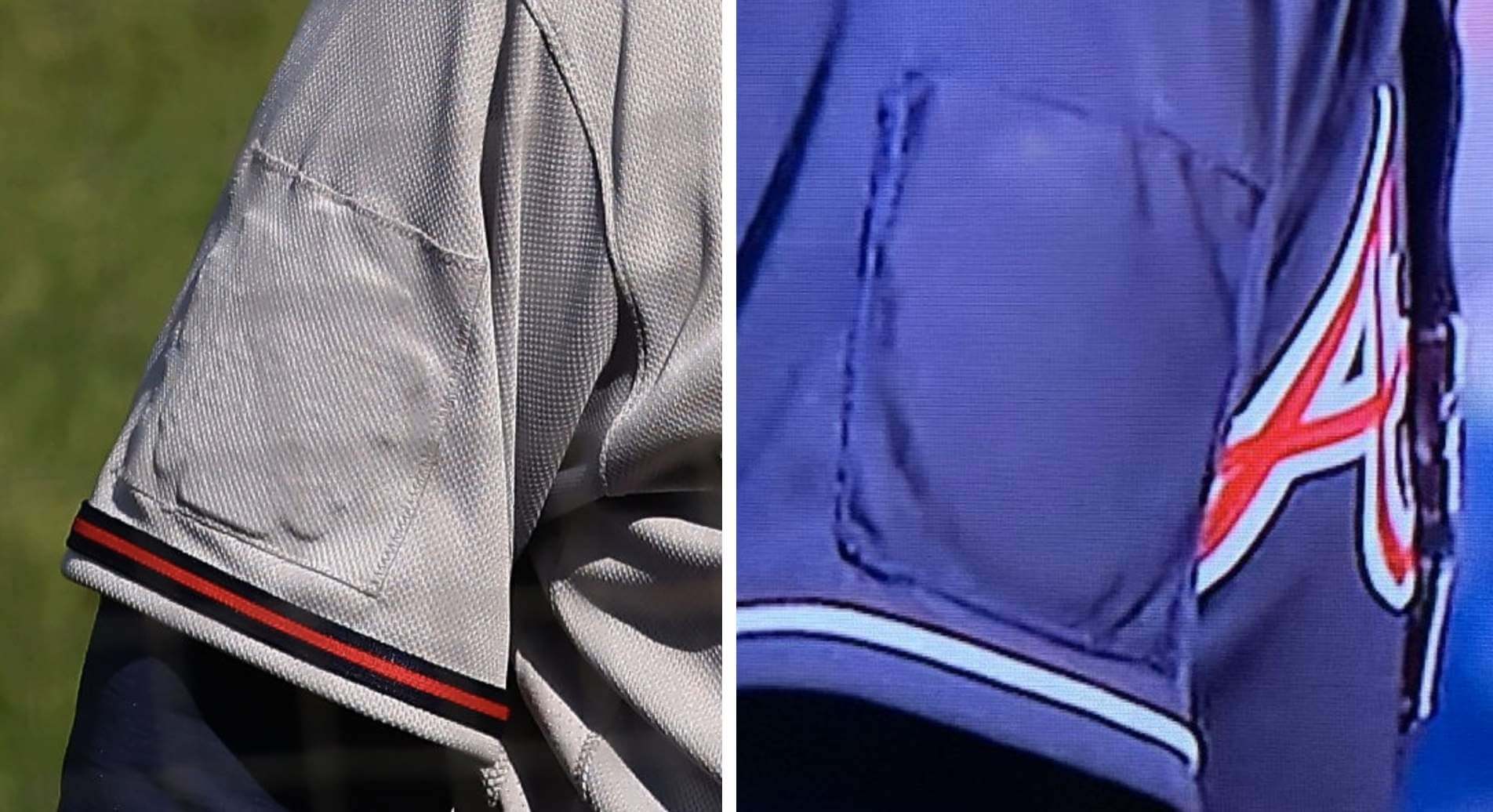
Patchwork: At left is the best photo I’ve seen of the cover-up patch that Atlanta is using to obscure their All-Star Game patch. Yesterday was the first time they wore their navy alternates since the announcement of the ASG’s relocation, so we got to see that cover-up patch’s debut.
People have been asking why they covered up the patches instead of simply removing them or even getting new jerseys. Removing the patches probably wasn’t an option because there likely would have been lots of sticky residue. And being on the road at the very beginning of the season during a pandemic probably isn’t the best time to coordinate a whole new set of jerseys (or two sets, if you count the grey and navy versions). So as counterintuitive as it might seem, the cover-ups may have been the most feasible option.
I fully expect the team to have fresh jerseys for their home opener this Friday. I figure that’s also when we’ll find out if they plan to move their Henry Aaron and Phil Niekro cap memorials down to the now-available sleeve — Friday or never.
Meanwhile, the Rockies played their first game since the announcement that the All-Star Game will be played at their ballpark. So far, no patches for them, but of course it’s still early days. We’ll see how that develops.
Pin Club reminder: In case you missed it last Thursday, the Uni Watch Pin Club’s latest release has a golf/Masters them. It’s a numbered edition of 200, with each pin individually numbered on the back, and as of this morning there are about 65 remaining. It’s available here, and we’re donating all the profits from this one to Fair Fight. (You can learn more about why we’ve chosen to do that here.)
The Ticker
By Lloyd Alaban

Baseball News: Here’s a new D-backs uni tracker for this season. … A sportswriter has ranked the 10 best Mets unis ever (from our own Phil Hecken). … Graffiti legend Blake Lethem, aka Keo aka Lord Scotch 79 aka Jonathan Lethem’s brother, made this fun two-tone Mets piece (from Ebin Sandler). … Here’s a look at the cold weather gear that Cleveland and the Marlins wore for Game Three of the 1997 World Series, which was played in frigid conditions (from Graham Clayton).

Football News: The Edmonton CFL team doesn’t yet have a new name, but it has quietly changed its logo (from Johnny Garfield).

Basketball News: NBA numerologist Etienne Catalan has a bunch of new NBA uni number assignments. … Remember those March Madness-themed route-marker signs that recently went up along Interstates in Indiana? Here’s what will happen to them now that the NCAA tourney is over (from William Yurasko).

Soccer News: New third kit leak for Manchester United (from our own Phil Hecken). … Sky Blue FC of the NWSL has a new name and logo (from multiple readers). … England’s Women’s Super League has a new 10th-anniversary logo (from our own Jamie Rathjen). … ESPN has ranked all of MLS’s new shirts (from our own Phil Hecken). … New shirts for Army men’s (from Justin Rocke). … FS1’s graphics for the CONCACAF Champions League match between the Portland Timbers and CD Marathon showed the wrong logos for both teams. When Portland scored, the graphic showed the badge of Werder Bremen; when Marathon scored, it showed the badge of Bayern Munich (from LM Grismer). … New kits for Alianza Lima (from Trevor Williams). … Also from Trevor: Alajuelense and Atlanta United both wore “metallic” numbers and NOBs in their CONCACAF Champions League game last night. … One more from Trevor: New fourth kit for Inter.

Grab Bag: The No. 28 will return to NASCAR Cup after a 12-year hiatus as part of driver Joey Gase’s Davey Allison fauxback/tribute entry for the Spring race at Talladega (from Christopher Hickey). … New UFC fighter unis (from @vicious155). … Russia has been banned from numerous worldwide competitions because of doping, which means Russian teams are not allowed to use the country’s flag. Instead, the Russian curling team has used the abstract shapes of a curling house to echo the white, blue, and red of the national flag. You can see it at the top of this screenshot, fifth flag from right (from Scott Rogers).

Does anyone have an extra March 2021 Uni Watch pin that they’d be willing to sell or trade to another reader? If so, please give me a shout. Thanks. — Paul
FWIW, the UCLA logo shown in the hat above is relatively new. They previously used a B that was a helluva lot closer to the Red Sox B, with sportslogos.net even saying that it’s still ‘presently’ in use:
link
I have a UCLA hat with the “closer to Boston B” from over 10+ years ago
Here is a link confirming the B is in fact an alternate logo that explicitly states it looks like Boston and has been in use for quite some time (in fact, a simple google search can even find the hat)
link
link
I came to the comments to say essentially the same thing. It looks like they may have changed from the Boston “B” to the new “B” when they switched from Adidas to UA as their uniform supplier.
link
Also, to further the UCLA connection, the Boston City Connect number font is similar to the traditional Clarendon font the football team has used for numbers.
link
The problem with the Nike-ification of Major League Baseball is that everyone has already seen all the outlandish uniforms you can do in the minor leagues. And so all this does is to diminish a major league look by having teams play as different identities, i.e, you’re no longer the Rochester Red Wings, you’re the Rochester Plates, you’re no longer the Hartford Yard Goats, you’re the Hartford Steamed Cheeseburgers, you’re no longer the Boston Red Sox, you’re the Boston Marathons. I guess it’s all in the name of “fun” – and merchandise sales – but it all feels so played out. And MLB, through its rapid rule changes and now its uniform program, is risking losing longtime fans while gaining no new ones, which I think is far more likely.
I fully agree with Paul that these are good uniforms out of context (I’d even say they border on rest uniforms) but they are not good Red Sox unis. To compare them to the NBA -which I think we have to – certain teams like Boston and LA participate in these programs to a very minimal degree. Boston seems to only allow for variations on what they have historically worn, only allowing for gold and/or black in addition to green and white and sticking closely to the city/name over number template, while the Lakers bounce between some homage to a throwback jersey or a black mamba/Hollywood nights branded black jersey. When it comes to MLB I fully expected the Yankees and BoSox to be these types of teams – sort of a “fiddle with it but don’t change it” mentality.
While I love the creativity and freedom in the MILB, it quickly goes over the top into useless novelty territory and the haste that seems apparent in some of the branding and novelty stunts is obvious in the quality of the jerseys and the sloppiness of the designs. I rarely wear jerseys, but when I do they have to at least have real stitched on letters/numbers/logos. I don’t want an ill-fitting scratchy polyester shirt with sublimated or silk screened design elements simply because this design is only meant to last a day or a week or a season or whatever so “why invest in quality?”.
Certainly MLB could use a shot of skilled creativity to liven things up, but I hope Nike and MLB brass remember that baseball is not basketball or football. Watching classic games during last years pandemic delay made me realize that baseball is so much more fun to watch without the constant barrage of ads/sponsors/shoutouts, without the clutter of graphics and information on the screen, etc. baseball is a sport that is infused with a bit of zen (it’s a quiet, slow moving sport at its core after all) and adherence to tradition helps with that.
Essentially, the Nike/MLB marriage could be a very good thing for baseball, but it will have to be careful not to go too far because what’s good for baseball and what’s very bad for baseball are on opposite sides of a very thin line.
Here’s hoping that the Cubs or White Sox don’t end up playing as the Chicago Deep Dish Pizzas or Chicago Italian Beefs. There is already a team in suburban Rosemont that is the Chicago Dogs (as in hot dogs), so I don’t think they’d do that.
Oh, I think the “Boston Finish Lines” has a ring to it.
This certainly won’t make me watch more baseball or buy more jerseys (I think my last MLB jersey was a youth Andy Van Slike one if that gives you any reference) but I never got why someone would decide to stop watching baseball entirely, just because a team changed colors on a shirt for 2 games a year.
I never got why someone would decide to stop watching baseball entirely, just because a team changed colors on a shirt for 2 games a year.
It’s just another straw on the camel’s back. For some people it’s their final straw. By itself I don’t think it’s enough for anyone to quit watching.
My final straw was last year, so these unis don’t really matter to me. My camel’s back was already broken. I’m done. I’d rather go back to watching football.
I watch a lot less baseball since the introduction of matte batting helmets and all of the single-digit pitchers.
These silly uniforms will certainly decrease my viewership even more now that baseball will be like college football where you turn it on and can’t even tell who is playing.
Maybe I can provide some perspective. During the 1981 strike, I became very irritated with MLB. So, I wrote up a list of six Intolerable Acts, and told people about it. What they are and which one was violated by MLB first isn’t important. Thing is, one of them was violated, and since I’d publicized my list, I’d made a commitment, and I stood by that commitment. Haven’t seen an MLB game in person or on TV since. I can fully understand that someone else’s list would include “No non team colored uniforms.”
Great analysis of the Red Sox jerseys, Paul. I think these are nice looking jerseys, but because they’re so “bold” and so non-Red Sox, it’s jarring and concerns me for how they’ll approach it for 29 other teams. I think a lot of it comes from how traditional MLB teams are in their jerseys, especially as a Yankees fan. We’re not expecting these bold color schemes that stray from what you envision for a team. The NBA feels more “natural” for these innovation because they feel “younger” and more “hip” than the MLB does. I’d be curious through MLB’s sales of merchandise how much reaction they see to the different color hats and merch they sell, like the yellow Yankees hats.
A thought about the Sky Blue FC rebrand: is this the first metro area team where the NJ leads an NJ-NY co-branding? The Metrostars were an NY/NJ naming, same with the Hitmen of the original XFL. And there are more examples from the minor leagues like the WLAF and indoor football. Wonder if the fact they’re owned by NJ’s governor impacted the decision to lead with NJ!
Even before you get to who the owner is, SBFC always played in New Jersey and identified as a New Jersey team — their abbreviation in scorebugs and on the league website was “NJ.”
Is that their team name or is it just “Gotham FC” with the NYJ logo?
I’m curious about the Yankees City Connect colors. They’re not going to do blue and orange for the NYC (also Bronx) flags, are they???
I expect something like a Harlem Globetrotters uniform for the Yankees.
I’m guessing red is off-the-table, just as i would expect blue would be for the Giants.
Based on what we’ve seen from the NBA City colors, I don’t think ANY colors are off the table for any team
True that. I think that can be a good thing though, as it can help certain teams find potential new design identities. The jazz for example went off script with the ombré red-yellow jerseys with the trail map thing down the side and that’s the best uniform they’ve had in ages and really one of the best new unis in the NBA in ages. In a way, I think Nike uses this “anything goes” tactic to sell merch as much as they use it to solve the problems they create. They blow up or slowly dilute a teams visual identity but they simultaneously throw so much other stuff at the wall that – in the wake of disappointment that follows their incessant meddling – they eventually hit on something good, and run with it.
In regards to the Broncos and Seahawks uniforms sticking around, it probably helps that these two teams won their first Super Bowls shortly after switching to the newer designs. I think that matters quite a bit.
They’re the uniforms everyone sees in all the replays. They’re the uniforms that fans remember when they remember that sense of euphoria.
The new alternate Red Sox uniforms are an abortion. Just one more reason this week to walk away from the MLB for me.
Abomination?
As a Boston denizen (though not a Red Sox fan), my initial impressions (after “oh no”) were related to the color scheme and uniform “theme” itself:
1. In every promotional piece I’ve read so far — unless I’ve missed something — the Sox and Nike seem to have taken pains to draw an association with the holiday, Patriot’s Day. I call BS. This is not a Patriot’s Day uniform, which one would think would rather obviously be red, white and blue. This is a Boston Marathon uniform (if the font and color weren’t enough, then the thinly veiled “runner’s number” on the sleeve should do it, or the reference to the “Finish Line” by the Sox’ CMO). Yet, no express mention of the Marathon or the BAA, the organization that puts on the Marathon. I’m almost surprised they didn’t just take a page out of the Super Bowl (Supe?) playbook and refer to it as “The Big Race.”
2. Understanding that the diversionary tactic above is likely a result of intellectual property issues, why didn’t the Sox claim this uniform was an homage to the City of Boston flag? It’s the same pale blue and yellow, and there would’ve been no awkward tapdancing around intellectual property…
The BAA has a licensing deal with Adidas. That probably explains why there is noting explicitly linking the two.
Great point!
Also the fact that the marathon isn’t happening on Patriot’s Day this year. I know the planning of the uniforms takes time, but why not delay these until next year when the marathon is hopefully back to its traditional date and not in October?
You know, I have been thinking about these uniforms probably a little too much over the last 30 hours and I just hit on why I think they bother me so much.
Nike is capitalizing on a day that, to a lot of us who live or lived in Boston in 2013, was a super traumatic experience. It was not that long ago. It seems like they had an idea to sell hats and worked backwards from there. (That part is probably obvious to a lot of people.)
Nike/the Red Sox aren’t even pretending to support an organization that will help the victims of the bombing who have ongoing medical needs, or supporting the families of the deceased or anything. They’re not under any obligation to, of course, but it’d make me feel slightly less icky if they had done that.
It’s all starting to sink in. Leagues care more about selling merchandise to Uzbeks who neither know nor care whether the ball is blown up or stuffed than they do about fans who’d like to know who they’re watching when they see a game. If they can figure out how to sell tickets to their lifestyle customers who don’t care about wins and losses, they’re all set.
I suppose that one way for MLB to drive down the average age of its fans is to alienate the people who’ve cared about the game for a long time. There’s no guarantee that younger folks will jump in to fill the void, though.
The new Boston jersey is horrendous.
Hate to say it, but will the Astros do a mockup of the 1980 Tuscon Toros?
Typo in the basketball section:
NBA numerologist has a bunch of Etienne Catalan has a bunch of new
Thanks. Fixed.
Check the title of the Basketball news section. “News News”
Thanks, Pedro. Fixed.
The new Red Sox uniforms don’t look like the Red Sox. Would be good Tampa Bay Rays alternates.
The problem with Nike is they are taking away my comfort as a spectator when I turn the game on. I’m a Mets fan. I turn on the game and I can take comfort knowing the home team wears white and the road team wears gray. Then you have a few alternates sprinkled in. You always know who’s playing. Mets have a blue alternate, Braves have a navy blue and red alternate, etc. It’s pretty easy and simple. I don’t mind alternates as long as they’re worn sparingly.
The problem with the NBA, and one of the major reasons I stopped watching is it’s confusing. Teams aren’t wearing their colors. There’s no immediately grounding of who’s home and away when turning the game on, and there’s no comfort or consistency in the identity of a team. This is where I fear MLB is going. Are the Yankees going to start wearing pinstripes at home? Am I going to see the Mets wear their gray uniforms when at Citi Field?
There is no reason for the Red Sox to pay homage to the marathon. None! They’re a baseball team. They play baseball. They are red/white/navy blue. Any homages to the marathon can be done as it’s always been done. Honor them before the game, invite the runners to the game, have them on the field and have the fans give them a round of applause, etc. The Red Sox can donate to the marathon or have a “honor the marathon” day.
I do not want to see the Mets in any colors but their blue/orange/white. Baseball already has a problem with their long games, convoluted rules, and boring style of play. They don’t need to add to their issues by creating confusing and disorienting visuals like the NBA.
Sorry, I meant Yankees wearing their pinstripes on the road.
I would not be surprised if the Yanks un-mothball the idea they had in the 1970s with the navy jersey with white pinstripes.
The old adage is true: we’re all just rooting for laundry. So you become attached to that laundry and when they throw out not just a primary-colored alternate jersey but a completely different set of colors you no longer have that connection to a visual identity. Even for just two games it’s too much, not to mention the onslaught of holiday-related bullshittery.
I have the same sentiments about the NBA. If I flip on a game and don’t immediately recognize the teams I just keep flipping. I admit I’m a casual basketball fan, but the visual product the NBA is providing is off putting and I will definite be less attentive to MLB if they follow a similar path.
Braves Starting Pitcher Drew Smyly did not have his patch covered in yesterday’s game. (link)
That’s the sesquicentennial patch, Jacob, not the All-Star patch.
I think the most blatant example of a sport staying traditional despite all logic is hockey and the breezers / socks.
Let’s be honest, pants make far more sense, and are far more intuitive for a sport played on ice, but Cooperalls never caught on, and we’ll probably see socks for the rest of time.
Interesting how much pull Tradition actually has.
I seem to remember someone (probably here) that one of the main reason that Cooperalls didn’t catch on was that ithey made it hard to stop while sliding on the ice. Not saying you’re wrong, just sayin there may be more factors at play for Cooperalls not catching on.
For those curious about the Boston Bees color schemes, I chose to use a Boston Bees theme for my membership card since I’m a Braves fan, but I completely understand (and agree!) with Paul’s decision to exclude them from membership cards.
Here’s the link to my card in the gallery: link
Other links used to find the correct design:
Replica uniform: link
Sports logo’s site:
link
MLB Collectors site:
link
China is now blurring western logos (Nike, Adidas, etc.) on the their TV
link
Hey all–Inspired by the really horrible Sox jerseys above, I had an idea for some MLB concepts, but have no idea how to even start on them. People who make uniform concepts, what software do you use and how complicated is it to learn?
While the Boston “City Connect” unis are kind of dumb and an obvious merch dump, I don’t really mind them. At least they look like a uniform and not like those ridiculous white on white and black on black unis that were worn a few years ago.
Also, going back to the Pirates and the numerals on the helmets a few days ago, I grew up watching them in the ’70s and I did not remember that. I loved their ’70s unis, from the pullovers and the mustard hats to the “We Are Family” mix and match unis. I wish the Pirates would bring one or both back full time and scrap their current set.
MLB trying to get people interested in baseball by unveiling the Sox uniform….then the Red Sox game takes a ridiculous 4+ hours last night.
They’re NOT trying to interest anyone in baseball, just jerseys and caps.
They’re willing to sacrifice fans on the altar of lifestyle.
It certainly seems so.
I appreciate that baseball is trying to be more relevant to a younger, more diverse crowd. As a brown millennial it is annoying to say I’m a baseball fan and get people telling me I’m acting white.
That said – NFL games are on network. Basketball and soccer are incredibly cheap to play. Not only are local baseball games on expensive regional sports channels that cord cutters cannot watch, but little leagues now require every kid to bring their own glove and bat and helmet. When I was a kid everyone could watch the cubs and braves and the everybody else was on local TV at least a few times a week, and all you needed for little league was a glove (and in the Caribbean they often have homeade cardboard gloves). To get more folks into baseball they need to make it cheaper to play or watch (and preferably both) – not make goofy uniforms.
(If they are going to go with the goofy uniforms I’m all for it just I’d orefer the in team colors. The As belong in green and gold. Other baseball teams can change their colors to more interesting ones if they’re bored)
“That said – NFL games are on network…local baseball (are) games on expensive regional sports channels that cord cutters cannot watch…”
This. Exactly this.
Most viewers do not want to watch sports on pay TV. Even when local NFL games are on pay TV, they are broadcast OTA. Good luck finding MLB or NBA games OTA.
This is the big inconsistency here, as Paul and others have pointed out more eloquently. The MLB and Nike don’t give a damn whether you, as a brown millennial, or I, as a middle-aged white woman, actually watch games. They’re not selling baseball. They’re not trying to make the games more attractive. They can’t decide on things like universal DH, speeding up the games (although I personally enjoy baseball in large part because it isn’t on a clock), etc. They’ve long since abandoned any pretense that they’re selling the games. They’re unabashedly all about selling jerseys and caps. I mean, it’s great if you come out to the ballpark and buy an $8 hotdog and a $20 beer, as long as you also buy 5 different kinds of caps. But really, what they want to do is sell $30 caps to kids in developing nations who don’t give a damned whether it’s a Red Sox cap or a Marlins cap (or UCLA or Dallas Cowboys, for that matter), as long as they think it looks cool.
I am a Bostonian. I love the marathon & marathon Monday was always one of my favorite events of the year (it is like a 2nd opening day)
It is a special day for Boston & the Red Sox are a huge part of it. Always have been. It is a tradition. These uniforms, which are the opposite of traditon, are not needed to sell more team merchandise.
Visit the team store on Yawkey Way there are already dozens of alternate styles of “authentic” shirts (home, road, Boston Strong, Friday navy, Sunday red, throwbacks, Irish Green, BP styles & spring training versions, etc). Look at the walls, floor to ceiling there are literally 100s of fitted hats to choose from (every color, every pattern, bright to black to camo) They already sell a ton of licensed merchandise a lot of never worn on the field for games.
Is it necessary to wear these yellow Aramark vendor shirts during a regular season game?
Does that on field factor drive sales within the al important lifestyle segment?
I say no. Casual or younger/hip fans buy them if they like the color & they match their sneakers. Not because they were worn on Marathon weekend.
If they’re going to have each team do this, then let’s go total ’70s for New York. I want the Yankees uniform to be an homage to the Baseball Furies gang from The Warriors, and for the Mets to base theirs on either “Welcome to Fear City” or “Headless Body in Topless Bar”.
The Diamondbacks are planning “city connect” uniforms when they aren’t even named after their city. Will they be playing as Phoenix for the day?
Also, not fair for Mets fans. If they go with the city colors they get to look almost normal.
Even more perplexing will be the Angels who don’t play in the same city they are named after but will still likely have an Anaheim reference on their City uniforms (either Disneyland or orange groves, I assume).
That really grinds my gears. When the team name is a tautology, there is a bond with the location that can’t flippantly be tossed aside.
I actually would like it if a MLB team had these colors, with the usual white and gray uniforms as the norm, and yellow, and also light blue, jerseys as the alternates. I find the lack of color diversity, except for the A’s and now the Padres, to be a negative about MLB uniforms. Especially with hat colors, with the primary hats practically all being black (7), red (5), or navy (10) & royal blue (6). Surprising there aren’t any other green teams. I know purple is non grata here, but I’d like either Colorado to wear a purple hat as their primary, or the Diamondbacks to go back to their primary purple. And I always preferred the Marlins original teal (aqua) hats. This light blue would be a nice addition to the league.
I know purple is non grata here…
Oooh, that gives me an idea for a new term: chromata non-grata!
But your larger point is well-taken, of course.
Totally on board with “chromata non grata”
A loooong time ago, I dated a woman named Ana. When we broke up, a friend referred to her as “Ana Non Grata.”
I agree with you Rick–more color diversity is a good thing, but these Red sox uniforms feel like a fly in the ointment.
Someone else said these would make great Rays uniforms, and I totally agree. I’d also love for the Phillies to go back to a maroon uniform, and for the Mariners and Marlins to bring teal back to the forefront. More purple, more green/teal, less usage of the same three Pantone shades would be great. But the teams that have been red and navy for 90 years should stay navy and red.
Absolutely agree this is horrible for the Red Sox. It would be tough for any team to change to this except as mentioned the Rays. The Angels toyed with light blue for a few years, which does seem to be a more appropriate color for angels than red, but I don’t see that happening again.
Email the Rays. They have absolutely no excuse as to why they’re not already mainly powder + yellow. Reimagining their current set in those colors would not only be super easy, but would be an instant improvement to the overall MLB sartorial collection, which as you mentioned, is currently severely limited.
Also on board with the Rockies and D-backs using more purple, though they probably wouldn’t appreciate each other going back to it simultaneously since they are ostensible division rivals and would rather have that color to themselves.
Absolutely agree. Most orange teams should rock more orange than black/blue, and the Pirates should wear more yellow, probably the brewers too. The Marlins should wear teal. The rays powder and yellow. The Phils maroon. The White Sox should maybe wear white sox but should definitely wear something other than black. The rockies should def have purple caps.
I agree, a little more diversity would be appreciated and welcome. I like Bud’s point about the Rays going with powder and yellow and just owning that look!
^yes
Powder blue and yellow used for an MLB uniform…my mind goes right to the Milwaukee Brewers road uniforms of my youth, even though they were primarily a royal blue squad back then.
While they did suffer from having way too many alternate uniforms in the not-so-distant past (and maybe still do?), I’d like to see them re-purpose those colors with better balance than what the Red Sox have done with them!
My candidate for an additional green team would be the Rays…though their time in green-sleeves didn’t last very long, to me that was their best look.
As for hats, I would prefer the Astros in orange, the Marlins in teal, and the Rockies in purple.
A bunch of jumbled thoughts that I hope eventually makes sense:
1.) There was a time in the 90’s where hip hop and sports were practically married. So many artists wore basketball, football, baseball, and sometimes even hockey jerseys in their music videos and while performing on stage
2.) I remember when the NBA instituted the dress code which basically prohibited casual wear on the bench, during interviews and pre/post game. If a player was injured, he basically still needed to be “suited up” on the bench. I do wonder if at that point, there was sort of a divorce of hip hop from sports. I feel that after that, wearing jerseys casually declined in popular culture.
3.) I do wonder if the research would show a decline in retail sales of jerseys being directly, or at least partially, related to the change in dress code by the NBA. If the players couldn’t wear casual wear on the bench, which often included athletes wearing the jerseys of other players both in the NBA and in other leagues, then it wasn’t as “cool” for the average guy on the street to wear jerseys as a part of his “gear”.
4.) Style changed in hip hop over the years as well, with less artists wearing jerseys on stage and in music videos. Also, the tailoring of style has changed – in the 90s and early 2000s, people wore baggier clothes, which I assume also mirrored or lead to the pajama style of MLB players and the overly baggy style in the NBA. Now, it seems the NBA players wear their unis more closer to the trim from the 70s/80s – snug. And urban stlye has lent to a more slim-fitting and trim cut for clothes.
So it makes sense to me that there is a focus on trying to find designs that “go viral” if you will. Boston Marathon jerseys for the Sox? Please buy buy buy because they tell a story. You can be proud of your city because *insert NikeSpeak about why we added this color and that font and this patch and that stitch, and you too can wear it!*
Great point about Nike trying to make uniforms go viral! I listen to a lot of entertainment podcasts and so many people in that industry are pushed to make videos and content that can pop and get a lot of short term views.
Yesterday on Paul’s Facebook post on this, David Berger mentioned that this kind of thing just seems to dilute the brands value, and I agree. Like I said in another reply, if I flip on a ESPN and don’t recognize the teams I don’t linger long. I’m from Pittsburgh and anytime I see any major teams appareal in a color other than black, white, or gold I think, with few exceptions, “Why would you buy that? That’s just wrong!”
Today’s post will just make me tell myself, “Well, that’s something meant for somebody younger I guess, and not for me.” That said, unless it’s a spectacular piece of design, I will more than likely never purchase anything that falls outside of the standard design elements of my sport teams.
I am a long time Red Sox fan … I love these uniforms .. but only if they restrict them to Patriots Day weekend. I think honoring the Marathon is great and I would rather they wear this then what they wear on the Marathon day.
I much prefer something like this to what the league has been doing on July 4th and Mothers Day.
Put that Mets graffiti mural on a jersey, and I’ll buy it.
Hey, maybe that’s a leak for their City Connection look. They could (and sadly, most likely will) do worse, right?
The Metropolitans from the 19th century were allegedly teal and black.
UGH!
Is it possible that the Braves patches are just covering up the All-Star emblem, just incase MLB reverses their decision? Would be easier to remove the sewn on patch than go back and reapply the All-Star emblem I would think.
No.
Nothing says young, hip, and diverse like that middle-age white guy/gal event par excellence, Marathon running. Growing up in inner Chicago, we definitely rocked marathon bibs and short runner shorts and traded 13.1 and 26.2 stickers with each other. C’mon man.
And for all the trends in uniform design that have come and go, I don’t recall ditching colors AND wordmarks/logos at the same time being a thing until recently. At what point is a Boston Red Sox jersey no longer a Boston Red Sox jersey? Does the B on the hat save it? Does it not matter as long as the team wears it?
Your point on marathon running not resonating at all with young and/or more diverse segments is spot-on and hilarious. I say this as a middle-aged white guy who is qualified for and hoping to run the Boston Marathon this October (moved back from April for 2021), so it super-duper resonated with me!
That being said, I don’t think it matters what inspired the design so long as the Red Sox (and Nike) have a design story to tell. Would a design based on the Boston city flag, a throw-back look or the topography of New England directly appeal to younger and/or more diverse people? Probably not, but that hasn’t stopped them from succeeding (in their minds) with that model for the NBA city deigns.
I also think that the as soon as any team wear a new design it makes one of their uniforms. Love it or hate it, there won’t be any question whether or not this is actually a Red Sox jersey in a few weeks.
You lost me (middle-aged white woman) with the idea that it doesn’t matter what inspired the design as long as there’s a “design story” to tell.
The only “story” I need to hear is that they’re the Red Sox, they’re one of the most iconic teams in major American sports, they’ve had some legendary players, they’ve had some very good eras and some very bad eras, they have a classic rivalry with the Yankees, and their dangling red socks logo is apparent when they take the field.
This idea of “story” has nothing to do with the sport, it has nothing to do with the team or its performance and history, and it has nothing to do with the game. It is 100% about selling more caps and t-shirts.
I don’t disagree with you at all. These city designs are all about selling more merch and MLB/Nike seem to know that they will. My point was that it doesn’t matter if the “story” behind the design actually resonates with whatever consumer segments they are targeting (current fans, new fans, younger people, older people, whatever)… the sotries are just a nonsense vehicle for them to pump out a new design that they can market.
They already make fashion apparel utilizing team logos so these feel redundant to me. I don’t see someone becoming a baseball fan because these “fashionable” items appear on-field for two games.
#5 saved me from a panic attack today
Wait… this is REAL? I guess I was holding out hope that it was a late April Fool’s joke.
Hasn’t it been well documented that the fashion industry is married to fossil fuels? Petroleum supplies all the synthetic fibers ubiquitous in sports fashion.
Nike should spearhead a movement for sustainable textiles, at least for the professional leagues. Seems this would dampen, at least a bit, Nike’s ability to churn out mass merchandised uniform crap. However, they’d make a very positive environmental statement. Seems like a win.
Question for Paul: Why is it not an instance of “rebranding” for a team to change its name, colors, uniforms, and all other aspects of its visual identity, to the extent that a team at the time had many visual brand assets? The Bees experiment was short-lived, but it was pretty comprehensive, especially compared to the usually much less thorough similar instances at the time, such as the brief Philadelphia Robins.
Just a word that (a) I’m sick of and (b) didn’t exist in the 1930s (thankfully), so I’m mocking it.
Brooklyn was briefly the Robins, in homage to Wilbert Robinson, their beloved manager.
Philly was briefly the Blue Jays. They had a “Rename the Team” contest. Blue Jays won.
The Uniform Tracker has more than just the Diamondbacks on it. When the Google Sheet loads completely there are tabs at the bottom for the rest of the teams.
Why don’t teams in other sports use the McAuliffe numeral font?
Despite myself, I find that I don’t hate the Red Sox City uniform. For a long-season sport like baseball, I just don’t mind a few stunt uniforms if they’re used in very limited durations. My strongest objections here are to the low-contrast cap logo and to the missed opportunity of not including a navy stripe on the sleeve hem striping to mirror the bib-patch colors and pattern. Also, I’d rather the type/shadow treatment on the front and back of the jersey be reversed.
Looking to the NBA uni-verse–the unrelenting shit storm that it is–and finding inspiration (read: business model) for ‘connecting with young fans’, making the game ‘fun’, and selling merchandise (ostensibly) is so achingly desperate and nakedly avaricious, its hard to believe there’s any hope for success on that path.
I am a baseball fan (and devout uni-aficionado) and I can only say:
“Good God, pull yourself together. You’re disgusting.”
Y’all want something to get indignant about?
I find it weird and unsettling that the Red Sox’s new Patriot Day images contain wafting smoke.
I know that’s a common edgy/intense uni-reveal trope. But all I can think of is the smoke that hung over the Boston Marathon finish line after the bomb went off eight years ago.
I thought that was quite disrespectful as well.
I wondered if they did it intentionally to try to be more impactful and dramatic. It seems like something Nike would do.
I’m glad you pointed that out–I really don’t love that.
I said this in reply to an earlier comment, but my biggest problem with this jersey is how Nike is co-opting a really traumatic day for a whole lot of people. I’ve lived in Boston for 10 and a half years now, and the only time I ever went to the finish line was 2013. About an hour after I left, a bomb went off about 10 feet from where I was standing. I can’t imagine ever watching the marathon at the finish line ever again. And now Nike is using that day to put expand their baseball uniform business into a lifestyle brand or whatever, all while (for contractual reasons) never actually mentioning the marathon in their press release. The whole thing is bad and stupid and just plain icky.
Agreed. That was troubling for me as well.
I believe it was just a basic run of the mill hype video effect, but it was not the appropriate option.
I used to go to either the Sox game or the back bay on Patriots day for many years. I was on Boylston St with my family in 2012. I still visit the city often, but I have not been back to Boston during either of these events since.
When I embarked on my project to give every team a “City Edition” uniform, certain pairings seemed natural (even if I didn’t necessarily follow through): Angels=Disneyland (been there, done that), Arizona=Phoenix, Texas=Dallas, Toronto=Canada, Colorado=Denver, Minnesota=Minneapolis/St. Paul. Others took a bit of thought: Houston=Mission Control, Dodgers=Hollywood, Boston=New England, Yankees=Bronx, Mets=Long Island, Miami=South Beach. And then came the teams who needed a great leap of faith: Cardinals=Mississippi River, White Sox=Lake Michigan, Kansas City=The Wizard of Oz, Cincinnati=?, Oakland=? Ultimately, most teams only stand for themselves, and to pretend otherwise is just a cash grab.
I get the goal to appeal to a younger generation. But I don’t see at all how this is a way to do it. Why would young people like blue and yellow over their real colors? The answer is to change the rules, not the uniforms. It seems like their logic was “if old people hate this move, young people will love it!”. No, everyone hates it.
Also, this isn’t at all a way to blend culture and uniforms or sports. You want your uniforms to be so iconic that they bleed into culture. Like the Yankees or the Lakers example provided. Not the other way around. People who don’t watch sports would maybe wear a Kobe Bryant Lakers jersey. No one is gonna wear a blue and silver Lebron jersey that makes no sense. Watering down your existing brand will only make it harder for it to transcend sports.
+1 on all of this.
+1,000 on all of that.
Another way to attract younger fans: maybe not start the majority of your World Series games so late often resulting in game completion times north of 11:30PM EST. My 6 year old has never seen the live ending of a WS game.
I remember reading a letter to the editor of a sports mag, making exactly this point. It concluded, “Today’s fan is in love with a game that no longer exists, and tomorrow’s fan has gone to bed.”
That was around 1985.
(I remember it because the punchline really stuck with me.)
Regrettably, people don’t care because of time-shifting viewing (Tivo, streaming, etc.).
that punchline sums it up perfectly…last WS day game was 1987. Also to amend my first entry, upon further review, I honestly don’t know if my 6 year old has ever seen the live START of a WS game.
Can’t wait to listen to Unified when these unis are the topic!
I recognize at the time the Broncos uniforms were newfangled, but at this point I think they actually look a little dated.
A lot of negative things have already been said about the Red Sox uniforms and I’m in agreement. My question is has any other team had an alternate uni design honoring another sport? I find it odd that Boston will be referencing the marathon. To be honest, I never knew how big the marathon was until 2013.
Sox fan here. I actually think these are quite nice (the bib number with the 617 area code on it is a really cool touch). If it were a new team being started here in Boston called the Boston Runners or something, this would actually be pretty great. I don’t love that it’s a Red Sox uni with not even a hint of red, but provided this stays a Patrots’ Day weekend thing, I don’t hate it as much as I thought I would.
I’m gonna bet that when Nike gets to the Tampa Bay Rays’ “City Connect” uniforms, they reference the City of Tampa, and not the City of St. Petersburg (where they actually play).