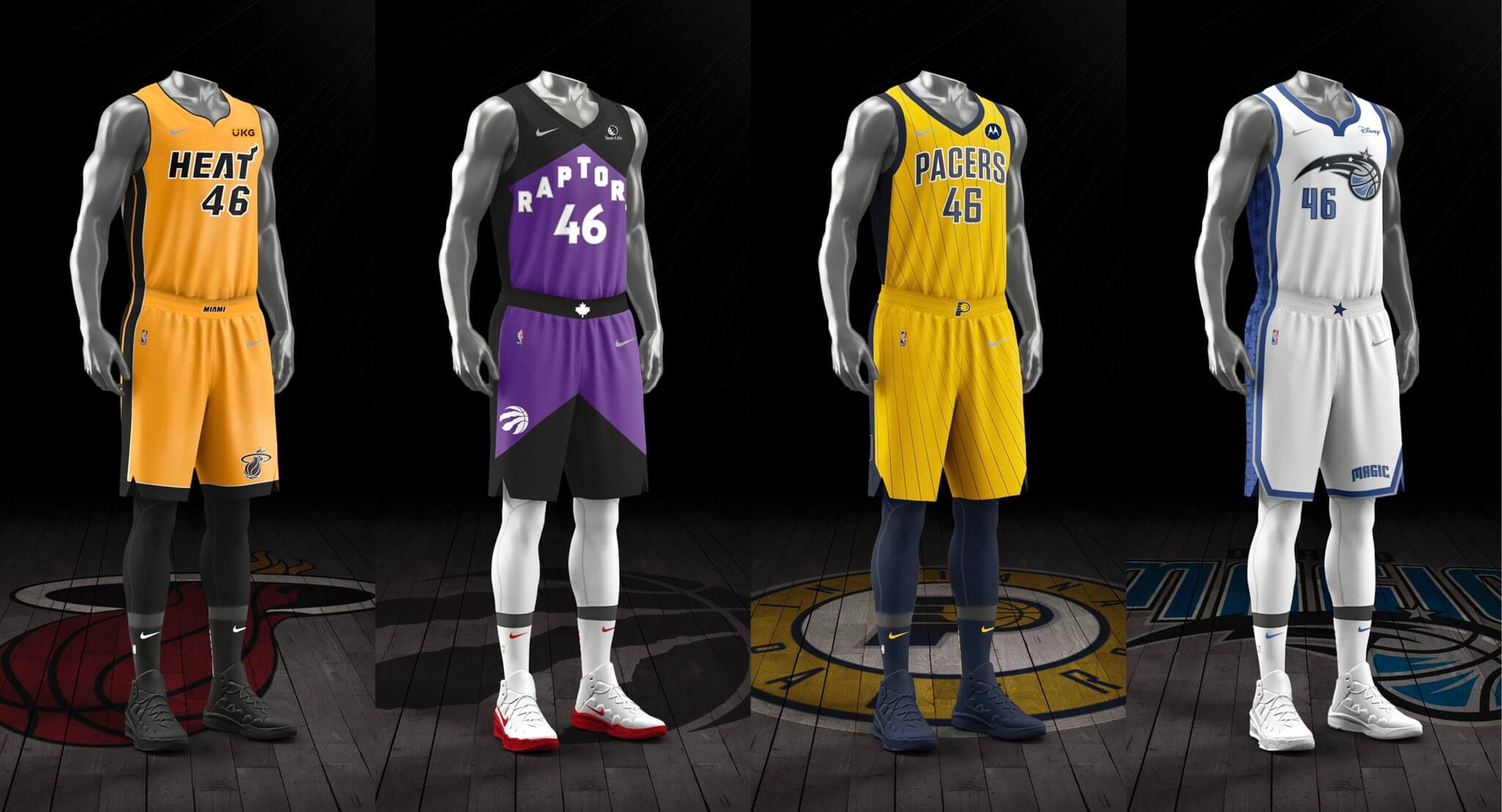
The NBA finally went ahead yesterday and unveiled this season’s Participation Trophy uniforms. These are the designs that 16 teams get to wear for making the playoffs last season, wheeee! Four of those 16 teams made the postseason despite having a losing record, so you can see what a huge honor it is to wear this oh-so-special category of uniform.
Refresher course: The Participation Trophy uniform program debuted, largely to a well-earned chorus of ridicule, during the 2018-19 season. It was then scrapped for the 2019-20 season, and now it’s back for 2020-21. With a track record like that, and with more than half the league qualifying for the postseason, I can’t imagine why anyone wouldn’t take these uniforms seriously.
You can see four of this season’s designs above. Here are the other 12:
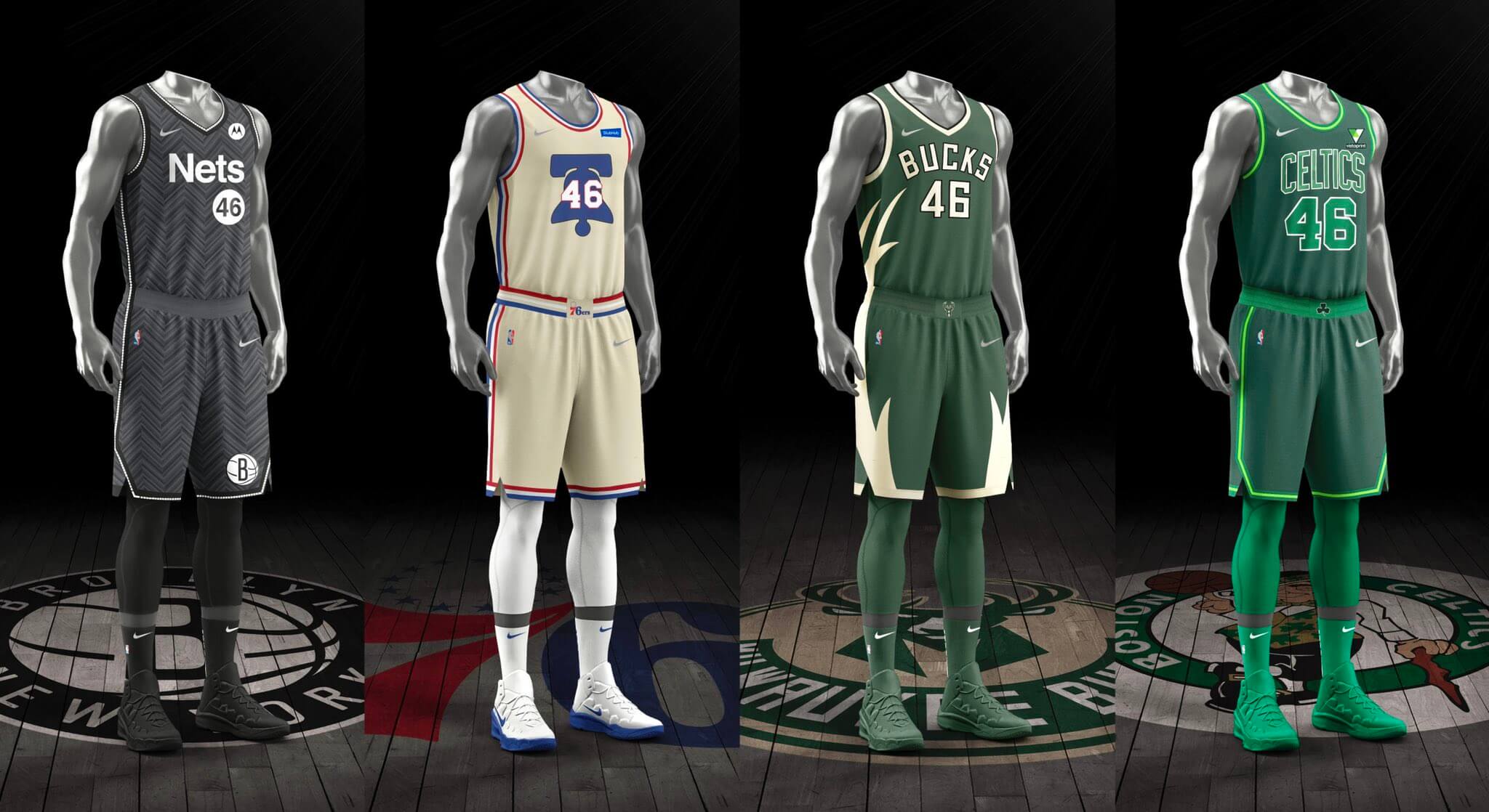
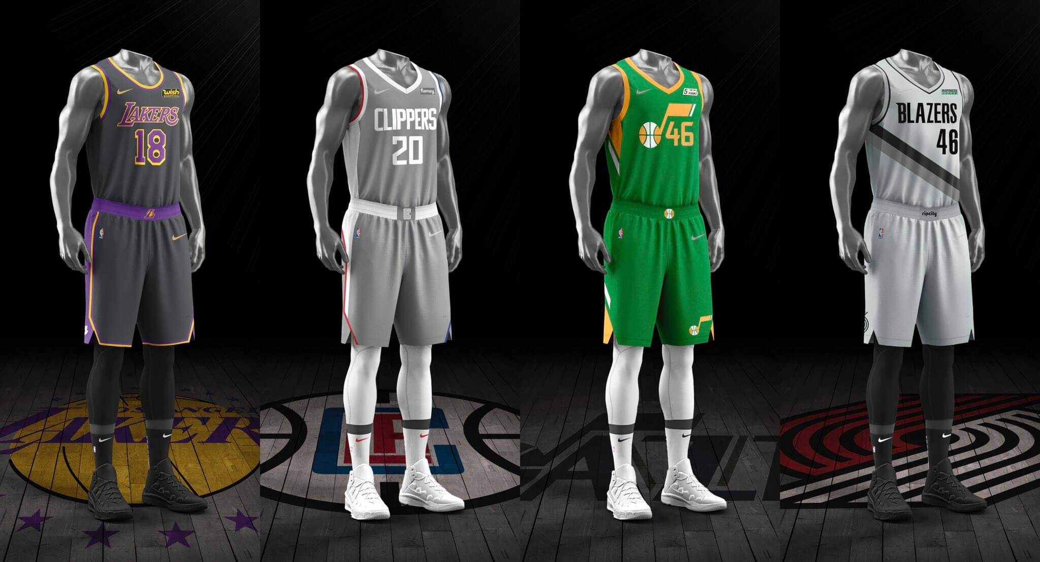
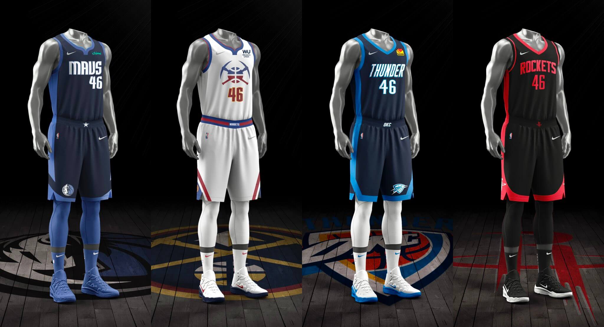
Many of the designs had leaked earlier. Some of the them are pretty good; some are awful; most are meh. Several had me thinking, “Wait, don’t they already wear that?” Three are green, which is nice to see (although one of the green ones also has green lettering/numbering, which is beyond stupid and hearkens back to the “Big Color” debacle). Two are grey, which I hate. One has a different-colored maker’s mark than the others, which I guess gets some people excited. Two don’t have ad patches, so those two are the best. All 16 will soon be mothballed and forgotten, so none of this really matters.
In an absolutely perfect development, the NBA couldn’t be bothered to finish the second paragraph of its press release about these uniforms, which really tells you everything you need to know:
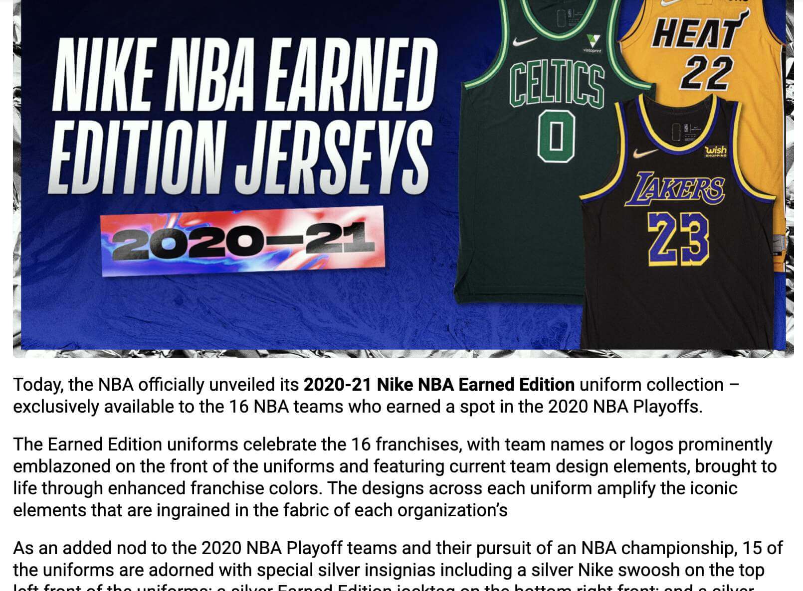
Can’t make it up!
Former NBA exec and current columnist for the The Athletic John Hollinger reacted to all this with a fun suggestion: Instead of awarding a new uniform to teams that make the playoffs, make teams that miss the playoffs wear a shitty throwback from their past. That’s not bad! They could call it the Shamed Edition. (Of course, the Nets are already wearing the throwback that Hollinger suggests in that tweet, but you get the basic idea.)
In other NBA news yesterday, the Lakers, Heat, Celtics, Bulls, Spurs, and Warriors will soon have their logos stamped into a new line of Oreo cookies! Check this out:
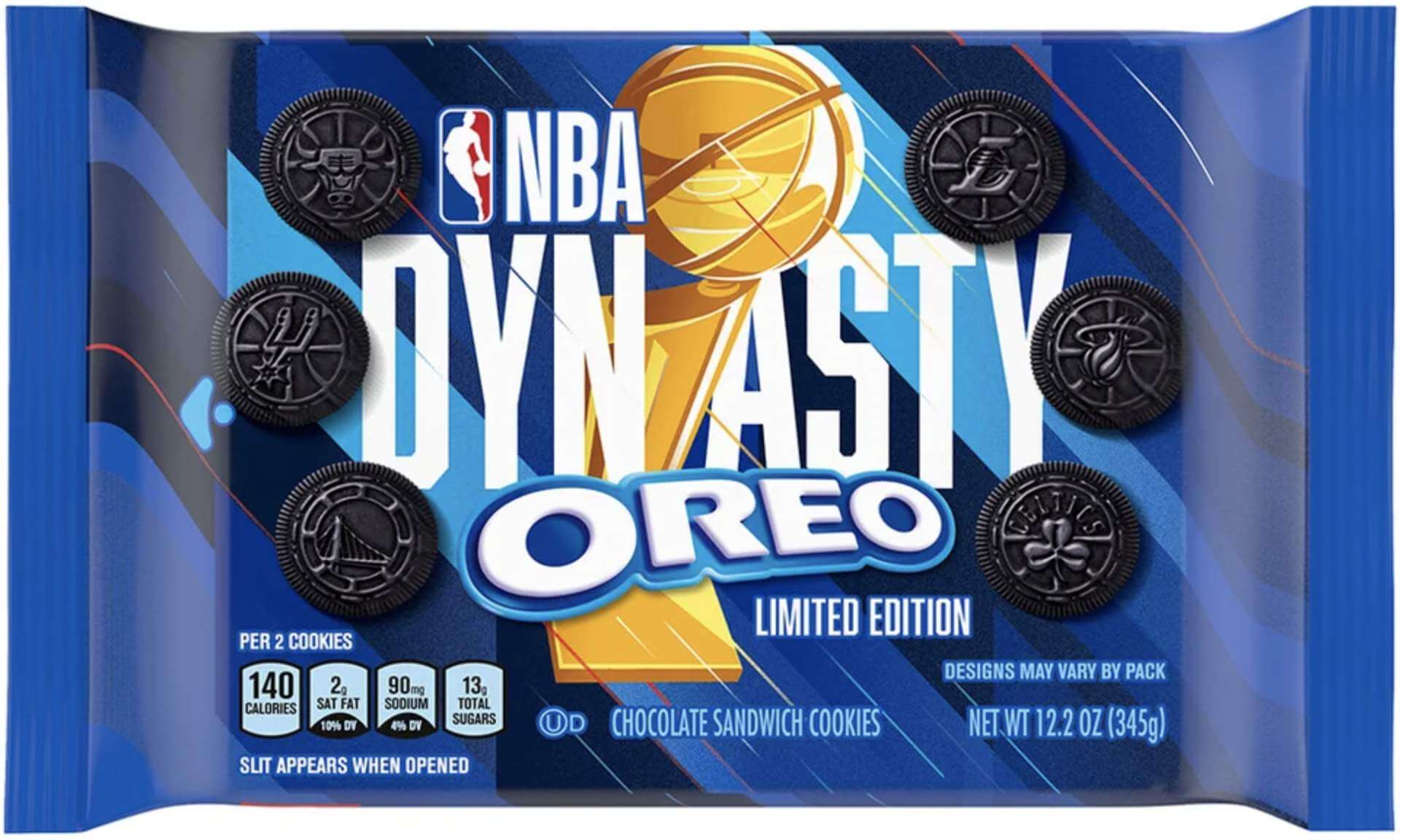
Personally, I think the Oreo news is much more noteworthy than the Participation Trophy uniforms. Tasty!
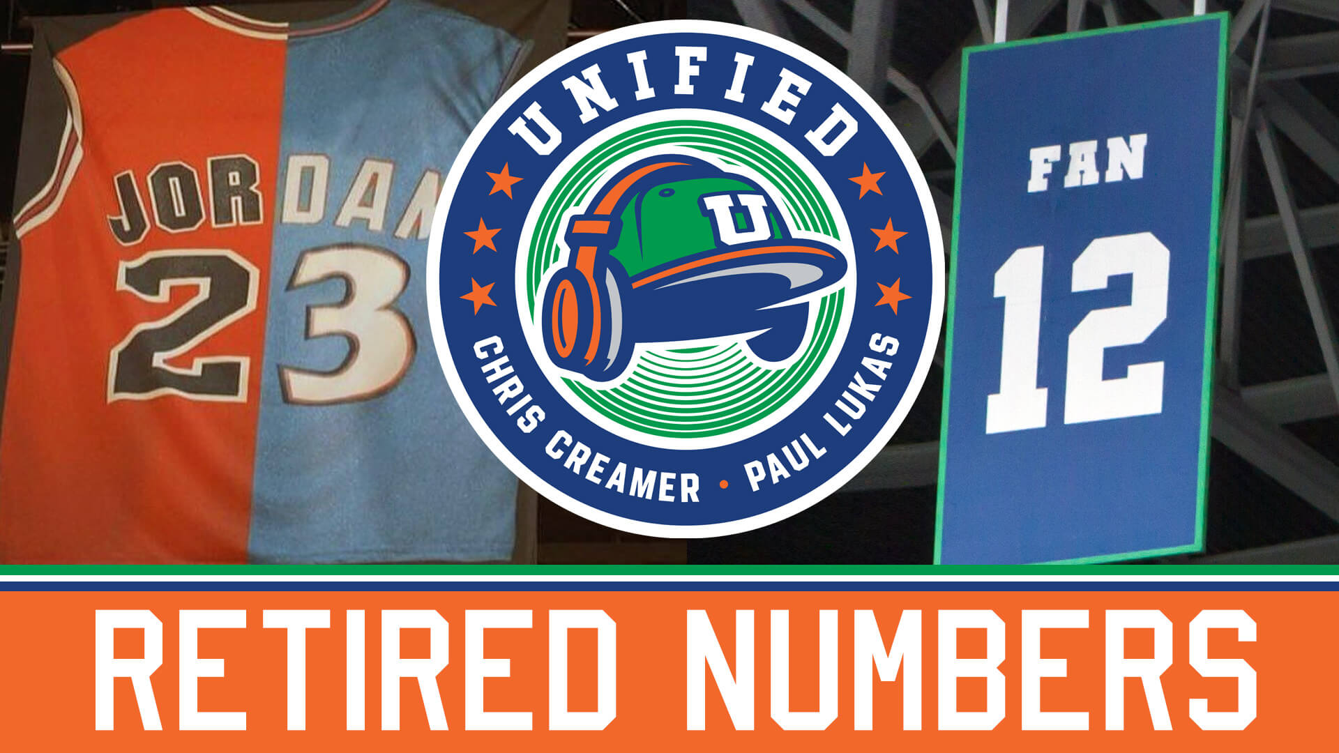
ITEM! New podcast episode: With an NFL team “unretiring” one of its retired numbers and an NBA team announcing that it will retire the number of a 31-year-old player who presumably has a lot of his career still ahead of him, Chris and I decided to discuss the ins and outs of retired numbers on this week’s installment of Unified. Plus we also discussed the recent NFL leaks, the NBA All-Star Game, MLB’s new Lou Gehrig Day, whether team success or failure should dictate uniform choices, and more.
Due to a microphone issue that we weren’t aware of until after we recorded, my voice sounds more echo-y on this episode. Sorry about that, and hope it’s not too distracting.
As always, you can listen to us on Apple, Google, Stitcher, TuneIn, and Spotify, or just use the player below:
The show notes from this episode, which include photos of many of the things we discussed, are here. Those photos (and some additional ones) also appear in the video version of the episode:
Please consider supporting this episode’s advertisers, Streaker Sports (20% off with checkout code UNIFIED), Homefield Apparel (15% off with checkout code UNIFIED), and Oxford Pennant (20% off with checkout code UNIFIED).
Enjoy the episode, and thanks for listening.
Click to enlarge
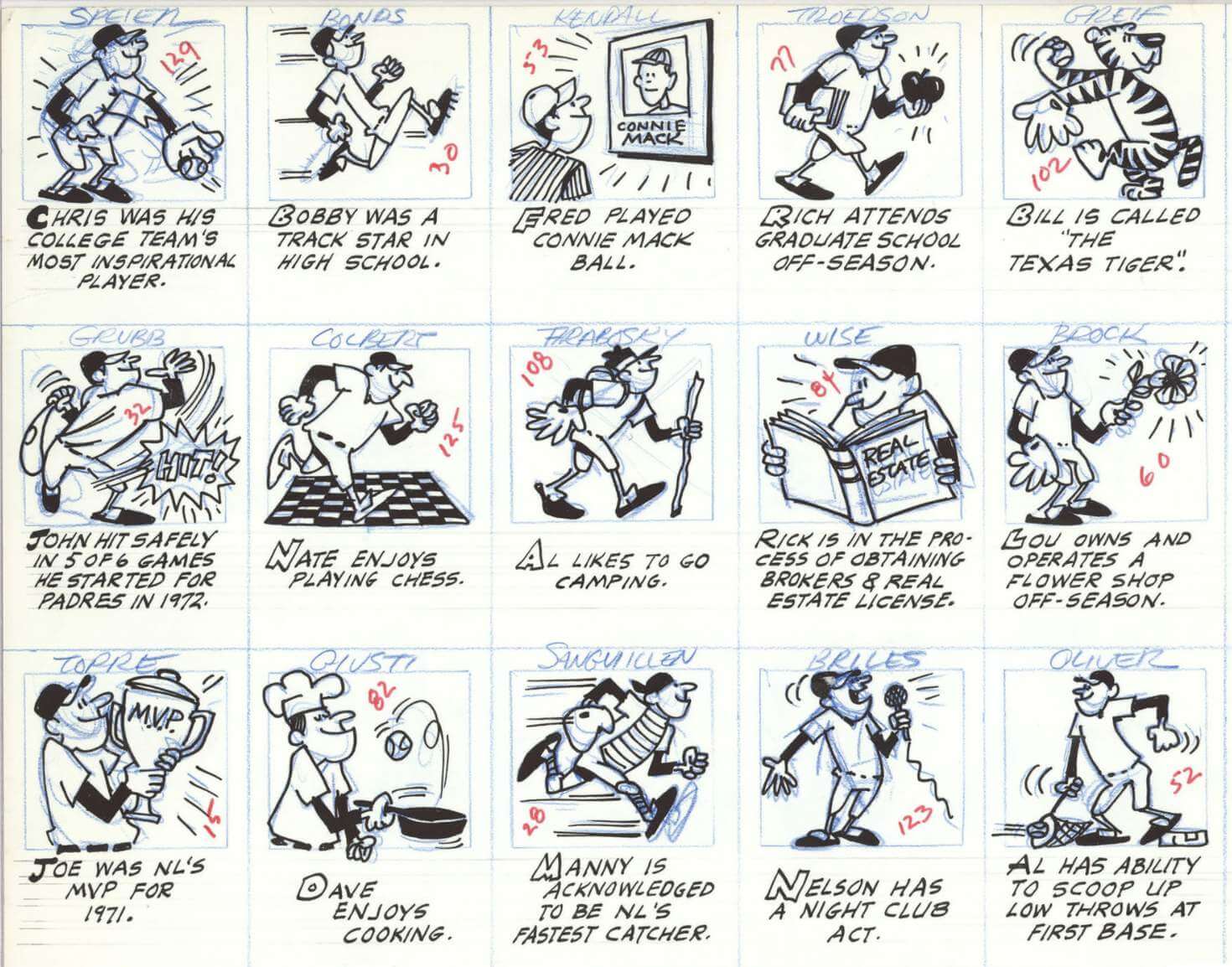
Too good for the Ticker: I’ve always loved the little cartoons that appeared on the back of Topps baseball cards in the 1960s and ’70s (which served as the model for Rob Ullman’s cartoon on the back of my Uni Watch trading card). The original artwork for many of those cartoons is currently being exhibited at the Baseball Hall of Fame, and there’s a great article about that here. The only downer is that nobody seems to know who the original artists were — a real shame. Still, the article is highly recommended. Enjoy!
(Big thanks to James Poisso for this one.)
Click to enlarge
Magnet reminder: In case you missed it on Wednesday, our round Uni Watch magnets are now back in stock — and I still have some of the winged stirrup magnets on hand as well. Both designs are available here. Thanks!


ITEM! Yet another membership raffle: Reader Evan Friednash recently purchased four memberships for me to raffle off, so that’s what we’re going to to today.
This will be a one-day raffle, with no entry restrictions. To enter, send an email to the raffle in-box by 8pm Eastern tonight. One entry per person. I’ll announce the four winners tomorrow. Big thanks to Evan for his generosity!
Meanwhile, the winner of yesterday’s membership raffle is Jay Grizzle. Congrats to him, and thanks to Ed Hahn for sponsoring that one.
The Ticker
By Paul

’Skins Watch: Anderson High School in Cincinnati, whose teams were formally called the Redskins, will now call its teams the Raptors (thanks, Alex). … The Canadian Press — basically a Canadian version of the AP — will no longer use the Cleveland MLB team’s name (from Noah Sidel). … Schools in Danville, Vt., will no longer call their teams the Indians (from Ryan Frazer). … Students at Nipmuc Regional High School in Massachusetts have started a petition to change the school’s “Nipmuc Warrior” mascot (from MplsMike). … Marion High School in Iowa has postponed its decision to change its team name from “Indians” to “Mavericks” after learning that the etymology of their proposed new name comes from Samuel A. Maverick, a 19th-century Texas rancher and slaveholder (from Kary Klismet). … Two New Jersey high schools — Pascack Hills and Pascack Valley — have renamed their teams “Broncos” and “Panthers,” respectively, after dropping “Cowboys” and “Indians” last year (from Kary Klismet). … Also from Kary: A student at North Central High School in Spokane, Wash., has helped write a legislative bill to ban Native-based team names in the state, which would also affect her own school. … The Atlanta Braves have donated $30,000 to the Eastern Band of the Cherokee Indians, which will help the tribe hire a Cherokee language teacher for its school system. The funds came in part from sales of a T-shirt featuring Cherokee syllabary displaying the word “Anetsovsgi,” which translates to “Ballplayer” (from @Squish581).

Baseball News: The Cardinals are doing a 1944 replica jersey giveaway on April 23, which suggests that they may be wearing ’44 throwbacks that day. … Here’s an item we missed: Phillies SS Didi Gregorius’s No. 18 jersey somehow didn’t make the trip to the team’s road game on Sunday, so he had to wear a No. 95 jersey instead. … Newly acquired Astros P Jake Odorizzi will wear No. 17 (from Ignacio Salazar). … With Texas abandoning most of its pandemic-related public health measures, the Rangers will allow full occupancy at their ballpark — albeit with masks required — for Opening Day (from Mike Chamernik). … The Boise Hawks of the independent Pioneer League have unveiled drawings for a proposed new stadium (from Kary Klismet). … Milwaukee’s Racing Sausages have kidnapped Bernie Brewer in the debut episode of a new video series, possibly portending a major makeover for Bernie (from Kary Klismet). … Padres radio broadcaster and Uni Watch pal Jesse Agler reports that the team’s top pitching prospect, MacKenzie Gore, has changed to wearing No. 1 this spring. Jesse says Gore will definitely be with the big league club at some point this season and might even make the Opening Day roster. If he keeps No. 1, he’ll join Matt Young of the 1990 Mariners as a rare 1-clad pitcher. … Twins SS Nick Gordon’s batting helmet logo was slightly askew yesterday (from Giles Ferrell). … A Reds fan has repainted his lawn jockey to look like it’s wearing Cincy’s 1956 road uni!

Football News: The Regina Rams — that’s a Canadian college team — have what appears to be a new secondary logo on their front bumper (from Wade Heidt). … Following up on yesterday’s entry about red-green colorblindness, Andrew Cosentino was watching an episode from the fourth season of Friday Night Lights that featured a red-vs.-green game. “It’s the first game of the series where neither team is wearing white,” he says.

Hockey News: Maple Leafs C Auston Matthews has been wearing some custom skates (from Wade Heidt). … Whoa, check out these amazing pics of a rink set up for a game on Lake Baikal, the deepest lake in the world! (From Ed Zelaski.) … New neon-accented mask for Stars G Anton Khudobin, to match the team’s alternate uni (from Wade Heidt).

Basketball News: PF Ersan Ilyasova will wear No. 77 for the Jazz. … Pro wrestler Chuck Taylor (yes, like the sneakers) wore a Joel Embiid 76ers jersey last night (from @btownmoose). … Ed Hahn spotted an auto repair shop with a Celtics-themed sign in Richmond, Va., of all place. … Gee, ya think the SWAC tourney logo was big enough on the court last night? (From @gimmethewooby.) … Update: Several commenters have informed me that the SWAC logo was so big because it had to cover UAB’s enormous center-court logo. … For the Big 12 tourney, all participating teams’ colors will be featured as part of the lighting at Union Station in Kansas City, with colors removed from the display as teams are eliminated (from Ryan Atkinson).

Soccer News: New home shirt for Argentine side Velez Sarsfield (from Ed Zelaski). … Also from Ed: New corporate advertiser and logo for the third-tier Polish league II Liga. … Rio de Janeiro’s Maracanã stadium is being renamed after Pelé. “Technically speaking, it already was named after a journalist, Mário Filho, but it’s still way more commonly known as the Maracanã,” says our own Jamie Rathjen.

Grab Bag: New F1 livery for Ferrari (thanks, Anthony). … Baltimore-based reader Andrew Cosentino created an Instagram slideshow of his 10 favorite redecorated Baltimore salt boxes. … Oh man, check out the sensational use of negative space in this preschool mascot design (big thanks to Jimmy Lonetti). … Saddleback College in California has narrowed the list to 21 possible replacements for its “Gauchos” team name (from Tom Wadsworth). … For the first time ever, tennis pro Roger Federer is competing in non-Nike footwear. … The NCAA is petitioning to invalidate a urology center’s registered trademark for the term “Vasectomy Mayhem,” claiming that it’s confusingly similar to NCAA marks like “March Mayhem” (from Andreas Papadopoulos). … A Twitter-er has determined that the U. of Iowa has 85 different trademarked sports logos currently in use (from Kary Klismet). … Here’s a look at the evolution of the Guinness beer logo. … An Aussie-rules football team announced that it has an “official Cheese Partner” (from Ash Norris). … Here’s an article, written by a logo designer, about why people care about logos.

Merch dump – kinda like your podcast tees? Magnets? Hats? Pins? Patches?
Sigh — we’ve been thru this so many times, Steve.
I’m not against merch. If teams want to sell T-shirts, magnets, stickers, pins, etc., I’m fine with that. If the merch is good, I’ll even celebrate it!
But when a team’s (or league’s) *uniform program* is dictated by merch concerns — in other words, when you dress your players in a new uniform just as an excuse to sell the retail version of it — that’s the tail wagging the dog.
See the difference?
Also, without the Uni Watch merch, the site wouldn’t exist. So there’s that.
Tail wagging the dog. There is a difference between creating merchandise because a logo / uniform / team is popular, and creating a uniform for the specific purpose of having new merchandise to sell.
Of course I understand your point. But the bottom line is you both sell merchandise to make money and you’ll always find a way to make the NBA the bad guy and Uniwatch the “poor poor site that can’t make enough money so buy our stuff!!”.
The NBA got creative and found a way to make more money, which is smart from a business standpoint. If you found a way to sell more merchandise on your site, I’m sure you’d take it too, even if that meant the tail was wagging the dog…
Who’s to say you didn’t start a podcast just so you could sell a podcast tee shirt? (tongue in cheek obviously, but you get what I’m saying?) Or you started a pin club (that really isn’t much of a club) to sell more merchandise. OH or your “memberships” which really don’t get you…anything? I’d say there’s not that much difference between your creative ways to make money and the NBA’s. Any other stance is mental gymnastics in my opinion.
But the bottom line is you both sell merchandise to make money.
You’re making a classic straw man argument, Steve. I have never, ever said there’s anything wrong with selling stuff to make money. What I have said, and will continue to say, is that it’s bullshit for a team to use its on-field (or on-court, on-ice, etc) uniform program just to float merch. When I describe something as a “merch dump,” that’s short for “merch dump masquerading as a uniform unveiling.”
The launch of merch-as-merch — as opposed to merch masquerading as a uniform launch — has never bothered me.
If you can’t see the distinction between those two categories, I’m sorry. You seem to be implying that every conceivable business practice is morally and ethically equivalent. I strongly disagree. More on that here: link
The Heat’s earned jersey is wretched. The Vice theme was nearly perfect but not only are the team ending the program, they’ve gone out with a bizarre gradient uni. The earned jersey could have been one last PROPER Vice uni to make up for the Trix yogurt outfit they’ve been wearing this year. Oh well.
That’s one of the few that I like! I dig that shade of yellow.
But whatever. It’ll be worn a few times and then gone forever.
To each their own. I think it’s very Pittsburgh and if you squint at the black, it looks like a Pacers jersey.
Typo: “Did Gregorius’”
Thanks! Fixed.
I’ll say it because I’m not Paul:
I really like the Raptors in purple here!
We sometimes say “If you chose shitty colors, you should be stuck with them.” Meanwhile Toronto has a good thing with the chevron motif. Combine those two things, and they look like the best and recognizable versions of themselves!
1. EARNED: Enough already. Home, road, alternate/clash is all you need. If I can’t tell who’s playing when I turn on my TV, your uniforms have failed their primary objective: to identify which players are members of a given team. And basketball jerseys are hardest to wear off the court – most people can pull off hockey, football, soccer and baseball jerseys pretty well but not tank tops. So what fool is going to buy all 5 of his team’s current tops, with one that is “earned” for the privilege of being the #8 seed in the East with a losing record? Is that something to commemorate? Especially if it is commemorated with a pale gray version of a design already being worn?
Now, get off my lawn, whippersnapper…
2. SWAC: the logo had to be that big to cover the giant fire-breathing dragon that UAB plastered over its home court, where the game was being played.
It’s not a great photo, but the UAB logo at Bartow Arena is enormous, so the SWAC logo had to be huge to cover it.
link
The baseball card cartoons are fun, but it always seemed strange to me that every player was illustrated as being Caucasian.
The alternative was probably awful streaky lines covering the face like Franklin from Peanuts. That wouldn’t scan well on cartoons that tiny.
Also, the cost of ink.
This is why Peanuts were published and picked up. This was noted in the Schulz bio.
That always bothered me too. Since the artist was working in black and white and for a tiny space smaller than a postage stamp, there isn’t a lot of room to add too much detail. Accurate caricatures of each player likely were not possible under space/time/budget parameters. So I think they were trying to be “generic” or “neutral,” although they really all do look pretty caucasian.
Aside from catchers (backwards hat, chest protector), there is very little distinction between any of the player’s overall looks.
Speaking of catchers, here is one odd detail: Manny Sanguillen is also shown as a left-hand throwing catcher.
Dear NBA.
Remember the moral of the “Goose That Laid the Golden Eggs”….
those who have plenty want more and more and more will eventually lose all!
Enough already!
“Shamed Edition” uniforms remind me of something else I’ve always thought was backward: instead of a Gatorade shower for the winning coach, why isn’t the LOSING coach doused in the stuff?
And then the bucket shoved down over his head and shoulders, so he staggers back and forth while TV cameras record his shame.
Regarding retired numbers, I might be in the minority that thinks a Ring of Honor/Hall of Fame and then having legacy numbers a la Michigan with #1, Clemson #4 the Cowboys with #88 to go along with a patch honoring the original great is a much better route to go instead of retiring numbers.
At some point you might just run out of numbers. As an Eagles fan they have 9 official retired numbers but they also haven’t handed out 5 other numbers of “popular” players dating back to Randall Cunningham. So right out of the gate, instead of 99 numbers to choose from, there are only 85 numbers.
At some point, you either have to unretire a number which how do you even decide that, or the NFL needs to loosen the position specific number restrictions. I think there are definitely certain situations a number should be retired (Jackie Robinson, Jerome Brown, Pat Tillman) but would rather see the tradition go away.
Side note, the Earned jerseys are pure trash.
Why not just fly a flag with the honored player’s number, while keeping ALL numbers active. Think how thrilled the current players would be when issued a ‘special’ number.
The idea should be honoring, not retiring.
Kind of what I was getting at, same concept but yes.
I hate the Cowboys but you look at how the handle 88. Drew Pearson, Michael Irvin, Dez Bryant, CeeDee Lamb. They give it to their great WR…Lamb wanted to wear 10 but Jerry Jones asked him to wear 88. I think that’s pretty cool. It also helps young players appreciate and learn the history of the team and great players who came before them.
Clemson unretired #4 for Deshaun Watson to wear. He then donned a patch honoring Steve Fuller, who the number was retired for. Pretty cool article here.
link
I think the issue in Arizona sort of confirms that numbers are retired for too many people, but not necessarily that you shouldn’t retire numbers. It makes sense if the player is so iconic that the number will always be associated with them, and they’ll never be forgotten. Could be that they were a great player who also are of historical significance for more than their performance (Robinson and Tillman as you noted), or could be that their performance was just historically great or significant to the franchise, someone like Tom Brady or Babe Ruth. But I would agree that a great player during their era who makes it to the hall of fame doesn’t quite move the needle enough to retire their number. If said person isn’t someone who is going to be held in high regard after those who watched them play are dead, then their legacy isn’t significant enough to warrant retiring their number. I have used Isaac Bruce as an example before. Great receiver, NFL hall of famer, worthy of recognition by the Rams. But in 30 years, are Rams fans going to be saying “no, that guy can’t wear #80, that is Bruce’s number”?
Whenever I look at the Yankees list of retired numbers and don’t get how a 170 win pitcher in Ron Guidry gets his number retired.
I’ve seen some Cubs fans clamoring for Bill Buckner’s 22 to be retired.
“He’s a guy I enjoyed watching” is enough criteria for some.
I’ve seen some Cubs fans clamoring for Bill Buckner’s 22 to be retired.
I think you mean Mets fans.
;)
Mets fans would want his #6 retired that he wore with the Saahkx.
That whole scenario in 1986 led to a miserable after-baseball life for Buckner. One of many reasons I dislike Boston and their sports.
Oreo missed a trick here: Each team’s cookies should have a themed flavor. Bucs could have beer flavored Oreos; soft pretzel flavor for the Sixers; mojito flavor for the Heat; etc.
NBA mishmash continues with these new releases and their colour schemes.
The Celtics look like vintage Bucks.
The Jazz look like vintage Sonics.
The Raptors (without the red trim in this uni) look like the Sacramento Kings.
The Mavs and Thunder look like each other.
I do like the Magic uni.
I really like the Jazz participation uniform, but I’m a sucker for kelly green uniforms. Also I’m surprised that I actually like the Bucks antlers, since I usually don’t like odd striping.
I agree with you on the Bucks. I approve of custom side panel designs when done right. For example I love the FSU basketball uniforms with the large feathers. Those are fantastic & feel like the Bucks are in that vicinity with the antlers.
Over at The Athletic, Joe Posnanski has been doing a Spring Training piece on each team in the league, including a uniform ranking on a scale of 1-10. Today’s entry on the Angels included a bit of a peek behind the curtain for that process:
“I see that UniWatch feels they overplay the halo-A logo, but I personally cannot get enough of it. I love that logo.”
The Angels need to go back to the lower case “a” logo.
link
I came across a sheet of these in a Heritage auction when I was researching the look for Paul’s card….but this specimen is particularly gorgeous. I need to get to the HOF.
I see that Boston Auto sign all the time, but it’s so dumb I’ve never thought to photograph it!
Rob, I was thinking of you when I saw that Boston Auto sign, because you’re the only person I know in Richmond!
And yeah, let’s meet up at Cooperstown and check out those Topps drawings!!
Heh. Count on me to take the picture. FWIW, we were coming back from Lunch Supper to our AirBNB. If I lived in Richmond, I’d get way too fat.
NBA uniform policy is out of control and needs to get some order back into it. I feel hockey is pushing the limits with teams having four jerseys with the reverse retro program, but at least those are team colors.
Need to go back to home, road, alt, throwback.
Also, I’ve asked it before and I’ll ask again. Is there actually any evidence of this really being a merch dump? What are sales like of NBA replicas these days? Most of the people I see depicted in basketball jerseys are wearing retro Champion ones from the 90s. It’s truly pointless.
Why stop there NBA? How about a set of uniforms for the 14 teams that DIDN’T make the playoffs in 2020? I agree with you 100% regarding the uniform lunacy in the league. It’s at the point that when I tune in to a game, I have to look at the score crawl at the bottom to figure out which 2 teams are even playing!
April 30, Nets and Blazers play at the Barclays Center. Let’s hope they don’t both wear these unis, lest the world implode.
There is a reason behind Matt Young being the first — and still only — pitcher to wear no. 1 in MLB. In 1990, he gave up his number so Ken Griffey, Sr. could wear his preferred jersey number 30. On that note, I always thought the M’s missed out on a cool phenomenon by putting just “JUNIOR” and “SENIOR” on the back of the Griffeys’ jersey. Would that have been the first SOOTB, Suffix Only On the Back?
It was an era where nobody put suffixes on their jerseys. You were more likely to see a first initial than a “II” or “Sr”. Nobody was going to go with “JUNIOR” or “SENIOR”. Even outside of Ichiro going FNOB, and the unnecessary suffixes (they don’t differentiate between 2 players on the same team), people seem fine with LNOB – which as a group are also wholly unnecessary. That’s why we have uniform numbers.
My favourites are any of the NBA jerseys with the team logo, love that look. The Rockets could easily add a rocket to theirs which would make them look so much better.
Grey uniforms. I remember when many people were saying “why doesn’t anybody wear grey as a primary colour?” Then teams started doing it with alt unis (remember that LA Kings one?), and the question was answered in its most practical fashion: because grey is awful as a primary colour. Especially when you wear it with black, white, and/or another shade of grey. It’s bland, it bears little distinction from white (or black, depending on the shade of grey) on TV; it just looks like the uniform spent too much time in the laundry. The Clippers, Blazers, and Lakers look like how they greyscale/desaturate pictures of people to remind you that the person is dead. This is meant to celebrate making the playoffs? It looks like the opposite.
The podcast video is now available:
link
For an instant, I asked myself, why is that Jordan frankenjersey on your splash photo showing half of a SD Clippers jersey? Then I remembered the forgettable Wizards uni he wore. Must be the lighting and the angle of the photo.
‘Bout to listen to the podcast while I decide which USFL shirt to order from Streaker Sports.
Listening to the podcast bring up Ed Kranepool reminded me of this gem: link
Chuck Taylor regularly wears Sixers jerseys on tv, he had on a Tobias Harris 70s throwback jersey a few months ago
I wish some of his fashion sense would carry over to Orange “Pockets” Cassidy.
Speaking as someone who went to a high school where the mascot was the polar bear (and who wore the mascot suit for one game) that preschool logo is uber-awesome!
If I were having a vasectomy, I think I would like it to be as mayhem-free as possible. Vasectomy Mayhem might work as a band name, though.
Admittedly a not a big NBA fan… but Dynasty cookies?
Lakers, Celtics, Bulls. Check.
The other three? Not so much, at least to me.
I was thinking the exact same thing.
I guess we can also include the Spurs (5 titles/15 years I think it was?) but the other two are a real stretch. Great teams for a few years is not a dynasty IMO
“The Canadian Press — basically a Canadian version of the AP — will no longer use the Cleveland MLB team’s name”
Paul, I’m interested to hear your thoughts on a national news organization making this decision. For better or worse, as of right now, they are the Cleveland Indians. If someone writes an opinion piece and wants to refer to them as the Cleveland baseball team, then I could see that being his/her prerogative. But if the Cleveland Indians do something newsworthy, it seems inaccurate not to report that fact.
(On a side note, Lori Ewing, the Canadian Press writer who tweeted it, said the organization would no longer use Cleveland’s “nickname.” It continues to baffle me how people paid to write stories do not know the difference between a name and nickname.)
All sorts of media outlets, including Uni Watch, boycotted the ’Skins name for years before it was changed.
Referring to the team as “Washington” was not “inaccurate,” and referring to the Cleveland MLB team as “Cleveland” will not be inaccurate either.
(As for the name/nickname issue, of course I agree with you!)
Paul, how exactly does that all work within the framework of professional writing guidelines?
It has been a while since I’ve taken professional writing our journalism courses, but I recall the need to be as clear and accurate as possible. Taking the step to boycott using a proper name runs counter that.
Off the top of my head I cannot think of other instances where the press refused to use a certain entity’s proper name, but I am sure it has happened before. Was there precedent you and others followed, or was it just sort of a gut decision and run with it type thing?
It’s fairly standard not to print objectionable words unless it’s absolutely necessary. For example, it’s been widely reported in recent days that Meyers Leonard recently combined an anti-Semitic slur and a misogynistic slur when referring to a fellow video gamer. But very few outlets have printed the full words that he said.
Referring to the team as “Washington” was not “inaccurate,”
Well, they are the Landover, MD Football Team, to be more accurate…
…that trains in Richmond (preseason) or Ashburn, VA (in season).
I actually like the “parchment” color of the 76ers uniform, which only makes sense, I guess, since I pictured the Sixers in a very similar design as an opposing team for a weekend “Uni Concept & Tweak” that Phil ran back in 2013 (you can see the design at this link…)
link
…and I came up with a very similar cream-colored design for the Washington Wizards as an opposing team for Paul’s Timberwolves re-design contest in 2015…
link
I like your retro styles. My favorite is the Suns (partially pictured on the opposition)
Is that a vertical thick block SUNS creating the stripe on the shorts? I believe it is & that is sweet
Mic — Thanks very much, and yes, the pants stripe on that Phoenix Suns design is indeed a vertical thick block “SUNS” — you have a very sharp eye to have spotted that. I should probably do that design separately as the featured team rather than just as an opposition team squeezed into the background.
The Heat, Raptors, Bucks & Jazz are pretty cool. Just don’t understand the whole “let’s make our uniforms grey” thing. In the days of HDTV, it seems pretty lame. That green the Jazz are going to wear should look pretty “Jazz-y”.
I’m surprised it took so long to make a yellow Heat uniform. It seems there should be yellow Suns’ uniforms, too.
Interesting story re: the MSU Spartans-
link
I’m curious if anyone knows the reason teams are moving away from the monikers of “Cowboys” and “Gauchos”
“Cowboys” (I’m assuming) because the two schools had a Cowboys/Indians rivalry. So once one school changed, the other one did as well.
“Gauchos” (I’m assuming) because it glorifies and thus validates European colonialism.
But I don’t know either of those for sure.
These NBA unis remind me a lot of the Malcolm Gladwell talk about spaghetti sauce: People don’t know what they want! Give them more options!