Click to enlarge
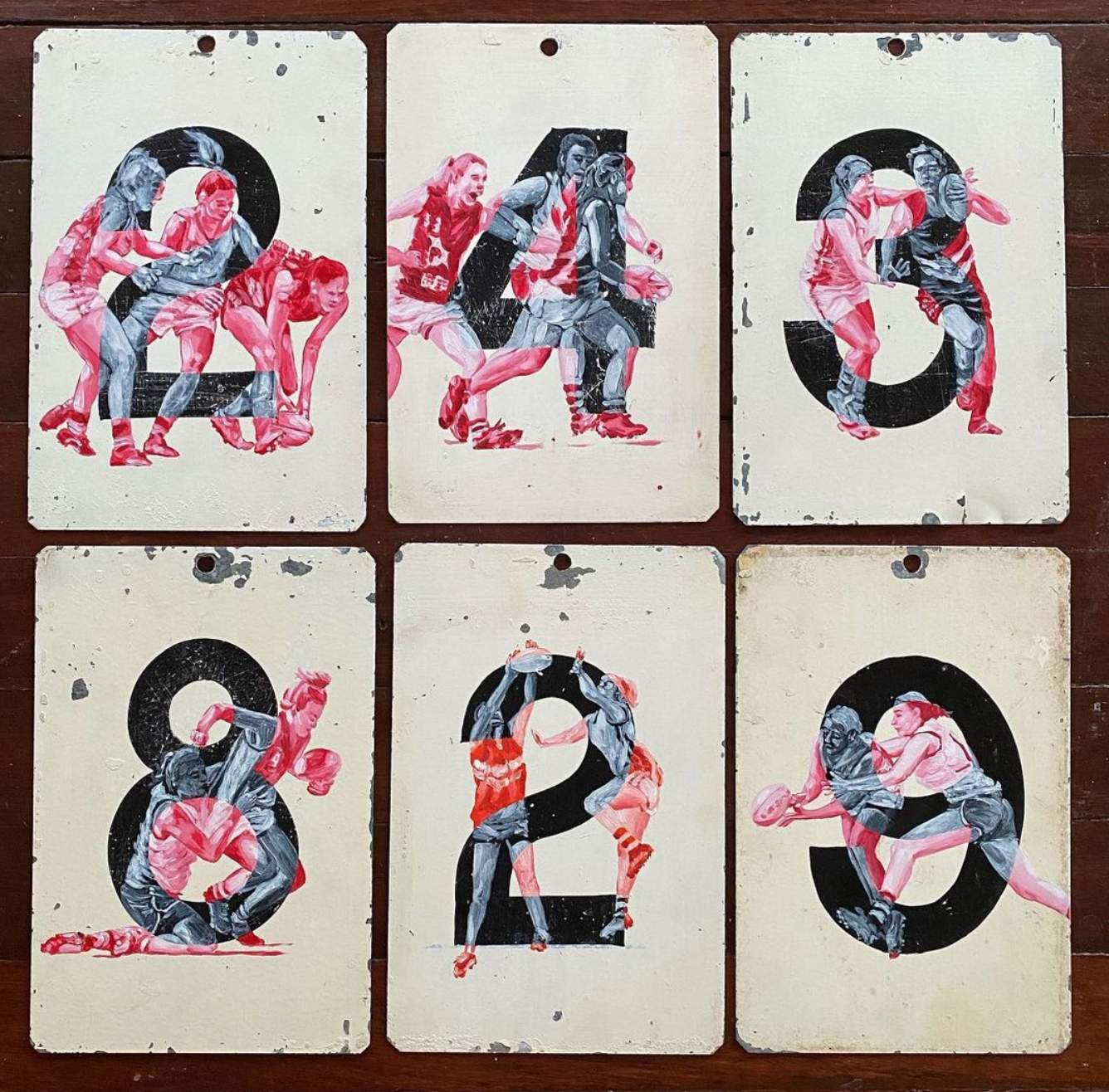
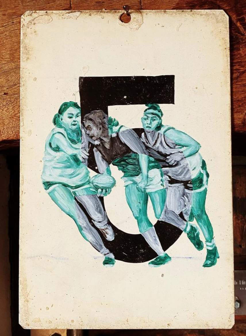
Got a note the other day from Australian reader James MacNeil, who wanted to let me know about a great new art project, called Keeping Score, by his friend Naomie Hatherley. She’s taken a bunch of old metal number placards that were used on manual scoreboards and painted scenes from women’s Aussie rules football on them.
If you look at the paintings shown above, you can see that the players appear in white when they overlap the numerals and in color when they’re against the white background. At first I thought this was just an aesthetic choice (and a really good one), but there’s more to it than that. Here’s an explainer from Hatherley’s website:
Until recently, girls were relegated to the sidelines as wistful observers or diehard supporters in the Australian Football League. … Following a report into women’s football, the AFL launched a series of exhibition matches in 2013 to test the water. Women’s AFL exploded. …
I pay homage to our women’s games to render the invisible visible. In some, I paint onto vintage tin number plates once used to score regional matches. The players are depicted as ghosts inside the numbers, lost to AFL history. Stepping outside the numbers, they are in colour, no longer passive observers, but active participants: seen and counted.
I love that concept. But even more, I love the look of Hatherley’s paintings on the old number placards. You can see that the numerals themselves were painted (not printed) onto the metal, which makes the whole thing feel more textural and organic. Here are some more examples:
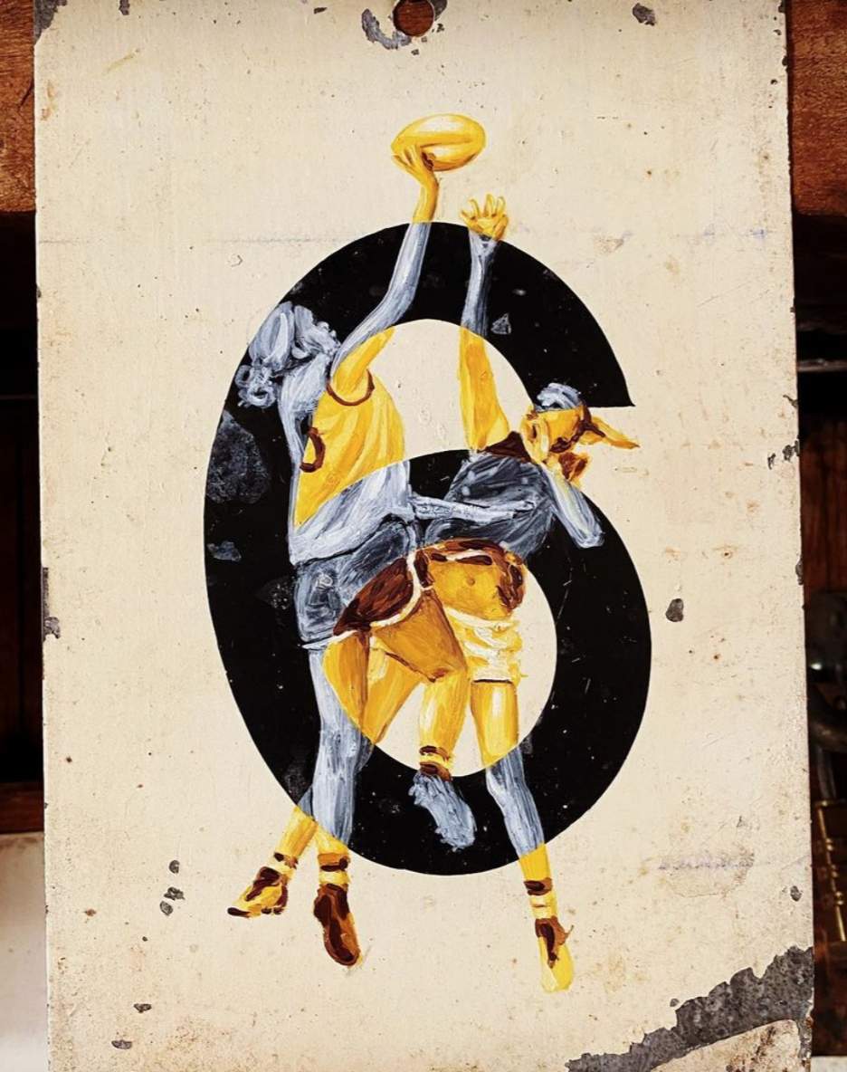
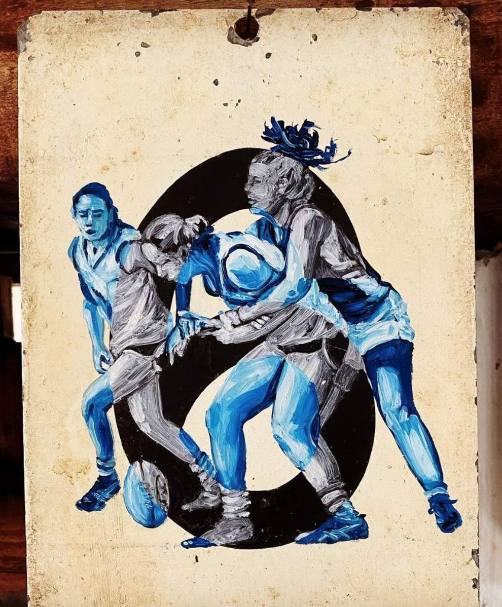
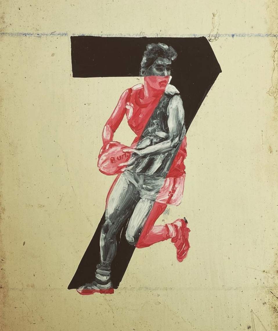
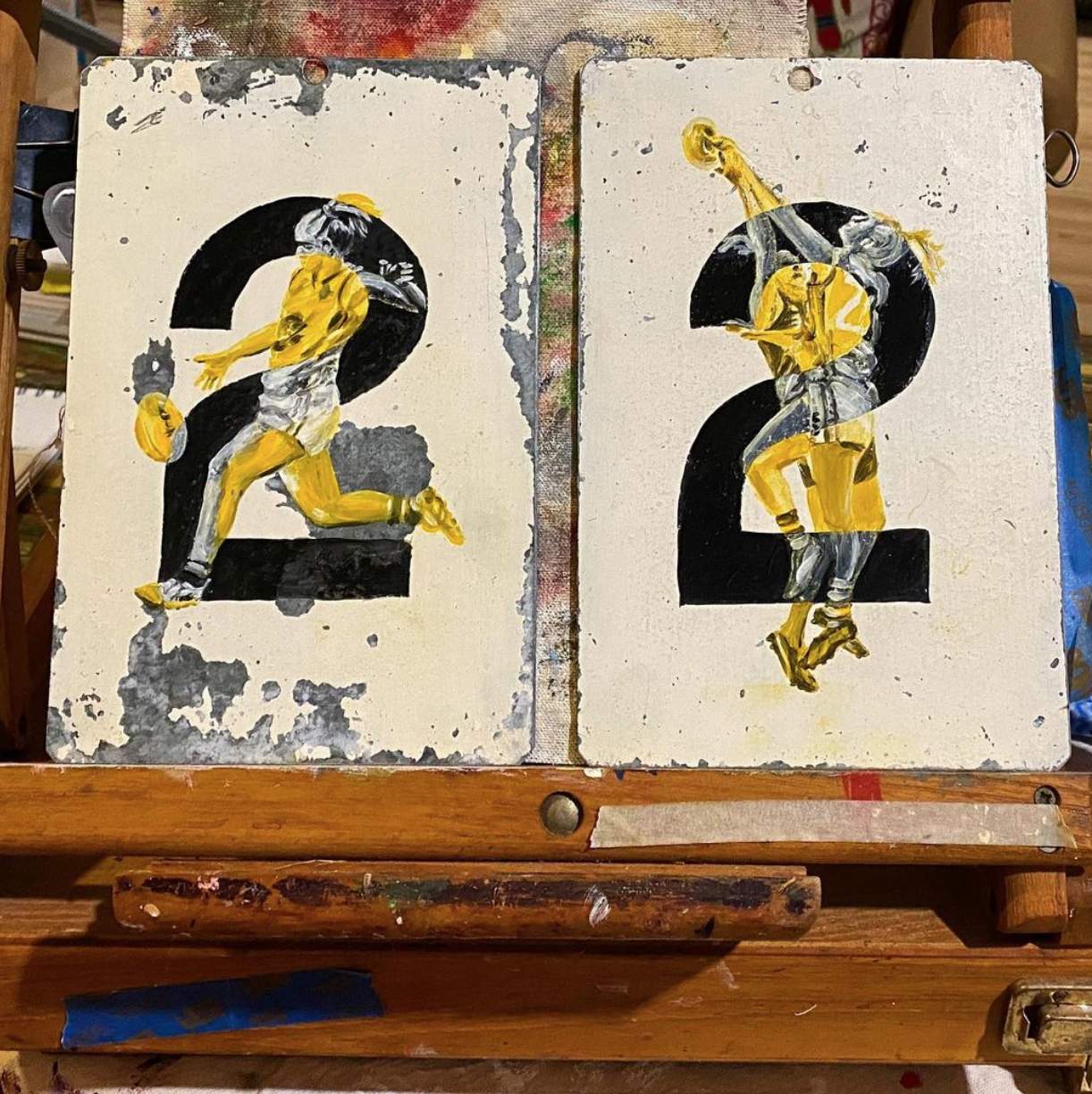
And here’s a time-lapse video showing Hatherley’s painting process:
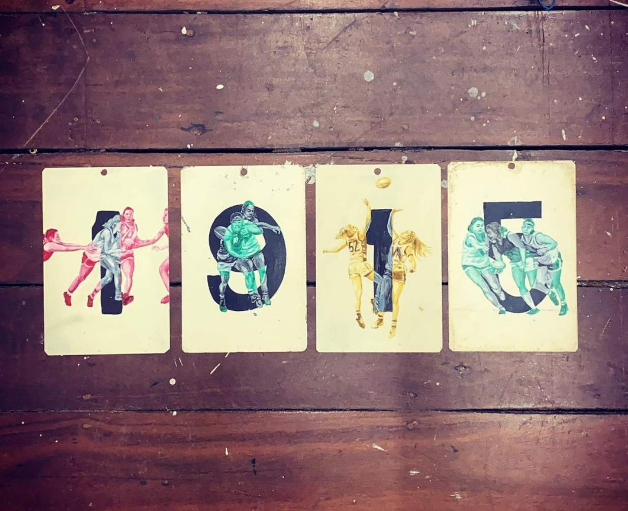
Sometimes Hatherley sequences the numbers to tell a story. For example, the first women’s footy game took place in 1915 in Perth, which explains this arrangement:
Interestingly, Hatherley is a fairly recent convert to women’s footy, as she explains on her website:
I have never been much of a footy fan, so my fascination with the love of the game comes from an outsider’s perspective.
The first local women’s game I watched in 2017, my 17-year-old daughter was tackled and had her arm broken. Undeterred, she went on to play as soon as she could — a typical story for many women who love the game. It’s not just a sport, it’s a community of amazing women who pull together in ways that extend beyond team and game. The tenacity, team spirit, and support these women share is incredibly inspiring.
I wanted to learn more, so I emailed Hatherley and asked how and when she acquired the number panels. Here’s her response:
I originally had just over 100 tin plates. My husband found them about 15 years ago at a local rubbish site and gave them to me (so romantic — he knows what I love). I have been hoarding them and carrying them around ever since (we have moved house four times during that period), waiting for the perfect project where I could use them.
Hatherley says it takes her between one and four hours to do one of the paintings, depending on how complex it is. For now she’s holding onto them so she can show them all in an exhibition either this year or next. After that, they’ll be available for sale.
The whole project is excellent. You can see lots of additional examples on Hatherley’s Instagram feed, and you can learn more about her on her website.
(Mega-thanks to James MacNeil, who deserves all the credit for this one.)
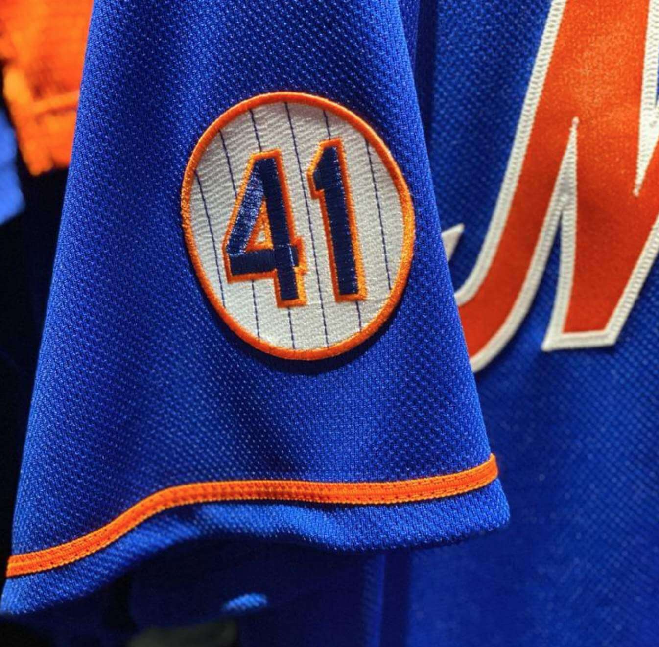
Another MLB memorial patch: The Mets yesterday announced that they’ll be wearing a Tom Seaver memorial patch for the 2021 season. The patch, which appears to be enormous, made its on-field debut in the Mets’ Grapefruit League opener yesterday:
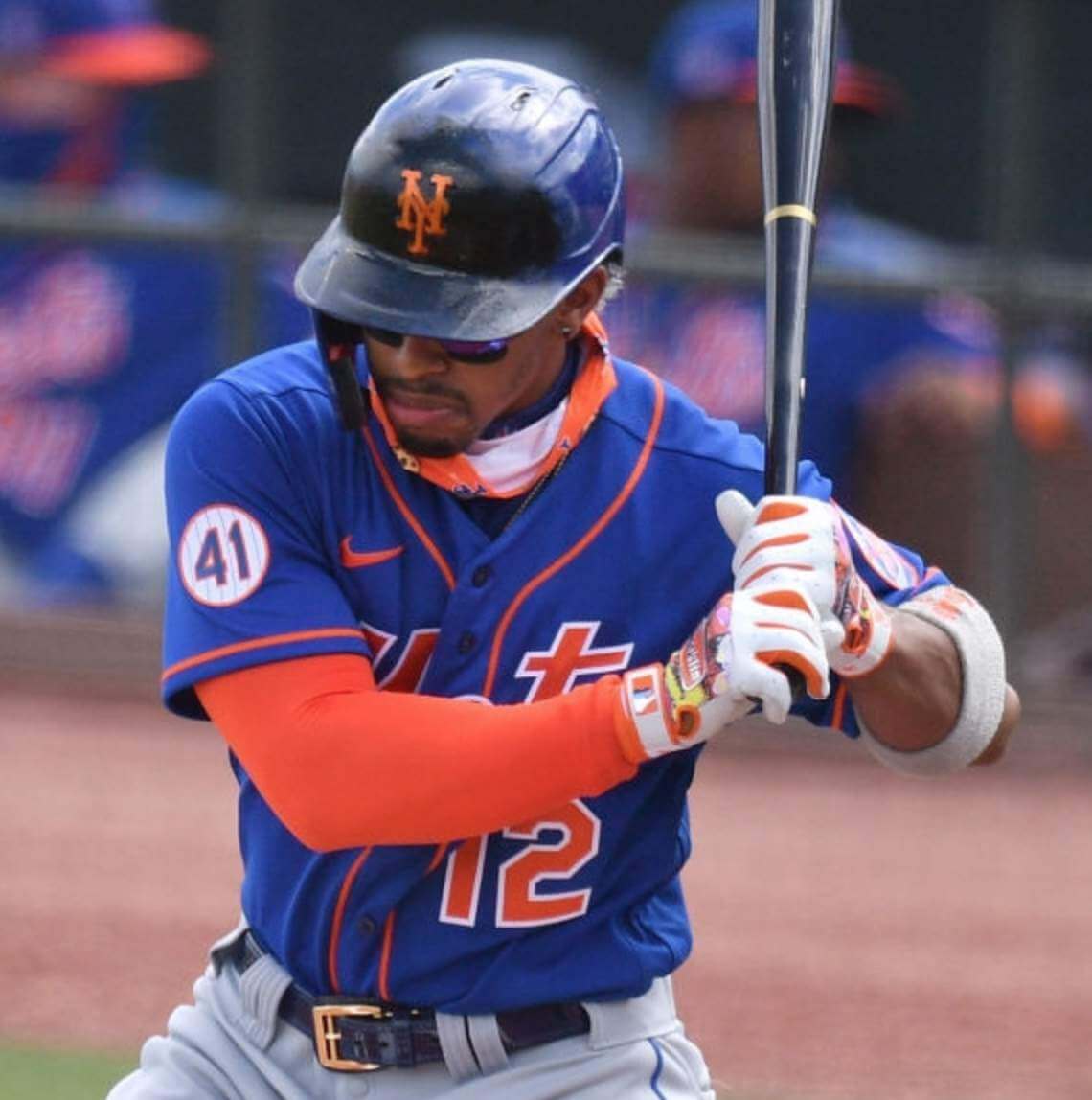
Some background: Seaver died on Aug. 31. The Mets added a black patch with white a “41” for him on Sept. 4 and wore it through the end of the season on Sept. 27:
So this new patch, much like the Yankees’ Whitey Ford patch, is a carryover memorial. But the Ford patch was worn for only one game before the Yanks were eliminated from the playoffs, while the Mets wore the Seaver patch for 23 days last year. I’m pretty sure that’s the longest period that any MLB memorial patch has been worn in its original season before being carried over to the next year (notwithstanding red herrings like the Padres’ “RAK” lettering for Ray Kroc, which was more of a perma-memorial).
The other thing the Mets and Yanks have in common here is that they’ve changed the carryover memorial’s design. The Yankees, as we’ve already discussed, changed for the Ford memorial from black “16” numbering to a black circle with a white “16.” Similarly, the Mets have changed the Seaver memorial from black/white to Mets colors. The design appears to be a duplicate of Seaver’s retired number placard.
Mets radio broadcaster Howie Rose had a nice take on the design switcheroo: “I love the fact that this patch is in orange and blue, with pinstripes and a white background. … [L]ast year, when they properly wore a black patch, we were mourning Tom. This year, we celebrate his life and career.” Nicely put.

Click to enlarge
Oh my: Padres pitcher Chris Paddack routinely wears stirrups. Until yesterday, however, I don’t think I’d ever seen him (or any other Padre, for that matter) wear yellow stirrups. Not a bad look! But would it be better with brown sannies?
(My thanks to AJ Borland for this one.)
Click to enlarge
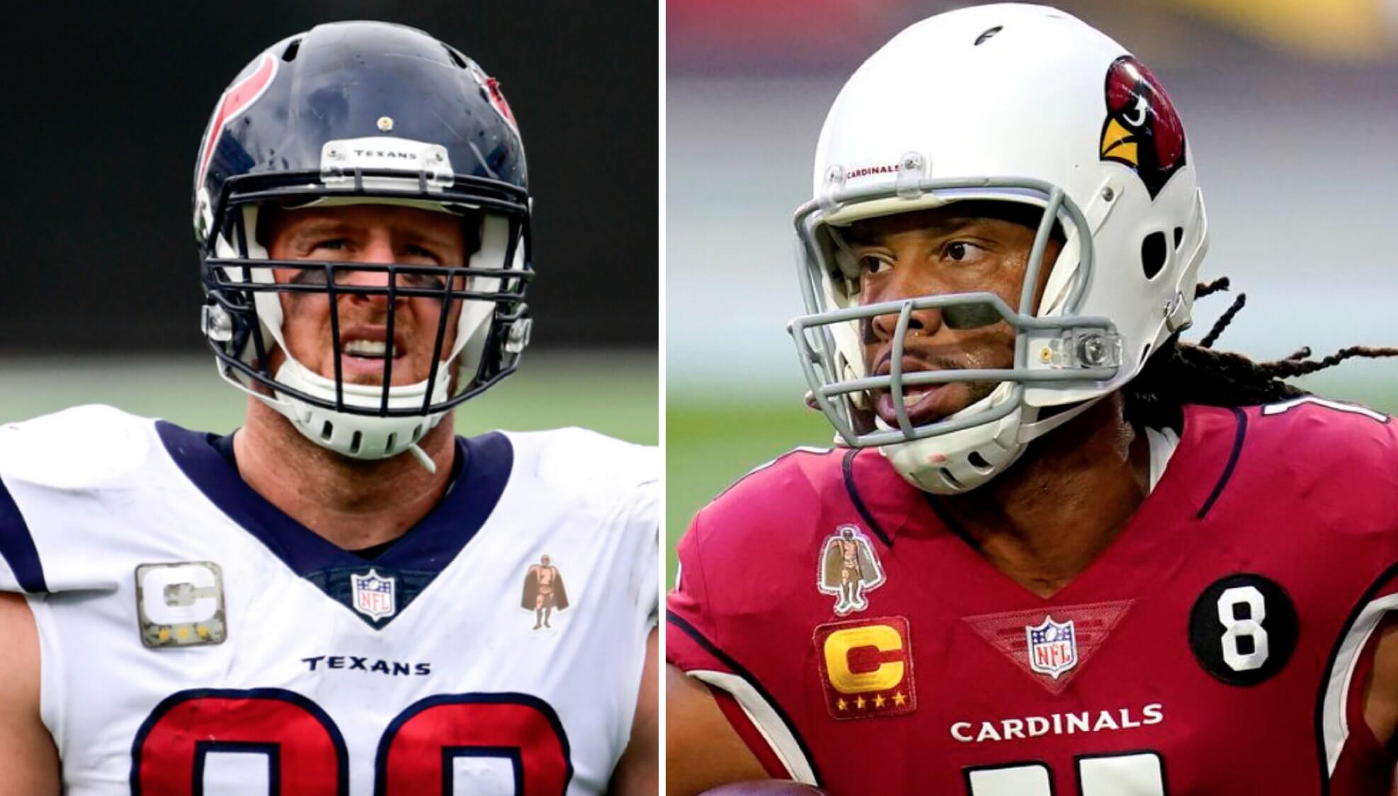
Curiouser and curiouser: Shortly after the news broke yesterday that former Texans defensive lineman J.J. Watt was signing with the Cardinals, I received an email from reader Alfonso Ferrari, who noted that if Cards wide receiver Larry Fitzgerald opts to play another season (something he has not yet committed to doing), that would give Arizona two players on the roster wearing the Walter Payton Man of the Year Award jersey patch simultaneously — an NFL first.
That seemed like a suitably geeky tidbit, so I forwarded Alfonso’s email to Alex Hider (he was on Ticker duty yesterday) so he could include it in today’s Ticker, and then I spent about 45 seconds finding good photos of Watt and Fitzgerald so I could tweet about this potential pioneering Payton patch panoply.
After more than a decade on Twitter, I have a reasonably decent sense of what will resonate with a large bunch of my followers and what will appeal to only the hardcore uni geeks. I don’t let such considerations drive what I post — if something is interesting or noteworthy to me, I’ll tweet it, regardless of how much appeal I think it has — but at this point I know the crowd-pleasers from the niche content.
I was pretty certain that the Watt/Fitzgerald scenario was in the latter category. I mean, really, who cares about the Payton patch besides serious patch aficionados like me? And besides, the Payton patch has only existed since 2017, so the “distinction” of being the first NFL team to have two Payton patchers on the roster is pretty dubious anyway. Worth a tweet? Sure. But will many people care? Of course not.
Shows what I know. As of this morning, my Watt/Fitzgerald tweet had garnered over 700 “likes” (that’s a lot for me). I’m not saying this as a way of bragging — rather, I’m genuinely puzzled about why this seemingly deep-niche factoid garnered so much positive feedback. Always interesting to see what people respond to!
Click to enlarge
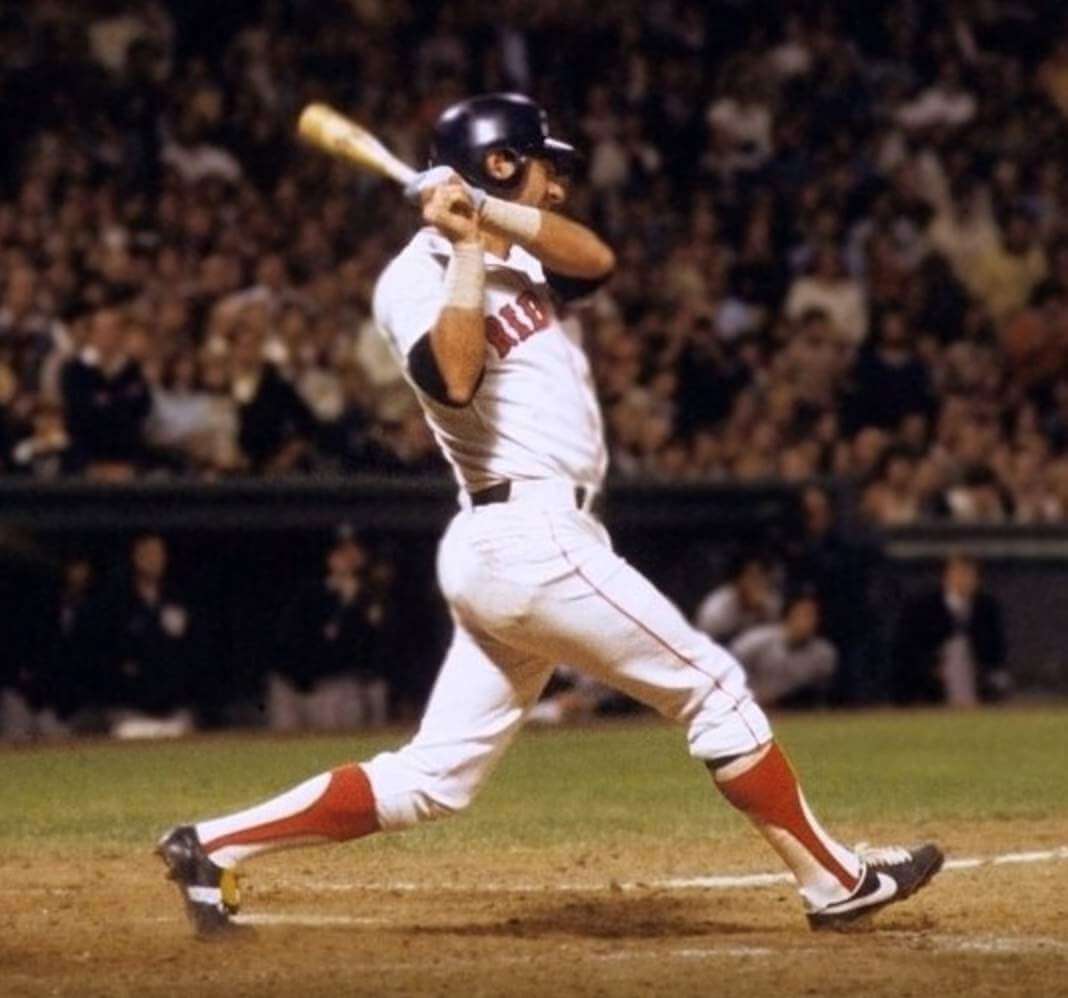
From head to toe: The photo above shows Carl Yastrzemski getting his 3,000th hit in 1979. See how the earhole on his helmet was enlarged? I was 15 years old at the time and had been fixating on Yaz’s earhole for a while at the time — one of my early bits of proto-uni-watching. (I believe he started doing it in 1978.) I was so obsessed with the earhole, however, that I didn’t notice — and hadn’t realized until just now, in fact (or maybe just forgot..?) — that he was wearing two different shoe brands when notching that milestone hit!
Even stranger, here’s a shot from that same period showing him with a different brand mismatch:
Bizarre. Anyone know more about this?
(My thanks to James Shannahan for pointing out the shoe situation.)
Click to enlarge
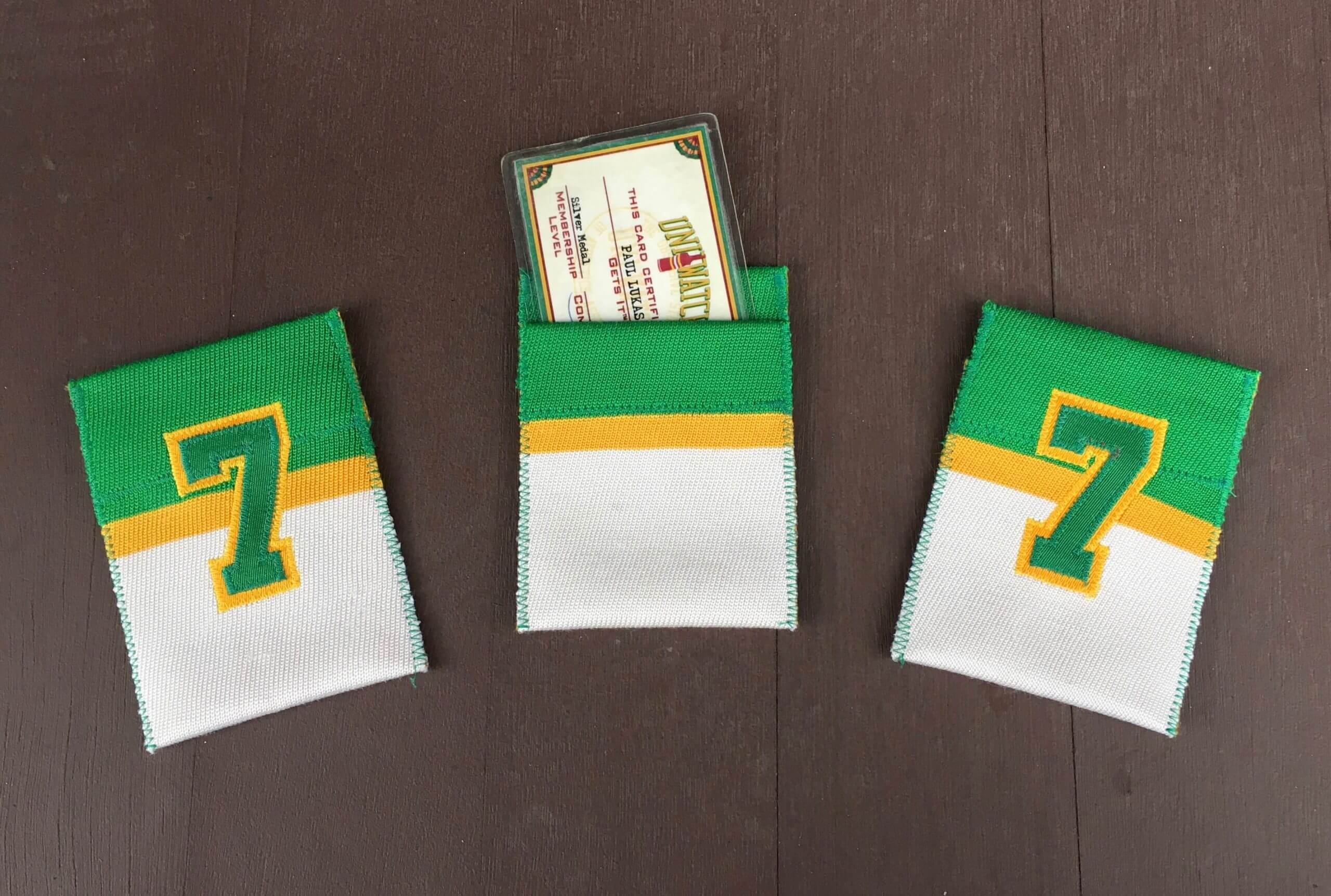
ITEM! DIY-driven membership drive: DIYer extraordinaire Wafflebored recently got in touch to let me know someone had given him an old durene hockey jersey in Uni Watch colors. “It was a very small kids’ size and had some holes,” he said, “so I decided there was no harm cutting it up for a project.”
That project has resulted in three wonderful little card pockets — perfect for holding, say, a Uni Watch membership card!
All three pockets are the same — striped on one side and No. 7 on the other. (Wafflebored says he chose that number in part because it’s one of my favorite numbers and also because it’s a simple numeral to work with at a small scale.) But since there are only three of them, how can I decide which lucky readers will end up with them?
Here’s how: We’re going to use these to kick off a week-long membership drive. I will pick three people at random from everyone who orders a membership card this week (including those who signed up yesterday), and those three people will get one of the beautiful card pockets along with their custom-designed membership cards.
Please join me in thanking Wafflebored for doing this. The only thing bigger than his sense of creativity is his spirit of generosity. You’re the best, buddy!
Also: About a year ago, as a gesture of pandemic solidarity, I lowered the membership price to $20. After this week, the price will go back to $25. So signing up this week is a good move — you’ll get in at the discounted price and will also get a shot at one of the card pockets.
As always, you can sign up for your own custom-designed card here, you can see all the cards we’ve designed so far here (now more than 3,000 of them!), and you can see how we produce the cards here.
Click to enlarge
Collector’s Corner
By Brinke Guthrie
Follow @brinkeguthrie
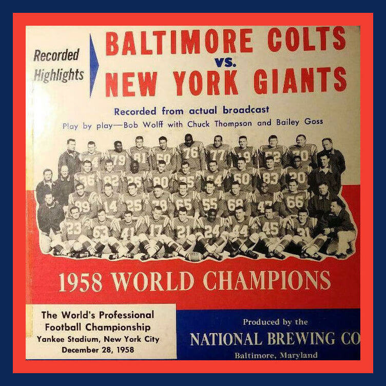
Here’s a 45-RPM record that documents the so-called Greatest Game Ever Played — the 1958 NFL Championship Game between the Baltimore Colts and the New York Giants. Side A is the fourth quarter, and Side B is the overtime period — the first overtime in a title game.
Now for the rest of this week’s picks:
• One more record, but this one is instructional rather than game highlights: Ralph Backstrom was the NHL Rookie of the Year in 1959 with the Montreal Canadiens and won six Cups with them. He’s also featured on this 1970 record, Ralph Backstrom on Offence, sponsored by (appropriate) Canada Dry. Mr. Backstrom passed away a little over three weeks ago at the age of 83.
• You could show this card to prove you were a charter member of the 1978 Ayres Great Gretzky Fan Club. (L.S. Ayres was a midwestern department store.)
• This baseball-themed game — simply called The Major League Base Ball Game — was produced almost a century ago by Parker Brothers.
• This is a clipboard that was carried around by ushers and stadium staff at the then-new Kingdome in Seattle. (“We’ve Got You Covered” — what a great slogan.)
• I’m including this Darryl Strawberry button for the simple reason that the word “Baseball” on the display card is one of the greatest fonts ever.
• This 1988 World Series Starter baseball jacket includes “NBC Sports” on the front.
• Here we have a set of four Major League Baseball All-Star Masks (Hot Rookies). I never really understood why you’d want to walk around with one of these on your face, although that Griffey guy did okay.
• I’ve seen the 1970s iHop AFC/NFC thermal cups lots of times, but this is the first time I’ve spotted a two-quart pitcher. (Couldn’t they just say “half-gallon”?)
• Here’s a set of 14 Fleer NFL Big Signs from the 1970s.
• Got an order form for a 1970s company called “Athletic Supply,” which offered a selection of Dallas Cowboys merch, right here.
Do you have an item to include on Collector’s Corner? Tweet submissions to @brinkeguthrie.
Click to enlarge
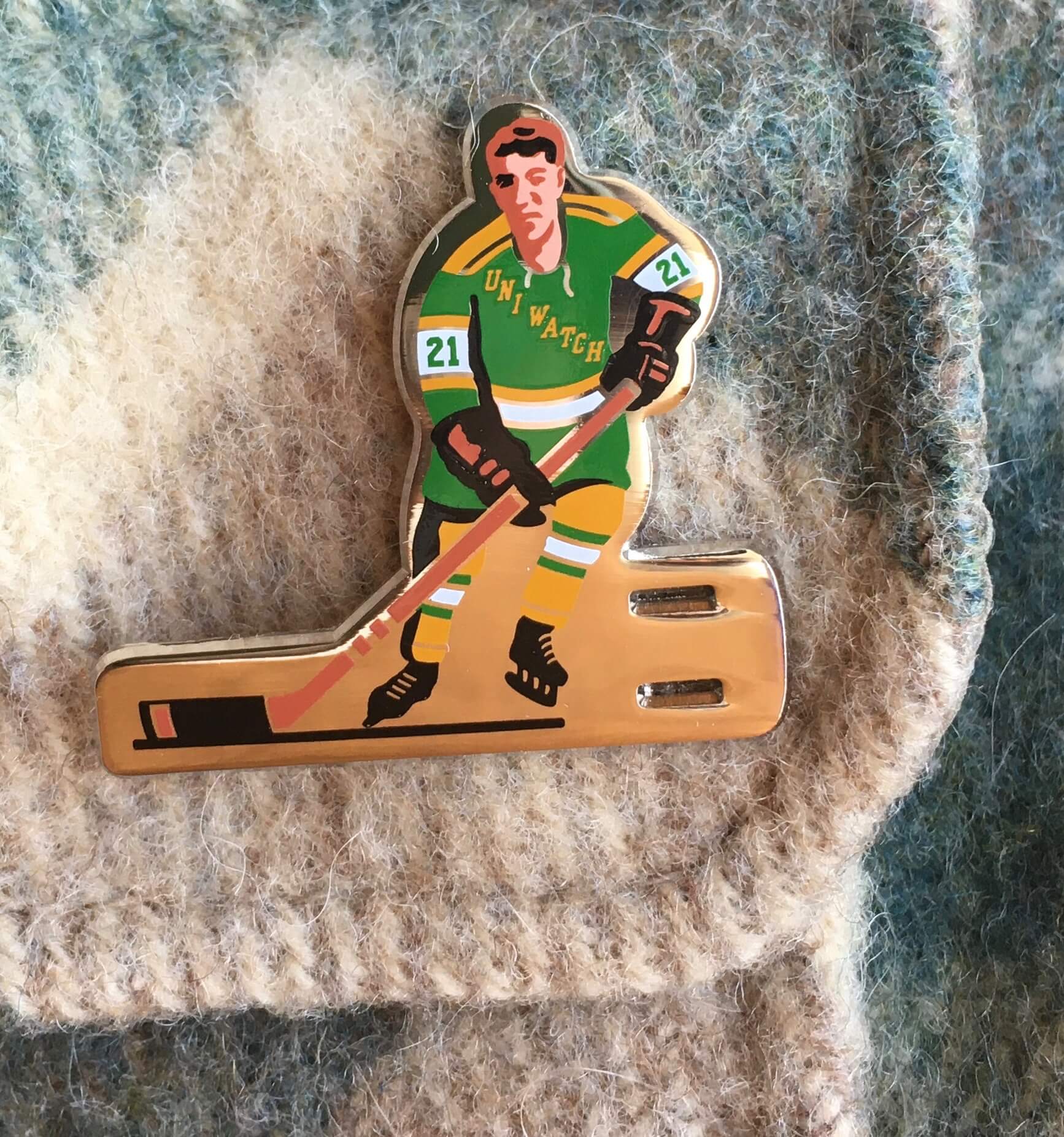
Pin Club reminder: In case you missed it on Monday, the Uni Watch Pin Club’s design for March is a shout-out to classic table hockey players. We even included the two slots for the pin to go through! It’s one of my favorite designs of the entire Pin Club project, and it’s available here.
This is a numbered edition of 200; after the first 24 hours of sales, about 85 were remaining. Here’s another view:
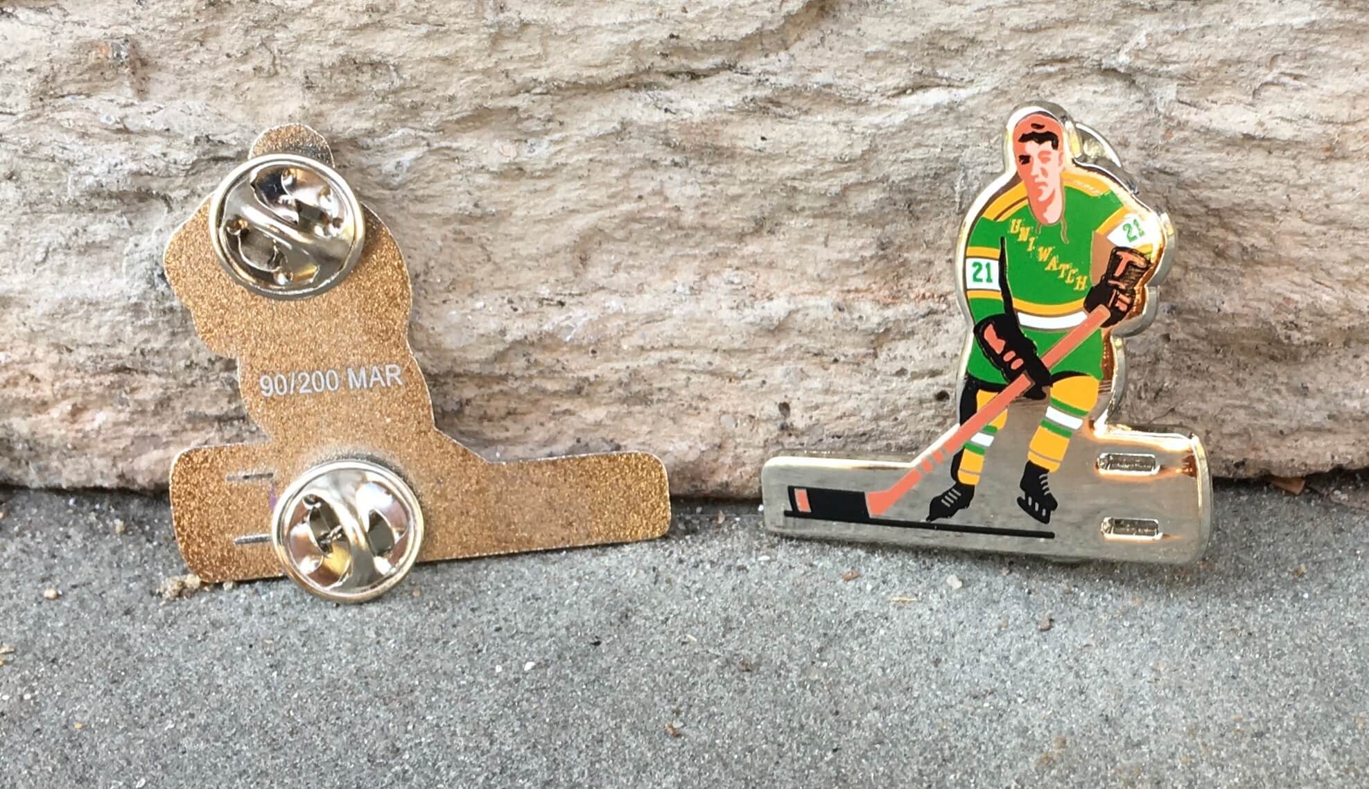
Again, this pin is available here. If you need to get caught up on the 2021 pins, here are the January and February designs. In addition, all of our remaining 2020 pins have been reduced in price by nearly 30% — they’re available in the Uni Watch Shop.
The Ticker
By Alex Hider

Baseball News: Dodgers P Trevor Bauer’s belt had his uni number and his personal logo during yesterday’s game (from Jakob Fox). … The A’s have released renderings of their new proposed stadium (from @jtretakoff). … A Maryland auction house is in the process of auctioning off Pete Rose’s all-maroon “Saturday Night Special” Phillies’ uniform. Bids close March 11. … Cool move by Ebbets Field Flannels, which announced yesterday that it is officially becoming a Negro Leagues Baseball Museum licensee and will start an “Authentic Black Diamond Collection” (from Scott Rogers). … John Stark was watching the ESPN miniseries The Bronx Is Burning about the 1977 Yankees and noted that in one scene, manager Billy Martin and C Thurman Munson had inconsistent cap logos. … Yanks prospect Armando Alvarez apparently likes his sleeves very short (from Jamie Burditt).

Pro Football News: Former Steelers great Jack Lambert is putting some of his mementos up for auction. You can see the individual auction listings here (thanks to all who shared). … The Oregon High Desert Storm are the newest members of the American West Football Conference, an arena football league. “Interesting logo, considering tornados are almost nonexistent here,” says Oregon resident Ted Turner. … The USFL used to sell glow-in-the-dark T-shirts (from Trevor Williams).
College Football News: BYU will have updated uniforms next year. In addition to their traditional white, navy, and royal jerseys and pants, they’ll also add a navy helmet and a royal helmet (thanks to all who shared). … Paul spotted this gorgeous 1940s game-used Cincinnati jersey for sale on eBay. … Jerry Quickel has quite the helmet collection — nearly 300 of them! More photos in this thread. … St. Francis High School in New York is poaching the 49ers’ logo (from Ryan Mallon).

Hockey News: The Red Wings have unveiled the dates they’ll be wearing their ЯR uniforms, and Vegas has released their uniform schedule for the month of March. … Rad Kern mocked up a hockey uniform inspired by the movie Dodgeball. … The Blackhawks shared a mesmerizing video that shows a fan creating the team’s logo in colored sand (from Shawn Anderson). … Reprinted from yesterday’s comments: Here’s a great story about a fan who’s created large replicas of the Original Six teams’ logos out of thousands of bottle caps (from Chris Clayton). … The Wild have changed the colors of the uni numbers on their white helmets. They used to be red for the road uni and yellow for ЯR, but now they’re green for both combos. “If I tried to explain this to my girlfriend, she’d just make fun of me,” says Karl Anderson. … Jimmy Lonetti found this great shot of Minnesota Fighting Saints LW Bob MacMillan wearing a rather goofy-looking football-style facemask.

NBA News: The Sacramento Monarchs haven’t played a game since 2009, but the Kings are honoring the former club with Monarchs cutouts in the stands at their arena (from Mike Chamernik). … This bag of chips featuring Celtics F Jayson Tatum thankfully omits Boston’s jersey advertiser (from @TheRealBigCoach). … Dylan Darling notes that while most NBA players these days wear compression sleeves, Nets PG Kyrie Irving still goes with an old-fashioned sweatband. Does anyone else still wear those?

College/High School Hoops: We have our first look at the court designs that will be used for the “First Four” — i.e., the play-in games — at the upcoming NCAA Tournament (from James Gilbert). … Virginia men’s seniors were presented with framed jerseys during their last home game last night. Notably, they were last year’s jersey design (from Jamie Rathjen). … Great story here: D3 women’s team Hope College had a whopping nine seniors on the roster this season. To honor them on Senior Day, coach Brian Morehouse started all nine of them, taking an immediate technical foul and a 2-0 deficit. The Flying Dutch went on to win (from David Raglin). … This piece goes behind the design of the Syracuse women’s pink cancer-awareness uniforms (from Michael). … High school basketball players in Michigan are required to wear masks during games, and failure to do so can result in a tech (from Brandon Weir). … Oregon women’s seniors were presented with a cake designed to look like the team’s court (from Josh Claywell).

Soccer News: A group of women in Japan made dresses and outfits inspired by Japanese club Gamba Osaka’s uniforms (from Jeremy Brahm). … New practice uniforms for top-level Brazilian club Sao Palo FC (from Marcos Vieira). … New kits for third-tier Polish club Hutnik Kraków (from Ed Żelaski). … New shirt for Peruvian side Universidad César Vallejo (from Trevor Williams). … Here’s an infographic tracking this season’s Premier League kits (from Jeremy Brahm). … The Athletic has a behind-the-scenes story on the making of the new Atlanta United kit. Key quote: “[Atlanta United’s chief business officer Catie Griggs] added that even if Atlanta United wanted to maintain the core look of the original jersey, a directive from Adidas to continuously evolve a kit’s design would make it difficult to do so. In fact, the level of design input that MLS clubs can offer throughout a creative process, which is already limited, will lessen moving forward, according to reporting from The Athletic’s Pablo Maurer” (from Michael Rich).

Grab Bag: Lawmakers in Iowa want to replace the welcome signs that greet drivers when they cross the border into the state. … Gay rights leader Tom Ammiano has finally been given the varsity letter (NYT link) that he earned in as a member of his high school cross country team way back in 1958. He believes his “high-pitched voice and effeminate mannerisms” led the school to discriminate against him at the time. … New logos for NAIA school Northwestern College in Iowa (from Dan Bodurtha). … A new player-run professional volleyball league launched over the weekend. The Athletes Unlimited league doesn’t have permanent teams — top scorers for each week are named team captains for the next week, and they then draft their own teams from the league pool. As a result, teams play in simple orange, purple, blue, and yellow uniforms. Topps is making cards for the league’s players, though. More info here from the New York Times (from Scott Kaplan). … A reader who wanted to remain anonymous notes that even sports bets now have tie-ins with advertisers. … Here are the curling uniforms that will be worn at the Tim Hortons Brier (from Adam Peleshaty). … Weyauwega-Fremont High School in Wisconsin is seeking a new logo after the U. of Wisconsin said the school’s logo is too similar to the Badgers’ “motion W” mark (from Ray Barrington). … New uniforms for British Royal Mail letter carriers (from Timmy Donahue). … A Nike executive has left the company following a report that her son was operating a business reselling sneakers (from Trevor Williams). … New F1 livery for Mercedes AMG (from Ephraim Vorzman). … Gatorade has come out with a wearable smart patch that measures the user’s sweat and hydration.

Click to enlarge
What Paul did last night: Yesterday was the 350th daily session of Pandemic Porch Cocktails™ — a grim milestone.
In 15 more days — well, you can do the math.
As always, you can see the full set of daily Pandemic Porch Cocktails™ photos here.
Can the Arizona Cardinals please upgrade their uniforms before they load up and get good! Those jerseys are the last thing I want to see on a memorable, nostalgic Super Bowl Run highlight reel we have to look back at for years to come.
Technically it wasn’t a “memorial patch,” but the “9-11-01” embroidery on the Mets’ sleeves was worn for 21 days (18 games) at the end of the 2001 season then carried over to 2002, so it falls just short.
The pinstriped “41” patches have been available commercially for many, many years; back around 2002 I picked up a “14” patch (same design) which I sewed onto my jersey when I coached in the PSAL from 2003-05.
Re: WP patch.
The sentiment behind the WP man of the year award is great. As is trying to recognizing off the field merit on the field on the uniform. But everything about the implementation of the patch is brutal in my opinion.
1. Increasingly teams are wearing chest patches as part of the standard uniform design (Jags, Steelers, Chiefs, Rams, Seahawks) which is bad enough.
2. Patching in general looks well as a one off thing, either an anniversary or memorial for a season, not as a regular uniform piece. They stand out and are sort of obtrusive, which work for a temporary item, not a full time uniform element.
3. The existing captain patches already add to the clutter, another good idea that is used well in other sports, but not the NFL.
4. Just look at that photo of Fitz, what if they made the Superbowl? You are talking about 4 patches?
5. Any sort of individual player recognition seems better suited for a decal on the back of a helmet than as a jersey patch.
6. The WP patch itself just doesn’t look good. Even though I know what it is, it simply isn’t pleasing to look at, for those who don’t know what it is they might think it is some sort of superhero decal.
Great points!
For an award based on Selflessness, it’s strange to have the player wear an individual patch. Very counter-intuitive.
And as for it not looking good, my best friend’s 7 year old thinks it’s Darth Vader, and doesn’t understand why “Good Guys” have to wear it and not a Yoda patch if they want. Which is adorable, but also perfectly illustrates your point. He will spend the next few years associating MOY winners with “Bad Guys”, which completely goes against it’s purpose.
I agree with every word of this. Well stated.
Agreed, well said.
I can’t find a source, but I remember reading once that toward the end of his career Yaz was dealing with a foot injury and wore a special shoe while hitting, which he would change whenever he got on base or played in the field.
He would swap out a shoe *when he reached base*?
Man, I don’t recall that at all. Hmmmmmm.
Found it. 35:20 of this video: link
Wow — great find! Thanks so much for sharing that, Jack!!
I noticed that in both photos he is wearing the same brand (Saucony) on his back foot. I believe they focus on running shoes, so maybe better support for his foot troubles?
…to render the invisible visible amazing
The only other memorial patch I remember carrying over for what felt like a long time was the Yankees with Yogi Berra in 2015. He passed on Sept 22, almost a full month after Seaver did in terms of relation to the end of the season, and the Yankees lost pretty immediately that year in the Wild Card play-in game, so it doesn’t sound like it was around for 23 days before adding it again the following season…but it sure felt like it was around for longer.
Before today, I was responsible for two of the last three entries with the “Women’s Sports” tag, plus I can think of three others, two by me, since then that don’t have the tag, so it’s fair to say I am delighted to see that percentage decrease.
Jamie, which entries should have had that tag but didn’t? Let me know and I’ll add them!
Also, I know that at least one venue that hosts AFLW (Fremantle Oval) still has a manual scoreboard, but Naomie and/or James may be more aware than me.
What great art by Naomie! Thank you for sharing James. I’ll be sharing this post with my daughters.
And great job Wafflebored! Another wonderful, simple concept perfectly executed!
Yaz did have foot trouble in his later playing years (and beyond). He wore different cleats because of that, but did not switch them out on the field during the game.
As Yaz got closer to the end of his career, he kept pulling is stirrups up higher and higher until he switched to the ribbon type. I liked the way he wore them in the late 60’s, with both blue stripes showing. I was not a fan of his later sartorial choices in stirrups.
He wore different cleats because of that, but did not switch them out on the field during the game.
Actually, he did! See the previous comment thread on this. I had no idea. Fascinating!
His cleats also had a “bizarre personal customization” from time to time (perhaps also due to foot ailments?):
link
Re: the “Greatest Game Ever Played” record by the National Brewing Co. of Baltimore. Frank Cashen who became the GM of the Orioles and the Mets was the director of advertising for the National Brewing Company. I couldn’t find in time period when Cashen held that position, but it is possible it was around ’58/’59.
OK, that Blackhawks sand video is mesmerizing and amazing. I clicked on the dude’s twitter page and he has many of them, for different sports.
Amazing talent, hypnotizing to watch.
Also, in that first photo of Yaz, he has his right stirrup on backwards.
I love the fact that the Pandemic Porch Cocktails are getting some daylight back in them! My own Pandemic Postcard Project has missed the hour or so I’d spend writing postcards in my back yard after work…39 degrees in early November was the line I had to draw. It’s looking like I might get to sit outside after work soon! Carry on with the PPC!
The Badgers “W” is the “Motion W” not the “Action W”. Forward!
Right you are. Fixed!
Chris Paddack, what can Brown do for you?
Thank goodness the term “footy” never caught on as a description for American football. Wow, the sound of that word really hits my ear wrong. Like when Claire on Modern Family said “me likey.”
I was glad to have that history lesson on Women’s Australian Football. It’s important every time women get an opportunity to establish themselves in activities that are dismissed as “men’s sports”. When women re-established fast-pitch softball, I was thrilled to see a sport which I thought was dying.
Ref the Tom Seaver Memorial patch – at least the “41” patch is in proper Mets colors. I tried to float to the Mets the concept of a knee stain for the year as a memorial to Tom. Imagine all the pants having a sublimated dirt stain!
So….why did Yaz need a big earhole?
I think to better hear the pitch count (read that somewhere.)
Correction: Strike count…
link
That’s actually what I thought you meant anyway!
Thanks. So 1978 would be the only year for the big red helmet earhole. Good to know!
Brown stirrups with yellow sannies would look pretty good also. Hmm…where have I seen that before?
link
Is the whole team going with white shoes, or are the days of such uniformity past?
Colored sanitaries were the intellectual property of many teams that wore white pants on the road (Giants, Padres, A’s) and the first few years of the Brewers’ blue road uniforms. They looked great!!
There was a Uni Watch piece many years ago about the aesthetic appeal of baseball uniforms with two or more team colors wearing stirrups of the base color with sanitary socks of the warmer/lighter color. Ideally, white cleats would set off this bit of leg styling.
Big fan of BYU Football, and I’ve liked everything except their dalliance with the tan trim a few decades back. But the dissonant element in their new/classic uniform is the Northwestern striping on the pants; too busy by half. It looks better when pant striping matches the helmet.
It’s likely those UVA jerseys from Senior Night were the actual jerseys from last season. I had an old jersey framed for me on my Senior Day at Rutgers way back in 2009.
Big thanks to Chris Hickey for sponsoring the NASCAR-themed membership card, just received yesterday. Gifted to my son and yes, 2008 Jimmie Johnson paint scheme. Thanks!!
Great post today! I loved the painted number signs, they’re great both in content and in style. And the bottle cap logos are amazing. Knew I should have been hoarding my bottle caps all these years. The jersey swatch card holder is sweet too.
I wish all teams had the amazing guide that BYU put out: link
It’s so nice
While looking at that ebay listing for the cool 1922 baseball game, I saw this listing for a 1913 baseball game!
link
For all you WNBA fans:
link
JJ Watt had a backwards Cardinals logo at his team introduction, for some reason:
link
I think that is the one from the other side of the helmet.
Cheers Paul, loved seeing this when i woke up down on this side of the globe!
Cheers to YOU, James — this one literally would not have happened if not for you telling me about it!
In the past, Kyrie Irving always wore compression sleeves on his left arm. It looks like the arm band is new for him this season, and I remember a player he idolized who wore his arm band in the same spot… Kobe tribute, perhaps?