Click to enlarge
Good morning! Greetings from Uni Watch HQ, where all three inhabitants continue to be safe and well.
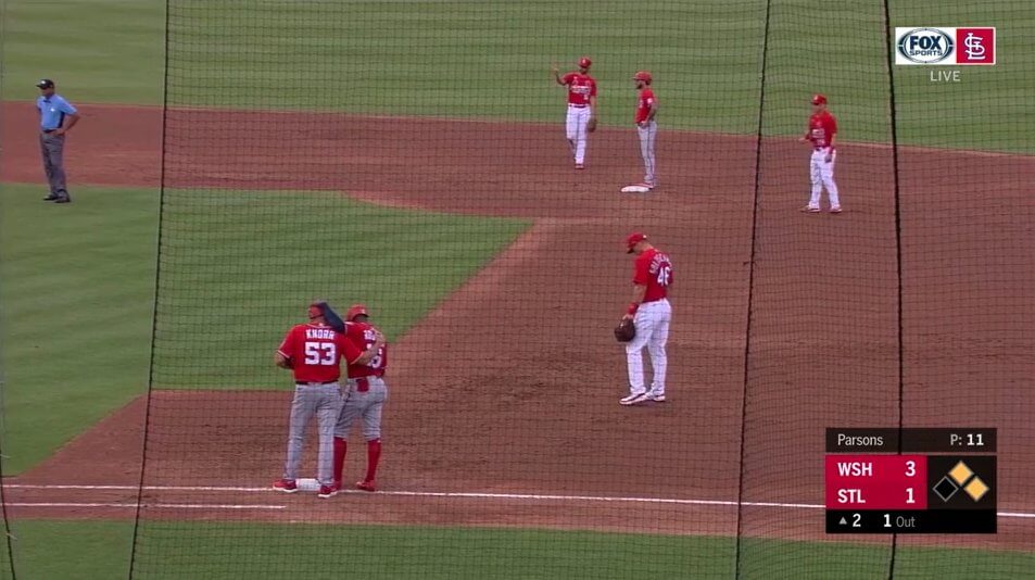
MLB spring training games got under way yesterday, and we were promptly confronted with a the Nats and Cardinals going red vs. red (see above). I usually don’t mind when two MLB teams wear same-colored jerseys — unlike most other sports, baseball doesn’t have all the players on both teams appearing on the field at the same time, so there isn’t much opportunity for a confusing kit clash. Then again, sometimes you get a situation like the one shown above. Obviously, this particular TV camera view makes it seems worse than it really was (sort of like selectively cropping a photo), but it’s still pretty funny!
A few other notes from yesterday’s Grapefruit and Cactus League openers:
• In a very different kind of color-vs.-color game, the Padres and Mariners went brown vs. light blue:
• At least two spring ballparks — Joker Marchant Stadium in Lakeland, Fla. (home of the Tigers) and the Peoria Sports Complex in Peoria, Ariz. (home of the Mariners and Padres) — allowed fans to sit on the grass beyond the outfield wall, but only in designated socially distant squares:
• Blue Jays shortstop Bo Bichette’s super-high pants cuffage, which he’s been doing for the past two seasons, is in midseason form:
• At least two first base coaches — Mark Budzinski of the Blue Jays and Wayne Kirby of the Padres — had uni-numbered masks. I know we saw plenty of that last season, but I’m just noting that it’s carrying over to spring training:
• Orioles first baseman Trey Mancini, who missed the 2020 season while recovering from colon cancer, got a nice response from the crowd for his first plate appearance (and then promptly singled — good for him!):
What really interests me about that video, though, is the way plate ump Will Little repeatedly kicked the plate “clean” with his feet. I get that he was doing it a bit longer than usual in order to let Mancini enjoy the ovation, but why was he using his feet to begin with? Come on — bend over and use the whisk broom! I know umps have been using the kick method for a long time now, but part of a game official’s job is to project a sense of righteous authority and proper protocol — the kick method always seems to undermine that, at least to me. If spring training is for brushing up on fundamentals, shouldn’t they at least break out the whisk broom just to get reacquainted with it?
• Speaking of umps: Ryan Blakney, who was working the plate for the Reds/Cleveland game, was still wearing last season’s memorial patches for former umps Eric Cooper, Chuck Meriweather, and Rick Reed. I didn’t see any other umps wearing those patches yesterday (although, obviously, I didn’t find photos of every single ump, so others could have been wearing the patches):
• Last week I noted that the Yankees’ Whitey Ford memorial patch appeared to be positioned very low on pitcher’s Gerrit Cole’s sleeve. Unfortunately, that appears to be the rule, not the exception:
An inch or two higher would look so much better!
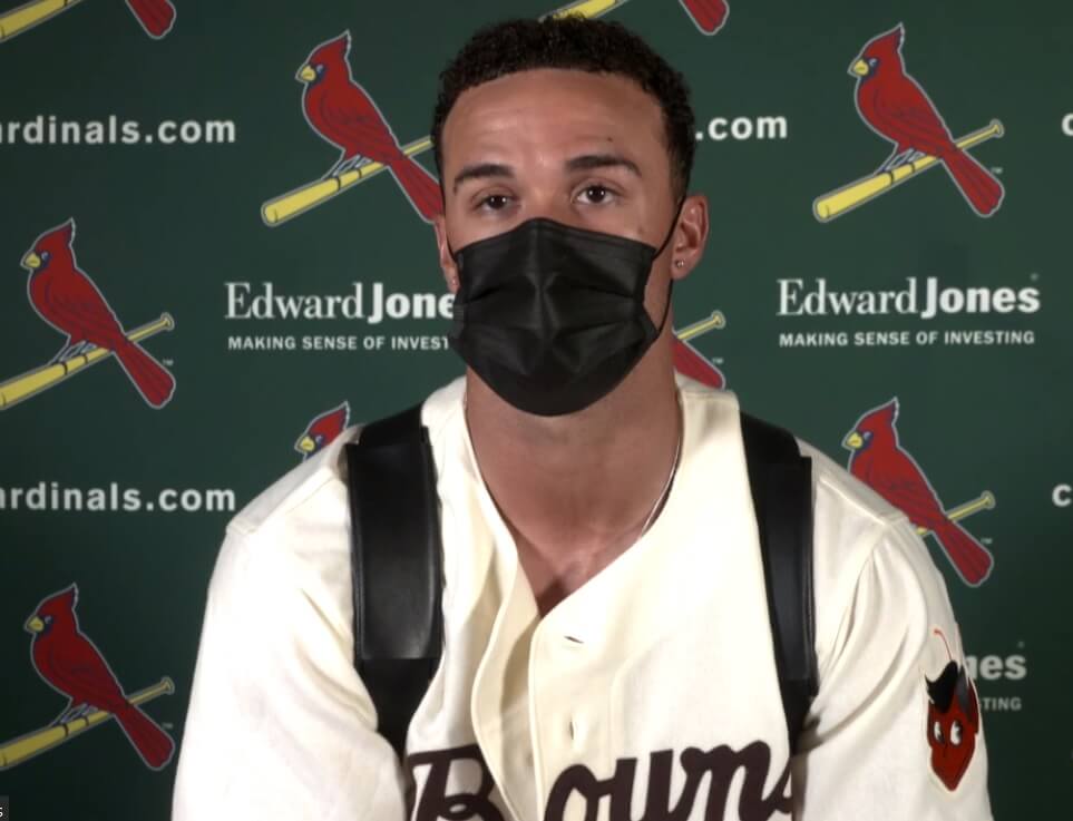
• Cardinals pitcher Jack Flaherty wore a St. Louis Browns jersey for his postgame press availability:
Ah, MLB uni-watching — it’s like riding a bike, I tells ya! Here’s to lots more uni-notable baseball moments in 2021.
(Thanks to Jim Howicz and @mrmichael21 for their contributions to this section.)
Click to enlarge
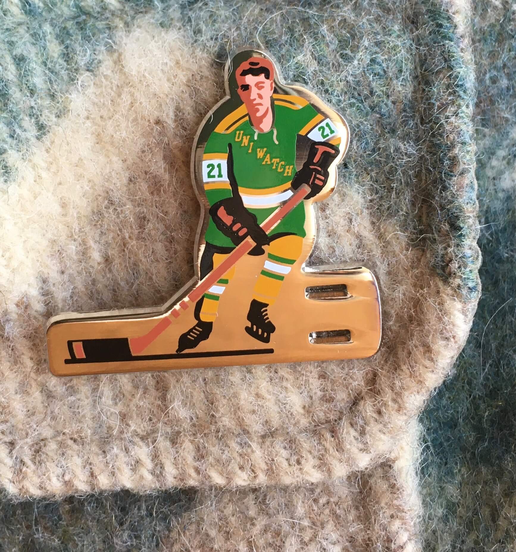
ITEM! March Pin Club release: Up until now, pin collaborator Todd Radom and I had done only one hockey-themed design (that was last October’s pin — about 30 of those still available), but this month we return to the ice with a pin based on classic table hockey players. We even included the two slots for the pin to go through! It’s one of my favorite designs of the entire Pin Club project, and it’s available here.
This is a numbered edition of 200. Here’s another view:
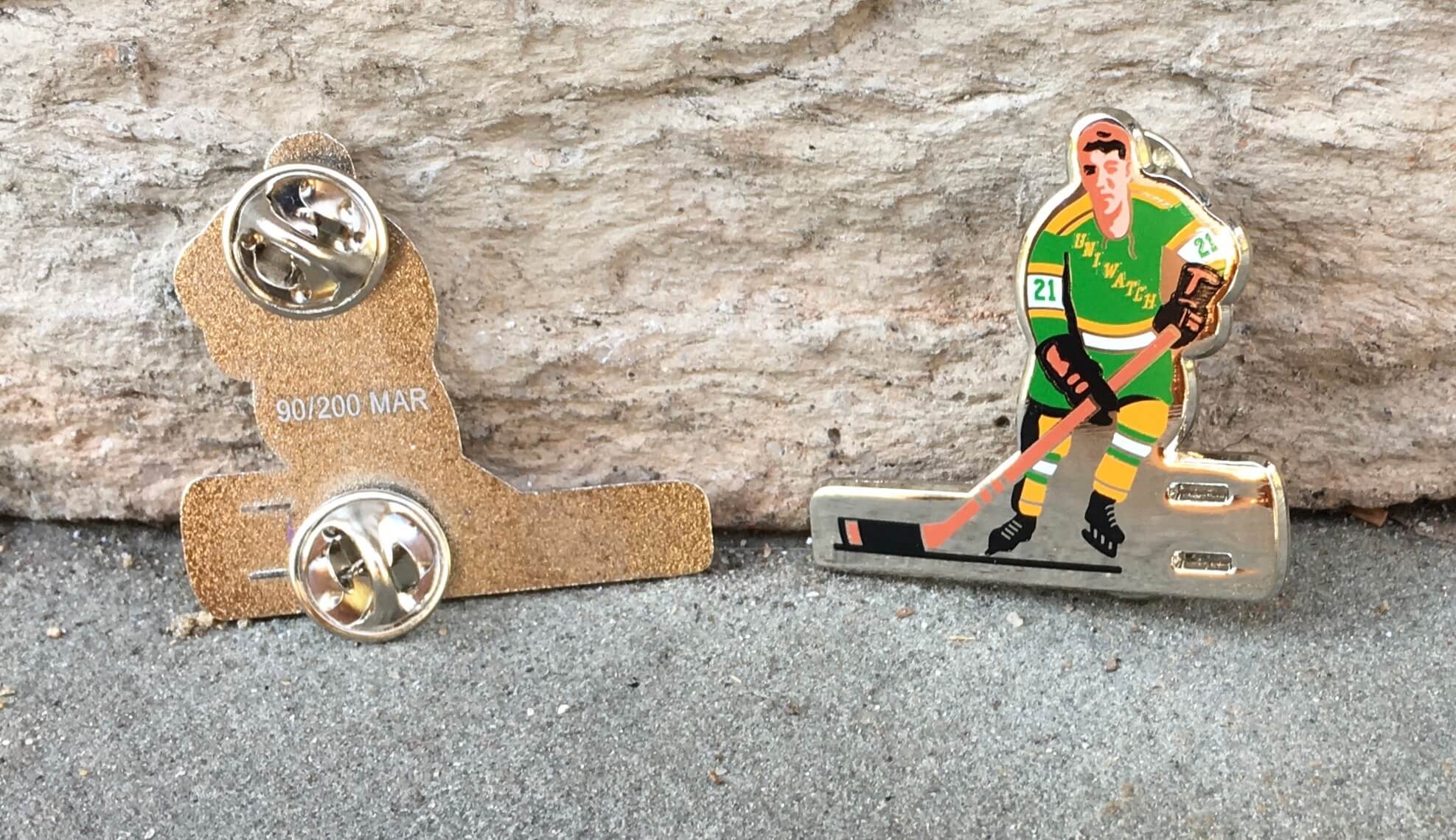
Again, this pin is available here. If you need to get caught up on the 2021 pins, here are the January and February designs. In addition, all of our remaining 2020 pins have been reduced in price by nearly 30% — they’re available in the Uni Watch Shop.
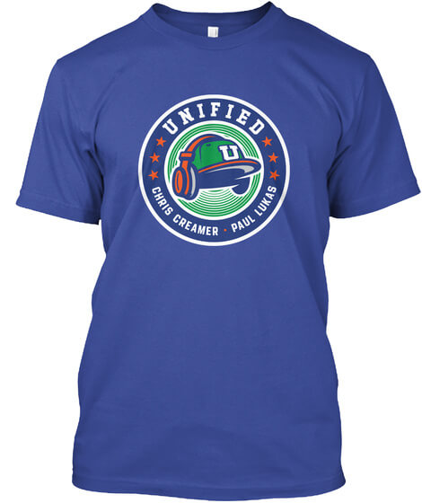
ITEM! Unified T-shirts now available: I’m happy to report that the Unified podcast now has its own merch shop, featuring an assortment of T-shirts and stickers. You can see our initial offerings here, and we’ll be adding new items in the weeks and months to come. If you have any specific requests or suggestions, feel free to let me know.
You can listen to our show, and subscribe to future episodes, on Apple, Google, Stitcher, TuneIn, and Spotify. Photos of things we’ve discussed in the episodes can found in the show notes on our website, and those same photos appear in the video versions of our episodes, which you can find on Chris’s YouTube channel.
If you haven’t caught our latest episode, you can also listen to that one here:
Thanks for the all the enthusiasm and support about this project!
Click to enlarge
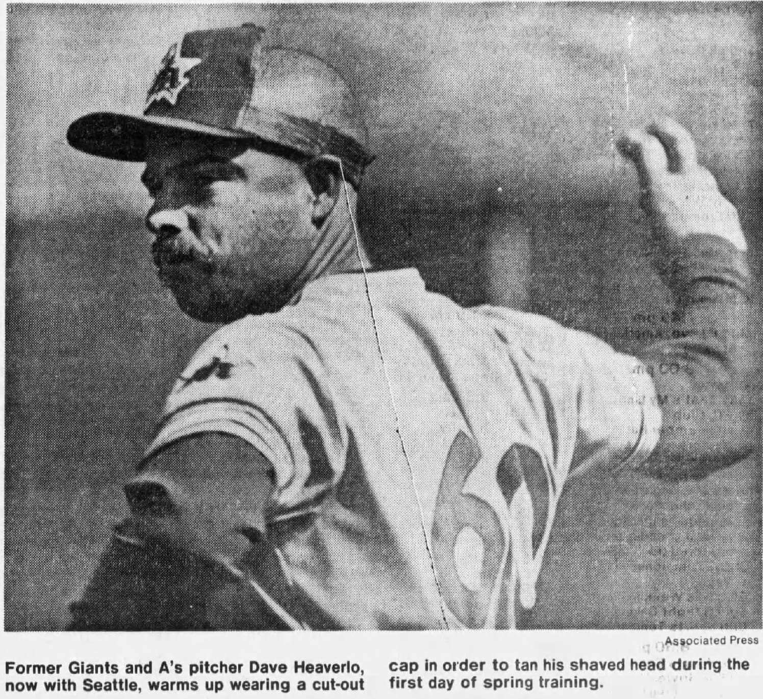
Cooler heads prevail: Forty years ago today, this wire photo of Mariners pitcher Dave Heaverlo appeared in newspapers across America. Somehow his cap-modification style never caught on!
(Big thanks to longtime reader/pal Jeff Ash for this one.)
Take that, swoosh! Even if you don’t care about logo creep as much as I do, I’d like to think that everyone reading this can appreciate the creativity and thought that went into the project shown above. First-rate!
(Big thanks to Paddy Raven for this one.)
Click for maximum cuteness
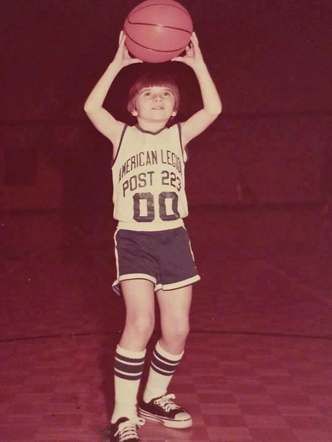
Waaay too good for the Ticker: All the recent chatter about zero and double-zero inspired reader Scott Williams to dig out this photo of himself from 1972, when he was nine years old. Is that pure gold or what? The Northwestern-striped tube sox, junior Chucks, the double-zero, and double-decker vertical arching! So good.
“Our entire entire 10-member squad wore only 00, 11, 22, etc., up to 99,” says Scott. “How many people can say they wore their entire season stats on their jersey, like I did?”
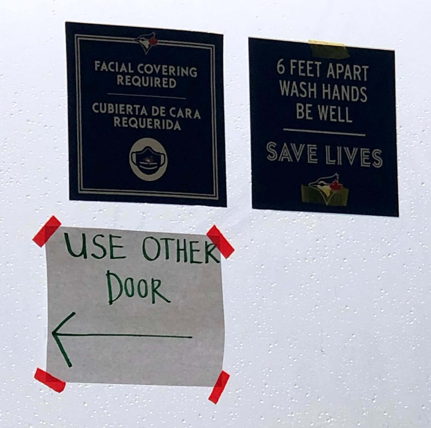
Blue Jays in Brooklyn? A reader who prefers to remain anonymous was getting vaccinated in Brooklyn the other day and saw these signs with Blue Jays logos and typography. This particular vax site was run by the state, not the city, so he theorized that the signs could have been repurposed from being used in Buffalo, where the Jays played their home games last season.
When I posted the photo on Twitter, @golbmchallenge confirmed that similar signs were posted at Buffalo’s Sahlen Field last season.
I’ll be able to see these same signs myself on Friday, when I’ll be getting vaccinated at the same site where the anonymous reader took the photo. Excited to be doing my part to protect myself and protect others!

Membership update: A new batch of designs has been added to the membership card gallery, including Zach Spencer’s, shown at right. If you don’t recognize the team, that’s because it’s based on his beer league hockey jersey — a great choice!
As of this morning, I have one remaining slot on the current sheet, so the next person to sign up will get their card without much of a wait time.
Ordering a membership card is a good way to support Uni Watch (which, frankly, could use your support these days). And remember, as a gesture of comm-uni-ty solidarity, the price of a membership has been reduced from $25 to $20 until further notice, plus a Uni Watch membership card entitles you to a 15% discount on any of the merchandise in the Uni Watch, Uni Rock, and Naming Wrongs shops, and the discount also applies to our Uni Watch Classic Cap and Uni Watch toque. (If you’re an existing member and would like to have the discount code, email me and I’ll hook you up.)
As always, you can sign up for your own custom-designed card here, you can see all the cards we’ve designed so far here (now more than 3,000 of them!), and you can see how we produce the cards here.
The Ticker
By Jamie Rathjen

Baseball News: Some Texas A&M players are wearing both the SEC’s graduate patch and the conference logo patch, when the former usually replaces the latter (from Clint Richardson). … Vanderbilt’s military-themed alternates apparently now have matching helmets (from @eggsngrits). … Reader Max Weintraub was watching a PBS documentary about Al Capone that frequently used this picture of him with Cubs C Gabby Hartnett, which is probably from a September 1931 Cubs/White Sox charity game.

Football News: Troy presented the “offseason MVPs” on offense and defense with spears as trophies (from Ben Whitehead).

Hockey News: The Predators wore Black History Month-themed warm-up jerseys on Saturday (from Wade Heidt). … The NBCSN soccer show Men in Blazers recently featured a Capitals ЯR sweater visible behind host Roger Bennett, who is a Caps fan — and he was also wearing a Whalers sweater. Bennett has also used that spot recently to display shirts belonging to American soccer players (from Max Weintraub). … SportsLogos.net head and Unified podcast co-host Chris Creamer appears in this article discussing the Sabres’ uniforms and ЯR design (thanks, Brinke).

Basketball News: Women’s college teams that wore pink or pink accents included both Syracuse and N.C. State, with Syracuse wearing pink at home; both Delaware and Towson; Georgetown; and Division III Baldwin Wallace. … The Ohio State/Iowa men’s game yesterday was color vs. color and script alternate vs. script alternate (from Nick Souza). … Ohio State also apparently gets a silver jersey tab for making a men’s Final Four as a Nike school, instead of the gold one national champions get, even though they did win the championship in 1960, before Nike existed (from @5th_Factor). … Whoa — looks like players in the Korean Basketball League are wearing advertising stickers on their bare upper arms!

Soccer News: In MLS, the Chicago Fire have two new shirts, while one for Orlando City is to come this week. … New shirts also for Georgia’s Dinamo Tbilisi (from Ed Żelaski). … English League Two’s Forest Green Rovers wore shirts partially made out of recycled coffee grounds and plastic on Saturday. FGR chairman Dale Vince owns a green energy company and is also responsible for other initiatives like changing the club colors to lime green and black and putting in some eco-friendly features at the stadium. … The final of the Copa Verde, a cup competition for clubs in western and northern Brazil to qualify for the Copa do Brasil, had sleeve patches featuring endangered Amazon animals (from Trevor Williams).

Grab Bag: Several pro golfers yesterday wore Tiger Woods’s trademark Sunday outfit of black cap, red shirt, and black pants to show support for him after his car accident (from multiple readers). … AFL Women’s recolored their logo for this weekend’s Indigenous round, and officials participated through their shirts. Teams also wore the same “Free the Flag” warm-up shirts, a reference to the Aboriginal Australian flag being copyrighted, as appeared in the men’s counterpart of the event last year. … Meanwhile, Adelaide’s Indigenous guernsey is white and is appearing for all away games this season, but they got a home game this weekend, so the result was a white-on-white matchup with St. Kilda (from Graham Clayton). … Reader Ryan Hemminger’s alma mater, Division III Bethany (W.Va.) College, had striped shorts for its men’s cross country team at the time of them winning an NCAA regional in 1980. … Ohio State field hockey has a 50th-anniversary logo. … Virginia’s Klöckner Stadium hosts soccer and lacrosse, which usually don’t overlap but do now because of part of the soccer season moving to spring, so the field lines for all three of soccer, men’s lacrosse, and women’s lacrosse are visible and painted a mix of white, orange, and dark blue.

Emancipation Day (observed): Twenty-five years ago today (well, it was actually Feb. 29, but that date doesn’t exist this year), I walked out of my office at Billboard Books for the final time and began life as a full-time freelance writer. I’d been freelancing on the side for a little over two years and decided it was time to take the plunge. Giving up a stable job was a bit scary, but I had to give it a try, because I wasn’t happy with my life or career up to that point and knew I needed to make changes or else I wouldn’t be able to keep facing myself in the mirror each morning. Can’t believe it’s been a full quarter-century since that day!
The flip side to the flexibility I’ve enjoyed since then, of course, is a lack of security (something that feels particularly precarious in the midst of the pandemic). But despite a few rocky moments, in the big picture it’s all worked out much better than I ever could have imagined, in part because of of the wonderful and supportive comm-uni-ty that’s formed around this website. On a near-daily basis, you folks make it clear to me that I made the right choice.
As I like to remind people each year on this date — and also remind myself — the moral of the story is this: If you want to change your life or reinvent yourself, don’t just sit around fantasizing about it — make it happen. Even if it doesn’t work out, at least you won’t spend the rest of your life wondering about what might have been.
Of course, maybe you already like your life just fine the way it is, in which case more power to you! Either way, thanks for listening, and thanks again for helping to make my choice a good one. — Paul
Some html tagging issues at the start of the Yankees’ patch section.
Thank you! Fixed.
I wonder if the Whitey Ford patch is so low on the sleeves because the Yankees are anticipating needing to add more patches throughout the season?
Congrats on getting an appointment! My wife got her first shot yesterday and I have mine tomorrow.
FWIW, I like the new hockey pin – but a question: was the intent to make the pin’s right eye look like a shiner? Either way, I think it’s a fun detail.
No — just shadowing. Good luck with your shot!
From 1870 to 1890, Syracuse’s official colors were pink and pea green, so those pink uniform could be considered fauxbacks.
“Cardinals pitcher Jack Flaherty wore a St. Louis Browns at his postgame press availability”
I’m assuming this should read “St. Louis Browns jersey.”
Yes == fixed.
The Orioles should work the Browns uniforms into their rotation again someday(did so in 2003)…while the ’52-’53 ones are nice, the ’47 version holds a bit more significance:
link
Congrats on your work anniversary Paul! We’re all glad you took that leap!
I will second that notion. Making big life changes is hard to do, when I made a career change I remember waking up feeling like an elephant was standing in my chest. But it was one of the best decisions I’ve ever made, and I’ve never looked back. If you’re in a rut, muster up some courage and do something about it!
Another spring training tradition worth noting…a number of teams, most specifically and un surprisingly the Yankees, wear their home whites instead of “spring training” jerseys to honor opening day of the spring game season. As you can see in your photos, the Orioles went with regular season home whites as well. Wondering how many other teams do this?
I know the Dodgers used to wear their traditional homes whites in Vero Beach. Not sure if they stuck to it since the move to Arizona.
Dodgers will wear white today for the first home game. After that it’s back to the softball uni’s.
Loving the hockey pin this month! Ordered! Now just waiting for a football bobble-head pin.
Hot take! The Yankees memorial patches…are exactly where they need to be on the sleeve ¯\_(ツ)_/¯
Do you even patch bro?!
/sarcasm
As someone who “gets it” like most others here, I don’t see how the placement of the patch is bad in any way, either. I don’t see how moving it up more would make it any better or worse.
I just think it’s too close to the sleeve cuff and would look better with a bit more clearance.
That cutout hat is hysterical. Did they not have visors 40 years ago???
Heaverlo was the first player I ever saw wear a number in the 60s (60). Hard to explain today, but it seemed outlandish to me then. A football number.
My God! You’re right! How did I forget that?
Numbers in the 60s still look outlandish.
Peoria Sports Complex is home to both the Mariners and the San Diego Padres. (The ST jerseys means it’s hard to tell which team is the home team for the game.)
Ah, didn’t realize. Text now adjusted!
Shared ST Homes in Arizona/Cactus League:
Reds/Indians (Goodyear, AZ)
Dodgers/White Sox (Phoenix, AZ)
Padres/Mariners (Peoria, AZ)
D-Backs/Rockies (Salt River/Pima Indian Community, AZ)
Rangers/Royals (Surprise, AZ)
Prior to the Vid, I had attended ST in Arizona for the prior 10 years. It’s a great place to see a lot of baseball in a number of different places, given that, depending upon where you stay, you have a wide choice of games within a 45 minute drive. Much different than the 2-3 hour drives in Florida.
Salt River is my favorite
There was an interesting Twitter kerfuffle involving pro golfer and Twitter darling Max Homa over the weekend. Homa posted that he loved Tiger Woods but couldn’t participate in the “Sunday red” homage because he didn’t bring a red shirt with him. He was promptly roasted by the comment section for not just going out to buy a red shirt (after all, he won a million bucks last weekend!). Homa had to explain that, due his contractual obligations, he couldn’t just run to the pro shop and grab a red shirt:
link
Oy.
The Ohio State/Iowa men’s game yesterday was color vs. color and script alternate vs. script alternate
Nice! We need more script.
Ohio State also apparently gets a silver jersey tab for making a men’s Final Four as a Nike school, instead of the gold one national champions get, even though they did win the championship in 1960, before Nike existed
The world did exist before the swoosh. This is ridiculous.
Virginia’s Klöckner Stadium hosts soccer and lacrosse, which usually don’t overlap but do now because of part of the soccer season moving to spring, so the field lines for all three of soccer, men’s lacrosse, and women’s lacrosse are visible and painted a mix of white, orange, and dark blue.
Love it. It’s nice to share!
Happy Emancipation Day (observed)!
It looked like the MLAX lines were white, the WLAX lines were orange, and any soccer lines that didn’t overlap with the other two were blue. The result was that the soccer lines were all three colors.
Mets link; it’s white with orange outline, blue pinstripes, and “41” in blue/orange. This replaces last year’s Seaver patch worn in September after Seaver died, which was black with “41” in white.
Gotta love it when you forget it’s new pin day and, BAM, there’s another gorgeous design! Ordered. Paul, probably not intentional, however, so far you’ve taken my overly elaborate pin program feedback and exceeded my expectations. Thank you.
Also, I just wanted to add on to what some other readers have said about hearing your voice on the podcast. Although I have been reading your material for the better part of two decades, I just now have heard what you sound like. It incredible how different the narrator’s voice is in my head from the voice that comes over the podcast. What I find most intriguing is that although I now *know* what you sound like, I *still* read the blog in my narrator’s voice.
Same here. I’ve lived so long with my version of Paul’s voice in my head I don’t think my brain can accept reality.
Really like that 2008(?)Jimmie Johnson – themed design that was recently added to membership galley…a terrific choice!
March 1st, the first lede devoted to baseball. Uniwatch just adds to my excitement for the baseball season, COVID or not
The Padres need to be using their spring training unis during the regular season. They look sharp!!
Congrats Paul on 25 years of independence.
Love this website, even before it ever was a website going back to the Village Voice days. Thank you for making our days a little bit better, almost every day!
Sincerely,
Nick Varrecchio
Thank you, Nick!
Man who drinks too much beer, makes NHL original six logos and the local news…. link
I can’t believe you’re selling shirts for a podcast.
Actually, lots of popular podcasts have T-shirts.
heartbreakingly i find the game of béisbol unwatchable anymore; however, if i was inclined to watch, Bo Bichette’s style encompasses exactly the direction baseball uniforms should go.
who wears slacks in the summer? hell! when was the last time a waxed pleather belt and trousers was even remotely in fashion anyway? why are we holding onto that one?
can we lighten the look a bit? maybe some of the uni-traditions, so out of skew anyway, might help. seriously, the entire baseball uniform needs a serious re-think, the ceiling grade of the game right now tops out at a C-/D+.
Baby/Bathwater.
Because of Chris Creamer, I learned the Buffalo Sabres were not the “Buffalo Sabers” in a bid to encourage Canadian citizens to follow the team. I’m never too old to learn something!
The RЯ Uniform program shows unexpected ambition in reviving the Quebec Nordiques’ and Minnesota North Stars’ designs. A uniform I liked but don’t know how it could be worked into the program is the 1999 Atlanta Thrashers’ white home sweater.
Congrats on 25 years. I’m also celebrating my silver work anniversary this year which means I’ve spent half my life there. Yikes!
That font on Heaverlo’s jersey seems unique for baseball. I assume it was only for spring training. I’ve only seen that font used in football. I can’t recall what it’s called but I do like it!
The Cubs and White Sox both put a version of that font on their link. I’ve always liked it; Rutgers had it on their football uniforms in the ’90s too. I think it is originally designed by the NCAA.
Here is a link, from Bill Henderson’s excellent uniform guide.
That curvy font is called University Gothic. It was created in the 1950s by an art professor named Ralph Douglass, who was on the staff University of New Mexico. He was mentioned in the Football Ticker of Uni Watch on March 23rd, 2020. At various times, it has been used by the Seventy-Sixers, the Mavericks, the Mariners, the Padres, and the Ottawa Renegades. Periodically, it will appear on college uniforms when a school decides to spruce up its look.
Congratulations Paul on Emancipation Day and your upcoming vaccine. You deserve all the good which comes to you.
Howard