By Phil Hecken, with Logan Paige
Follow @PhilHecken
Good Sunday morning, Uni Watchers. Hope you’re all staying safe and well.
Now then, I received the following e-mail from reader Logan Paige earlier this week:
Hey there,
As a lifetime Philly fan, former PA resident, and big time Uni Watch fan, I recently had a thought run through my head. Why is it that Pittsburgh pro sports teams have a cohesive look that matches the colors of their city flag and yet none of my own Philadelphia teams sport the powder blue and yellow (sans one 2007 Eagles game)?
This led me down a path of researching how other teams in other cities have approached this. Are there other cities like Pittsburgh where many, if not all, of the teams share the local colors?
I found some interesting things, including many teams that I had no idea were derived from their city’s flag (Knicks, Mets), and some cities that surprisingly had no chromatic connection whatsoever to their pro sports teams (Los Angeles).
Let me know if you’d like to learn more about my findings, my process, and if you think this would make good content for the site. Either way, I found it very interesting as someone who enjoys uniforms and municipal flag design and hope that you do too!
Best,
Logan Paige
I’m not quite the vexillologist (or even vexillophile) that some in the readership are, but I have always been intrigued by nation, state and city flags — but for uni-philes such as ourselves, flags bear a close kinship to uniforms. On several occasions we’ve featured uniform/flag articles on this site (I remember doing a set of concepts about a dozen years ago for baseball where I attempted — as best one can do in MS Paint, anyway — to place every team in color elements based upon their city flags), so when Logan approached me with this I was quite intrigued and thought it would make for an interesting piece. Here’s Logan.
Uniform Colors and City Flags
by Logan Paige
As a lifetime Philly fan and longtime PA resident, I was often jealous of the fans on the other side of the state. Pittsburgh is of course known for its cohesive look across its professional teams, with the black and yellow matching that of the Pittsburgh official city flag. Meanwhile, my teams were a hodge-podge of colors that had no connection to the powder blue and yellow of the Philadelphia flag (which would be an excellent uni color set!). We got one Eagles game in 2007 with those colors as a throwback that didn’t really ever exist and that’s it.
This got me thinking about sports teams and their connections to city colors. Were there other cities like Pittsburgh? Or were most like Philly? I went to work to find these answers. I had a simple methodology for rating cities in terms of their cohesive colors. For each team, they received a point if their colors were a match to the city flag, half a point if it seemed derived or inspired by the colors but not an exact match, and zero if it wasn’t close. To make things simpler, I only looked at cities with more than team in the big 4 pro leagues and only counted primary sets of colors (no NBA “City” uniforms here).
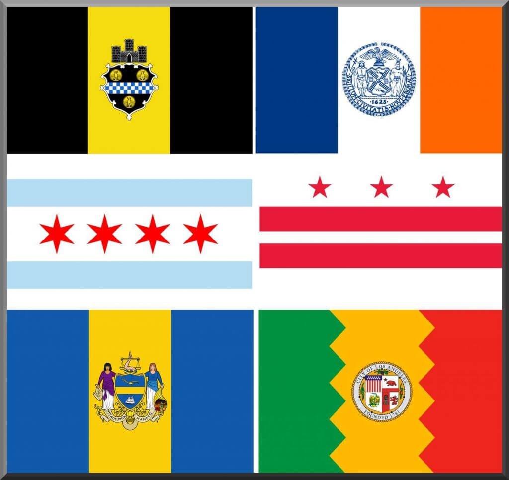
Below are my top 3 cities based on uniform-flag color cohesion, as well as a couple I found surprising that mostly lacked this type of connection at all.
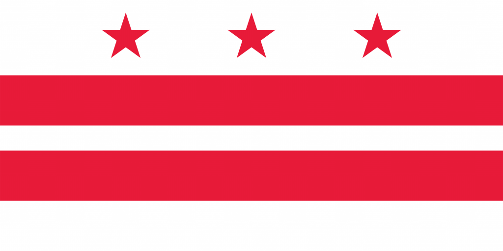
3. Washington DC
I struggled a bit at scoring the uniforms in our nation’s capital. Technically the flag of the city only uses the colors red and white. However, it is also so closely tied with the United States, that the inclusion of blue is understandable. I ultimately settled on 1 point if the team was predominately red and white, and half a point if blue was pretty prominent in the uniforms and logo. This gave DC 2 points with only the Football Team receiving zero points in a mostly cohesive district.
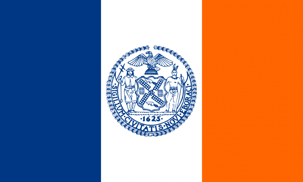
2. New York City
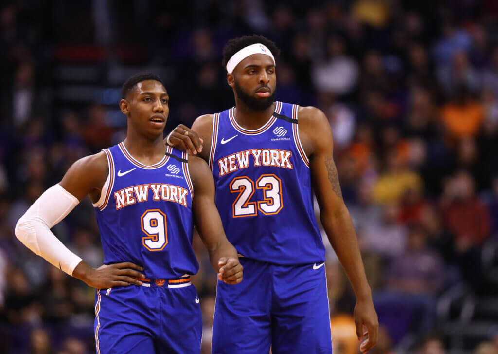
Now this one might be slightly controversial. It was tied for the most points at 3, though the argument could be made that the city as a whole is not cohesive. The flag of the Big Apple proudly flies the colors of blue, orange, and white. This strongly matches the Mets, Knicks, and Islanders but is a complete disconnect from all of the remaining NYC teams. Makes you wonder if the Giants or Jets ever thought about donning the city’s blue and orange?
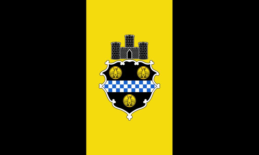
1. Pittsburgh
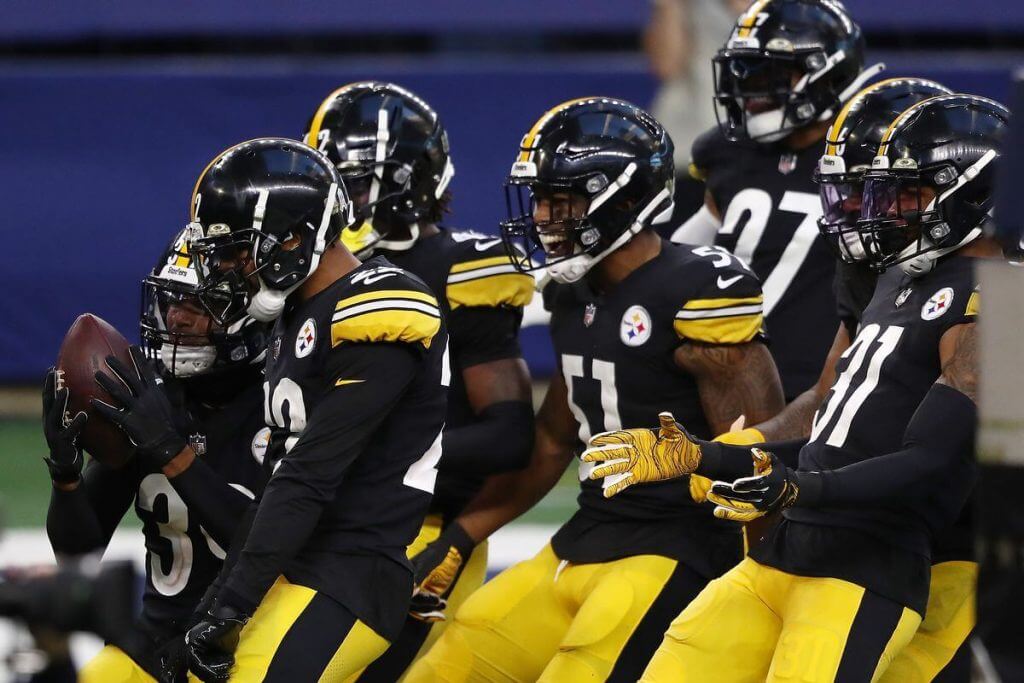
Alright, no surprise here. Not only does it have 3 points, it does it with a 100% success rate and no doubt in my mind that if they were the next NBA expansion team that they would do so wearing the famed black and yellow. No other city had uniform-flag cohesion quite like the Iron City.
Surprises
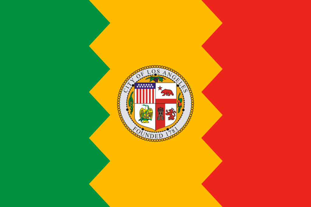
My biggest surprise was that were exactly zero matches in the City of Angels. A metro area that consists of 7 professional teams has absolutely no connection to the red, yellow, and green of the Los Angeles flag. Though to be fair, I’m not sure it’s the most appealing color combination so I don’t entirely place the blame on the teams. Maybe we’ll see an appearance in a future Clippers alternate uniform one day.
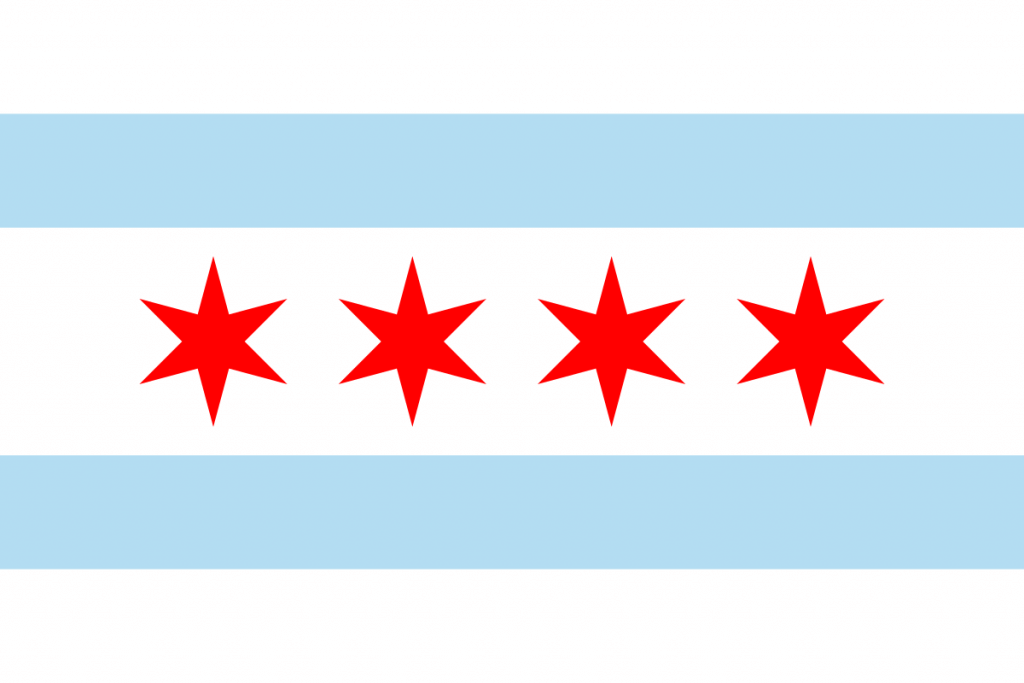
And finally, a city that I think is completely missing the boat is Chicago. The powder blue and red flag of the Windy City is iconic and an excellent color combo for uniforms. I gave the Cubs half a point for at least going the route of red, white and blue but no other team decided to even come close. While it’s hard to argue changing any of the teams’ looks at this point, it’s worth considering what could have been.
And that’s what I’ve got for you. I always found flag design to be pretty interesting and enjoyed seeing how it connected to the uni-verse.
Thanks, Logan! I’ve vacillated on this sort of thing over the years. On the one hand, I love how Pittsburgh teams embrace the black and gold of their city flag — it’s their thing, and it totally works. However, would I like it if some other teams from the same city did the same thing? I don’t think I would, because it’s unique to Pittsburgh. Imitation may be the sincerest form of flattery, but it squads from cities other than Pittsburgh were to rally around the flag colors, it would make it less special, for them and for Pittsburgh. Now, would I like perhaps one team (or even a couple out of many) from a city to embrace the city flag colors (like NY has done to a certain extent with the Mets, Knicks and Isles)? I think that would depend on the colors and the designs. Just as black and gold are great colors together, so too are orange and blue. Also, I will give a tip of the cap to the Chicago Red Stars for literally incorporating their flag onto their unis.
Readers? What say you? I know we’ve discussed flags and uniforms before — but it never hurts to refocus the discussion as Logan has.


Uni Concepts & Tweaks
Time for more Uni Tweaks from the UW readership.
I hope you guys like this feature and will want to continue to submit your concepts and tweaks to me. If you do, Shoot me an E-mail (Phil (dot) Hecken (at) gmail (dot) com).
Today’s concept come from Drew Abernathy, who has some concepts for a redesigned Houston Texans football team.
He writes…
Hey, Phil;
Here is a redesign I did for the Houston Texans.
Description:
A buddy of mine on Twitter mentioned that the Texans’ seemed like a team that’s either an afterthought or unfinished. Digging around the G.U.D., their uniform looks like a different take on the last Patriots uniform (debuted in 2000, I think).
So, I decided to try my hand at a redesign. Using a Light Royal Blue in response to the Adams’ family. I flattened the bull, kept the dark steel blue as an accent, and made a different stripe pattern. Kept their number and name fonts and added a stripe to the helmet. Even made a battle red color rush, uniform.
And here are his designs:
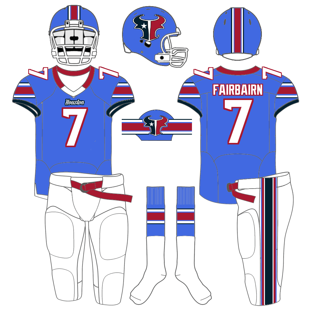
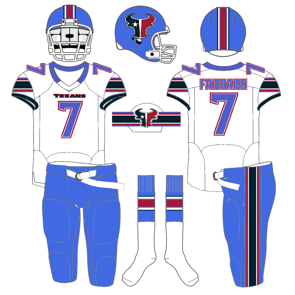
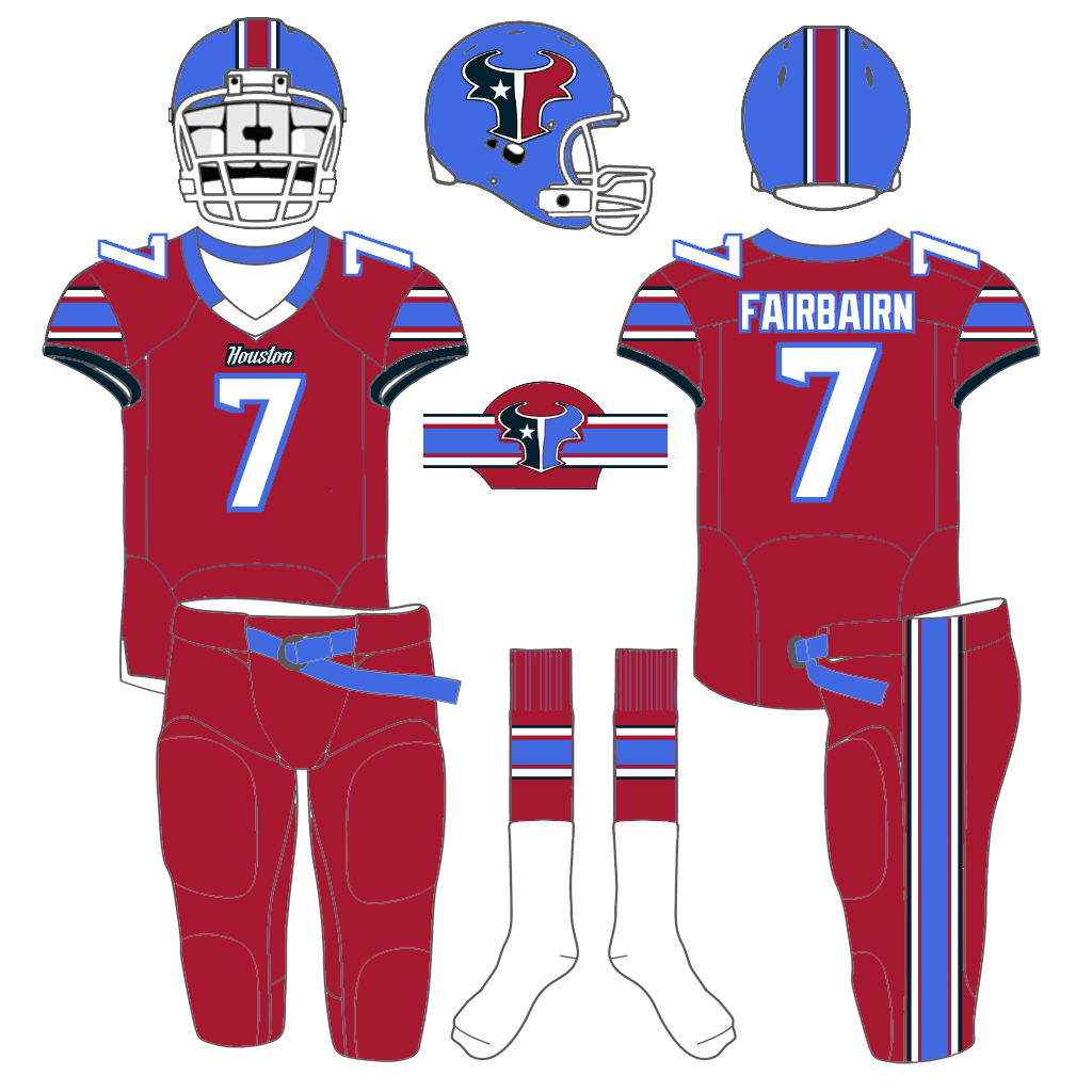
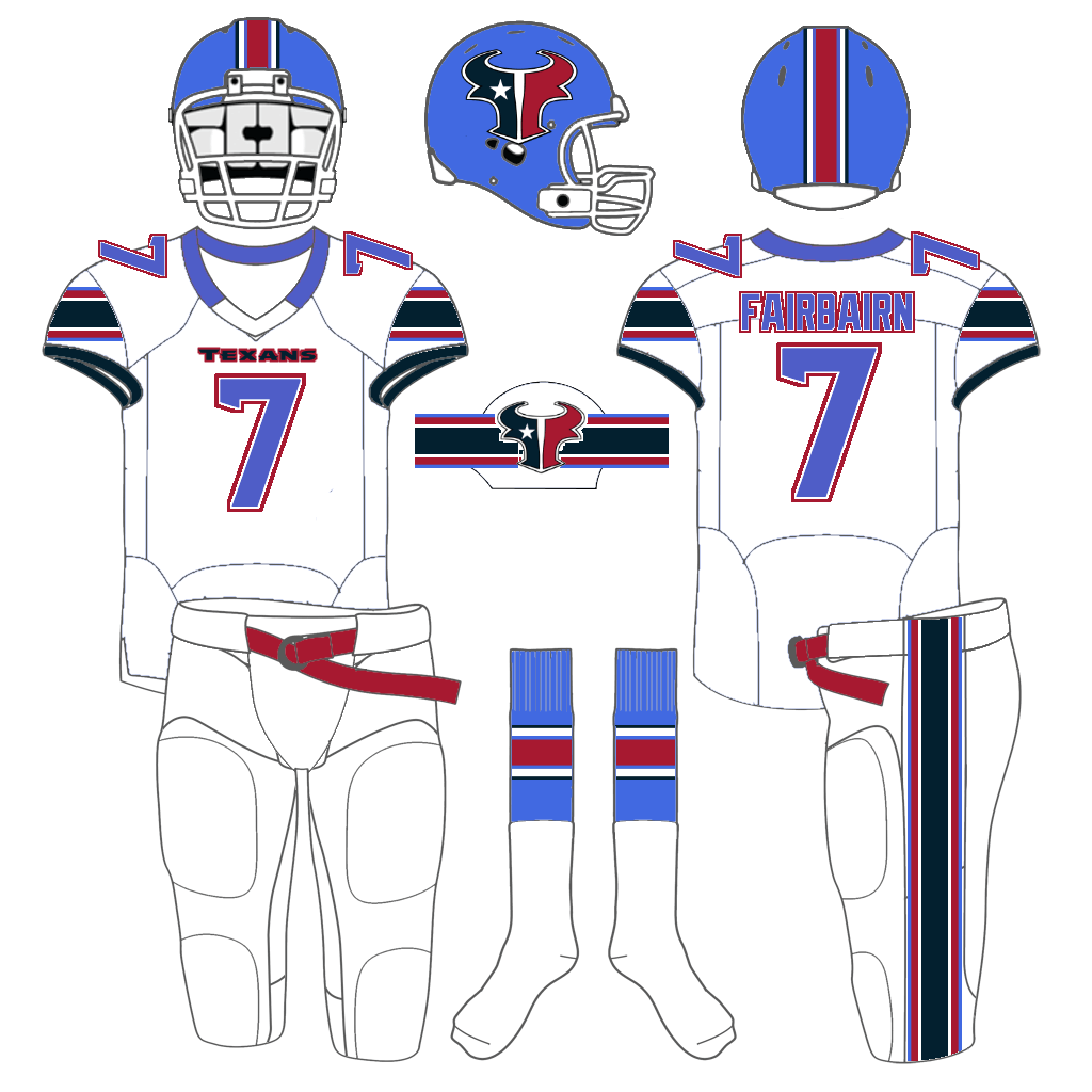
Thanks Drew!
OK readers (and concepters). If you have some tweaks or concepts, shoot ’em my way with a brief description of your creation and I’ll run ’em here.

Guess The Game…
from the scoreboard
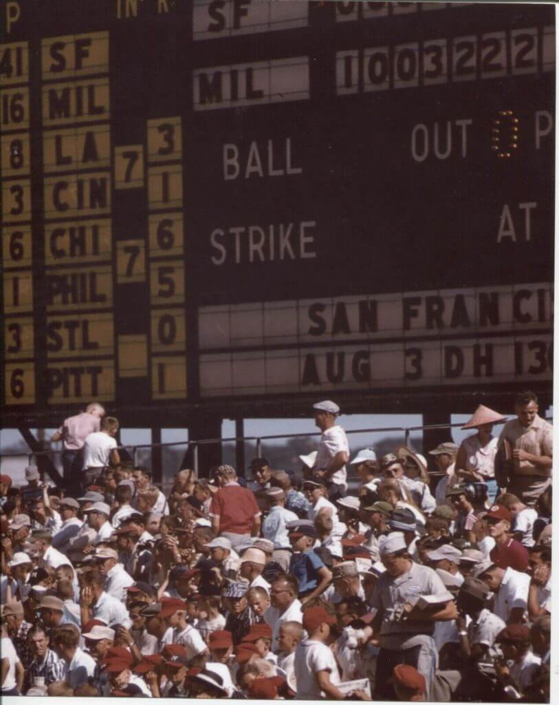
Today’s scoreboard comes from ojai67.
The premise of the game (GTGFTS) is simple: I’ll post a scoreboard and you guys simply identify the game depicted. In the past, I don’t know if I’ve ever completely stumped you (some are easier than others).
Here’s the Scoreboard. In the comments below, try to identify the game (date & location, as well as final score). If anything noteworthy occurred during the game, please add that in (and if you were AT the game, well bonus points for you!):
Please continue sending these in! You’re welcome to send me any scoreboard photos (with answers please), and I’ll keep running them.

Threads of our Game…
Got an e-mail yesterday from the great Craig Brown, who runs the fantastic Threads Of Our Game website. If you’re not familiar with it, the primary focus is on pre-1900 baseball uniforms and related ephemera.
He wrote:
Hello baseball historians,
Here’s a quick look at a long-lost uniform: the Boston black of 1899.
The all-black uniform was one of baseball’s more intriguing fashion statements. The trend started big in New York on July 28, 1888, when the Giants took the field in “stunning suits of coal.” The look spread quickly westward — to the Alleghenies, to the Plains, and to California — but eventually the fad would fade. Enter the 1899 Bostons and manager Frank Selee, who decked out his team this year in an all-black road uniform, augmented by scarlet stripes on the caps and socks. It seems there are no pictures of Boston’s men in black, so please allow Threads to bring this long-lost uniform out from the shadows of time.
See the Boston uniform here.
See the Threads News Feed here.
Thank you for your time,
Craig Brown
Threads Of Our Game
Thanks, Craig! Great work (as always) on this!
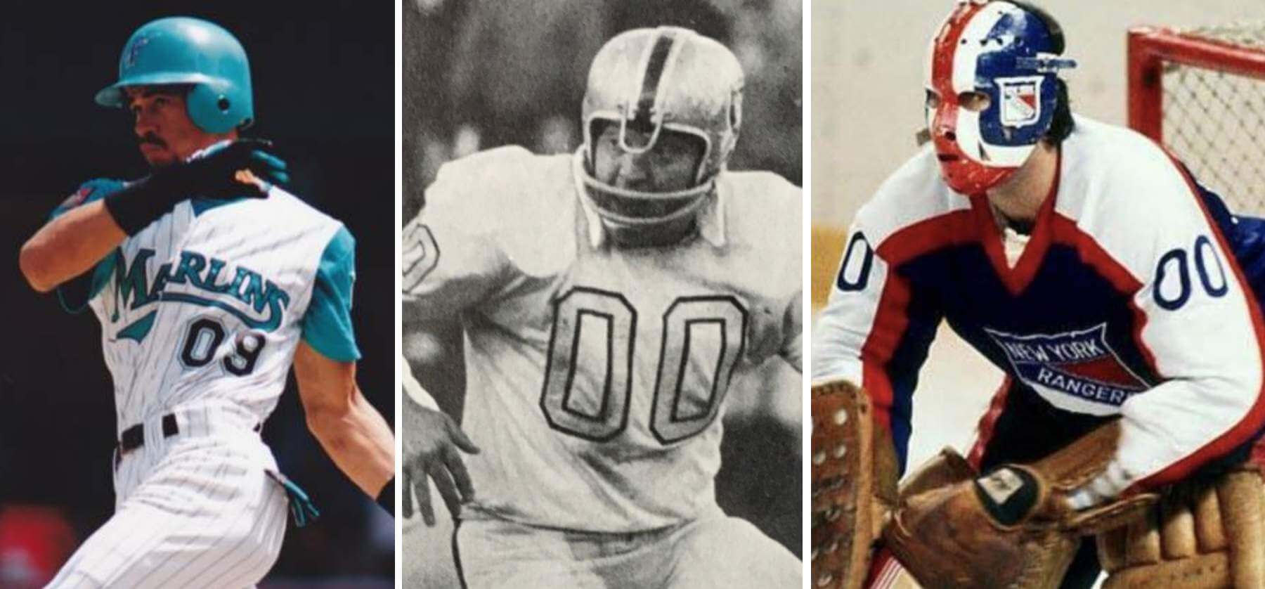
Podcast reminder: Paul here. In case you missed it, for this week’s episode of Unified, the recent scenario in which the Mets’ starting rotation could have featured both a No. 0 and a No. 00, which I wrote about on Monday, led us to explore various situations featuring zero and double-zero (including, as shown above, such famously zero-clad players as Benito Santiago, Jim Otto, and John Davidson). It was a really fun discussion, in part because Chris isn’t usually that into uniform numbers, but he still ended up having a lot to say!
We also talked about the Jags’ new emphasis on teal, the news that the Washington Football Team’s placeholder identity will be extended for another year, the ЯR uniforms that we think deserve to be upgraded to full-time status, and more.
You can listen to this episode, and subscribe to future ones, on Apple, Google, Stitcher, TuneIn, and Spotify, or just use the player below:
The show notes from this episode, which include photos of most of the things we discussed, are here. Those photos also appear in the video version of this episode, which you can watch here:
Enjoy the episode, and thanks for all the enthusiasm and positive feedback on this project.
Uni Watch News Ticker
By Phil

Baseball News: The website MLB.com has put out a piece we here at Uni Watch could probably have written: The best baseball cap for every team. Lots of good (and surprising) choices in there. Definitely worth the read (from David Cline). … Western Illinois has an interesting look, with the team name and uniform number on top of a large image of the mascot (from Tom Pachuta). … “Odd” Cardinals font: “Saw this ad in my Facebook feed today,” says Darren McFadden. “The number font on the middle mask is obviously not the Cardinals’ uniform font.” … 114 years ago yesterday, the New York Yankees first added pinstripes to their unis. … The St. Louis Cards gave Carl Taylor a full NOB in 1970 (they also had a Chuck Taylor). From MBD Chicago. … The Arizona Wildcats debuted a new white panel cap yesterday (from Chris Mycoskie). … Mount Marty Softball has some new unis (from Timmy Donahue). … MLB just released MLB Local Collection. Says Ignacio Salazar, “Logos combined within each teams state outline. Rest can be seen here.” … According to some Instagram stories, a few players received pairs of Francisco Lindor’s New Balance cleats, including Salvador Pérez and Ronald Acuña Jr. (from Balsley). … UTRGV Baseball has new uniforms (from Timmy Donahue). … The Danville Baseball Club will announce a new name and identity March 16 (from Tommy Turner).

NFL News: Maybe some things are best just left alone. Ever wonder what “Reverse Retro” jerseys would look like for the NFC North? Wonder no more. If you check out his Twitter homepage and scroll a ways, you can see more NFL reverse retro concepts. … We talk about how the NFL’s potential dropping of the one-shell rule could allow us to see Bucco Bruce and Pat Patriot again, but how about seeing classic Seahawks unis once again? (seeing how long it takes Steve McQuistran to make a “blank helmets” reference in the comments…) … “Before Black History Month comes to an end, let us not forget Gene Mingo, recognized as the first Black kicker in the NFL,” writes Jimmer Vilk. “He also was the very last straight-on kicker for the Steelers.” He adds, “Gene Mingo was not the last Black straight-on kicker in the NFL, though. In week 2 of the 1979 season, Saints K/P Russell Erxlaben was injured, so RB Tony Galbreath handled the placekicking and WR Wes Chandler did the punting. Which might be the only game with a Black kicker and punter on the same team (couldn’t get a clean screenshot of Chandler).” … The Cincinnati Bengals had “fun” with a jersey redesign joke on social media.
College Football News: The Michigan State Spartans will have a new helmet this season, based off the classic script worn by their hoops teams of Magic et. al. You can see the video reveal here. … Southern Utah University unveiled some new uniforms yesterday (from Timmy Donahue).

Hockey News: “The WHL started their short season on Friday night. Just the Alberta teams in the Central Division have started at this point,” writes Wade Heidt. “The Edmonton Oil Kings usually share Rogers Place with the Edmonton Oilers. Not this year with pandemic restrictions. They are playing in the much smaller Downtown Community Arena as you can see from these highlights. Strange to see regular season major junior hockey in a venue this small. No fans in the building anyway so does not really matter how many seats.” … Also from Wade: “The WHL’s East Division will be soon begin the season playing out of 1 hub city. All East Division teams will play at the Brandt Centre in Regina, SK. Here is the centre ice paint job for the arena during this season featuring the WHL logo.” Is it poetic (sartorial) justice that one of the worst Reverse Retro looks, sported by the Vancouver Canucks, resulted in the team going 0-4 while wearing them? … The Tampa Bay Lightning wore Black History Month patches last evening (from Jakob Fox), who also point out the hangers have Stanley Cup Champion logos on them. … Really nice looking matchup last night between the LA Kings and Minnesota North Stars Wild, both wearing their Reverse Retro uniforms (from Jakob Fox). Even the lineup cards were rendered in RR colors. … It really was a outstanding looking game.

NBA News: The Boston Celtics green uniforms may be iconic, but according to this article, they should consider not wearing them any more (or as often) since their record while sporting them isn’t as good as other uni options. I wouldn’t go so far as to say they’re “cursed.”

College Hoops News: It’s not that rare in college hoops, but Virginia Tech wore orange at home to create a color versus color game against Wake Forest (from Andrew Cosentino). … Also from Andrew: Yesterday was originally scheduled to be Virginia Tech’s senior day, so they celebrated accordingly. However, their game against Louisville on 2/13 was rescheduled for 3/3. Therefore, this game technically wasn’t their last home game of the year. Per their annual tradition, the Hokies put their senior players’ numbers and senior managers’ initials near mid court. … Xavier unveiled some gorgeous throwbacks (from Evan Nash). They were worn from 1976-79. … Nicklaus Wallmeyer notes both Xavier and Washington wore throwback units for their games … UC Riverside with an urban camo treatment on their shoulders and, while its hard to see in the picture, on the bottom of their shorts (from Timmy Donahue). … Roy Williams was presented with a “900” jersey on the occasion of his 900th win (from James Gilbert). … The Kansas Jayhawks wore red uniforms last night against Baylor (from Adam Franz).

Soccer News: A few soccer bits you may have missed: Inter Miami CF have launched a “La Palma” secondary jersey for 2021 season. … Nashville SC unveiled a new away jersey for 2021 Major League Soccer season: The Vibe II. … Minnesota United unveiled their 2021 River Kit as a secondary jersey. … The Atlanta United unveiled a new primary kit. … The San Diego Sockers & St. Louis Ambush played in retro early #MISLSoccer 80s jerseys on Friday night in St. Louis (from the San Diego Sockers). Jimmer Vilk will require a pants change.

Grab Bag: Get the Caddyshack jokes ready: did you know the Phoenix Open has a mascot? It’s a gopher (from Shawn Hairston). … UCLA gymnastics debuted new leotards last night (from Timmy Donahue).
And finally… big thanks to Logan Paige for sharing his thoughts on the relationships between city flag colors and the extent to which teams share those colors — really a good think piece!
Everyone have a good Sunday, and I’ll catch you all back here next weekend.
Peace,
PH
GTGFTS is San Francisco at Milwaukee, August 2, 1958, a 10-0 win by the champs and one of four shutouts that year by Braves rookie Carl Willey.
FWIW the Philadelphia Union have a navy blue and gold combo and often wears a gold center stripe on a navy blue base reminiscent of the flag. The Chicago Red Stars of the NWSL also use the city’s flag colors. And if you expand this to alternates, the Bulls have had several city flag inspired uniforms, as have the LA Galaxy
Philadelphia’s city colors are based on the Swedish flag, as the area was once a Swedish colony. That said, the cradle of independence is a better historical touchstone than said Swedish colony, I would rather that our teams went red/white/blue. But that would mean no more Eagles (kelly) green and no more Flyers orange & black. We already have enough red/white/blue teams. I love the idea of city unity but I like what we have.
The Texans concept is giving me a Bills vibe circa 2000, and not in a good way. Trying to be all things to all people leaves you with a muddled mess. Not sure that it works here.
The Western Illinois uniforms are garish.
The New Era state outline hats are nice! Sorry, Rockies.
The helmet is the right color, so I’d be fine with it.
(in reference to the Texans concept)
And so is the face mask ; )
The most embarrassing thing about the Rockies’ outline hat is they used the outline of Wyoming and no one even noticed.
:)Hey Europe! Suck my Florida! (Many Sources)
Ha!
Some Philly sports teams did adopt the flag colors, though not all at the same time.
The Eagles’ ancestors the Frankford Yellow Jackets, the 1930-something Phillies and the AHL (?) Rockets all wore the yellow and blue…and for some reason the NBA Warriors switched to those colors after leaving for San Fran.
Also, your critique of the Texans’ concept is spot on!
Thanks for the feedback. Just trying to create a separate identity for the Texans from what they have now. Plus I’m a fan of stripes.
Soccer clubs seem to lean more heavily into local flag imagery.
In particular, New York City FC explicitly takes its shade of orange from the city flag. And they’ve worn a modified NYC flag on their uniform since 2017 (adopting a flag flown in the supporters section).
link
DC United and Philadelphia Union have badges featuring flag iconography.
link.svg
link
In the lower divisions, Forward Madison FC uses the city flag prominently, not only on their badge but also as the basis for their uniform.
link.svg
link
link
I think this might be because they’re newer and came into being when flag awareness was more of a thing. Most Madisonians didn’t even know they had a municipal flag until an awareness campaign was mounted a couple years ago, perfect timing for a new team to adopt it.
To add to this, the Mets may use the New York City flag colors but I believe this is not the primary intention. I believe the primary intention was to combine the main colors of the teams that they replaced: the royal blue dodgers and the orange giants. But I do find it interesting that (and this is only now that the nets have taken prominence over the knicks) the “lesser” New York teams have a color coded through line. I say lesser only because the rangers and yanks will always be THE New York team of their respective sport and while the knicks will probably always be THE New York basketball team, they have gained a reputation as a weak team and organization while the nets have made strong moves to be the more successful team and the more enjoyable team to follow.
This is what I always heard as well. Maybe it is just a coincidence.
The Washington Capitals also use three stars like the DC flag. IIRC, the team has also referenced them representing the District, Virginia and Maryland and may have included some storytelling. Something Maryland is where we first played, DC is our home and Virginia is where we train.
Love the piece around the city colours (totally agree with Chicago missing a huge trick) although the Mets colour scheme is actually a nod to the older NY teams, taking the orange from the Giants and the blue from the Dodgers. Just works out nicely that this aligns with the flag.
I strenuously disagree that having more teams adopt the colors of their city flag would somehow diminish Pittsburgh, and I sincerely wish more franchises would follow the model. Doing so would do wonders for civic pride and really weave a team into the fabric of its community — and this is exactly why most teams won’t do it. The more closely a franchise is linked to a place, the harder it would be to leave town, or threaten to do so to get that new stadium. Also, it’s not surprising at all that L.A. scores so low on the flag match scale when most of its pro teams moved from somewhere else.
The White Sox wore red and light blue (city flag colors) road uniforms when Dick Allen was on the team.
link
Came here to say that. And I’m sure the flag had nothing whatsoever to do with the choice.
Always thought the Pittsburgh model was silly, not to mention stifling creativity.
I don’t know about that (“stifling creativity”). None of Pittsburgh’s entries into professional basketball (ABA, CBA) featured a black/gold motif. While the indoor soccer history was black/gold it wasn’t until recent that the Riverhounds adopted black/gold (they had used both blue and red in prior years).
So while I would totally be in favor of a black/gold NBA team if the city ever got an expansion or relocated squad (again, not holding my breath), I don’t think it would be a done deal. It IS a scheme missing from the NBA though.
We have a thing in Pittsburgh called the “Yinzer tuxedo” and it occurs when you were two or more DIFFERENT teams gear, like a Pirate had and Steeler jersey for example. A Philly tuxedo would be all over the place in color, at least Pittsbugh matches ahahaha.
On the reverse retro football concepts in the ticker: some of these actually should be implemented immediately. Many of the successful designs hit with me because they are simple and classic, which is what many teams need right now.
But here’s something for discussion: that twitterer also has some nfl/nba design swaps and in my opinion most are fantastic regarding the nfl designs applied to nba jersey templates but not the other way around. I would argue it’s because nfl uniforms easily turn clownish when the design gets too high concept, but nba jerseys can often use a little restraint plus they allow normally ignored or underused design elements to shine where nfl uniforms are typically just t shirts with big numbers on them and you rarely get a good look at word marks or secondary logos or other elements. Any thoughts on why football jerseys look so good as simple templates but often fail at unique or complex designs while basketballs jerseys can really carry unique or complex designs well?
I’m the only person I know who would like to see a solid yellow Packers’ uniform.
Well, you and Jimmer Vilk
Oh my…yes, please.
link
Are you and Walter link?
Definitely.
In a heartbeat! C’mon, you’re already wearing yellow helmets and pants; go big or go home. It seems like a logical move for a team so closely associated with cheese.
The ought to at least make the stripes match the helmet and pants
The San Diego Sockers & St. Louis Ambush played in retro early #MISLSoccer 80s jerseys on Friday night in St. Louis
Where’s the link?
Shit. It should have been in there (fixed now). But to save you from scrolling, link.
Bring Back The St Louis Steamers!
Very nice matchup.
Certainly the short-lived DC Defenders fits the city flag criteria…
link
The Sacramento Kings statement uniforms uses a chainmail pattern that is supposedly based on the design of the city flag
Thoughtful article, Logan, and thanks for sharing it!
Two friendly methodological critiques:
1) I think your attempt at creating a numerical score would be more rigorous if you divided your total numerical value by the number of teams included in your scoring. By doing so, Pittsburgh would set the scale at a 1.0, and New York would be closer to a 0.5.
2) I also think your scale would be more valuable if it included pro soccer teams, men’s an women’s. I would tend to include any pro team at any level, including minors, but I’d certainly at least include soccer. For one thing, soccer is approaching major-sport status nationally, and in most MLS cities it’s a top-level sport locally. For another, soccer has tended to embrace city flags as an inspiration for team identities, and that’s a trend that’s old enough and lasting enough that I think it should be captured in any scale of this sort.
But like I said, I offer these as friendly amendments. I really appreciate your great article today!
Just ran across a video of an old 1969 Phillies Cubs game. At about 1:29:00 mark, the home plate ump removes his suit jacket on a hot day, and umps the rest of the game in a t-shirt.
link
Touché
Here in Nashville, two of our three pro teams (the Predators and Nashville SC) wear a version of the blue and gold of our city flag.
link
Also, interesting how the Cleveland and Washington Local Collection caps are the only two that don’t feature the team name anywhere on the cap. Cleveland I get, they’re about to rebrand, but Washington?
The Tigers have the script Detroit over the state silhouette.
Those caps look better than I expected them to.
Good call, I missed that one.
From 1971-1975, the White Sox absolutely matched the colors of the Chicago flag.
link
But only when they weren’t playing in Chicago!
“I offer these as friendly amendments”
might have to use that one, we’ll see how it goes.
What was the rationale for thrIslanders using blue and orange? They didn’t start out in New York City so it’s an interesting choice. We’re they trying to get some “secondhand coolness” from the Mets and Knickerbockers? Both of those franchises were doing well when the isles started up.
As a proudish resident of Nassau County, where the Isles play, they too chose to use the colors of the link. There’s a gold/yellow element in there which might have been interesting to use in place of the white elements (anyone wanna mock that up?) on the jersey. I’d really like to see how it played out if they had gone with gold/yellow in lieu of the white jersey…
I did not know that about the Nassau flag. I’ve probaby never seen it before and haven’t ever bene to Nassau County in fact.
Does Nassau’s flag ever get flown outside of official functions? I have occasionally seen my city (Alexandria) and one of my former counties (Arlington soon to be changed) flags in front of homes, though infrequently. DC flags, Maryland flags on the other hand are flown often. Virginia — not so much.
I’d venture to say, “no” — officially we see it everywhere, but I don’t think I’ve ever seen it as say, a bumper sticker nor have I ever seen anyone flying one on their house. Nassau County has like 1.5 million residents (maybe a little less, but more than 1,000,000), and there are many government buildings and parks and the like, where it flies beneath or below the US flag. I don’t think I’ve ever seen it not in an official capacity.
A few nitpicks on the subject of teams adopting the colors of their city, as it concerns NYC:
1. Until their recent, brief move to Brooklyn, the Islanders have never identified themselves as a NYC based team. They make their home in Nashua County. In contrast, the Giants and Jets identify as New York teams who just happen to play their games across the river in NJ.
2. NYC is home to multiple teams in the major sports. The Mets would not want to look like the Yankee, the Jets would not want to match the Giants, and the Nets would not want to match the Knicks.
I seem to recall the Penguins changing their colors from the original powder blue and white to black and gold to capitalize on the popularity and success of the Steelers and Pirates. Was there any mention at that time of the city flag?
Just noticed that autocorrect changed the home of the Islanders from “Nassau” to “Nashua”.
Excellent point on the Penguins. They totally just capitalized on the “city of champions” 1979 and actually made the change mid-season! And the former Pittsburgh Hornets, a successful AHL franchise were red/white
St. Louis has had pretty good flag color coordination. Our flag is red, yellow, and blue. The Blues’ throwbacks and alternates match exactly, and the Cards obviously have red, navy and powder blue, and yellow accents. Even when the Rams were here, before they went to shiny beige, their blue and yellow matched the flag as well.
So where does the city of Detroit rank in regards to flag/team colors? link
Correction: the Yankees started wearing pinstripes 109 years ago, not 114.
The Los Angeles flag’s colors are a bit garish. I have a feeling any uniform based upon that color scheme is going to be met with derision, save one of the local soccer teams. Soccer’s a more colorful game, anyway.
I’m late to the party, but…
LA Galaxy first season:
link
LA Galaxy alternate jersey a few years ago:
link
MLB.com’s list of hats has a pretty big boo-boo. The best Cleveland cap is still the “Caveman C”, for the reason the whole team’s identity with the multicolored jerseys was to evoke the lettering found on wooden National-Park signage. The Neuland typeface looks like it could have been engraved in wood. Not a golden age when you look at the team’s record, but it whelped Cleveland’s iconic navy-over-white look.
I vote for the LA Bad Brains.
The New York Football Giants always used some combination of blue, red, and white, going back to the leather helmet days.
The Yankees are the Yankees, dark blue and white.
The Jets nee the Titans of New York wore blue and gold in 1960. The Jets allegedly changed to Kelly green and white as by 1963 they were supposedly new majority owner David (Sonny) Werblin’s favorite colors, and the colors of his jockey’s silks.
And as noted, the New York Islanders play off the colors of Nassau County, NY … blue, orange and white …
The Nets? Only great when in the ABA, and the great Julius Erving wore the white, blue and red.
City flags – OAKLAND is green and gold
link
Indeed, but remember, Charles O. Finley put the team in those colors during their KC days, so it’s coincidental, not deliberate.
MLB Hats likes the “Big A” hat for the Angels? No Way. The best hat the Angels wore was first the LA hat with the Halo on the hat. Second was lower case a they wore for a year.
Angels need to go back to primarily blue with red accents, permanently.
Angels need to go back to being CALIFORNIA, regardless of their headwear.
The Angels willful muddying of their geographic adjective is infuriating, almost as much as the littering of their jerseys with redundant patches that clarify nothing.
completely agree
If you get a chance, pull up an image of the city flag of East St. Louis (IL) on your phone (funnier when small).
My friend saw it and said, “East St. Louis… the land of sunrises, coffee pots, seatbelts, and justice!”
Look for golfers on the tour to wear red and black today as a shout out to Tiger.
Noticed that yesterday’s FB game between Delaware State and Howard, both teams wore the 150th patch. Curious if there’s a reason behind not one but both teams still sporting it. I thought it was an old picture at first then noticed the facemasks. link
The Chicago Fire of the MLS have repeatedly incorporated the colors and logo of the city flag. In fact, the current white jersey incorporates the stars from the flag.
Portland Trail Blazers need to make their next city edition based on the great Portland city flag.
link
I actually happened to sketch a concept of these last night! Not sure how I would share a scan of what I did since it was paper-and-pencil.
Independent baseball Chicago Dogs did a pretty good job incorporating the city flag into their logo.
link