An interesting scenario played out over the weekend, which led to a fun uni-related spat between me and my favorite blogger. Give me a minute to set up the backstory.
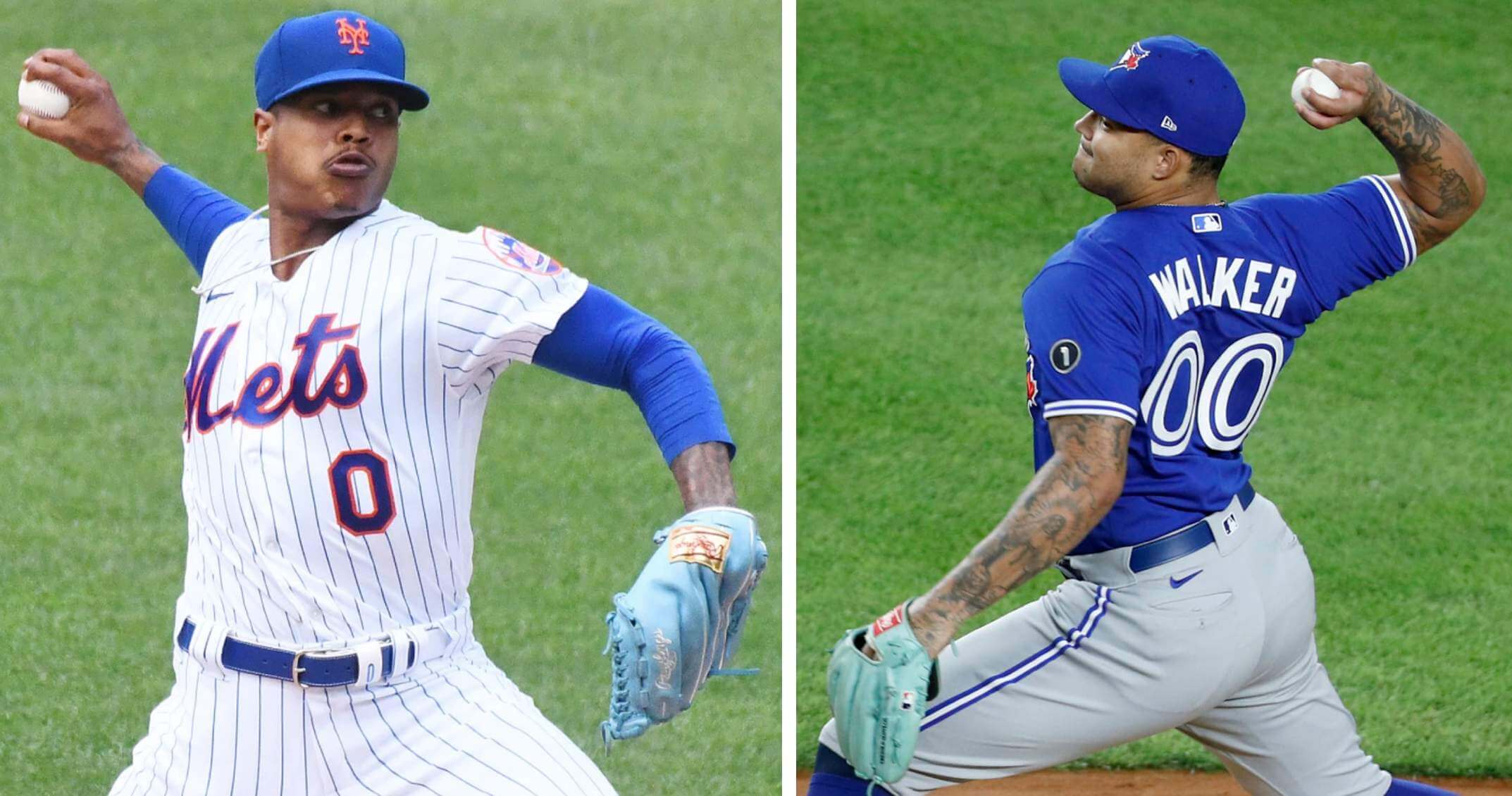
So: On Friday it was reported that the Mets were signing free agent pitcher Taijuan Walker (wasn’t official yet, pending a physical, you know how that works). Walker had worn No. 00 for his previous team, the Blue Jays (above right). Since the Mets already have pitcher Marcus Stroman wearing No. 0 (above left), that meant the Mets were potentially poised to become only the second team in MLB history to have 0 and 00 on the roster simultaneously (the first was the 1985 Blue Jays, who had Al Oliver and Cliff Johnson), and the first to have both of those numbers in the same starting rotation! (As a side note, I didn’t realize until choosing those two photos that Stroman and Walker also both wear blue gloves!)
But that would come to pass only if Walker stuck with double-zero. Late Friday night he posted a Twitter poll, asking fans if he should wear 00 or 99 (the latter of which he wore with the Mariners and D-backs, making him the only player in MLB history to wear 99 and 00). Double-zero ended up winning the poll, although somewhat narrowly:
Which number?
— Taijuan Walker (@tai_walker) February 20, 2021
On Saturday, evening, Walker tweeted a Photoshopped image of himself (presumably created by the Mets) wearing No. 00, which seemed to settle the issue. But when a fan responded to that tweet by asking, “So we’re going with 00?,” Walker said he still wasn’t sure:
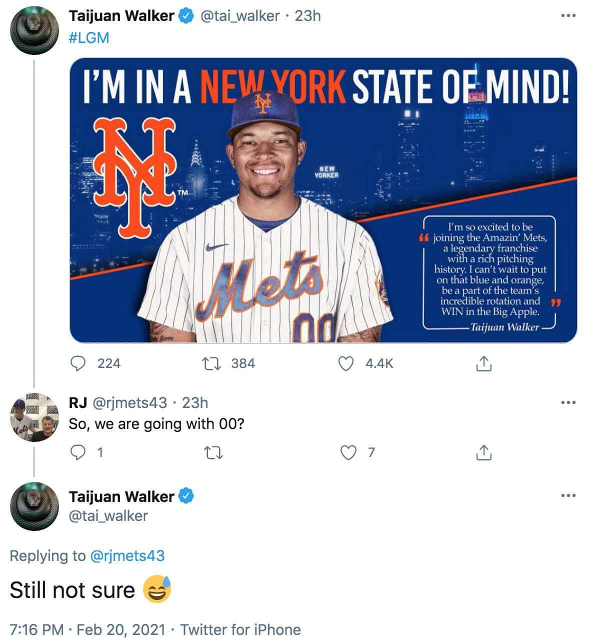
Hmmmm.
A few hours later, Walker said he will actually be wearing No. 99. So that was the end of the potential 0/00 situation — it won’t be happening after all. (And yes, I realize Mets first baseman Tony Clark had to stop wearing No. 00 back in 2003 because Mr. Met wears that number, blah-blah-blah. We don’t know whether that had anything to do with Walker not going with double-zero.)
Among the many interested observers watching this situation unfold on Saturday was my friend Shannon Shark. He runs the excellent Mets Police site, which is the only sports blog I follow on a regular basis. I don’t recall when I first started reading his stuff, but my Gmail archive indicates that I’ve been emailing with him since at least 2009. In that time, we’ve become mutual fans and allies, and my respect for him has grown steadily. We have lots of things in common — we love the Mets, hate the Mets’ BFBS uniforms, hold Matt Harvey in fairly low regard, think Dom Smith is a better baseball player than Pete Alonso, and and tend to get impatient and cranky with things we regard as bullshit. But when it came to Taijuan Walker and the potential 0/00 situation, well, it would be fair to say that we weren’t on the same page:
Au contraire, I *love* this – hope it comes to pass!
— Paul Lukas (@UniWatch) February 19, 2021
So, basically, Shannon was opposed to the potential 0/00 situation (because he thinks those aren’t proper baseball uni numbers), and I was rooting for it to happen (because it would be a fun anomaly and I enjoy uni-numerical aberrations).
Okay, no biggie — agree to disagree and all that. But Shannon decided to take it a step further. First, he turned his Twitter avatar purple (which, unfortunately, I didn’t think to take a screen shot of). When someone asked him why, here’s how he responded:
It is part of my Cold War vs Paul @uniwatch Lukas. He refuses to speak out against the idea of 00 being issued to a Mets player so I have embraced Purple, the color which looks best on uniforms. I am pushing for Purple Mets alternates. https://t.co/Q6pA6rzvca
— metspolice.com (@metspolice) February 20, 2021
I genuinely laughed out loud when I read that. A Cold War — bring it! Shannon went ahead and trolled me by posting a few more pro-purple tweets but then called a truce when Walker announced that he’d be wearing 99 instead of 00:
Thanks to my 3rd favorite Met @tai_walker choosing uniform sanity I hereby cease my Cold War hostilities against Paul @UniWatch Lukas.
— metspolice.com (@metspolice) February 21, 2021
I found all of this hilarious. I also thought it might make for a good conversation, so I asked Shannon if we could discuss the situation either over the phone or via DM. He chose the latter. Here’s a transcript, edited for length and clarity:
Uni Watch: Okay, so you were opposed to Taijuan Walker wearing No. 00. Why?
Mets Police: When I look at a baseball game, I feel it should look a certain way. The pitcher should have a number between 11 and 59 (excepting 42). The position players should be between 1 and 51. Why? I dunno — that’s what baseball looks like. For the same reason your goaltender should have a number in the 30s and your QB looks best with a two-digit number between 10 and 19.
Mathematically, some feel that 0 is not a number. I will let the mathematicians debate that — to me, 0 is clearly a number. But aren’t 0 and 00 the same thing? If Stroman is 0 (I am also against 0 as a baseball number), how could someone else be 00? Why not issue 05 or 041? [Cue the Benito Santiago references. — PL]
In my mind’s eye is a perfect baseball game. It’s a sunny day game and the Mets are wearing their home pinstripes, NNOB, and blue caps. When you start to deviate — a swoosh jersey, a black drop shadow, 0 and 00 — that all starts to move away from the connections I have with the team. You add enough things and suddenly you start to wonder how else you could spend your three hours on a nice day. Be the New York Mets. Don’t be an arena league football team.
UW: So, just to clarify, you didn’t just object to the possibility of Stroman and Walker doubling up on zero and double-zero — you also would have objected to Walker wearing 00 even if Stroman wore a “normal” number, and you also objected to Stroman wearing 0 even before the Mets acquired Walker (and presumably also objected to Stroman wearing No. 7 in 2019, because it’s a single-digit number). Is that all accurate?
MP: Yes, although I’m okay with a pitcher wearing a single digit. I just think it looks weird. So no issue on the 7, but I am not in favor of 0 being worn on baseball jerseys.
UW: Is 0 any better or more acceptable if the player’s name begins with the letter O, as was briefly the case with Rey Ordoñez, and also with Omar Quintanilla?
MP: No! I hated when Ordoñez did it. It looked so much better when he wore 10!
———
I’m going to stop the transcript here to add some context. The day before we engaged in this discussion, Shannon published a blog post entitled “My plan to fix baseball: Introducing the Premier League of Baseball.” It’s his not-so-modest proposal to fix what he views as baseball’s various ailments (games are too long, too many relievers, too many teams nobody really cares about, not enough star power, etc.). Among his proposed fixes: a “premier league” whose eight teams will play only three seven-inning games per week, thus maximizing front-line starting pitchers. Maybe that’s a good idea, or maybe it’s not — but either way, it seems like it’s somewhat in conflict with the “baseball should look a certain way” mindset. I was intrigued by that seeming inconsistency, so I pointed it out:
UW: One thing I’m finding interesting here is that you’re taking a very traditionalist stance about the uniforms (which is fine, of course), but you just published a proposal with all sorts of radically non-traditional ideas about remaking the sport! In fact, I cracked up when I was reading that post and got to the paragraph that says, “My league will play seven-inning games and have a DH. There will be fully normal extra innings as God intended.” I mean, a lot of people might say that God also intended nine innings and no DH, right?
I’m not trying to play “gotcha.” Rather, I’m saying that we all tend to be rather conveniently selective about the areas where we’re old-school (like, say, which uni numbers look “right” and which ones don’t) vs. the areas where we’re willing to push the envelope. Any thoughts on that?
MP: Fair point. I think baseball does need to evolve to survive. I don’t think there are many people not directly or indirectly employed by baseball who think the game — the actual game, the pure fun of watching the game, not some billionaire’s financials — is in good shape. The record book was destroyed in 1998 [by steroids], so let’s let it go. I’ve written before about baseball’s ages or eras, which come in roughly 25-year installments. We’re starting a new age now, so let’s make some changes to the game — seven-inning games, universal DH, and so on.
Stepping off that soapbox, I think you and I agree that teams can and should look sharp while playing the game. For me, that includes a nice, proper number and NNOB (you can’t read a uniform name from the upper deck, and on TV you don’t need it).
UW: Turk Wendell wore No. 99 for the Mets (and also for two other teams), and Mitch Williams also wore 99 for three teams. So is 99 more of a reliever’s number, and is it therefore not much better than 00 for Walker?
MP: 99 is a much better choice than 00. It’s true that we have come to associate it with relievers since Major League, but I can bend on that one.
Let me add: As dug in as I am on uniforms, I have long been an advocate of what I call “Anything Goes Sunday.” I think there is a kernel of an idea in what MLB has done with Players Choice Weekend or whatever it’s called. It the Mets want to wear Hawaiian shirts and shorts once a week with nicknames and crazy numbers, okay — I like fun. But come World Series time, slap on those pinstripes and have a proper number!
UW: Last question: When Walker announced that he would wear 99, you called off the Cold War. What if he had gone with 00? How might the Cold War have developed??
MP: I like a good Cold War. I planned on finding as many purple Mets things as I could, and would have passively-aggressively posted them. I would also have advocated for a purple Mets alt (which, ya know, with a 00 on the back might look cool on Anything Goes Sunday). Then we could hit a game together and both be annoyed!
———
A really fun discussion! What I find so interesting is that Shannon is clearly a traditionalist when it comes to visual aesthetics but is willing (nay, eager) to break long-established norms when it comes to other aspects of the game — many of which, while not strictly visual, could also be considered aesthetic, at least in terms of the larger spirit of the sport. An impressive bit of compartmentalization!
What about you folks? Discuss!
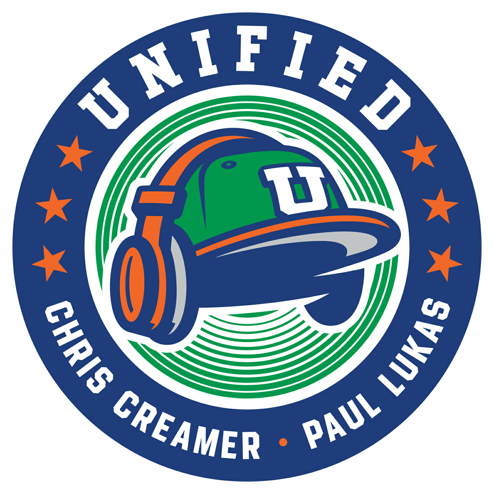
ITEM! Show about logos now has official logo: I’m happy to announce that Unified, my new podcast project with Chris Creamer, now has a primary logo (which you can click to enlarge), created by the great Brian Gundell. I love how it turned out!
Let’s shift into FAQ mode:
Why did you choose these colors?
We went with green for Uni Watch, blue for SportsLogos.net, and orange trim because it goes well with both green and blue.
What about the fonts?
We went with a classic block font for the show name and a classic NOB font for our personal names.
What’s with those concentric circles?
They’re sound waves, and/or radio waves, and/or a speaker cone. You know, because it’s a podcast!
What about the stars?
They’re just a uniform-y detail. There’s no particular significance to the fact that there’s six of them — not everything has to be about “storytelling.”
The little bullet in between your names is off-center.
Yeah. That was unavoidable due to the differing lengths of our names. We played around with various ways to solve that issue and ultimately decided that it’s fine as is.
Wouldn’t a microphone be more appropriate than headphones?
Mic-based podcast logos are a visual cliché that we wanted to avoid. Also, a mic would be about us, while the headphones are more about you, the listeners — we thought it was a more comm-uni-ty-minded way to go.
It would look extra-cool if the radio waves could be animated.
You mean like this?
Pretty cool, right? Longtime Uni Watch reader/pal Michael Princip created that for us. We’ll use it at the start of our video episodes. Thanks so much, Michael!
The underbill of the cap looks like a Nike logo!
Indeed. That wasn’t intentional — Brian just included that shadowing/highlighting because it made sense. Once we realized it looked swoosh-ish, we played around with various ways of tweaking it, but it looks best this way, so we decided to leave it as is. An unintentional uni-related Easter egg!
Are there any secondary logos?
The cap can function on its own as a stand-alone mark (as shown at left), and there may also be a version showing the “U” logo wearing headphones.
Also — and I’m really excited about this — there will be additional versions based on other sports. So instead of the baseball cap, there’ll be a version featuring a football helmet, another one featuring a goalie mask, and so on. So we’ll have a whole suite of interrelated uni-themed logos! But the version I’m showing you today will be the primary mark, or at least that’s the current plan.
Will there be Unified merchandise?
Probably. I imagine we’ll do T-shirts, stickers, maybe patches. We might also make a batch of caps like the one shown in the logo. Stand by for all of that.
What about that other logo you were using?
Longtime Uni Watch reader/pal Joe Hilseberg took it upon himself to create a logo for us (shown at right) when I announced the podcast’s existence. He didn’t tell me he was doing it — he just did it and sent it to me. So nice of him! We had already hired Brian to create our official graphics by that point, but Joe’s design was good, so we used it as a placeholder.
When I shared the new logo on social media over this past weekend, a few people said, “Nice, but I liked that other design better” or “I like this, but I like the vertically arched one too!” We like Joe’s design as well, so we’re going to include it in our merchandise offerings, and of course we’ll split the profits with him.
———
I think that’s it for now. If you haven’t caught our latest episode, you can listen to it on Apple, Google, Stitcher, TuneIn, and Spotify, or just use the player below:
Photos of things we discussed in this episode are available on the Unified website, and those photos also appear in the video version of the episode:
Thanks for listening/watching! I’m really pleased with how this project is developing.
Click to enlarge
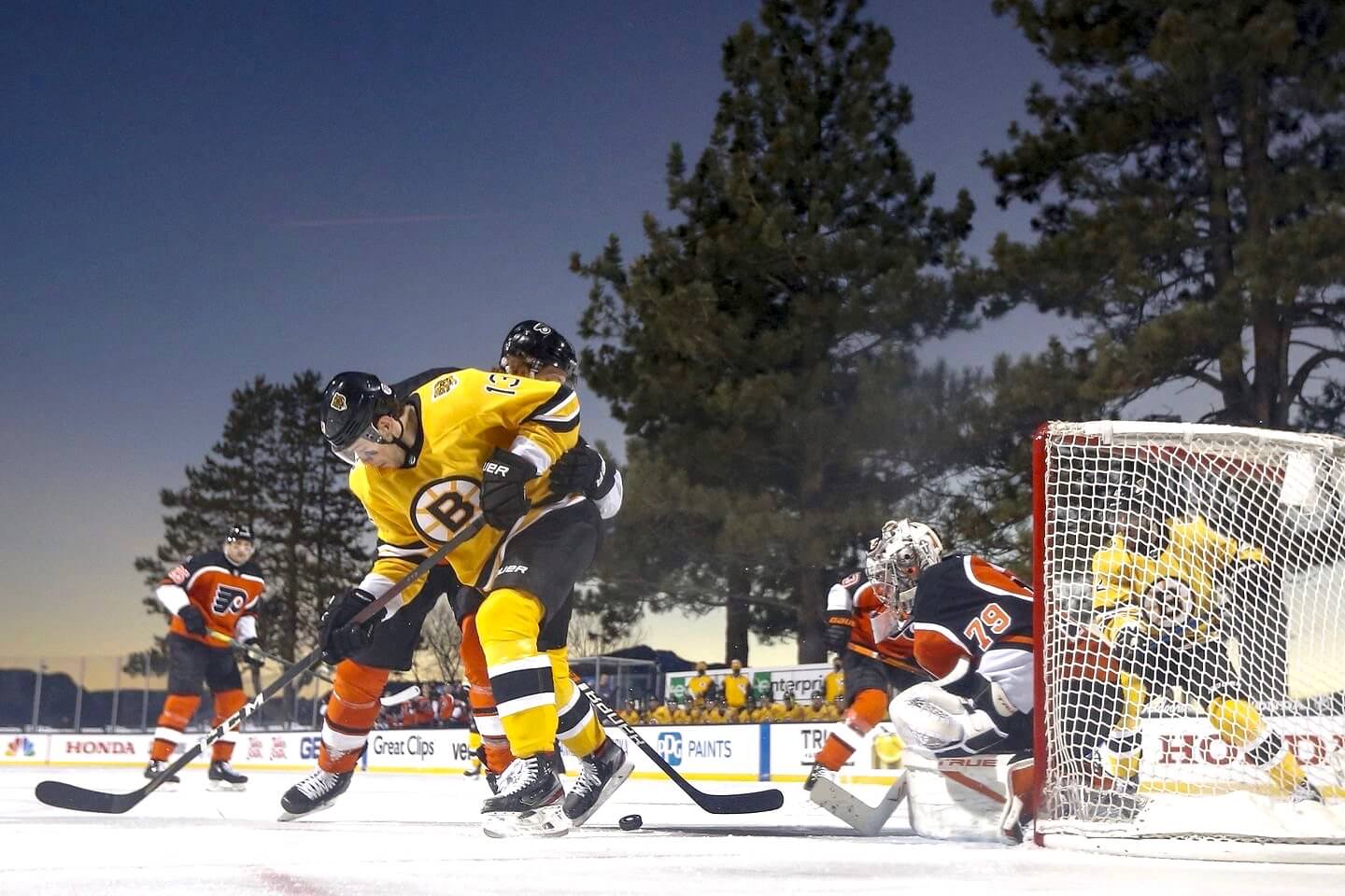
Too good for the Ticker: Damn, is that a gorgeous photo or what? It’s from last night’s Bruins/Flyers outdoor game at Lake Tahoe, with both teams wearing their ЯR uniforms (which in the Bruins’ case should really become their primary look, no?). Love the trees in the background! Lots of additional photos here.
Meanwhile, reader Michael Raskin notes that the red line in Tahoe did not run through the center-ice logo:
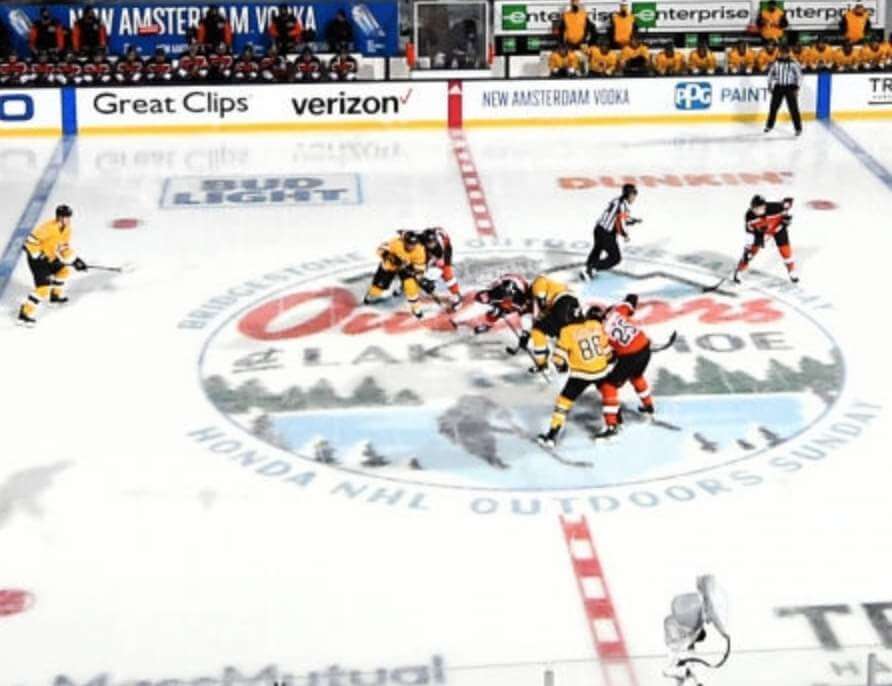
That’s notable, because NHL red lines normally run through the logo. What do we think of this change? Is it better to leave the logo pristine (as long as there’s a center dot for faceoffs, of course), or is it better to maintain the full-length integrity of the red line?
Click to enlarge
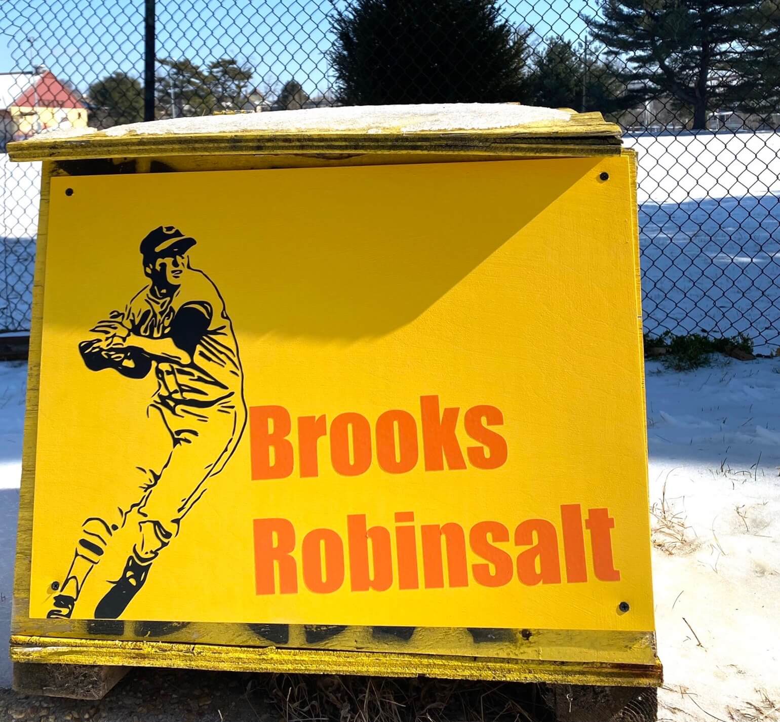
Salt box update: As you may recall, last week I wrote about the amazing phenomenon of Baltimore salt boxes being redecorated around the city. Reader Will Shoken liked the story so much that he contacted Juliet Ames — the artist who’s responsible for most of the new salt box designs — and suggested that she do one based on Brooks Robinson. As you can see above, she took the suggestion and ran with it!
Can the Frank Robinsalt version be far behind?
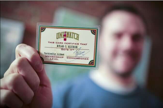

ITEM! New membership raffle: Reader Zach Spencer bought himself a Uni Watch membership the other day and, in a generous gesture, purchased an additional membership for me to raffle off, so that’s what we’re going to do today.
This will be a one-day raffle. To enter, send an email to the raffle in-box by 8pm Eastern tonight. I’ll announce the winner tomorrow. Big thanks to Zach for sponsoring this one!
The Ticker
By Jamie Rathjen

Baseball News: Royals P Danny Duffy is changing to No. 30, becoming the first Royals player to wear that number since the previous Royal to wear it, Yordano Ventura, died in 2017 (thanks, Brinke). … Also from Brinke: Brewers OF Christian Yelich has new city skyline-themed cleats. … This video of the Cardinals’ 1954 spring training features a segment with the team’s equipment manager starting at the linked point (from Scott Unes). … There is at least one new jersey for Wichita State (from Blake Cripps). … LSU and Air Force went purple vs. blue yesterday. “Tough for some of us colorboind folks,” says Ernie Ballard.

Football News: FCS school Jackson State played their first game of the season yesterday. The helmet design they wore had a logo on only one side (from Chris Mycoskie).

Hockey News: Blues G Jordan Binnington changed pants in the middle of Saturday’s game (from John Heiligstein). … Devils C Travis Zajac received a T-shirt for his 1,000th game with the team (from Jakob Fox). … This picture of the 1953 Warroad (Minn.) HS team has among other things one of the captains apparently wearing an armband (from Brandon Weir). … Avs G Philipp Grubauer wore sunglasses under his mask during Satuday’s pregame warm-ups (from Mike Chamernik).

Basketball News: The Raptors’ Earned design has leaked. … Lakers PF Kyle Kuzma changed his shorts and jersey at the side of the court on Saturday after bleeding on them (from Mike Chamernik). … Women’s college teams that wore pink or pink accents this weekend included N.C. State (from Timmy Donahue and Jennifer Hayden); Northwestern, in which Wisconsin also wore white on the road; both Michigan and Ohio State; both Purdue and Michigan State; Belmont; and San Diego State. Syracuse, who we mentioned here yesterday, participated by wearing white for an away game. … Color-vs.-color men’s college games this weekend included Iowa State/Oklahoma (from Sam McKinley) and Michigan/Ohio State.

Soccer News: A kit based on the Premier League’s No Room for Racism campaign is coming back to FIFA Ultimate Team for a second year in a row. … New kits or shirts for Sweden’s Djurgårdens IF and midseason for Ukraine’s Metalist Kharkiv (the latter from Ed Żelaski). … Mexico’s Tijuana started taping over one of their shirt ads roughly a month ago, presumably because it’s not supposed to be there anymore (from @bryant_rf). … The postponed Women’s Euro 2022 now has a new logo. The tournament was supposed to be this year and initially used a similar logo to most of the previous editions. The also-postponed men’s version not only still has its original logo, it’s still called Euro 2020 (from Germán Cabrejo). … Northwestern’s teams played their games this weekend indoors at the football team’s practice facility. … USWNT and Orlando Pride striker Alex Morgan’s daughter Charlie already has a shirt with “Mom” as the NOB (from Kary Klismet). … The current incarnation of the indoor San Diego Sockers are wearing throwbacks to the first NASL version this week.

Grab Bag: AFL Women’s is holding its first Indigenous round next weekend, which likely means new designs for every team, though some have already been wearing theirs regularly for all away games. Besides those teams, Carlton and Geelong were the first to reveal their designs. … Australia’s Super Netball’s Queensland Firebirds have a 25th-season logo. … Here are some renderings of the planned new field hockey stadium in the Indian state of Odisha, which is to host the 2023 men’s World Cup. … A blog called Impersonal Finances has some ideas on who could replace the people depicted on U.S. currency designs. … A new African low-cost airline revealed its first crew uniforms (from Kary Klismet). … New F1 livery for Alfa Romeo (from Ephraim Vorzman). … Some pro bowlers are masking up on the lanes.

Mascot caps – the caps worn by mascots – are my catnip, so I’m all in if caps in the style of the podcast logo cap are ever offered!
It will probably happen. But we might change the logo from a plain “U” to a “U” wearing headphones!
The Unified hat in the logo looks exactly like my Block U utes hat, only a different color of course. Just saying. Putting headphones on the U on the hat would be a good idea to differentiate it.
The “0” thing is also team dependent: Seeing Adam Ottavino wear “0” for the Yankees the last two years was vaguely unsettling. What’s next? Beards?
Come to Seattle. You’ll see plenty of beards…
” (As a side note, I didn’t realize until choose those two photos that Stroman and Walker also both wear blue gloves!)”
Maybe missing a second “I”???
Fixed!
Glad to know that sometimes six stars are just six stars.
Agreed! Well said.
I like a good Cold War. lol
Kevin, you and Shannon would totally get along!
Every stated preference depends on when you fell in love with the game. To me, pitchers wear numbers from 13 to 49. Even 12 looks odd to me.
Most of the reason I can accept single-digit pitcher numbers is from covering years of high-school and junior-college baseball where a lot of players have them. Juco players who become pitching specialists still want to wear their high-school number if they can and so I was used to pitchers wearing single digits.
The most popular at the college level seemed to be 4 and 8. I could almost guarantee a pitcher would be wearing those every season. I was somewhat surprised 1 wasn’t chosen more often.
So to me, it seemed a bit unusual that there *weren’t* MLB pitchers wearing single-digit numbers.
It’s probably a cost-prohibitive design, but a cap with the full cap/headphones logo would tick so many boxes for me.
The logo is really outstanding!
I second that!
Not only did the Warrod MN captain wear an armband, he wore the number 1 and the goalie wore 16.
And a goalie wearing glasses to boot!
Same scenario in Basketball with Portland having a 0 and 00. I was watching the Trailblazers play the Mavericks the other day and the Blazers had a lineup consisting of the numbers 00, 1, 23, 4, and 5. All 5 players 0-5 without a number repeating. I thought that was cool. Also at one point Portland had a 00, 11, 33, and 55 on the floor while the Mavericks had an 11, 33, and 77. That was a lot of repeating numbers. Is there any way to see if 2 teams have ever had 10 guys on the floor with double digit numbers or single digit numbers.
Those outdoor hockey photos really are gorgeous, even with the geico-honda-verizon etc in there. I’ve tried watching, but the games lately are just way too covered in advertising – the boards, the ice, the stands. I wish it weren’t so distracting.
Just so everyone knows where I stand on the number issue:
0 – acceptable
00 – acceptable
0 and 00 on the same team, acceptable
0digit (like 05) – unacceptable
Mets – don’t like them
Matt Harvey – amazed how he continued to play in MLB for as long as he did.
BFBS baseball jerseys – don’t like them
White Sox black jersey – love it.
Mets rule and Taijuan is going with 99.
Watching Atlas v America this weekend, LigaMX action. Great game featured a #198 v a #218. I’ve never seen 3 digit numbers before, anybody know the story behind that? Is it just a LigaMX thing?
Pretty sure Atlas was employing a “false 218”. Lol.
Yes, a reader wrote link on that.
For context, more than half of the Liga MX teams that have already played this weekend had at least one such player in their matchday squad.
One issue wrt Walker’s uni # selection is the fact that at the moment the Mets have very few to dole out. There are 69 players in camp, 14 uniformed coaching/managerial personnel (including for the 1st time this year 2 assistant pitching coaches!– that’s triple the number the teams we grew up with had). The Mets have officially taken 5 numbers out of circulation due to retirement (31, 36, 37, 41 + 42) and have several numbers in limbo due to pending retirement and/or their uneasiness re-issuing them despite having done so often (8-since 2002; 17-since 2010; plus David Wright’s 5; and 24, which is in a kind of double secret limbo given the Mets’ thrice-broken promise to Joan Payson to memorialize Willie Mays and the current Robinson Cano suspension). All that left Walker with few choices as to unissued jerseys– just 7, 69, 85, 98, 99 or 00. 6 out of 101! All this changes again once guys start getting cut of course –but it does signal one reason why we’re seeing and will continue to see unusual inflation/deflation in “traditional” digits. My own thought is taking a distinct or unusual number is okay if you’re a guy who can embody it. What I don’t like is passive pressure on the “limbo-ing” (Stroman took 0 because he himself declared it was disrepectful to the memory of Jose Reyes. Now some fans believe that, and the team gets sensitive, and privately frets that it’s dissing every significant player whose number isn’t retired like Reyes or Ed Kranepool. Slippery slope!
Awesome analysis, Jon — thanks!! (Stupid of me not to have consulted you, the preeminent Mets number guru, when preparing today’s piece. Mea culpa!)
This is worth a blog entry. It begs the question of if teams would ever duplicate numbers or do something like letter-number combos.
College football allows for duplicate numbers on offense and defense. Maybe pitches vs. field players?
The blog has shown old photos of Dodgers camp with a letter-number system.
Probably merchandising would screw this up. :-(
I can hear it now:
“Now pitching, for the Yankees, Number 342, Joe McGirk”
Benito Santiago for a time wore “09” — such a practice could extend another 9 options before going to triple digits or incorporating letters (or symbols–watch for that next player’s weekend). I’m pretty sure Santaigo’s the only player ever to have tried that in baseball.
I usually not a 0 or 00, but I’m not against anyone wearing them. My last name has a double “oo” in it, and I had thought that 00 might look good with it, but I still wouldn’t choose this over my favorite number 11. I like 0 better than 00, and players with their first letter of their name, first or last, is fine. In fact as a kid I wondered why Oscar Robertson, the “Big O”, didn’t wear 0 when he went to the Bucks and changed his number 14 from the Royals to number 1 for the Bucks? That brings up another question of why did Oscar change his number? I can’t imagine Jon McGlocklin not relinquishing this number to Robertson if he wanted it, or was that not a thing back then when start players changed teams and a lesser player had his number?
We went with green for Uni Watch, blue for SportsLogos.net, and orange trim because it goes well with both green and blue.
I thought it was an amalgamation of your yellow and Chris’ red. But sometimes orange is just orange…
Looks good. I’d wear that.
I’d also wear 0 or 00, and I have no numbering system at all for baseball. Well, no triple digits and I’m on the fence about Santiago’s 09 (I think 00-09 would make for good ineligible receiver numbers in football, though).
I like the new unified logo but going with a flat brimmed hat was a surprise
Brian’s initial sketches included a curved-brim version. We liked the flat better — not necessarily because we prefer flat brims in real life, but because it just worked better as part of the logo.
there will be additional versions based on other sports. So instead of the baseball cap, there’ll be a version featuring a football helmet, another one featuring a goalie mask, and so on.
Single-bar helmet, please!
For basketball, you could have a headband, I suppose. Or maybe a basketball wearing a headband and headphones.
Way ahead of ya, Jim!
;)
00 is better than 0 for a pitcher. Bobo Newsome wore it during some of hia days pitching for the original Nats.
Football and hockey should allow 0 and 00.
I am not a fan of 0 or 00 for uniform #s. However, based on the available # analysis done in a previous comment by Jon, I understand the challenge that teams may face with available #s. I am in fact a Celtics fan & there are some crazy non-traditional basketball #s players have to wear based on all the retired ones. I think this is a good example to validate his point. Also, I forsee problems in football with the roster size plus limited options of position-based # assignments. If teams retire #s they would run out pretty quick.
So if we need the extra # for some clubs, I think you must choose between 0 & 00. You should not have both on the same team. If I have to choose I am going with 0. Apologies to the Chief, one of my all-time favorite Celtics, but I do not consider 00 to be an actual #… is it?
I am probably incurring the wrath of Paul and others with this take… but I really do not like the Unified logo. I am honestly kind of in disbelief that this is what they ended up using as the logo. It feels like so many of the generic sports blog and podcast logos already out there and (if I didn’t know any better) would get the impression from the design that this podcast focuses on something relating to football coaching. I’m not digging the blue, green and orange color scheme… it feels like the result of a bad compromise or group-think.
Obviously this is all only one person’s opinion. I am just surprised since I’d never expect this logo to be something that Paul would actually approve. I personally like the logo created by Joe Hilseberg much better as I feel it combines the Uni Watch and SportsLogos identities in a simple yet visually pleasing design.
That being said, I’m really loving the podcast and my opinion on the logo definitely won’t deter me from listening every week!
No wrath from me, Joe. If it doesn’t work for you, then it doesn’t work for you! No harm, no foul. Glad you like the show anyway — thanks for listening!
I tend to agree with most points you make here. I see ‘Bartman’ from Cubs fame with the hat and headphones. Looney Tunes logo for the circles. And I pointed out them maybe three leaves instead of three stars on the left to signify Chris’ country.
We did try the three maple leaves — didn’t look right. Moreover, the stars don’t signify America — they’re just stars. So no need to signify Canada.
When I was a kid in the 60s the Reds assigned numbers by position. Coaches and catchers had single digits, infielders 10-19, outfielders 20-29, pitchers 30-49. That’s still what looks right to me.
I like the logo. I like that the bullet between your names is off centered, it reinforces that the hat is looking “up” a little bit. Maybe when it’s football helmet time, the logo should get rotated “down” (maybe reversing the name order?) to look like it’s about to smash into another logo helmet, like tv graphics of olden days.
For basketball, it’s all about sneakers, for me. Just saying.
Happy monday, everyone who reads Internet comments. Have a great week!
Let’s not forget that Adam Ottavino wore 0 for the Rockies while Dinger the mascot wore 00. Yeah, mascots are people too. FIGHT ME!
Maybe just go with the cap instead of the full logo for the avatar on twitter? The surrounding text is just lost at that size. Nice work Brian!
Disappointed to see the word “microphone” abbreviated as “mic” instead of the proper “mike’. I read an article the other day (can’t recall which publication) where the author/editor used “mic” as the abbreviation for the object, but then used “miked” as the past-tense abbreviation for the verb. Probably because “miced” would have looked stupid. Yeah, well so does “mic”.
Actually, John, “mic” has been proper AP style for over a decade now:
link.
OK, I just checked my frig and noticed I was out of diet coc. I’ll just hop on my bic and head to the grocery store for a re-supply. I hope the AP style manual catches up to me soon!
John,
Trying to rationalize English spelling (or pronunciation for that matter) is a DANGEROUSLY slippery slope!
My wife (journalism degree) was constantly correcting me about how I should write using AP style for everything.
One of the many reasons she’s my ex-wife. :-P
Well, there goes my big plan to seduce Tim. Dammit….
I think the logo works (and the pod is great), but for me it has strong SB Nation logo vibes. I know that SBN hardly has the market cornered on roundels with lettering in the outside, but this immediately brought those logos to mind.
For reference: link
Totally fair! Honestly hadn’t occurred to me, probably because I haven’t looked at SBN in ages. But you’re right!
“We went with green for Uni Watch, blue for SportsLogos.net, and orange trim because it goes well with both green and blue.” You could also say that orange is the result of combining your secondary colors of yellow and red!
Although it wasn’t used much, I miss the 00 in professional hockey.
I sometimes wear it in goal but that is just for pickup aka scrub hockey. Also might have wore it in the past a fill in for beer league or a low level tournament – where they couldn’t have cared less what the goalie has for number.
One person on the Mets wearing a number I don’t like is not an issue for me. I do have issues with the Mets though and seem to be the only one who cares about these details:
1) Their iconic ball logo was changed from its original buildings, the NY was removed and wordmark made less sharp years ago. This really bugs me and I bought a t-shirt recently that actually has the true logo.
2) The uniform patch, based on this wrong logo, has the Mets slightly off centered – an artifact from when they added that stupid drop shadow and moved everything left a bit to compensate. Graphic artists today have no sense of aesthetics and have not corrected this.
3) The Mets script on their jerseys is also distorted. It is generally too large, the M is too far from the e and the e is too fat. This happened over the years and looks wrong to me.
4) The front number 6s and 9s are also distorted from when they had drop shadows.The looped parts are too narrow. I have pointed this out to their stitcher who did nothing.
The Mets have the “Team-with-a-short-name issue”, that is, the word is too square and needs undue tinkering to get it to sit correctly on the jersey front. Could be a reason they went for henleys and pullovers in the ’70s-’80s: No placket to negotiate. Ideally, the italicized nature of the lettering should be negated by the upward slant of the script (see the Nationals).
Generally I dislike teams having roundels or patches on the left sleeves, but I give the Mets a pass because it visually differentiates them from the Yankees.
It wasn’t hard in the late 1960s
link
The roundel can’t be too bad when it is based on one of the best logos of all time (when true to the original).
See how good this looked:
link
To be honest, I don’t care what the podcast logo looks like. Just keep up the good content! And as far as a player selecting a uniform number, they’re doing it for themselves and not us. I’m with Paul though in liking the uni-oddity of 00 or 0. I REALLY loved that photo of Santiago today in that classic Marlins uni. Are there any membership cards with Santiago-esque numbers?