Every single day, there’s an upside-down baseball stirrup at the top of this website. But today there are two upside-down stirrups! That’s due to a really fun new team identity that was revealed yesterday.
Here’s the deal: Since 1963, the Appalachian League has been a rookie-level minor league, with the Appy League teams affiliated with various MLB parent clubs. But as part of MLB’s new reorganization of the minors, the Appy League has been redesignated as a collegiate wood-bat league. As a result, the league’s teams, most of which have simply used the team names of their MLB parent affiliates (the Johnson City Cardinals, the Bluefield Blue Jays, and so on), are getting new stand-alone identities.
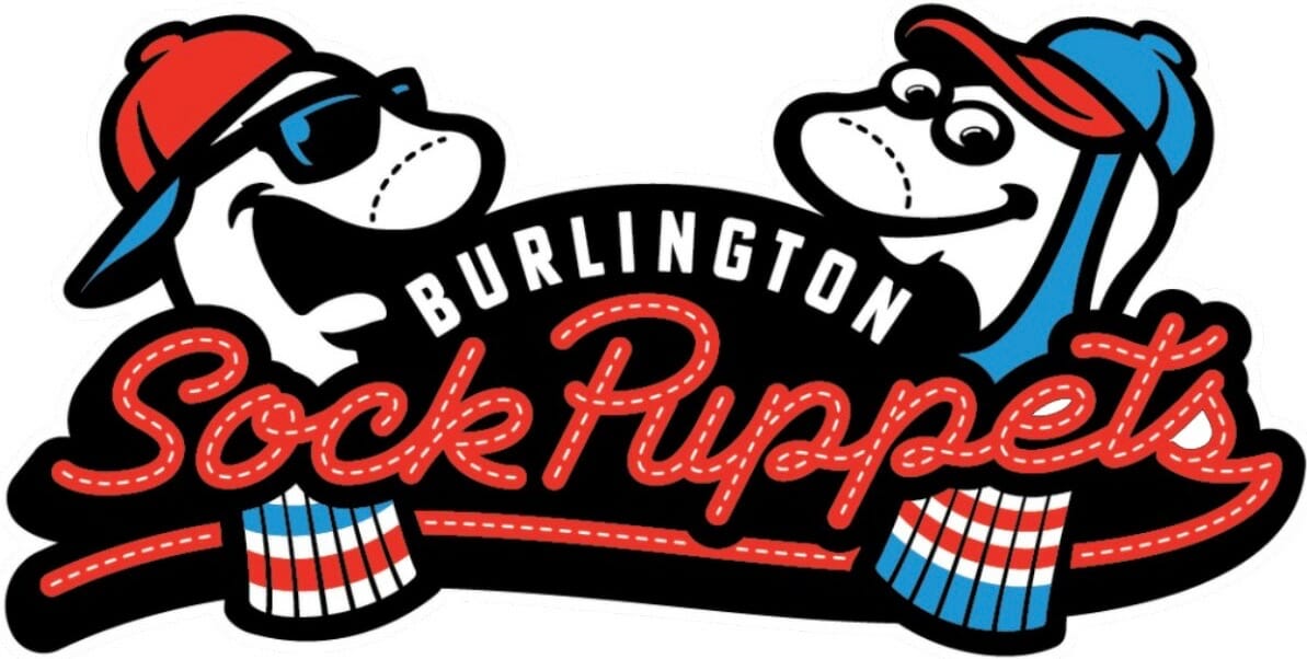
One of those teams is the Appy League franchise in Burlington, N.C. Previously known as the Burlington Royals, they announced yesterday that they’re being reborn as the Burlington Sock Puppets — a nod to the city’s history as a stronghold of sock-knitting mills.
Granted, “Sock Puppets” is a pretty odd choice for a team name, but there’s a lot to like here. For example:
• For decades now I’ve been waiting for anthropomorphized stirrup character and never even realized it! Why didn’t I think of this myself for Uni Watch? This mascot instantly vaults to the top of the “Best Mascots Ever” list. (It’s worth noting that there’s some precedent for anthropomorphized sock logos — but not, to my knowledge, stirrups.)
• I love how the mascot character without the stirrup has a douchey dude-bro look (he’s basically Poochie), while the stirrup-clad character looks all wholesome and friendly. As it should be! I’m not sure if these characters have names yet (if that was mentioned anywhere in the press notes, I missed it), so for now let’s call them Douchey and Danny.
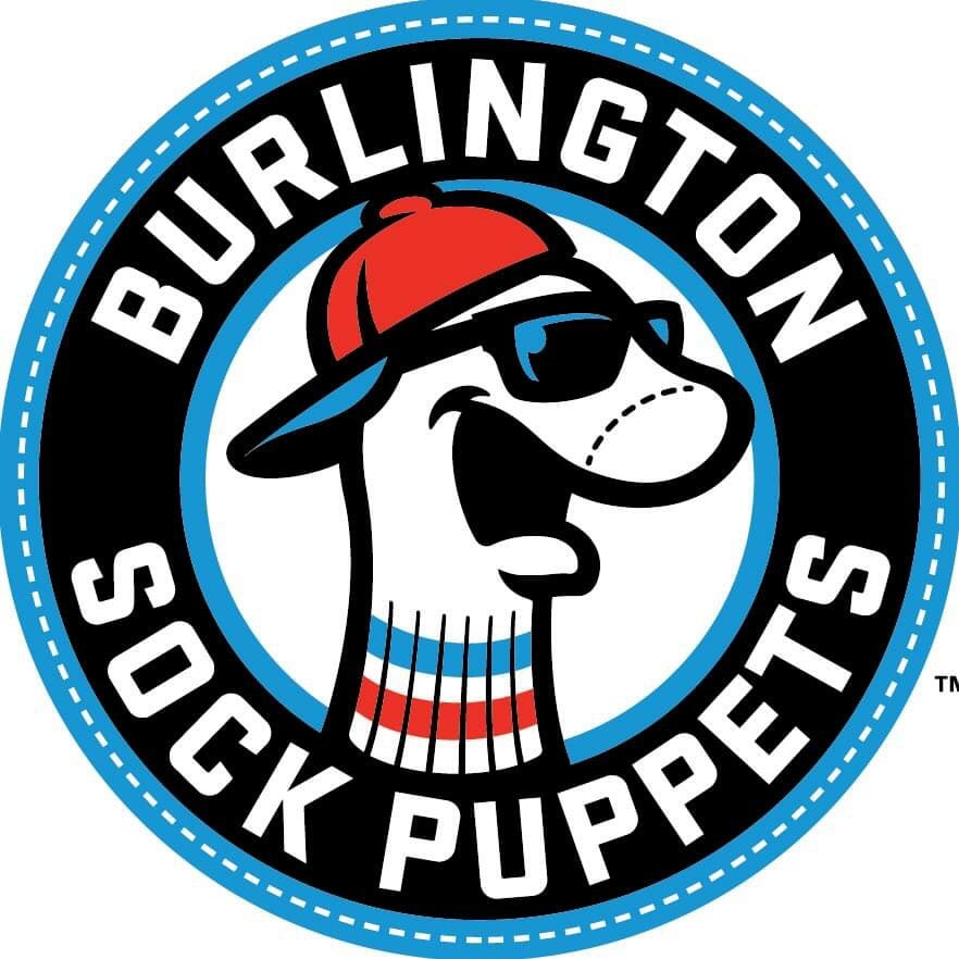
As you can see at right, they’re using Douchey as the basis for a roundel logo. Here’s hoping they give Danny the same treatment!
• Douchey and Danny appear as actual sock puppets in the team’s name-reveal video! Unfortunately, they used two-in-ones for Danny, instead of a real stirrup over a real sock, but it’s still pretty great. You can see the puppets here:
• In a move that’s arguably even cooler, the unveiling video also includes, with no explanation or warning, an old Burlington socks commercial. Not sure of the year, but it feels circa-1970 to me, and it’s pretty hilarious. You can see it here:
Meanwhile, here’s a bizarre tangent: As some of you may be aware, if a person creates a phony online identity — usually in the form of a bogus social media account that’s used to express things that the person wouldn’t want to be held accountable for — that identity is called a sock puppet account. And you know who was semi-recently caught using a sock puppet account? The police chief of that other Burlington — the one in Vermont. So he appears to be the original Burlington sock puppet! The newly named team should have him down to North Carolina for some sort of in-game promotion.
And, of course, let’s hope the team actually wears stirrups.
Click to enlarge
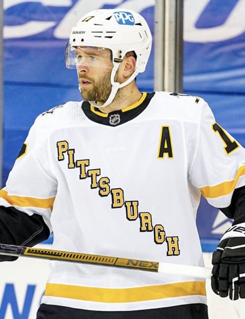
So you think you’re a uni-watcher: Notice anything a bit off about Penguins right wing Bryan Rust’s uniform (aside from the gross helmet ad, of course)? I don’t want to give it away too soon, so take a minute and then scroll down to see the answer.
The answer, of course, is that the “I” on Rust’s jersey is upside-down. You can tell because its drop-shadow projects to the northeast, instead of to the southwest like all the other letters’ drop-shadows:
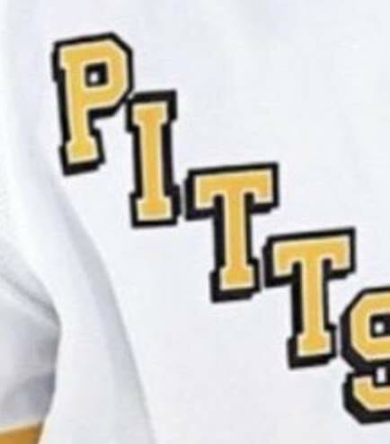
That’s some godhead-level uni-watching right there, and it comes our way from reader Mike Givler (although I believe a few other people also noticed it independently of him). Spectacularly eagle-eyed work by him!
Click to enlarge
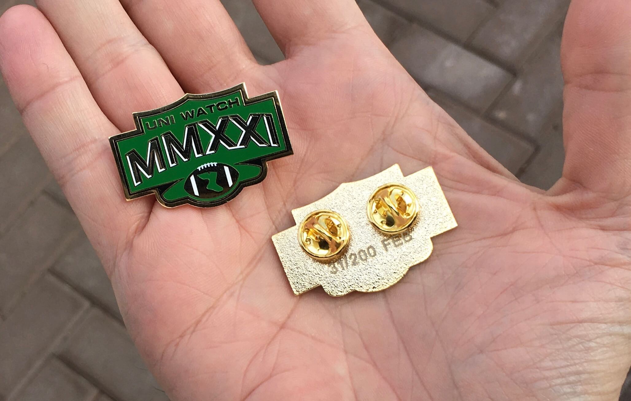
Pin Club reminder: In case you missed it on Monday, the Uni Watch Pin Club’s design for February is now available. It’s a shout-out to the Super Bowl, with the year 2021 rendered in Roman numerals. Numbered edition of 200; as of this morning, about 95 are left.
Again, the pin is available here. My thanks, as always, for your consideration.
Click to enlarge
Collector’s Corner
By Brinke Guthrie
Follow @brinkeguthrie
“Okay, campers, rise and shine! And don’t forget your booties cause it’s cooooooold out there today.” That’s the opening to one of my favorite movies, Groundhog Day, streaming today on every platform imaginable, which I’m mentioning because today is Groundhog Day!
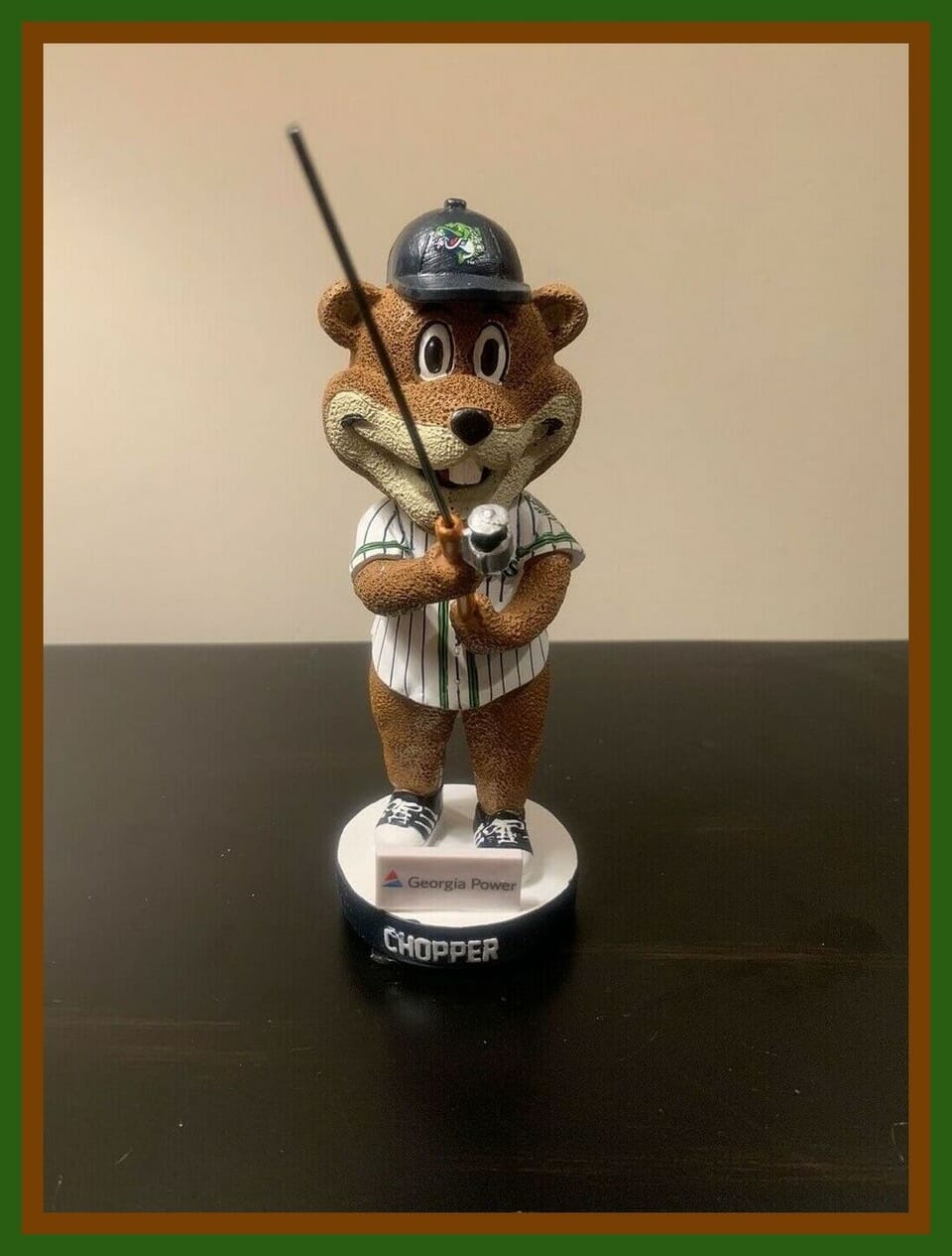
Unfortunately, Punxsutawney Phil says we have lots more winter weather ahead of us. But hey, it’s his holiday and we don’t want to blame the messenger, so we lead off Collector’s Corner this week with a Chopper the Groundhog bobblehead, which shows Chopper wearing the uniform of the minor league Gwinnett Stripers baseball team. But wait! One website says, “Chopper is a marmota monax, better known as a groundhog, woodchuck, or whistlepig.” See what you learn on this website? Speaking of which: Groundhogs must like fish, since Chopper comes armed with his own fishing pole.
Now for the rest of this week’s picks:
• Here’s a 1960 decorative plate shaped like the Stanley Cup, commemorating the Montreal Canadiens’ fifth straight title. They’d just swept the Maple Leafs in four games — rematch of the previous season’s finals — and this was their 10th straight finals appearance. C’est magnifique!
• This was in the Ticker last week, but it’s worth repeating here: My goodness, check out this tequila sunrise McDonalds softball team uniform. A value meal at any price!
• Don’t worry, we haven’t forgotten that there’s a Big Game coming up this Sunday. First we have a late-1990s Tampa Bay Buccaneers “sharktooth” design polo shirt from Logo Athletic. The seller says this was a coach’s shirt, and he’s right about that. “BR” is on the collar tag — the initials of strength and conditioning coach Brad Roll, who was on the late Sam Wyche’s staff for the 1993-1995 seasons. (Also, as I tweeted last week, the version of Bucco Bruce looks a bit crazed on this particular item.)
• The defending champs from Kansas City are the Bucs’ opponents, and they’re represented this week by this late-1960s bobblehead in great shape — no wear/tear on the back of the helmet like you often see.
• Speaking of the Supe, here’s a 1999 Super Bowl XXXIII metal sign from Miller Lite, decorated with the all the then-current teams/logos.
• This is an American League Annual Pass for the 2012 season. It seems the bearer and guest could use this to see a game at any American League ballpark — now there’s a deal!
• According to this ticket stub, if you had eight dollars in your wallet, you could afford a box seat in the lower level of Candlestick Park for the 1961 MLB All Star Game. This was the game where Giants pitcher Stu Miller, pitching for the National League in his home park, was supposedly blown off the mound by the San Francisco Bay winds. As that linked article says, “Why was a ballpark ever built there?”
• These 1992 Miami Dolphins stickers were sponsored by 610 WIOD radio and identified you as a season ticket holder.
• If you were at Cincinnati’s Riverfront Stadium on Aug. 17, 1984 — Pete Rose’s first game as a player/manager — you received this certificate suitable for framing.
• Here’s a pair of 1960s officially approved NBA basketball shoes — “The Choice of Big Leaguers,” don’tcha know (never mind that “Big Leaguer” is a term usually associated with baseball). But did those big leaguers really choose the red suede?
Got an item to include on Collector’s Corner? Tweet submissions to @brinkeguthrie

Click to enlarge
Printed matter: Check out this sensational Denver Broncos letterhead from 1960. The photo was sent my way by Broncos memorabilia maven Tom Jacobsen, who says, “I’ve seen this Broncos logo before, but never this letterhead.” A nice find!
This is one of several beautiful vintage letterhead photos that Tom sent me the other day. They’re all from a neighbor of his, whose dad was at the Broncos’ 1960 training camp. You can see the rest of them here.
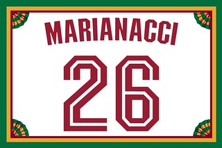
Membership update: Eight new designs have been added to the membership card gallery. That includes Matthew Marianacci, whose card is based on Stanford’s early-2000s hoops uni. Nice one!
Ordering a membership card is a good way to support Uni Watch (which, frankly, could use your support these days). And remember, as a gesture of comm-uni-ty solidarity, the price of a membership has been reduced from $25 to $20 until further notice, plus a Uni Watch membership card entitles you to a 15% discount on any of the merchandise in the Uni Watch, Uni Rock, and Naming Wrongs shops, and the discount also applies to our Uni Watch Classic Cap and Uni Watch toque. (If you’re an existing member and would like to have the discount code, email me and I’ll hook you up.)
As always, you can sign up for your own custom-designed card here, you can see all the cards we’ve designed so far here (now more than 3,000 of them!), and you can see how we produce the cards here.
The Ticker
By Alex Hider

Baseball News: The cover for MLB The Show 21, which features Padres SS Fernando Tatis Jr., was released yesterday (from Dylan Bercu and our own Anthony Emerson). … Another new Appalachian League team identity, aside from the Sock Puppets: the Bristol State Liners (thanks to all who shared). … With Red Sox 2B Dustin Pedroia retiring yesterday, Boston’s Double-A affiliate, the Portland Sea Dogs, shared photos from one of Pedroia’s rehab stints, during which he wore what appears to be a relettered Sox jersey (note the maker’s mark), but the Sea Dogs wordmark was in navy while his teammates’ were in red (from Josh Miller). … Jorge Cruz found a Marlins-branded golf divot tool and ball marker kit that includes both the team’s current and old logos. … Nats 1B Ryan Zimmerman used one of his bats to measure the snowfall near his home.

NFL News: Cool idea from @summo_13, who made these NFL 8-bit phone wallpapers inspired by the Atari 2600 football.

Hockey News: The Rangers wore “Equality” warm-up jerseys to commemorate Black History Month last night. The jerseys will be auctioned off to benefit the United Negro College Fund and the New York Urban League (from Brandon Wheatkings). … Also from Brandon: Ole Miss sent famous football alum Eli Manning one of its new hockey sweaters … NHL uniform schedules continue to trickle out, most recently for the Sabres and Predators. Nashville also announced that they’ll wear navy helmets with their Reverse Retro uniforms (from Paul Braverman and Taylor Crabtree). … We have a first look at the goalie pads that Kings netminders Jonathan Quick and Calvin Petersen will wear with the team’s Reverse Retro uniforms (from Jakob Fox). … The owners of Maple Leaf Coffee Roasters in Roseville, Ill., are Canadians and hockey fans, and have given a few of their blends hockey-inspired names and packaging (from Bruce Adams). … The Savannah Morning News is holding a “best team name contest” for the city’s new ECHL expansion team (from Kary Klismet). … In the early 1970s, the Omaha Knights, who at the time were an Atlanta Flames affiliate, had a Flames-based “K” jersey crest, although it sort of looked more like a melting “M.” … Caps D Zdeno Chára’s new shipment of sticks was mistakenly delivered to some guy in New Jersey (from Mike Chamernik).

Basketball News: Here’s a profile on the Oakland-based artist who helped design the Warriors’ “The Town” alternate jerseys. He shares how he feels about the team’s move to San Francisco and what he thinks about their new “Oakland forever” alternates (thanks to all who shared). … Newly-signed Nets F Norvel Pelle will wear No. 14 (from Etienne Catalan). … It’s almost too easy to forget that the current Jazz color palate spans the entire spectrum of the rainbow (from @Wilds_Lee). … Wyoming has unveiled a new uniform based on the state’s flag (from @WyoFBEQ).

.Soccer News: MLS has released the ball design for the 2021 season (from @texastrevor).

Grab Bag: New pride uniforms for Carlton and Western Bulldogs of AFL Women’s, the women’s Australian Rules Football league (from Jamie Rathjen). … We’ve got several submissions from Kary Klismet: The University of Arkansas has unveiled new logos for its 150th anniversary, and the athletic department is celebrating the anniversary with a page that shows the evolution of the Razorback logo. … The Atlanta school board has recommended that a stadium in the district currently named after a segregationist newspaper editor from the 1800s be renamed after the state’s first Black high school athletic director. … Columbus Signature Academy New Tech High School in Indiana has chosen “Dragons” as its new team name. … The North Carolina DMV will no longer issue license plates that include Confederate flag imagery (from James Gilbert). … New York City mayoral candidate Andrew Yang expressed support for a new NYC flag yesterday (from our own Anthony Emerson). … Rohan Mustafa, a cricket player for Team Abu Dhabi of the UAE T10 League, wore a backwards cap on the field yesterday (from Peter Della Penna). … Speaking of cricket, Northamptonshire Steelbacks have dropped military imagery from their new logo “to attract a younger, more diverse set of fans” (from @jerrypemberton). … Fun fact: Stetson University in Florida was named after John B. Stetson, of Stetson Hat fame. Their teams are known as the Hatters, and their “S” logo features a hat worked into the negative space (from Mike Chamernik).

Click to enlarge

What Paul did last night: Winter wonderland here in NYC yesterday, as we got slammed by a serious Nor’easter. The porch was a mess, and it was still snowing, so we brought out a couple of stools and pressed them into service.
We thought the snowstorm would be the perfect occasion to crack open the 1976 curling-themed bourbon decanter that reader David Sonny recently sent me, so we brought it outside and prepared to break the seal — an event that seemed video-worthy:
Dang. Fortunately, we were able to extract the cork and access the booze, which was excellent. Thanks, David!
One more thing about the snow: Earlier in the day we decided to go out for a walk, so we bundled up, opened the door to the house, and found this:

I can’t fully explain why, but there is something so satisfying about that crisp, clean edge of snow!
As always, you can see the full set of Pandemic Porch Cocktails™ photos — now more than 320 of them — here.
Wish I could be as enthusiastic about the Sock Puppets. The whole race to out-cutesy each other with “I can’t believe they’re calling themselves that” names is bringing me close to literal nausea.
I do like the Stetson Hatters logo, fwiw.
I feel like these cutesy names are not for us though. They are for kids, and I think it’s cool that they are trying to attract kids to local pro baseball.
In my town we had a team call the Brevard Manatees and the mascot wore this massive, adorable manatee costume. The kids just ate it up.
There were a lot of new identities spawned when minor-league teams developed alternate identities for intersquad games last summer.
The Somerset Patriots, Tulsa Drillers, and Kenosha Kingfish were out front in doing this. The K-Town Bobbers had a really cute logo.
Well said. I find minor league games to be more family friendly, especially if you have younger children. I hated it when Akron rebranded from the Aeros to the Rubberducks but like you said, they didn’t do it for me. I’d love to know if teams that rebrand to these cute nicknames see a sustained growth in merchandise sales.
Well if they’re aimed at kids, it certainly wasn’t at my 8-year-old self. A cool name back then was something like “New Haven Ravens” or “Kissimmee Cobras”. I understand wanting a family-friendly eye catching name that sets the team apart from a traditional MLB name. But in that case, there are plenty of ways to have a fun, unique moniker that isn’t geared towards 4 year olds. Names like “River Dogs”, “Shuckers”, “JetHawks”, and “Stripers” all have local ties, have potential for fun uniforms/logos, and can appeal (if done right) to both kids and their parents.
Names like “Sock Puppets”, “Trash Pandas, and “Baby Cakes” are just embarrassingly childish. I’m 33 and don’t have kids (yet). I’d be curious to know if any of y’all who are parents to 6-11 year olds think their kids would want to wear a t-shirt with “Sock Puppets” across their chests.
All I can say is that I suspect my 3 siblings growing up in the 90’s and early 2000’s would likely find such a shirt deeply uncool once we hit 8 or so.
Except the Burlington team is no longer a minor league team. MLB stripped all three Burlingtons of affiliated baseball. So there is no effort at attracting kids to the minor leagues in this identity…
One of the downsides of small town newspapers not running daily is that there will never be a headline from when the Johnson City Doughboys whoop up on this team by 10.
Would put some here, but decorum is the better part of valor.
Hopefully the NY Post guys will keep an eye on them.
So, would a headline read during a Sock Puppet losing streak be “Losing Threads” or “Darn socks lose grip”
For the Penguins, (I mentioned this over the weekend) MSG is using the Vegas Gold logo when the Pens score, but the regular yellow with all other logos
Big blunder on the Sock Puppets logo. The counters in the “e” and “s” of “Puppets” are filled in white. Not only is it not consistent with the rest of the letters (like the “o” in “Sock”), it’s really distracting.
Yes, now it is. Can’t unsee…
I think that is just a graphical glitch from whatever Paul is using. If you look at other images it is black.
That can happen sometimes when it is true black (0,0,0).
Five years ago the Hartford Yard Goats name seemed really out there. Now it seems like one of the more normal names.
I was initially a bit concerned that one of my favorite minor league teams, the Vermont Lake Monsters, had changed its name–not because Sock Puppets is bad (it’s great!) but it would mean we lose the Lake Monsters.
(It’s worth noting that there’s some precedent for anthropomorphized sock logos)….
Don’t forget Socko! The Colorado Springs Skysox mascot (b.1993 d.2000). A short-lived fella, replaced by a fun-loving Fox.
link
link
…and the Red Sox
And the Sydney Blue Sox
link
Utica still has the Blue Sox (albeit a collegiate wooden bat league).
Toledo had the Glass Sox.
I once made a mockup of a team called the Trenton Steel Sox (gray sannies with drawings of rivets up the side).
(Oh, and I love the name “Socko”! Great memories of Mick Foley)
Re: the McDonald’s jersey.
A couple of differences from the “orthodox” UltraStripe design. One, the jersey has those red raglan sleeves.
The other is that the rainbow stripes only alternate amongst three colors, not four. I have seen this done effectively before, such as with Black Pike about three years ago.
link
Granted, “Sock Puppets” is a pretty odd choice for a team name, but there’s a lot to like here.
Hey Chicago…since your AL team can’t wear the right colored socks, maybe they should use this name!
Unfortunately, Punxsutawney Phil says we have lots more winter weather ahead of us.(fixed)
I wonder why the Chicago southside baseball team never chose to wear black sannies and white stirrups in its current iteration like the team did in 1969 and 1970.
I noticed the Penguins shoulder logo doesn’t have the golden triangle either. Maybe it was mentioned previously and I didn’t catch that.
I dealt with a broken cork on a bottle of Pimms #1 a couple of summers ago. I inherited it from my father who probaly inherited it from his father. The bottle had to be at least 20 years old, but probably more than 25.
I was underwhelmed by the Pittsburgh RR uniform, perhaps because I was expecting the Robopenguin on the shoulder yoke, but also because the regular Penguins’ sweater has a lot more gold in it. They should have rendered the whole jersey in yellow.
The Sock Puppets may be at the top of Paul’s mascot list, but not Homer Simpson’s…
link
THANK YOU! I kept racking my brain because I knew there was an old Simpsons clip somewhere and I couldn’t think of it!
That tile work on your floor is perfection.
We were just saying that yesterday! It’s only in the tiny vestibule, but it’s really nice.
Paul, if you love sock mascots, you’d have loved the short-lived FC Tampa Bay (Rowdies) mascot “Hoops McGee”: link
The back story is, when they announced the Rowdies were coming back in 2010, they had a big trademark dispute with same lame apparel company in Texas who was camping on the name. So for 2010 and 2011, the team had to call itself “FC Tampa Bay” and not use any official logos or imagery from the old NASL days. The mascot, naturally, was a anthropomorphic hooped sock (from their iconic and unique uniforms).
I had forgotten about Hoops! Love the colors, of course.
I want to be Mr. Fun Guy that says that the Sock Puppet name is great. Can’t do it. Put me in the angry old man category (not that angry, really). They should have been the Burlington Millers. The sock puppets could have been mascots or alternate logos. Sorry.
And if we are going to be truly cynical about this and say that merchandise sales drive everything, this brand won’t last. I can’t see the typical baseball fan buying this in a sustained fashion. Maybe they want the novelty angle for an initial splash and won’t mind a rebrand in a couple of years.
I would even accept the Burlington Sockers (or better yet, “Sox”).
“Miller’s” is great, but as others have said, it doesn’t ring the cash register.
In Arrowhead stadium, the Chiefs have something called the “Hall of Honor” and it includes a pretty cool little museum. I could be wrong, but there’s a Broncos letterhead (I think it’s that same one) and it’s a letter than the owner of the Broncos sent to the rest of the league bragging about their new uniforms and how they’ll be the best in the league. Obviously, they turned out to be the blue and orange.
I was going to post my own comment about the Broncos letterhead, but I’ll drop it here since you already kicked off the topic.
I love that Broncos letterhead. The funny thing is, the wordmark on the letterhead appears to be in orange (as does the lettering in the footer), but the Broncos’ original uniforms were brown and yellow. The team famously purchased them from the original Copper Bowl, a defunct college all-star game in Arizona:
link
Since this letter predates the Broncos’ first game, I wonder if the team had planned on having orange as part of its primary visual identity before the cash-strapped front office decided to grab those second-hand uniforms on the cheap and switched up their color scheme because of it. It seems plausible, especially since they switched to orange uniforms with blue trim when they ditched the brown and yellow togs two years later.
Socks are giving me a little bit of a Utica Club Schultz and Dooley vibe.
Kudos to Burlington for the excellent rebranding. Thumbs down to them for not having on field caps ready for sale as I most likely would have bought one on impulse today.
For the curling-interested, I saw a story from Volume One here in Eau Claire about the first U.S. “crokicurl” rink, which was installed in neighboring Altoona, WI. No uniforms involved, yet, but maybe if some other rinks get installed across the country? See the link in my name.
That’s awesome.
One of my neighbours built a small rink. No actual rocks, just 4L milk jugs filled with coloured water and frozen. Wooden stakes in the ice and some paint. Its an absolute hoot that requires no equipment at all.
Typo in the first sentence of the Grab Bag section:
New prinde uniforms
Fixed.
Paul, the snow level at your door has a way to go before getting to levels that will allow you to do this-
link
Pretty common to see posts like this on social media here in Minnesota after big snow storms.
I was getting prepared to love the flag-based Wyoming basketball uniforms, but they indulged in a pet peeve of mine: Straight-across lettering. Vertical arching is what I prefer, but radial arching is cool, too. Hate to be the bastard at the family reunion:(
Wyoming’s flag is one modification away from being a top tier US state flag: Get rid of the state seal in the bison!
Wyoming’s flag stands out with its border and easily recognizable animal shape. The seal is not necessary.
Wyoming has a very classic look associated with Brown and Yellow. Another “one uniform too many”.
The link to the article about the Bristol State Liners provides a nice writeup of the new team identity, but is light on the team’s visual branding. Here’s a link that shows the new loogos:
link
Thanks, Kary. Will add to Ticker.
The dislike for so-called “cute” team names is disappointing. I don’t think of it as “cute.” It’s fun. Baseball does not have to be super serious.
Apparently I replied to an unrelated comment. My bad. Apologies.
Fun and dignity are not mutually exclusive concepts.
I didn’t realize that the line for dignity was drawn somewhere between grown men playing a game for a living and grown men playing a game for a living with a team name designed to make people smile.
In New Jersey, the scholastic sports teams representing Phillipsburg are the Stateliners (one word) as opposed to the Bristol wooden-bat team.
And only a few miles away, Belvidere were always the County Seaters (two words).
Everything about that Broncos letter is great, the letterhead, the content (bring your own shoes)…thanks for sharing!
Douchey and Danny, hilarious.
Agree re how cool it is to see snow with an edge like that. When I was a kid living in CT, around ’77 or ’78 we had a blizzard, and I remember opening the front door to a wall of snow like that, only about 4 feet high. Really cool (although Mom made me close the door quickly!).
It was very interesting reading the letters included in the gallery showing the Denver Broncos letterhead. I found it really odd that the Broncos would send letters addressing team business on the letterhead of a minor league baseball team.
Same ownership at the time. But yeah, it’s weird.
The letter on the Denver Bears letterhead is from January 16, 1960 and doesn’t refer to the Broncos by name at all – just the “Denver Football Club.” I suspect that the team hadn’t even selected “Broncos” as its name yet.
According to link, Denver chose its name in a “name the team” fan contest in 1960, so I’m guessing the contest must have been held sometime between January 16th and May 27th, the date of the letter on the Broncos letterhead.
Looks like the player is Billy Shoemake from LSU (although most of his history appears to be in a JC, thus one of the letters asking about his JC information). One letter has Shoemake releasing the rights to a bubble gum card. That card can be seen at
link
Can’t find any stats reference that Shoemake made the team (#84 on the Broncos in 1960 looks to have been worn by Al Day, a linebacker.
Shoemake was drafted by the Washington R******s in the 14th round of the draft in 1960. Looks not to have been drafted in the AFL Draft.
Nice bit of research, and nice find on the football card!
I was ready to get on board with the Sock Puppets until Danny proudly proclaimed that the textile legacy in Burlington “continued even to this day still.” And then my internal Redundancy Police took over and the whole thing stopped being fun.
Los Angeles is in the midst of a week of temps in the mid- to high-70s, which would be fine in April but not so much in February, so I’m super jealous of the snow and that gorgeous tile.
re: the burlington police chief
“on paid administrative leave”…
so….he essentially got a paid vacation for actions completely unbecoming of a person in his position
The city’s contract with the police union probably makes it extremely difficult to fire him.
The Omaha Knights’ flaming “K” logo bothers me, but not because it looks like a melting “M” (I see it!).
The Calgary Flames have a flaming “C” logo. The Atlanta Flames had a flaming “A” logo. Why didn’t the Omaha Knights have a flaming “O” logo!?!
The best letter-modified Flames logo was definitely the flaming “Q” for the Quad City Flames.
Hopefully Tatis, Jr. isn’t struck down by the infamous MLB The Show cover curse…
Paul,
Has anyone discussed the lack of uniformity (pun intended) of the lettering spacing and alignment on the Penguins R.R. sweater. Some letters are overlapped by 50% – some much less? Is this a historical reference to a specific previous sweater or just new?
not withstanding the I issue. It especially seems like the P is cramped in the upper right (of player) corner
It didn’t help that they were playing the Rangers, who own the diagonal-word look. Speaking of the Blueshirts, I would totally buy a blue hat with the italicized “R” on it, drop-shadow and all.
As a Burlington resident, I had mixed feelings yesterday about the new name. But hey, it’ll eventually grow on me. It could be worse; we could’ve lost our team altogether.
Get ready for some more interesting names as the other eight teams in the Appy League still have reveals coming.
You did lose your team altogether. This is a team made up of college players, not professional athletes. Pretty much every city and town across the country now has a wood bat team.
Yes and no. We did lose the “Royals” and the pleasure of seeing them other Appy League teams that also closely resemble their MLB parent club, but at least we still have baseball being played at the stadium. Going from mostly first year MiLB’ers to mostly first and second year collegiate players, the quality of baseball will definitely change some. But being situated between the Durham Bulls and Greensboro Grasshoppers, our team attracted mostly locals here in Alamance County anyway. I don’t expect that to change.
Count me as a “Please come on to my lawn” person. I like the Sock Puppets name. Speaking of that Burlington team, a great podcast is The Mysterious and Unbelievable Case of the Batboy and the Hot Dogs. Based on that city and team from the early 90’s.
Getting a “Sifl and Olly” vibe from that Sock Puppets logo. And that is fine with me… link
As long as they’re not the Sock Monkeys. Gahhhh those things creep me out!
In reference to the letterheads, I’d love to see a real Charleston Rockets helmet now. Interesting to see a logo on the front of the helmet.
I want to apologize to Brinke. I tried to follow his Twitter link above and saw I was blocked by him. I don’t know what I did, but it was definitely not intentional, so mea culpa Brinke!
Ted, I have no idea why that was, no apology needed! I unblocked you; must have been in error. MY apologies.
steelers helmet on the super bowl promo is backwards