
By Phil Hecken, with Jimmer Vilk
Follow @PhilHecken
Good Saturday Morning Uni Watchers! I hope everyone had a good week and you’re staying safe and healthy.
For obvious reasons, we here at Uni Watch not only discuss uniforms — new, old, concepts, good, bad, ugly — but we often delve into some of the psychology behind the unis. For example, why have black (particularly BFBS, or “Black for Black’s Sake”) uniforms become so popular in the past few decades? Are some uniforms lucky? For example, the Buccaneers are 5-0 this season when wearing white jerseys over pewter pants. Even though as the home team, they could have chosen to wear their “normal” home red over pewter for the Supe, they elected to go with the “undefeated” combo. Is it a lucky uni? Do teams really perform “better” when wearing certain uniforms or combos?
Last week, Jimmer Vilk approached me with an idea for something I’m not sure we’ve ever discussed (at least, not at length) here on Uni Watch, based on a comment he’d made that day:
“Been toying around with this idea for years… the concept of what is a slow number vs what is a fast number?”
I had seen his comment, and I thought, “sure, that might be ripe for further exploration” and thus, today’s piece was born. I’ll let Jimmer take it from here…
Which Jersey Numbers are “Fast” or “Slow”?
By Jim Vilk
Paul’s inauguration wrapup back on January 21st included a photo of President Biden’s “46” license plate and a link to one writer’s suggestions for the greatest athletes to wear the number 46. My response in the comments section was, “46…in my head that’s a slow number. No wonder there weren’t many examples. 47…now that gives me a sense of speed. Maybe it’s the angle of the 7.” This brought back a thought that has been going through my head for decades: which jersey numbers are “fast” or “slow”? I had some ideas over the years, but decided to do a little deep thinking on it this past week. What follows is one man’s method for assigning a speed to each number. Unsurprising to Phil, it’s going to turn some standard notions on their heads.
Before I go further, I’m not saying fast equals good or slow equals bad. I’m also not saying a speedster shouldn’t wear a slow number and a slow runner shouldn’t wear a fast number. Even though I still think the NFL’s numbering system is a little harsh, there does need to be some kind of system, so there will be players whose numbers may not line up with this method. Others may not want to line up with it. That’s fine…after all, not every little thing in sports needs to be a perfect fit.
That being said, let’s begin by looking at the single digits. The thin number 1 and the angular 4 and 7 stood out for me as “fast” numbers. On the other hand, 6, 8 and 9 have a lot going on, especially in standard block font. They look chunkier, and therefore, in my head (your head may vary), much slower. That leaves 0, 2, 3 and 5. They’re not thin, but they have a bit more open space than the “slow” numbers. Instead of trying to fit them into one extreme or the other, I put them in the “medium” category.
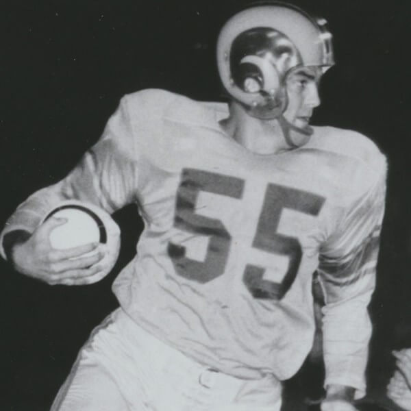
Most of you may be with me so far. I’m about to throw some curves, though, as we go higher. For starters, I came to realize that all double numbers (00, 11, etc., up to 99) look fast to me. Yes, all of them. That’s right, Sammy Hagar, 55 IS fast!
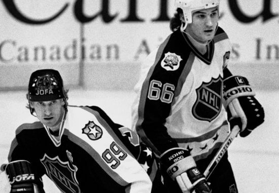
So is 66, which may not be as weird as you think. Recently we’ve had players like Mario Lemieux (pictured with a pretty quick number 99) …
… Yasiel Puig …

… and English cricket’s Joe Root (get it…”Root 66″?) …
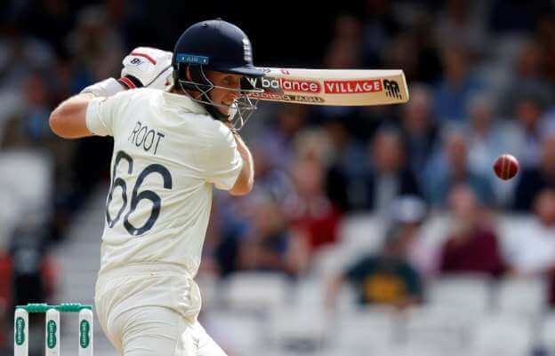
… so it’s not that much of a stretch these days.
Also, double numbers remind me of how old DC comics used to show the Flash in motion.
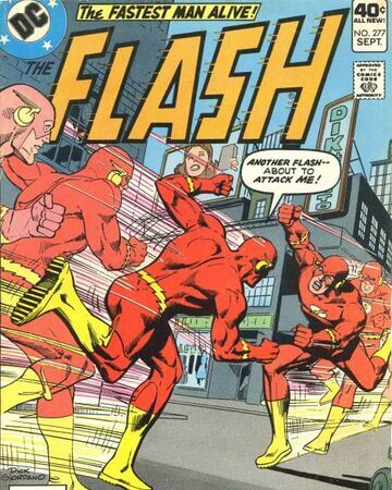
Multiple images of the same thing = speed.
Another probable curveball for you is this: for me, the second digit, not the first, is the primary indicator of a number’s speed. Forward motion is depicted as going from left to right, so the right side would be the front of a forward-moving object. The left (or rear) side is the secondary indicator. In other words, while we probably all see 84 as looking faster than 70, I also see 74 as looking faster than 80, and way faster than 86 or 89. This also means that while I see 41 as looking faster than 60, I see 61 as faster than 40, and way faster than 46. Again, I’m not suggesting that some linemen need to switch numbers with some backs and receivers, but if the numbering system went away or changed dramatically, I wouldn’t have a problem if they did.
Longtime CFL fans may still be with me. They are well aware that 70-79 are eligible receiver numbers. Check out Edmonton QB Warren Moon and his receiving corps back in the early 80s!
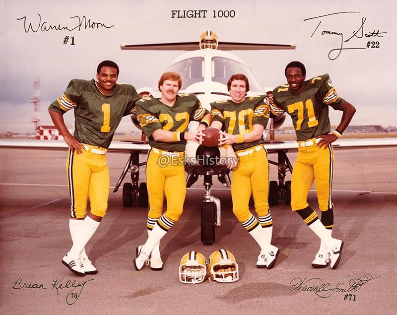
It only took me a couple of games to get used to these numbers. This photo made even more sense to me after I thought more about my method. You have the speedy little 22, the possession receiver wearing a medium-ish 70 and the tall, thin speedster wearing two fast digits. In this case, a perfect fit!
So what got me thinking about all this in the first place? More accurately, who got me thinking about all this? Earnest Jackson.
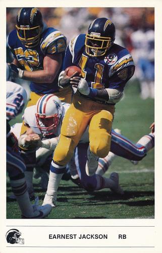
Wearing number 41 for the San Diego Chargers, he led the league in rushing in 1984 with more than 1,100 yards. The following season, number 41 had another thousand-yard season with the Eagles.
That wasn’t good enough for Philadelphia, who released him after the 1986 season began. He then signed with Pittsburgh, who issued him the number 43.
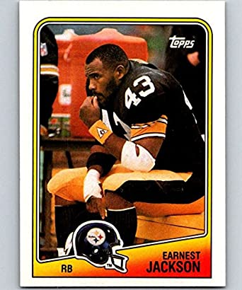
In three seasons with the Steelers he rushed for 910, 696 and 315 yards, according to Pro Football Reference. Did I know those stats back in my late teenage years? No, but I did notice that he seemed to have lost a step when he joined my then-favorite team. I remember thinking, it seems as if he can’t turn the corner when they run the sweep. Maybe it’s the number? No, it couldn’t be that, because Gary Anderson (not the kicker) wore the same number when he was a star with the USFL’s Tampa Bay Bandits (before he signed with the Chargers, which was the reason Jackson ended up with the Eagles).
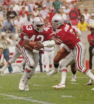
It was just a coincidence that, as Jackson went from a speedy number to a slightly less speedy one, his rushing numbers dipped as well. I do think the number change helped me notice the dropoff, though.
Where does your favorite number fall in this method? I have a handful and they’re in all three categories. Is there anyone you think looked off after getting a new number? Is there anyone you think got an “upgraded” number and the stats improved as well? Does anyone have another method of seeing numbers? Let me know in the comments.
Thanks, Jimmer! Great think piece — OK, readers, tell us what your thoughts are below!


A Fine Piece of Uni Sleuthing

Before we go any further — take a good look at the graphic above, from our pal Chris Creamer over at SportsLogos.net. Are the shades of red used by the Kansas City and Tampa Bay teams the same shade?
It’s not all that subtle. The answer is no.
A few days ago, Darren Rovell posted a tweet announcing that the Chiefs and Bucs 1) use the exact same shade of red in their primary logo, and 2) this is the first such instance of this ever happening in a Super Bowl. USA Today confirmed this as “fact.”
Many of you may be saying, hey…wait a minute. That can’t be true, can it? Chris posted an article on his website yesterday entitled, “Fact Check: Bucs-Chiefs the First Super Bowl Colour Match?” What was he fact checking?
In a great job of sleuthing by Chris (and another UW pal, Donovan Moore, who runs the great TruColor.net website), he found both of these claims to be decidedly false. Not only is this not the first instance of two teams’ primary logo colors being identical, it turns out the Chiefs red and the Bucs red aren’t even the same shade. They are close, to be sure, but they are not exact. There have actually been FOUR instances where two teams’ primary logo colors have been exact matches (including one that occurred in the infamous “Wide Right” game between the Giants and Bills), but next Sunday’s Supe won’t be the fifth.
Paul notes, “it’s a great bit of reporting and really shows why it’s so important not to just trust things because someone posts them on Twitter.”
Well done Chris. Hopefully this juicy detective work will be part of your first podcast with Paul!


Uni Concepts & Tweaks
Time for more Uni Tweaks from the UW readership.
I hope you guys like this feature and will want to continue to submit your concepts and tweaks to me. If you do, Shoot me an E-mail (Phil (dot) Hecken (at) gmail (dot) com).
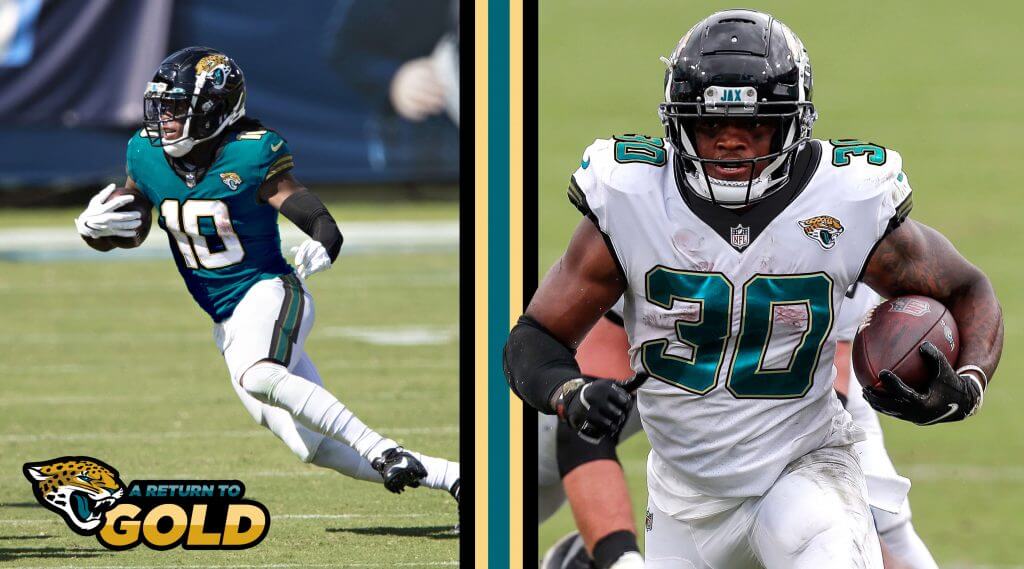
Today’s set of concepts come from Lee Traylor, who has a rebrand for the Jacksonville Jaguars. While their current unis are far superior to the mess they wore immediately prior, many people feel their current set is rather bland. Lee offers up this new concept:
He writes,
Greetings!
I’ve attached my concept for what the Jacksonville Jaguars may look like if they returned to a modern version of their original uniform. I’ve always thought the Jaguars nailed it right out of the gate with their original uni’s and lament that they’ve strayed so drastically from what was an instantly recognizable, unique set. They could even call it a “return to gold” – referencing both the early success of the franchise and their recent eschewing of the color.
Cheers from Texas,
Lee Traylor
Thanks Lee!
OK readers (and concepters). If you have some tweaks or concepts, shoot ’em my way with a brief description of your creation and I’ll run ’em here.


Guess The Game…
from the scoreboard
Today’s scoreboard comes from Harrison Huntley.
The premise of the game (GTGFTS) is simple: I’ll post a scoreboard and you guys simply identify the game depicted. In the past, I don’t know if I’ve ever completely stumped you (some are easier than others).
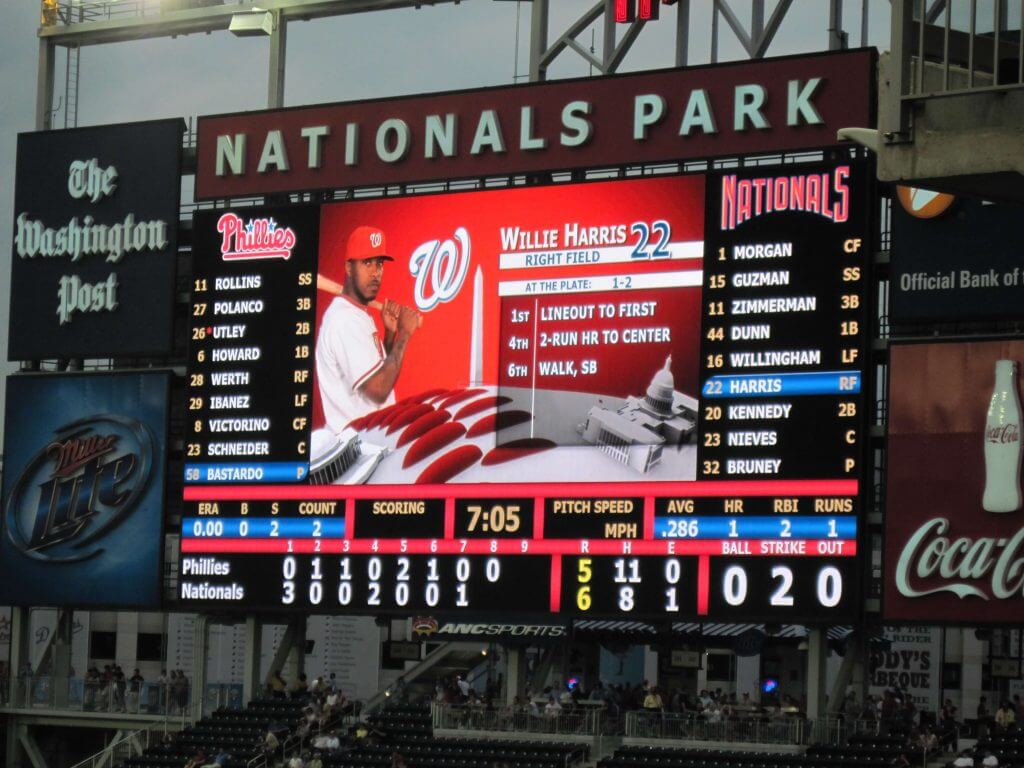
Here’s the Scoreboard. In the comments below, try to identify the game (date & location, as well as final score). If anything noteworthy occurred during the game, please add that in (and if you were AT the game, well bonus points for you!):
Please continue sending these in! You’re welcome to send me any scoreboard photos (with answers please), and I’ll keep running them.


Hi there. In case you missed it on Friday, I’m excited to announce that SportsLogos.net found Chris Creamer and I are partnering up on a new podcast project, which we hope will launch next week. You can learn all about it here.
Also: Teespring is currently running one of its periodic site-wide sales. From now through midnight on Monday, you can get 10% off of anything in the Uni Watch, Naming Wrongs, and Uni Rock shops by using the checkout code BYEBLUES (sorry, I don’t pick these code names). The 10% discount will come out of Teespring’s end, so you’ll save a bit of coin and Uni Watch will still make its full profit — a win-win!
Finally, I don’t usually plug weekday blog entries on the weekend, but Friday’s post, featuring an interview with the 95-year-old woman who designed the original uniforms for Shea Stadium ushers and ticket takers back in the early 1960s, was a big, big hit with readers. If you haven’t already seen it, you can check it out here.
Okay, that’s it from me. Handing the baton back to Phil now!


The Ticker
By Anthony Emerson

Baseball News: The Chicago Tribune looked back on 40 years of Jerry Reinsdorf’s ownership of the White Sox, and included this photo of prototype uniforms following his purchase of the team (from David Dahl). … P Blake Snell officially has a uni number with the Padres, 22, but it’s yet to be updated at the team store’s display. Oddly, P Yu Darvish’s number has been updated — they were acquired on the same day (from Jonathan Coffey). … New unis for Furman softball (from Timmy Donahue). … Here’s a look at the Fenway Park mass vaccination site.

NFL News: The Browns are soft-launching their 75th anniversary logo, and a new throwback alternate is in the works. … Yesterday, we ticker-linked this photo of the field for Super Bowl LV. One thing I didn’t notice, and that Matthew Brooks pointed out, was that walls around the stadium have Dolphins padding. Miami, of course, hosted last year’s Super Bowl, so maybe they’re reusing old padding to avoid the appearance of impartiality, seeing as the Bucs are playing in their own stadium? … Here’s a close-up look at the ball for next week’s game (from multiple readers). Reader Steve Hemsath notes that there’s no date or location on the ball, which is unusual. … There are several ground stickers on the Tampa Riverwalk for the city’s Super Bowl experience, featuring past games and championship rings. Unfortunately, they use current logos, so Super Bowls with the St. Louis Rams have LA Rams logos, among other issues (from Kevin C. Burns). … A Chiefs fan has created an $800 Patrick Mahomes jersey made of chain mail (thanks, Phil). … An eight-year-old Bucs fan wanted to show his support for his favorite team, but his Mom couldn’t afford to buy him a jersey. So he made one out of sticky notes (from Matthew Algeo).

Hockey News: Check this out — a life-size replica of the Stanley Cup, made out of hockey cards! (from Brandon Weir). … The Canucks will have a Reverse Retro homestand in February (from Wade Heidt).
.

NBA News: Thunder PG Shai Gilgeous-Alexander wore a double-stacked NOB last night, which is especially odd considering he wore the same uniform with a single-lined NOB two weeks ago (from Justin Rocke). … New Rockets F/G Kevin Porter Jr. will wear No. 3 (from Etienne Catalan). … Also posted in the soccer section: Blazers G/F Gary Trent Jr. wore Manchester United’s zebra-striped sweatsuit heading into the arena.

Soccer News: The third kit for Cobh Ramblers of the League of Ireland First Division will feature the logo of Breaking the Silence, a suicide awareness charity (thanks, Jamie). … Ligue 1 side Olympique Marseille have unveiled a new alternate kit without a uni ad, designed to celebrate the city’s African communities (from @bryant_rf). … New third kit for Mexican side Pumas UANM (from Ed Żelaski). … Paris Saint-Germain have a new Jordan-branded fourth kit. Paul, avert your eyes (from Brian Hattab). … Cross-posted from the NBA section: Blazers G/F Gary Trent Jr. wore Manchester United’s zebra-striped sweatsuit heading into the arena.

Grab Bag: Fox Sports Ohio and SportsTime Ohio will be rebranded as Bally Sports Ohio and Bally Sports Great Lakes respectively (from Tom Pachuta). … Australia’s rugby governing body has held a vote to decide which shade of gold the national team will use going forward, after years of complaints that the shade of gold looked too yellow (from Josh Gardner). … A leak has revealed the ranks in the new Space Force (from Timmy Donahue). … Also from Timmy: New Zealand’s police force has added a new uniform that includes a hijab for Muslim female officers. … During an episode of the Fresh Prince of Bel Air, Will Smith wore a Flyers hat, Sixers T-shirt, and Eagles sweat pants. Apparently the Phillies got the short end of the stick (from @btxj).


And finally… thanks to Jimmer for that fun think piece. I’m still trying to decide whether I believe there are “fast” or “slow” numbers, but for me — at least in football — I’m kinda leaning towards the single digits as “fast” numbers. What do you guys think?
Everyone have a great Saturday and stay safe. I’ll catch you back here on the morrow. Till then…
Peace,
PH
April 8, 2010, Philadelphia at Washington
The scoreboard is from April 8, 2010. The first thing I looked at was Adam Dunn’s BRef page since I knew he wasn’t with the Nationals long. He played with them in 2009 and 2010. Okay, good start. I tried a few other players like Adam Kennedy and Josh Willingham but they also played in 2009 and 2010. I then noticed Schneider is the catcher for the Phillies. I assumed this was Brian Schneider and I knew at the end of his career he was bouncing around. Sure enough, 2010 he was with the Phillies. I checked his game log and saw he played in 2 games at Nationals Park that year, one of which was way too low scoring. Thus, it was April 8, 2010.
The Miami dolphins walls just look like extra walls being brought in for extra on field suites boxes I don’t think it has anything to do with trying to make it as neutral a Super Bowl as should be, by the way do we know if the bucs will be allowed to blow the cannons on the ship after they score.
It’s an early picture…the upside down midfield logo shows they weren’t quite finished…so I’m sure the walls will be covered in time. Even if they’re not, it’s on the same side of the field as the main camera, so no one at home will notice.
The logo isn’t necessarily upside down. The picture might be taken from the opposite (East) side of the stadium. The pirate ship is in the north End Zone.
Yeah, I was joking, because I have a beef against tv-centric field designs. I miss when they used to throw a bone to the fans sitting on the other side of the stadium.
Regarding the “fast or slow” concept, I recall Mike Adamle who use to wear “1” because it made him appear taller. Perhaps someone should look at numbers that make you taller or shorter.
To me, the speed of a number (as well as any other attributes we might associate with numbers) is almost entirely based on the players I associate with the number.
I associate 00 with both Jim Otto
link
and Ken Burrough.
link
Pick a speed. ;)
I know what you mean, though. Between Walter Payton
link
and Spencer Tillman,
link
I associate 34 with being able to fly.
But but but…
doesn’t anyone wearing Bellotti Bold look faster (and stronger)???
Nah, they’d just look goofy.
In my first draft I had a mention about that accursed font, but I cut it out to save time.
I also cut out a part about Benito Santiago’s slow 09. After I did, I had a thought…even though I would like to see any football player wear 00, how about assigning 00-09 to all ineligible receivers? Then everyone else can wear any other number they want.
Totally shocked that you used a pic of Ken Burrough in a 72-‘74 Oilers uniform ; )
Of course!
I liked your examples down below. When you said Vince Coleman, that made me look up Rickey Henderson. His best stolen base totals were when he wore 39 and 35. Once he got the faster looking 24 his numbers ironically went down.
link
Sad to see the Space Force going with the Air Force and Army ranks instead of the Navy. Besides seeming right to have the Navy ranks like Star Trek, it also makes sense since both the Navy and Star Fleet will have “Ships” that should be commanded by Captains. It’s already confusing that the Army and Air Force Captains aren’t the same rank as the higher ranking Navy Captain. Army Captain is the same rank as a Navy Lieutenant, where as a Navy Captain is the same as an Army or Air Force Colonel.
I’m just bummed they didn’t introduce the rank of Cadet
+100.
Haha, who wouldn’t enlist to be a Space Cadet!
Hi Phil, thanks for this. First that came to my mind was that Eric Dickerson famously changed from number 25 because it was “too slow”. Reference link
I definitely think there are fast and slow numbers. For me, it seems to be based on whether the number is top heavy or bottom heavy. Top heavy numbers, like 2, 7, and 9 are the fastest ones for me. I think it’s because, due to gravity, anything top heavy has potential energy and looks like its about to fall or move. Conversely, bottom heavy numbers, like 6 in particular, and 4 as well, seem the slowest. Think of a triangle – if you have the point at the bottom, like the Penguins logo, it seems fast. If the point is at the top, like a pyramid, it seems rooted in the ground, and slow.
Also, when we think of athletic figures, it’s always broad shoulders and narrow waist, so there might be an association there as well.
That’s why I see 6 as really slow, the slowest number of all, but I see 9 as fast. Without question 7 is the fastest. And 1, 3, 5, 8, and 0 are neutral. 4, which due to the angles should be fast, seems slow to me due to the bottom weighting.
In any case a very good uni-related topic.
I wore double numbers during my extremely average sports career. 55 in youth football. It didn’t make me faster. 22 and 33 in high school baseball. They didn’t make me faster.
Jets LB Marvin Jones wore 55 as a defender because it was the speed limit.
Interesting topic today. The speed I associate with numbers has everything to do with the NFL number designations. From slowest to fastest:
70s (tackles)
90s (defensive linemen)
60 (interior linemen)
50 (linebackers)
40s (fullbacks and safeties)
30s (bigger halfbacks and safeties)
80s (receivers and tight ends)
20s (small/quicker halfbacks and corners)
10s (receivers)
I can’t say I like the recent trend of receivers wearing numbers in the teens, to me that was always for QBs/Ps/Ks, with the occasional bottom of the depth chart receiver if they ran out of 80s. But now that they do wear them, 80s seem slower to me.
Really dig the Jags concept… that original pants stripe, in particular, was perfection. Bring it back! Return to gold!
Corey Hart playing center field at 6’5″ wearing No. 1 seemed strange.
Tampa Bay Bandits look exactly like The Ohio State University.
Kyle Lewis (2020 AL ROY). 6’4″ and wears #1 in Centerfield for the Mariners…
Great work, Jim!
I associate doubled-digits with power, not speed.
Kevin Harvick was fast in a slow number (29), as was Vince Coleman.
Harvick’s stats got much better when he switched to ‘fast’ #4 (more wins in less time, a Cup championship too). Coleman in #1 and #11…not so much.
I’d say the Eagles did OK with the player who replaced Earnest Jackson in the #41…
Keith Byars.
Great read Vilk! I don’t know if I associate certain numbers as “slow” or “fast”. But certain ones just don’t/wouldn’t look “right” to me on some positions. Say, a running back in the 40s because for some reason I equate those with safeties as one example.
I also look at body type for certain numbers. Larry Fitzgerald’s body type was the prototypical 11 (thank goodness he came into the league as the WRs were allowed to wear 10-19 because I just don’t think he would have ever looked right in an 80-something.
Or the newly permitted 0 in college football. I really think that number is perfect for DL and doesn’t really look right any other player!
great job mothervilker. that was awesome,and i can’t disagree with the reasoning. and i love the photo choices leading to talking points that some people don’t know. much more interesting then the usual examples, loved loved loved it.
Glad you liked!
Dave Stapleton wore number 11 for the Red Sox in the ‘80s because he thought it made him *look* faster.
You acknowledged everyone in your “Fast Numbers” group except the great #55 of the LA Rams, Hall of Famer Tom Fears. Yes, he wore #55 for 4 years as an end between 1948 and 1951. Fears changed to #80 in 1952 and wore the #80 through the rest of his career.
Also of interest is the white football, used in night games during the 50s.
My synesthesia allows me to assign numbers color and attitude, but strangely, not speed.
The difference between KC’s red and the Bucs’ red reminds me of a game I saw in the 1980’s between the Chiefs and Washington. Though the colors were plainly different, there wasn’t enough of a difference to register on the low-def TV screens of the decade, and the resulting game between a red-white-red team and a red-white-white one was very difficult to watch. Fans not old enough to remember the NY Giants wearing navy blue helmets will have trouble imagining the handicap of bad TV.
Red-red-white > red-white-white
The picture of the Super Bowl field is definitely taken from the Eastern sideline, hence the “upside down” logos.
Clues:
Bucs will come out of the locker room in south west corner, with logo in south end zone., and team will be on West (NFC) sideline.
KC will be on East (AFC) sideline. You may never see that logo on TV, considering all the team players and the tarp that usually covers the grass area there.
The photo booths at the top of the 300 level are on the West side. No such booths on East side. (Because East side faces into the sun…)
Great stuff, today, Jim! I remember reading an article in Sports Illustrated sometime around 1987 or 1988 that discussed NFL players’ thoughts on this very issue – which numbers “fast” and which were “slow.” It’s stuck with me ever since I read it.
The consensus seemed to be that numbers in the 20s and low 30s were “fast,” (good choices for speedy tailbacks or cornerbacks) and numbers in the 40s were “slow” (best for fullbacks and strong safeties). I don’t know if their consensus lines up precisely with your analysis, but it’s interesting to see that numerals – and more specifically, how they’re used on sports uniforms – can convey a perception of speed (or the lack therefor).
It appears that MSG is using the old Vegas Gold penguin graphic against the Rangers when a goal is scored…
I’ve always thought double digit uniform numbers looked better aestheticly (more balanced?) than singles. In hockey and football they definitely look faster since those are “faster” sports, if that makes sense. I chose 88 as my Uni Watch membership card number for that reason. Plus I’m partial to even numbers, even to go so far as choosing an even-numbered checkout lane at the grocery store. Hey, we all have our quirks!
I’m partial to even numbers, even to go so far as choosing an even-numbered checkout lane at the grocery store. Hey, we all have our quirks!
Yes we do!
I’ll admit, there’s one store where I’ll pick either aisle 6 for Julius Erving or aisle 8 for Willie Stargell.
But if another aisle is free I’ll take it. My quirks take a back seat to getting home faster.
Gambling and sports. Sports and gambling. Forever linked. But I am really shocked how a media outlet can sell their branding like that – to any entity. I understand that every media concern is owned by a powerful, single minded brand, so I won’t talk about editorial integrity, but something about this just hits me wrong.
(And of course gambling is not yet legal in Ohio, so this is Bally’s attempt to “put it all on the line,” as it were.)
A cousin and I imagined wayyy back in our youth what would be “fast” and “slow” numbers for NFL receivers, who at the time were limited to 80-89.
We decided 80, 83, 85, 86 and 88 were “fast” for wide receivers and 81, 82, 87 and 89 were “slow” for tight ends. I don’t recall if we actually reached a consensus on 84; I thought it was “fast” and he felt it was “slow.”
My guess that if we were to slot 10-19 today it would be 10, 11, 13 and 16 for fast guys, 12, 14, 15, 17 and 18 for slow guys and a standoff on 19.