For all photos, click to enlarge
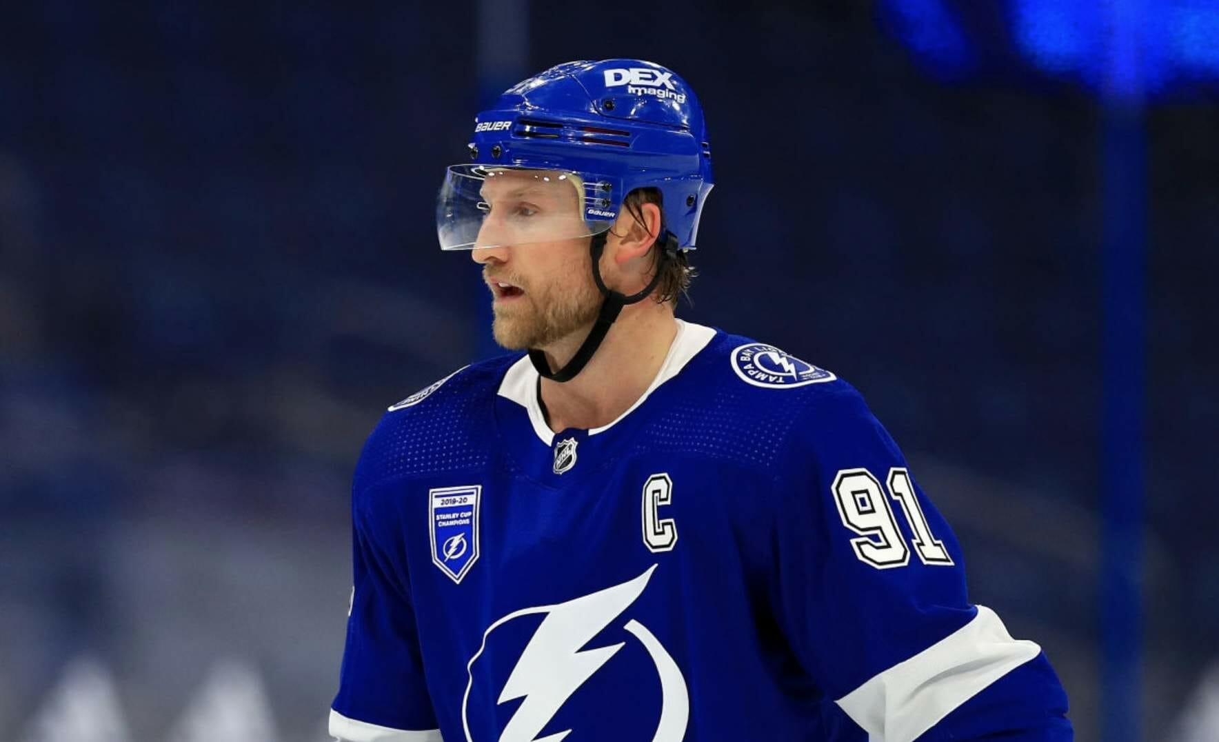
The NHL season finally began last night. In a move that got no advance fanfare, at least that I’m aware of, the defending Stanley Cup champs, the Lightning, wore a championship banner-themed jersey patch for their opening game. I couldn’t find a good close-up photo of the patch itself, but it’s the same logo shown on this puck:
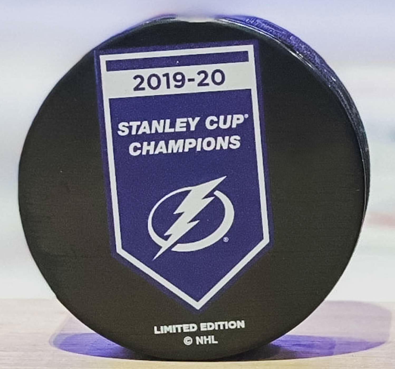
A banner-themed patch for the defending champs is not unprecedented. The Blues wore one at the start of last season, and the Bruins did likewise in 2011.
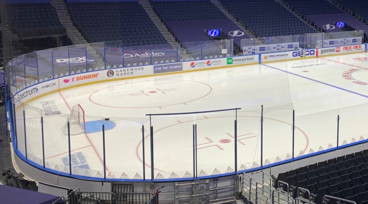
Speaking of the Lightning, they also added a bunch of Adidas logos to the base of the glass:
Those were two items from a flurry of uni-related moves that took place on the opening day of the NHL season. Here are some more:
• The Bruins added a memorial decal for Travis Roy, the inspirational former BU player who died in late October (additional info here):
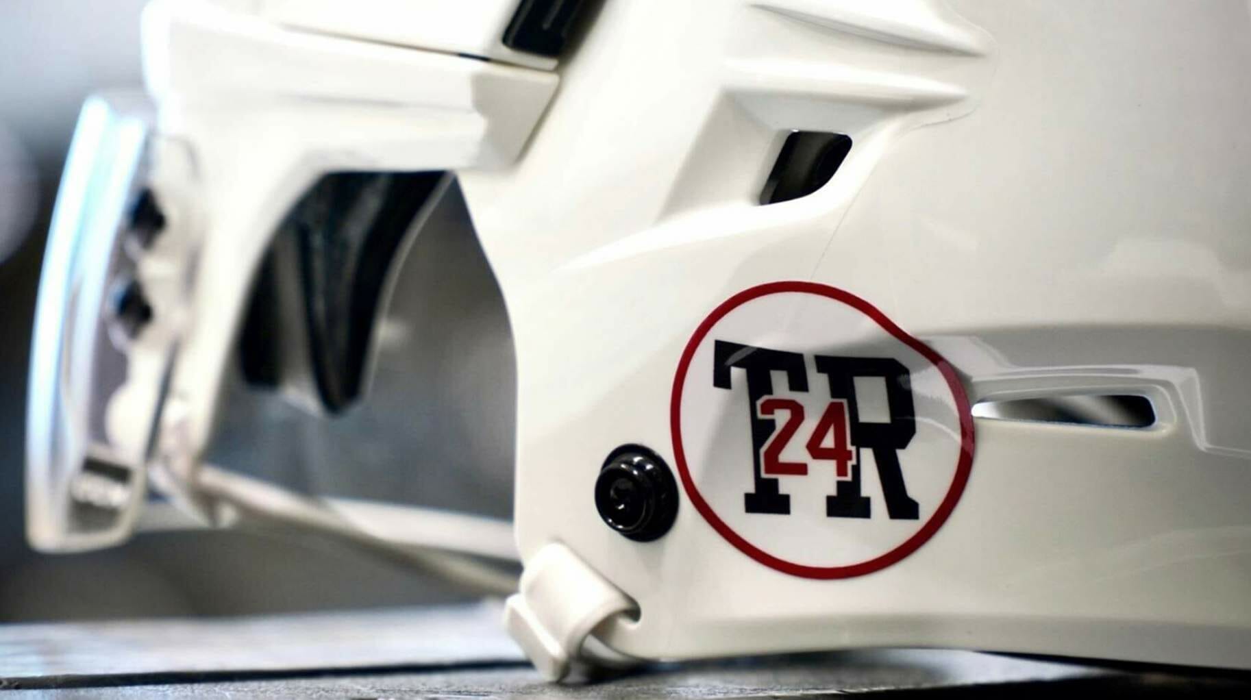
It’s an interesting design — you don’t see many memorials that feature the deceased’s initials and uni number!
• Speaking of the Bruins: With Willie O’Ree’s No. 22 being retired (as was mentioned in yesterday’s Ticker), newly acquired winger Craig Smith is changing from that number to No. 12. Smith had been assigned No. 22 after signing with Boston as a free agent in October, so he now has the unusual distinction of having been assigned a roster number that he never actually wore in a game.
• The Oilers honored longtime locker room attendant Joey Moss, who died in October, by wearing his NOB during pregame activities, plus they added a memorial helmet decal:
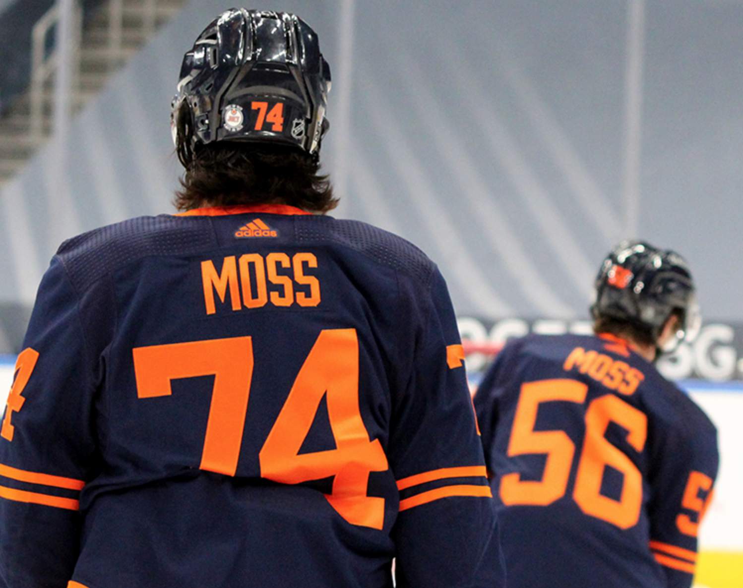
The weird thing about this is that the Oilers had already announced a helmet decal last week for former coach John Muckler — who, by coincidence, had the same initials as Joey Moss. In fact, when photos of the Muckler photo began circulating last week, some people mistakenly thought it was for Moss! No sign of the Muckler decal last night, so maybe the Moss decal was just for the season opener..? We’ll find out when the Oilers play their next game.
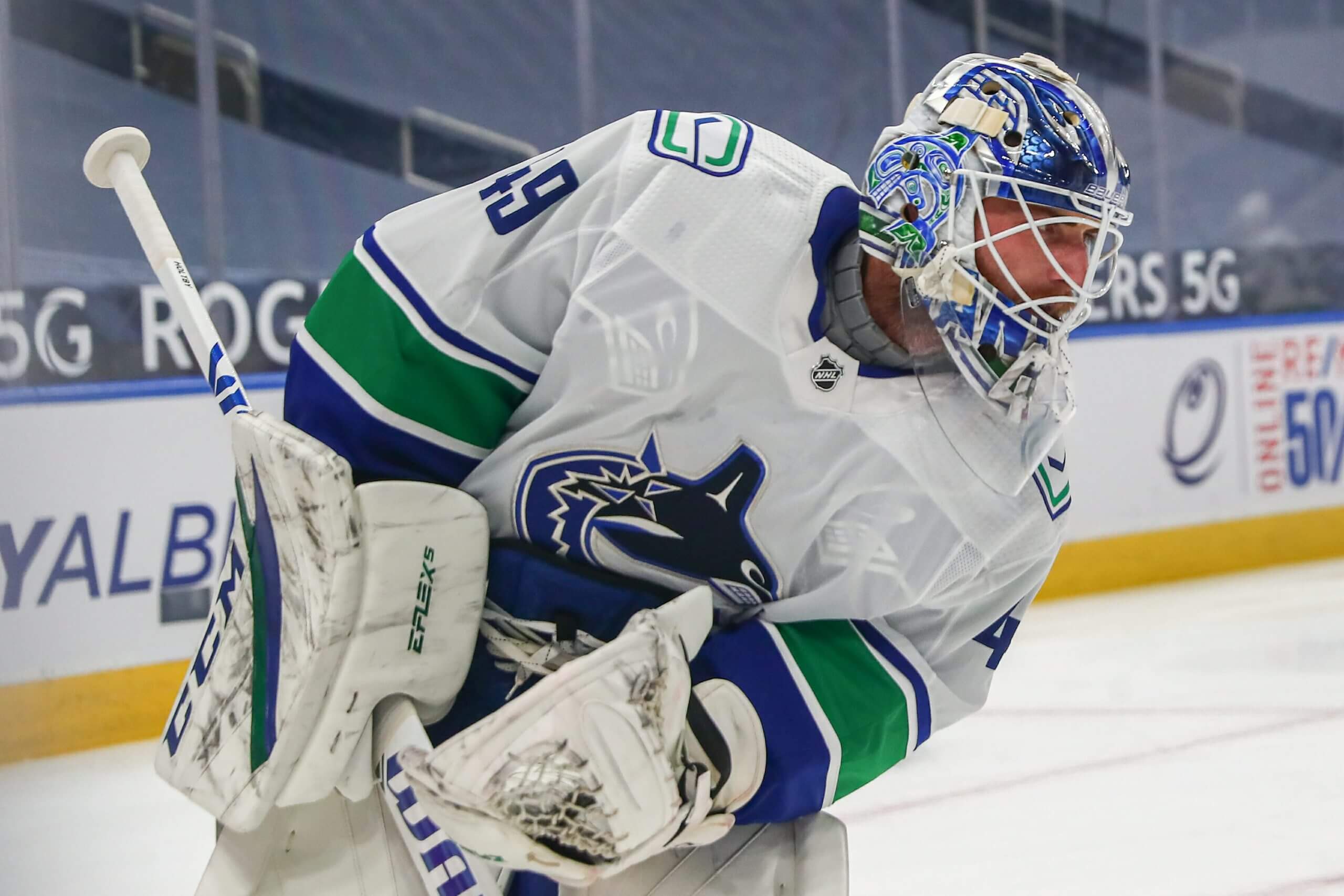
• Canucks goalie Braden Holtby’s chest protector logos were visible through his jersey:
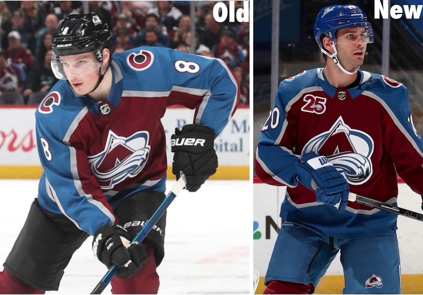
• Several readers got in touch to say that the Avalanche’s shade of blue appears to be lighter. But I think it just seems that way because their helmets, pants, and gloves are now blue instead of black:
• A bunch of teams waited until Opening Day to announce their helmet ads. I won’t mention most of them here because I don’t want to give the advertisers free exposure, but the Flyers deserve special mention for the disparity between what they showed in their announcement and what they actually wore on the ice. Here’s what they announced:
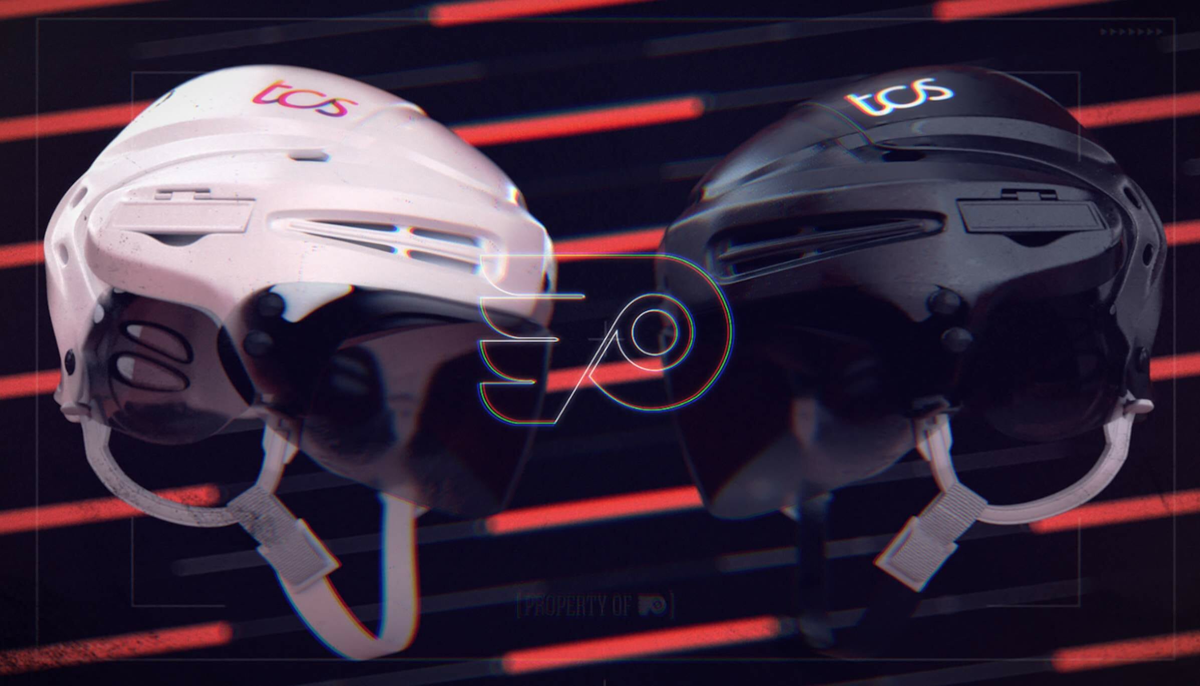
And here’s what they actually wore:
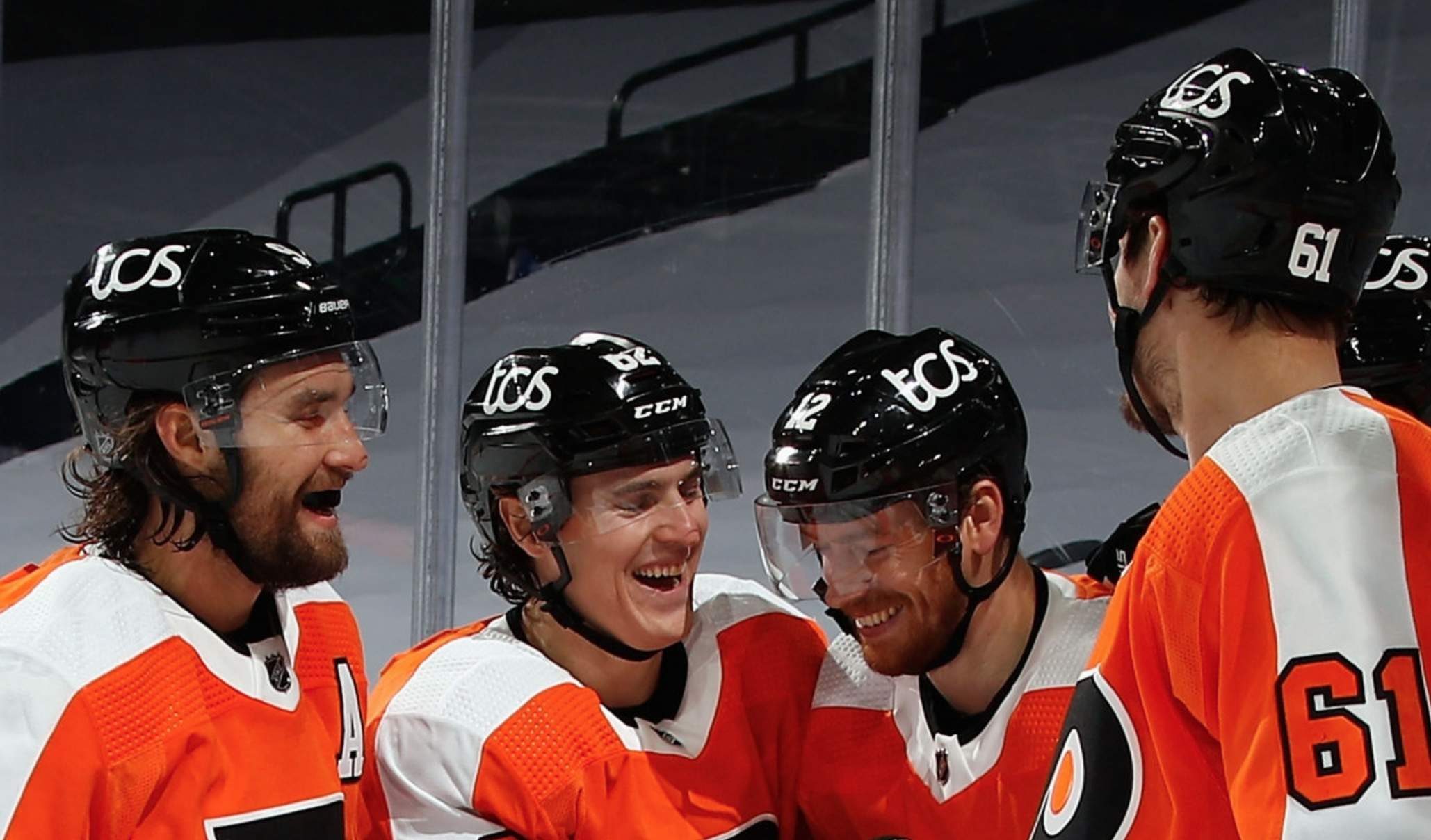
Yeesh — it’s bigger than the NOB lettering!
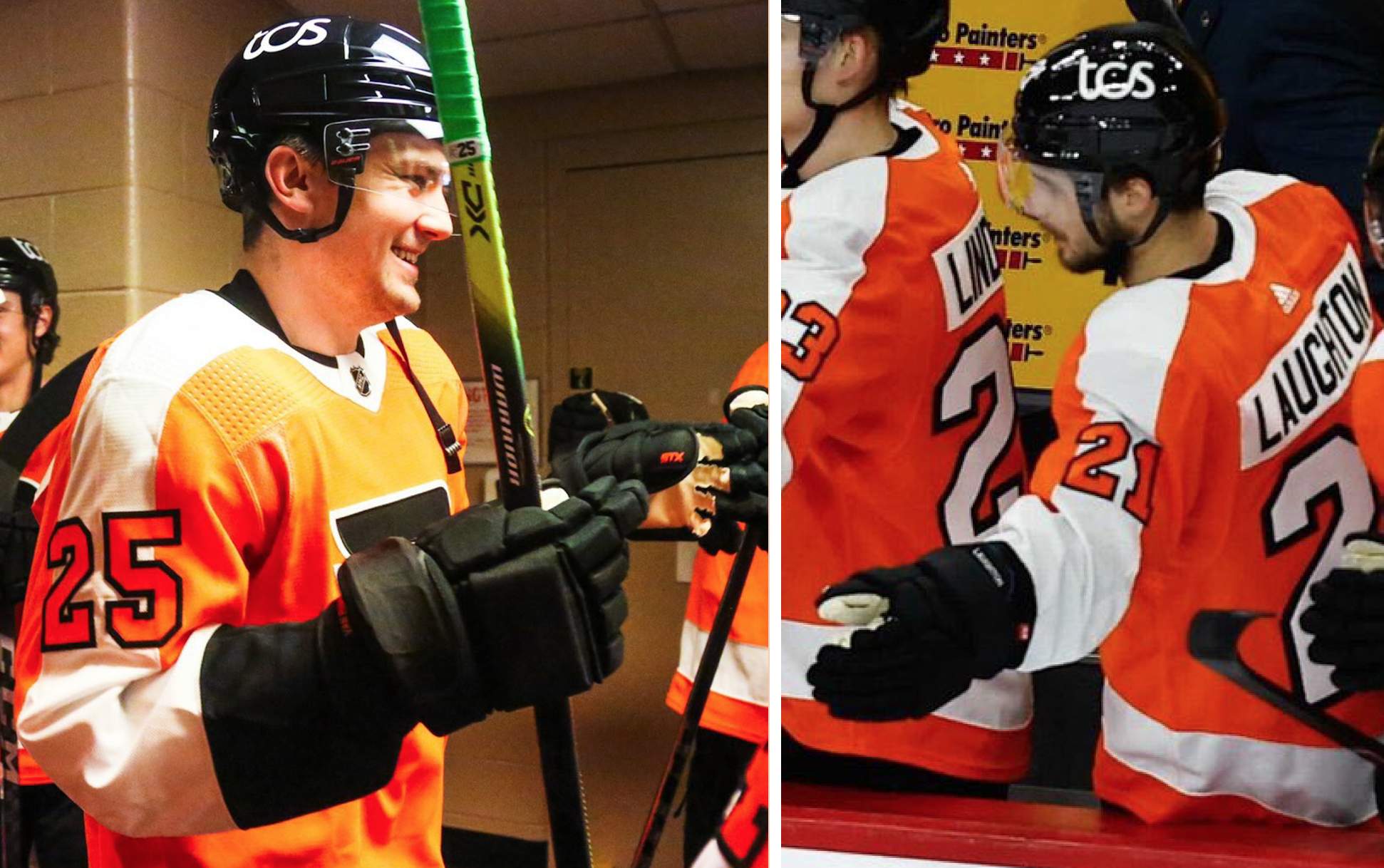
• Speaking of the Flyers, two of their players — winger James van Riemsdyk and center Scott Laughton — wore gloves with the STX maker’s mark blacked out, indicating that STX apparently declined to pay a licensing fee this season. If you look closely, though, you can see that they forgot to black out the maker’s mark on van Riemsdyk’s thumb:
• The NHL added more sponsor inventory advertising behind the benches. How bad is it? So bad that even Darren Rovell, who never met a business-oriented move he didn’t like, thinks it’s a bit much:
The NHL has approved more sponsor inventory for this season, including expanded dimensions for behind the bench signage.
It just got more challenging to watch my @NJDevils games…. pic.twitter.com/sN2wFxevM9
— Darren Rovell (@darrenrovell) January 13, 2021
• There were also lots of virtual ads projected inside the blue lines:
Looks like @NBCSports is using superimposed ads on the ice beyond the blue line. @UniWatch #NHL pic.twitter.com/WOMXB4dyM4
— TheFaceoff.net (@thefaceoffnet) January 13, 2021
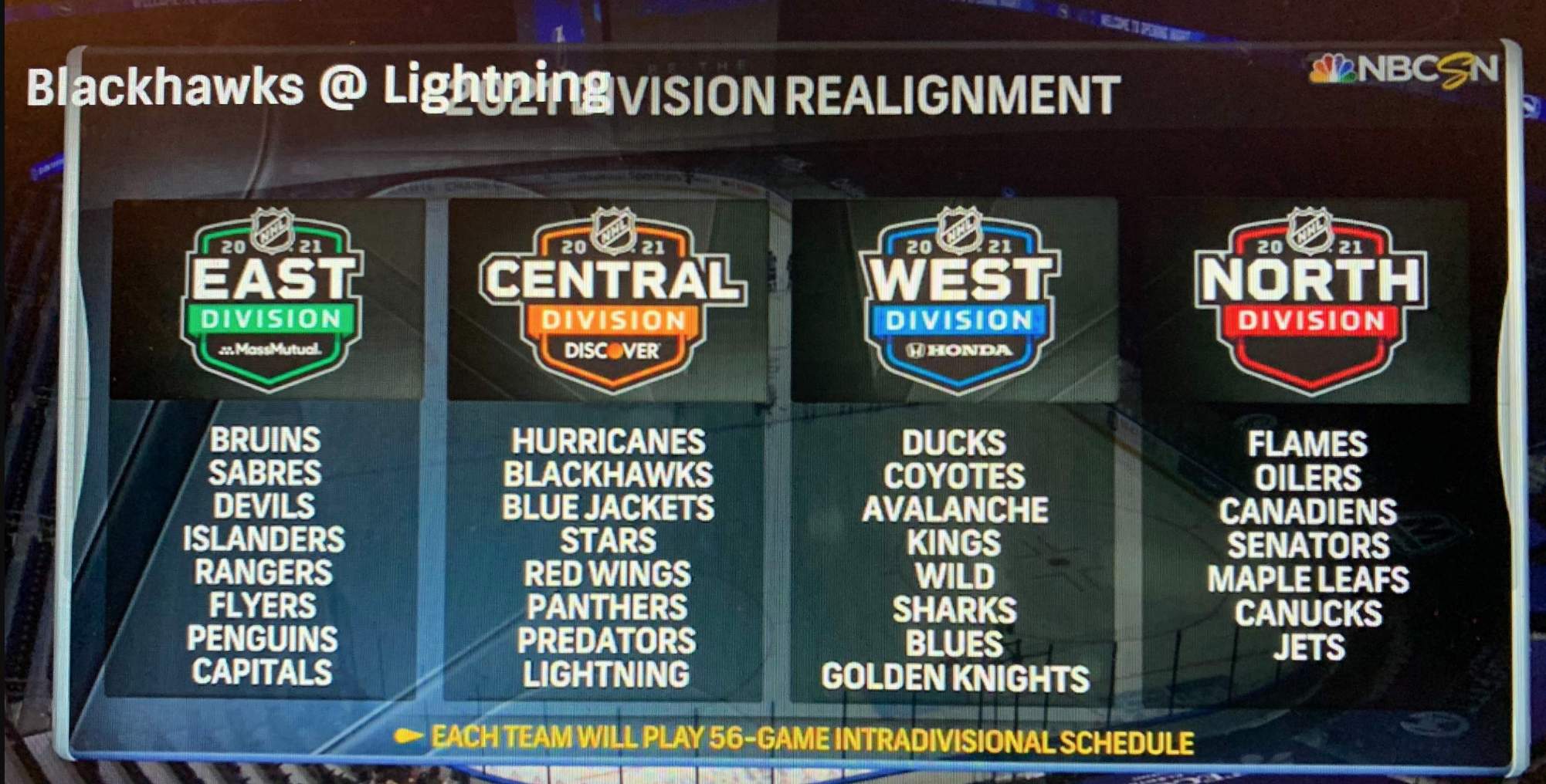
• In a bizarre bit of corporate theater that makes my head hurt, NBC showed the new advertised names for three of the league’s four divisions but omitted the fourth one (because it conflicted with one of the broadcast’s existing advertisers..?):
• Two teams — the Coyotes and Jets— announced their uniform schedules for the full season. (The Hurricanes did likewise last week.) Good for them! Why doesn’t every team do this?
Want more NHL uni info? Here’s my annual NHL Season Preview (which is already out of date due to all the last-minute announcements, but it still covers the vast majority of this season’s new on-ice developments).
(My thanks to John Baker, Shane Bua, Wade Heidt, Moe Khan, Jean Lefebvre, Mark Morgan, Alex Smolokoff, @RealNickAngel, @Kurzy17, @jayhod522, and @BigShotJeff for their contributions to this section.)
For all photos in this section, click to enlarge
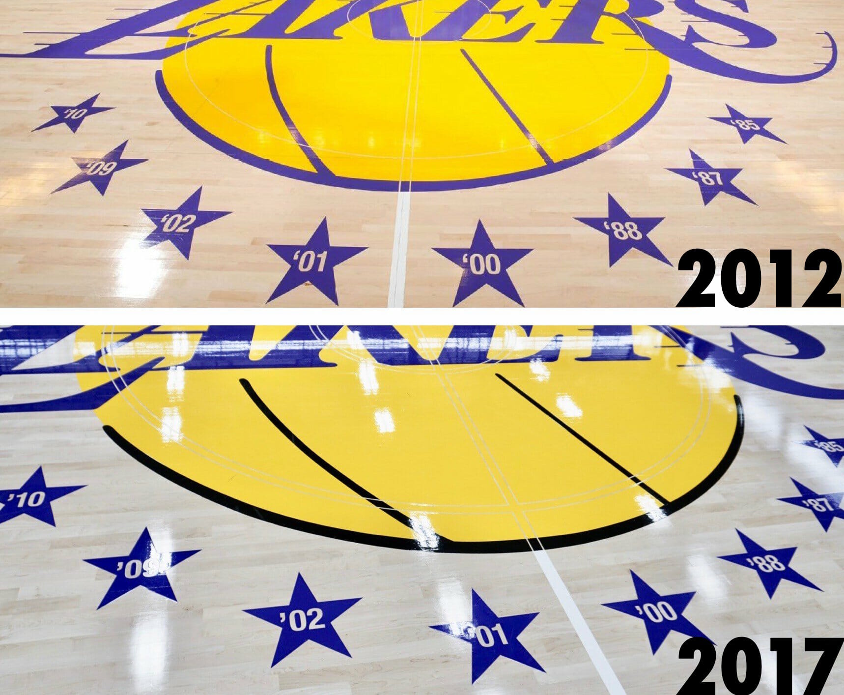
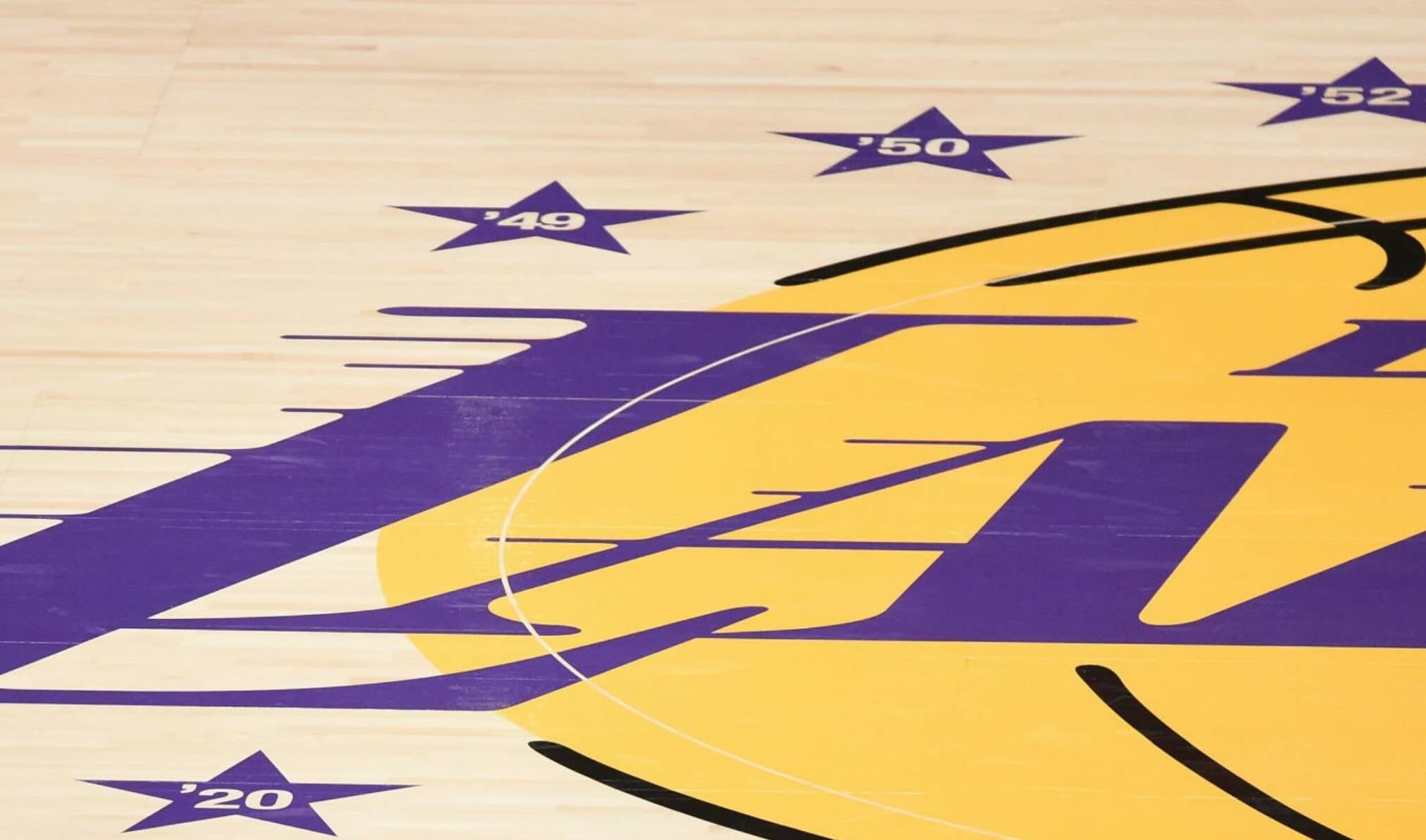
Seeing stars: The championship stars that the Lakers added to their center-court design in 2012 have long been apostrophetically problematic. As you can see above, the stars originally had backwards apostrophes, although the team corrected them in 2017. When they won the title last fall — their first since the stars were added to the court — I wondered if they’d screw things up again when adding a new star to the court.
But then I forgot about it — until yesterday, that is, when reader Rick Ho drew my attention to a new commercial that the Lakers have been running. It’s only half a minute long, so check it out:
Here’s the commercial pic.twitter.com/Qxxt8jP6fZ
— rick ho (@rickhodesigns) January 13, 2021
Rut-roh — right from the start we can see that they’re back to using backwards apostrophes:
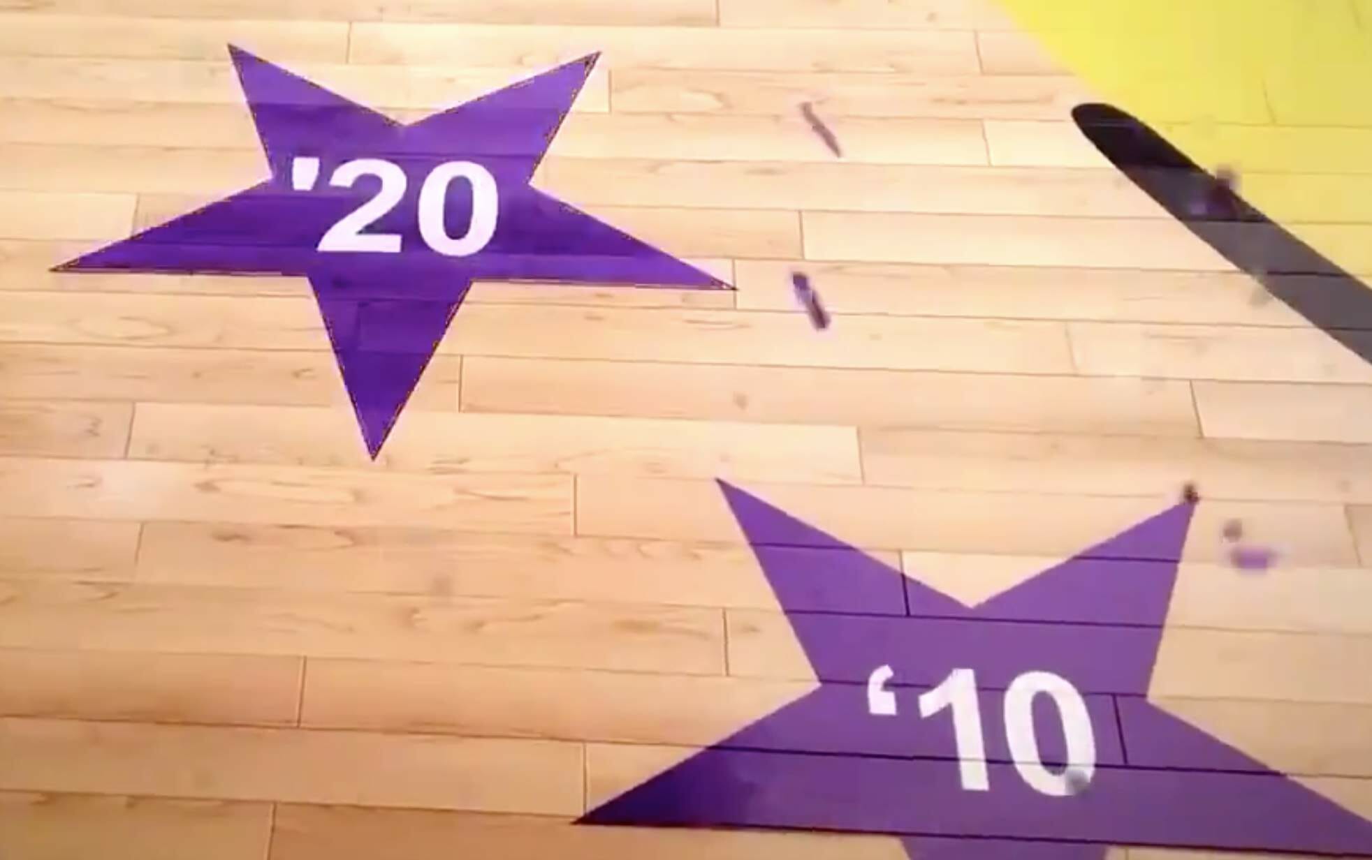
But things get even worse when they show the new star for the 2020 title — it has a straight apostrophe, which (a) is lame-o and (b) doesn’t match the other stars!
So pathetic — or so I thought.
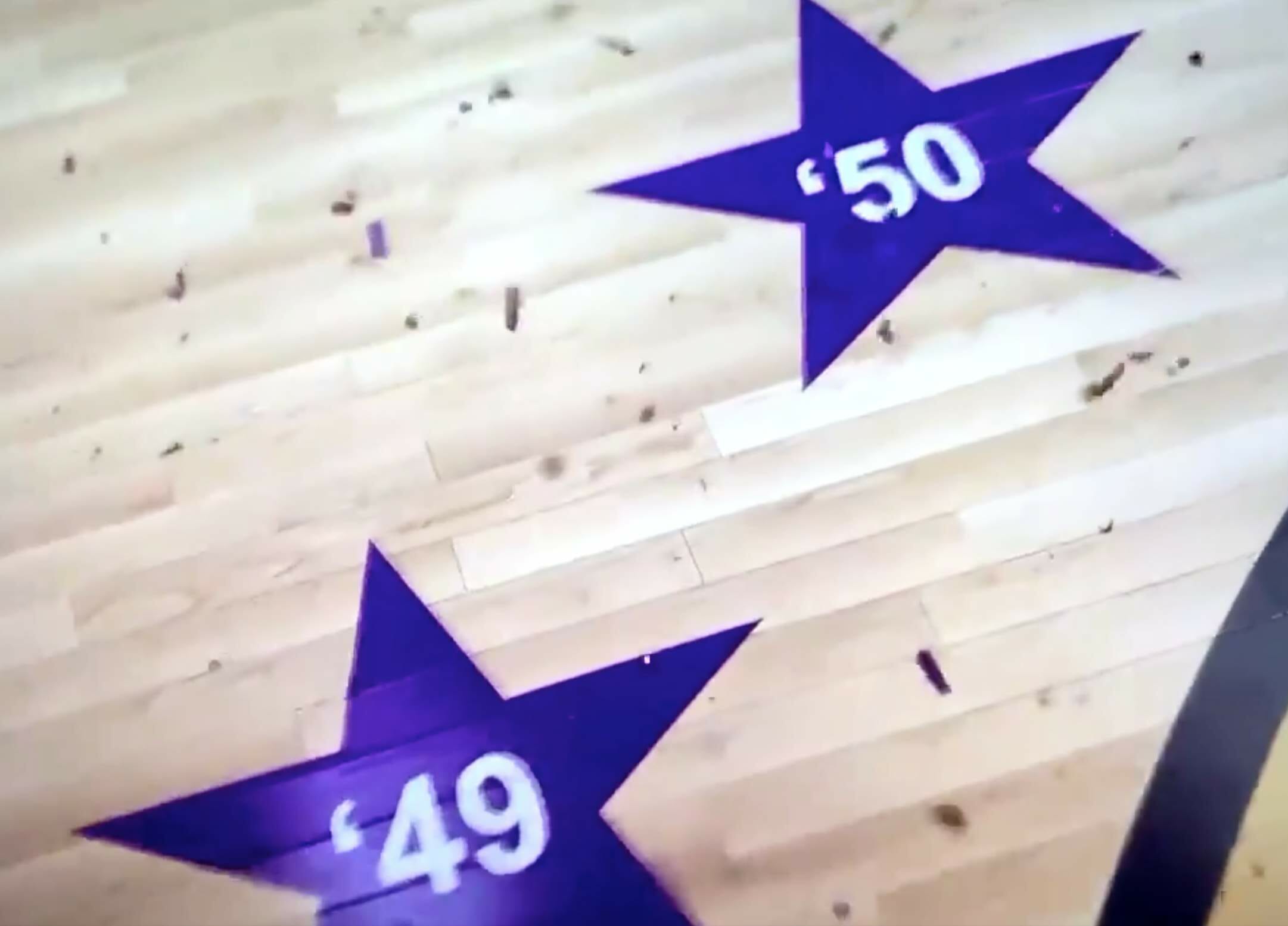
But then I found a wire photo from Dec. 22 — the day that the current season started — indicating that the stars, including the one that’s been added for last season’s championship, have proper apostrophes after all:
Hmmmm.
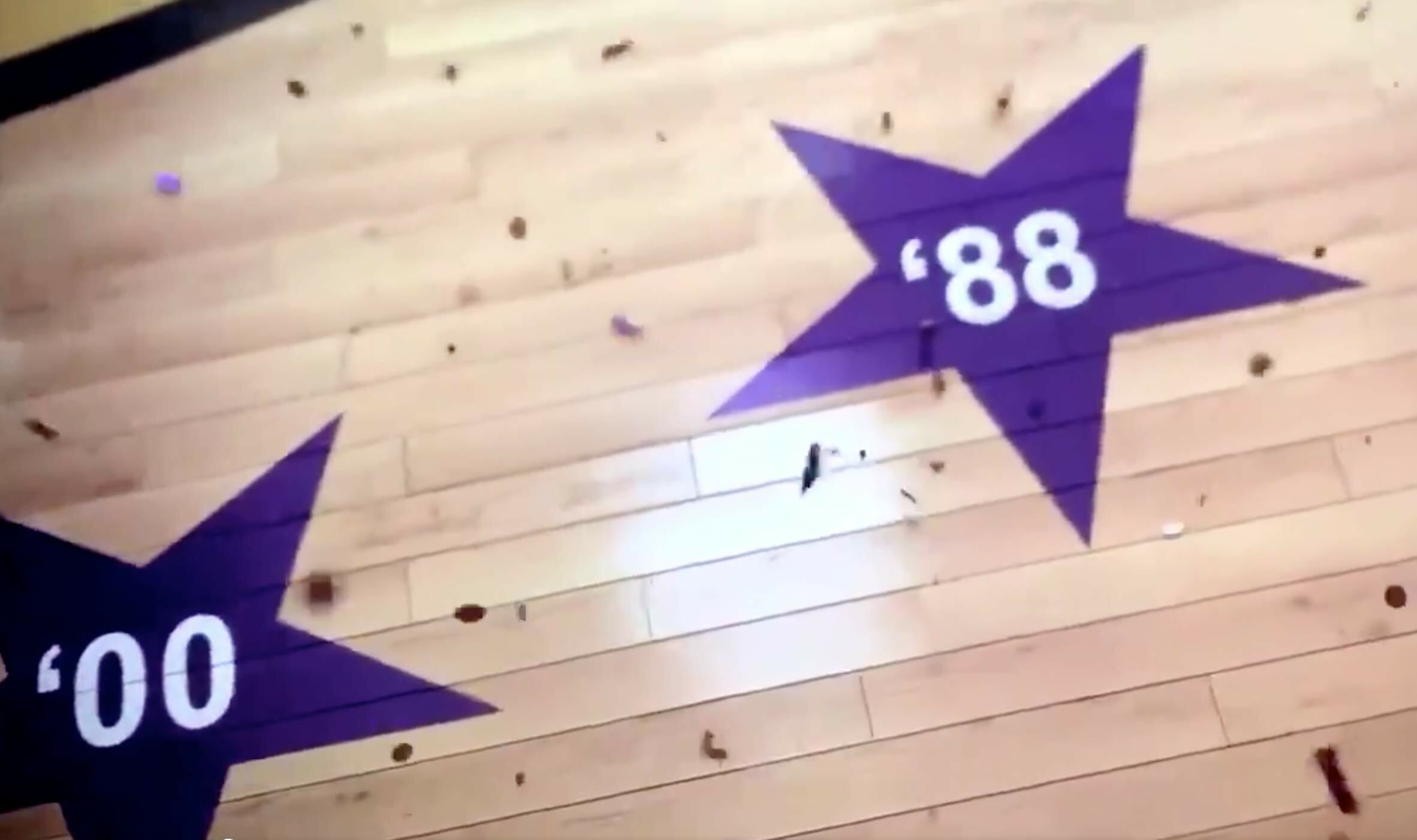
And that’s not the only thing that’s fishy in the commercial. In real life, all of the stars are oriented with their center points pointing straight upward. But in the commercial, the stars along the lower portion of the logo are rotated:
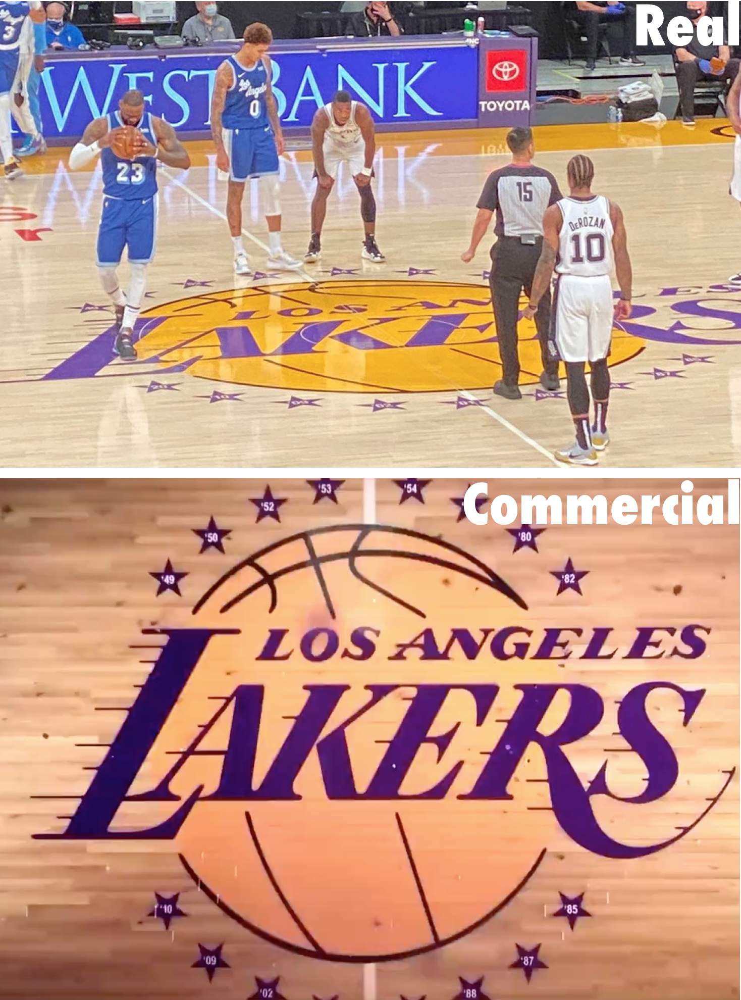
So it appears that the court in the commercial isn’t real — it’s just CGI, and the ad agency was sloppy about the details. That’s pretty bad, but not as bad as it would be if the Lakers had done it on the real court!
Still, the ad is the latest evidence that most Americans have no idea how to use an apostrophe, so we should probably just retire it from our punctuative toolkit already.
(Big thanks to Rick Ho, who deserves all the credit for this one.)
Click to enlarge
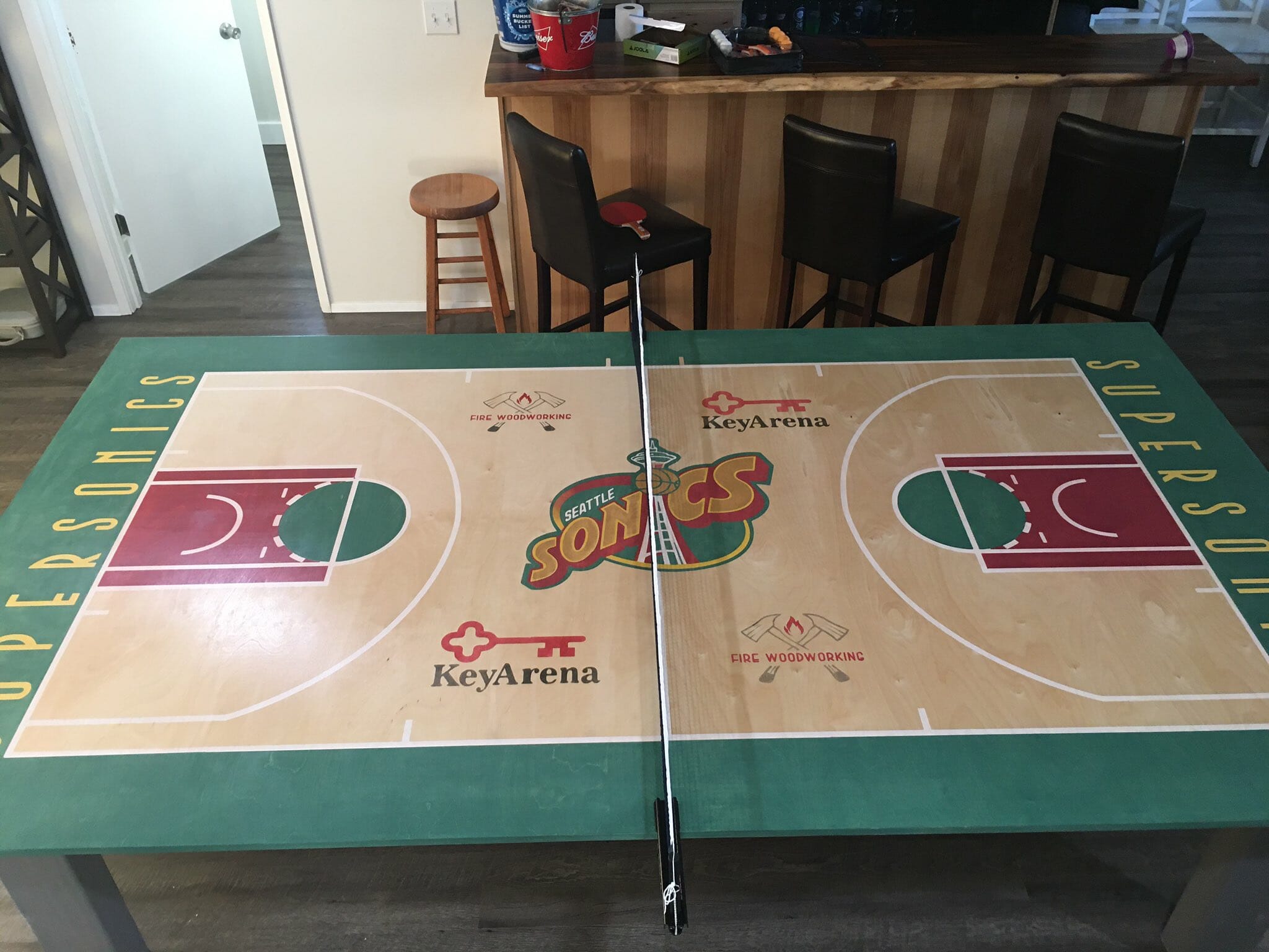
Why hasn’t this been done before?: Some guy on Twitter DIY’d himself a ping-pong table based on the SuperSonics’ old court design. How awesome is that?! And why haven’t we seen lots of ping-pong tables based on the designs of basketball courts, hockey rinks, football fields, soccer pitches, and so on until now? We need more of this!
(My thanks to Bridger Deschamps for this one.)
Click to enlarge
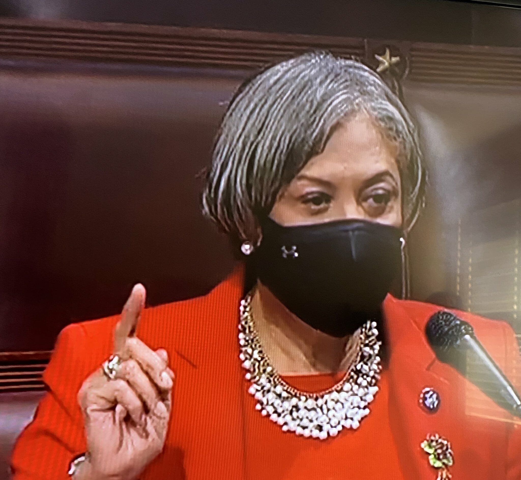
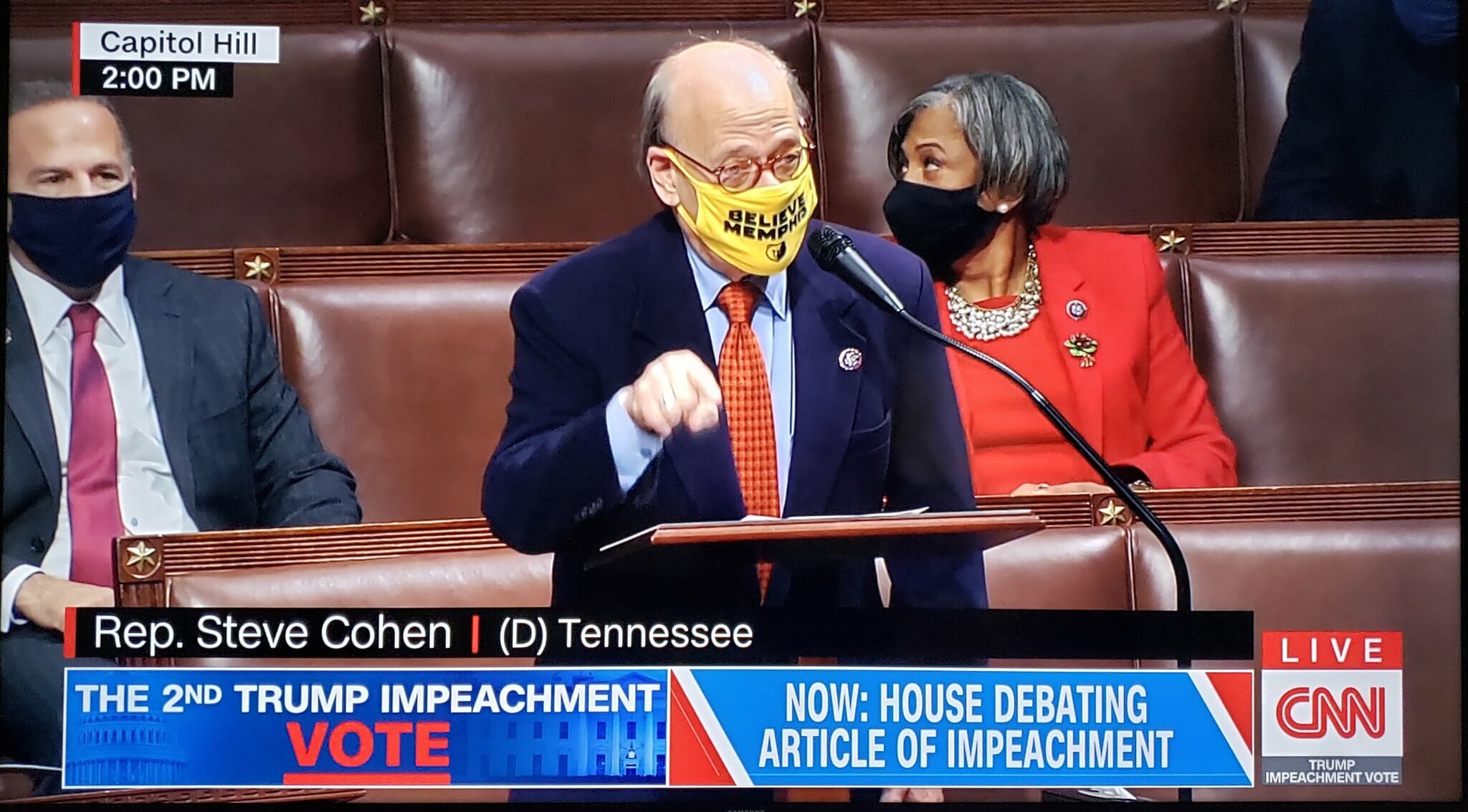
We must protect this House (literally): I don’t normally like logo creep or referencing corporate slogans, but Michigan Congresswoman Brenda Lawrence wearing an Under Armour mask on the floor of the House of Representatives during yesterday’s impeachment debate we almost too perfect.
Lawrence wasn’t the only one with a uni-notable face covering:
• Tennessee Congressman Steve Cohen wore a Memphis Grizzlies mask.
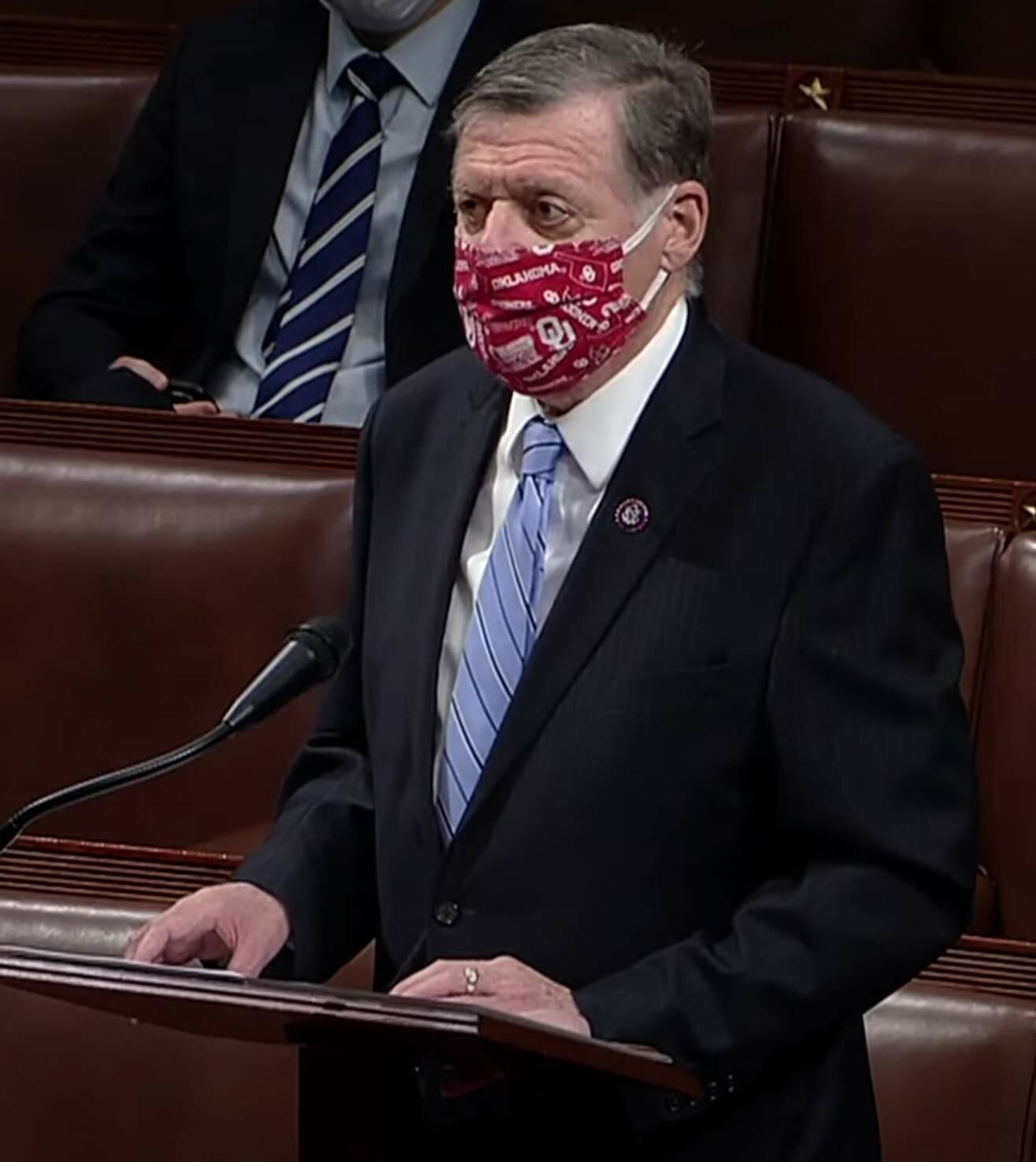
• And Oklahoma Congressman Tom Cole wore an OU mask:
(Thanks to Timmy Donahue, Danny Pedroza, @ChancePlett, and the Tugboat Captain for contributing to this section).
For all photos, click to enlarge
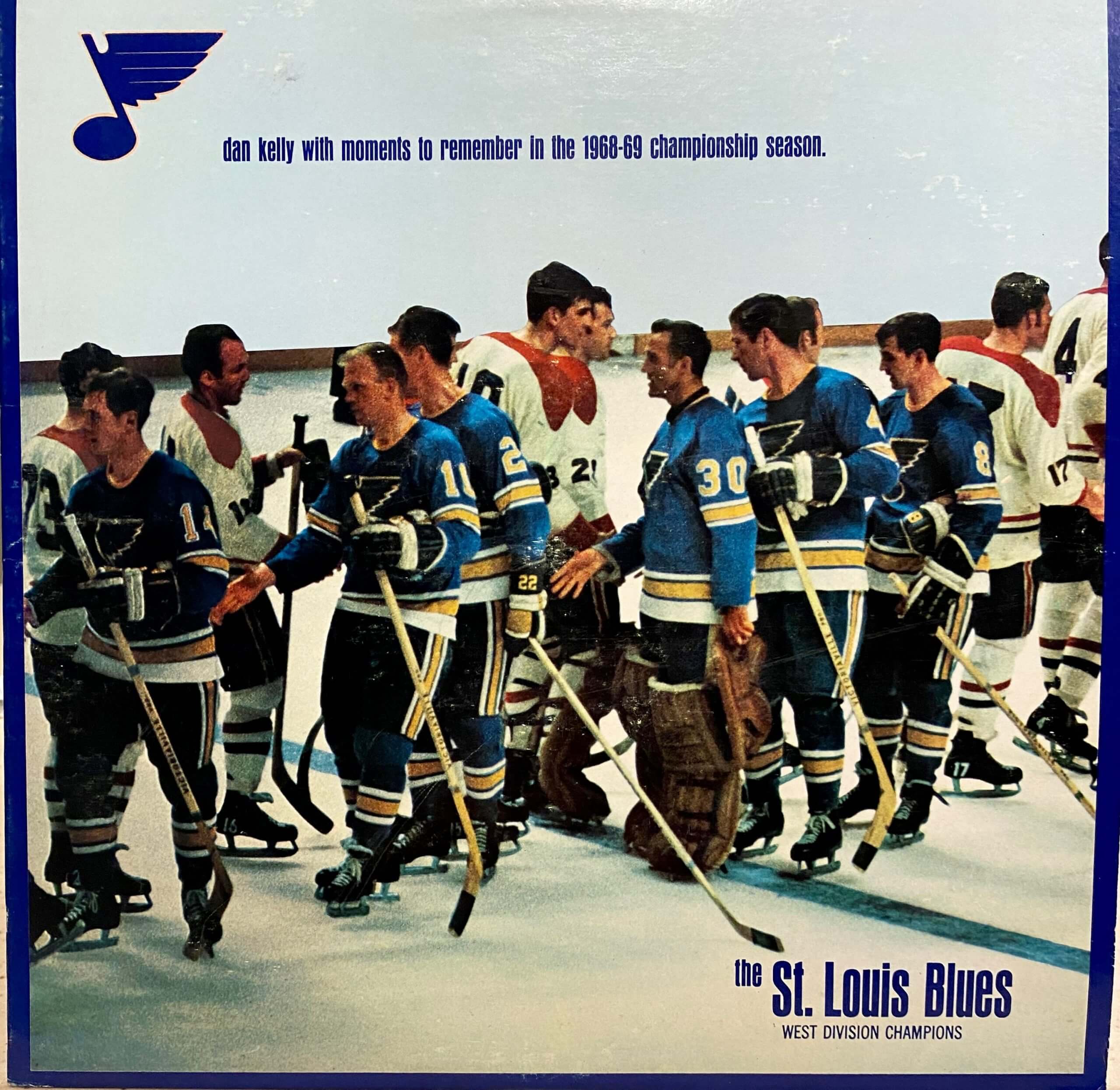
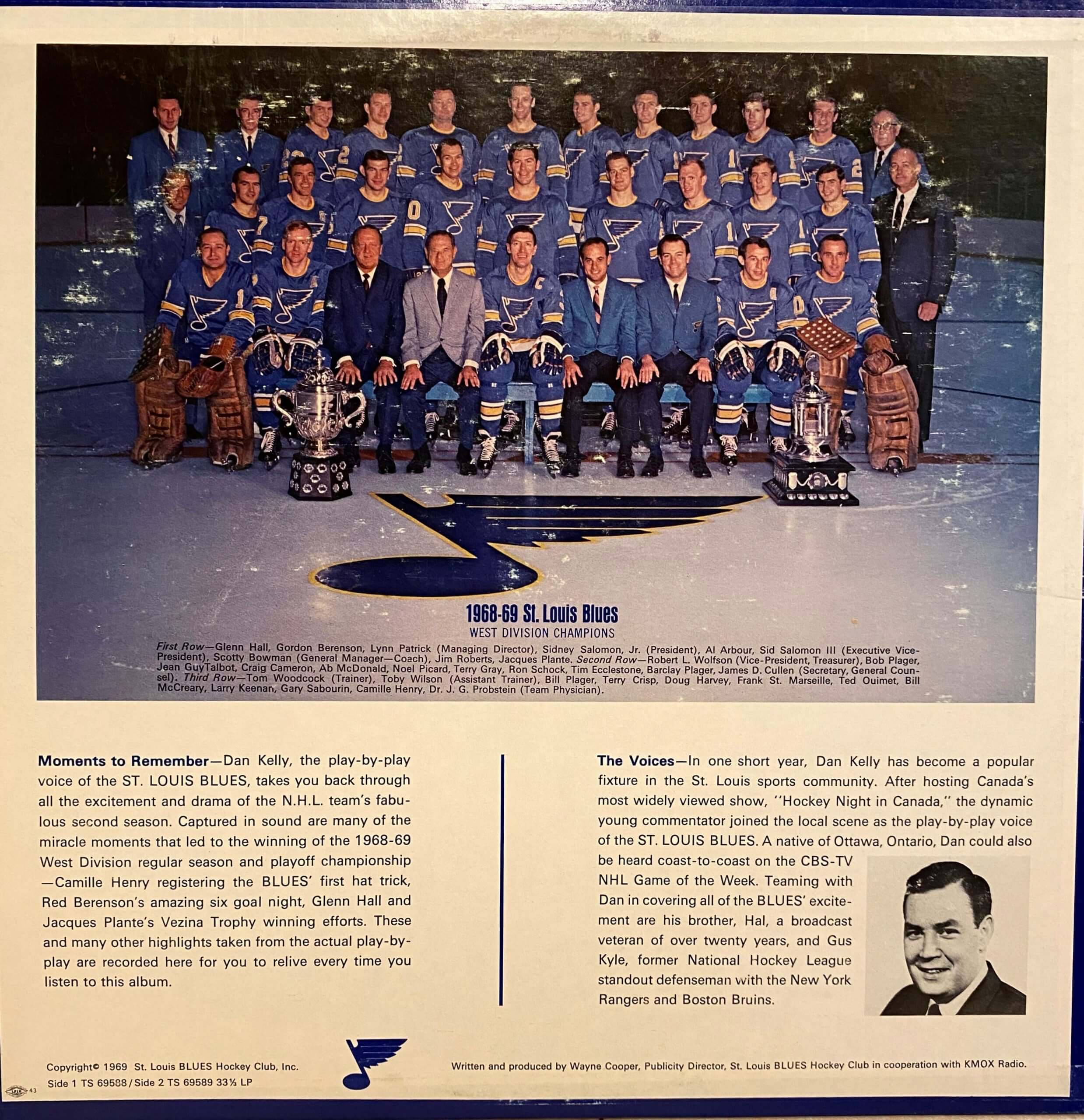
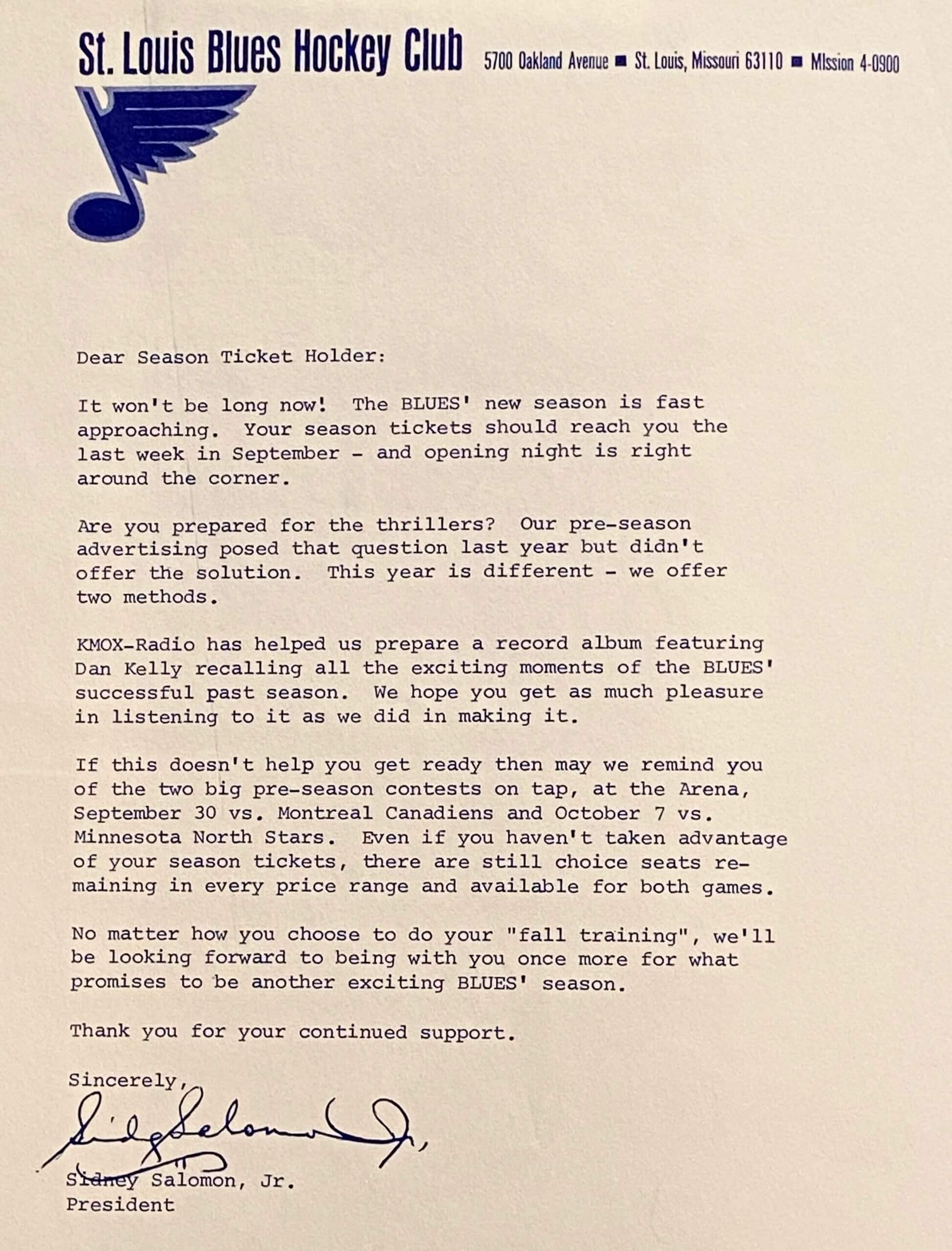
Too good for the Ticker: Cool thrift store find by longtime reader Frank Mercogliano, who found this super-cool-looking LP of 1968-69 St. Louis Blues radio highlights! Here’s the back cover:
Even better, a letter that came with the album — printed in blue ink on Blues stationery — was still tucked inside the LP cover:
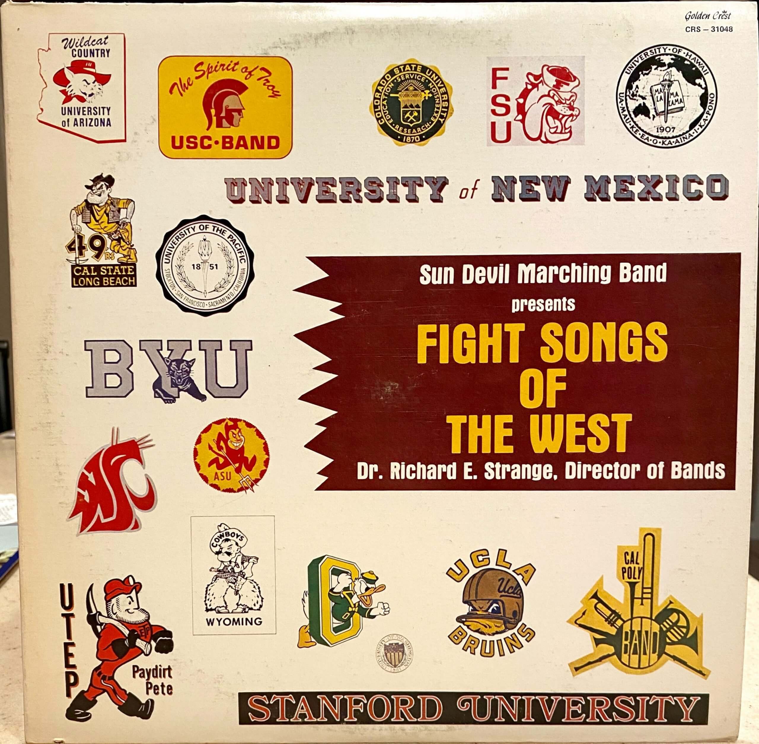
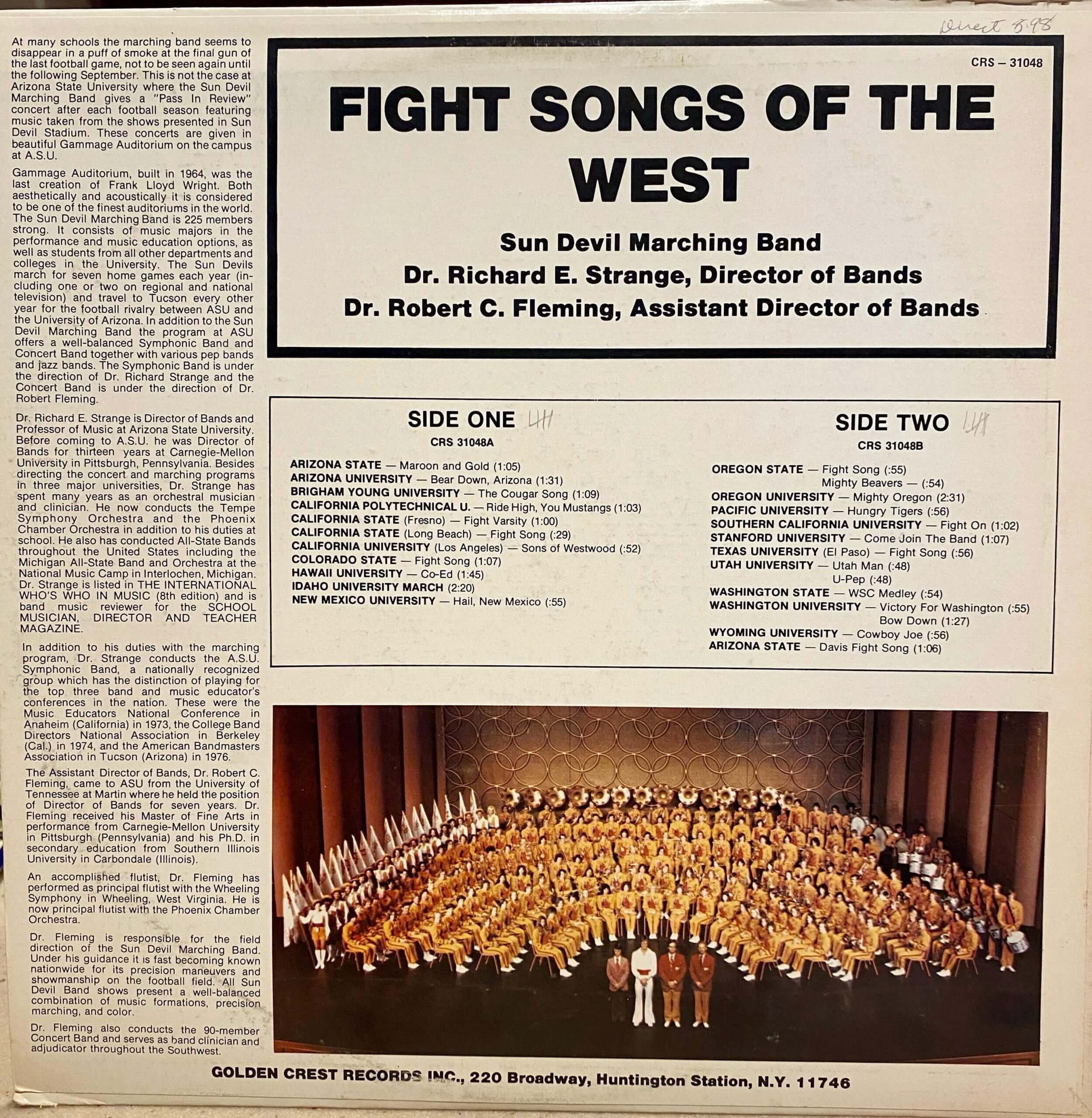
And there’s more: Frank also found this LP of the Arizona State marching band playing “Fight Songs of the West.” Check out these logos:
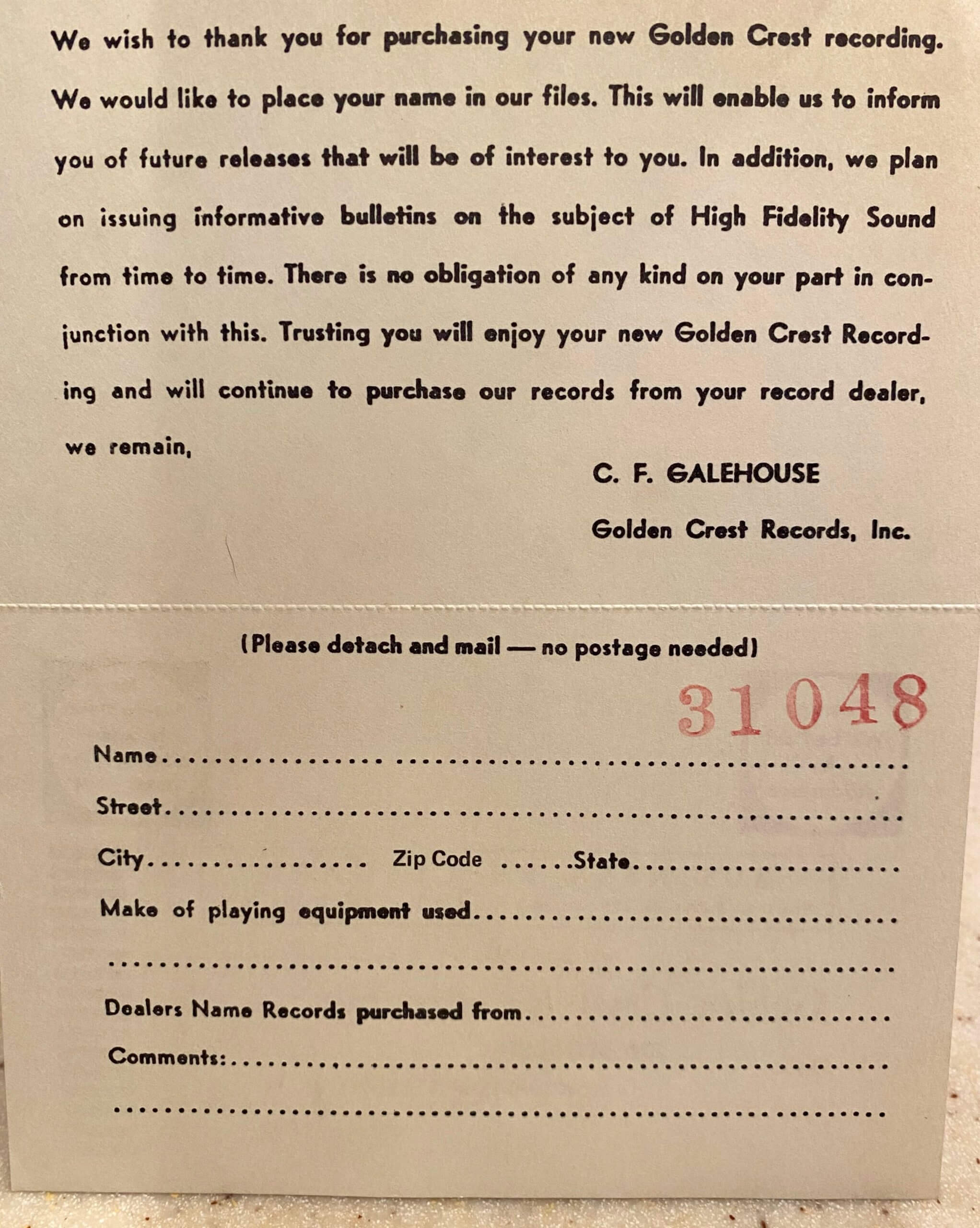
This one also had a treasure tucked inside — a reply card (which the original owner, obviously, never sent in):
The combined price for these two fine additions to Frank’s audio library? Eight bucks — what a score!
For all photos, click to enlarge
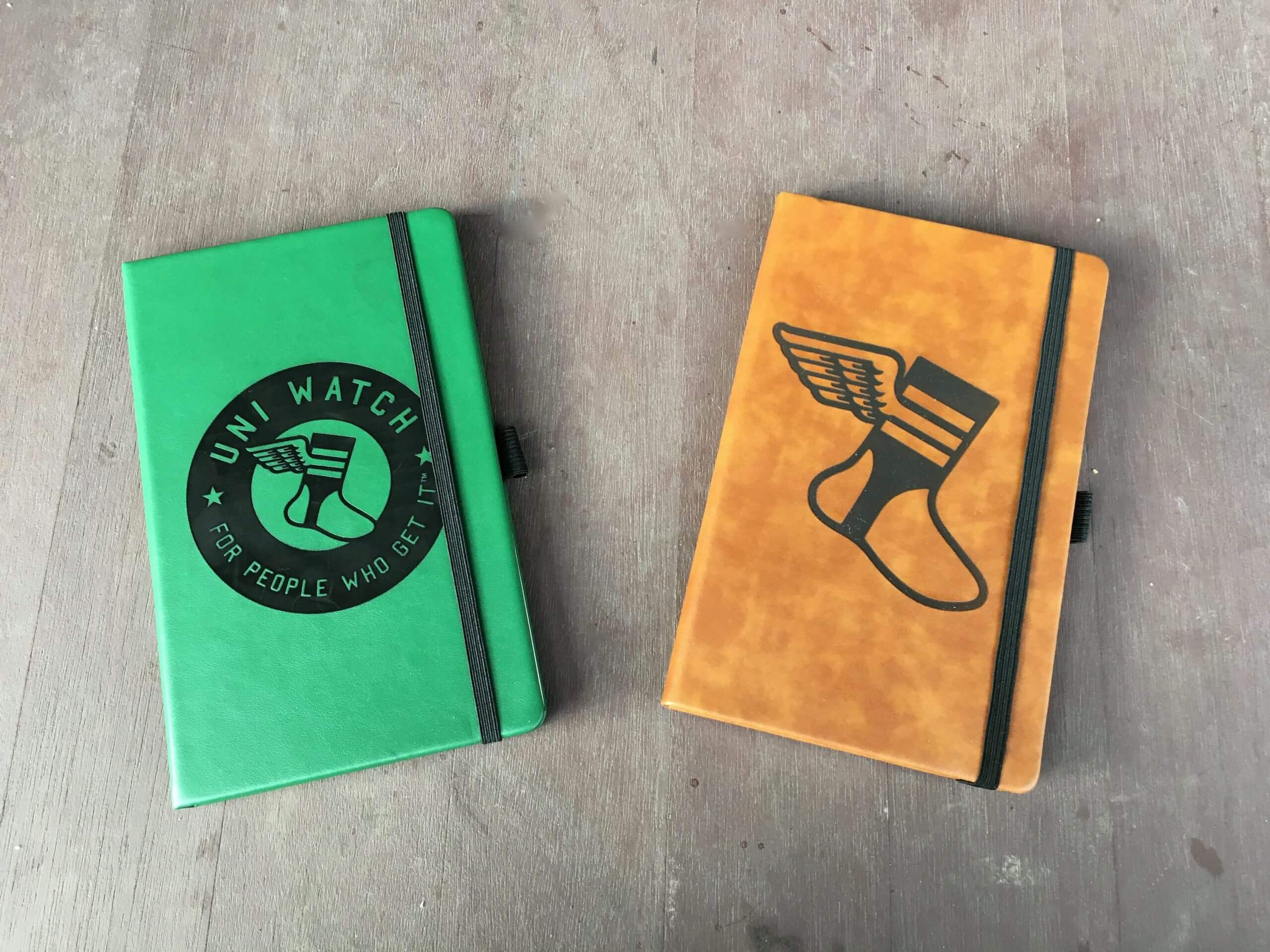
Feedback wanted: A merchandiser who’s interested in working with me sent me samples of a few products, including these leather-bound notepads with the Uni Watch logos laser-etched into them. Inside they have ruled paper:
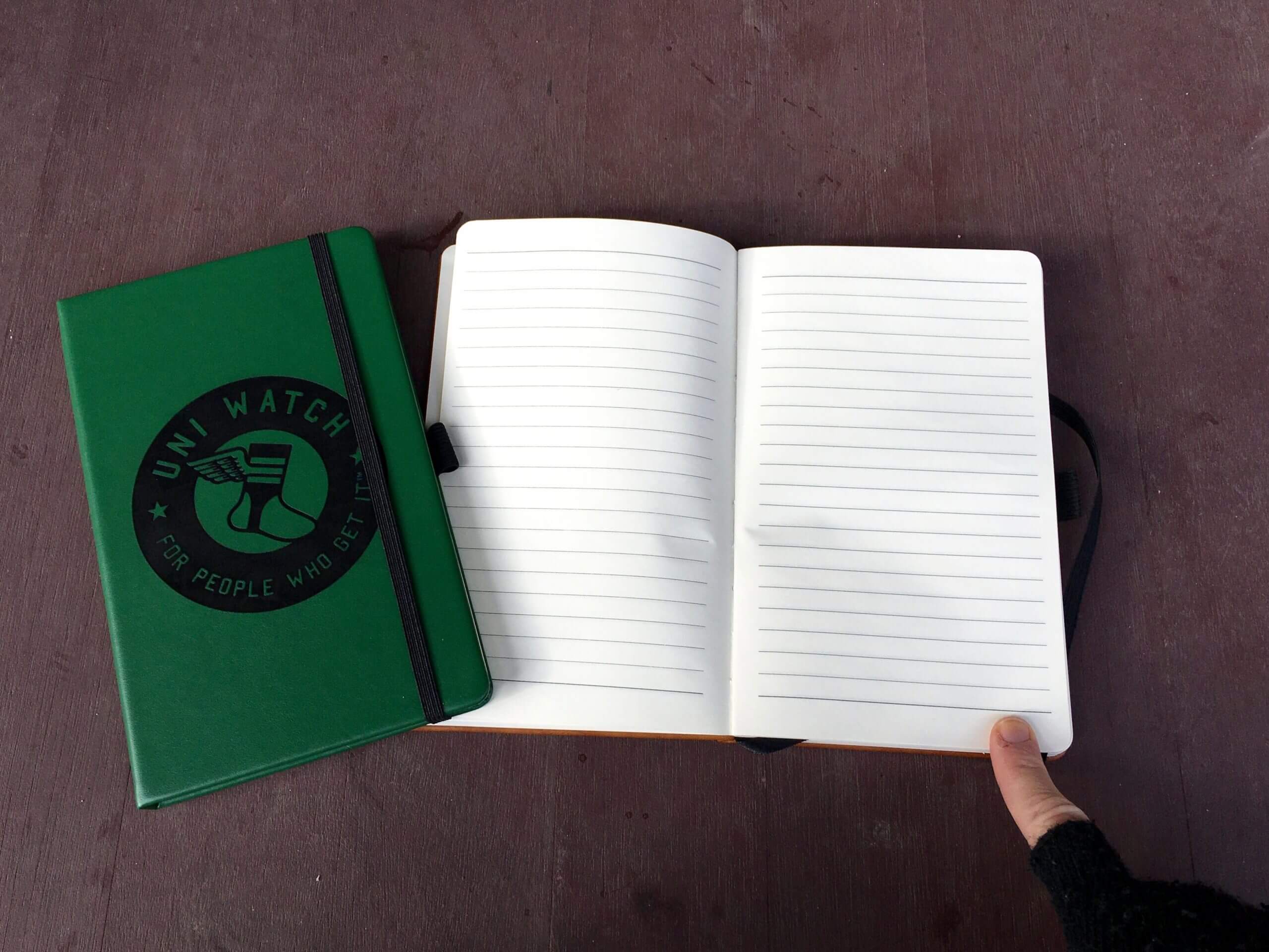
They’re very nice — but does anyone still write on paper anymore? Or to put it another way, would any of you actually be interested in purchasing something like this for, say, $15-ish? They can be made on demand, so there are no inventory issues, but I don’t want to put a product out there just for the sake of doing it.
My instincts say this isn’t quite right for Uni Watch, but my instincts have certainly been wrong plenty of times before, so let me know what you think. Thanks!
The Ticker
By Paul

’Skins Watch: All of these are from Kary Klismet: Here’s an interesting feature on Native American activist Ray Halbritter, who’s been instrumental in bringing national attention to the issue of Native-themed mascots in sports. … La Veta High School in Colorado has changed its team from “Redskins” to “Red Hawks.” … Pocatello High School in Idaho, having retired its old Native-themed identity, is requesting public submissions to help design a logo and mascot for its new “Thunder” team name. … The school district in Port Neches, Texas, has denied a former resident’s grievance over the local high school’s “Indians” team name but has said it is open to forming a commission to study the issue further.

Baseball News: Here’s a video of the Blue Jays’ new AstroTurf field surface being manufactured (from James Gilbert). … The latest Atlantic League team will be called the Gastonia Honey Hunters. … In a sadly Idiocratic move, the village of West Milwaukee is keeping the highway name Miller Park Way, even though the road leads to a stadium that is no longer called Miller Park (from Ray Barrington).

NFL News: Never seen this before: The Panthers have a sorta-kinda logo for their GM search (from Mike Chamernik). … Two breweries — one in Baltimore and one in Buffalo — have made a friendly wager on this Saturday’s Ravens/Bills game, with the losing brewery to pay for our friends at Oxford Pennant to make custom-made pennants to be hung in the winner’s taproom (from Andrew Cosentino).
College Football News: With Aloha Stadium closed because of structural and financial issues, Hawaii has decided to play its home games next season on-campus at the 2,500-seat Clarence T.C. Ching Athletics Complex (from Kary Klismet).

Hockey News: This is pretty awesome: an animated timeline of every NHL franchise’s cumulative winning percentage from 1917 through last season (big thanks to Andreas Papadopoulos). … Also from Andreas: Check out this shot of Burton Cummings, former frontman of the 1960s-’70s rock band the Guess Who, in an old Winnipeg Jets uniform. … New mask in the works for Canucks G Braden Holtby (from Wade Heidt). … Check out how the Notre Dame equipment staff packs the team’s jerseys — with just the NOBs showing (from Jeff Brown).

NBA News: When yesterday’s James Harden blockbuster trade was announced, ESPN Photoshopped Harden into a Nets uniform with last season’s ad patch. … Here’s a great old Puma sneaker ad featuring Clyde Frazier in a backwards NBA All-Star jersey (from @NFL_Journal).

Soccer News: The New England Revolution are expected to release a new shirt in March. … La Liga side Athletic Bilbao is adding a new chest patch for today’s Supercopa de España semifinal against Real Madrid. … Manchester United has somehow managed to wear nine different kit combos in 17 games (from Trevor Williams). … Looks like more dishwater may be on the way in Los Angeles, as LAFC’s new “linen” away kit has leaked (from Trevor Williams).

Grab Bag: A cycling fan has a collection of more than 2,300 jerseys. … The Blue Point Brewing Company — a brewery named after my hometown, although it’s actually located in the next town over — has a really crummy new logo. … In a victory for press freedom and confectionary justice, a federal appeals court has ruled that The Louisville Courier-Journal can publish the term “Derby Pie” without violating any trademark rules. I’ve been publishing my own Derby Pie recipe each spring here on Uni Watch for many years and look forward to doing so again in a few months (from Eric Bangeman). … New kits for the the Severn Stars, a team in the UK’s Netball Superleague. “This is actually the first time a team in a league has a charity advertiser,” says our own Jamie Rathjen. … Also from Jamie: According to this article about the Gaelic Athletic Association’s introduction of shirt ads in 1991, the move passed at the GAA congress only because somebody intending to vote against accidentally cast an invalid vote, so the measure reached the necessary two-thirds majority by one vote. … Duquesne has a new mascot logo, the Duquesne Duke (from @talisker66). … A school in London has threatened legal action against the parents of a 12-year-old Muslim student because of her refusal to wear the short skirt that’s part of the school’s uniform (from Kary Klismet). … Facebook has reportedly told its employees to avoid wearing the company’s logo in public. … Very cool story about an archive of Japanese logo designs. … New NASCAR firesuits for Chip Ganassi Racing. “Interesting to see how they differentiate between the two drivers by swapping the placement of the lime green and light blue, and by giving Kurt Busch (right) a faux belt,” says Chris Cruz. “Also, Ross (left) includes a watermelon logo, as he’s from a family of watermelon farmers and is known as the Melon Man.” … New volleyball uniforms for Wyoming (from Darryl Knight). … President-elect Joe Biden will reportedly wear Ralph Lauren attire for his inauguration (from Tom Turner). … New athletics logos and identity for Wake Technical Community College in Raleigh, N.C. (from Kary Klismet). … Also from Kary: New logos and uniforms for esports organization Team Spirit.

Yesterday’s post about the Cavs’ 1990s and early-2000s uniforms generated a lot of very positive feedback (thank you!). But as some of you are aware, some of the information in that piece is now being disputed. I’m still in the process of looking into this and will have more to say tomorrow. See you then. — Paul
Small thing, that second album find from Frank is from the Arizona State marching band. The UNM logo above the box that states “The Sun Devil Marching Band Presents….” can be confusing. But Dr. Richard Strange was the ASU Director of Bands, and the album opens and closes with the Sun Devils fight song.
Fixed. Frank works for UNM, so that’s why I instinctively/mistakenly put that there.
Notebook: I don’t write on paper.
English language educator here…the average American physically writes less than 40 words per week not including their signature. Usually those 40 words are a grocery list or some sort of other list.
I am not discounting the product. Writing is already niche. Writing in a Uni-Watch notebook would be even further niche.
Even in my classrooms, I have students type on their iPads.
“Fewer” than 40 words, right English language educator?
I tend to remember things better if I’ve written them down.
This is 100% true for me as well. Typing is OK for me but if it is written in my own handwriting, it sticks in my brain.
I do write on paper, but I’m persnickety about my notebooks and would never buy one sight-unseen. Most generic or promotional notebooks use paper that’s barely suitable for rollerball ink and hopeless for fountain pen ink.
I keep a daily bullet journal for work, so I’d be interested from that aspect, but I agree with Randy that paper quality is key because I write with fountain pens most of the time. Appropriate quality paper doesn’t have to be expensive — the brand Red/Black makes very affordable notebooks that have excellent paper — but I wouldn’t buy a paper journal without knowing what the paper was like.
Old school here! I still enjoy writing on paper. More specifically printing in the style I learned in Grade 11 Drafting class. But I admit I wouldn’t pay $15 for a notebook. Plenty of other Uni swag that’s much better/useful/fun.
Yeah, I still write on paper, but I could just slap a UW sticker on a cheaper notebook.
I absolutely still write on paper and make meaningful use of notebooks [Moleskine and my new fave: Leuchttrum1917]…as do many of my friends. I probably buy and use 4-6 per year. That said, ruled paper is held in low regard; most prefer grid-paper or dot-grid…
Additionally, none of us spend money on ’emblazoned’ notebooks…strictly for amateurs, tho some of us decorate with stickers or artwork…
I think your impulse is correct: Not for Uni-Watch.
(but stickers is great idea)
In lieu of notebook, what about a Uni-Watch coloring book?
It could have action scenes from all the major sports, but with blank uniforms that we can design and color in with our own team ideas. A few pages can just be blank team uniform templates as well.
You can even run a contest for uniform design contests that must use the coloring book template and crayons or colored pencils only!
I would definitely buy one of those!
1. The picture under the note about the Travis Roy memorial is of the Flyers’ helmet advertiser that you use later.
2. The division advertiser that NBC didn’t show doesn’t operate in the US, and therefore presumably doesn’t have any sort of deal with NBC.
1. The picture under the note about the Travis Roy memorial is of the Flyers’ helmet advertiser that you use later.
What? I don’t understand what you’re trying to tell me here, Andrew.
Never mind — figured out the issue. Fixed.
#2 is correct – either they did not pay NBC for the exposure, or the NHL used their usual tactic of selling Canada-specific sponsorships. Official Beer and Official coffee are two where they very visibly have separate US and CDN advertisement deals.
Two of the three US division advertisers do not operate in Canada, so I wonder if they’ll show up on Sportsnet.
I was surprised, the helmet ads in the Chicago-Tampa game didn’t bother me, visually, as much as I thought they would (they bother me on principal, of course), but I thought they looked terrible in the Pittsburgh-Philly game. As Paul noted, Philly’s ads were huge, and Pittsburgh’s were blue which didn’t look right with their black and gold. I found the ads on the glass very distracting in Tampa; if I watch less hockey this season due to ads, I think that will be the primary factor.
I write in paper notebooks. There may only be a few of us out there, but I thought those notebooks looked pretty cool, and I would definitely buy a few. But don’t go through a whole rigamarole just for me and my life choices.
I agree. I’m a fountain pen enthusiast, and also like to scratch stuff down for work. I’d be interested.
Re: the animated winning percentage
Why go through all the trouble of being mathematically accurate and animating it if you are not going to get the logos / teams correct.
The NJ Devils weren’t always the Devils and I don’t think I saw the Golden Seals or Barons
An interesting note about the new Duquesne logo is that the eyes are hypercycloids – from the Pittsburgh Steelers logo.
If they needed permission, I am sure it was no problem (since the football team plays on Arthur J. Rooney Field.)
It’s funny…these days, when Brandiose and others put snarly teeth on all kinds of animals/things that don’t naturally have them, the lion duke is closed-mouthed.
Not complaining, mind you. Not at all. My only quibbleis that I wish they would’ve given the lion a monocle to go with the top hat.
The Hurricanes posted their uniform schedule last week link
Yes, I had that in my NHL Season Preview. But adding it to today’s post is a good idea — will do.
Speaking of which: For the three teams that have released their full uni schedules, here’s how often they’ll be wearing their Reverse Retro uniforms:
Coyotes: 5 times
Hurricanes: 2 times
Jets: 2 times
After all the fuss, that’s not much exposure.
I made a Ticker offering the other day, the Canadiens will wear their Reverse Retro six times. Twice vs Edmonton, never vs Calgary, and then once each vs the rest. That, and no alternates, assume red at home and white away otherwise, bing bang boom you have the Habs uniform schedule too, unless we get a surprise white at home switcheroo.
In this shortened season I feel the Hurricanes are wearing their black alternates for too many games. 12 games too many in this short season. It is their alternate and they are wearing it almost as many games as the primary red jersey. Primary red jersey should make more appearances than 14.
RE: Teams releasing uniform schedules
My first thought on this is ideally it would be completely unnecessary. Home and away, done and done. Though I can tolerate the occasional throwback for an anniversary or something like that, however in that case isn’t it a bit more enjoyable when a team just springs it on you on gameday with no hype. A nice little surprise. Sort of like the Ravens just showing up with gold pants one game randomly in 2015. Or back when new uniforms and logos just showed up one day, and weren’t hyped in advance for months?
If a team has so many different uniforms in their regular rotation that an advance schedule becomes necessary, to me that is sort of like the saying you either have one QB or no QBs.
Ditto
Home game – home uni
Road game road uni
Marjorie Taylor Greene wore a Molon Labe mask on the House floor the day before.
I love to write on paper and would buy a notebook.
Paul, a humble request. I understand this is your blog and you can do as you please, which I respect. But I hope you’ll hear me out.
I am a very long time reader of your blog. I absolutely love it. It’s a must read every morning for me. However, I am dismayed by the increased discussion of people in politics in your posts. I understand these are politicized times we live in, but the purpose of your blog is a discussion of uniforms. “The obsessive study of athletics aesthetics.” I understand the blog deviates from uniforms and may discuss famous people, movie stars, or politicians wearing a jersey or a sports-related mask. But it’s strayed to what shoes politicians wear or what non-sports message they have on their masks.
However, I am even more dismayed that you point out two Congressmen who wore masks for athletic teams and then go on to make a remark of a Congresswoman who you derided as a “QAnon fabulist” Marjorie Taylor Greene and her mask, which has nothing to do with athletics or uniforms whatsoever. I’m not familiar with Greene and I don’t live in GA, but it feels like you went out of your way to bring this woman onto your blog and insult her. Her political ideology, her mask, and even Ms. Greene herself has nothing to do with uniforms. Ironically, you’re providing a platform for her and amplifying her message (whatever that is).
It doesn’t matter which side of the political divide you are, but it has nothing to do with the shared obsession of uniforms that you and your readers have. In my opinion, unnecessary insults toward a person in one party on a sports uniform blog is a divisive act. If you want to point out politicians wearing masks of sports teams while in session in Congress, I suppose that’s fair game, but to point out another politician wearing a mask that’s unrelated to sports or uniforms merely to insult her is not needed.
Again, this is your blog and you write/manage it as you see fit. I remain a loyal reader, but I just wanted to provide some feedback and hope you’ll take it into consideration in future posts.
Thank you for reading Paul.
Thanks for the thoughtful feedback. All fair points — will remove.
I just wanted to note how nice it is for someone to share their thoughts like this openly and then for the writer to say ‘yep, I see your point’ with out a big to do. Kudos to you both.
Side note: in reading this I do wonder if there could be an interesting topic or article on the connection between sports fans and actions of people wearing sports memorabilia. Example: not supporting a team any longer because a player did something you disagree with or not liking that a band you don’t like wears your favorite teams jersey.
Thoughts?
I’m just another reader and I don’t speak for Uni Watch, but if I may disagree on a few points:
– It’s preposterous to say that a face mask worn by a congressperson is not relevant to a discussion of face masks worn by congresspeople. Besides, Uni Watch regularly mentions non-athletic uniforms and clothing (flight attendants, police, neckties worn by reporters on election night). Heck, there’s a ticker item about a brewery logo design today. Yet it is only the callout of this particular congressperson that seems to bother you.
– Accurately describing a QAnon fabulist as such is not an insult.
– It DOES matter which side of the political divide you’re on. You’re either for the violent overthrow of democracy or against it. If you’re for it, you should be called out for your odious position. Fascists thrive in “apolitical” spaces.
I’d proudly use this notebook in Bosnia and Herzegovina.
To follow up on my comment yesterday (on an issue I’m pretty sure nobody but my cares about – haha)…
It looks like the Avs’ shoulder logo is retaining the black circle after all. When they said they were removing black from their unis, I assumed they would change the circle to blue. Then, in Paul’s season preview, there’s a video game screenshot that appeared to show a burgundy circle.
Personally, I’m glad it’s still black, as it provides a nice bit of contrast with the surrounding colors.
They need the change the numbers and names on the back of the white jersey because they are black and it will not match well anymore. But I have not heard any information about this happening.
Seeing the Avalanche in the blue equipment looks weird to me. No better way to describe it. It will take some getting used to for me after 25 years of seeing them with the black equipment.
The helmets look royal blue. I thought they used more of a steel blue before with the black. Maybe if the blues now were closer to their original it’d look better. Not sure what blue they official use but it seems too royal now.
I would write in a notebook, I do it daily for work.
Re: notebooks: how big are they? If they’re 6″×9″ or so I’d buy a couple (I use them for both journaling and keeping track of soccer games I go to).
Almost that size, Daniel — 5-1/4 x 8-1/4.
I’m a paper and fountain pen guy, and I also use a pad to scratch stuff down for work. I’d be interested in a notebook.
Thanks for sharing the piece on Ray Halbritter, Paul–it’s very interesting to see his profile raised to a national level. I grew up in a school district that lost significant tax revenue when the Oneida Nation began purchasing land and claiming sovereignty, and in subsequent years, I’ve found myself needing to really examine my opinions of what happened. This profile was really excellent context.
I constantly use a physical notebook, but would not buy one of those. In a perfect world, though, you could sell hybrid notebooks with scorecards and unlined paper, so people could use them at games. Maybe you could even customize the scorecards to track certain uniform details for each team… A pipe dream, probably, but I think that would be a pretty neat product to feature UniWatch branding.
Regarding the Under Armour face mask worn by Rep. Lawrence. She actually has it on upside down. The UA logo should be on the bottom half of the face mask. I know as I have a couple of these masks. They are the best masks I’ve found for wearing at the gym when doing cardio. They have a little structure to them so they don’t go in your mouth when you’re breathing heavy.
The Sam Foltz 27 tribute Nebraska did in 2016…
link
Yup, I write in notebooks. I use the ones that are about 5X7 or 6×8, lined and about 240 pages or so. I prefer a decent paper stock as I may use a fountain, rollerball, or a ballpoint pen depending on my mood. Now, the leather cover would be nice and would certainly up the price. However, I will be upfront with you and tell you if I can stay at around $10 or so, that would be great and thats what I currently shoot for. Regarding quantity, I am good for about 6 – 8 of them per year. Sorry for the “nerding out” but you hit on something I am really into!
We’re all about nerding out here, Don. Thanks for the feedback!
Is the Avalanche pant change a rare example of a team logo replacing a maker’s mark? I noticed it in the comparisons of the black pants to blue before, but today is the first I’ve seen with an actual player in uniform and not a digital render. Haven’t seen this discussed.
The maker’s mark is smaller and along the sides now. Other teams also display the maker’s mark on pants in this way. It has usually been Lou Lamoriello teams. Devils, Leafs, and Islanders do the same.
link
True the Avalanche did not have their logo on the pants before and it is now there.
Thanks for that, definitely more subtle than it was before.
Could NBC be omitting Scotiabank from the NHL North Division as
1) Its Scotiabank, who has no footprint inside the US?
ii) Its full of Canadian teams, and they’ll not be covering any game within it due to the border restrictions?
C) An intern screwed up because they have this image on their sports page?
link
I wonder how many people got the “We must protect this house” bit. Been awhile since UA used that campaign
I certainly did – and it was brilliant.
Today I learned, on Uni Watch and thanks to a marching band album, that Wyoming at one point used the Cowboy that I think of as being Oklahoma State’s Pistol Pete.
I would love a retrospective on all of the old mascots that used to have similarities, like the era when it was en vogue to put your mascot in a sailor hat: link
There’s an agreement between Oklahoma State and Wyoming on the use of Pistol Pete (coloring differences between the 2 universities are the basis of the agreement). New Mexico State has a licensing agreement with OSU to use Pistol Pete.
link
Thanks for including the records. They sound great by the way!
Thanks for sharing them, Frank! (And my apologies for not including the photos of the labels — they didn’t seem all that remarkable.)
Hey Paul –
On the Uni notebooks. In the building design industry many of us designers use these type of notebooks for note, details, sketches ect. We generally get them free from vendors. With that said, it would be unfortunate to discard something cool like this as eventually when the book is filled it is recycled.
1 thought if this ideas gains steam, is to have the leather portion with logo be a sleeve that a notebook goes in. That way when you are done with the notebook you can replace it and keep the Uni sleeve. I could see that being a nice 10-15 purchase.
Cheers!
Seems to me that an easy fix for The Miller Park Way issue would be to keep the name, but just eliminate the space…Miller Parkway. Say it’s named after the beer instead of the park…or maybe there’s a famous Milwaukee resident with that last name, say it’s named after him or her.
That way you can change the name, but keep it at the same time. Then the team can just pay for the new signage and everyone’s happy.
Nope. Not that simple. Trucks cannot go on “parkways.” It’s a whole thing. You’d have to get the government involved in classifying the type of road it is. And I’d all but guarantee that the Brewers have trucks that would eventually need to access that road, so you’d better not call it a parkway.
What the team should have done is name the road literally anything that isn’t idiocratic. (Side bar: yes, idiocracy, but that word isn’t working for me because it feels like “idiosyncratic” without the syn.) Robin Yount Drive? Bernie Brewer Boulevard? Milwaukee Brewers Way? Too late now. What a gigantic headache. Here’s an illustrated example of why there’s a line in the sand that should not be crossed. Government: Don’t sell everything to a highest bidder!
Agreed.
Stadium naming rights are gross. Public street naming rights are damn indefensible.
Notebooks – sign me up! I have one at work, one on my desk at home, one on the kitchen table, and I am always looking for another one. I would happily buy a UniWatch notebook!
I absolutely love the notebooks, especially the brown one. It reminds me of baseball glove leather, one of my favorite things in the world. I’d totally order one if made available!
“Confectionary Justice” for all!
Paul’s Derby Pie recipe is another must-try, believe me.
Grab Bag:
Ross Crash, err…Chastain.
The Gallagher of NASCAR.
Last season, his paint scheme which showcased that same advertiser featured watermelon seeds:
link
I have a 2017 Blue Point tin sign hung up in my yard, so I guess it’s vintage now
why haven’t we seen lots of ping-pong tables based on the designs of basketball courts, hockey rinks, football fields, soccer pitches, and so on until now? We need more of this!
Totally agree…although I wish this table looked like the Seattle Center Coliseum from the previous decade.
link
Paul
I hope you can do a follow up interview with the team from Oxford Pennant after the season is complete (hopefully a month from now). All their work has been amazing (and they’ve raised $20k for the local children’s hospital thus far in the playoff run) and it’s so so interesting to have a major team to have a deal with a local small business in today’s world.
For the Lakers commercial my guess is that whoever designed the court did the top stars first and then mirrored them on the bottom (and replaced the years). Efficiency in the name of quality I guess.
I believe the haphazard stars are from the practice facility floor. The Lakers’ television network is based in El Segundo, very close to the practice facility, so not a leap to assume they accessed the practice facility to develop the commercial. Different standard of care I guess.
feeling artsy-fartsy last night i see.
The Avs change to blue is astonishingly bad. It disrupts the entire feel of the sweater and makes them look like they’re playing in a beer league where everyone’s breezers comes from a prior team. I’m surprised there hasn’t been more criticism directed at that update – I can’t think of a uniform tweak (non-full uni overhaul) I’ve ever disliked more.
Similar thinking but opposite conclusion? I love the change.
I vividly remember seeing the Colorado Avalanche in NHL books as a kid (I was just getting into hockey, and I always say I was very uni-aware as a kid, before Uni Watch and before I had ever heard of Paul Lukas) and thinking “It looks like they got sweet jerseys, but then realized that no equipment matches, so they just went with black.”
By anecdotal analogy, I remember getting signed up for Little League…the registration fees included your team’s team color cap, t-shirt aka uniform top, and socks, but the parents were all told “Your kids are gonna need to bring their own baseball pants.” And it looked…special. There was always one or two kids in gray pants because their other pants were dirty, and an occasional mom would say “I don’t like buying white baseball pants because they get dirty. He can wear gray and I can wash them easier.” And with pants, some kids had drawstring waists, and others had belt loops…and other kids’ belts could be in any god damn color they already had.
That’s exactly what the Avalanche used to look like, in my opinion. “Everybody get all black equipment to wear with this.” Now? It finally all works together. It looks like Management ponied up for team-issued equipment that’s meant to look good with the rest of the uniform. Welcome to the NHL, Colorado!
Longtime Avs fan here, and I think I agree more with Mike (Engle, that is – sorry, Michael!).
I appreciate the Avs’ attempt to bring some chromatic consistency to their uniform program. I never loved the black breezers and helmets because black was never a major component of the team’s identify outside of those uniform elements. The team has always emphasized the burgundy and blue over the other supporting colors in their color scheme.
I have to admit, however, that after a quarter-century of seeing them with the black accessories, they don’t quite LOOK like the Avs to me yet in blue. (Which I think may be a reaction similar to what Michael had.) I think I’ll get used to it, but it may take longer than I would have expected.
I love the unique shade of steel blue they use – darker than powder blue but lighter than royal blue – and I’m glad to see more of it incorporated into the uniform. But part of me misses the greater contrast provided by the black. I almost wonder if the helmet would look better in burgundy to break up the run of blue from the jerseys sleeves and shoulders on up.
So Holtby wearing a mask design not created by a local artist using local reference was not OK, but using one created by a local artist using local reference is OK?
Are the rules about all this published somewhere?
I definitely would be interested in a notebook. While I was thinking about what designs I would prefer, it occurred to me that the cover (or an inside cover) would be a cool place to display UniWatch membership card(s).
I’m interested in the notepad… but to be honest, I don’t see much people writing anything down anymore… BUT if it doesn’t get any traction, I would love to purchase one of samples.
I love the look of the notepads, but I don’t think I would use them much, so I probably wouldn’t buy them.
Paul – I would definitely be interested in the notebooks, especially the leather looking one on the right side. I’m using notebooks all the time as I read. Found writing down notes is better than just plain highlighting something.
Sad to see the Coyotes not using a white version of the kachina sweater. It’s much better visually than the dark ones.
That album art is amazing, never seen UTEP written as “Texas University (El Paso)”. The mascot used is the rare “Sweet Pete”, the goodwill ambassador logo. The more familiar, running miner was for athletics
link
The current fight song is a marching band version Marty Robbins’ El Paso; I thought we used the same fight song as UT up until the 90s.
I’m a notebook fan. I can see myself buying 1 or 2 of the one on the right to support the cause, assuming they can be shipped to Canada.
I’d absolutely buy a notebook (or 2)
I’m watching Sheffield United-Tottenham Hotspur on NBCSN, and Tottenham has a sleeve sponsor/advertiser! Time for Mr. Yuk!